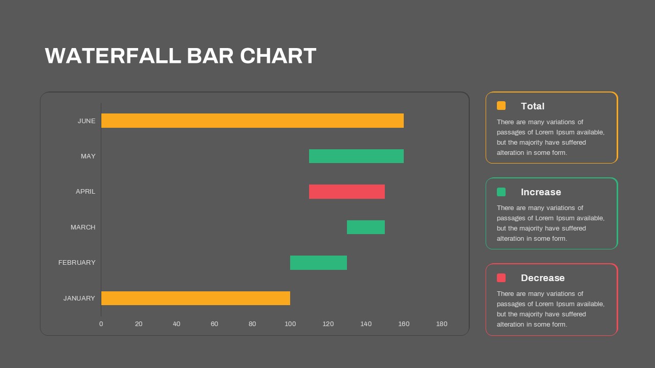
Waterfall Bar Chart Analysis Template for PowerPoint & Google Slides


Description
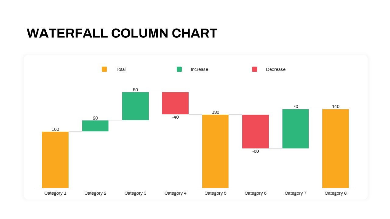
This slide features a horizontal waterfall bar chart designed to visualize month-to-month fluctuations with precision and clarity. Each bar segment is color-coded—orange for cumulative totals, green for positive variances, and red for negative variances—allowing your audience to instantly grasp key performance shifts. A clean legend panel with rounded corners and subtle outlines provides context for each series, while the minimal white background and thin axis lines ensure the data remains front and center. Built on fully editable master layouts, this asset includes customizable color swatches, font styles, and placeholder text boxes that adapt seamlessly to your brand guidelines. Whether you need to adjust bar heights, relabel categories, or swap out months, you can make updates in seconds without compromising resolution or alignment. Optimized for both PowerPoint and Google Slides, it preserves visual fidelity across devices and eliminates version conflicts, so you spend less time troubleshooting and more time analyzing.
Who is it for
Financial analysts, operations managers, project leads, and business executives will benefit from this waterfall bar chart when illustrating revenue trends, variance analyses, or budget reconciliations. Data scientists, consultants, and marketing strategists can also harness its clarity to communicate sequential impacts and strategic insights.
Other Uses
Beyond month-over-month performance reviews, repurpose this template for profit-and-loss breakdowns, cash flow statements, gap analyses, and bridge charts in investor presentations. Use the color-coded segments to highlight cost savings, expense drivers, or inventory shifts, and integrate the slide into quarterly reports, boardroom decks, or KPI dashboards to drive data-informed discussions.
Login to download this file

Item ID
SB03657
Related Templates

Waterfall Column Chart Analysis Template for PowerPoint & Google Slides
Bar/Column
Waterfall Chart Data Visualization Template for PowerPoint & Google Slides
Comparison Chart
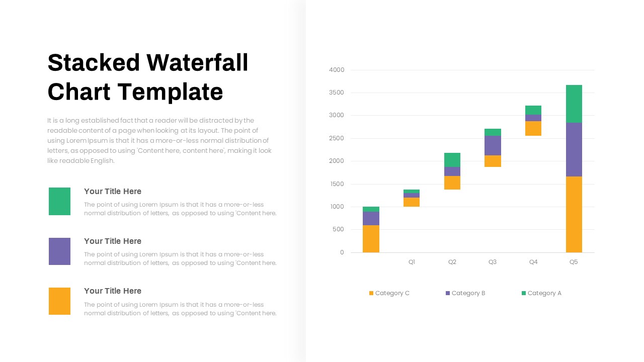
Stacked Waterfall Chart Template for PowerPoint & Google Slides
Bar/Column
Creative Data Analysis Bar Chart template for PowerPoint & Google Slides
Bar/Column
Pencil Bar Chart Data Analysis Template for PowerPoint & Google Slides
Bar/Column
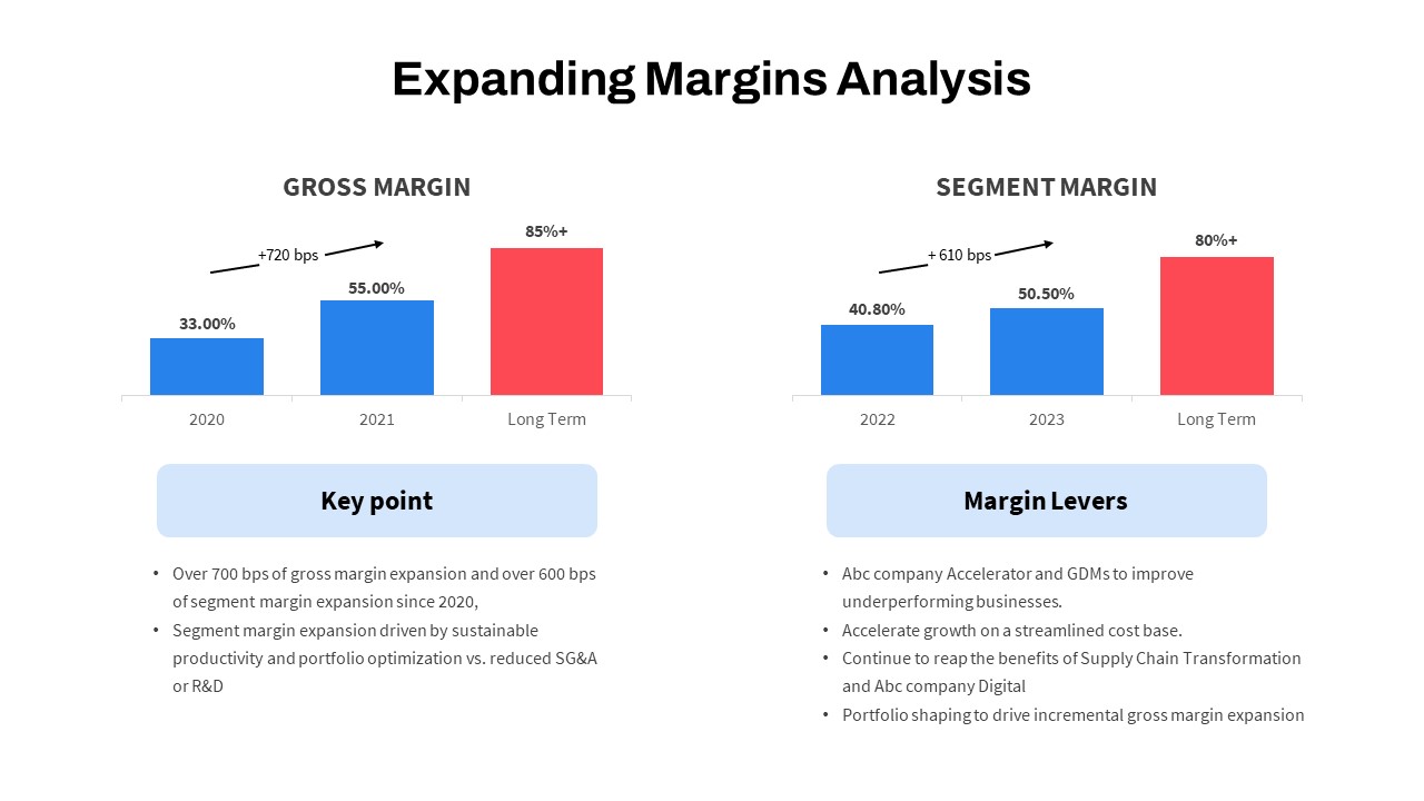
Expanding Margins Analysis Bar Chart Template for PowerPoint & Google Slides
Charts
Data Analysis Bar Chart with Insights Template for PowerPoint & Google Slides
Bar/Column
Free
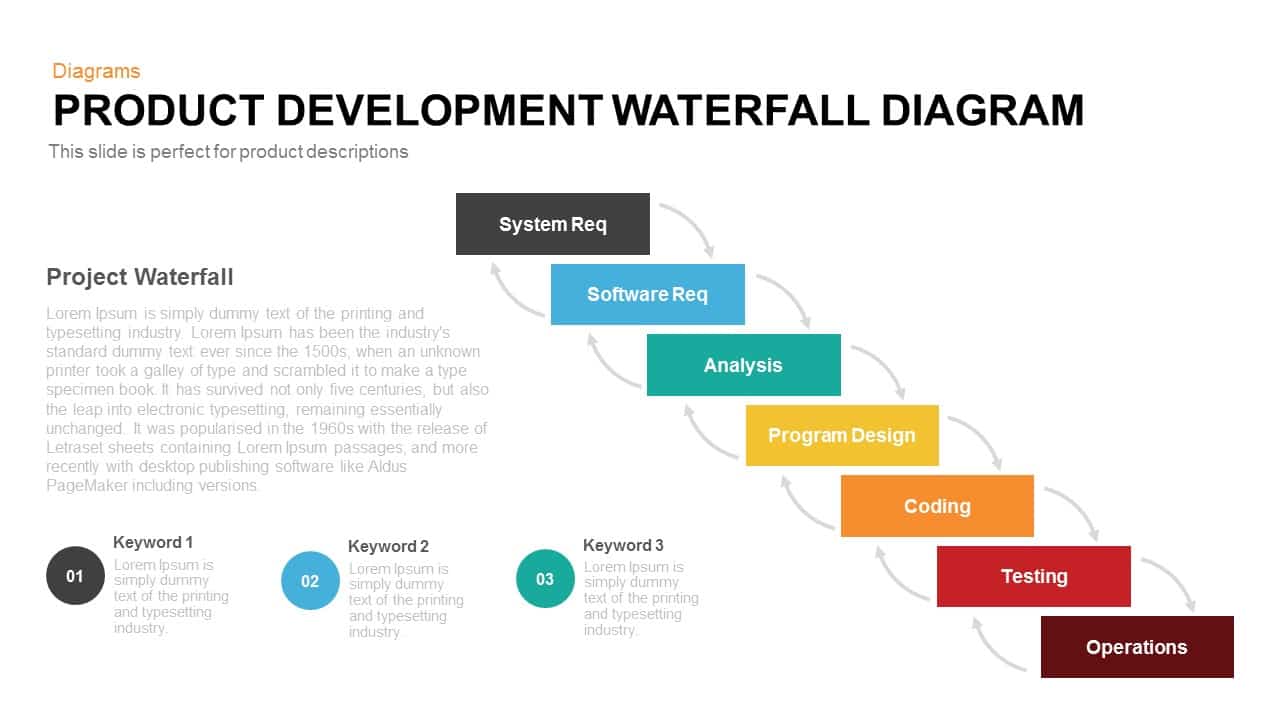
Product Development Waterfall Diagram Template for PowerPoint & Google Slides
Process
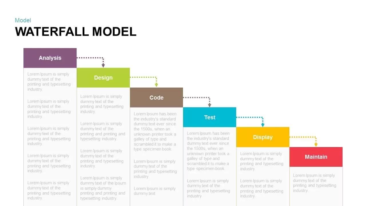
Waterfall Model Diagram Template for PowerPoint & Google Slides
Information Technology
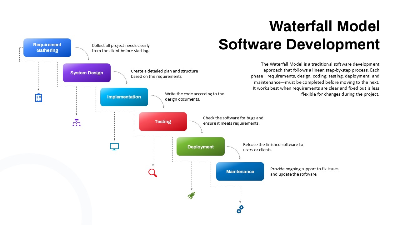
Waterfall Software Development Process Template for PowerPoint & Google Slides
Software Development
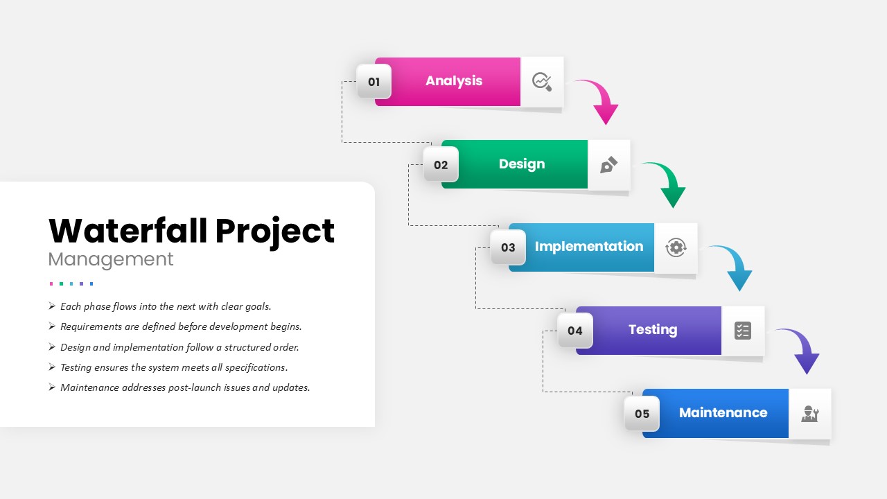
Waterfall Project Management PowerPoint Template
Process
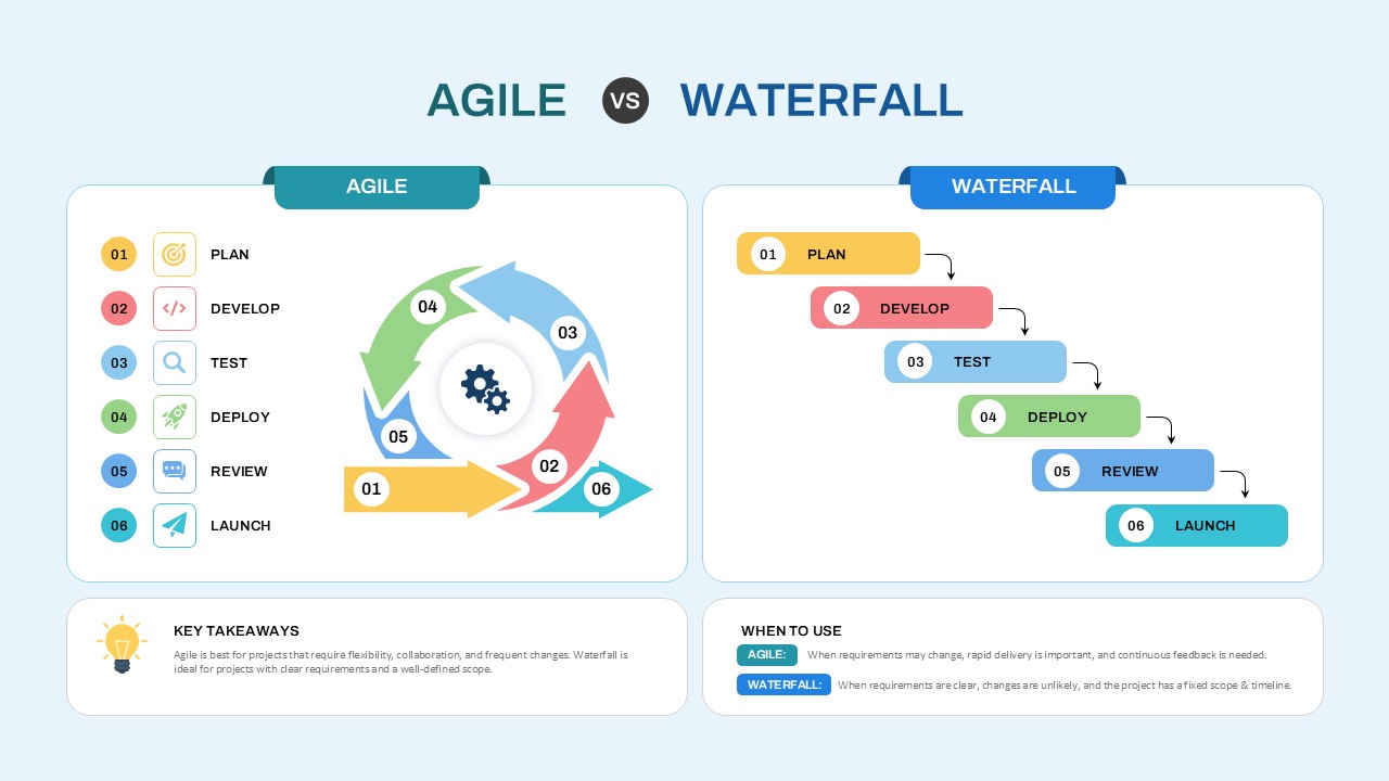
Agile vs Waterfall Comparison Template
Comparison Chart

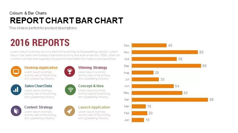
Monthly Reports Bar Chart template for PowerPoint & Google Slides
Bar/Column
Interactive Product Comparison Bar Chart Template for PowerPoint & Google Slides
Bar/Column
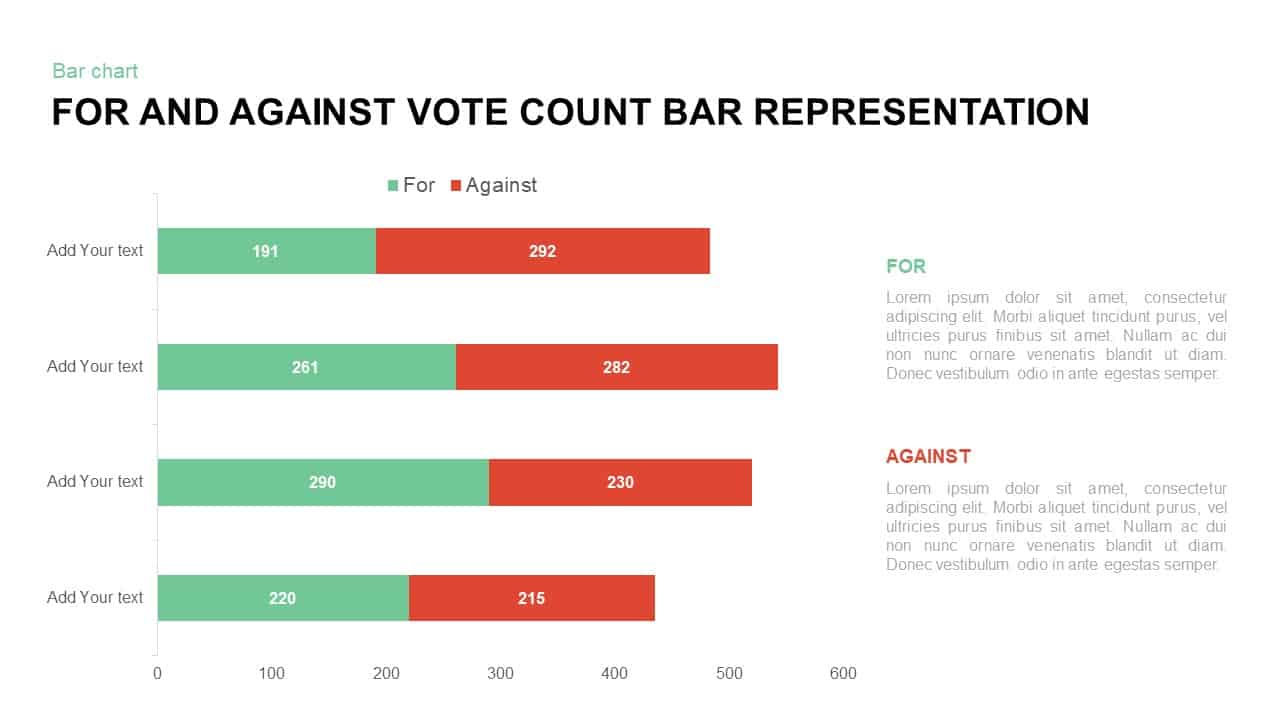
For and Against Vote Count Bar Chart Template for PowerPoint & Google Slides
Bar/Column
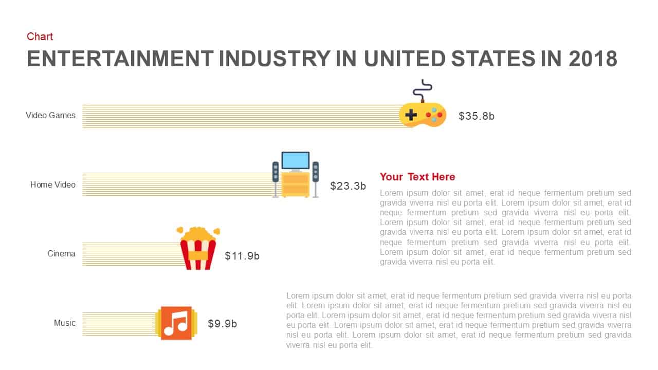
Entertainment Industry Revenue Bar Chart Template for PowerPoint & Google Slides
Bar/Column
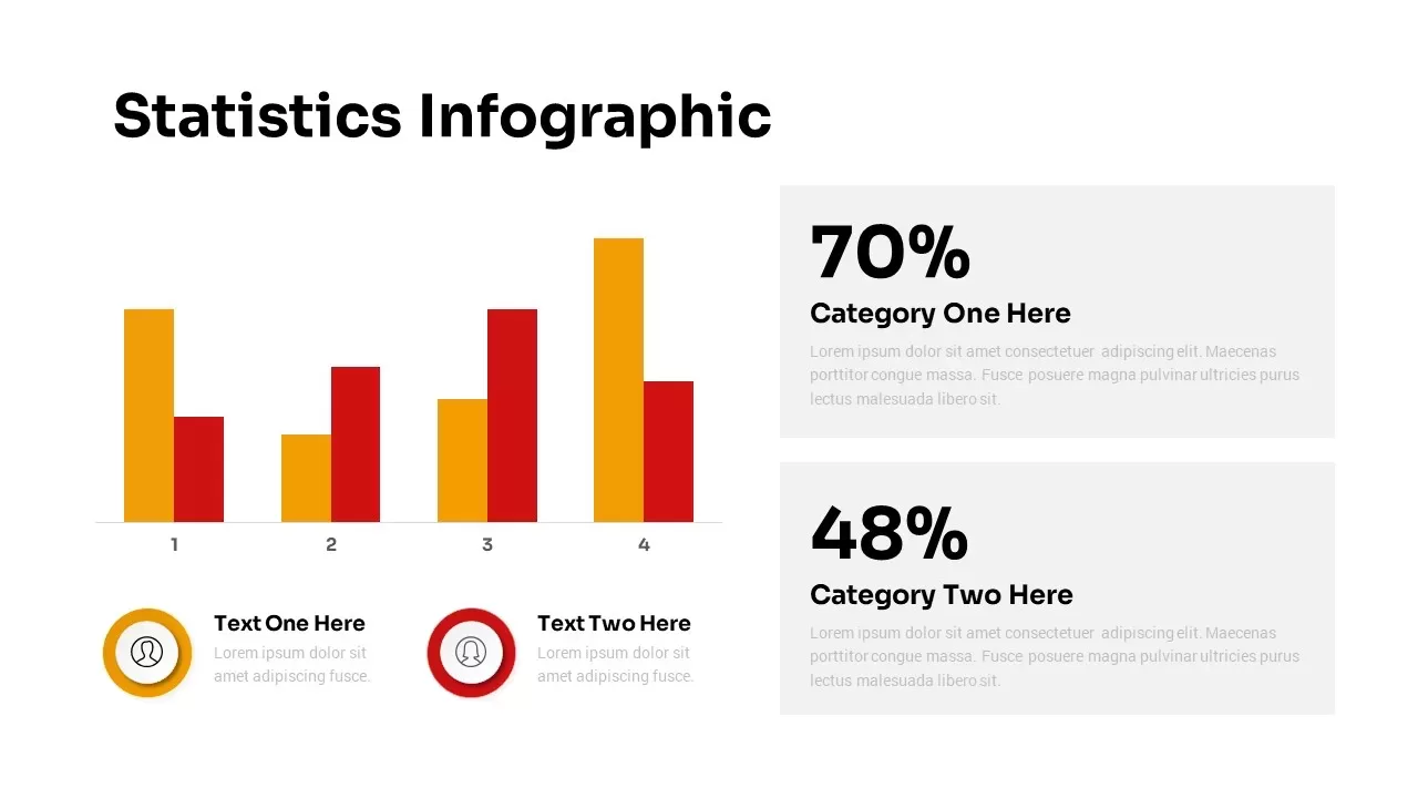
Statistics Infographic & KPI Bar Chart Template for PowerPoint & Google Slides
Bar/Column
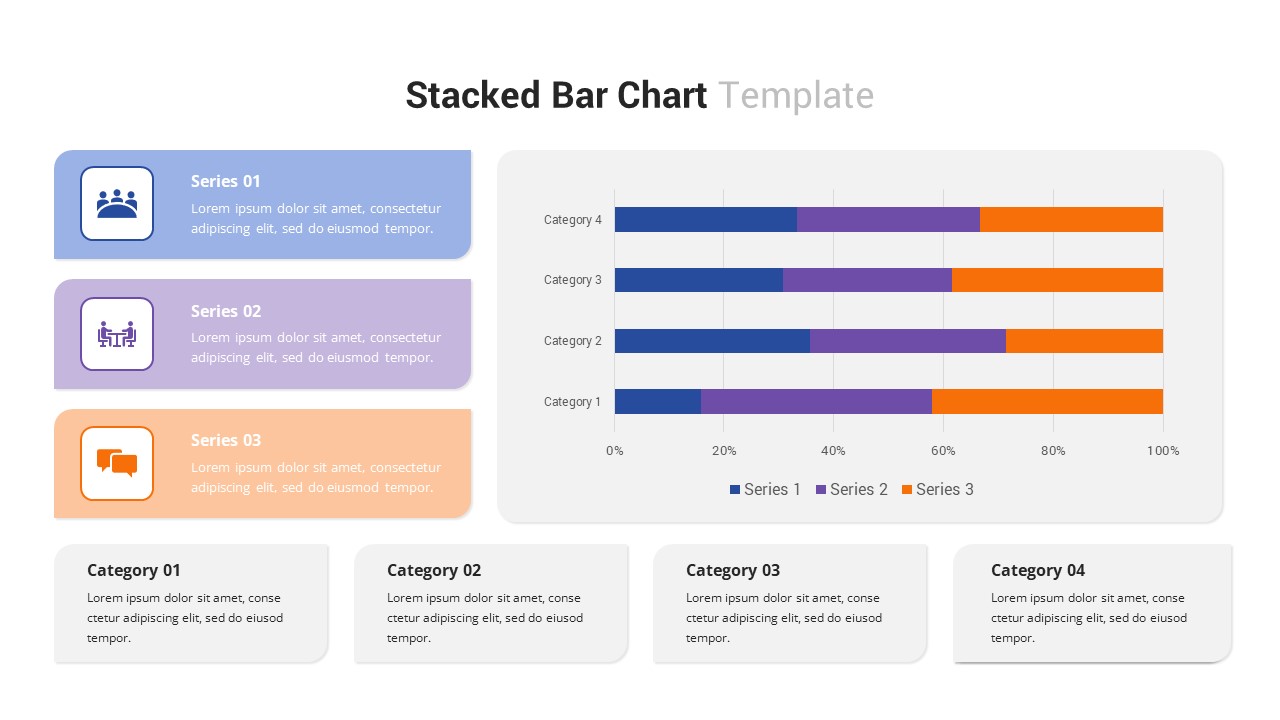
Multi-Series Stacked Bar Chart Template for PowerPoint & Google Slides
Bar/Column
Two-Option Bar Chart Comparison Table Template for PowerPoint & Google Slides
Comparison
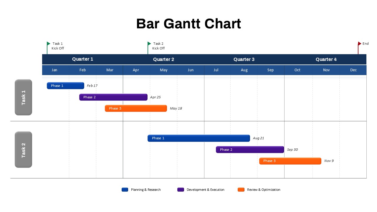
Bar Gantt Chart Template for PowerPoint & Google Slides
Gantt Chart