Donut Split Analysis template for PowerPoint & Google Slides


Description
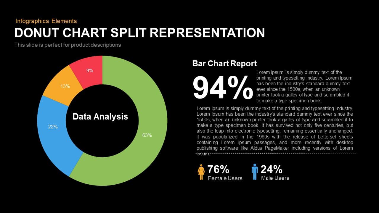
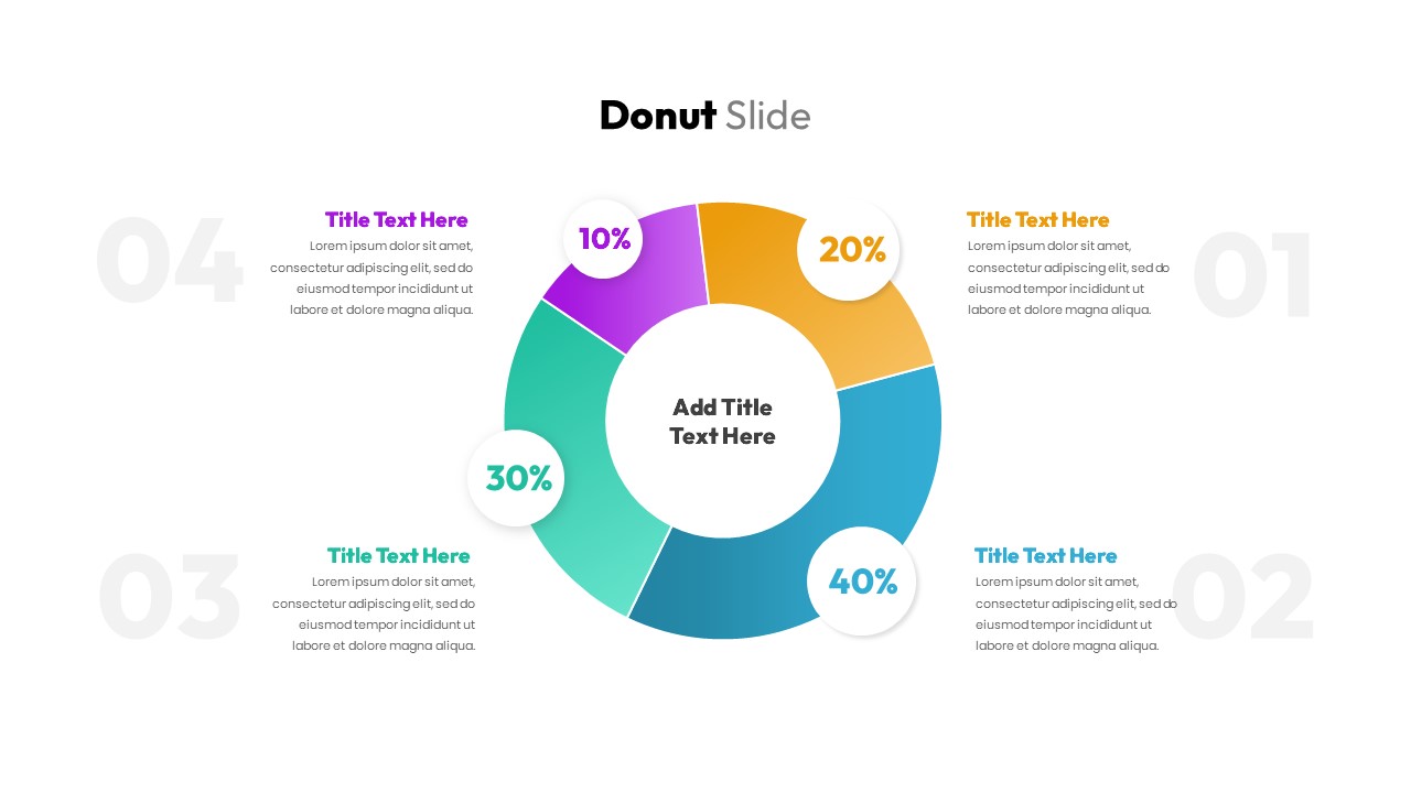
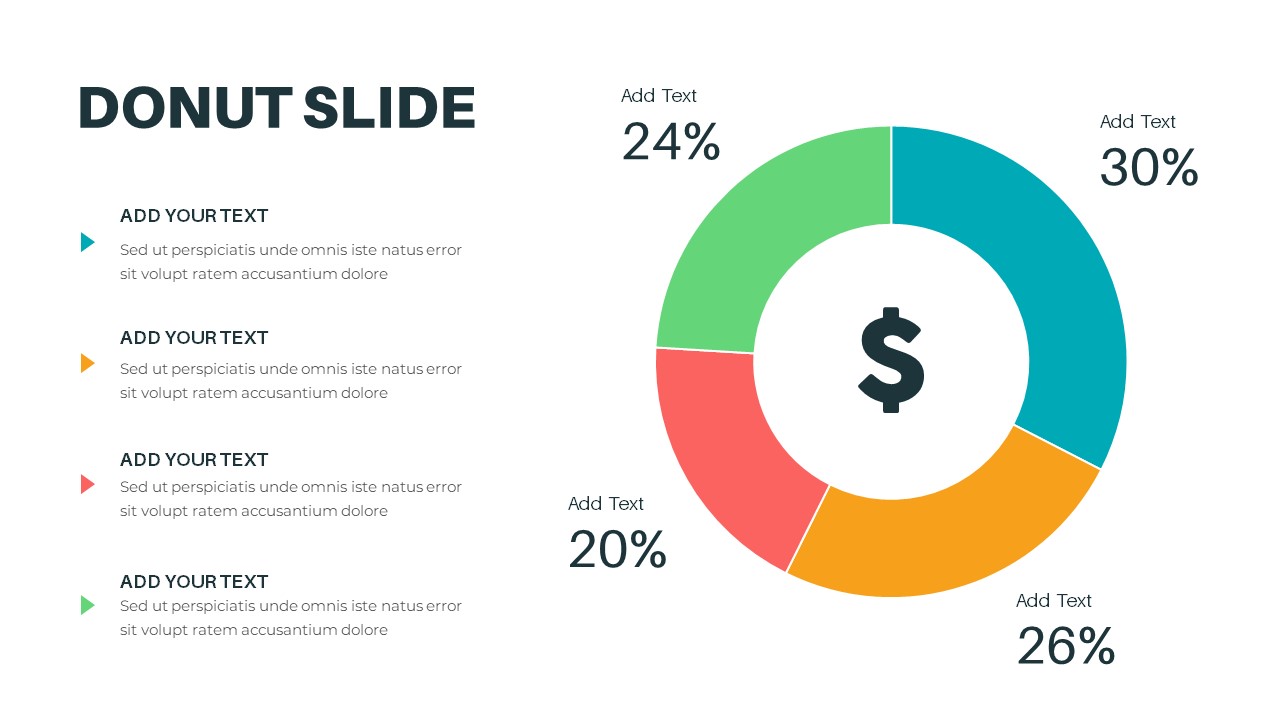
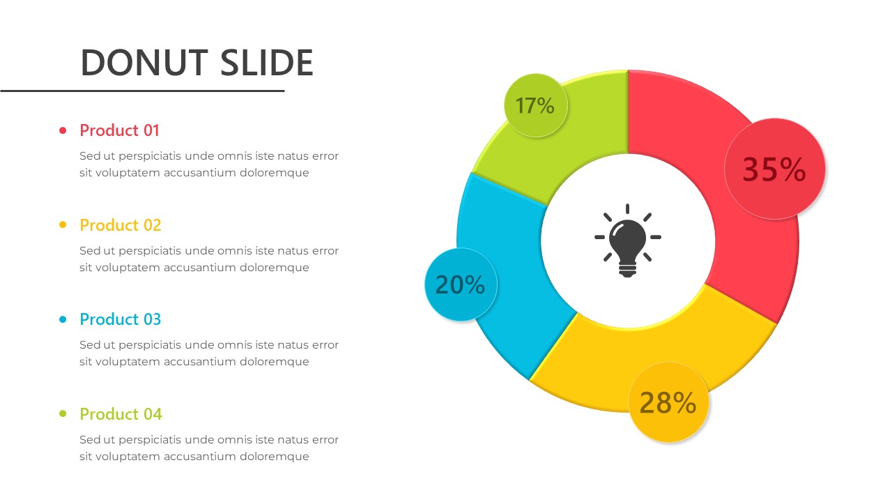
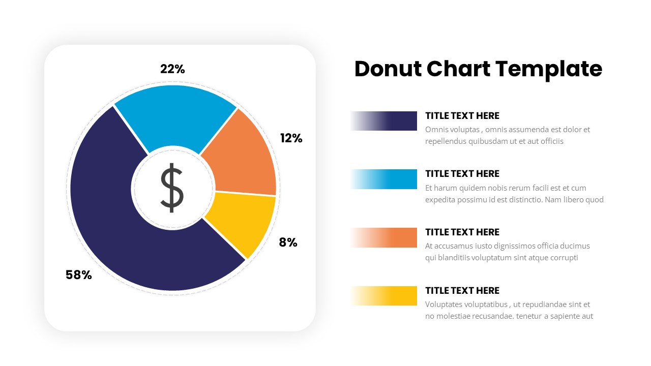
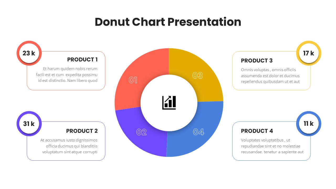
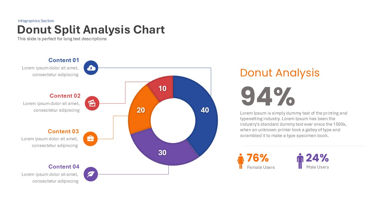
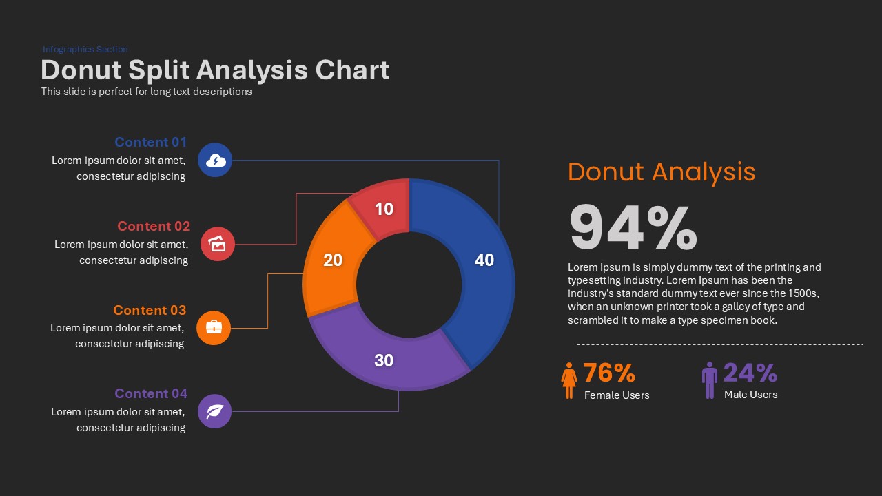
This Donut Split Analysis template features a clean white canvas anchored by a multi-segment donut chart at the center. The chart is divided into four editable segments—40%, 30%, 20%, and 10%—each rendered in a distinct accent hue for immediate visual differentiation. Precision connector lines link each segment to callout icons and text placeholders on the left, allowing you to label Content 01 through Content 04 with concise descriptions. On the right, a bold “Donut Analysis” headline and a large percentage placeholder let you summarize overall performance (e.g., 94%) with an imperative call-to-action narrative. Beneath, gender distribution metrics highlight 76% female and 24% male user breakdowns using matching colored icons and percentages.
Built on master slides for PowerPoint and Google Slides, every element—from segment colors and connector lines to icons and text blocks—is fully editable. Swap theme colors via the built-in palette, replace icons with custom SVGs, and update fonts globally with free web fonts. The vector-based donut and icons guarantee pixel-perfect rendering on HD projectors, retina displays, and virtual meeting backgrounds. This layout supports both 16:9 widescreen and 4:3 aspect ratios without manual reformatting. Hidden variation slides offer alternate color schemes, expanded segment counts, and inverted layouts for rapid customization. Pre-configured entrance animations and morph transitions guide viewers through each data point in sequence, while alignment guides and subtle drop shadows maintain a polished, professional aesthetic.
Who is it for
Marketing analysts, product managers, and data storytellers looking to present channel splits, audience demographics, or survey results. Executives and consultants can leverage the slide for quarterly reports, client dashboards, and stakeholder briefings.
Other Uses
Repurpose this slide to compare budget allocations, feature adoption rates, or customer satisfaction scores. Swap the donut for radial bar charts or gauge visuals to adapt the template for financial forecasts, resource planning, or operational dashboards with minimal effort.
Login to download this file

Item ID
SB00030
Related Templates

Donut Chart Split Template for PowerPoint & Google Slides
Charts
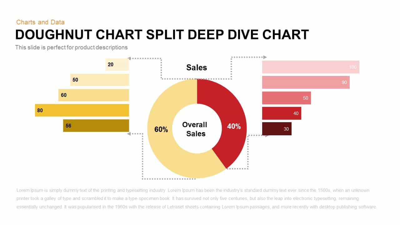
Split Doughnut Deep Dive Sales Analysis Template for PowerPoint & Google Slides
Pie/Donut
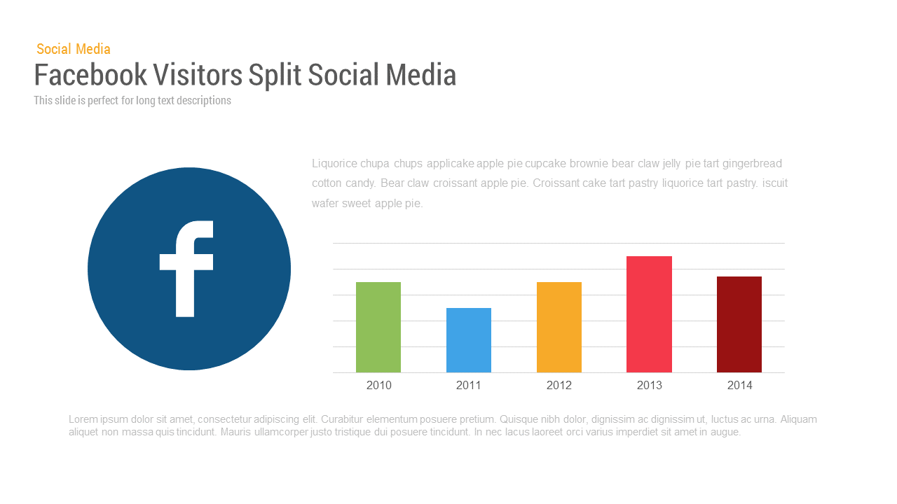
Facebook User Split template for PowerPoint & Google Slides
Bar/Column
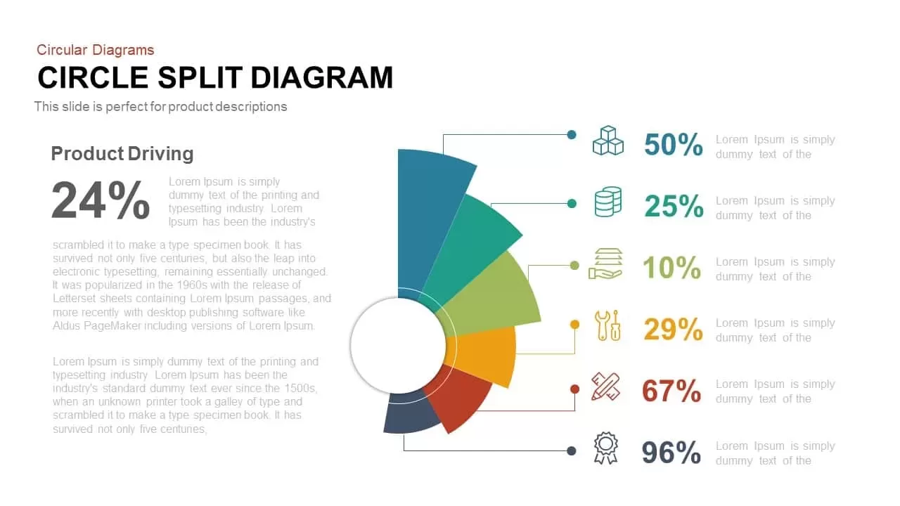
Multi-Segment Circle Split Diagram template for PowerPoint & Google Slides
Circular

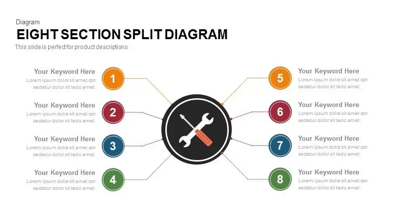
8-Section Split Diagram with Hub Icon template for PowerPoint & Google Slides
Circular
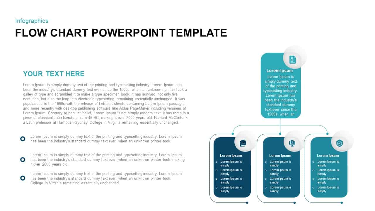
Vertical Split Flow Chart Diagram Template for PowerPoint & Google Slides
Flow Charts
Capital Structure Dynamic Split Chart Template for PowerPoint & Google Slides
Comparison Chart
About Us Split Photo Template for PowerPoint & Google Slides
Marketing
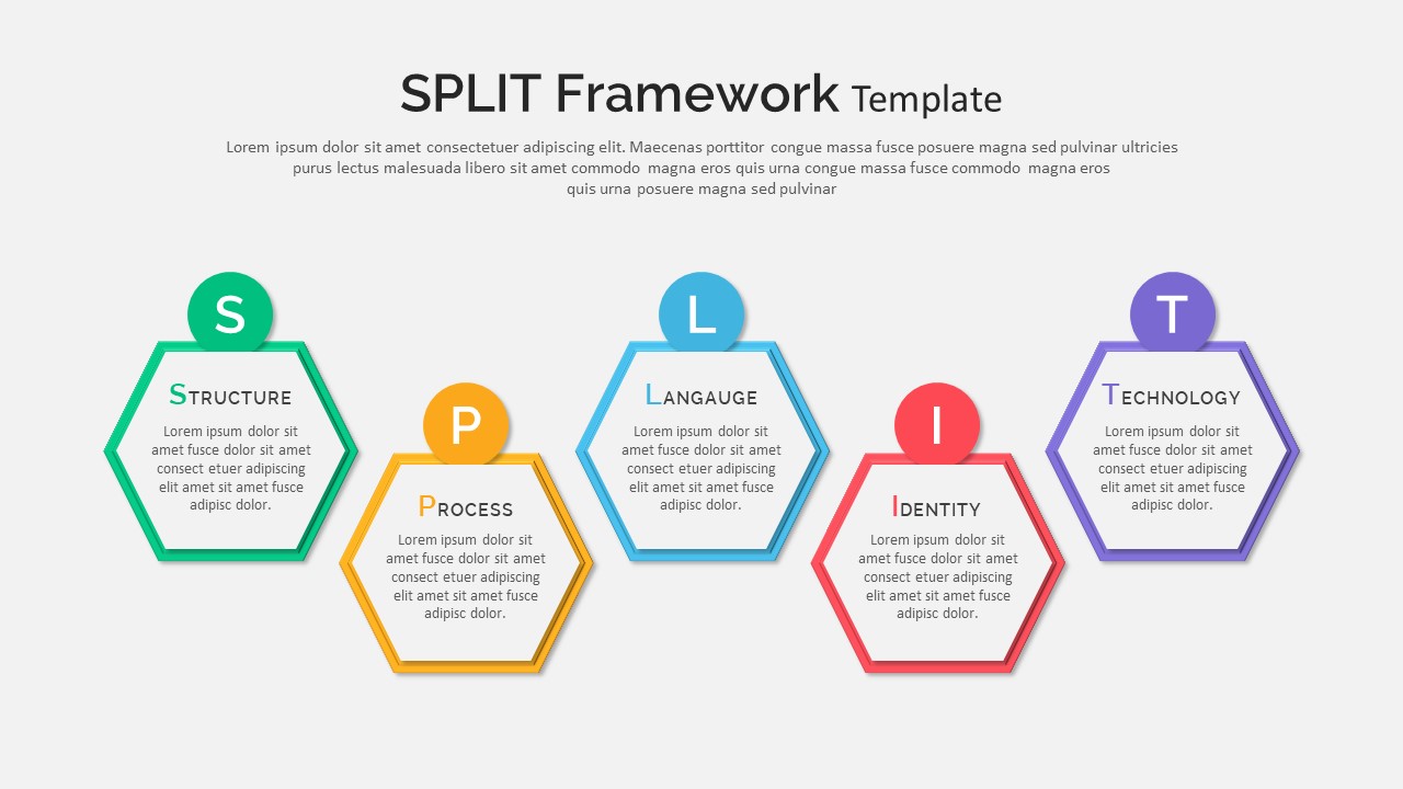
Split Framework Hexagon Diagram Slide Template for PowerPoint & Google Slides
Process
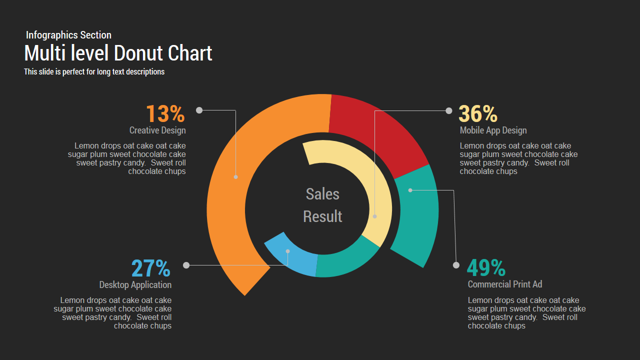
Multi level Donut Chart Template
Pie/Donut
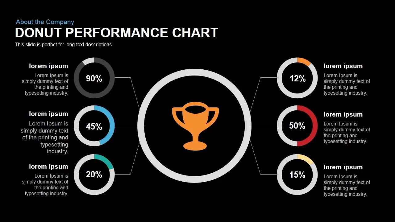
Donut Performance Chart template for PowerPoint & Google Slides
Pie/Donut
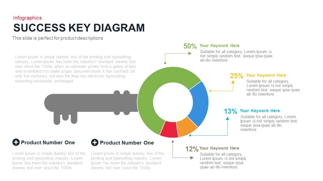
Success Key Diagram with Donut Chart Template for PowerPoint & Google Slides
Pie/Donut

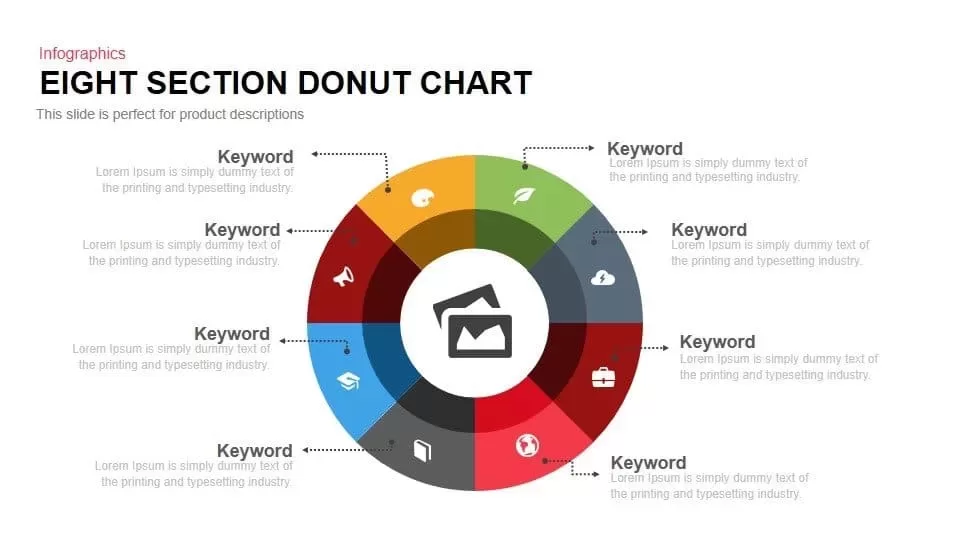
Eight Section Donut Chart Infographic Template for PowerPoint & Google Slides
Pie/Donut
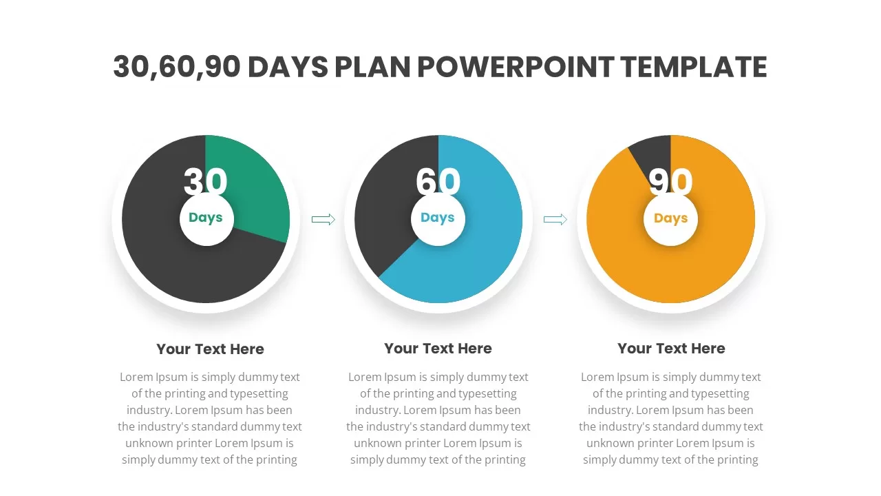
30 60 90 Days Plan PowerPoint Template
Timeline
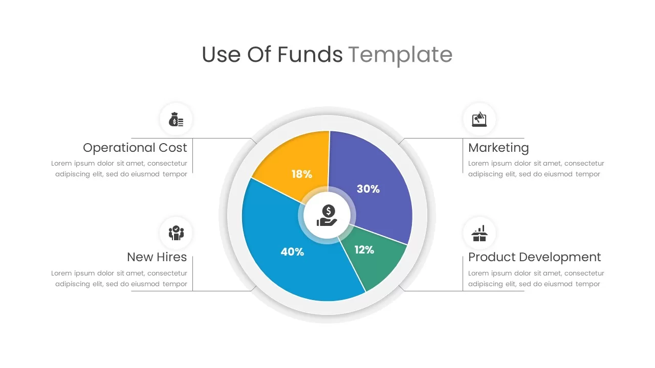
Use of Funds Donut Chart Infographic Template for PowerPoint & Google Slides
Circular
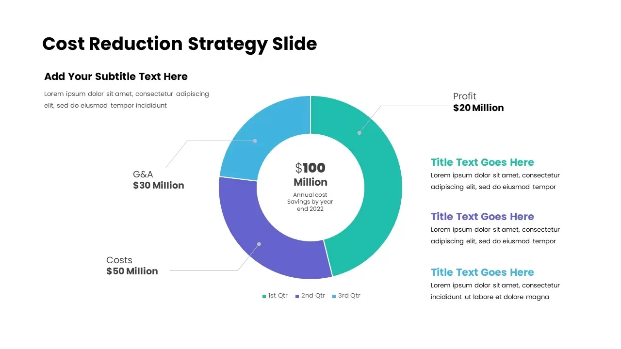
Cost Reduction Strategy Donut Chart Template for PowerPoint & Google Slides
Pie/Donut
Donut Chart Data Breakdown template for PowerPoint & Google Slides
Pie/Donut
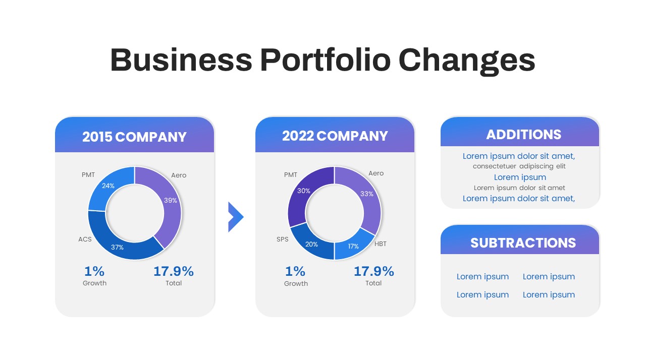
Business Portfolio Changes Donut Chart Template for PowerPoint & Google Slides
Pie/Donut
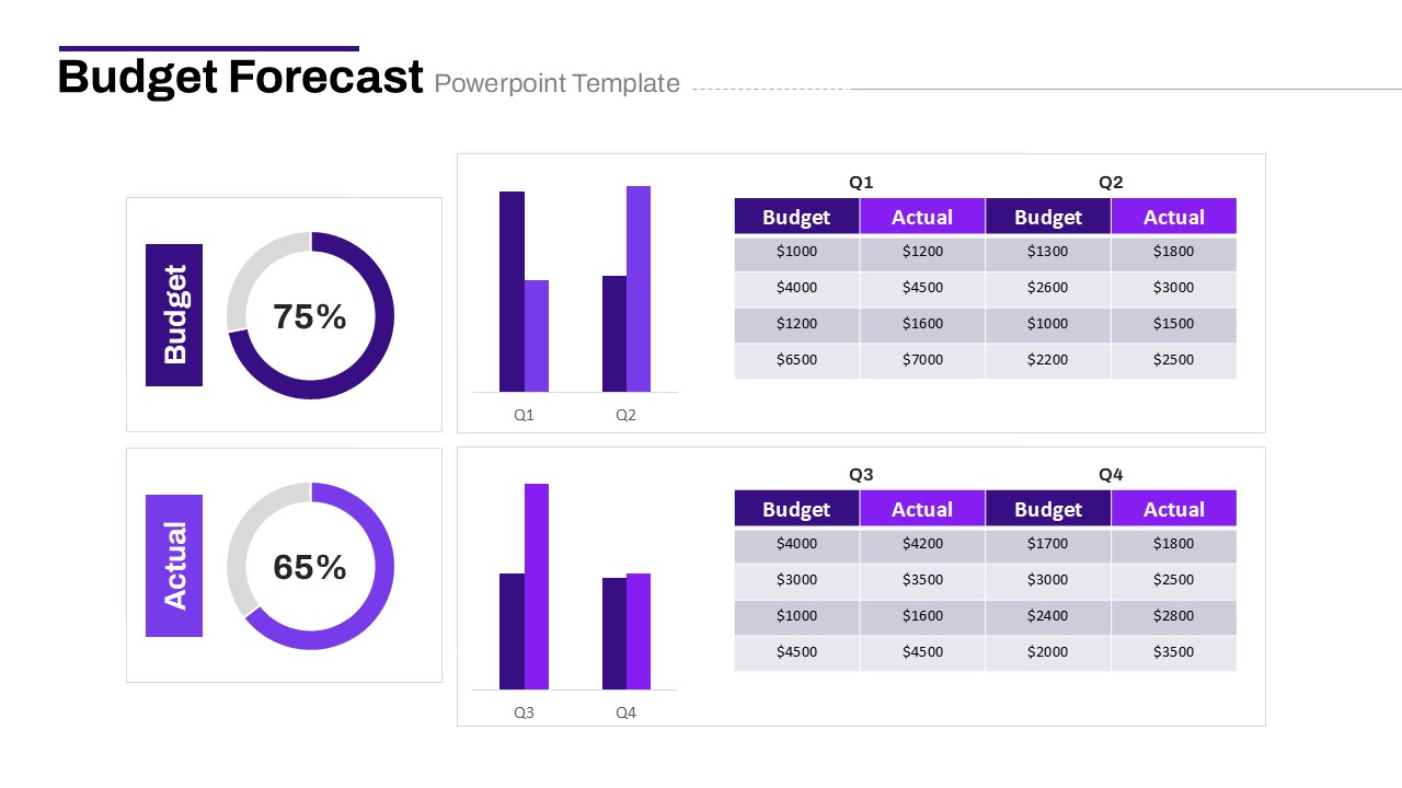
Budget Forecast Dashboard & Donut Charts Template for PowerPoint & Google Slides
Pie/Donut
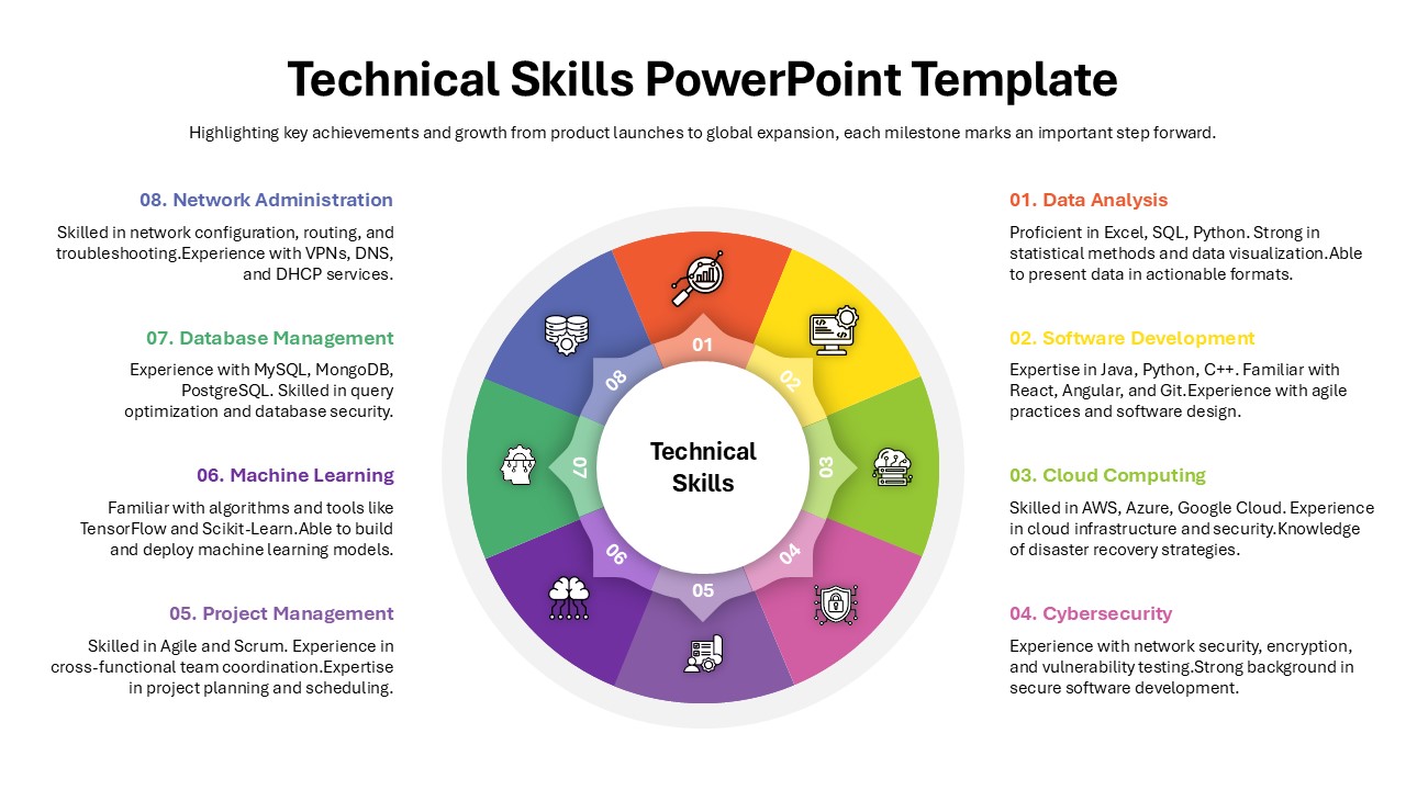
Technical Skills Donut Chart Overview Template for PowerPoint & Google Slides
HR
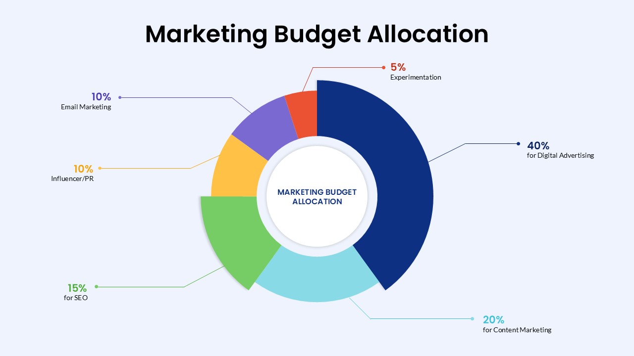
Marketing Budget Allocation Donut Chart Template for PowerPoint & Google Slides
Marketing
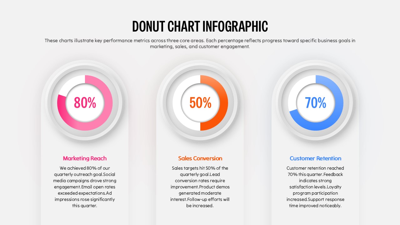
Three Segment Donut Chart KPI Infographic Template for PowerPoint & Google Slides
Pie/Donut
Donut Diagram PowerPoint Template
Pie/Donut
Donut Chart Template for PowerPoint & Google Slides
Pie/Donut
Donut Chart PowerPoint Template
Pie/Donut
Donut Chart Presentation Template
Pie/Donut

Comparison Donut Chart PowerPoint Template and Keynote
Pie/Donut
PEST Analysis PowerPoint Template for PowerPoint & Google Slides
Business Strategy
Creative Smartphone Feature PowerPoint Template
Charts
Box SWOT Analysis Infographic Template for PowerPoint & Google Slides
SWOT
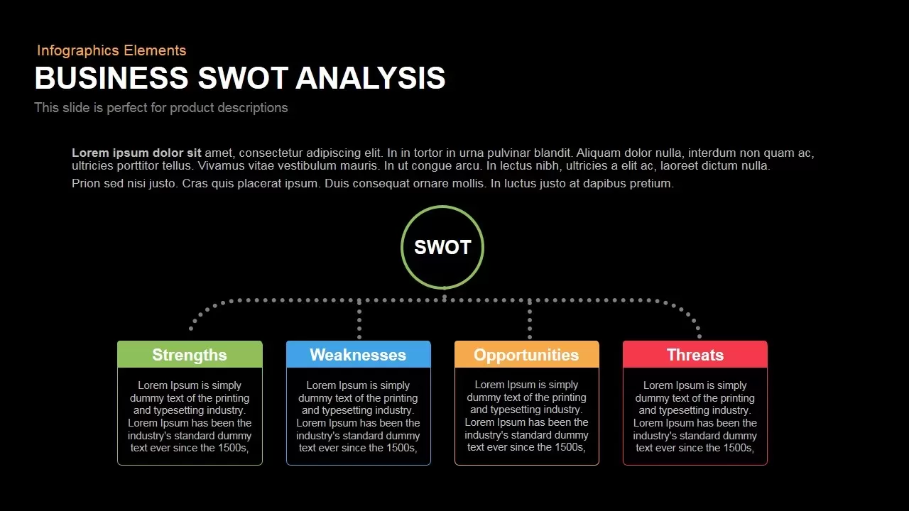
Box Business SWOT Analysis Template for PowerPoint & Google Slides
SWOT
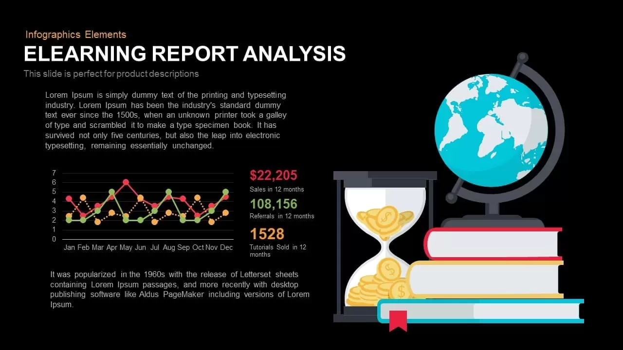
E-Learning Report Analysis Template for PowerPoint & Google Slides
Infographics
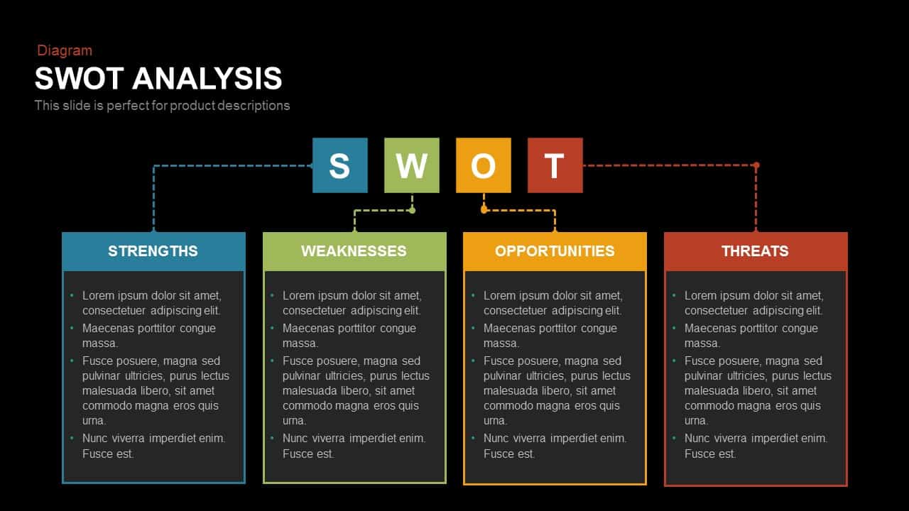
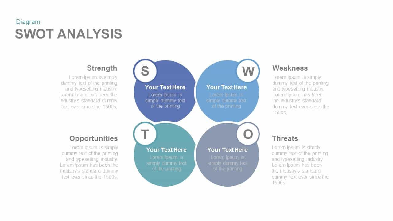
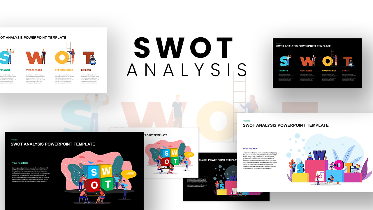
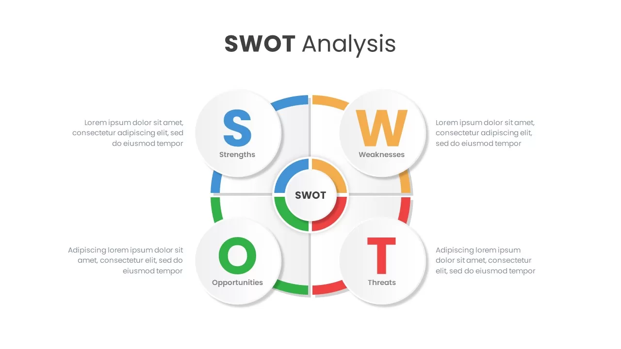
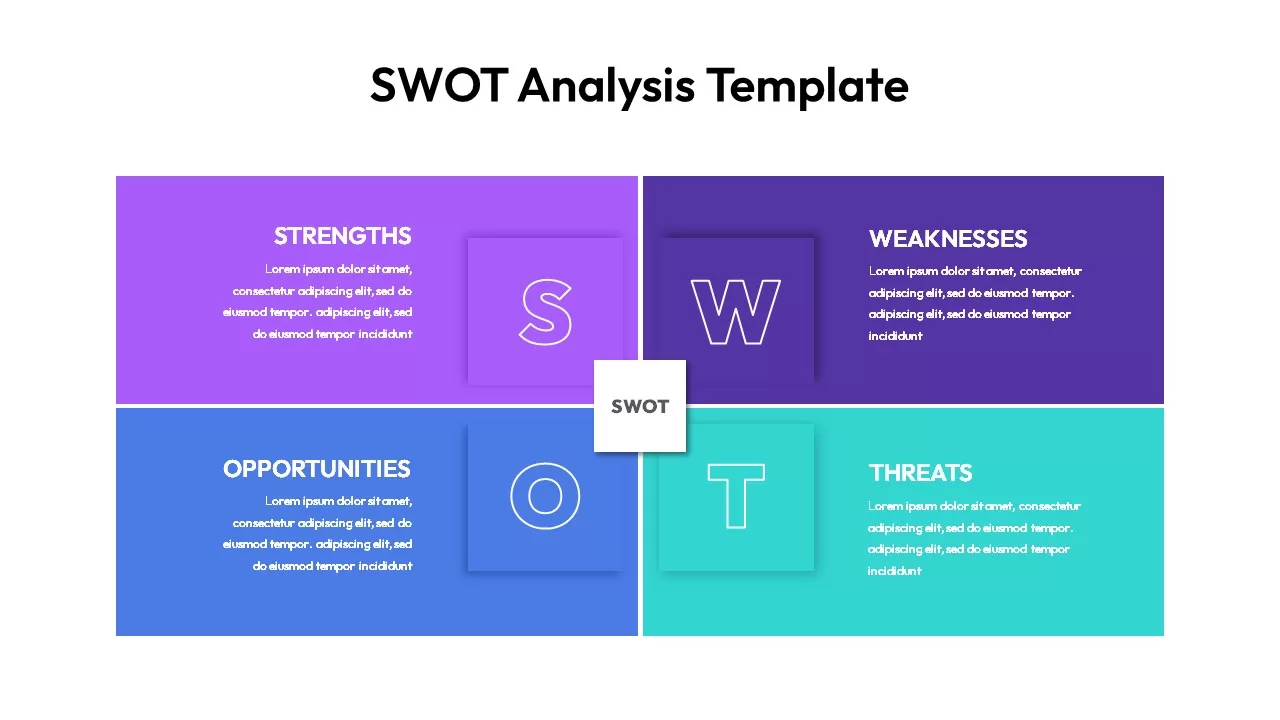
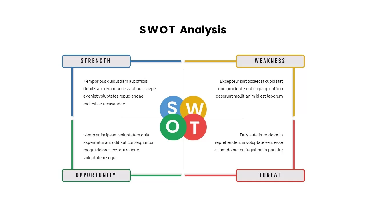
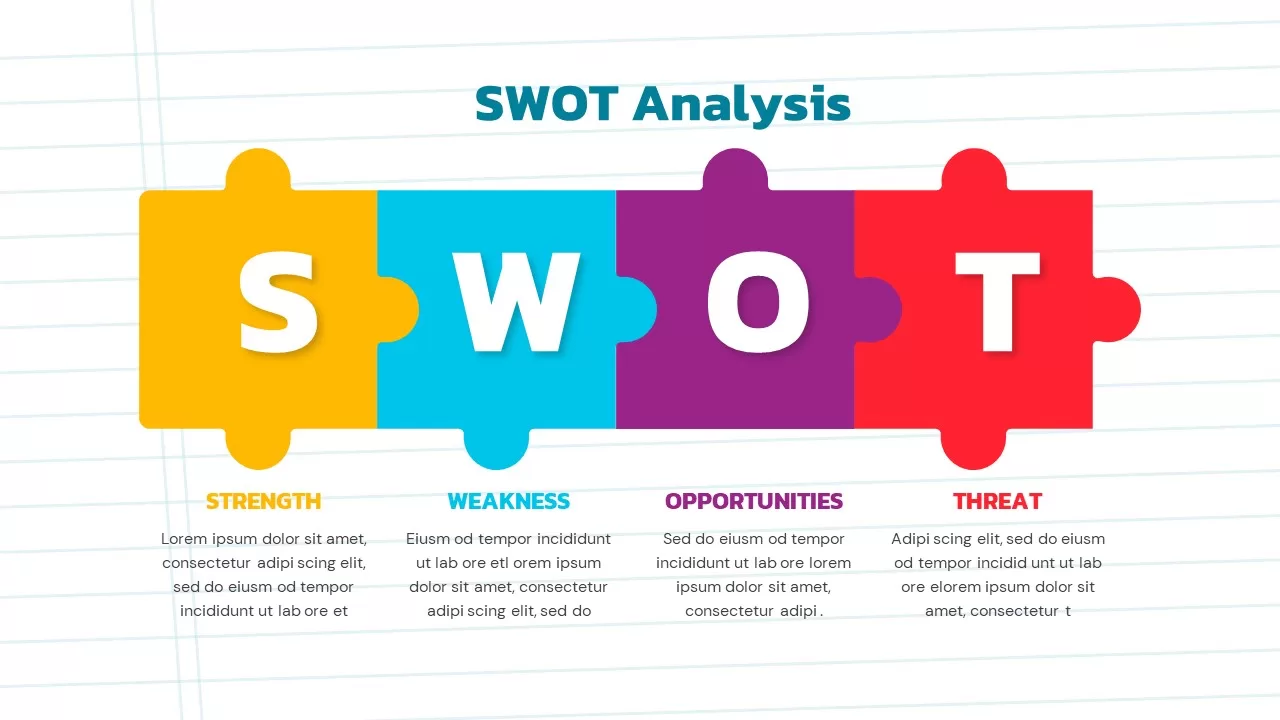
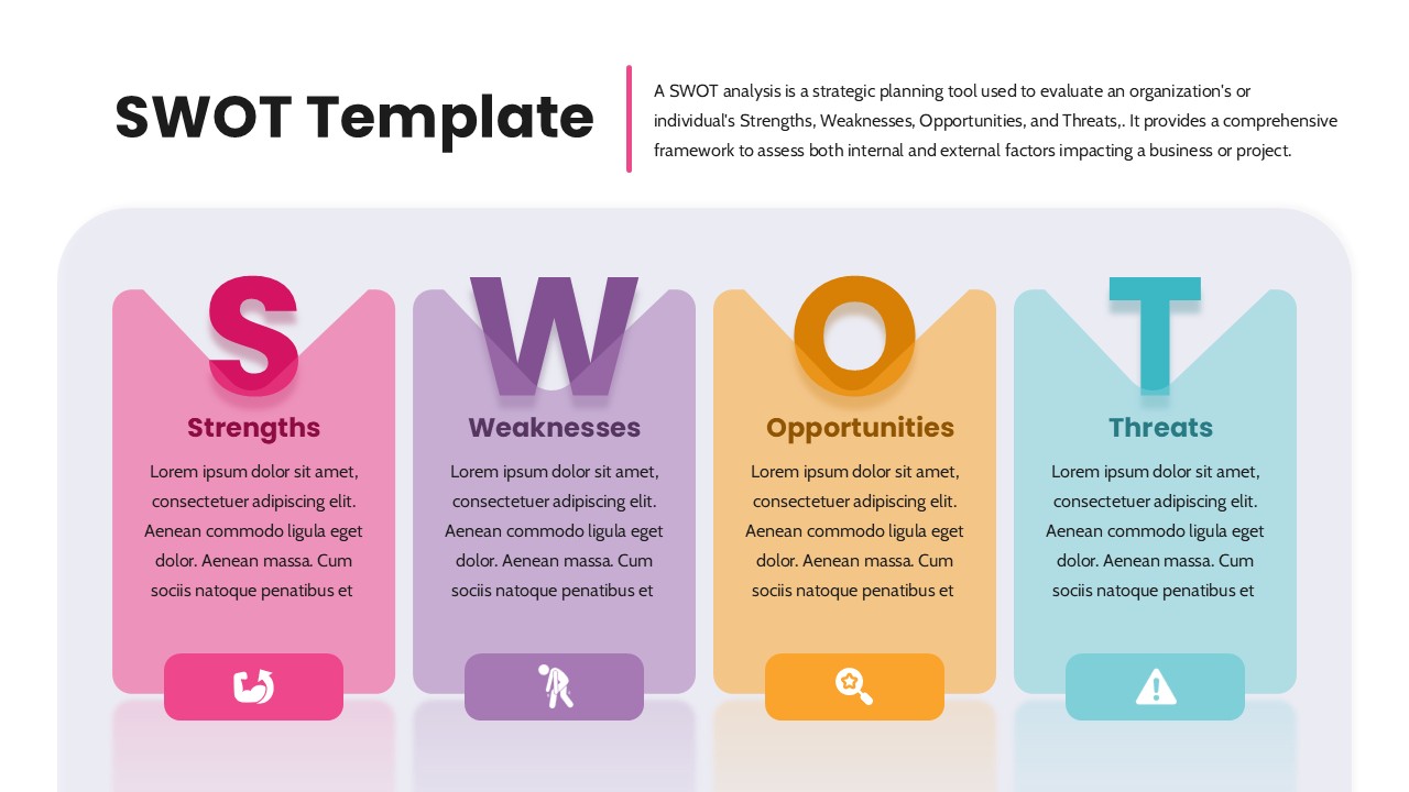
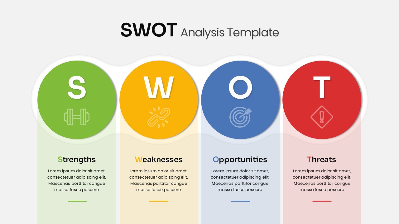
SWOT Analysis template for PowerPoint & Google Slides
SWOT
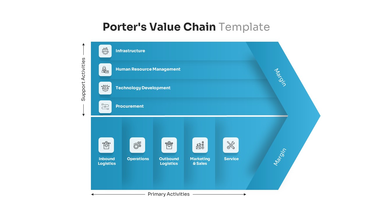
Porter’s Value Chain Analysis Diagram Template for PowerPoint & Google Slides
Business Strategy
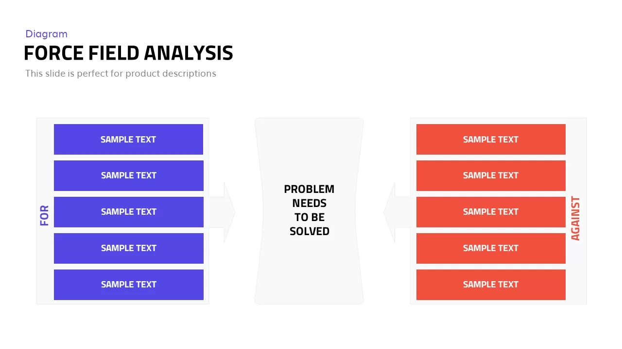
Editable Force Field Analysis Diagram Template for PowerPoint & Google Slides
Business Plan
Free SWOT Analysis PowerPoint Template
SWOT
Free
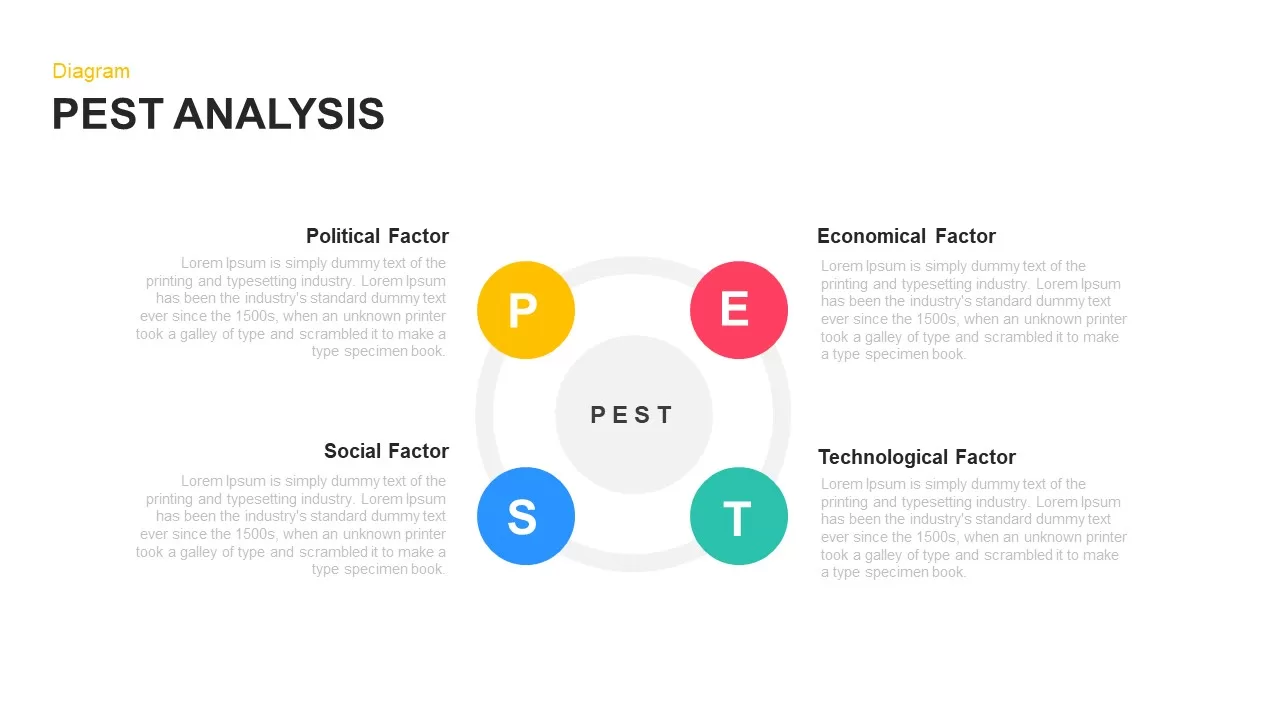
PEST Analysis Circular Diagram Template for PowerPoint & Google Slides
PEST
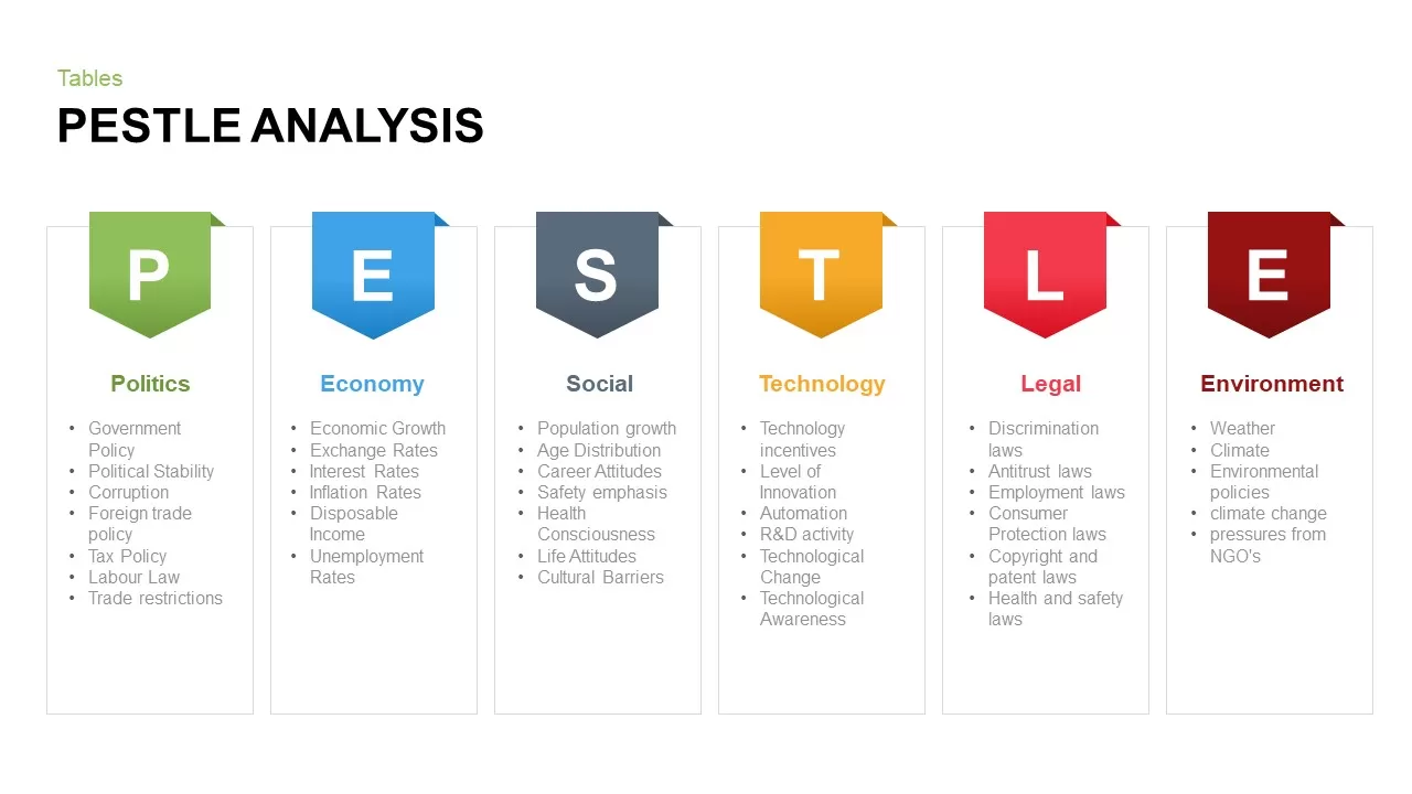
Pestle Analysis PowerPoint Template and Slides
PEST
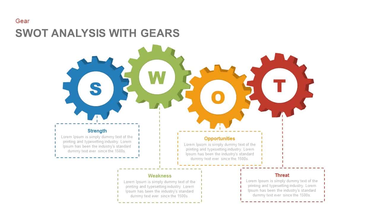
SWOT Analysis Gear Diagram Slide Template for PowerPoint & Google Slides
SWOT
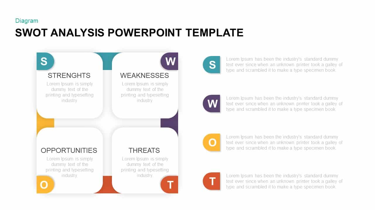
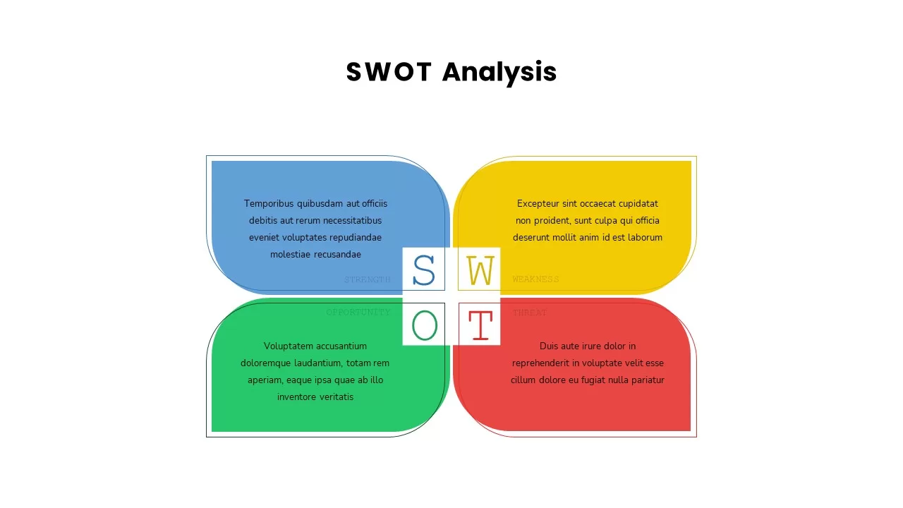
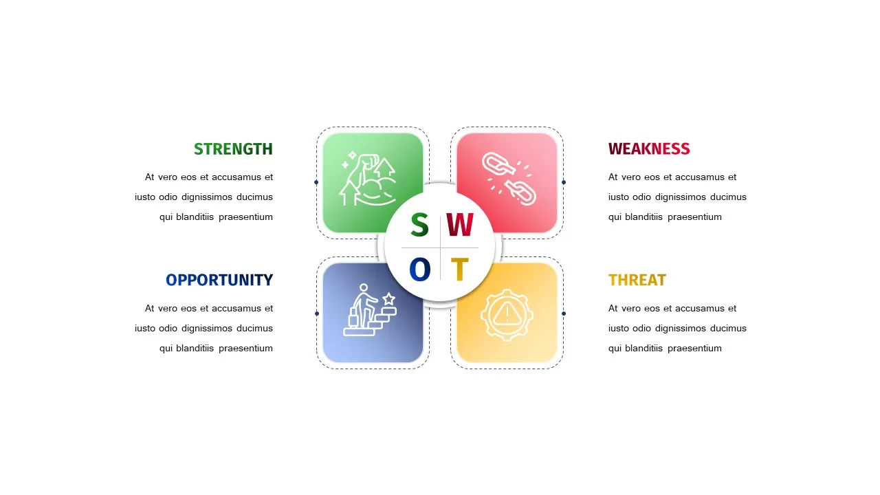
Four-Quadrant SWOT Analysis Diagram Template for PowerPoint & Google Slides
SWOT
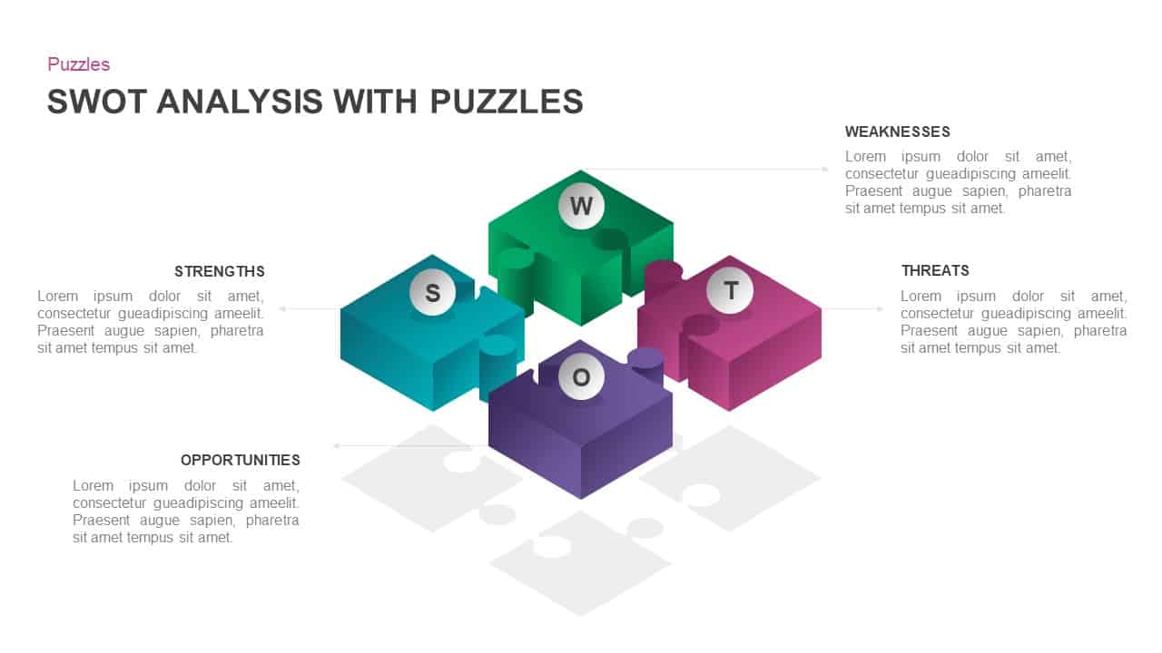
Interactive 3D Puzzle SWOT Analysis Slide Template for PowerPoint & Google Slides
SWOT
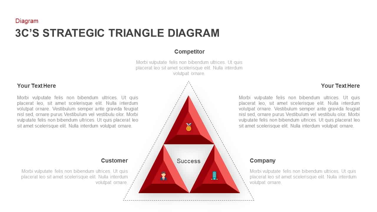
3C Strategic Triangle Analysis Template for PowerPoint & Google Slides
Competitor Analysis
Versatile SWOT Analysis Slide Collection Template for PowerPoint & Google Slides
SWOT
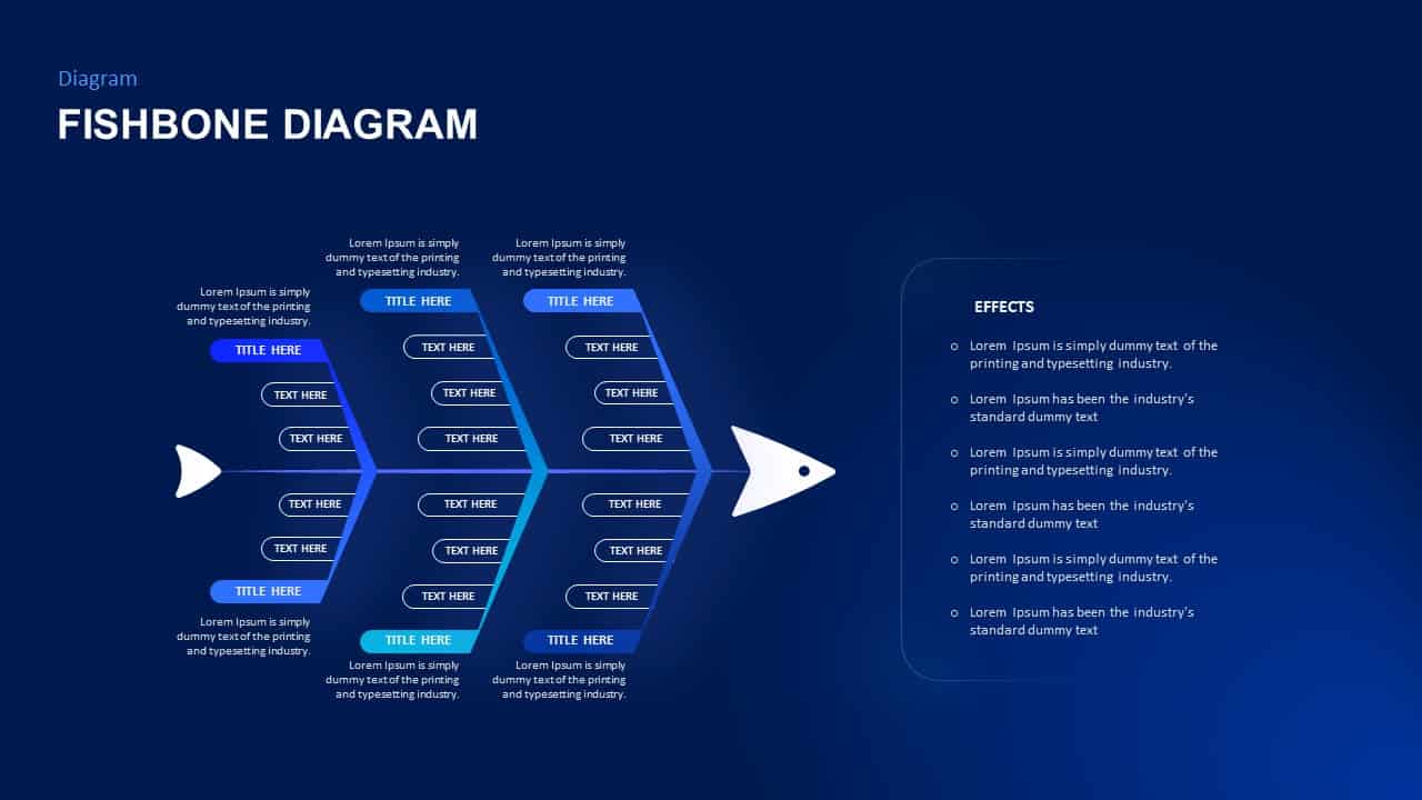
Fishbone Cause Analysis Diagram Template for PowerPoint & Google Slides
Process

Break-Even Analysis template for PowerPoint & Google Slides
Process
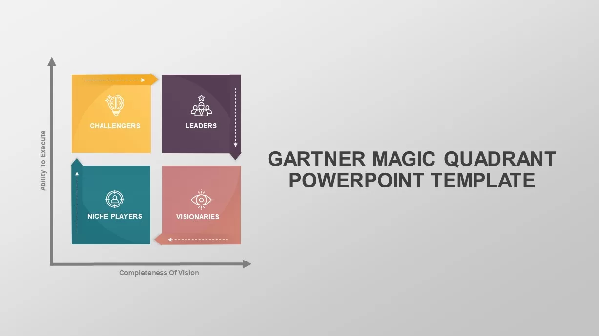
Gartner Magic Quadrant Analysis Template for PowerPoint & Google Slides
Business
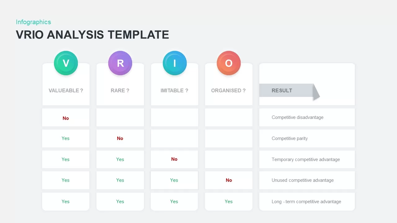
VRIO Analysis Infographic Template for PowerPoint & Google Slides
Business Strategy
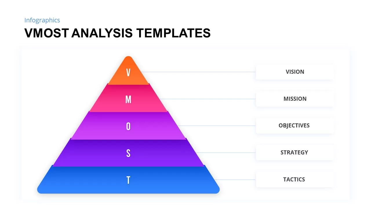
VMOST Analysis Template for PowerPoint & Google Slides
Business Strategy
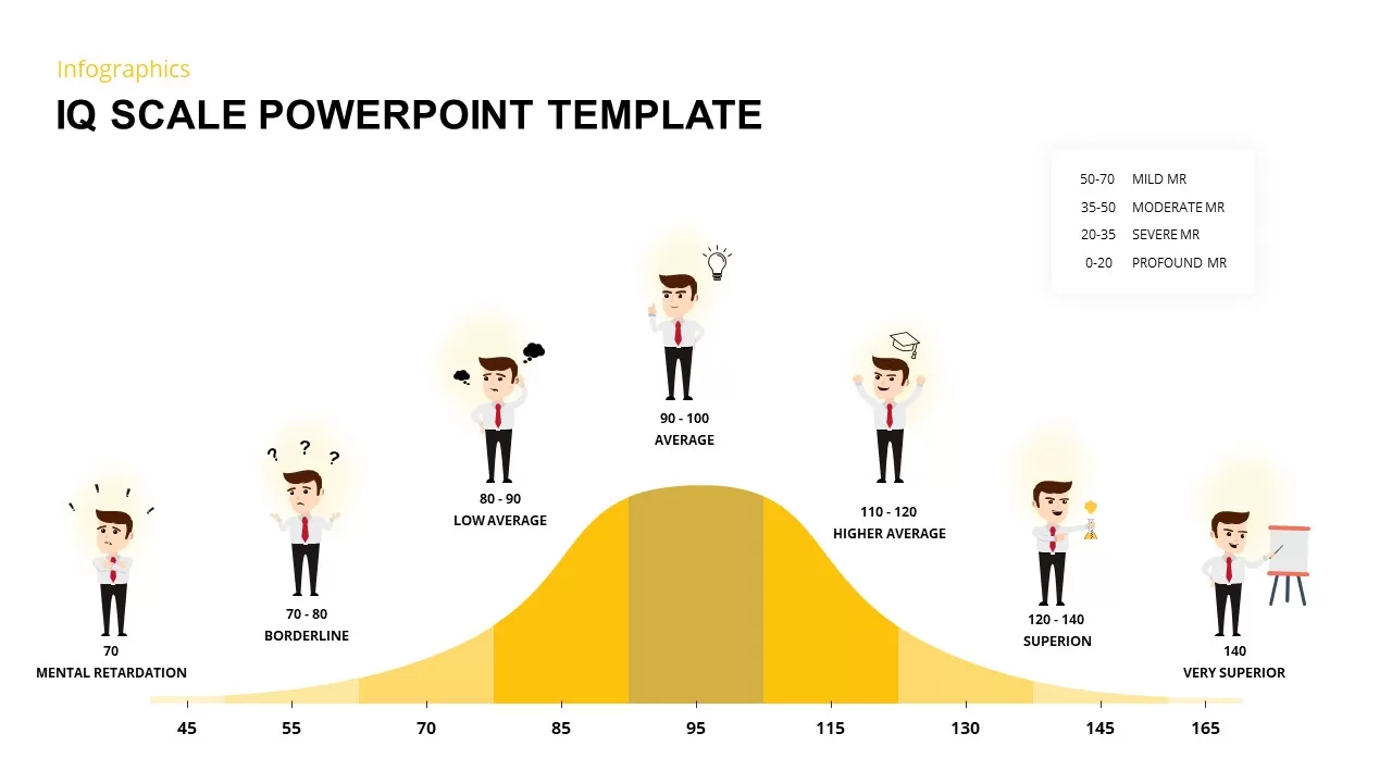
IQ Scale Analysis Diagram template for PowerPoint & Google Slides
Employee Performance
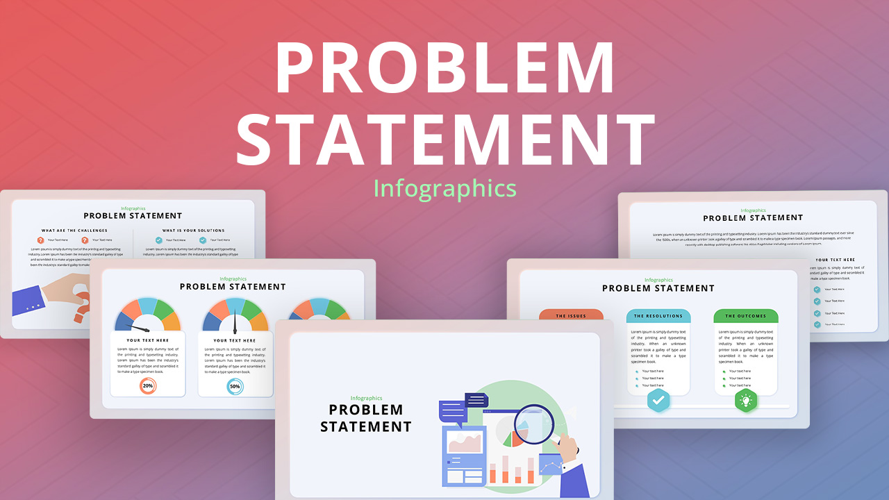
Problem Statement Infographic PowerPoint Template
Business Strategy
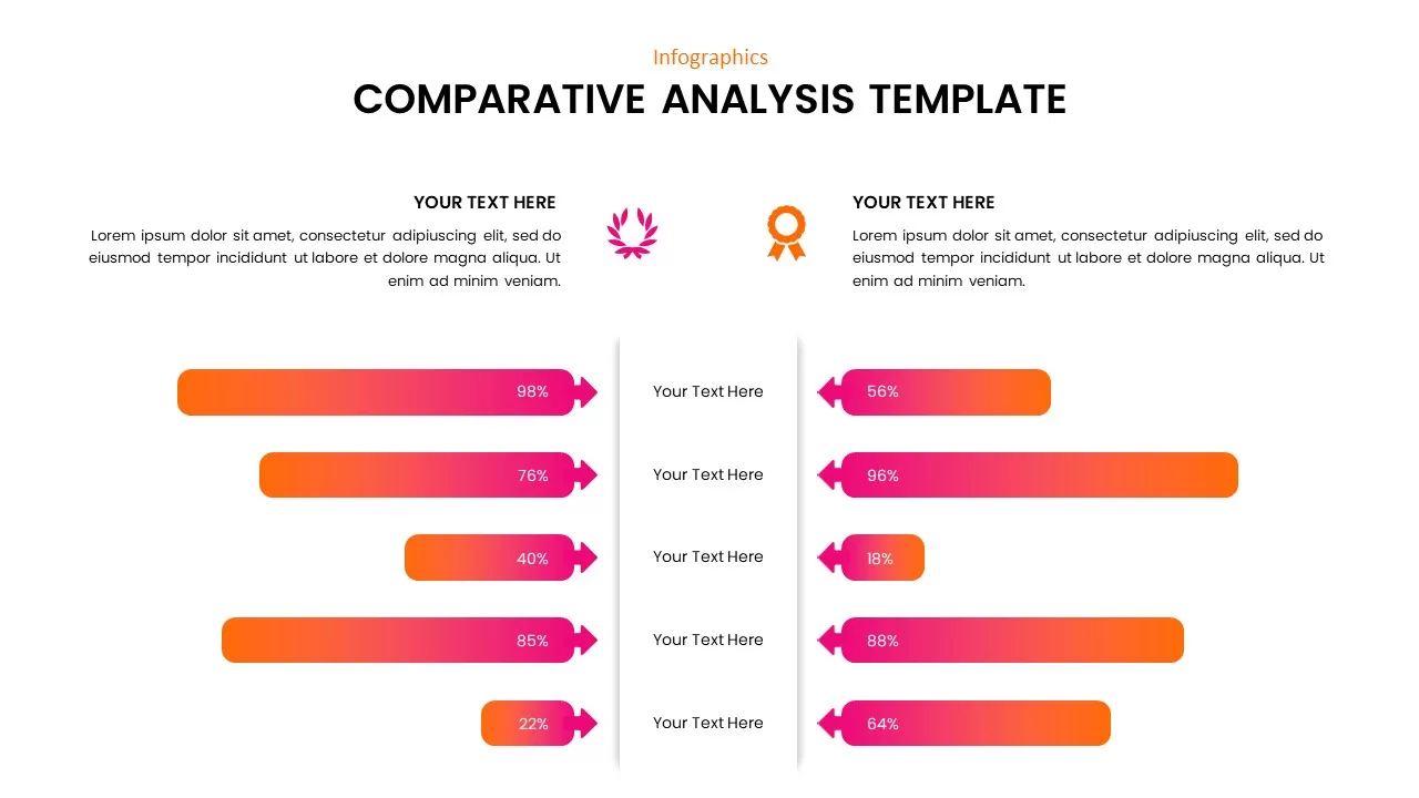
Comparative Analysis template for PowerPoint & Google Slides
Business Report
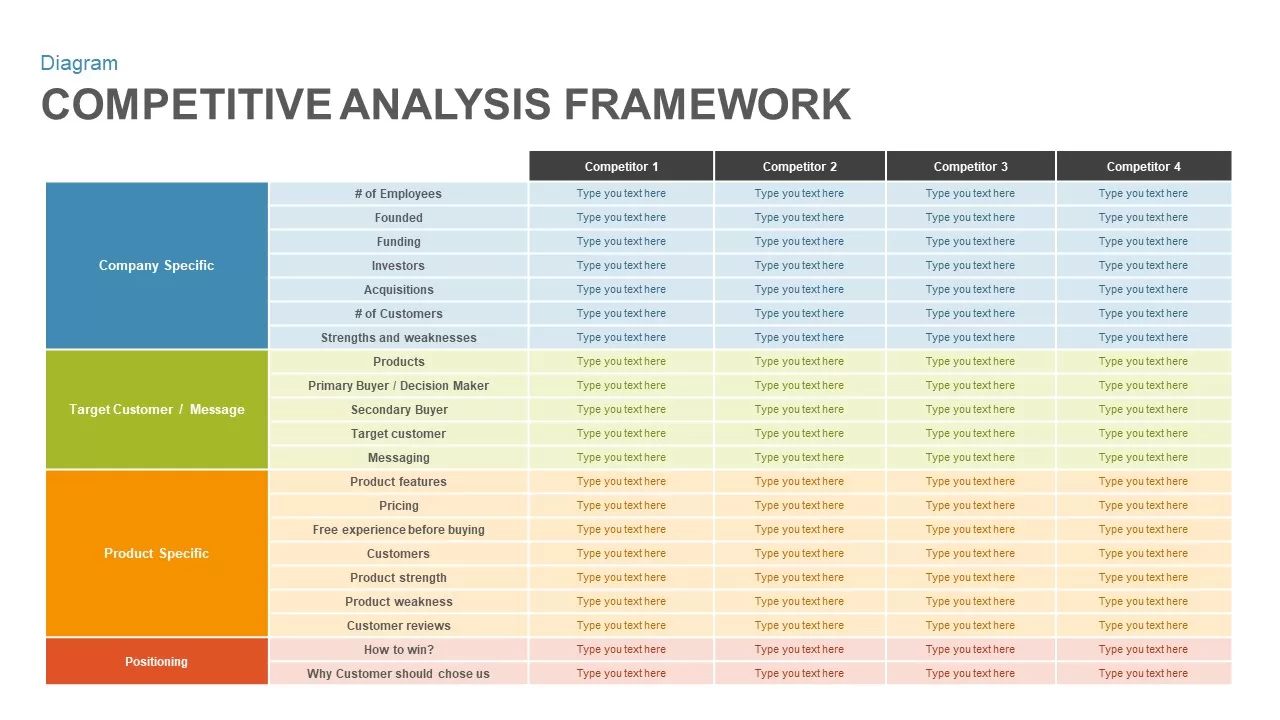
Competitive Analysis Framework Template
Business Report
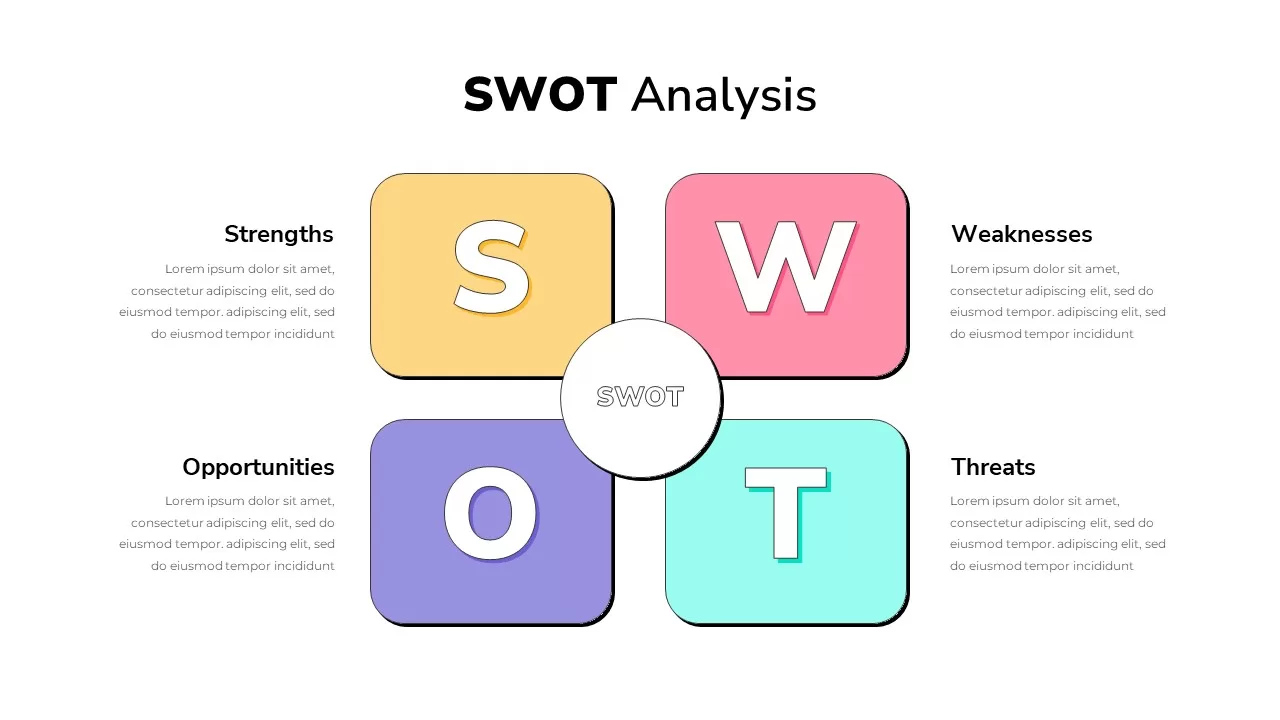
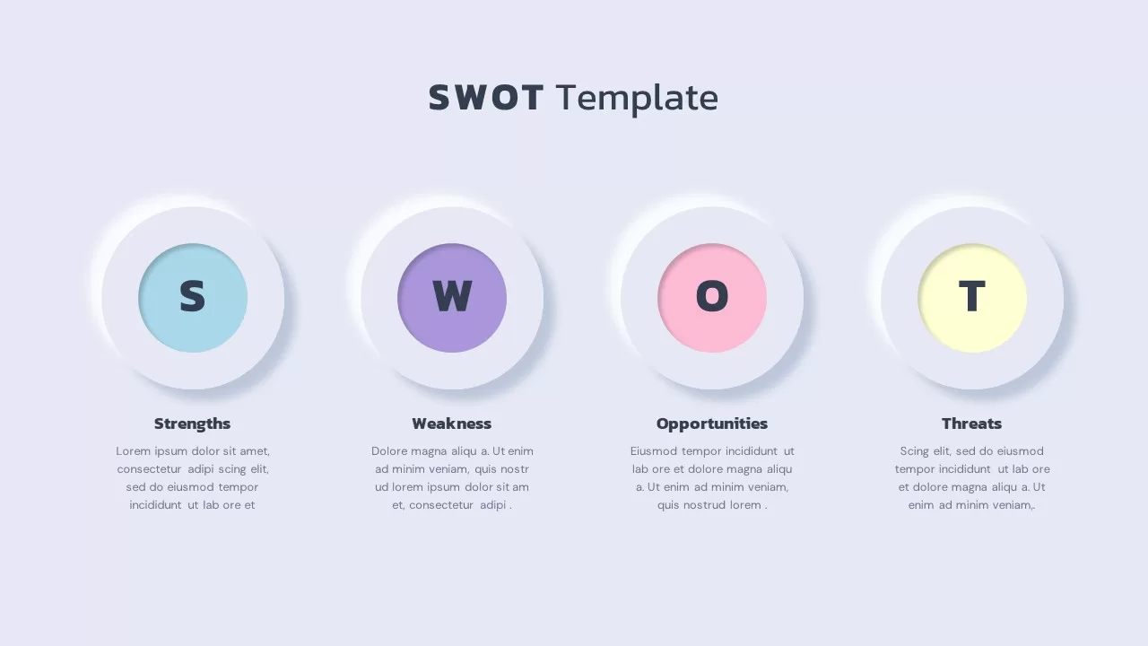
SWOT Analysis Template for PowerPoint Presentation
SWOT
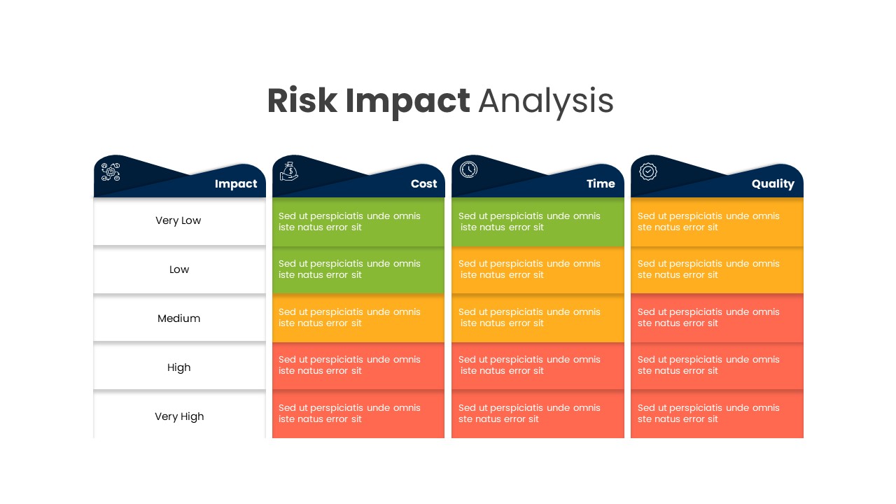
Risk Impact Analysis Template
Risk Management
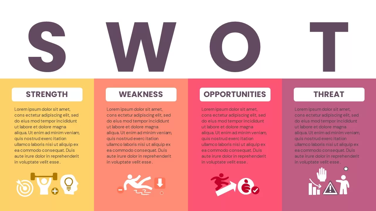
Modern Colorful SWOT Quadrant Analysis Template for PowerPoint & Google Slides
SWOT
SWOT Analysis Infographics
SWOT
Colorful Vertical SWOT Analysis Layout Template for PowerPoint & Google Slides
SWOT
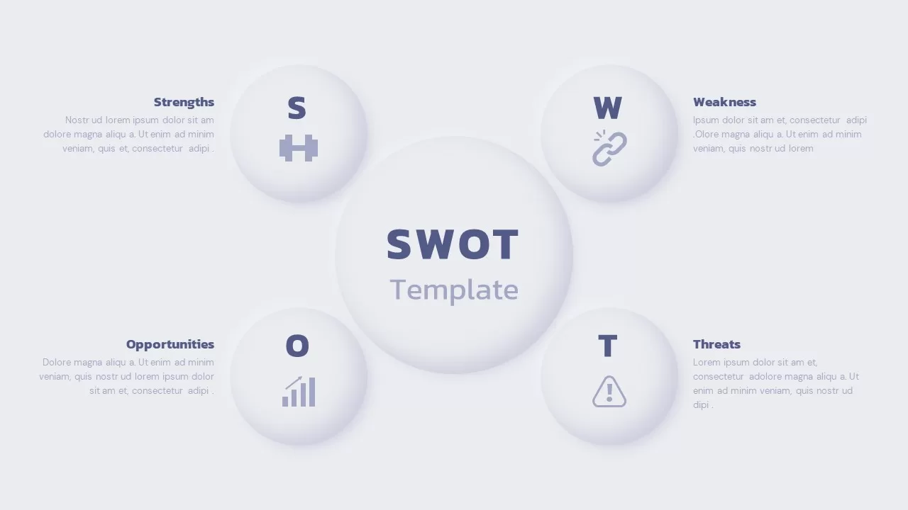
SWOT Analysis Framework template for PowerPoint & Google Slides
SWOT
SWOT Analysis Infographics PowerPoint Template
Business
SWOT Analysis Quadrant template for PowerPoint & Google Slides
Business Strategy
SWOT Template
Business Strategy
SWOT Analysis Infographic
SWOT
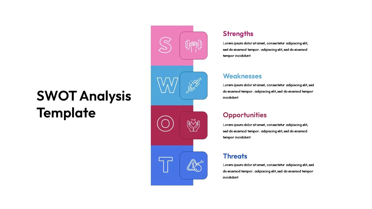
SWOT Analysis template for PowerPoint & Google Slides
SWOT
SWOT Analysis Editable Template Infographics
Opportunities Challenges
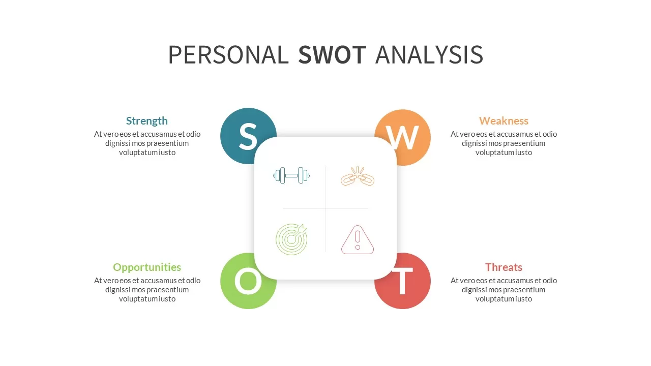
Photo Personal SWOT Analysis Callouts Template for PowerPoint & Google Slides
SWOT
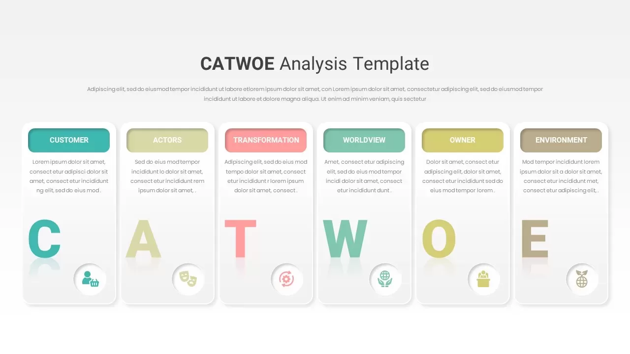
CATWOE Analysis Template for PowerPoint & Google Slides
Process
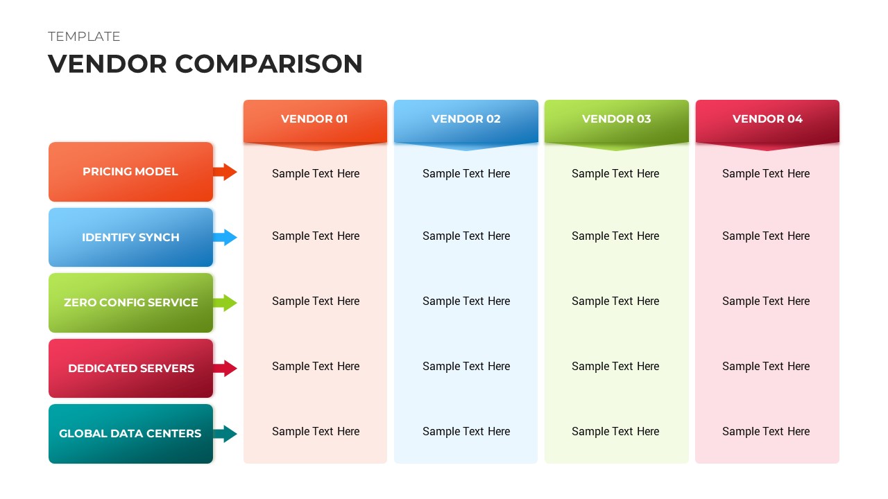
Vendor Comparison Template Slides
Comparison Chart
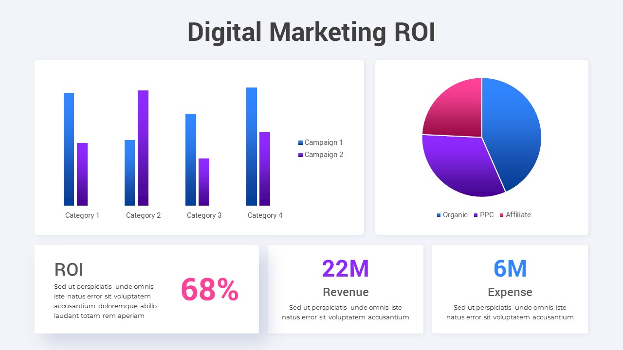
Digital Marketing ROI Analysis template for PowerPoint & Google Slides
Digital Marketing
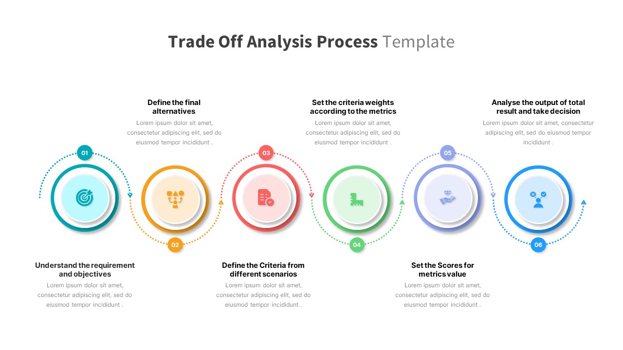
Trade Off Analysis Process template for PowerPoint & Google Slides
Process
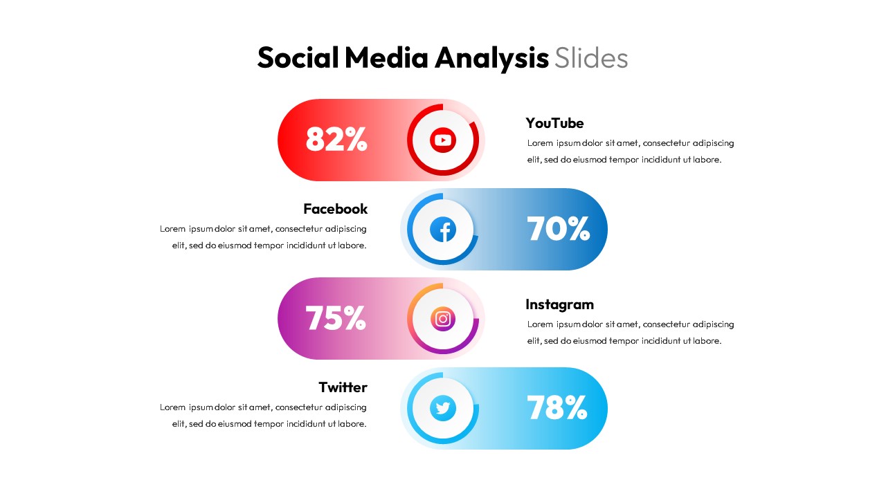
Social Media Analysis Metrics Slide Deck Template for PowerPoint & Google Slides
Digital Marketing
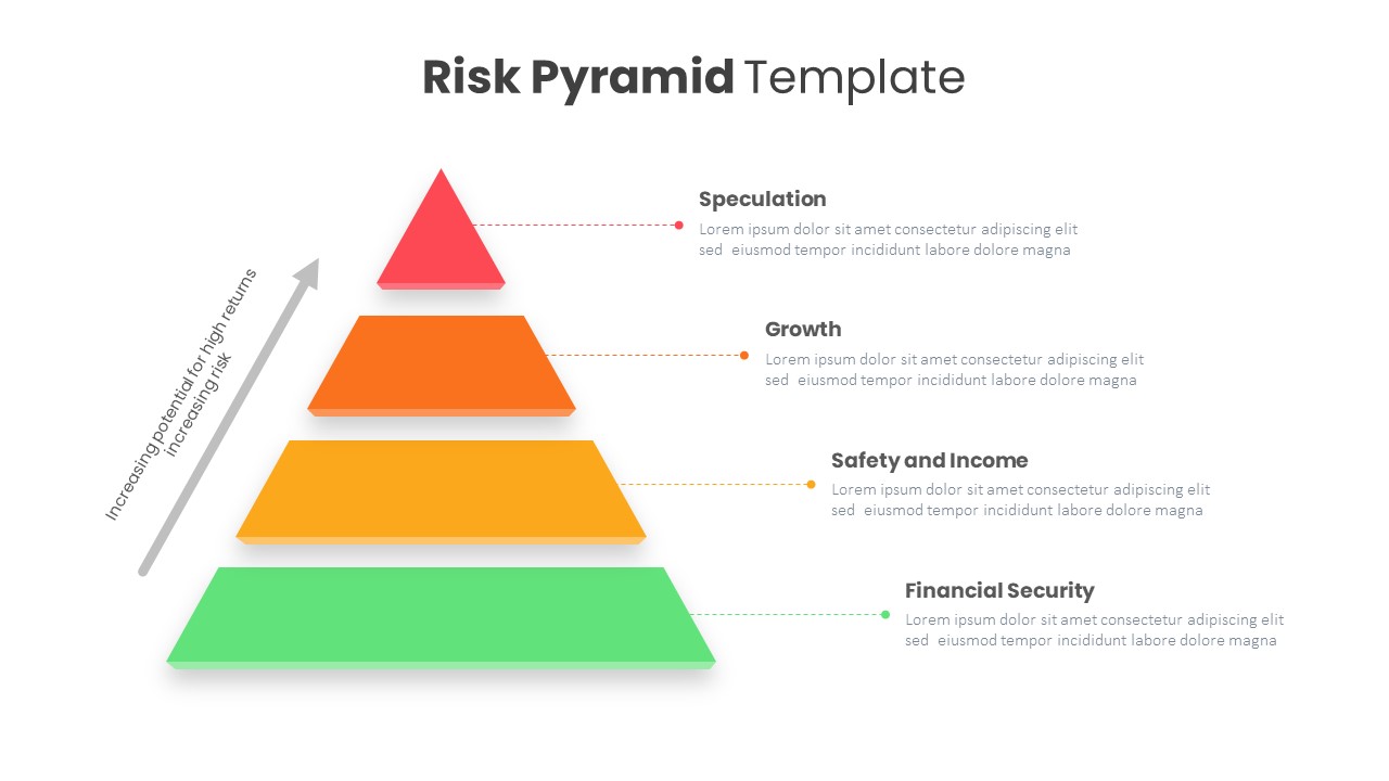
Risk Pyramid Hierarchy Analysis Template for PowerPoint & Google Slides
Pyramid
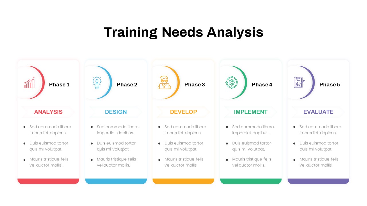
Training Needs Analysis PowerPoint Template
Employee Performance
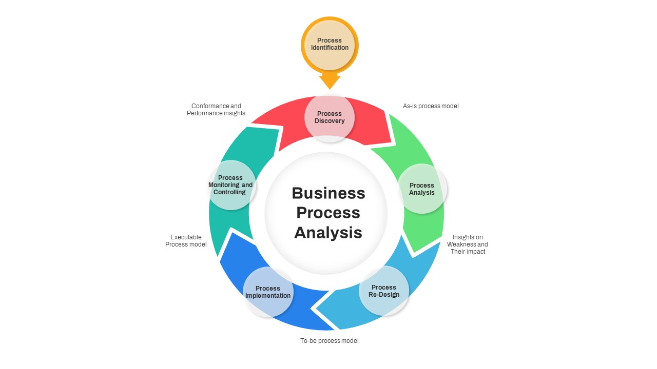
Business Process Analysis Cycle Diagram Template for PowerPoint & Google Slides
Business Strategy
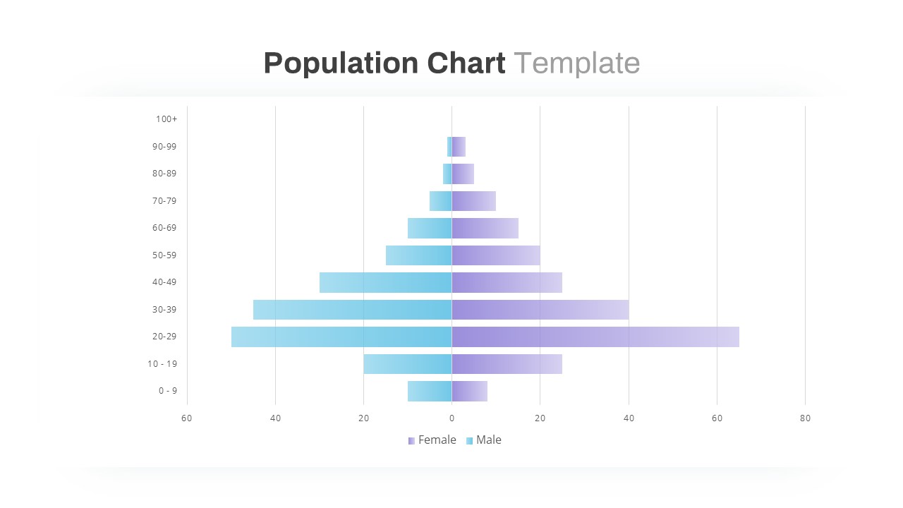
Population Pyramid Chart Analysis Template for PowerPoint & Google Slides
Bar/Column
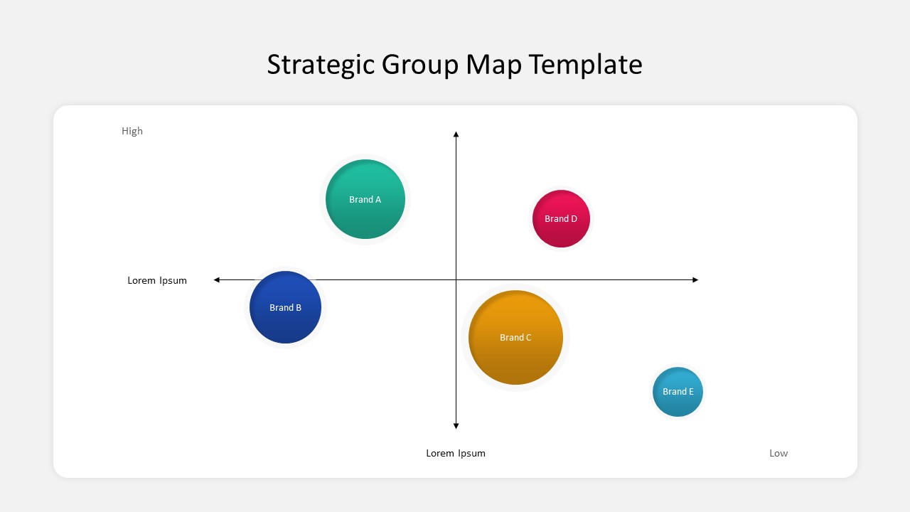
Free Strategic Group Map Template
Competitor Analysis
Free
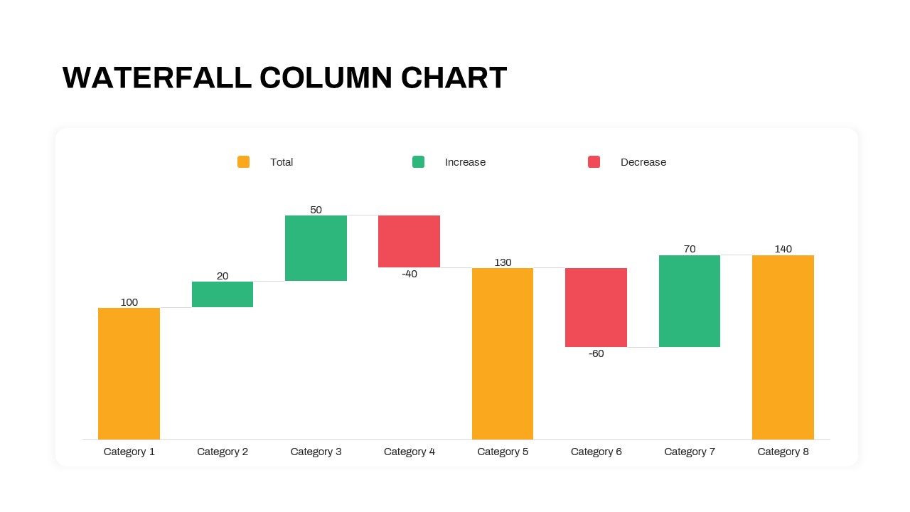
Waterfall Column Chart Analysis Template for PowerPoint & Google Slides
Bar/Column
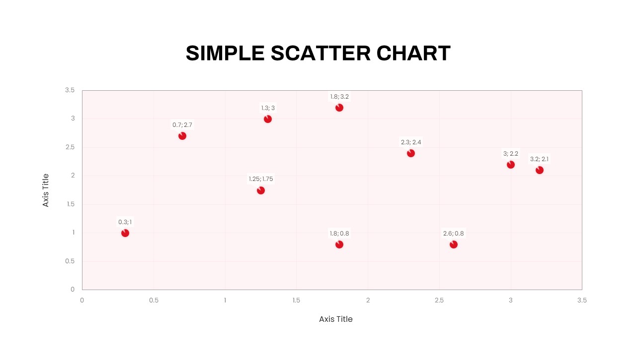
Simple Scatter Chart Analysis Template for PowerPoint & Google Slides
Comparison Chart
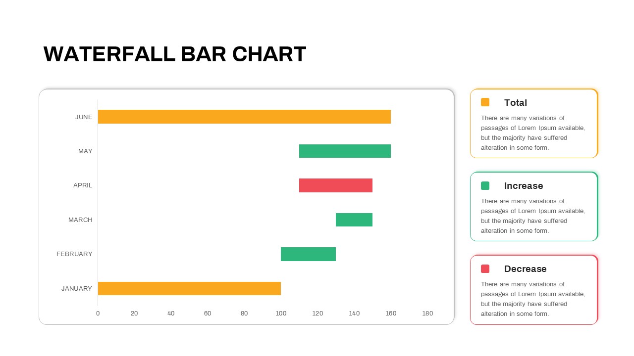
Waterfall Bar Chart Analysis Template for PowerPoint & Google Slides
Bar/Column
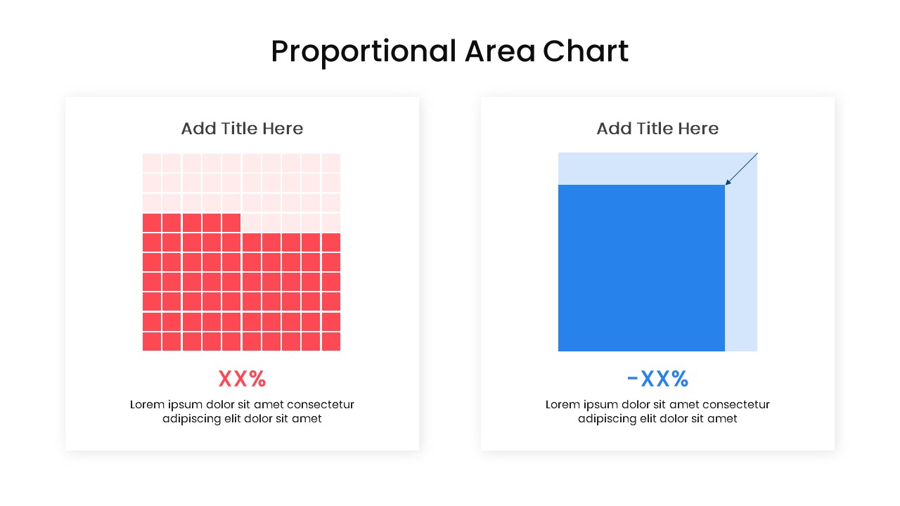
Proportional Area Chart Analysis Template for PowerPoint & Google Slides
Comparison Chart
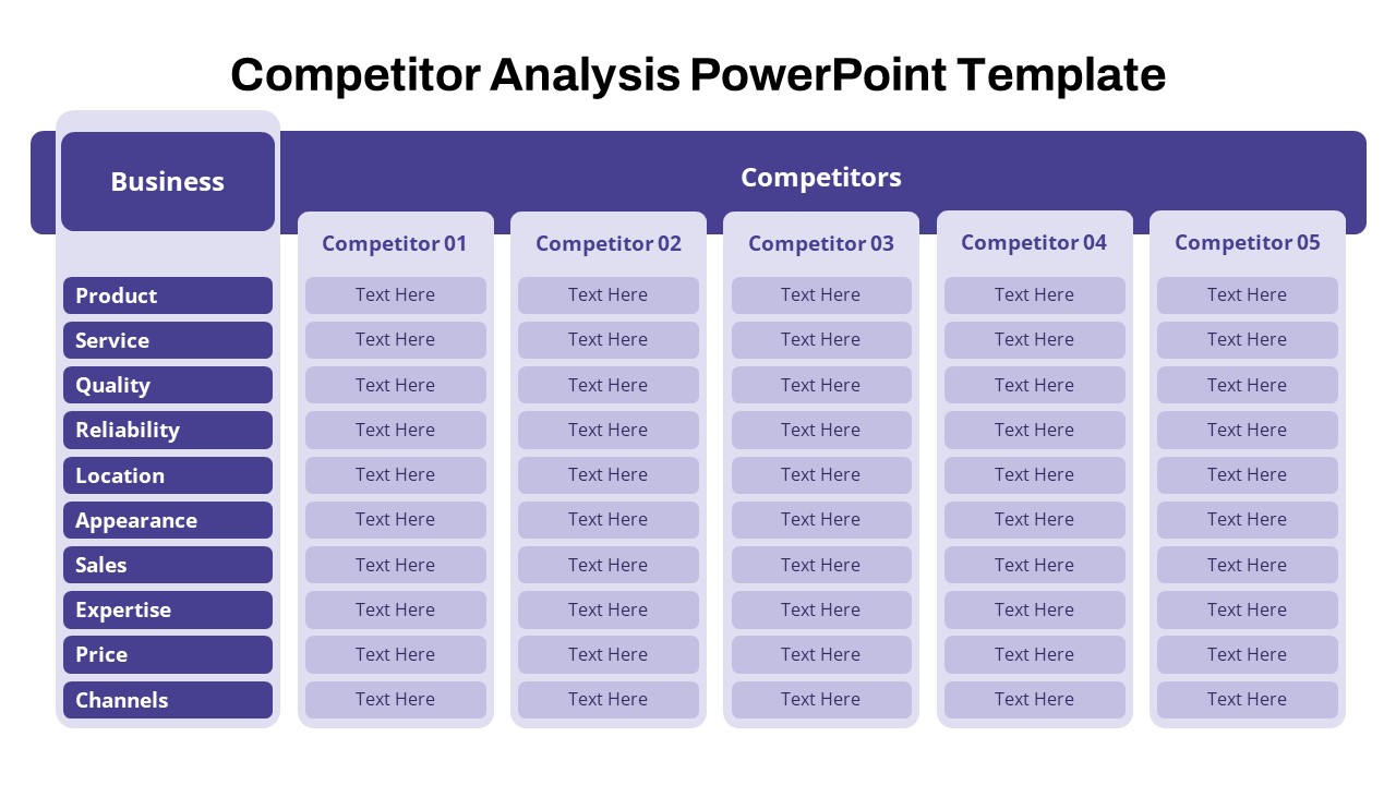
Free Competitor Analysis PowerPoint Template
Competitor Analysis
Free
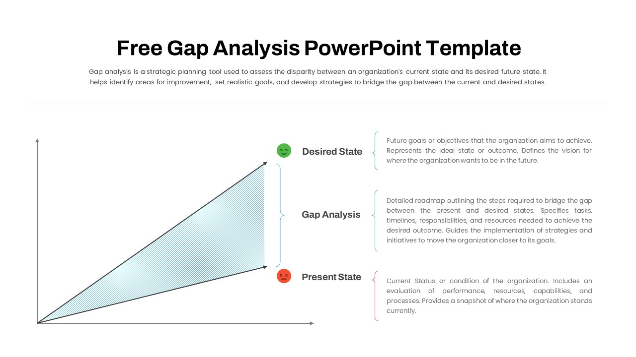
Free Comprehensive Gap Analysis Framework Template for PowerPoint & Google Slides
Opportunities Challenges
Free
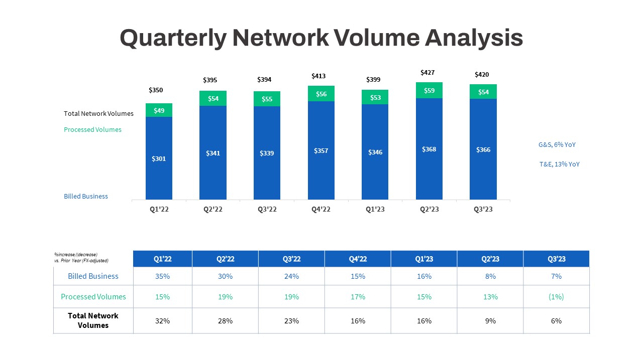
Quarterly Network Volume Analysis Template for PowerPoint & Google Slides
Business Report
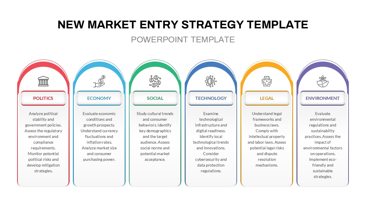
PESTLE Analysis for Market Entry Template for PowerPoint & Google Slides
PEST
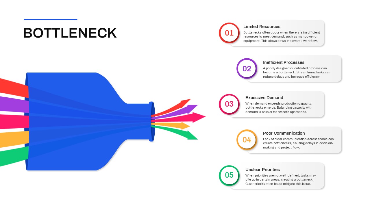
Bottleneck PowerPoint Template
Process
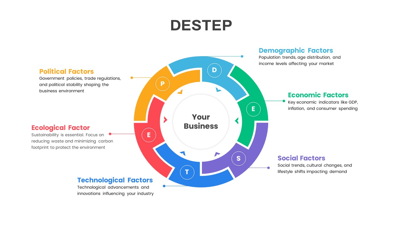
DESTEP Marketing Analysis Diagram Template for PowerPoint & Google Slides
Circular
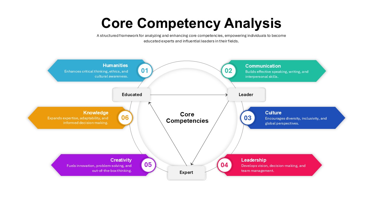
Core Competency Analysis PowerPoint Template
Circular
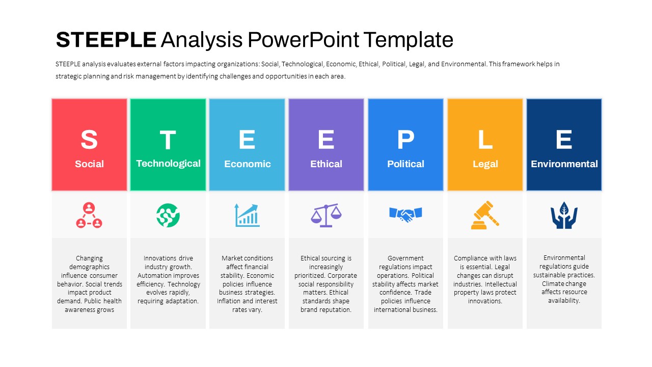
STEEPLE Analysis framework template for PowerPoint & Google Slides
Business Strategy
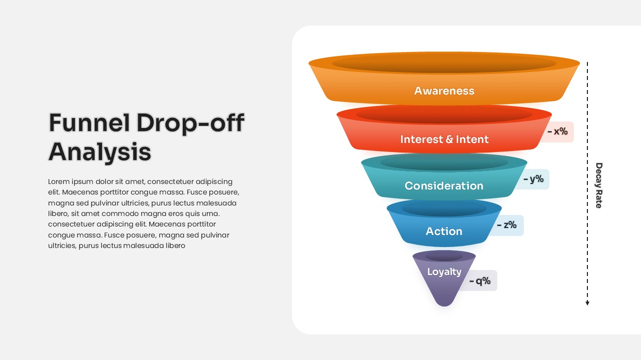
Funnel Drop-off Analysis template for PowerPoint & Google Slides
Business
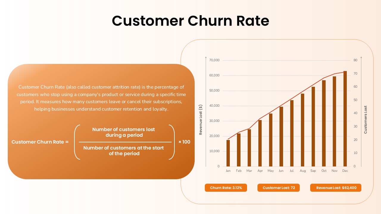
Customer Churn Rate Analysis template for PowerPoint & Google Slides
Business Report
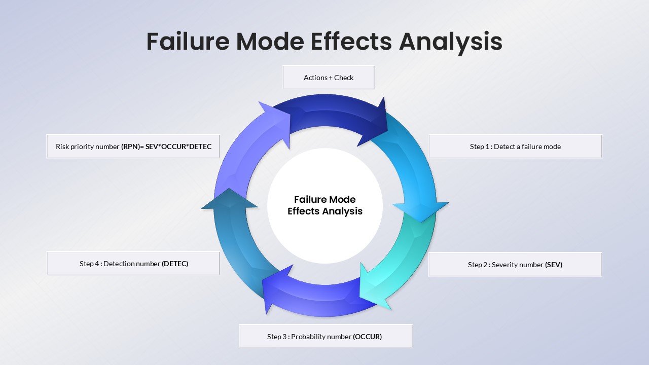
Failure Mode Effects Analysis (FMEA) Slide Template for PowerPoint & Google Slides
Process
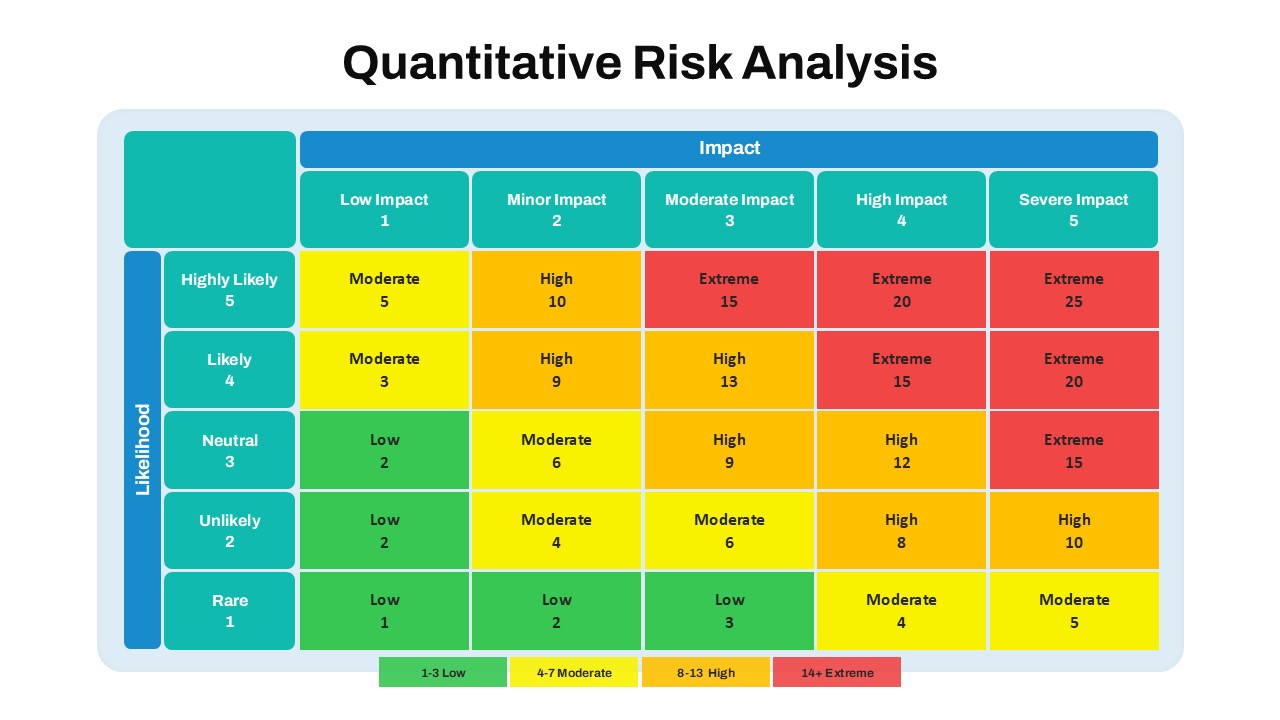
Quantitative Risk Analysis Matrix template for PowerPoint & Google Slides
Risk Management
Colorful SWOT Analysis Quadrant Template for PowerPoint & Google Slides
SWOT
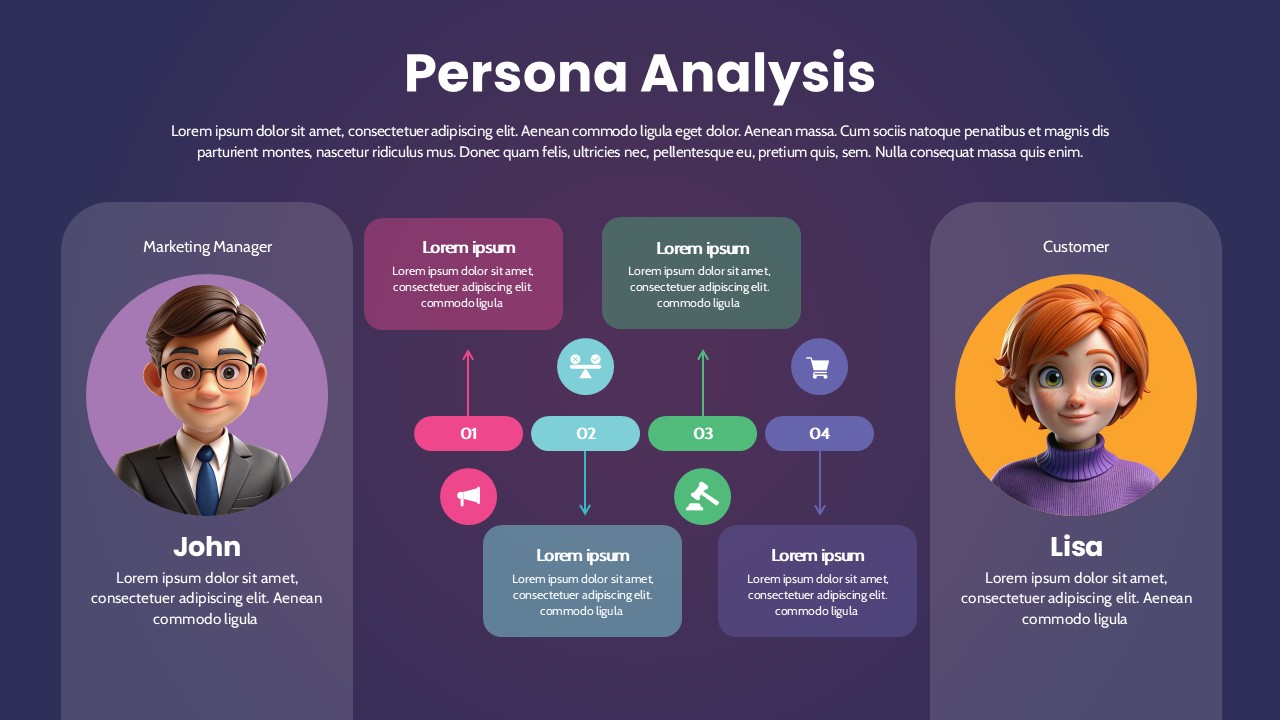
Persona Analysis Template for PowerPoint & Google Slides
Infographics
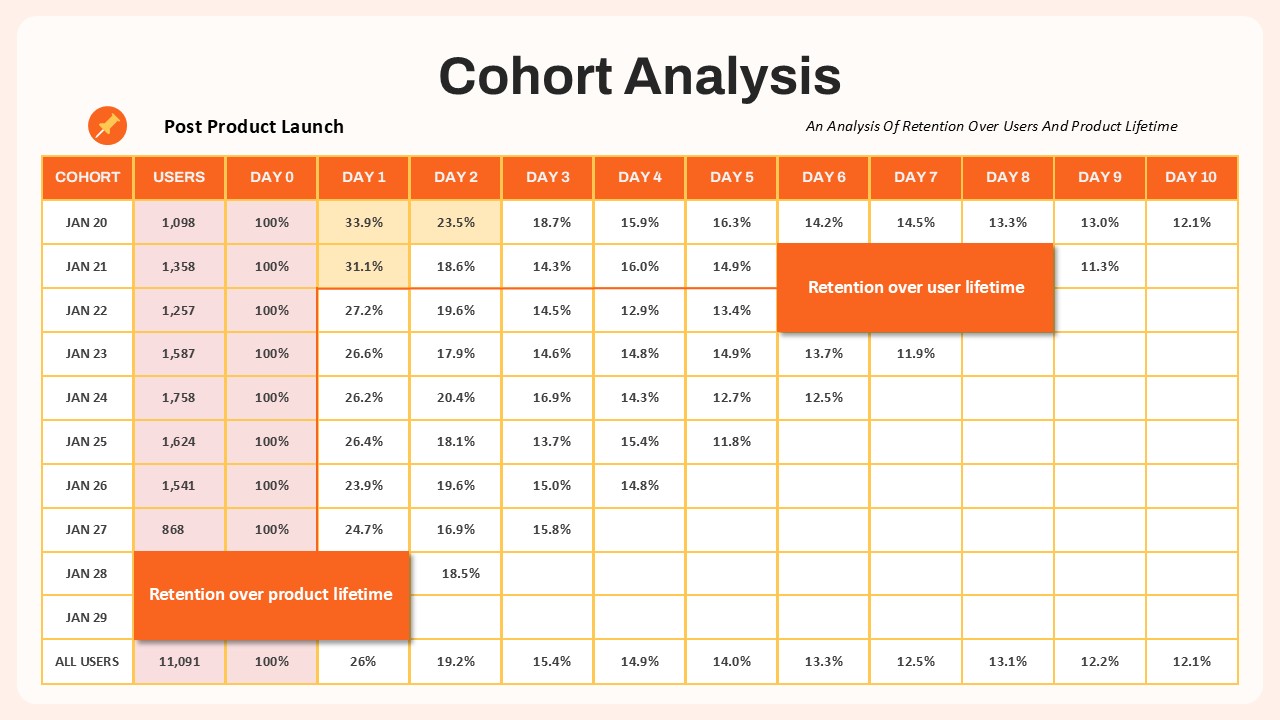
Cohort Analysis Retention Dashboard Template for PowerPoint & Google Slides
Comparison Chart
Multi Color SWOT Analysis Quadrant Template for PowerPoint & Google Slides
SWOT
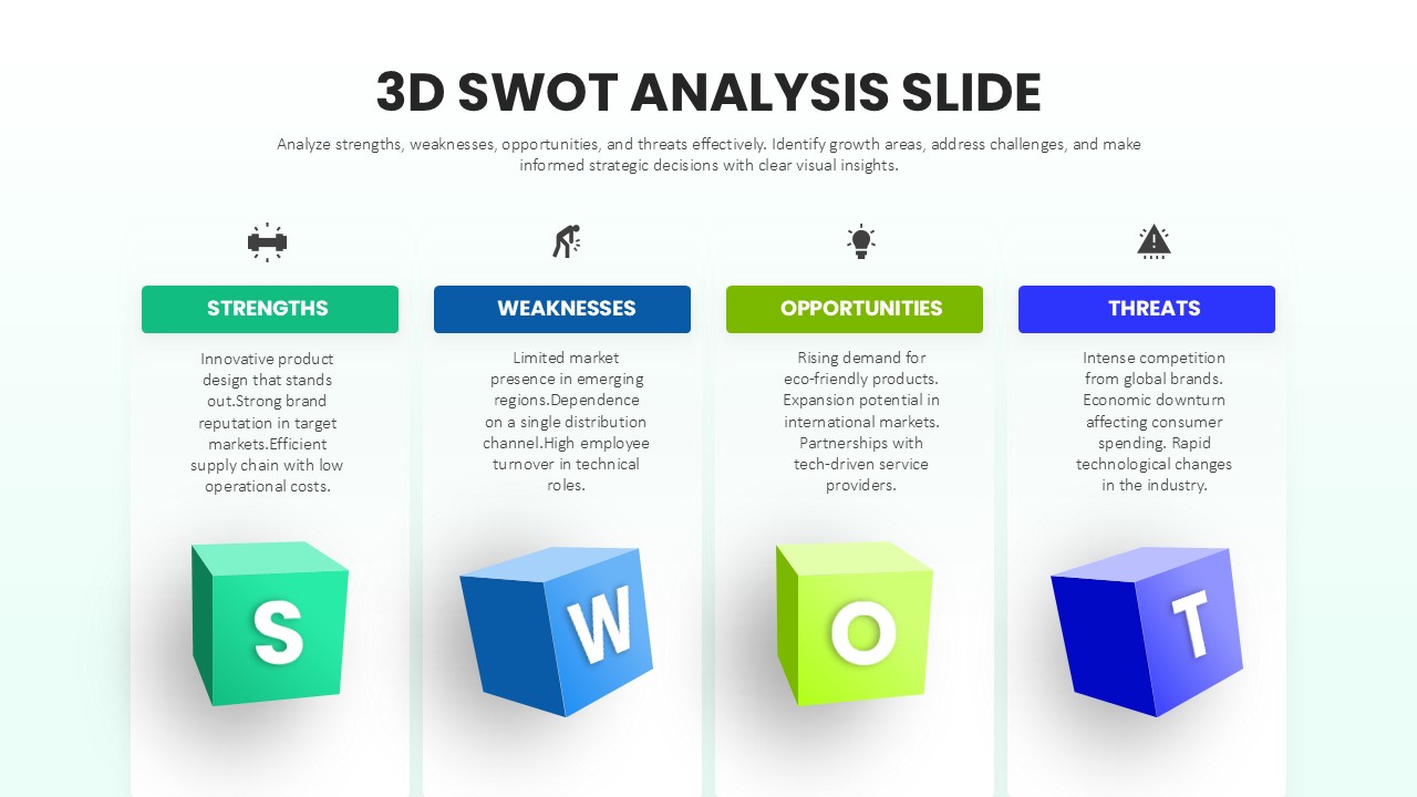
3D SWOT Analysis Template for PowerPoint & Google Slides
SWOT
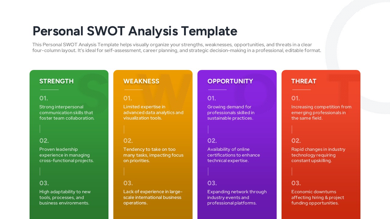
Personal SWOT Analysis Matrix Cards Template for PowerPoint & Google Slides
SWOT
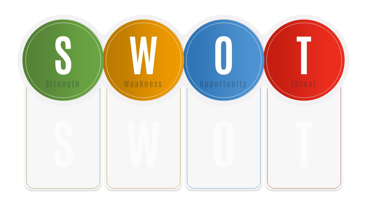
Blank SWOT Analysis Template for PowerPoint & Google Slides
SWOT
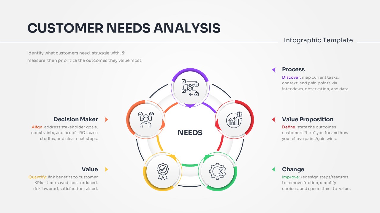
Customer Needs Analysis Template for PowerPoint & Google Slides
Customer Experience
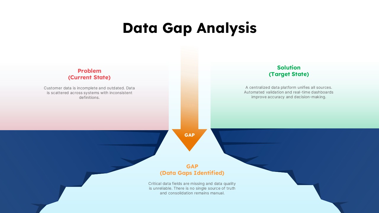
Data Gap Analysis Template for PowerPoint & Google Slides
Business