Creative Data Analysis Bar Chart template for PowerPoint & Google Slides


Description
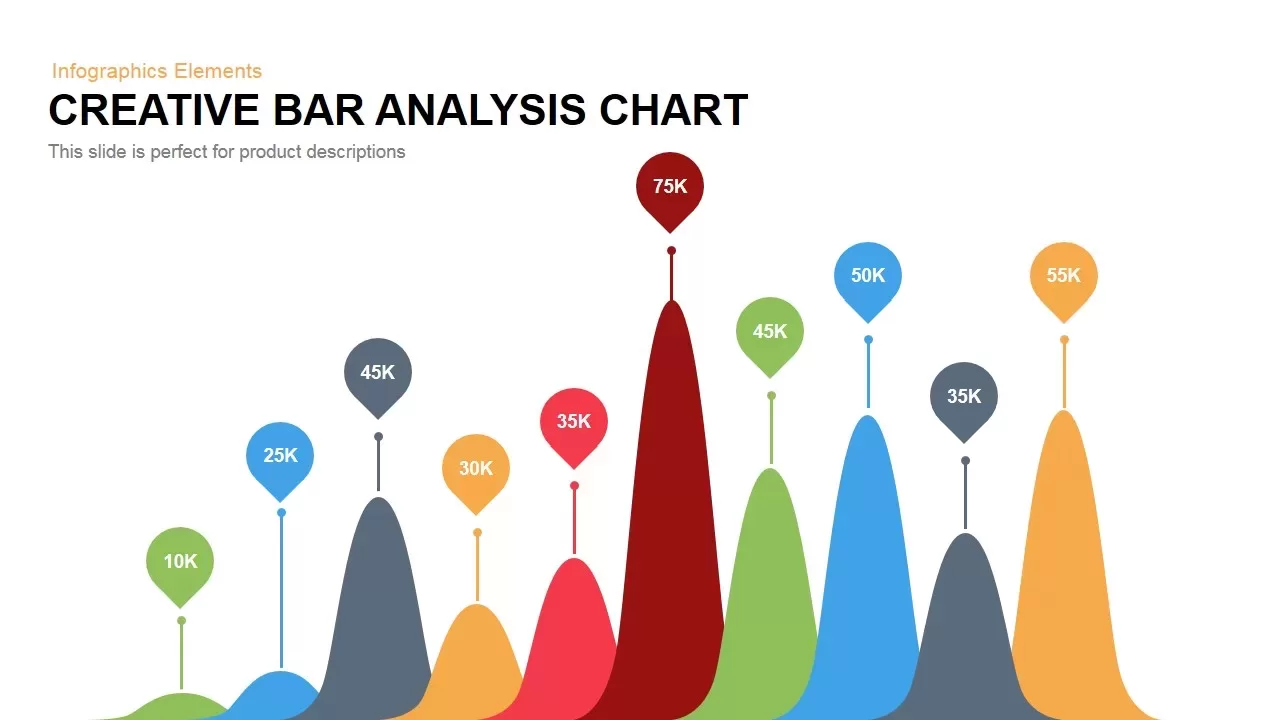
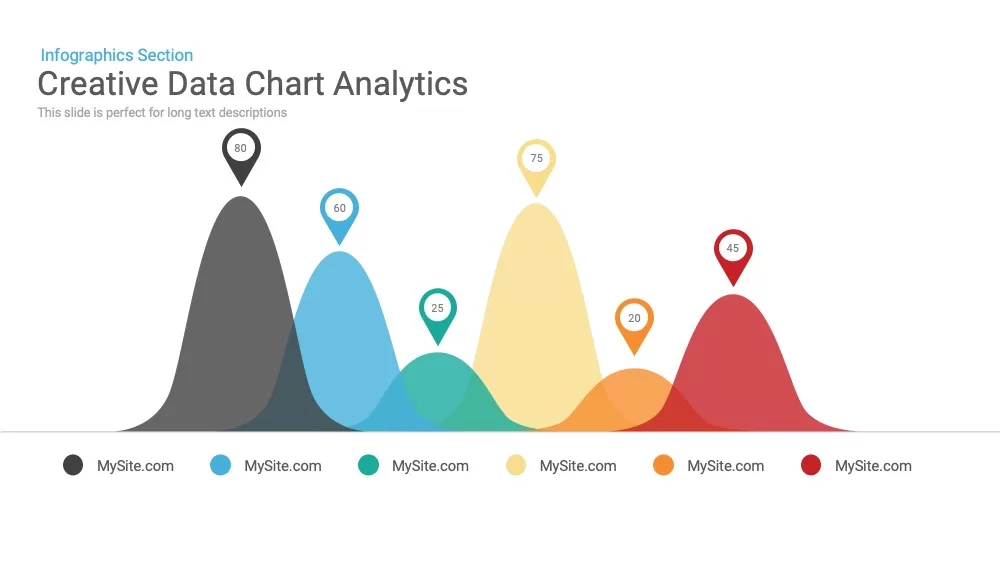
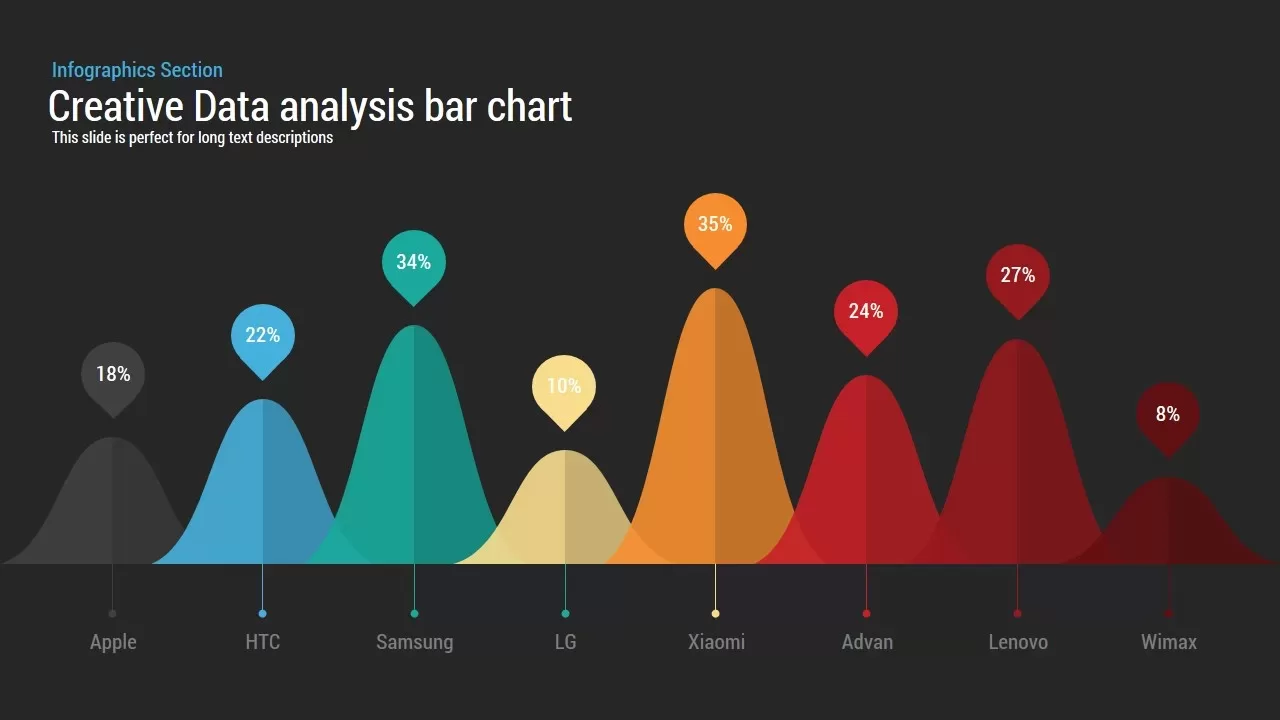
This Analysis Bar Chart template features a clean white background populated by a series of stylized bell-curve peaks to represent comparative data across multiple categories. Each peak employs a unique accent hue—ranging from neutral gray and sky blue through teal, gold, orange, red, and deep burgundy—making it easy to distinguish between eight distinct data series such as Apple (18%), HTC (22%), Samsung (34%), LG (10%), Xiaomi (35%), Advan (24%), Lenovo (27%), and Wimax (8%). Small pointer callouts atop each peak clearly display percentage values, while thin connector lines anchor to base labels for category names, preserving a visually balanced layout.
Built on master slides in both PowerPoint and Google Slides, every graphic element—including the peak shapes, callout markers, connector lines, and axis labels—is fully editable. Swap theme colors via the built-in palette to match your brand, replace callout markers with custom icons, or adjust peak widths and heights by dragging vector shapes. Free web fonts ensure consistent typography across platforms, while hidden variation slides offer alternate color schemes, fewer or additional peaks, and inverted layouts for rapid customization.
Optimized for 16:9 widescreen and 4:3 formats, the template renders crisply on HD projectors, virtual meeting backgrounds, and retina displays. Subtle drop shadows beneath each peak add depth without clutter, and precise alignment guides guarantee perfect spacing for a polished, professional aesthetic. Pre-configured entrance animations and morph transitions can be applied to introduce peaks sequentially, guiding your audience through the data narrative. With intuitive drag-and-drop editing and zero design headaches, this template accelerates data-driven storytelling in minutes.
Who is it for
Data analysts, marketing professionals, and product managers seeking an engaging way to compare multiple metrics side by side. Consultants, executives, and educators can leverage this slide for performance reviews, competitive analyses, and research presentations.
Other Uses
Repurpose this layout to visualize survey results, budget allocations, website traffic trends, or resource distribution. Swap bell-curve peaks for line graphs or stacked columns to adapt the design for financial forecasts, demographic studies, or project timelines.
Login to download this file

Item ID
SB00025
Related Templates

Pencil Bar Chart Data Analysis Template for PowerPoint & Google Slides
Bar/Column
Data Analysis Bar Chart with Insights Template for PowerPoint & Google Slides
Bar/Column
Free
3D Bar Chart Data Infographics Template for PowerPoint & Google Slides
Bar/Column
Simple Bar Chart Data Visualization Template for PowerPoint & Google Slides
Bar/Column
Data Bar Chart Template for PowerPoint and Keynote
Bar/Column
Creative Bar Chart template for PowerPoint & Google Slides
Charts
Waterfall Bar Chart Analysis Template for PowerPoint & Google Slides
Bar/Column
Expanding Margins Analysis Bar Chart Template for PowerPoint & Google Slides
Charts

Creative data chart Analytics Presentation Template
Charts
Mobile Data Analysis Chart template for PowerPoint & Google Slides
Charts
Simple Area Chart Data Trends Analysis Template for PowerPoint & Google Slides
Comparison Chart
Creative Lab Beakers Data Infographic template for PowerPoint & Google Slides
Infographics
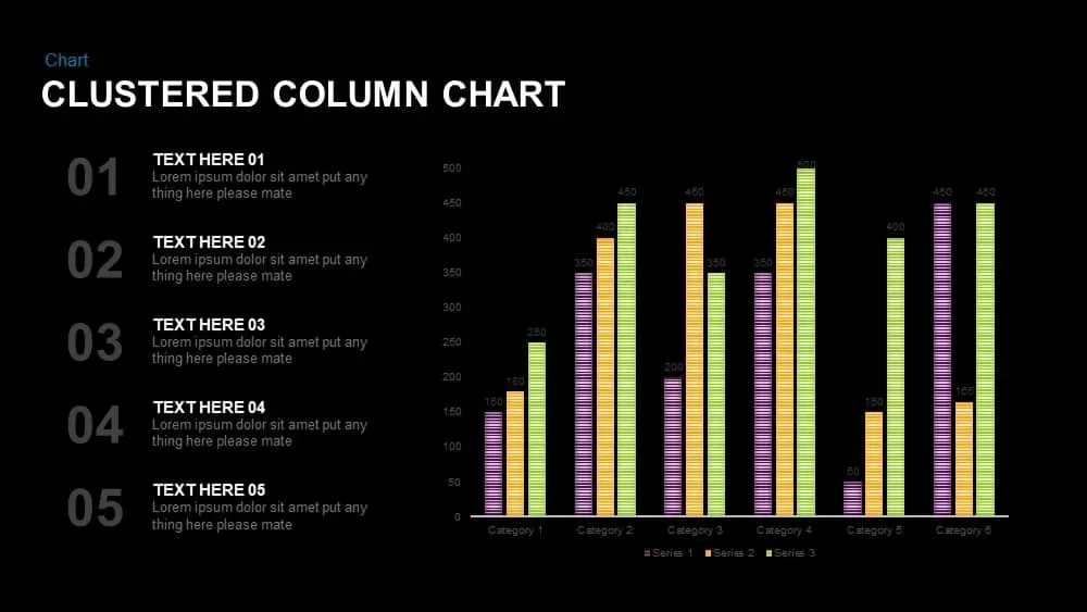
Clustered Column Chart Data Analysis Template for PowerPoint
Bar/Column
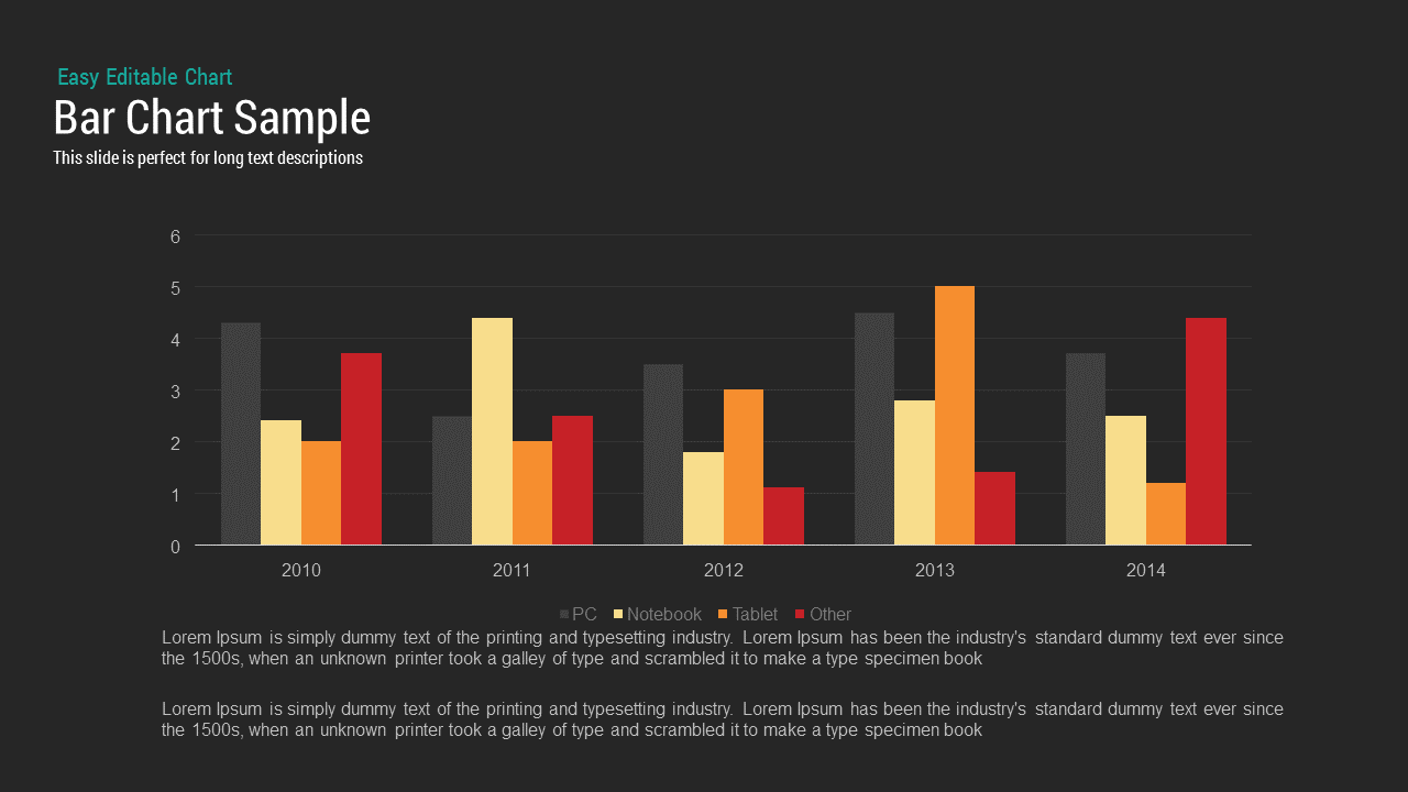
Bar Chart Sample template for PowerPoint & Google Slides
Bar/Column
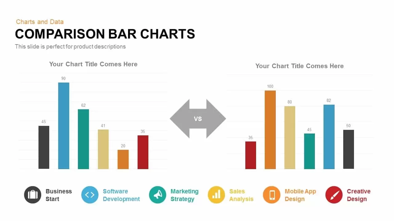
Comparison Bar Chart template for PowerPoint & Google Slides
Comparison Chart
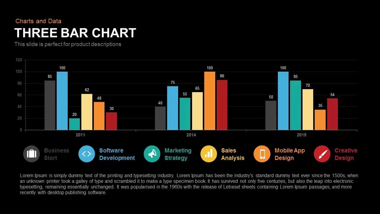
Three Bar Chart PowerPoint Template
Charts
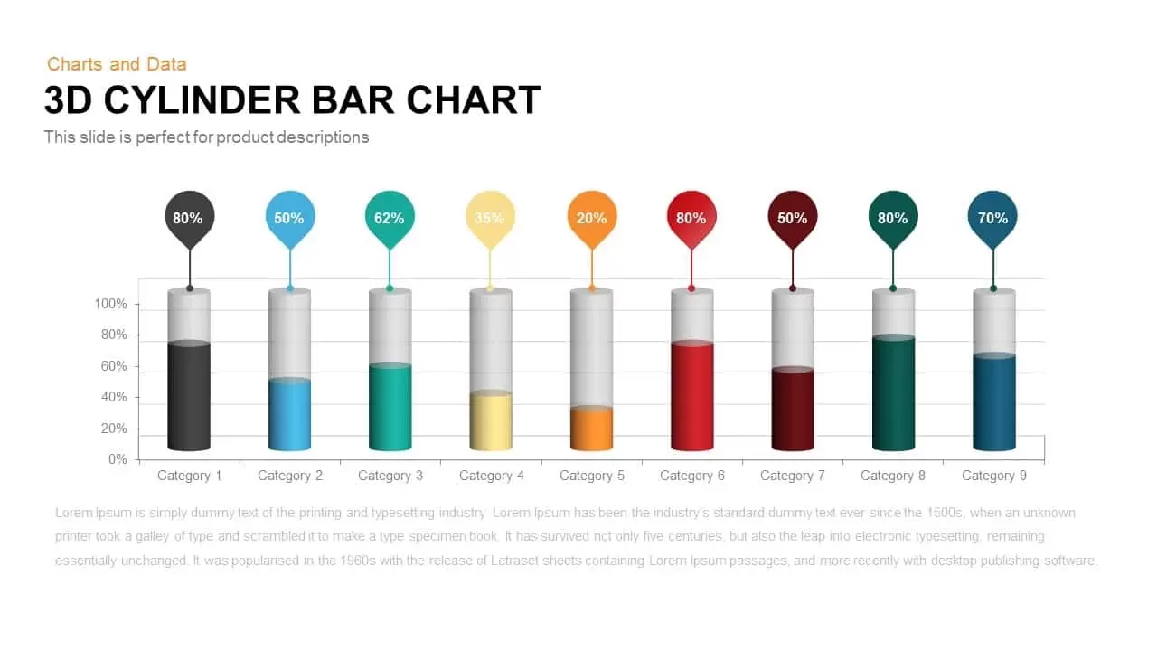
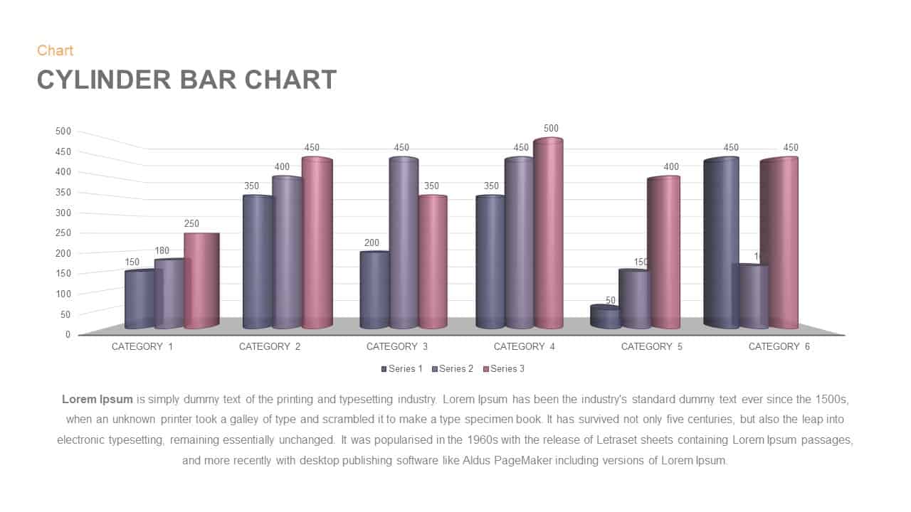
3D Cylinder Bar Chart Template for PowerPoint & Google Slides
Bar/Column

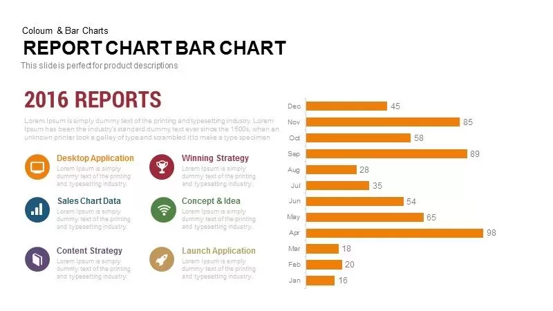
Monthly Reports Bar Chart template for PowerPoint & Google Slides
Bar/Column

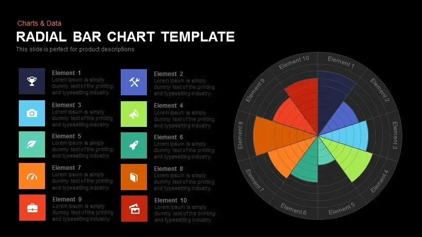
Colorful Radial Bar Chart Template for PowerPoint & Google Slides
Bar/Column
Interactive Product Comparison Bar Chart Template for PowerPoint & Google Slides
Bar/Column
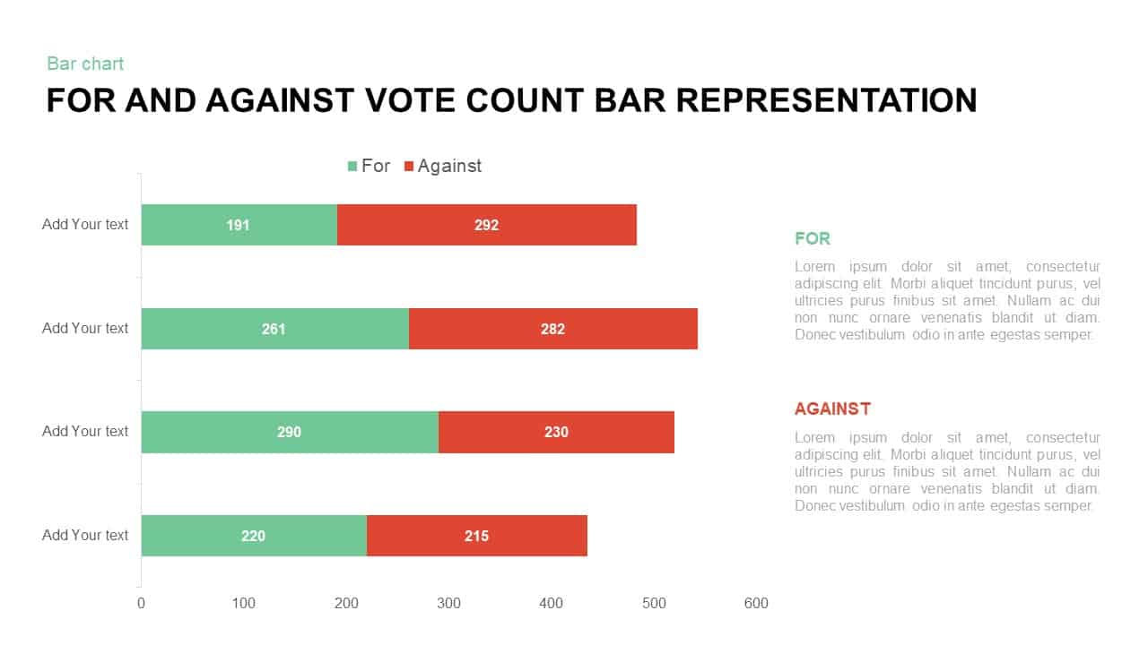
For and Against Vote Count Bar Chart Template for PowerPoint & Google Slides
Bar/Column
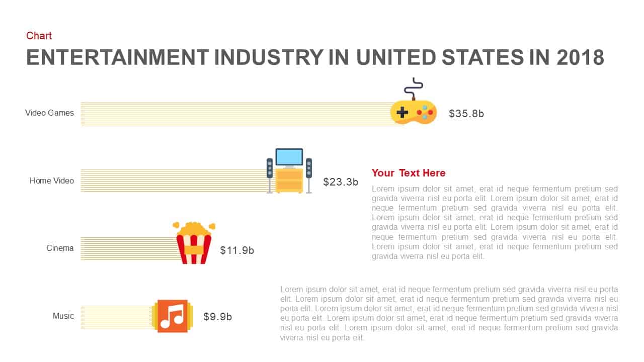
Entertainment Industry Revenue Bar Chart Template for PowerPoint & Google Slides
Bar/Column
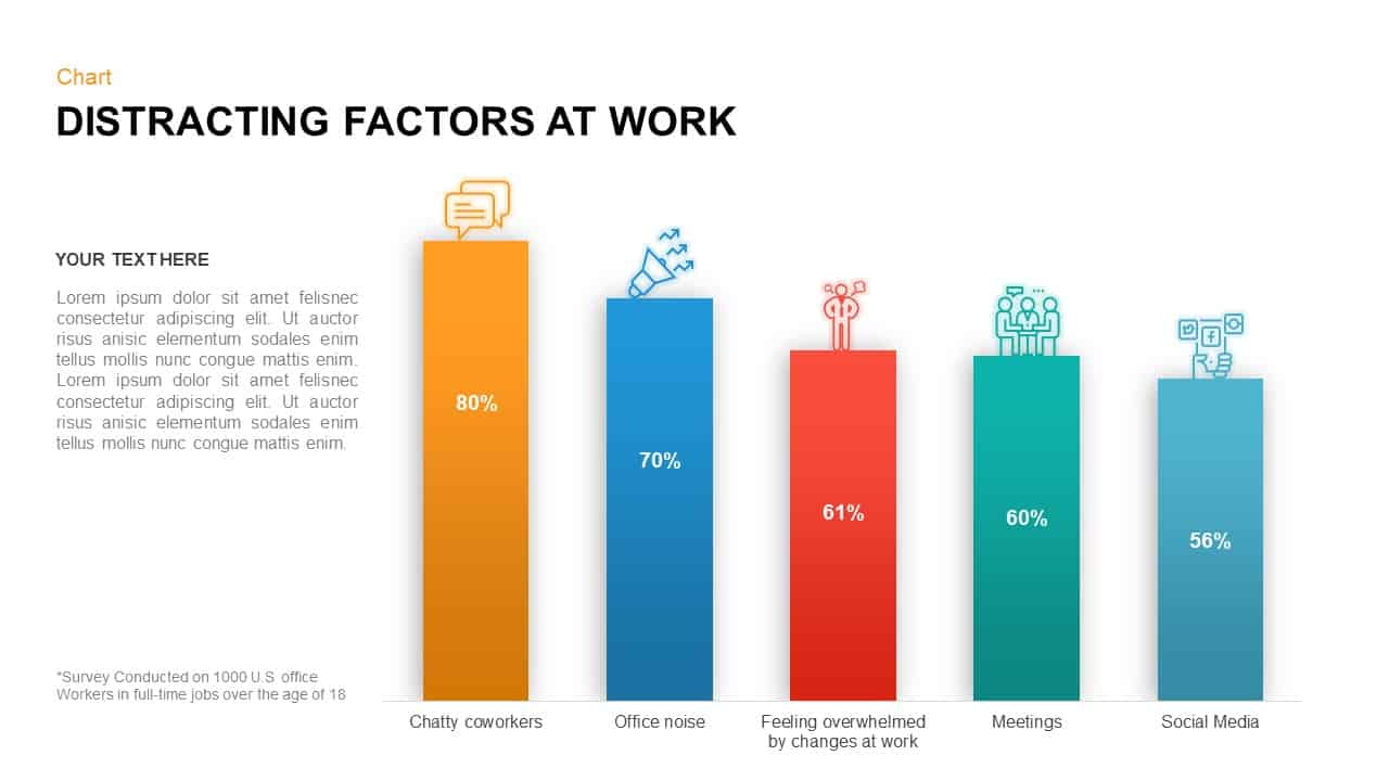
Distracting Factors at Work Bar Chart Template for PowerPoint & Google Slides
Bar/Column
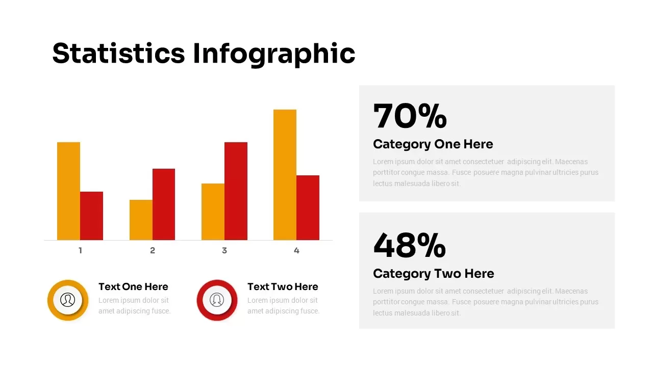
Statistics Infographic & KPI Bar Chart Template for PowerPoint & Google Slides
Bar/Column
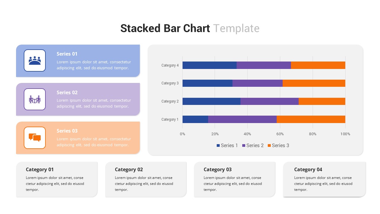
Multi-Series Stacked Bar Chart Template for PowerPoint & Google Slides
Bar/Column
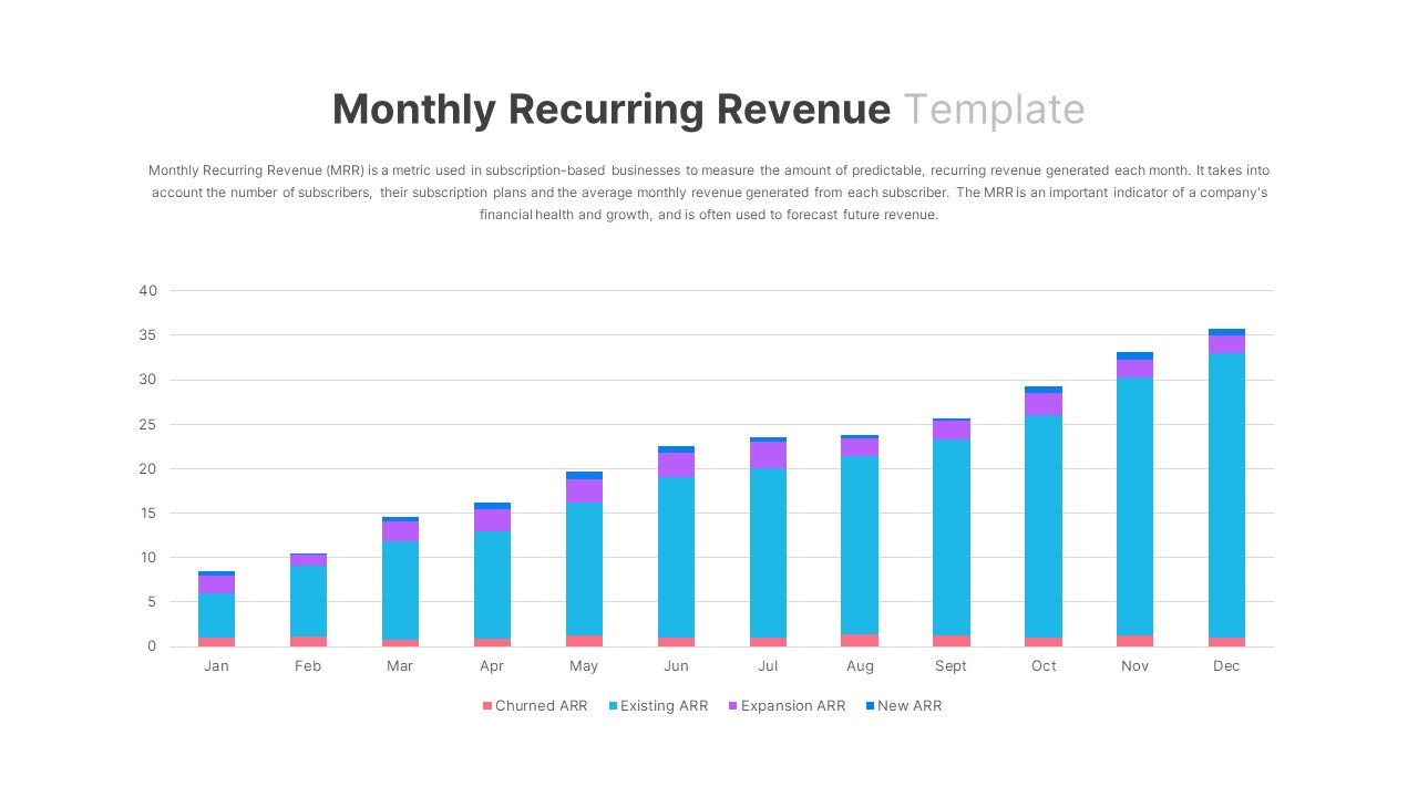
Monthly Recurring Revenue KPI Bar Chart Template for PowerPoint & Google Slides
Bar/Column
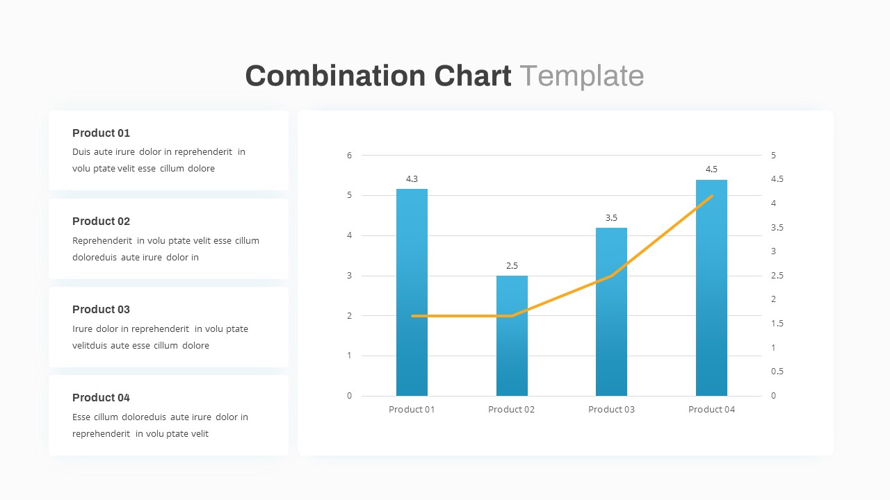
Combination Bar and Line Chart Template for PowerPoint & Google Slides
Bar/Column
Animated Clustered Bar Chart Template for PowerPoint & Google Slides
Bar/Column
Animated Stacked Bar Chart Template for PowerPoint & Google Slides
Bar/Column
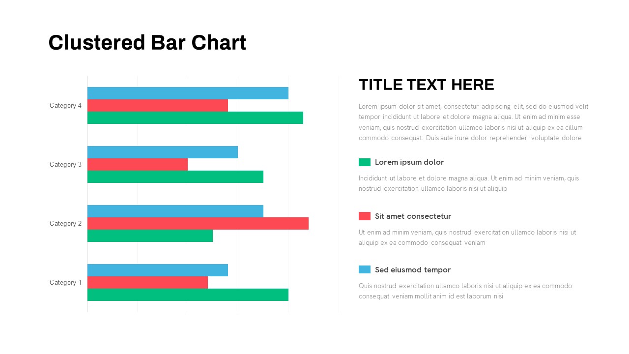
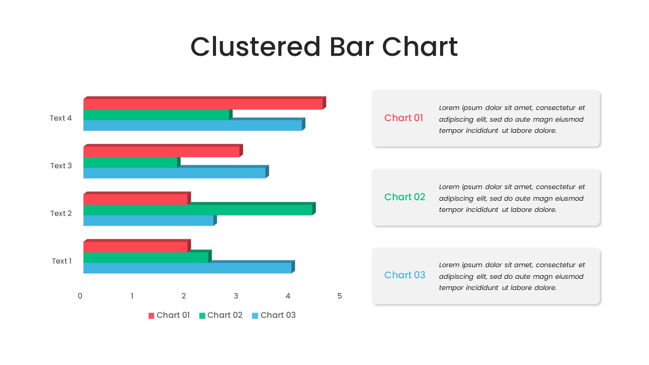
Clustered Bar Chart Comparison Template for PowerPoint & Google Slides
Bar/Column
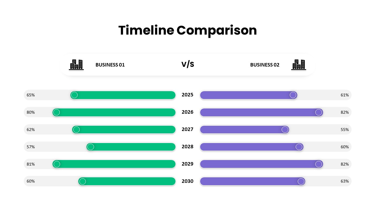
Timeline Comparison Slide PowerPoint Template
Comparison Chart
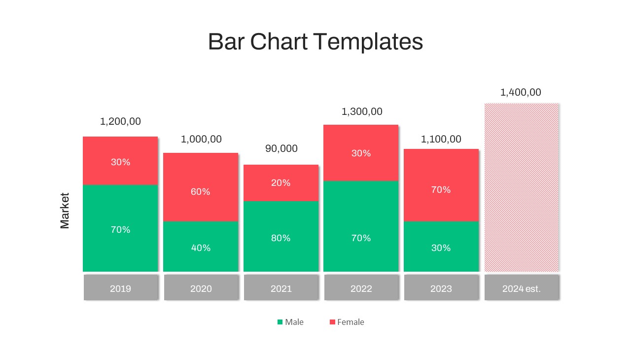
Year-over-Year Stacked Gender Bar Chart Template for PowerPoint & Google Slides
Bar/Column
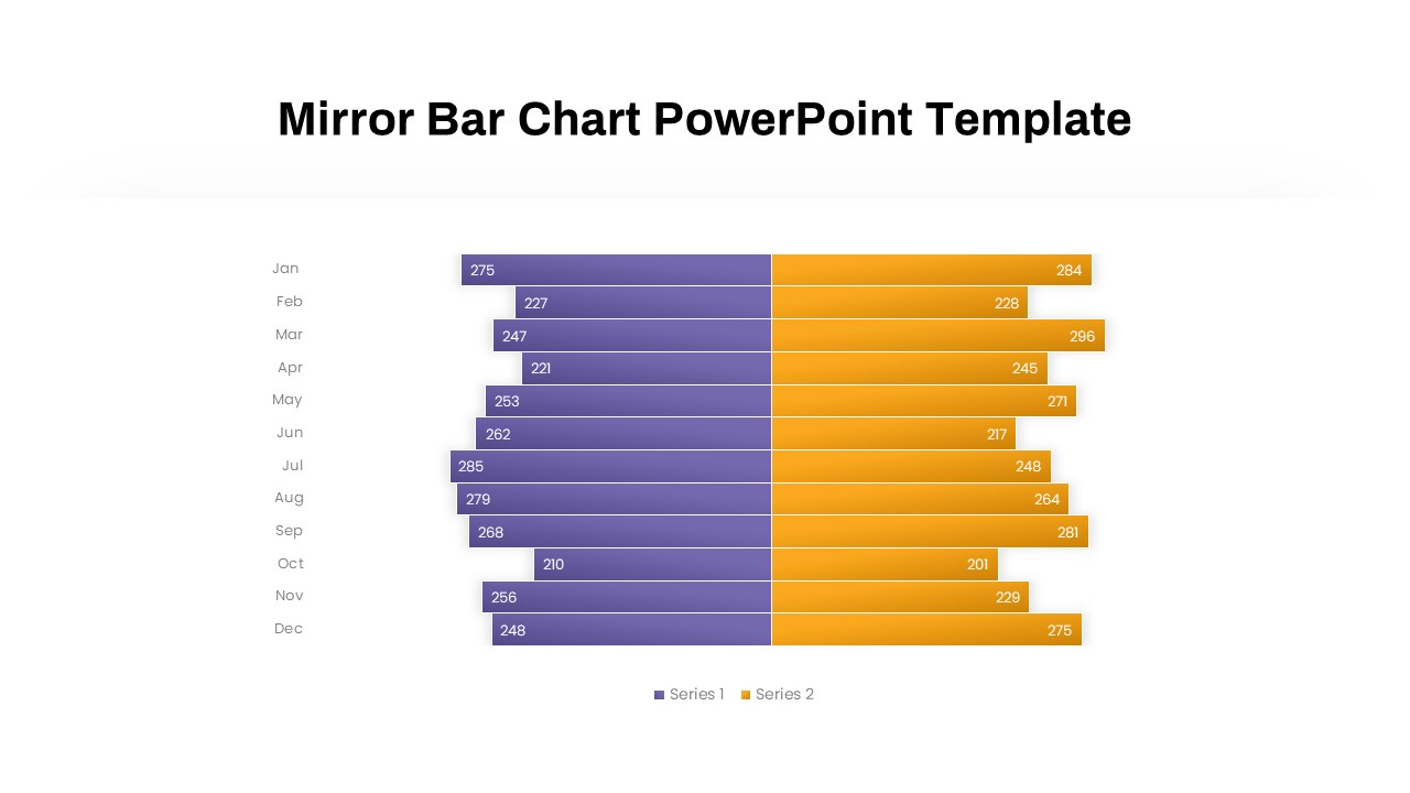
Mirror Bar Chart Comparison Template for PowerPoint & Google Slides
Bar/Column
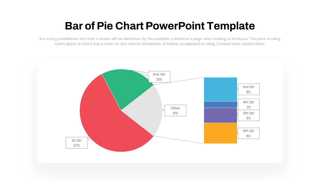
Dynamic Bar-of-Pie Chart Comparison Template for PowerPoint & Google Slides
Pie/Donut
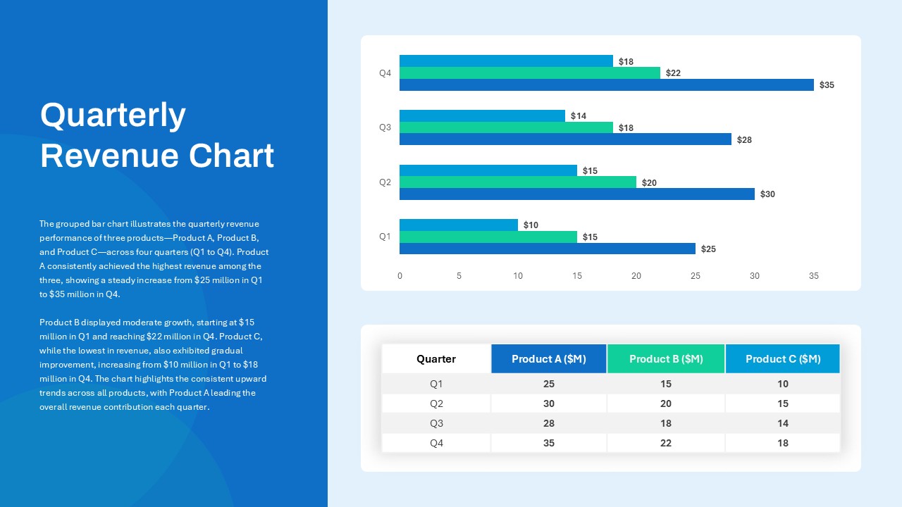
Quarterly Revenue Chart PowerPoint Template
Bar/Column
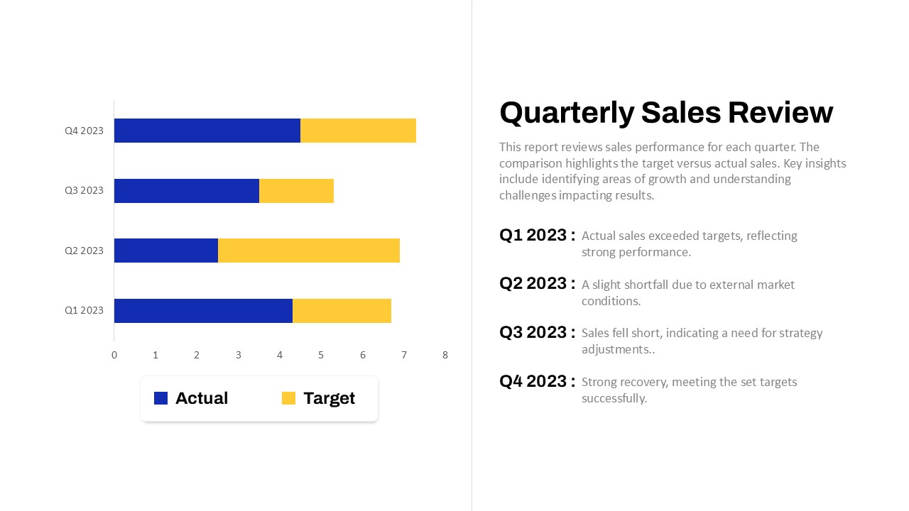
Quarterly Sales Review Bar Chart Template for PowerPoint & Google Slides
Bar/Column
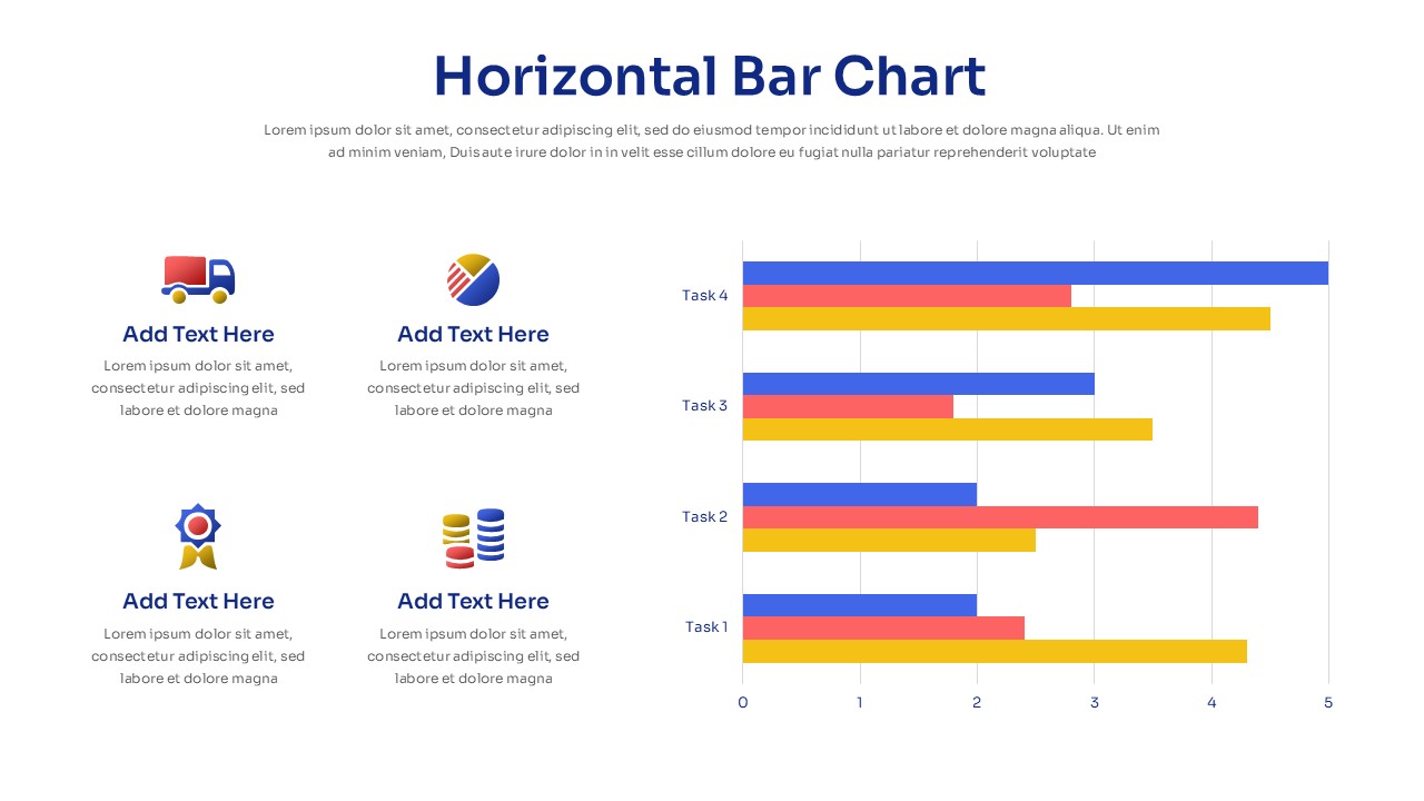
Horizontal Bar Chart Slide with Icons Template for PowerPoint & Google Slides
Bar/Column
Two-Option Bar Chart Comparison Table Template for PowerPoint & Google Slides
Comparison
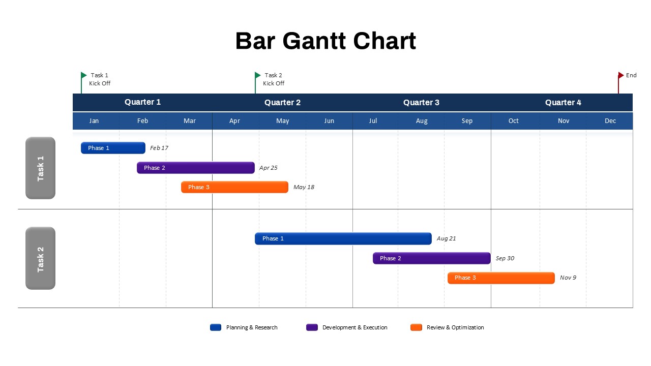
Bar Gantt Chart Template for PowerPoint & Google Slides
Gantt Chart
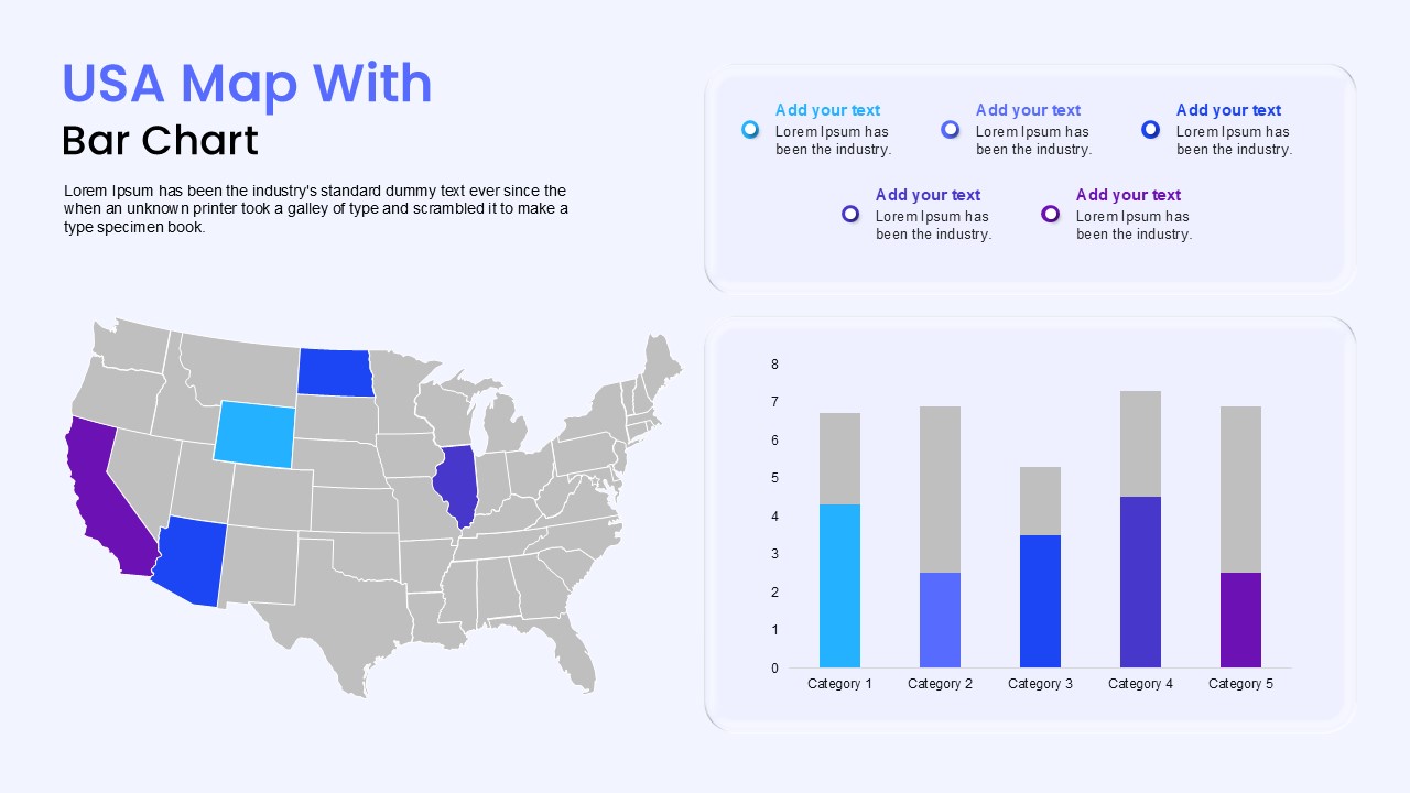
USA Map with Bar Chart Template for PowerPoint & Google Slides
World Maps
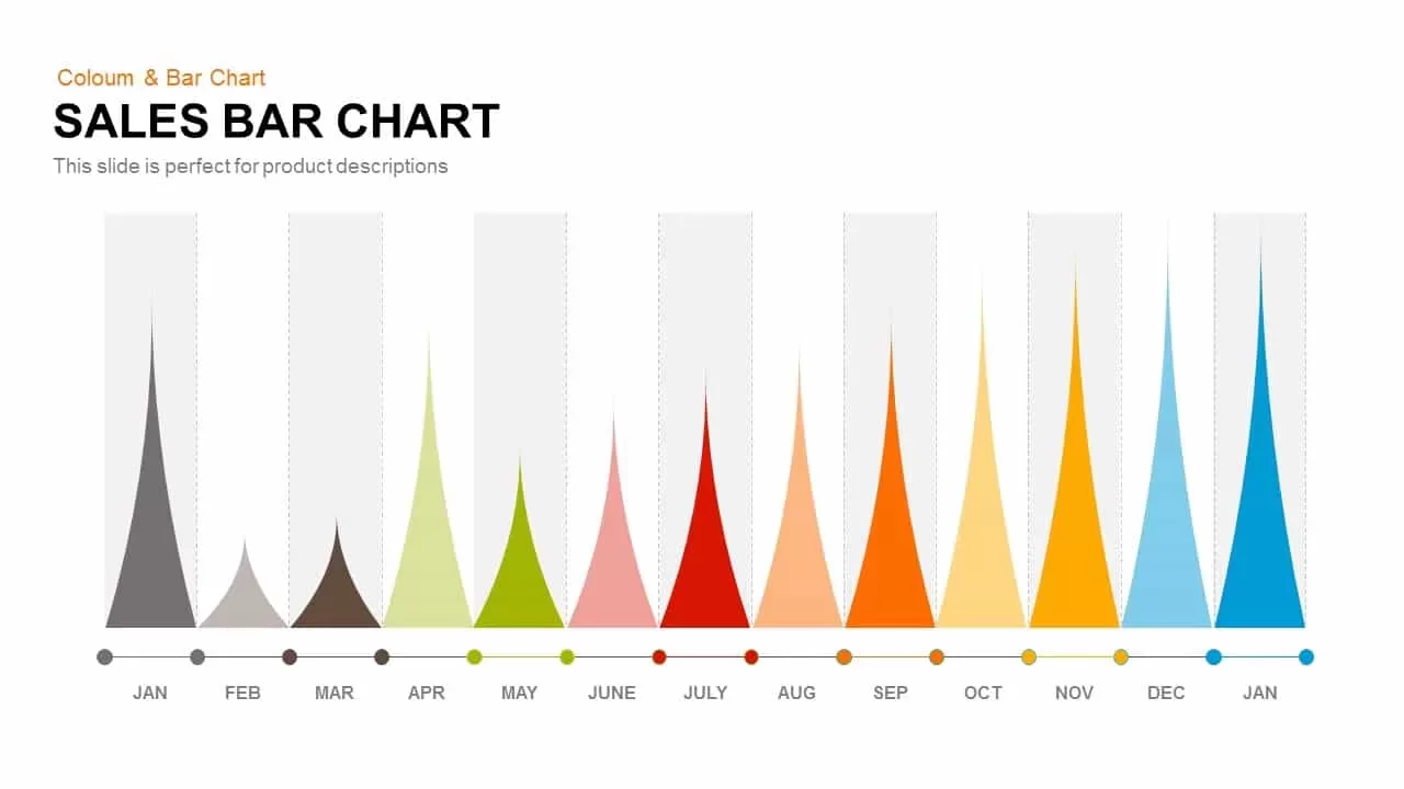
Sales Bar Chart Template for PowerPoint and Google slides
Bar/Column

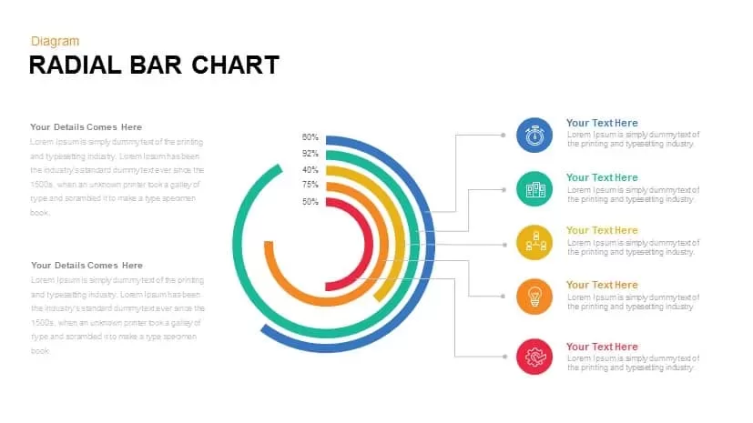
Radial Bar Chart Diagram for PowerPoint & Google Slides
Bar/Column
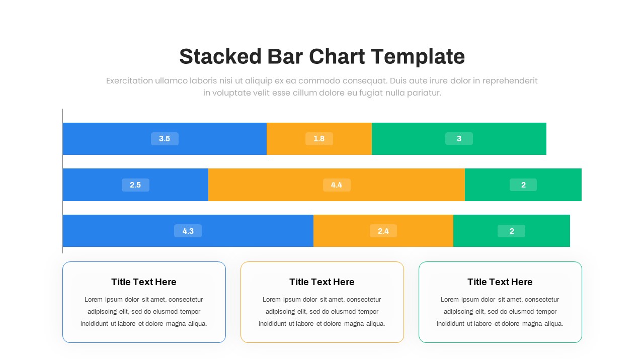
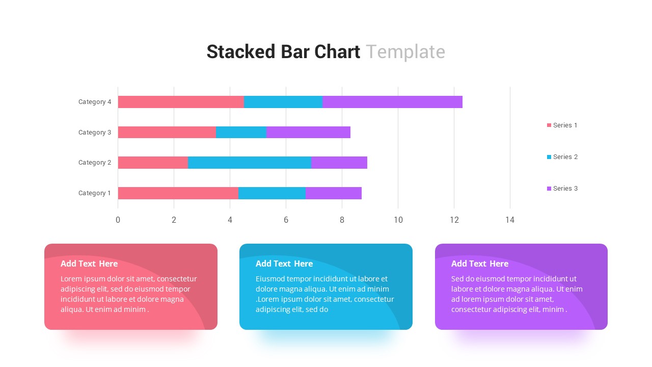
Stacked Bar Chart for PowerPoint & Google Slides
Bar/Column
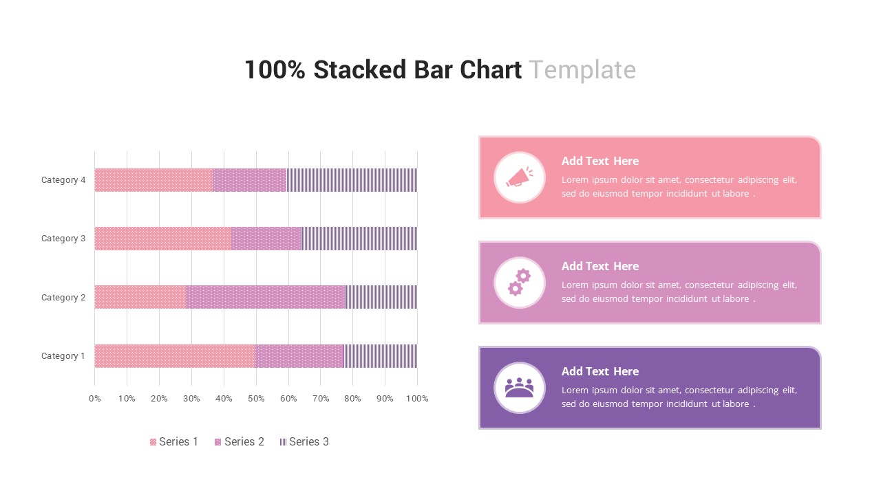
100% Stacked Bar Chart for PowerPoint & Google Slides
Bar/Column
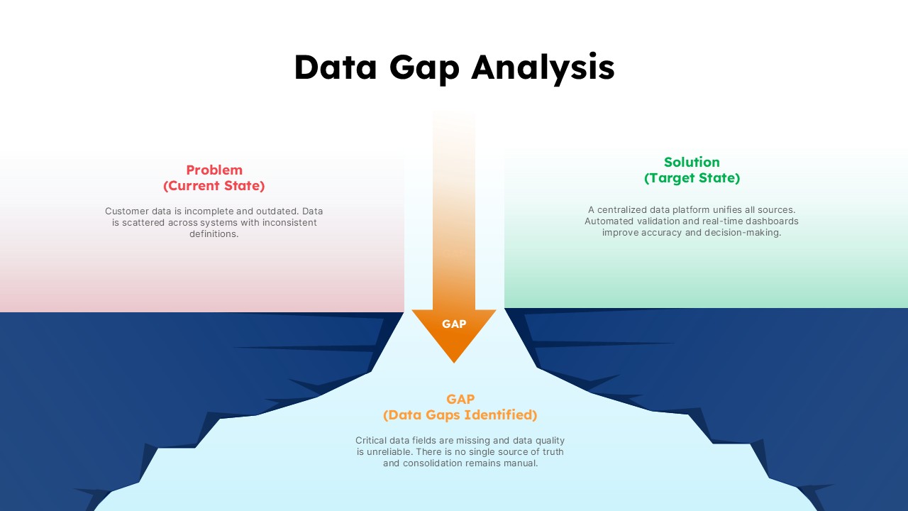
Data Gap Analysis Template for PowerPoint & Google Slides
Business
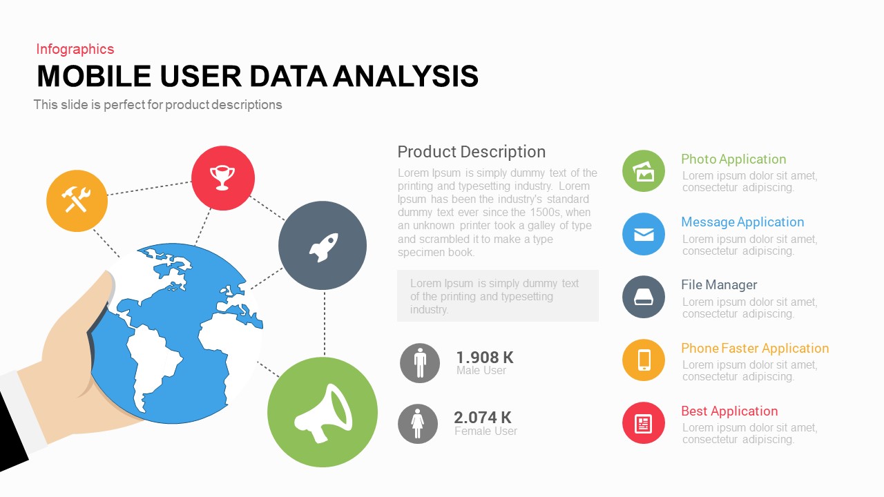
Mobile User Data Analysis Infographic for PowerPoint & Google Slides
Process
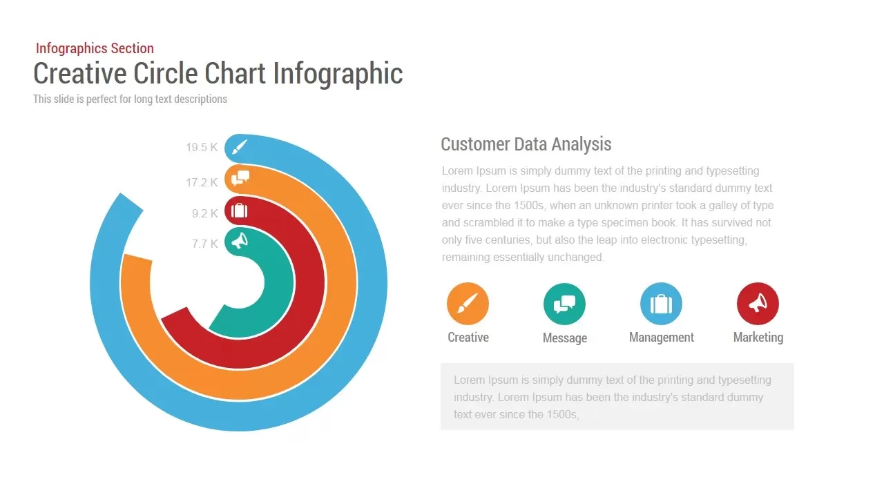
Circle Chart Data template for PowerPoint & Google Slides
Pie/Donut
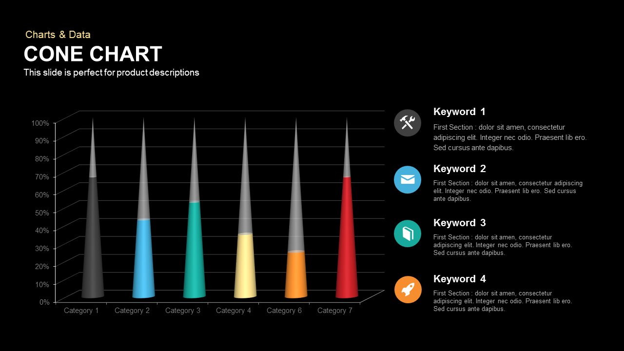
3D Cone Chart Data Visualization template for PowerPoint & Google Slides
Bar/Column
Tornado Chart Data Comparison Slide Template for PowerPoint & Google Slides
Bar/Column
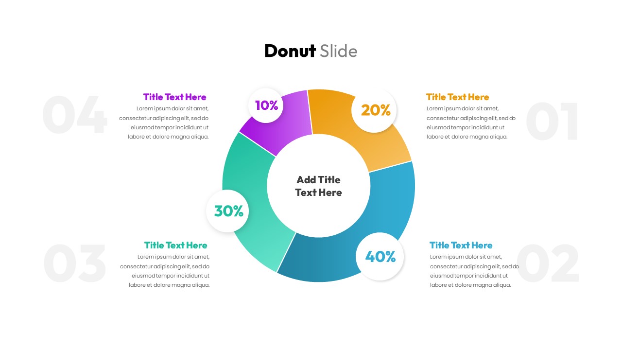
Donut Chart Data Breakdown template for PowerPoint & Google Slides
Pie/Donut
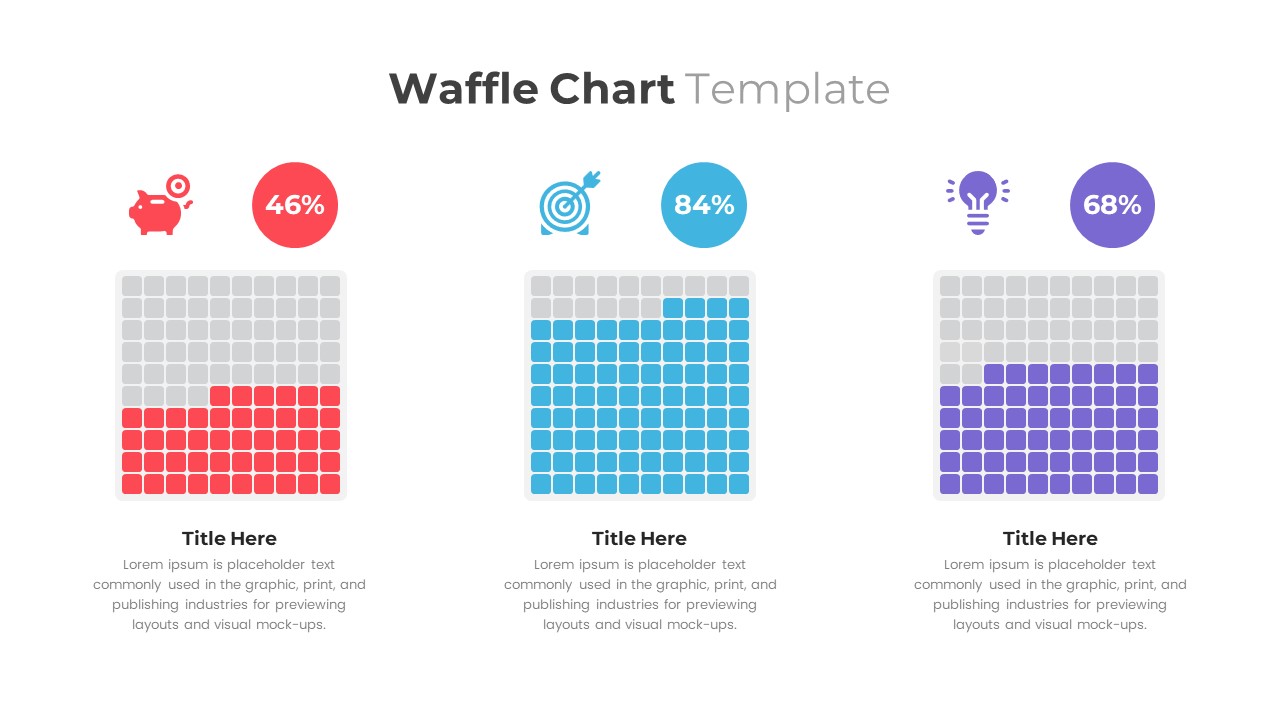
Waffle Chart Data Visualization Template for PowerPoint & Google Slides
Comparison Chart
Free Stacked Column Chart Data Visualization Template for PowerPoint & Google Slides
Bar/Column
Free
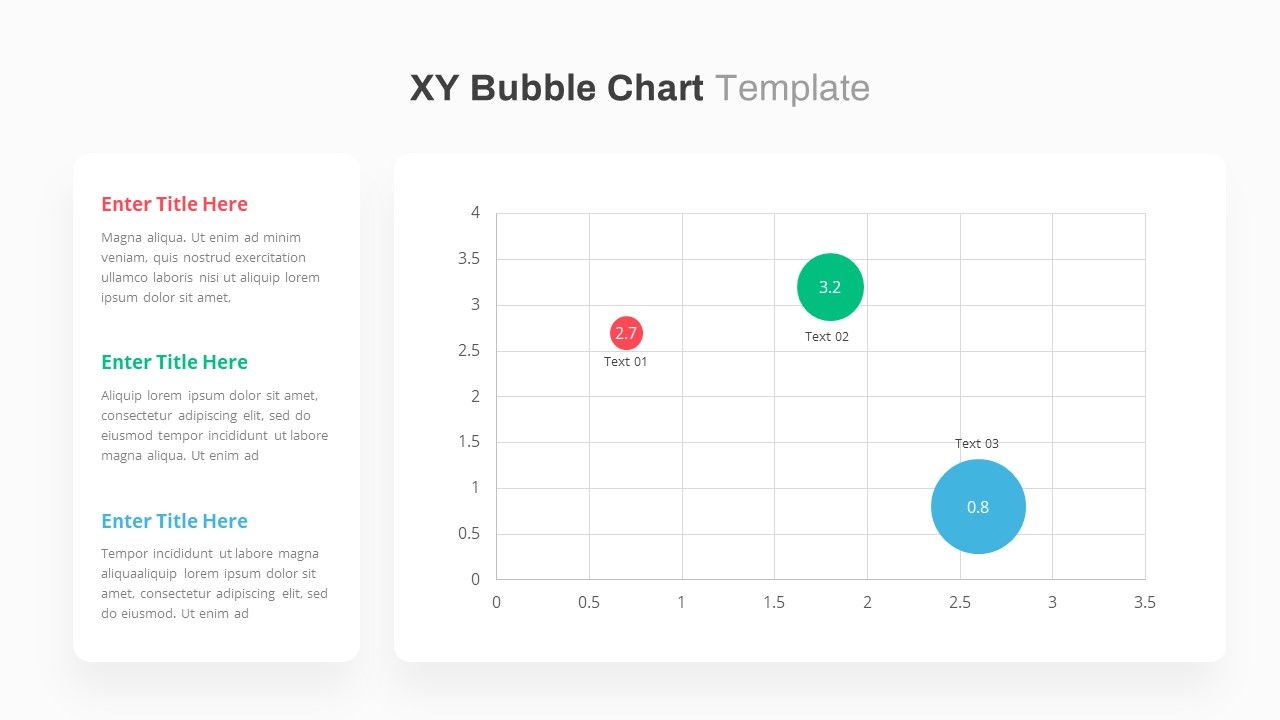
X Y Bubble Chart PowerPoint Template
Comparison Chart
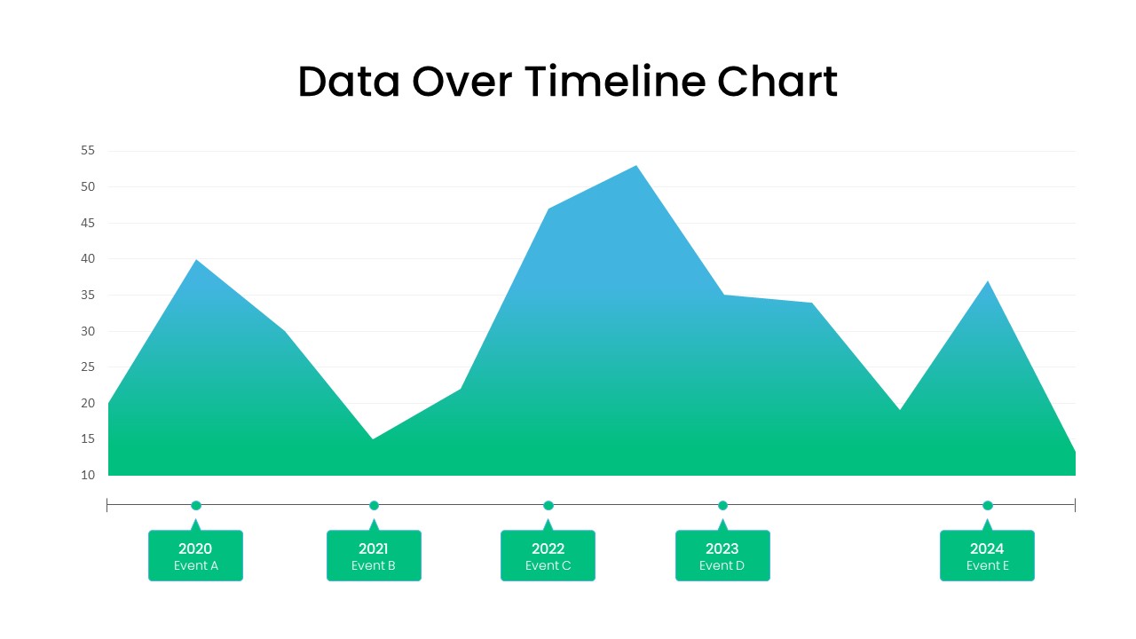
Data Over Timeline Chart Template for PowerPoint
Charts
Waterfall Chart Data Visualization Template for PowerPoint & Google Slides
Comparison Chart
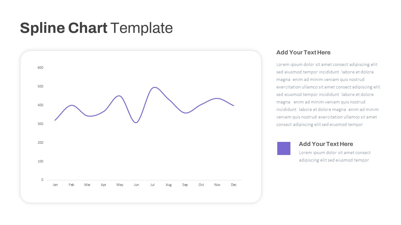
Multipurpose Spline Chart Data Trend Template for PowerPoint & Google Slides
Bar/Column
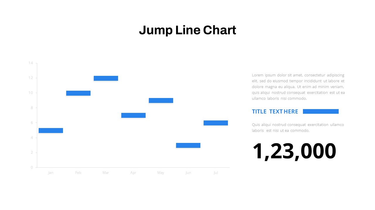
Interactive Jump Line Data Chart Template for PowerPoint & Google Slides
Comparison Chart
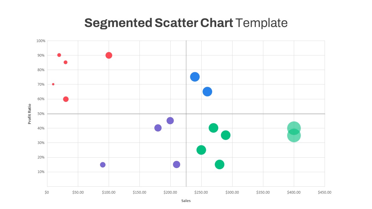
Segmented Scatter Chart Data Visualization Template for PowerPoint & Google Slides
Business Strategy
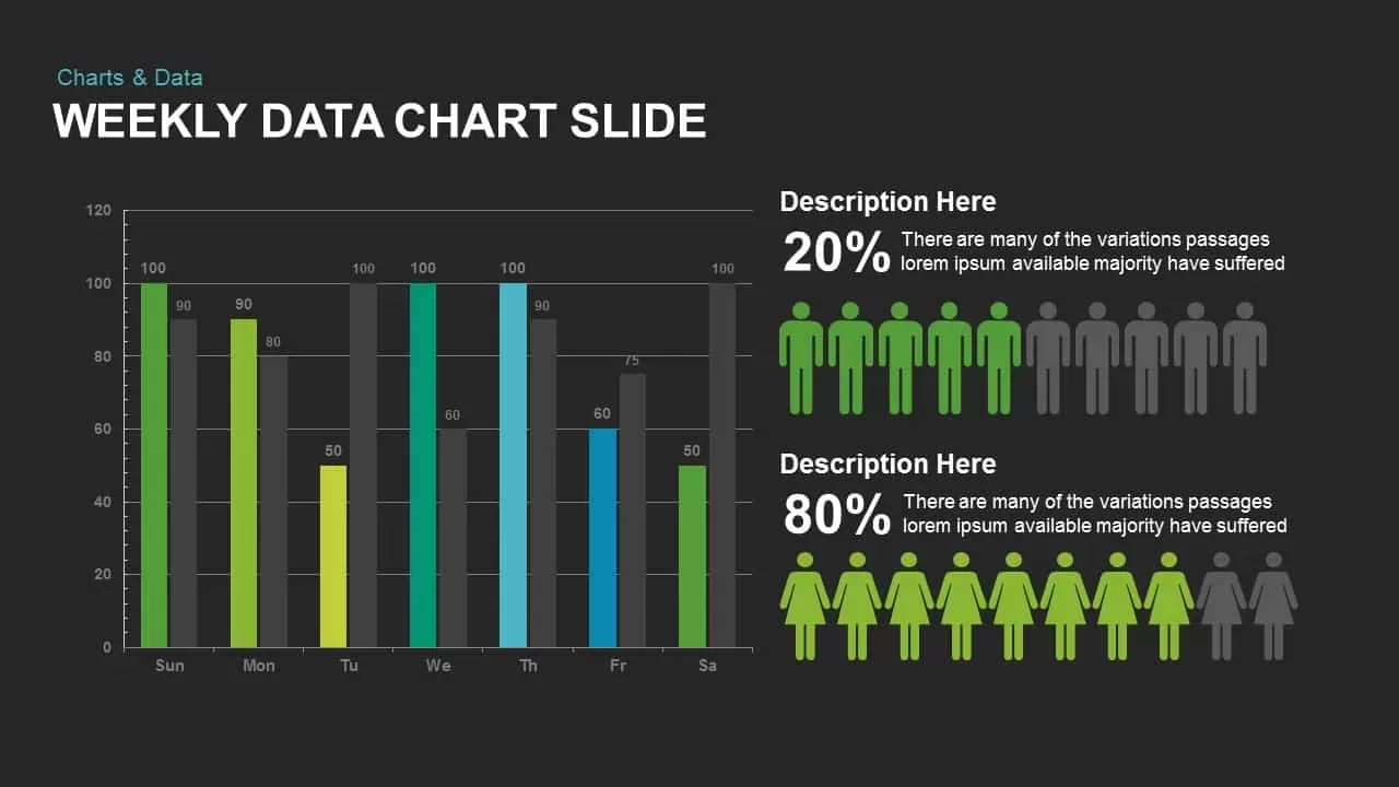
Weekly Data Chart Slide for PowerPoint & Google Slides
Comparison Chart

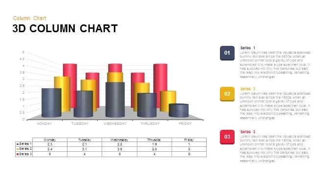
3D Column Chart with Data Table for PowerPoint & Google Slides
Bar/Column
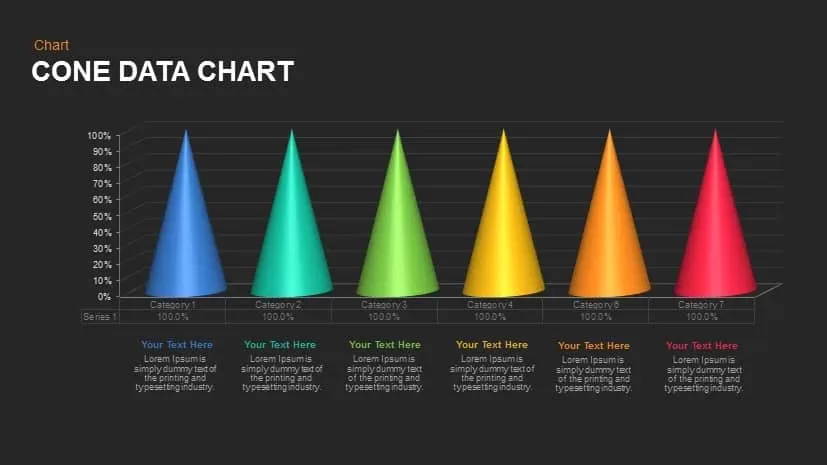
Cone Data Chart for PowerPoint & Google Slides
Charts
3D Cylinder Bar Chart Visualization Template for PowerPoint
Bar/Column
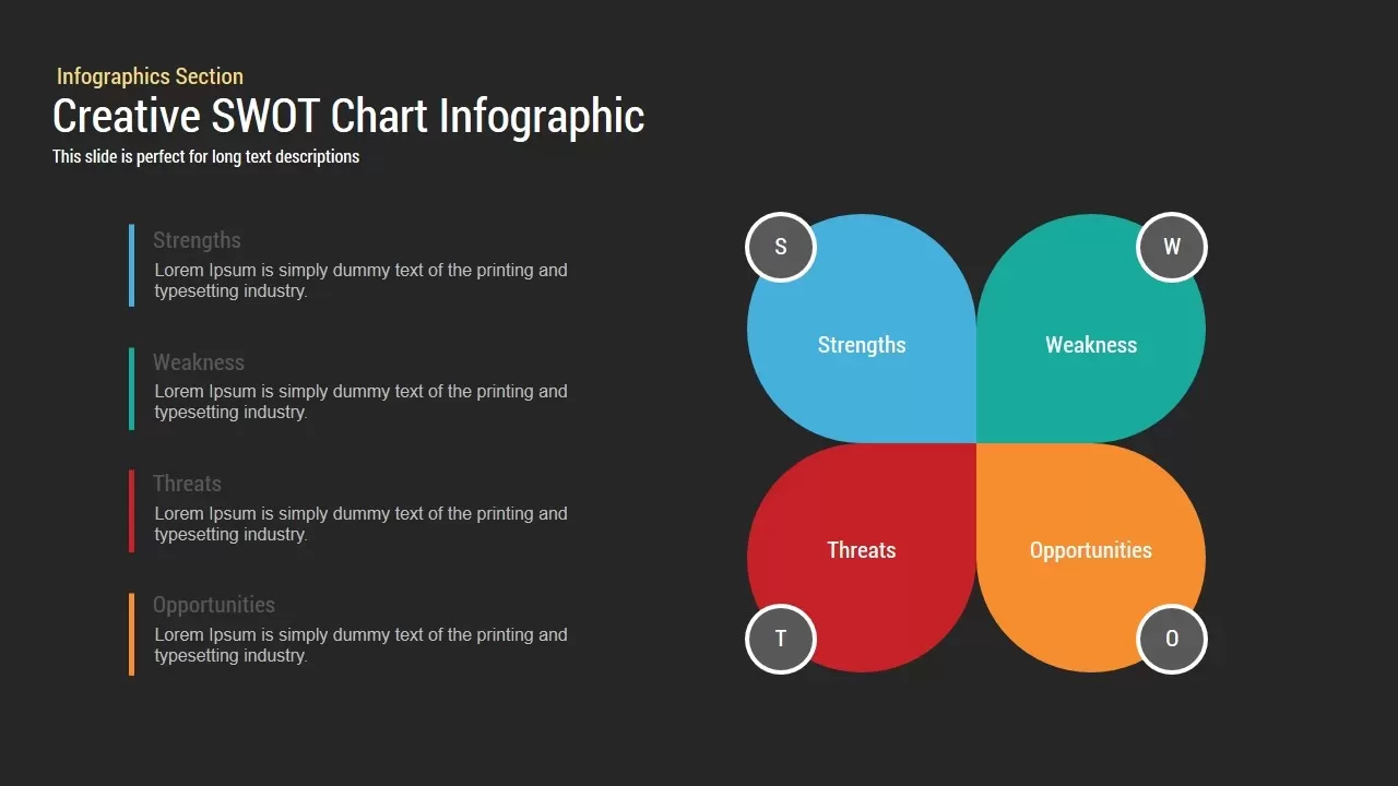
Creative SWOT Chart template for PowerPoint & Google Slides
SWOT
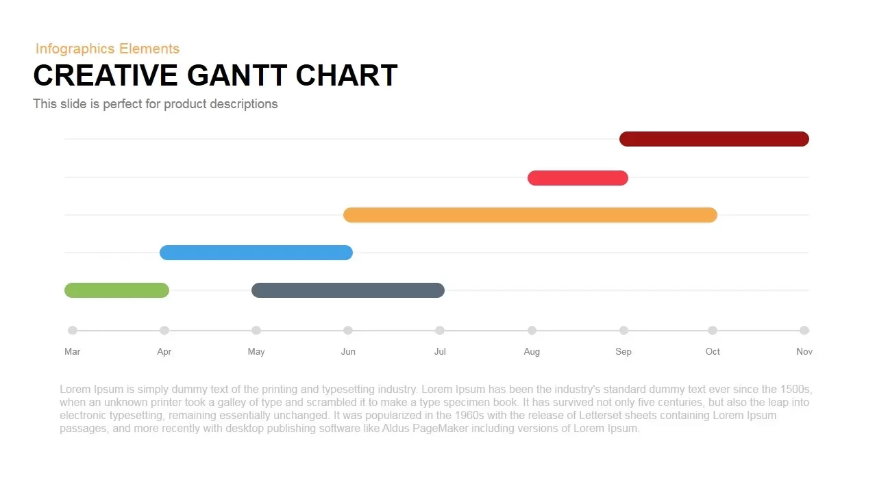
Creative Dynamic Gantt Chart Timeline Template for PowerPoint & Google Slides
Timeline
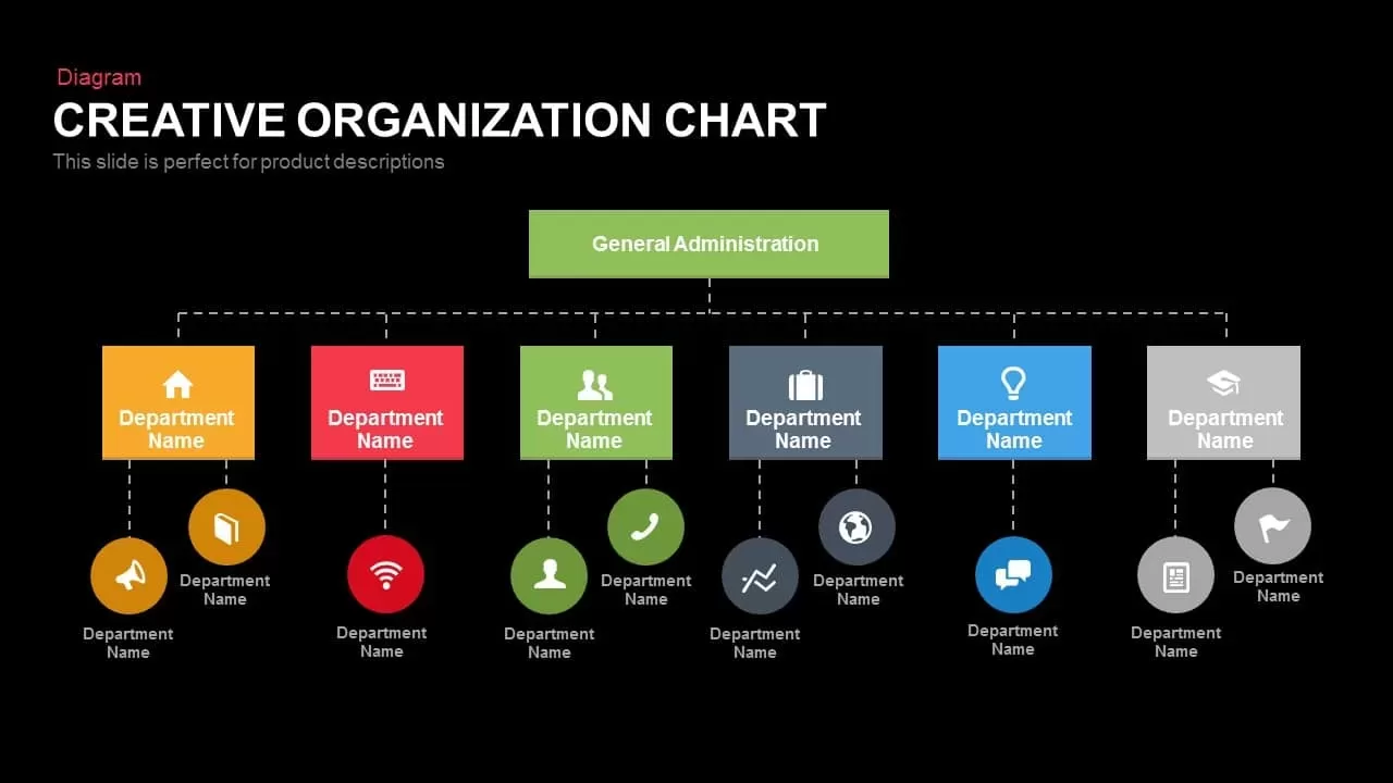
Creative Organization Chart Diagram Template for PowerPoint & Google Slides
Org Chart
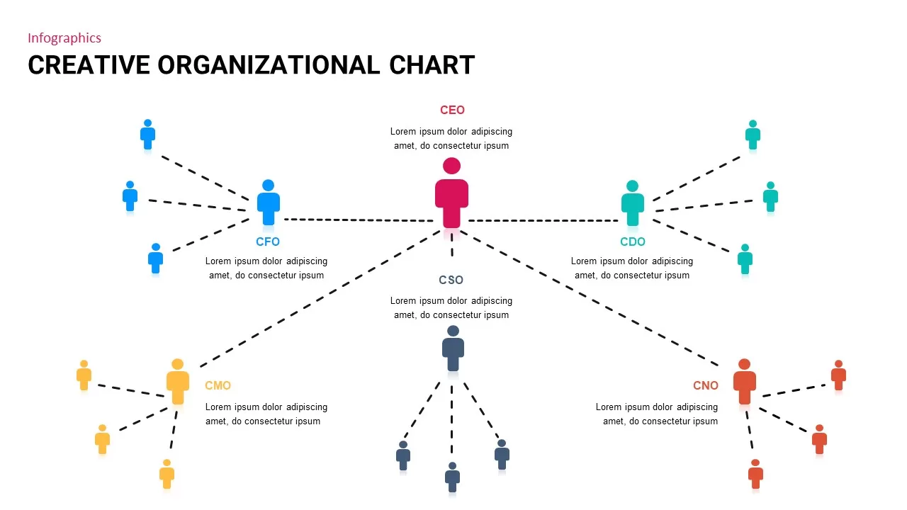
Creative Organizational Chart Template for PowerPoint & Google Slides
Org Chart
Data-Driven Line Chart Diagram Template for PowerPoint
Comparison Chart
3D Bar Graph Infographic Template for PowerPoint & Google Slides
Bar/Column
Five-Stage Vertical Bar Process Template for PowerPoint & Google Slides
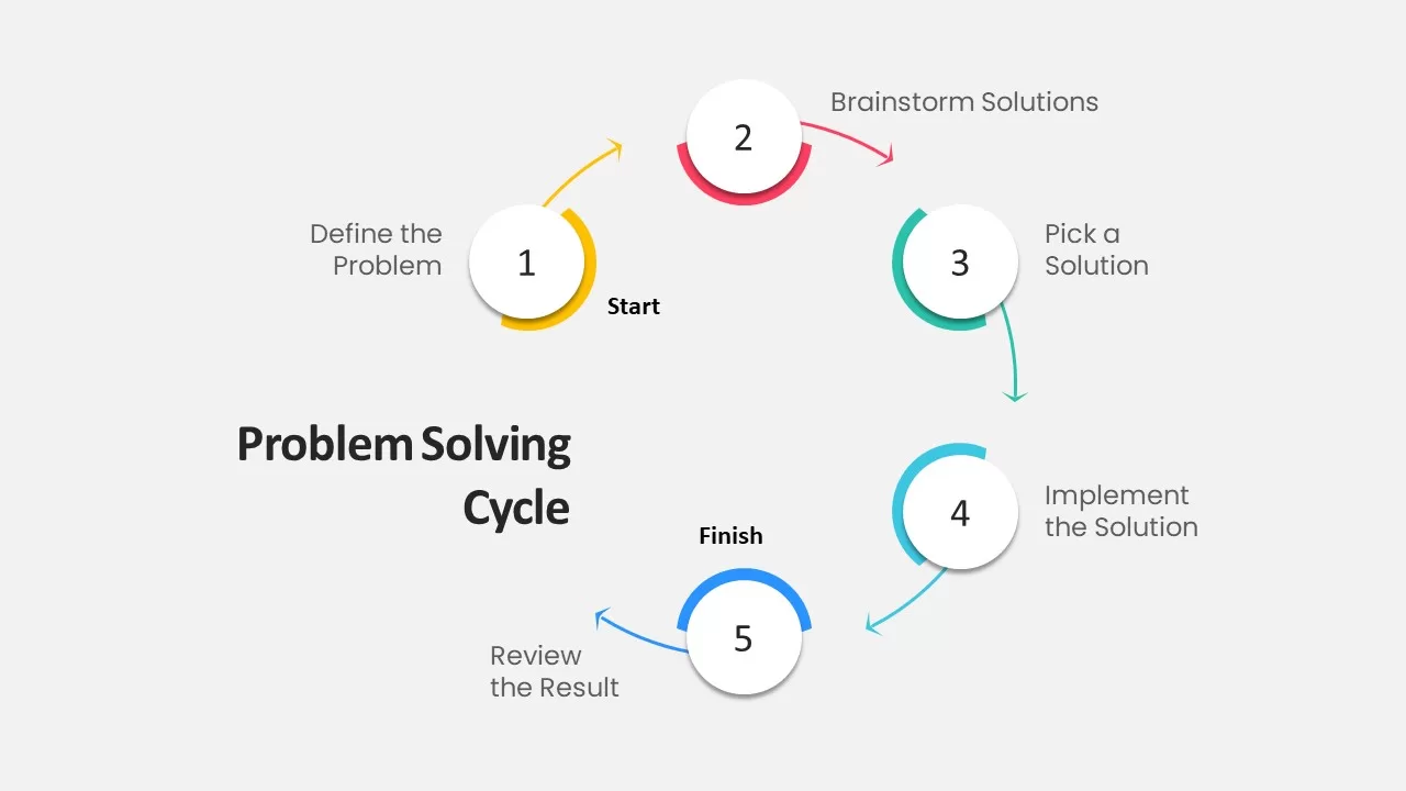
Process
Progress Timeline Bar PowerPoint Template
Timeline
Progress Bar and Milestone Visualization Template for PowerPoint & Google Slides
Timeline

Blank Bar Graph Template for PowerPoint & Google Slides
Bar/Column
Progress Bar Graph Layout Design for PowerPoint & Google Slides
Charts
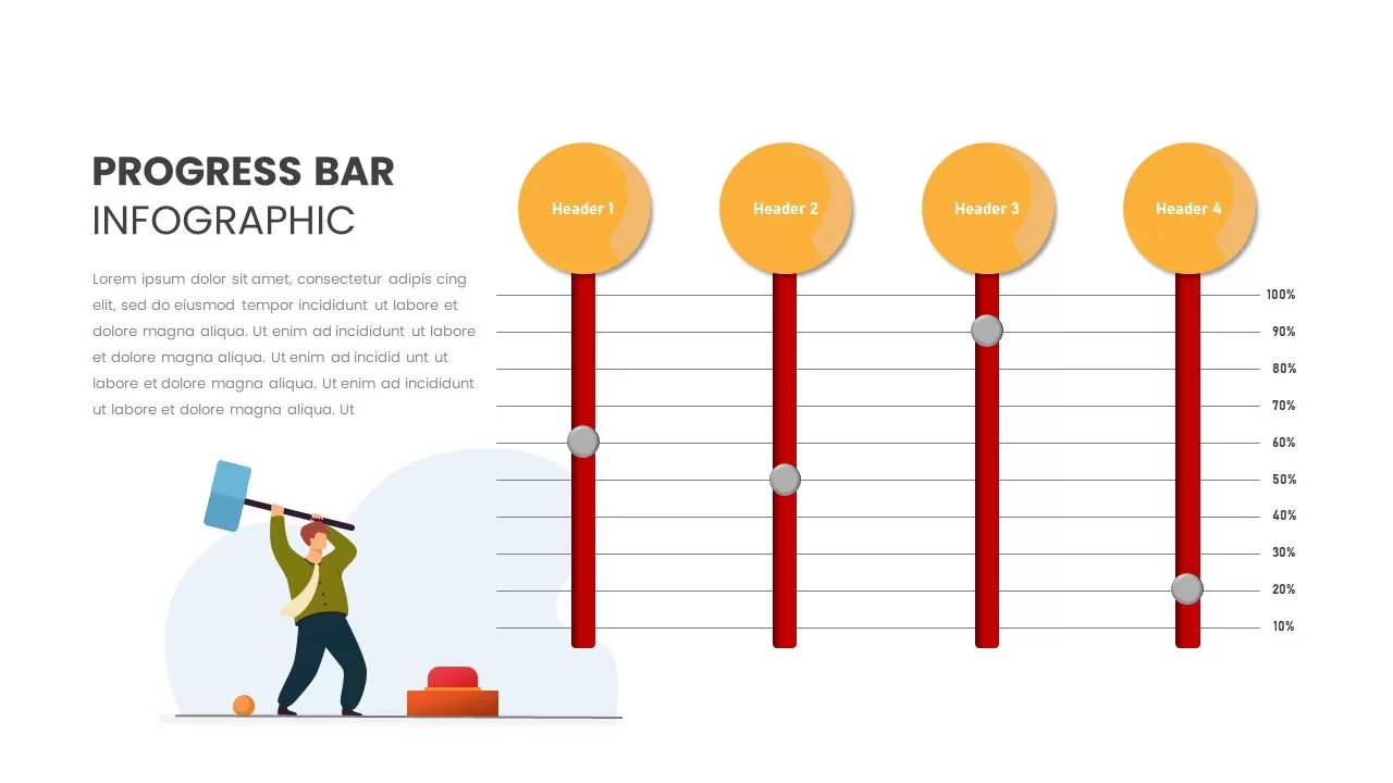
Progress Bar Infographic for PowerPoint & Google Slides
Business
Progress Bar infographic pack for PowerPoint & Google Slides
Business
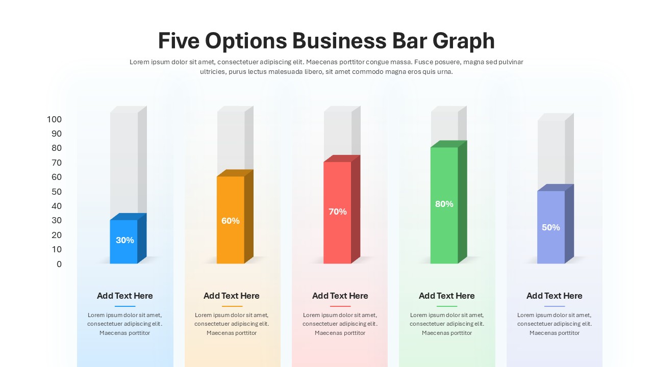
Five Options Business Bar Graph for PowerPoint & Google Slides
Business Report
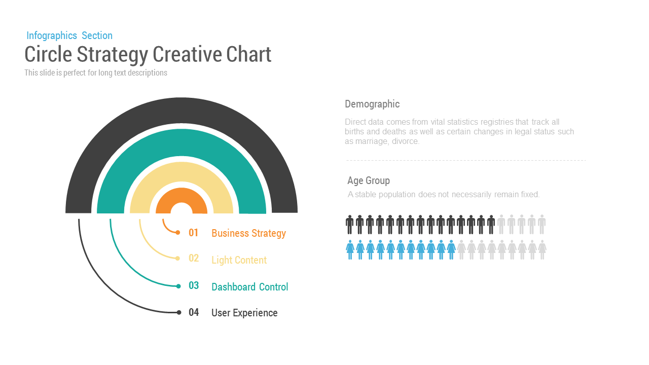
Circle Strategy Creative Chart for PowerPoint
Business Strategy
Section Divider Slide Presentation Template
Decks

Line Chart Analysis template for PowerPoint & Google Slides
Charts
Population Pyramid Chart Analysis Template for PowerPoint & Google Slides
Bar/Column
Waterfall Column Chart Analysis Template for PowerPoint & Google Slides
Bar/Column
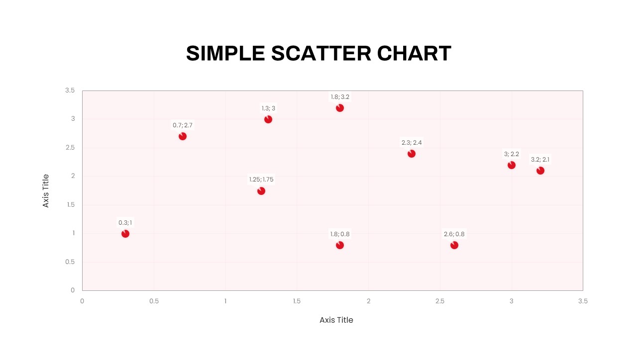
Simple Scatter Chart Analysis Template for PowerPoint & Google Slides
Comparison Chart
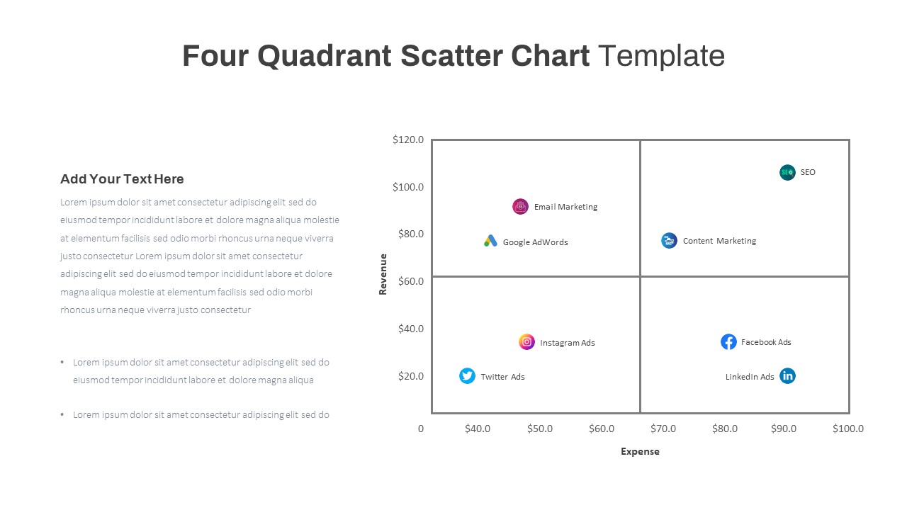
Four Quadrant Scatter Chart Powerpoint Template
Comparison Chart
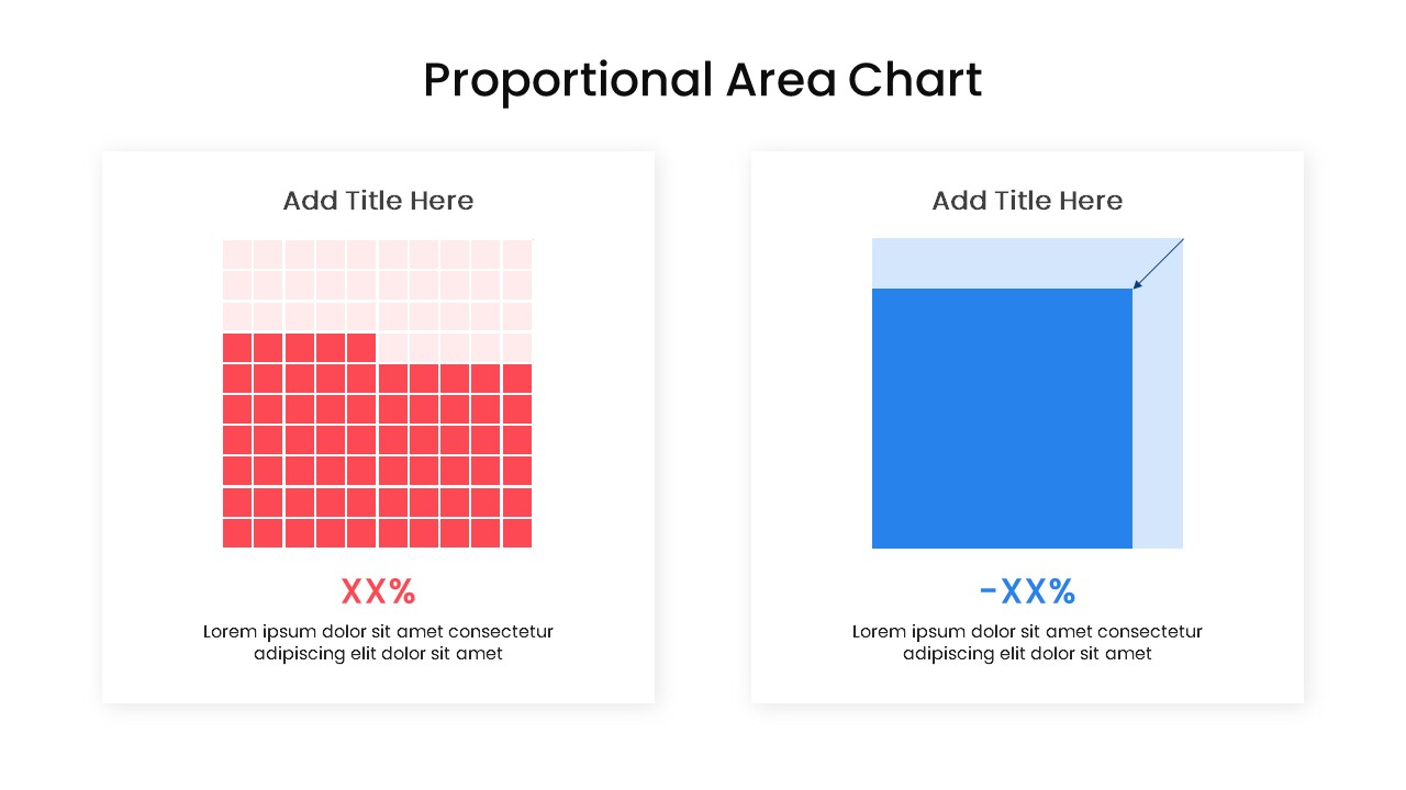
Proportional Area Chart Analysis Template for PowerPoint & Google Slides
Comparison Chart
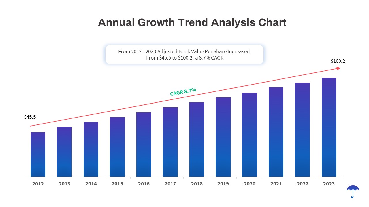
Annual Growth Trend Analysis Chart template for PowerPoint & Google Slides
Business Report
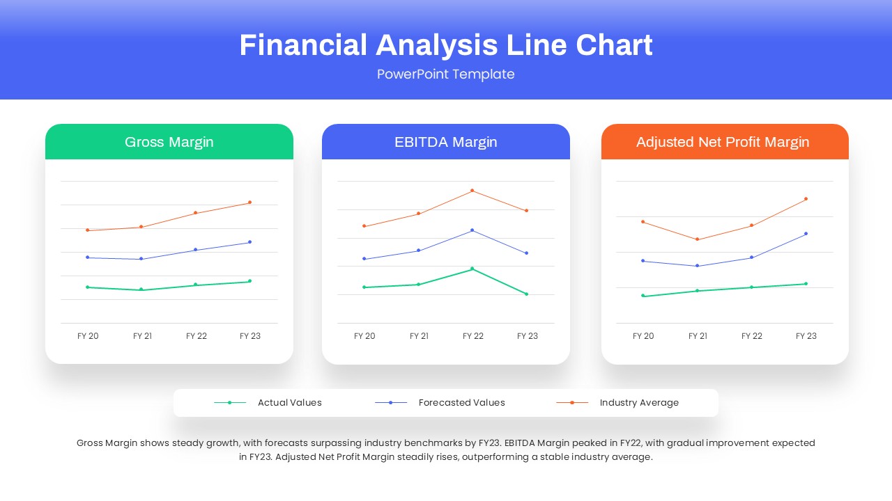
Dynamic Financial Analysis Line Chart Template for PowerPoint & Google Slides
Finance
Skills Gap Analysis Comparison Chart Template for PowerPoint & Google Slides
Gap
Data Science PowerPoint Template
Pitch Deck
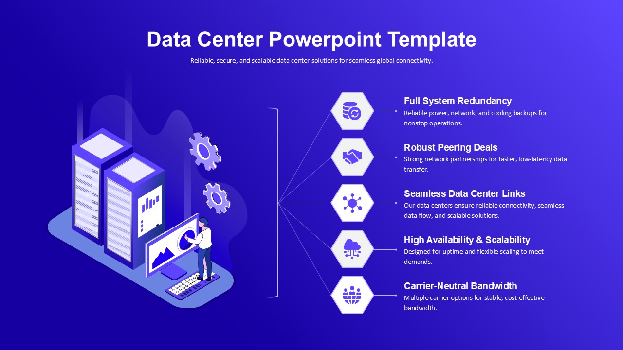
Data Center PowerPoint Template for PowerPoint & Google Slides
Information Technology
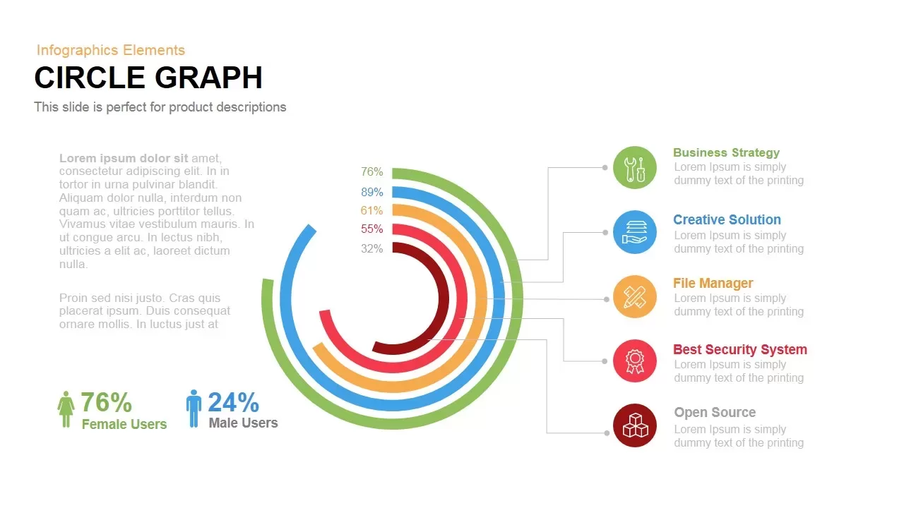
Circle Graph Data Visualization Template for PowerPoint & Google Slides
Circular
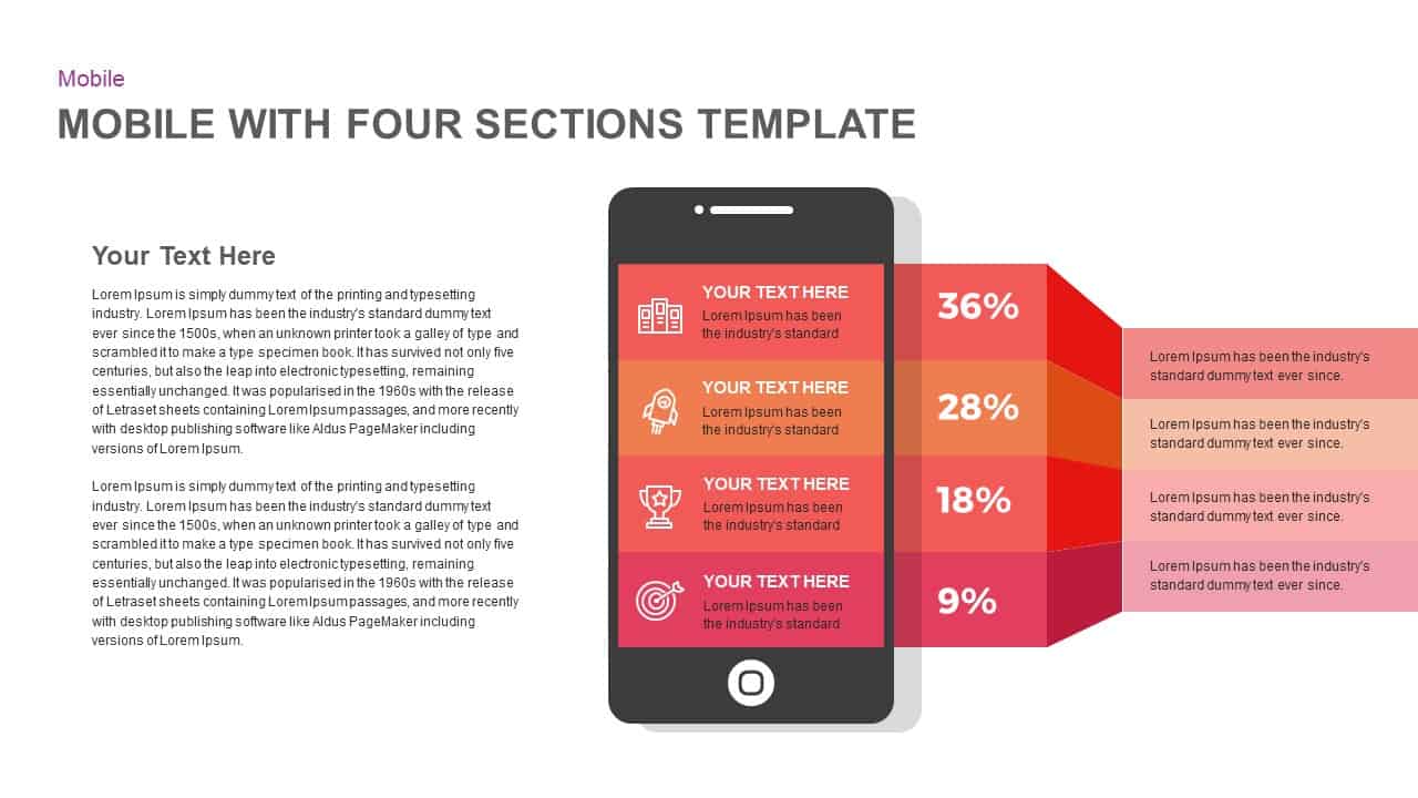
Mobile Infographics Data Visualization Template for PowerPoint & Google Slides
Infographics
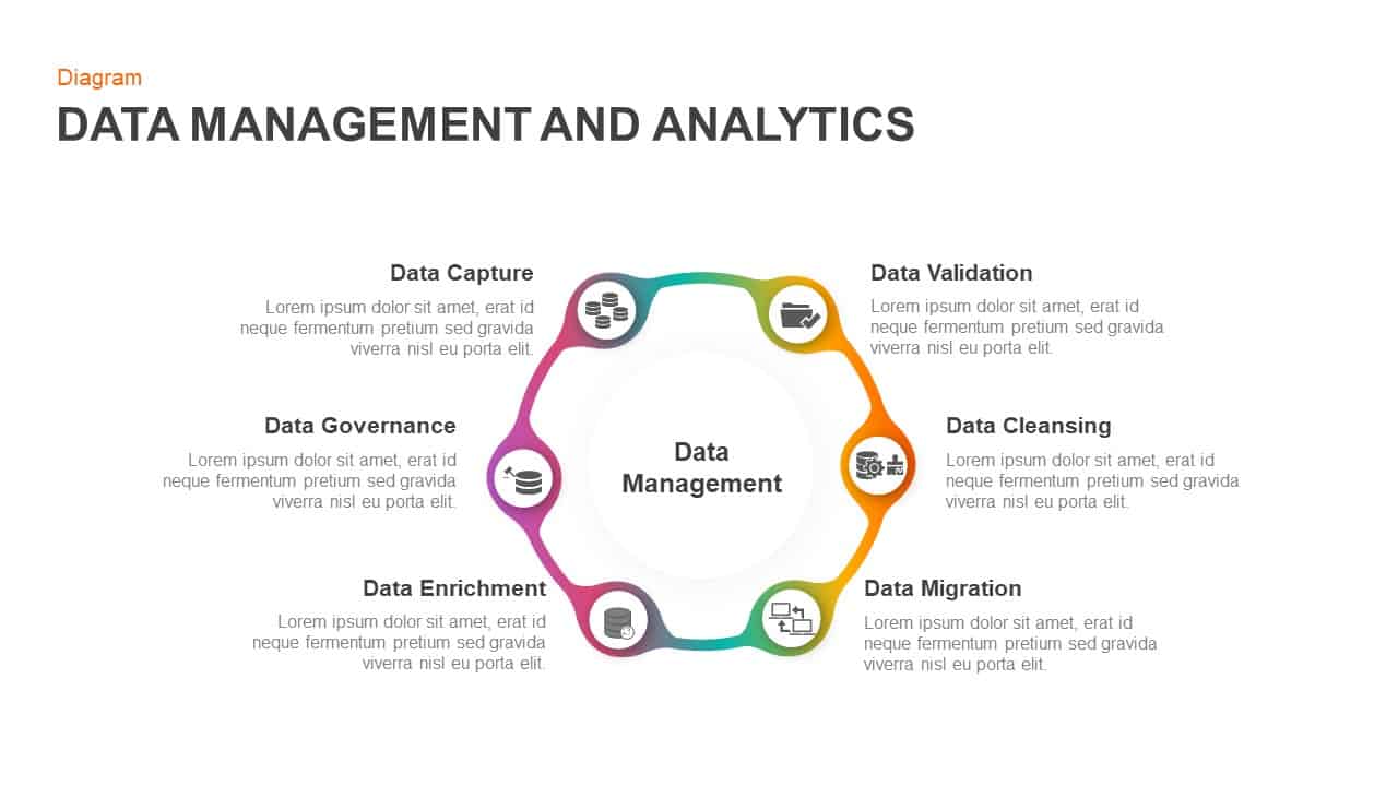
Data Management and Analytics Diagram Template for PowerPoint & Google Slides
Circular
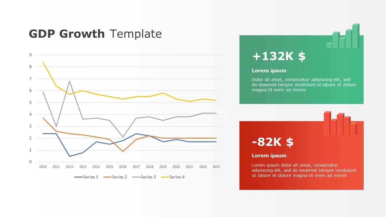
Data-driven GDP Growth Infographic Pack Template for PowerPoint & Google Slides
Infographics
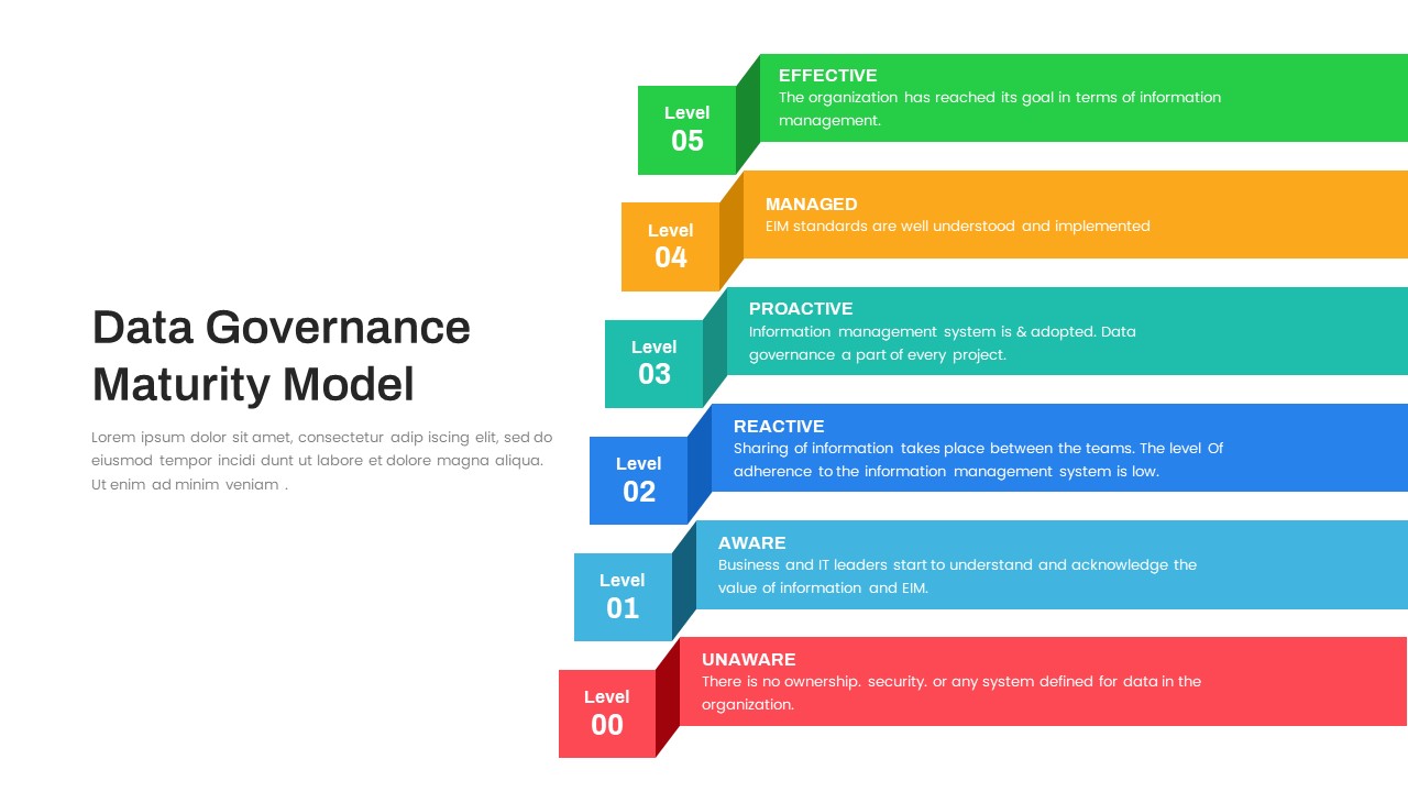
Layered Data Governance Maturity Model Template for PowerPoint & Google Slides
Process
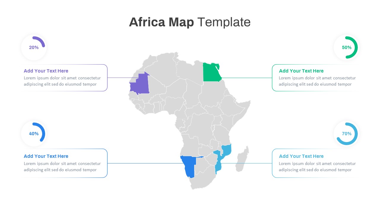
Editable Africa Map Infographic Data Template for PowerPoint & Google Slides
World Maps
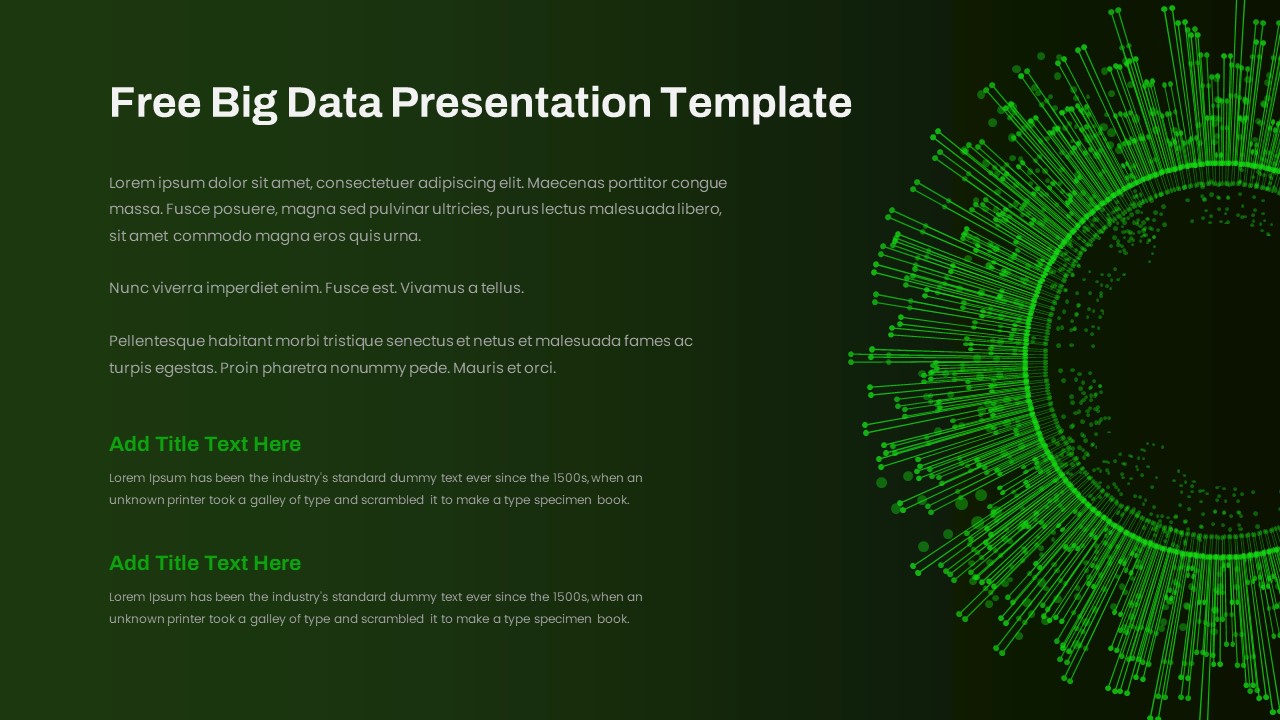
Free Big Data Network Visualization Template for PowerPoint & Google Slides
Circular
Free
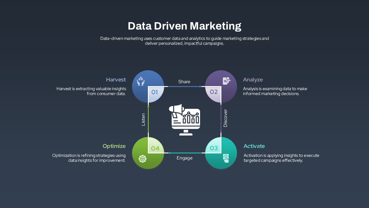
Data-Driven Marketing Lifecycle Diagram Template for PowerPoint & Google Slides
Process
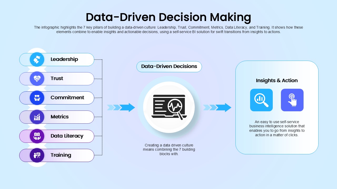
Data-Driven Decision Making overview template for PowerPoint & Google Slides
Business
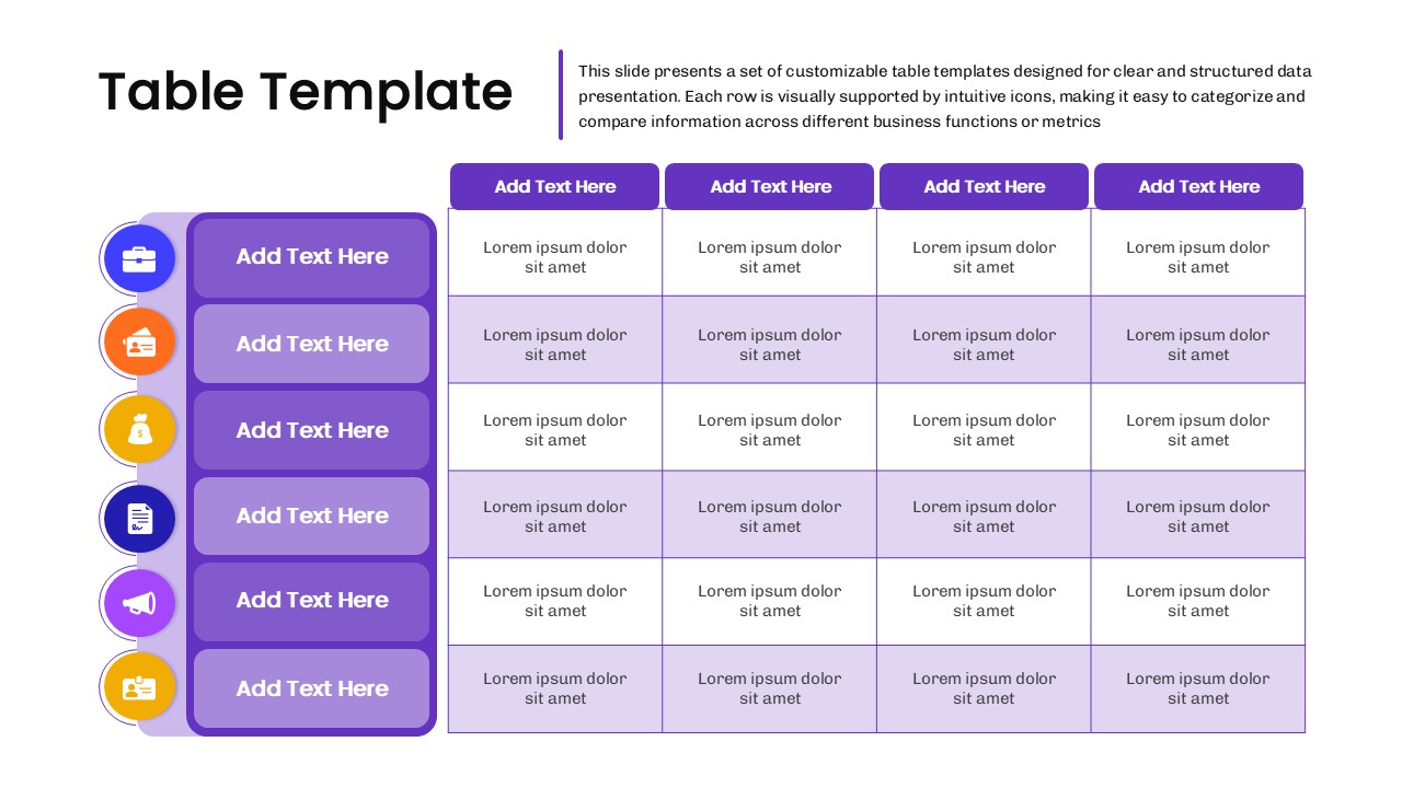
Business Data Table Template for PowerPoint & Google Slides
Table
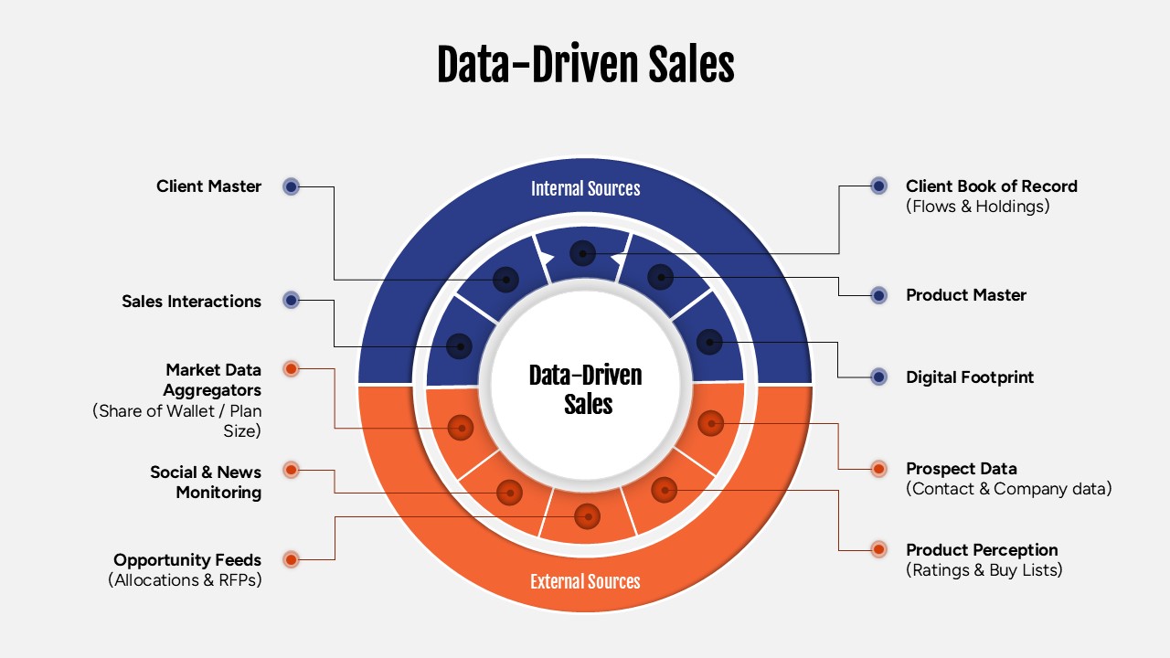
Data-Driven Sales Strategy Diagram Template for PowerPoint & Google Slides
Marketing