Comparison Bar Chart template for PowerPoint & Google Slides
Comparison Bar Charts PowerPoint and Google Slides Template
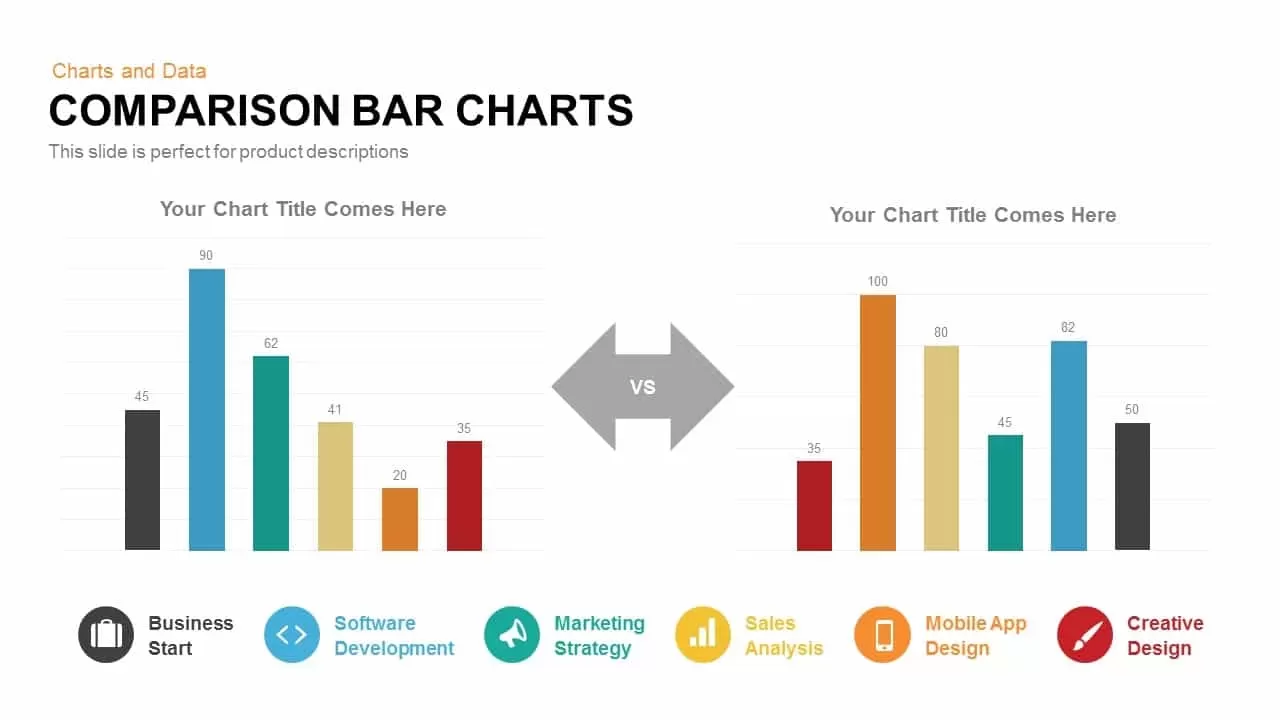
Benchmarking performance metrics, evaluating year-over-year growth, or comparing competitor capabilities requires an intuitive quantitative layout. If you need diverse comparative formats, you can explore versatile options like a comparison slide PowerPoint template, visualize multi-variable data using a dedicated comparison chart PowerPoint template, or organize detailed feature breakdowns with a structured three and four column comparison table. This side-by-side bar chart template equips data analysts, marketing directors, financial planners, and project managers with a balanced visual framework to evaluate two distinct data sets with clarity.
Key slide components and visual highlights include:
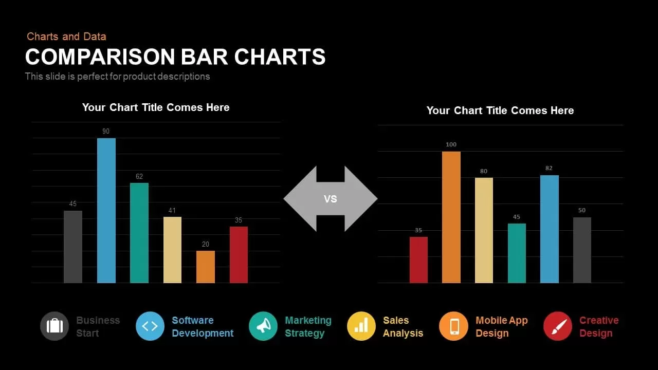
- Two parallel vertical bar charts separated by a bold central “VS” double-headed arrow to emphasize direct comparison.
- Multi-colored metric bars with clean numerical data labels positioned on top of each bar for effortless scanning.
- A coordinated color-coded legend along the bottom spanning charcoal, cyan, teal, gold, orange, and deep red.
- Vector line icons paired with core functional categories including Business Start, Software Development, Marketing Strategy, Sales Analysis, Mobile App Design, and Creative Design.
Login to download this file

Item ID
SB00208


Related Templates

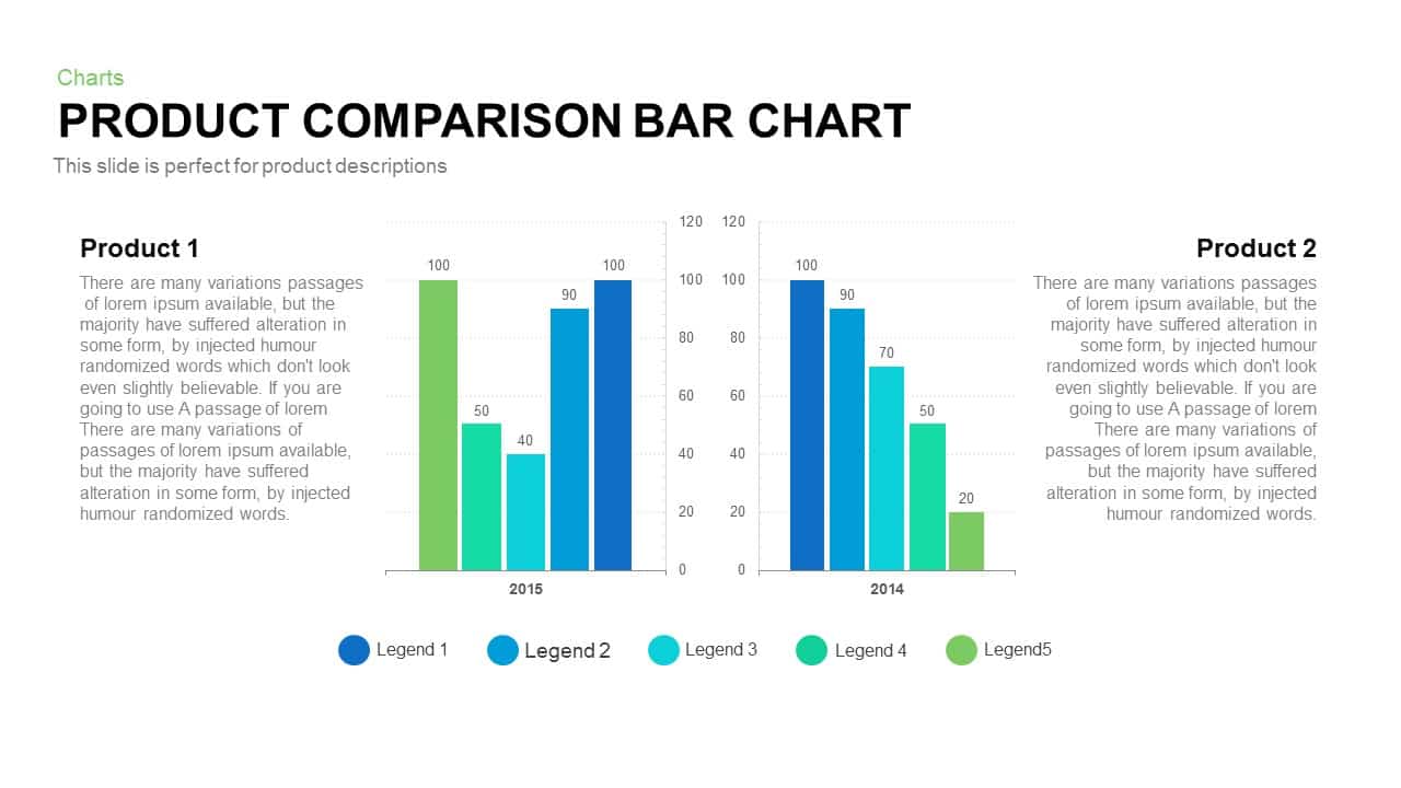
Product Comparison Bar Chart Template
Bar/Column
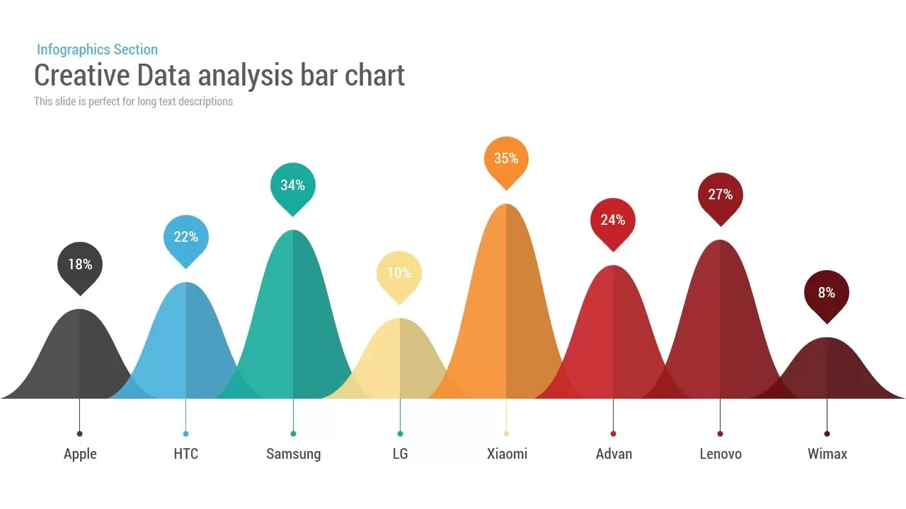
Creative Data Analysis Bar Chart template for PowerPoint & Google Slides
Bar/Column

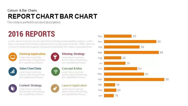
Monthly Reports Bar Chart template for PowerPoint & Google Slides
Bar/Column
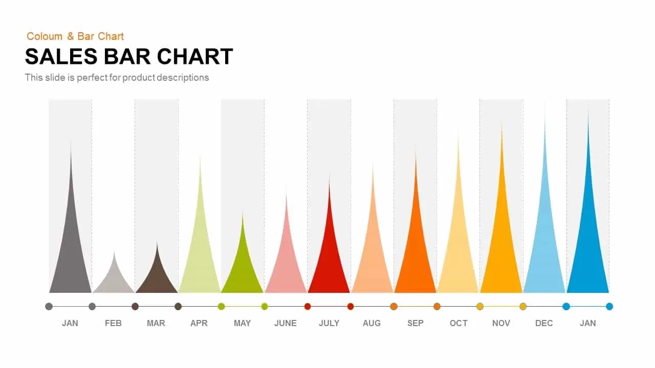
Sales Bar Chart Template for PowerPoint and Google slides
Bar/Column
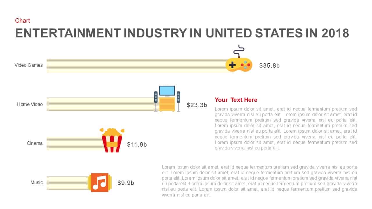
Entertainment Industry Revenue Bar Chart Template for PowerPoint & Google Slides
Bar/Column
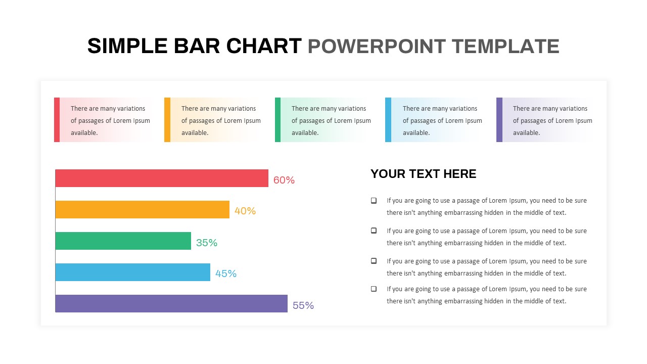
Simple Bar Chart Data Visualization Template for PowerPoint & Google Slides
Bar/Column
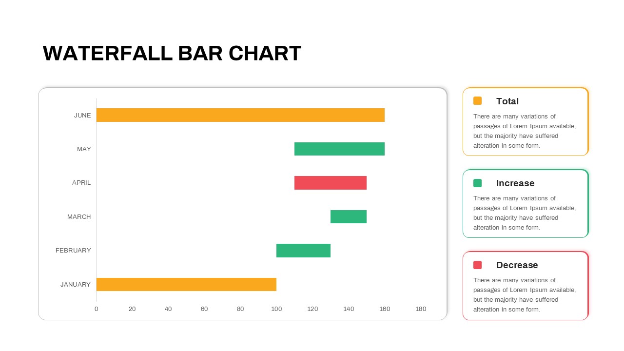
Waterfall Bar Chart Template for PowerPoint & Google Slides
Bar/Column
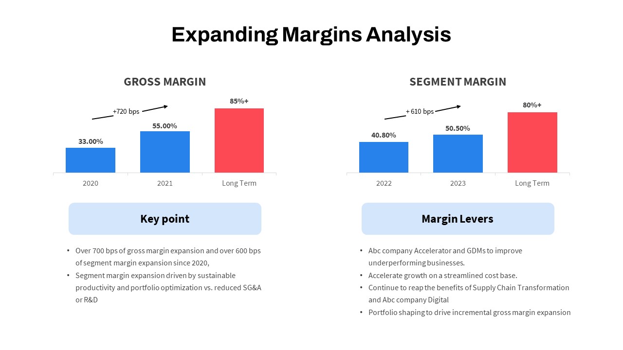
Expanding Margins Analysis Bar Chart Template for PowerPoint & Google Slides
Charts
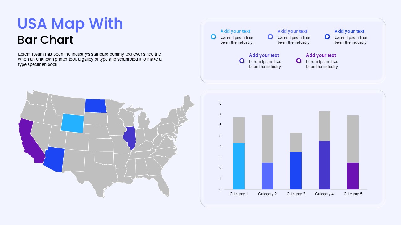
USA Map with Bar Chart Template for PowerPoint & Google Slides
World Maps
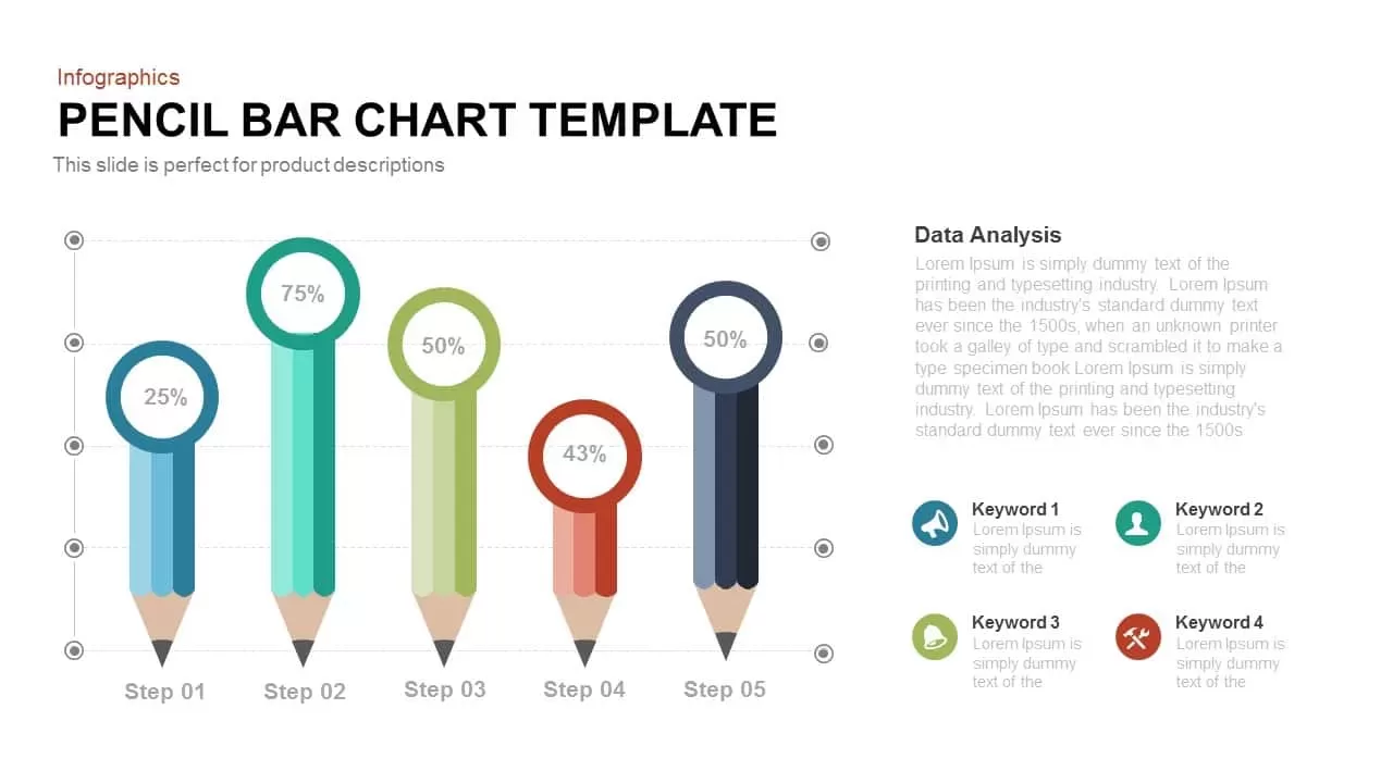
Pencil Bar Chart PowerPoint Template and Google Slide
Bar/Column
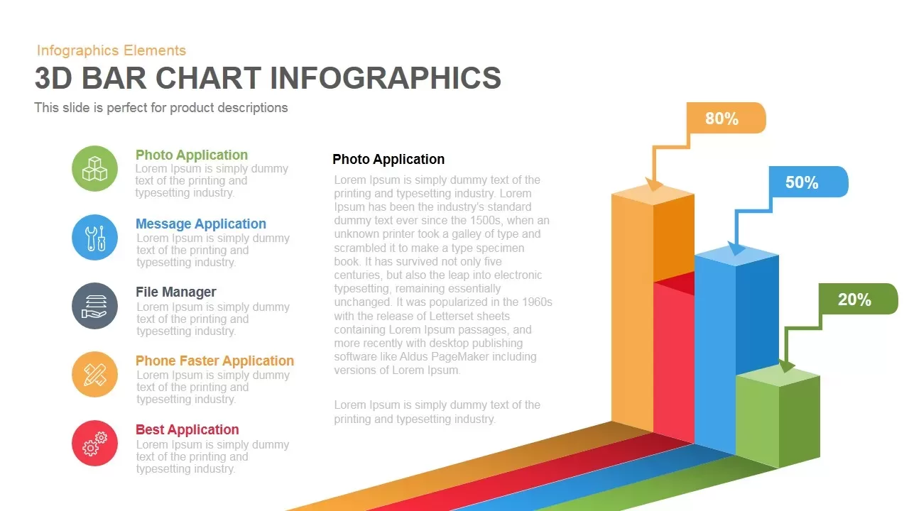
3D Bar Chart Infographics Template for PowerPoint Template
Bar/Column
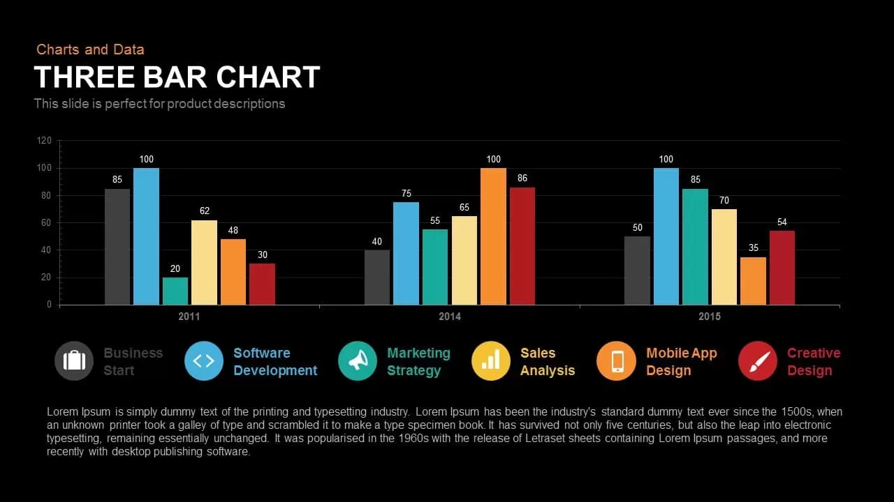
Three Bar Chart PowerPoint Template
Charts
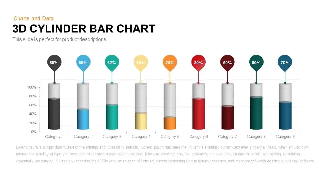
3D Cylinder Bar Chart PowerPoint Template
Bar/Column

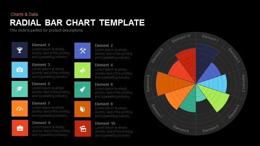
Radial Bar Chart Template for PowerPoint
Bar/Column
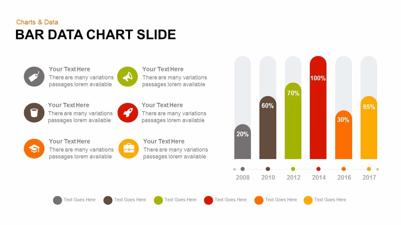
Data Bar Chart Template for PowerPoint and Keynote
Bar/Column
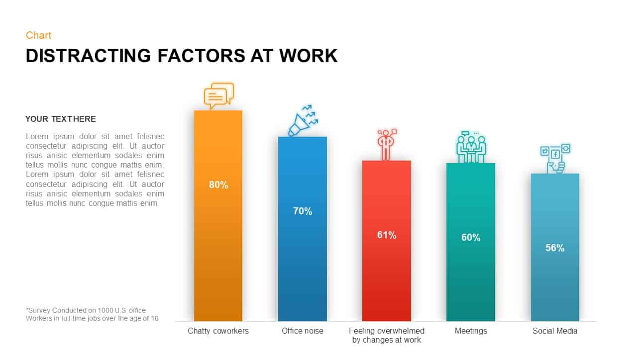
Distracting Factors at Work – Bar Chart Template for PowerPoint
Bar/Column
Multi-Series Stacked Bar Chart PowerPoint Template
Bar/Column
Animated Clustered Bar Chart Template for PowerPoint
Bar/Column
Animated Stacked Bar Chart PowerPoint Template
Bar/Column
Clustered Bar Chart PowerPoint Template
Bar/Column