USA Map with Bar Chart Template for PowerPoint & Google Slides
USA Map with Bar Chart Presentation Template for PowerPoint & Google Slides
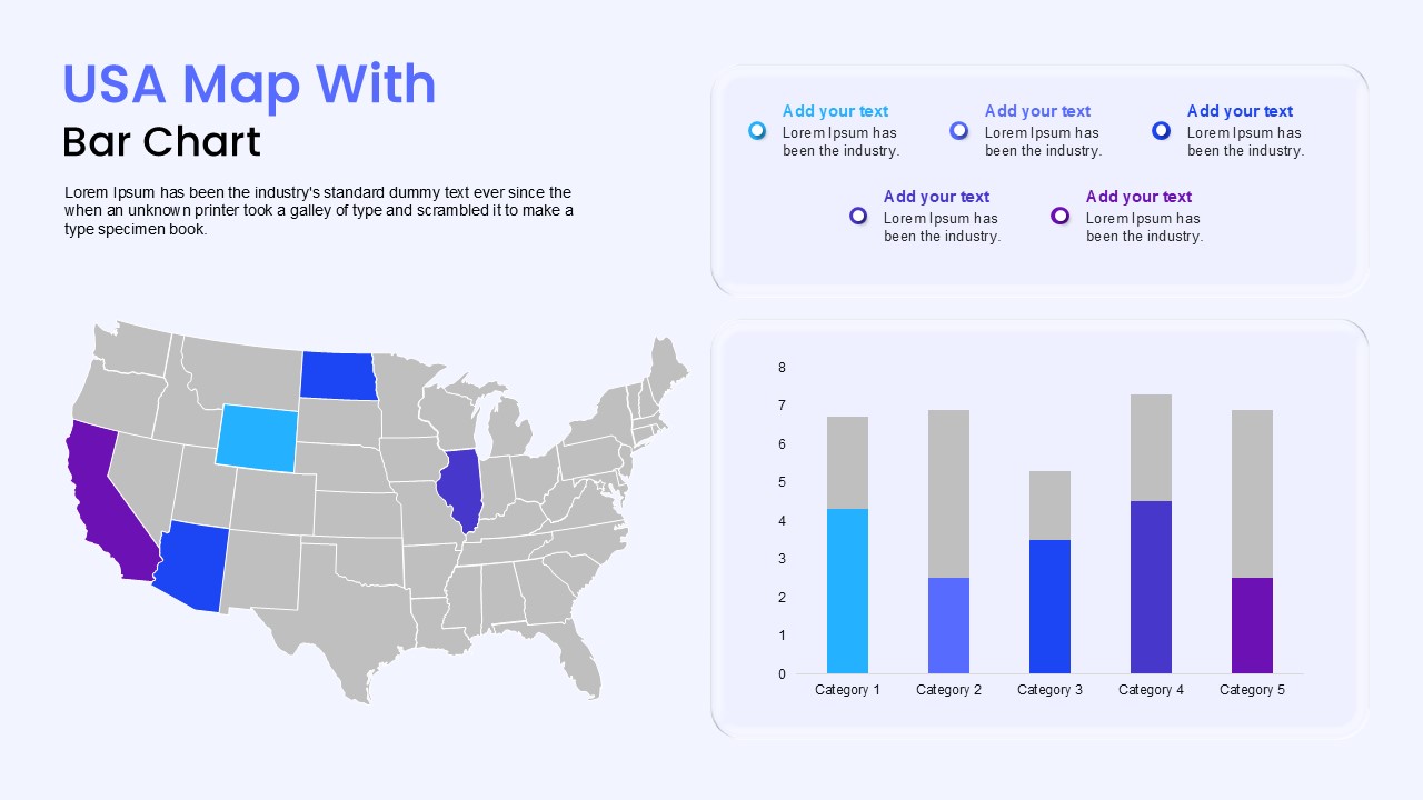
Breaking down regional sales, demographic reach, or state-level performance requires a clear link between geography and data metrics. Combining a detailed territory map with a stacked bar graph, this USA map with bar chart template gives commercial teams, market research analysts, and operations leads a clean way to report location-specific numbers alongside overall volume.
The side-by-side design links geographical target markets directly to quantitative results, keeping regional performance reports, expansion plans, and investor decks simple to follow.
Where This Framework Fits Best
- Regional Sales & Revenue Reviews: Compare quarterly revenue across key regional territories, highlighting top-performing states against national benchmarks.
- Market Expansion Planning: Present demographic data and market penetration levels to leadership before opening new regional hubs or retail locations.
- Supply Chain & Distribution Logistics: Track regional inventory levels, shipping volumes, or warehouse capacity across key domestic fulfillment corridors.
- Marketing Campaign Performance: Display state-level digital ad reach, customer acquisition costs, or lead generation figures during media reviews.
Slide Architecture and Visual Mechanics
Set against an open, light background, the presentation slide splits into two primary informational halves:
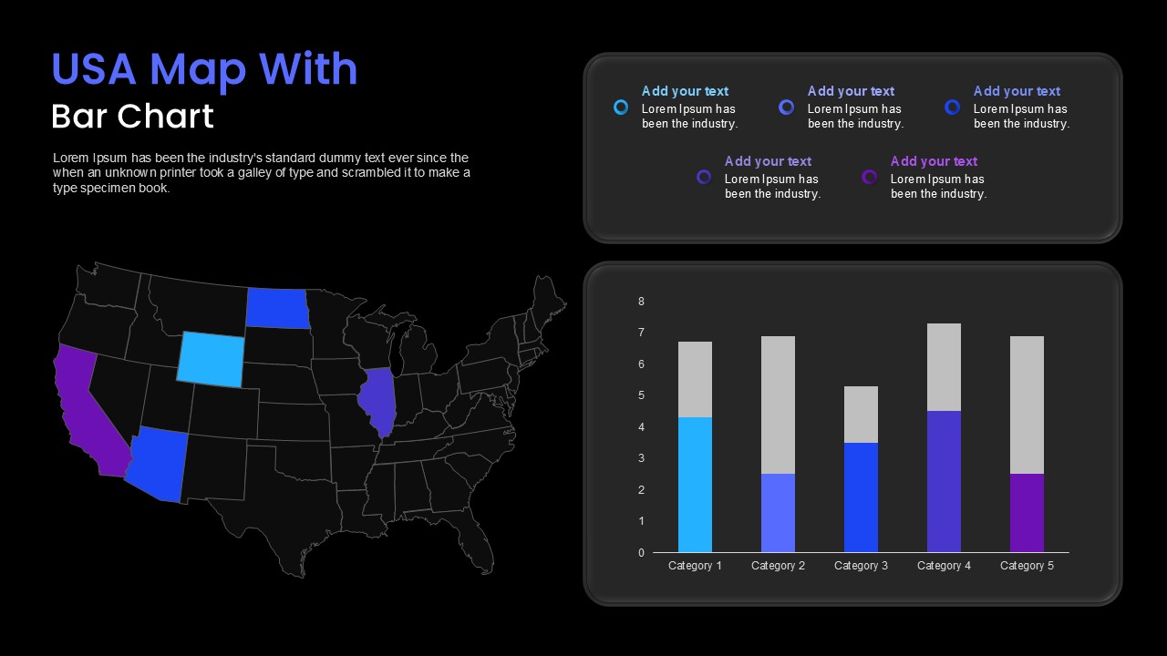
- Left Map Canvas: Features an editable United States vector map in neutral gray, with key focus states highlighted in bright cyan, royal blue, deep cobalt, and vibrant purple. Above the map sits a dedicated section for your primary headline and introductory context paragraph.
- Upper Legend Container: A rounded white card on the top right displays five color-coordinated text callouts with circular indicator rings, ideal for state names, regional KPIs, or short takeaway notes.
- Lower Data Chart: A matching white card beneath houses a vertical stacked bar chart (Categories 1 through 5), tracking values against an eight-point vertical axis. The colored base bars coordinate with the highlighted states on the map, while neutral gray top sections show total benchmarks or remaining capacity.
- 100% Vector Flexibility: Every state border, bar height, axis label, color fill, and text field uses fully editable vector elements compatible with Microsoft PowerPoint and Google Slides.
Check out our full collection of world map templates for presentations.
Login to download this file

Item ID
SB05453Designed By
Gopika


Related Templates

4th July USA Independence Day Template
Graphics
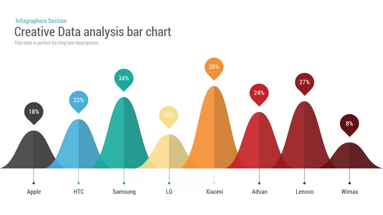
Creative Data Analysis Bar Chart template for PowerPoint & Google Slides
Bar/Column
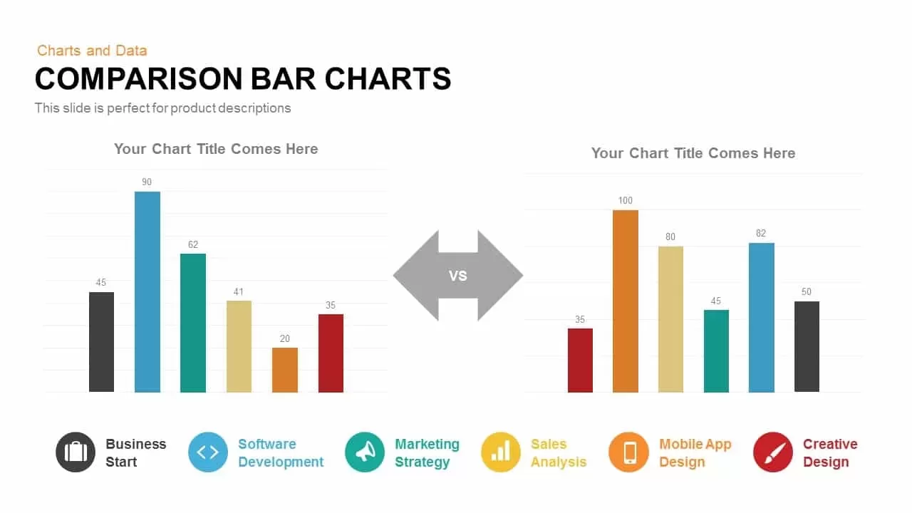
Comparison Bar Chart template for PowerPoint & Google Slides
Comparison Chart

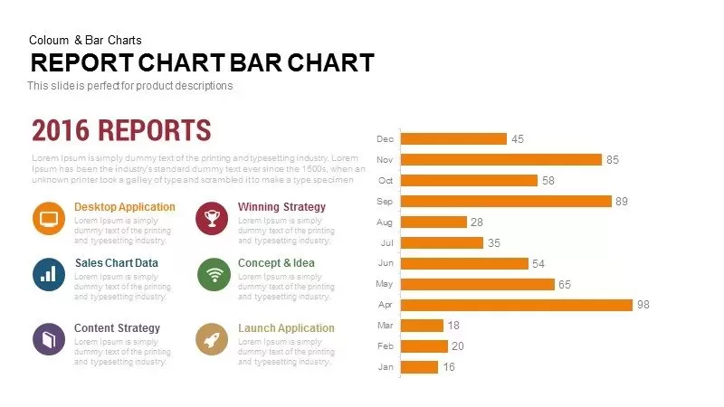
Monthly Reports Bar Chart template for PowerPoint & Google Slides
Bar/Column
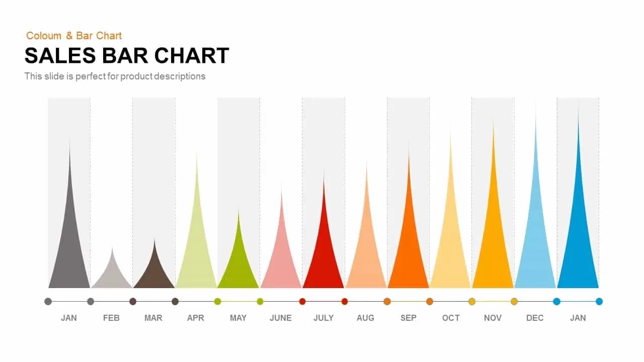
Sales Bar Chart Template for PowerPoint and Google slides
Bar/Column
Entertainment Industry Revenue Bar Chart Template for PowerPoint & Google Slides
Bar/Column
Multi-Series Stacked Bar Chart PowerPoint Template
Bar/Column
Simple Bar Chart Data Visualization Template for PowerPoint & Google Slides
Bar/Column
Waterfall Bar Chart Template for PowerPoint & Google Slides
Bar/Column
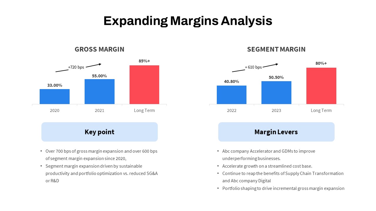
Expanding Margins Analysis Bar Chart Template for PowerPoint & Google Slides
Charts
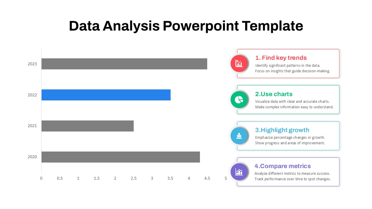
4-Step Data Analysis PowerPoint Template
Bar/Column
Free
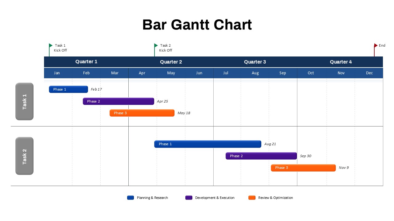
Bar Gantt Chart PowerPoint Template
Gantt Chart
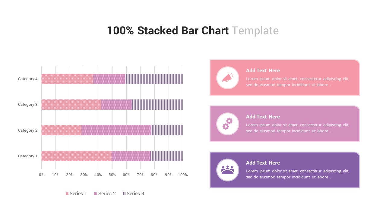
100% Stacked Bar Chart PowerPoint Template
Bar/Column
Pencil Bar Chart PowerPoint Template and Google Slide
Bar/Column
3D Bar Chart Infographics Template for PowerPoint Template
Bar/Column
3D Cylinder Bar Chart PowerPoint Template
Bar/Column

Radial Bar Chart Template for PowerPoint
Bar/Column
Data Bar Chart Template for PowerPoint and Keynote
Bar/Column
Distracting Factors at Work – Bar Chart Template for PowerPoint
Bar/Column
Clustered Bar Chart PowerPoint Template
Bar/Column