Simple Bar Chart Data Visualization Template for PowerPoint & Google Slides
Simple Bar Chart PowerPoint Template for Google Slides
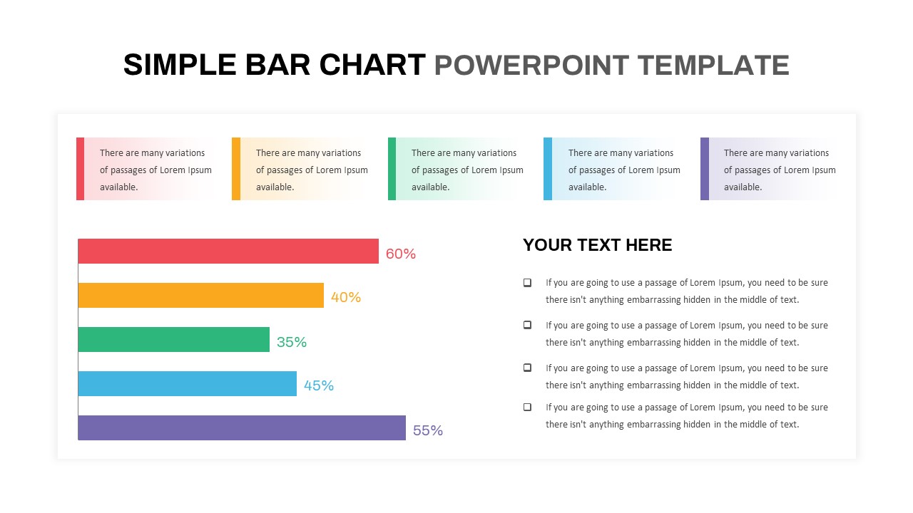
Presenting performance comparisons, survey results, or key metric trends requires a clean data visualization layout. A simple bar chart PowerPoint template gives business analysts, marketing managers, financial advisors, and project leads a direct framework to showcase percentage metrics and comparative data points. Featuring a five-tier horizontal bar graph paired with top category summary blocks and a dedicated commentary section, this slide turns quantitative data into an easy-to-read executive report.
Present Data Comparisons and Key Analytical Takeaways
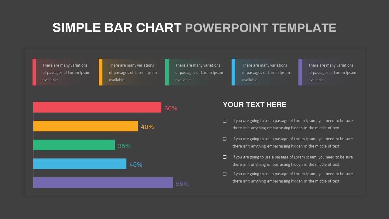
- Five-Tier Horizontal Bar Graph: Displays percentage metrics across five color-coded data bars in red (60%), yellow (40%), green (35%), light blue (45%), and purple (55%).
- Top Category Summary Cards: Five distinct accent cards corresponding to each color bar line the top of the slide to provide high-level category summaries.
- Side-by-Side Commentary Area: A dedicated right-hand text section with checkbox bullet points provides ample room to explain analytical insights, key takeaways, or strategic context.
- Balanced Visual Layout: Seamlessly pairs graphical data indicators with bulleted text boxes to maintain visual clarity without overcrowding the canvas.
- Fully Editable Graphics: Easily adjust bar lengths, update percentage values, modify color schemes, and replace placeholder text within this simple bar chart template across major slide platforms.
Whether you are delivering quarterly performance updates, presenting market research analysis, or reviewing operational metrics during executive syncs, this structured horizontal bar chart ensures your presentation data remains clear and professional.
Login to download this file

Item ID
SB03602


Related Templates

3D Cylinder Bar Chart Visualization Template for PowerPoint
Bar/Column
Waffle Chart Data Visualization Template for PowerPoint & Google Slides
Comparison Chart
Segmented Scatter Chart Data Visualization Template for PowerPoint & Google Slides
Business Strategy
Progress Bar and Milestone Visualization Template for PowerPoint & Google Slides
Timeline
Professional Heatmap Data Visualization Template for PowerPoint & Google Slides
Infographics
KPI Dashboard Data Visualization Template
Bar/Column
Creative Data Analysis Bar Chart template for PowerPoint & Google Slides
Bar/Column
Growth Curve Line Chart Visualization Template for PowerPoint & Google Slides
Charts
Dynamic Sunburst Chart Visualization Template for PowerPoint & Google Slides
Charts
Simple Area Chart Data Trends Analysis Template for PowerPoint & Google Slides
Comparison Chart
Data Bar Chart Template for PowerPoint and Keynote
Bar/Column
Balance Scale Metaphor PowerPoint Template
Comparison
Professional Risk Heat Map Visualization Template for PowerPoint & Google Slides
Risk Management
Kentucky County Map Visualization Template for PowerPoint & Google Slides
World Maps
Free Four Box Style Visualization PPT Template & Slides
Process
Free
Comparison Bar Chart template for PowerPoint & Google Slides
Comparison Chart
Entertainment Industry Revenue Bar Chart Template for PowerPoint & Google Slides
Bar/Column
Multi-Series Stacked Bar Chart PowerPoint Template
Bar/Column
Expanding Margins Analysis Bar Chart Template for PowerPoint & Google Slides
Charts
USA Map with Bar Chart Template for PowerPoint & Google Slides
World Maps