Professional Risk Heat Map Visualization Template for PowerPoint & Google Slides
Heat Map Presentation Template for PowerPoint & Google Slides
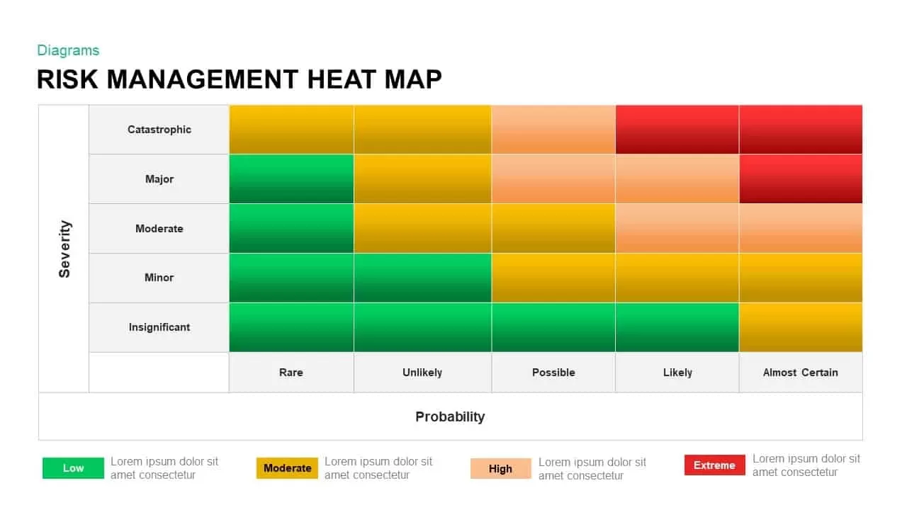
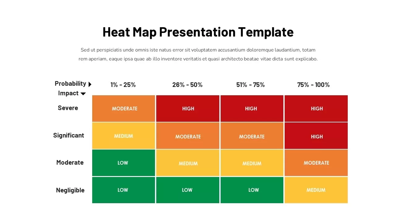
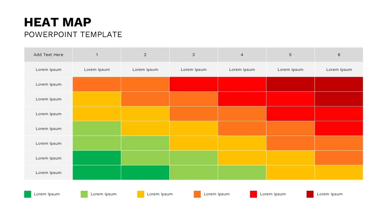
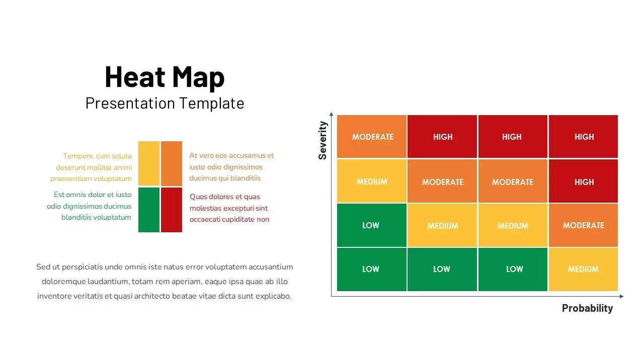
Evaluating project hazards, prioritizing compliance vulnerabilities, or presenting quantitative risk management models requires a clear analytical layout. A risk heat map slide gives project managers, operations leads, compliance officers, and risk directors an intuitive framework to plot potential threats. Combining a 4×4 matrix grid alongside a color-matched legend, this slide transforms complex probability assessments into an executive-ready presentation.
Map Operational Risk Levels with a 4×4 Probability Matrix
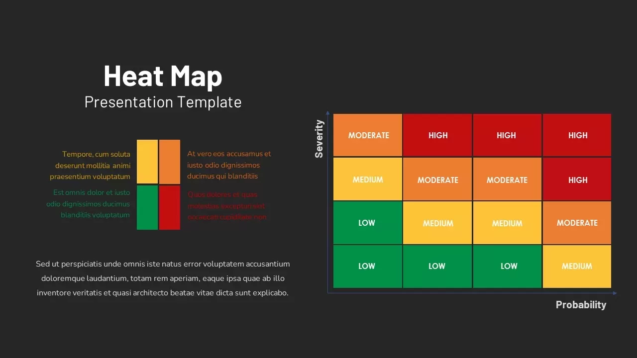
- Structured 4×4 Risk Matrix: Maps risk severity against probability across sixteen distinct color-coded cells, establishing a clear visual evaluation grid.
- Intuitive Color Gradient Coding: Utilizes a four-tier color scheme to categorize risk levels instantly, moving from green (Low) and yellow (Medium) to orange (Moderate) and deep red (High).
- Clear Axis Indicators: Labeled vertical “Severity” and horizontal “Probability” axes provide quick orientation for team discussions.
- Side-by-Side Legend Block: Features a 2×2 color block key flanked by dedicated text fields, offering space for detailed risk definitions or category notes.
- Fully Editable Component Layout: Adjust grid dimensions, update text headers, modify color thresholds, and customize copy effortlessly across major presentation platforms.
Whenever your team needs to conduct quarterly risk audits, review compliance measures, or present executive threat reports, this heat map template ensures your analytical findings remain structured, clear, and visually compelling.
Login to download this file

Item ID
SB02909


Related Templates

Risk Management Heat Map Diagram Template for PowerPoint & Google Slides
Comparison Chart
Heat Map Infographic Template For Risk Assessment and Priority Analysis
Comparison Chart
Professional Heatmap Data Visualization Template for PowerPoint & Google Slides
Infographics
Kentucky County Map Visualization Template for PowerPoint & Google Slides
World Maps
Heat Map Template for PowerPoint
Bar/Column
Heat Map Slide for PowerPoint For Presentation
Maps
Heat Map Infographics Template
Risk Management
Heat Map Template
Risk Management
Heat Map Template for Presentations
Comparison Chart
Balance Scale Metaphor PowerPoint Template
Comparison
Waffle Chart Data Visualization Template for PowerPoint & Google Slides
Comparison Chart
Stacked Column Chart Template
Bar/Column
Free
Simple Bar Chart Data Visualization Template for PowerPoint & Google Slides
Bar/Column
Growth Curve Line Chart Visualization Template for PowerPoint & Google Slides
Charts
Progress Bar and Milestone Visualization Template for PowerPoint & Google Slides
Timeline
Dynamic Sunburst Chart Visualization Template for PowerPoint & Google Slides
Charts
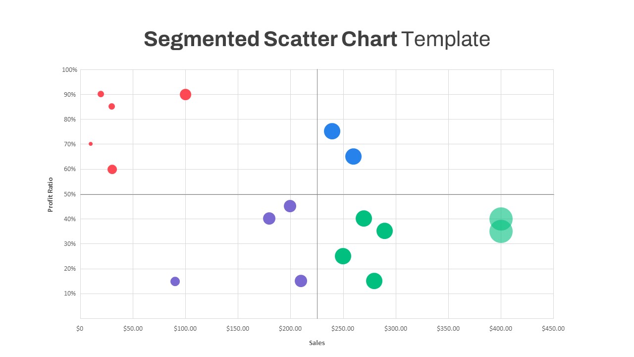
Segmented Scatter Chart Data Visualization Template for PowerPoint & Google Slides
Business Strategy
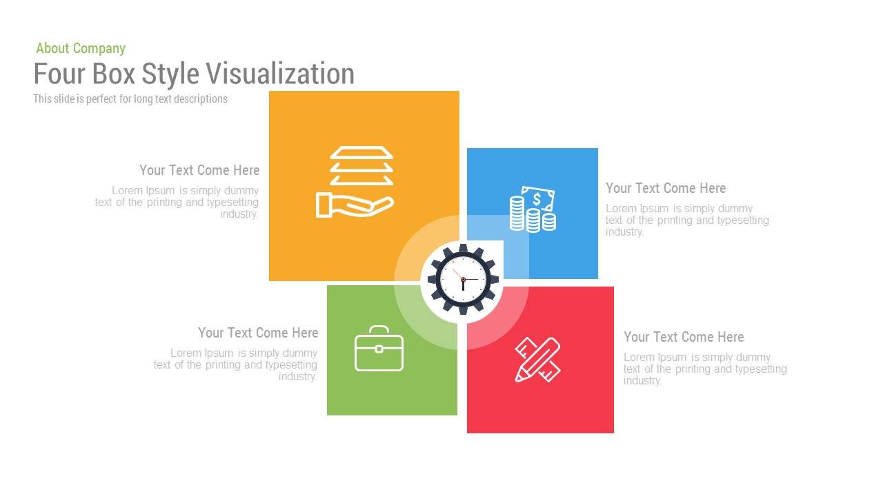
Free Four Box Style Visualization PPT Template & Slides
Process
Free
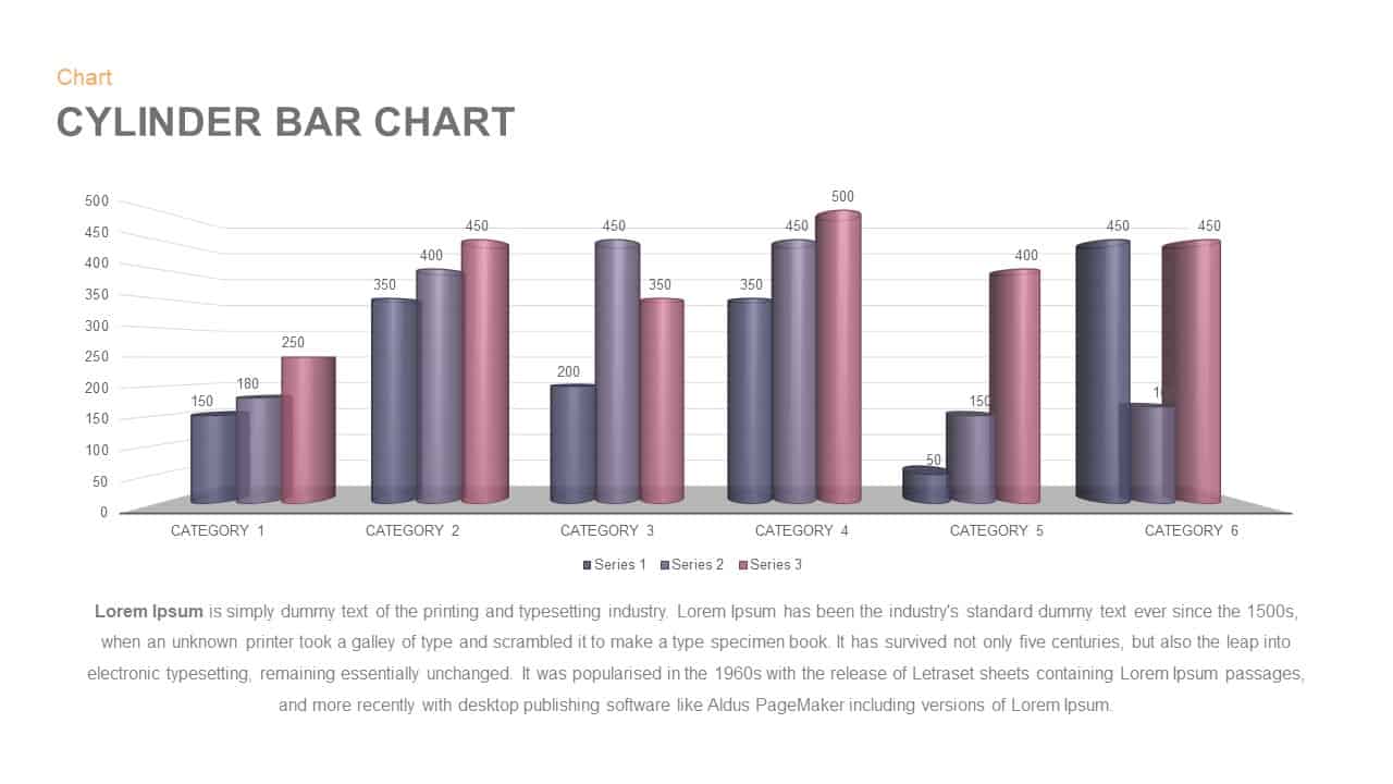
3D Cylinder Bar Chart Visualization Template for PowerPoint
Bar/Column
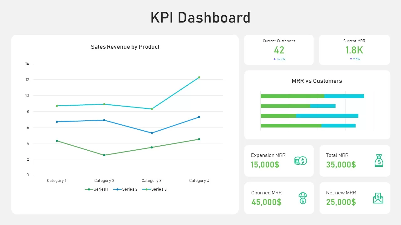
KPI Dashboard Data Visualization Template
Bar/Column