Professional Heatmap Data Visualization Template for PowerPoint & Google Slides
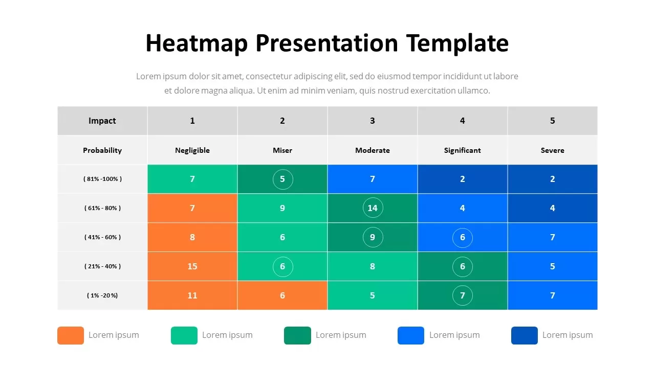
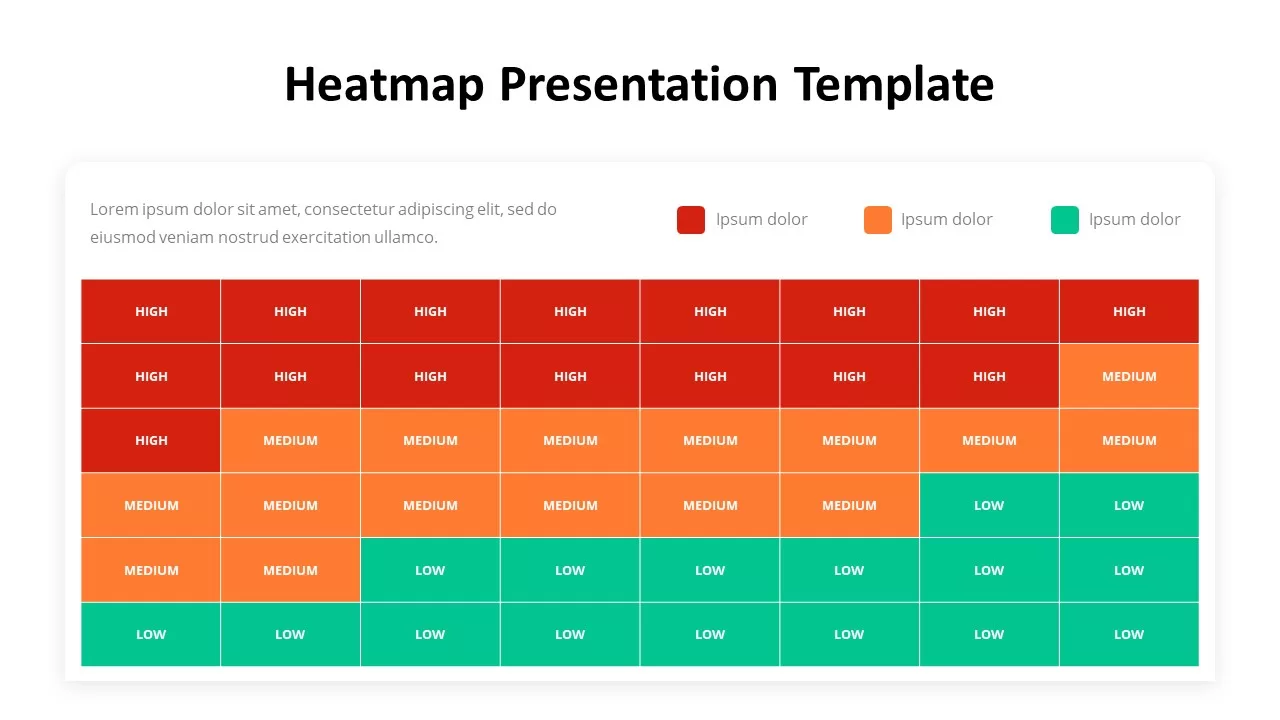
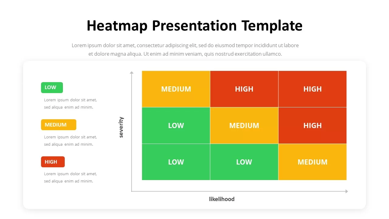
Heatmap Presentation Template for PowerPoint & Google Slides
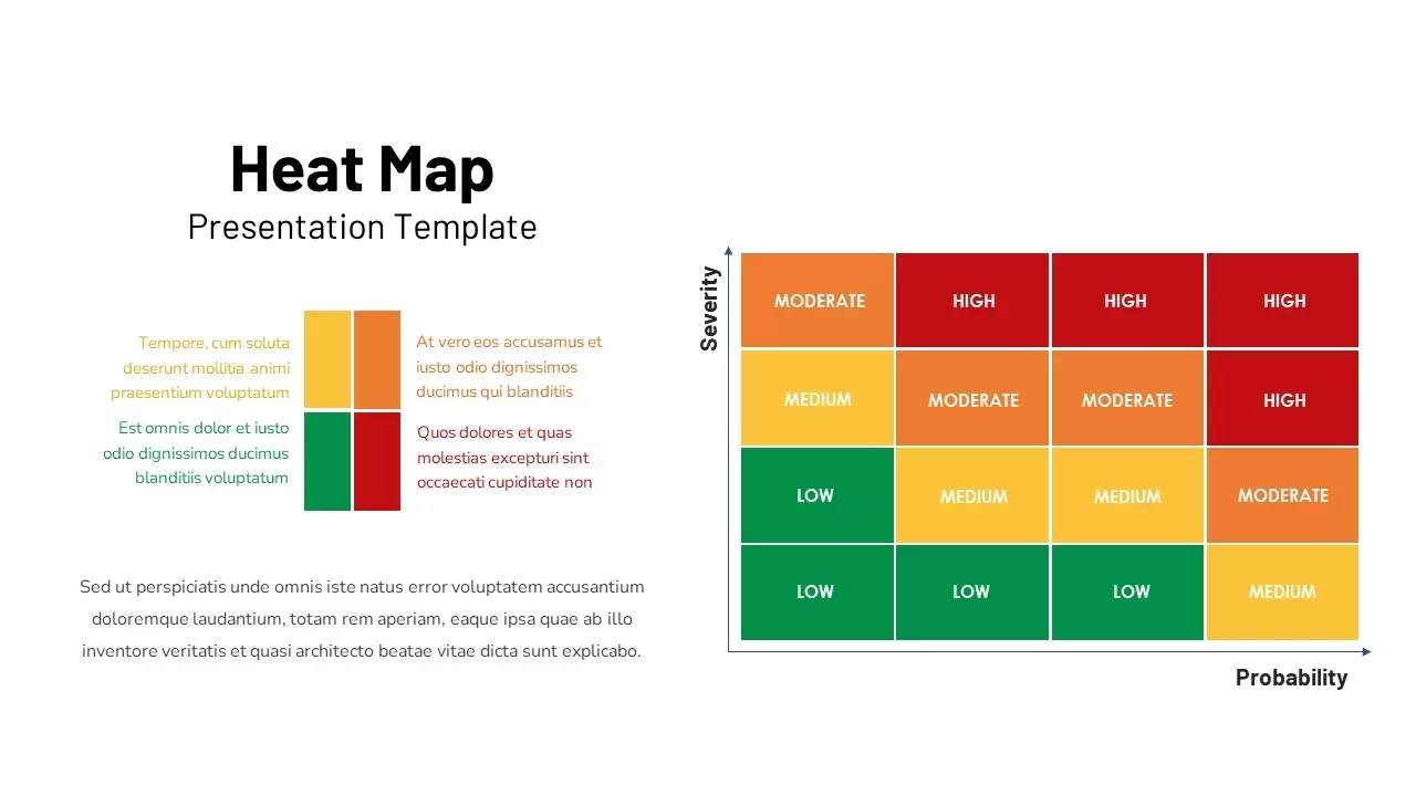
Visualizing risk matrices, user activity concentration, or multi-variable performance data requires a clear structure that translates complex numbers into immediate visual insights. Standard numerical tables often obscure critical high-and-low intensity trends, leaving team members and stakeholders hunting through raw figures to spot patterns. Incorporating a dedicated heatmap presentation template provides risk officers, data analysts, and product managers with a clean grid matrix to present density analytics and comparative assessments side by side.
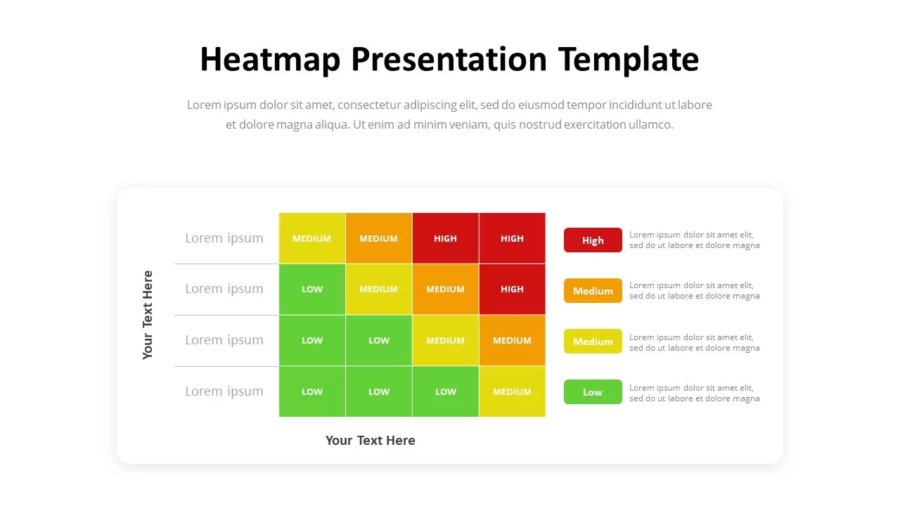
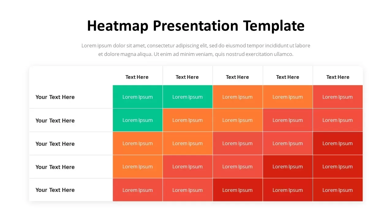
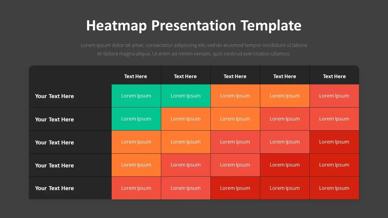
Structured as a five-by-five grid layout, the template organizes data points across a distinct color-coded gradient scale. Green cells highlight low-risk or high-performing zones, shifting through orange and lighter red tones to dark red blocks that signify high intensity or severe critical thresholds. Clear row and column headers anchor the top and left margins, giving you structured space to cross-examine variables, operational categories, or impact levels across your dataset.
Customizing this analytical matrix takes minimal effort across both PowerPoint and Google Slides. Every grid cell, header label, background block, and text placeholder is a fully editable component. You can easily adjust color gradients to match corporate reporting guidelines, modify matrix dimensions, and update text values in a few quick clicks to build a clear, data-driven presentation.
Login to download this file

Item ID
SB03028


Related Templates

Professional Risk Heat Map Visualization Template for PowerPoint & Google Slides
Risk Management
Waffle Chart Data Visualization Template for PowerPoint & Google Slides
Comparison Chart
Stacked Column Chart Template
Bar/Column
Free
Simple Bar Chart Data Visualization Template for PowerPoint & Google Slides
Bar/Column
Segmented Scatter Chart Data Visualization Template for PowerPoint & Google Slides
Business Strategy
KPI Dashboard Data Visualization Template
Bar/Column
Risk Assessment Heatmap Matrix Template
Comparison Chart
Risk Heatmap Comparison Template
Maps
Heatmap Comparison Template for PowerPoint & Google Slides
Maps
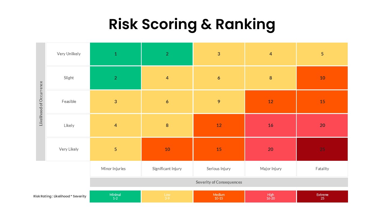
Risk Scoring & Ranking Heatmap PowerPoint Template
Risk Management
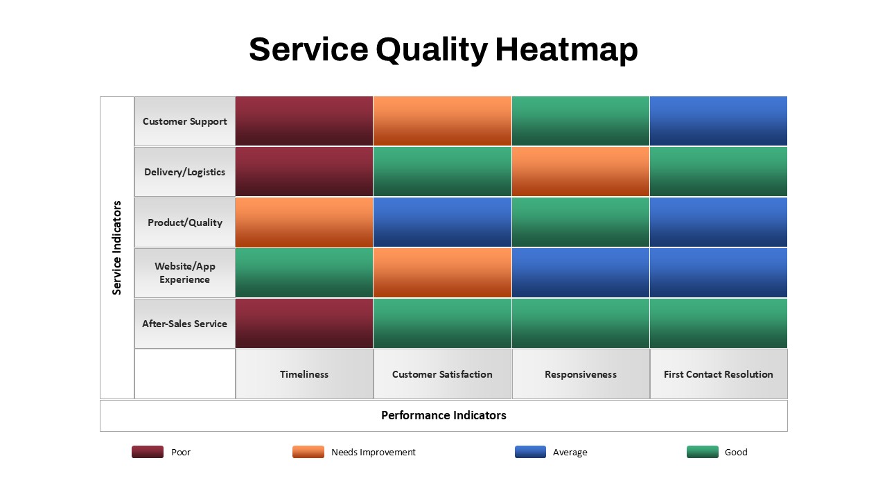
Service Quality Heatmap Template for PowerPoint & Google Slides
Business
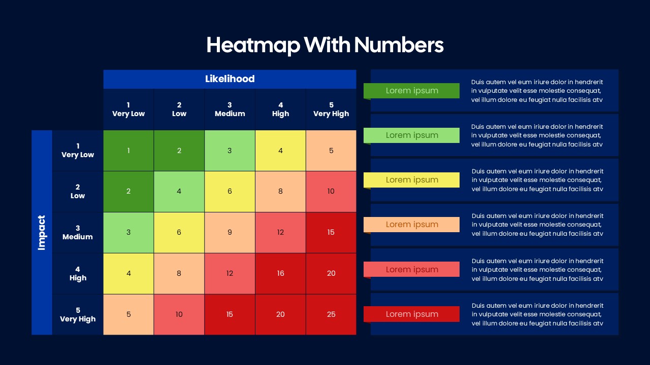
Heatmap Matrix with Numbers for PowerPoint and Google Slides
Project
Heatmap Template
Maps
Balance Scale Metaphor PowerPoint Template
Comparison
Growth Curve Line Chart Visualization Template for PowerPoint & Google Slides
Charts
Progress Bar and Milestone Visualization Template for PowerPoint & Google Slides
Timeline
Dynamic Sunburst Chart Visualization Template for PowerPoint & Google Slides
Charts
Kentucky County Map Visualization Template for PowerPoint & Google Slides
World Maps
Free Four Box Style Visualization PPT Template & Slides
Process
Free
3D Cylinder Bar Chart Visualization Template for PowerPoint
Bar/Column