Dynamic Sunburst Chart Visualization Template for PowerPoint & Google Slides
Sunburst Chart PowerPoint and Google Slides Template
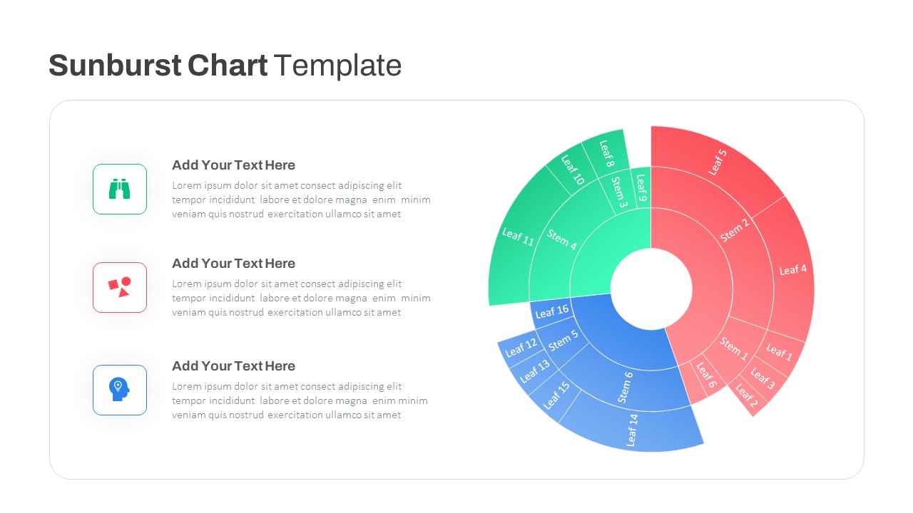
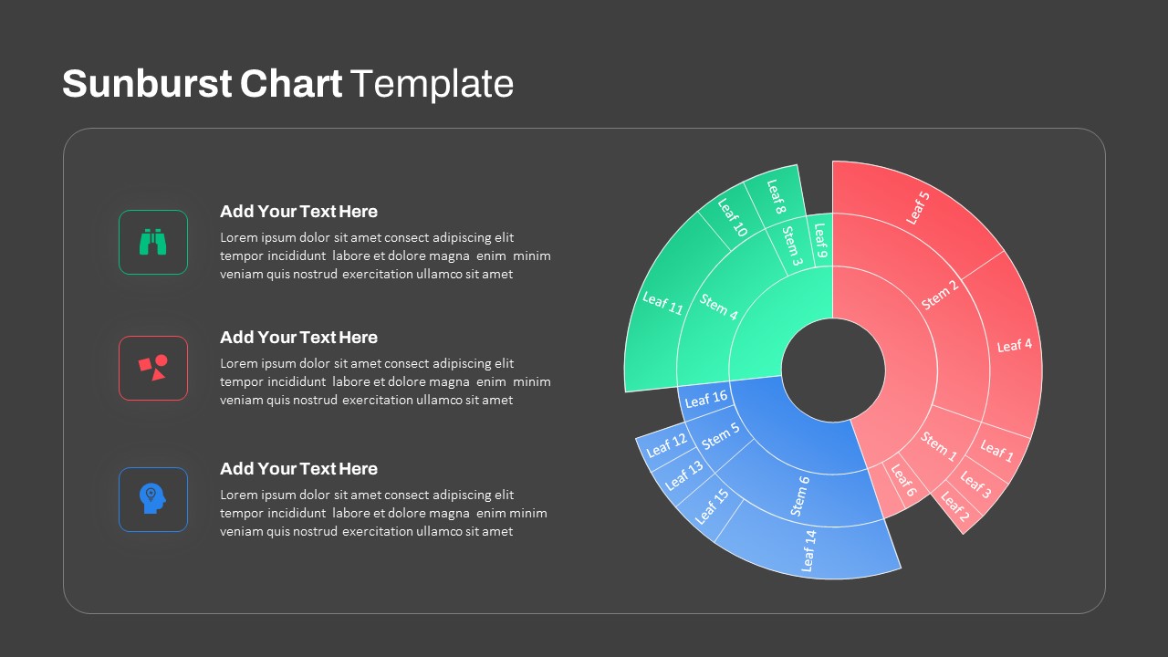
Visualizing multi-level hierarchical data, breaking down departmental budgets, or mapping parent-child category relationships works best with an intuitive radial diagram. A sunburst chart represents data trees through concentric rings, where each inner ring displays parent categories and radiating outer segments show child subdivisions. This slide template gives business analysts, data scientists, financial planners, and project managers a clean visual structure to present nested structures, market segmentations, and organizational breakdowns clearly.
Key slide components and visual highlights include:
- A multi-tiered radial sunburst chart on the right showing hierarchical layers branching outward across primary stems and outer leaf segments.
- Three primary color-coded categories dividing the radial structure: coral red for the dominant sector, bright emerald green for the secondary division, and sky blue for the third branch.
- Concentric segmented arcs showing proportion and hierarchy, complete with sample segment labels tracking from inner stem nodes to outer leaves.
- Three stacked descriptive text blocks on the left, each paired with a dedicated header and space for analytical findings or category definitions.
- Rounded square icon containers framing line art symbols for exploration, structural components, and strategic insights.
- A high-contrast presentation card set against a soft, clean backdrop to keep complex hierarchical slices clear on monitors and projectors.
- Fully editable vector components in PowerPoint and Google Slides, letting you adjust arc angles, customize category colors, swap icons, and update data labels directly.
Login to download this file

Item ID
SB03843


Related Templates

Waffle Chart Data Visualization Template for PowerPoint & Google Slides
Comparison Chart
Stacked Column Chart Template
Bar/Column
Free
Simple Bar Chart Data Visualization Template for PowerPoint & Google Slides
Bar/Column
Growth Curve Line Chart Visualization Template for PowerPoint & Google Slides
Charts
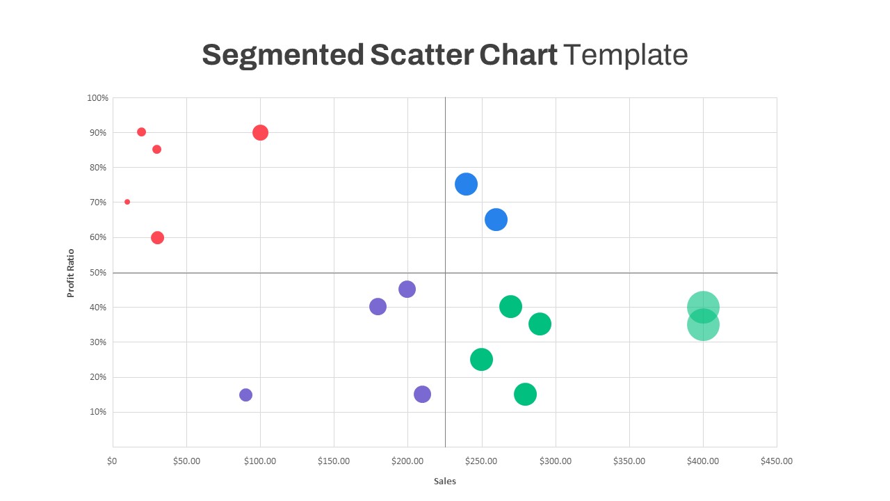
Segmented Scatter Chart Data Visualization Template for PowerPoint & Google Slides
Business Strategy
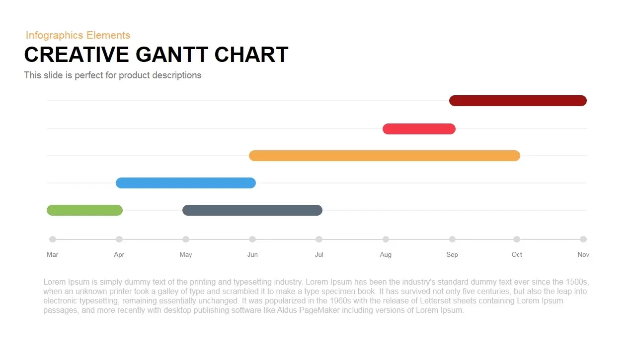
Creative Dynamic Gantt Chart Timeline Template for PowerPoint & Google Slides
Timeline
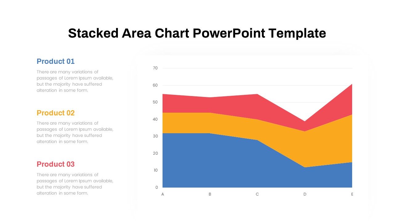
Dynamic Three-Series Stacked Area Chart Template for PowerPoint & Google Slides
Comparison Chart
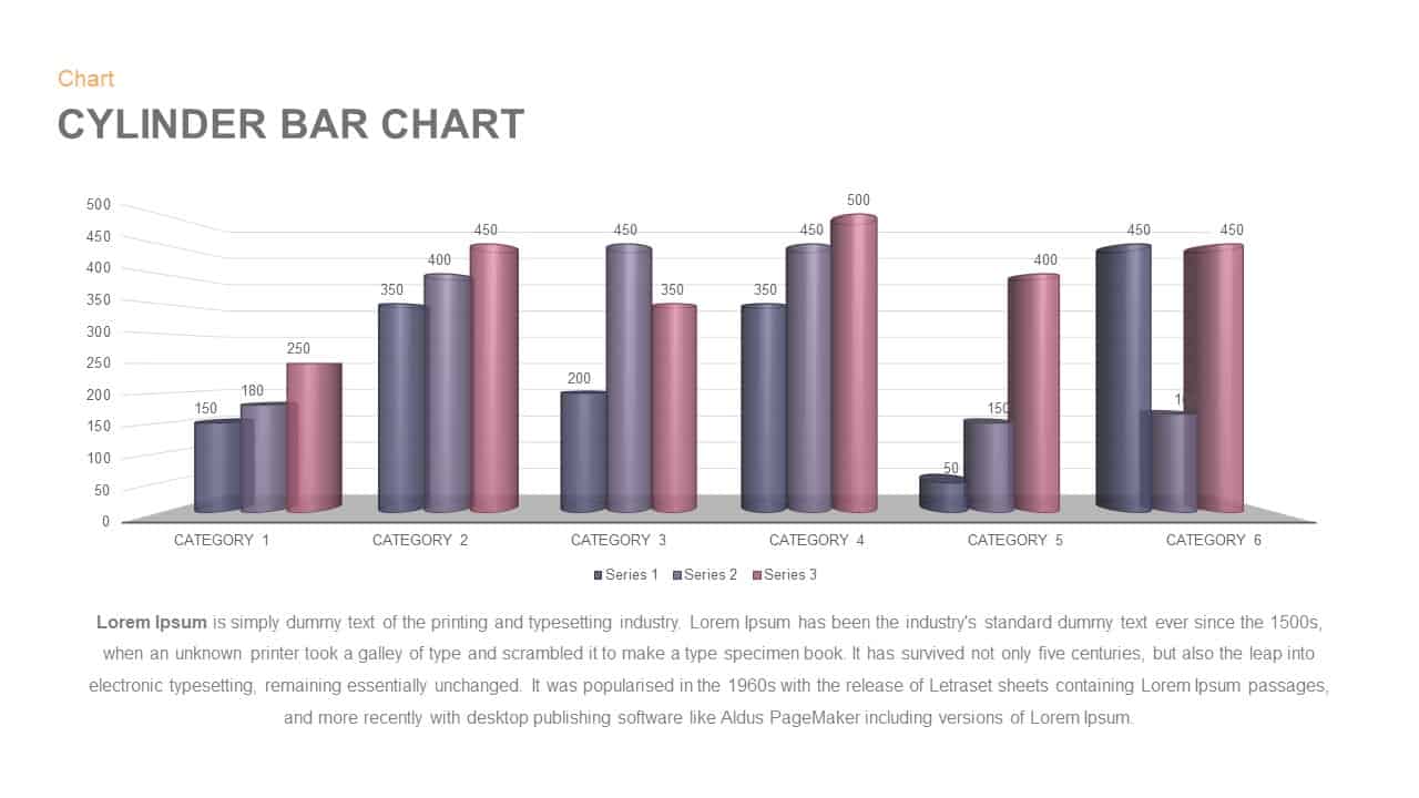
3D Cylinder Bar Chart Visualization Template for PowerPoint
Bar/Column
Balance Scale Metaphor PowerPoint Template
Comparison
Professional Risk Heat Map Visualization Template for PowerPoint & Google Slides
Risk Management
Professional Heatmap Data Visualization Template for PowerPoint & Google Slides
Infographics
Progress Bar and Milestone Visualization Template for PowerPoint & Google Slides
Timeline
Kentucky County Map Visualization Template for PowerPoint & Google Slides
World Maps
Free Four Box Style Visualization PPT Template & Slides
Process
Free

Dynamic Arrow Process Template for PowerPoint & Google Slides
Process

Dynamic 4 Gear Process Diagram Template for PowerPoint & Google Slides
Process
Dynamic Growth Arrow Step Infographic Template for PowerPoint & Google Slides
Process
Dynamic Statistics & Progress Charts Template for PowerPoint & Google Slides
Pie/Donut
Dynamic 3D Rubik’s Cube Diagram Pack Template for PowerPoint & Google Slides
Infographics
Dynamic Carousel Icon Hub Diagram PowerPoint
Circular