Dynamic Three-Series Stacked Area Chart Template for PowerPoint & Google Slides
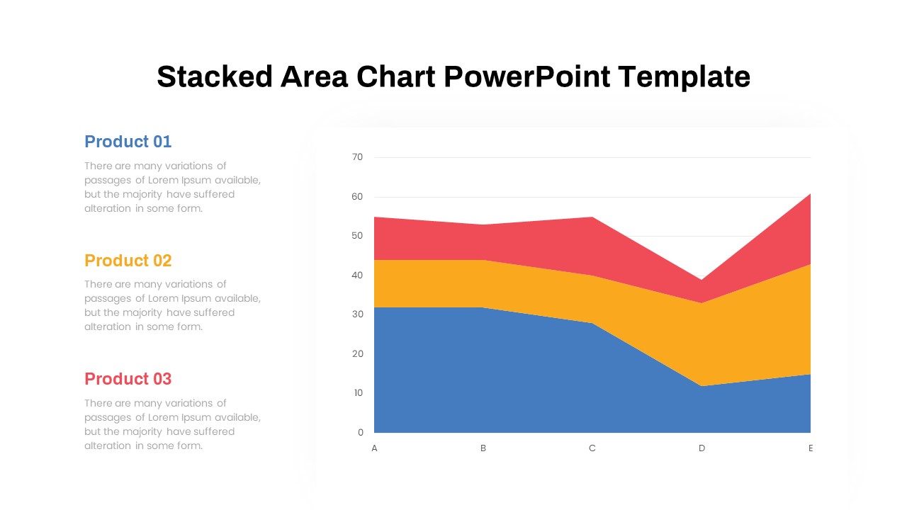
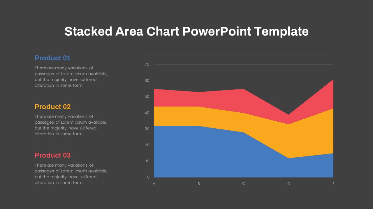
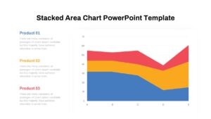
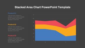
Stacked Area Chart PowerPoint and Google Slides Template
Visualizing cumulative trends over time requires a clean design that makes complex numerical data simple to understand. A stacked area chart allows data analysts, financial managers, and business strategists to compare multiple variables while demonstrating their contribution to a total sum. Using standard line graphs can often clutter a deck, but area graphs clearly showcase volume changes across sales metrics, revenue streams, or product line performances over distinct periods.
Key benefits and features of these data visualization slides include:
- Clear color-coded layers that easily distinguish individual metrics like Product 01, Product 02, and Product 03.
- Structured layout with dedicated text space alongside the chart for key takeaways, insights, or executive summaries.
- Simple customization options to adjust data values, color palettes, and axis labels directly within your preferred editor.
- Ideal for presenting quarterly sales breakdowns, market share expansion, and resource allocation over time.
Login to download this file

Item ID
SB03771


Related Templates

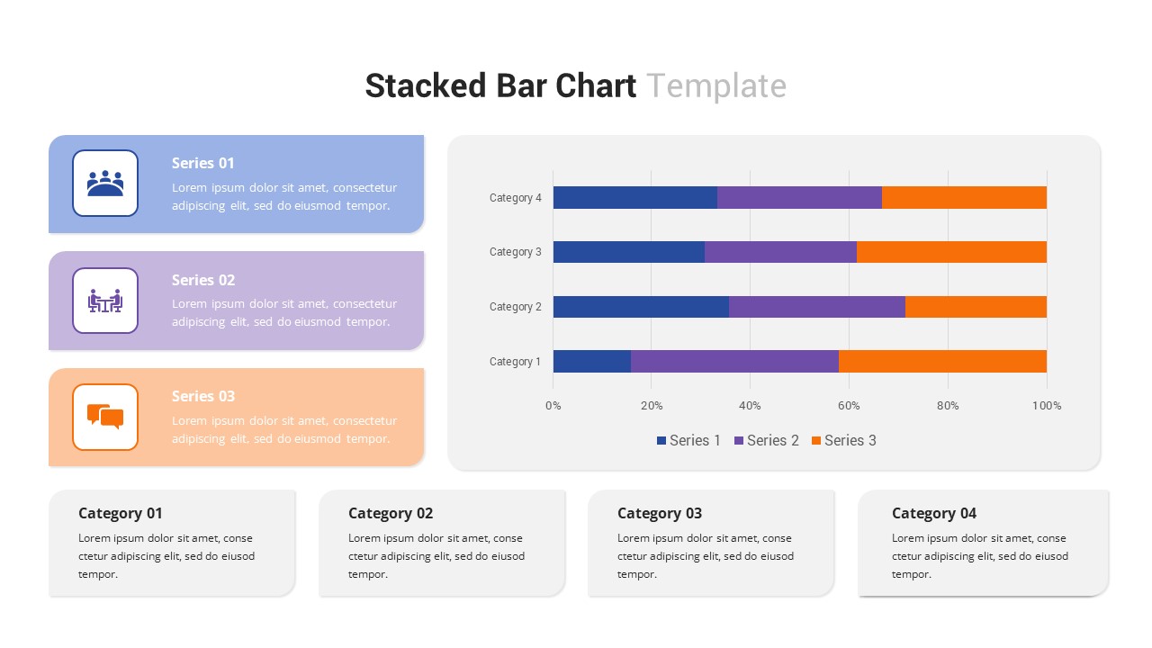
Multi-Series Stacked Bar Chart PowerPoint Template
Bar/Column
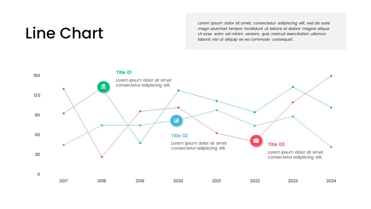
Multi-Series Line Chart with Icons Template for PowerPoint & Google Slides
Comparison Chart
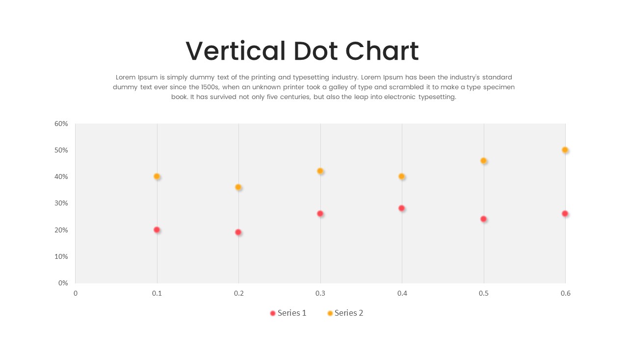
Multi-Series Vertical Dot Chart Template for PowerPoint
Comparison Chart
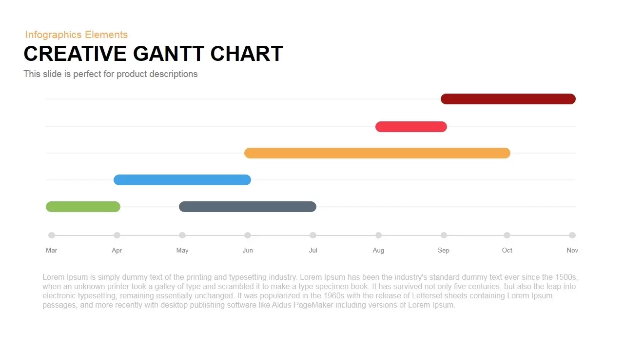
Creative Dynamic Gantt Chart Timeline Template for PowerPoint & Google Slides
Timeline
Dynamic Sunburst Chart Visualization Template for PowerPoint & Google Slides
Charts
Stacked Column Chart Template
Bar/Column
Free
100% Stacked Bar Chart PowerPoint Template
Bar/Column
Animated Stacked Bar Chart PowerPoint Template
Bar/Column
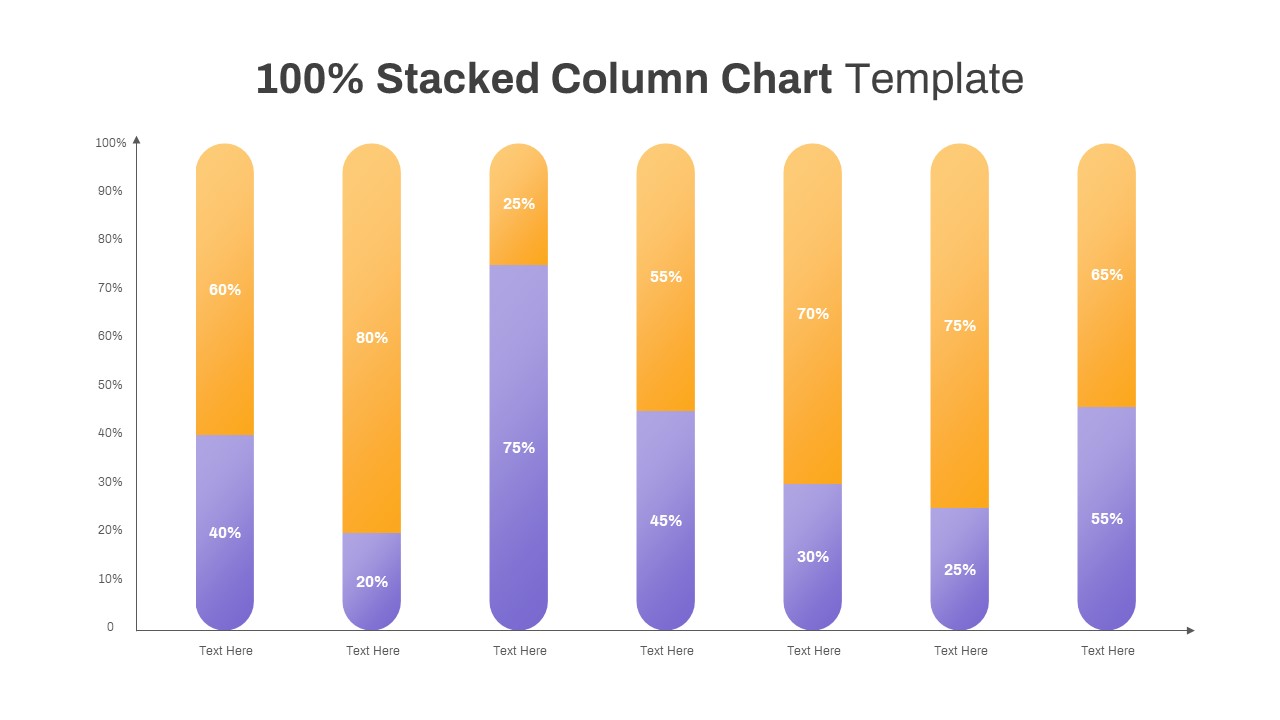
100% Stacked Column Chart PowerPoint Template
Bar/Column
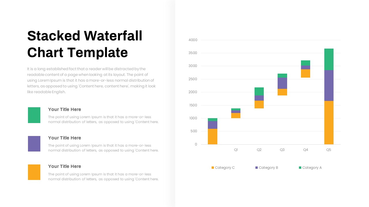
Stacked Waterfall Chart PowerPoint Template
Bar/Column
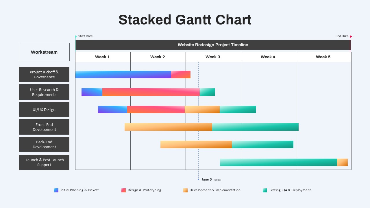
Stacked Gantt Chart PowerPoint Template
Gantt Chart
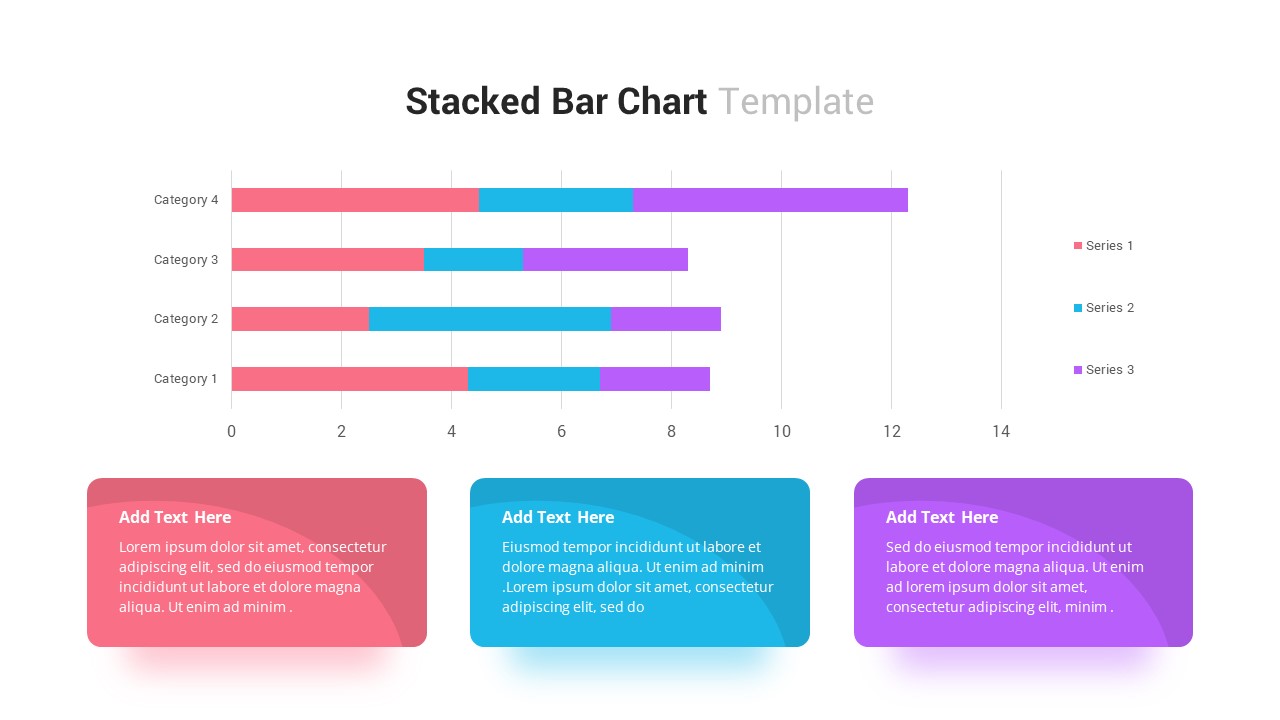
Stacked Bar Chart Template
Bar/Column
Dynamic Shield Process Flow Diagram template for PowerPoint & Google Slides
Process
Dynamic Growth Arrow Step Infographic Template for PowerPoint & Google Slides
Process
Dynamic Curved Arrow Process Roadmap Template for PowerPoint & Google Slides
Process
Dynamic Four-Step Gear Process Template for PowerPoint & Google Slides
Process

Free Global Warming PowerPoint Presentation Template
Pitch Deck
Free
Dynamic Carousel Icon Hub Diagram PowerPoint
Circular
Project Status Presentation Template
Project Status
Dynamic Creative Optimization Marketing Template for PowerPoint & Google Slides
Digital Marketing