Multi-Series Line Chart with Icons Template for PowerPoint & Google Slides
Multi-Series Line Chart with Icons Template for PowerPoint & Google Slides
Tracking comparative performance trends, multi-product revenue growth, or multi-year financial metrics requires a clean analytical layout that makes complex data points easy to digest. Dense spreadsheets and unformatted graphs often obscure critical inflection points, leaving stakeholders searching through raw numbers to spot key business shifts. Incorporating a dedicated multi-series line chart template gives financial analysts, project managers, and growth strategists a clear visual framework to track comparative datasets across consecutive timeline periods.
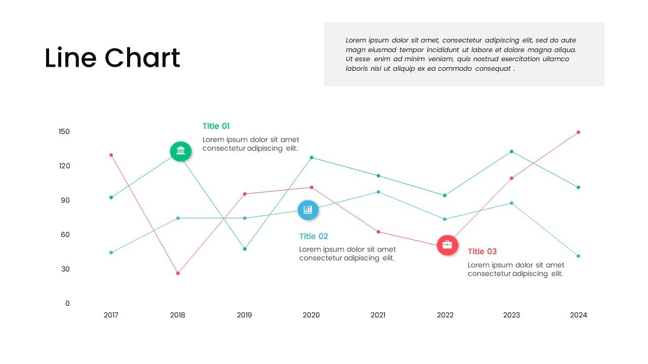
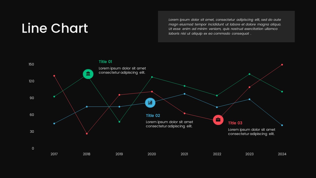
Spanning horizontally across the lower section, a multi-line graph plots three distinct data series in green, blue, and coral red across a timeline from 2017 to 2024. Circular icon badges highlight specific inflection points on each line, serving as visual anchors that connect directly to adjacent title callouts and brief text explanations. A prominent grey text container positioned in the upper right provides additional room for high-level commentary, executive summaries, or key analytical takeaways.
Customizing this multi-series data layout takes minimal effort across both PowerPoint and Google Slides. Every trend line, data point node, icon badge, vector shape, and text box is a fully editable component. You can easily adjust color palettes to match corporate brand standards, update data plot positions, swap out line icons, and refine descriptive text blocks in just a few quick clicks.
Login to download this file

Item ID
SB03711


Related Templates

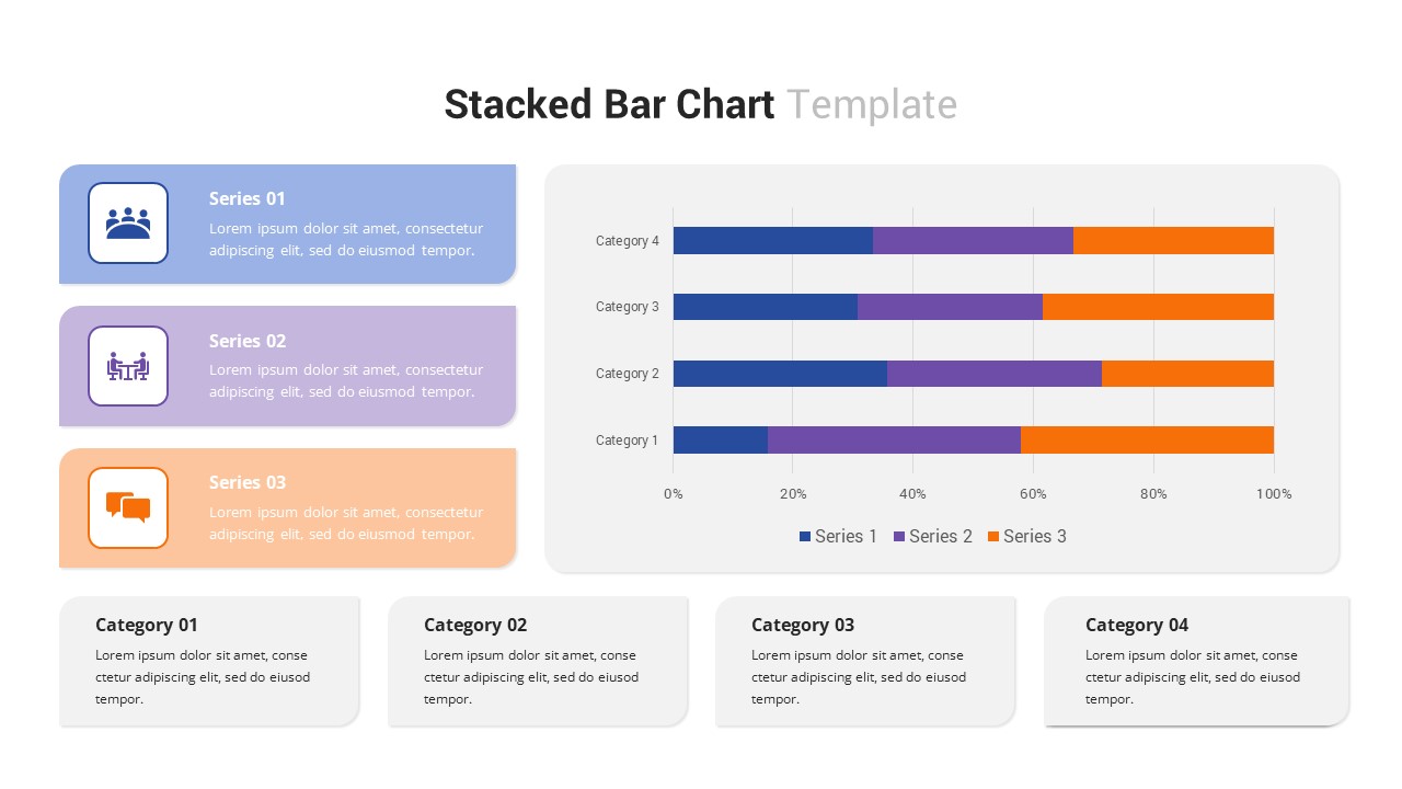
Multi-Series Stacked Bar Chart PowerPoint Template
Bar/Column
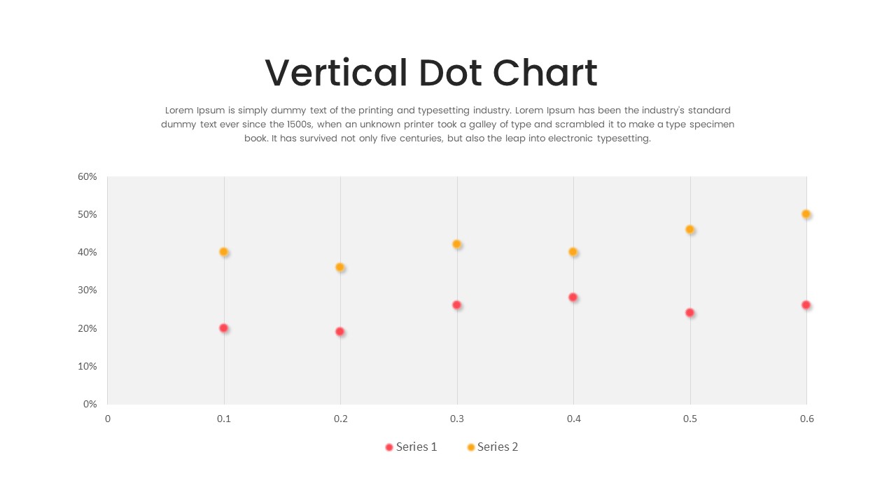
Multi-Series Vertical Dot Chart Template for PowerPoint
Comparison Chart
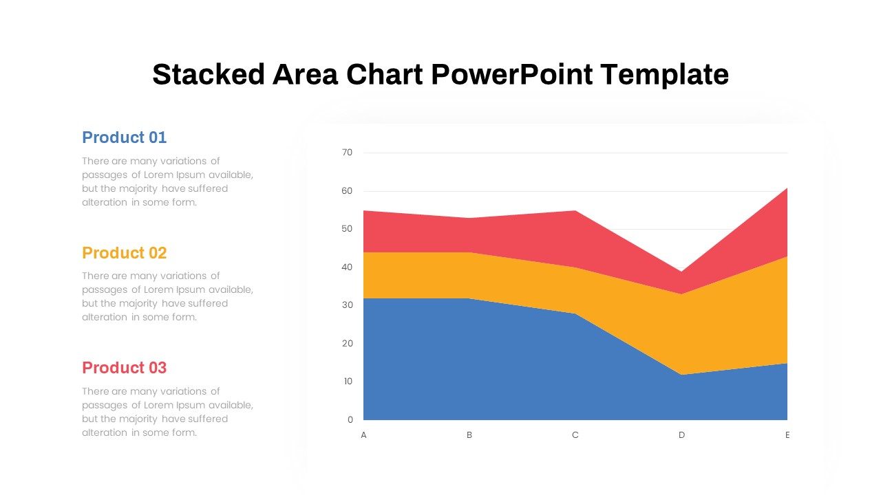
Dynamic Three-Series Stacked Area Chart Template for PowerPoint & Google Slides
Comparison Chart
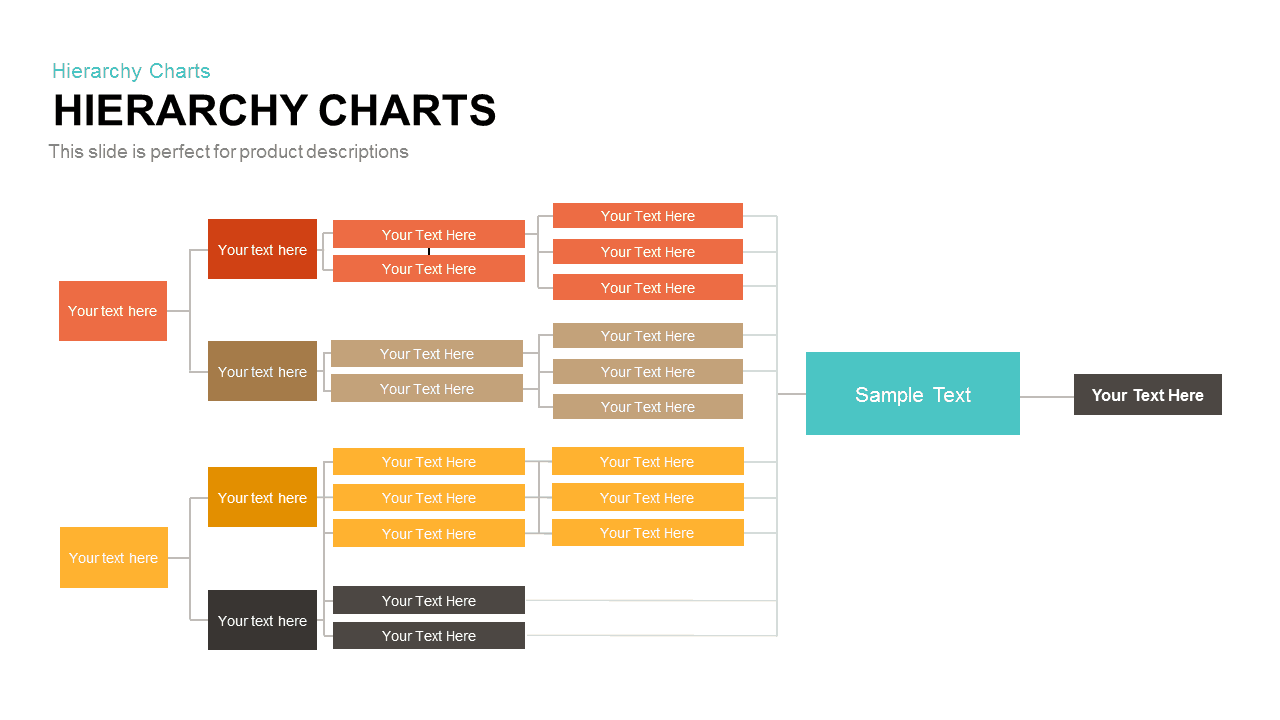
Horizontal Multi-Level Hierarchy Chart template for PowerPoint & Google Slides
Org Chart
Minimal Multi-Year Column Chart Template for PowerPoint & Google Slides
Bar/Column
Modern Multi-Color Polar Chart Diagram Template for PowerPoint & Google Slides
Charts

Line Chart Analysis PowerPoint Template and Google Slides
Charts

Application Revenue Line Chart KPI Template
Revenue
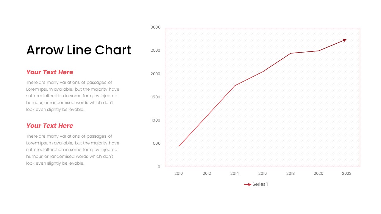
Arrow Line Chart Template
Comparison Chart
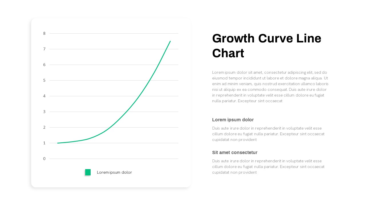
Growth Curve Line Chart Visualization Template for PowerPoint & Google Slides
Charts
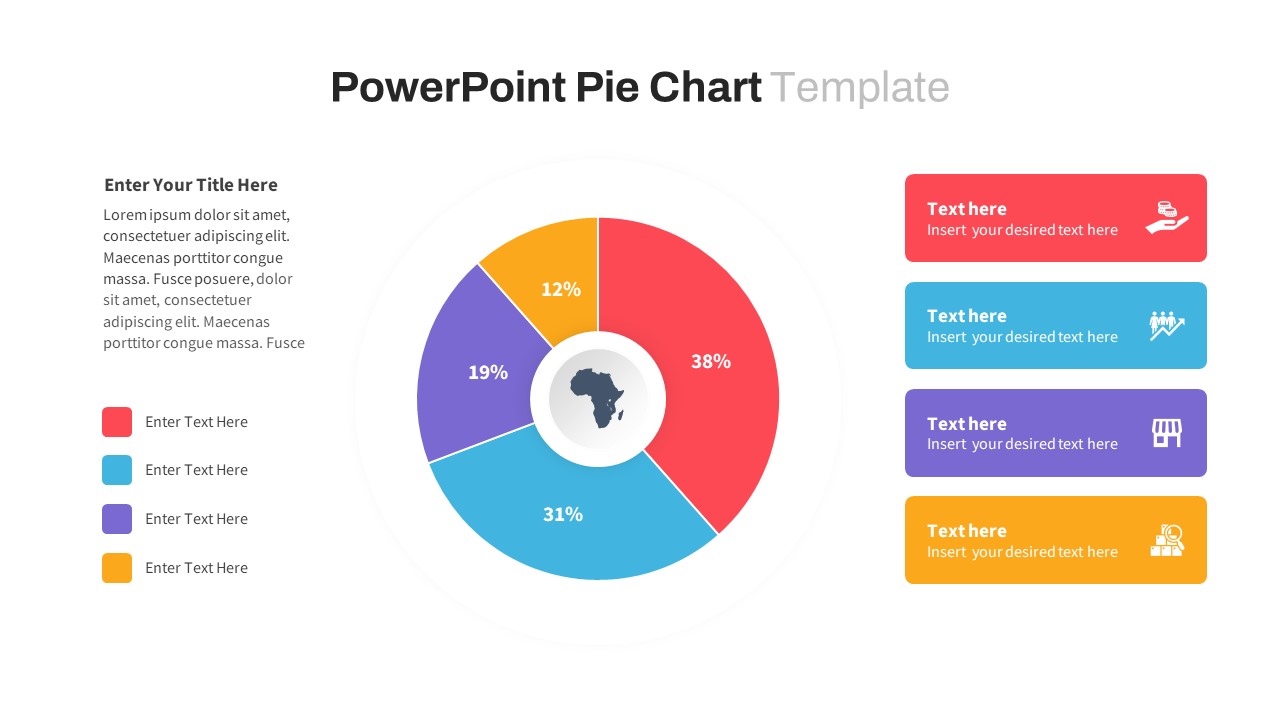
Segmented Pie Chart Infographic with Icons for PowerPoint & Google Slides
Pie/Donut
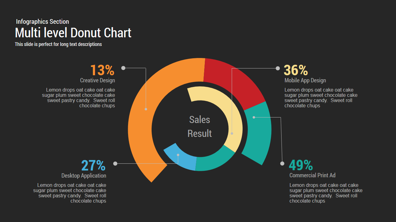
Multi level Donut Chart Template
Pie/Donut
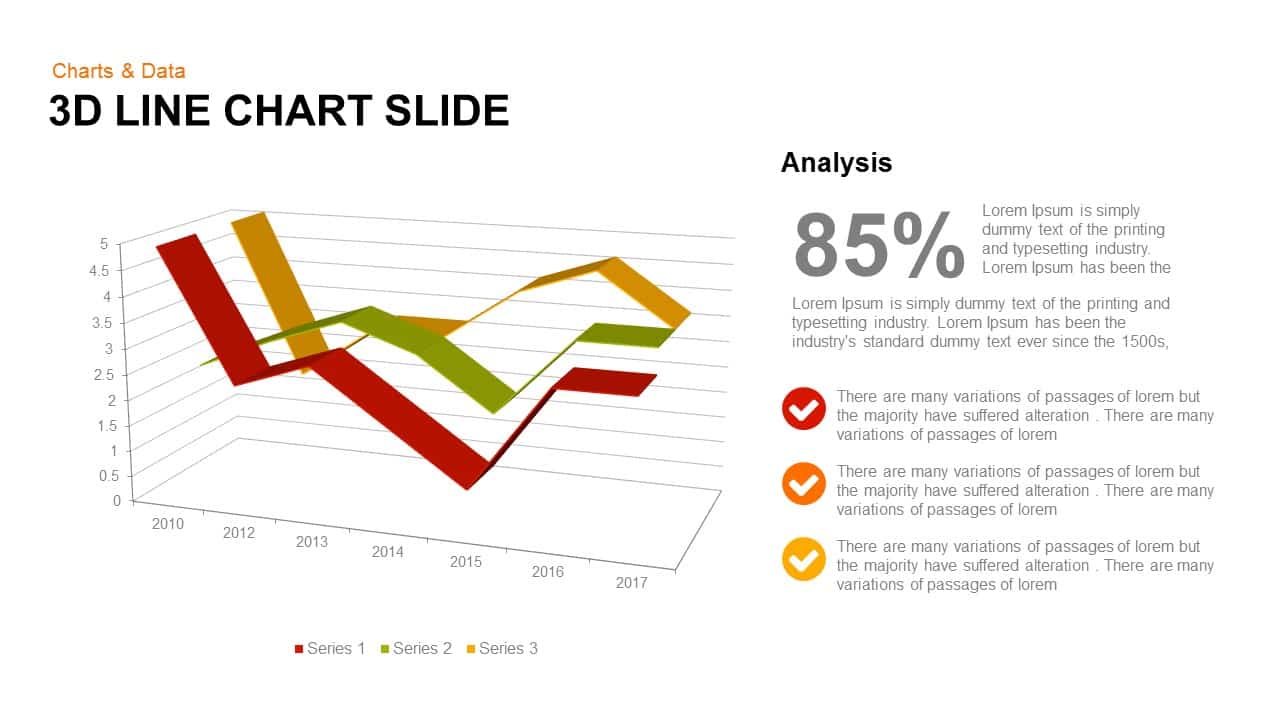
3d Line Chart PowerPoint Template
Charts
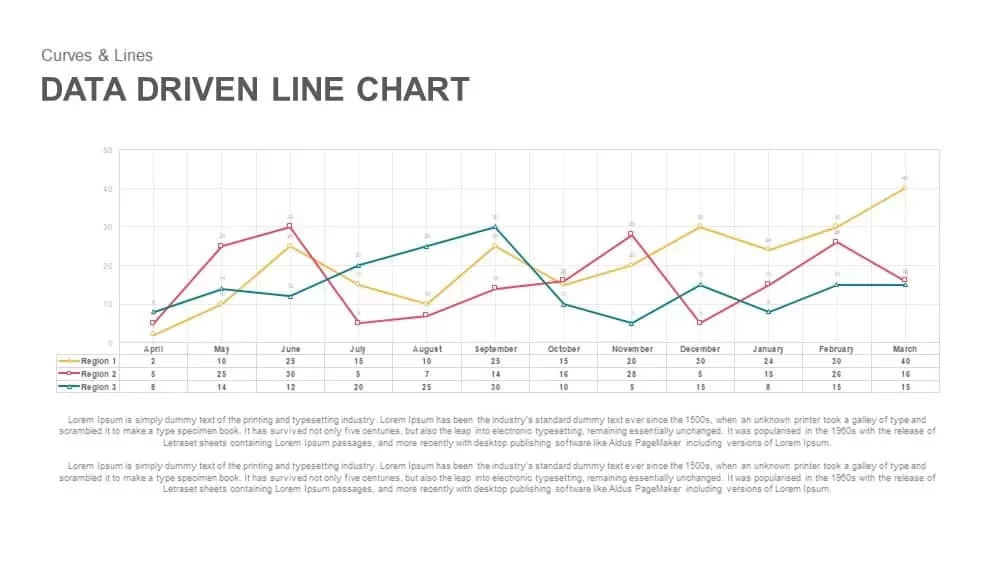
Data Driven Line Chart Template for PowerPoint
Comparison Chart
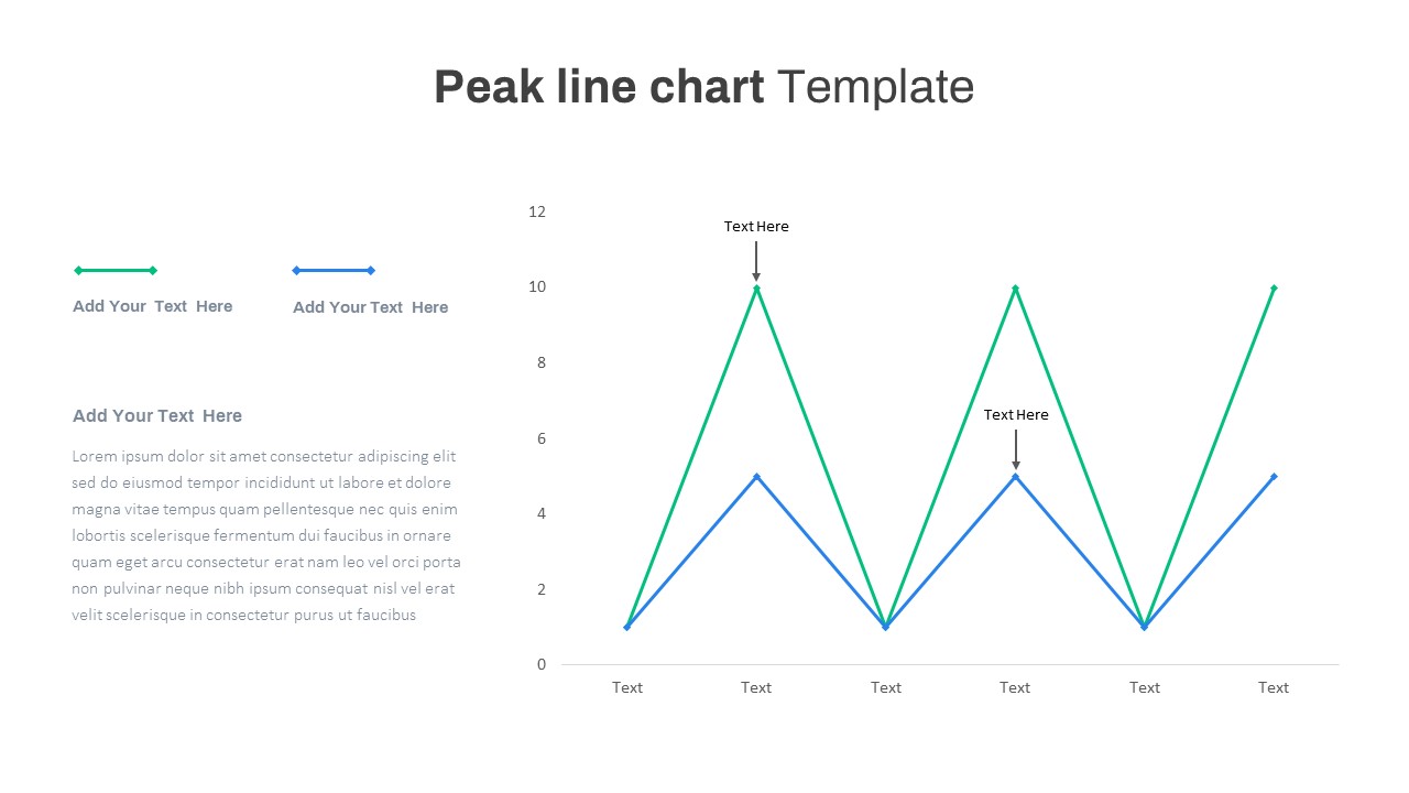
Peak Line Chart PowerPoint Template
Comparison Chart
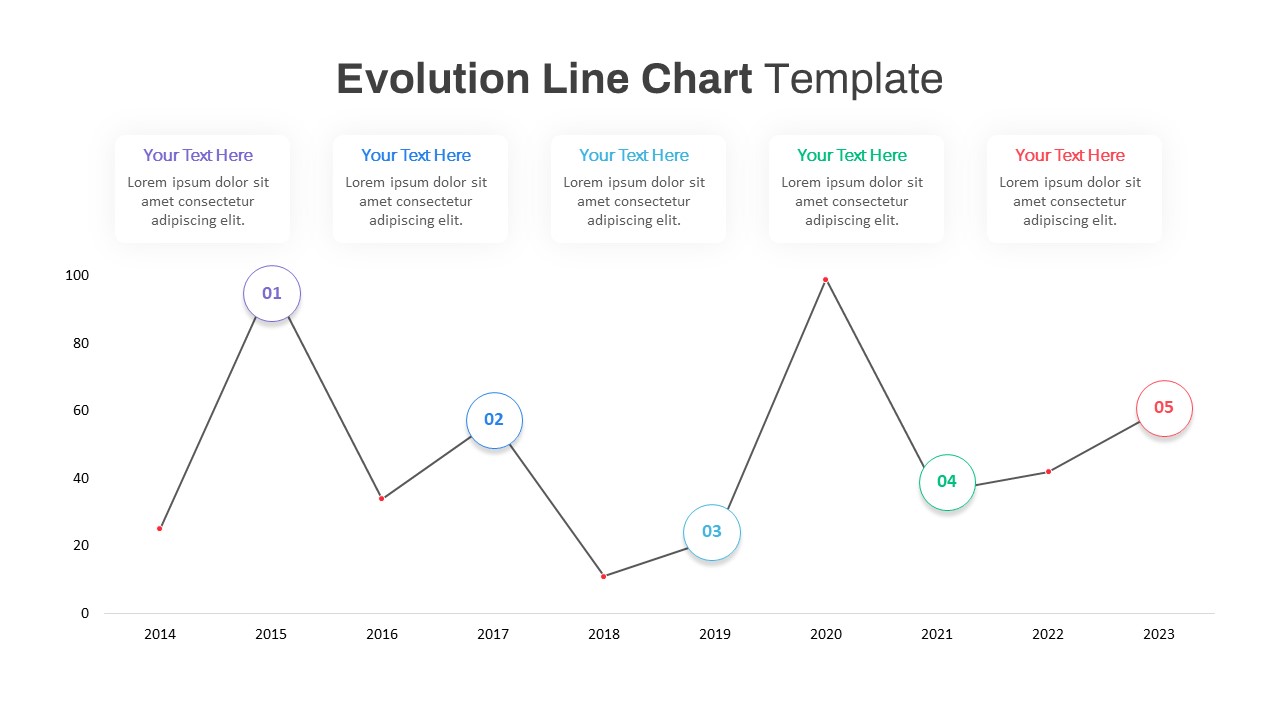
Evolution Line Chart PowerPoint Template
Timeline
Multiple Line Chart PowerPoint Template
Comparison Chart
Jump Line Chart PowerPoint Template
Comparison Chart
Financial Analysis Line Chart PowerPoint Template
Finance
Line Chart Representation PowerPoint Templates
Charts