Minimal Multi-Year Column Chart Template for PowerPoint & Google Slides
Multiple Column Chart PowerPoint and Google Slides Template
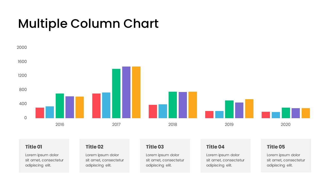
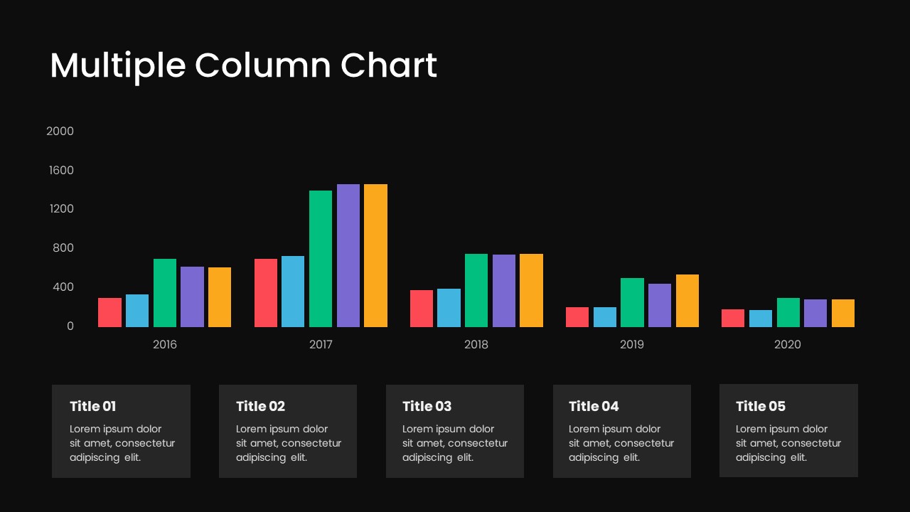
Benchmarking annual financial performance, analyzing multi-category business metrics, comparing revenue streams, or evaluating cross-departmental growth across multi-year cycles requires a clean, data-driven visualization. This multiple column chart PowerPoint template provides financial analysts, marketing directors, project managers, and executive leadership teams with an organized clustered column layout spanning a five-year timeline. By grouping distinct data series side by side across annual increments, this slide helps presenters highlight trend shifts, peak performance periods, and comparative variances clearly during board meetings and quarterly business reviews.
Key slide components and visual highlights include:
- A five-year horizontal timeline axis tracking historical or projected performance from 2016 through 2020.
- Clustered multi-column bar sets with five distinct color-coded variables: coral red, sky blue, vibrant green, medium purple, and warm amber yellow.
- A clear vertical y-axis calibrated in increments of 400 units (from 0 to 2000) for measuring volume, revenue, or percentage benchmarks.
- Five dedicated light-grey card containers positioned beneath the chart grid (Title 01 through Title 05) for detailing annual insights, operational drivers, and strategic takeaways.
- Generous white space and minimal background noise engineered for maximum legibility on digital screens, conference room projectors, and printed executive handouts.
- Fully editable data-driven chart vectors that allow presenters to modify column values, adjust colors, and customize descriptive text directly inside PowerPoint or Google Slides.
Login to download this file

Item ID
SB03606


Related Templates

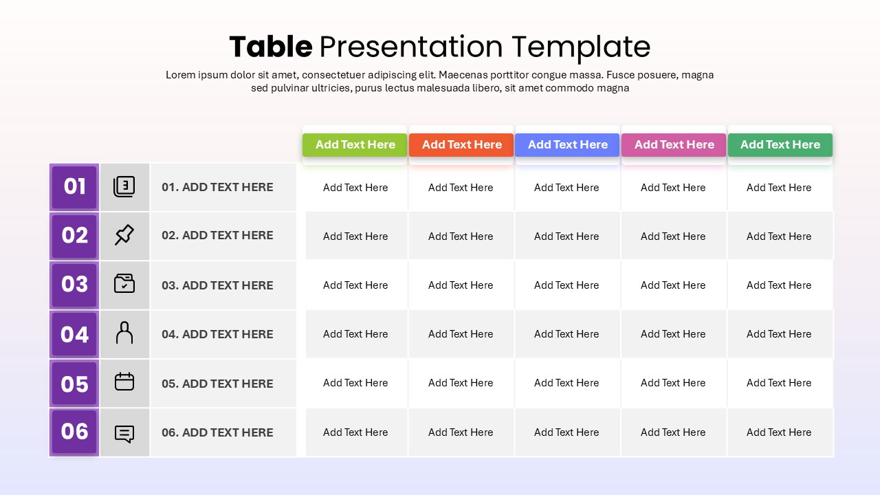
6-Row Highlight Table PowerPoint Template
Table
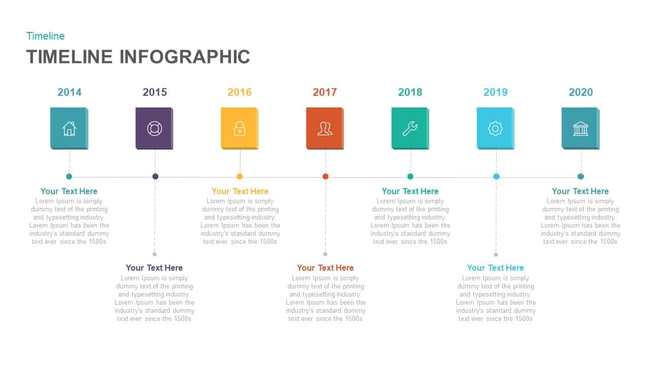
Multi-Year Timeline Infographic Template for PowerPoint & Google Slides
Timeline
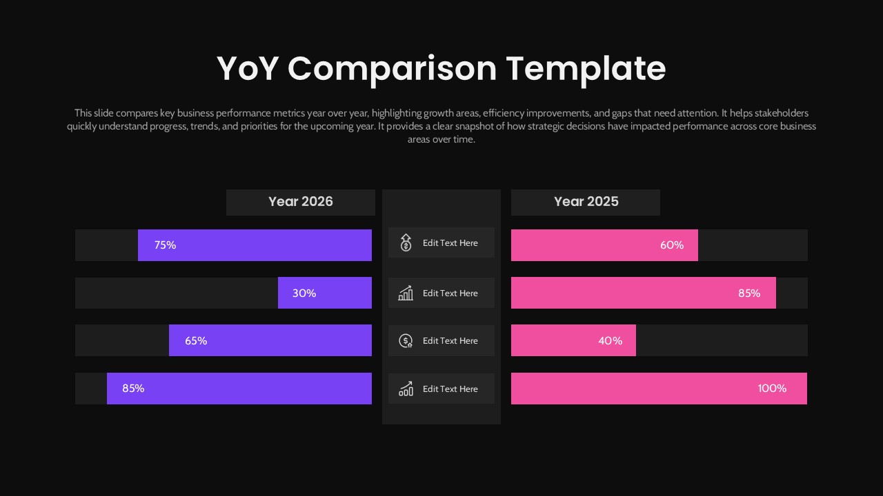
Year-over-Year Performance Comparison Template
Comparison Chart
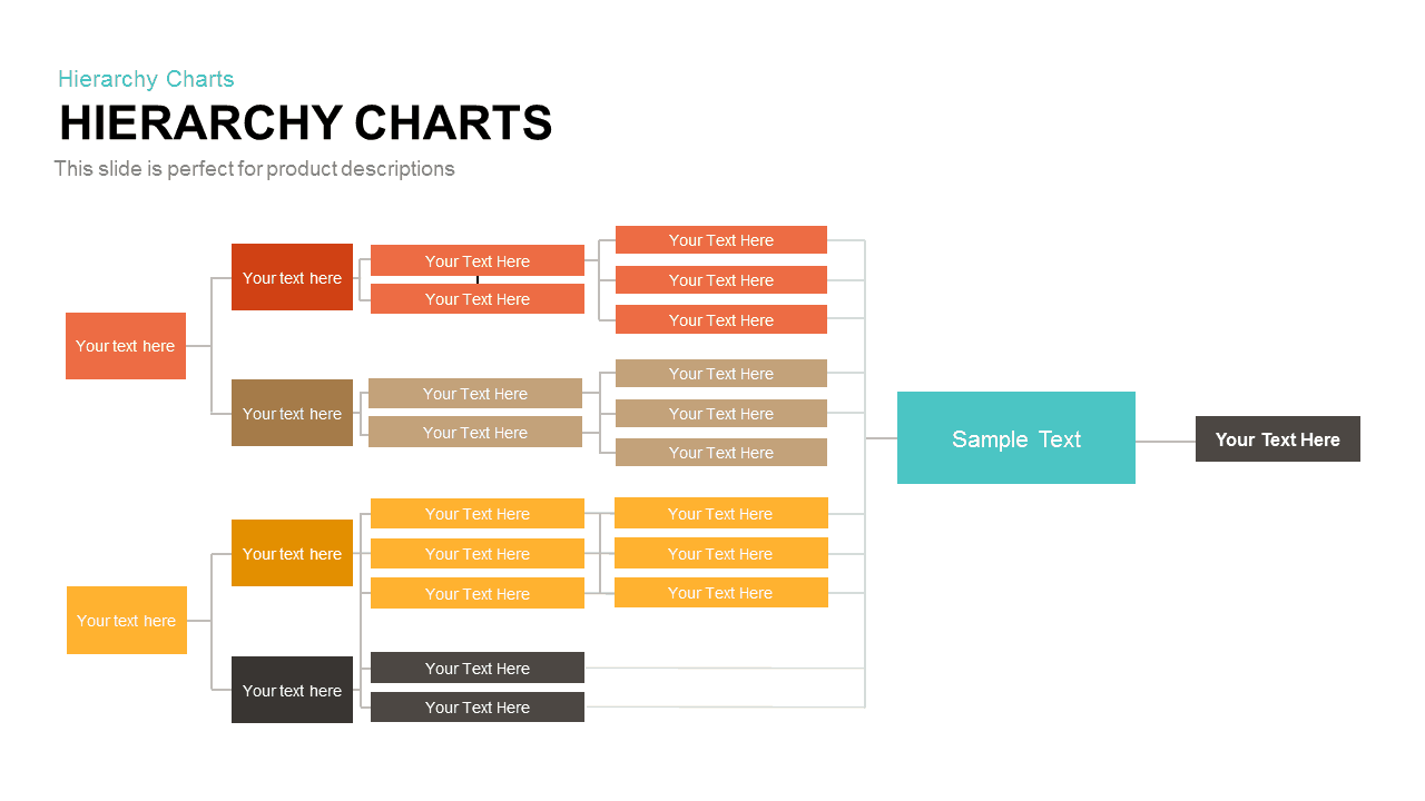
Horizontal Multi-Level Hierarchy Chart template for PowerPoint & Google Slides
Org Chart
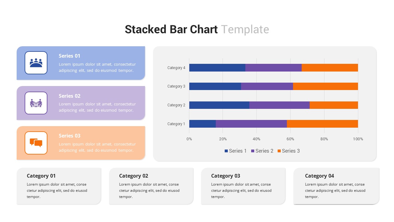
Multi-Series Stacked Bar Chart PowerPoint Template
Bar/Column
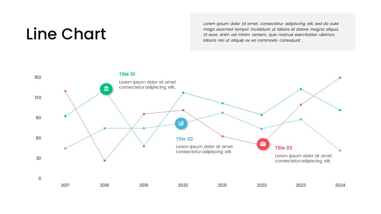
Multi-Series Line Chart with Icons Template for PowerPoint & Google Slides
Comparison Chart
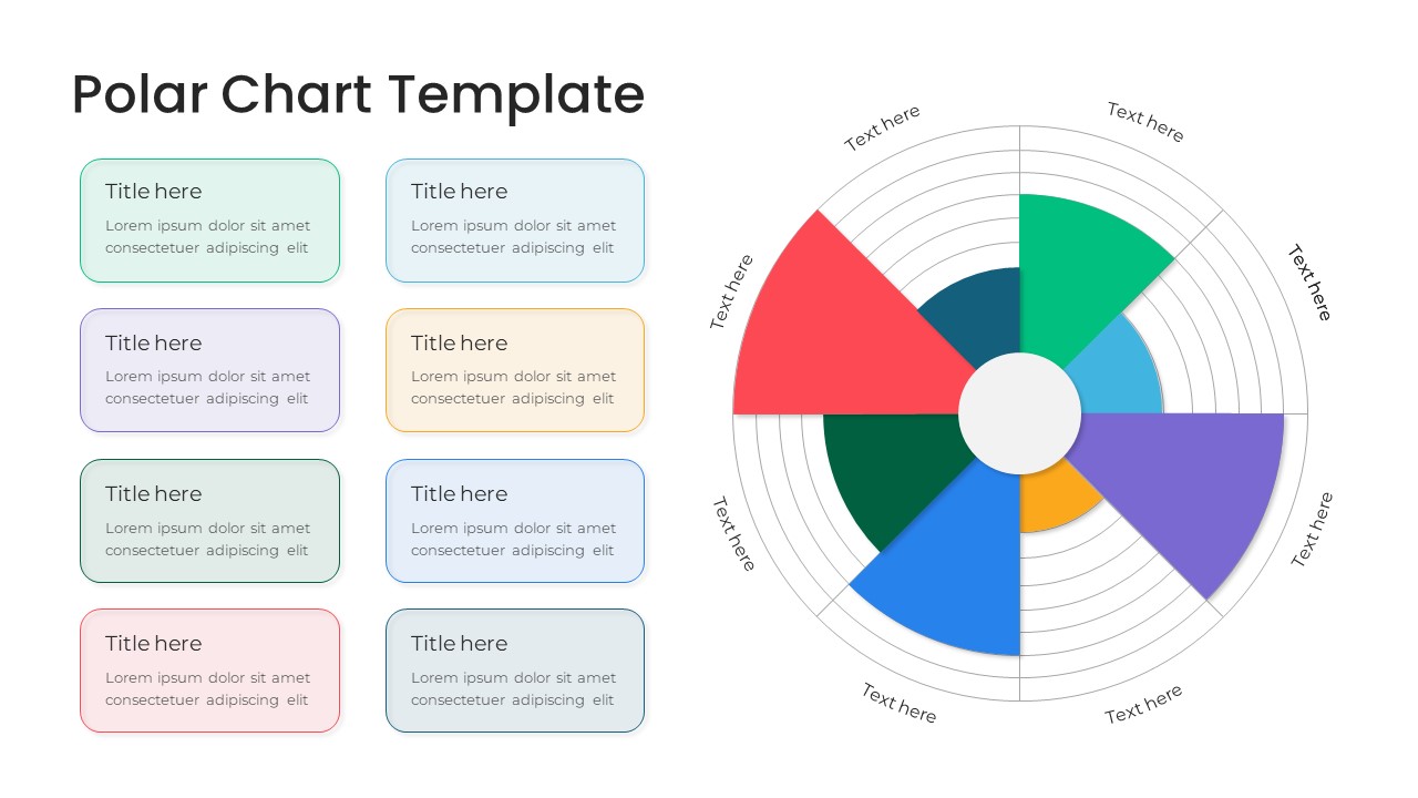
Modern Multi-Color Polar Chart Diagram Template for PowerPoint & Google Slides
Charts
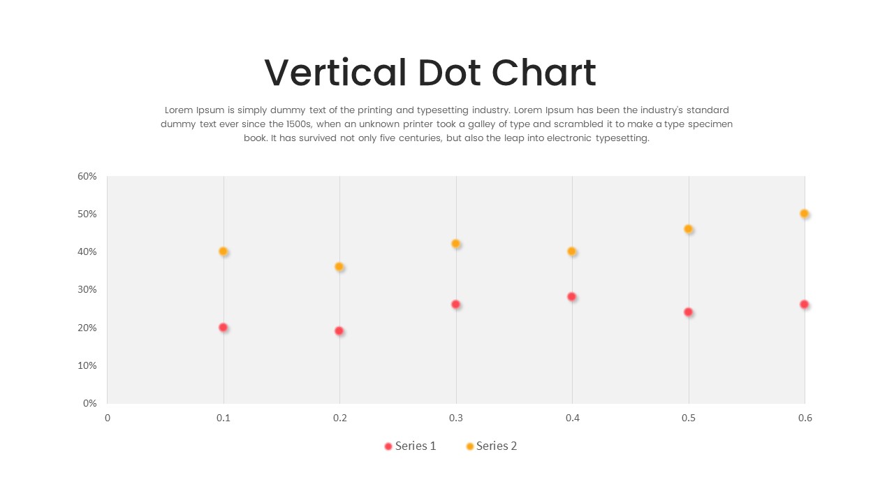
Multi-Series Vertical Dot Chart Template for PowerPoint
Comparison Chart
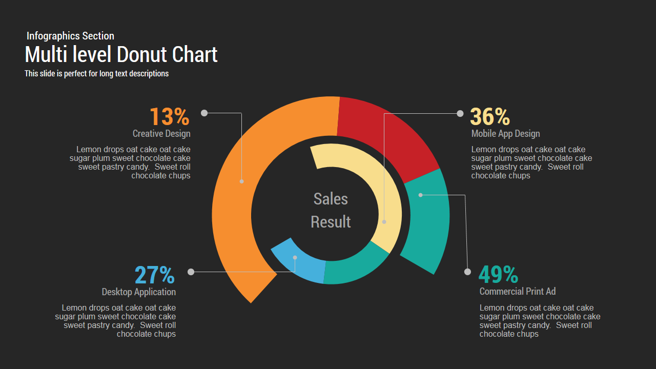
Multi level Donut Chart Template
Pie/Donut
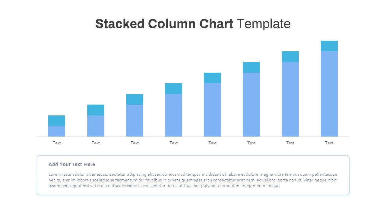
Stacked Column Chart Template
Bar/Column
Free
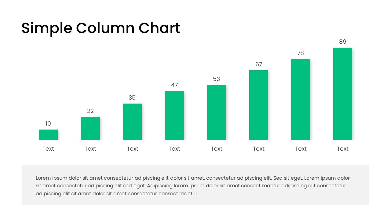
Free Editable Simple Column Chart for PowerPoint & Google Slides
Bar/Column
Free
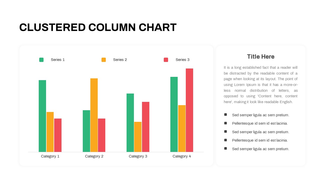
Clustered Column Chart Template for PowerPoint & Google Slides
Bar/Column
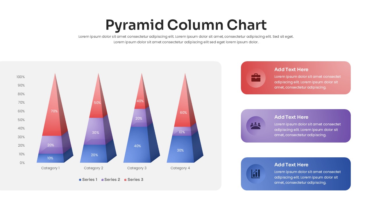
3D Pyramid Column Chart Template
Bar/Column

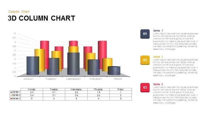
3D Column Chart for PowerPoint Presentation Template
Bar/Column

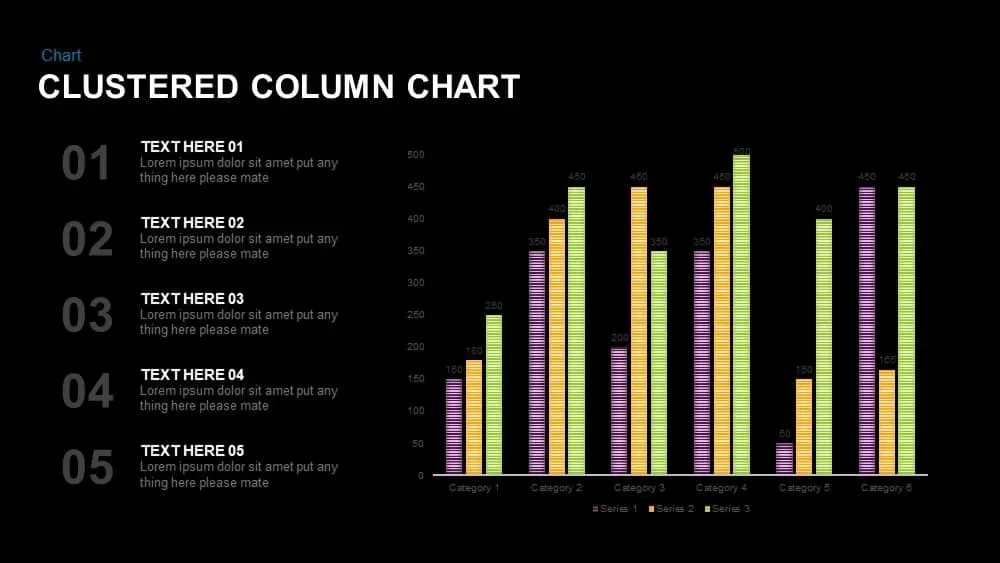
Clustered Column Chart PowerPoint Template
Bar/Column
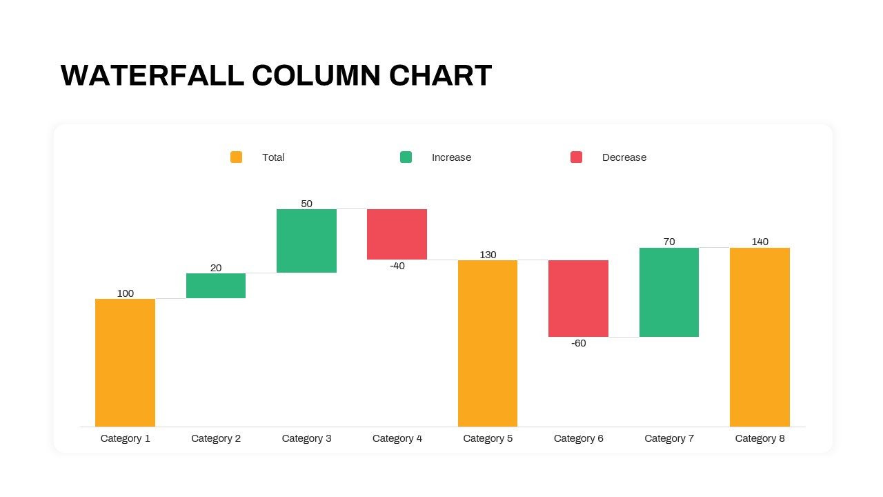
Waterfall Column Chart PowerPoint Template
Bar/Column
100% Stacked Column Chart PowerPoint Template
Bar/Column
Grouped Column Chart PowerPoint Template
Bar/Column
Multi-Color Milestone Timeline Layout Template for PowerPoint & Google Slides
Timeline
RPA Strategy Multi-Step Diagram Template for PowerPoint & Google Slides
Process