Stacked Column Chart Template
Present data trends clearly with editable comparison charts
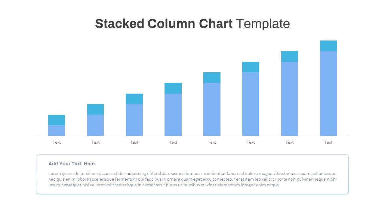
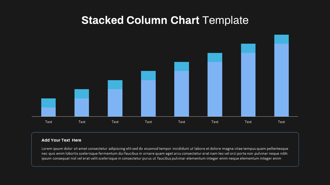
A Stacked Column Chart Template helps presenters compare two related data series across multiple categories in a clear and visually engaging format. Featuring eight stacked columns with contrasting light-blue and teal segments, this slide makes it easy to showcase trends, performance metrics, budget distributions, and other comparative data. The clean layout, combined with a dedicated text area for explanations and insights, ensures that audiences can quickly understand key takeaways without being distracted by unnecessary design elements.
Built for PowerPoint and Google Slides, this chart and graph template offers a professional balance of simplicity and flexibility. Users can effortlessly update chart values, customize colors to match brand guidelines, and edit the accompanying text section to provide context for the data being presented. The minimalist design, supported by subtle gridlines, clear typography, and scalable vector elements, makes it suitable for quarterly reviews, financial reports, KPI tracking, resource allocation analysis, and business performance presentations.
Whether you’re comparing actual versus forecast figures, sales versus returns, revenue versus costs, or survey results across different categories, this Google Slides template helps transform complex datasets into meaningful visual stories. Its structured format allows stakeholders to identify trends, spot outliers, and make informed decisions while maintaining a polished and consistent presentation style. Download this free stacked column chart slide and create impactful data presentations in minutes.
Login to download this file

Item ID
SB03590


Related Templates

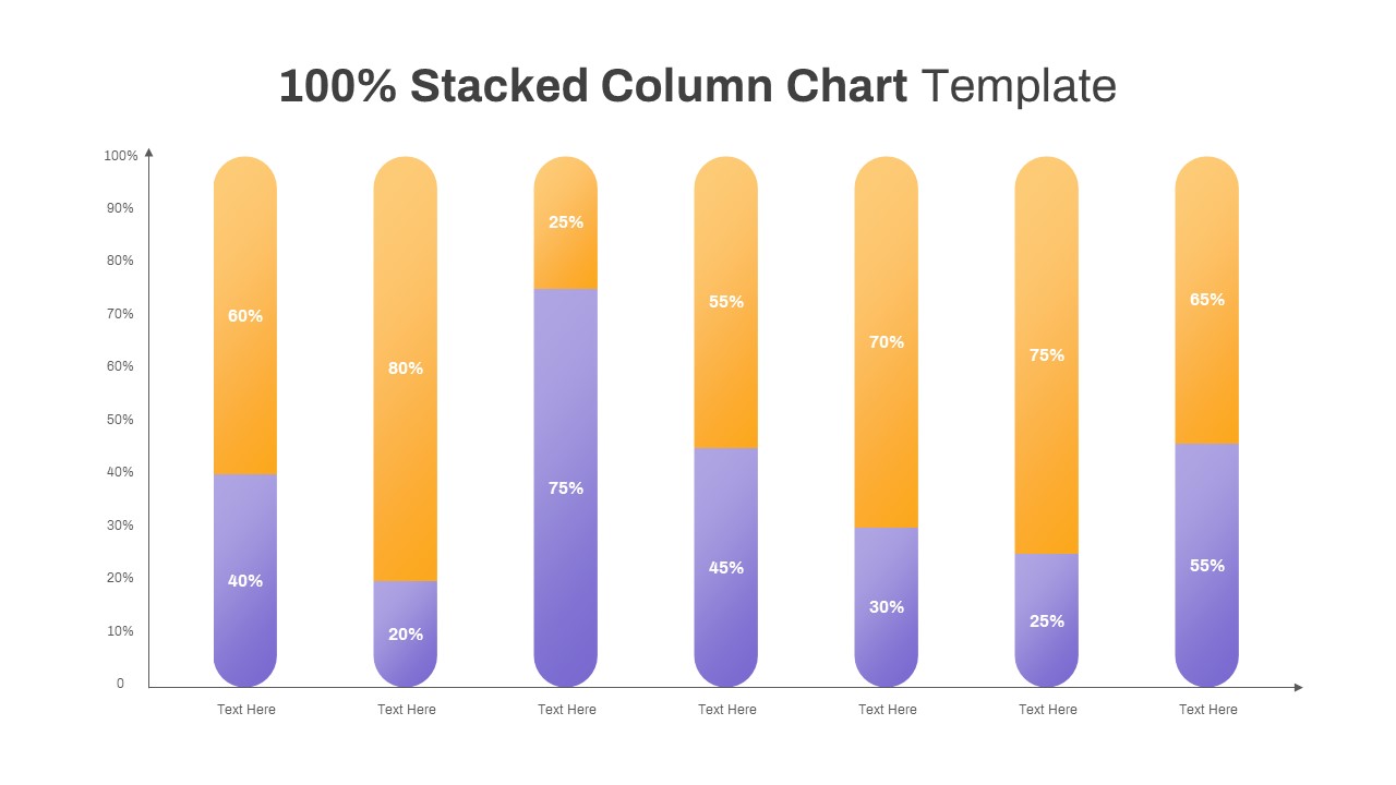
100% Stacked Column Chart PowerPoint Template
Bar/Column
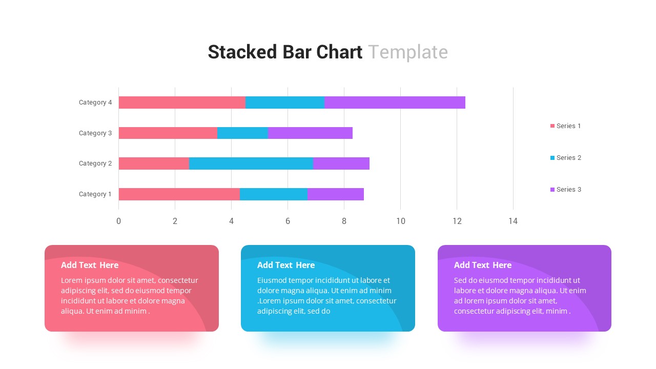
Stacked Bar Chart Template
Bar/Column
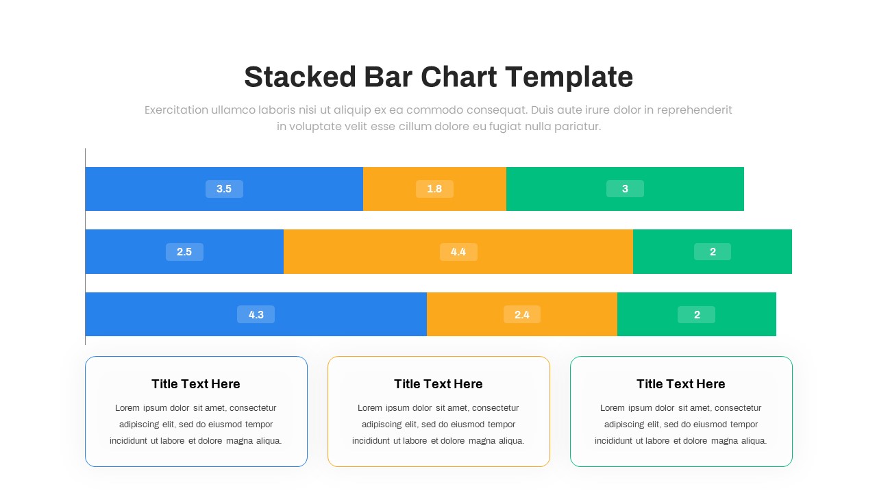
Multi-Series Stacked Bar Chart PowerPoint Template
Bar/Column
Animated Stacked Bar Chart PowerPoint Template
Bar/Column
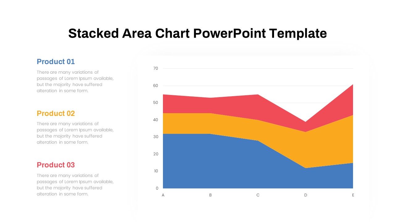
Dynamic Three-Series Stacked Area Chart Template for PowerPoint & Google Slides
Comparison Chart
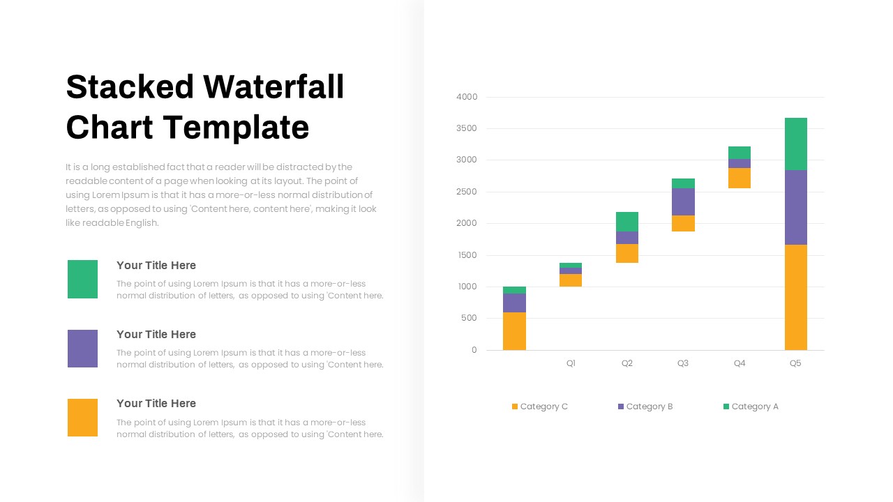
Stacked Waterfall Chart PowerPoint Template
Bar/Column
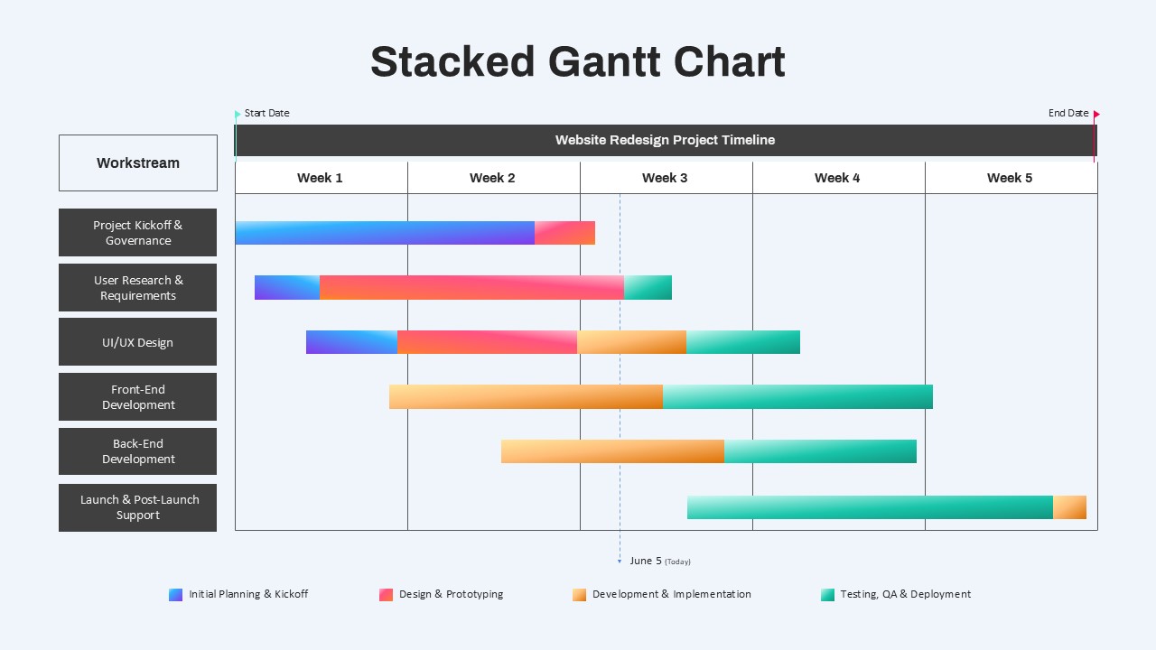
Stacked Gantt Chart PowerPoint Template
Gantt Chart
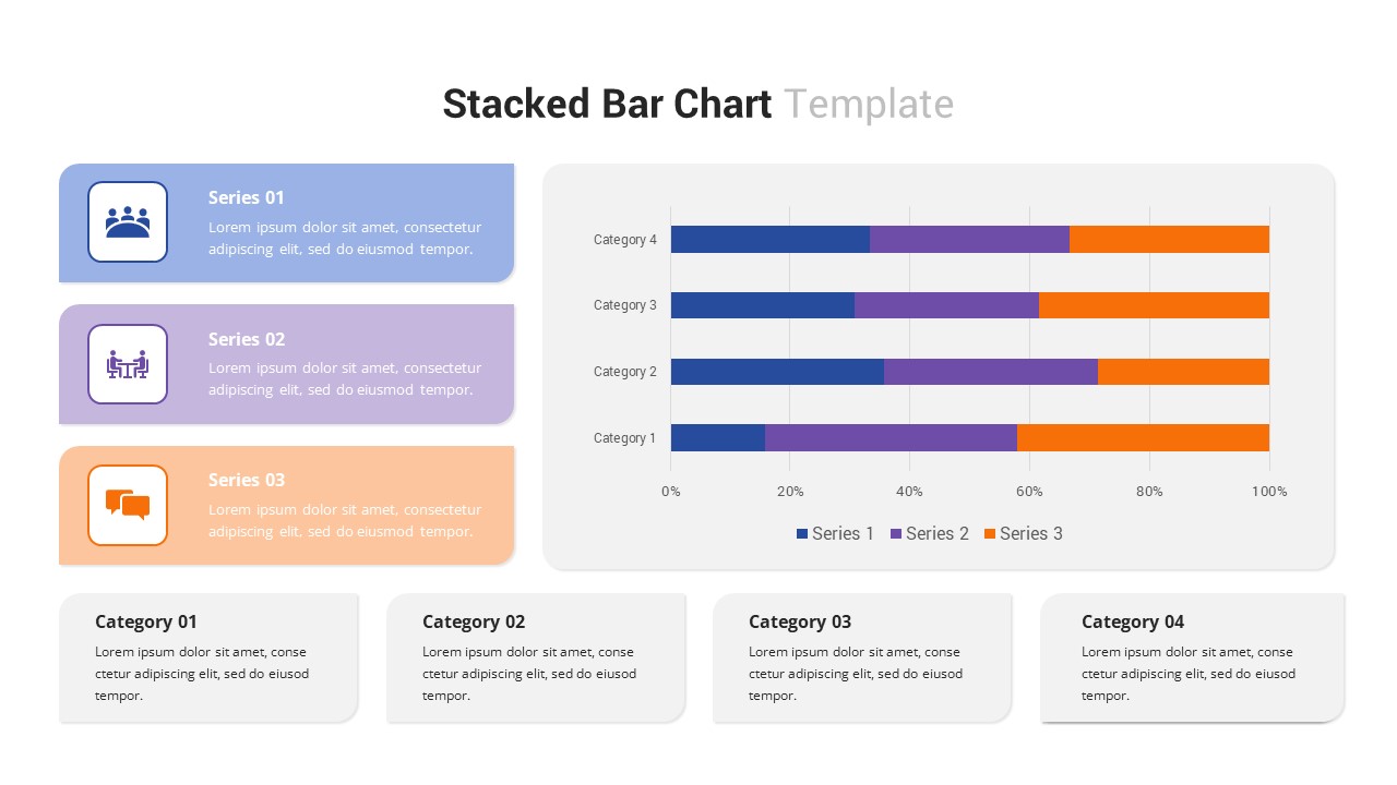
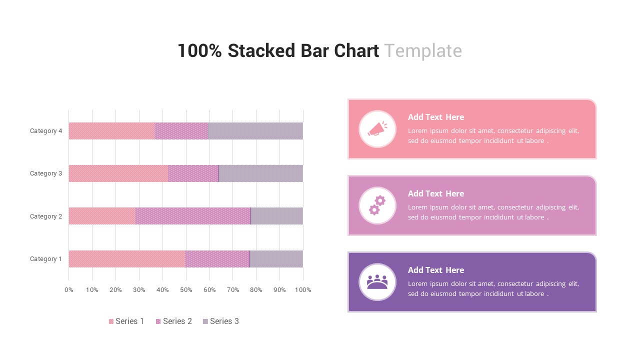
100% Stacked Bar Chart PowerPoint Template
Bar/Column

Stacked Cubes Pyramid PowerPoint Template
Pyramid
Stacked Cubes Pyramid Six-Option Diagram Template for PowerPoint & Google Slides
Pyramid
Elegant Stacked Photo Collage Layout Template for PowerPoint
Graphics
Creative 3d Stacked Circle Infographics PowerPoint
Pyramid

3D Column Chart for PowerPoint Presentation Template
Bar/Column
Clustered Column Chart PowerPoint Template
Bar/Column
Free Editable Simple Column Chart for PowerPoint & Google Slides
Bar/Column
Free
Minimal Multi-Year Column Chart Template for PowerPoint & Google Slides
Bar/Column
Waterfall Column Chart PowerPoint Template
Bar/Column
Clustered Column Chart Template for PowerPoint & Google Slides
Bar/Column
Grouped Column Chart PowerPoint Template
Bar/Column
3D Pyramid Column Chart Template
Bar/Column