Multi-Series Stacked Bar Chart PowerPoint Template
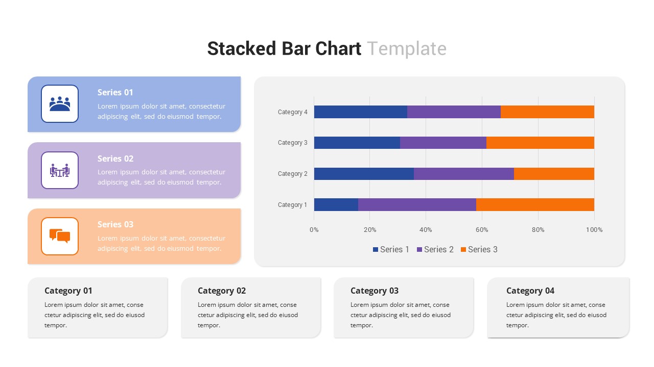
Category Performance Comparison Dashboard for Business Reporting
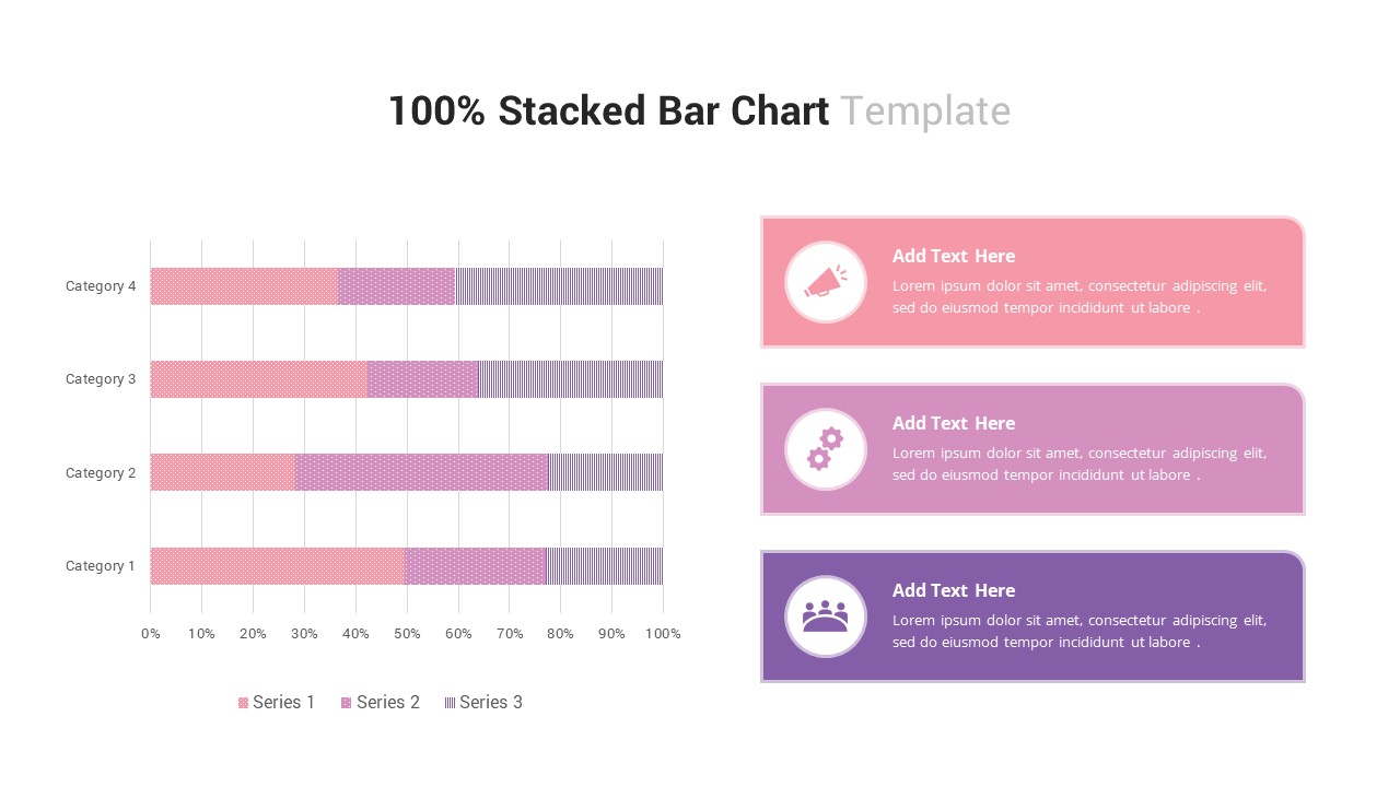
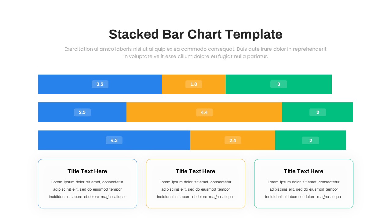
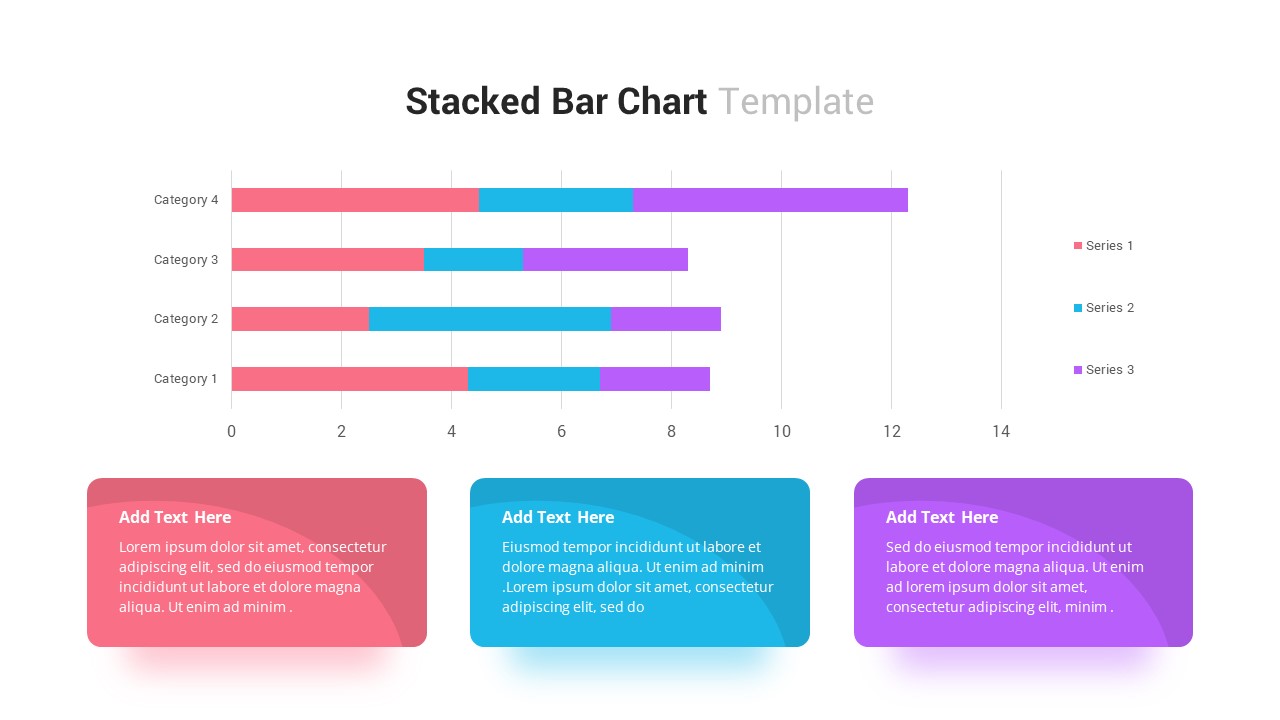
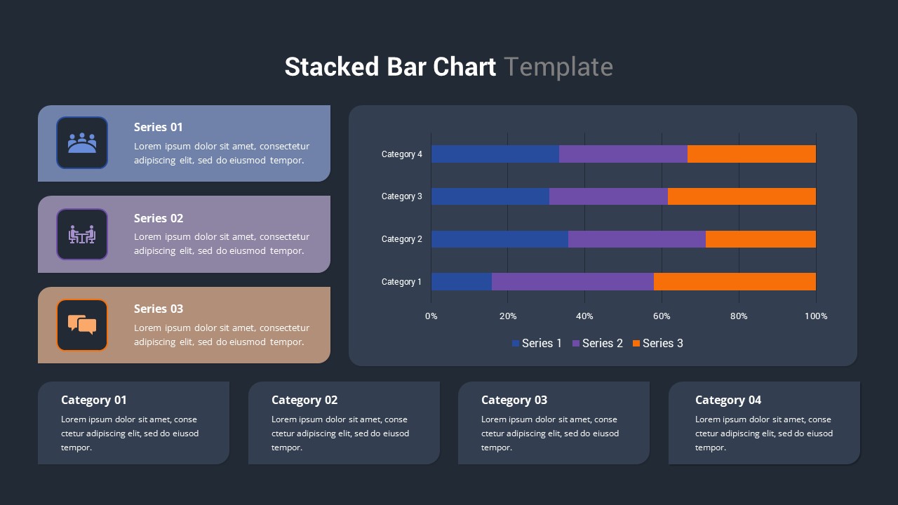
Present complex data with clarity using this professionally designed Stacked Bar Chart template. Created for performance reporting and category comparison, the slide combines data visualization with supporting insights in a clean, executive-friendly layout. Three color-coded information panels on the left introduce each data series, while the horizontal stacked bar chart on the right enables audiences to compare multiple metrics across categories at a glance.
The chart is displayed inside a modern rounded container and features four category comparisons segmented into three distinct series. Matching legend indicators, percentage-based axis labels, and subtle gridlines improve readability and help viewers interpret trends accurately. Beneath the chart, four dedicated insight boxes provide space for key observations, performance highlights, recommendations, or strategic takeaways, allowing presenters to connect data with actionable business context.
Built for PowerPoint and Google Slides, this bar chart template is fully editable and optimized for rapid customization. Users can update chart values, modify colors, replace icons, edit text, resize elements, and apply corporate branding in minutes. The balanced layout, professional typography, soft shadows, and generous spacing ensure that data remains the focal point while maintaining a polished visual appearance. Whether used for executive dashboards, sales reviews, marketing reports, or operational performance tracking, this slide transforms raw numbers into meaningful business insights.
Who Should Download This Stacked Bar Chart Template?
Marketing Teams & Performance Analysts
- Compare campaign performance across multiple channels.
- Present KPI breakdowns during monthly and quarterly reviews.
- Highlight marketing contribution by category or region.
Sales Managers & Revenue Teams
- Visualize product-line performance and revenue distribution.
- Track sales targets against actual results.
- Present territory or account comparisons in leadership meetings.
Business Executives & Decision Makers
- Review strategic performance metrics at a glance.
- Support data-driven discussions during board presentations.
- Identify trends and opportunities across departments.
Project Managers & Operations Leaders
- Compare project progress across multiple workstreams.
- Showcase resource allocation and operational efficiency.
- Present performance summaries with supporting commentary.
Consultants & Business Analysts
- Deliver client-ready performance dashboards.
- Simplify complex datasets for stakeholder presentations.
- Communicate recommendations alongside visual evidence.
Turn performance metrics into meaningful business stories with this professionally crafted Stacked Bar Chart template. Download it today to create executive-ready reports, marketing dashboards, sales reviews, and strategic presentations that communicate insights clearly and drive informed decision-making.
Login to download this file

Item ID
SB03265


Related Templates

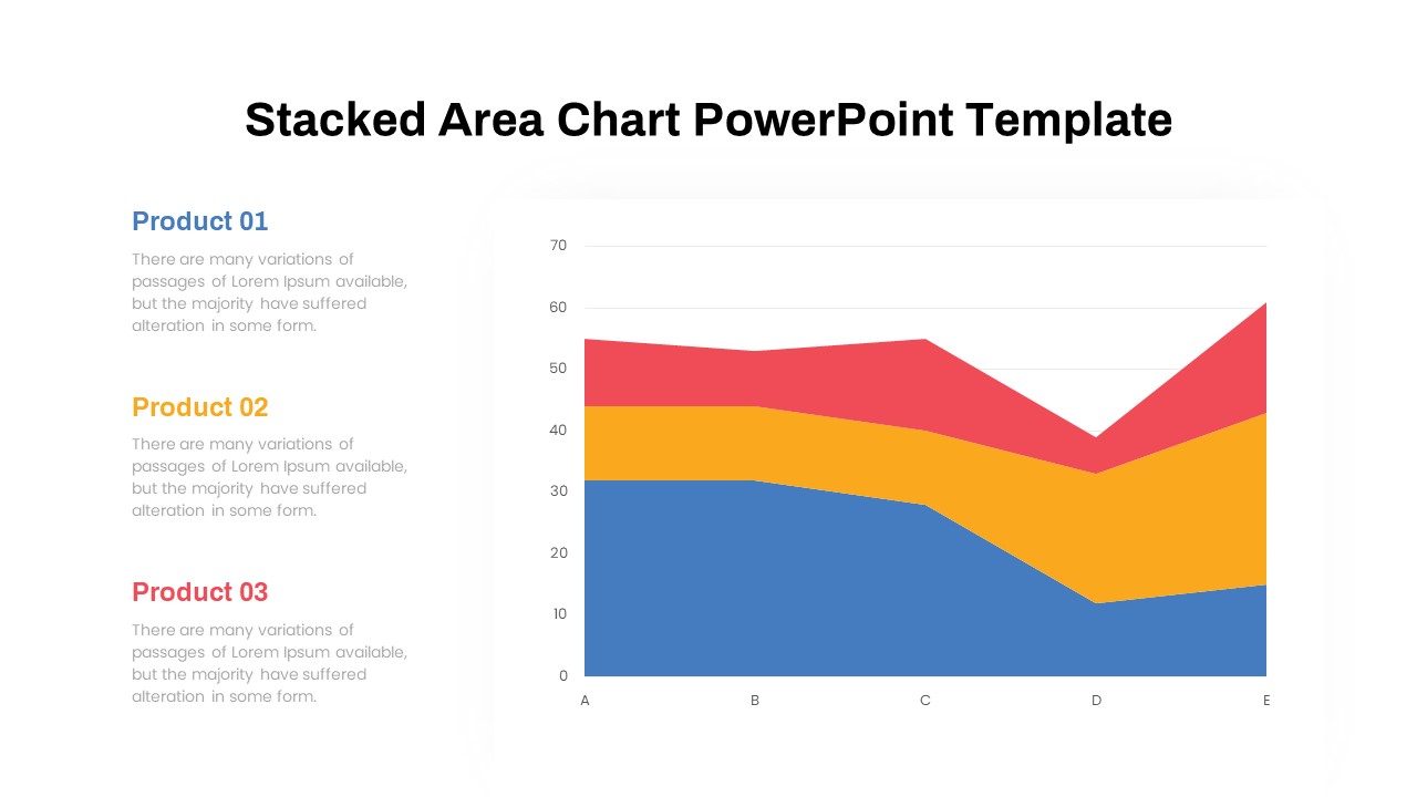
Dynamic Three-Series Stacked Area Chart Template for PowerPoint & Google Slides
Comparison Chart
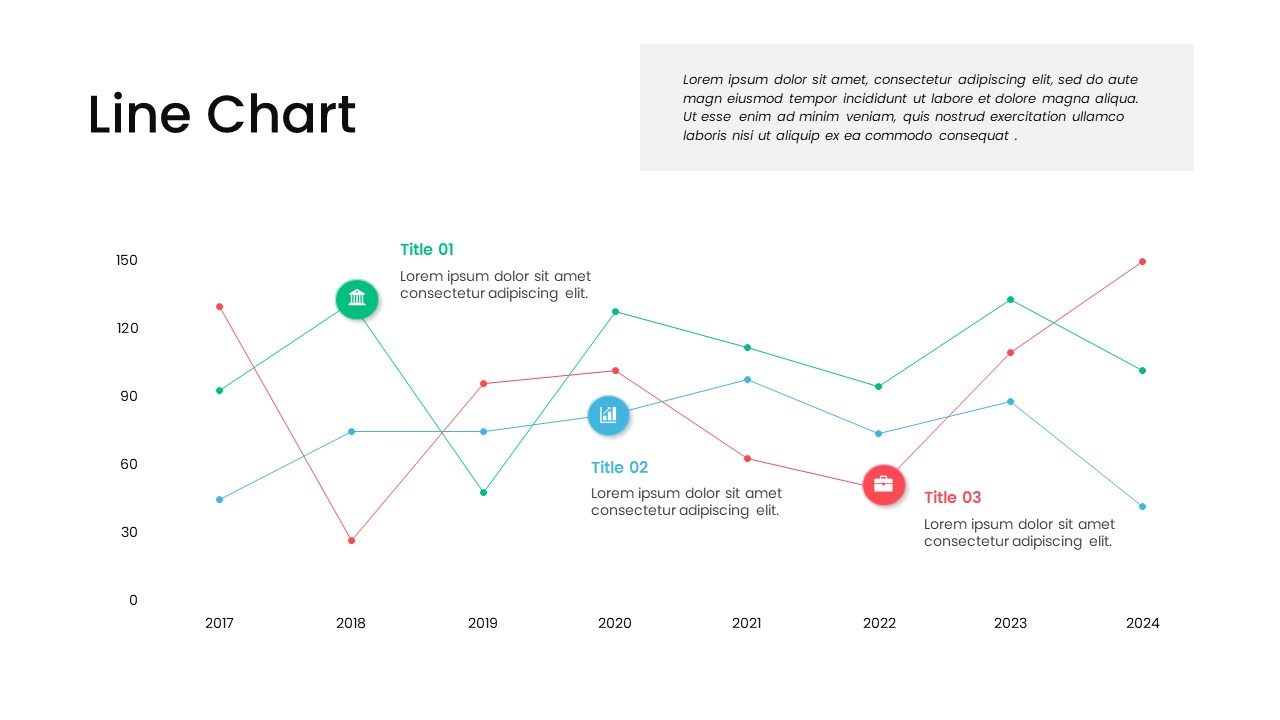
Multi-Series Line Chart with Icons Template for PowerPoint & Google Slides
Comparison Chart
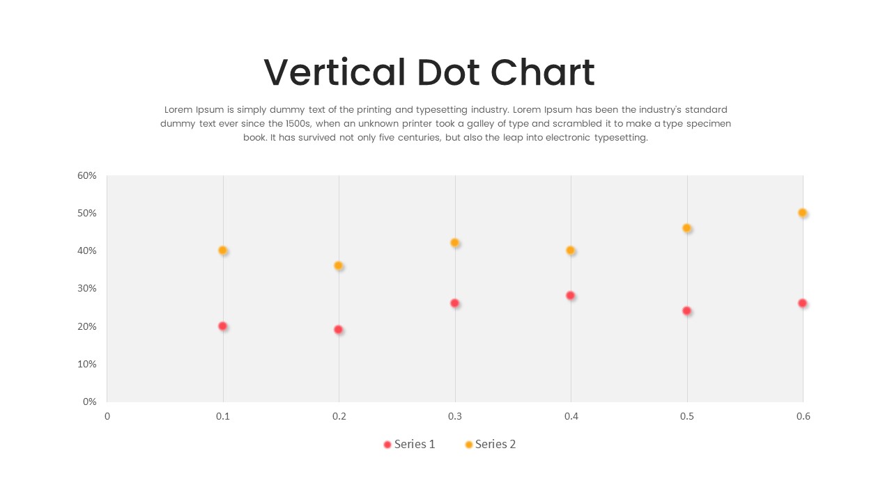
Multi-Series Vertical Dot Chart Template for PowerPoint
Comparison Chart
100% Stacked Bar Chart PowerPoint Template
Bar/Column
Animated Stacked Bar Chart PowerPoint Template
Bar/Column
Stacked Bar Chart Template
Bar/Column
100% Stacked Column Chart PowerPoint Template
Bar/Column
Stacked Waterfall Chart PowerPoint Template
Bar/Column
Stacked Gantt Chart PowerPoint Template
Gantt Chart
Stacked Column Chart Template
Bar/Column
Free
Horizontal Multi-Level Hierarchy Chart template for PowerPoint & Google Slides
Org Chart
Minimal Multi-Year Column Chart Template for PowerPoint & Google Slides
Bar/Column
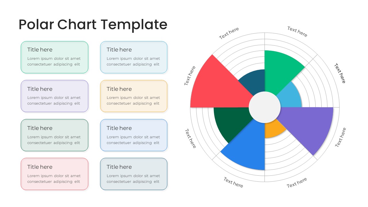
Modern Multi-Color Polar Chart Diagram Template for PowerPoint & Google Slides
Charts
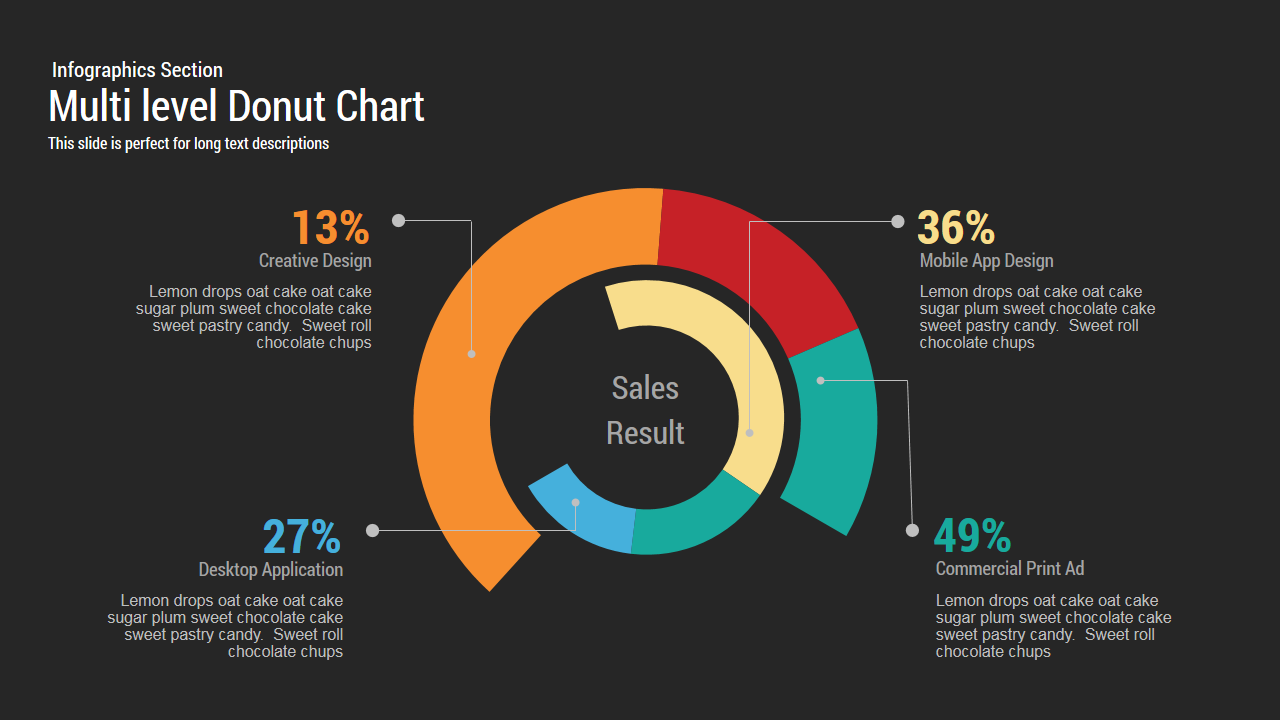
Multi level Donut Chart Template
Pie/Donut

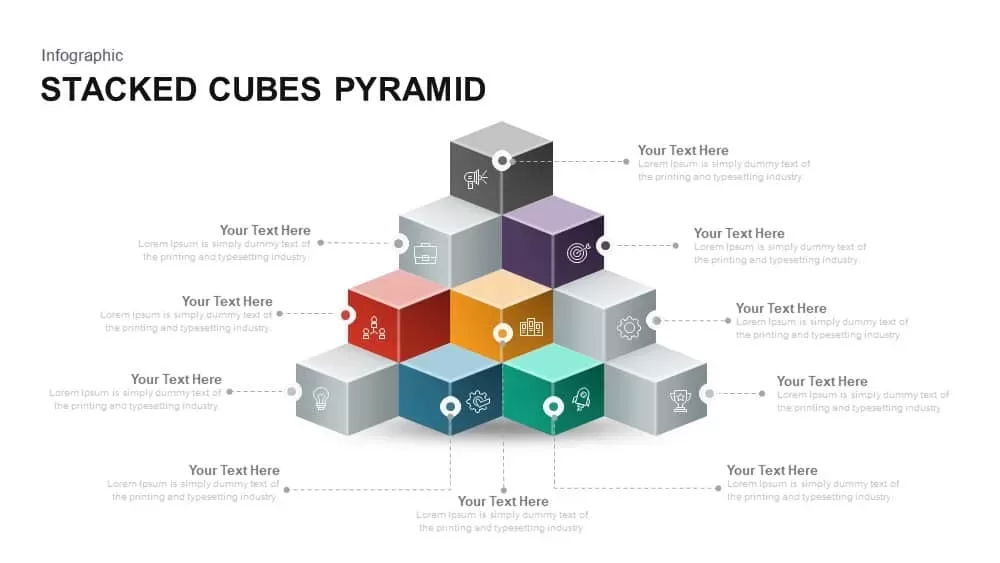
Stacked Cubes Pyramid PowerPoint Template
Pyramid
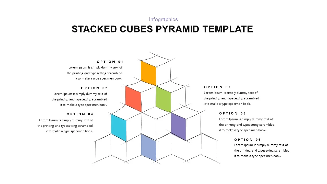
Stacked Cubes Pyramid Six-Option Diagram Template for PowerPoint & Google Slides
Pyramid
Elegant Stacked Photo Collage Layout Template for PowerPoint & Google Slides
Graphics
Creative 3d Stacked Circle Infographics PowerPoint
Pyramid
3D Bar Chart Infographics Template for PowerPoint Template
Bar/Column
Horizontal Bar Chart PowerPoint Template
Bar/Column