Multi-Series Vertical Dot Chart Template for PowerPoint
PowerPoint Dot Plot Chart
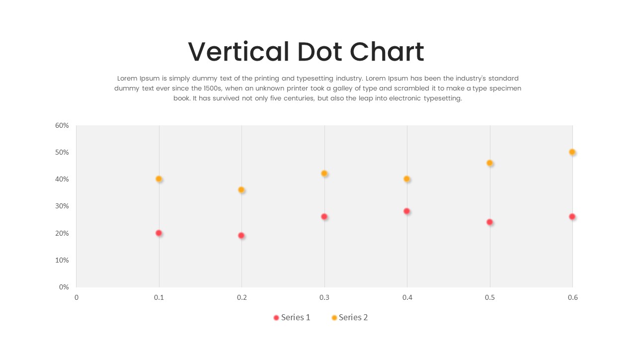
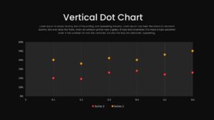
Present precise, side-by-side comparisons with this multi-series vertical dot chart slide. A clean white canvas features six evenly spaced vertical axes (0.1 to 0.6), each accented by subtle alternating gray bands to guide the eye. Two distinct data series—one in vibrant red and one in warm yellow—are plotted as circular markers along percentage values from 0% to 60%. A concise legend at the bottom clarifies series names, while a shaded top-right text box offers space for an executive summary or descriptive note.
This comparison chart template offers an effective way to showcase and compare two data sets. For example, it is an ideal statistical chart for visualizing the rate of interest changes over time, particularly in response to central bank decisions. By employing a dot chart to plot the data series, you can precisely display the fluctuations in interest rates for two distinct periods or entities, such as before and after a central bank policy decision or comparing rates between different financial institutions.
The vertical dot chart PowerPoint template’s layout involves two vertical lines, each assigned a specific color, such as orange and red, to differentiate the two data sets. On these lines, the individual data points are represented by dots, with their vertical positions accurately corresponding to the respective interest rates. The horizontal axis can represent time intervals or specific dates, creating a chronological flow of interest rate changes, and the vertical axis denotes the interest rates in percentage or other suitable units.
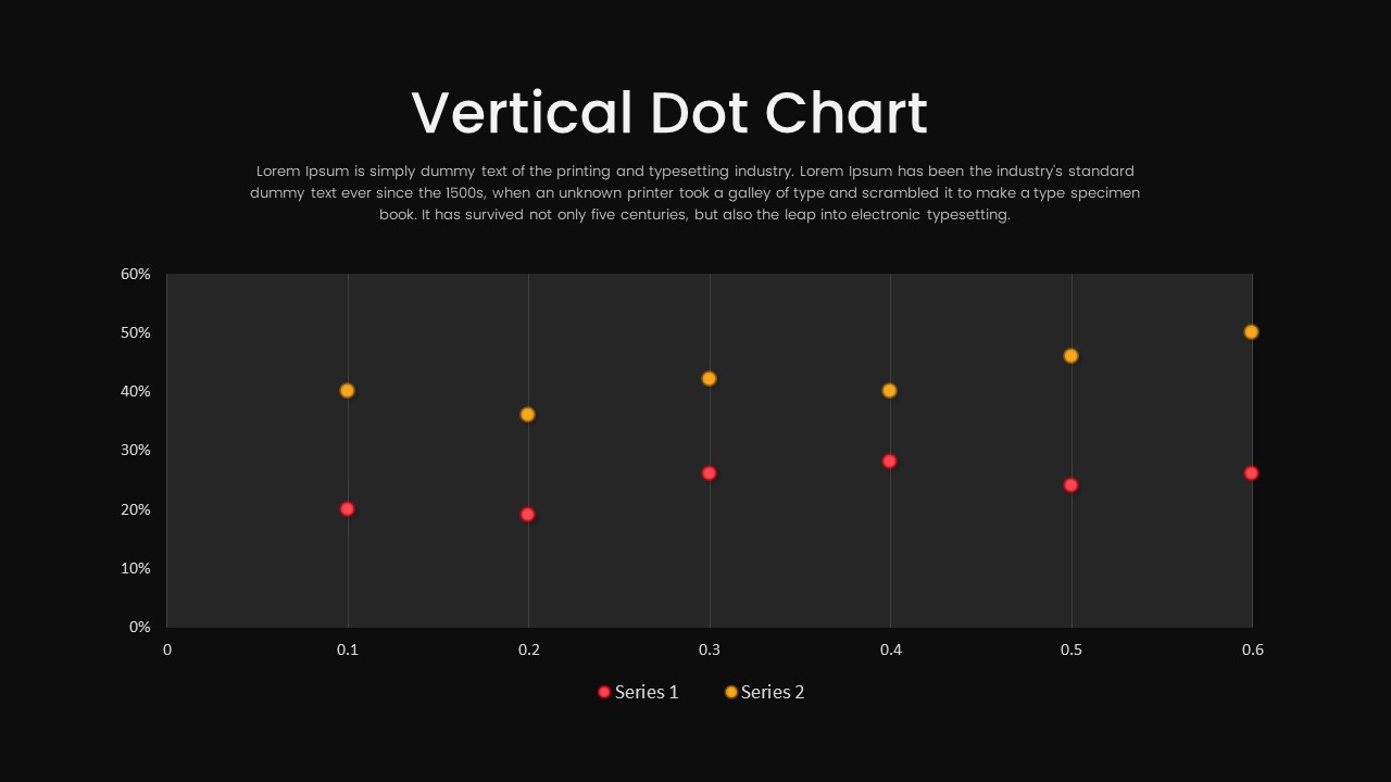
This is a One Pager template in light and dark background modes. Whether used for financial analysis, economic research, or policy evaluation, this vertical dot chart template for PowerPoint provides an accessible and informative means of communicating simple data to a broad audience. It can be edited using all major versions of PowerPoint and Google Slides. Feel free to travel across our extensive collections of PowerPoint charts and graphs!
Login to download this file

Item ID
SB03714


Related Templates

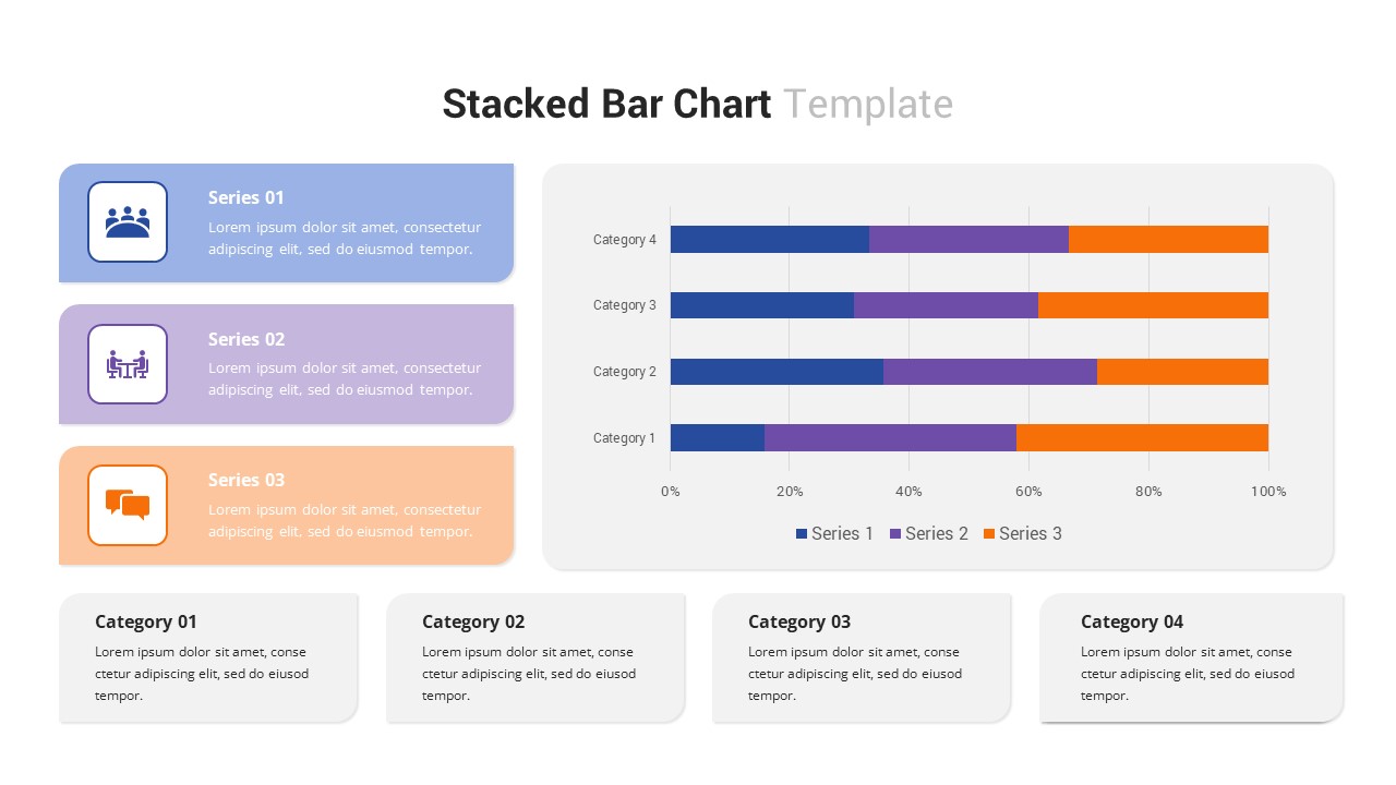
Multi-Series Stacked Bar Chart PowerPoint Template
Bar/Column
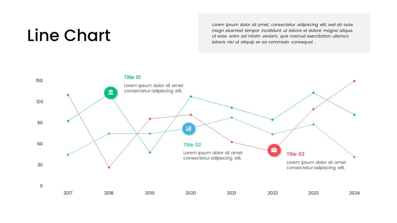
Multi-Series Line Chart with Icons Template for PowerPoint & Google Slides
Comparison Chart
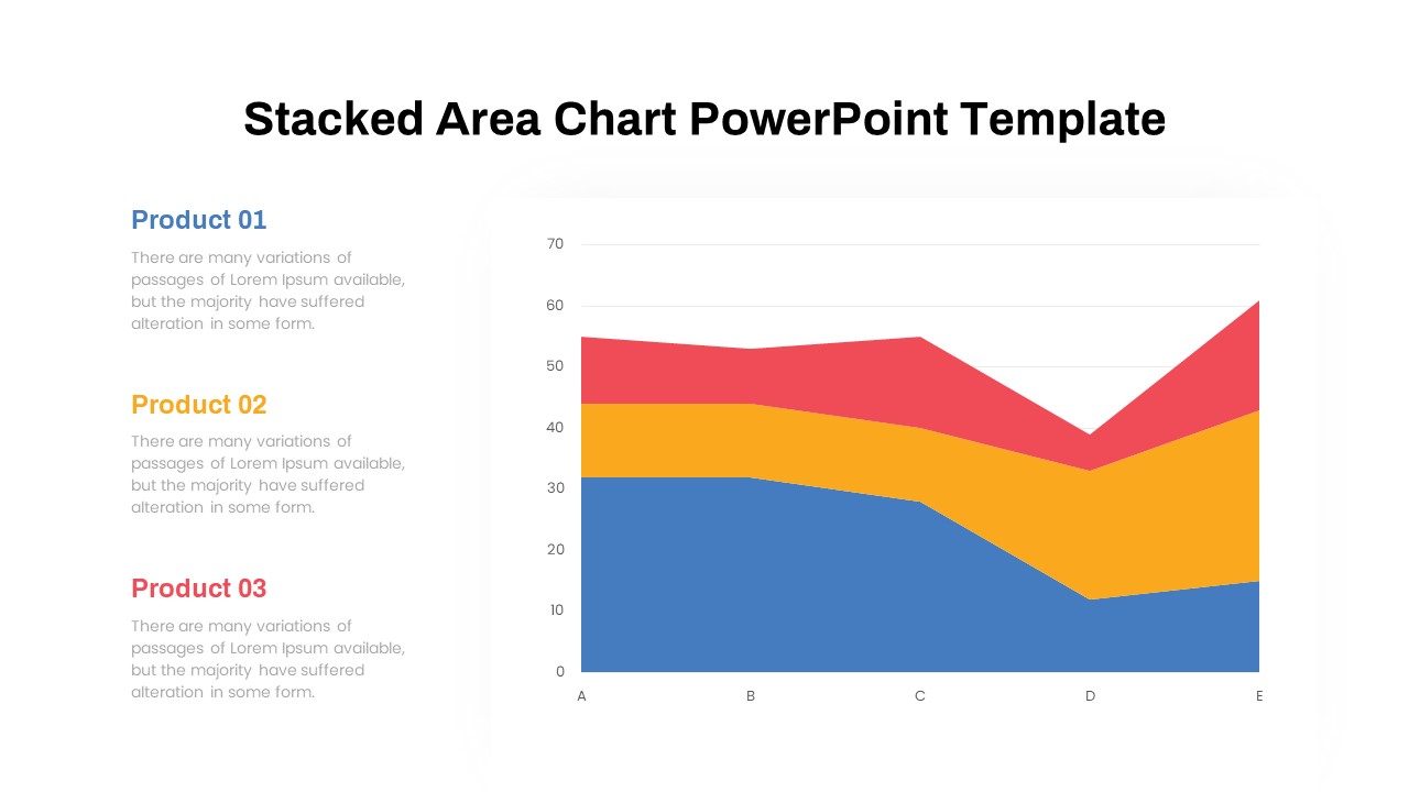
Dynamic Three-Series Stacked Area Chart Template for PowerPoint & Google Slides
Comparison Chart
Polka Dot Theme Background PowerPoint Template
Background
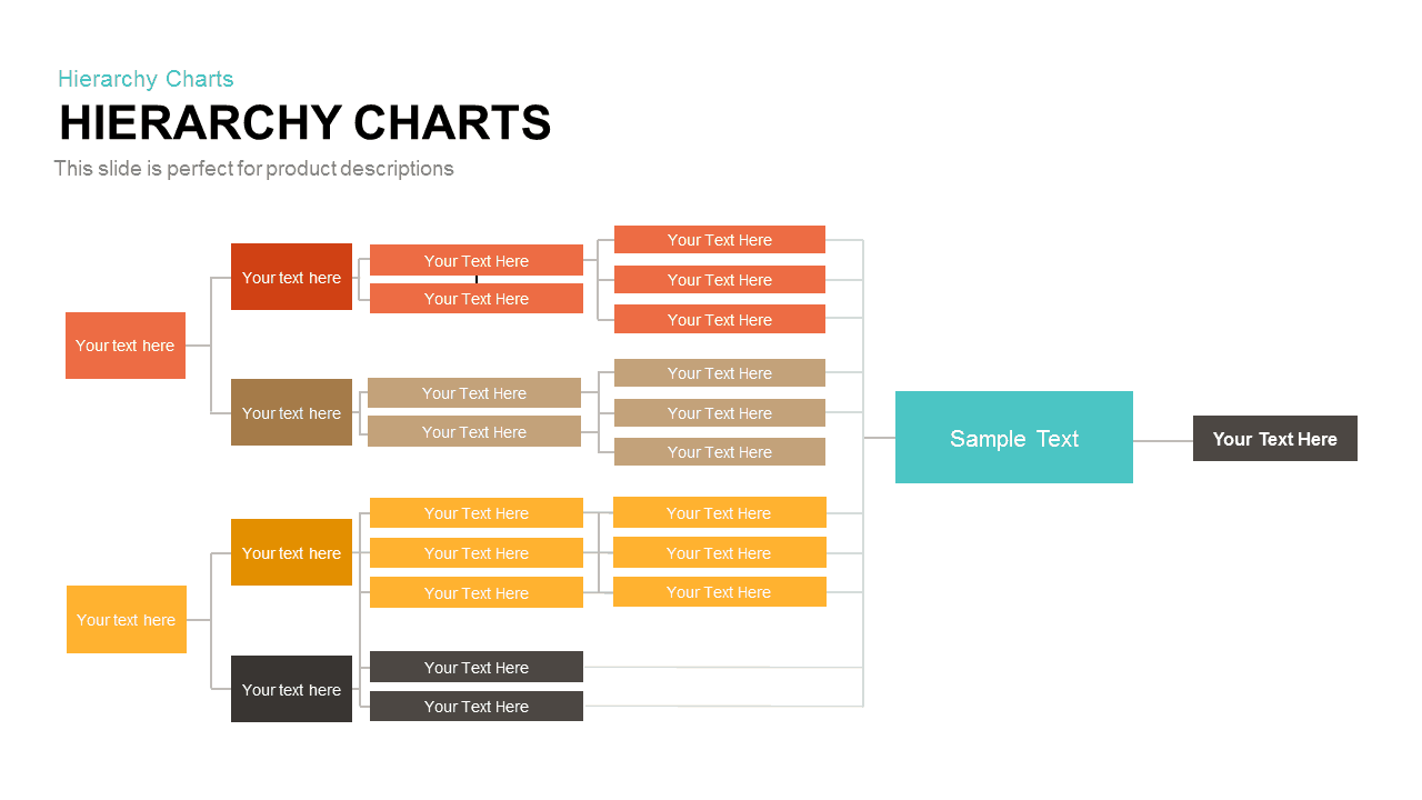
Horizontal Multi-Level Hierarchy Chart template for PowerPoint & Google Slides
Org Chart
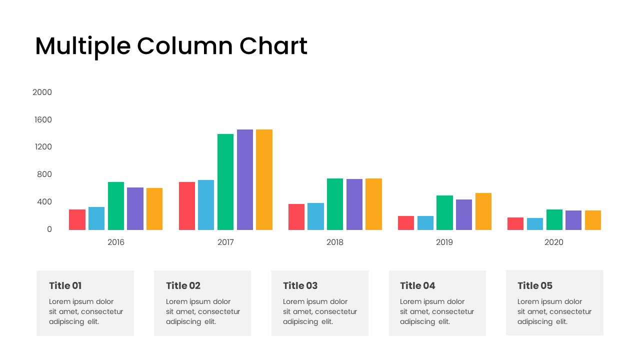
Minimal Multi-Year Column Chart Template for PowerPoint & Google Slides
Bar/Column
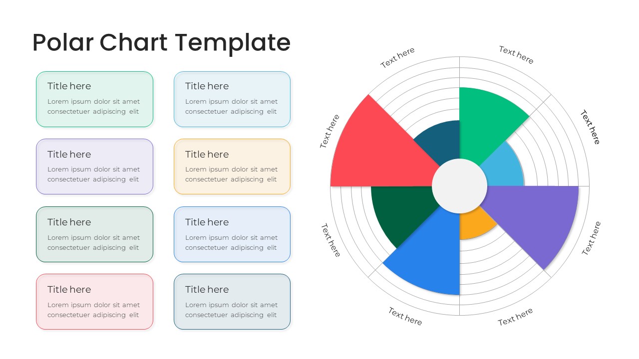
Modern Multi-Color Polar Chart Diagram Template for PowerPoint & Google Slides
Charts
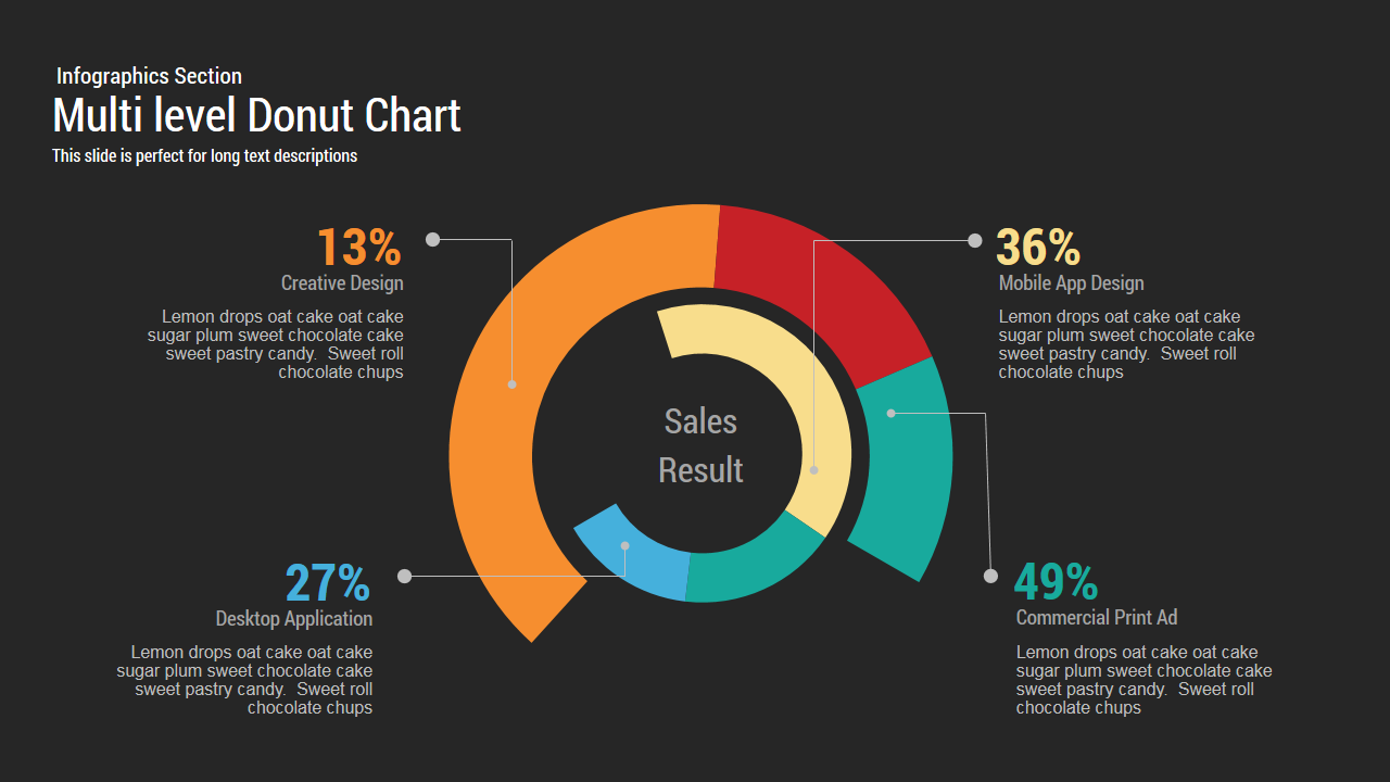
Multi level Donut Chart Template
Pie/Donut
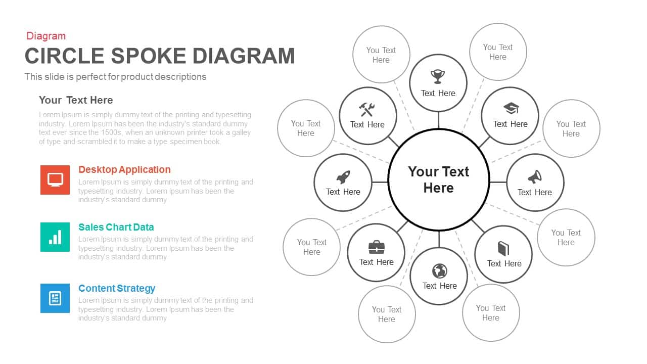
Multi-layout Circle Spoke Diagram Template for PowerPoint & Google Slides
Circular
Multi-Style Presentation Agenda Template for PowerPoint & Google Slides
Agenda

Free Multi Level Roadmap Infographic PowerPoint Template
Roadmap
Free
Animated Multi-Gear Cluster Infographic Template for PowerPoint & Google Slides
Process
Multi-Color Milestone Timeline Layout Template for PowerPoint & Google Slides
Timeline
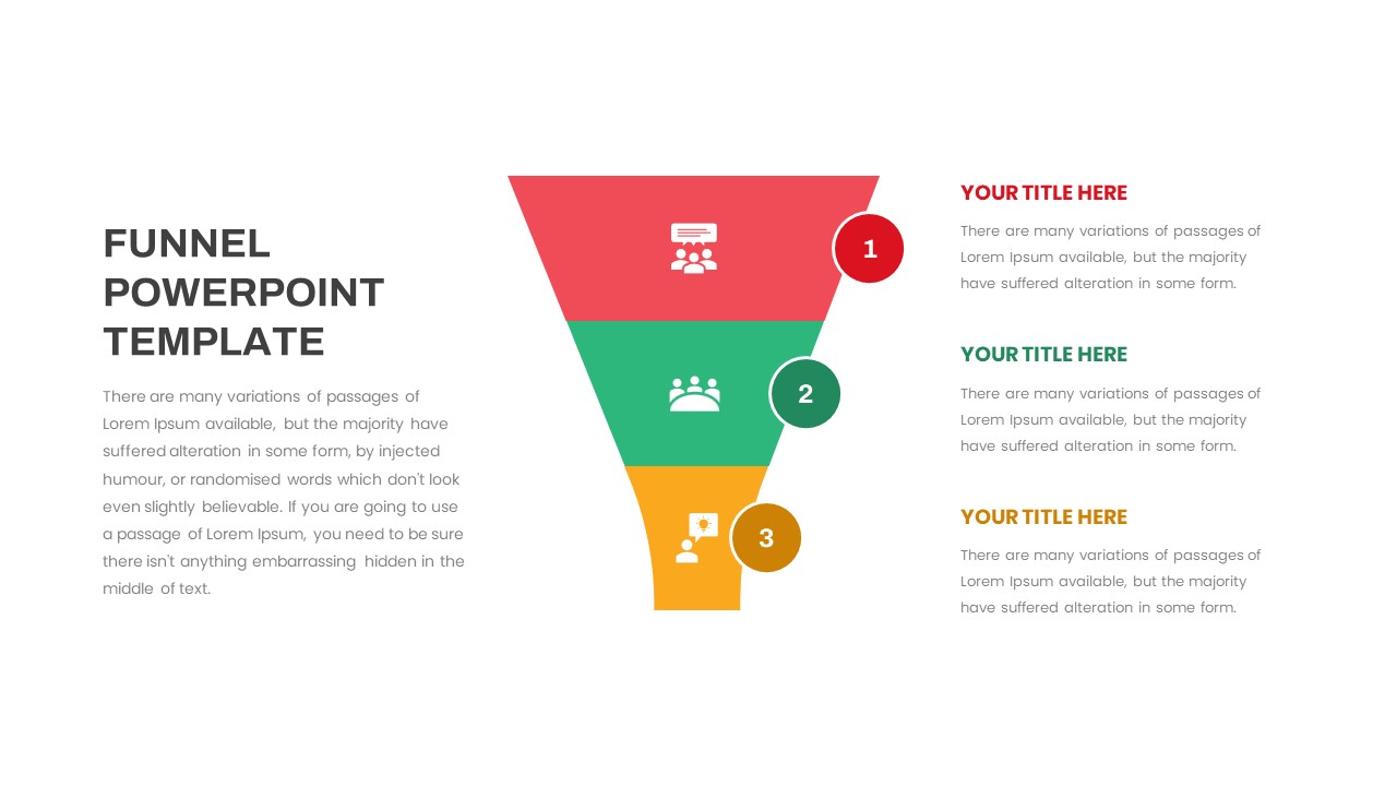
Funnel PowerPoint Template
Funnel
Free
Board of Directors PowerPoint Template
Our Team
Multi-Point Diagram Presentation Template for PowerPoint & Google Slides
Process
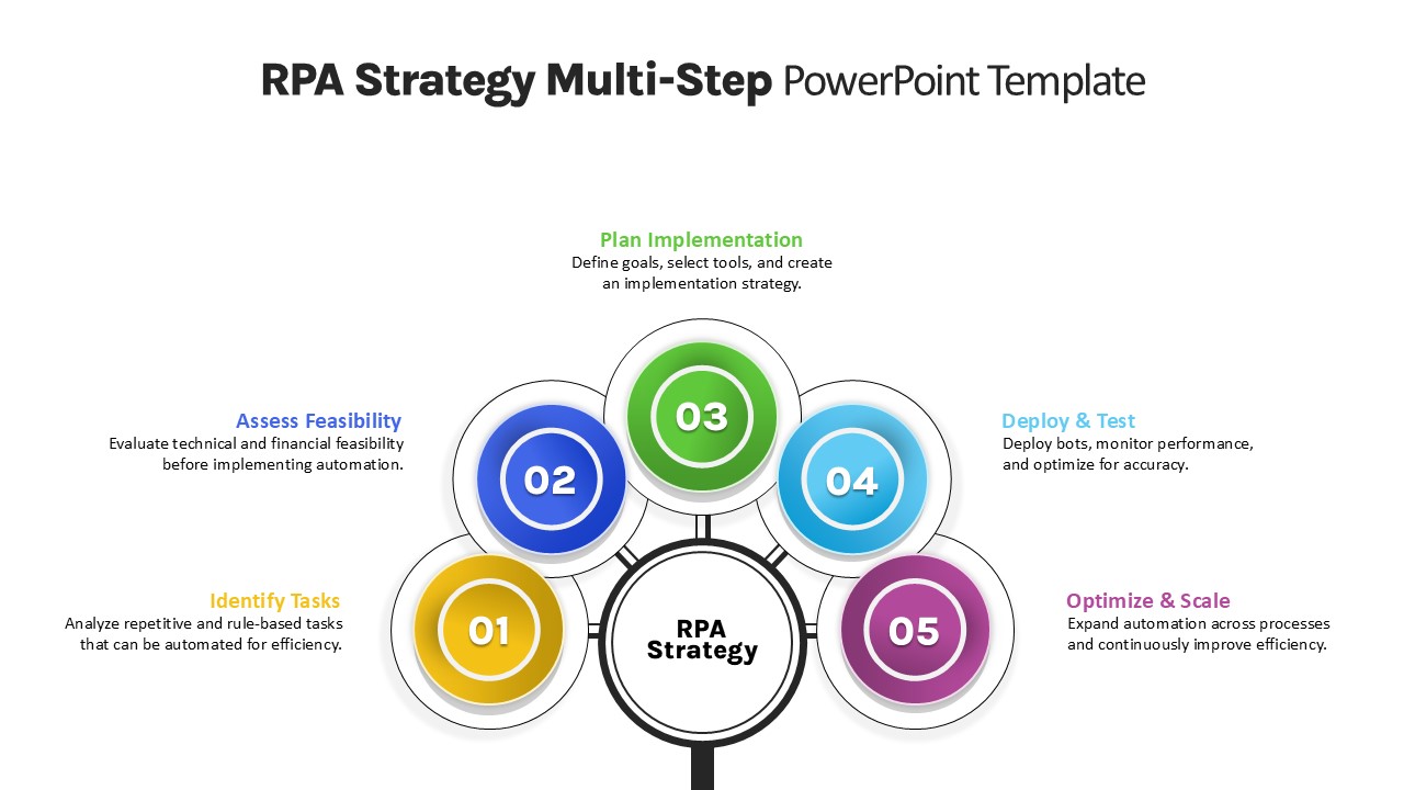
RPA Strategy Multi-Step Diagram Template for PowerPoint & Google Slides
Process
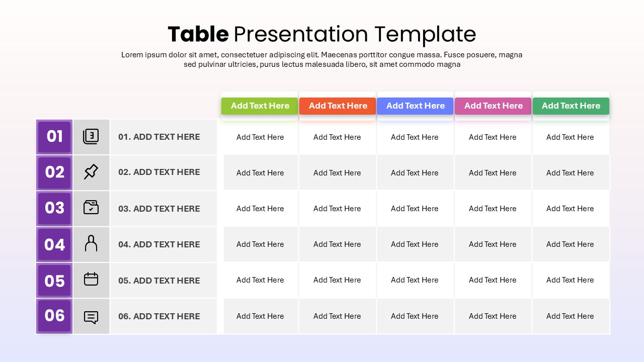
6-Row Highlight Table PowerPoint Template
Table
4-Section SWOT Analysis PowerPoint Template
SWOT
Multi Day Conference Agenda PowerPoint Template
Agenda