3D Pyramid Column Chart Template
3D Pyramid Column Chart for Data Visualization
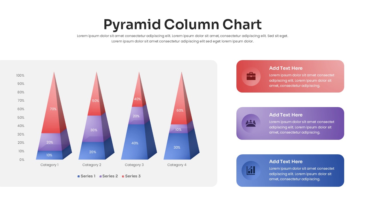
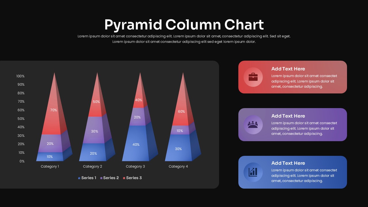
The 3D Pyramid Column Chart offers a visually engaging way to compare data across four categories and multiple segments. Each isometric pyramid is divided into three colored tiers, making it easy to show proportions, percentages, or layered values. A vertical axis and category labels provide context, while the supporting callout panels give you space to highlight important findings.
Use this 3D Pyramid Column Chart to present sales breakdowns, market share, customer segments, revenue distribution, resource allocation, campaign performance, and KPI comparisons. It can also support financial reports, marketing presentations, product analysis, business reviews, and management dashboards.
Turn Data Into a Visual Story
The pyramid structure makes layered information easier to compare at a glance. Use the callout areas to explain key trends, identify important differences, or summarize the actions suggested by your data. You can also duplicate or remove sections to accommodate different datasets and presentation requirements.
Login to download this file

Item ID
SB05389


Related Templates

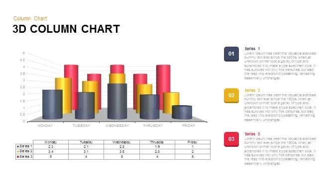
3D Column Chart for PowerPoint Presentation Template
Bar/Column

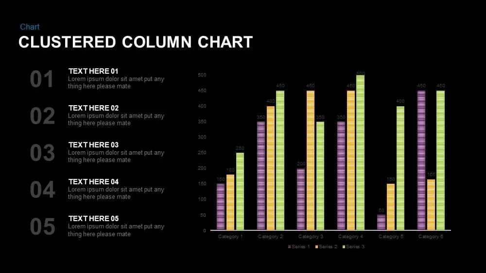
Clustered Column Chart PowerPoint Template
Bar/Column

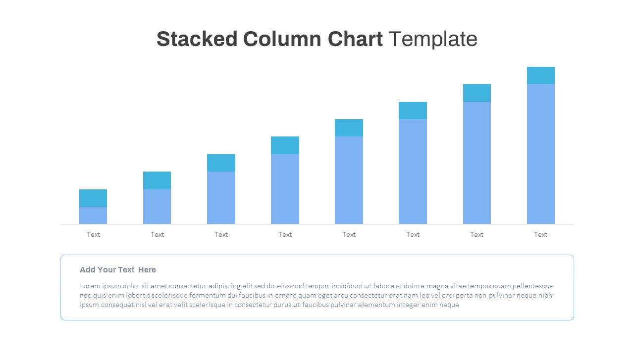
Stacked Column Chart Template
Bar/Column
Free
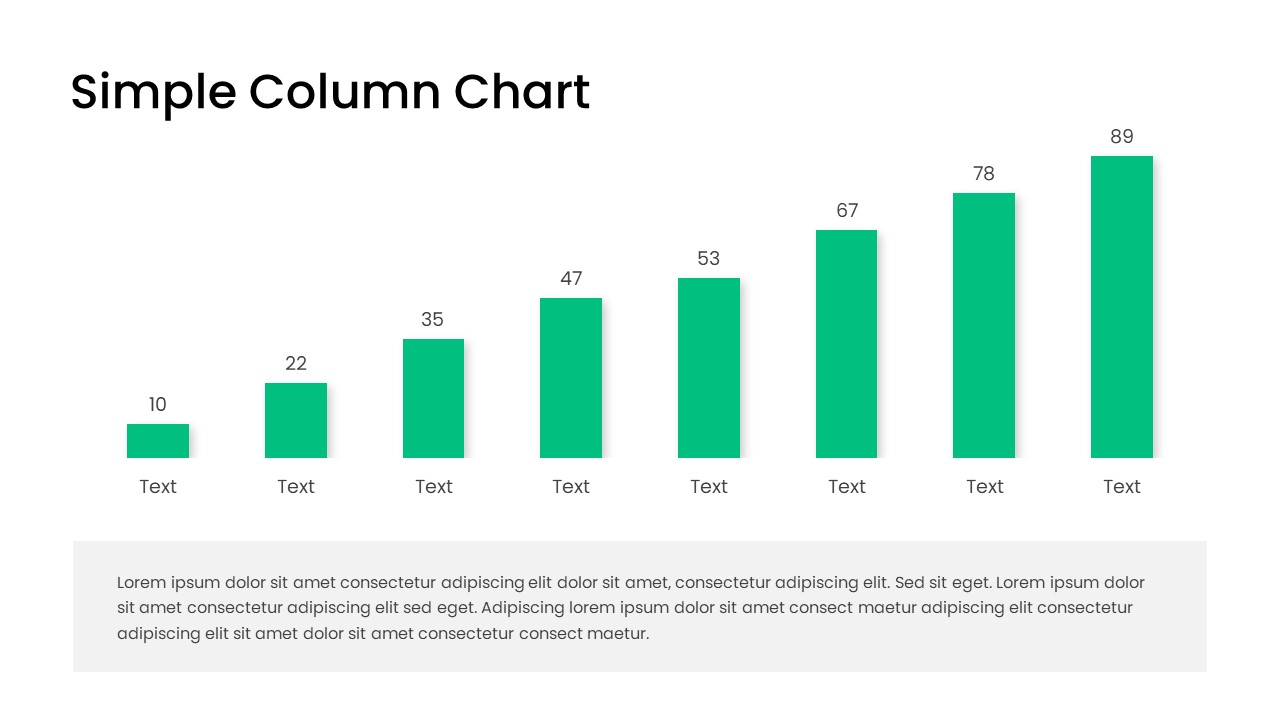
Free Editable Simple Column Chart for PowerPoint & Google Slides
Bar/Column
Free
Minimal Multi-Year Column Chart Template for PowerPoint & Google Slides
Bar/Column
Waterfall Column Chart PowerPoint Template
Bar/Column
Clustered Column Chart Template for PowerPoint & Google Slides
Bar/Column
100% Stacked Column Chart PowerPoint Template
Bar/Column
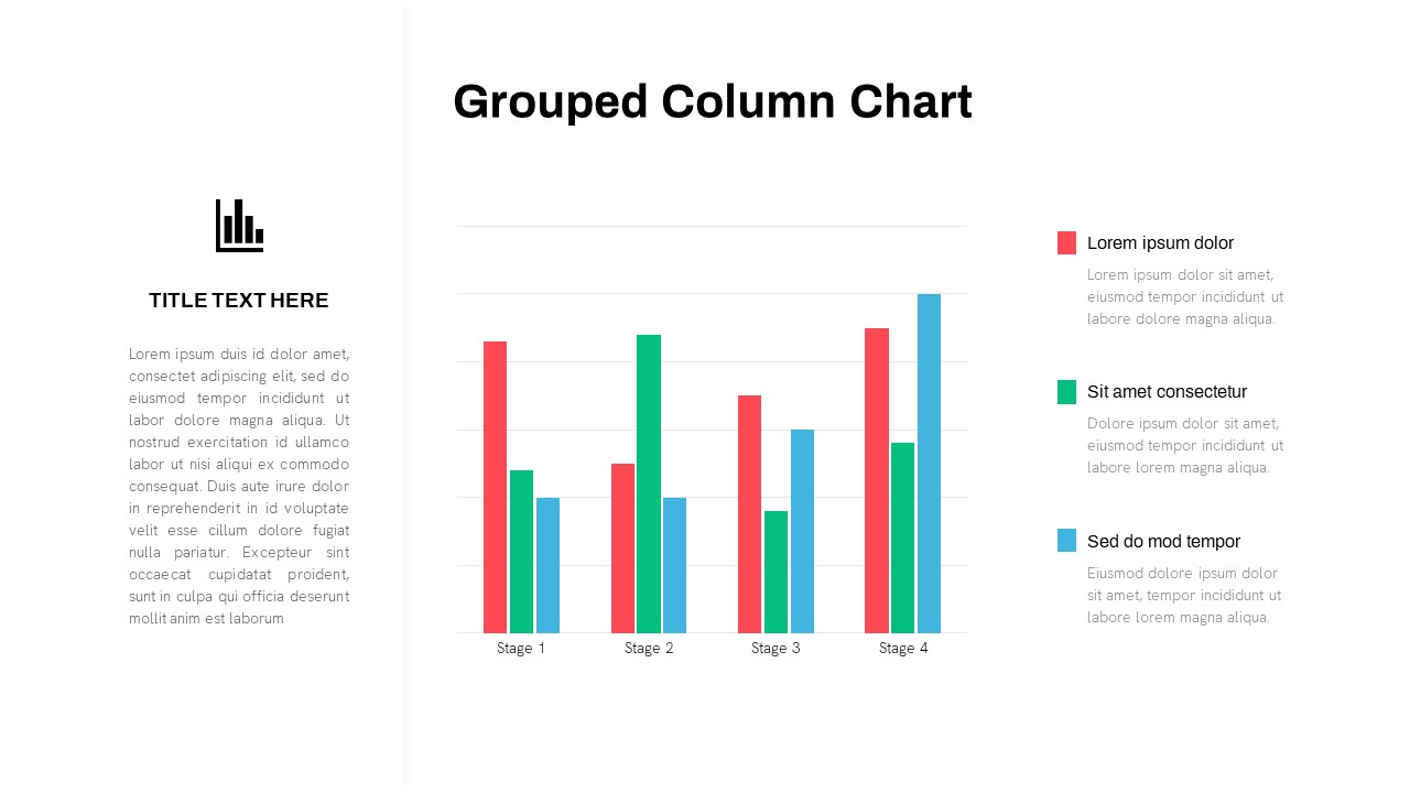
Grouped Column Chart PowerPoint Template
Bar/Column
4 Column Pricing Table Template for PowerPoint Template
Comparison
3-Column Comparison template for PowerPoint & Google Slides
Comparison
Six Column Table Template for PowerPoint
Table
Clean Three-Four Column Table Slide Template for PowerPoint & Google Slides
Business Report
3 Column PowerPoint Template
Infographics
5 Column Infographic Template
Business
6-Row Highlight Table PowerPoint Template
Table
Four Column Table Presentation Template
Table
Table Presentation Template PPT & Google Slides Theme
Comparison
4-Column Blank Table PowerPoint Template
Table
Six Column Data Table Template
Table