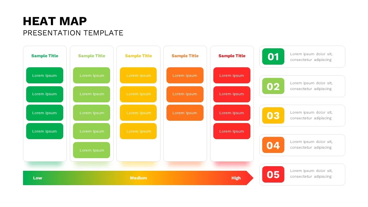
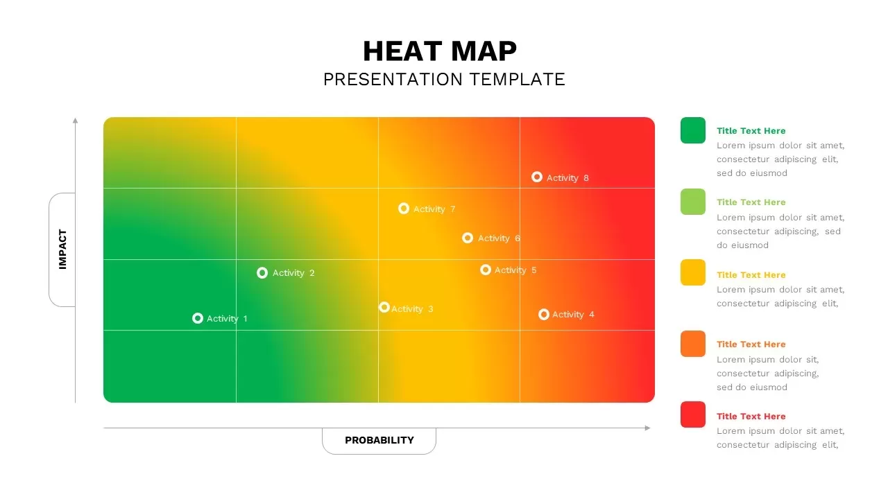
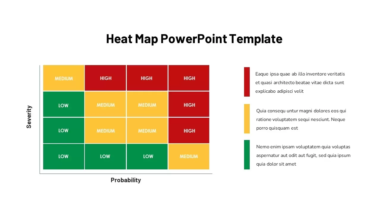
Heat Map Template for Presentations
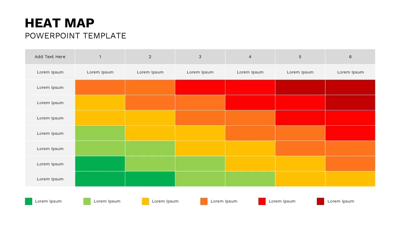
Transform raw data into meaningful visual insights with this Data Visualization Heat Map PowerPoint Template. Designed for professionals who need to present complex information in a simple and impactful format, this template uses a color-coded heat map structure to highlight trends, comparisons, and performance levels at a glance.
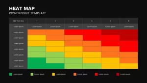
The layout features a clean matrix design where colors represent varying levels of intensity, performance, risk, or activity. This visual approach enables audiences to quickly identify patterns, outliers, strengths, and areas that require attention without having to analyze lengthy tables or spreadsheets. The gradient-based format makes large datasets easier to interpret, helping presenters communicate findings more effectively.
Ideal for business analysts, project managers, consultants, marketers, financial professionals, researchers, and educators, this ppt template supports a wide range of analytical and reporting needs. Use it to present key performance indicators, sales performance, market research results, customer satisfaction scores, risk assessments, operational metrics, resource utilization, or strategic planning data. The heat map design is particularly useful when comparing multiple variables across categories, departments, regions, or time periods.
The professional appearance of the heatmap ppt template makes it suitable for executive meetings, board presentations, corporate reports, workshops, training sessions, and academic projects. Its structured format ensures information remains organized while maintaining a visually engaging presentation style that encourages data-driven decision-making.
Fully editable in both PowerPoint and Google Slides, the template allows users to customize labels, data categories, color scales, and content with ease. Whether you need to adapt the slide for business reporting, performance monitoring, or research analysis, the flexible layout can be tailored to fit your specific requirements.
By combining clarity, simplicity, and analytical power, this Heat Map Presentation Template helps transform complex datasets into compelling visual stories. It is an excellent choice for professionals seeking to present information in a way that is both informative and easy to understand, ensuring key insights stand out and resonate with audiences. Download this Heat Map presentation Template now!
Login to download this file

Item ID
SB02912
Related Templates

Risk Management Heat Map Diagram Template for PowerPoint & Google Slides
Comparison Chart
Heat Map Analysis Template for PowerPoint & Google Slides
Risk Management
Heat Map Risk Assessment Presentation Template for PowerPoint & Google Slides
Risk Management
Professional Risk Heat Map Visualization Template for PowerPoint & Google Slides
Risk Management
Heat Map Template for PowerPoint
Bar/Column
Heat Map Infographic Template For Risk Assessment and Priority Analysis
Comparison Chart
Heat Map Slide for PowerPoint For Presentation
Maps
Flow Chart Template For PowerPoint Presentations
Flow Charts
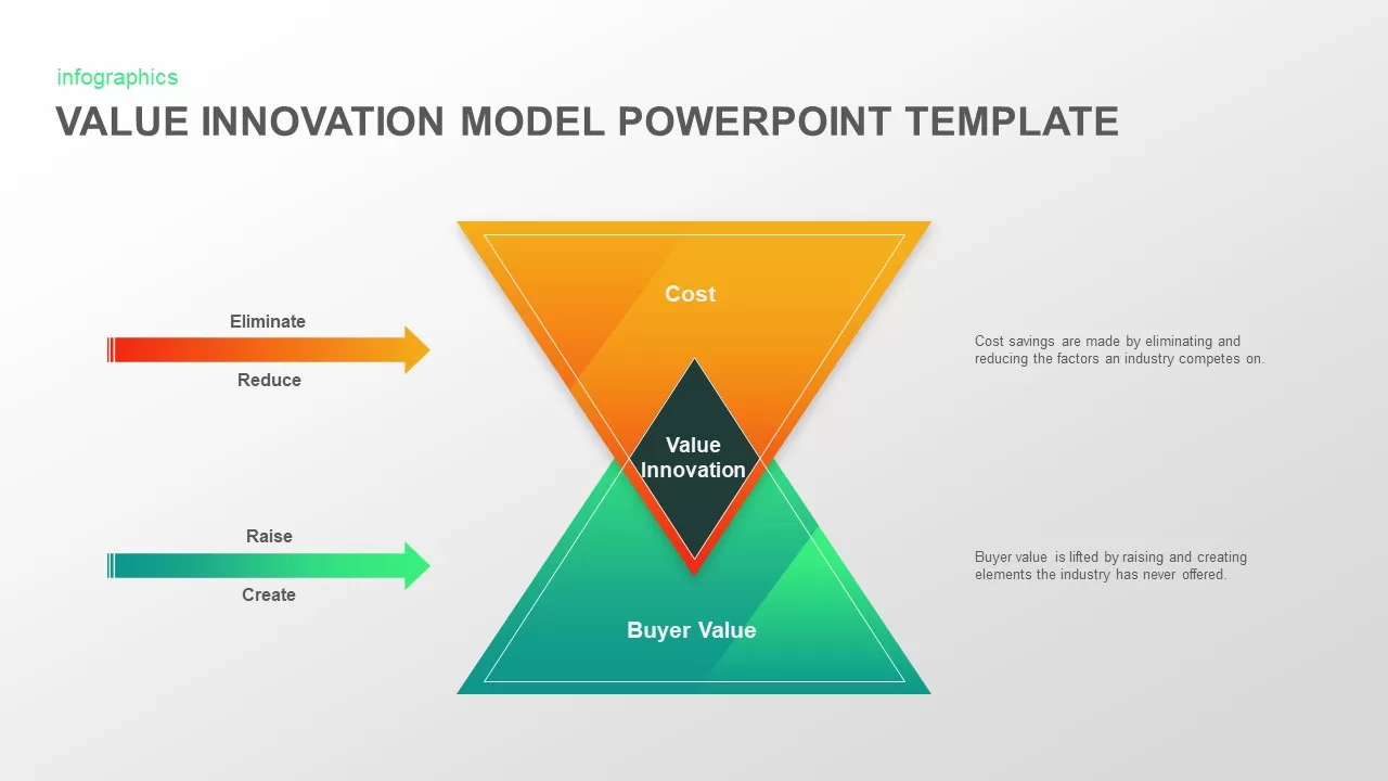
Value Innovation Model PowerPoint & Google Slides Template for Presentations
Business Proposal
Employee Training Deck PowerPoint Template for Presentations
Recruitment

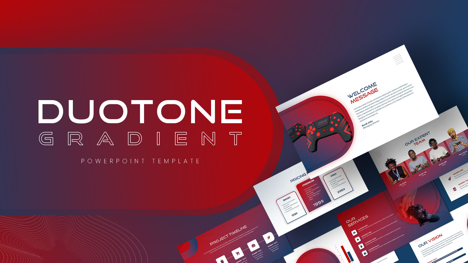
Duotone Gradient PowerPoint & Google Slides Template for Presentations
Technology
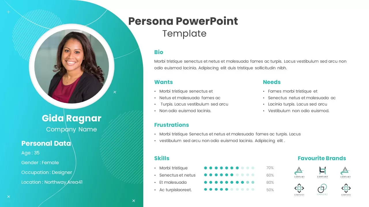
Persona PowerPoint Template for Presentations
Customer Journey
Free Sticky Notes Template Designed For Presentations
Graphics
Free

Free Company Profile PowerPoint Template for Business Presentations
Company Profile
Free
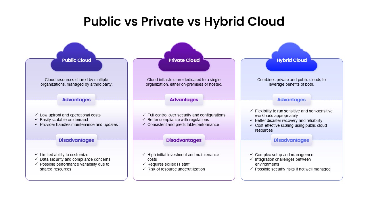
Public vs Private vs Hybrid Cloud Comparison Template for Presentations
Cloud Computing
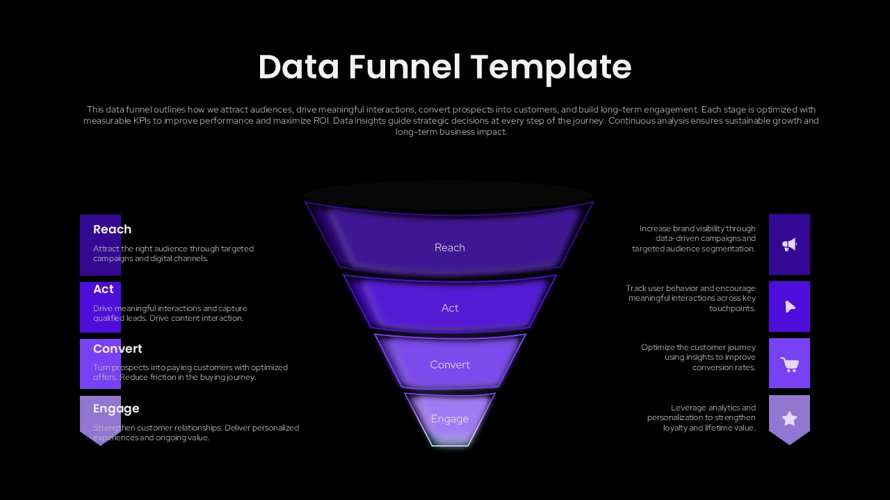
Data Funnel Template for Marketing Presentations (PowerPoint/Google Slides)
Funnel
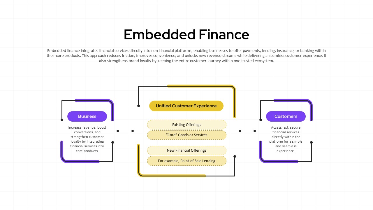
Embedded Finance Template for Presentations (PowerPoint/Google Slides)
Finance
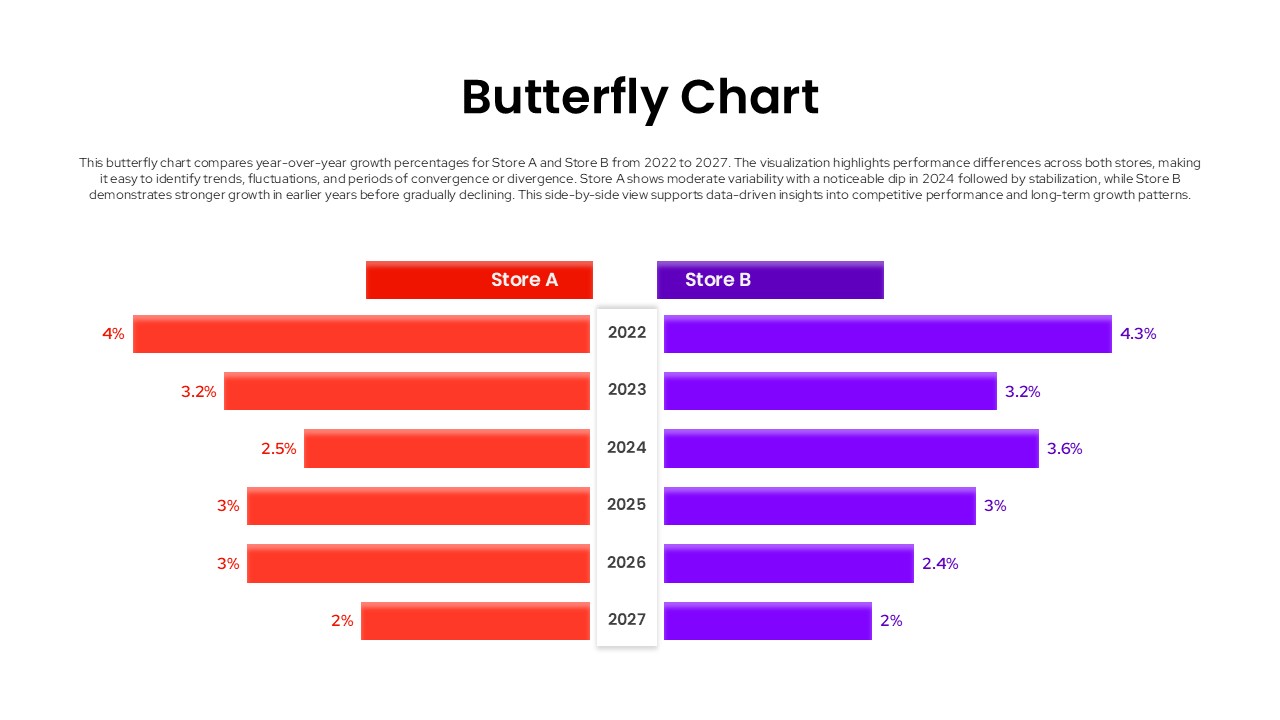
Butterfly Chart Template for PowerPoint & Google Slides Presentations
Comparison Chart
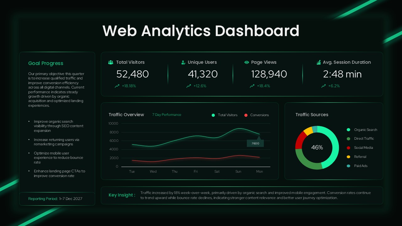
Web Analytics Dashboard Template for PowerPoint & Google Slides Presentations
Business
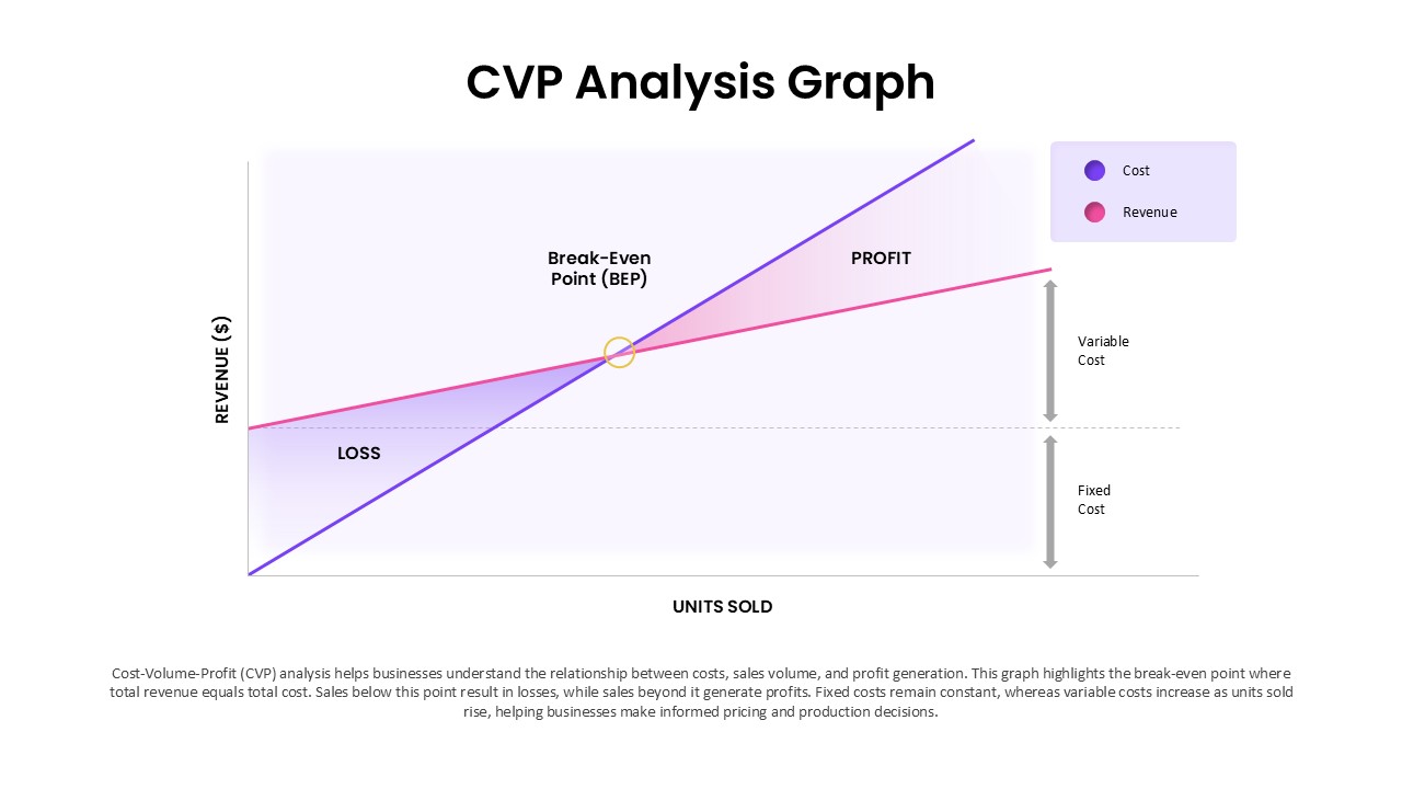
Cost Volume-Profit Analysis Graph (CVP) Template for Financial Planning Presentations
Finance