Butterfly Chart Template for PowerPoint & Google Slides Presentations

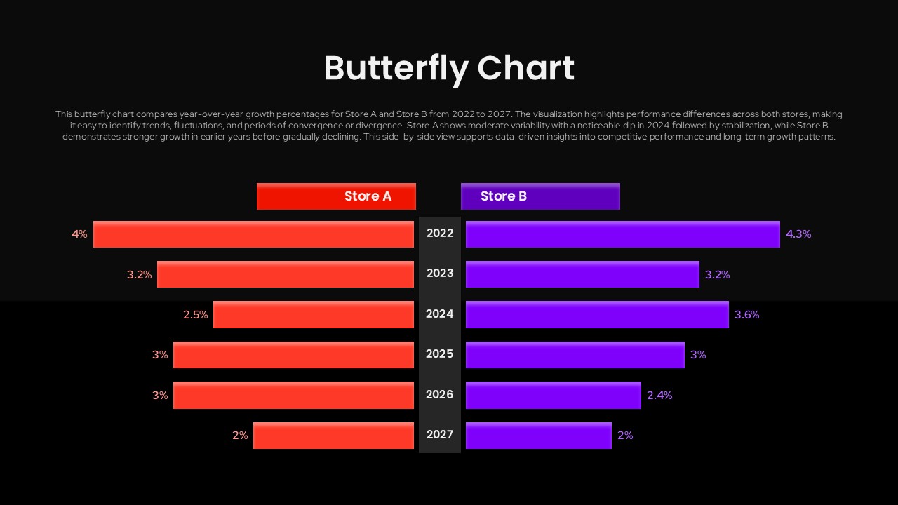
This is a butterfly chart (also known as a tornado chart or divergent bar chart) template for PowerPoint and Google Slides presentations. It places two sets of data side by side, having a shared central axis. This looks like a butterfly wing, and that’s how it got its name. This type of chart makes it easy to see which side is “winning” in any given year.
The template is available in 2 themes, but can be customized easily using your presentation tool. It’s perfect for presentations related to comparative analysis, sales performance monitoring, or business intelligence.
For more slides like this, check out our collection of comparison chart templates.
Frequently Asked Questions
How do I customize the data values in the butterfly chart?
Can I change the colors of the Store A and Store B bars?
Login to download this file

Item ID
SB05817Designed By
Naseeba Sithara
Related Templates

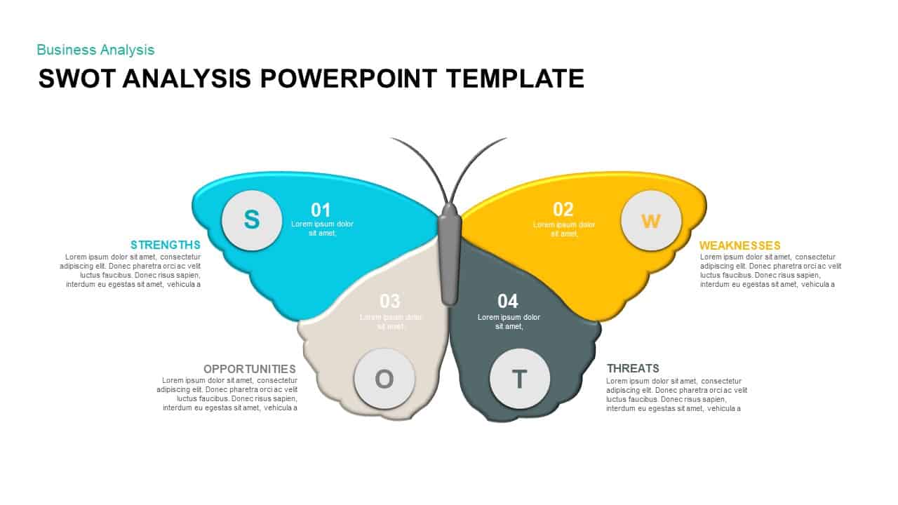
Butterfly SWOT Analysis Diagram Template for PowerPoint & Google Slides
SWOT
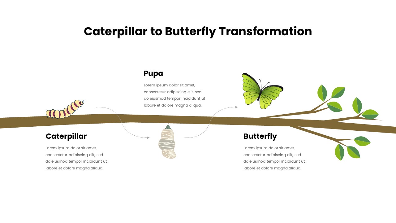
Caterpillar to Butterfly Process Template for PowerPoint & Google Slides
Process
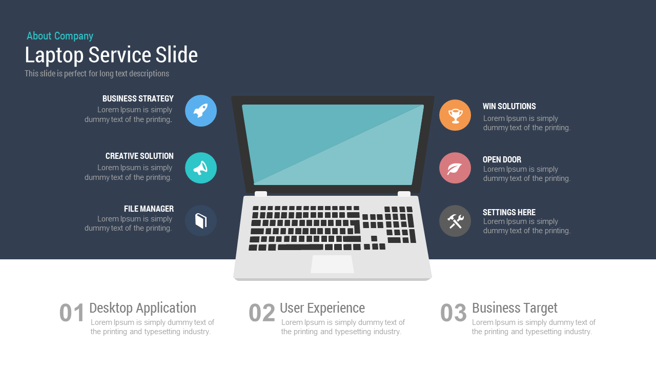
Free Laptop Service Slide Template for PowerPoint & Google Slides Presentations
Business
Free
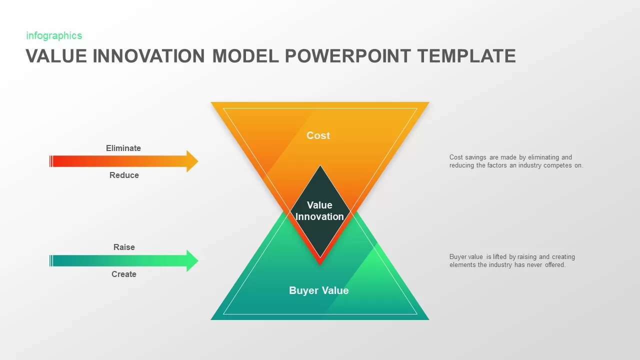
Value Innovation Model PowerPoint & Google Slides Template for Presentations
Business Proposal
Business Competition PowerPoint & Google Slides Template for Presentations
Business Strategy
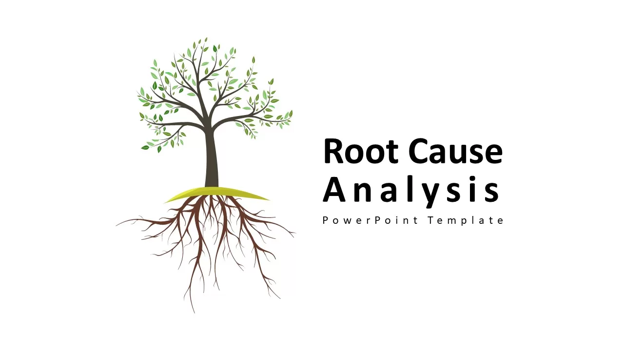
Root Cause Analysis Template PowerPoint and Google Slides
Business Strategy
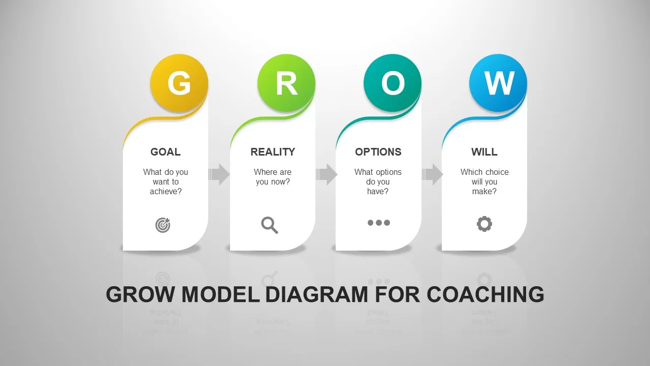
GROW Model Coaching PowerPoint & Google Slides Template for Presentations
Business Strategy

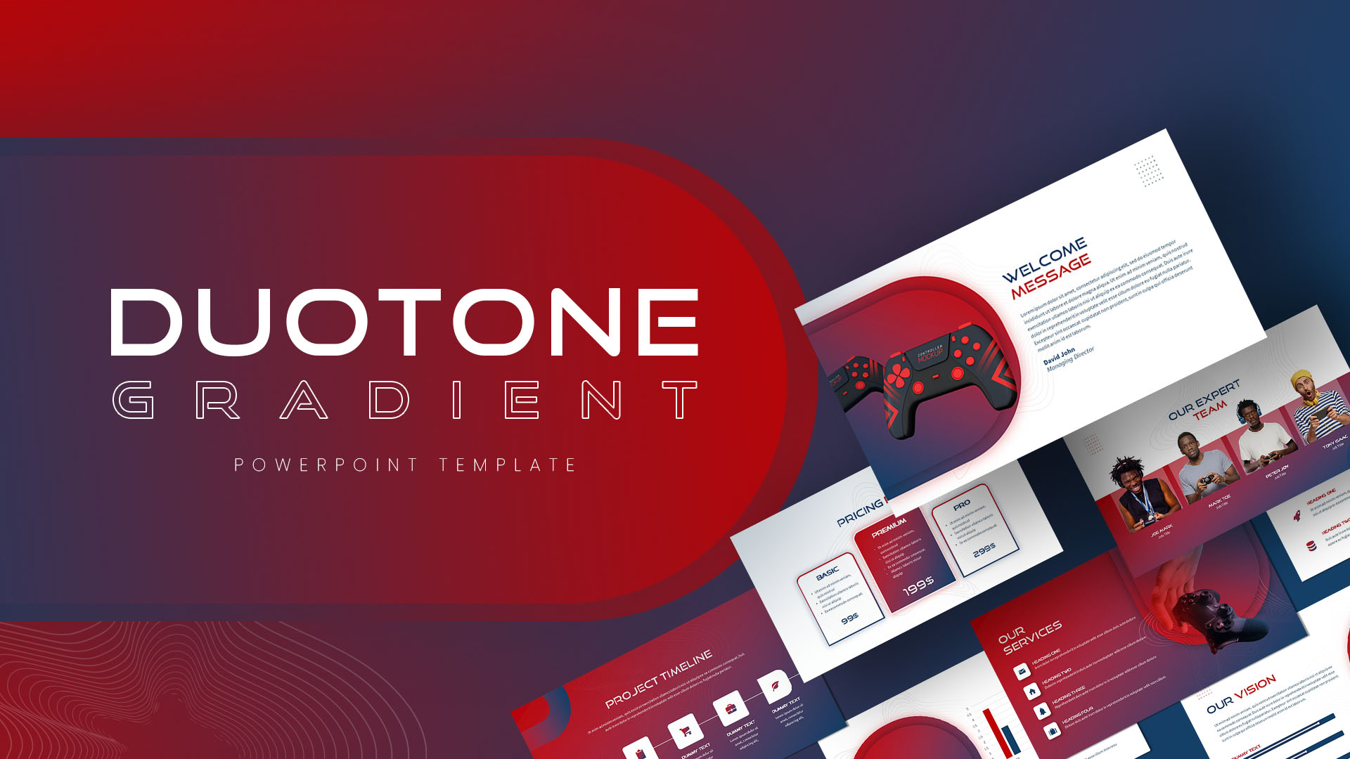
Duotone Gradient PowerPoint & Google Slides Template for Presentations
Technology
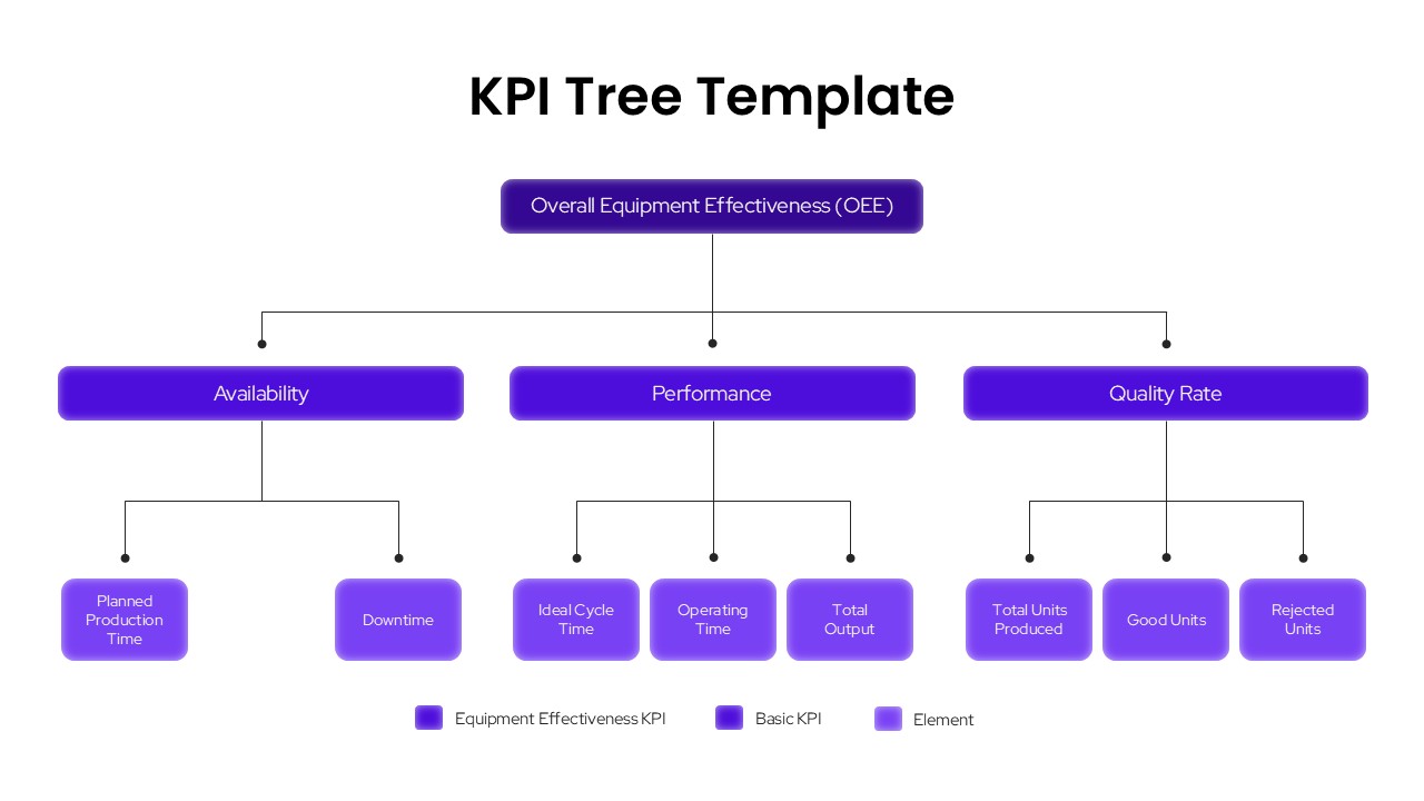
KPI Tree OEE Breakdown Template for PowerPoint & Google Slides Presentations
Infographics
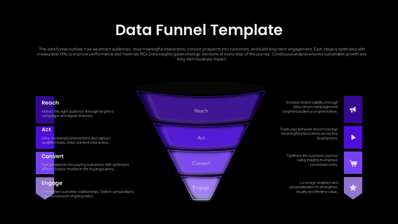
Data Funnel Template for Marketing Presentations (PowerPoint/Google Slides)
Funnel
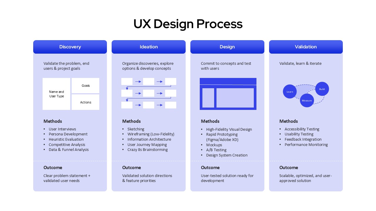
UX Design Process Template for PowerPoint and Google Slides Presentations
Process
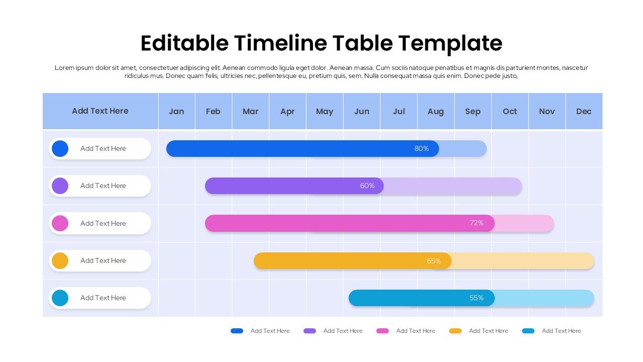
Editable Timeline Table Template for PowerPoint Presentations & Google Slides
Timeline
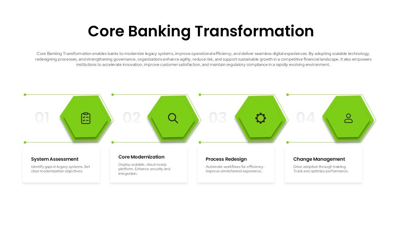
Core Banking Transformation Template for PowerPoint & Google Slides Presentations
Information Technology
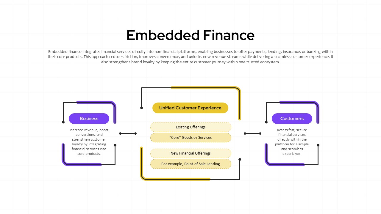
Embedded Finance Template for Presentations (PowerPoint/Google Slides)
Finance
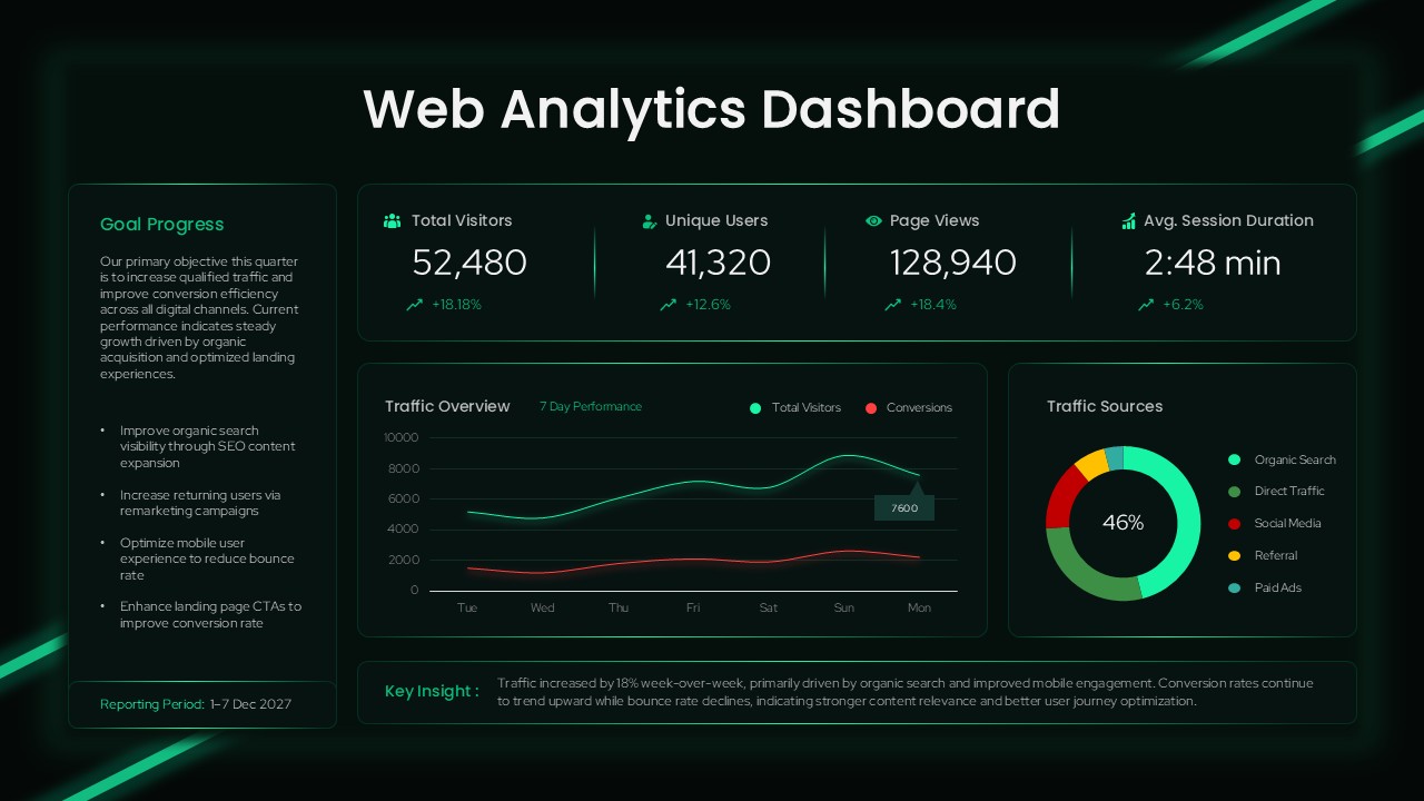
Web Analytics Dashboard Template for PowerPoint & Google Slides Presentations
Business
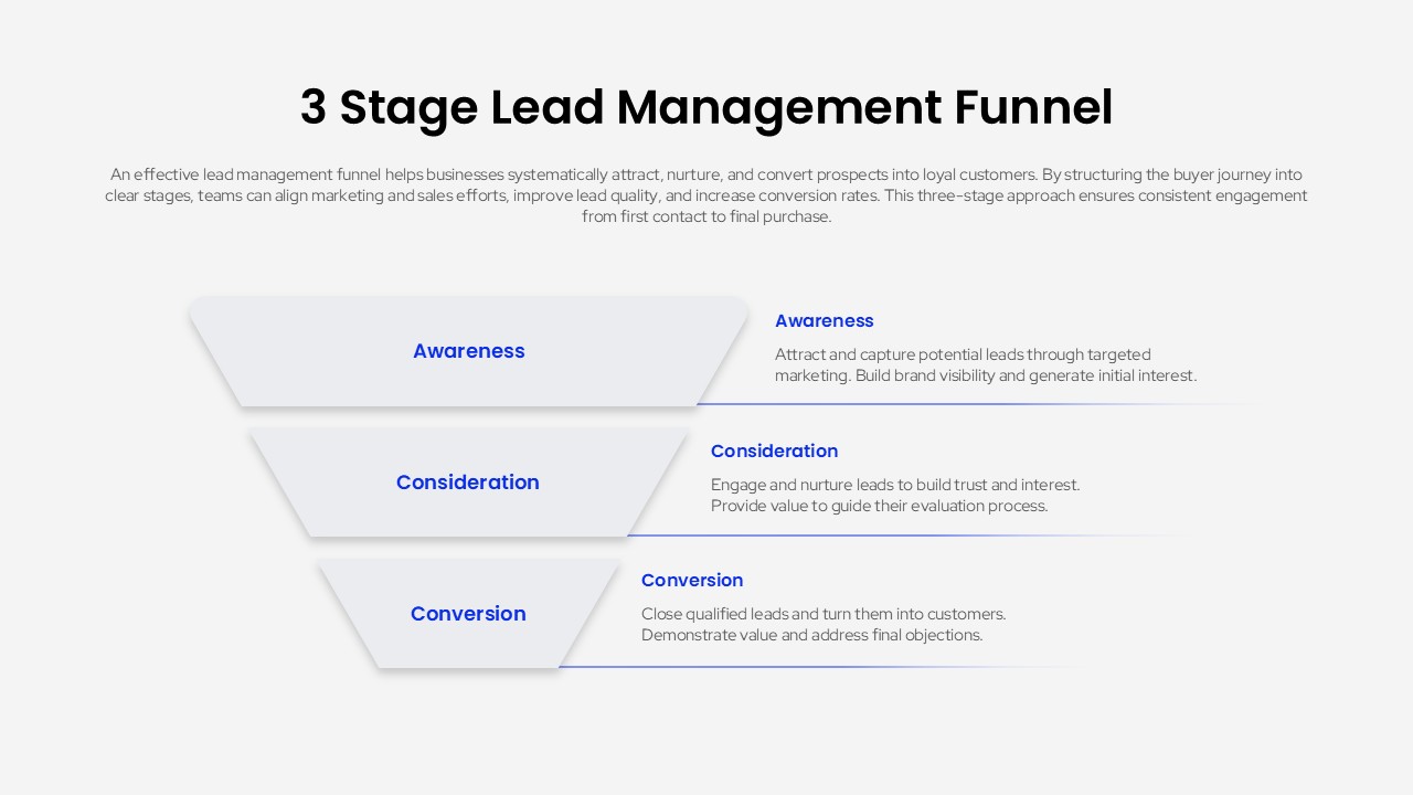
3 Stage Lead Management Funnel Template for Marketing and Sales Presentations
Marketing Funnel
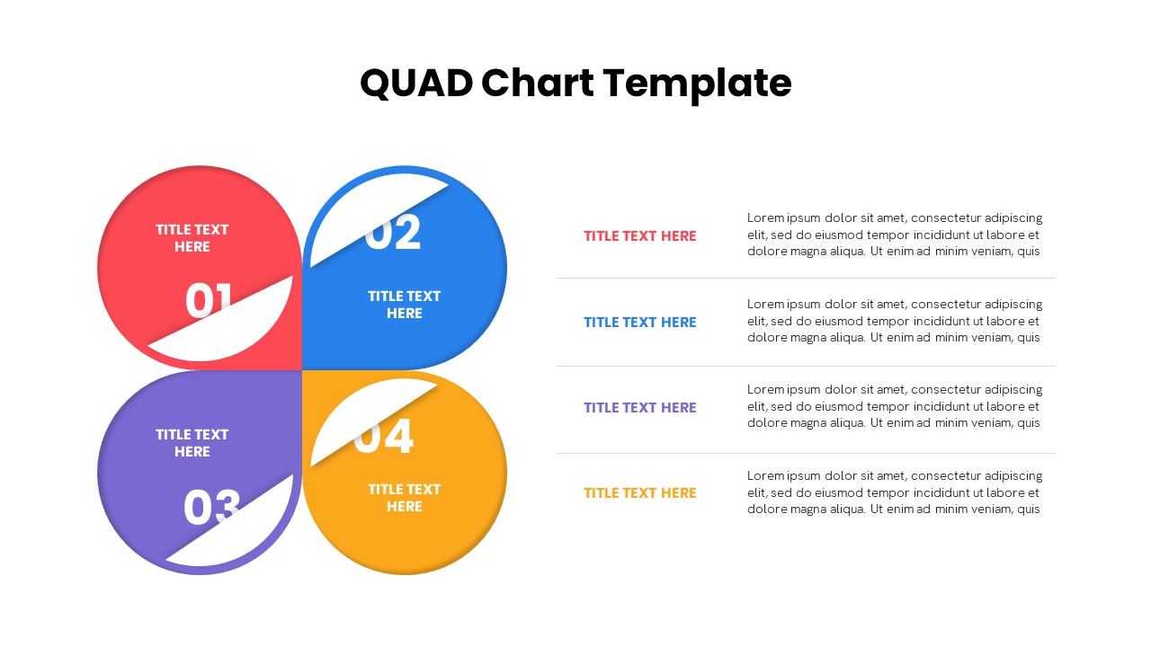
Quad Chart Infographic Pack of 8 Slides Template for PowerPoint & Google Slides
Comparison Chart
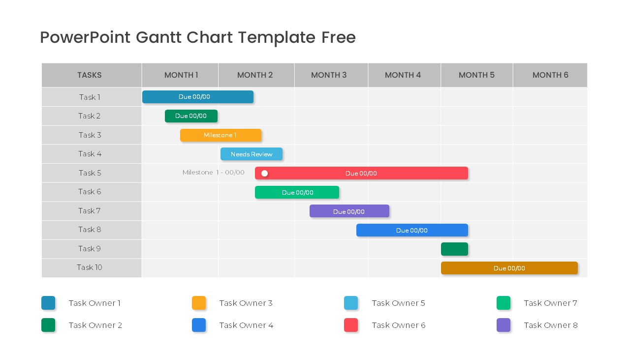
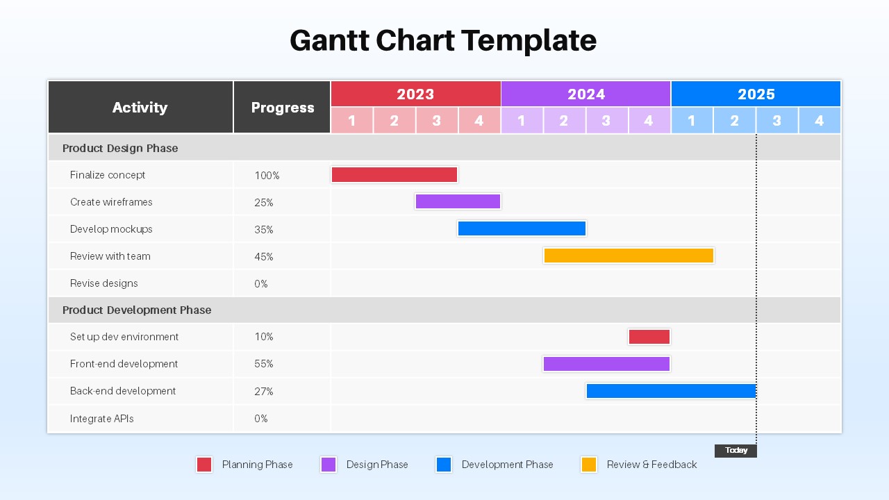
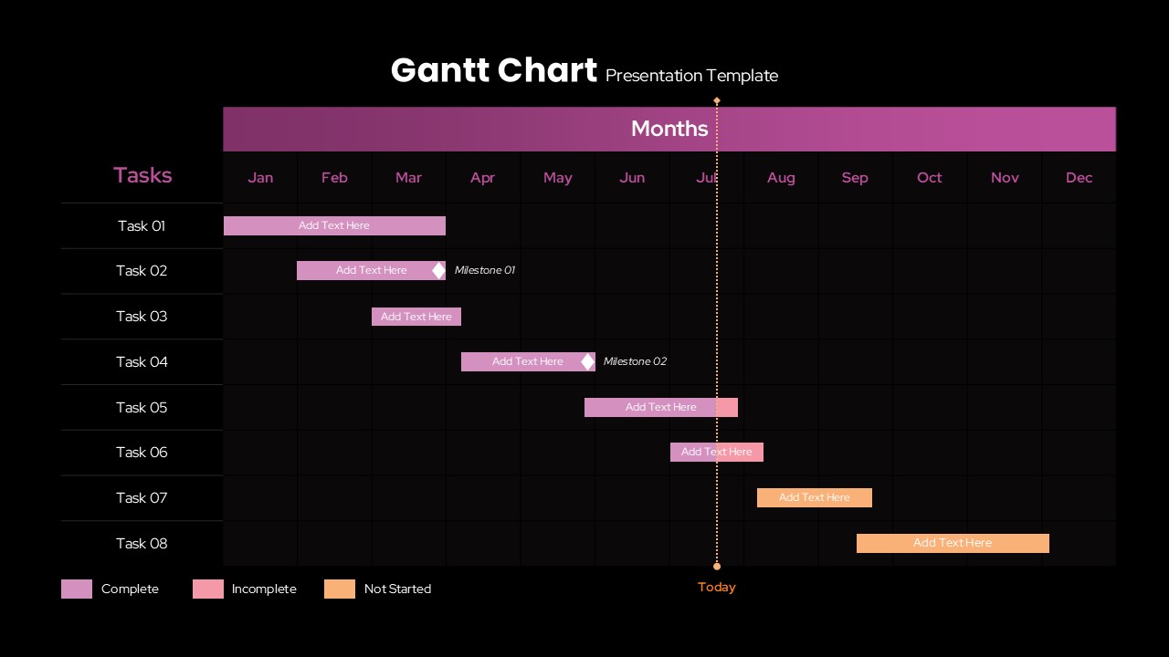
Free Professional Gantt Chart Pack – 4 Slides Template for PowerPoint & Google Slides
Gantt Chart
Free
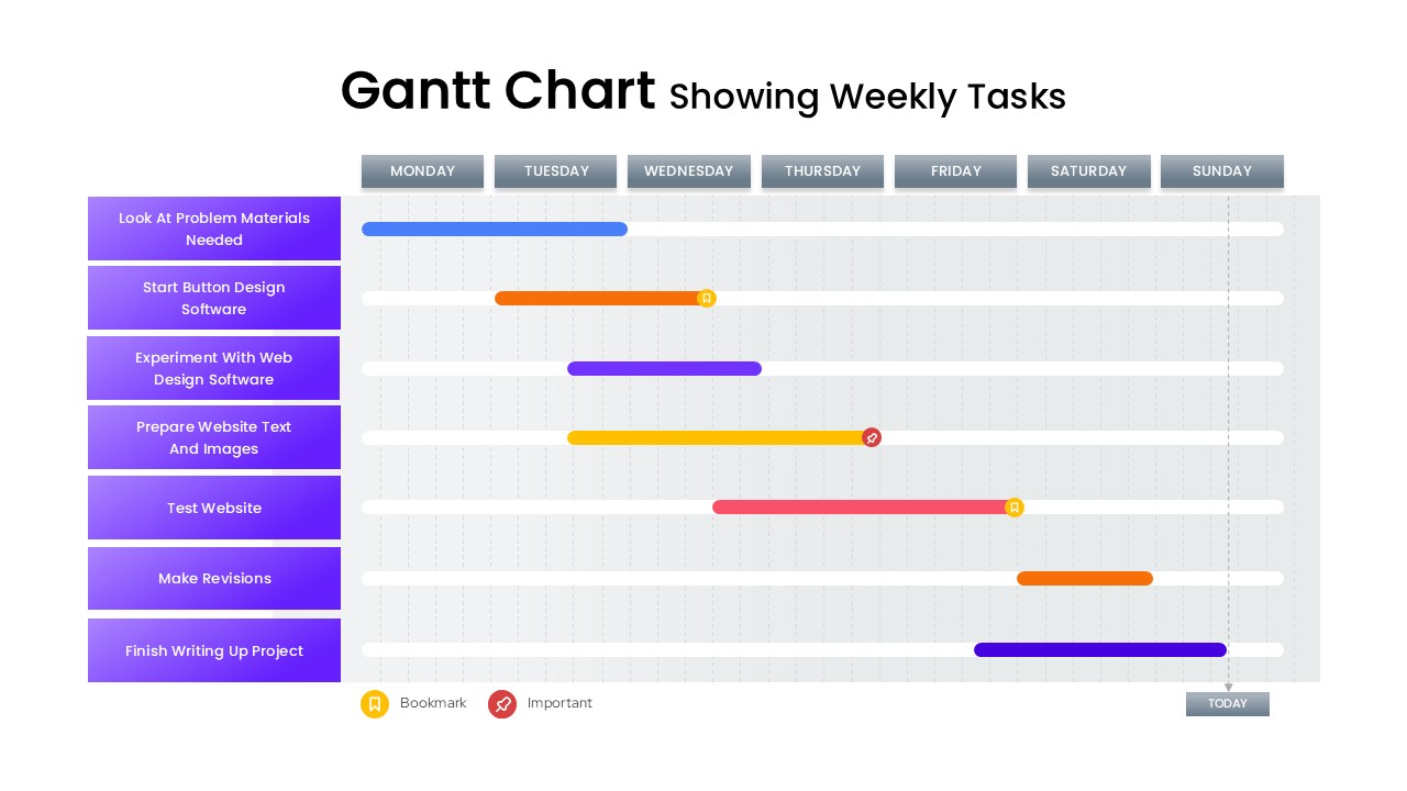
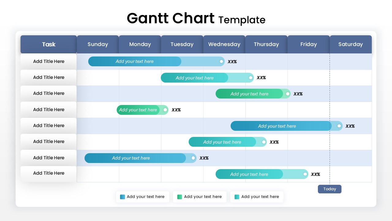
Gantt Chart Template Showing Weekly Tasks Template for PowerPoint & Google Slides
Gantt Chart
Mobile Data Analysis Chart template for PowerPoint & Google Slides
Charts
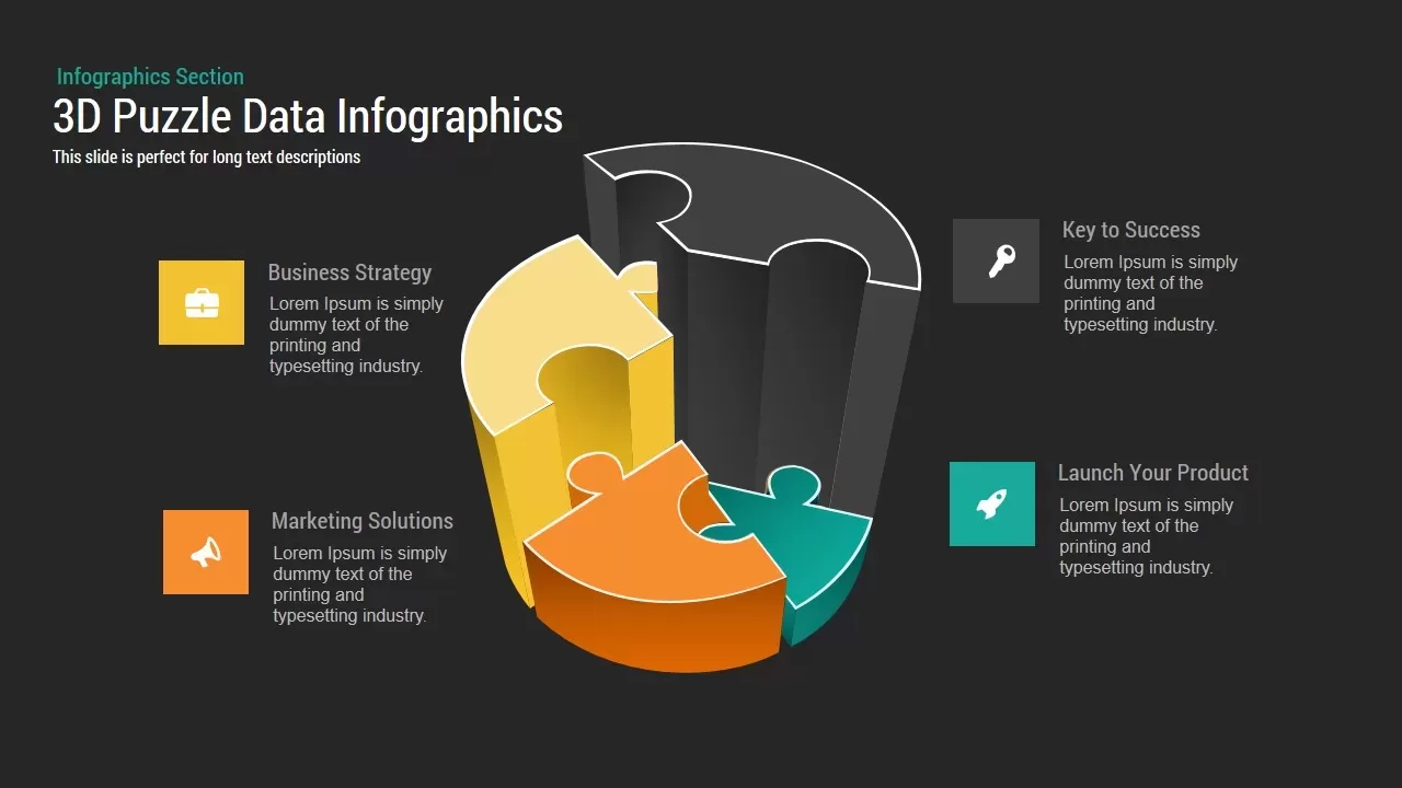
3D Puzzle Chart template for PowerPoint & Google Slides
Infographics
Creative Data Analysis Bar Chart template for PowerPoint & Google Slides
Bar/Column
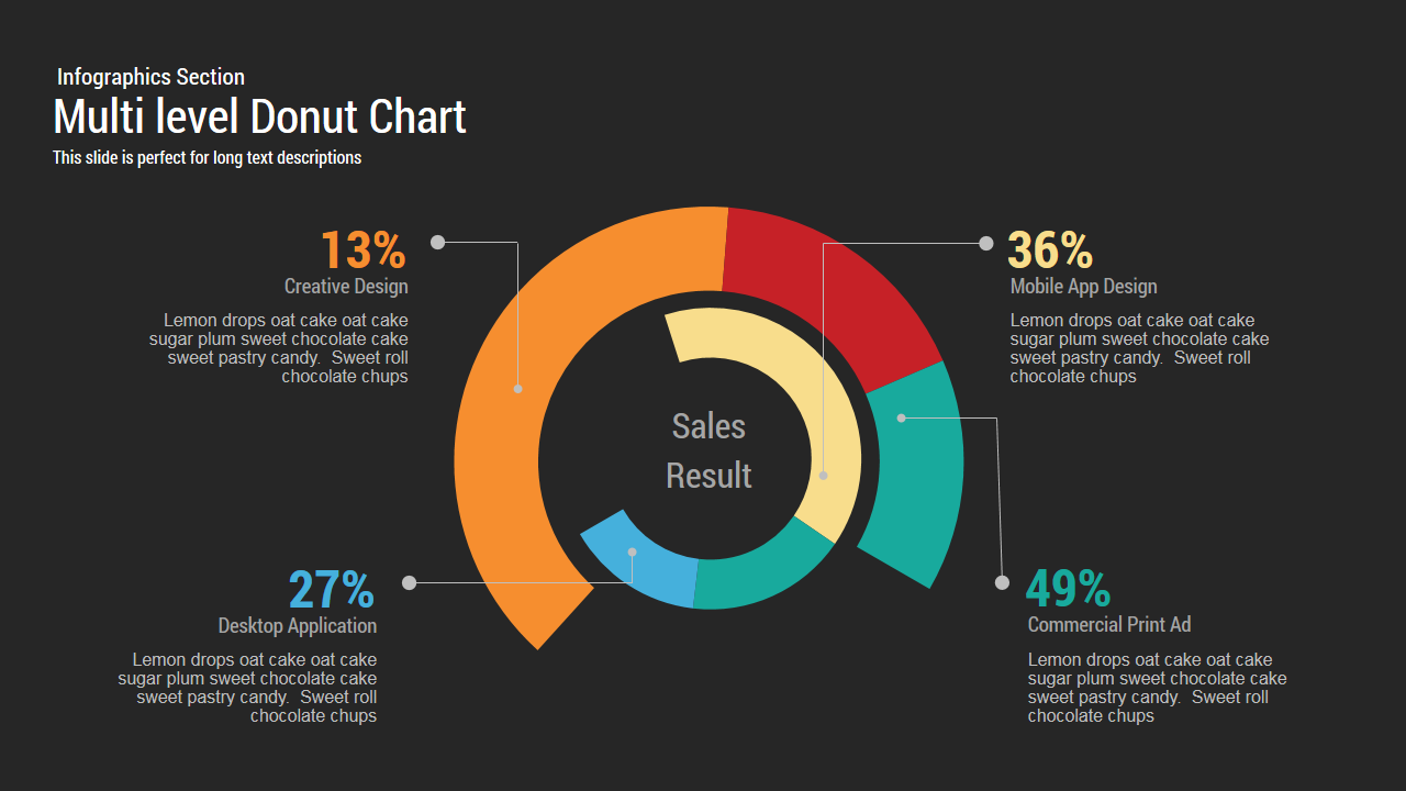
Multi level Donut Chart Template
Pie/Donut

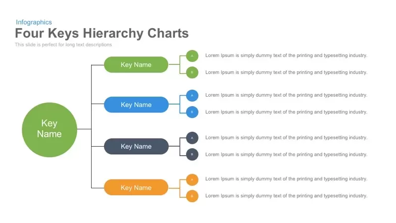
Four Keys Hierarchy Chart template for PowerPoint & Google Slides
Process
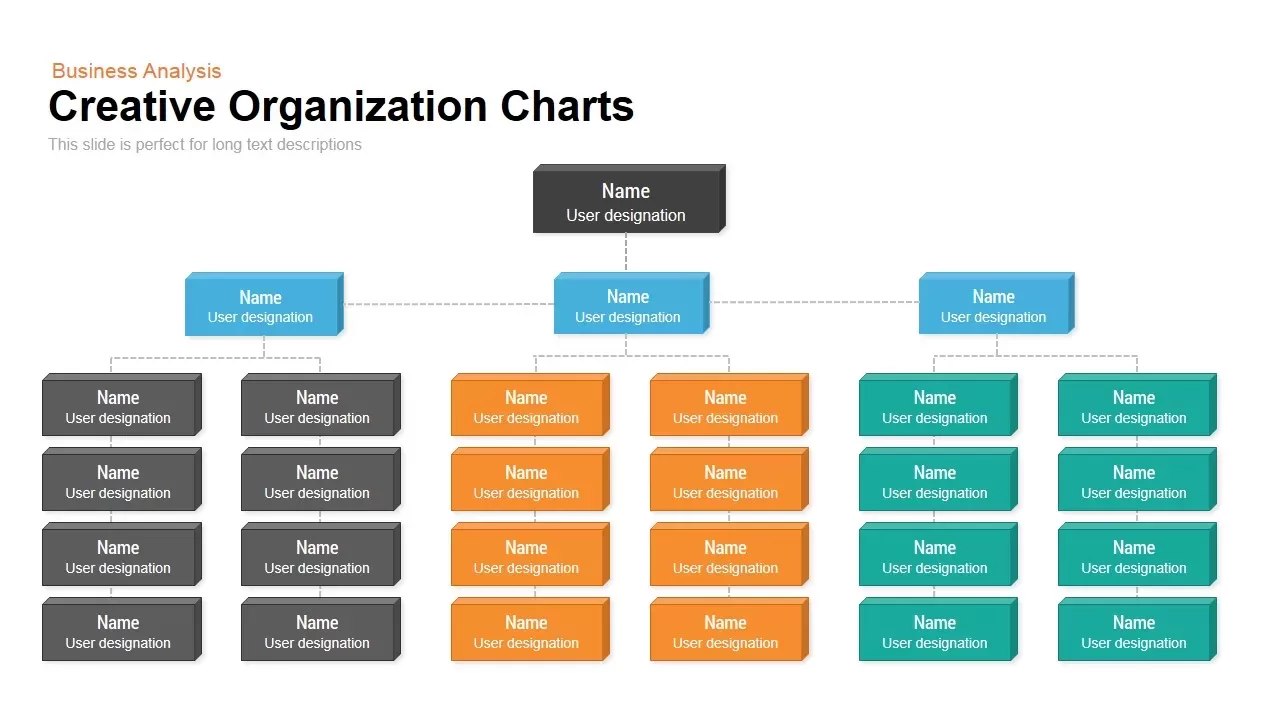
Organization Chart template for PowerPoint & Google Slides
Org Chart
3D Bar Chart Data Infographics Template for PowerPoint & Google Slides
Bar/Column
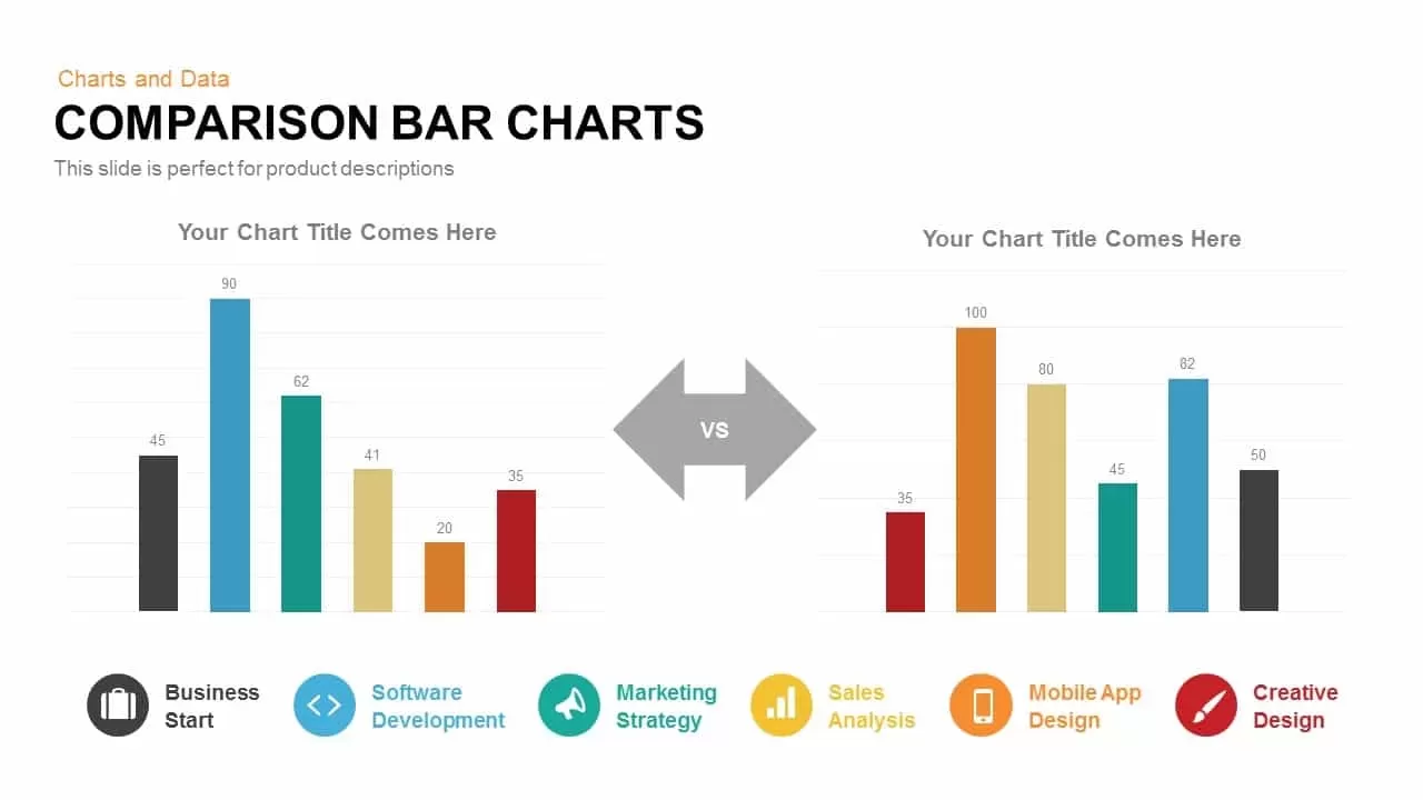
Comparison Bar Chart template for PowerPoint & Google Slides
Comparison Chart
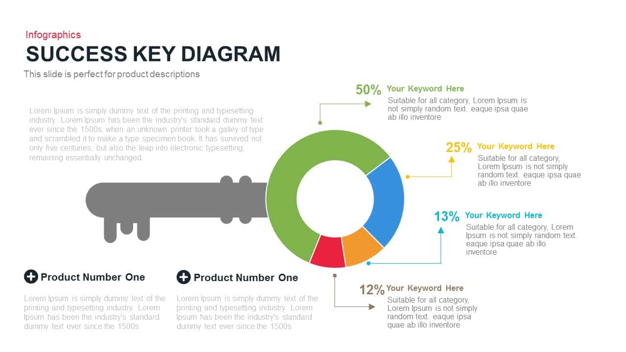
Success Key Diagram with Donut Chart Template for PowerPoint & Google Slides
Pie/Donut
Pencil Bar Chart Data Analysis Template for PowerPoint & Google Slides
Bar/Column
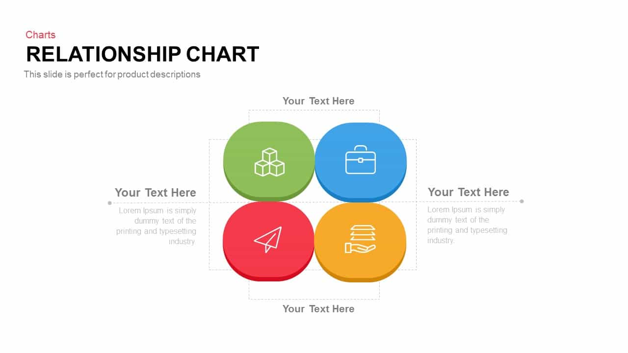
Relationship Chart template for PowerPoint & Google Slides
Flow Charts

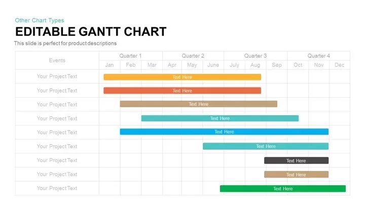
Fully Editable Gantt Chart Timeline template for PowerPoint & Google Slides
Gantt Chart
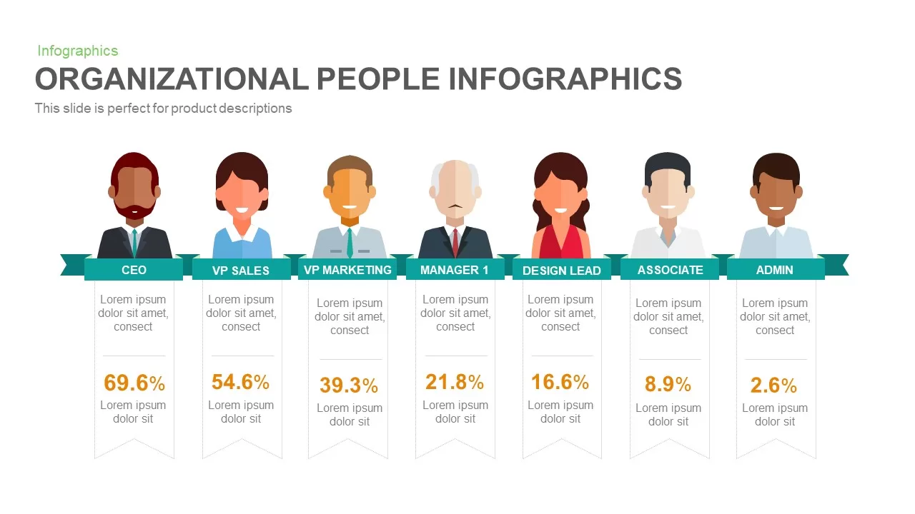
Organizational People Percentage Chart template for PowerPoint & Google Slides
Org Chart
Interactive Product Comparison Bar Chart Template for PowerPoint & Google Slides
Bar/Column

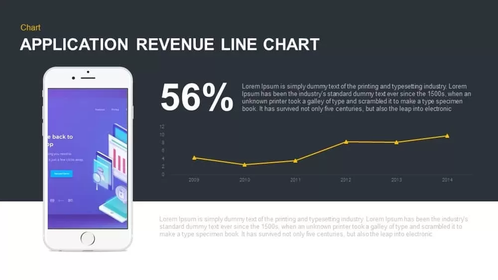
Application Revenue Line Chart KPI Template for PowerPoint & Google Slides
Revenue
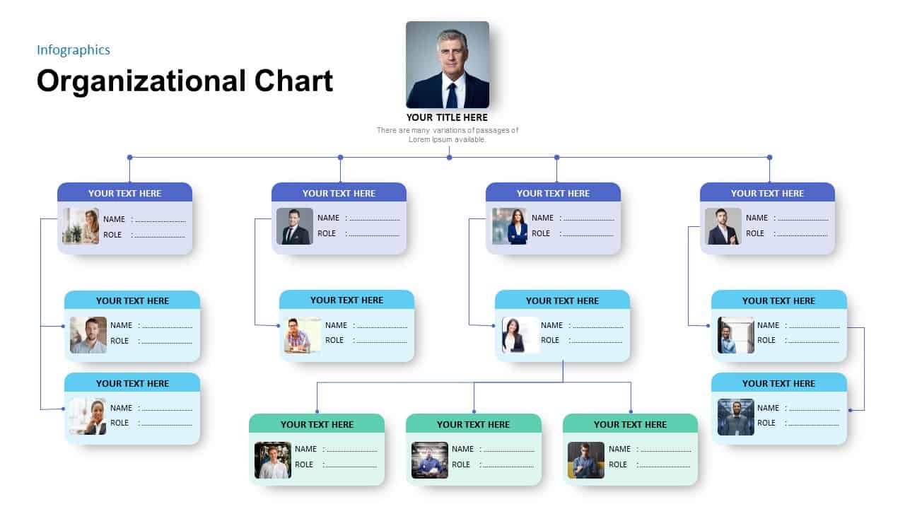
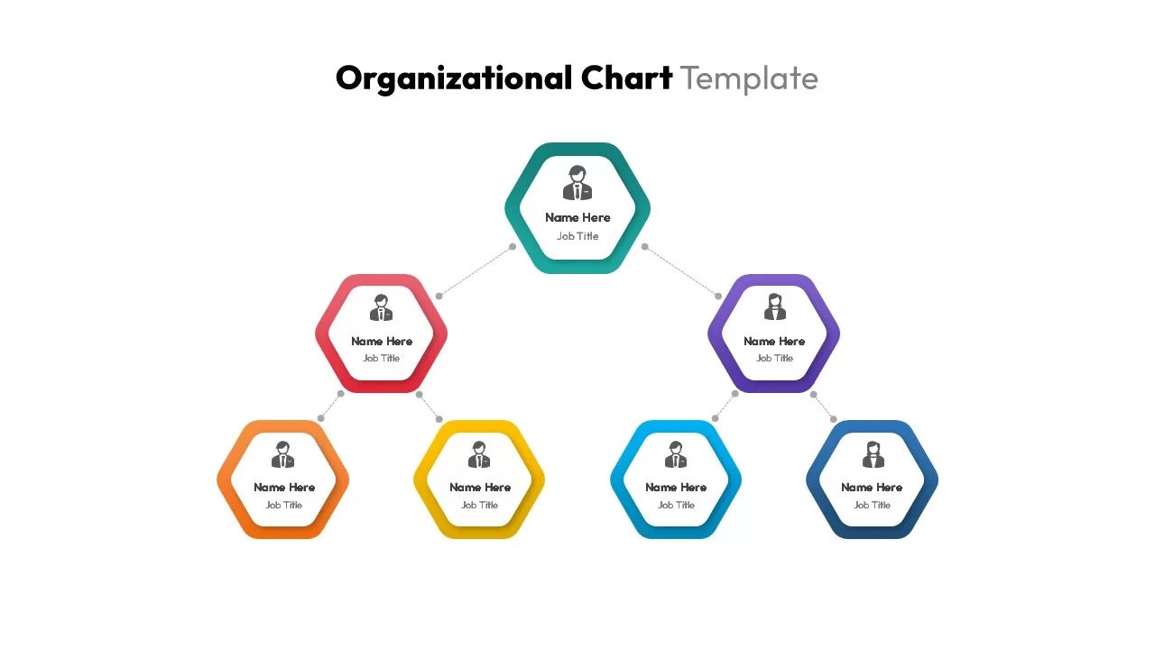
Organizational Chart PowerPoint Template
Org Chart
Circular Org Chart in PowerPoint & Google Slides
Org Chart
Distracting Factors at Work Bar Chart Template for PowerPoint & Google Slides
Bar/Column
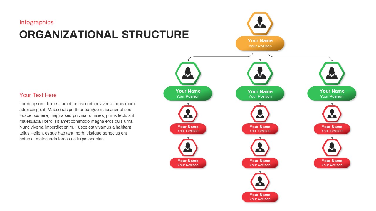
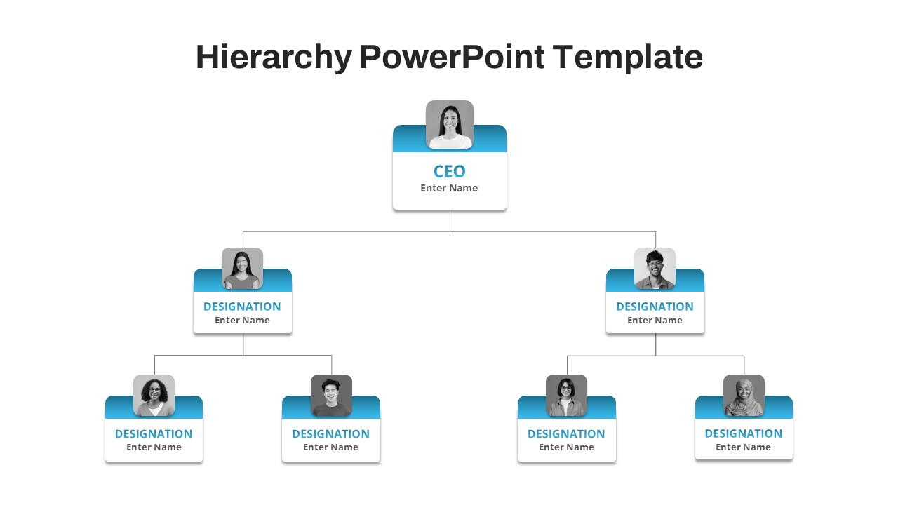
Organizational Structure Hierarchy Chart Template for PowerPoint & Google Slides
Org Chart
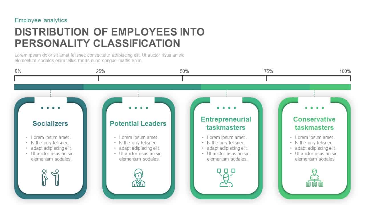
Employee Personality Distribution Chart Template for PowerPoint & Google Slides
Bar/Column
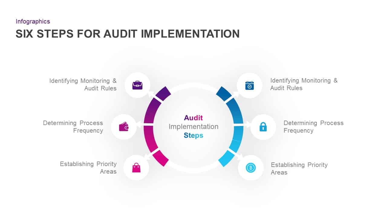
Six-Step Audit Implementation Chart Template for PowerPoint & Google Slides
Circular
Modern Organizational Chart Hierarchy Template for PowerPoint & Google Slides
Org Chart

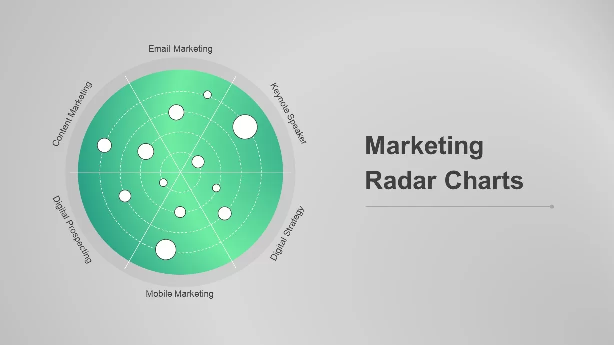
Dynamic Marketing Radar Chart Analytics Template for PowerPoint & Google Slides
Comparison
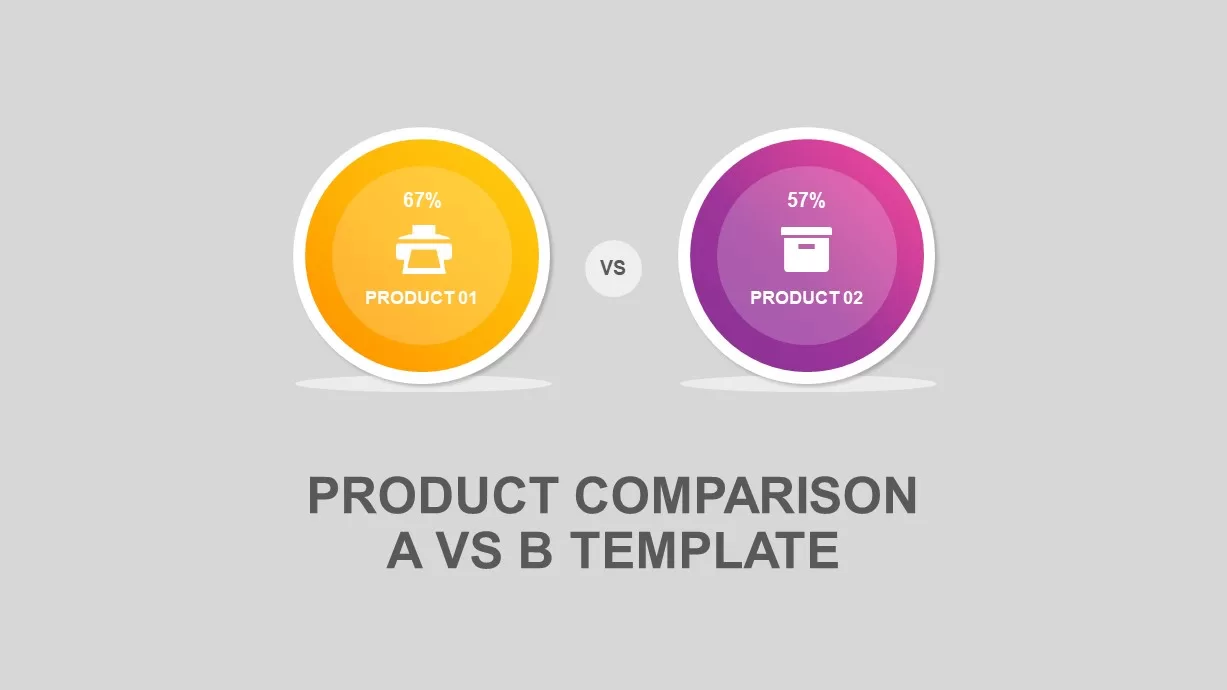
Circular Product Comparison Chart Template for PowerPoint & Google Slides
Comparison Chart
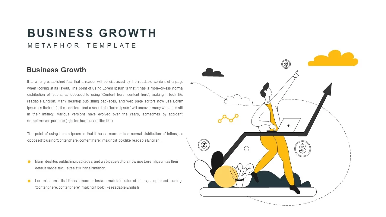
Business Growth Metaphor Chart Template for PowerPoint & Google Slides
Business
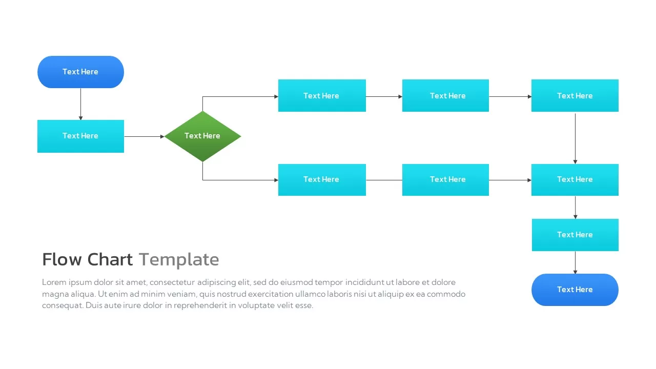
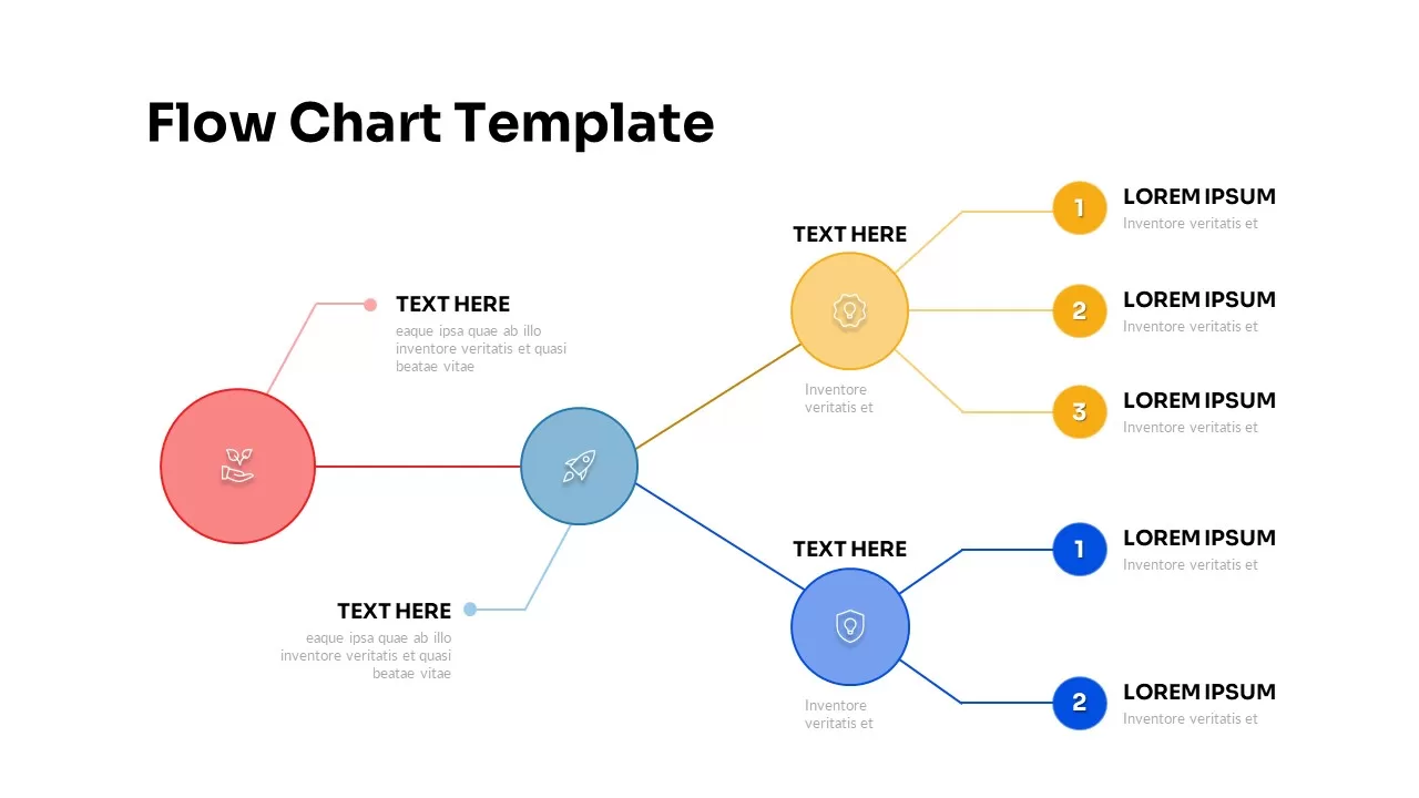
Flow Chart Diagram template for PowerPoint & Google Slides
Flow Charts
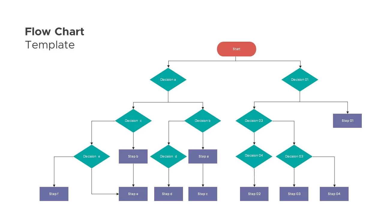
Flow Chart Decision Tree Template for PowerPoint & Google Slides
Flow Charts
Organizational Chart Template for PowerPoint & Google Slides
Our Team
Free Circular Multi-Step Flow Chart Diagram Template for PowerPoint & Google Slides
Flow Charts
Free
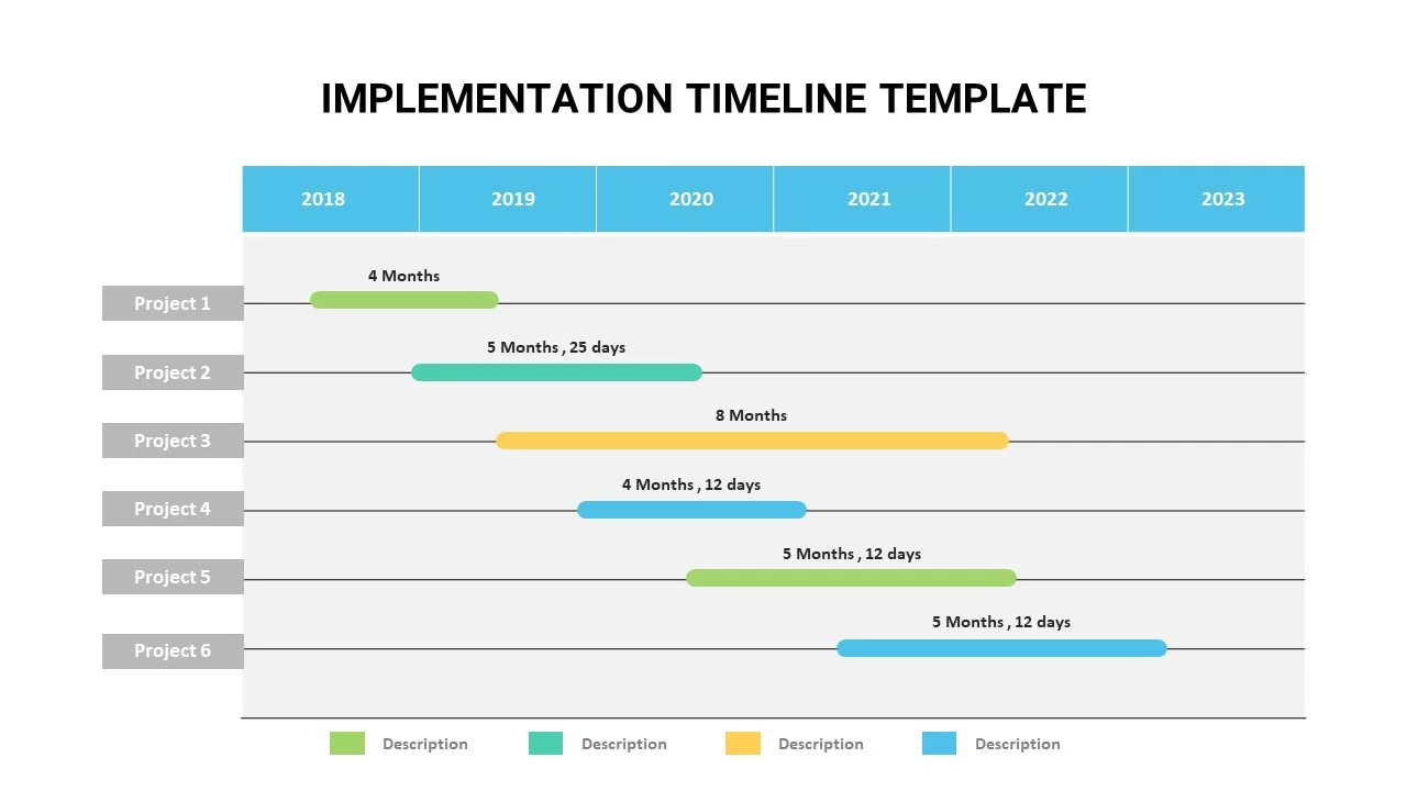
Animated Implementation Timeline Chart Template for PowerPoint & Google Slides
Timeline
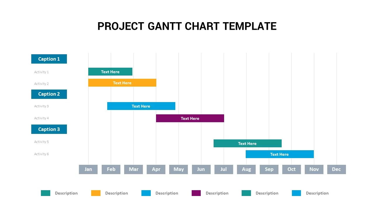
Project Gantt Chart Template for PowerPoint & Google Slides
Gantt Chart
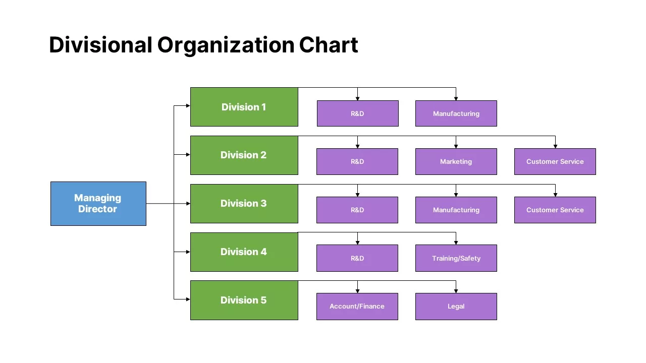
Divisional Organization Chart Template for PowerPoint & Google Slides
Org Chart
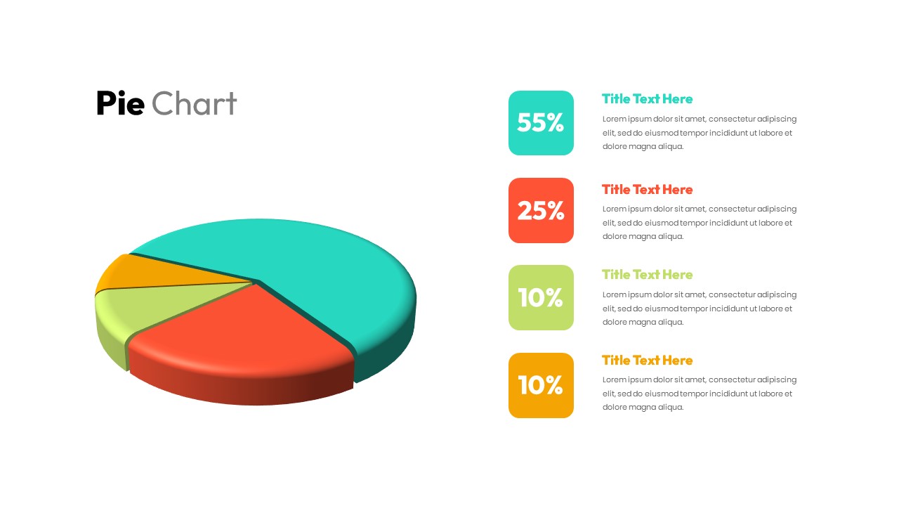
3D pie chart infographic template for PowerPoint & Google Slides
Pie/Donut
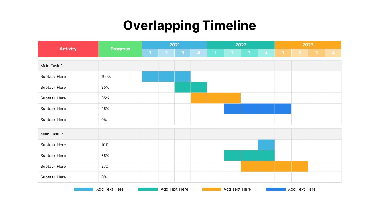
Overlapping Timeline Gantt Chart Diagram Template for PowerPoint & Google Slides
Timeline
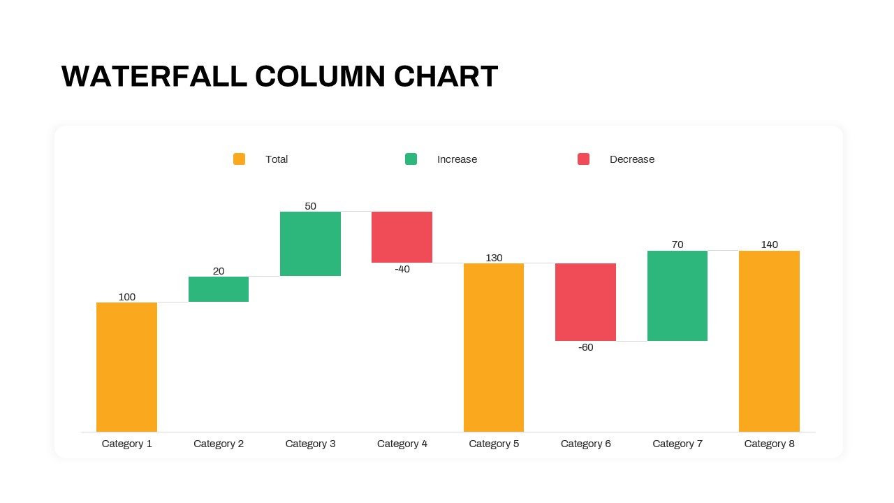
Waterfall Column Chart Analysis Template for PowerPoint & Google Slides
Bar/Column
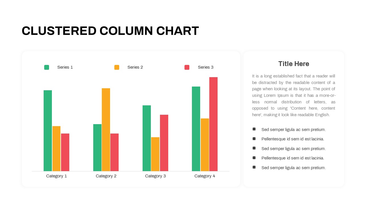
Professional Clustered Column Chart Template for PowerPoint & Google Slides
Bar/Column
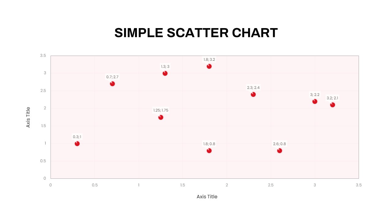
Simple Scatter Chart Analysis Template for PowerPoint & Google Slides
Comparison Chart
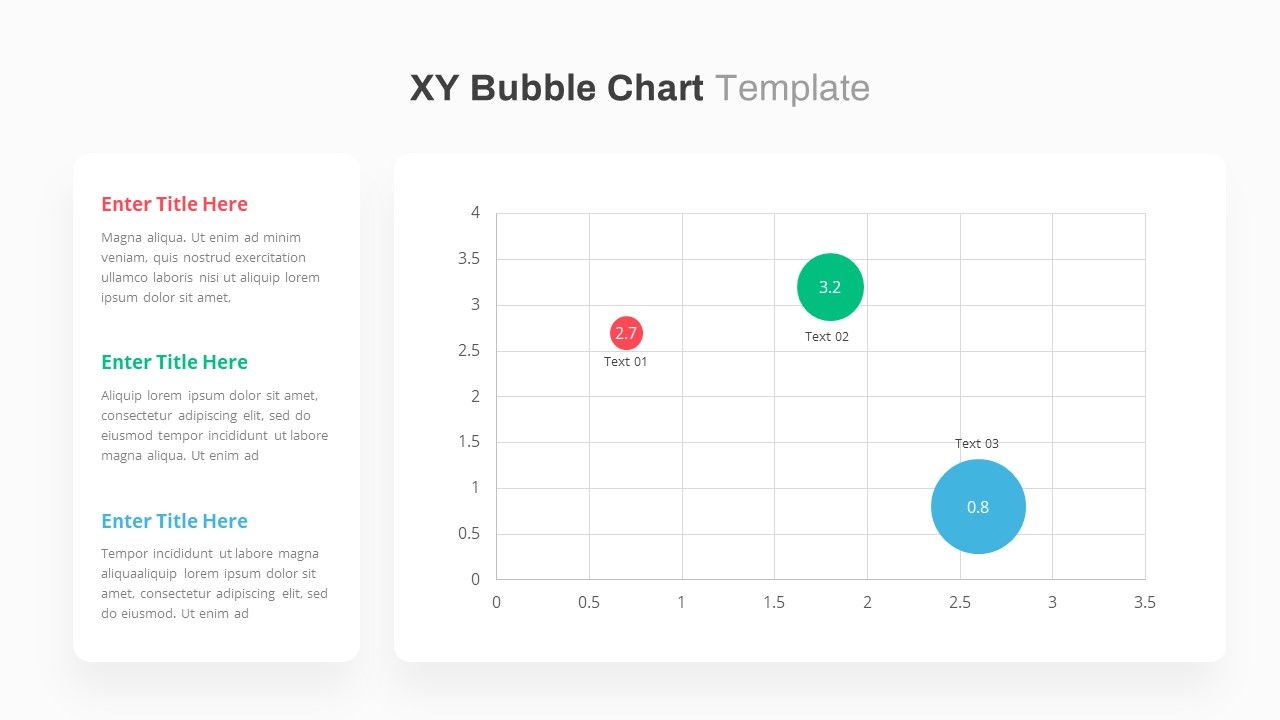
XY Bubble Chart Data Visualization Template for PowerPoint & Google Slides
Comparison Chart
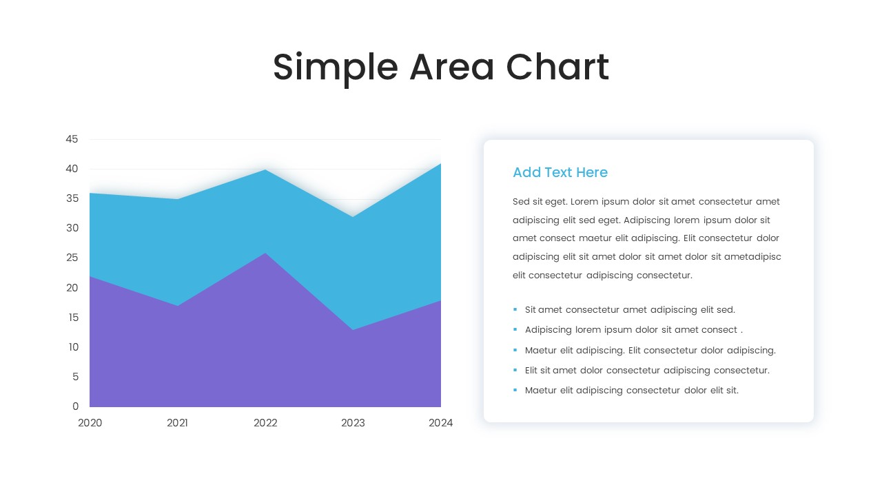
Simple Area Chart Data Trends Analysis Template for PowerPoint & Google Slides
Comparison Chart
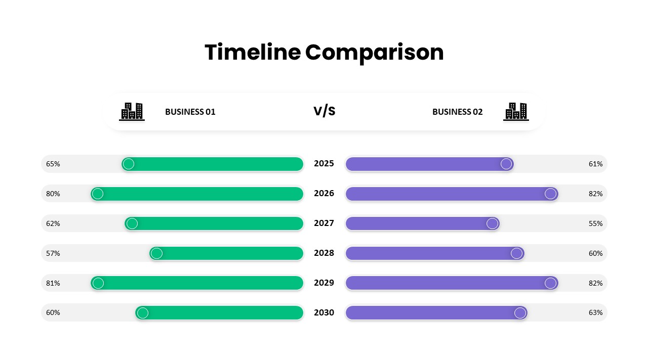
Timeline Comparison Slide PowerPoint Template
Comparison Chart
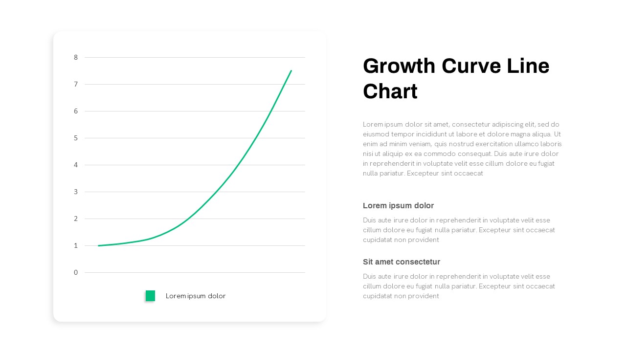
Growth Curve Line Chart Visualization Template for PowerPoint & Google Slides
Charts
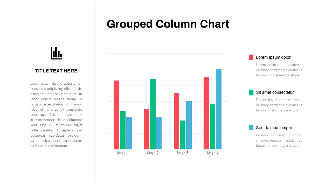
Grouped Column Chart Comparison Template for PowerPoint & Google Slides
Bar/Column
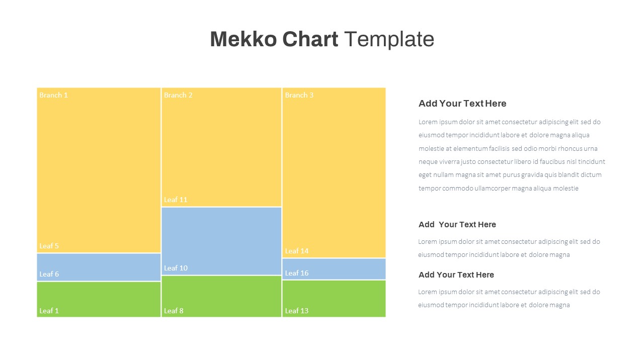
Mekko Chart with Segmented Branches & Leaves Template for PowerPoint & Google Slides
Bar/Column
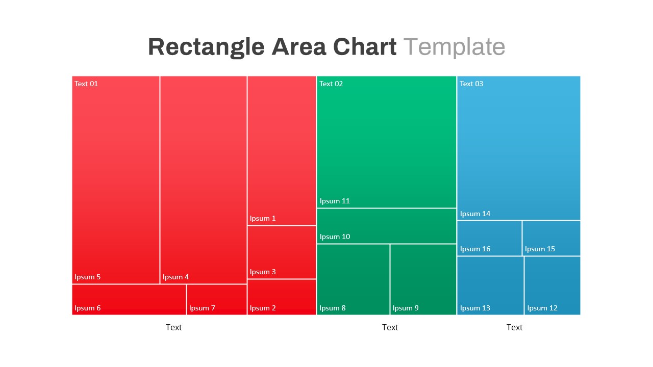
Rectangle Area Chart with Gradient Fill Template for PowerPoint & Google Slides
Comparison Chart
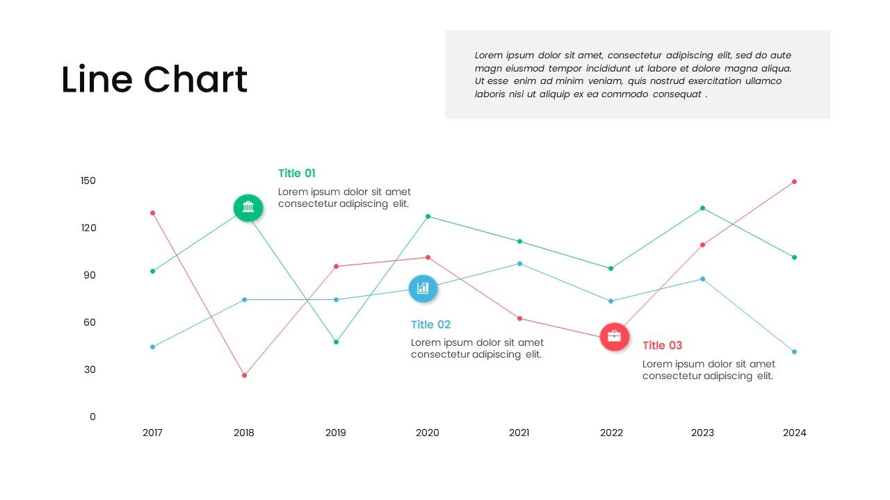
Multi-Series Line Chart with Icons Template for PowerPoint & Google Slides
Comparison Chart
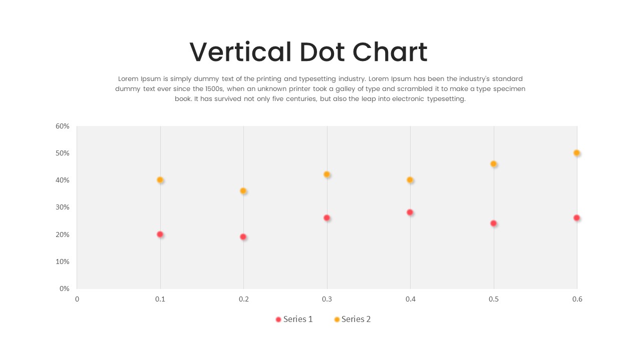
Multi-Series Vertical Dot Chart Template for PowerPoint & Google Slides
Comparison Chart
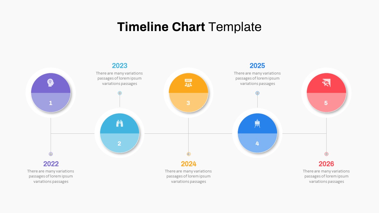
Five-Phase Horizontal Timeline Chart Template for PowerPoint & Google Slides
Timeline
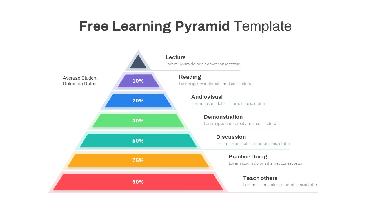
Free Learning Retention Pyramid Chart Template for PowerPoint & Google Slides
Pyramid
Free
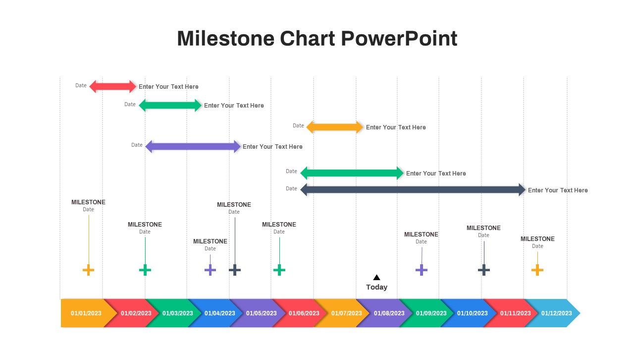
Milestone Chart PowerPoint
Timeline
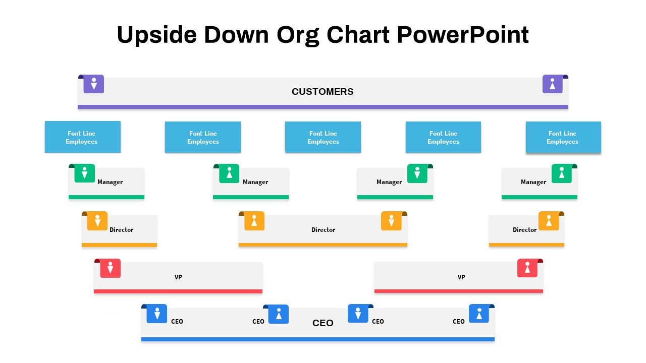
Upside-Down Organizational Chart Diagram Template for PowerPoint & Google Slides
Org Chart
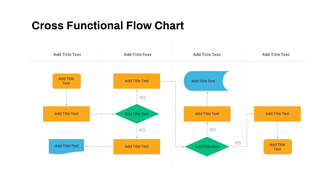
Cross Functional Swimlane Flow Chart Template for PowerPoint & Google Slides
Flow Charts
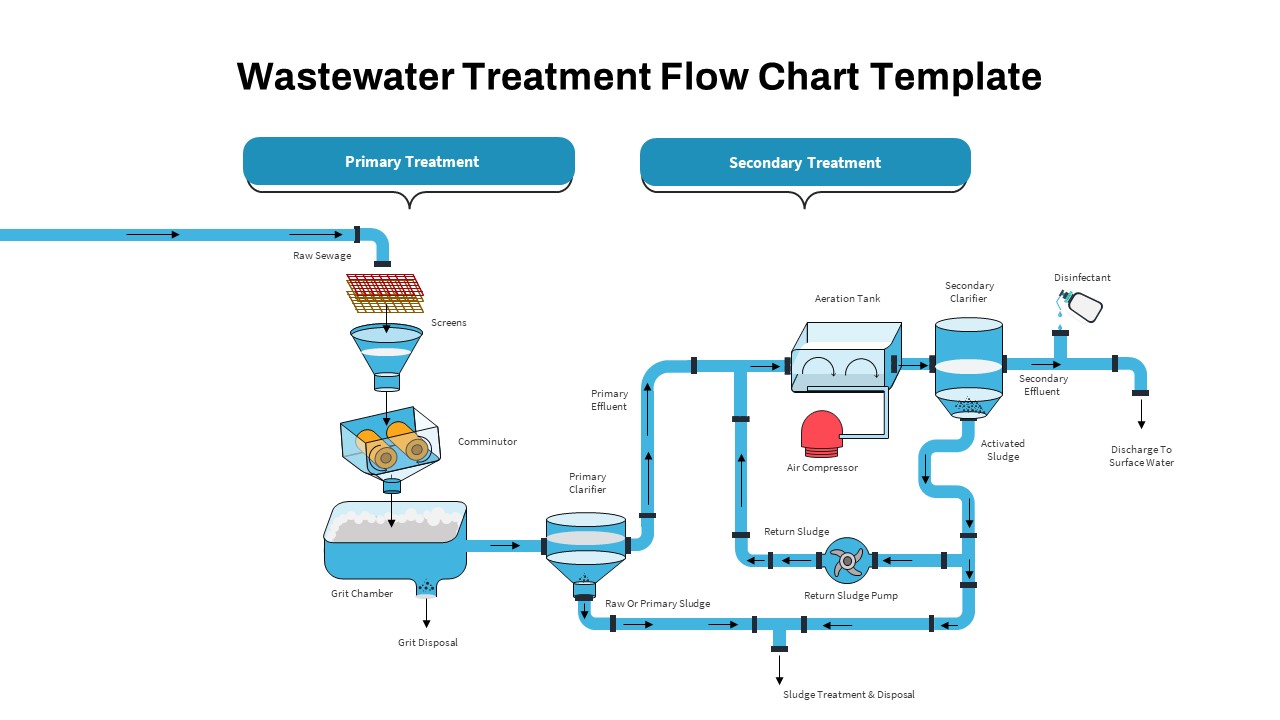
Wastewater Treatment Process Flow Chart Template for PowerPoint & Google Slides
Flow Charts
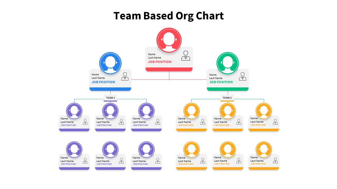
Team-Based Organizational Chart Template for PowerPoint & Google Slides
Org Chart
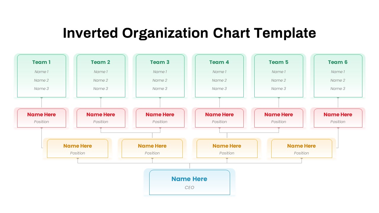
Inverted Organization Chart Diagram Template for PowerPoint & Google Slides
Org Chart
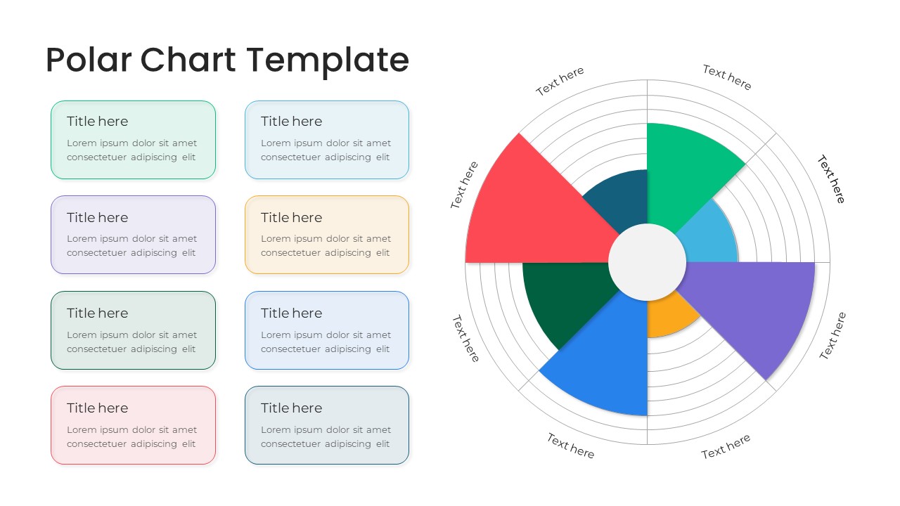
Modern Multi-Color Polar Chart Diagram Template for PowerPoint & Google Slides
Charts
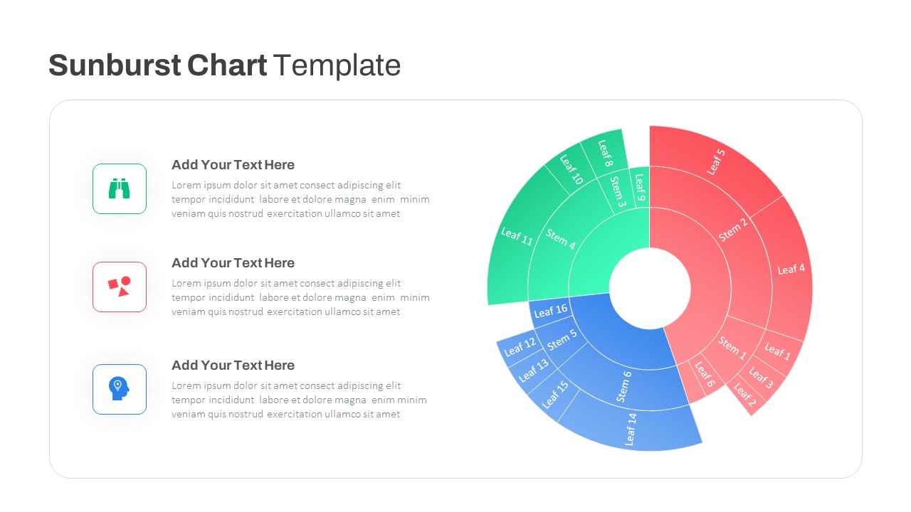
Dynamic Sunburst Chart Visualization Template for PowerPoint & Google Slides
Charts
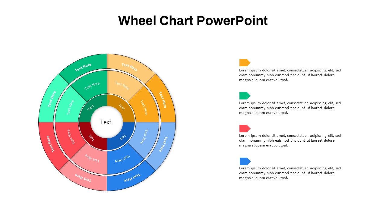
Wheel Chart PowerPoint Templates
Pie/Donut
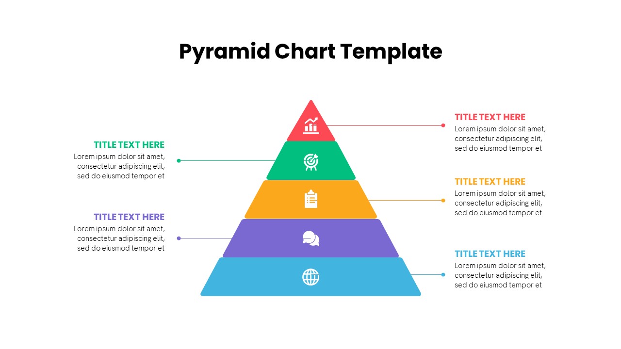
Multi-Level Colorful Pyramid Chart Template for PowerPoint & Google Slides
Pyramid
Free Corporate Hierarchy Organizational Chart Template for PowerPoint & Google Slides
Org Chart
Free
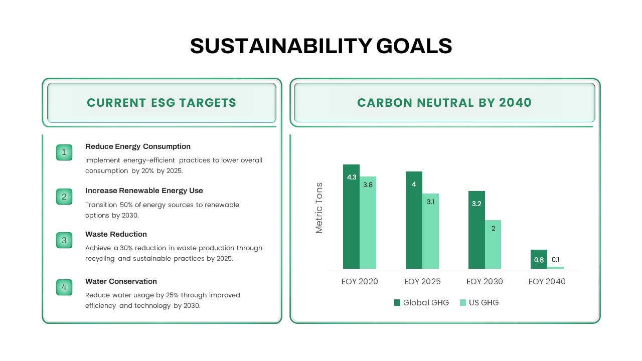
Sustainability Goals and Targets Chart Template for PowerPoint & Google Slides
Goals
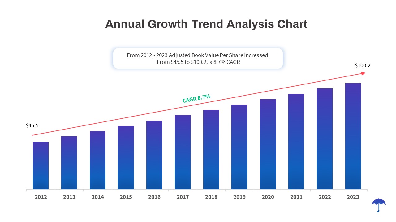
Annual Growth Trend Analysis Chart template for PowerPoint & Google Slides
Business Report
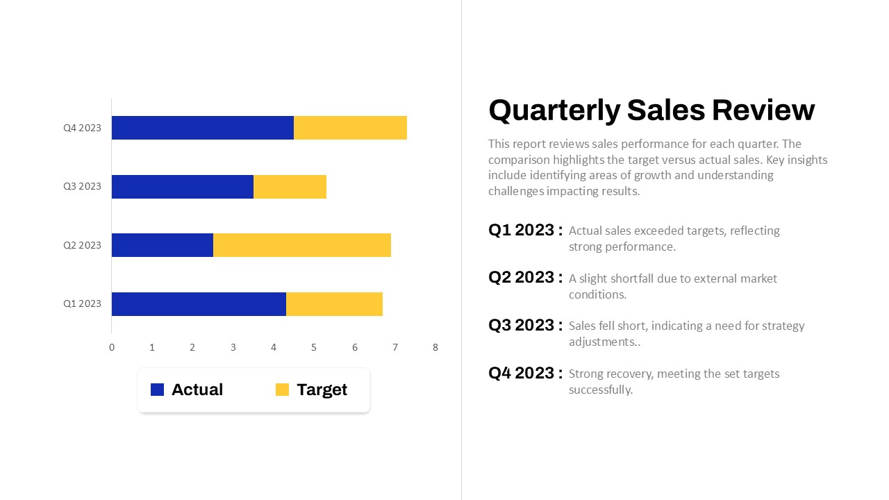
Quarterly Sales Review Bar Chart Template for PowerPoint & Google Slides
Bar/Column
Data Analysis Bar Chart with Insights Template for PowerPoint & Google Slides
Bar/Column
Free
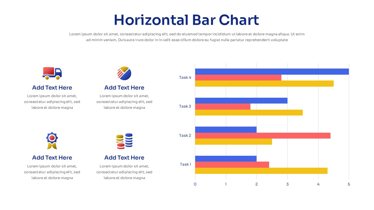
Horizontal Bar Chart Slide with Icons Template for PowerPoint & Google Slides
Bar/Column
Project Tracker Timeline Gantt Chart Template for PowerPoint & Google Slides
Project Status
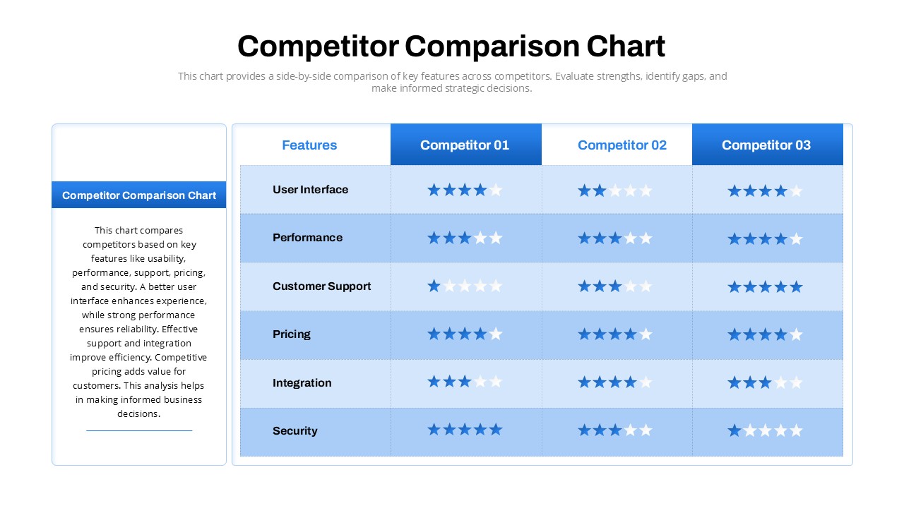
Competitor Comparison Chart Design Template for PowerPoint & Google Slides
Comparison
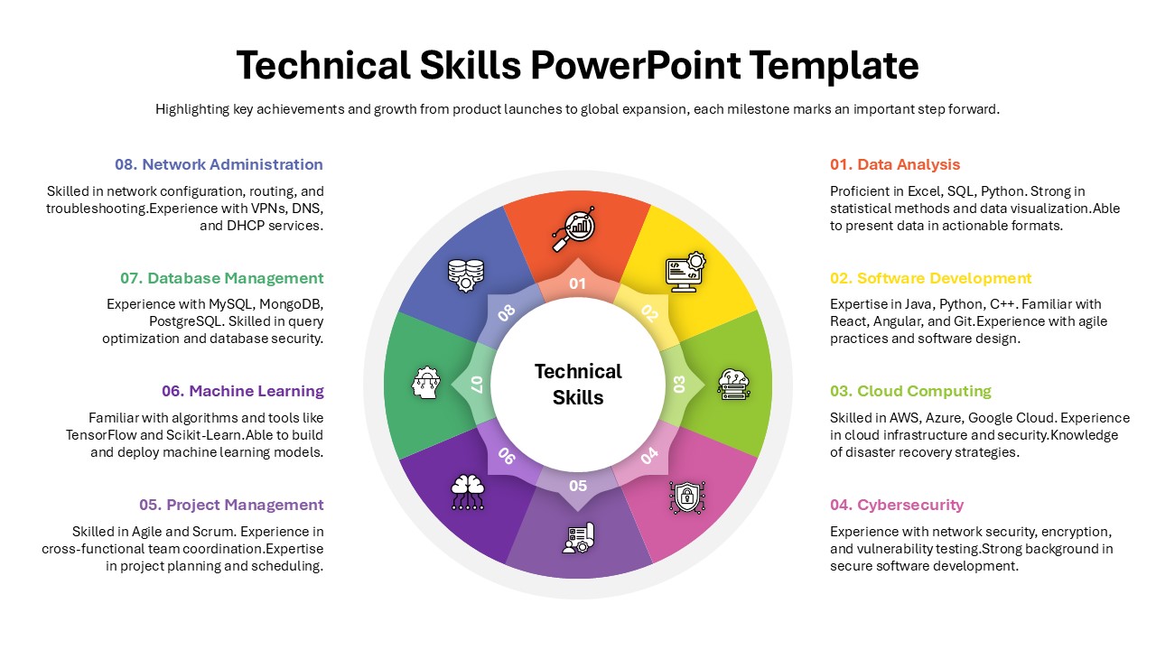
Technical Skills Donut Chart Overview Template for PowerPoint & Google Slides
HR
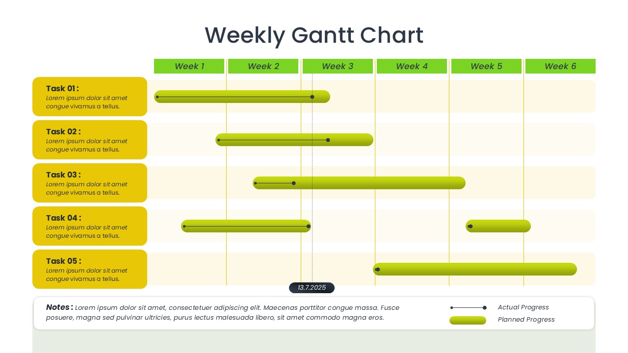
Weekly Gantt Chart Project Timeline Template for PowerPoint & Google Slides
Gantt Chart
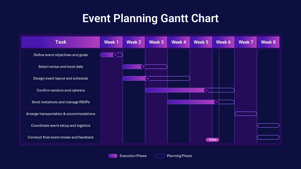
Event Planning Gantt Chart template for PowerPoint & Google Slides
Business
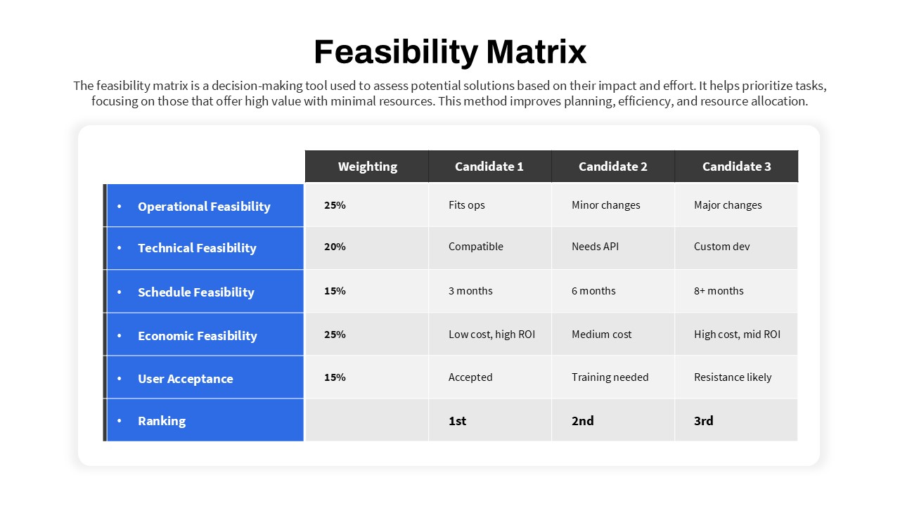
Feasibility Matrix Comparison Chart Template for PowerPoint & Google Slides
Comparison Chart
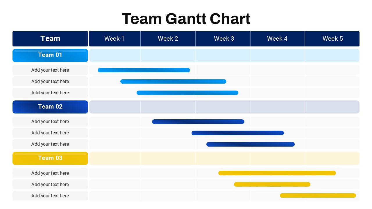
Team Gantt Chart Overview template for PowerPoint & Google Slides
Project Status
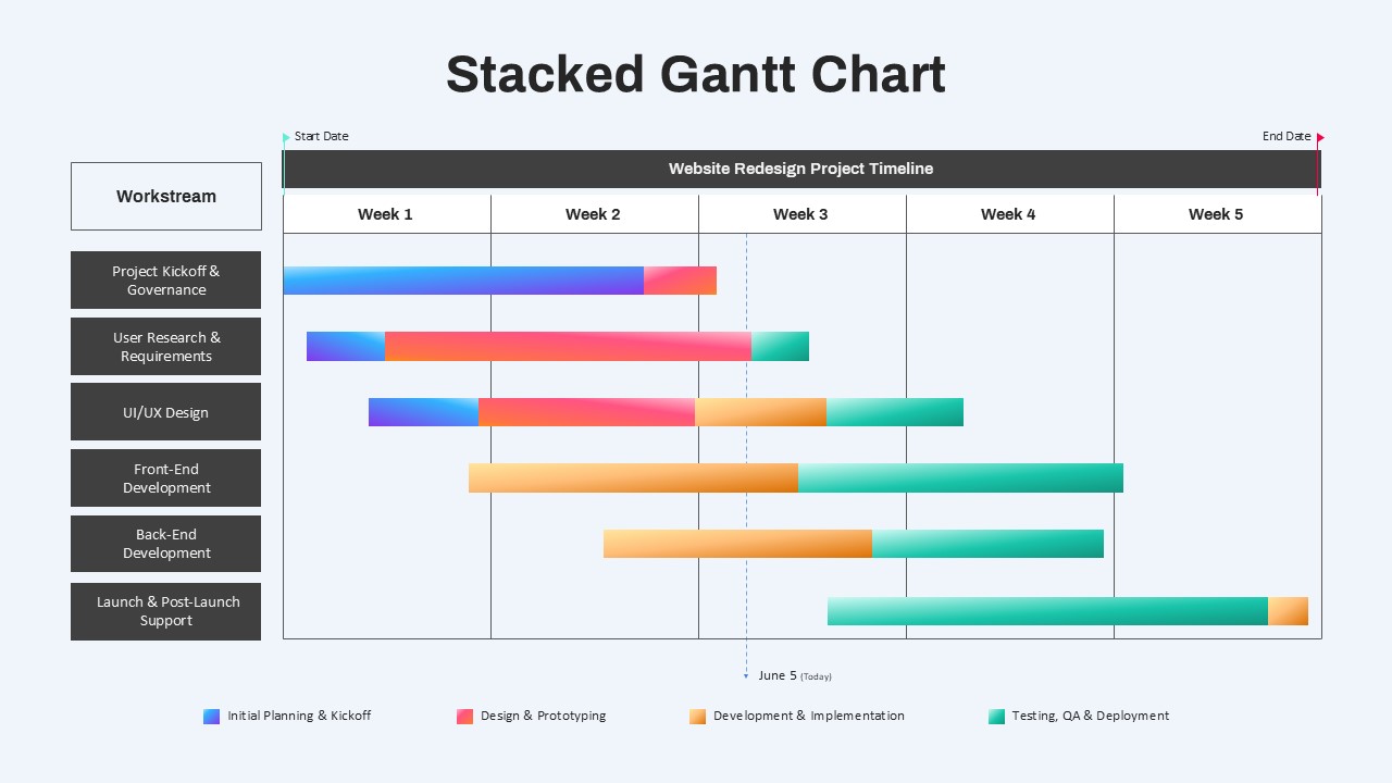
Stacked Gantt Chart Timeline Slide Template for PowerPoint & Google Slides
Gantt Chart
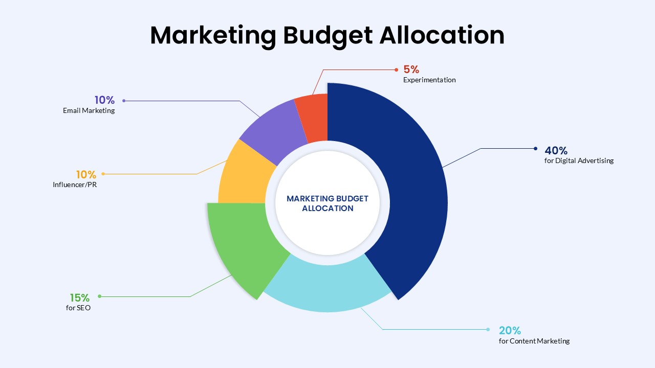
Marketing Budget Allocation Donut Chart Template for PowerPoint & Google Slides
Marketing
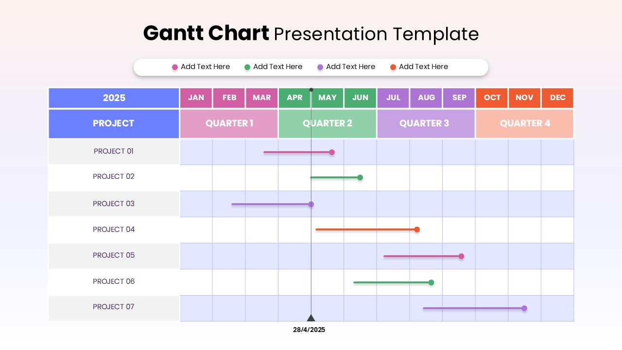
Project Timeline Gantt Chart Template for PowerPoint & Google Slides
Gantt Chart
Colorful Annual Gantt Chart Project Planner Template for PowerPoint & Google Slides
Gantt Chart
Weekly Gantt Chart with Milestones Template for PowerPoint & Google Slides
Gantt Chart
Colorful Annual Gantt Chart Timeline Template for PowerPoint & Google Slides
Gantt Chart
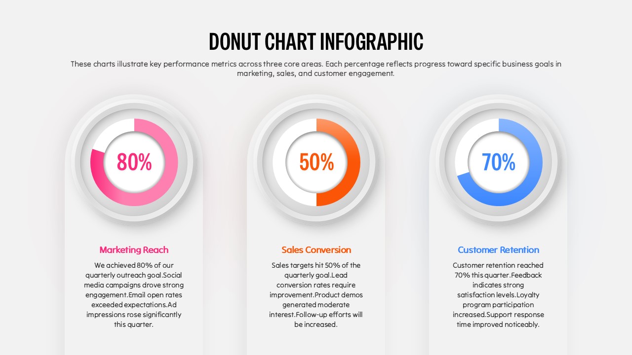
Three Segment Donut Chart KPI Infographic Template for PowerPoint & Google Slides
Pie/Donut
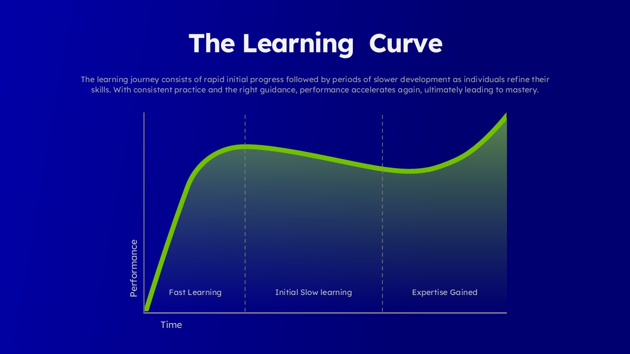
Learning Curve Performance Growth Chart Template for PowerPoint & Google Slides
Employee Performance
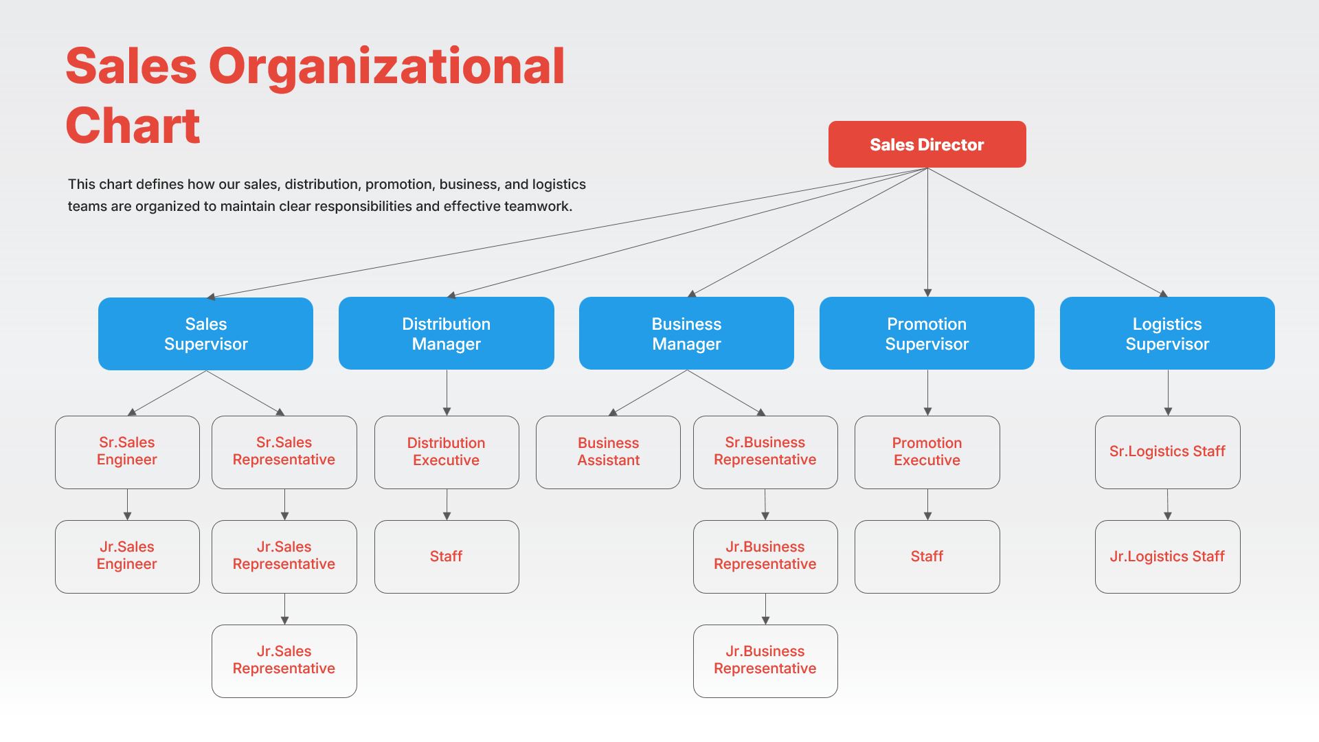
Sales Organizational Chart Hierarchy Template for PowerPoint & Google Slides
Org Chart
Blank Comparison Chart Template for PowerPoint & Google Slides
Comparison Chart