Heat Map Slide for PowerPoint For Presentation
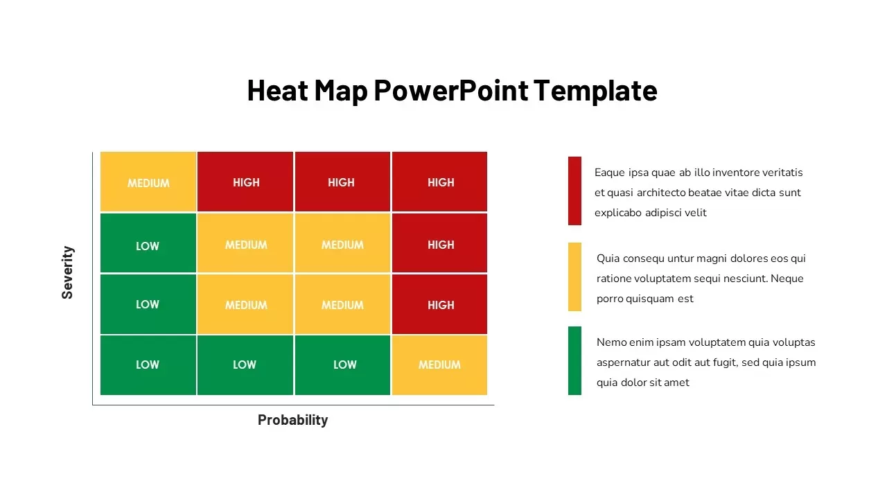
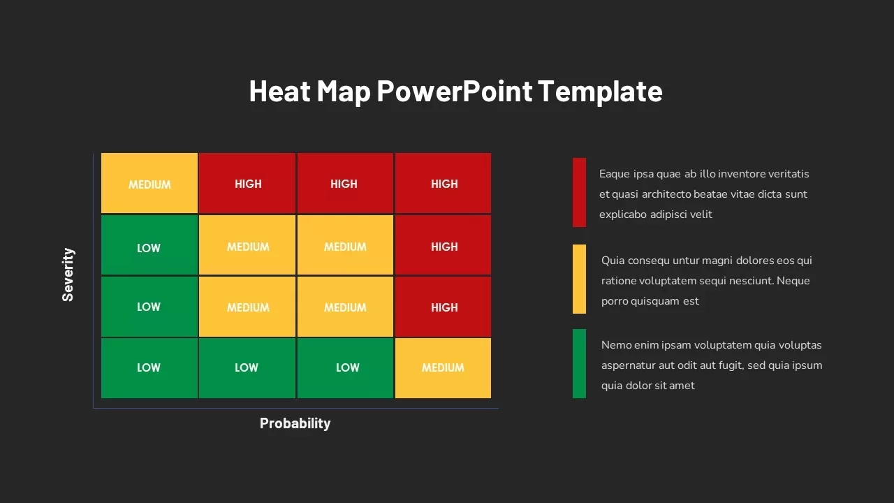

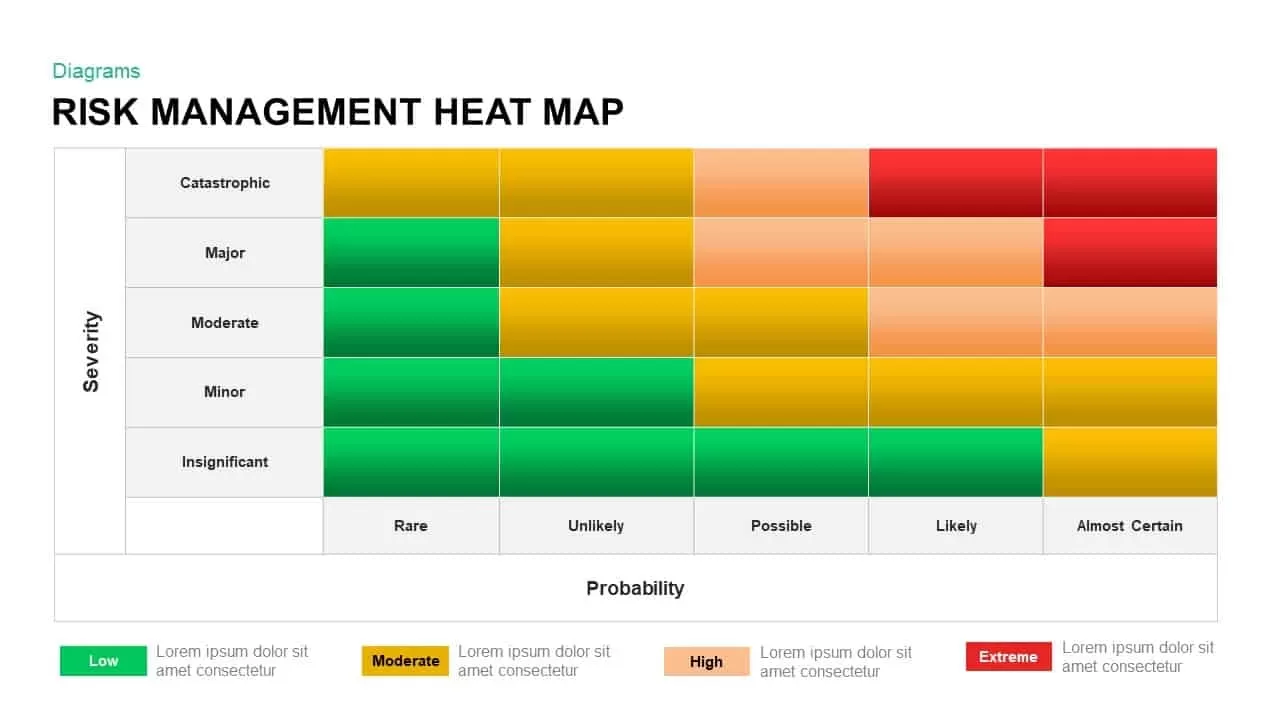
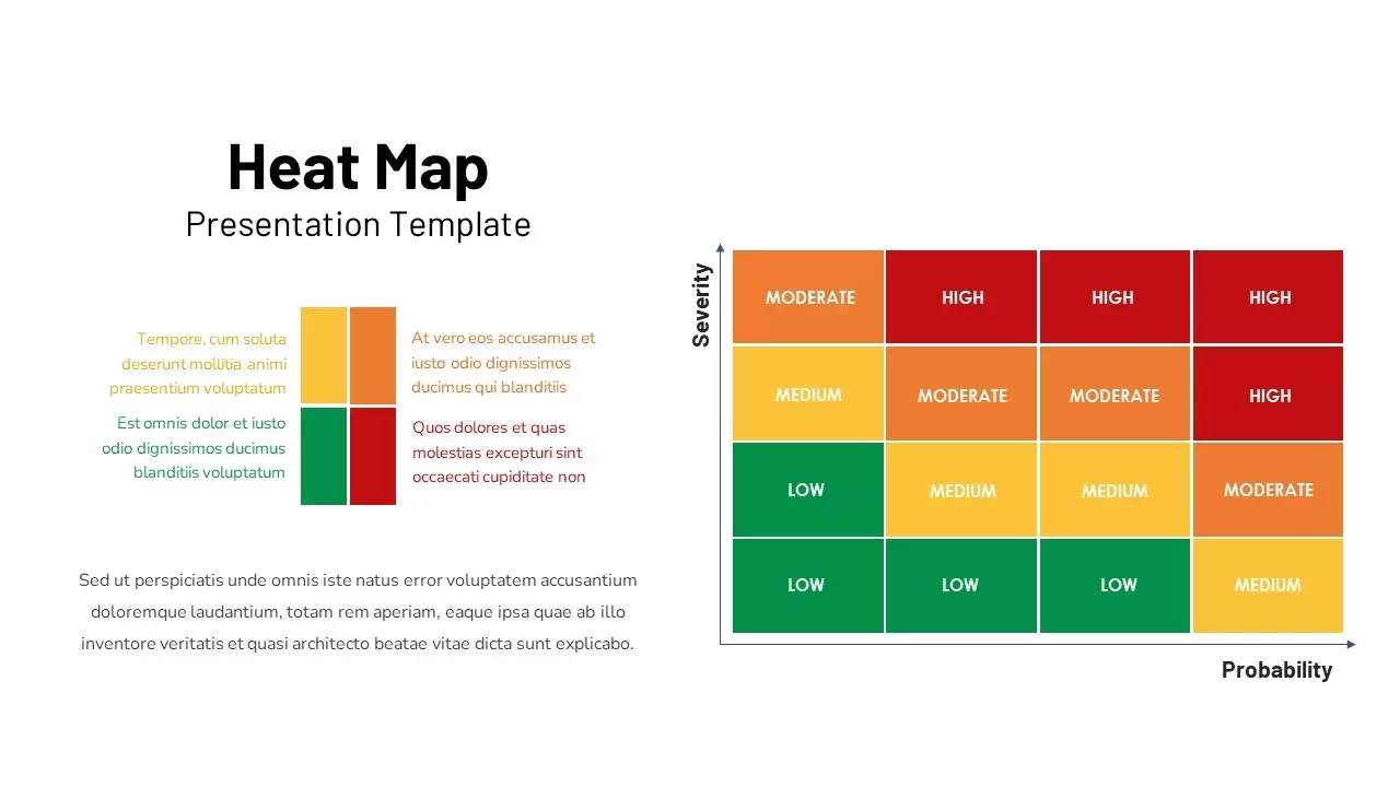
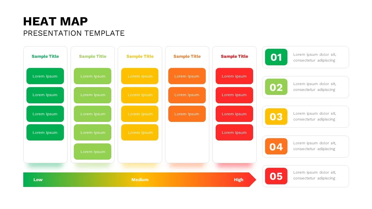
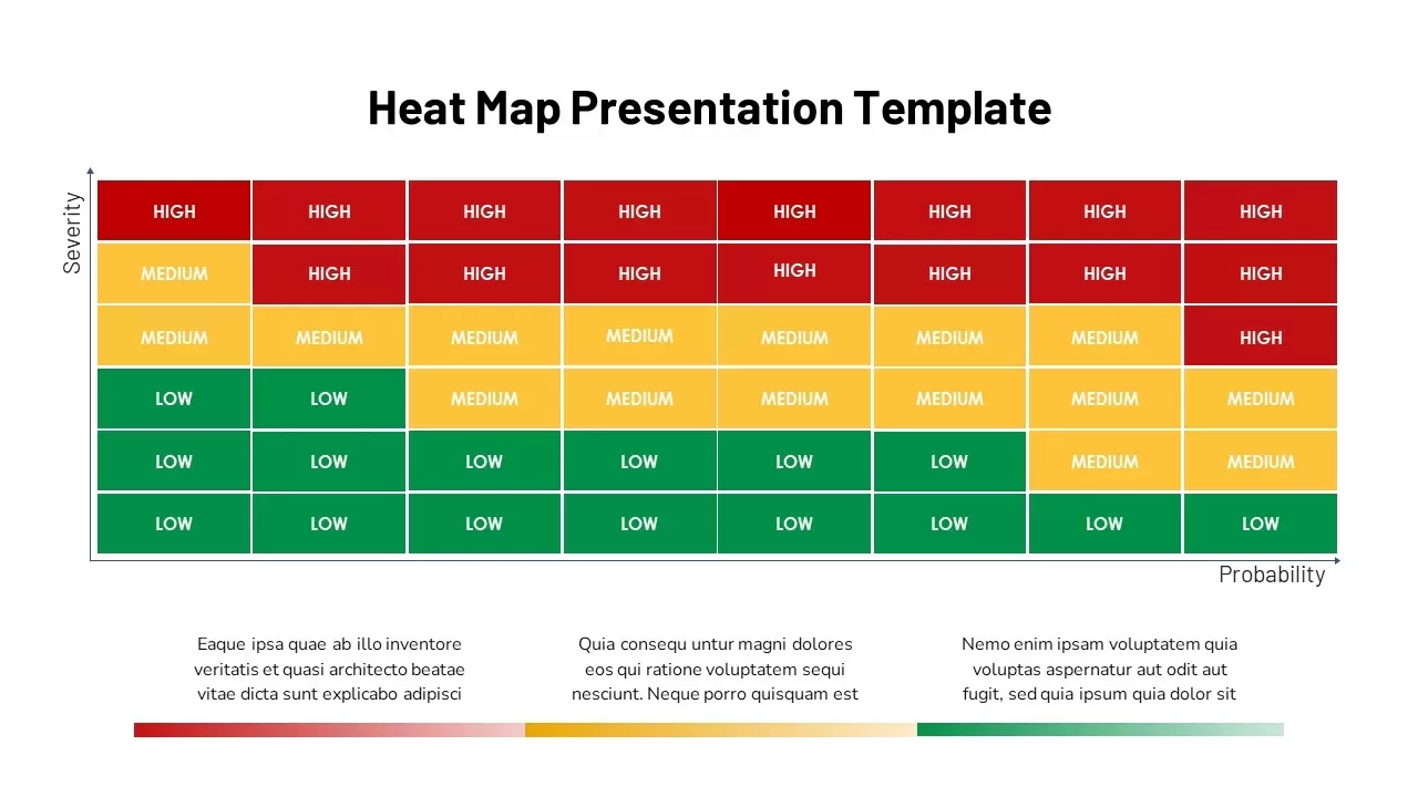
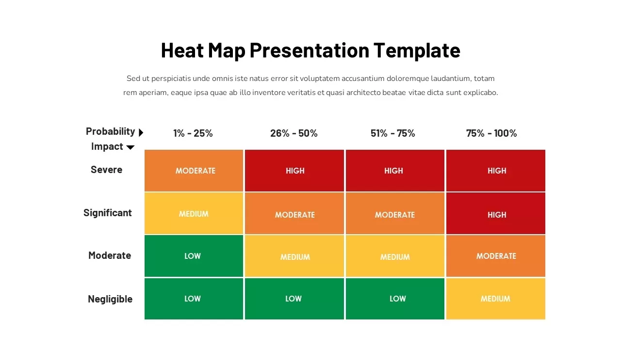
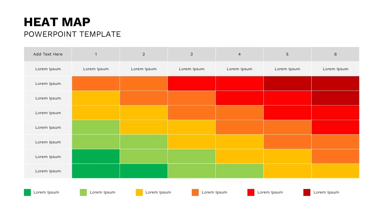
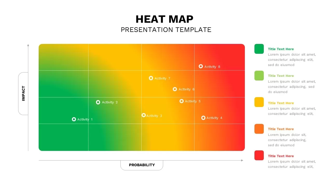
This Heat Map Slide provides a visually engaging and easy-to-understand matrix for assessing risk factors based on severity and probability. The slide uses color codinggreen for low risk, yellow for medium risk, and red for high risk—to help prioritize actions or decisions based on a combination of these two key factors. The template is perfect for risk assessment, project management, or decision-making presentations where clear visual representations are needed.
The heat map is organized with severity listed on the vertical axis and probability on the horizontal axis, offering a clear representation of data. Each box is customizable, allowing you to input relevant text or data specific to your analysis. The template is fully editable and adaptable, making it a versatile tool for different industries, including project management, marketing, and business strategy.
Login to download this file

Item ID
SB02890


Related Templates

Risk Management Heat Map Diagram Template for PowerPoint & Google Slides
Comparison Chart
Professional Risk Heat Map Visualization Template for PowerPoint & Google Slides
Risk Management
Heat Map Template for PowerPoint
Bar/Column
Heat Map Infographics Template
Risk Management
Heat Map Template
Risk Management
Heat Map Template for Presentations
Comparison Chart
Heat Map Infographic Template For Risk Assessment and Priority Analysis
Comparison Chart
Mind map PowerPoint Template and Google Slide Slide in Diamond Shape
Mind Maps
Free Social Media Analytics Map Presentation PowerPoint Template
World Maps
Free
Azerbaijan Map PowerPoint Presentation Template
World Maps
Concept Map Presentation Template
Mind Maps
Mind Map Template for Presentation
Mind Maps
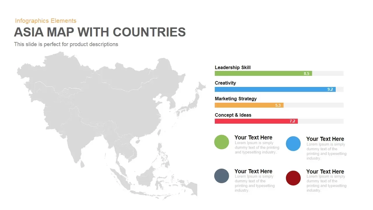
Asia Map PowerPoint Template and Google Slide with Countries
World Maps
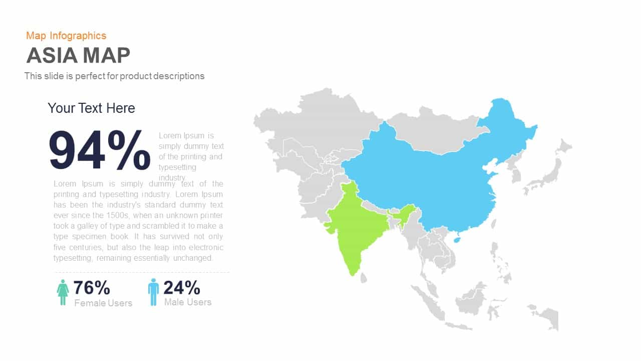
Asia Map PowerPoint Template and Google Slide
World Maps

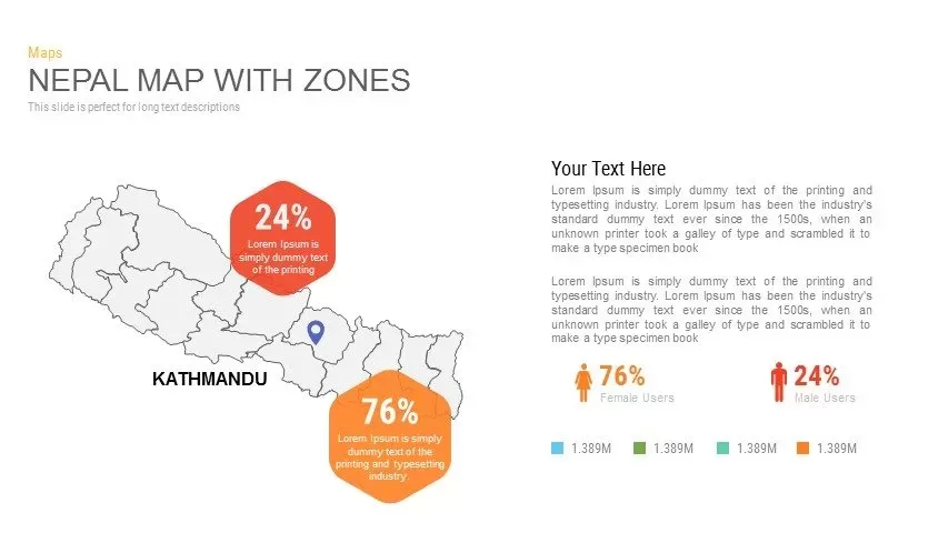
Nepal Map With zones PowerPoint and Google Slide Template
Maps
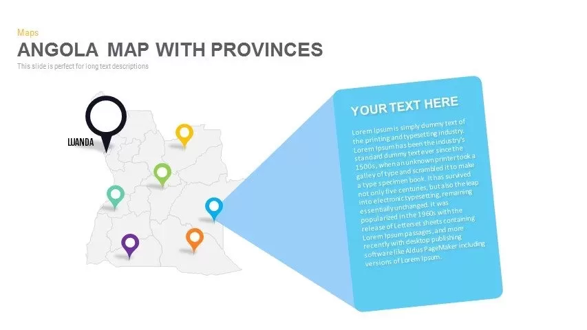
Angola Provinces Map Slide Pack Template for PowerPoint & Google Slides
World Maps
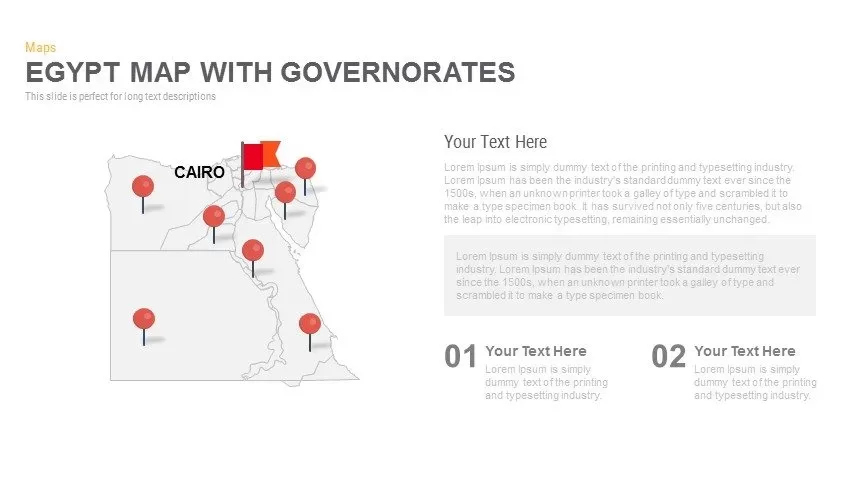
Egypt Regional Map Slide Pack Template for PowerPoint & Google Slides
World Maps
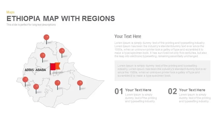
Ethiopia Map with Regions Slide Pack Template for PowerPoint & Google Slides
World Maps
Mind Map Infographic Slide Template for PowerPoint & Google Slides
Mind Maps
Mind Map Slide PowerPoint Template
Mind Maps