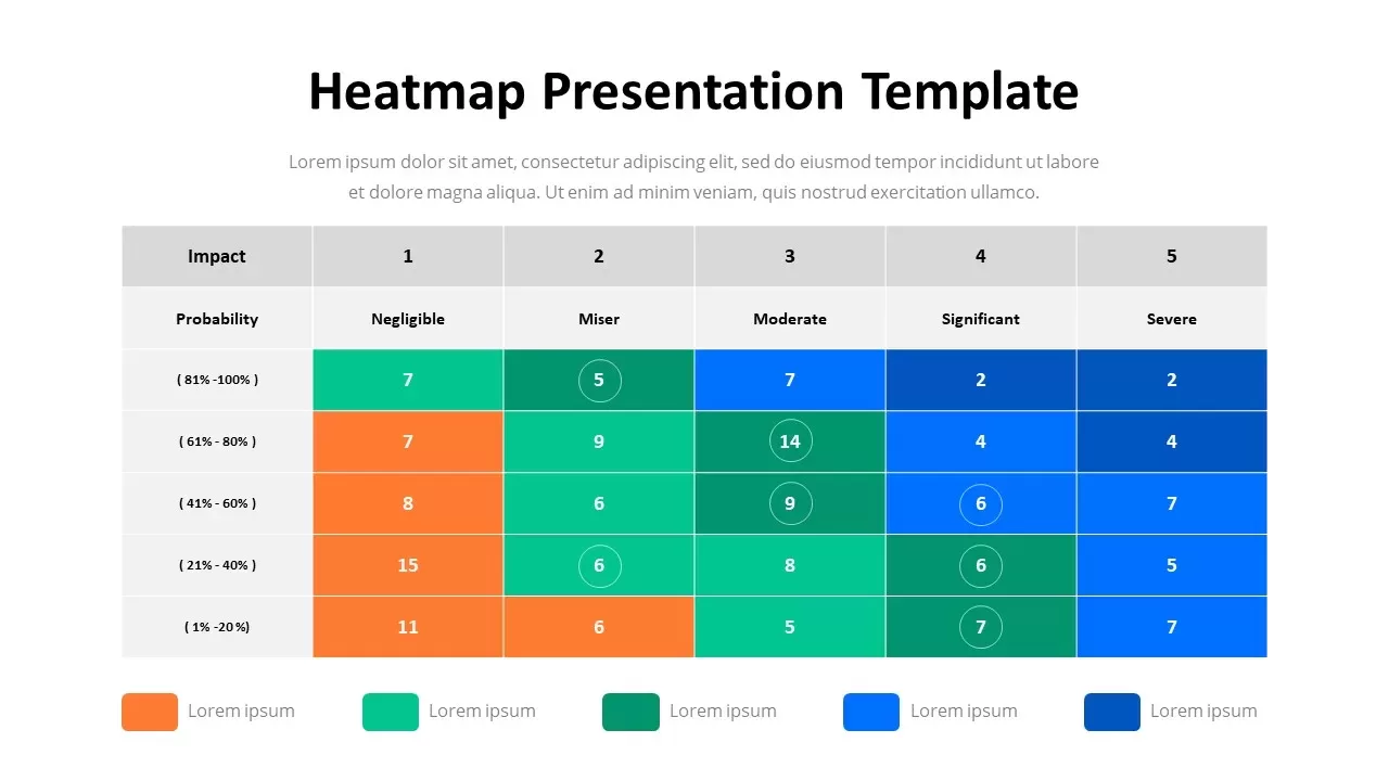
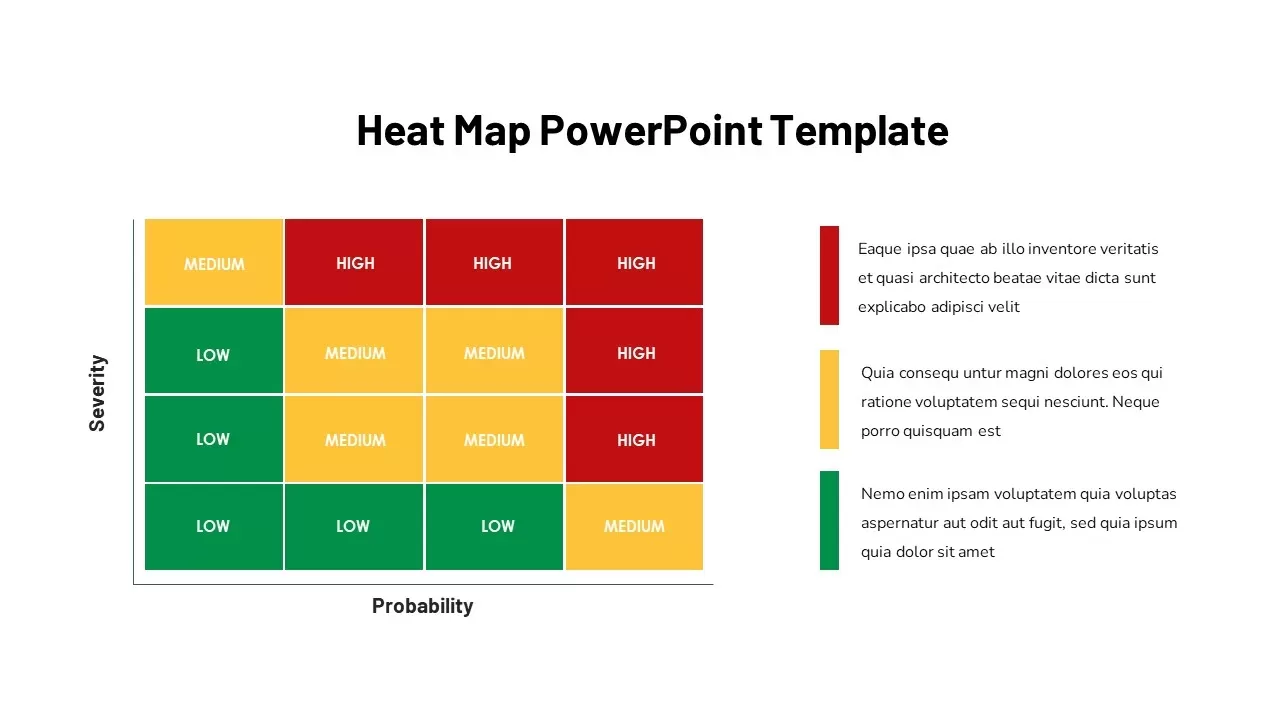
Heat Map Infographic Template For Risk Assessment and Priority Analysis


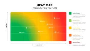
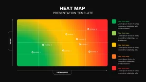
When decisions depend on understanding risk, impact, or priority levels, a visual framework can communicate insights far more effectively than rows of numbers. This Heat Map PowerPoint Template helps transform complex data into a clear, color-coded presentation that audiences can interpret at a glance.
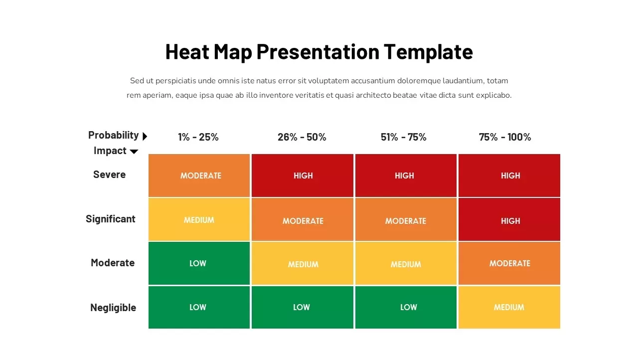
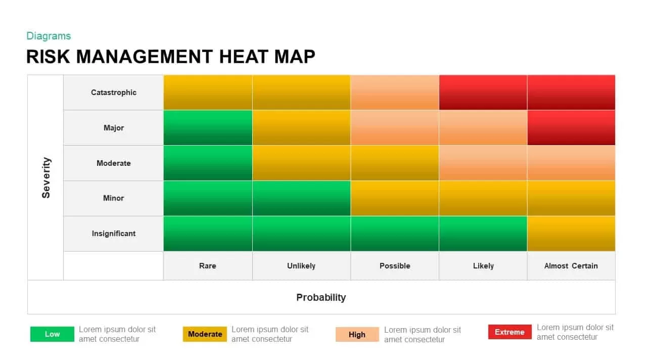
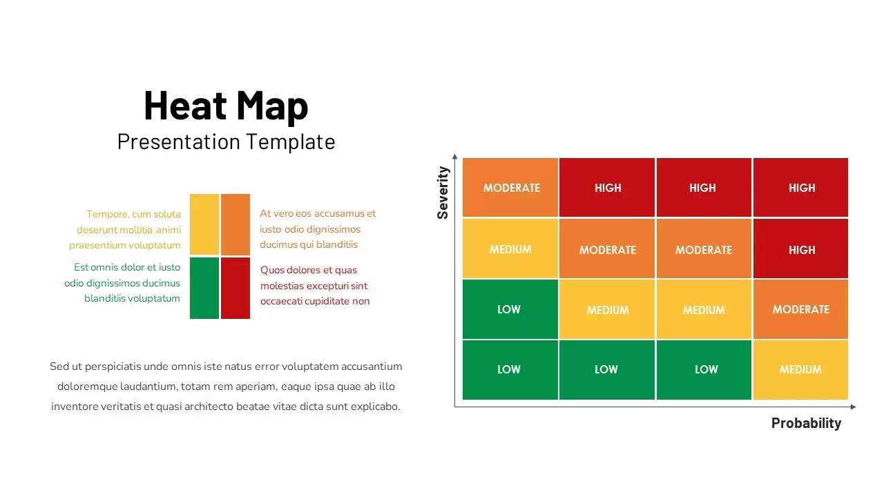
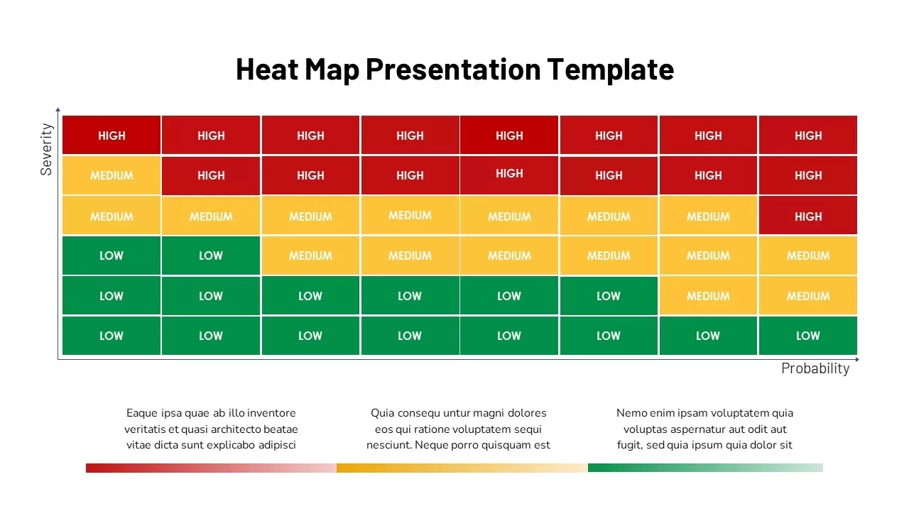
The template is built for professionals who need to present assessments, evaluations, and strategic findings in a concise format. By organizing information across impact and probability dimensions, the slide allows teams to quickly identify critical issues, emerging opportunities, and areas that require immediate attention. The intuitive layout encourages productive discussions and supports data-driven decision-making.
Fully compatible with PowerPoint and Google Slides, this editable template can be customized for a wide range of business scenarios. Update colors, labels, icons, data points, and branding elements to match your reporting requirements without spending time creating diagrams from scratch.
Risk Assessment Matrix PowerPoint Template
This Heat Map PPT Template is particularly useful for risk management presentations, project reviews, operational planning, compliance reporting, cybersecurity assessments, business continuity planning, and strategic workshops. Consultants, analysts, project managers, executives, and leadership teams can use it to communicate findings with greater clarity and confidence.
Whether you’re presenting organizational risks, project priorities, or performance trends, this PowerPoint heat map slide provides a professional and visually engaging way to highlight what matters most. The result is a presentation that is easier to understand, easier to discuss, and ultimately more effective in supporting informed business decisions.
Login to download this file

Item ID
SB02918
Related Templates

Heat Map Risk Assessment Presentation Template for PowerPoint & Google Slides
Risk Management
Risk Management Heat Map Diagram Template for PowerPoint & Google Slides
Comparison Chart
Professional Risk Heat Map Visualization Template for PowerPoint & Google Slides
Risk Management
Heat Map Analysis Template for PowerPoint & Google Slides
Risk Management
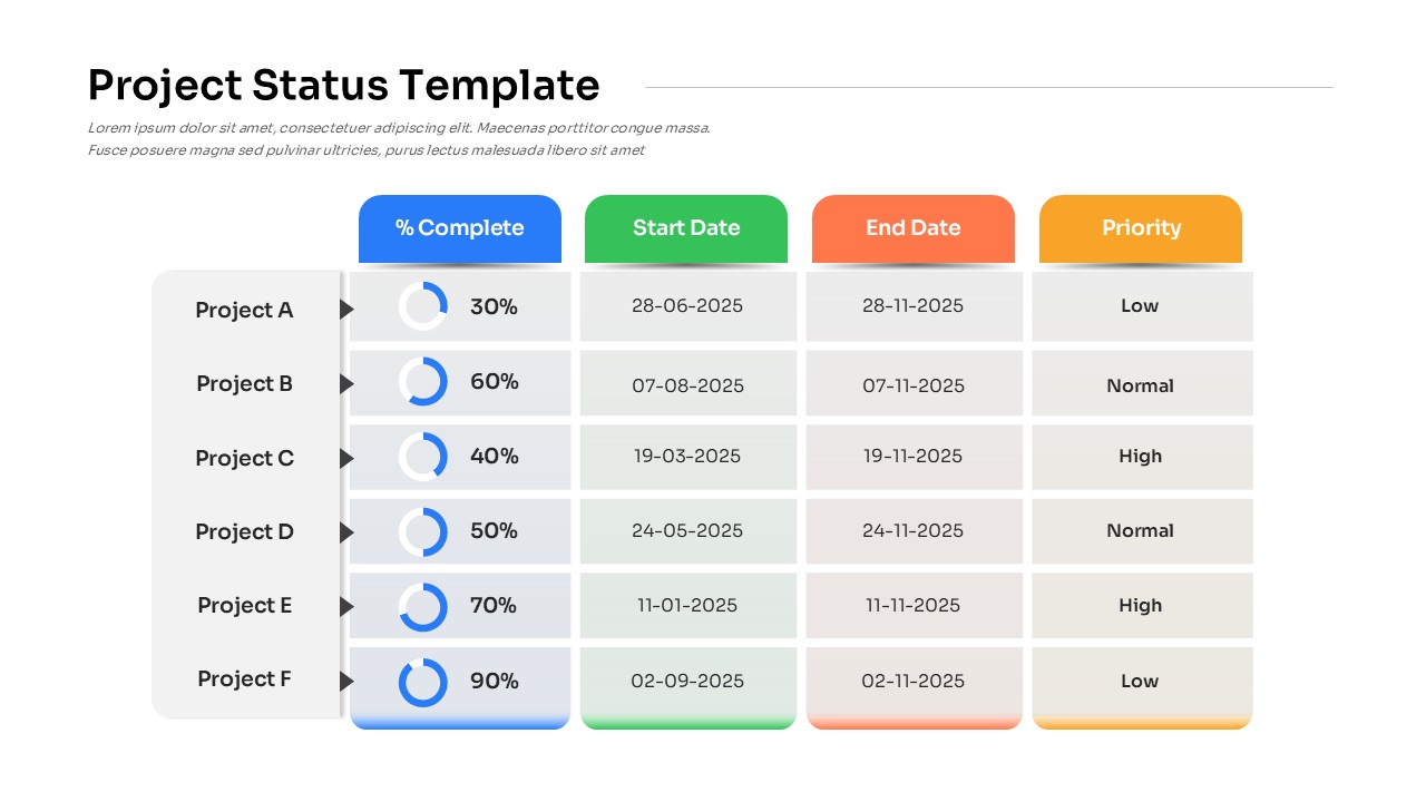
Project Status with Progress & Priority Template for PowerPoint & Google Slides
Table
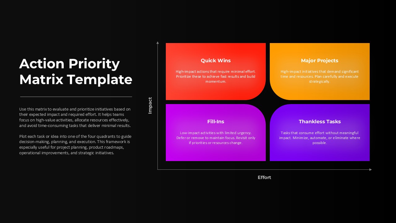
Action Priority Impact Effort Matrix Template for PowerPoint & Google Slides
Business Strategy
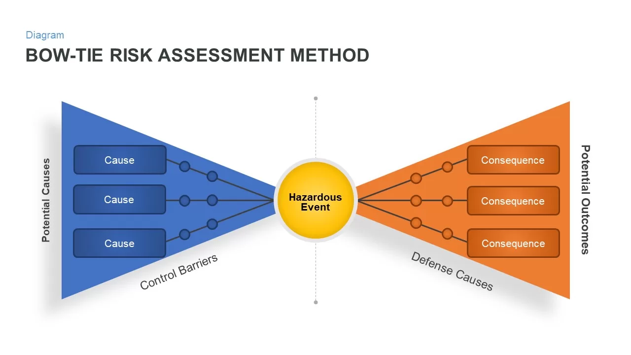
Bow Tie Risk Assessment Method PowerPoint Template
Risk Management
Risk Assessment Heatmap Matrix Slide Template for PowerPoint & Google Slides
Comparison Chart
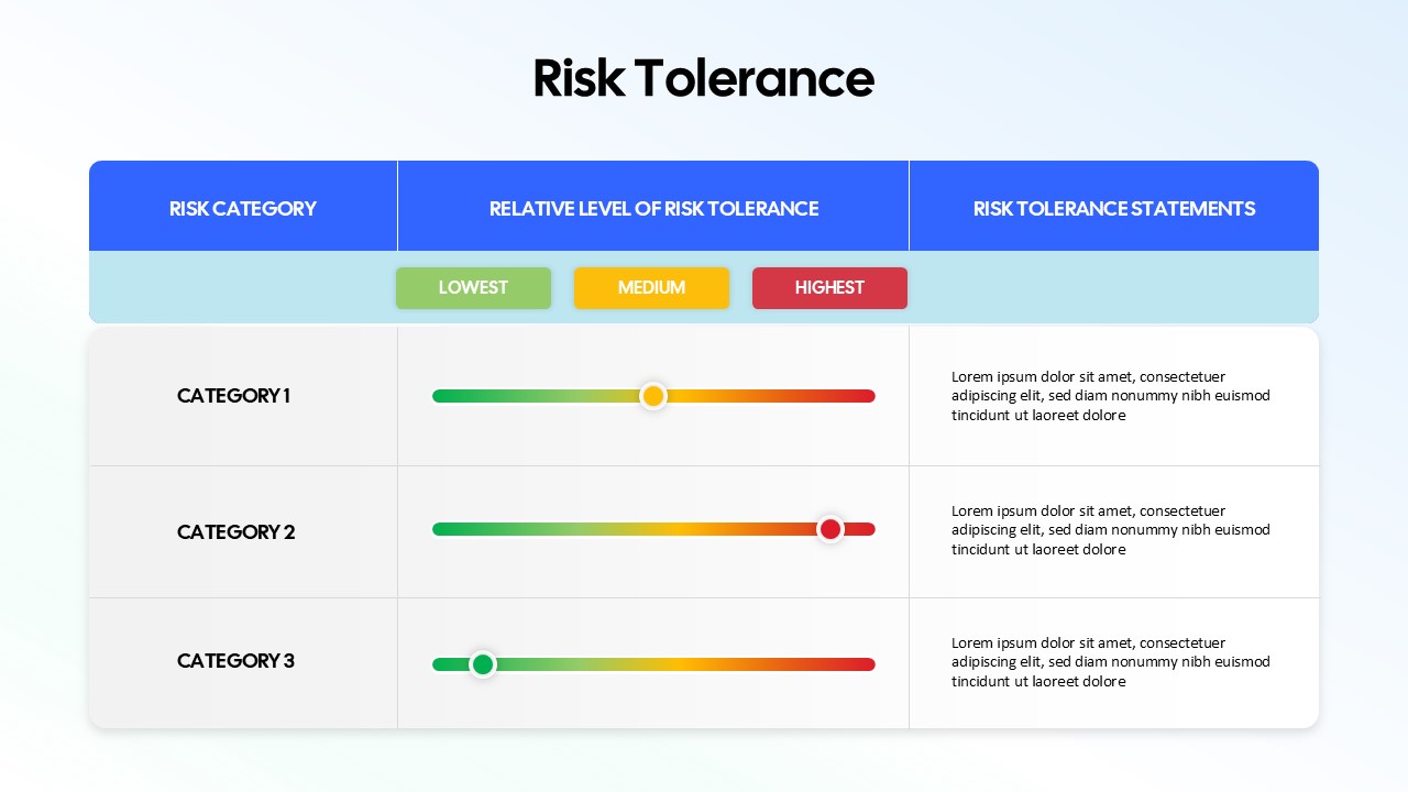
Risk Tolerance Assessment Sliders Template for PowerPoint & Google Slides
Finance
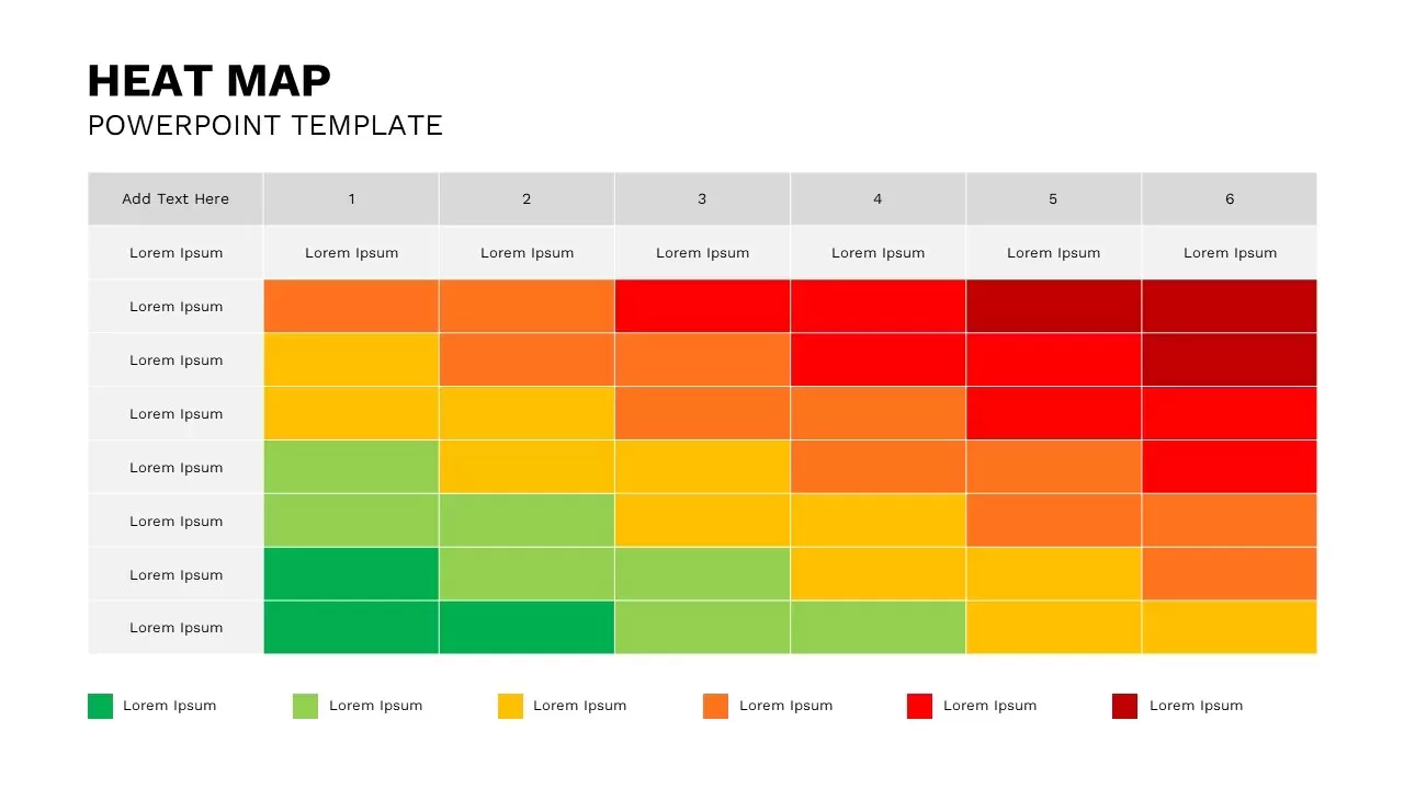
Heat Map Template for Presentations
Comparison Chart
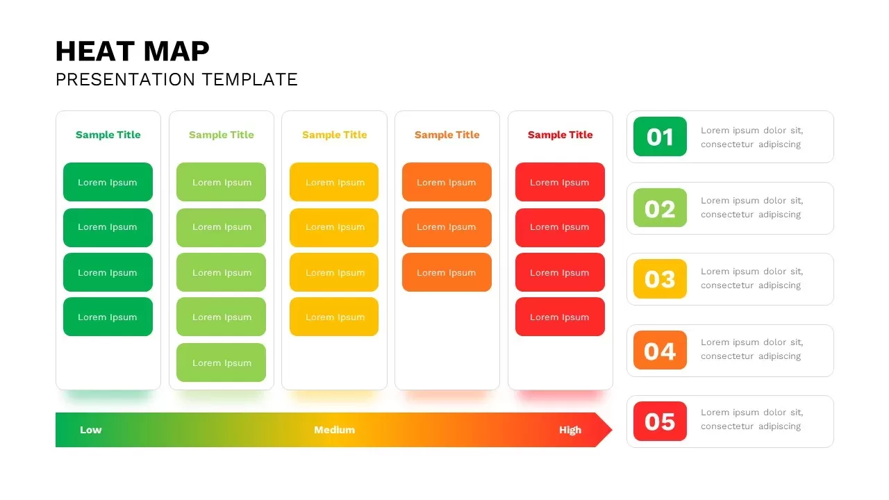
Heat Map Template for PowerPoint
Bar/Column
Heat Map Slide for PowerPoint For Presentation
Maps
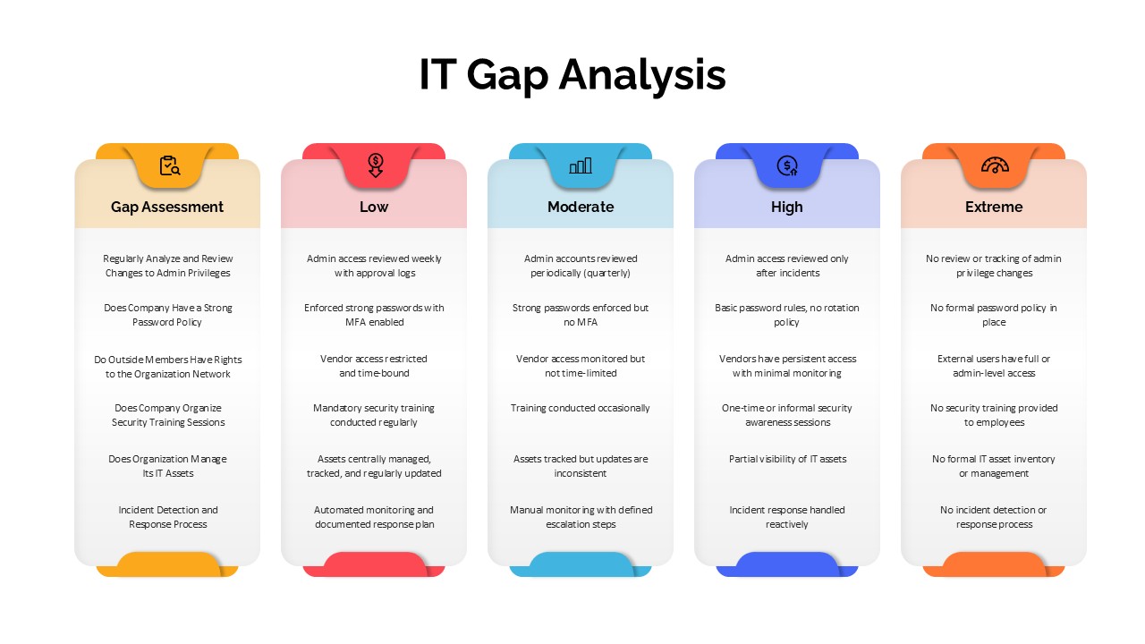
IT Gap Analysis Assessment Matrix Template for PowerPoint & Google Slides
Information Technology
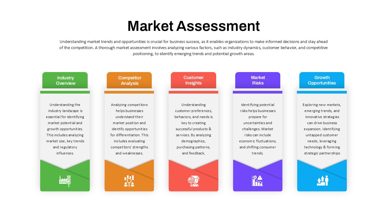
Market Assessment Infographic Slide Template for PowerPoint & Google Slides
Process
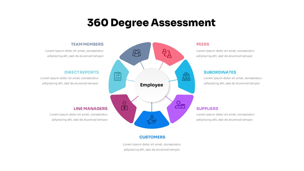
360 Degree Assessment Template for PowerPoint & Google Slides
Employee Performance
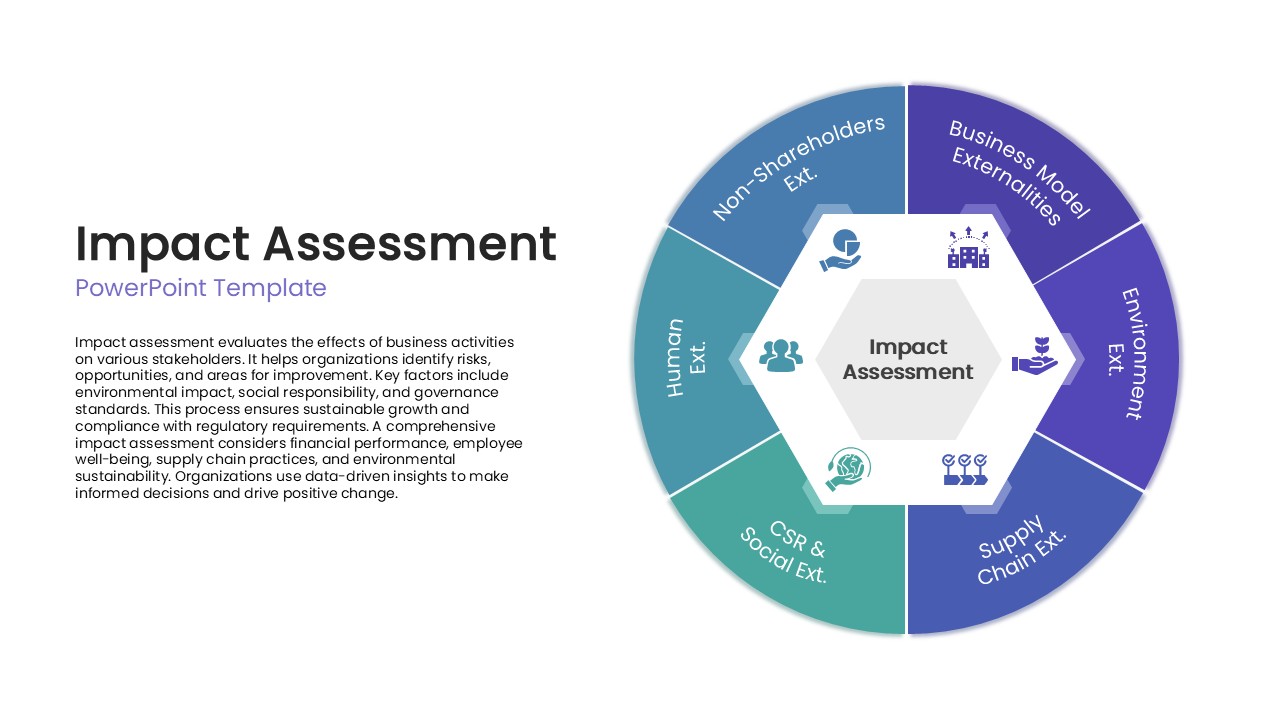
Impact Assessment Circular Diagram Template for PowerPoint & Google Slides
Circular
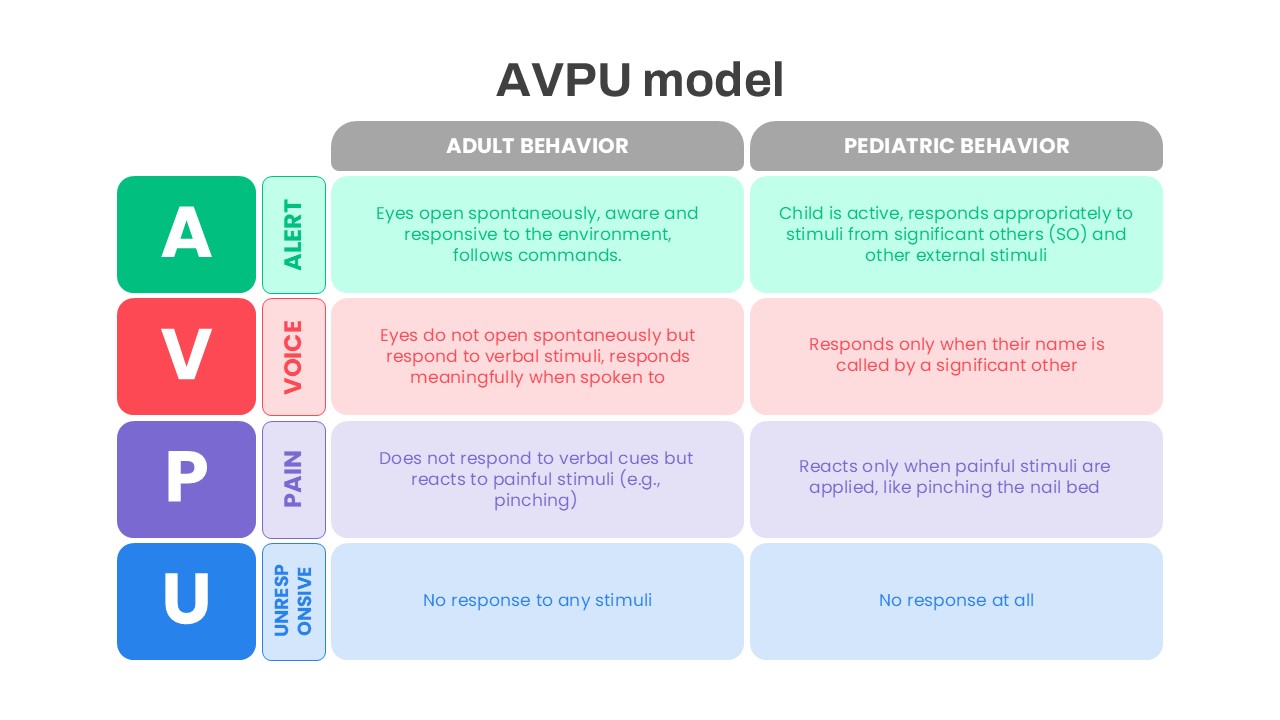
AVPU Model Behavior Assessment Template for PowerPoint & Google Slides
Health
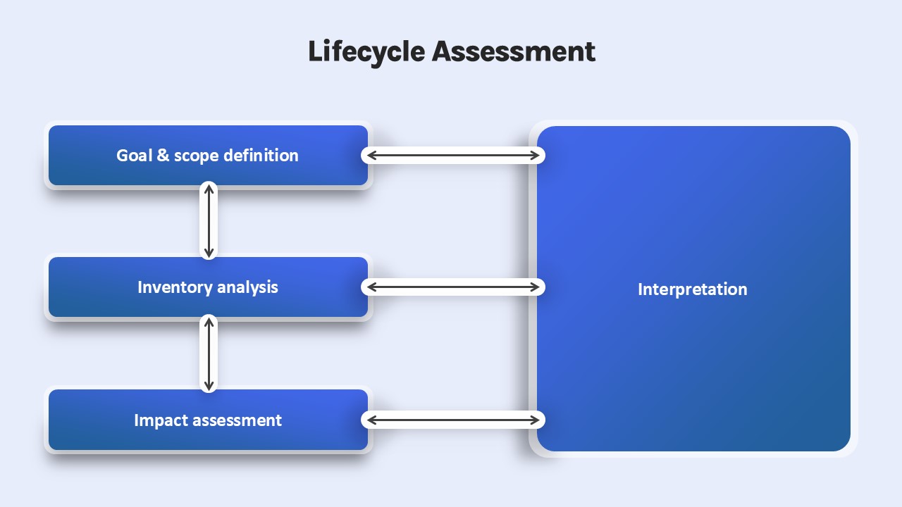
Lifecycle Assessment template for PowerPoint & Google Slides
Process
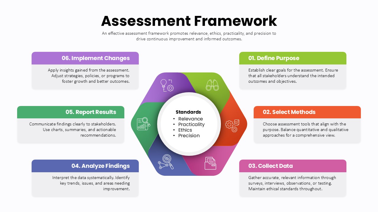
Assessment Framework Circular Diagram Template for PowerPoint & Google Slides
Circular
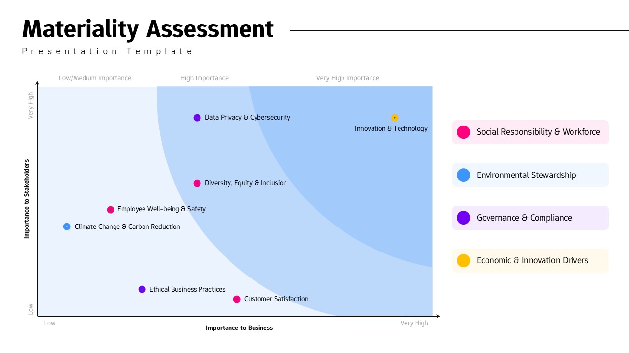
Materiality Assessment Matrix Diagram Template for PowerPoint & Google Slides
Risk Management