Sales Bar Chart Template for PowerPoint and Google slides
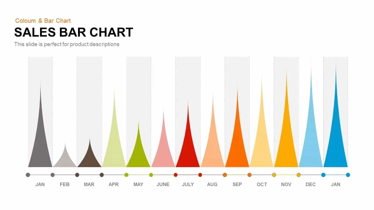
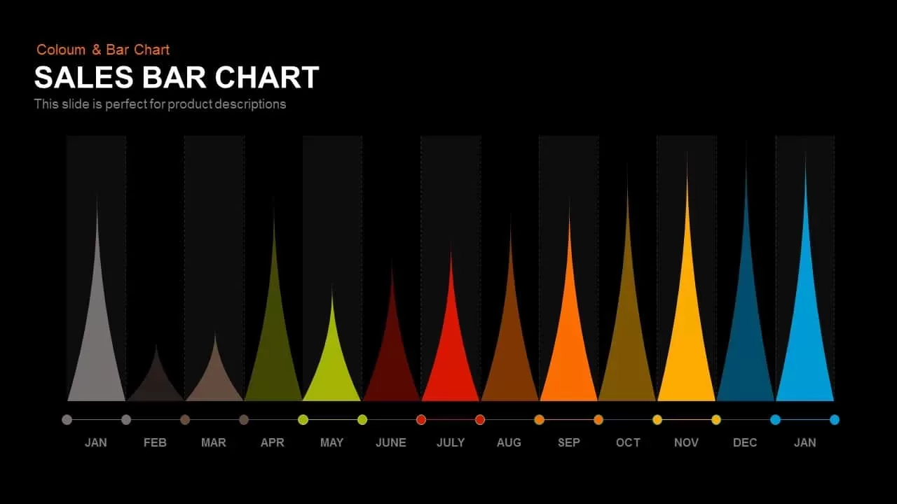
Sales Bar Chart PowerPoint Template
Sales bar chart PowerPoint template and slides is a graphical representation of your sales volumes in consecutive periods. This PowerPoint is an excellent way to present comparisons and changes in data. The statistical tool makes easy understanding of sales and the competition with a visual aid. The users can make changes in color combination and the shapes according to their data and requirements.
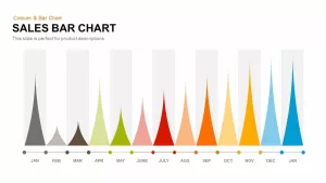
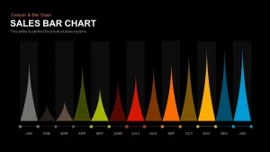
You can represent the change in trends of the Sales Bar Chart of the products in an effective way. This is a pyramid shape bar chart which is available in two backgrounds white and black and all the pyramid shaped bars are of different colors which makes the template more attractive. The horizontal is used to show the comparison among different categories. One axis of the bar chart shows the specific categories being compared and other axis represent a discreet value. In a bar chart you can either compare the sale of several items or the sale of a single item in different time period. The length of the bars represents the proportional values.
You can use the sales bar chart template to represent the data into discrete groups such as months of the year, age group, size, etc. it becomes very easy to analyze the data when it is represent in the Bar Chart. You can make the bar chart for sale of a product, how much you are spending on different products, profit of different products or profit earned from a single product in different time frames, etc. If you are about to give a PowerPoint presentation on the performance of a particular product or set of product than the Bar Chart template is a perfect choice for you. It will make your data easy to understand and attractive. The template is fully editable and you can customize the template according to your needs.
Login to download this file

Item ID
SB00387
Related Templates

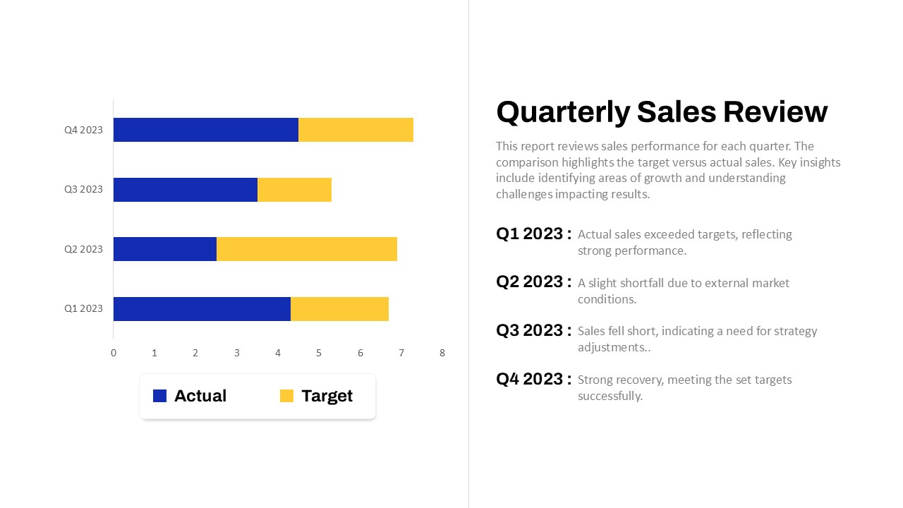
Quarterly Sales Review Bar Chart Template for PowerPoint & Google Slides
Bar/Column
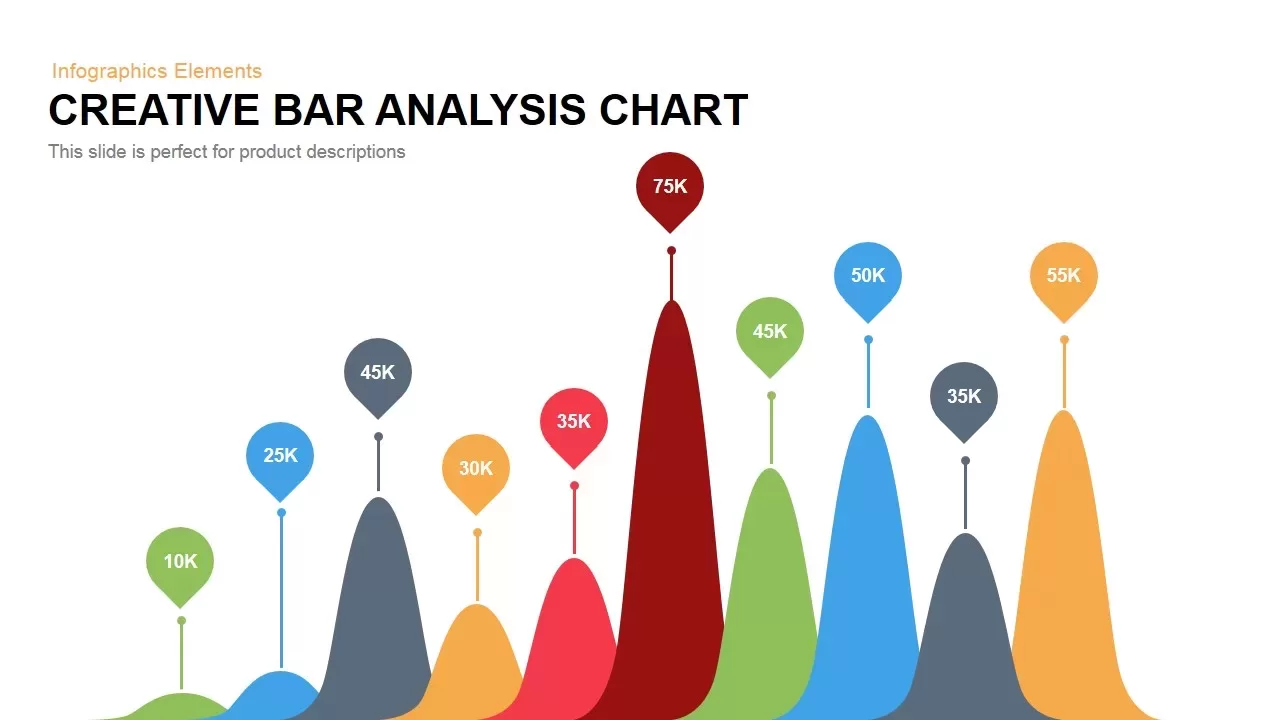
Creative Data Analysis Bar Chart template for PowerPoint & Google Slides
Bar/Column
3D Bar Chart Data Infographics Template for PowerPoint & Google Slides
Bar/Column
Creative Bar Chart template for PowerPoint & Google Slides
Charts
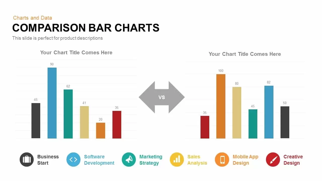
Comparison Bar Chart template for PowerPoint & Google Slides
Comparison Chart
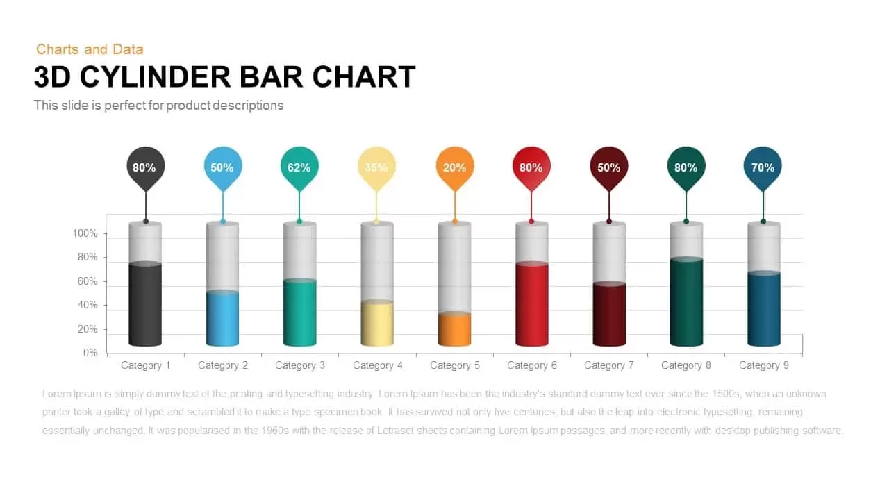
3D Cylinder Bar Chart Template for PowerPoint & Google Slides
Bar/Column

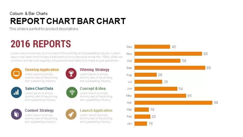
Monthly Reports Bar Chart template for PowerPoint & Google Slides
Bar/Column

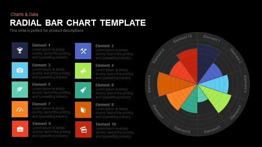
Colorful Radial Bar Chart Template for PowerPoint & Google Slides
Bar/Column
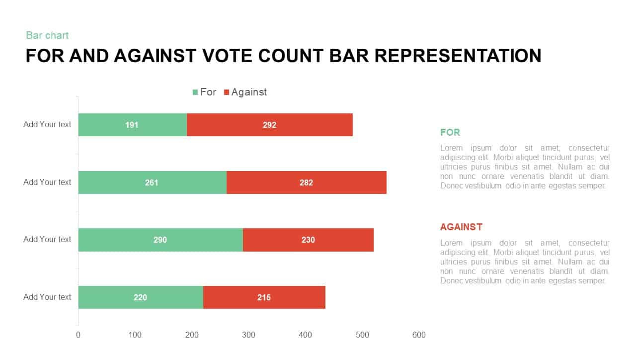
For and Against Vote Count Bar Chart Template for PowerPoint & Google Slides
Bar/Column
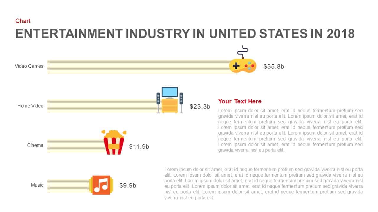
Entertainment Industry Revenue Bar Chart Template for PowerPoint & Google Slides
Bar/Column
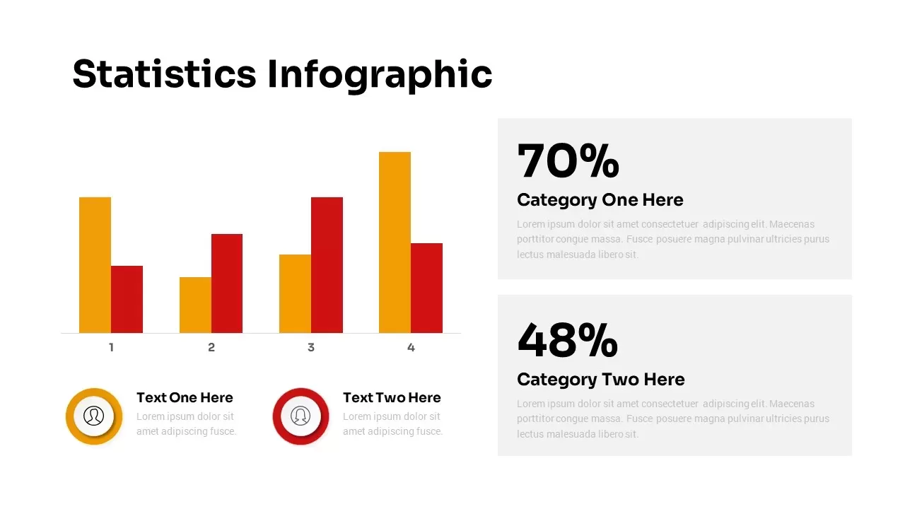
Statistics Infographic & KPI Bar Chart Template for PowerPoint & Google Slides
Bar/Column
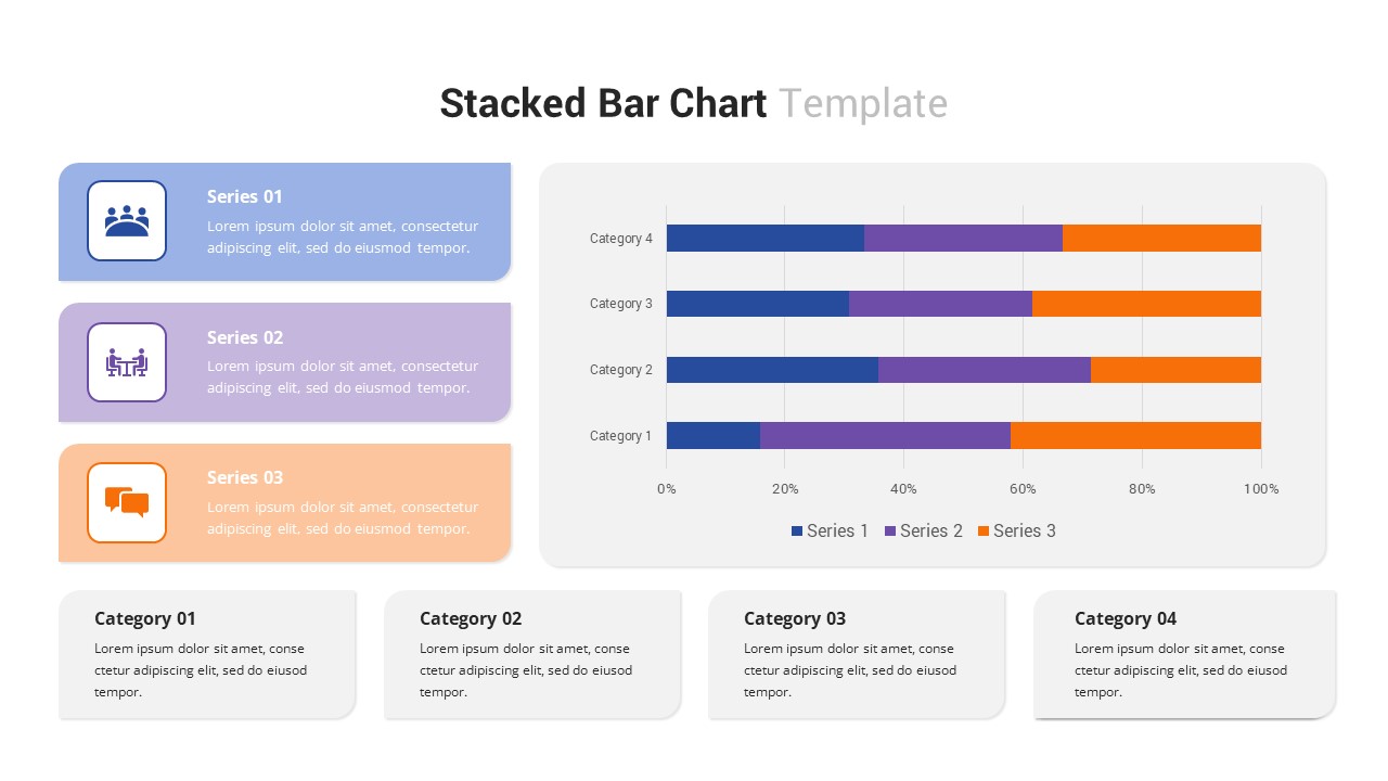
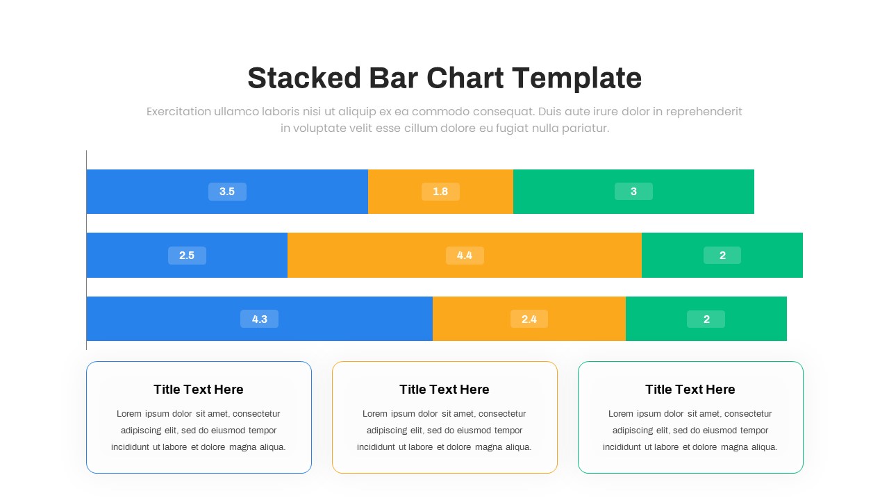
Multi-Series Stacked Bar Chart Template for PowerPoint & Google Slides
Bar/Column
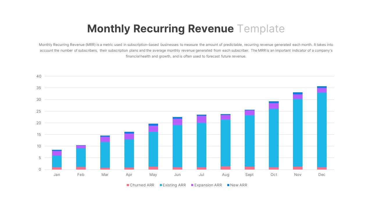
Monthly Recurring Revenue KPI Bar Chart Template for PowerPoint & Google Slides
Bar/Column
Animated Clustered Bar Chart Template for PowerPoint & Google Slides
Bar/Column
Animated Stacked Bar Chart Template for PowerPoint & Google Slides
Bar/Column
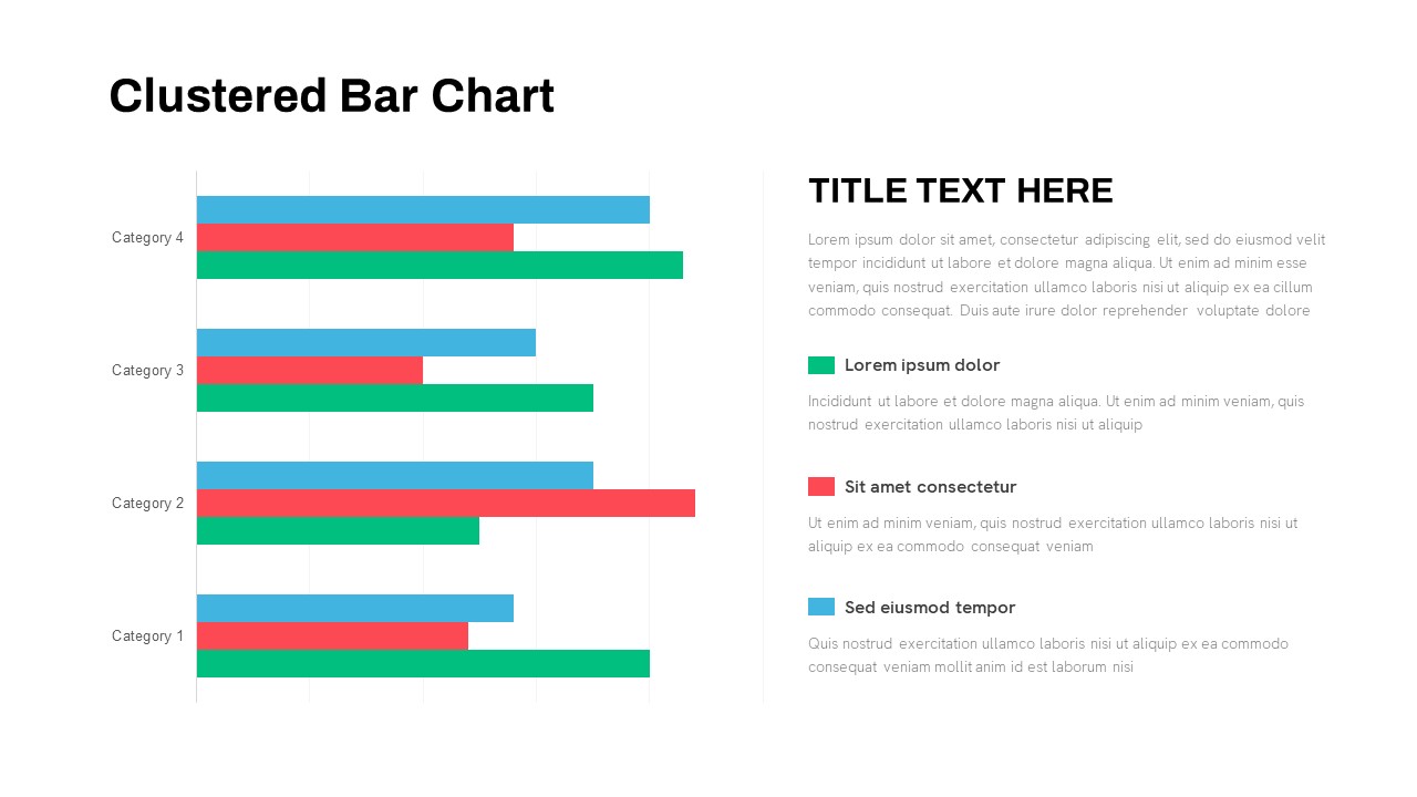
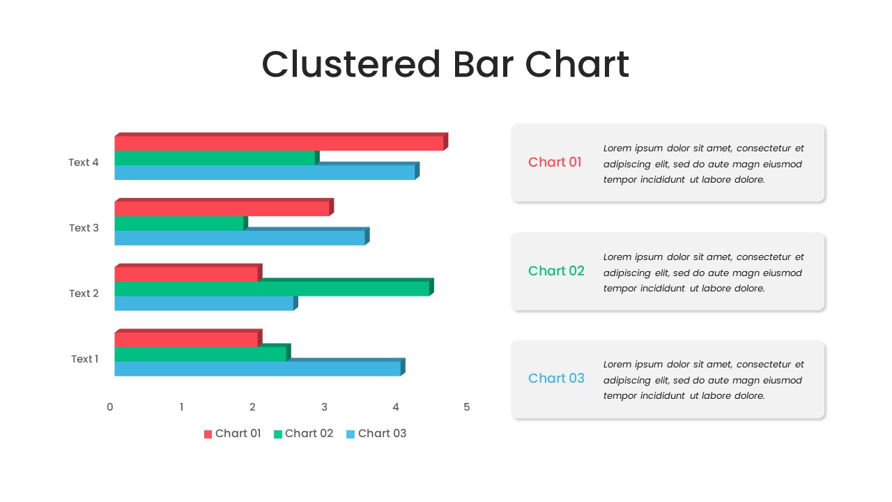
Clustered Bar Chart Comparison Template for PowerPoint & Google Slides
Bar/Column
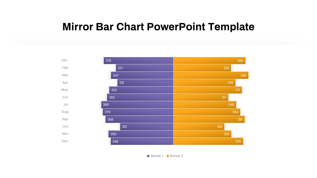
Mirror Bar Chart Comparison Template for PowerPoint & Google Slides
Bar/Column
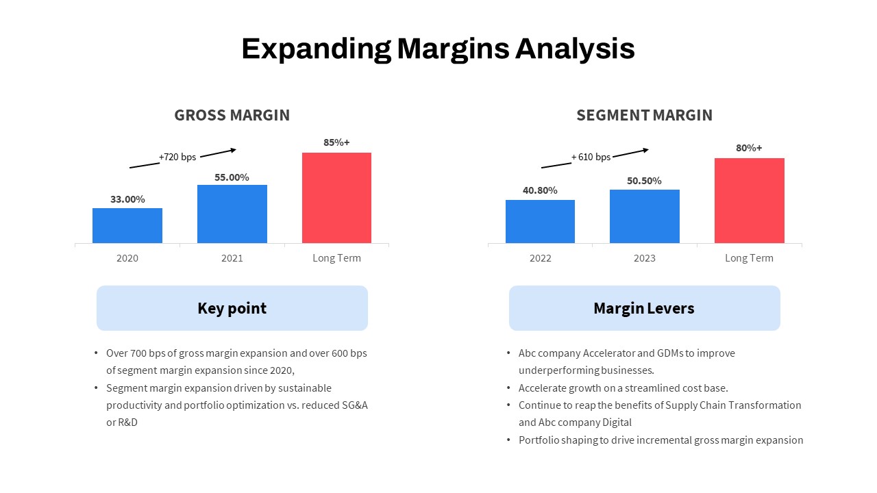
Expanding Margins Analysis Bar Chart Template for PowerPoint & Google Slides
Charts
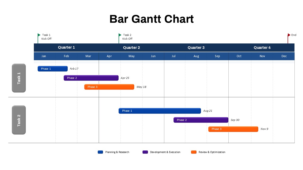
Bar Gantt Chart Template for PowerPoint & Google Slides
Gantt Chart
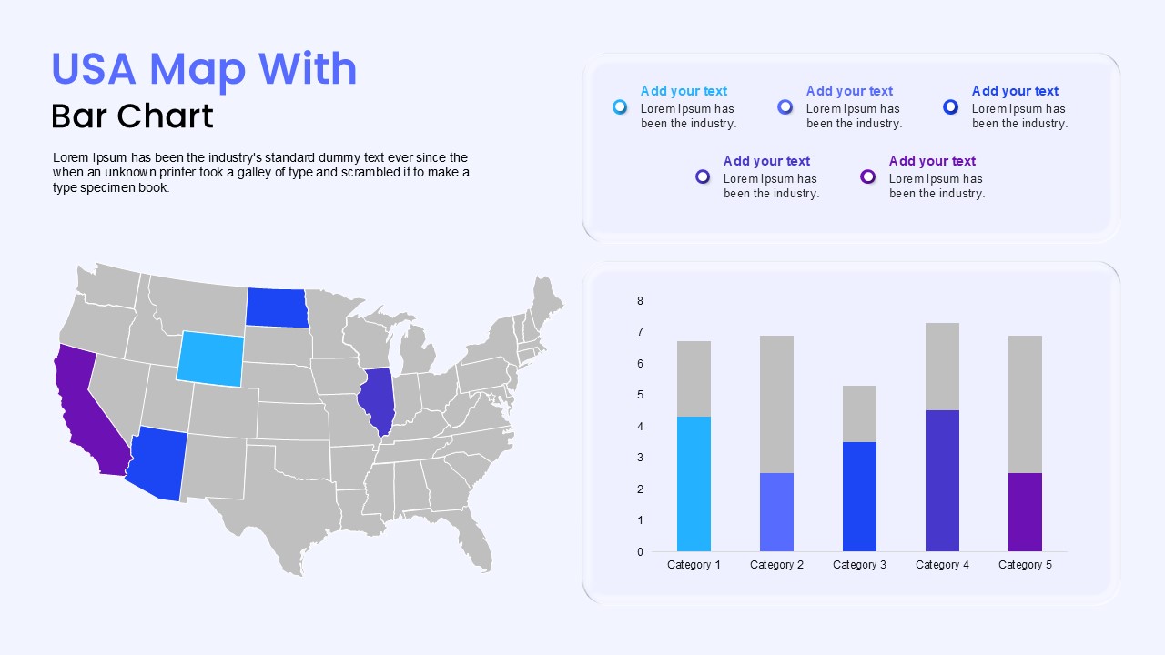
USA Map with Bar Chart Template for PowerPoint & Google Slides
World Maps