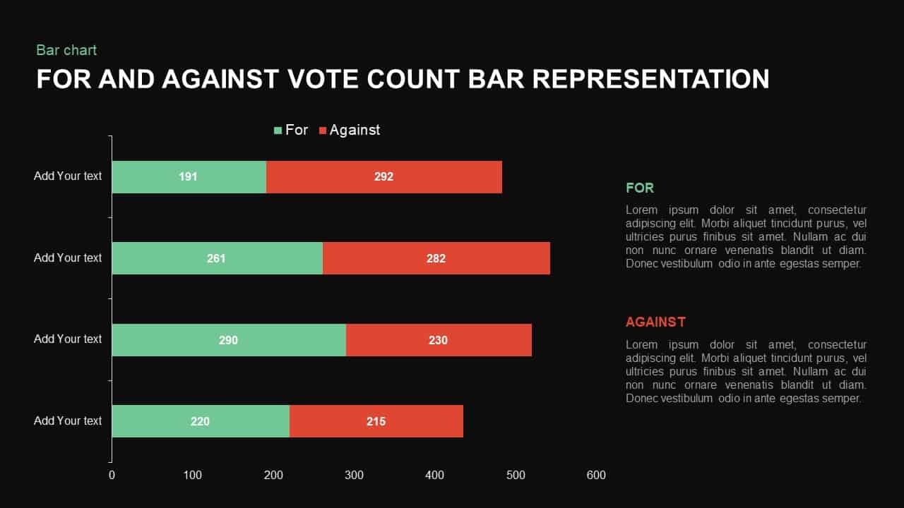
For and Against Vote Count Bar Chart Template for PowerPoint & Google Slides


Description
Leverage this versatile horizontal bar chart slide to clearly compare supporting and opposing data in a single view. Featuring two-tone bars—green for “For” and red for “Against”—each segment includes numeric labels and category names on the left axis. The clean white background, subtle gridlines, and minimal iconography ensure maximum focus on your data. Editable vector shapes and text placeholders allow you to customize bar lengths, colors, labels, and axis scales via the master slide. Whether you need to highlight survey results, stakeholder positions, or decision-making criteria, this chart adapts seamlessly to your content.
Optimized for PowerPoint and Google Slides, this template leverages SmartArt and built-in animations for sequential reveals and dynamic filtering of data series. You can hide or highlight individual bars to spotlight critical comparisons, adjust segment colors to match your brand, and swap icons via drag-and-drop. The slide’s modular layout ensures pixel-perfect scaling across devices and consistent formatting across multiple presentations. Accessibility features—including high-contrast text options, large font sizes, and screen-reader-friendly labels—ensure broad audience comprehension.
Designed with efficiency in mind, the slide integrates fully with master slide themes, allowing global style updates without manual edits. Simply change theme colors or fonts on the master to apply across all bars and labels. The axis and legend positions are flexible: move them to suit different slide layouts or presentation styles without sacrificing clarity. These smart design choices minimize editing time and eliminate version control headaches when collaborating across teams. Built-in legend markers and adjustable gridlines allow you to control visual density and adapt to different data complexities or audience needs.
Who is it for
Product managers, market researchers, analysts, project leads, and decision-makers will benefit from this bar chart slide when presenting comparative data and facilitating discussions.
Other Uses
Repurpose this slide to compare budget allocations, survey responses, risk assessments, resource planning scenarios, or project milestone progress across any two contrasting data sets.
Login to download this file

Item ID
SB01318
Related Templates

3D Bar Chart Data Infographics Template for PowerPoint & Google Slides
Bar/Column
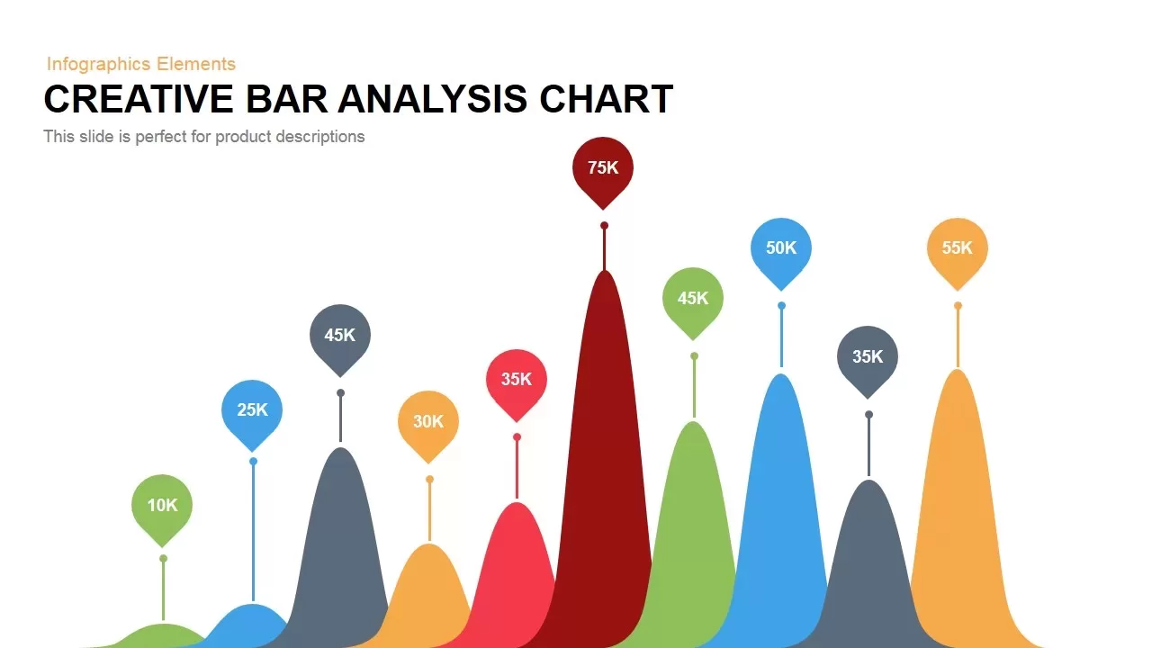
Creative Bar Chart template for PowerPoint & Google Slides
Charts
Pencil Bar Chart Data Analysis Template for PowerPoint & Google Slides
Bar/Column

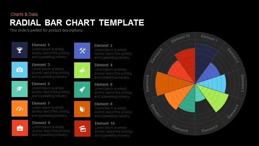
Colorful Radial Bar Chart Template for PowerPoint & Google Slides
Bar/Column
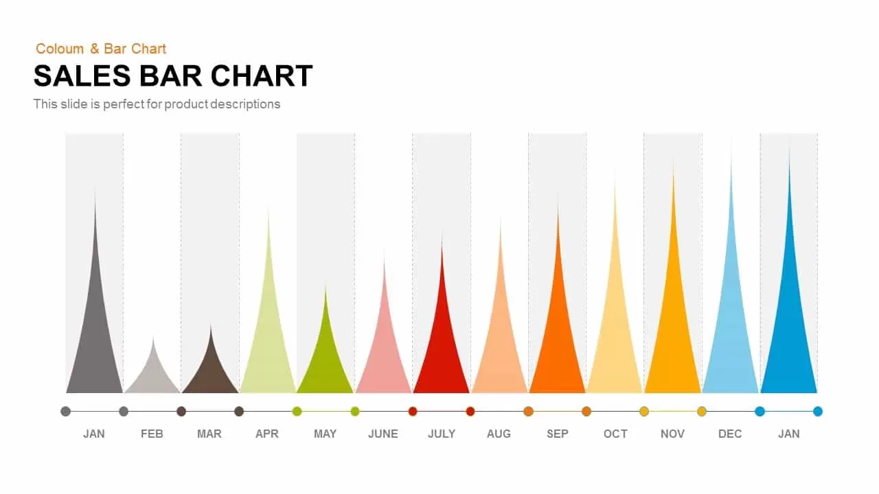
Sales Bar Chart Template for PowerPoint and Google slides
Bar/Column
Interactive Product Comparison Bar Chart Template for PowerPoint & Google Slides
Bar/Column
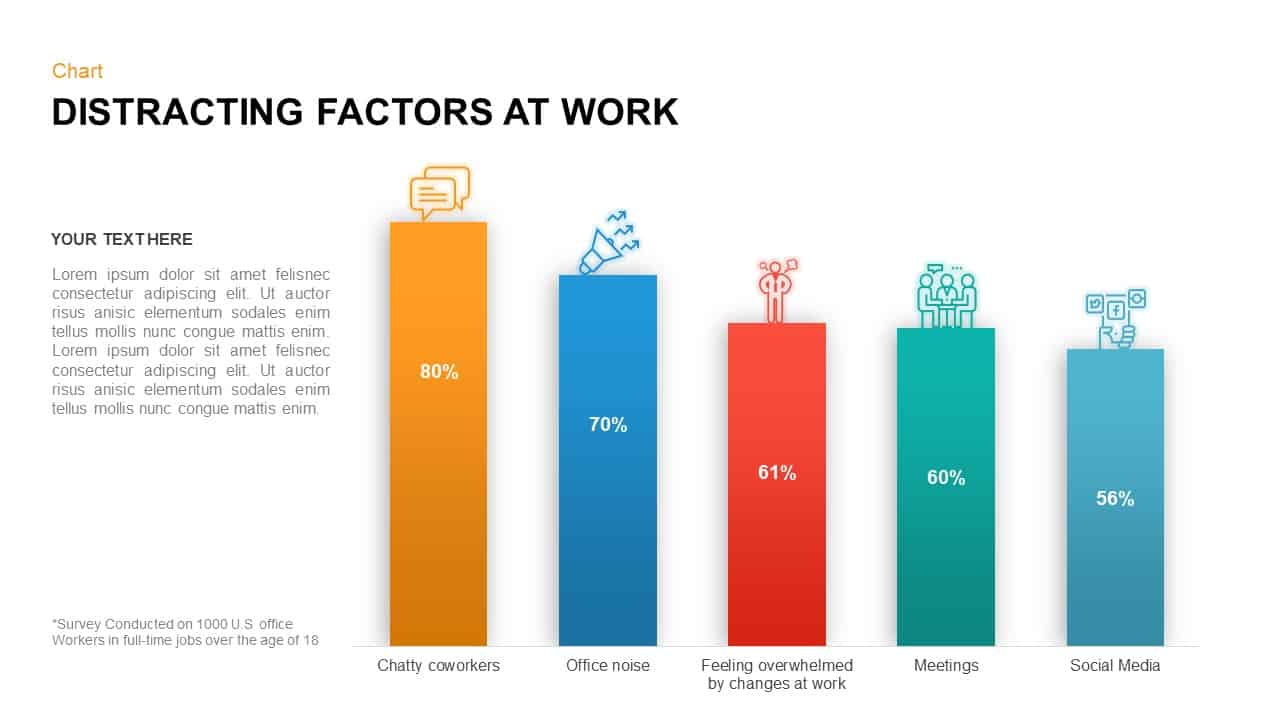
Distracting Factors at Work – Bar Chart Template for PowerPoint
Bar/Column
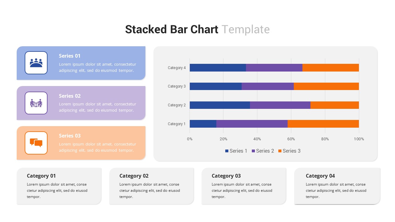
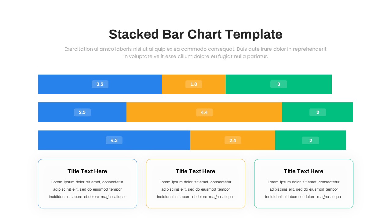
Multi-Series Stacked Bar Chart Template for PowerPoint & Google Slides
Bar/Column
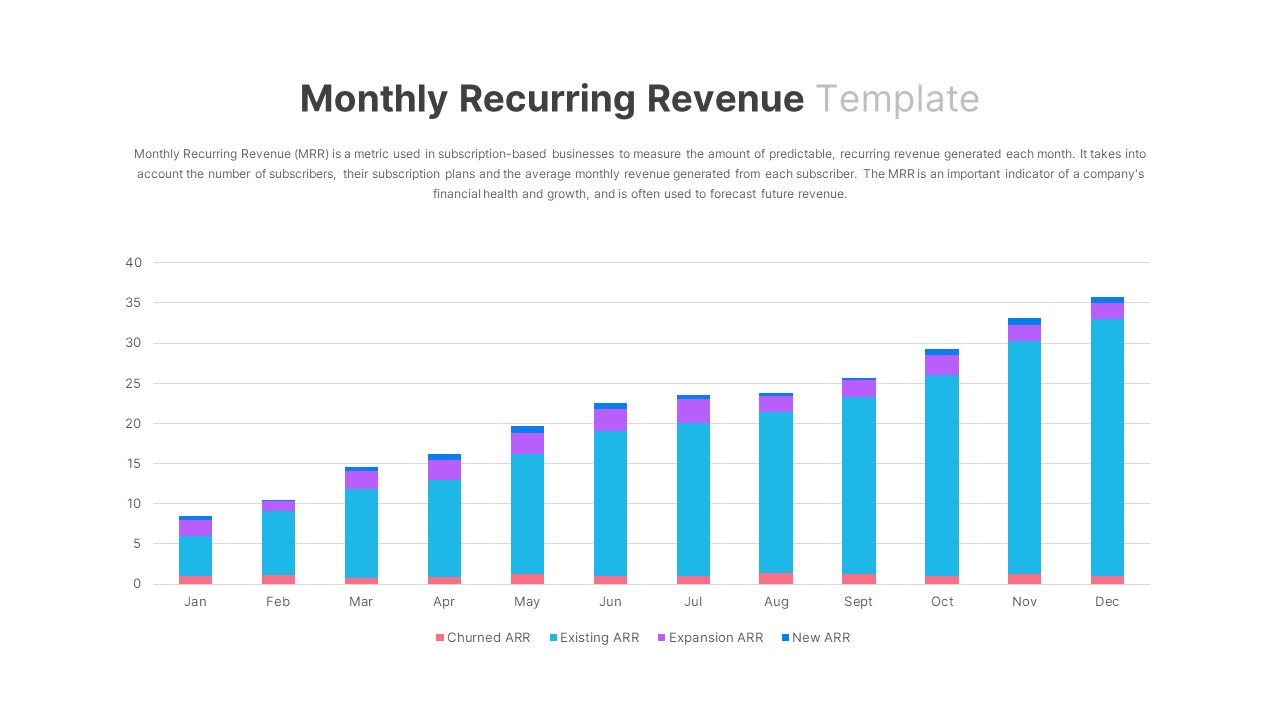
Monthly Recurring Revenue KPI Bar Chart Template for PowerPoint & Google Slides
Bar/Column
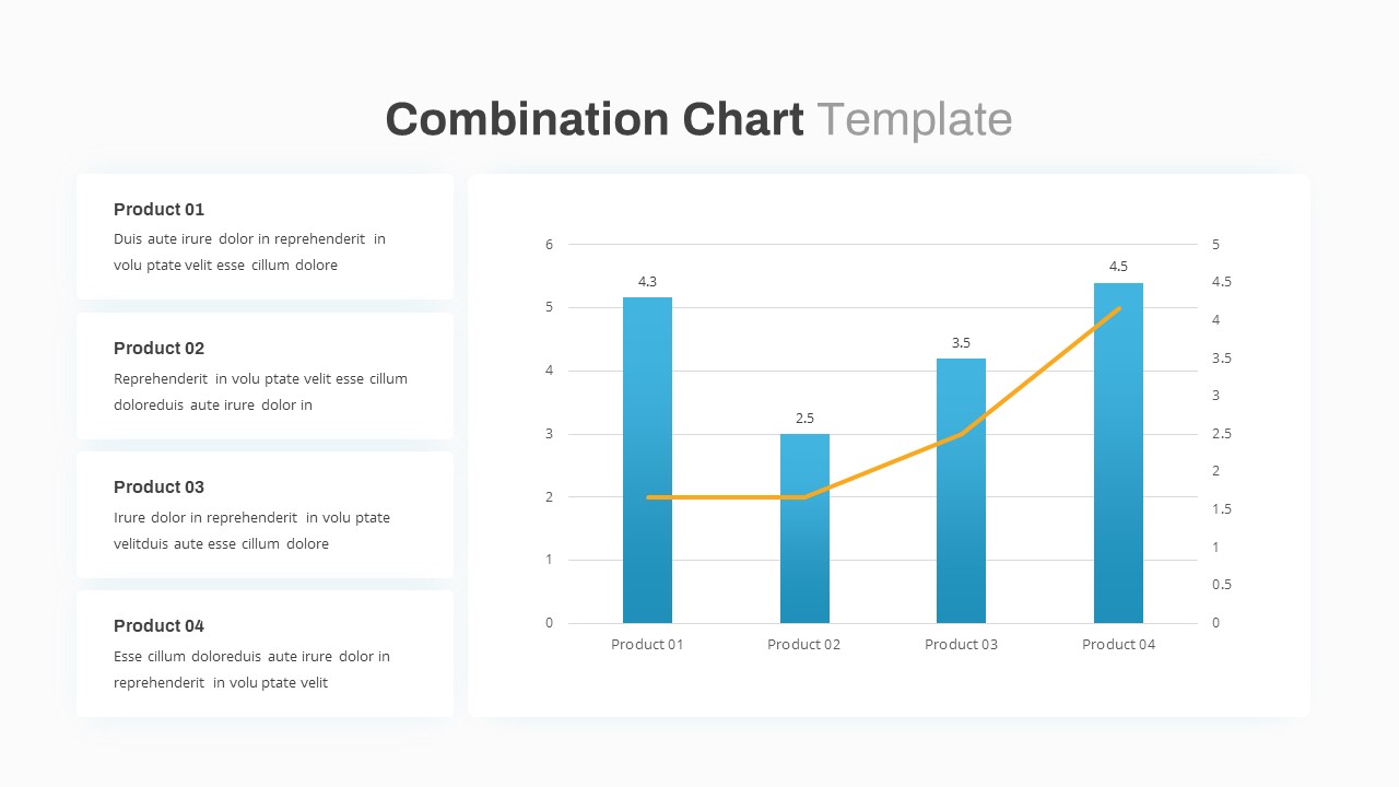
Combination Bar and Line Chart Template for PowerPoint & Google Slides
Bar/Column
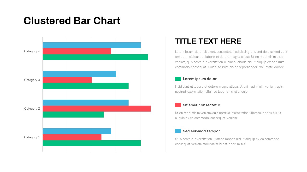
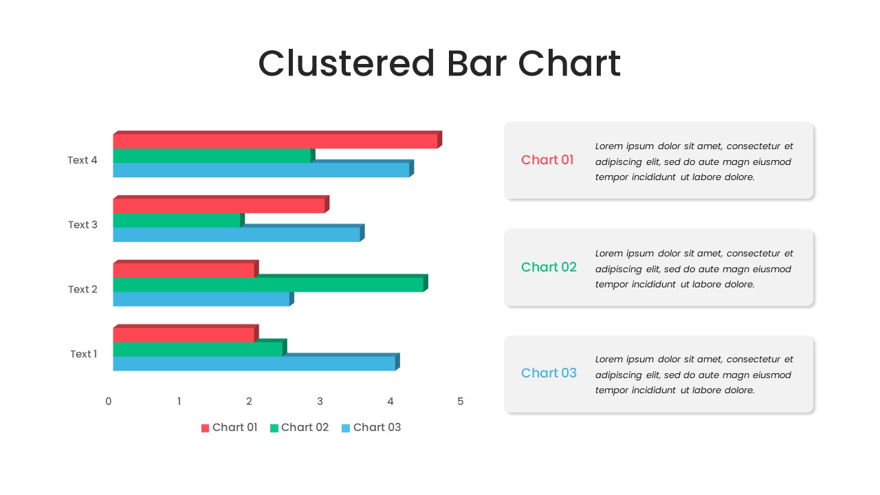
Animated Clustered Bar Chart Template for PowerPoint & Google Slides
Bar/Column
Animated Stacked Bar Chart Template for PowerPoint & Google Slides
Bar/Column
Simple Bar Chart Data Visualization Template for PowerPoint & Google Slides
Bar/Column
Clustered Bar Chart Comparison Template for PowerPoint & Google Slides
Bar/Column
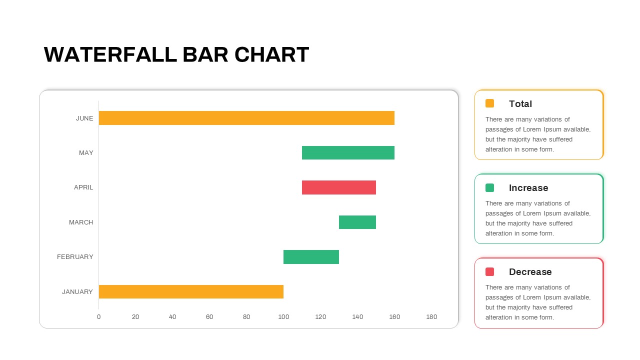
Waterfall Bar Chart Analysis Template for PowerPoint & Google Slides
Bar/Column
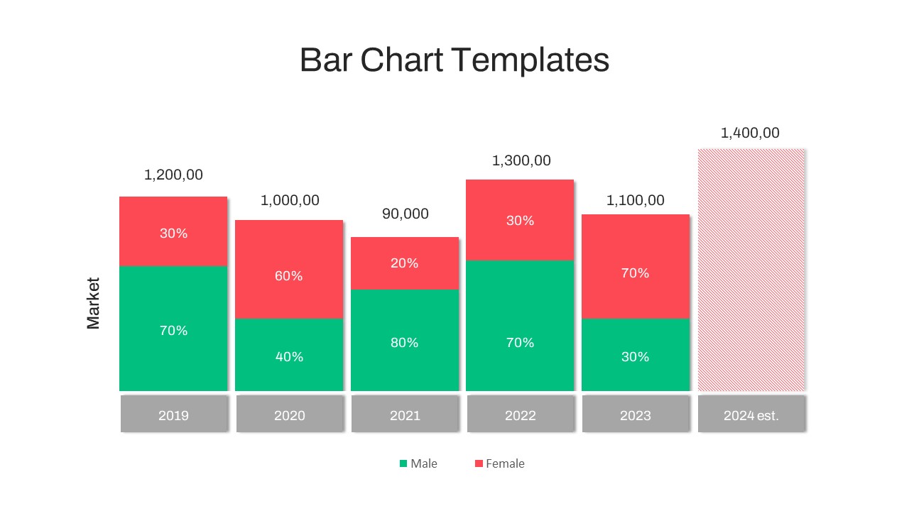
Year-over-Year Stacked Gender Bar Chart Template for PowerPoint & Google Slides
Bar/Column
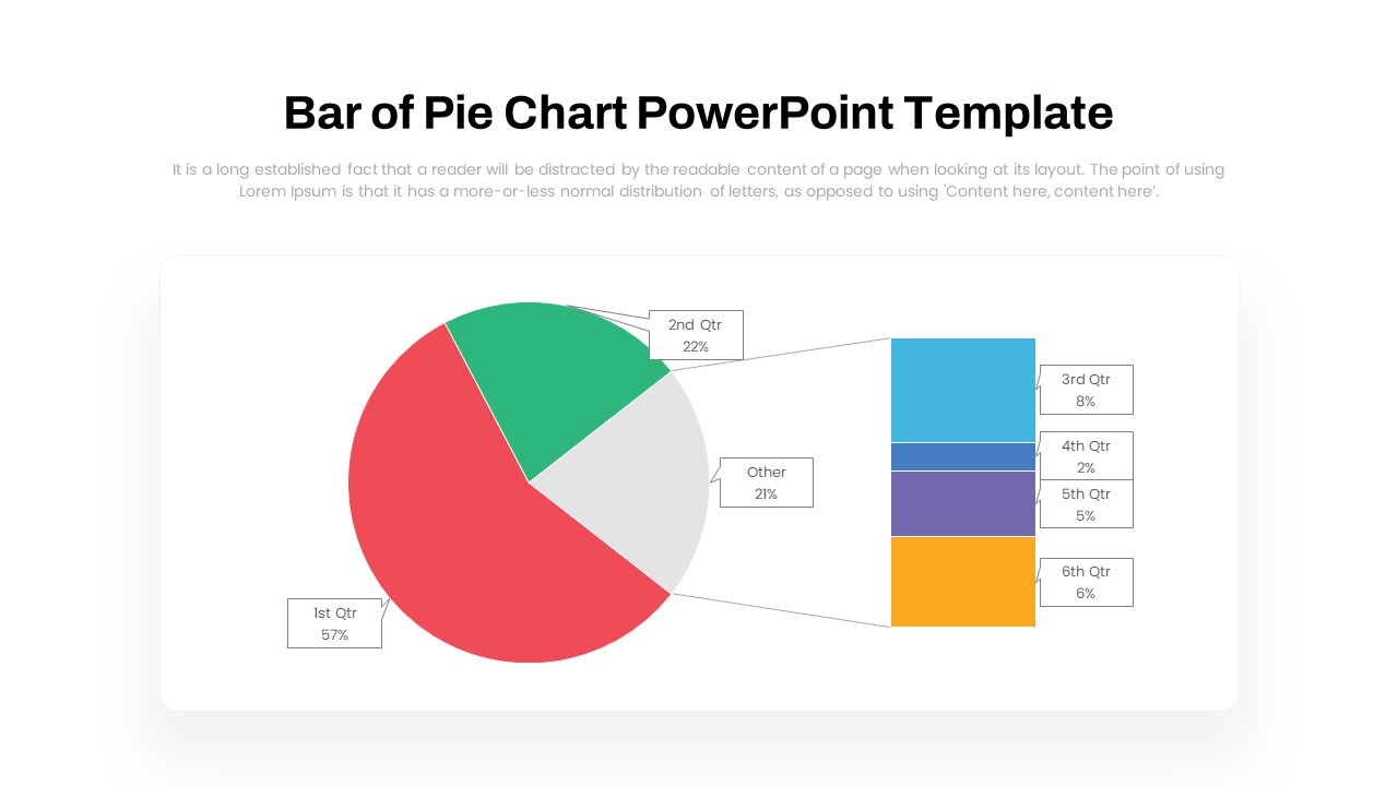
Dynamic Bar-of-Pie Chart Comparison Template for PowerPoint & Google Slides
Pie/Donut
Data Analysis Bar Chart with Insights Template for PowerPoint & Google Slides
Bar/Column
Free
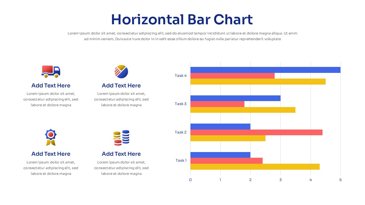
Horizontal Bar Chart Slide with Icons Template for PowerPoint & Google Slides
Bar/Column
Two-Option Bar Chart Comparison Table Template for PowerPoint & Google Slides
Comparison