Waterfall Chart Data Visualization Template for PowerPoint & Google Slides


Description
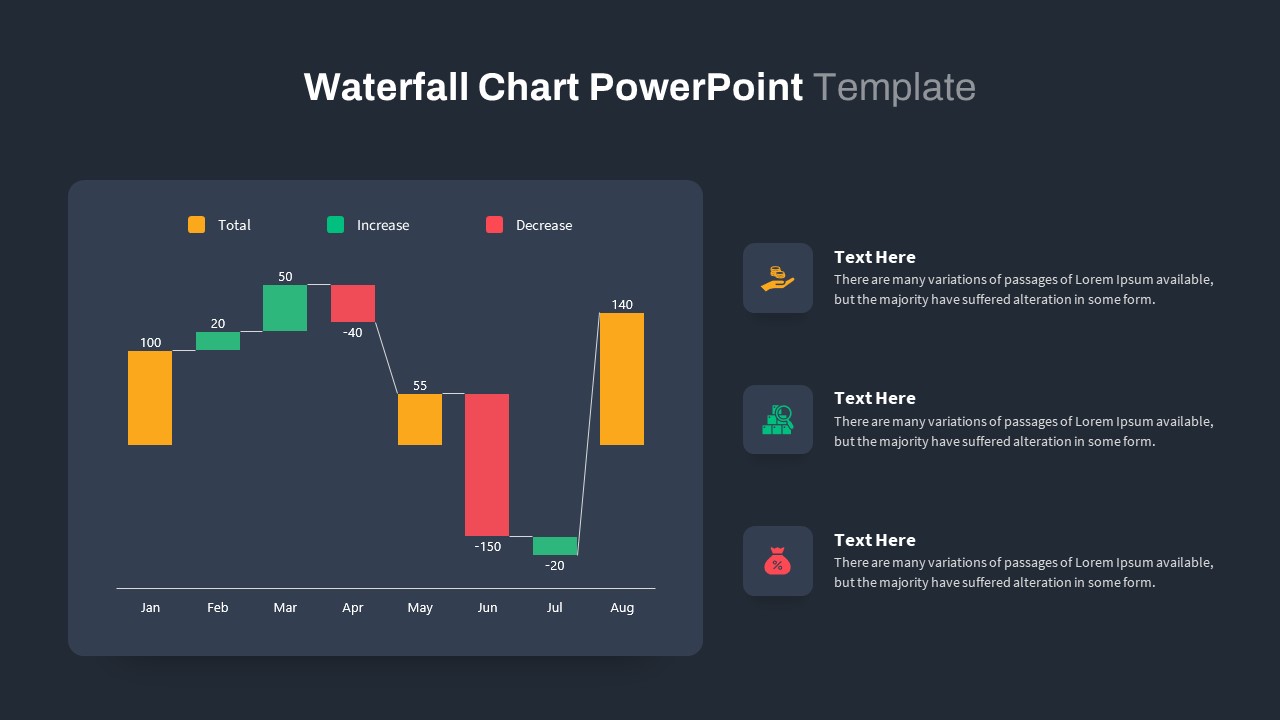
Empower your audience to grasp step-by-step changes with this comprehensive waterfall chart slide. The design features a white slide background with a subtle light-gray rounded rectangle framing the chart area, where six vertical bars represent “Total” values and incremental changes across months from January through August. Orange bars indicate starting, midpoint, and final totals; green bars highlight positive increases; red bars denote decreases, while thin connectors visually trace the cumulative flow. Each bar comes with a data label at its peak, ensuring numeric clarity.
On the right, three flat icon callouts—an orange hand with coins, a green bar chart, and a red percent-bag icon—each accompanied by editable text, provide space for key insights or summary bullets. A legend at the top decodes color mappings for Totals, Increases, and Decreases.
Built on master slides, every element can be customized instantly: adjust bar widths, recolor markers, modify axis scales, or replace icons to align with corporate branding or presentation themes. Vector-based shapes retain crisp quality across screen sizes and print. Intuitive grouping and descriptive layer names simplify edits, while a hidden dark-mode variant preserves contrast in low-light environments. Preconfigured entrance animations allow sequential reveals of each series or callout for dynamic storytelling.
Optimized for PowerPoint and Google Slides, this chart maintains pixel-perfect fidelity across devices and supports multiple aspect ratios and right-to-left text. Whether you’re illustrating budget variances, revenue progression, expense breakdowns, or incremental KPIs, this waterfall chart slide helps you deliver data-driven narratives with precision. Leverage its editable layouts to track financial flows, supply chain changes, or sequential project impacts—empowering stakeholders to visualize complex data with clarity and professionalism.
Who is it for
Financial analysts, marketing managers, and business strategists will benefit from this waterfall chart when presenting budget variances, cost breakdowns, or performance KPIs. Consultants, educators, and project leads can also leverage its clear design to teach data literacy or highlight strategic insights.
Other Uses
Repurpose this slide for profit-and-loss analyses, cost-benefit breakdowns, cumulative KPI tracking, or as a component within an executive dashboard. Simply swap out icons, adjust bar values, or modify color mappings to suit any data-driven narrative.
Login to download this file

Item ID
SB03748
Related Templates

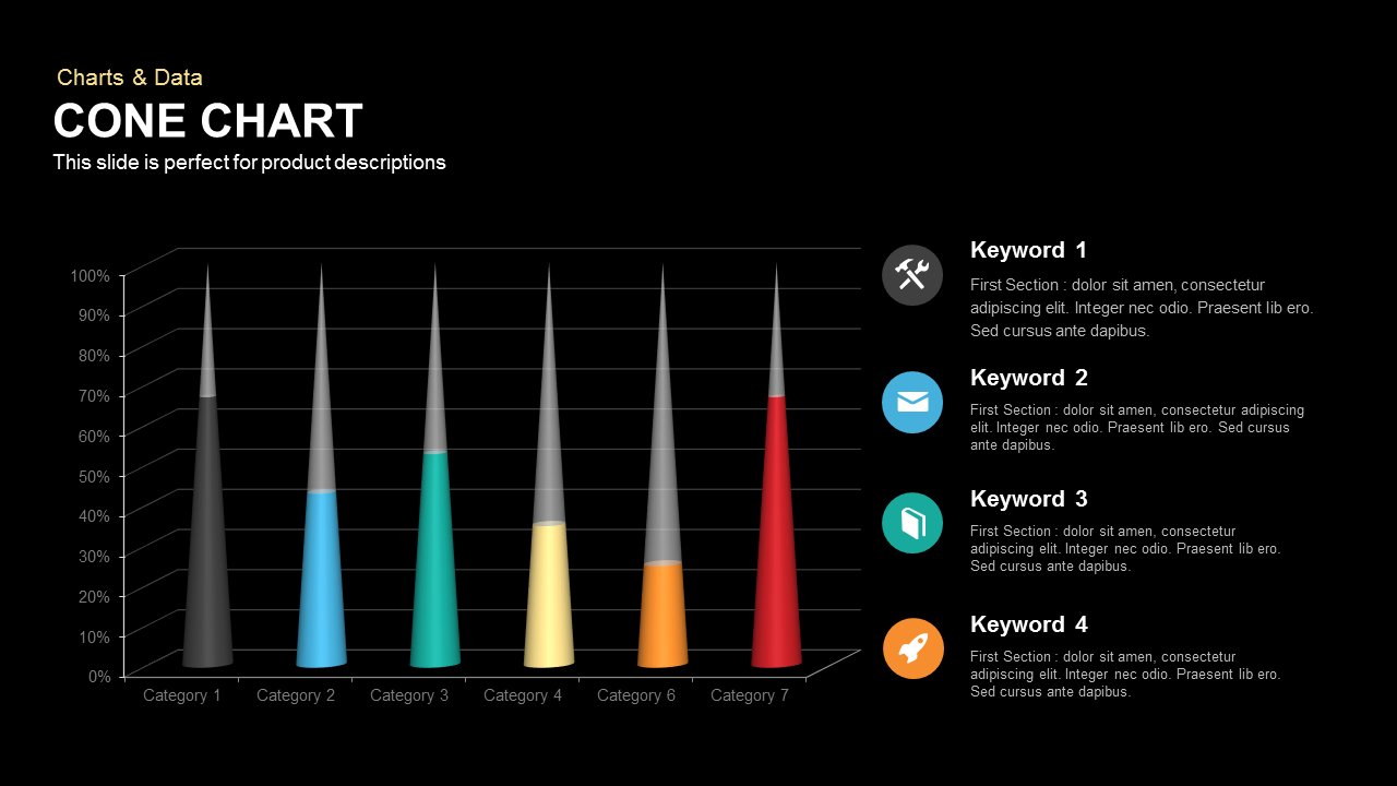
Cone Chart PowerPoint Template
Bar/Column
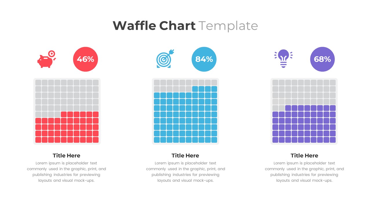
Waffle Chart Data Visualization Template for PowerPoint & Google Slides
Comparison Chart
Free Stacked Column Chart Data Visualization Template for PowerPoint & Google Slides
Bar/Column
Free
Simple Bar Chart Data Visualization Template for PowerPoint & Google Slides
Bar/Column
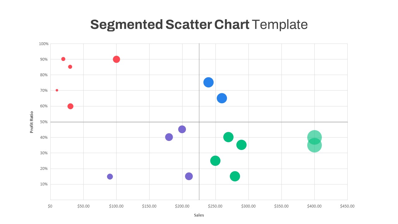
Segmented Scatter Chart Data Visualization Template for PowerPoint & Google Slides
Business Strategy
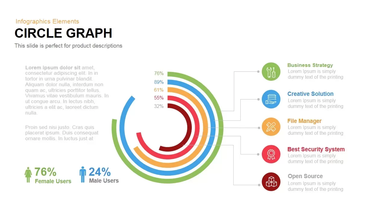
Circle Graph Data Visualization Template for PowerPoint & Google Slides
Circular
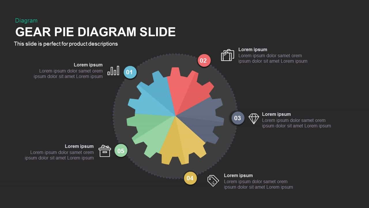
Gear Pie chart PowerPoint Template
Pie/Donut
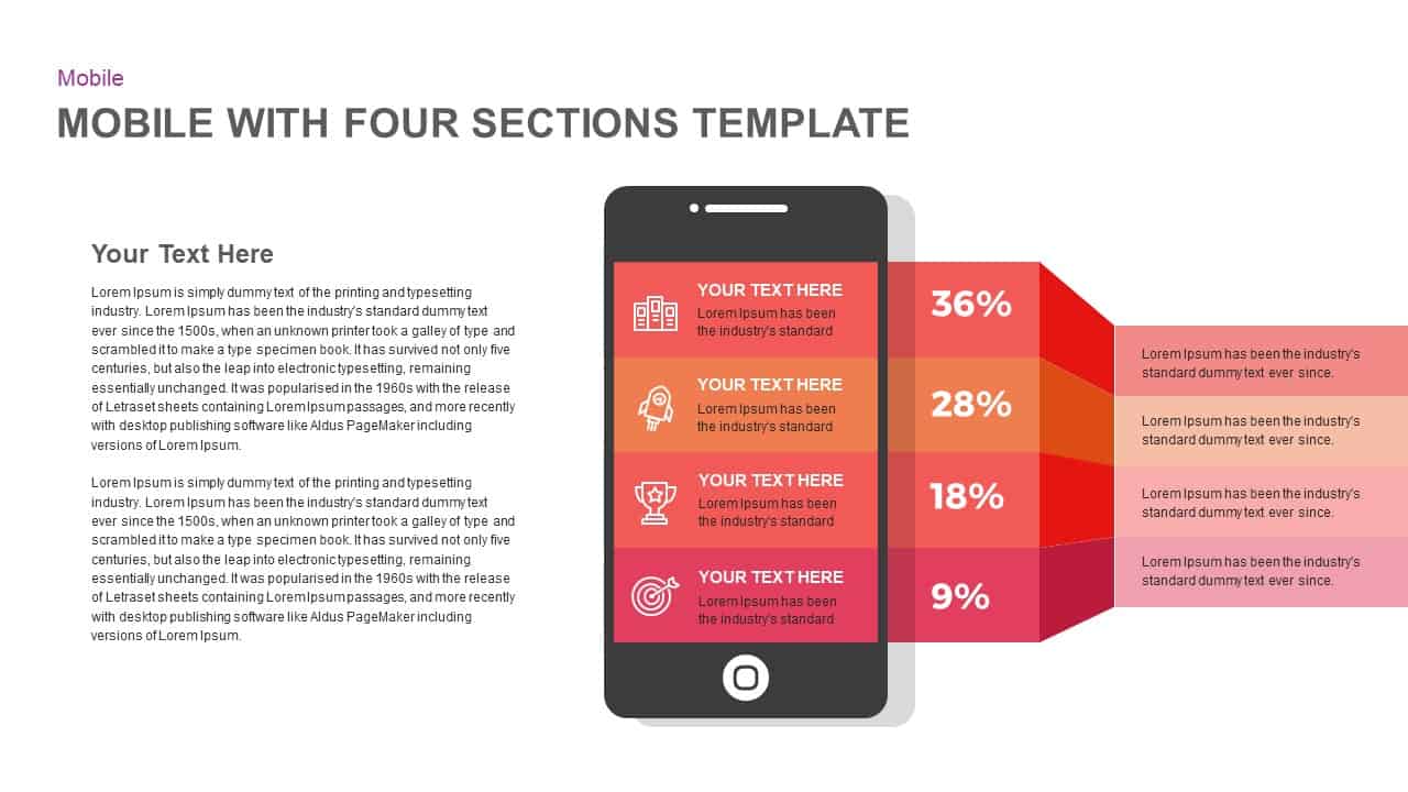
Mobile Infographics Data Visualization Template for PowerPoint & Google Slides
Infographics
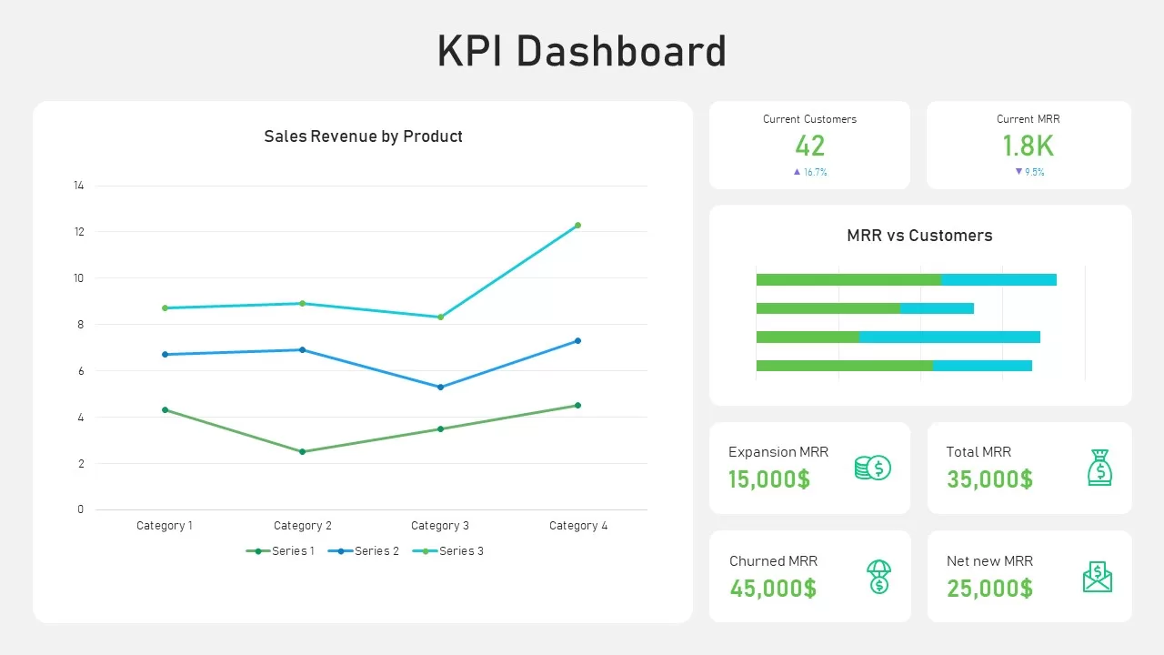
KPI Dashboard Data Visualization Template for PowerPoint & Google Slides
Bar/Column
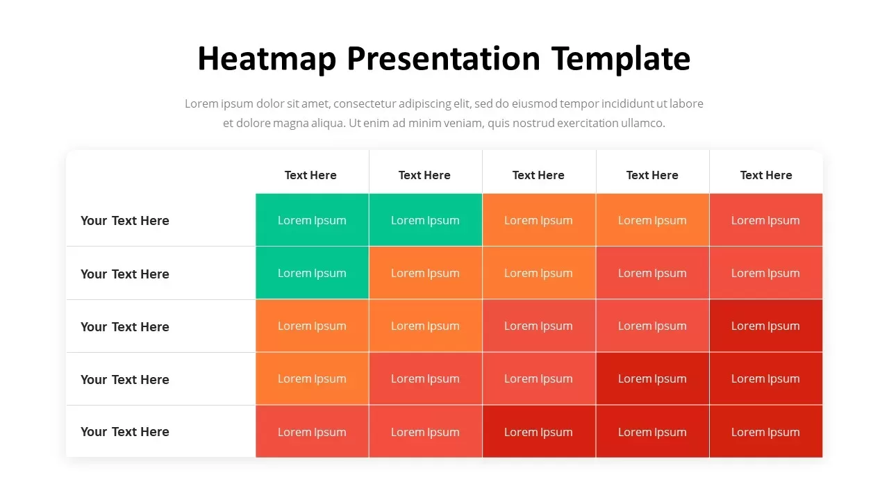
Professional Heatmap Data Visualization Template for PowerPoint & Google Slides
Infographics
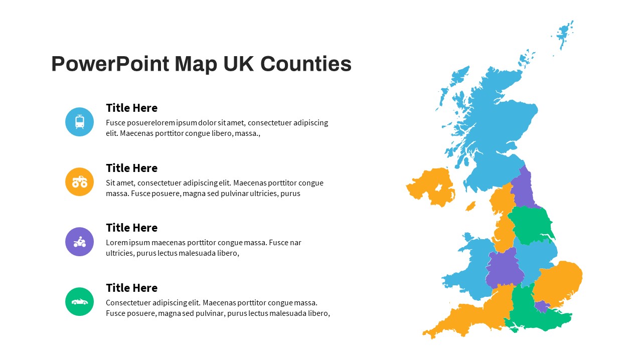
UK Counties Map Data Visualization Template for PowerPoint & Google Slides
World Maps
Free Big Data Network Visualization Template for PowerPoint & Google Slides
Circular
Free
Growth Curve Line Chart Visualization Template for PowerPoint & Google Slides
Charts
Dynamic Sunburst Chart Visualization Template for PowerPoint & Google Slides
Charts
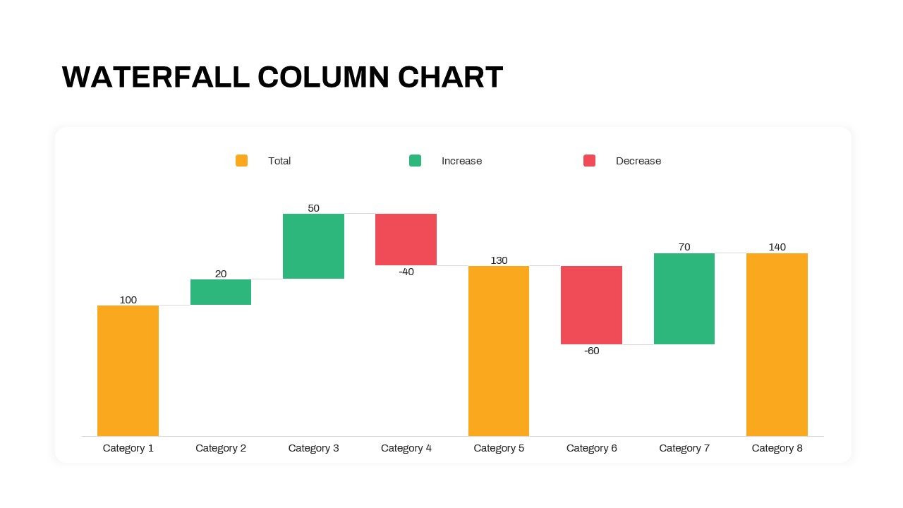
Waterfall Column Chart Analysis Template for PowerPoint & Google Slides
Bar/Column
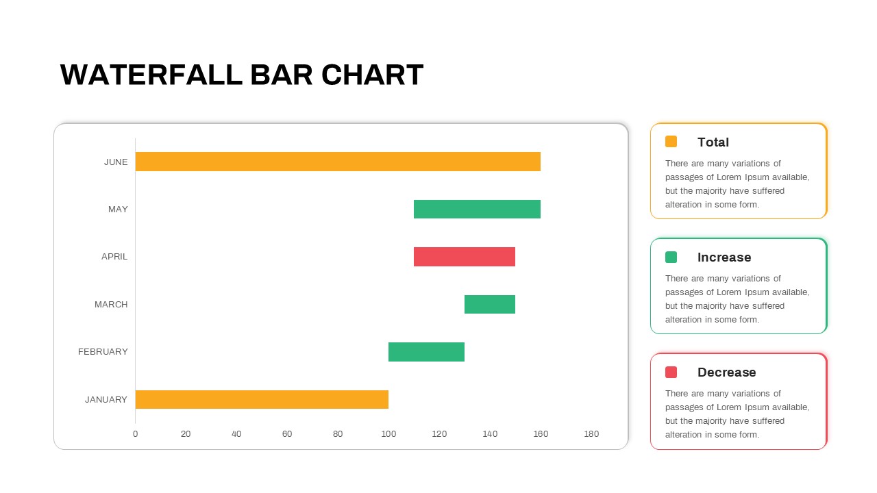
Waterfall Bar Chart Analysis Template for PowerPoint & Google Slides
Bar/Column
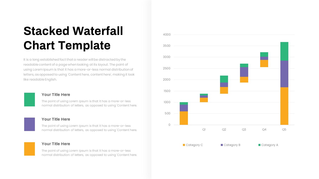
Stacked Waterfall Chart Template for PowerPoint & Google Slides
Bar/Column
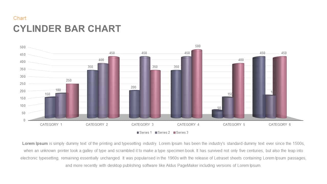
3D Cylinder Bar Chart Visualization Template for PowerPoint
Bar/Column
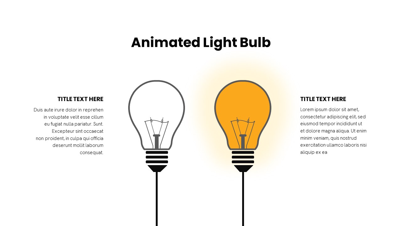
Animated Light Bulb Visualization Template for PowerPoint & Google Slides
Process
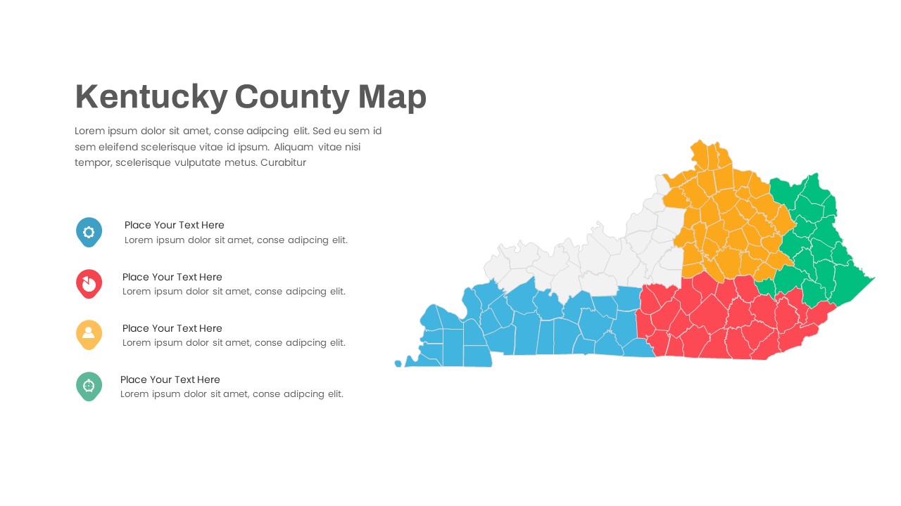
Kentucky County Map Visualization Template for PowerPoint & Google Slides
World Maps