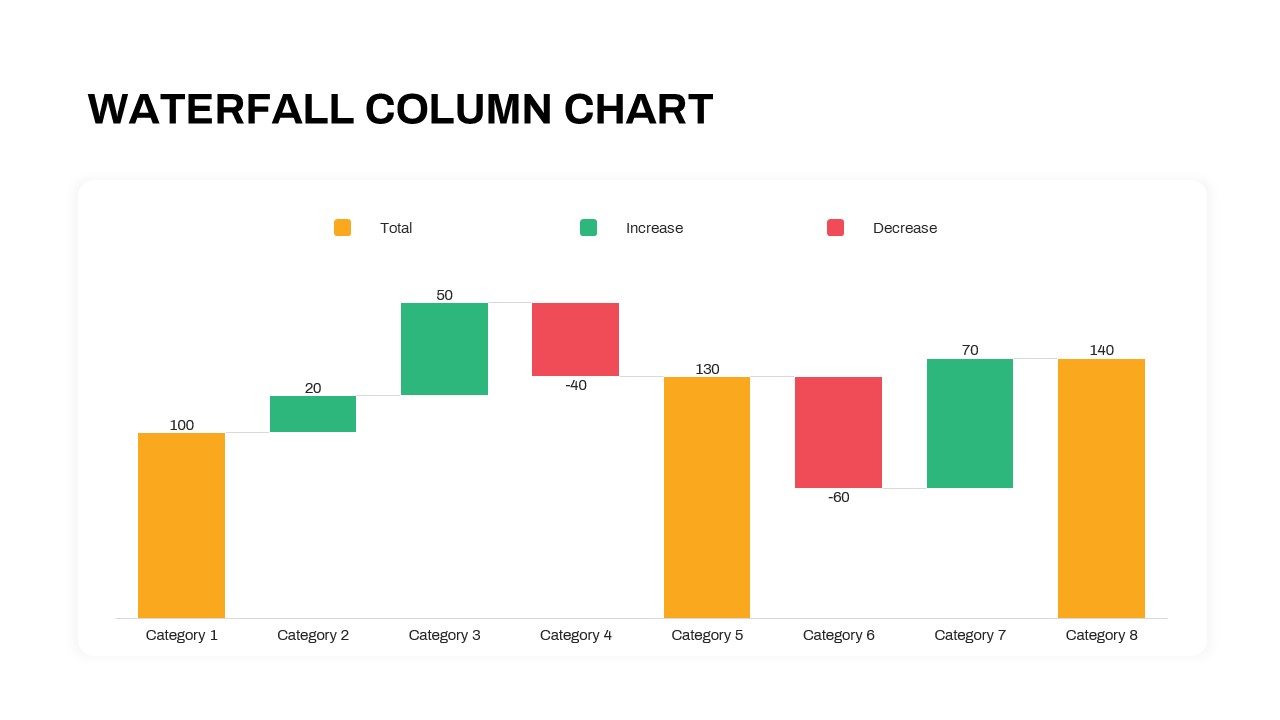
Waterfall Column Chart Analysis Template for PowerPoint & Google Slides


Description
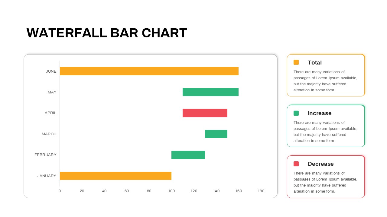
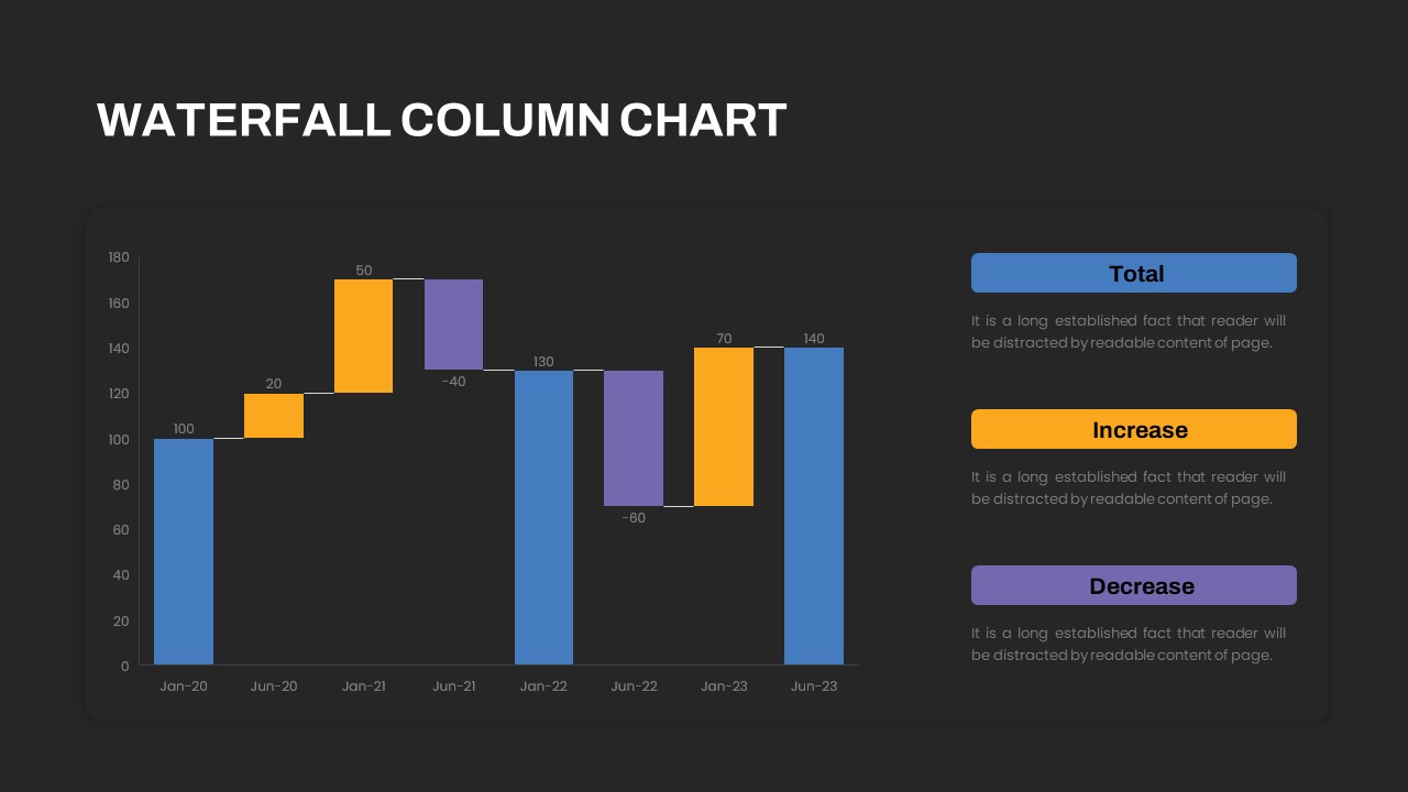
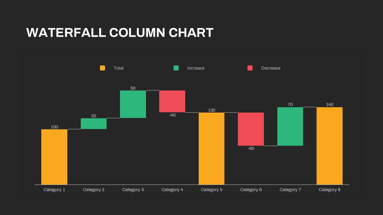
This waterfall column chart template provides a clear, color-coded visualization of sequential value changes across categories or time periods. It features three series—totals, increases, and decreases—displayed as vertical bars that step up or down to illustrate net movement. The clean legend aligns above the chart area, while value labels annotate each bar for instant comprehension. Rounded chart corners and subtle gridlines rest on a minimalist white canvas, ensuring data stands out without distractions. A secondary version offers a temporal axis with date-based labels and a side panel for descriptive text, enabling narrative context and insights.
Customizable axis titles and grid formatting give you full control over presentation style, while optional callout shapes highlight critical inflection points. Built-in placeholders streamline updates: adjust series colors, revise data tables, or reposition legends in seconds. Whether you’re depicting revenue trends, expense breakdowns, or project milestones, the waterfall bars animate smoothly between points. Master slides preserve brand consistency, and smart labels automatically recalculate when values change. Both PowerPoint and Google Slides maintain full fidelity, ensuring seamless collaboration and error-free handoffs.
Who is it for
Financial analysts, project managers, and marketing teams will leverage this template to reconcile budgets, trace cost drivers, or illustrate ROI. Consultants and executive presenters can harness its clarity to support investment pitches, board reviews, and quarterly performance summaries.
Other Uses
Beyond finance, repurpose the waterfall layout for sales pipeline breakdowns, inventory flow analyses, or operational efficiency studies. Insert multiple charts per slide to compare business units, product lines, or regional performance. Use the side panel to capture executive summaries, strategic insights, or action items, turning raw data into compelling, decision-ready storytelling.
Login to download this file

Item ID
SB03605
Related Templates

Waterfall Bar Chart Analysis Template for PowerPoint & Google Slides
Bar/Column
Waterfall Chart Data Visualization Template for PowerPoint & Google Slides
Comparison Chart
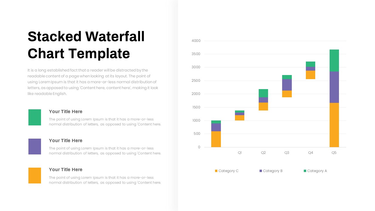
Stacked Waterfall Chart Template for PowerPoint & Google Slides
Bar/Column
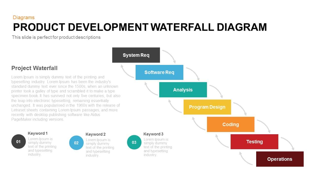
Product Development Waterfall Diagram Template for PowerPoint & Google Slides
Process
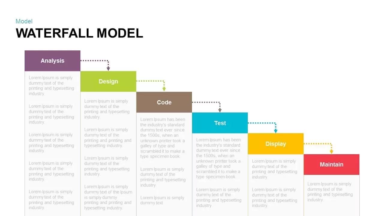
Waterfall Model Diagram Template for PowerPoint & Google Slides
Information Technology
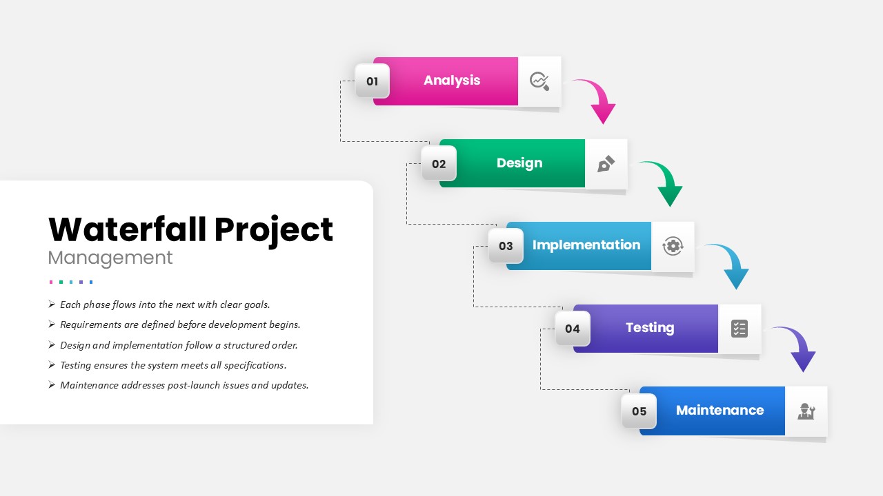
Waterfall Project Management Process template for PowerPoint & Google Slides
Process
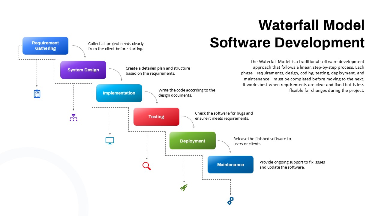
Waterfall Software Development Process Template for PowerPoint & Google Slides
Software Development

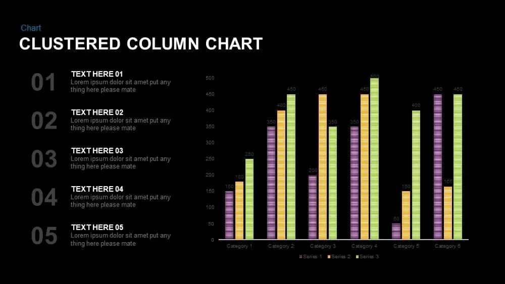
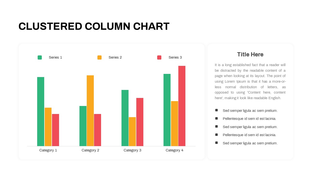
Clustered Column Chart Data Analysis Template for PowerPoint
Bar/Column
Free Stacked Column Chart Data Visualization Template for PowerPoint & Google Slides
Bar/Column
Free
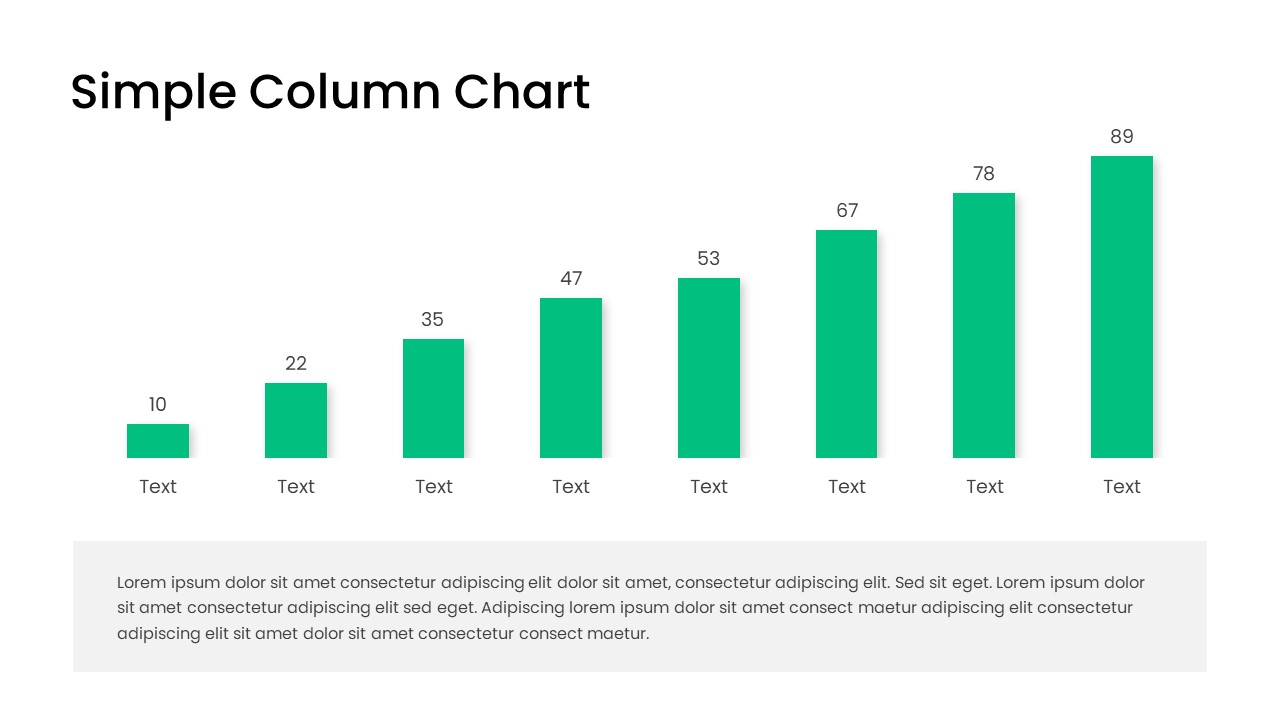
Free Editable Simple Column Chart Slide Template for PowerPoint & Google Slides
Bar/Column
Free
Minimal Multi-Year Column Chart Template for PowerPoint & Google Slides
Bar/Column
Professional Clustered Column Chart Template for PowerPoint & Google Slides
Bar/Column
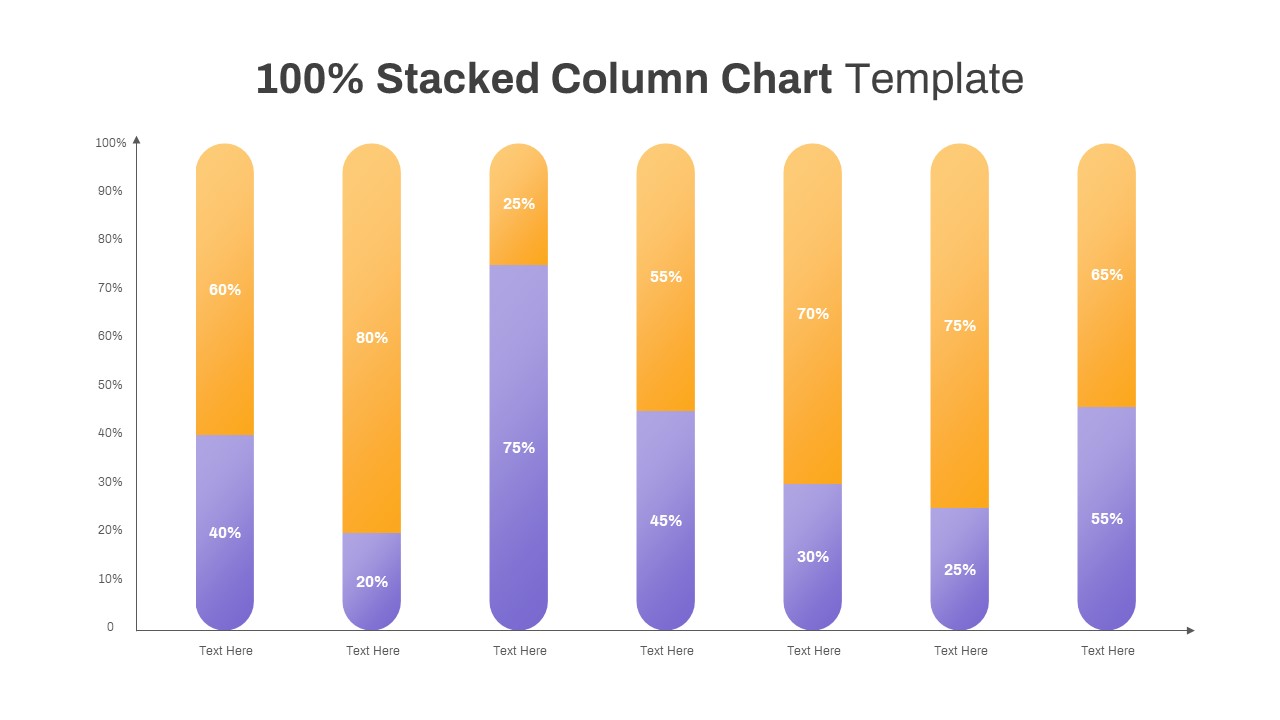
Professional 100% Stacked Column Chart Template for PowerPoint & Google Slides
Bar/Column
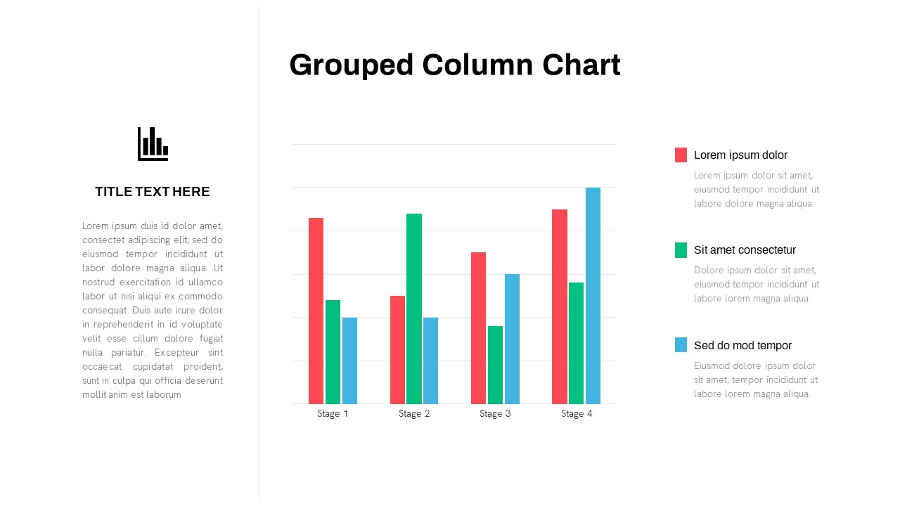
Grouped Column Chart Comparison Template for PowerPoint & Google Slides
Bar/Column
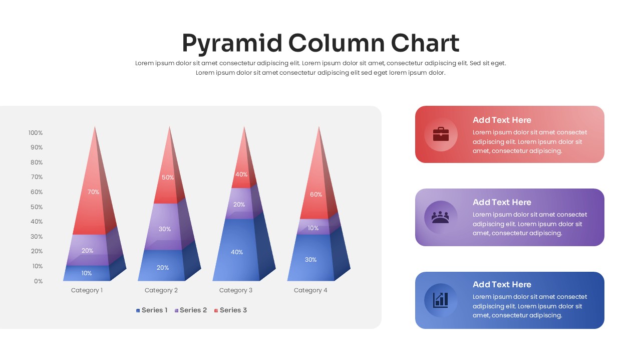
3D Pyramid Column Chart Infographic Template for PowerPoint & Google Slides
Bar/Column

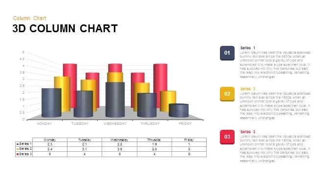
3D Column Chart with Data Table for PowerPoint & Google Slides
Bar/Column
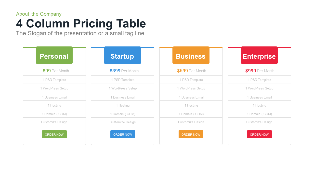
4 Column Pricing template for PowerPoint & Google Slides
Comparison
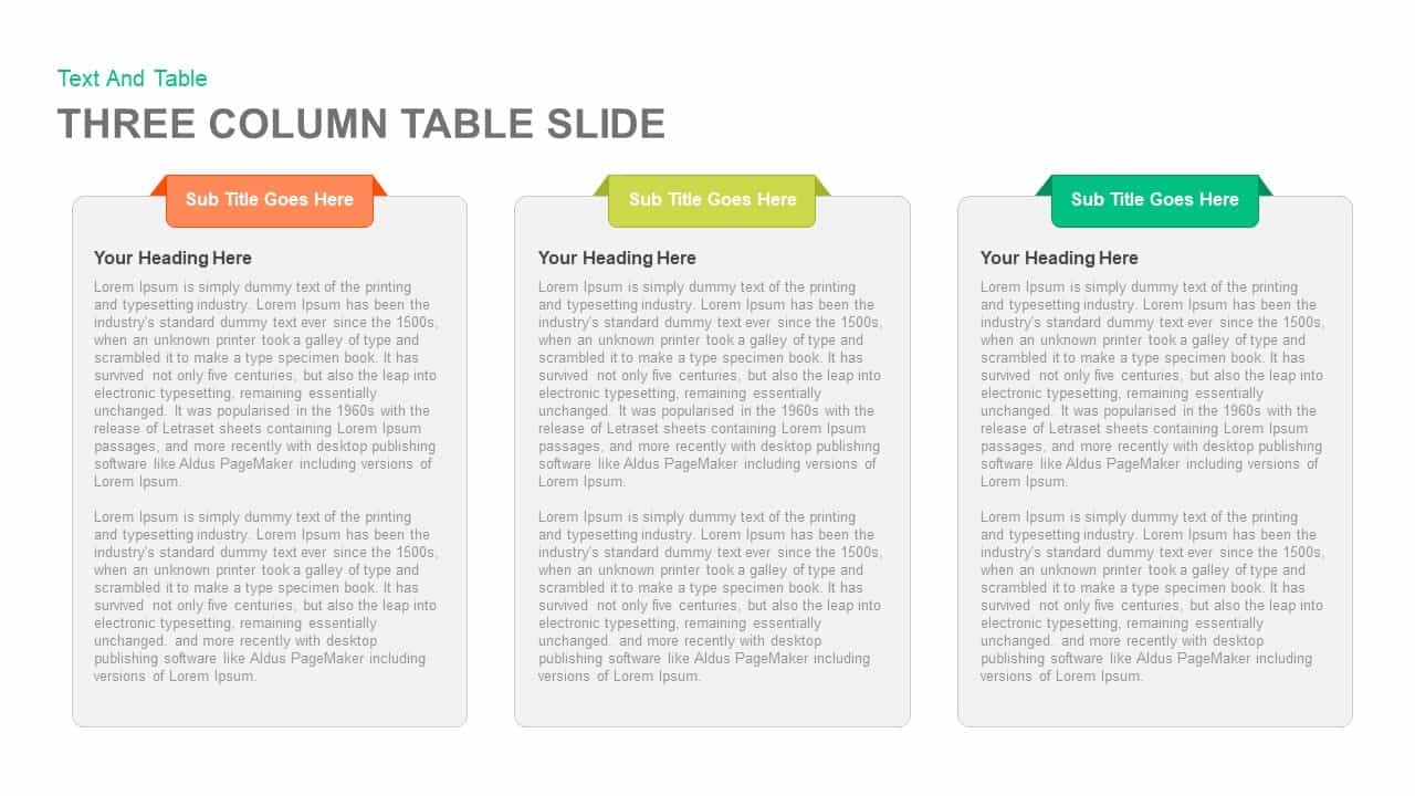
3-Column Comparison template for PowerPoint & Google Slides
Comparison
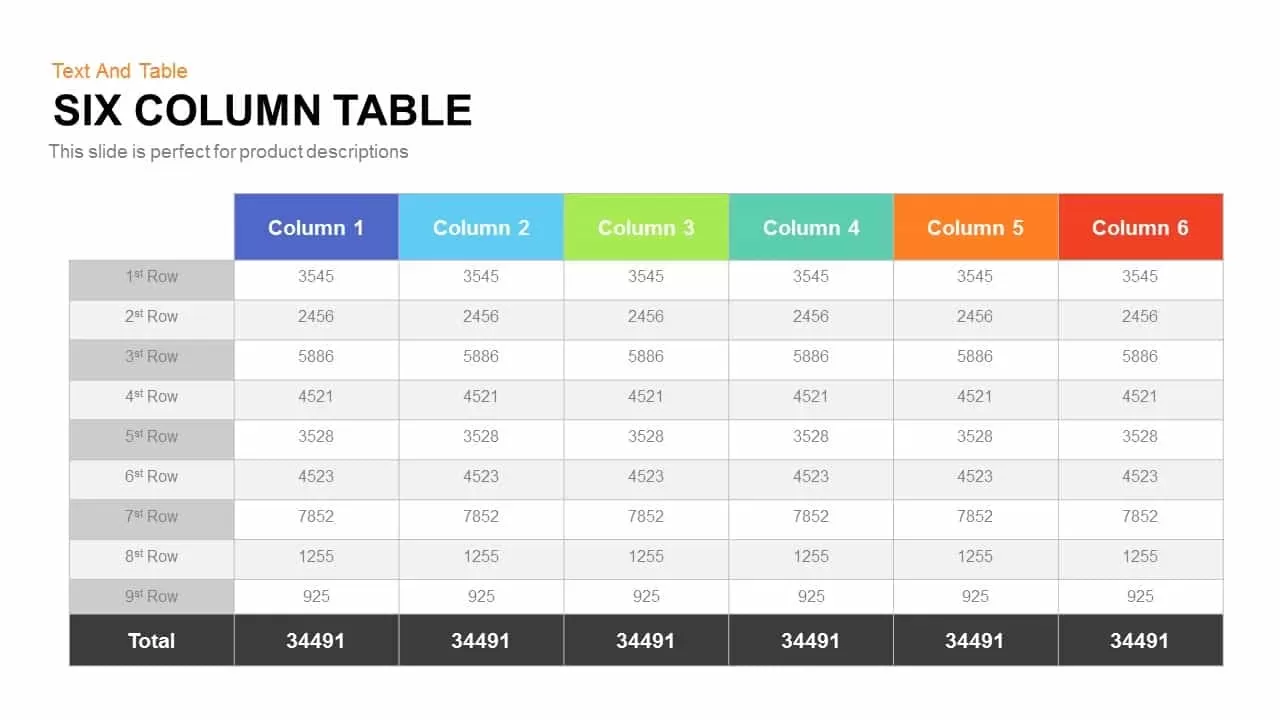
Six Column Table template for PowerPoint & Google Slides
Table
Clean Three-Four Column Table Slide Template for PowerPoint & Google Slides
Business Report
Three and Four-Column Card Layout Template for PowerPoint & Google Slides
Infographics
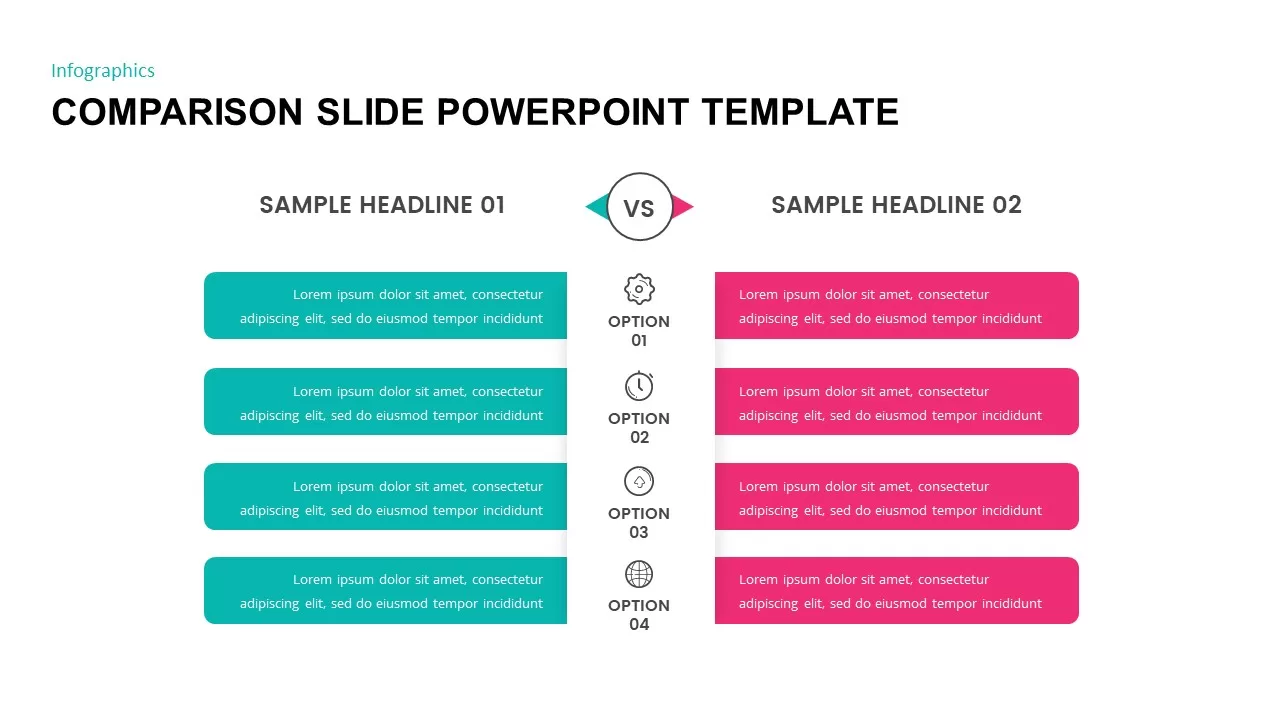
Comparison Slide Presentation Template
Comparison
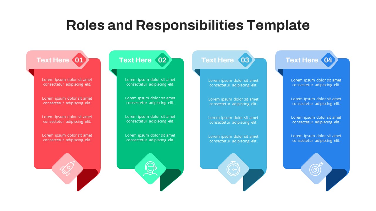
Free Four-Column Roles and Responsibilities Template for PowerPoint & Google Slides
Our Team
Free
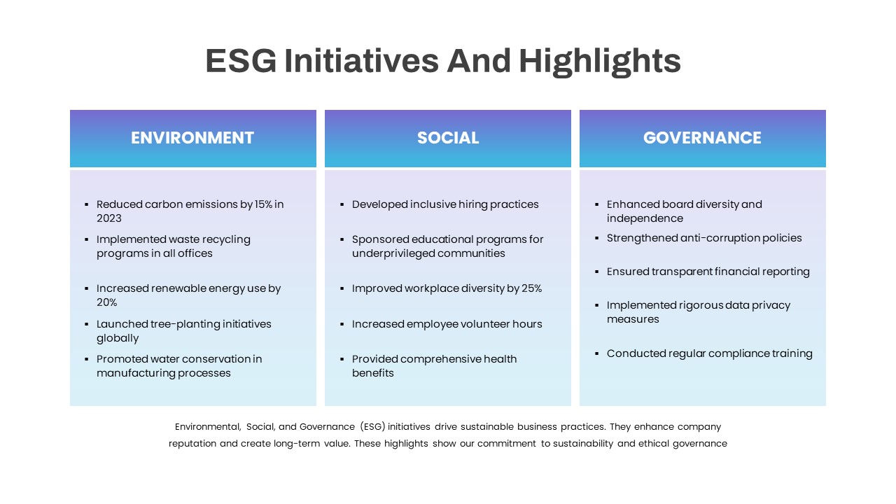
ESG Initiatives Three-Column Template for PowerPoint & Google Slides
Comparison
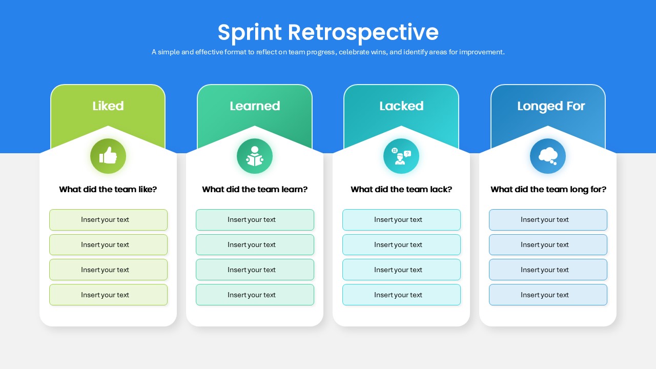
Sprint Retrospective Four-Column Template for PowerPoint & Google Slides
Process
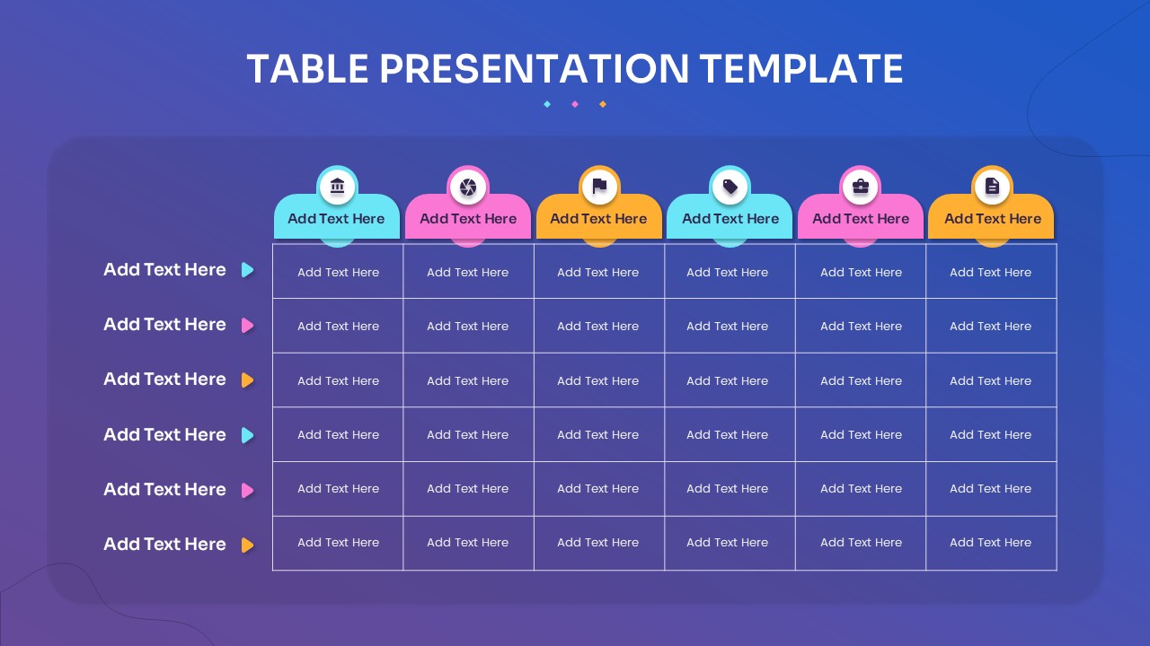
Multi-Column Table Presentation Template for PowerPoint & Google Slides
Table
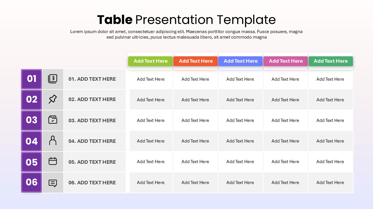
Six-Row Multi-Column Table Presentation Template for PowerPoint & Google Slides
Table
Colorful Four-Column Table Layout Template for PowerPoint & Google Slides
Table
Five Column Comparison Table Layout Template for PowerPoint & Google Slides
Comparison
Two-Column Table Presentation Template for PowerPoint & Google Slides
Table
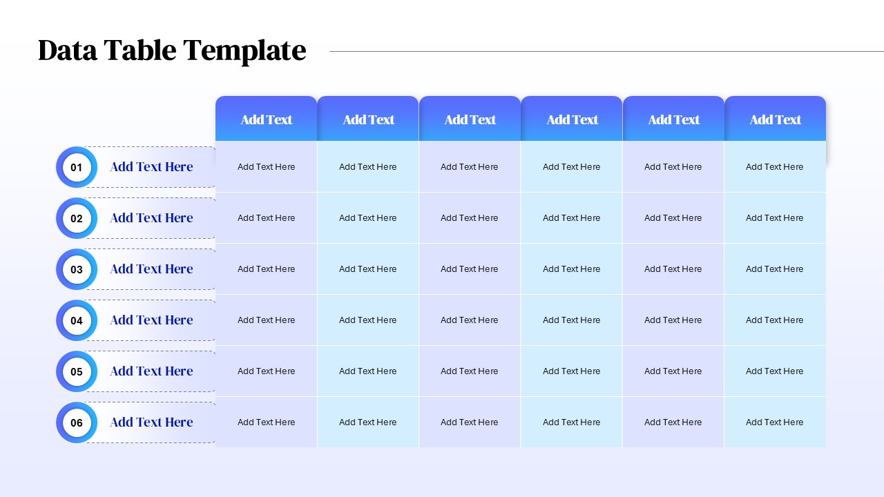
Six Column Data Table Template for PowerPoint & Google Slides
Table
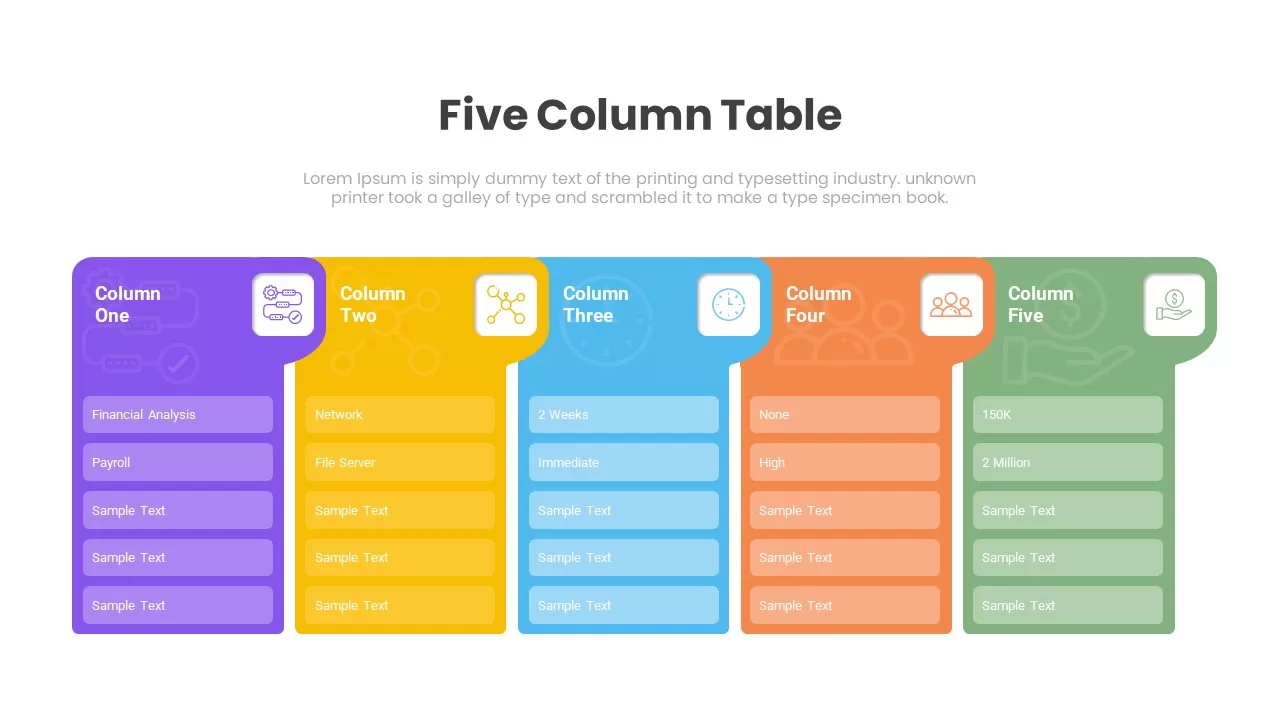
Five Column Table Infographics for PowerPoint & Google Slides
Business
1 to 5 Column infographic pack for PowerPoint & Google Slides
Business
Mobile Data Analysis Chart template for PowerPoint & Google Slides
Charts
Creative Data Analysis Bar Chart template for PowerPoint & Google Slides
Bar/Column
Pencil Bar Chart Data Analysis Template for PowerPoint & Google Slides
Bar/Column

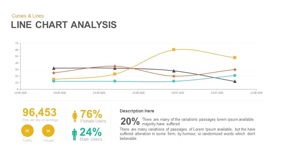
Line Chart Analysis template for PowerPoint & Google Slides
Charts
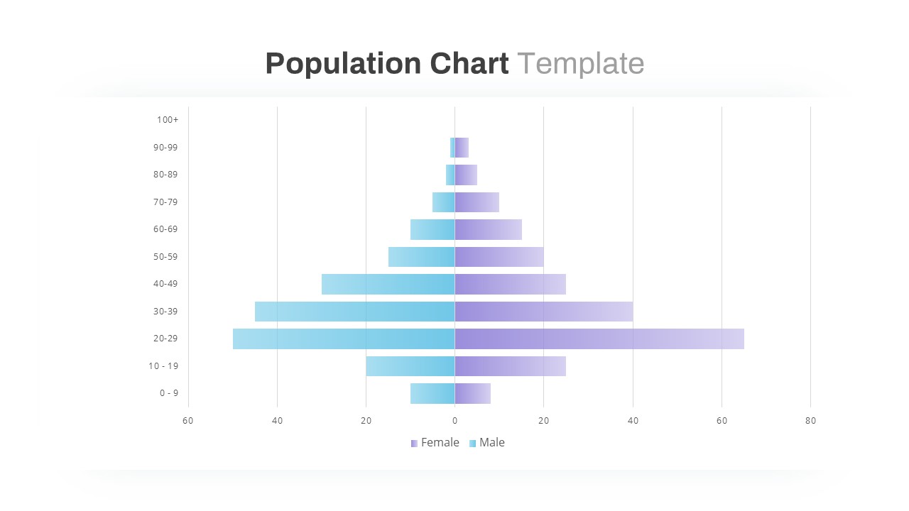
Population Pyramid Chart Analysis Template for PowerPoint & Google Slides
Bar/Column
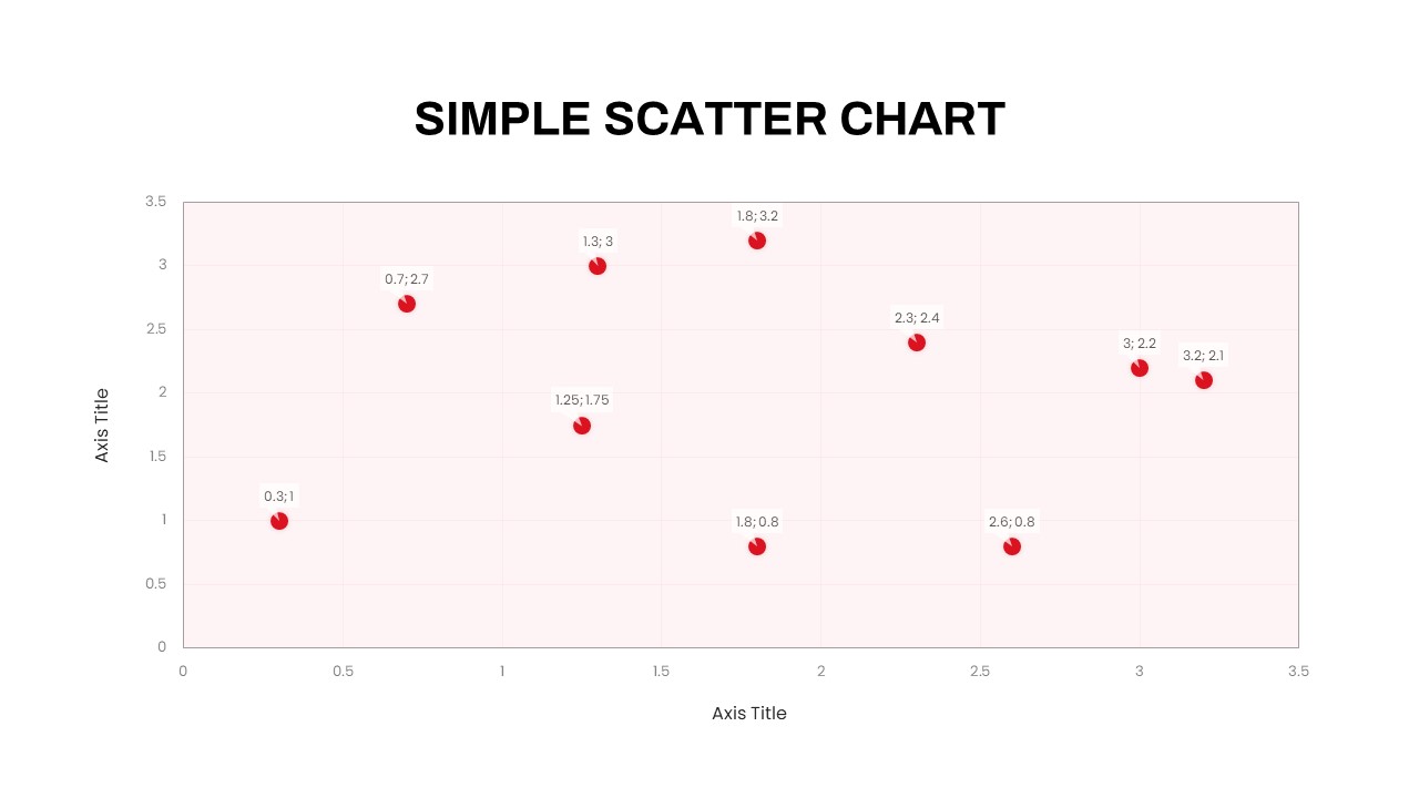
Simple Scatter Chart Analysis Template for PowerPoint & Google Slides
Comparison Chart
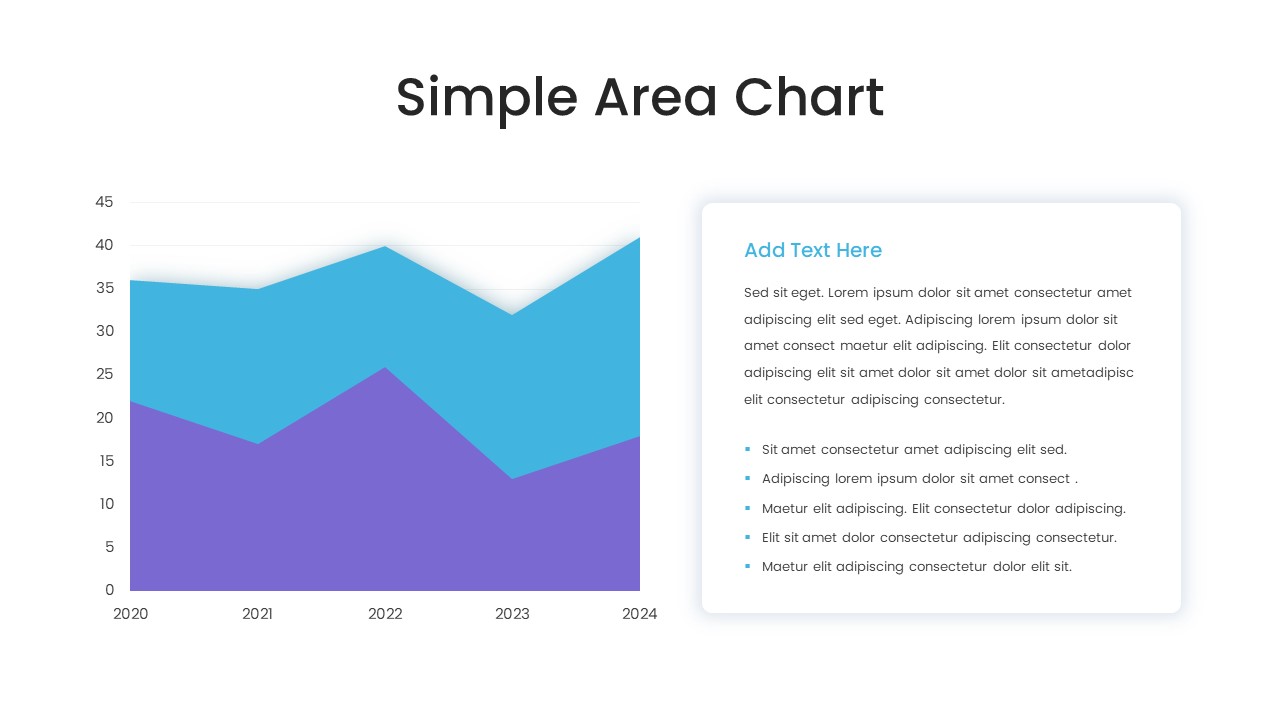
Simple Area Chart Data Trends Analysis Template for PowerPoint & Google Slides
Comparison Chart
Four Quadrant Scatter Chart Powerpoint Template
Comparison Chart
Proportional Area Chart Analysis Template for PowerPoint & Google Slides
Comparison Chart
Expanding Margins Analysis Bar Chart Template for PowerPoint & Google Slides
Charts
Annual Growth Trend Analysis Chart template for PowerPoint & Google Slides
Business Report
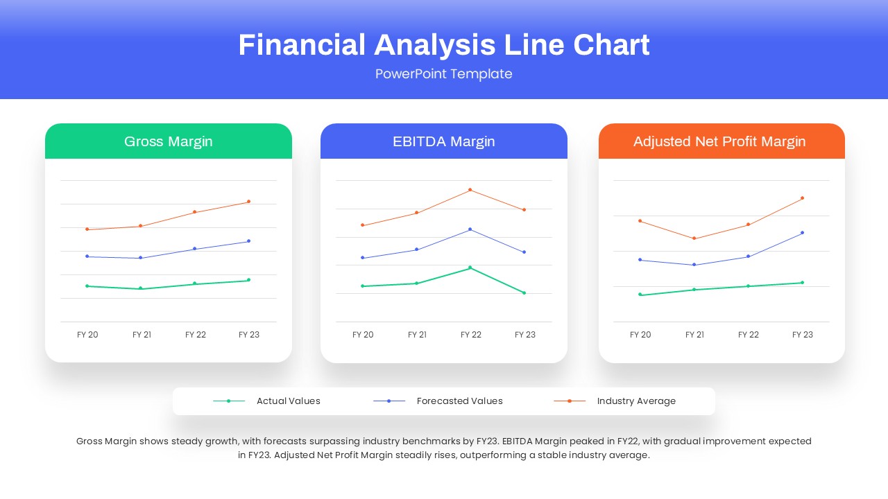
Dynamic Financial Analysis Line Chart Template for PowerPoint & Google Slides
Finance
Data Analysis Bar Chart with Insights Template for PowerPoint & Google Slides
Bar/Column
Free
Skills Gap Analysis Comparison Chart Template for PowerPoint & Google Slides
Gap
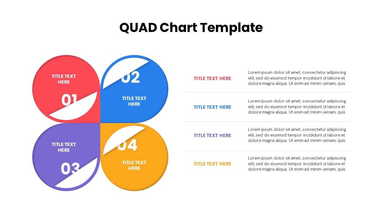
Quad Chart Infographic Pack of 8 Slides Template for PowerPoint & Google Slides
Comparison Chart
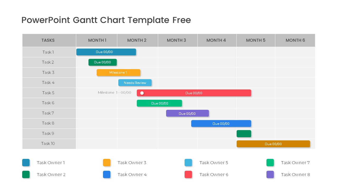
Free Professional Gantt Chart Pack – 4 Slides Template for PowerPoint & Google Slides
Gantt Chart
Free
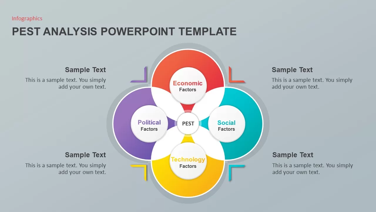
PEST Analysis PowerPoint Template for PowerPoint & Google Slides
Business Strategy
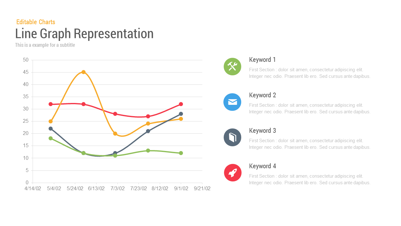
Line Graph Analysis template for PowerPoint & Google Slides
Charts
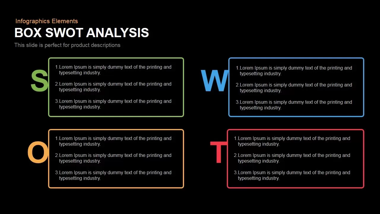
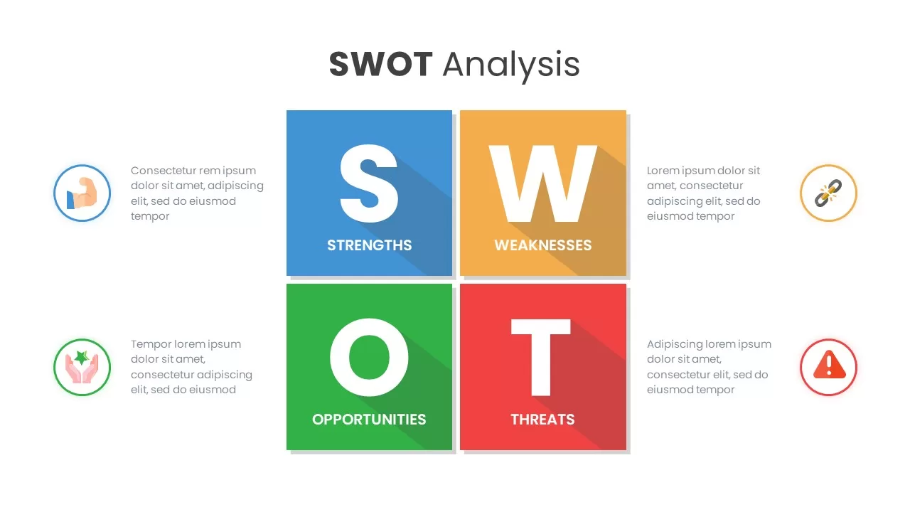
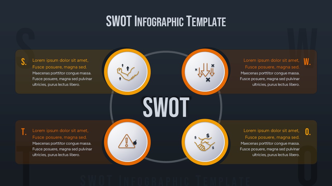
Box SWOT Analysis Infographic Template for PowerPoint & Google Slides
SWOT
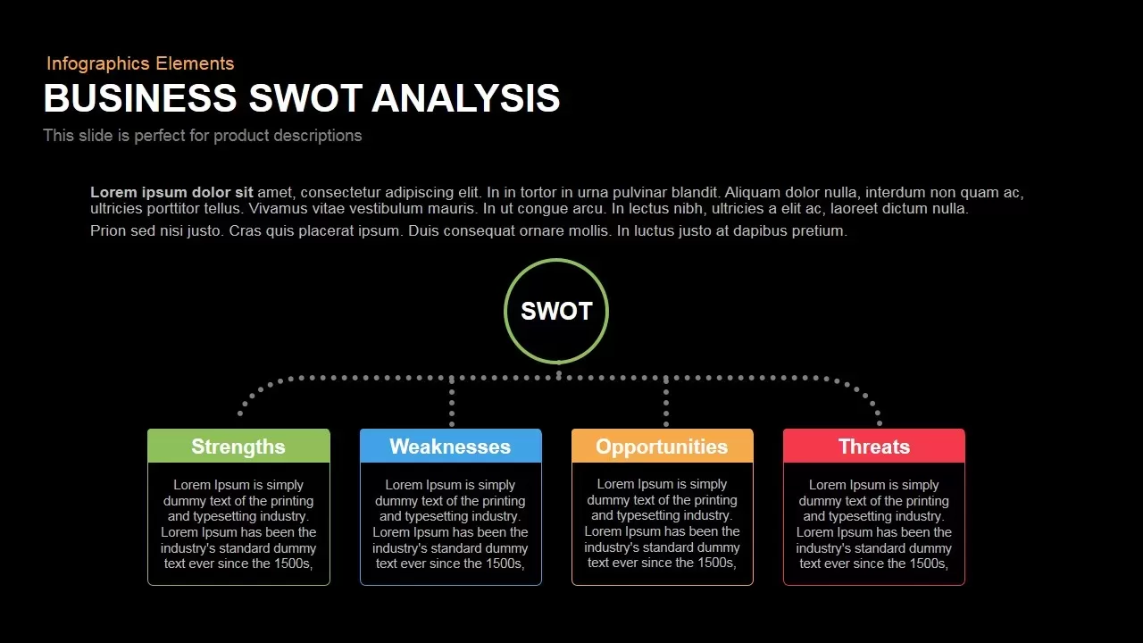
Box Business SWOT Analysis Template for PowerPoint & Google Slides
SWOT
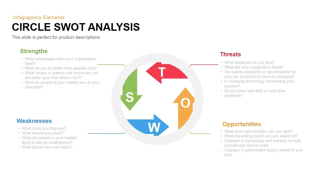
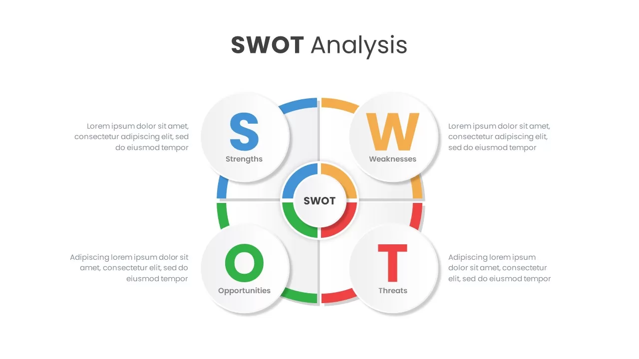
Modern Circle SWOT Analysis Diagram Template for PowerPoint & Google Slides
SWOT
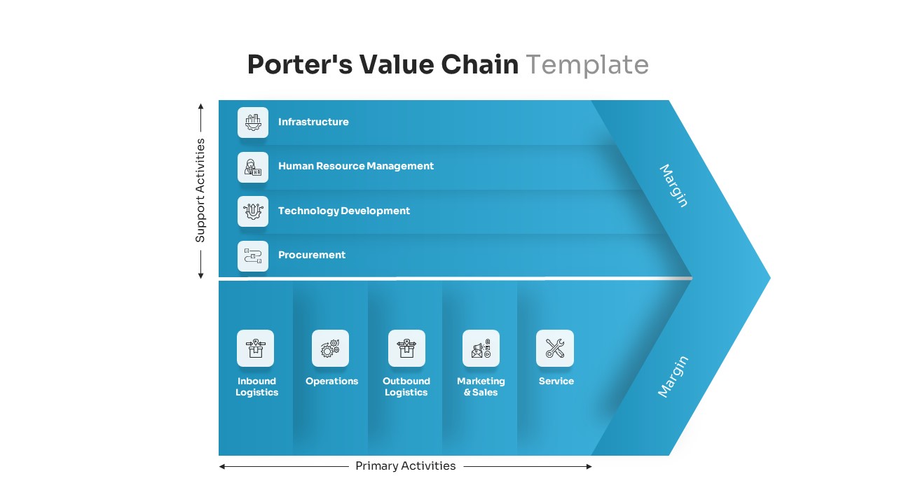
Porter’s Value Chain Analysis Diagram Template for PowerPoint & Google Slides
Business Strategy

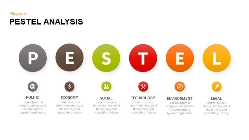
Professional PESTEL Analysis Diagram Template for PowerPoint & Google Slides
PEST

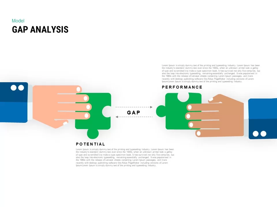
Interactive Gap Analysis Puzzle Diagram Template for PowerPoint & Google Slides
Gap
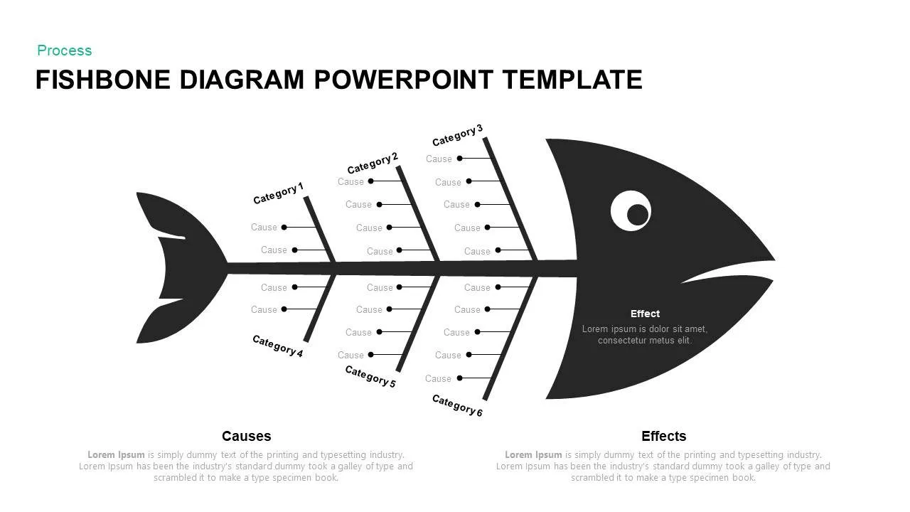
Fishbone Diagram Analysis Template for PowerPoint & Google Slides
Flow Charts
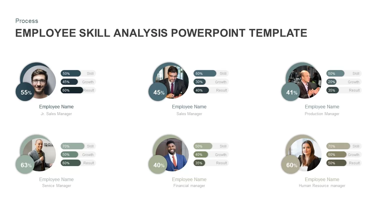
Employee Skill Analysis Dashboard Template for PowerPoint & Google Slides
Employee Performance
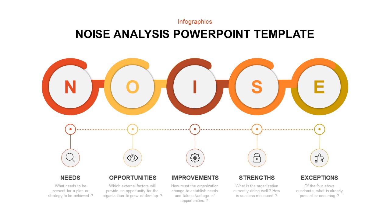
Modern Noise Analysis Infographic Template for PowerPoint & Google Slides
Process
Four-Quadrant SWOT Analysis Diagram Template for PowerPoint & Google Slides
SWOT
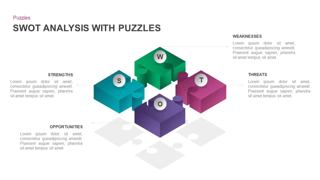
Interactive 3D Puzzle SWOT Analysis Slide Template for PowerPoint & Google Slides
SWOT
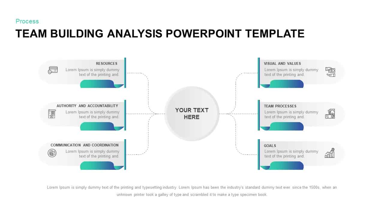
Team Building Hub-and-Spoke Analysis Template for PowerPoint & Google Slides
Process
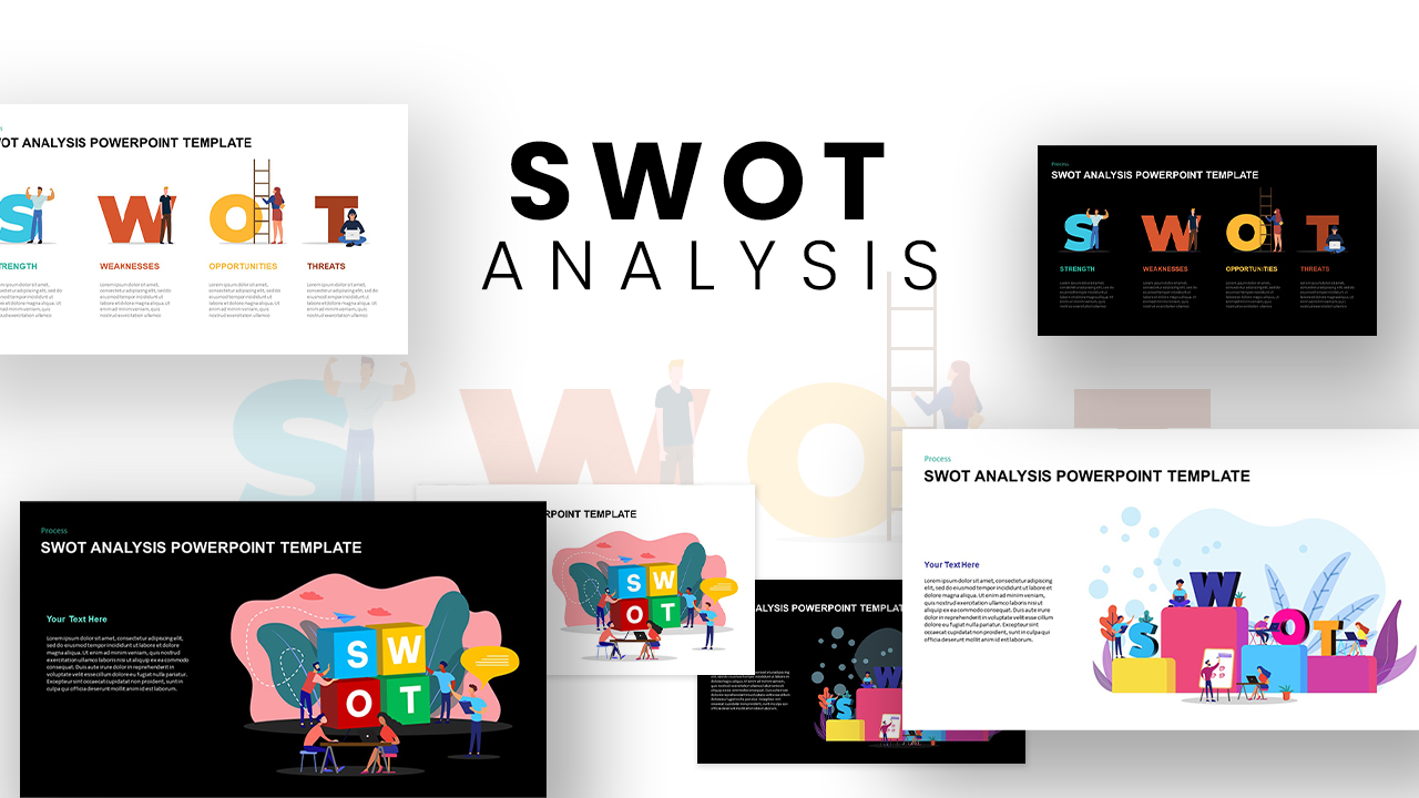
Versatile SWOT Analysis Slide Collection Template for PowerPoint & Google Slides
SWOT
3D Cube SWOT Analysis Infographic Template for PowerPoint & Google Slides
SWOT
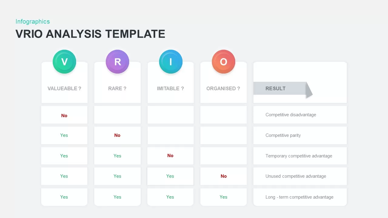
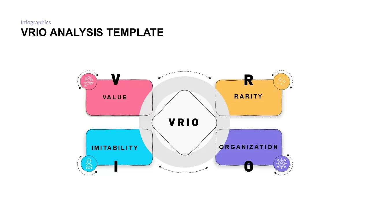
VRIO Analysis Infographic Template for PowerPoint & Google Slides
Business Strategy
VRIO Analysis Framework template for PowerPoint & Google Slides
Business Strategy
SWOT Analysis Grid Infographic Template for PowerPoint & Google Slides
SWOT
Circular SWOT Analysis Infographic Template for PowerPoint & Google Slides
SWOT
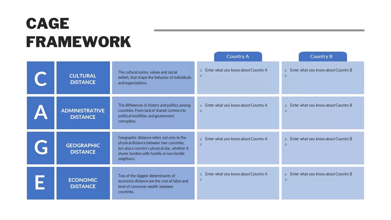
CAGE Framework PowerPoint Template & Google Slides
Competitor Analysis
Colorful SWOT Analysis Quadrant Template for PowerPoint & Google Slides
SWOT
SWOT Analysis Framework template for PowerPoint & Google Slides
SWOT
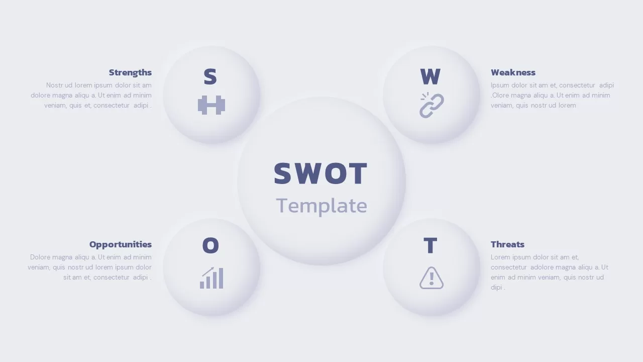
SWOT Analysis Overview template for PowerPoint & Google Slides
Business
SWOT Analysis Quadrant template for PowerPoint & Google Slides
Business Strategy
SWOT Analysis Blocks template for PowerPoint & Google Slides
Business Strategy
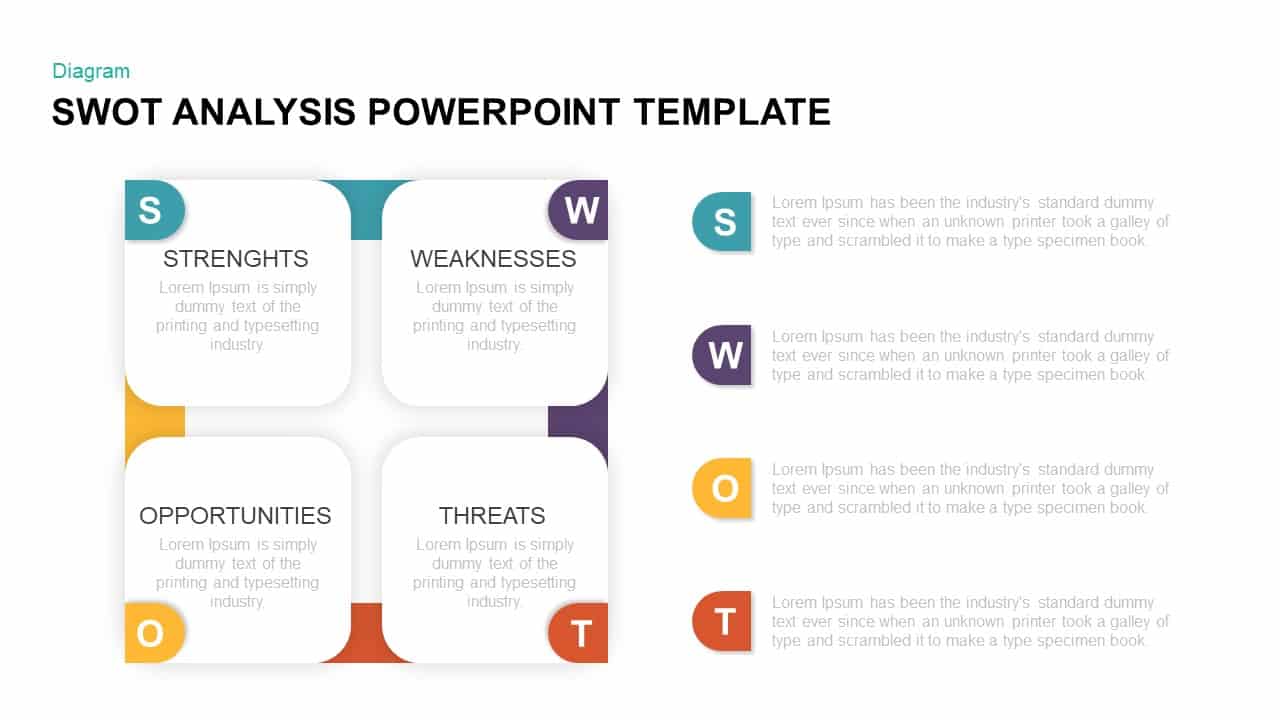
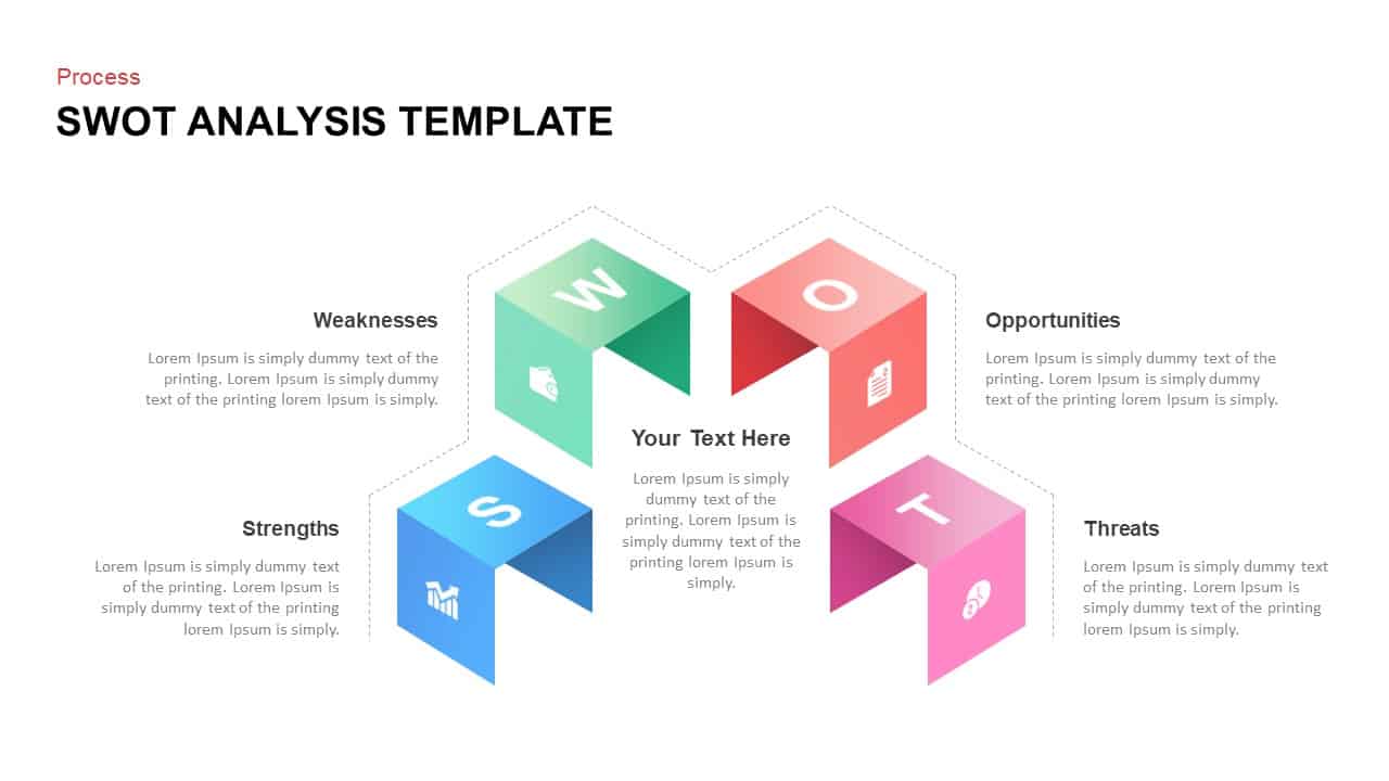
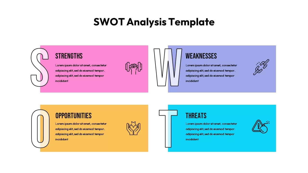
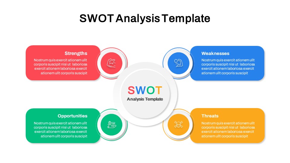
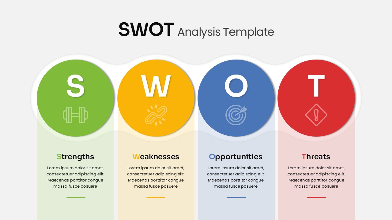
SWOT Analysis Template for PowerPoint & Google Slides
Business Strategy
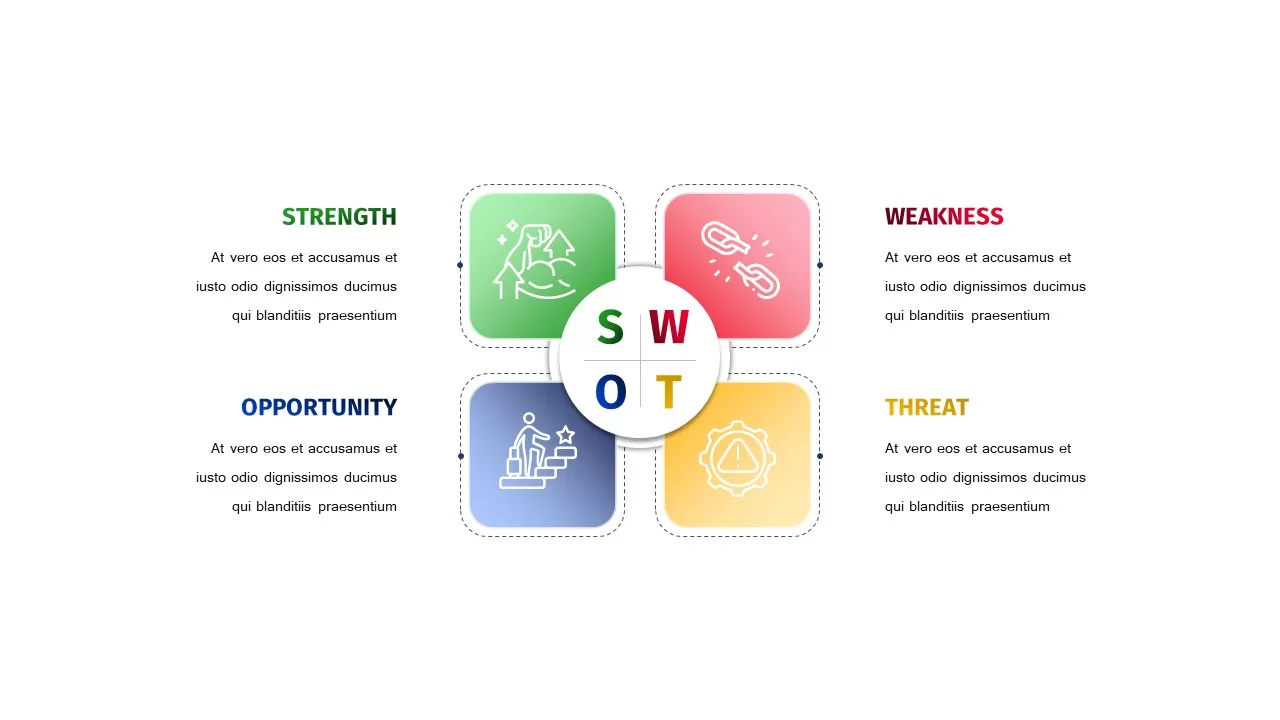
SWOT Analysis template for PowerPoint & Google Slides
SWOT
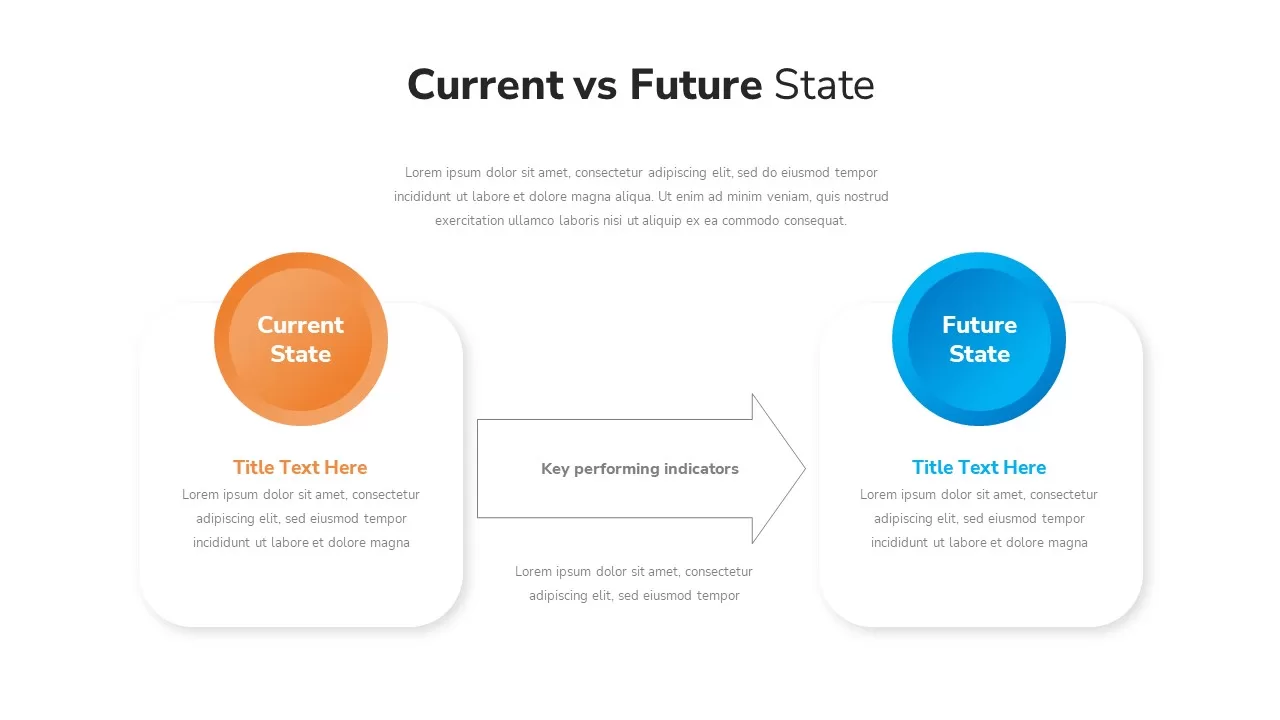
Current vs Future State Analysis template for PowerPoint & Google Slides
Comparison
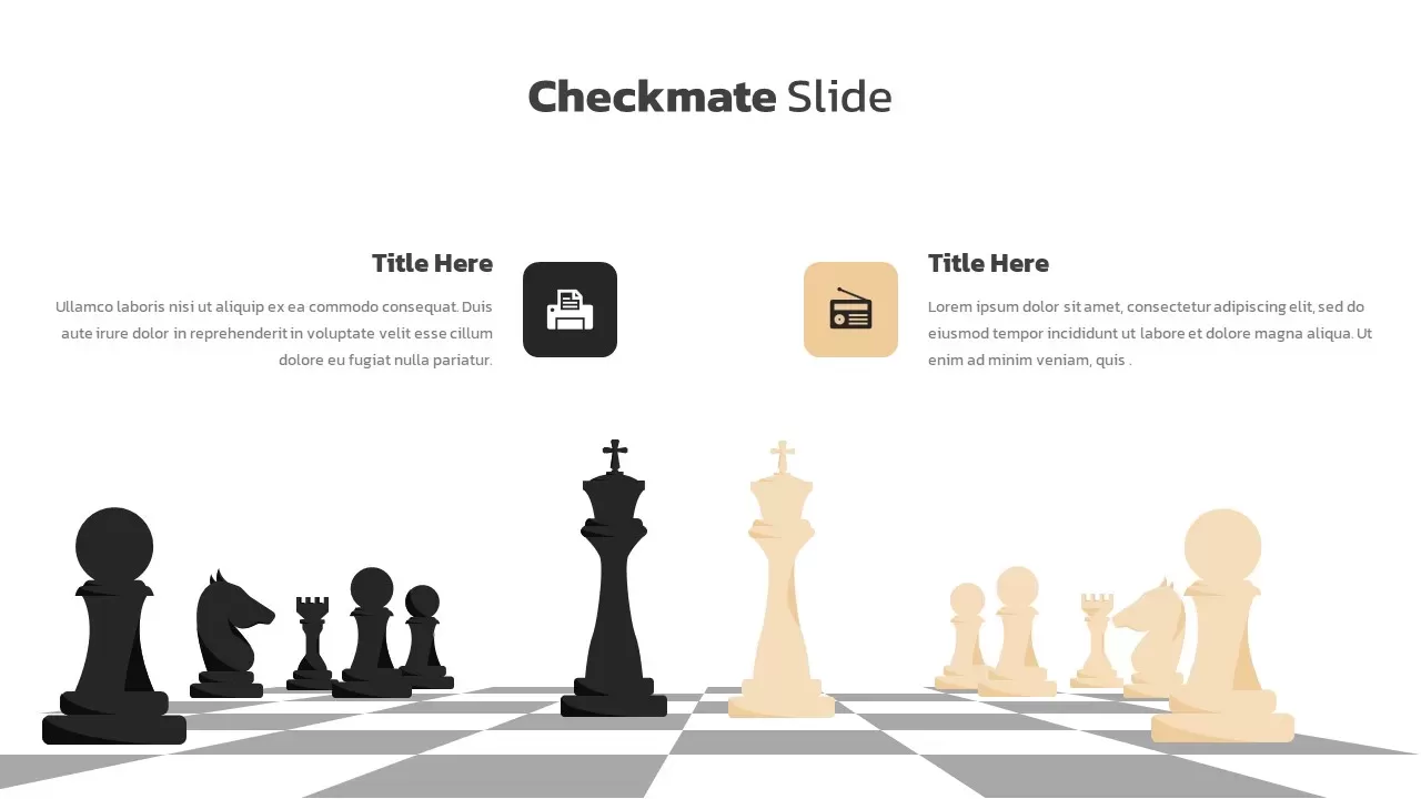
Checkmate Slide for Competitor Analysis Template for PowerPoint & Google Slides
Competitor Analysis
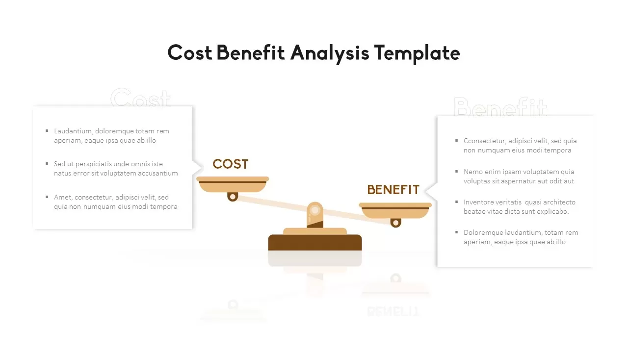
Cost Benefit Analysis Comparison Template for PowerPoint & Google Slides
Comparison
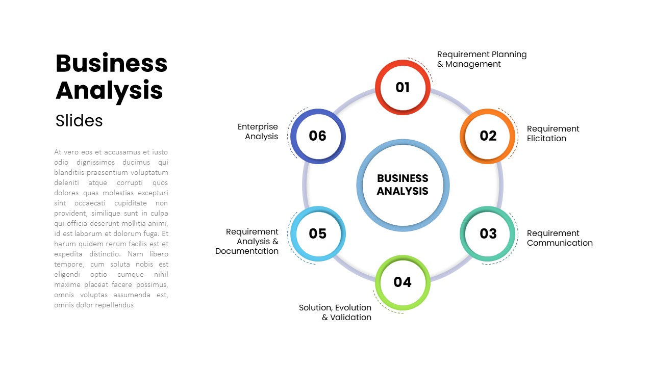
Six-Step Business Analysis Diagram template for PowerPoint & Google Slides
Circular
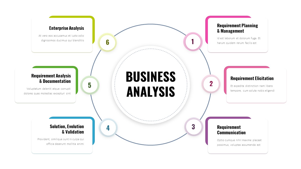
Six-Step Business Analysis Template for PowerPoint & Google Slides
Process
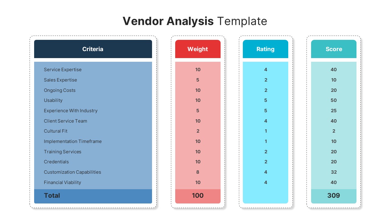
Vendor Analysis Criteria and Scoring template for PowerPoint & Google Slides
Business
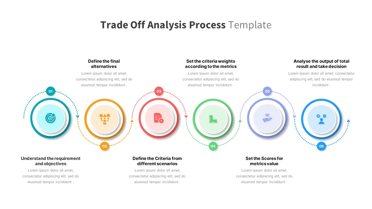
Trade Off Analysis Process template for PowerPoint & Google Slides
Process
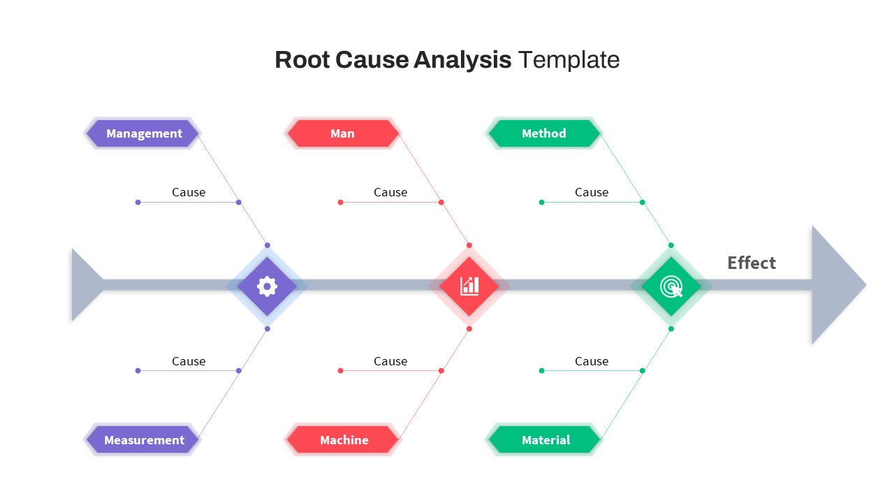
Free Root Cause Analysis PowerPoint Template
Process
Free
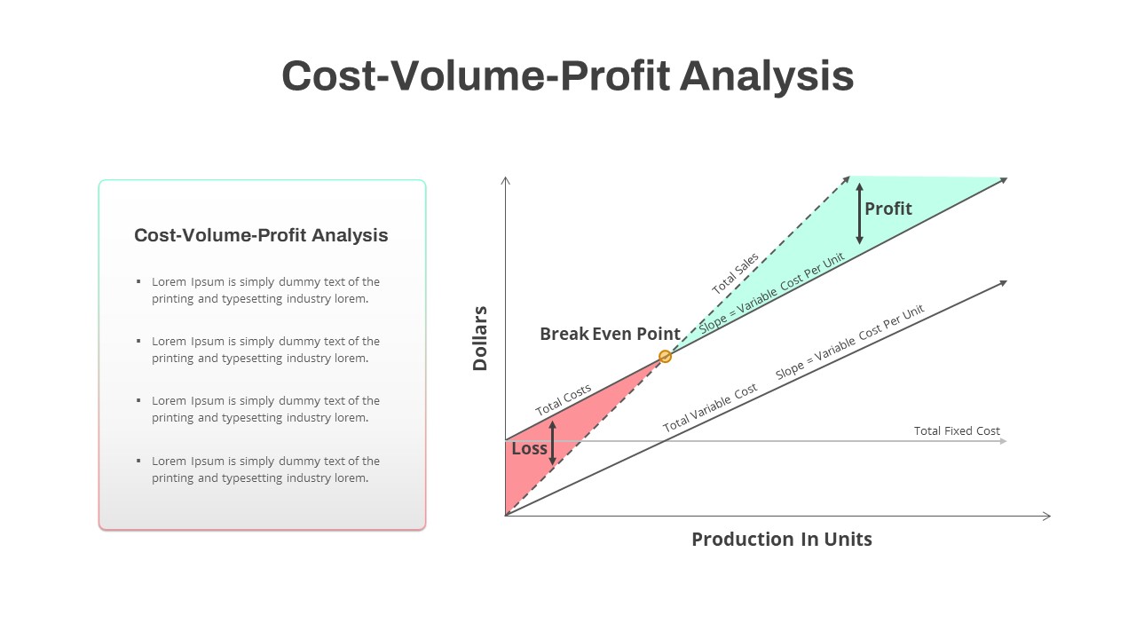
Cost-Volume-Profit Analysis Diagram Template for PowerPoint & Google Slides
Finance
Colorful SWOT Analysis Diagram Template for PowerPoint & Google Slides
SWOT
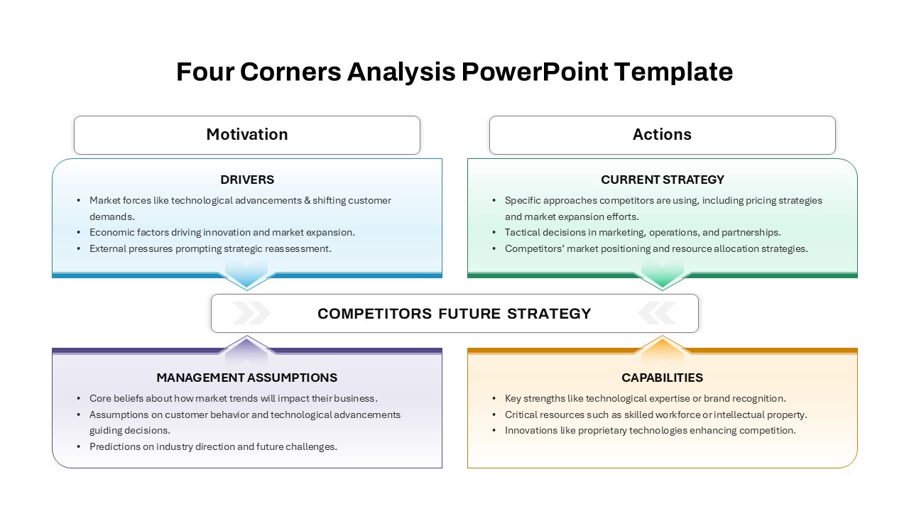
Four-Corners Strategic Analysis Quadrant Template for PowerPoint & Google Slides
SWOT
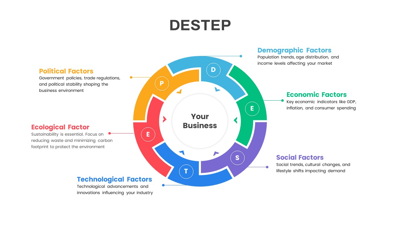
DESTEP Marketing Analysis Diagram Template for PowerPoint & Google Slides
Circular
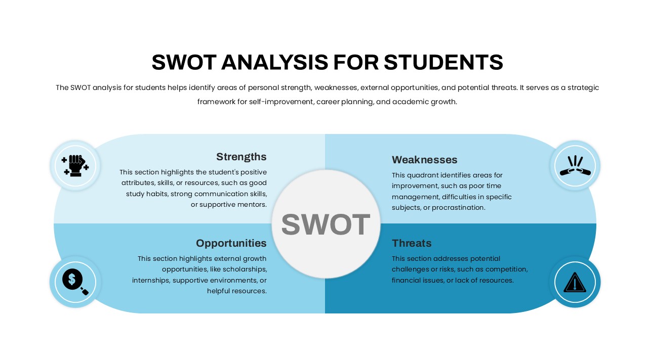
Student SWOT Analysis Framework Template for PowerPoint & Google Slides
SWOT
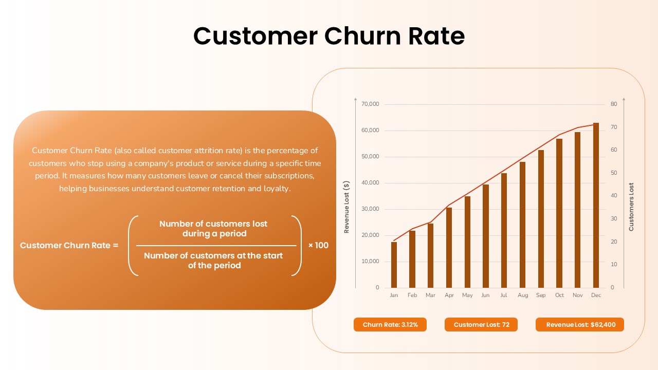
Customer Churn Rate Analysis template for PowerPoint & Google Slides
Business Report
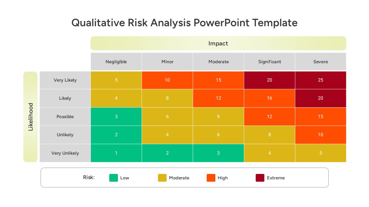
Qualitative Risk Analysis template for PowerPoint & Google Slides
Business
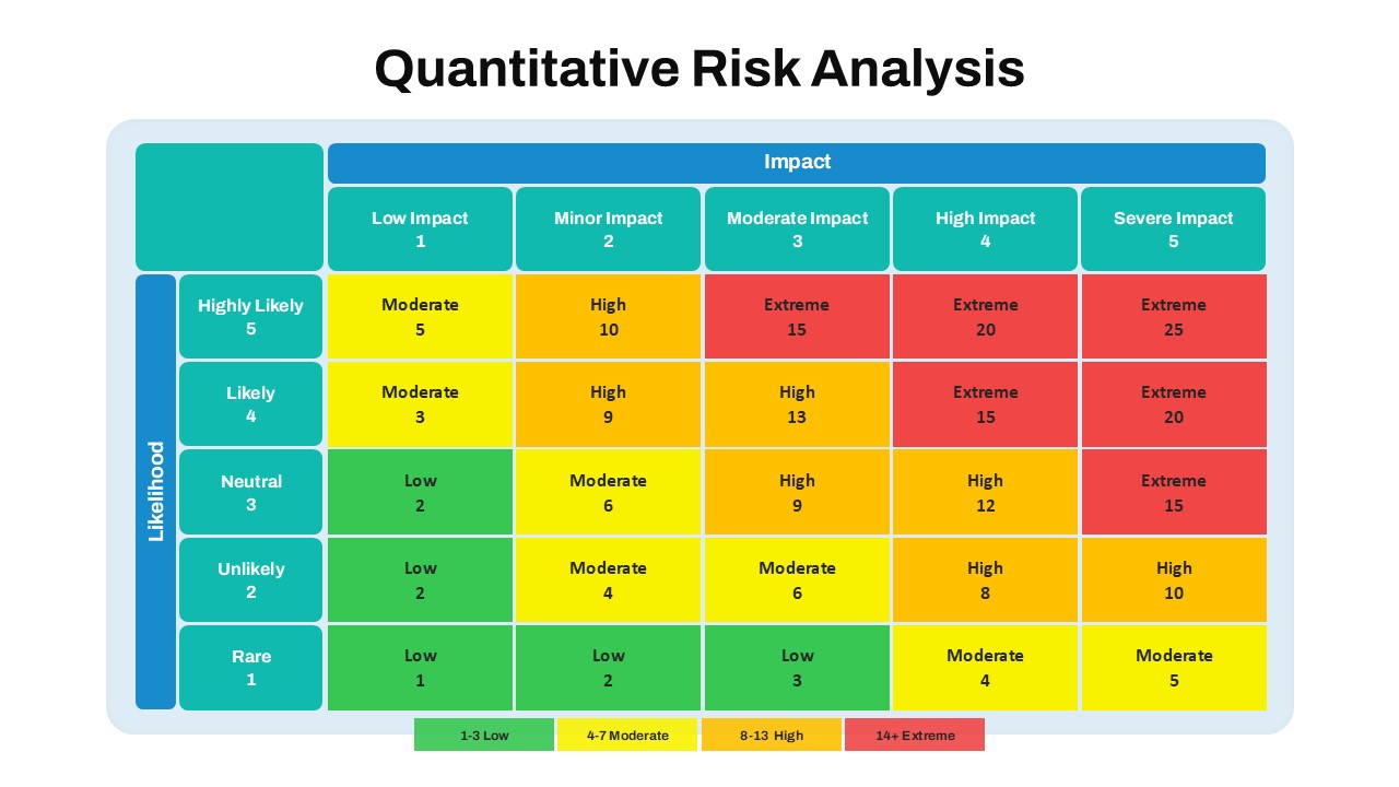
Quantitative Risk Analysis Matrix template for PowerPoint & Google Slides
Risk Management
SWOT Analysis Infographic with Circular Icons Template for PowerPoint & Google Slides
SWOT
Multi Color SWOT Analysis Quadrant Template for PowerPoint & Google Slides
SWOT
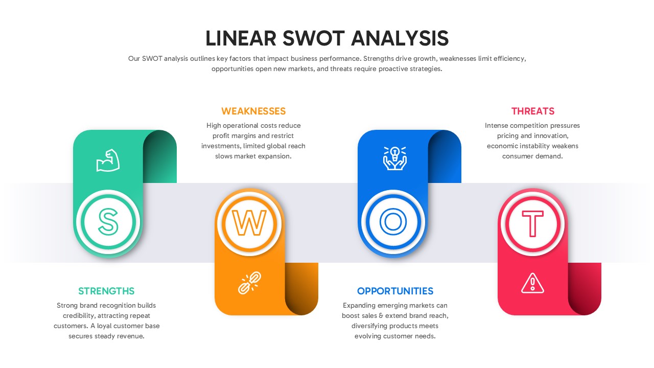
Linear SWOT Analysis Slide Template for PowerPoint & Google Slides
SWOT
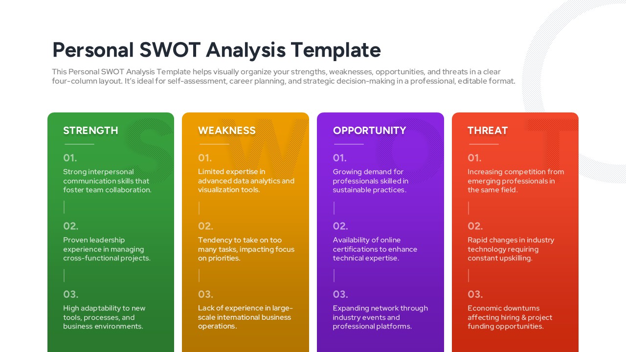
Personal SWOT Analysis Matrix Cards Template for PowerPoint & Google Slides
SWOT
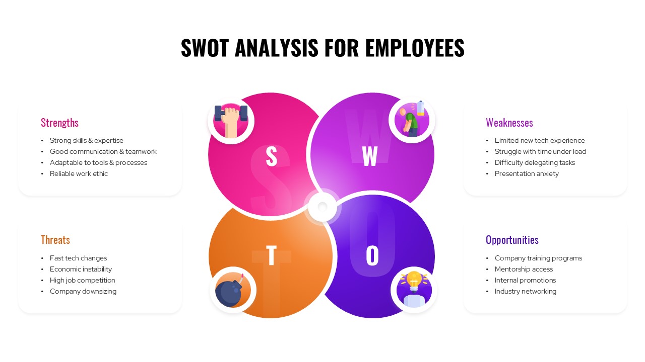
SWOT Analysis For Employees Template for PowerPoint & Google Slides
SWOT
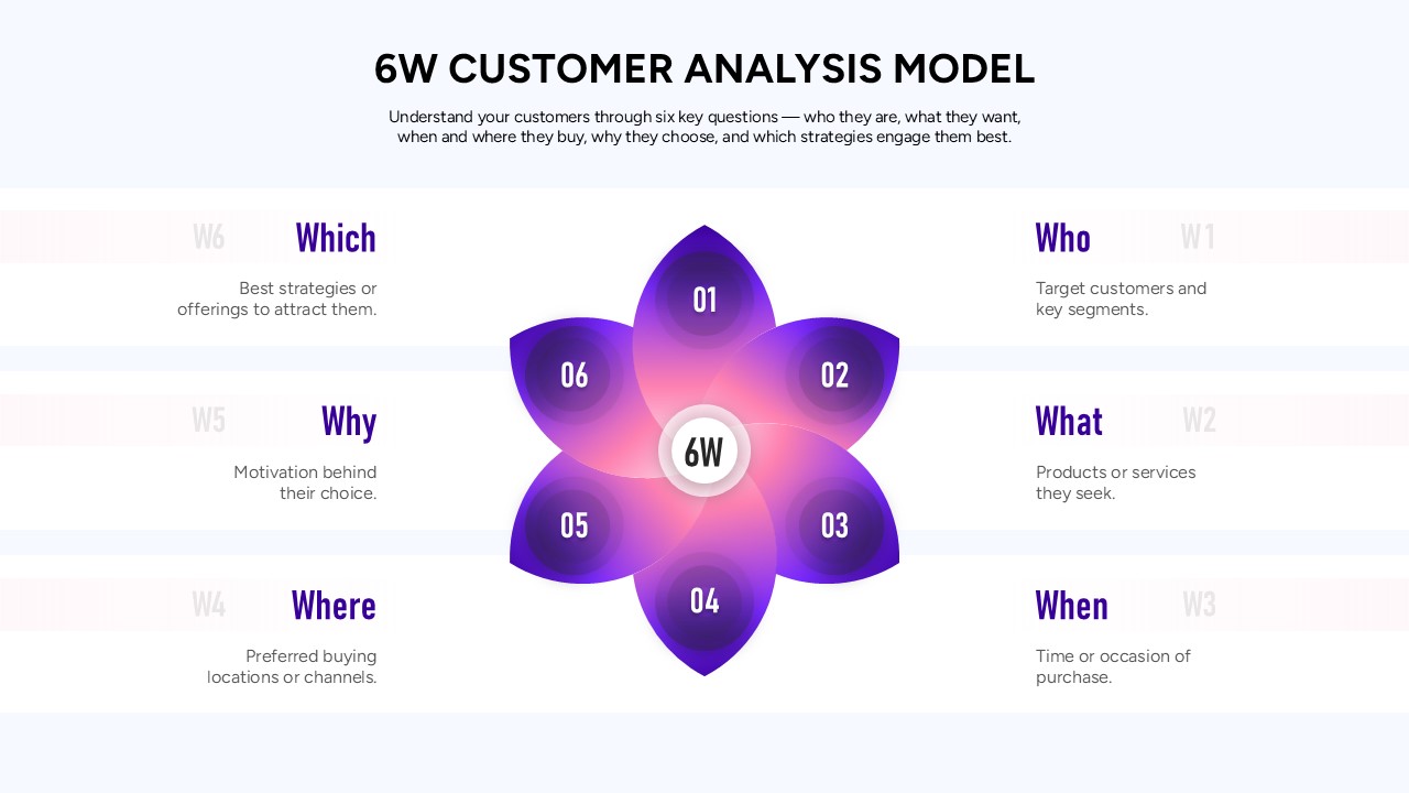
6W Customer Analysis Model Template for PowerPoint & Google Slides
Customer Experience
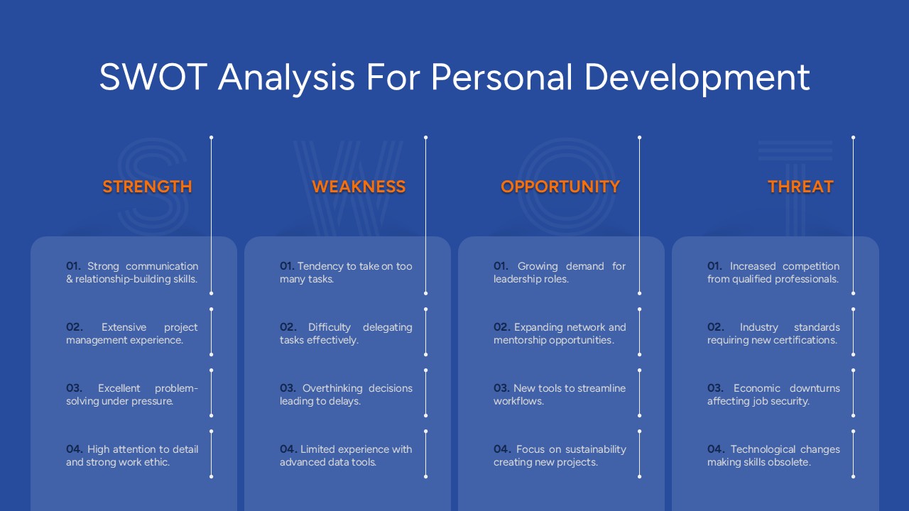
Free SWOT Analysis for Personal Development Template for PowerPoint & Google Slides
SWOT
Free