3D pie chart infographic template for PowerPoint & Google Slides
3D Pie Chart PowerPoint and Google Slides Template
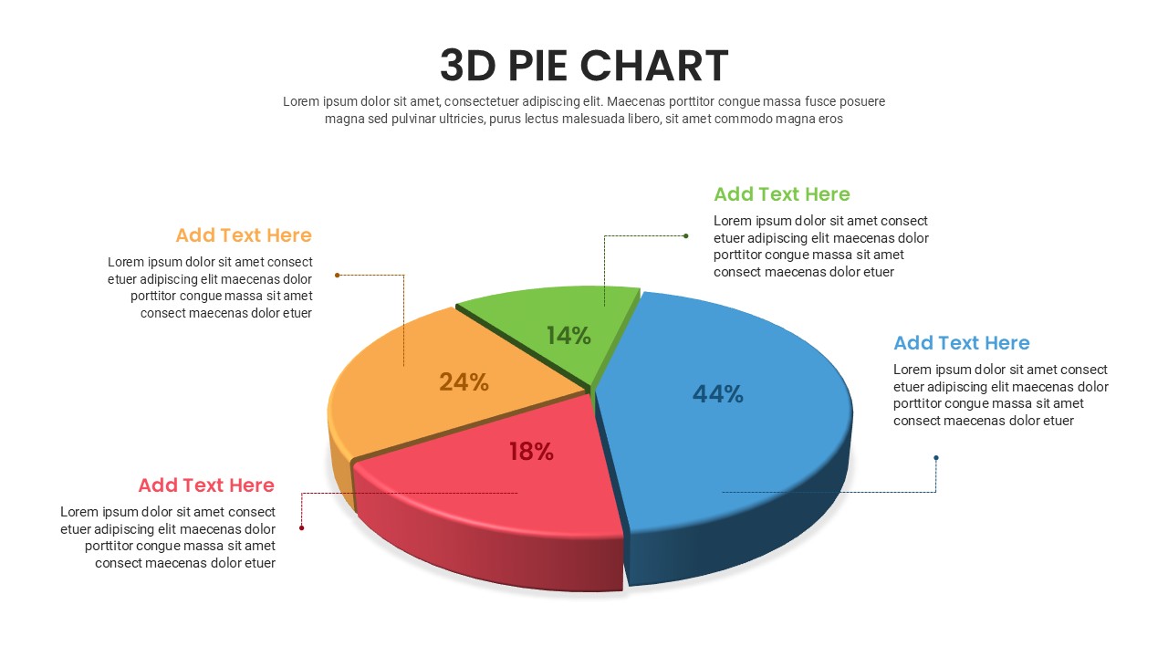
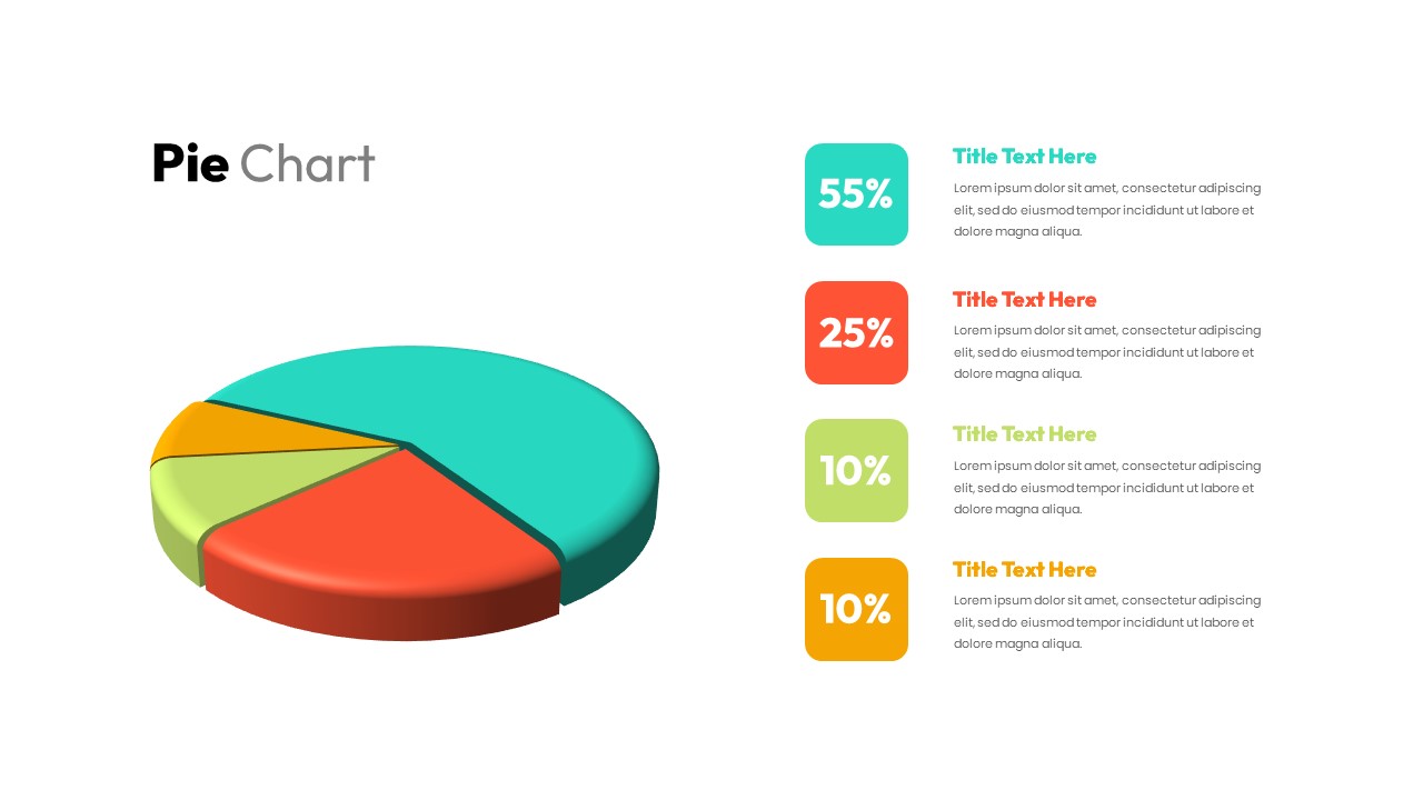
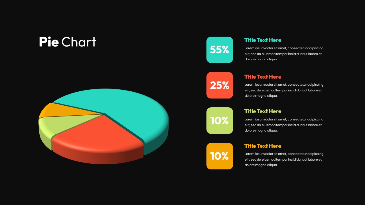
Presenting market share distributions, budget allocations, revenue streams, or demographic breakdowns requires an intuitive visual model that makes proportions immediately clear. This 3D pie chart template gives business analysts, financial planners, and project managers a volumetric data visualization to showcase four distinct percentage tiers. Positioned alongside clean, color-coordinated legend badges, this slide helps speakers explain fractional data and comparative contributions with complete clarity during executive reviews.
Key slide components and visual highlights include:
- A prominent isometric 3D pie chart divided into four distinct segments showing proportional volume and dimensional depth.
- High-contrast color palette featuring turquoise green (55%), coral red (25%), light olive green (10%), and warm amber yellow (10%).
- Four structured right-aligned callout cards with bold percentage badges matching the chart segment colors.
- Dedicated title and description containers for providing concise analytical context, KPI benchmarks, or operational notes.
- Minimalist white presentation canvas designed for high readability across virtual conferences and printed board summaries.
- 100% editable vector components that allow presenters to modify segment hues, adjust percentage figures, and update typography directly inside PowerPoint or Google Slides.
Login to download this file

Item ID
SB03230


Related Templates

Segmented Pie Chart Infographic with Icons for PowerPoint & Google Slides
Pie/Donut
Free 3D Pie Chart PowerPoint Template & Google Slides
Pie/Donut
Free
3-Chart Comparison PowerPoint Template
Pie/Donut
Business Opportunity PowerPoint Pie-Chart Template
Pie/Donut
Gear Pie chart PowerPoint Template
Pie/Donut
Pie Chart with Social Media Market Share PowerPoint Template
Pie/Donut
Bar of Pie Chart PowerPoint Template
Pie/Donut
Demographic Pie Chart PowerPoint Template
Pie/Donut
Car Companies Sales Pie Chart Template
BCG

Pie Segment Diagram PowerPoint Template
Pie/Donut
Quad Chart Infographic Pack of 8 Slides Template for PowerPoint & Google Slides
Comparison Chart
3D Pyramid Column Chart Template
Bar/Column
Organizational Chart Infographic PowerPoint Template
Org Chart
Donut Chart Infographic Template for PowerPoint
Pie/Donut
Circle Chart Infographic PowerPoint Template
Pie/Donut
Infographic Organization Chart Template for PowerPoint
Org Chart
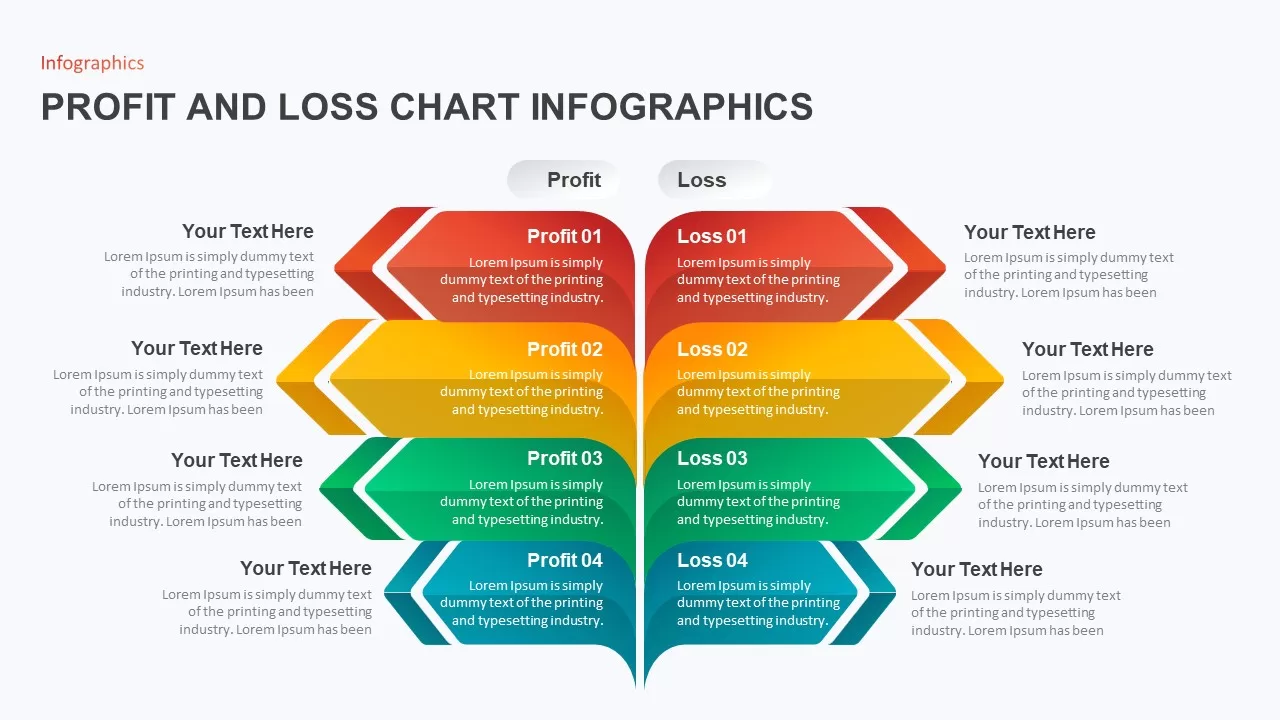
Profit and Loss Chart Infographic for PowerPoint Presentation
Business Report
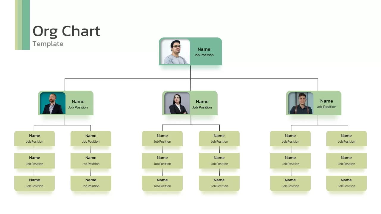
Org Chart Infographic Template
Org Chart
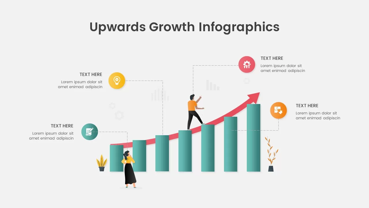
Growth Chart infographic
Infographics
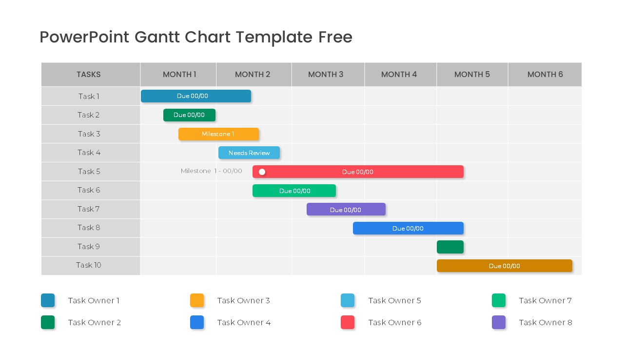
Free Professional Gantt Chart Pack – 4 Slides Template for PowerPoint & Google Slides
Gantt Chart
Free