Quarterly Sales template for PowerPoint & Google Slides
Quarterly Sales Chart PowerPoint and Google Slides Template
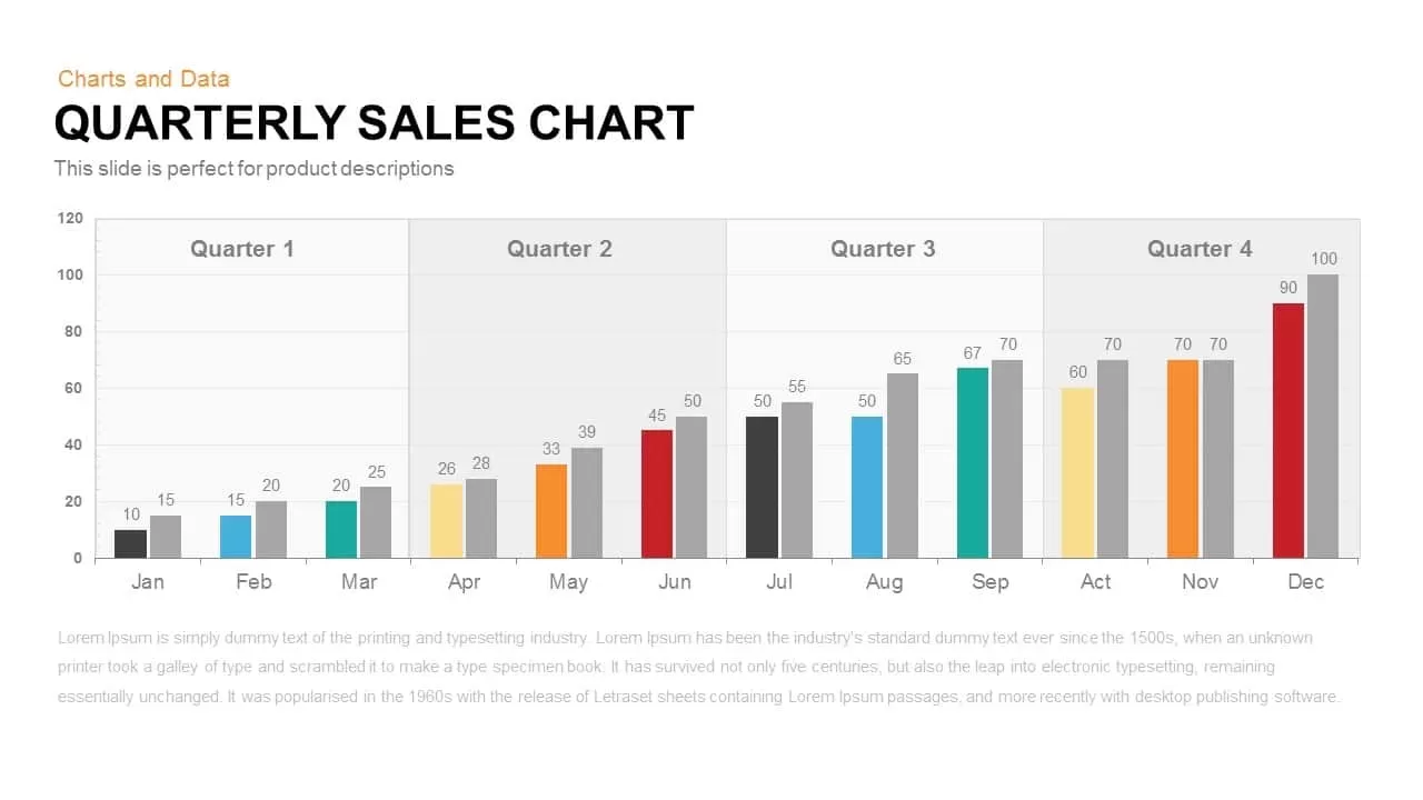
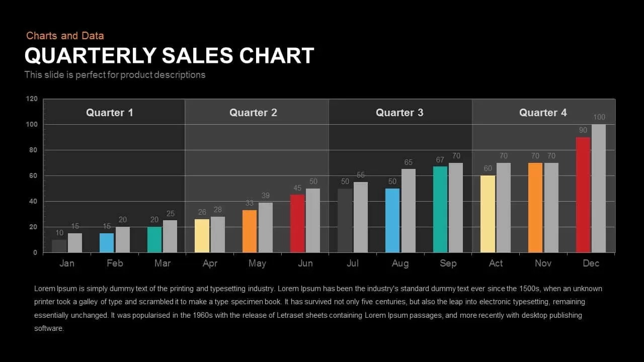
Tracking annual revenue progression, evaluating monthly sales quotas, or presenting financial performance across fiscal periods requires a clear quantitative layout. This quarterly sales chart presentation template equips sales leads, financial analysts, operations directors, and business executives with a structured bar chart designed to compare monthly metrics across four distinct business quarters.
Key slide components and visual highlights include:
- A full 12-month timeline plotted along the horizontal axis from January through December, divided into Quarter 1, Quarter 2, Quarter 3, and Quarter 4.
- Paired column bars for each month to benchmark actual sales against projected targets or prior-year performance.
- A coordinated color progression across the months featuring charcoal, sky blue, teal, pale yellow, orange, and crimson, contrasted against neutral gray benchmark bars.
- Direct data callout labels positioned above every bar along a clear vertical metric scale from 0 to 120.
- A clean narrative text block spanning the base of the slide for key takeaways, executive summaries, or revenue driver explanations.
Login to download this file

Item ID
SB00210


Related Templates

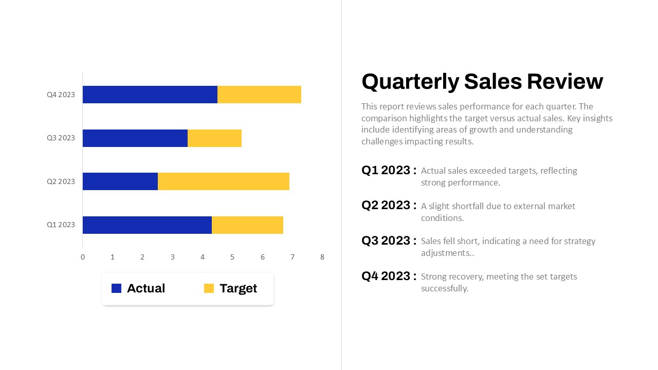
Quarterly Sales Review PowerPoint Template
Bar/Column
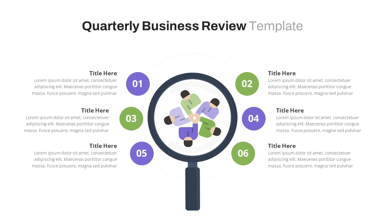
Free Quarterly Business Review PowerPoint Template & Google Slides
Business
Free
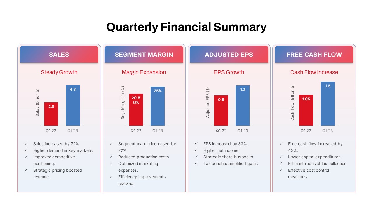
Quarterly Financial Summary Dashboard Template for PowerPoint & Google Slides
Business Report
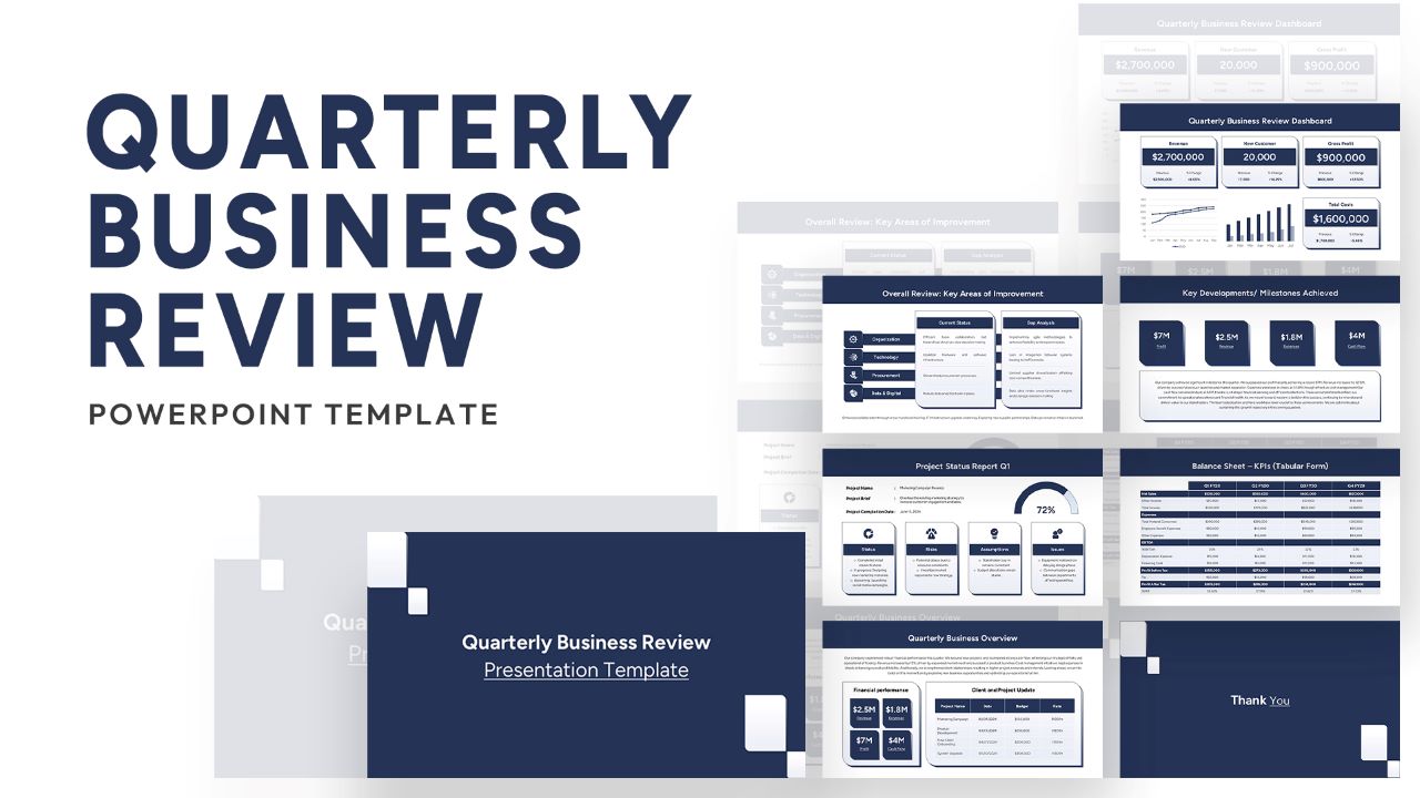
Quarterly Business Review Dashboard Template for PowerPoint & Google Slides
Pitch Deck

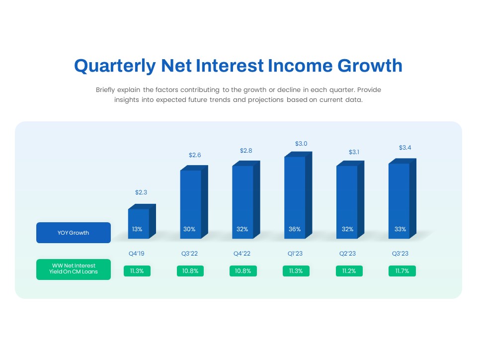
Quarterly Net Interest Income Growth Template for PowerPoint & Google Slides
Bar/Column
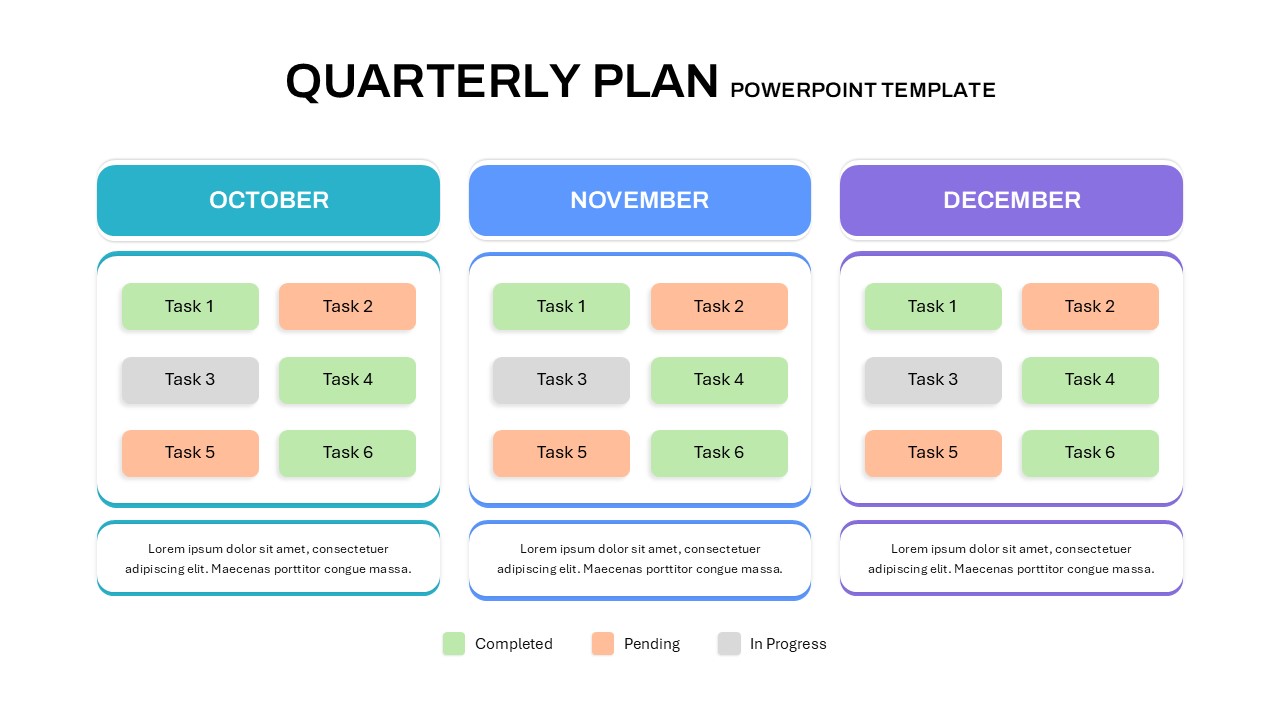
Quarterly Plan Template for PowerPoint & Google Slides
Project Status

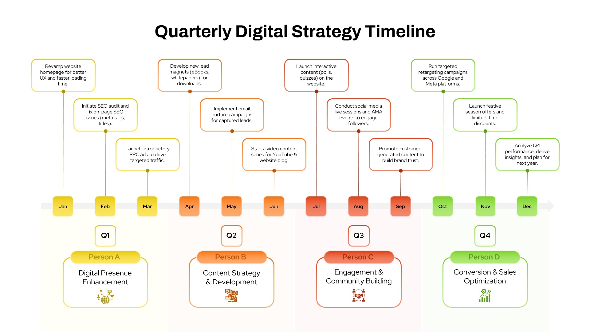
Quarterly Digital Strategy Timeline template for PowerPoint & Google Slides
Digital Marketing
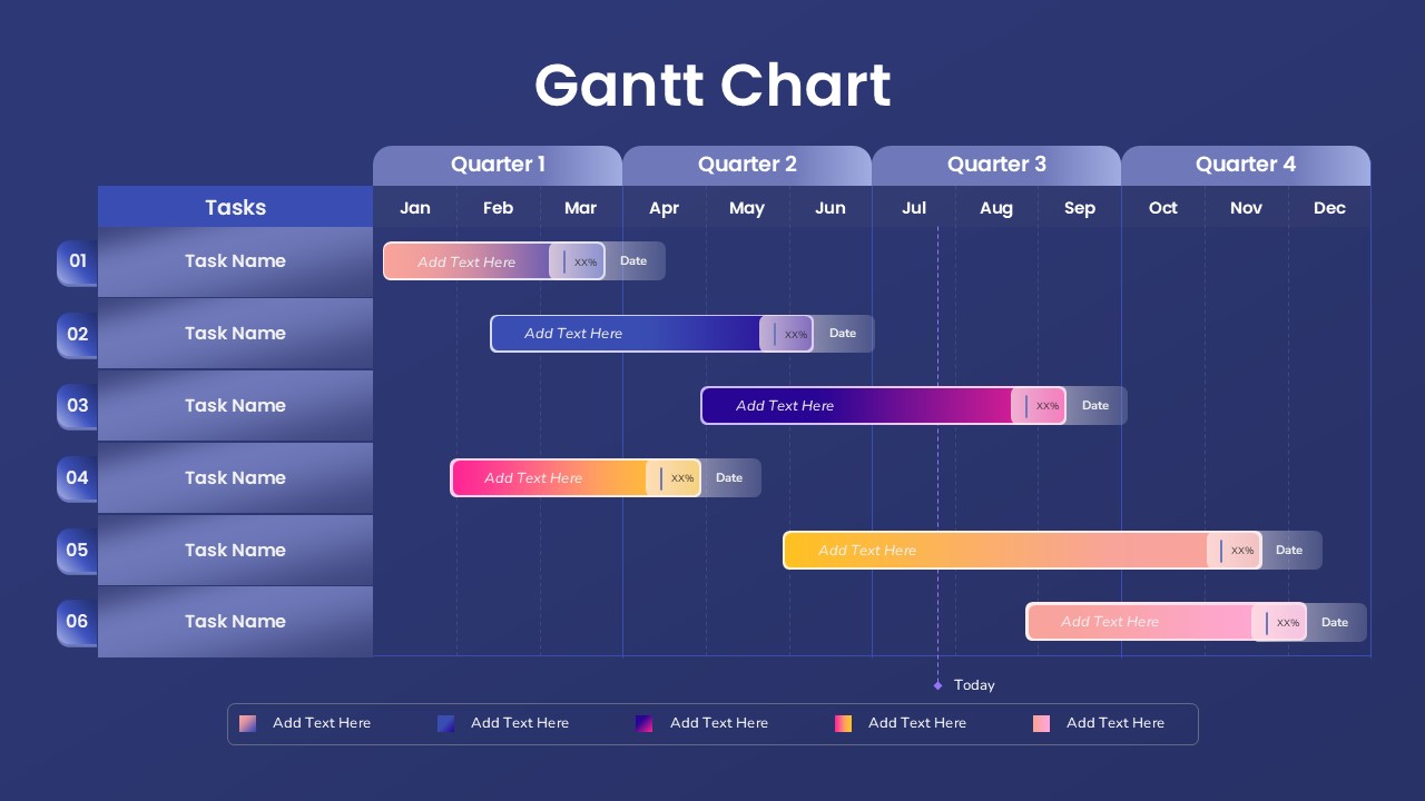
Quarterly Gantt Chart with Today Marker Template for PowerPoint & Google Slides
Gantt Chart
Quarterly Comparison Pie Chart Template for PowerPoint & Google Slides
Pie/Donut
Quarterly Financial Report Dashboard Template for PowerPoint & Google Slides
Finance
2023 Quarterly Planner PowerPoint Template
Project
Quarterly Roadmap Timeline PowerPoint Template
Timeline
Quarterly Achievement PowerPoint Template
Accomplishment
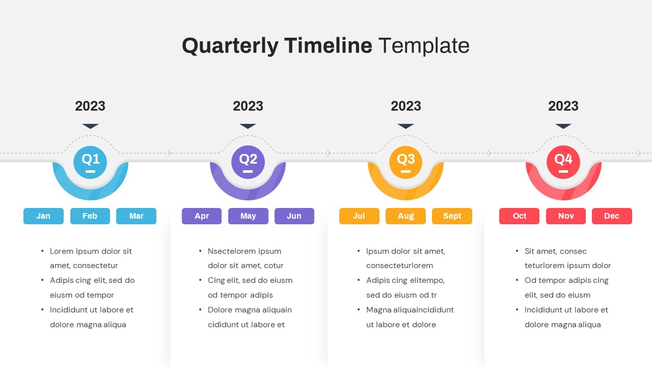
Quarterly Timeline Template For PowerPoint
Timeline
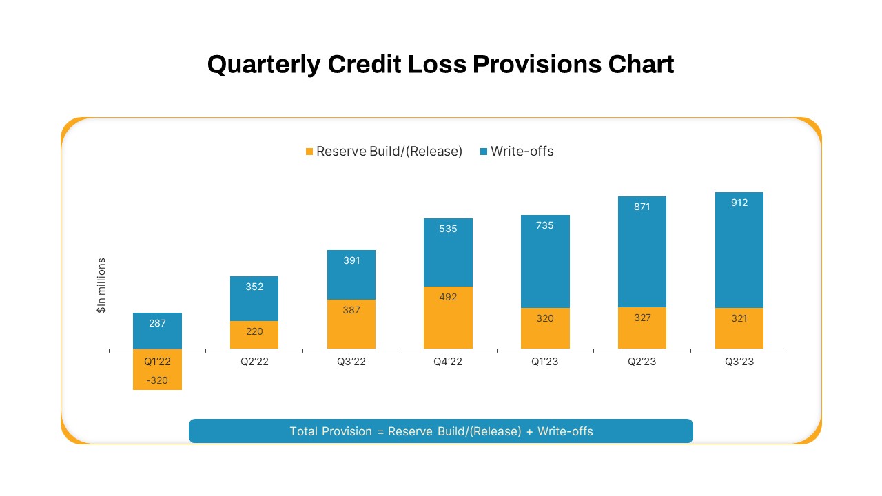
Quarterly Credit Loss Provisions Chart PowerPoint Template
Bar/Column
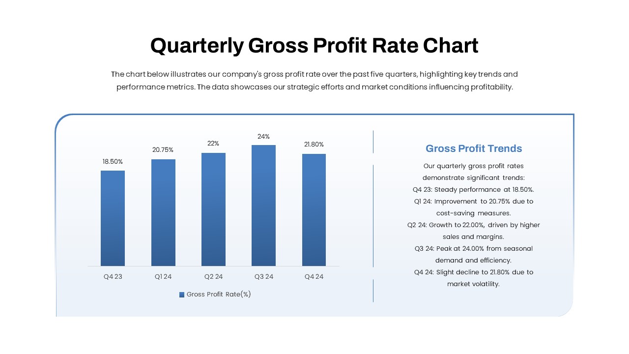
Quarterly Gross Profit Rate Chart PowerPoint Template
Revenue
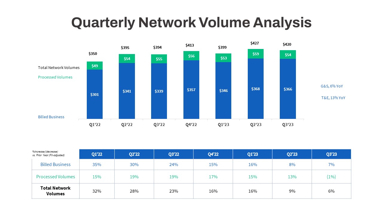
Quarterly Network Volume Analysis PowerPoint Template
Business Report
Quarterly Revenue Chart PowerPoint Template
Bar/Column
Cloud Revel Sales Presentation Template for PowerPoint & Google Slides
Marketing
Sales Pitch Roadmap Infographic Template for PowerPoint & Google Slides
Marketing