Four Quadrant Scatter Chart Powerpoint Template
Description
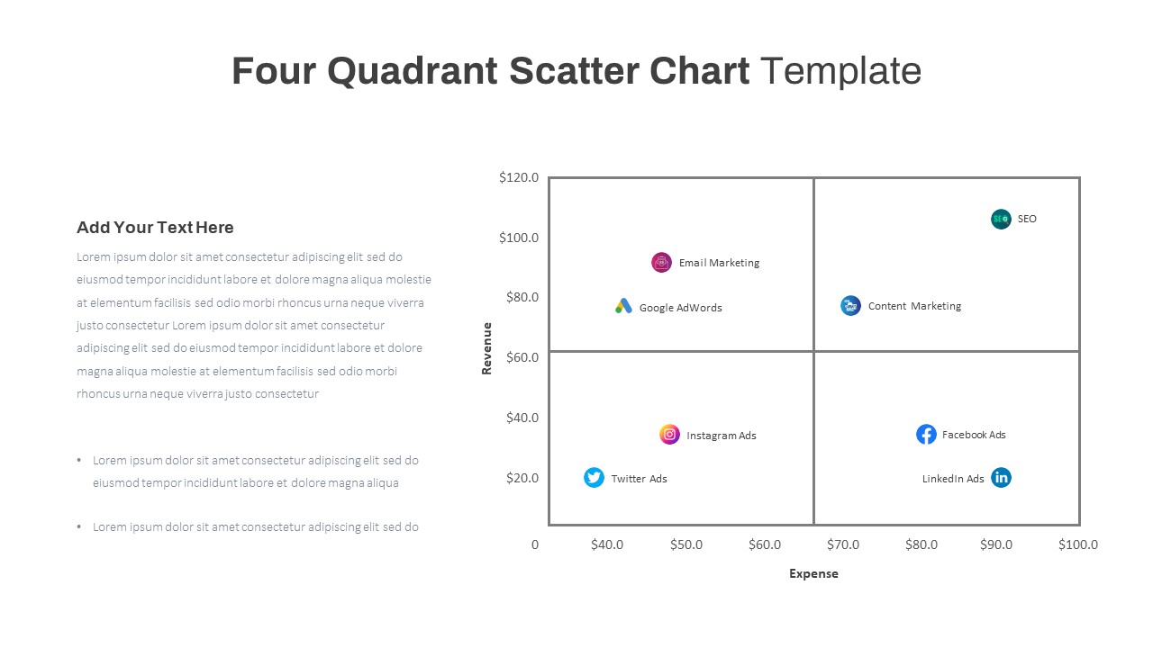
A quadrant scatter chart PowerPoint template is a bubble chart that is divided into four sections, each representing a different equation. It provides a means to group values into categories based on specific criteria. This chart allows you to visually plot points on a scatter plot, categorizing them into four distinct quadrants. It is a popular graphical representation used to analyze and visualize the relationship between two variable dimensions. Quadrant scatter charts in PowerPoint are effective tools for understanding data patterns and relationships clearly and concisely.
How to read a four-quadrant scatter chart PowerPoint Template
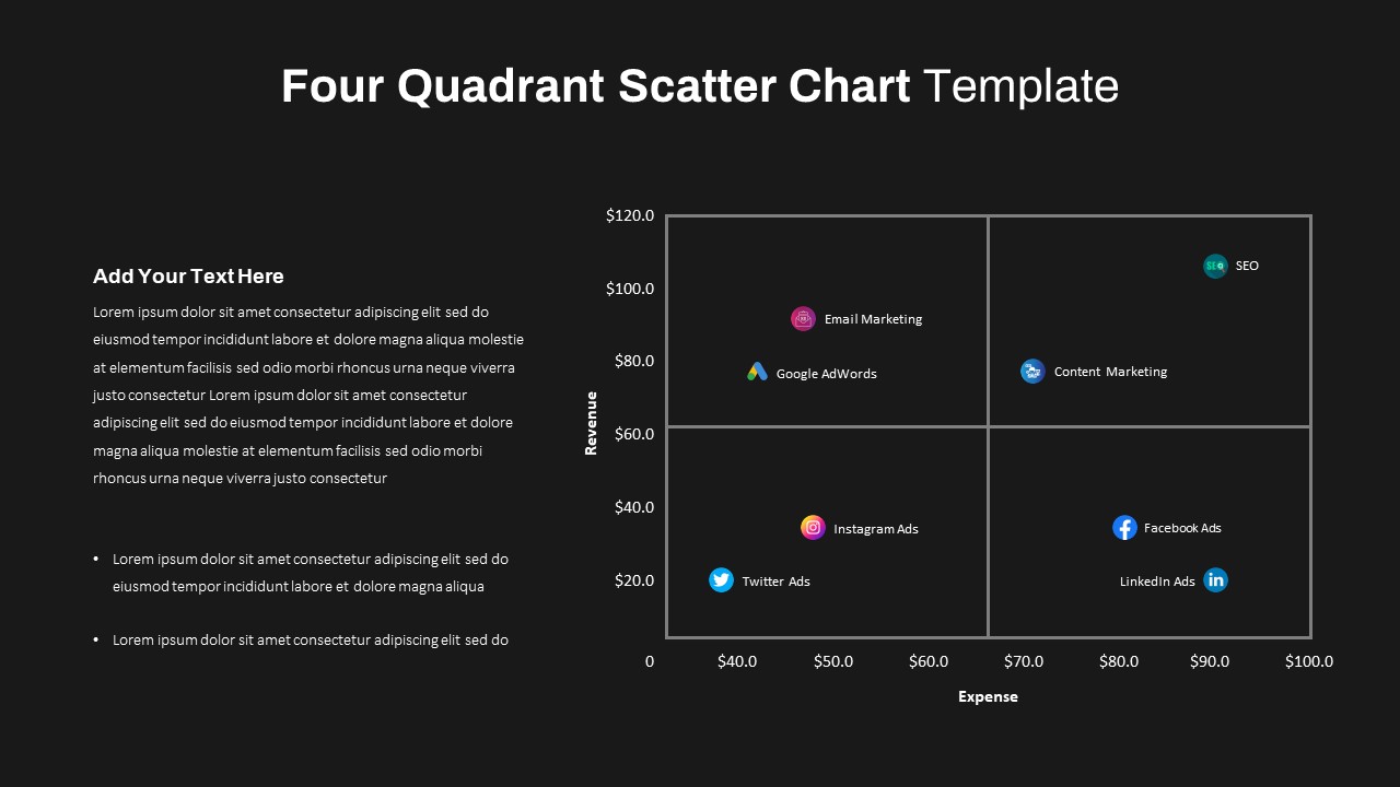
The placement of a data point in a specific quadrant depends on the positive or negative values of the variables. For example, if one variable represents profitability and the other represents market share, the quadrants can be labelled as follows:
Top Right (High Profitability, High Market Share): This quadrant represents the most desirable outcome, indicating high profitability and a large market share. Companies or data points in this quadrant are considered successful.
Top Left (Low Profitability, High Market Share): This quadrant represents companies or data points that have a significant market share but struggle with profitability. It may suggest the need for strategic changes to improve profitability while maintaining market dominance.
Bottom Right (High Profitability, Low Market Share): This quadrant represents companies or data points that have high profitability but a smaller market share. It may indicate a niche market or a successful but specialized product or service.
Bottom Left (Low Profitability, Low Market Share): This quadrant represents companies or data points that have low profitability and a small market share. It may indicate underperforming businesses or areas for improvement.
The four-quadrant scatter chart template offers a convenient way to assess the relationship between digital marketing expenses and revenue. It allows you to analyze and visualize this data in a clear and organized manner. Moreover, you have the flexibility to select your preferred background color from two available options. The template also provides PowerPoint editing capabilities, allowing you to easily incorporate and customize your own data. Also, check out our massive collection of charts and diagrams.
Login to download this file

Item ID
SB03666
Related Templates

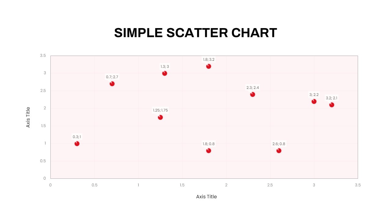
Simple Scatter Chart Analysis Template for PowerPoint & Google Slides
Comparison Chart
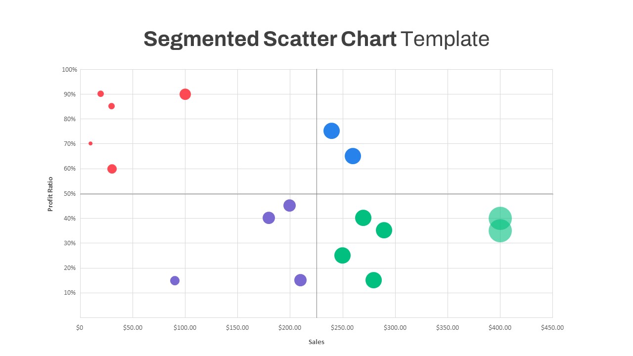
Segmented Scatter Chart Data Visualization Template for PowerPoint & Google Slides
Business Strategy
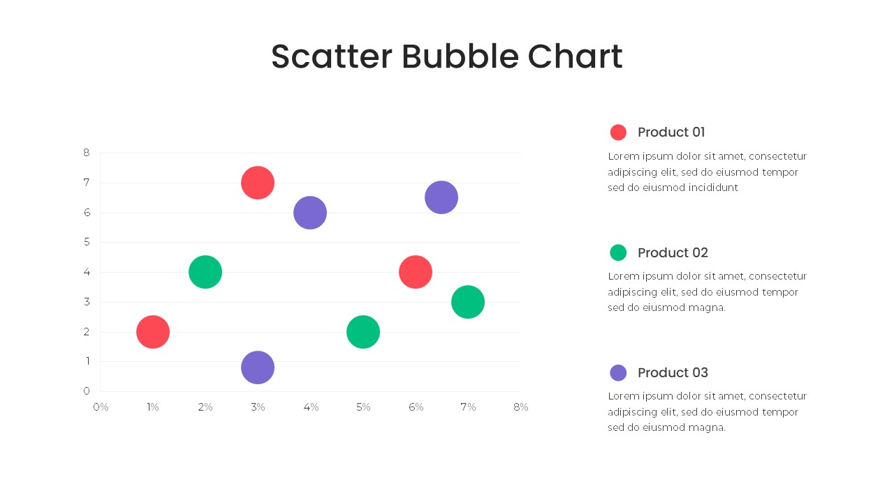
Bubble Chart Scatter, Diagram & Matrix Template for PowerPoint & Google Slides
Comparison Chart
Four-Quadrant SWOT Analysis Diagram Template for PowerPoint & Google Slides
SWOT
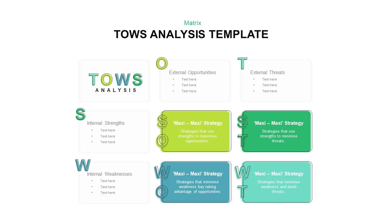
Editable Four-Quadrant TOWS Matrix Template for PowerPoint & Google Slides
Opportunities Challenges
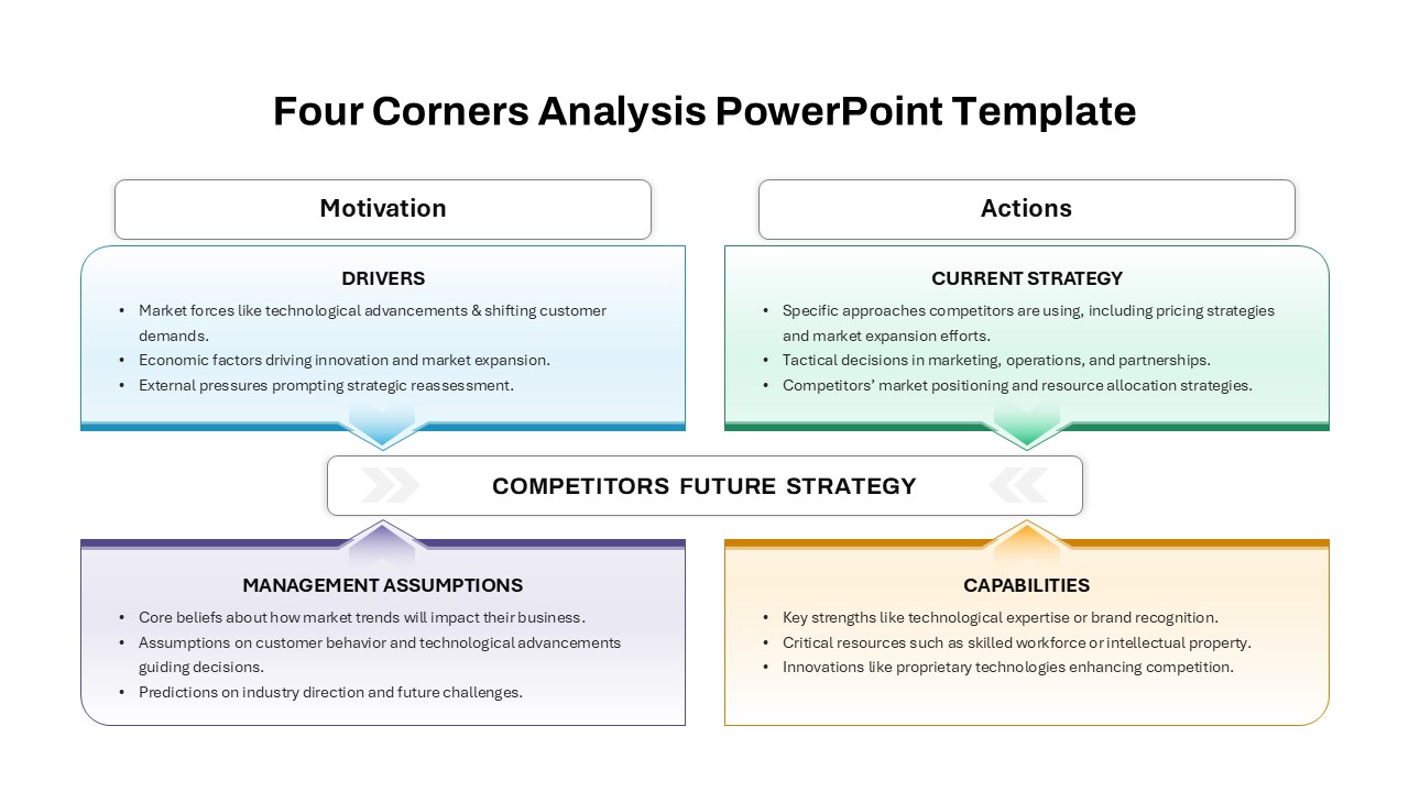
Four-Corners Strategic Analysis Quadrant Template for PowerPoint & Google Slides
SWOT
Four-Quadrant Responsible AI Framework Template for PowerPoint & Google Slides
Circular
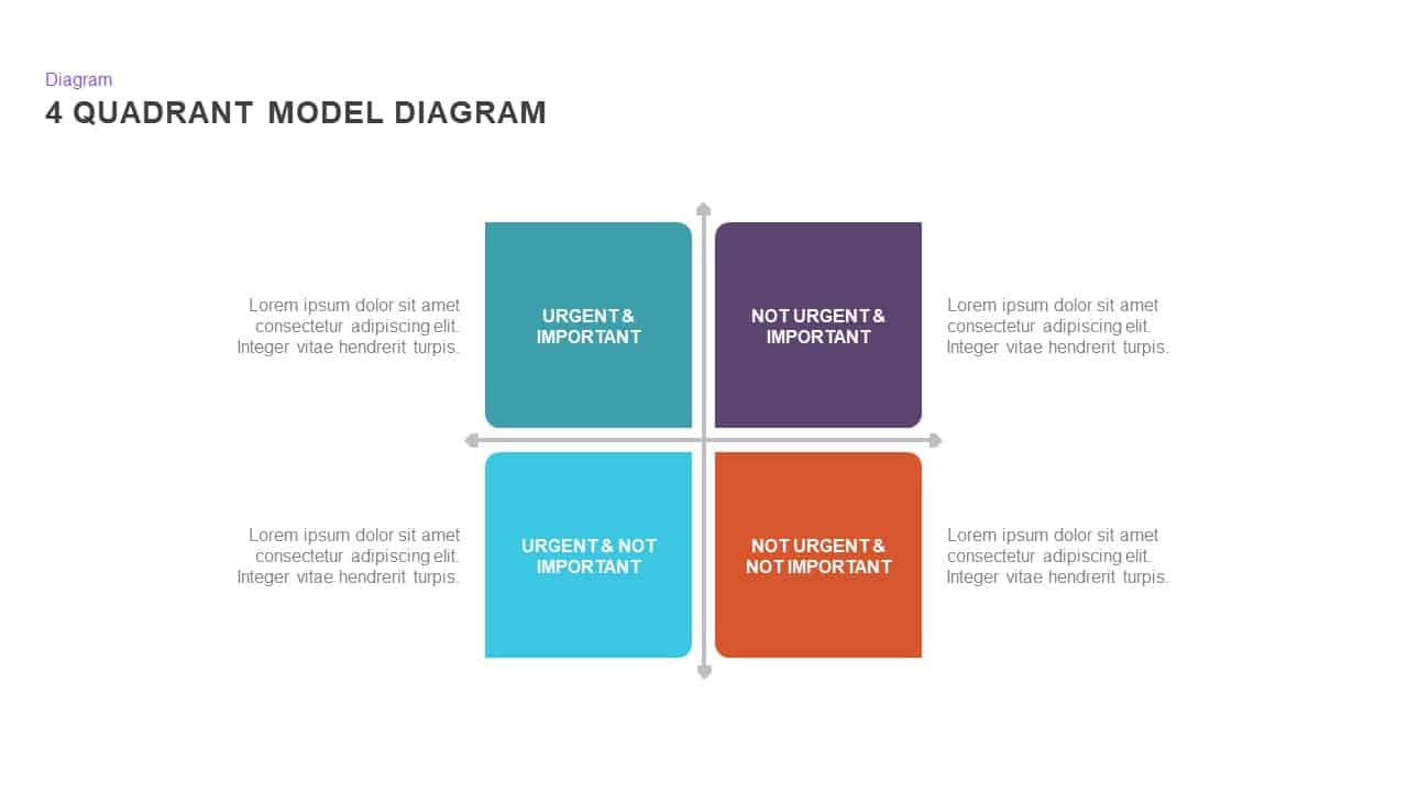
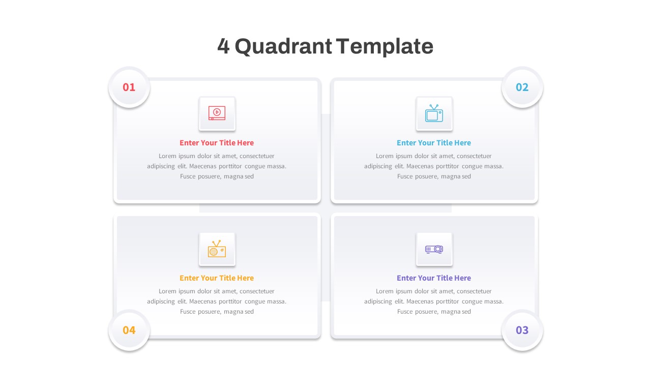
4 Quadrant PowerPoint Template
Process
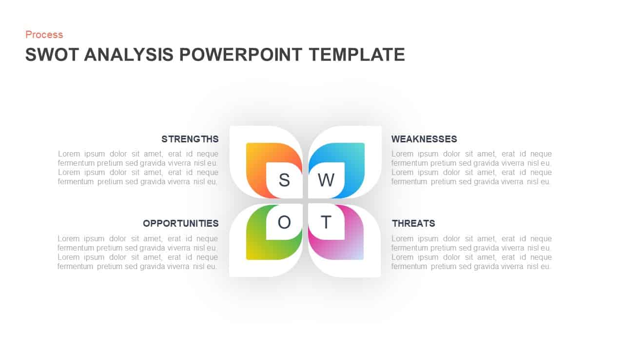
SWOT Analysis Diagram Template
SWOT

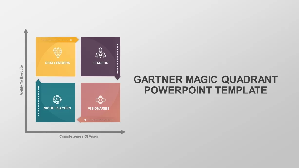
Gartner Magic Quadrant Analysis Template for PowerPoint & Google Slides
Business
Modern Colorful SWOT Quadrant Analysis Template for PowerPoint & Google Slides
SWOT
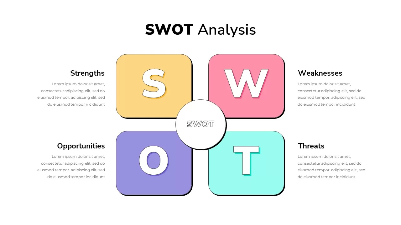
SWOT Analysis Quadrant template for PowerPoint & Google Slides
Business Strategy
SWOT Analysis Quadrant template for PowerPoint & Google Slides
Business Strategy
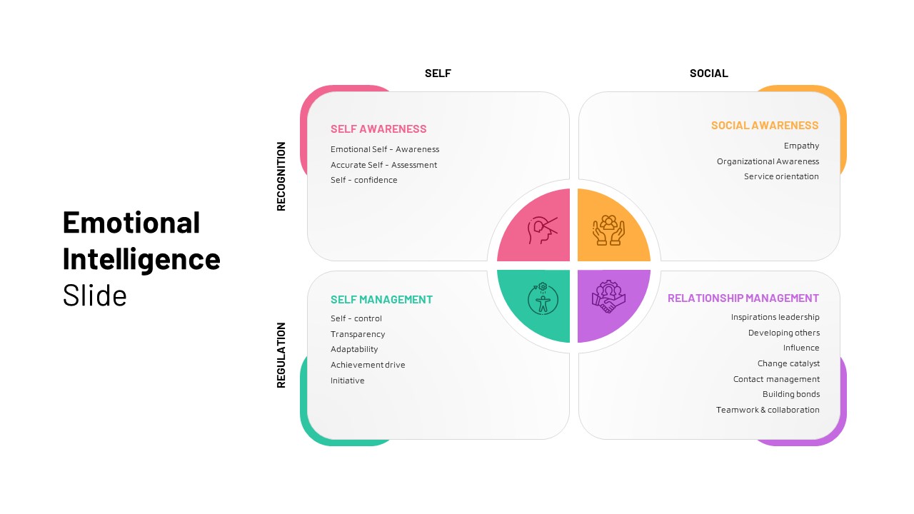
Emotional Intelligence Quadrant Template for PowerPoint & Google Slides
Circular
Free 4 Quadrant Template for PowerPoint & Google Slides
Business
Free
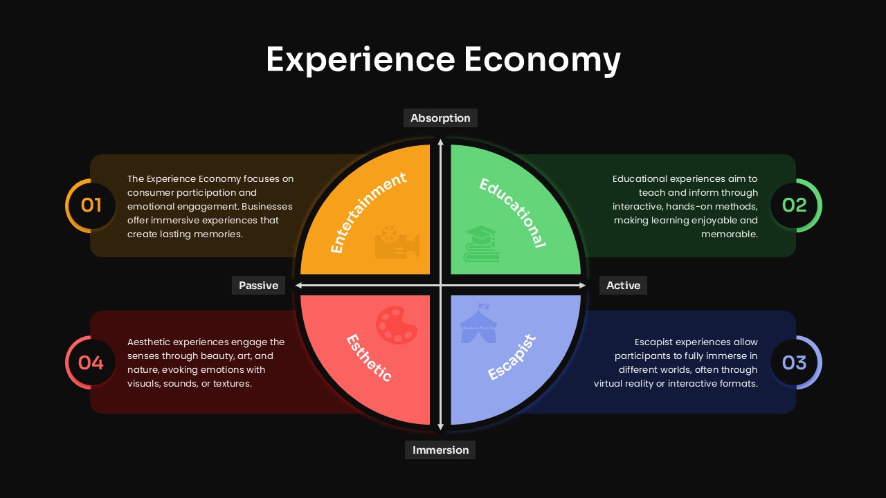
Experience Economy Quadrant Diagram Template for PowerPoint & Google Slides
Circular
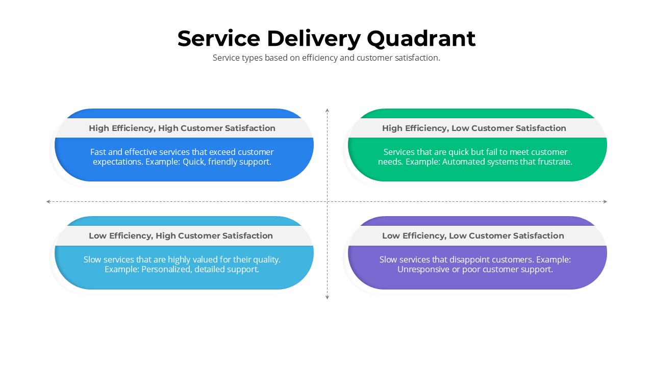
Service Delivery Quadrant Slide Template for PowerPoint & Google Slides
Comparison
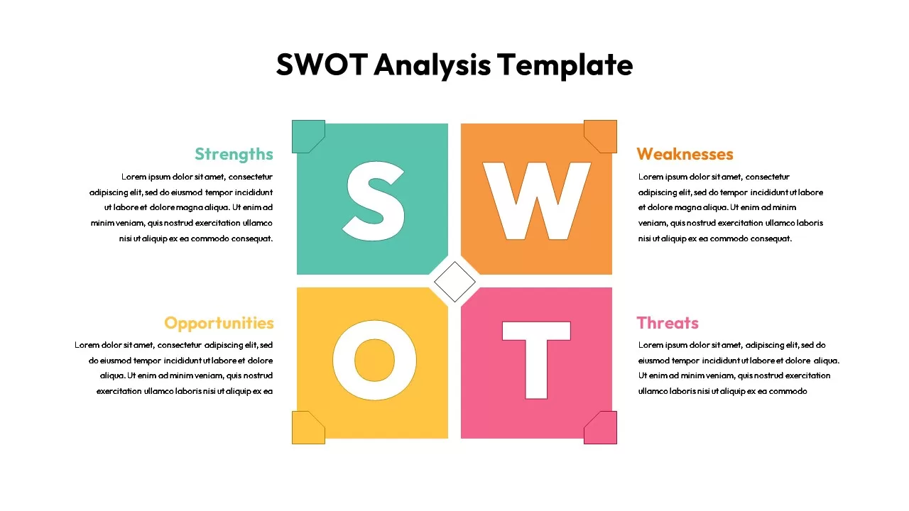
Colorful SWOT Analysis Quadrant Template for PowerPoint & Google Slides
SWOT
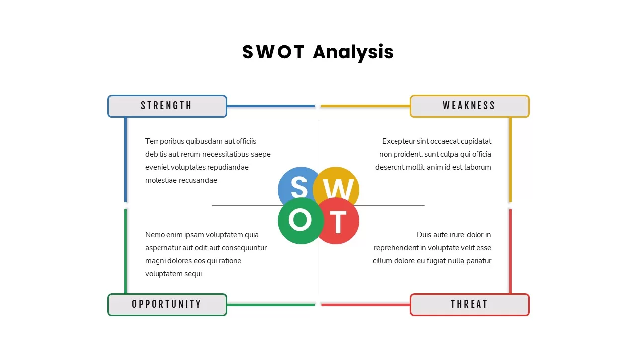
Multi Color SWOT Analysis Quadrant Template for PowerPoint & Google Slides
SWOT
3D Quadrant SWOT Analysis Template for PowerPoint & Google Slides
SWOT