Waffle Chart Data Visualization Template for PowerPoint & Google Slides


Description
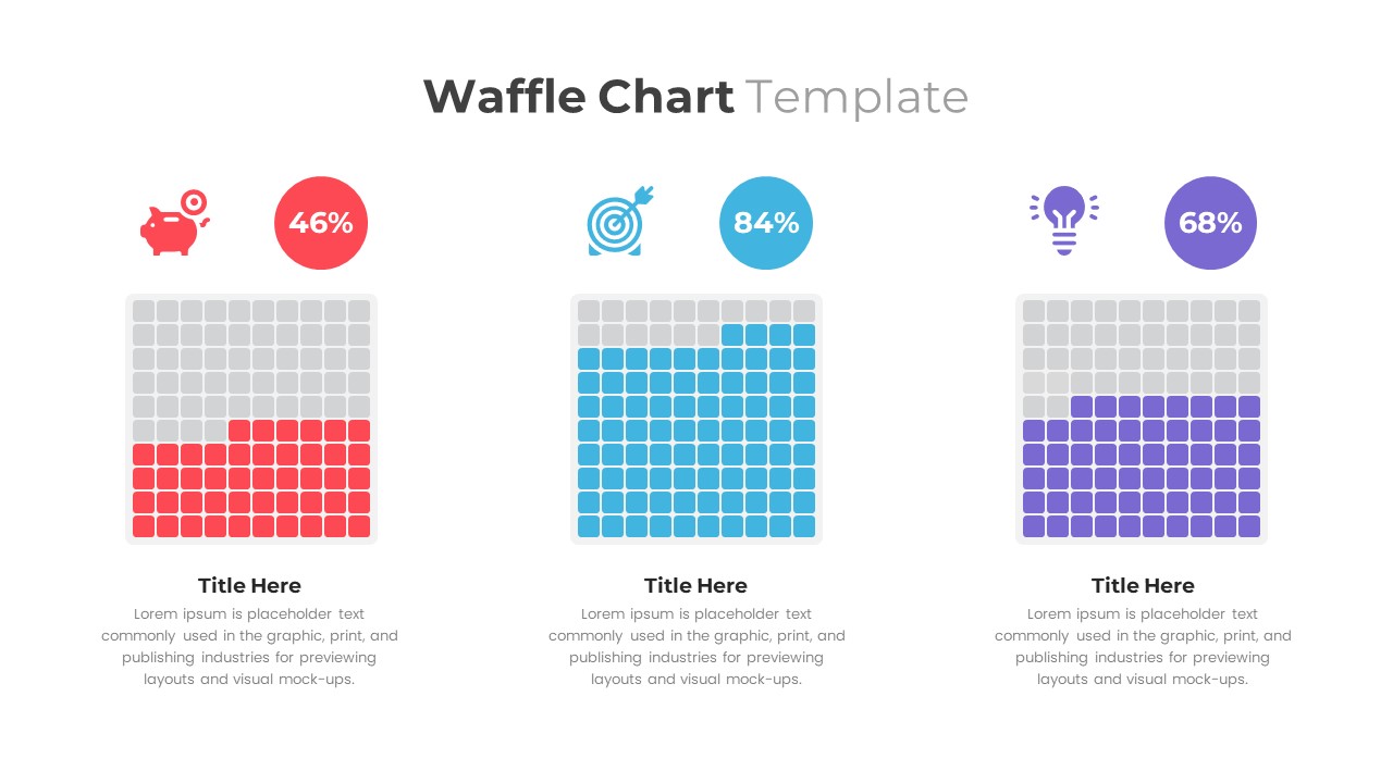
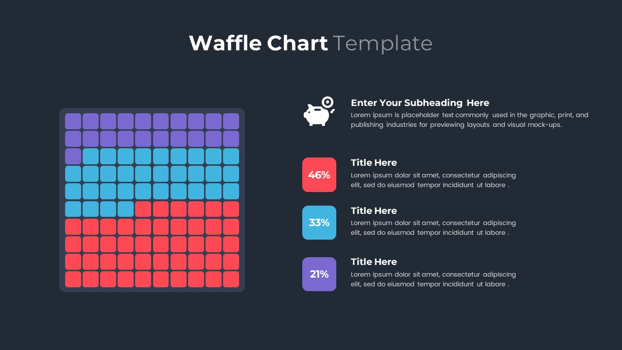
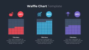
Make use of this Waffle Chart Data Visualization slide to present percentage breakdowns with absolute clarity using ten-by-ten grids that represent 1% per square. The first variant showcases three side-by-side waffle charts—each a 100-cell grid color-coded in red, blue, and purple—topped with intuitive icons (piggy bank, target, lightbulb) and bold percentage labels (46%, 84%, 68%). The second variant features a unified 10×10 grid segmented by red (46%), blue (33%), and violet (21%), paired with a clear legend and subheading placeholder for deeper context. Both layouts maintain a crisp, flat design aesthetic, minimalist typography, and consistent spacing to ensure optimal readability and audience engagement.
Designed for quick customization, every vector cell, icon, and text placeholder is fully editable via master slides. Simply swap colors, update percentage values, switch icons, or revise copy to match your brand guidelines. Optimized for both PowerPoint and Google Slides, these charts scale flawlessly across devices, eliminating formatting headaches and ensuring pixel-perfect clarity in boardrooms, webinars, or virtual workshops.
Beyond standard reporting, this template supports multi-category comparisons and dynamic storytelling. Duplicate grids to track performance over time, overlay graphic accents to emphasize targets, or animate cell fills in Google Slides for added impact. Its grid-based approach transforms abstract percentages into tangible visuals, fostering stakeholder alignment and data-driven discussions across departments.
Who is it for
Data analysts, marketers, financial planners, project managers, and educators who need to convey percentage-based insights clearly and memorably will benefit from this waffle chart template.
Other Uses
Ideal for budget allocations, customer satisfaction scores, resource planning, KPI dashboards, survey result comparisons, and product adoption rate presentations.
Login to download this file

Item ID
SB03513
Related Templates

Cone Chart PowerPoint Template
Bar/Column
Free Stacked Column Chart Data Visualization Template for PowerPoint & Google Slides
Bar/Column
Free
Simple Bar Chart Data Visualization Template for PowerPoint & Google Slides
Bar/Column
Waterfall Chart Data Visualization Template for PowerPoint & Google Slides
Comparison Chart
Segmented Scatter Chart Data Visualization Template for PowerPoint & Google Slides
Business Strategy
Circle Graph Data Visualization Template for PowerPoint & Google Slides
Circular
Gear Pie Diagram Data Visualization Template for PowerPoint & Google Slides
Pie/Donut
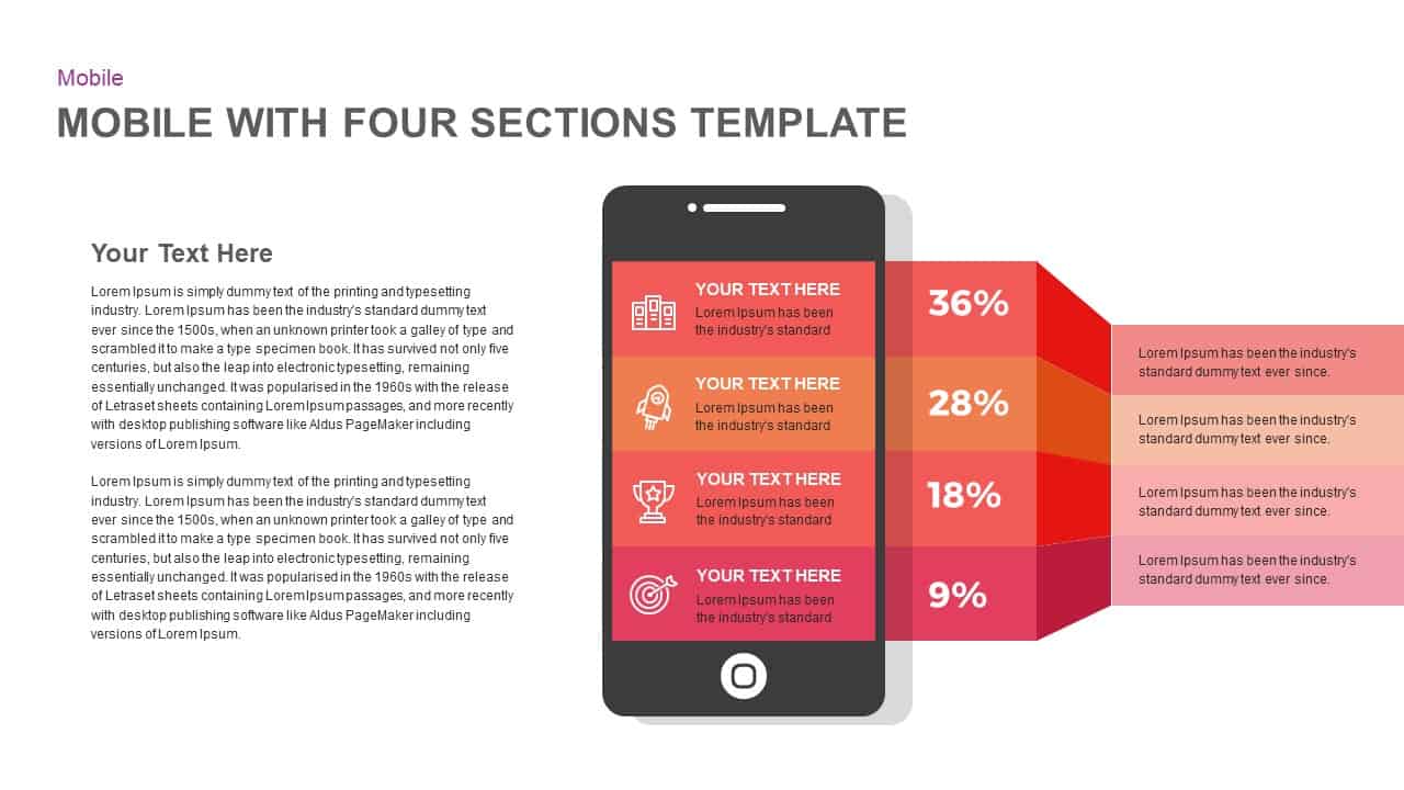
Mobile Infographics Data Visualization Template for PowerPoint & Google Slides
Infographics
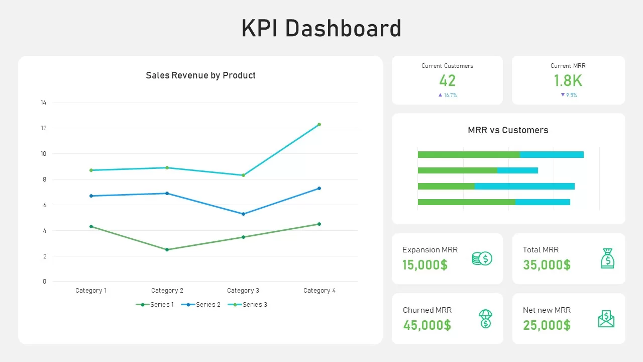
KPI Dashboard Data Visualization Template for PowerPoint & Google Slides
Bar/Column
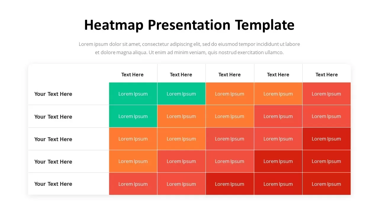
Professional Heatmap Data Visualization Template for PowerPoint & Google Slides
Infographics
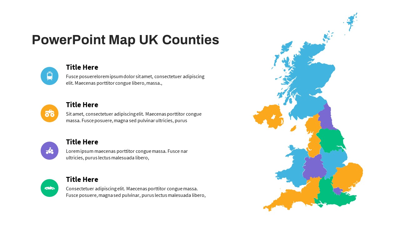
UK Counties Map Data Visualization Template for PowerPoint & Google Slides
World Maps
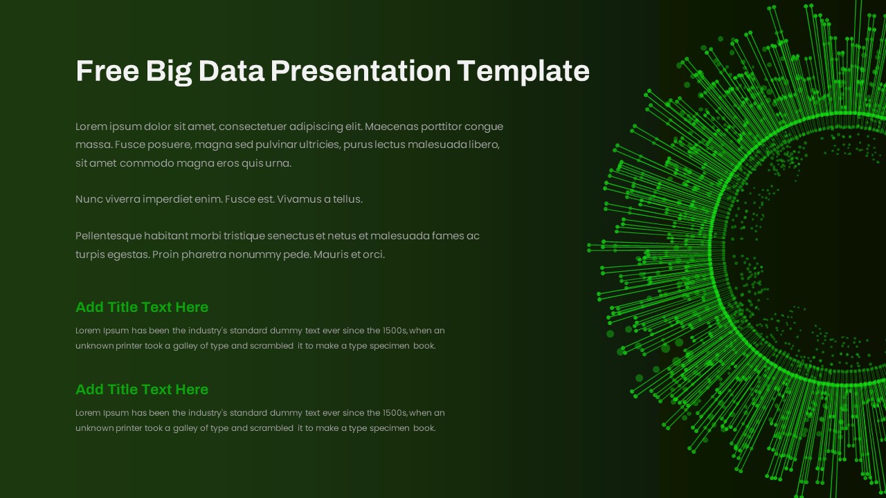
Free Big Data Network Visualization Template for PowerPoint & Google Slides
Circular
Free
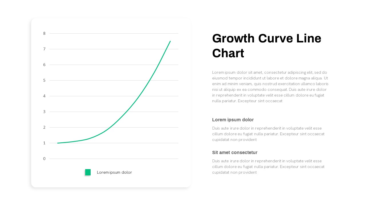
Growth Curve Line Chart Visualization Template for PowerPoint & Google Slides
Charts
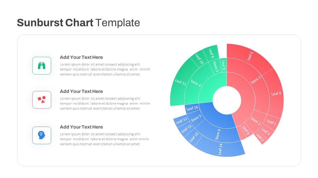
Dynamic Sunburst Chart Visualization Template for PowerPoint & Google Slides
Charts
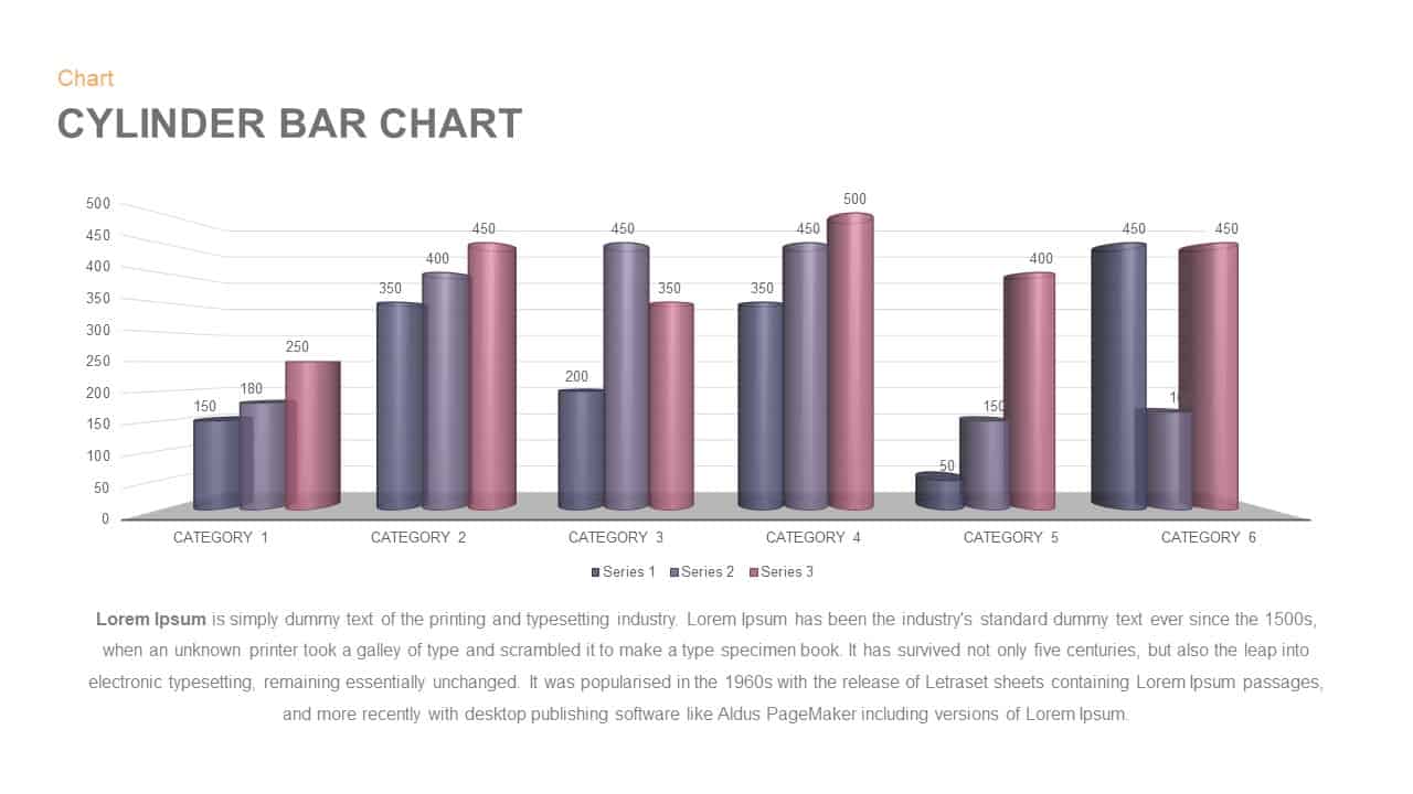
3D Cylinder Bar Chart Visualization Template for PowerPoint
Bar/Column

Bold Diamond Risk Alert Visualization Template for PowerPoint & Google Slides
Risk Management
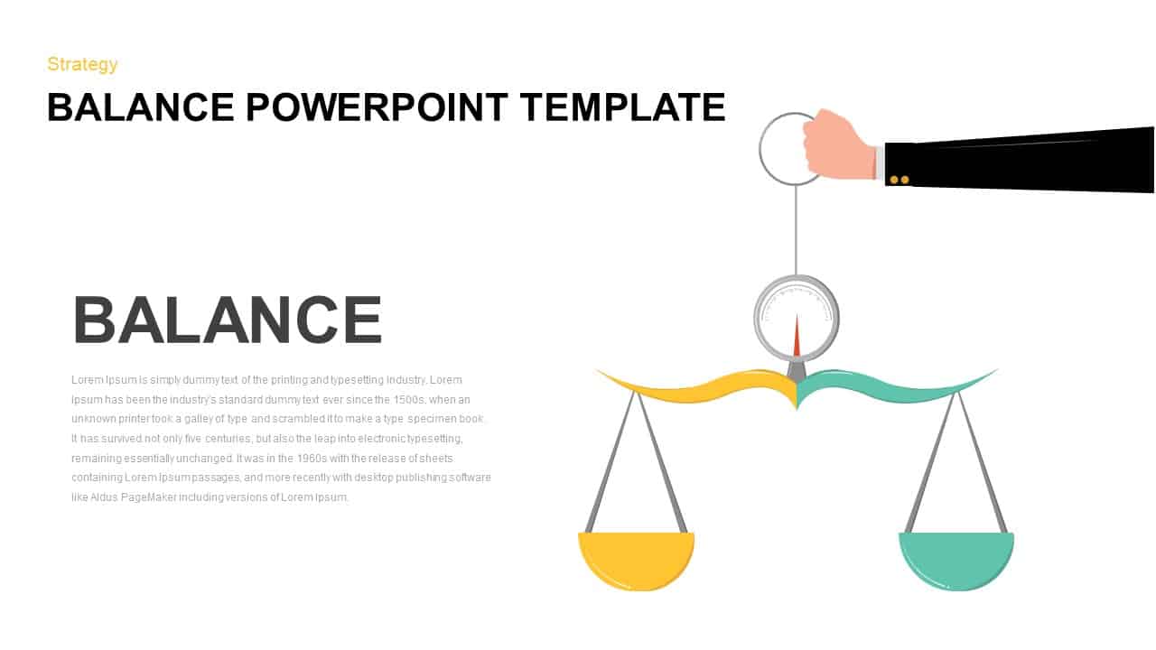
Balance Scale Visualization Infographic Template for PowerPoint & Google Slides
Comparison
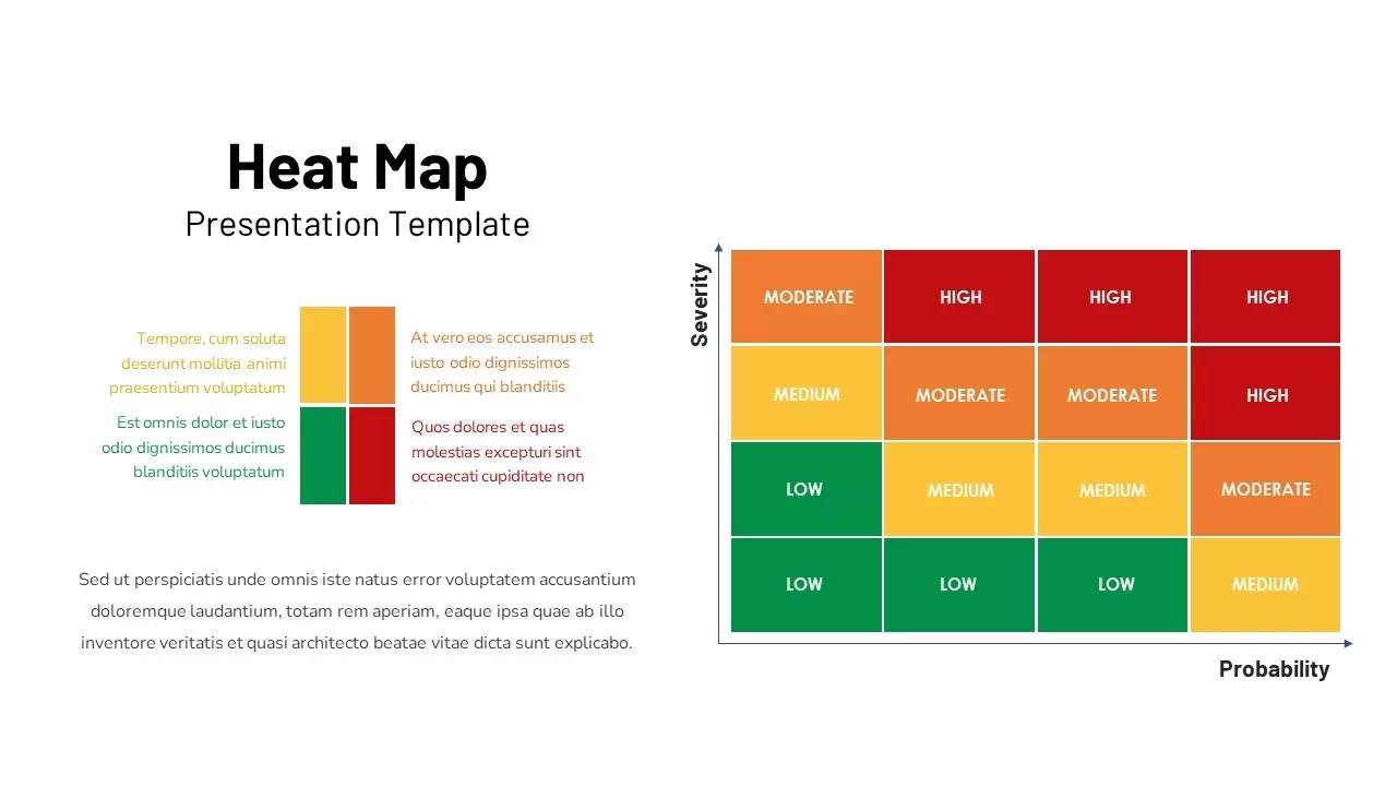
Professional Risk Heat Map Visualization Template for PowerPoint & Google Slides
Risk Management
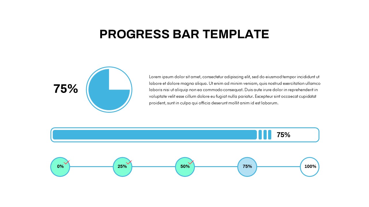
Progress Bar and Milestone Visualization Template for PowerPoint & Google Slides
Timeline
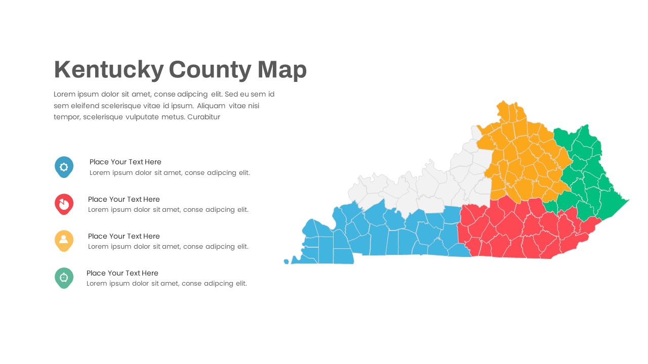
Kentucky County Map Visualization Template for PowerPoint & Google Slides
World Maps