Modern Multi-Color Polar Chart Diagram Template for PowerPoint & Google Slides
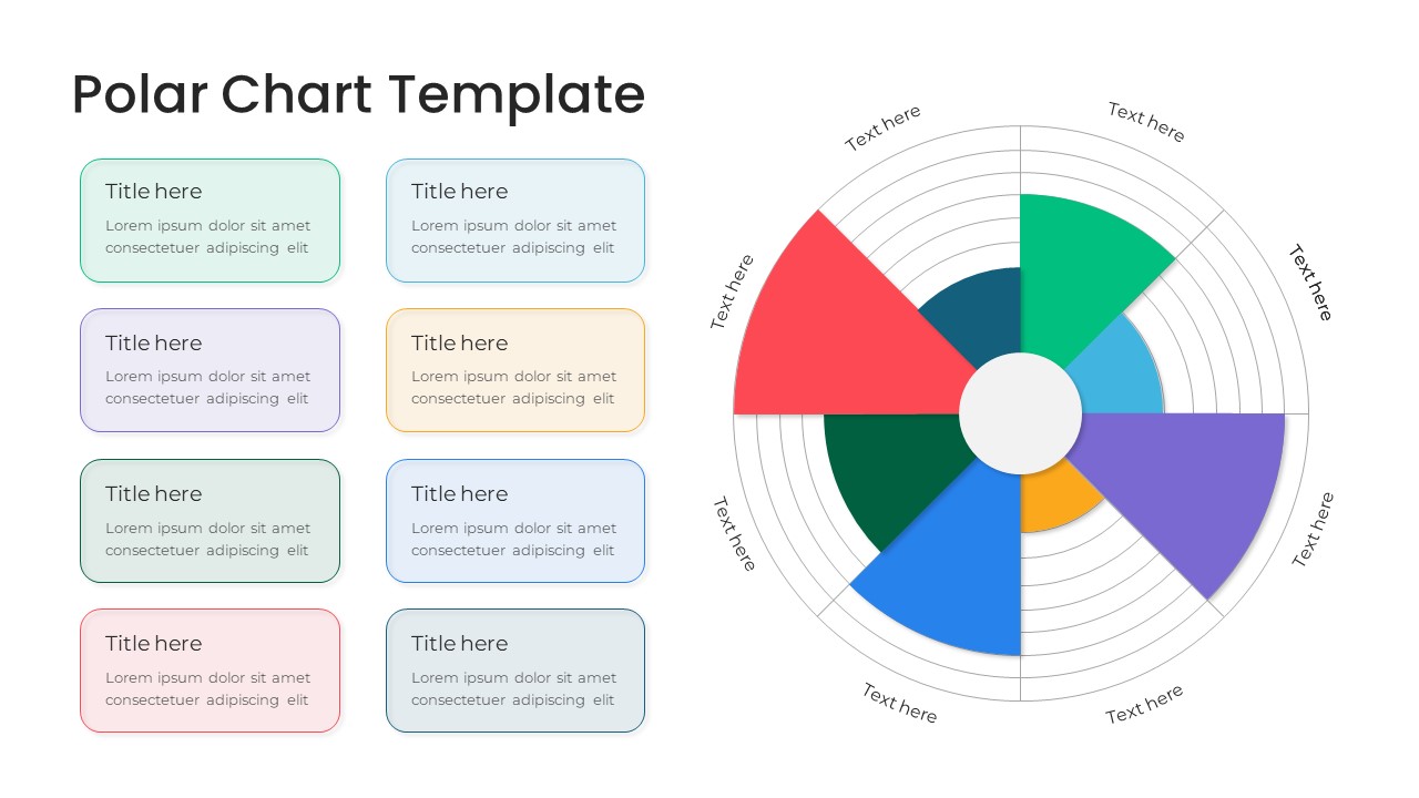
Polar Chart PowerPoint and Google Slides Template
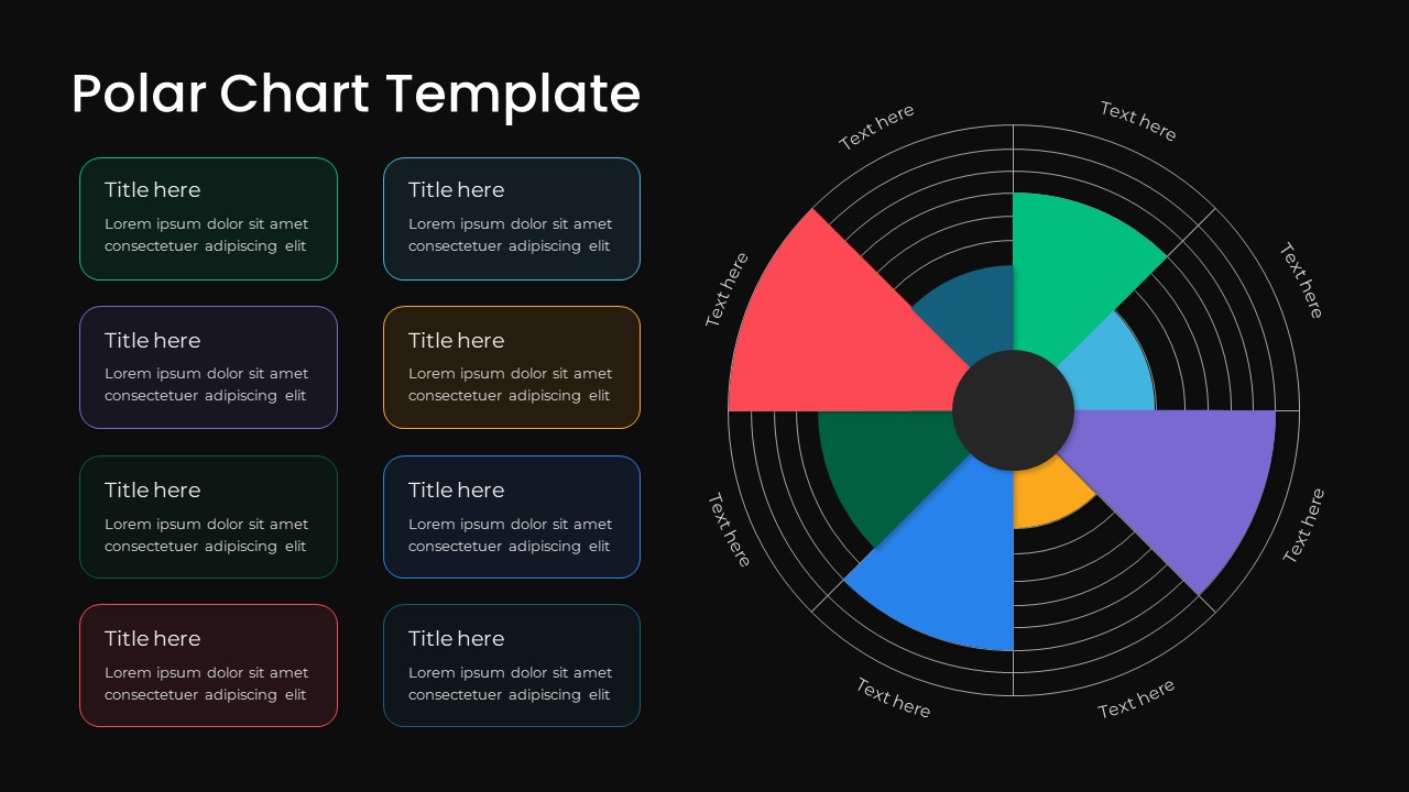
Comparing cyclical data, evaluating multi-variable business metrics, visualizing proportional performance categories, or presenting seasonal analytics requires an intuitive circular graphing framework. This polar chart PowerPoint template equips data analysts, financial strategists, operations managers, and business intelligence leads with a modern coxcomb diagram layout. By organizing varying sector radii across concentric grid rings, this slide helps presenters display quantitative differences, market shares, and departmental evaluations with precision during executive reviews and stakeholder meetings.
Key slide components and visual highlights include:
- A prominent polar area chart positioned on the right, featuring radiating angular segments with varying radius lengths to represent magnitude and data scale.
- A concentric circular grid background providing clear proportional markers and measurement intervals.
- An eight-color sector palette utilizing coral red, emerald green, sky blue, purple, amber orange, cobalt blue, dark teal, and ocean navy.
- Outer perimeter text labels mapped to each chart segment for rapid data attribution and category naming.
- A structured two-column legend on the left consisting of eight pastel-tinted cards matching each sector color, equipped with bold title placeholders and descriptive text fields.
- Crisp white presentation background engineered to deliver sharp contrast and readability across conference room displays and virtual meetings.
- 100% editable vector components that let presenters adjust sector angles, modify radii, customize color schemes, and update data descriptions directly within PowerPoint or Google Slides.
Login to download this file

Item ID
SB03826


Related Templates

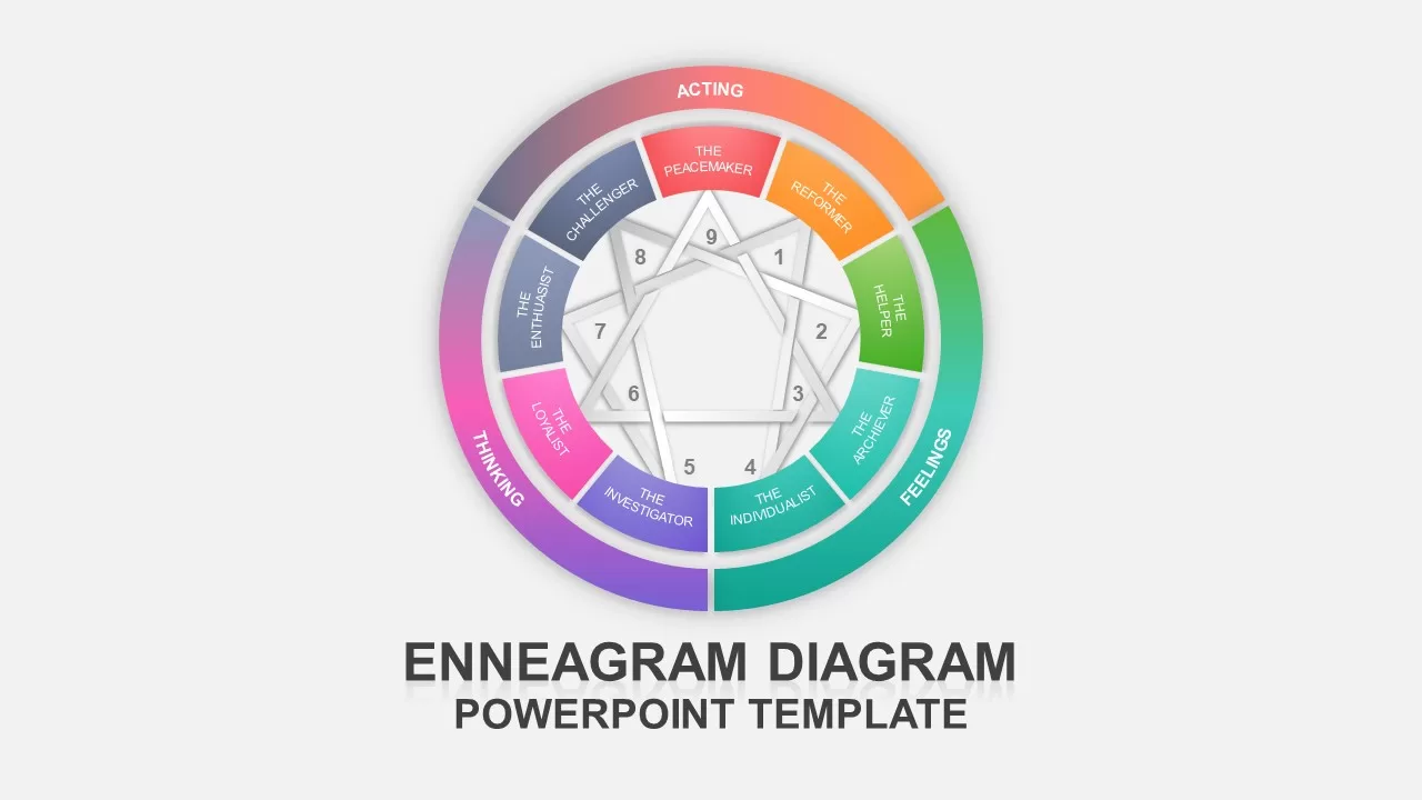
Multi-Color Enneagram Circular Diagram Template for PowerPoint & Google Slides
Circular
Multi-Color Milestone Timeline Layout Template for PowerPoint & Google Slides
Timeline
4-Section SWOT Analysis PowerPoint Template
SWOT
Color Coded Gantt Chart for PowerPoint and Google Slides
Business
3D Color Organizational Chart Template
Org Chart
Horizontal Multi-Level Hierarchy Chart template for PowerPoint & Google Slides
Org Chart
Multi-Series Stacked Bar Chart PowerPoint Template
Bar/Column
Minimal Multi-Year Column Chart Template for PowerPoint & Google Slides
Bar/Column
Multi-Series Line Chart with Icons Template for PowerPoint & Google Slides
Comparison Chart
Multi-Series Vertical Dot Chart Template for PowerPoint
Comparison Chart
Multi level Donut Chart Template
Pie/Donut
Multi-layout Circle Spoke Diagram Template for PowerPoint & Google Slides
Circular
Multi-Point Diagram Presentation Template for PowerPoint & Google Slides
Process
RPA Strategy Multi-Step Diagram Template for PowerPoint & Google Slides
Process
Color-Coded Calendar Infographic Template for PowerPoint & Google Slides
Infographics

Gradient Color Agenda Slide Bundle Template for PowerPoint & Google Slides
Agenda
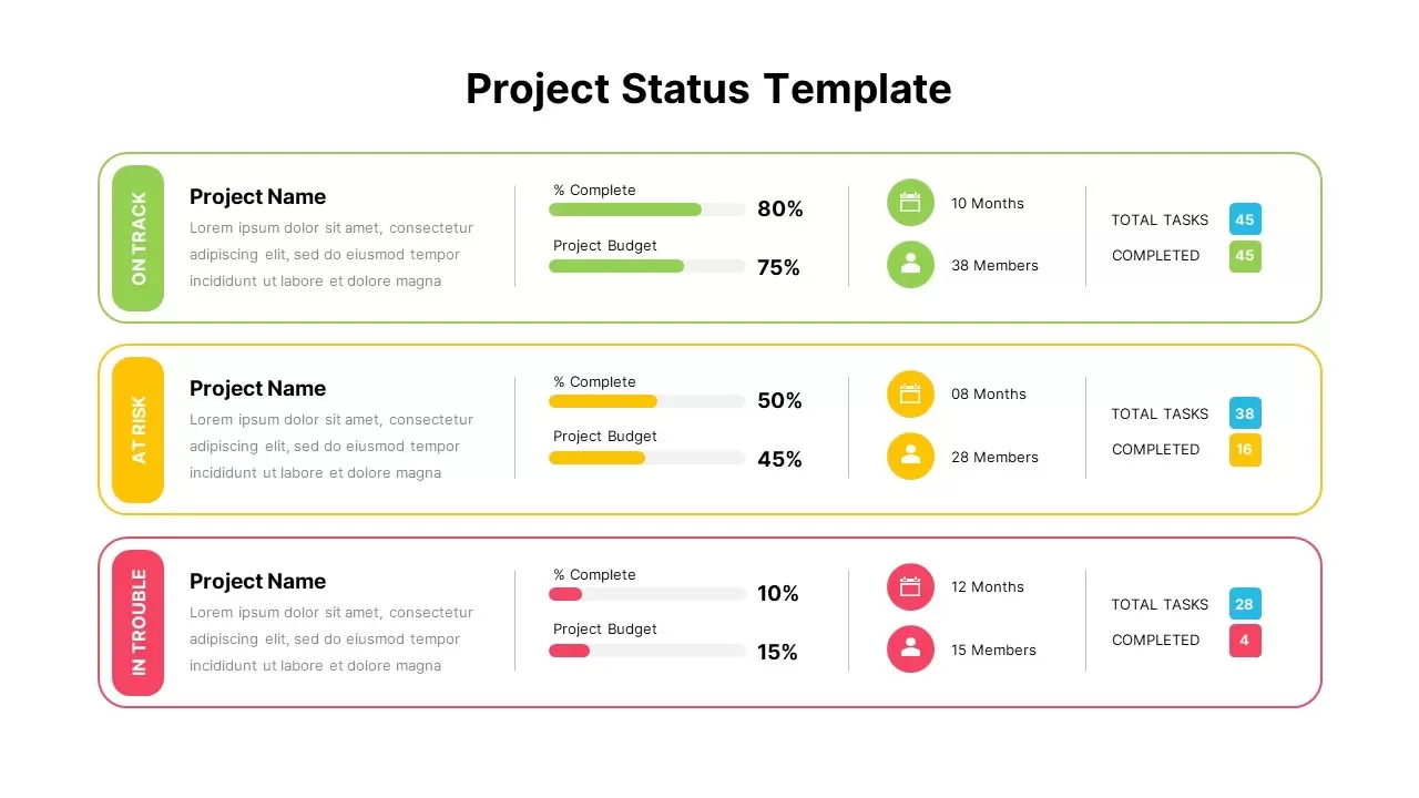
Color-Coded Project Status Template for PowerPoint & Google Slides
Project Status
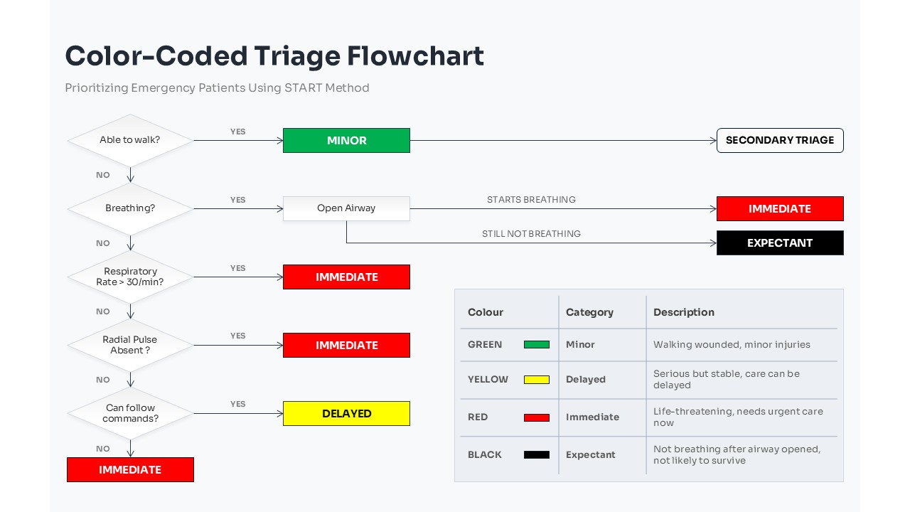
Color-Coded Triage Flowchart PowerPoint Template
Flow Charts
Doodle Multi Presentation Template for PowerPoint & Google Slides
Company Profile
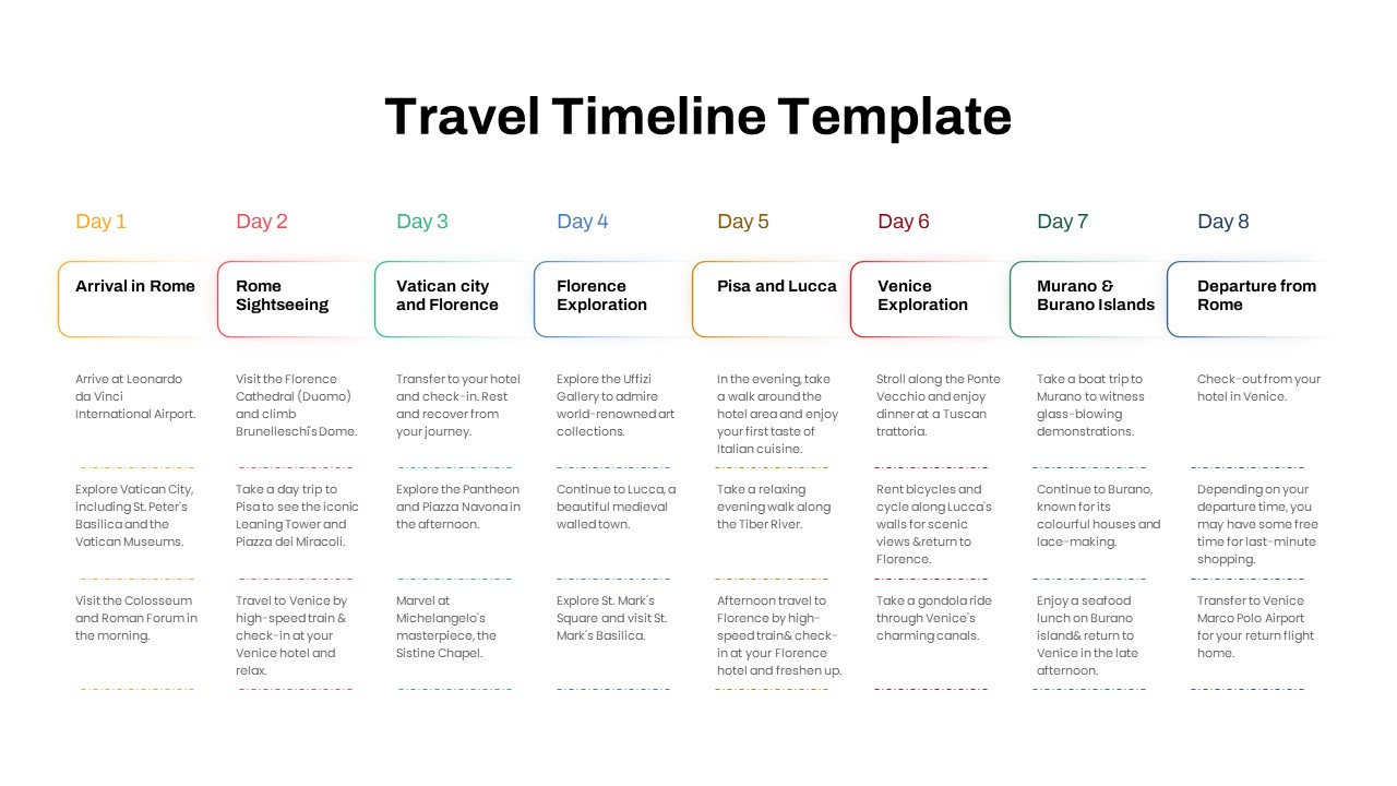
Free Travel Timeline Template for PowerPoint
Timeline
Free