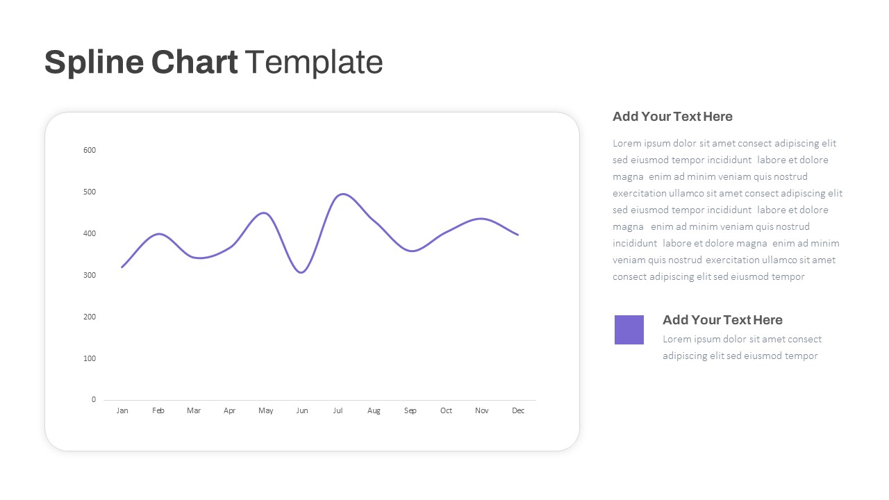
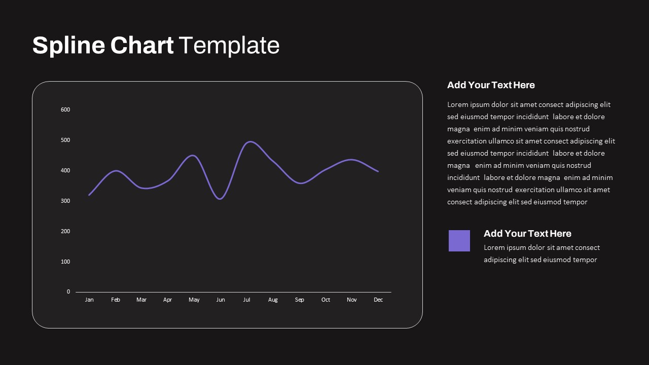
Multipurpose Spline Chart Data Trend Template for PowerPoint & Google Slides
Description
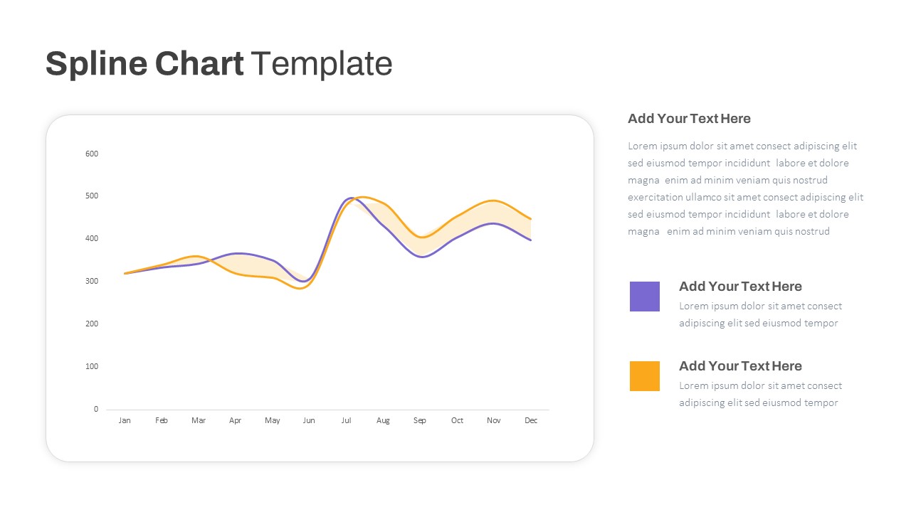
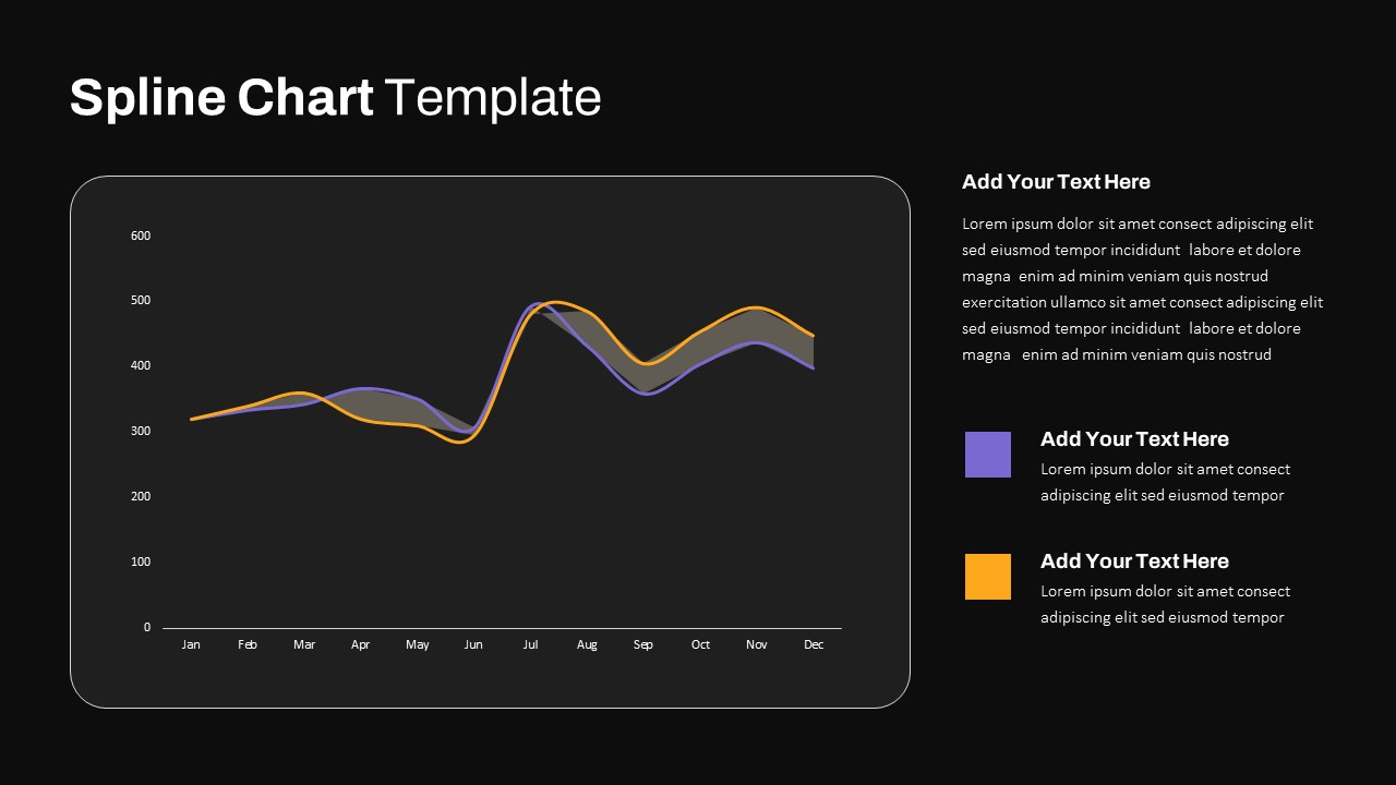
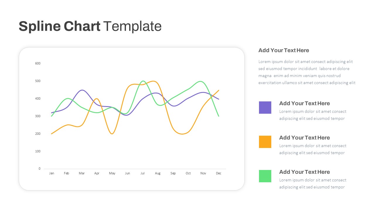
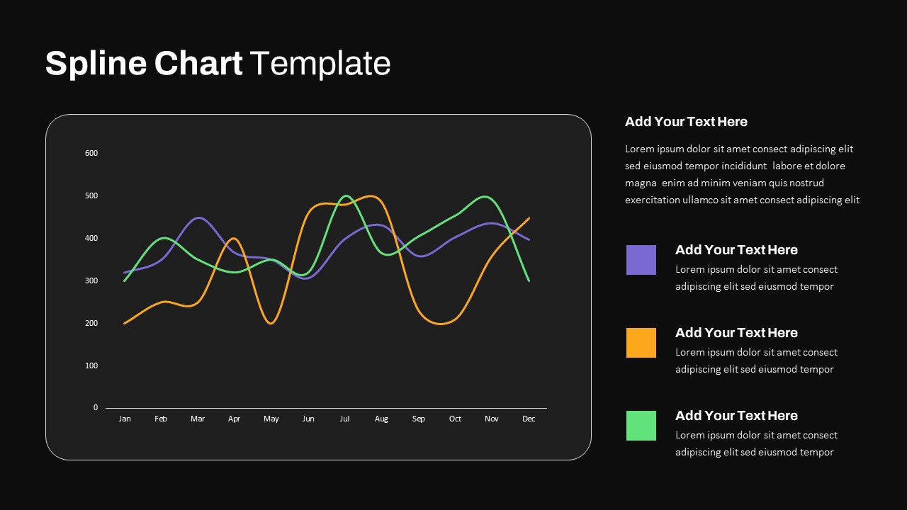
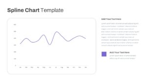
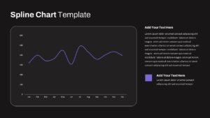
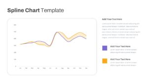
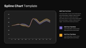
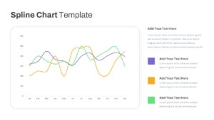
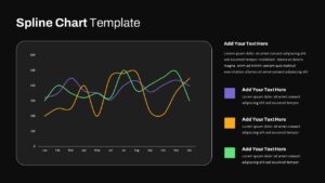
Leverage this multipurpose spline chart template to visualize data trends, seasonal fluctuations, and performance metrics with smooth, curved line segments. The pack includes three layouts: a single-series chart for a focused monthly overview, a dual-series overlay with shaded divergence areas, and a triple-series comparative view to track up to three metrics simultaneously. Each slide features a rounded-corner chart frame, subtle gridlines, and modern sans-serif typography, complemented by editable legends and color-coded data markers. Built on master slides for PowerPoint and Google Slides, you can resize vector shapes, swap theme colors, adjust axis scales, or update data in seconds. A clean white background and minimal drop shadows ensure a distraction-free display that adapts seamlessly to corporate or creative branding. Intuitive placeholder controls and alignment guides accelerate slide creation under tight deadlines, while high-resolution elements maintain pixel-perfect clarity across displays and print. Ideal for quarterly reports, sales forecasts, website traffic analysis, or any time-series presentation, this spline chart toolkit empowers you to communicate complex trends clearly and persuasively.
Who is it for
Marketing analysts, financial planners, project managers, business intelligence teams, and data journalists will benefit from these spline chart layouts when presenting time-based data trends, KPI progress, or comparative performance analyses.
Other Uses
Repurpose these slides for revenue projections, budget vs. actual comparisons, customer engagement metrics, product usage trends, or resource planning forecasts. Duplicate and recolor series to suit any multi-metric narrative.
Login to download this file

Item ID
SB03792
Related Templates

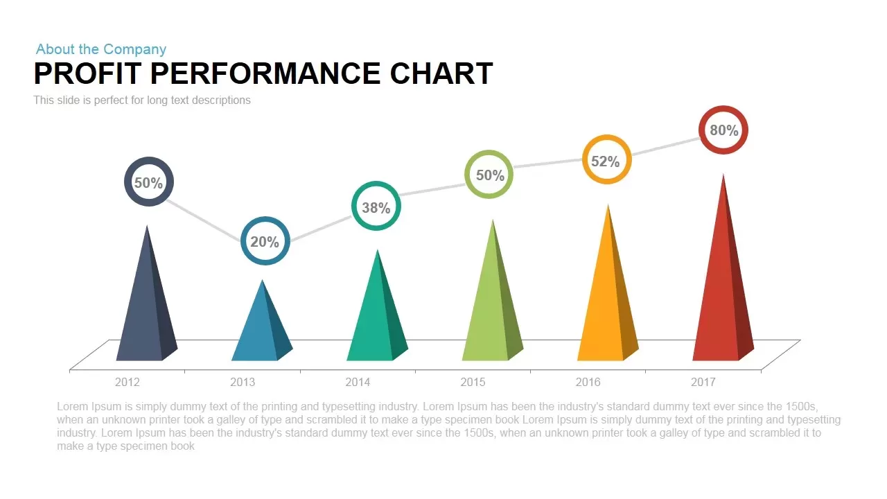
Profit Performance Trend Chart Template for PowerPoint & Google Slides
Finance
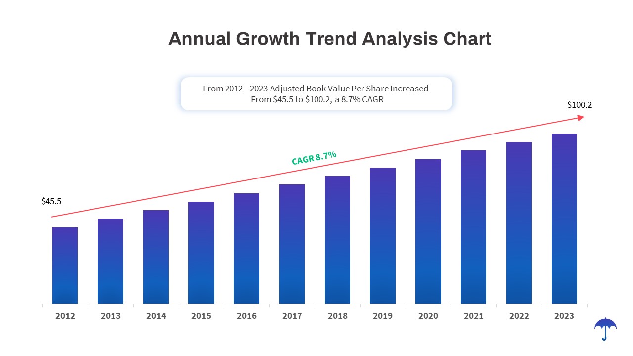
Annual Growth Trend Analysis Chart template for PowerPoint & Google Slides
Business Report

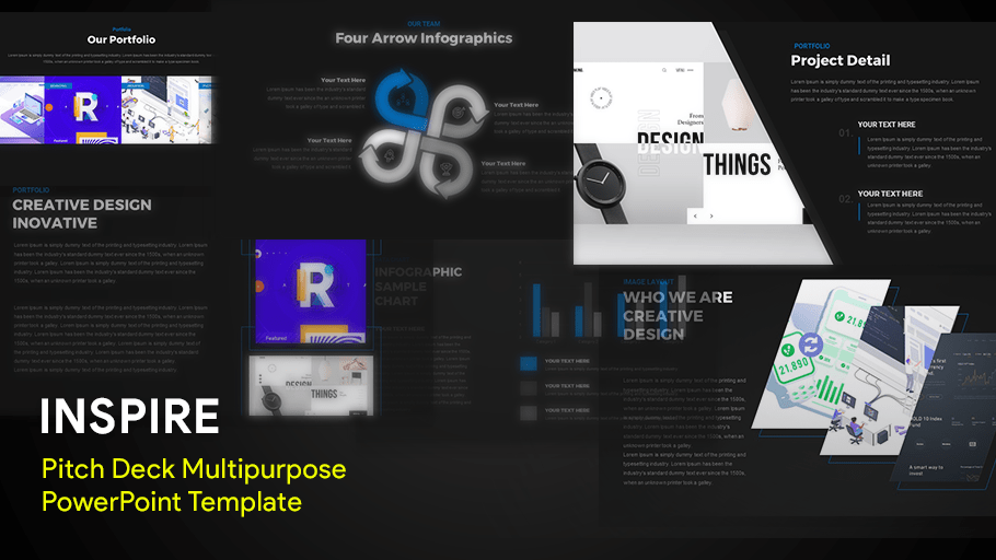
Inspire Multipurpose Creative Deck PowerPoint Template for PowerPoint & Google Slides
Pitch Deck
Multipurpose Presentation Title Slide Template for PowerPoint & Google Slides
Pitch Deck
Multipurpose Business Deck template for PowerPoint & Google Slides
Pitch Deck
Pastel Multipurpose Presentation Deck Template for PowerPoint & Google Slides
Decks
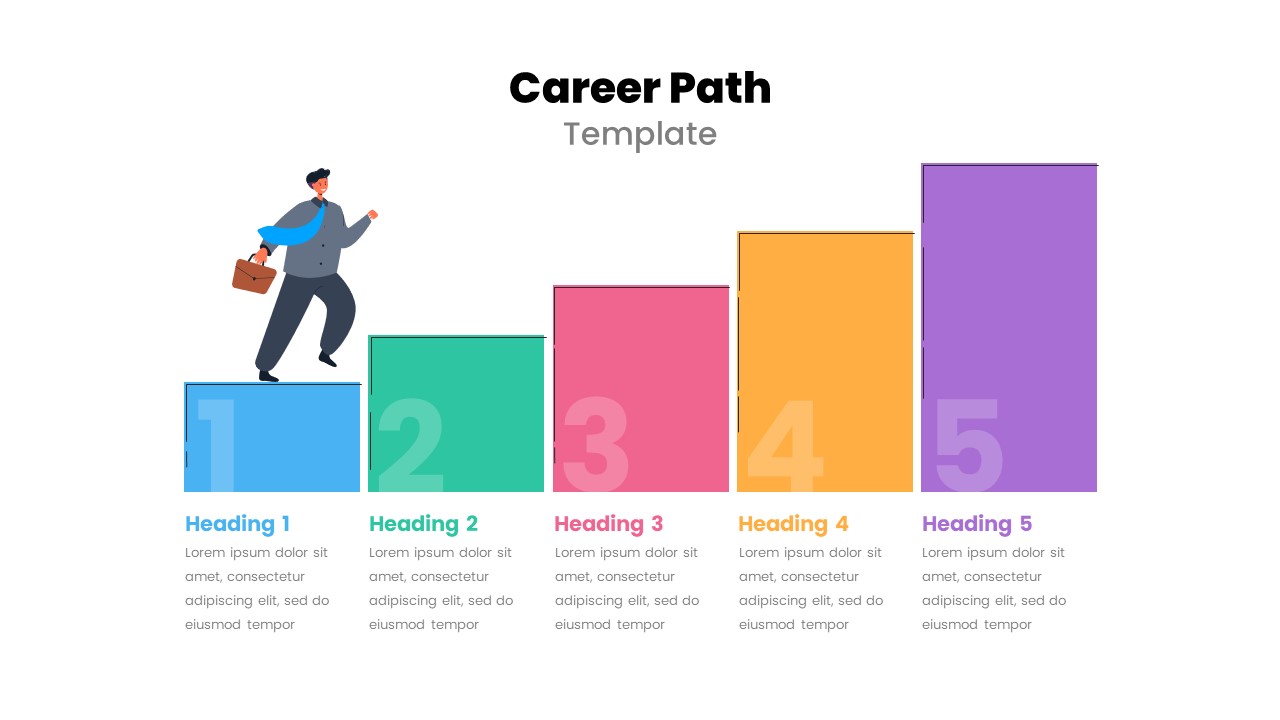
Free Career Path Template for PowerPoint
Roadmap
Free
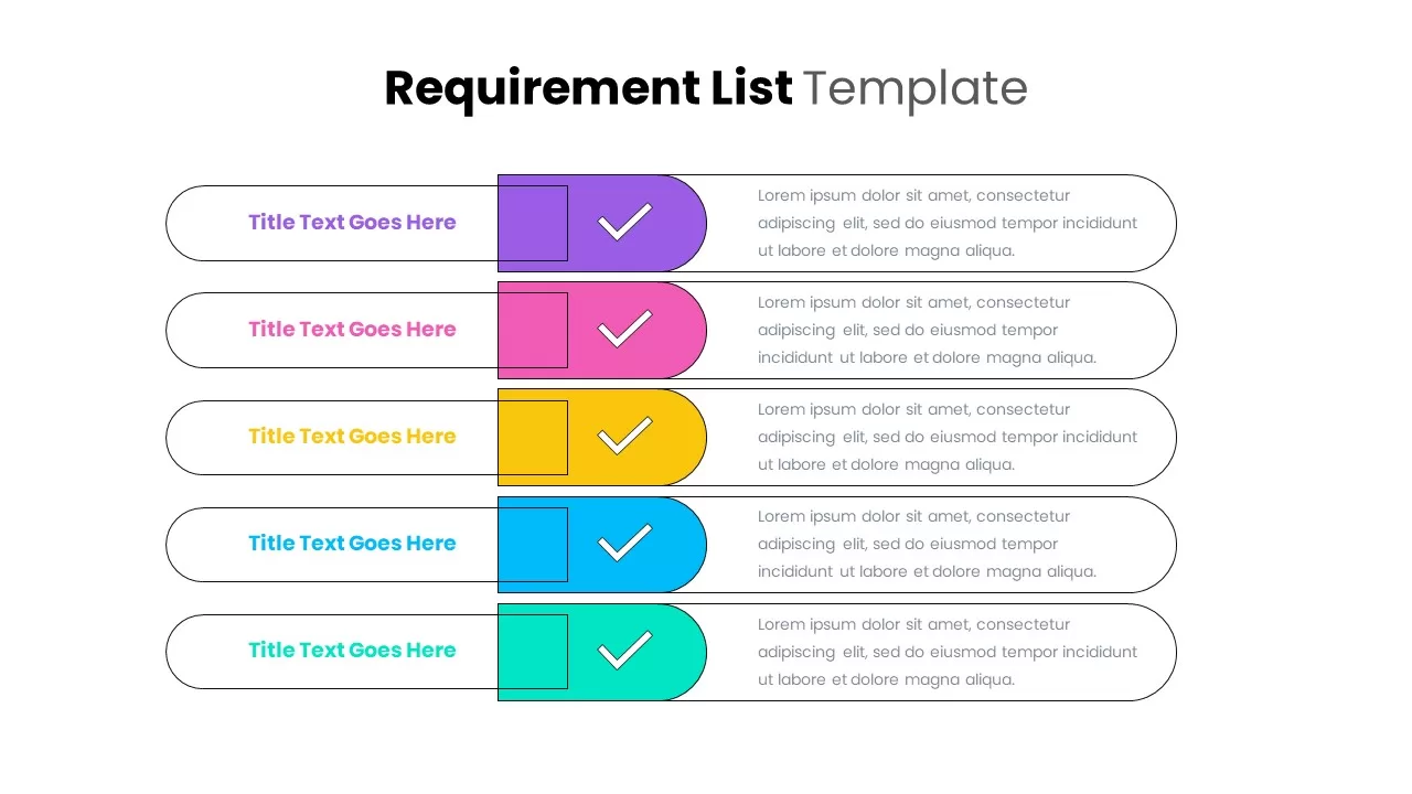
Multipurpose Requirement List Slide Set Template for PowerPoint & Google Slides
Infographics

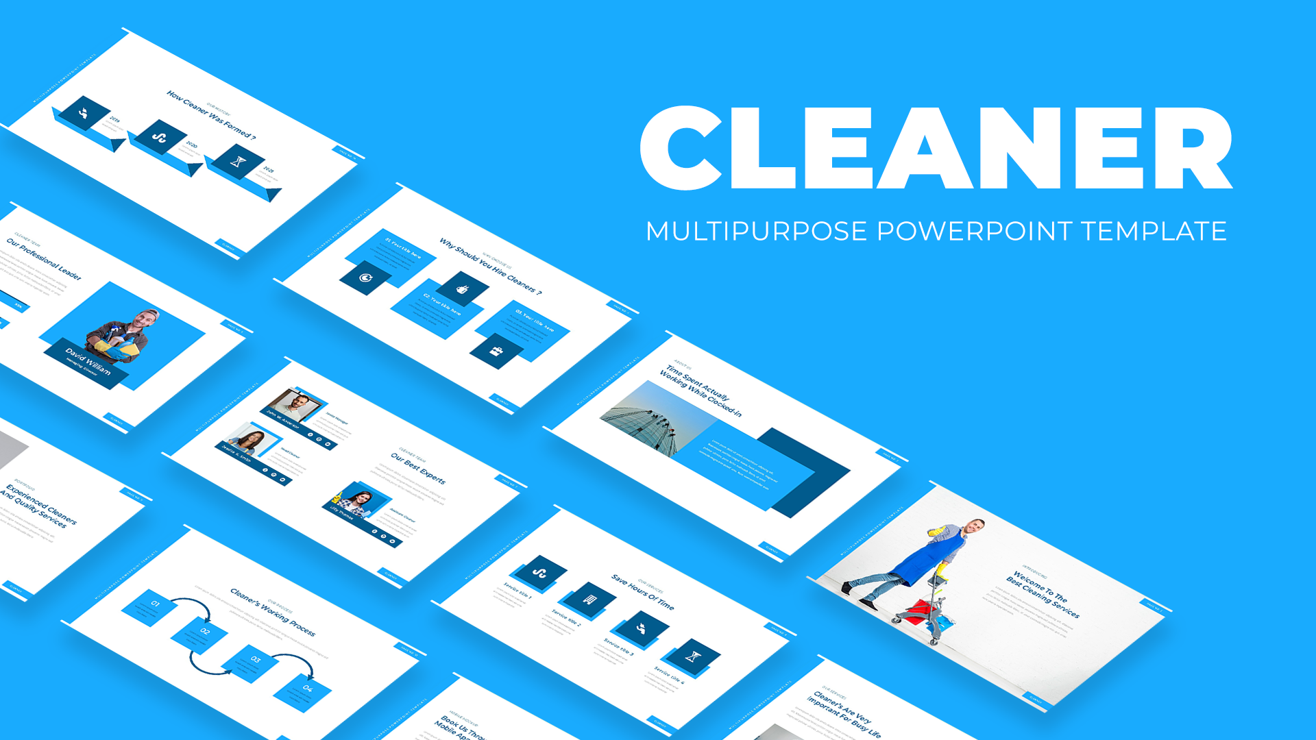
Multipurpose Cleaning Services Pitch Deck Template for PowerPoint & Google Slides
Marketing
Free Modern Multipurpose Pitch Deck Template for PowerPoint & Google Slides
Pitch Deck
Free

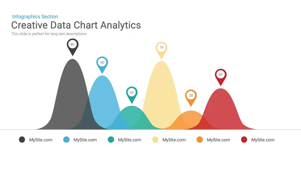
Creative data chart Analytics Presentation Template
Charts
Mobile Data Analysis Chart template for PowerPoint & Google Slides
Charts
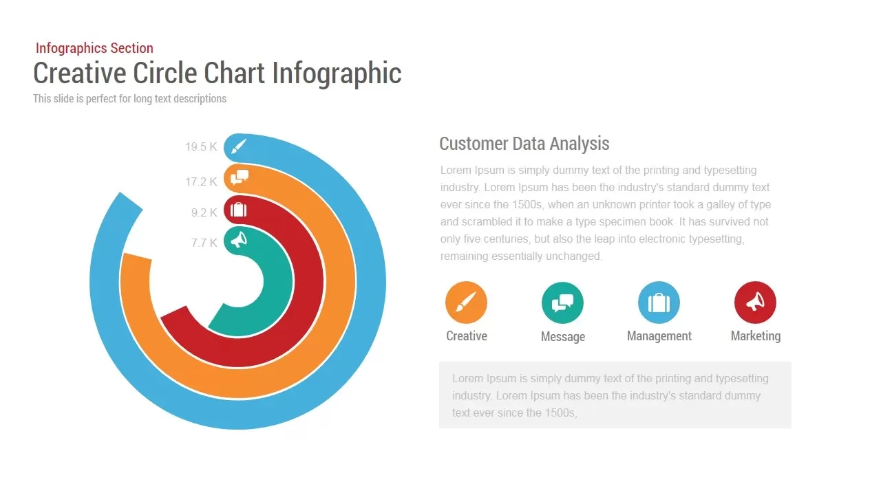
Circle Chart Data template for PowerPoint & Google Slides
Pie/Donut
Creative Data Analysis Bar Chart template for PowerPoint & Google Slides
Bar/Column
3D Bar Chart Data Infographics Template for PowerPoint & Google Slides
Bar/Column
Pencil Bar Chart Data Analysis Template for PowerPoint & Google Slides
Bar/Column
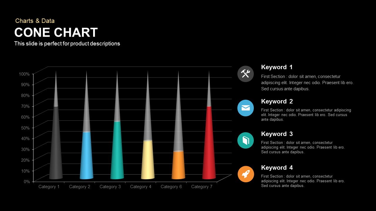
3D Cone Chart Data Visualization template for PowerPoint & Google Slides
Bar/Column
Tornado Chart Data Comparison Slide Template for PowerPoint & Google Slides
Bar/Column
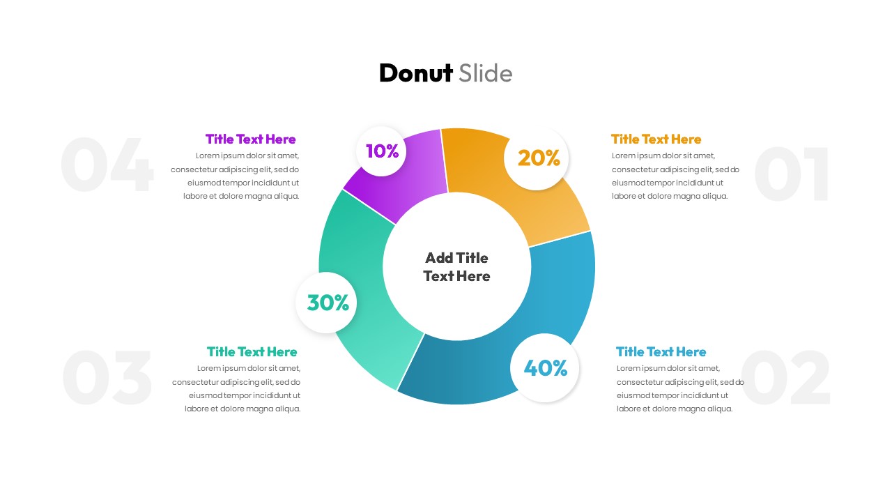
Donut Chart Data Breakdown template for PowerPoint & Google Slides
Pie/Donut
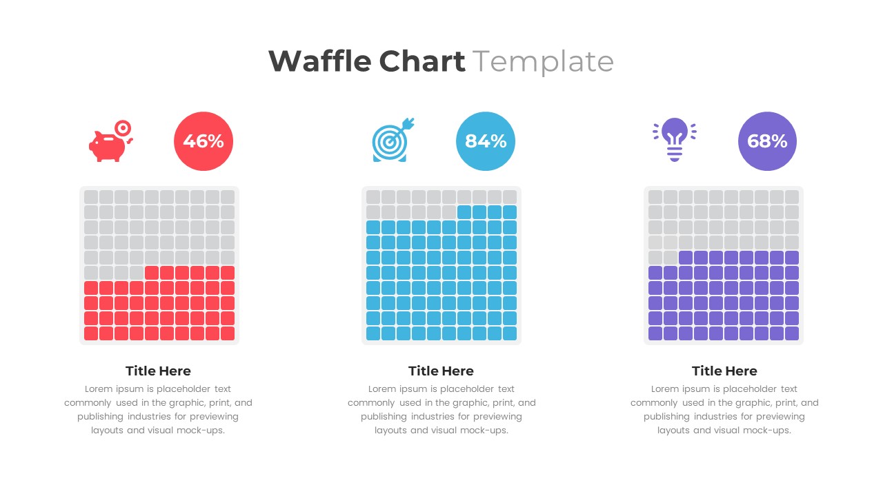
Waffle Chart Data Visualization Template for PowerPoint & Google Slides
Comparison Chart
Free Stacked Column Chart Data Visualization Template for PowerPoint & Google Slides
Bar/Column
Free
Simple Bar Chart Data Visualization Template for PowerPoint & Google Slides
Bar/Column
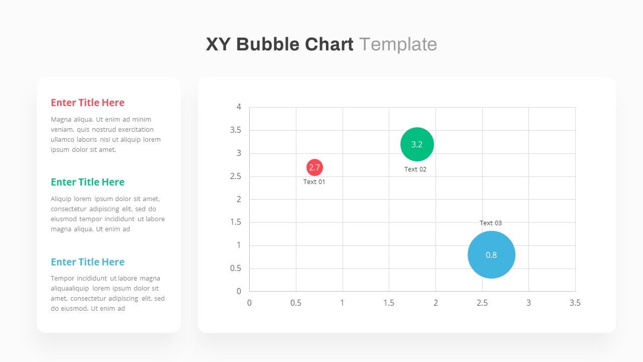
XY Bubble Chart Data Visualization Template for PowerPoint & Google Slides
Comparison Chart
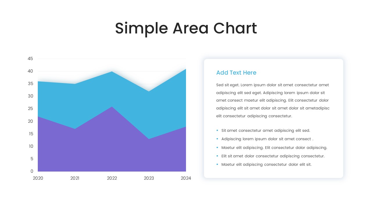
Simple Area Chart Data Trends Analysis Template for PowerPoint & Google Slides
Comparison Chart
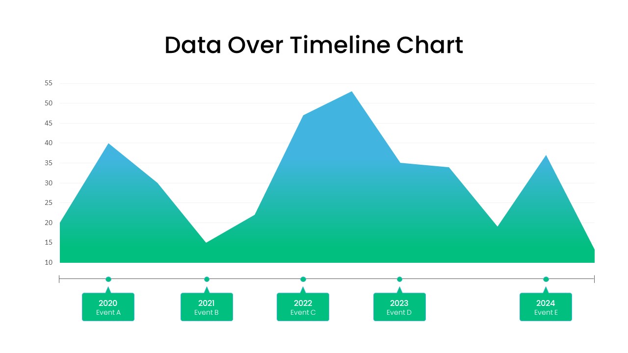
Data Over Time Line Chart template for PowerPoint & Google Slides
Charts
Waterfall Chart Data Visualization Template for PowerPoint & Google Slides
Comparison Chart
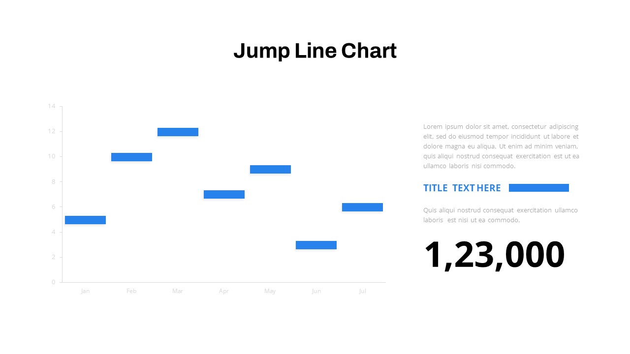
Interactive Jump Line Data Chart Template for PowerPoint & Google Slides
Comparison Chart
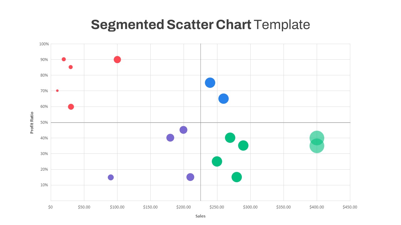
Segmented Scatter Chart Data Visualization Template for PowerPoint & Google Slides
Business Strategy
Data Analysis Bar Chart with Insights Template for PowerPoint & Google Slides
Bar/Column
Free
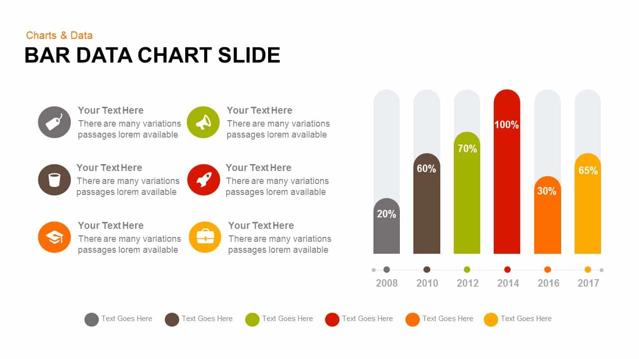
Bar Data Chart Slide for PowerPoint & Google Slides
Bar/Column
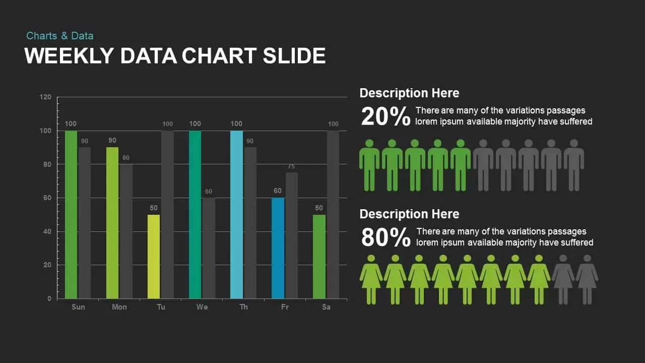
Weekly Data Chart Slide for PowerPoint & Google Slides
Comparison Chart

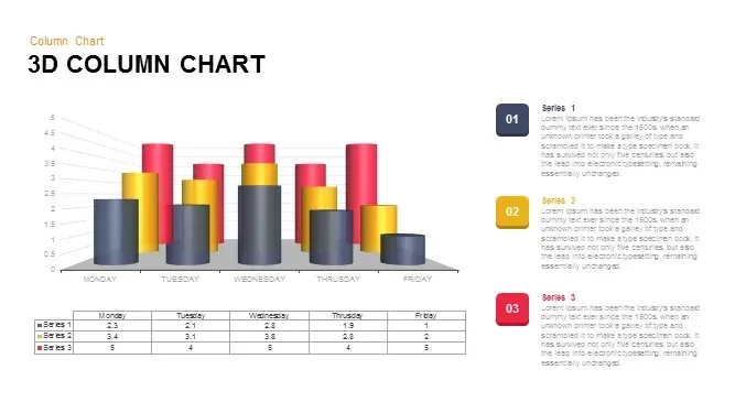
3D Column Chart with Data Table for PowerPoint & Google Slides
Bar/Column

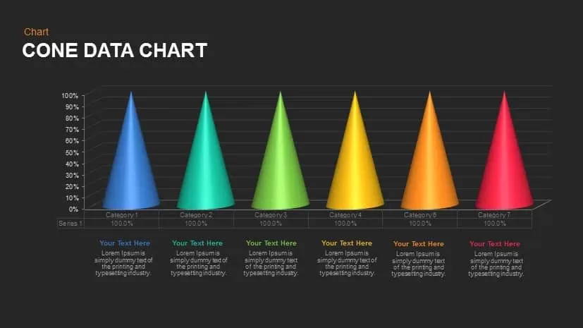
Cone Data Chart for PowerPoint & Google Slides
Charts
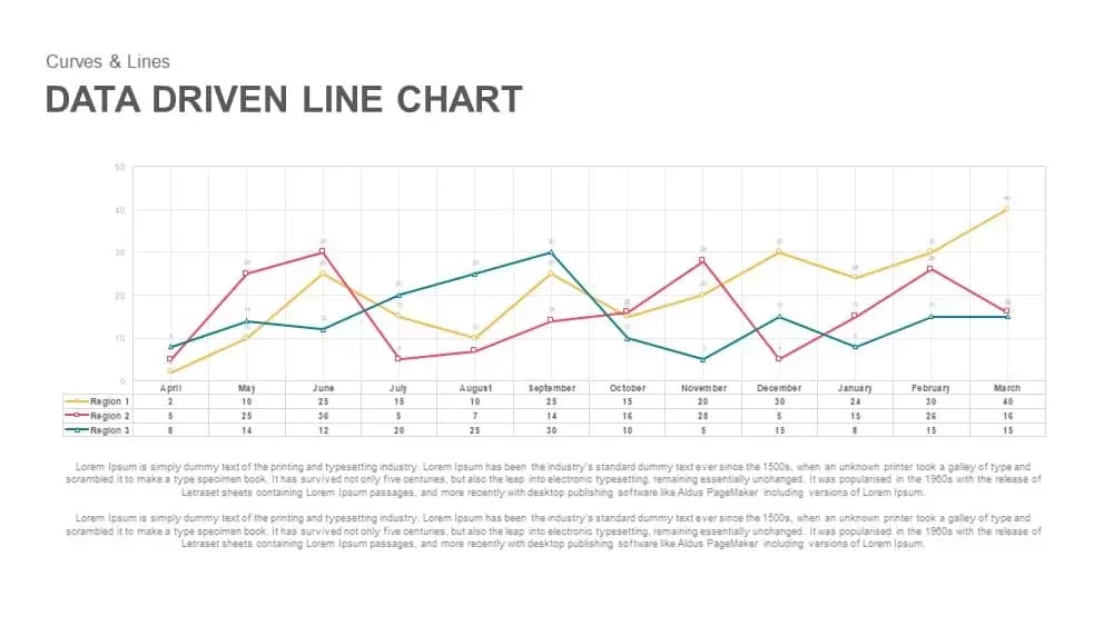
Data-Driven Line Chart Diagram Template for PowerPoint
Comparison Chart
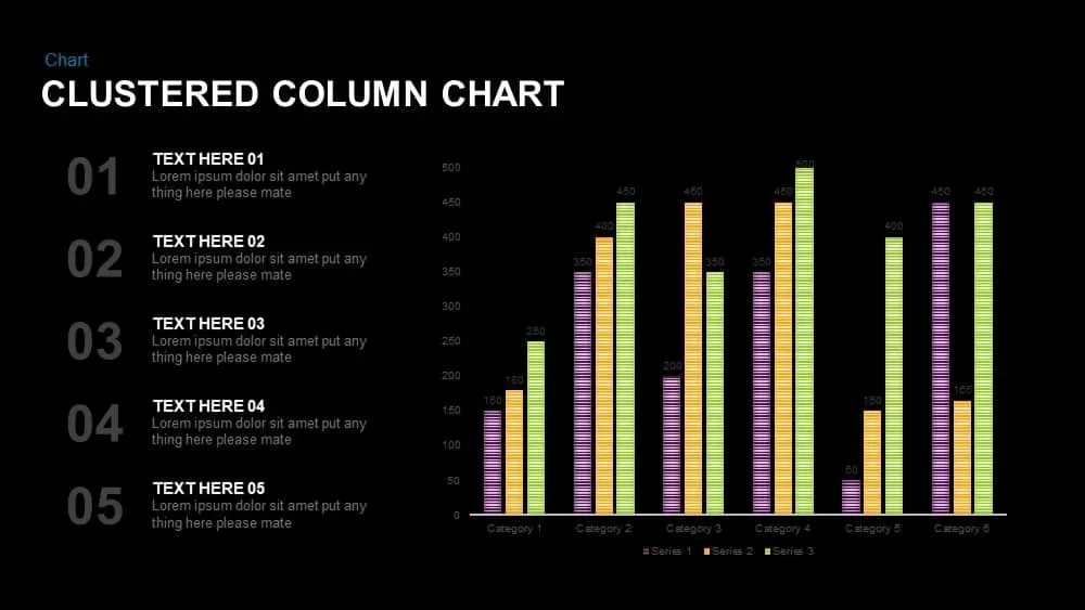
Clustered Column Chart Data Analysis Template for PowerPoint
Bar/Column
Data Science PowerPoint Presentation Template for PowerPoint & Google Slides
Pitch Deck
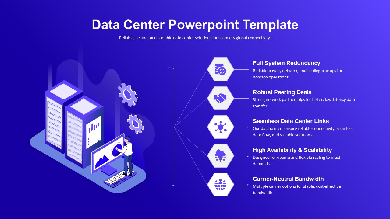
Data Center PowerPoint Template for PowerPoint & Google Slides
Information Technology
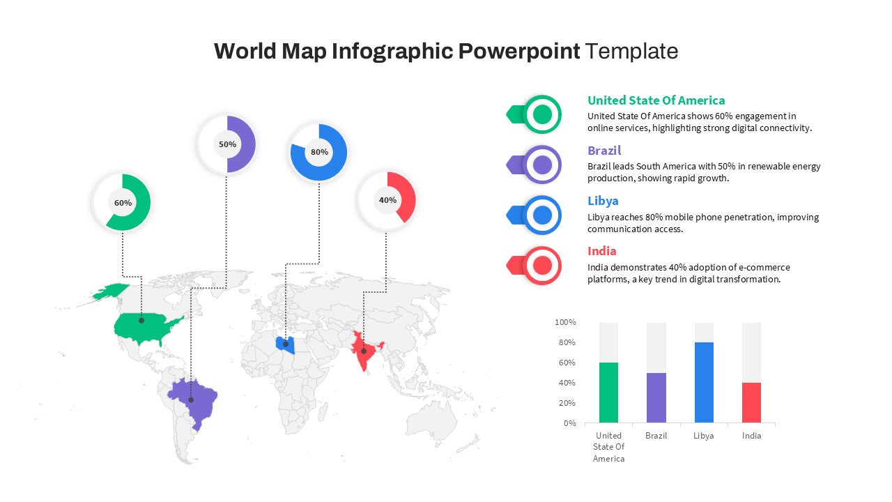
World Map Data template for PowerPoint & Google Slides
World Maps
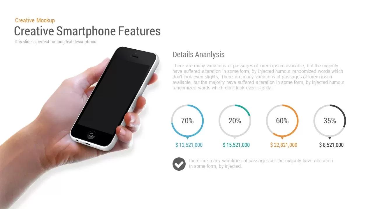
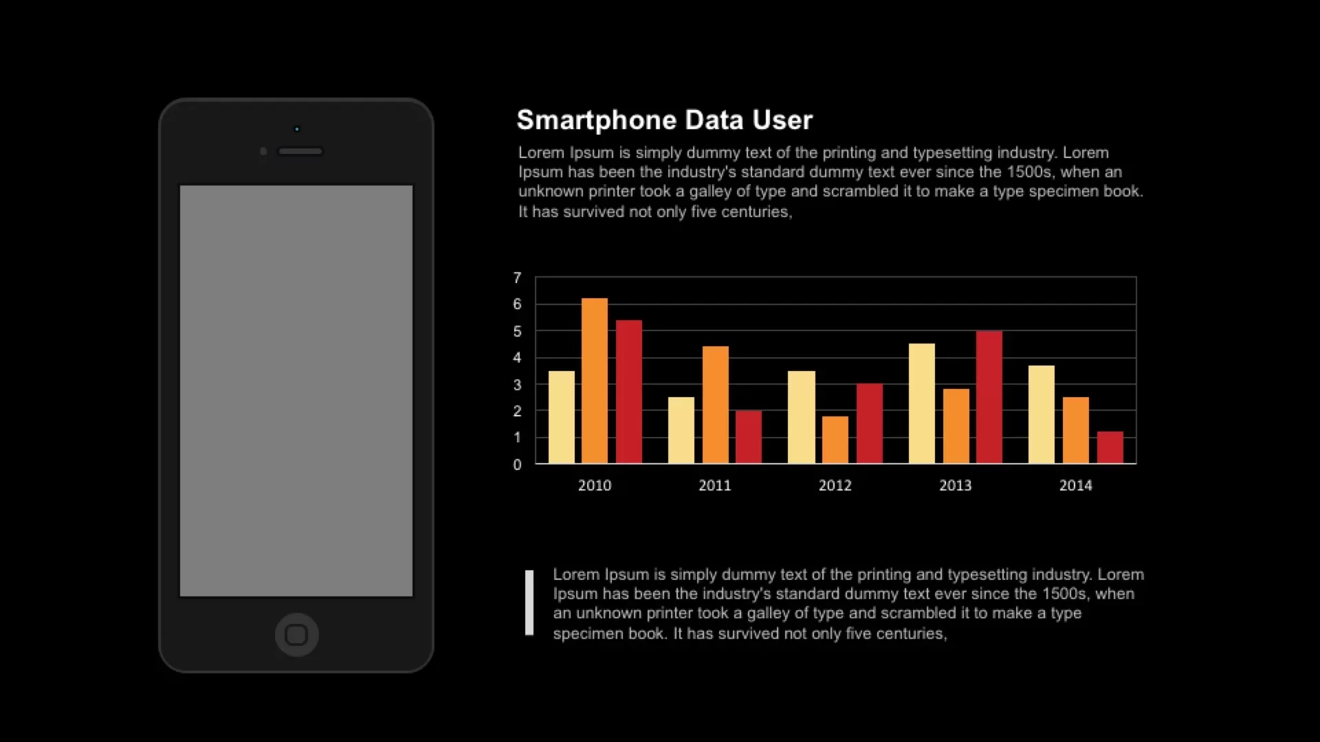
Smartphone Data User template for PowerPoint & Google Slides
Charts
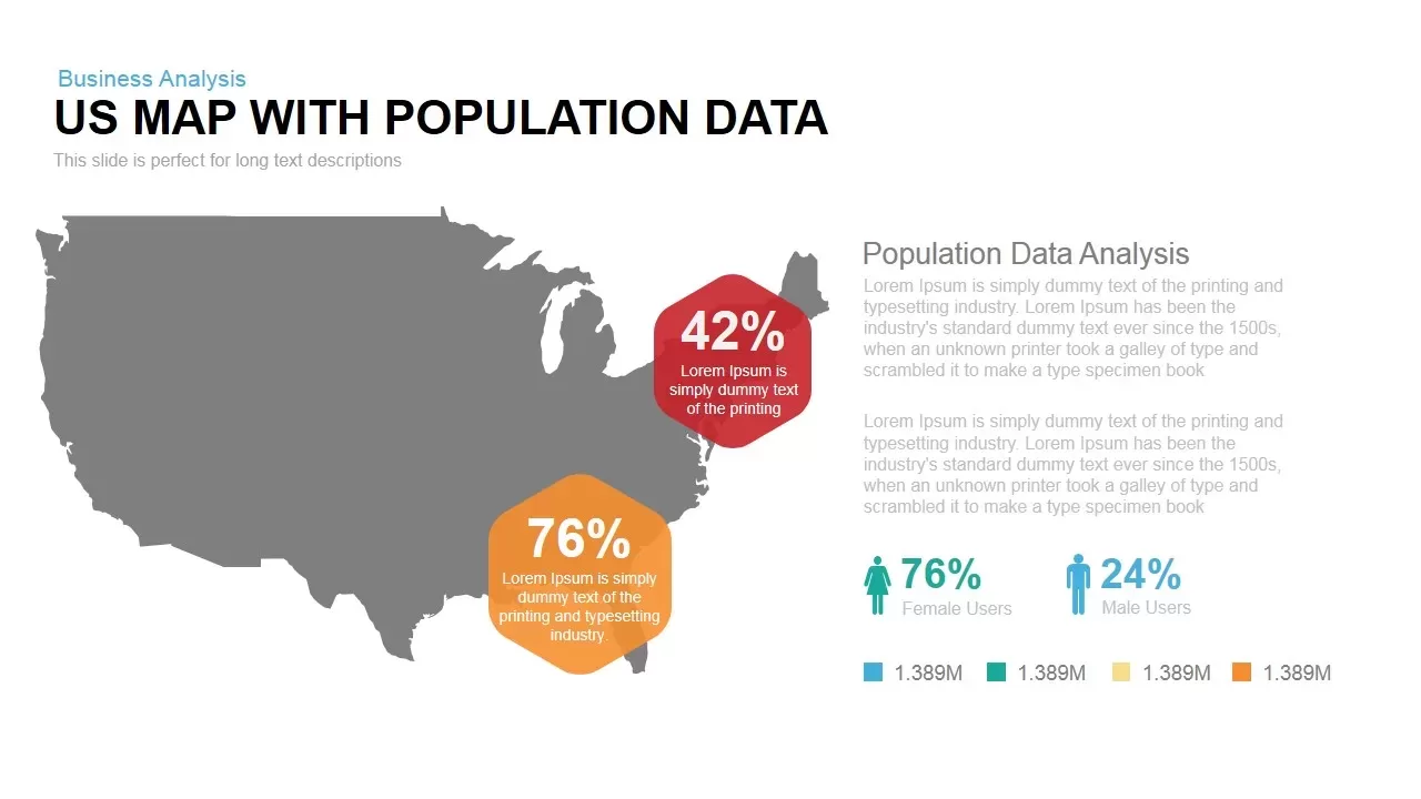
Interactive US Population Data Map Slide Template for PowerPoint & Google Slides
World Maps
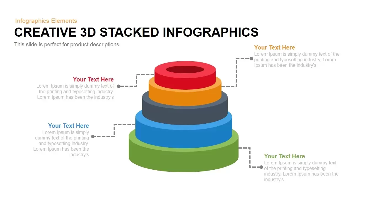
3D Stacked Infographic Layers Data Template for PowerPoint & Google Slides
Pyramid
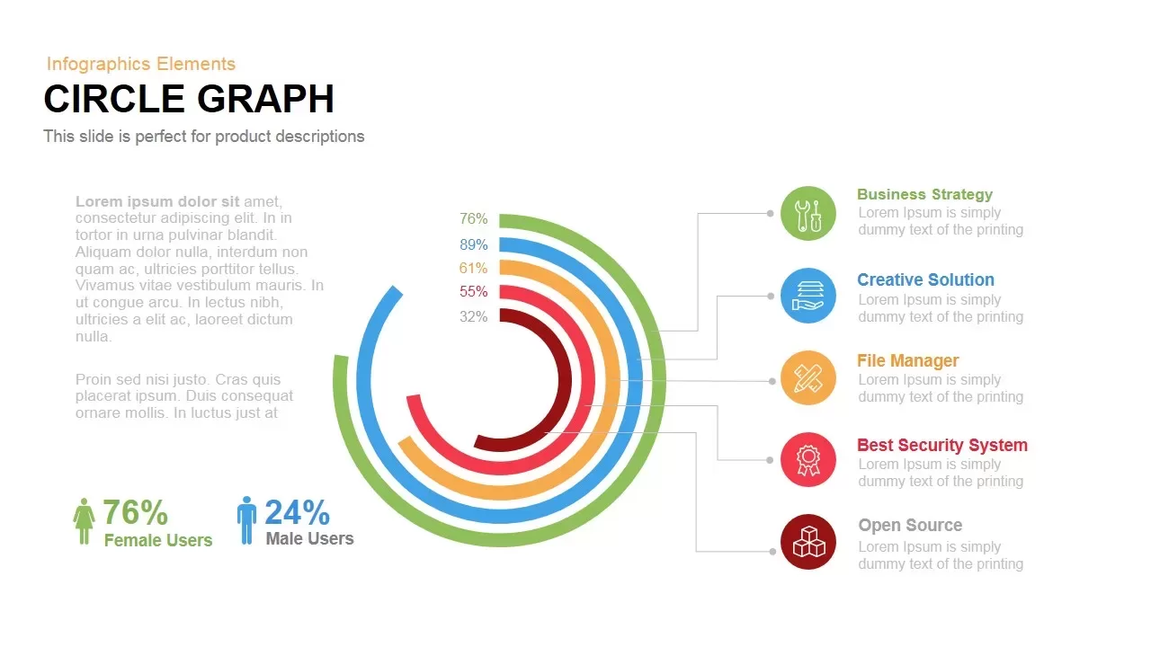
Circle Graph Data Visualization Template for PowerPoint & Google Slides
Circular
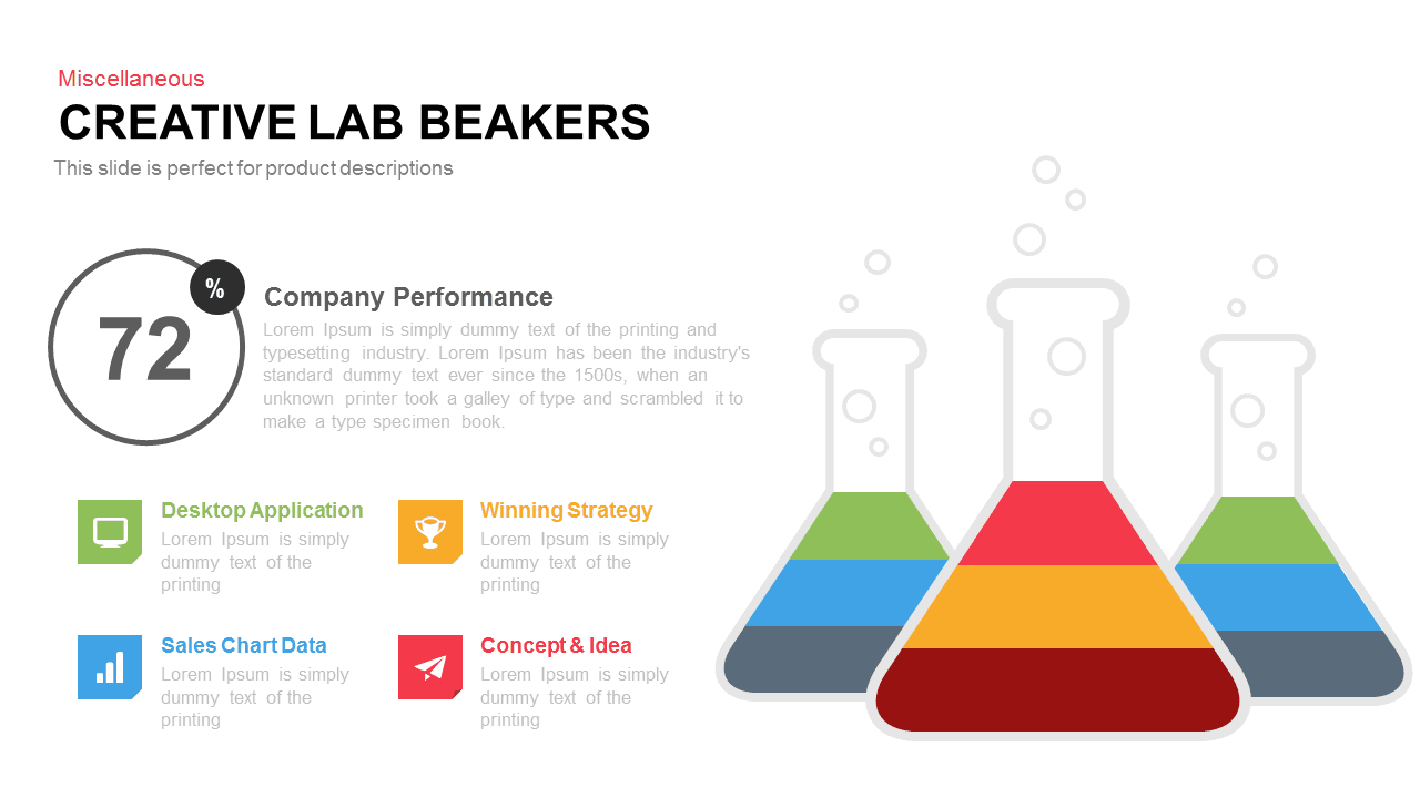
Creative Lab Beakers Data Infographic template for PowerPoint & Google Slides
Infographics

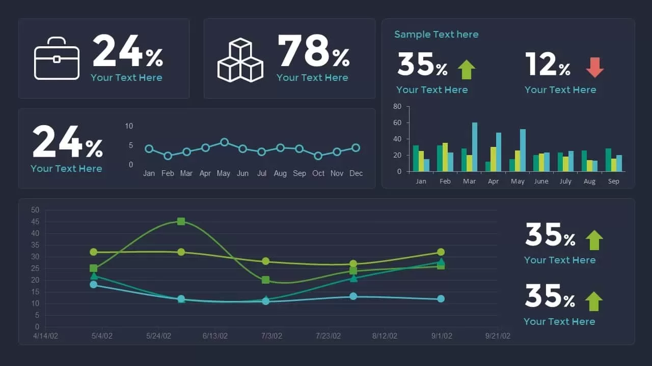
Dynamic Data Dashboard Infographic Template for PowerPoint & Google Slides
Bar/Column
Data Analytics Dashboard Design template for PowerPoint & Google Slides
Bar/Column
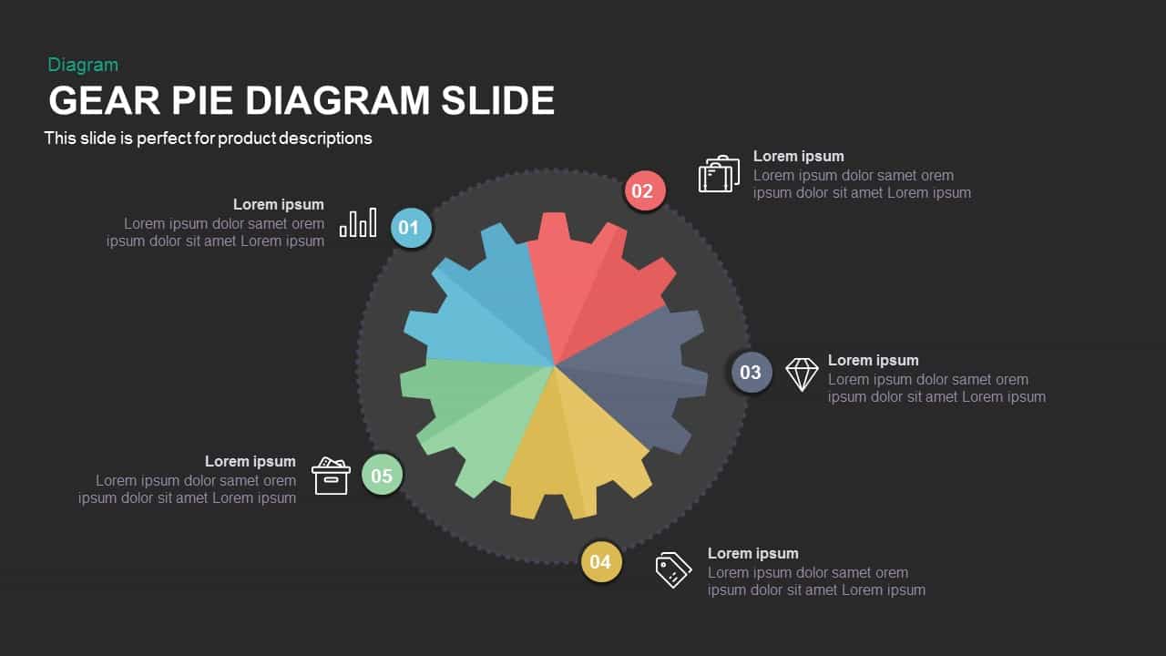
Gear Pie Diagram Data Visualization Template for PowerPoint & Google Slides
Pie/Donut
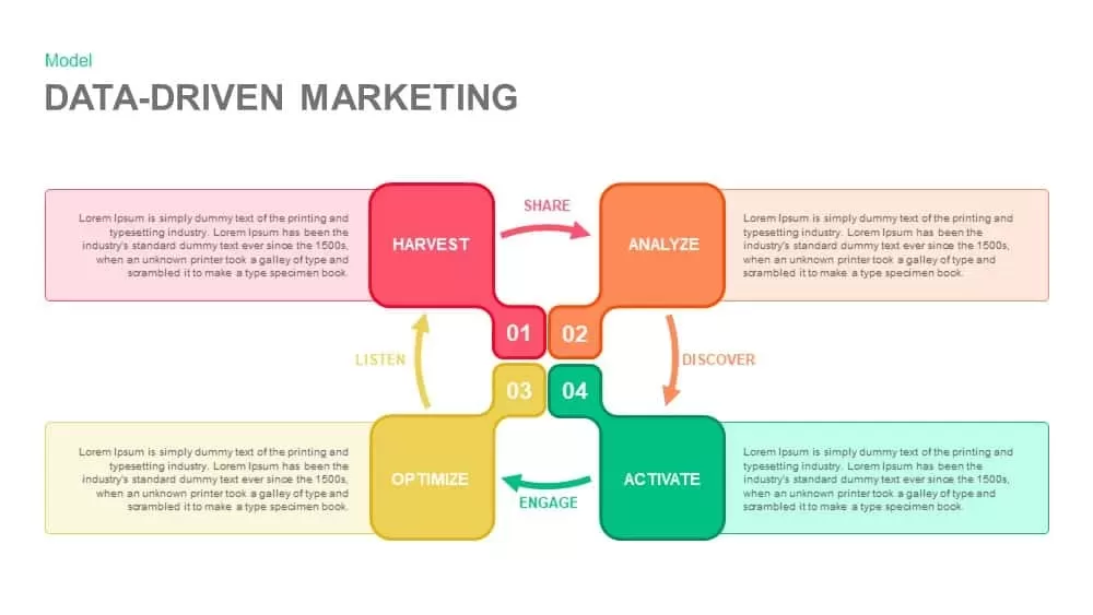
Data-Driven Marketing Cycle Diagram Template for PowerPoint & Google Slides
Customer Journey
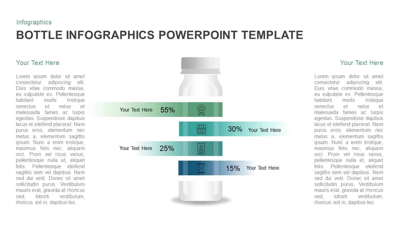
Bottle Data Percentage Infographic Template for PowerPoint & Google Slides
Infographics
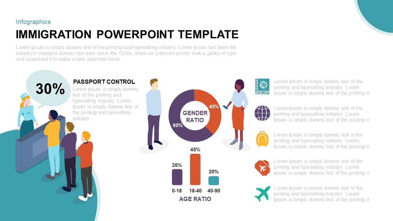
Immigration Data Dashboard Template for PowerPoint & Google Slides
Bar/Column
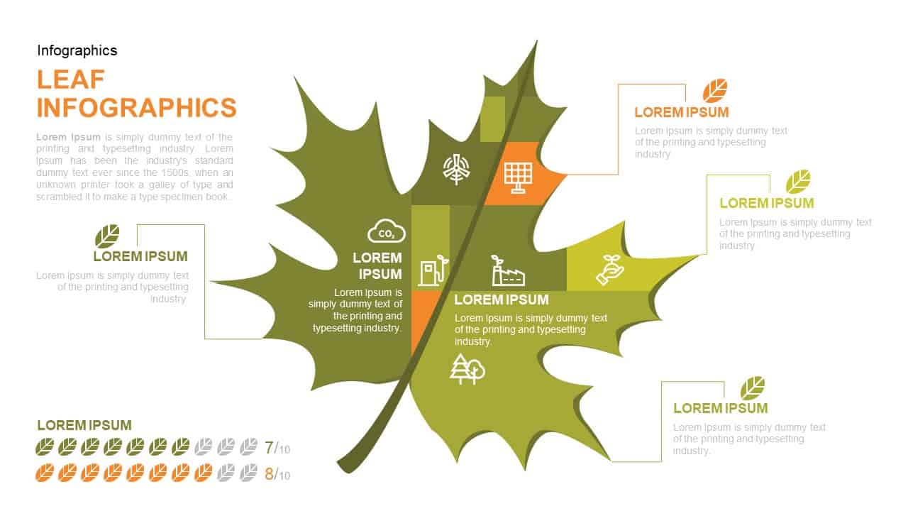
Leaf Infographic Data Visualization Template for PowerPoint & Google Slides
Infographics
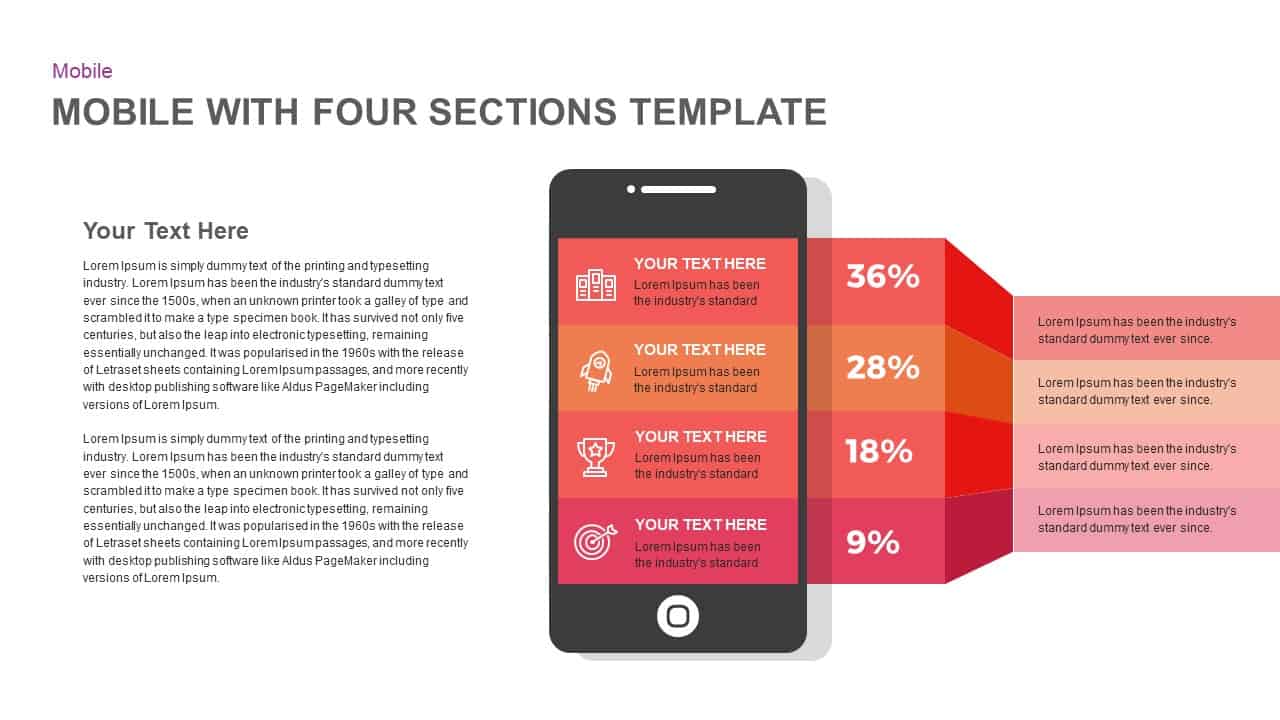
Mobile Infographics Data Visualization Template for PowerPoint & Google Slides
Infographics
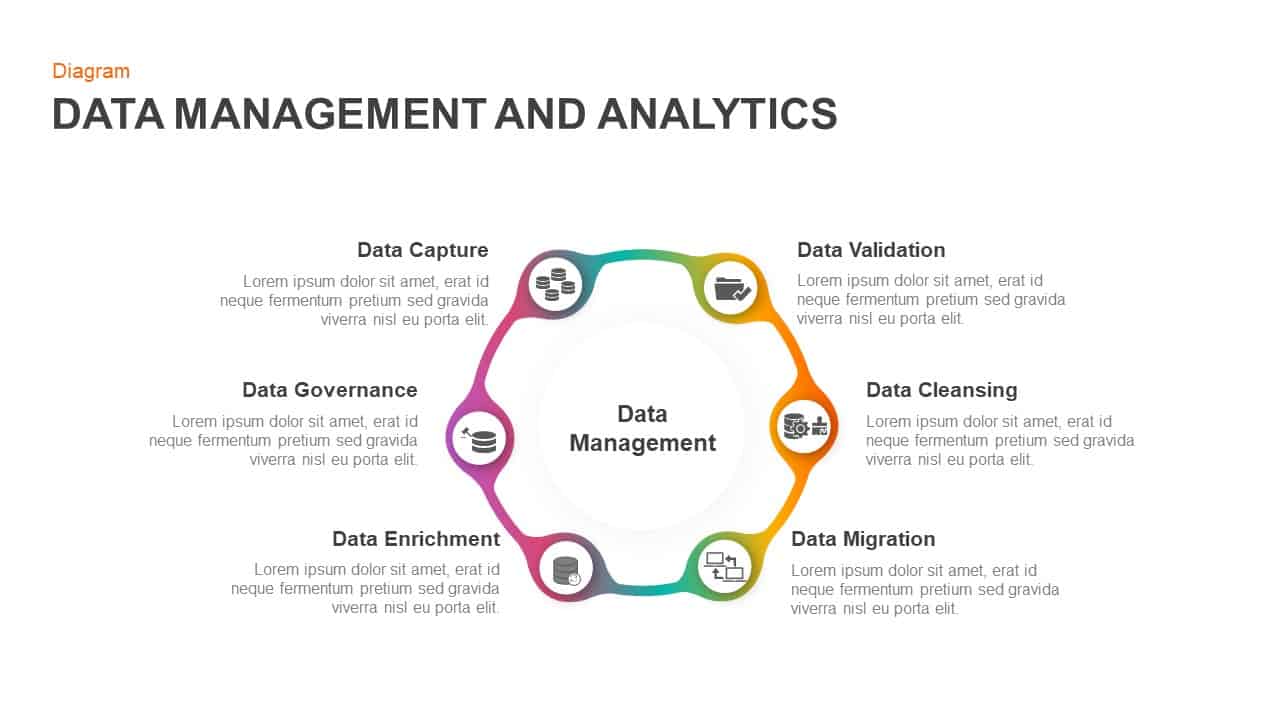
Data Management and Analytics Diagram Template for PowerPoint & Google Slides
Circular
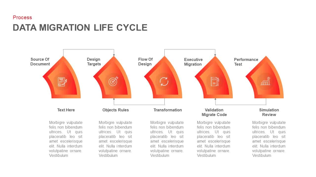
Data Migration Life Cycle Curved Diagram Template for PowerPoint & Google Slides
Process
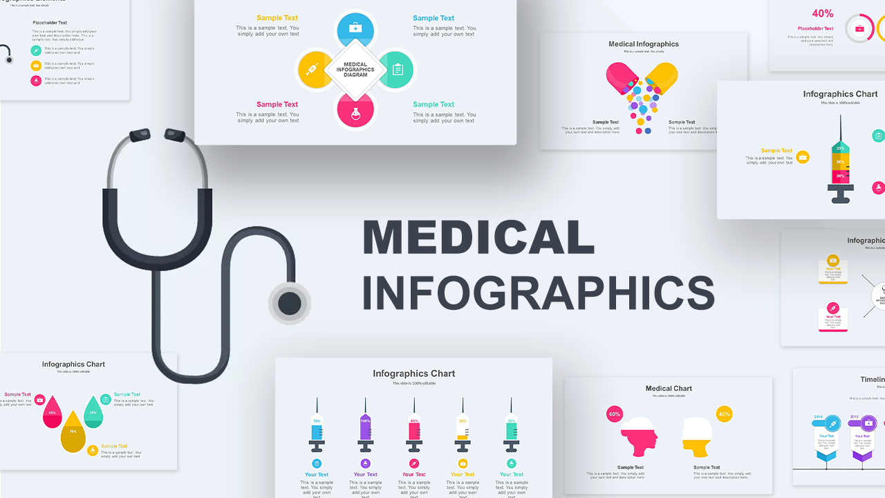
Medical Infographics Data Visualization Template for PowerPoint & Google Slides
Health
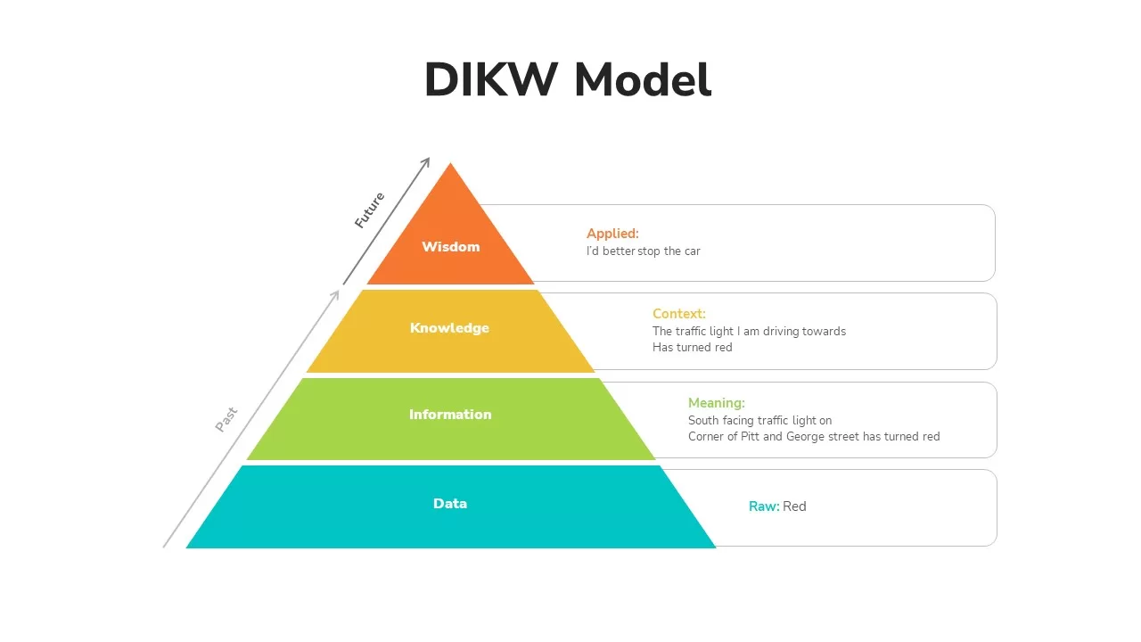
DIKW Data to Wisdom Pyramid Model Template for PowerPoint & Google Slides
Pyramid
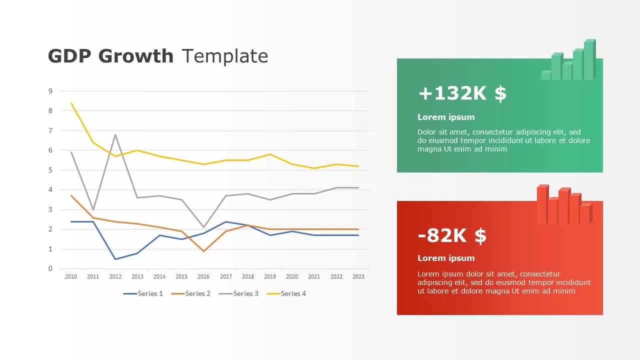
Data-driven GDP Growth Infographic Pack Template for PowerPoint & Google Slides
Infographics
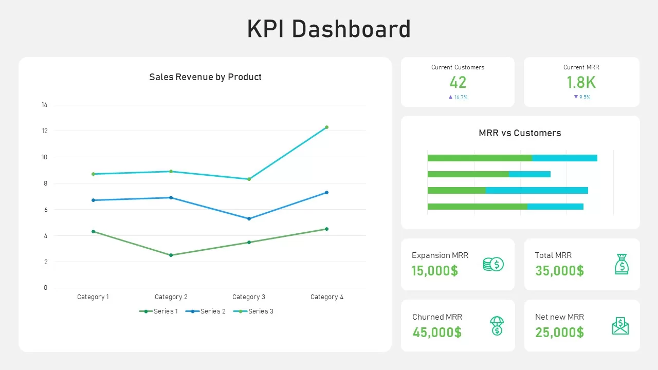
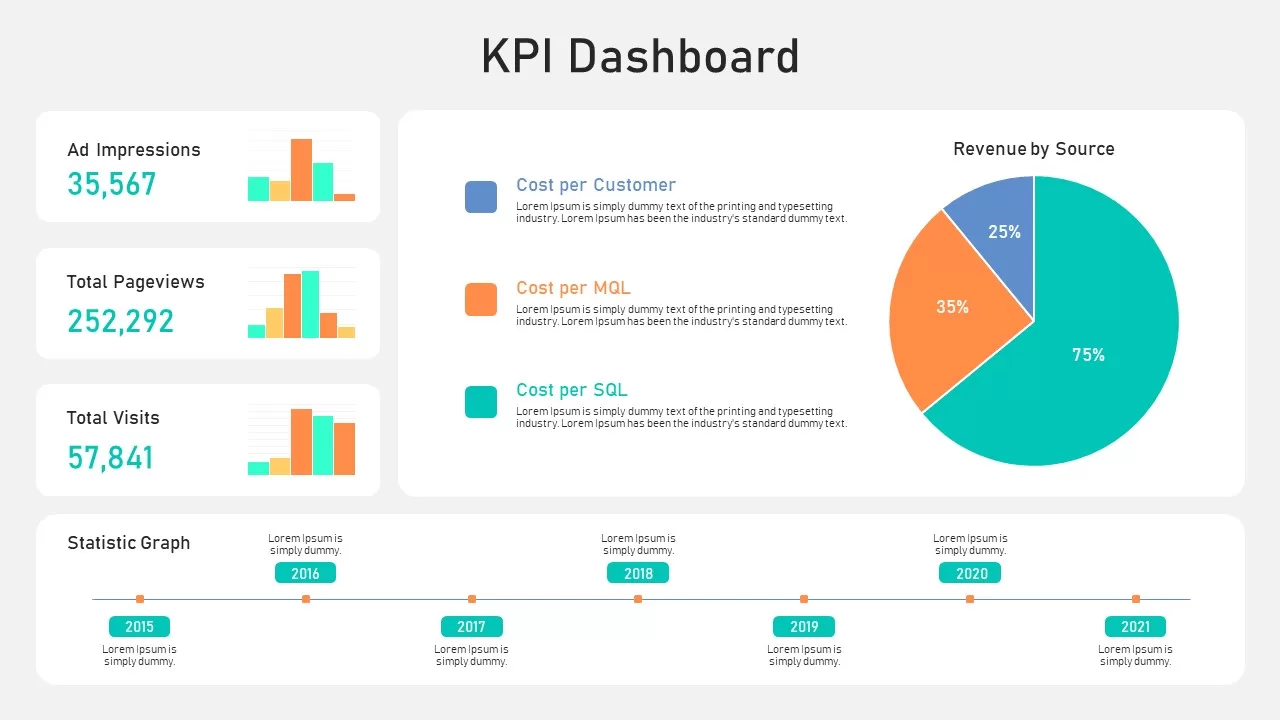
KPI Dashboard Data Visualization Template for PowerPoint & Google Slides
Bar/Column
KPI Dashboard Data Overview Slide Template for PowerPoint & Google Slides
Bar/Column
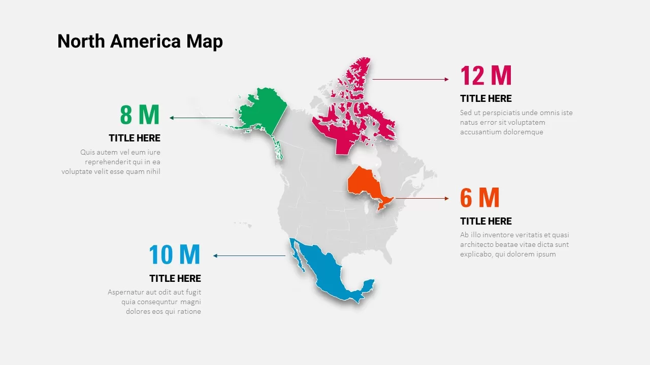
North America Data Map Callouts Template for PowerPoint & Google Slides
World Maps
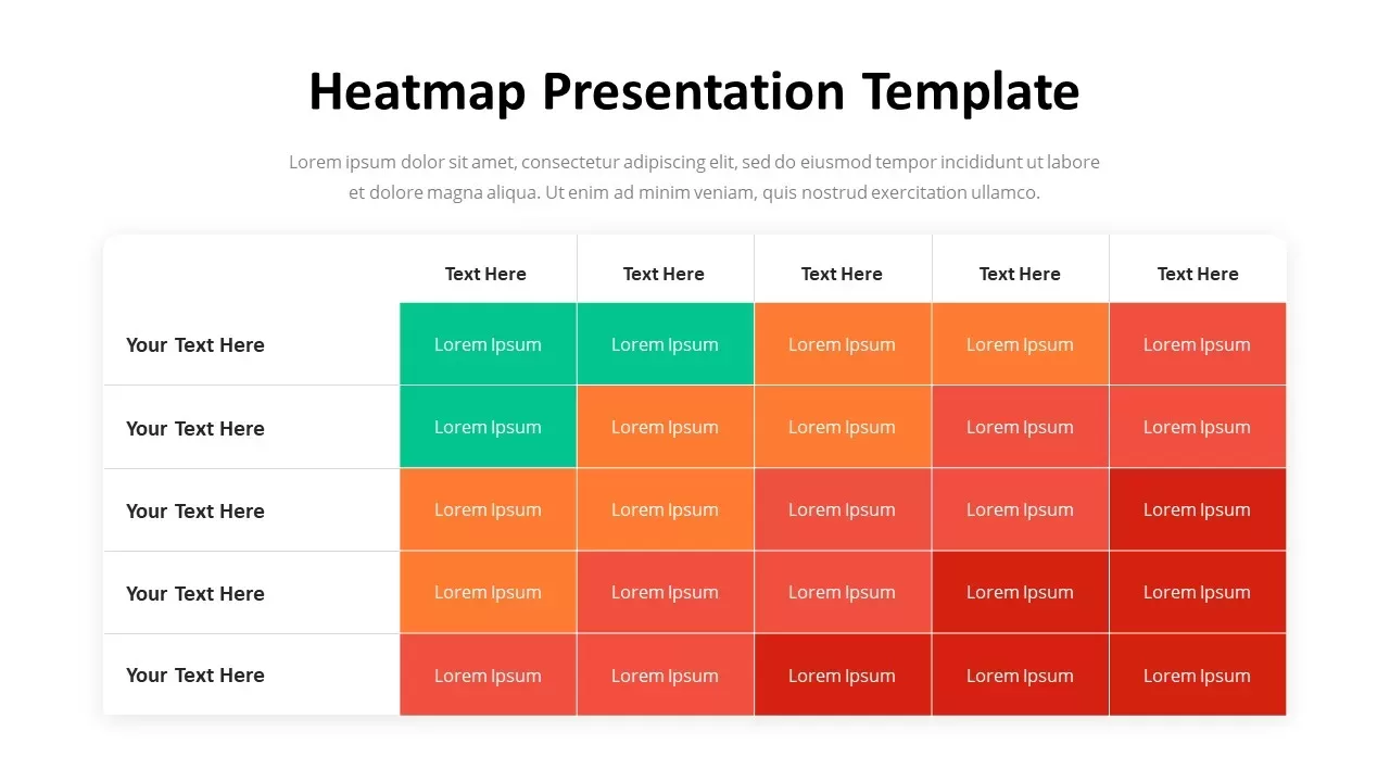
Professional Heatmap Data Visualization Template for PowerPoint & Google Slides
Infographics

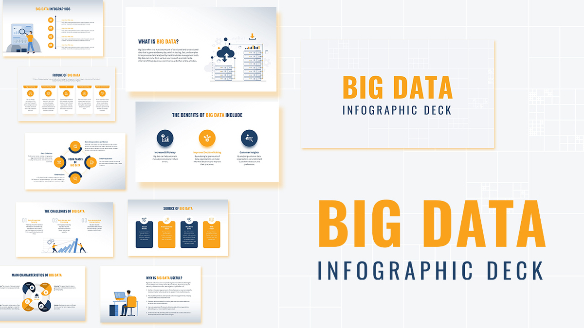
Modern Big Data Infographic Deck Template for PowerPoint & Google Slides
Decks
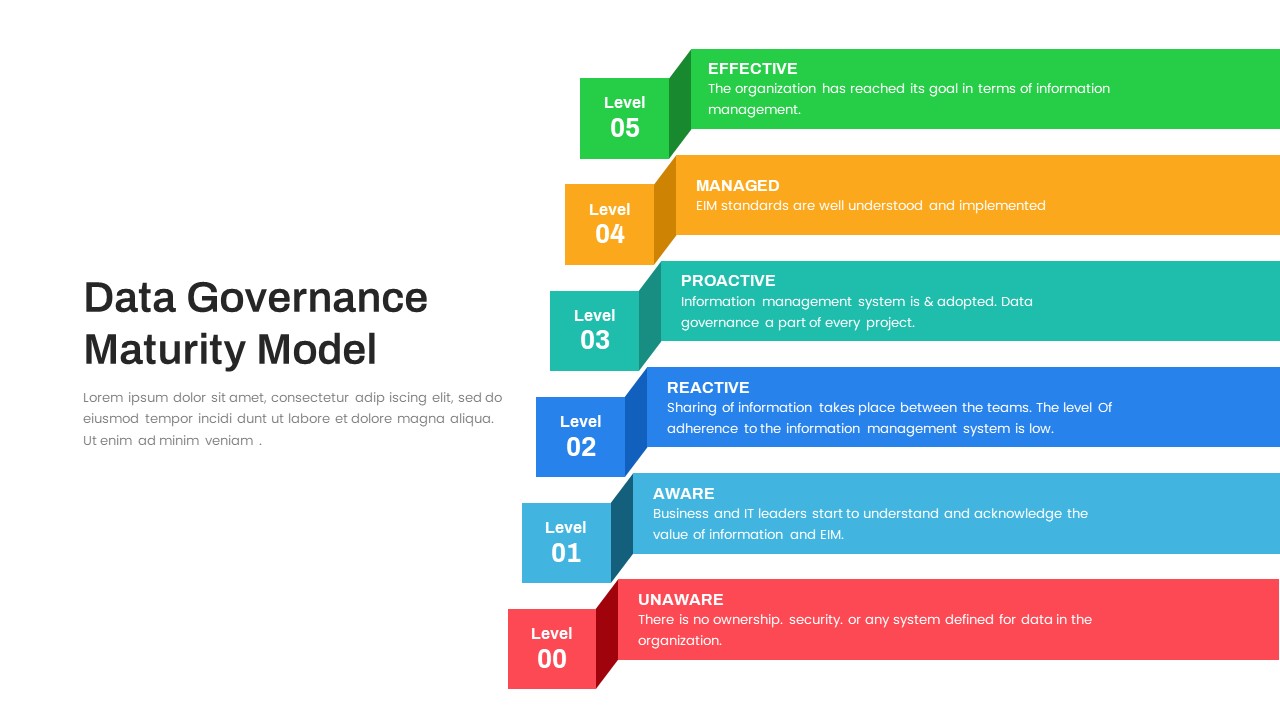
Layered Data Governance Maturity Model Template for PowerPoint & Google Slides
Process
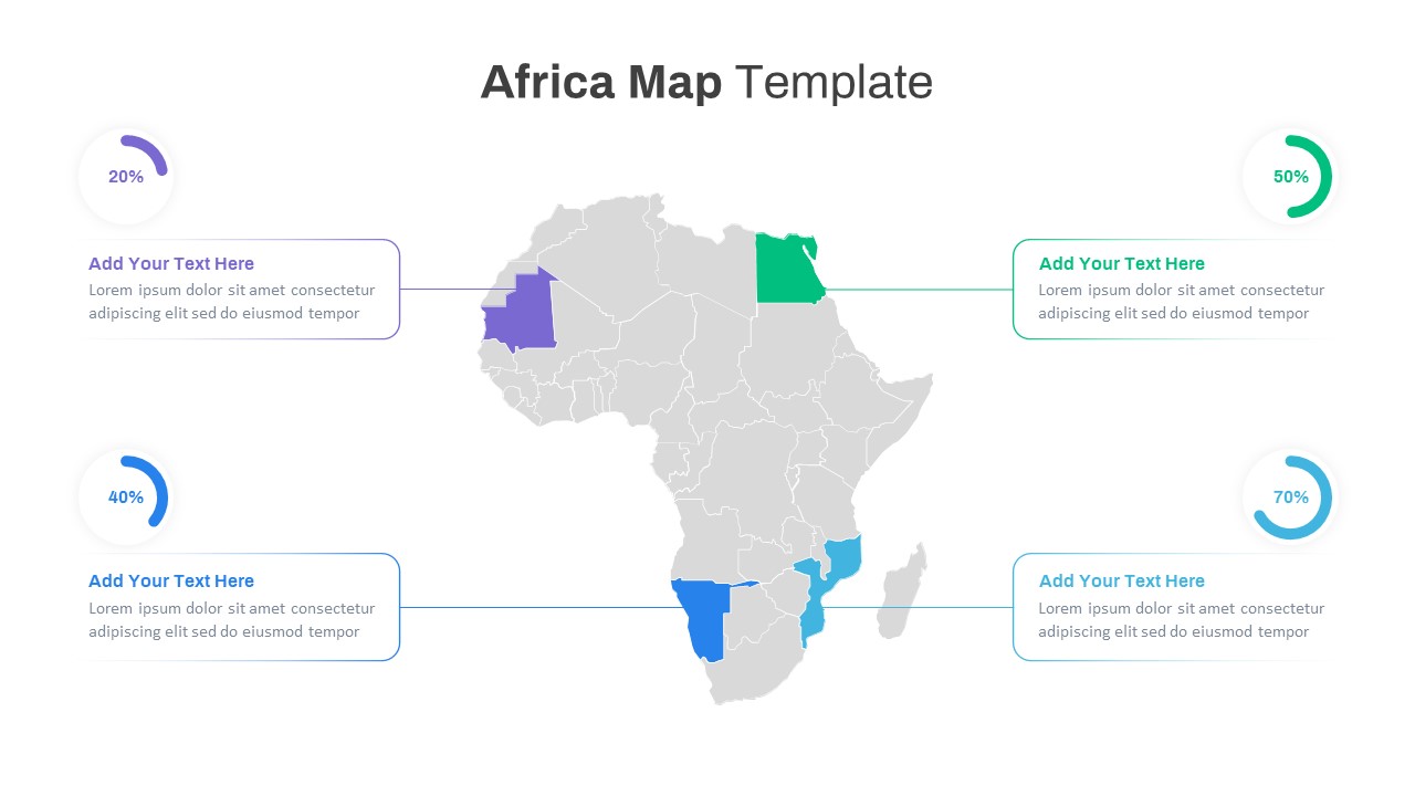
Editable Africa Map Infographic Data Template for PowerPoint & Google Slides
World Maps
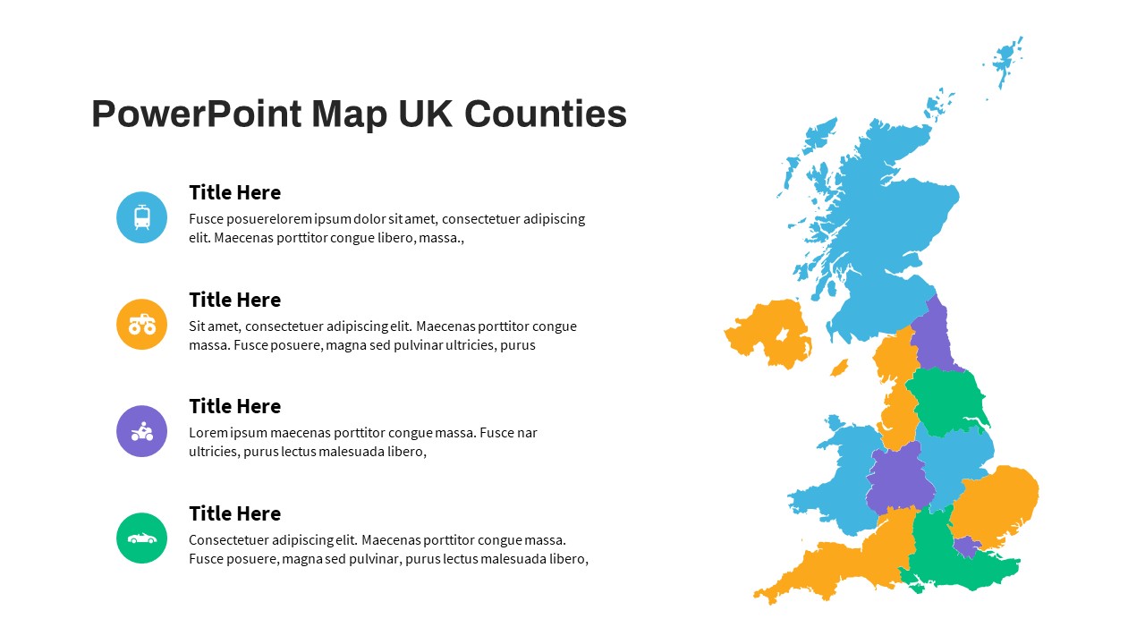
UK Counties Map Data Visualization Template for PowerPoint & Google Slides
World Maps
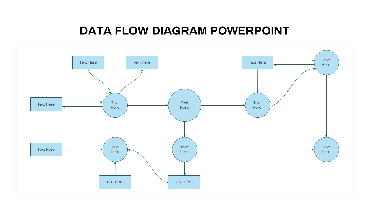
Advanced Data Flow Diagram Pack Template for PowerPoint & Google Slides
Flow Charts
Free Big Data Network Visualization Template for PowerPoint & Google Slides
Circular
Free
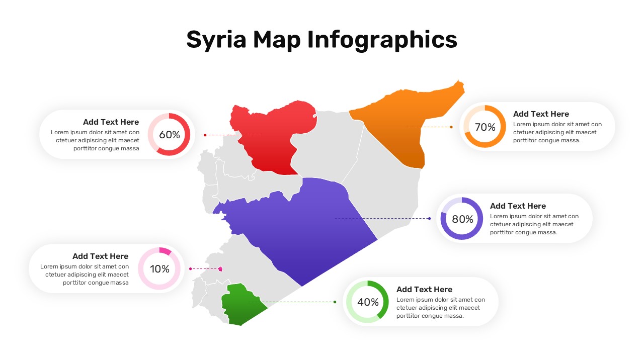
Syria Regional Data Map Infographic Template for PowerPoint & Google Slides
World Maps
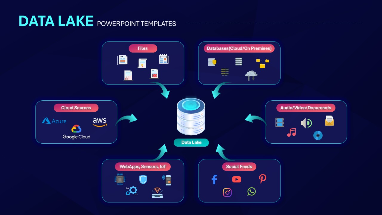
Data Lake Hub-and-Spoke Diagram Template for PowerPoint & Google Slides
Cloud Computing
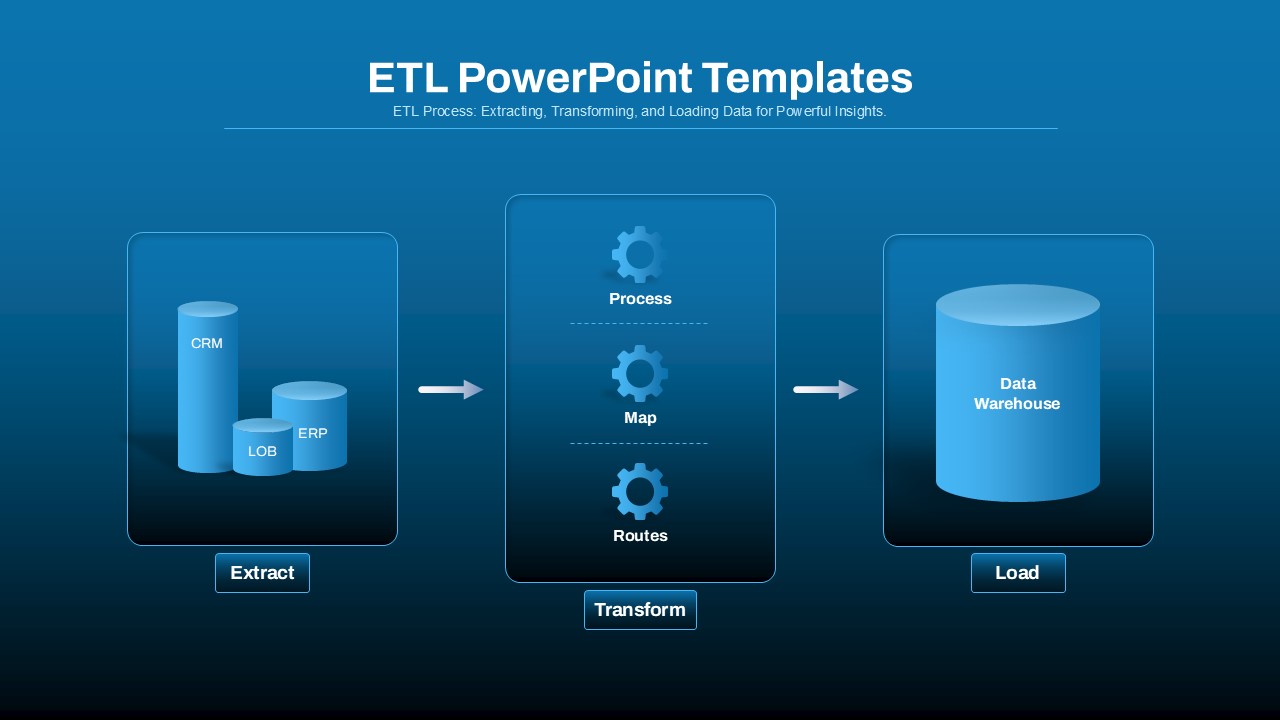
ETL Data Pipeline Workflow Diagram Template for PowerPoint & Google Slides
Process
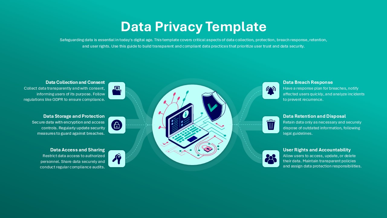
Data Privacy template for PowerPoint & Google Slides
Information Technology
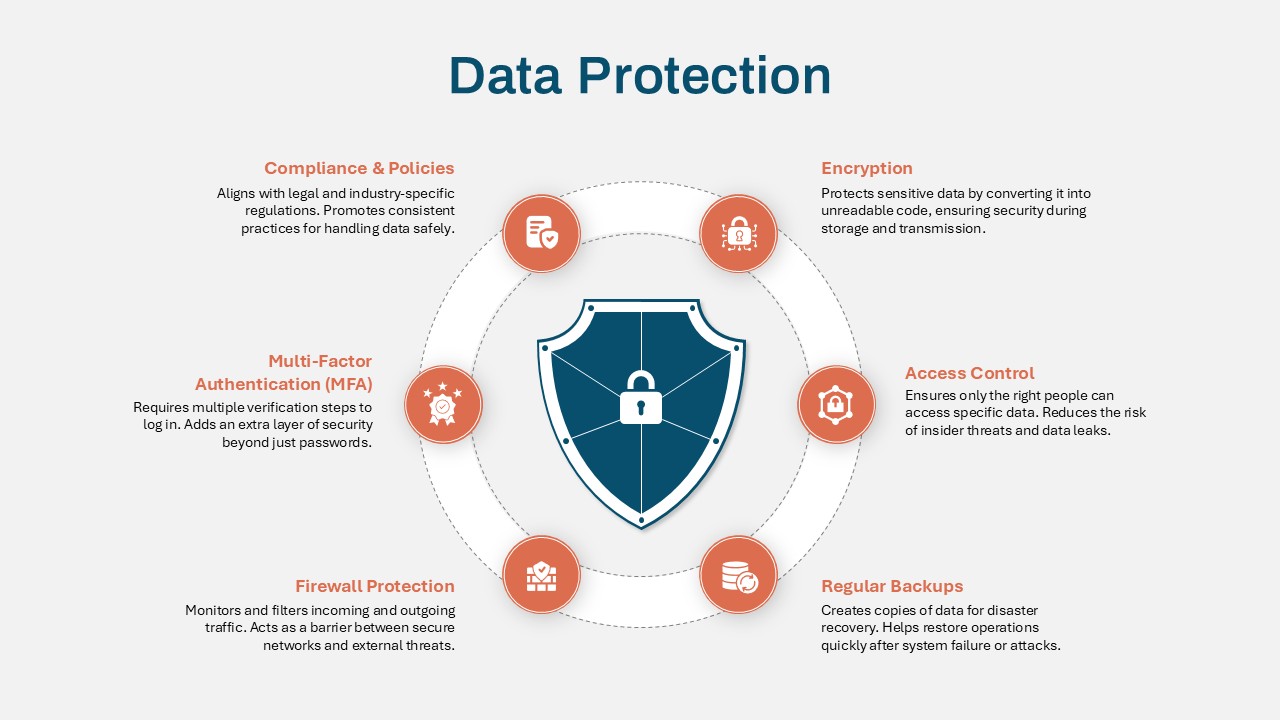
Data Protection Strategies template for PowerPoint & Google Slides
Information Technology
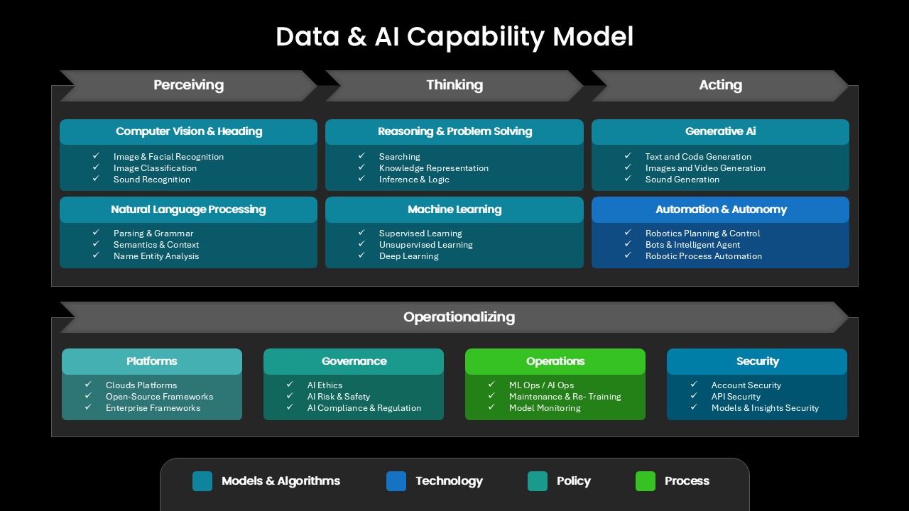
Comprehensive Data & AI Capability Model Template for PowerPoint & Google Slides
AI
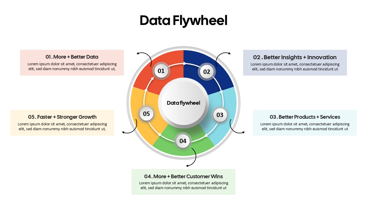
Data Flywheel Strategy template for PowerPoint & Google Slides
Business
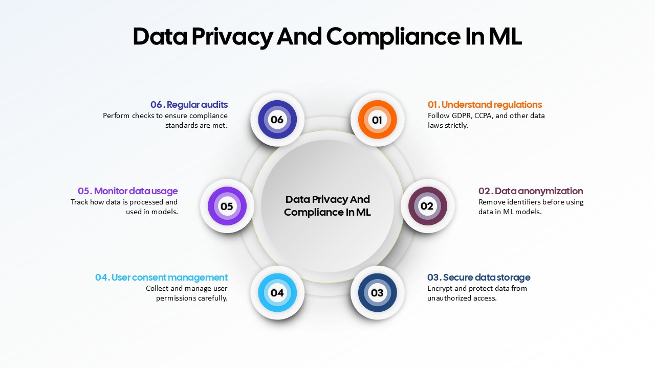
Data Privacy and Compliance in ML template for PowerPoint & Google Slides
Technology
Data-Driven AI in Insurance Infographic Template for PowerPoint & Google Slides
Circular
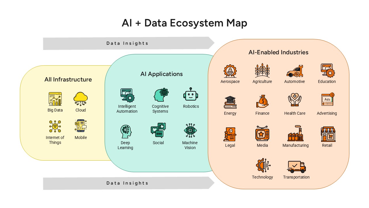
AI and Data Ecosystem Map Template for PowerPoint & Google Slides
AI
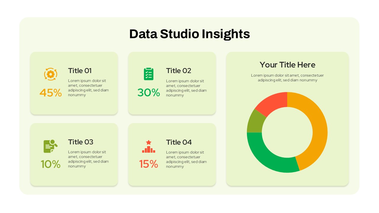
Data Studio Insights template for PowerPoint & Google Slides
Business Report
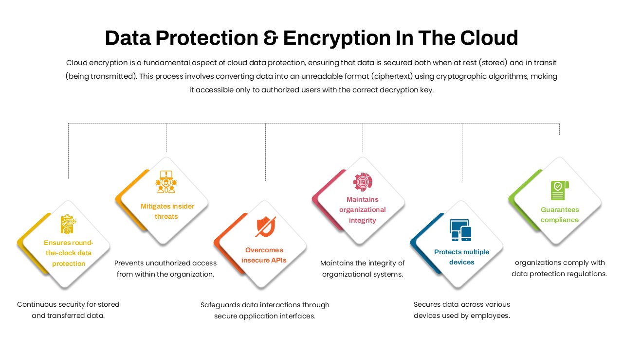
Data Protection & Encryption in the Cloud Overview template for PowerPoint & Google Slides
Cloud Computing
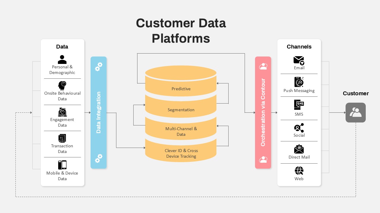
Customer Data Platform Workflow Diagram Template for PowerPoint & Google Slides
Information Technology
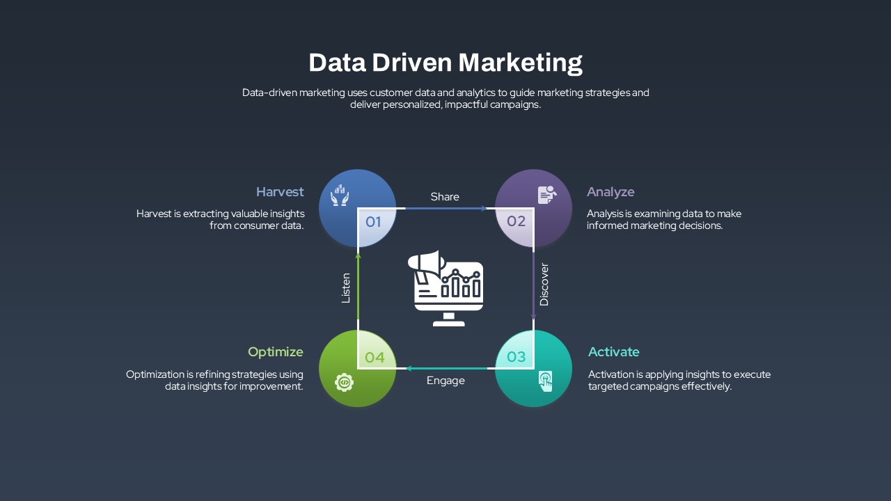
Data-Driven Marketing Lifecycle Diagram Template for PowerPoint & Google Slides
Process
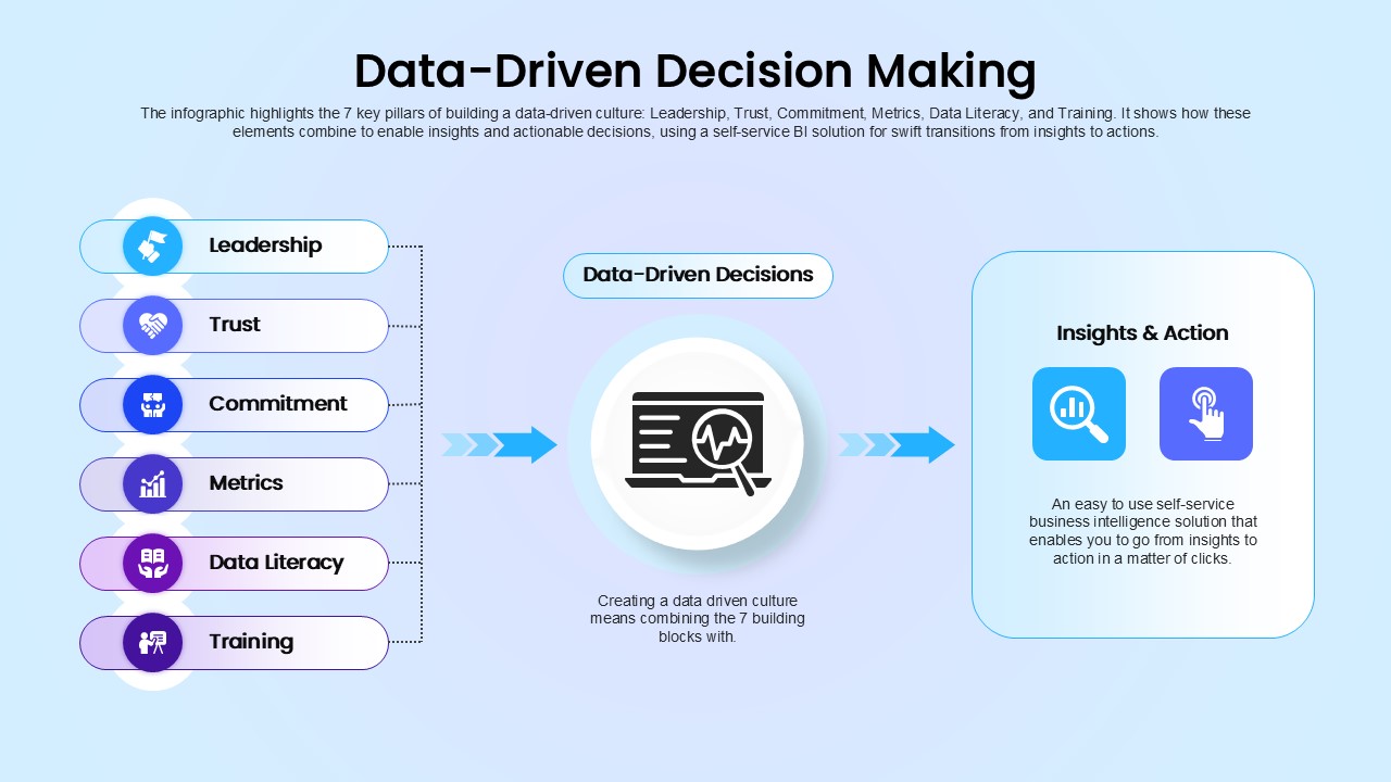
Data-Driven Decision Making overview template for PowerPoint & Google Slides
Business
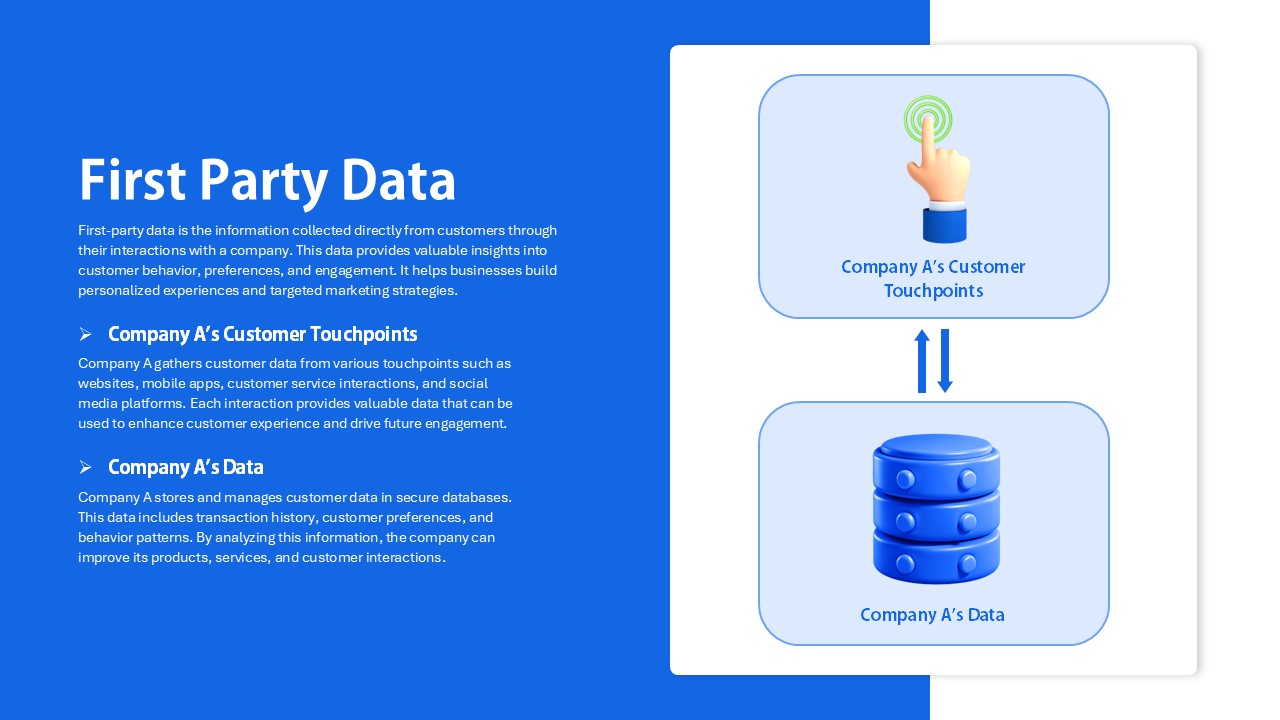
First Party Data Overview Template for PowerPoint & Google Slides
Business
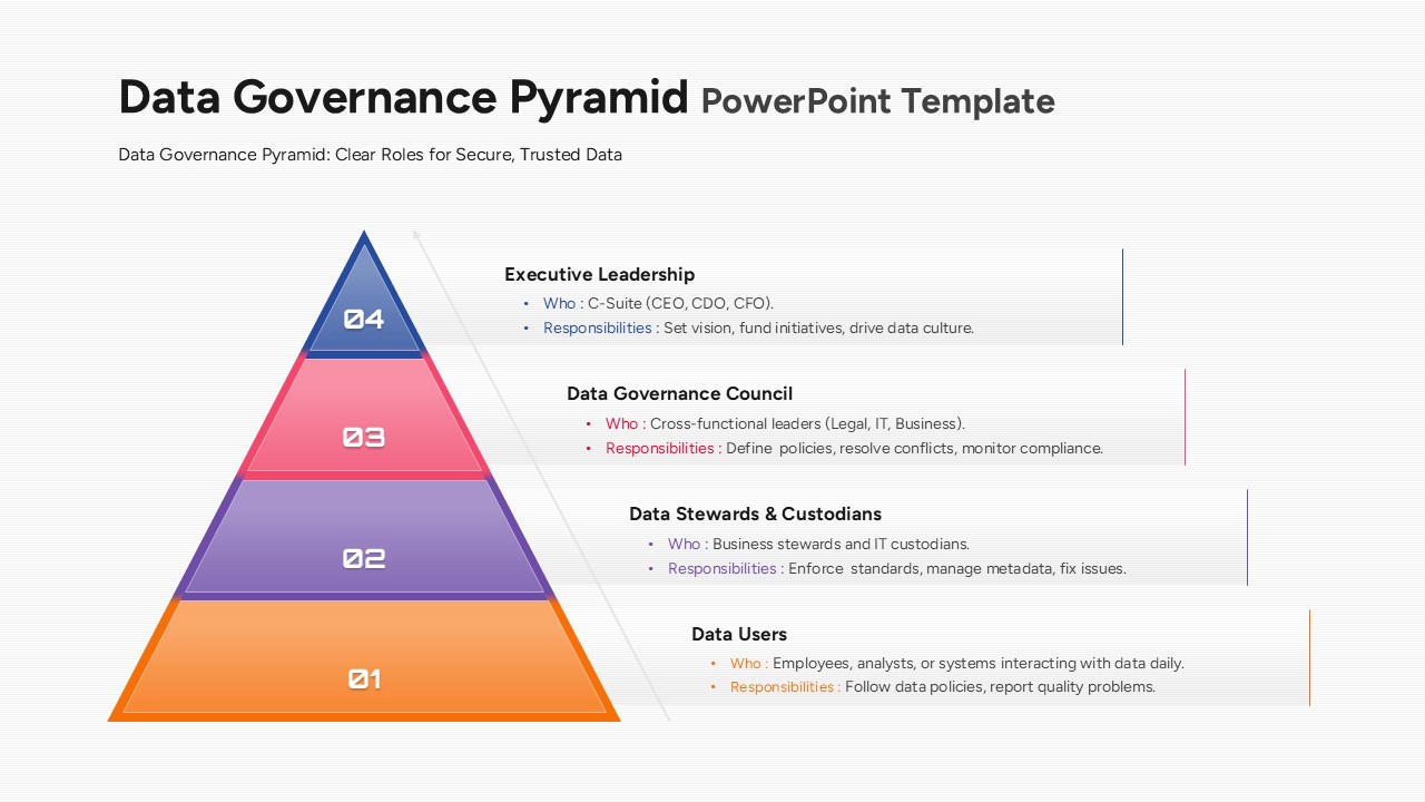
Data Governance Roles Pyramid Diagram Template for PowerPoint & Google Slides
Pyramid
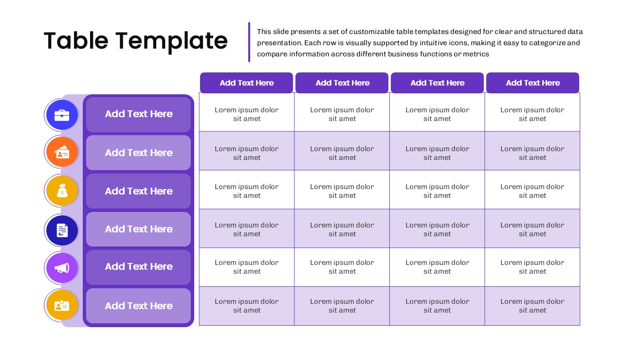
Business Data Table Template for PowerPoint & Google Slides
Table
Colorful Business Data Comparison Table Template for PowerPoint & Google Slides
Table
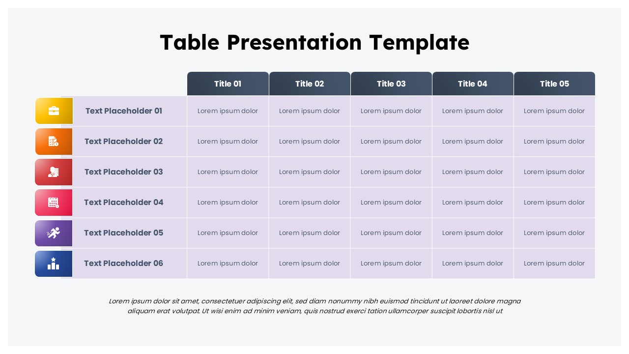
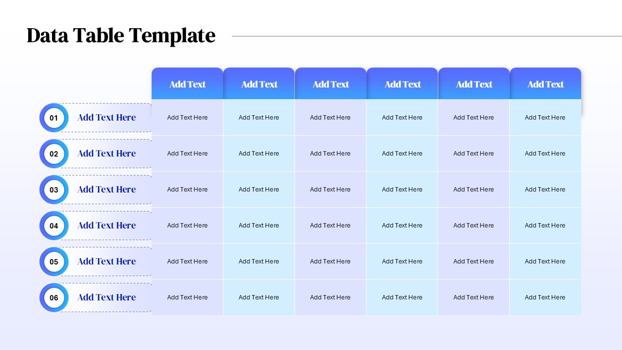
Six Column Data Table Template for PowerPoint & Google Slides
Table
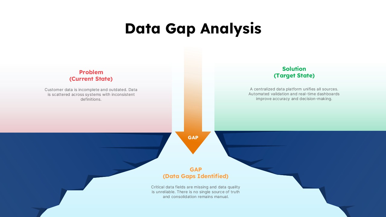
Data Gap Analysis Template for PowerPoint & Google Slides
Business
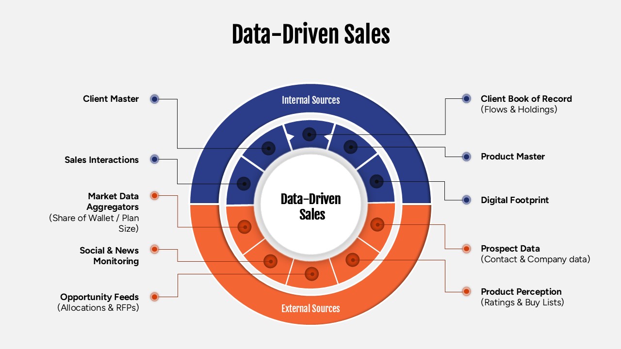
Data-Driven Sales Strategy Diagram Template for PowerPoint & Google Slides
Marketing
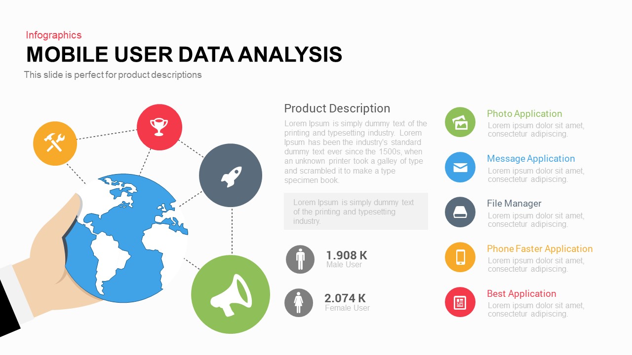
Mobile User Data Analysis Infographic for PowerPoint & Google Slides
Process
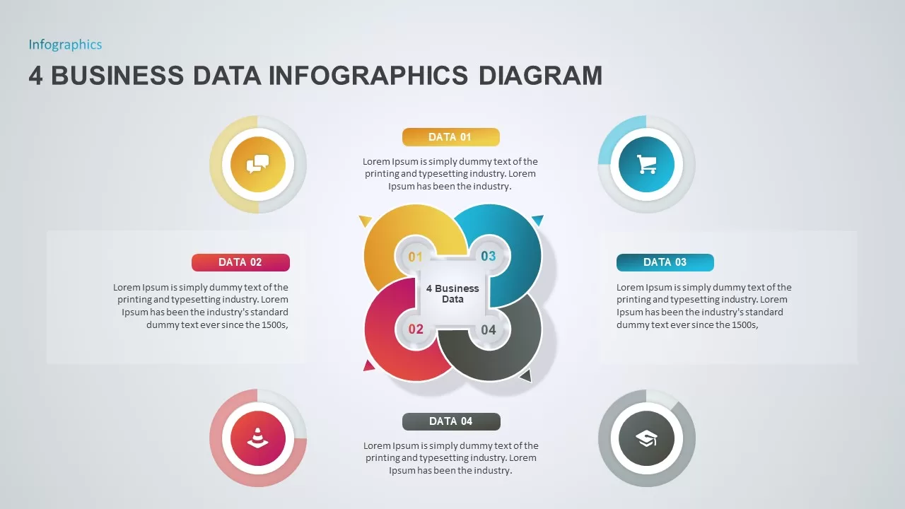
4 Business Data Infographics Diagram for PowerPoint & Google Slides
Process
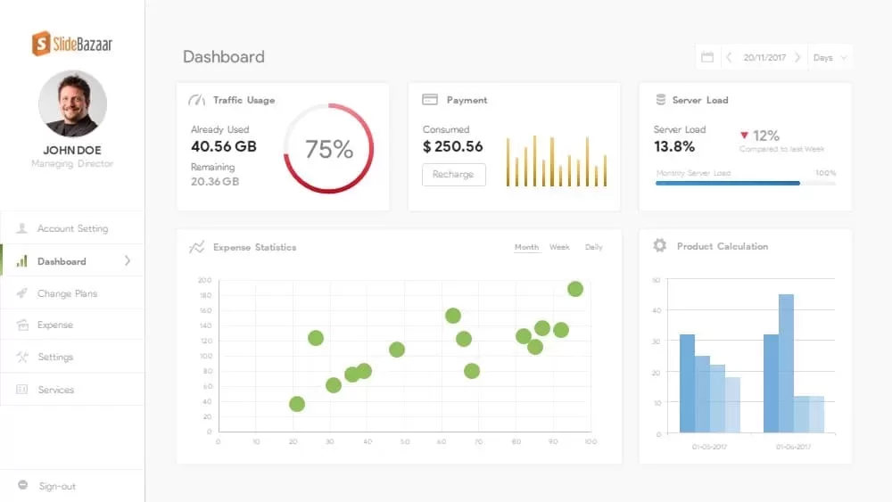
Free Data Analytics Dashboard Template for PowerPoint
Charts
Free
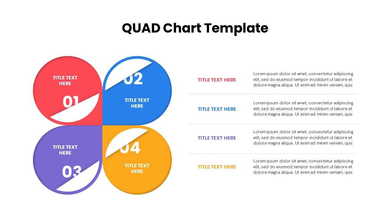
Quad Chart Infographic Pack of 8 Slides Template for PowerPoint & Google Slides
Comparison Chart
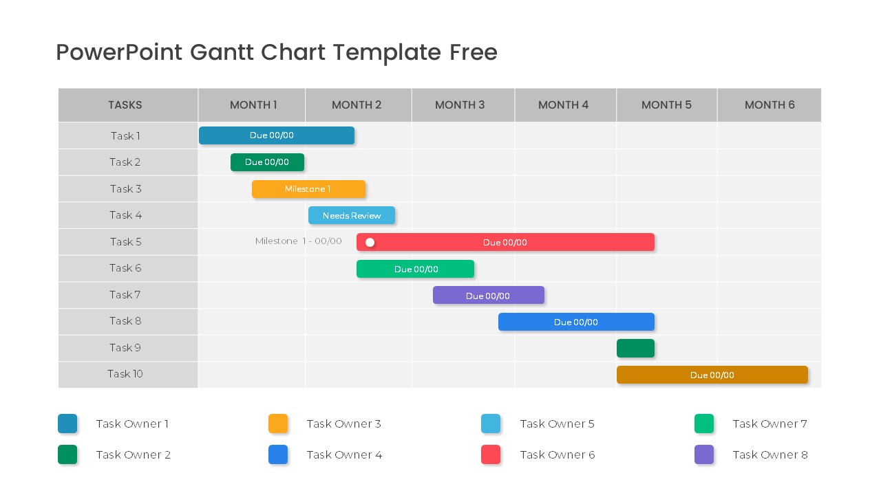
Free Professional Gantt Chart Pack – 4 Slides Template for PowerPoint & Google Slides
Gantt Chart
Free

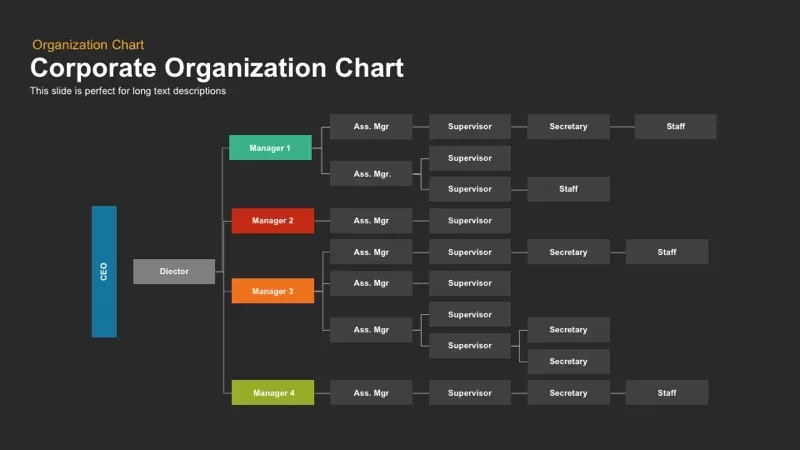
Corporate Organization Chart template for PowerPoint & Google Slides
Org Chart
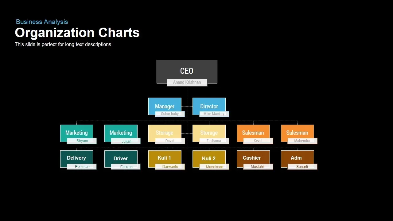
Business Organization Chart Hierarchy Template for PowerPoint & Google Slides
Org Chart
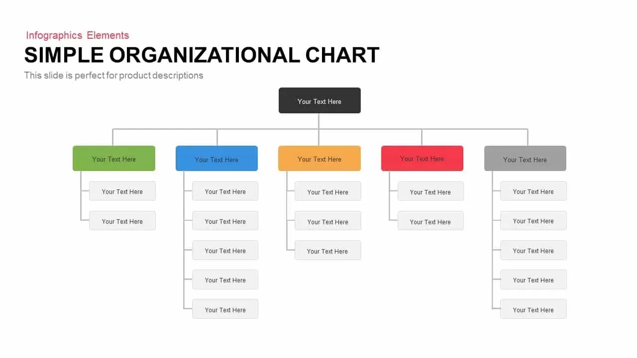
Simple Organizational Chart Infographic Template for PowerPoint & Google Slides
Org Chart
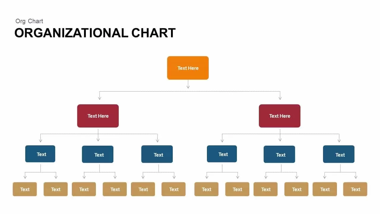
Organizational Chart Structure template for PowerPoint & Google Slides
Org Chart
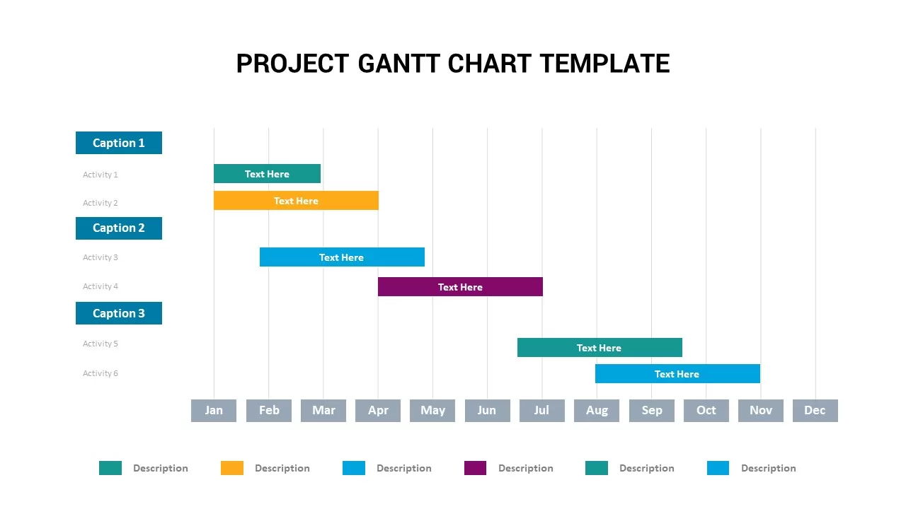
Project Gantt Chart Template for PowerPoint & Google Slides
Gantt Chart
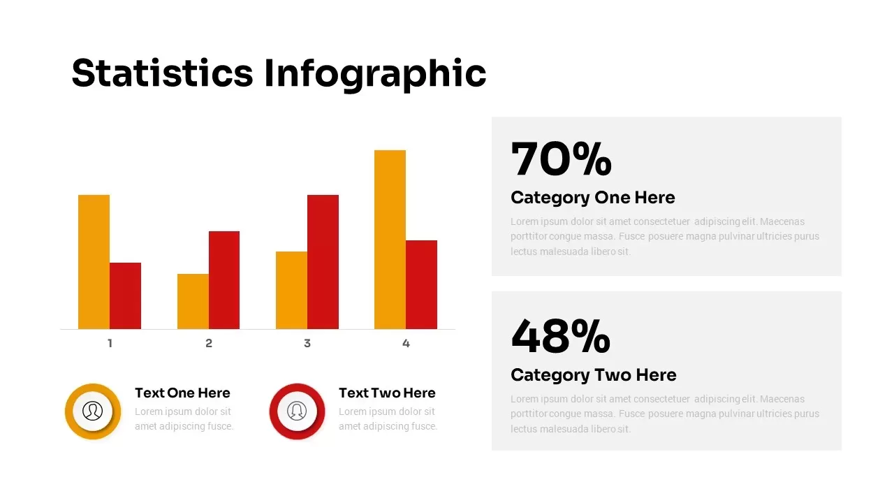
Statistics Infographic & KPI Bar Chart Template for PowerPoint & Google Slides
Bar/Column
Project Tracker Timeline Gantt Chart Template for PowerPoint & Google Slides
Project Status