Tornado Chart Data Comparison Slide Template for PowerPoint & Google Slides
Tornado Chart PowerPoint Template for Survey Analysis and Sensitivity Benchmarking
Evaluating comparative survey responses, displaying demographic poll results, conducting project sensitivity analyses, or benchmarking two distinct data variables side by side requires a clear bidirectional data visualization format. This tornado chart PowerPoint template equips financial analysts, market researchers, risk managers, and business strategists with an intuitive butterfly diagram. Designed to complement dedicated comparison templates, this layout helps presenters illustrate variable variances, compare polling distributions, and identify dominant risk factors during stakeholder presentations and executive reviews.
Analyze Opposing Data Points with a Sensitivity Analysis Presentation Slide
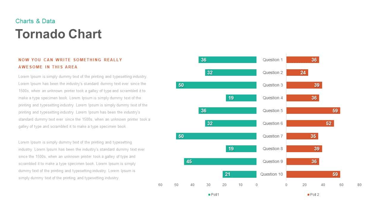
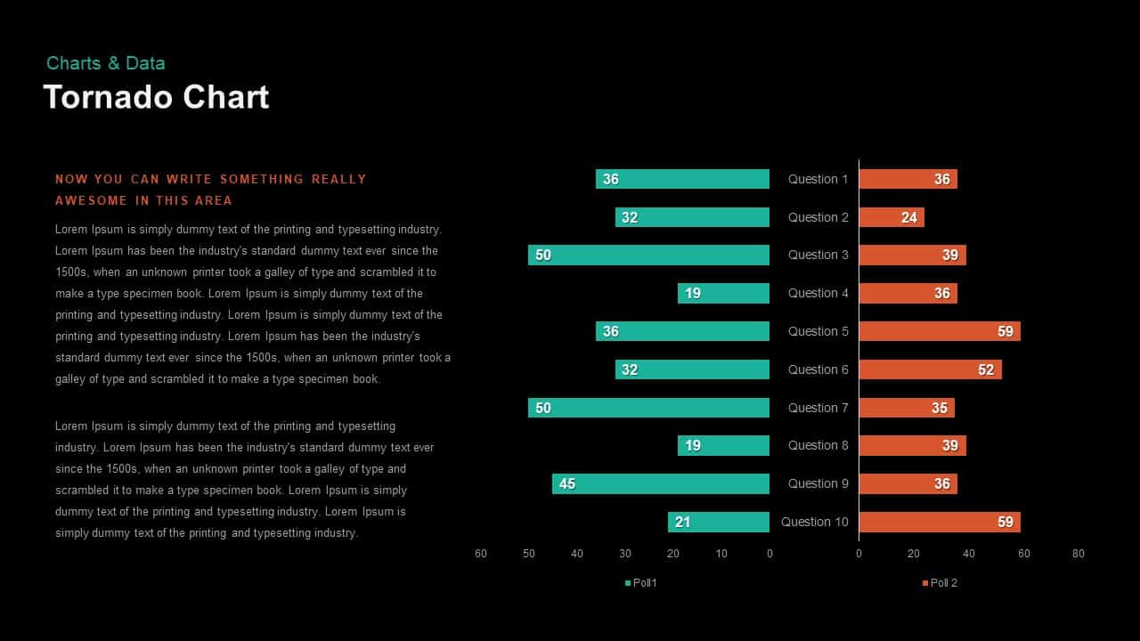
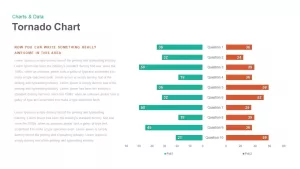
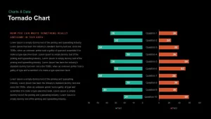
Delivering complex data sets to corporate stakeholders requires crisp visual contrast and balanced metric placement. A sensitivity analysis presentation slide layout provides a central categorical axis listing ten distinct evaluation points from Question 1 to Question 10. By pairing an emerald teal bar on the left with a terracotta orange bar on the right, this format serves as a clean alternative to a process comparison chart when evaluating opposing performance metrics, survey answers, or demographic preferences across identical parameters.
Benchmark Strategic Variables using Bidirectional Bar Chart Google Slides
Highlighting variances across conflicting priorities, team viewpoints, or risk factors demands clear quantitative scaffolding. Functioning alongside specialized conflict infographics comparison slides, these bidirectional bar chart slides for Google Slides feature clean horizontal gridlines, numerical data labels on every bar, and dedicated left-aligned narrative containers. Every horizontal bar, axis number, color accent, and descriptive text block is completely editable directly within PowerPoint or Google Slides.
Login to download this file

Item ID
SB00918


Related Templates

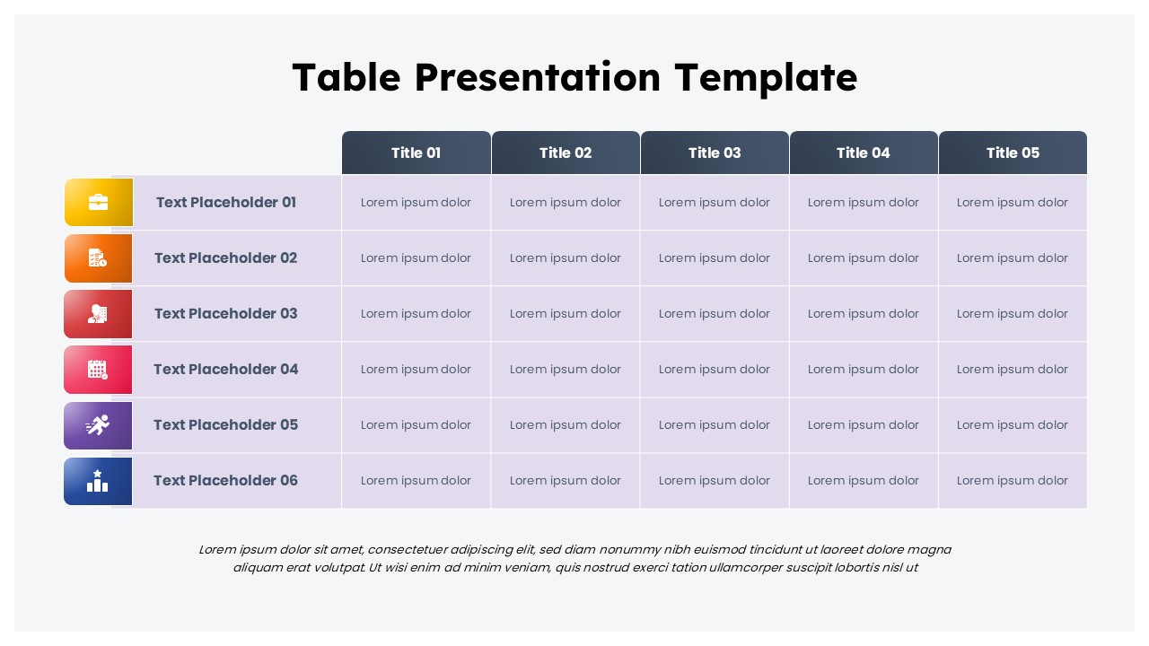
Colorful Table Presentation Template for PowerPoint & Google Slides
Table
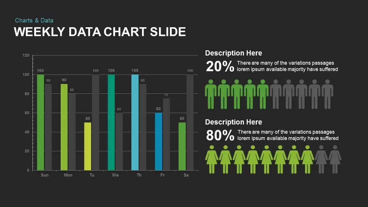
Weekly Data Chart Slide for PowerPoint & Google Slides
Comparison Chart
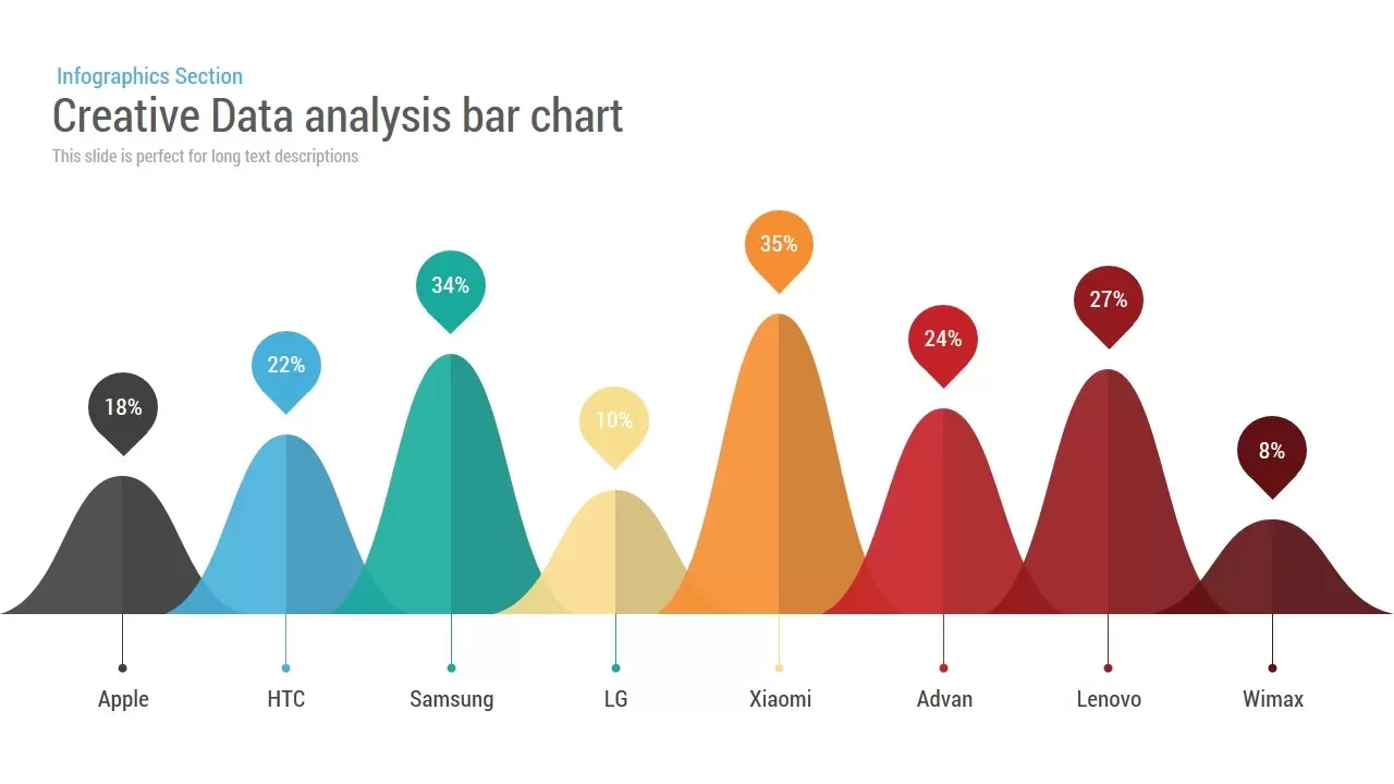
Creative Data Analysis Bar Chart template for PowerPoint & Google Slides
Bar/Column
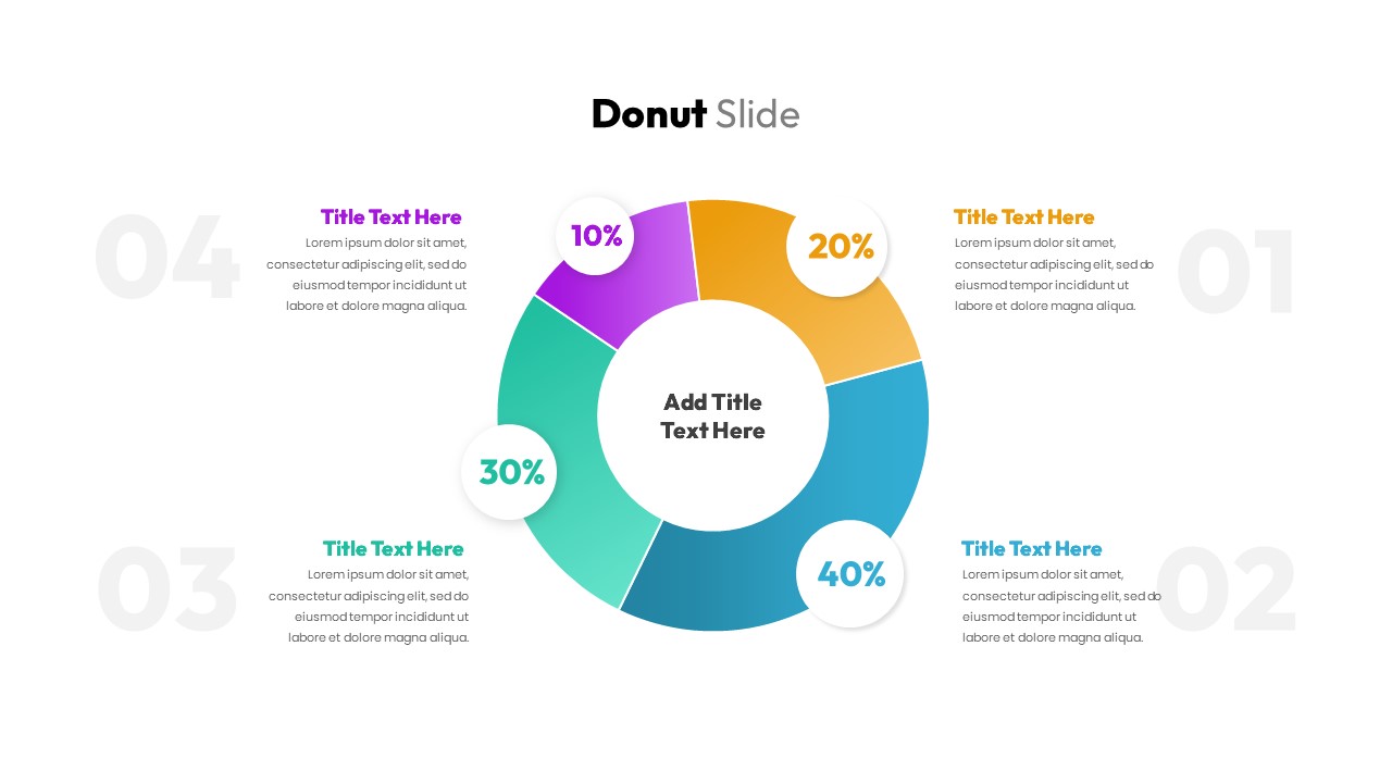
Donut Chart Data Breakdown template for PowerPoint & Google Slides
Pie/Donut
Waffle Chart Data Visualization Template for PowerPoint & Google Slides
Comparison Chart
Stacked Column Chart Template
Bar/Column
Free
Simple Bar Chart Data Visualization Template for PowerPoint & Google Slides
Bar/Column
Simple Area Chart Data Trends Analysis Template for PowerPoint & Google Slides
Comparison Chart
Segmented Scatter Chart Data Visualization Template for PowerPoint & Google Slides
Business Strategy
4-Step Data Analysis PowerPoint Template
Bar/Column
Free
Comparison Chart Design for PowerPoint & Google Slides
Comparison
Comparison Bar Chart template for PowerPoint & Google Slides
Comparison Chart

Circular Product Comparison Chart Template for PowerPoint & Google Slides
Comparison Chart
People Demographic Comparison Chart Template for PowerPoint & Google Slides
Comparison
Competitor Comparison Chart Design Template for PowerPoint & Google Slides
Comparison
Skills Gap Analysis PowerPoint Template
Gap
Feasibility Matrix Comparison Chart Template
Comparison Chart
3-Chart Comparison PowerPoint Template
Pie/Donut
Blank Comparison Chart PowerPoint Template
Comparison Chart
Process Comparison PowerPoint Template
Infographics