People Demographic Comparison Chart Template for PowerPoint & Google Slides
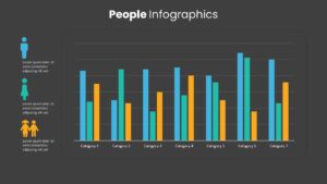
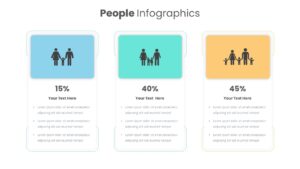
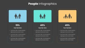
Demographic Comparison Chart Template for PowerPoint & Google Slides
Presenting audience statistics, market research, or workforce diversity data requires a visually compelling layout that turns raw numbers into actionable insights. Dense data tables and uninspired bar graphs often fail to highlight crucial population trends, leaving key stakeholders overwhelmed. Adopting a multi-slide demographic comparison chart template empowers market researchers, HR directors, and business strategists to showcase audience breakdowns across clean, intuitive layouts.
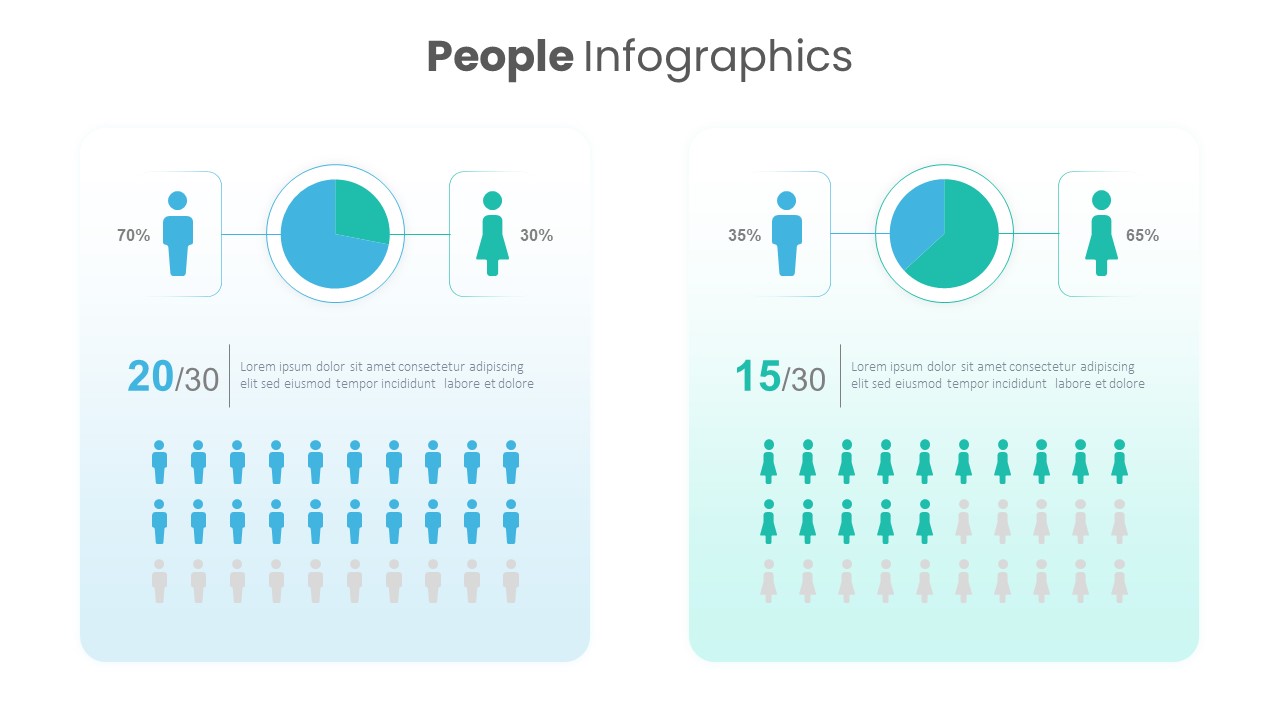
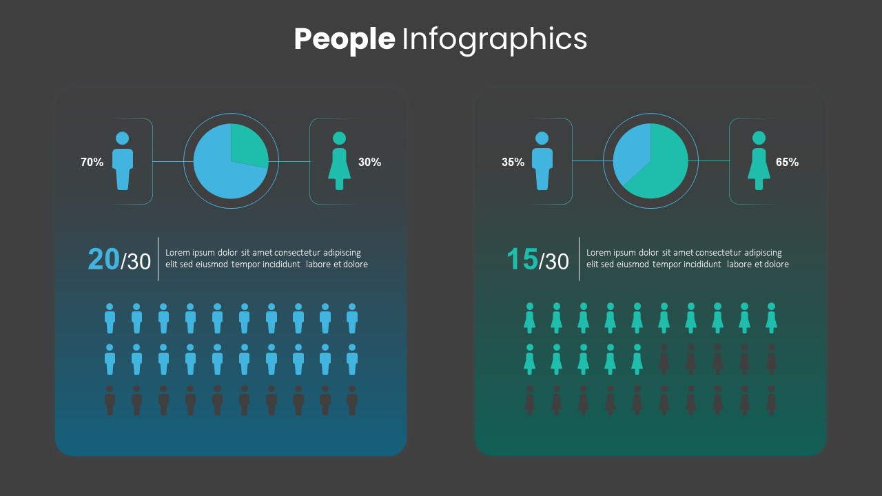
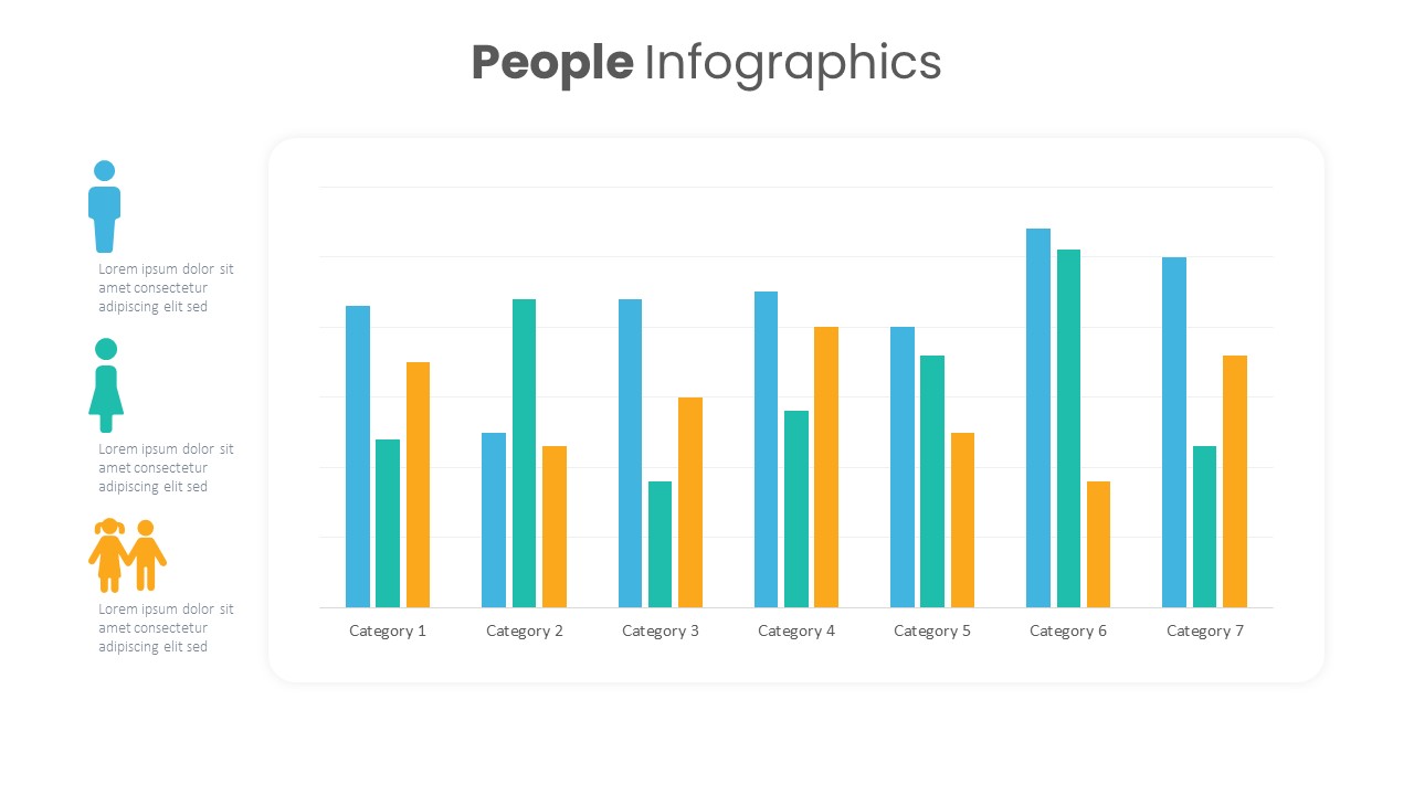
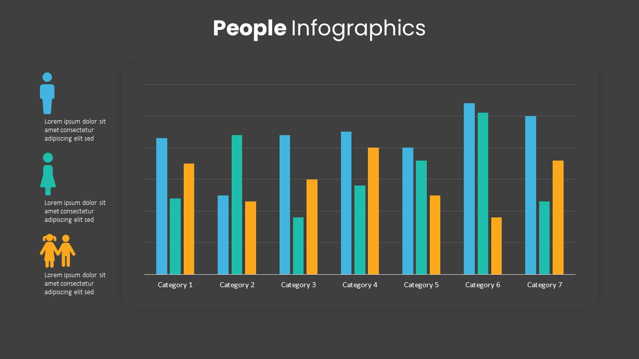
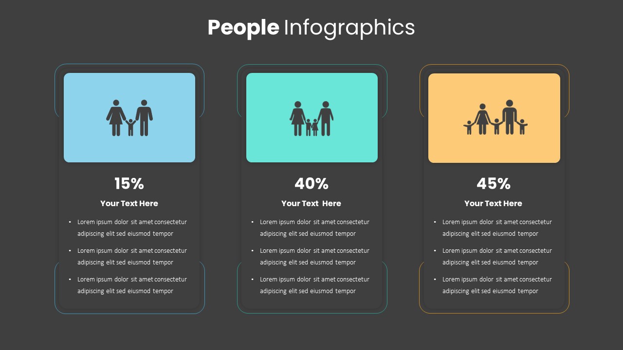
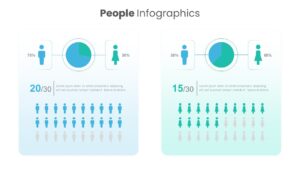
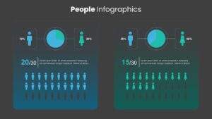
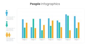
Designed as a comprehensive presentation deck, this set offers multiple slide variations featuring pie charts, gender silhouette ratios, pictogram arrays, and comparative bar charts on both light and dark backgrounds. The featured slide displays two side-by-side comparative cards with male and female percentages, central pie diagrams, ratio metrics, and highlighted human icon arrays. This variety allows you to present gender breakdowns, age group distributions, survey results, and target audience segments with total visual balance.
Tailoring every slide to match your project needs is smooth and straightforward in PowerPoint and Google Slides. All vector shapes, pie charts, pictogram icons, color fills, and text fields are fully customizable. You can rapidly update percentage values, recolor elements to align with corporate branding, and adjust text descriptions in just a few clicks, giving you a powerful tool to convey demographic insights with maximum precision.
Login to download this file

Item ID
SB03504


Related Templates

Demographic Pie Chart PowerPoint Template
Pie/Donut
Gender Comparison People Infographic Template for PowerPoint & Google Slides
Comparison
Demographic Targeting Template
Infographics
Demographic vs Psychographic Segmentation Template for PPT & Google Slides
Comparison
Demographic Transition PowerPoint Template
Process
Isometric Business People Organization Chart Template for PowerPoint
Org Chart
Conversation Between Two People template for PowerPoint & Google Slides
Graphics
Blue Silhouettes of People Template
Our Team
Business People Characters Presentation Template for PowerPoint & Google Slides
Decks
4 People Racing to Finish Line Template for PowerPoint & Google Slides
Business
People Stage Infographics PowerPoint and Google Slide Template
Process
People Infographic Organizational PowerPoint Template
Org Chart

People Puzzle Pieces Diagram Template for PowerPoint
Org Chart
PCI (People Centered Implementation) Diagram for PowerPoint
Process
The Global People Management Diagram for the PowerPoint Presentation
Business Models
Silhouette People with Bubbles Template
Comparison
6 Principles of People Management PPT Template
HR
Silhouettes Of People template
Company Profile
People Strategy Business Competitive Corporate Diagram
Process
People Process Technology Slide
Process