Weekly Data Chart Slide for PowerPoint & Google Slides
Weekly Data Chart PowerPoint and Google Slides Template
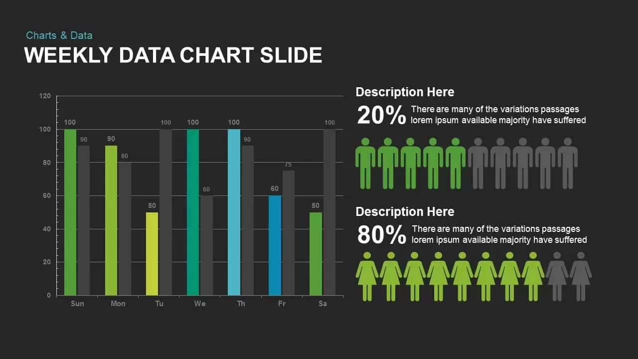
Tracking daily operational volume, measuring weekly sales trends, analyzing workflow productivity, or presenting audience demographic splits requires a data-focused visual presentation layout. This weekly data chart PowerPoint template provides data analysts, project managers, marketing strategists, and operations directors with a side-by-side analytical interface on a modern dark theme. By pairing a day-by-day clustered bar chart with dual demographic pictographs, this slide helps presenters translate complex weekly numbers and audience ratios into clear takeaways during sprint reviews and board meetings.
Key slide components and visual highlights include:
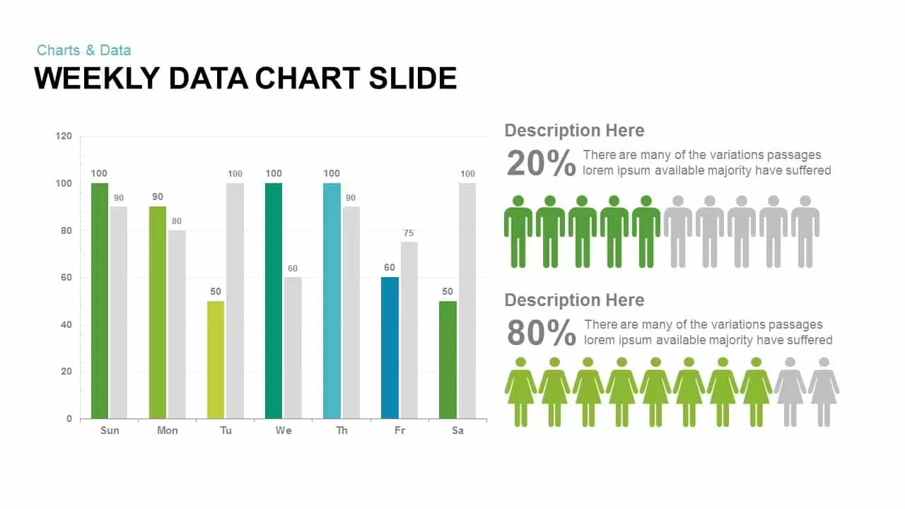
- A 7-day horizontal bar chart tracking performance metrics from Sunday through Saturday (Sun, Mon, Tu, We, Th, Fr, Sa).
- Clustered dual-bar sets comparing target vs actual data points with numerical value callouts directly above each column.
- Distinct color spectrum highlighting primary bars across green, lime, emerald, and cyan against contrasting charcoal benchmark bars.
- A vertical y-axis calibrated in twenty-unit intervals from 0 to 120 for measuring performance output and volume metrics.
- Two dedicated right-aligned demographic pictograph modules representing 20% male and 80% female user proportions with ten-figure silhouette icon rows.
- Large numerical percentage callouts paired with clear headline and descriptive text placeholders for presenting contextual findings.
- High-contrast dark charcoal background engineered for modern digital displays, conference screens, and executive briefings.
- 100% editable vector components that allow presenters to modify column values, adjust color codes, and edit demographic ratios directly within PowerPoint or Google Slides.
Login to download this file

Item ID
SB00734


Related Templates

Weekly Gantt Chart with Milestones Template for PowerPoint & Google Slides
Gantt Chart
Weekly Gantt Chart Template for PPT & Google Slides Theme
Gantt Chart
Gantt Chart Showing Weekly Tasks Template
Gantt Chart
Tornado Chart Data Comparison Slide Template for PowerPoint & Google Slides
Bar/Column
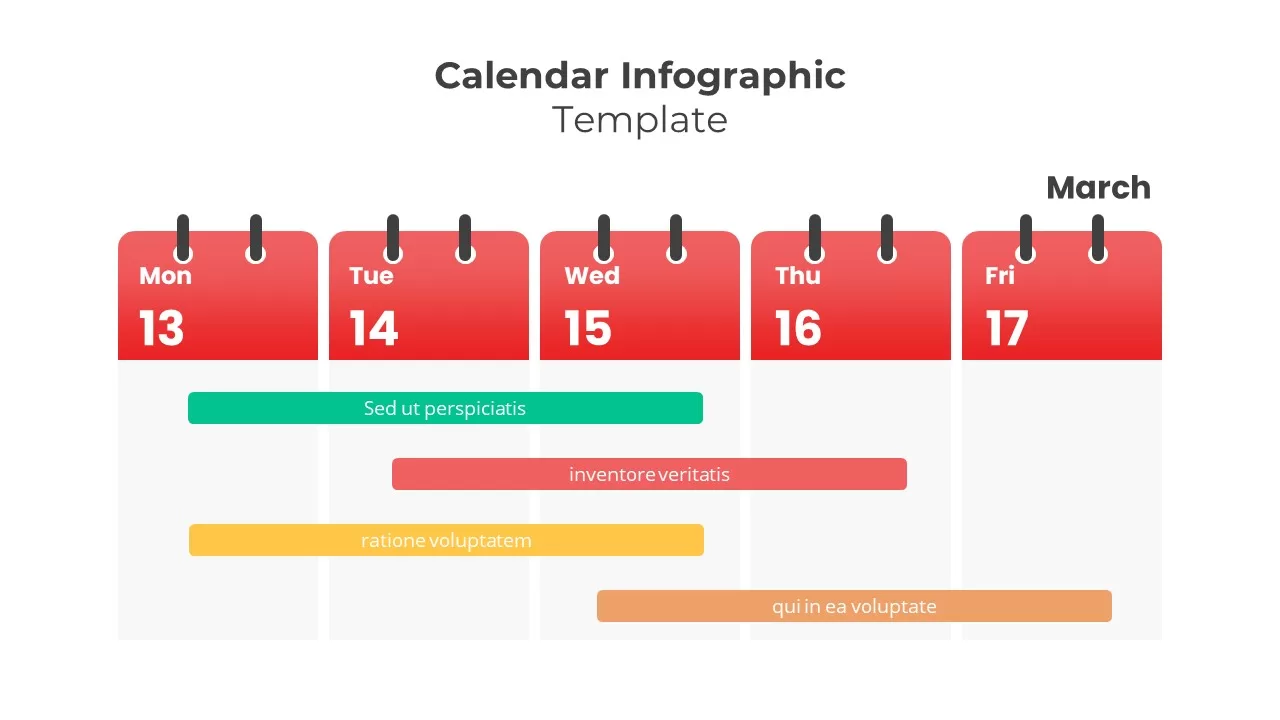
Weekly Five-Day Calendar Infographic Template for PowerPoint & Google Slides
Timeline
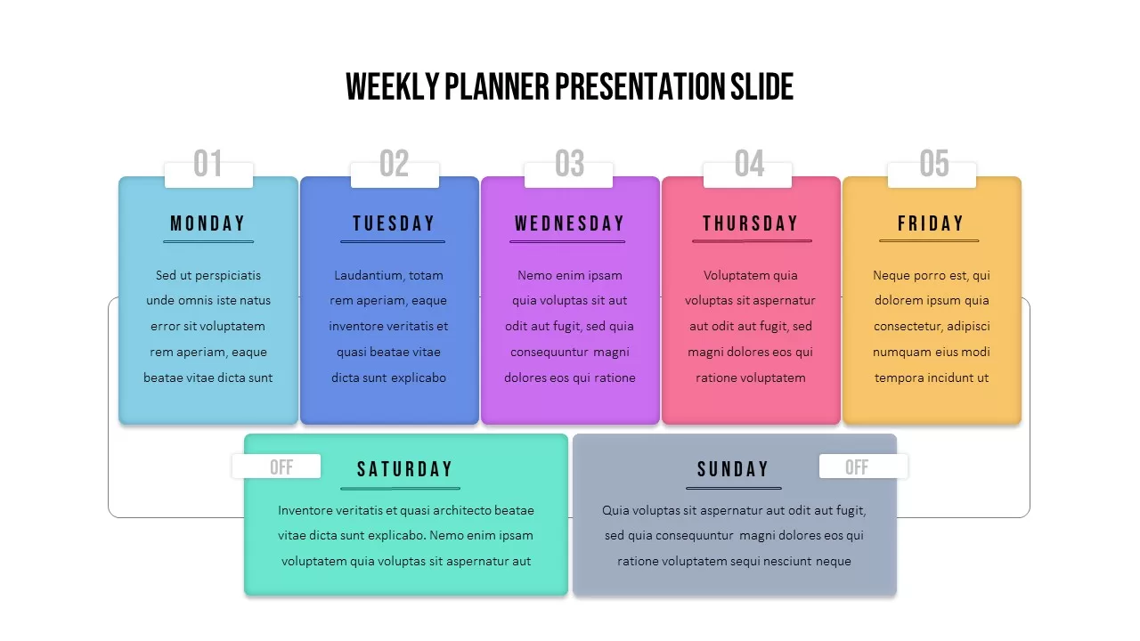
Weekly Planner Presentation Slide Template
Agenda
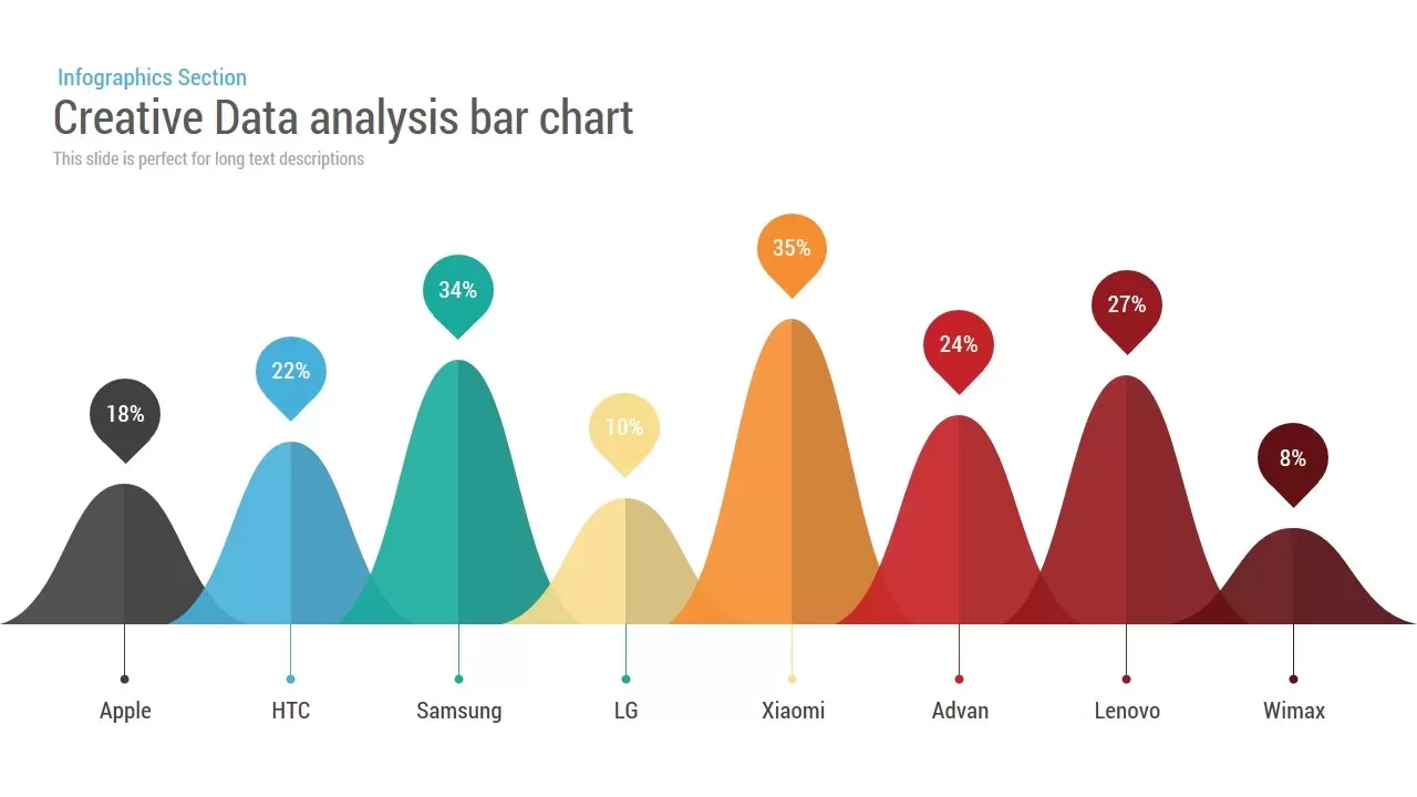
Creative Data Analysis Bar Chart template for PowerPoint & Google Slides
Bar/Column
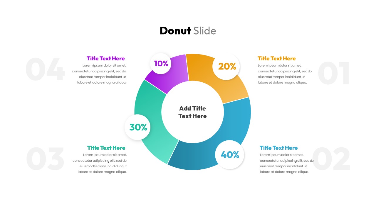
Donut Chart Data Breakdown template for PowerPoint & Google Slides
Pie/Donut
Waffle Chart Data Visualization Template for PowerPoint & Google Slides
Comparison Chart
Simple Bar Chart Data Visualization Template for PowerPoint & Google Slides
Bar/Column
Simple Area Chart Data Trends Analysis Template for PowerPoint & Google Slides
Comparison Chart
Segmented Scatter Chart Data Visualization Template for PowerPoint & Google Slides
Business Strategy
Weekly Report PowerPoint Template
Infographics
Weekly Update PowerPoint Template
Agenda
Weekly Planner PowerPoint Template
Infographics
Weekly Agenda PowerPoint Template
Agenda
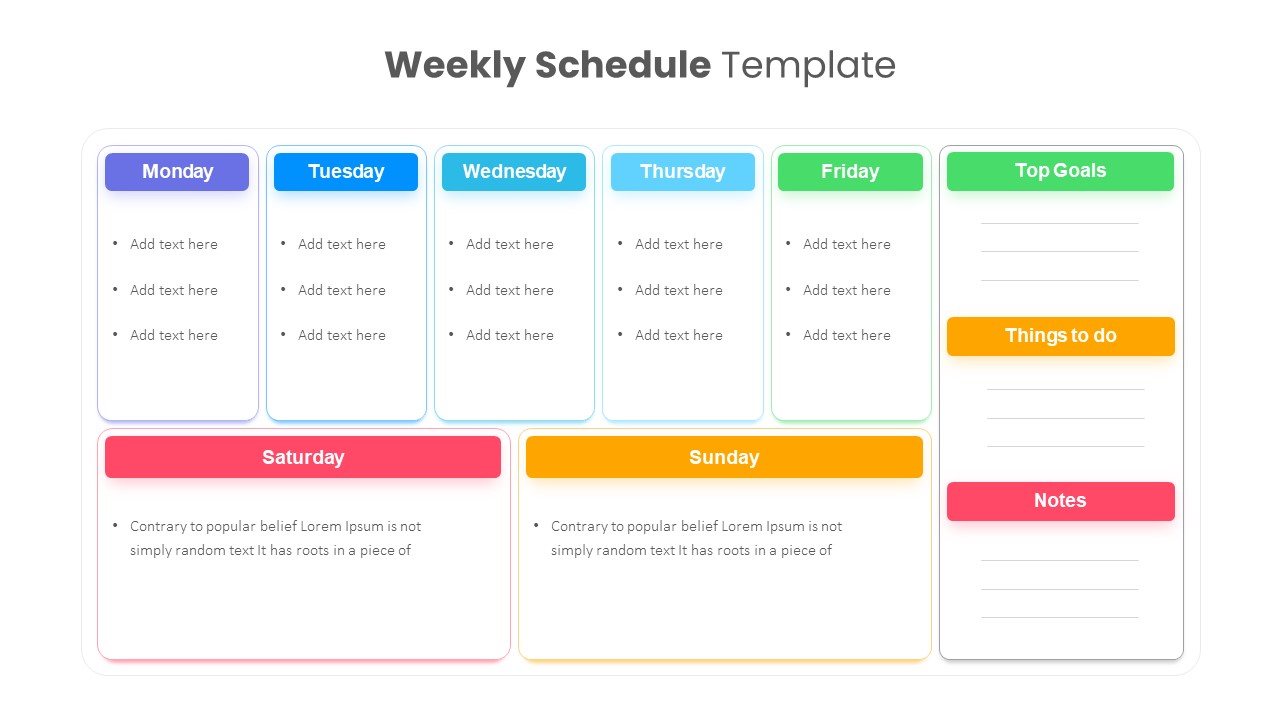
Weekly Schedule PowerPoint Template
Agenda
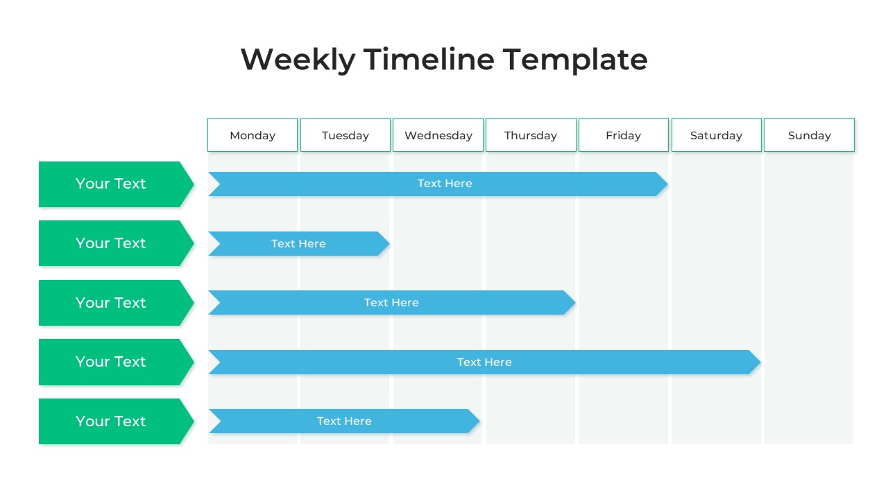
Weekly Timeline PowerPoint Template
Timeline
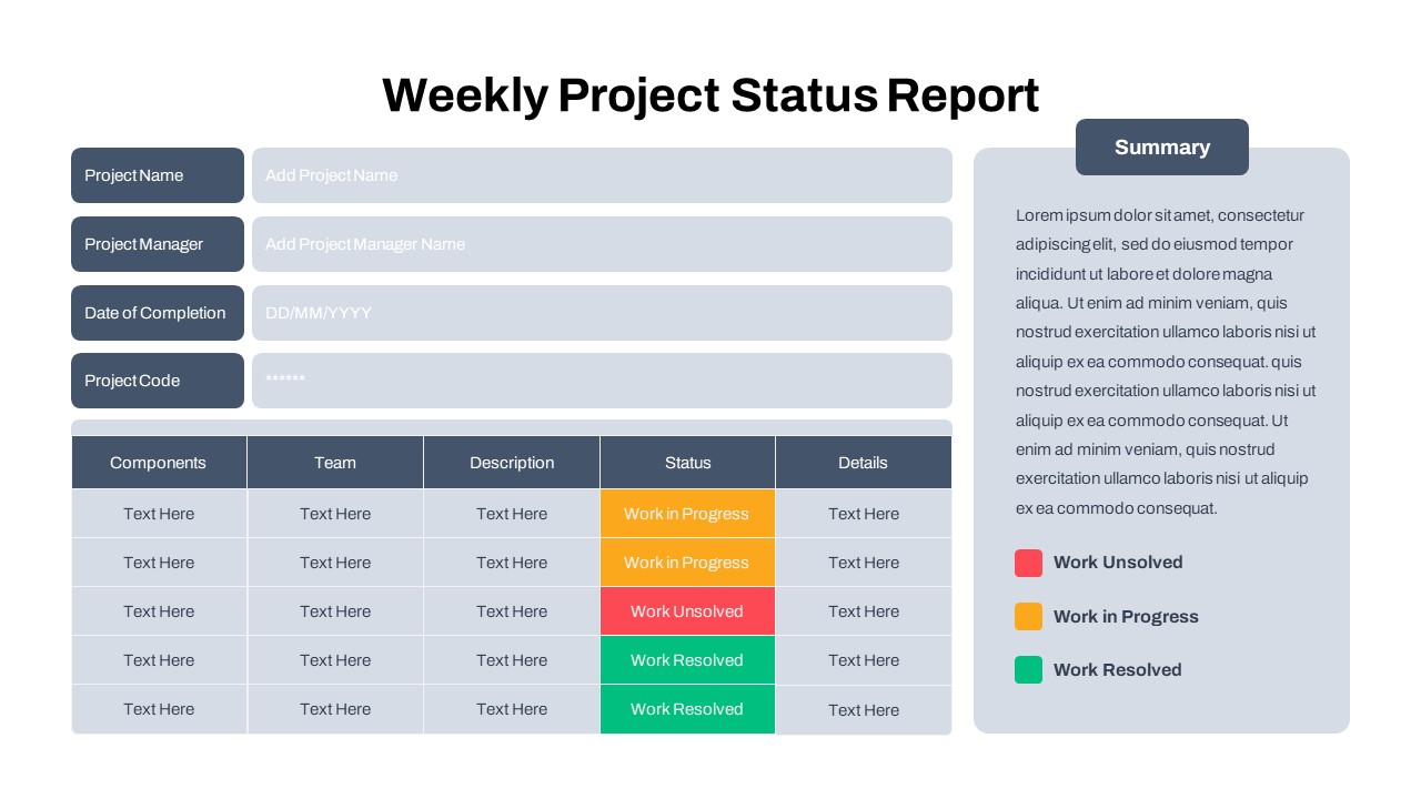
Free Weekly Status Report PowerPoint Template
Project Status
Free
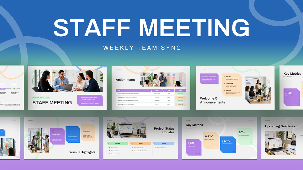
Weekly Staff Meeting PowerPoint Template
Decks