Professional Clustered Column Chart Template for PowerPoint & Google Slides

Description
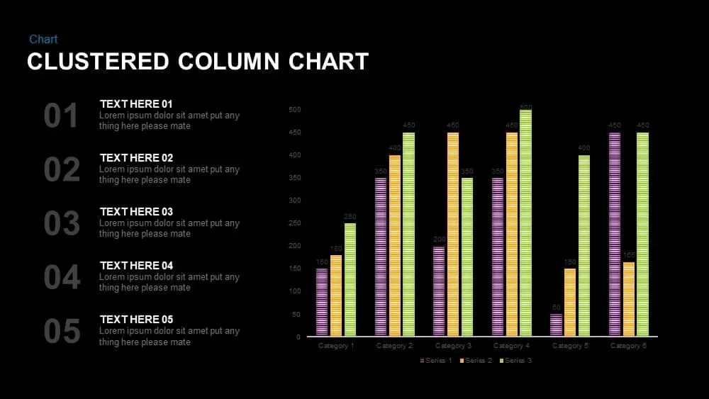
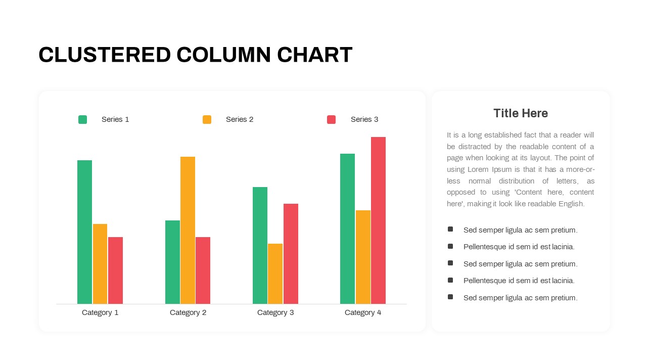
This clean clustered column chart slide presents a side-by-side comparison of three data series across four categories, set against a minimalist white canvas. On the left, color-coded bars in green, yellow, and red clearly distinguish Series 1, Series 2, and Series 3, with subtle gridlines and axis labels enhancing readability without visual clutter. A bold black title at the top announces the slide purpose, while the right-hand panel features a rounded-corner text box for an explanatory headline, descriptive paragraph, and five bullet points—each accompanied by a simple square icon for emphasis. Generous padding around all elements ensures a balanced layout that directs attention seamlessly between chart and commentary.
Built on fully editable master slides, this template allows you to swap chart data, adjust bar hues, and update text content in seconds. All shapes and icons are vector-based for crisp resizing, and font styles are predefined for consistent hierarchy between headings, body text, and bullets. Whether you’re showcasing quarterly KPIs, financial forecasts, or survey results, this slide maintains full resolution clarity and formatting integrity across both PowerPoint and Google Slides. The streamlined design also supports quick customization—relabel categories, modify legend entries, or tweak color accents to match corporate branding without disrupting the overall composition.
By pairing a well-structured chart with contextual insights in a unified visual system, this slide accelerates your workflow and reinforces data-driven storytelling. It’s optimized to highlight trends at a glance while providing space for narrative explanations, making complex comparisons instantly accessible to any audience.
Who is it for
Analysts, marketing teams, financial managers, and consultants who need to present comparative data stories—such as sales performance, budget allocations, or research findings—in a clear, professional format.
Other Uses
Repurpose this layout for KPI dashboards, competitive benchmarking, product feature comparisons, customer satisfaction surveys, or operational performance reviews.
Login to download this file

Item ID
SB03599
Related Templates

Clustered Column Chart Data Analysis Template for PowerPoint
Bar/Column

Animated Clustered Bar Chart Template for PowerPoint & Google Slides
Bar/Column
Clustered Bar Chart Comparison Template for PowerPoint & Google Slides
Bar/Column
Professional 100% Stacked Column Chart Template for PowerPoint & Google Slides
Bar/Column
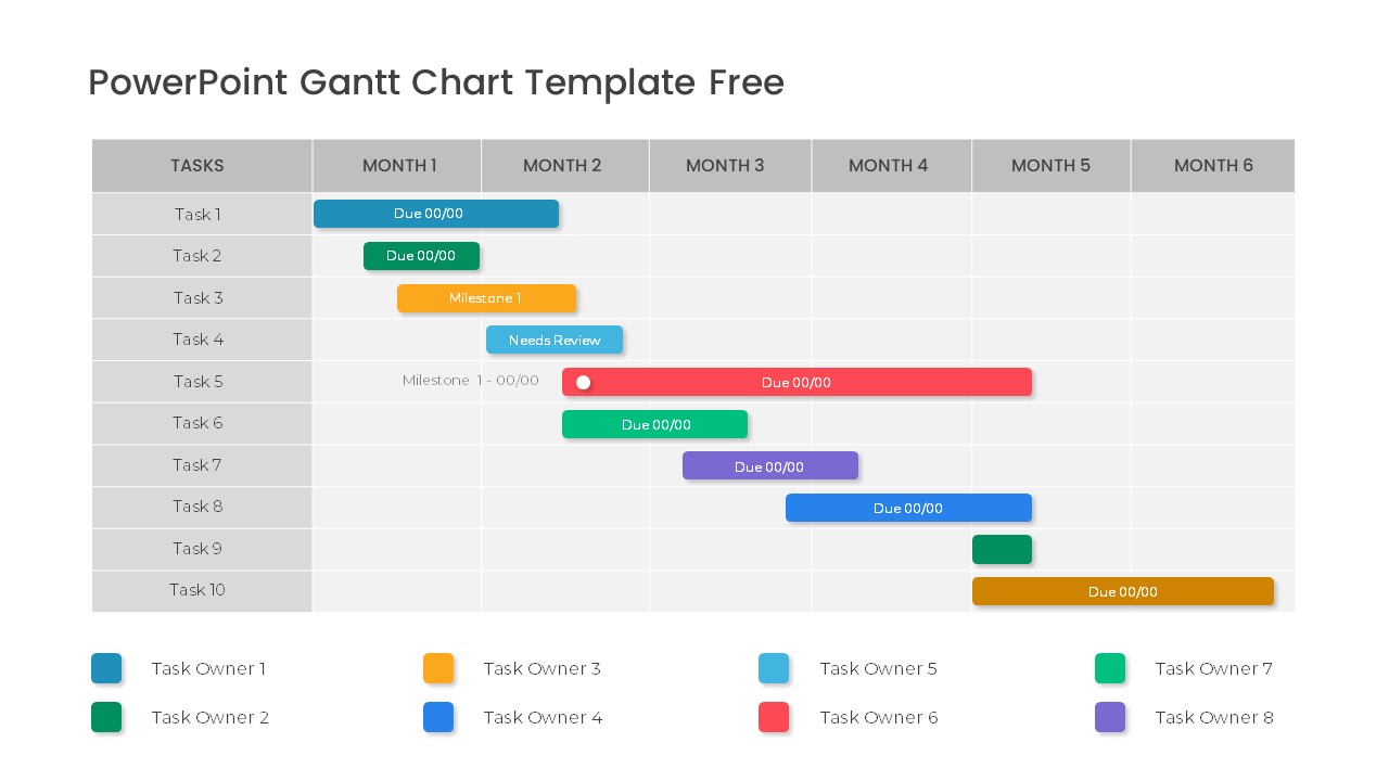
Free Professional Gantt Chart Pack – 4 Slides Template for PowerPoint & Google Slides
Gantt Chart
Free
Free Stacked Column Chart Data Visualization Template for PowerPoint & Google Slides
Bar/Column
Free
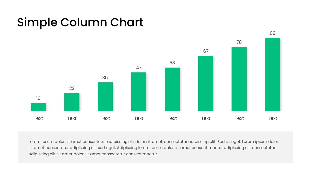
Free Editable Simple Column Chart Slide Template for PowerPoint & Google Slides
Bar/Column
Free
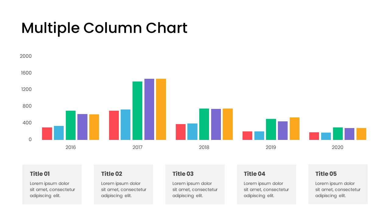
Minimal Multi-Year Column Chart Template for PowerPoint & Google Slides
Bar/Column
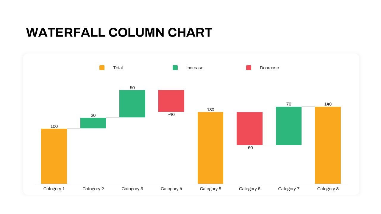
Waterfall Column Chart Analysis Template for PowerPoint & Google Slides
Bar/Column
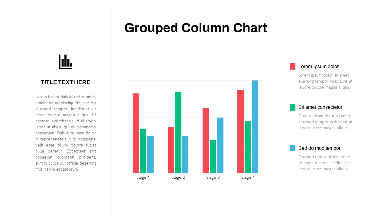
Grouped Column Chart Comparison Template for PowerPoint & Google Slides
Bar/Column
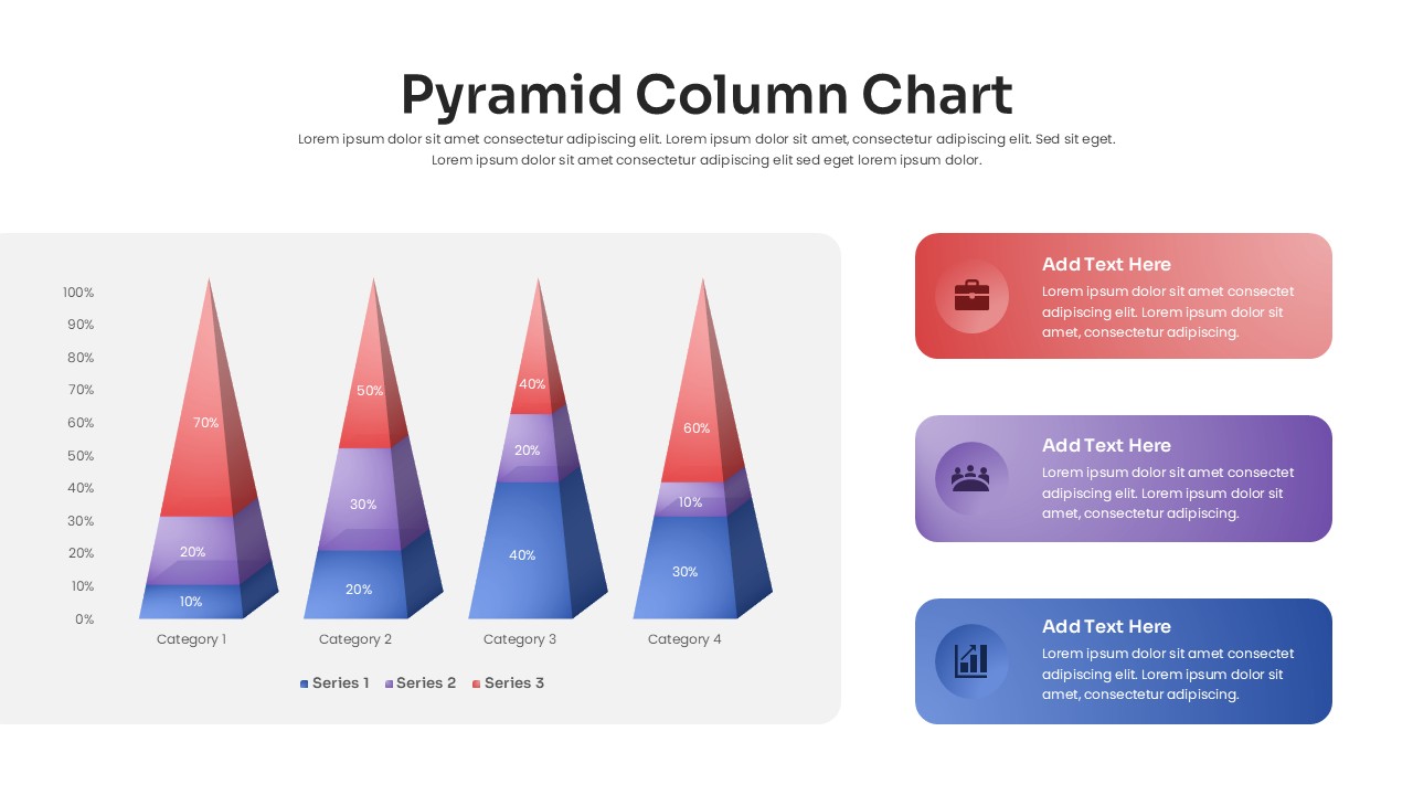
3D Pyramid Column Chart Infographic Template for PowerPoint & Google Slides
Bar/Column

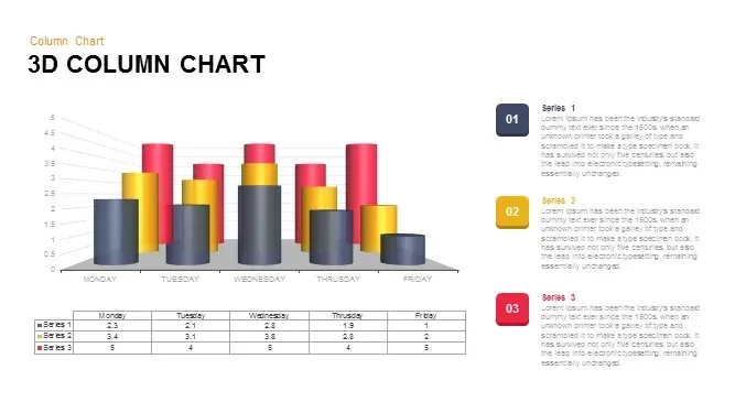
3D Column Chart with Data Table for PowerPoint & Google Slides
Bar/Column
Professional Organizational Chart Diagram Template for PowerPoint & Google Slides
Org Chart
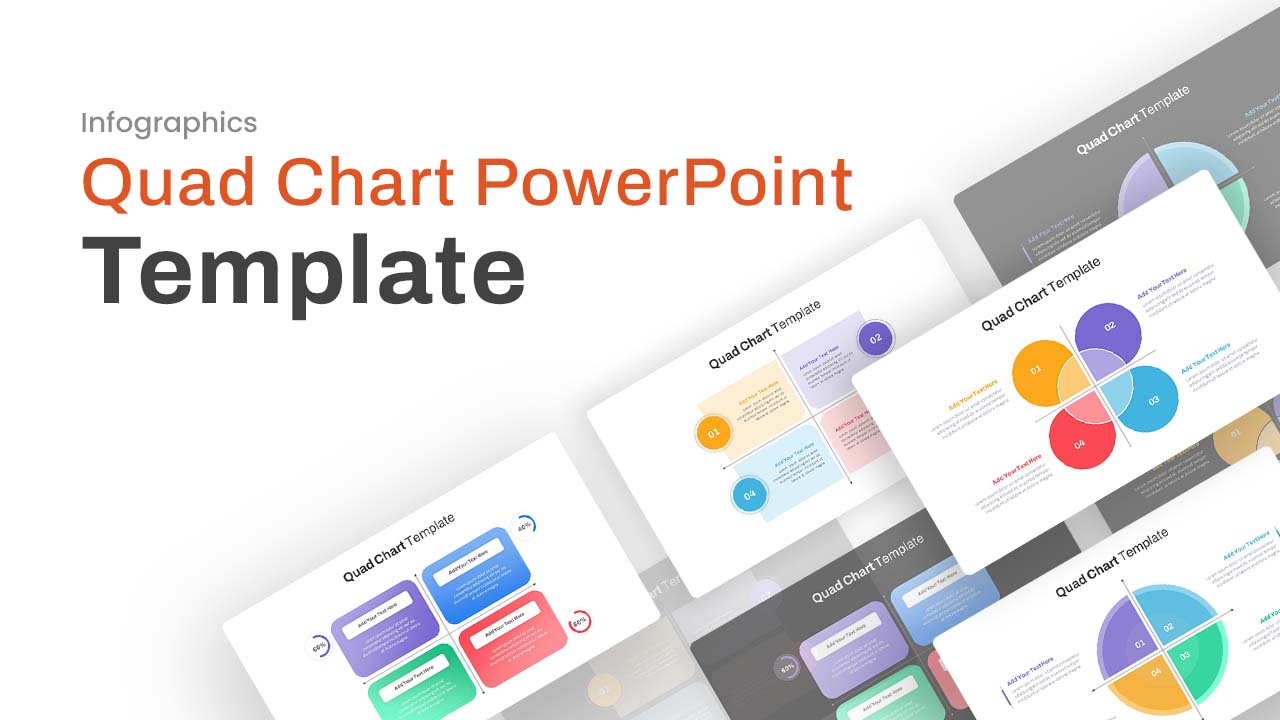
Professional Quad Chart Layout Template for PowerPoint & Google Slides
Pie/Donut
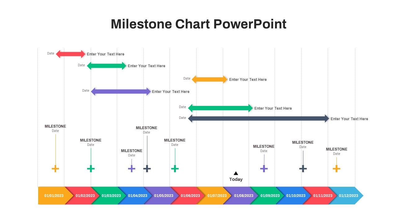
Milestone Chart PowerPoint
Timeline
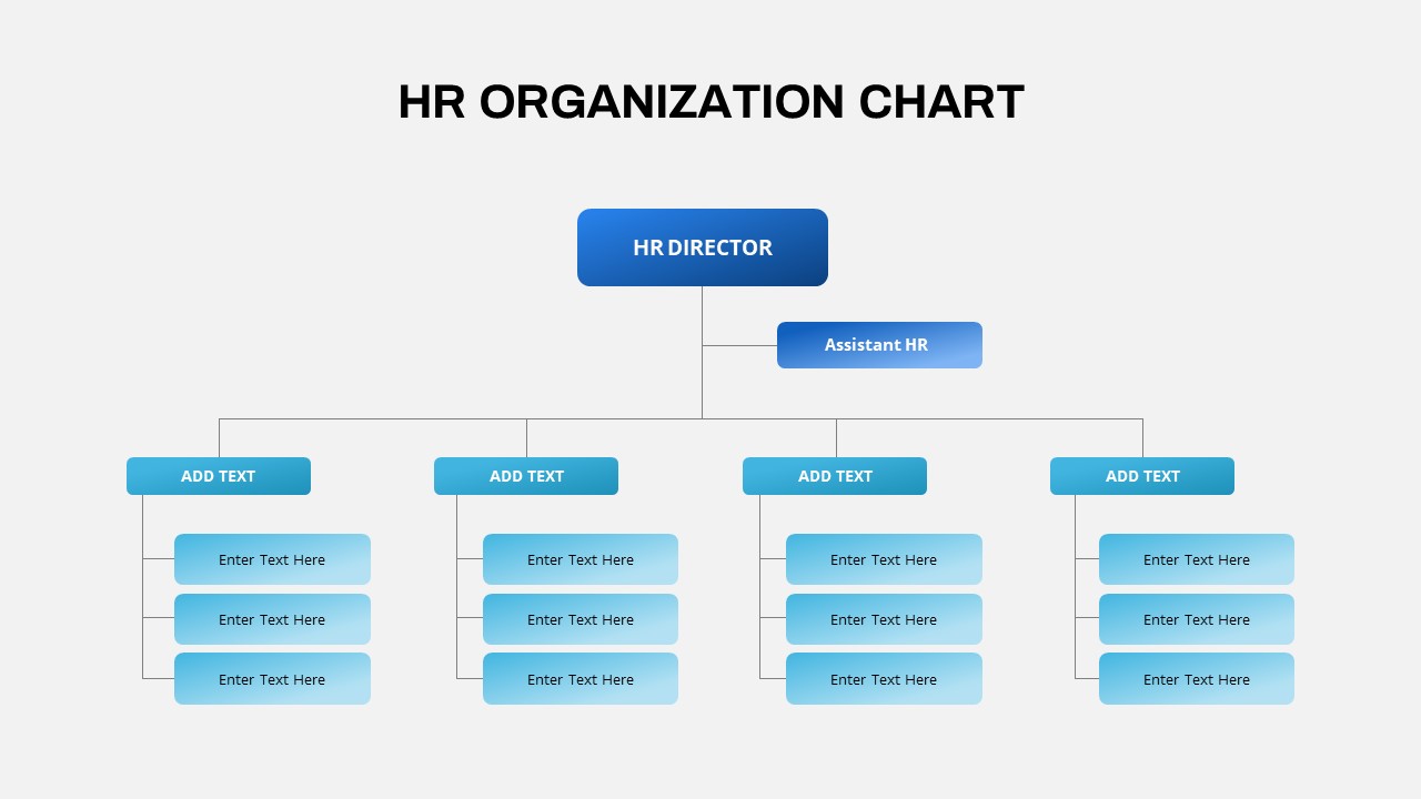
HR Org Chart PowerPoint Template
Org Chart
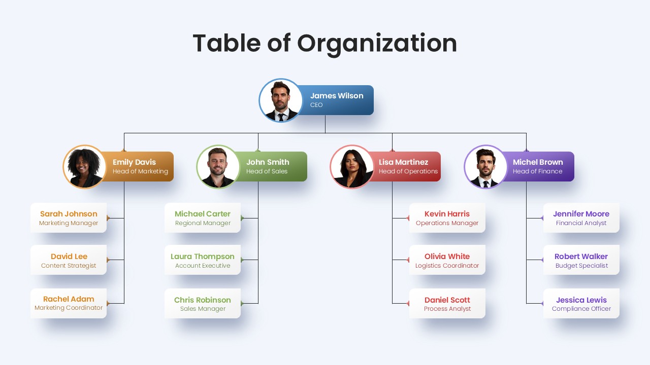
Professional Table of Organization Chart Template for PowerPoint & Google Slides
Org Chart
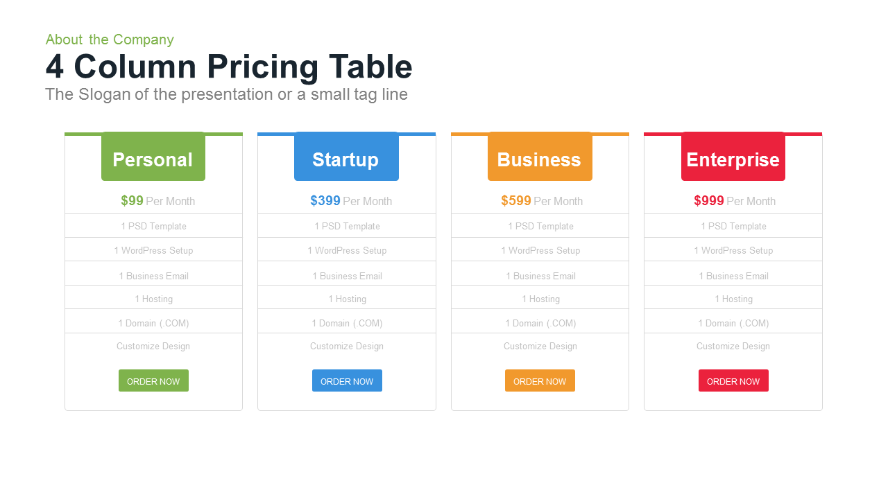
4 Column Pricing template for PowerPoint & Google Slides
Comparison
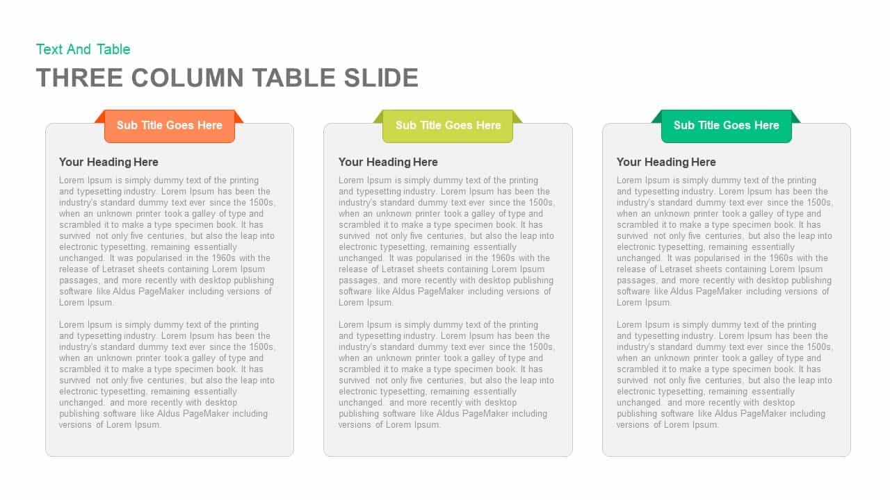
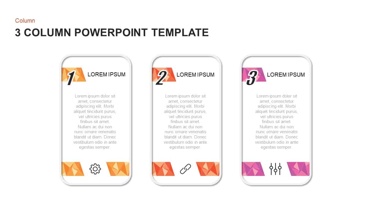
3-Column Comparison template for PowerPoint & Google Slides
Comparison
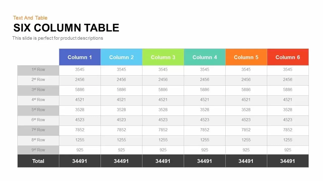
Six Column Table template for PowerPoint & Google Slides
Table
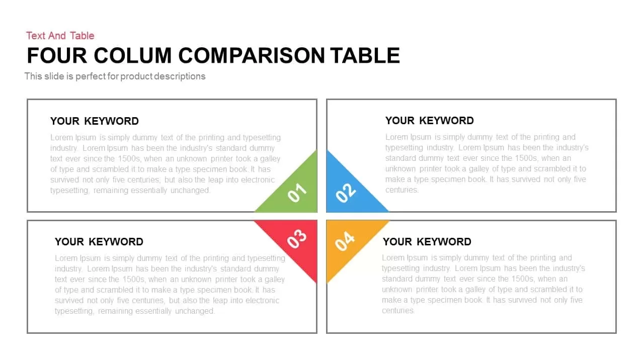
Clean Three-Four Column Table Slide Template for PowerPoint & Google Slides
Business Report
Three and Four-Column Card Layout Template for PowerPoint & Google Slides
Infographics
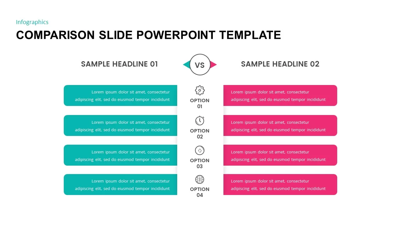
Comparison Slide Presentation Template
Comparison
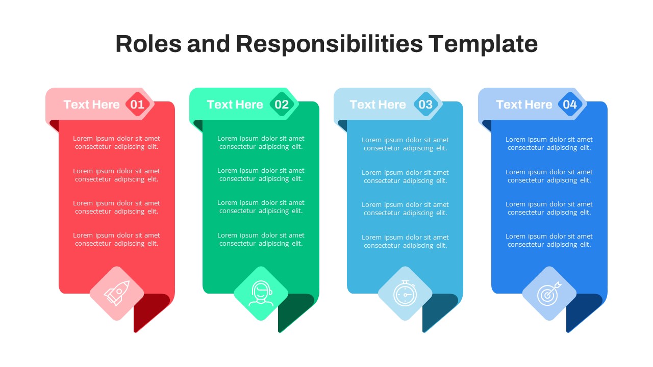
Free Four-Column Roles and Responsibilities Template for PowerPoint & Google Slides
Our Team
Free
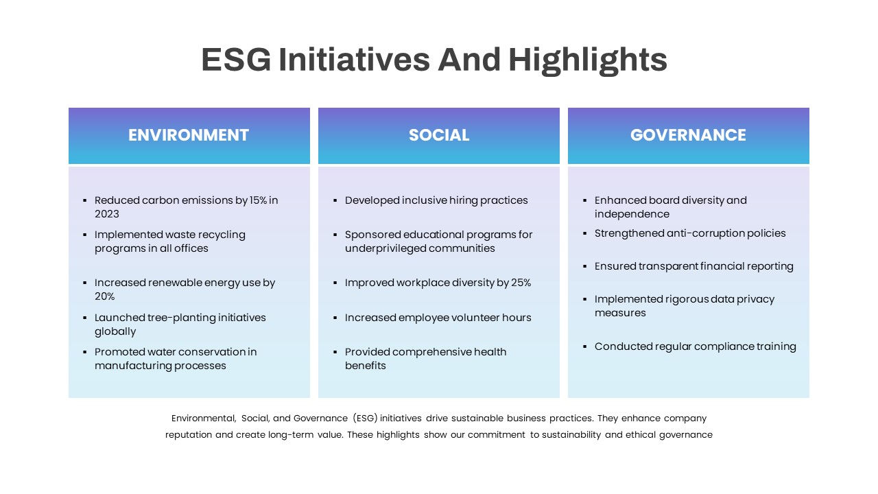
ESG Initiatives Three-Column Template for PowerPoint & Google Slides
Comparison
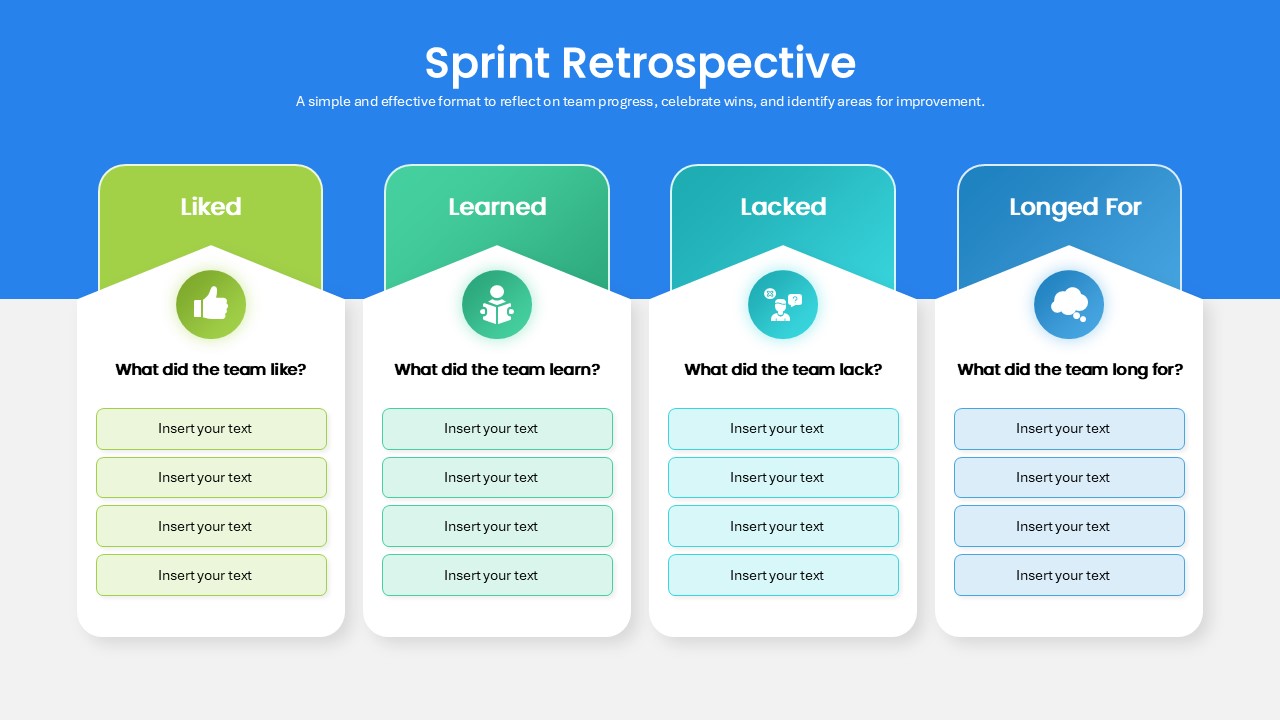
Sprint Retrospective Four-Column Template for PowerPoint & Google Slides
Process
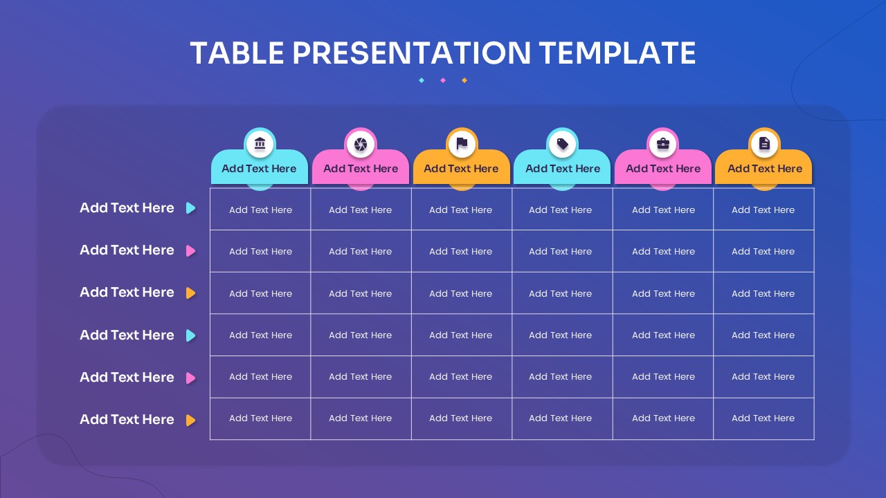
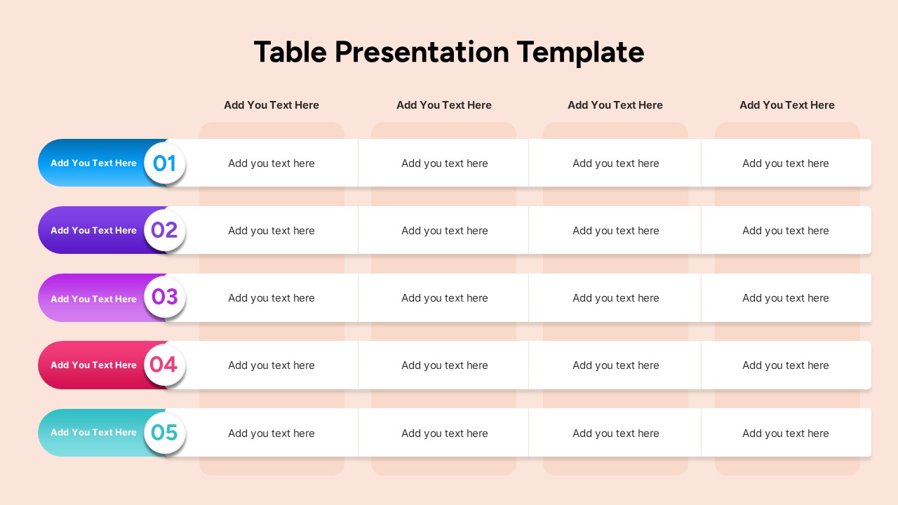
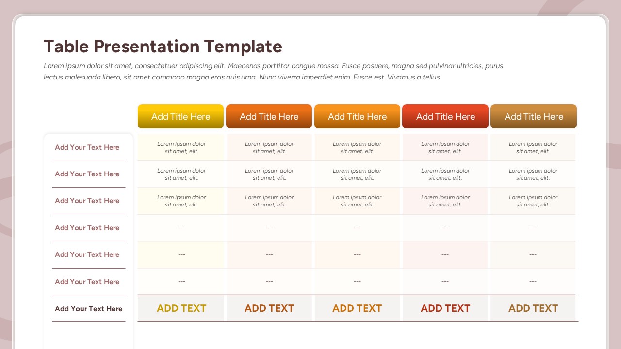
Multi-Column Table Presentation Template for PowerPoint & Google Slides
Table
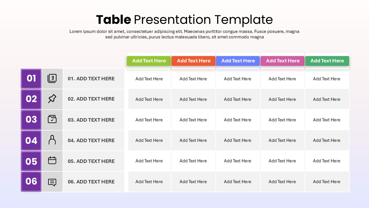
Six-Row Multi-Column Table Presentation Template for PowerPoint & Google Slides
Table
Colorful Four-Column Table Layout Template for PowerPoint & Google Slides
Table
Five Column Comparison Table Layout Template for PowerPoint & Google Slides
Comparison
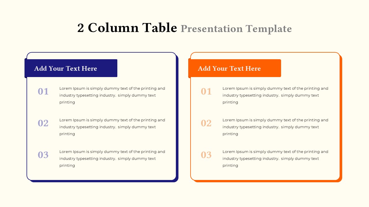
Two-Column Table Presentation Template for PowerPoint & Google Slides
Table
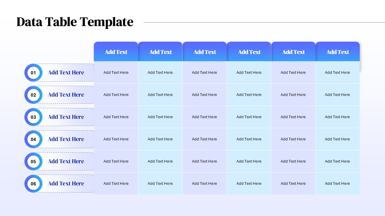
Six Column Data Table Template for PowerPoint & Google Slides
Table
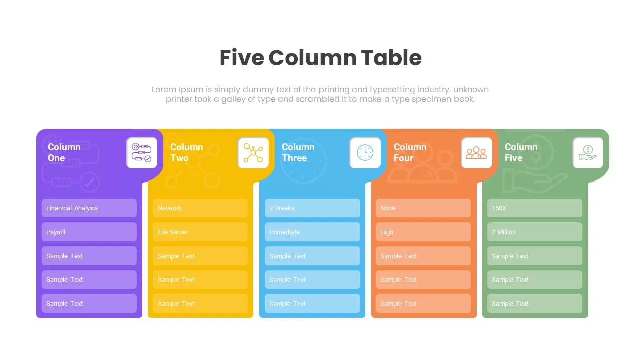
Five Column Table Infographics for PowerPoint & Google Slides
Business
1 to 5 Column infographic pack for PowerPoint & Google Slides
Business
Professional 3D Funnel Infographic Template for PowerPoint & Google Slides
Funnel
Professional Structured 3D Layer Diagram Template for PowerPoint & Google Slides
Process
Professional 3D Gear Process Diagram Template for PowerPoint & Google Slides
Process
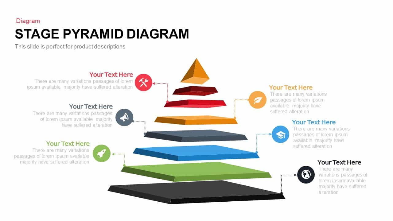
Professional 5-Stage Pyramid Diagram Template for PowerPoint & Google Slides
Pyramid
Professional 4-Piece 3D Pyramid Diagram Template for PowerPoint & Google Slides
Pyramid

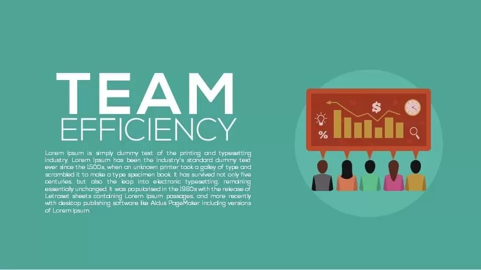
Professional Team Efficiency Dashboard Template for PowerPoint & Google Slides
Business Report
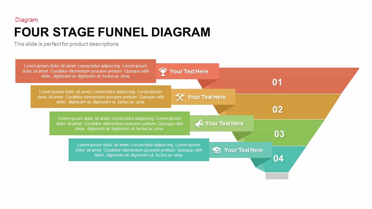
Professional Four-Stage Funnel Diagram Template for PowerPoint & Google Slides
Funnel
Professional Security Metaphor Diagram Template for PowerPoint & Google Slides
Information Technology
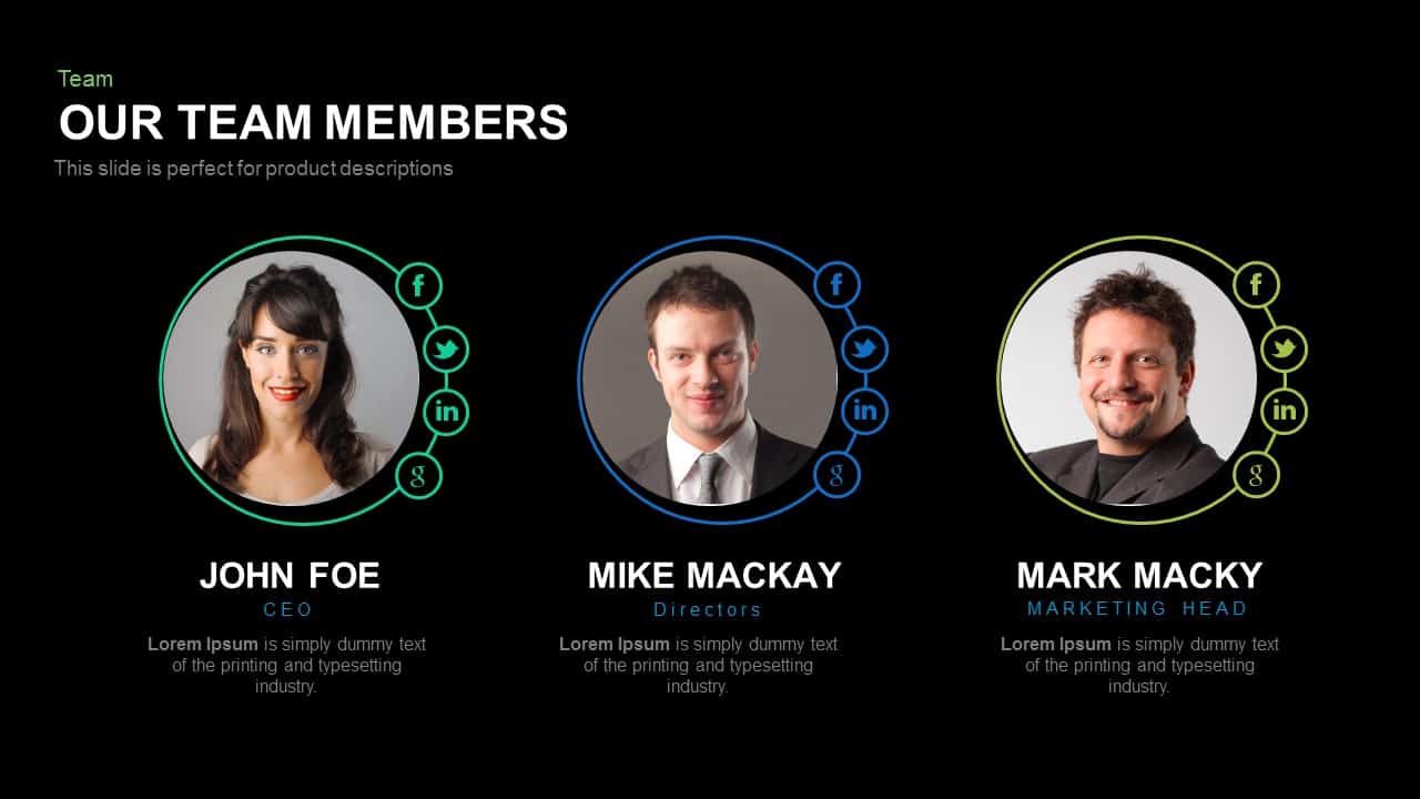
Professional Team Members Slide Template for PowerPoint & Google Slides
Our Team
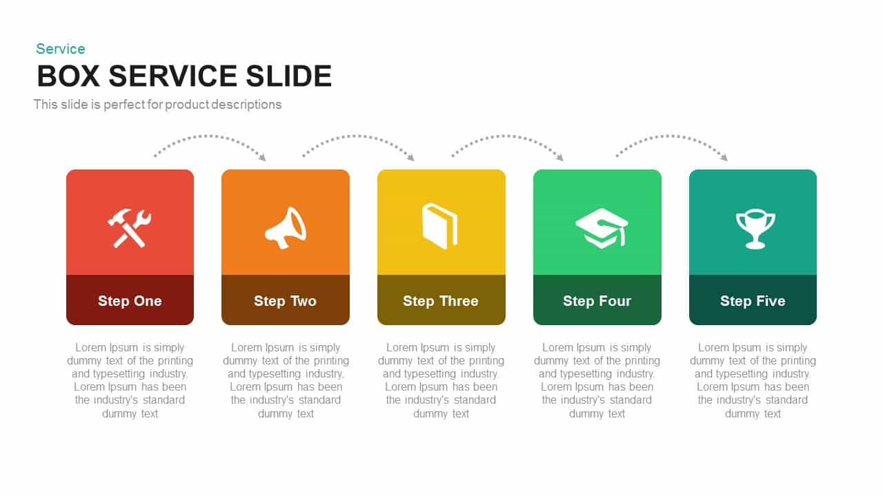
Professional Box Service Diagram Template for PowerPoint & Google Slides
Comparison
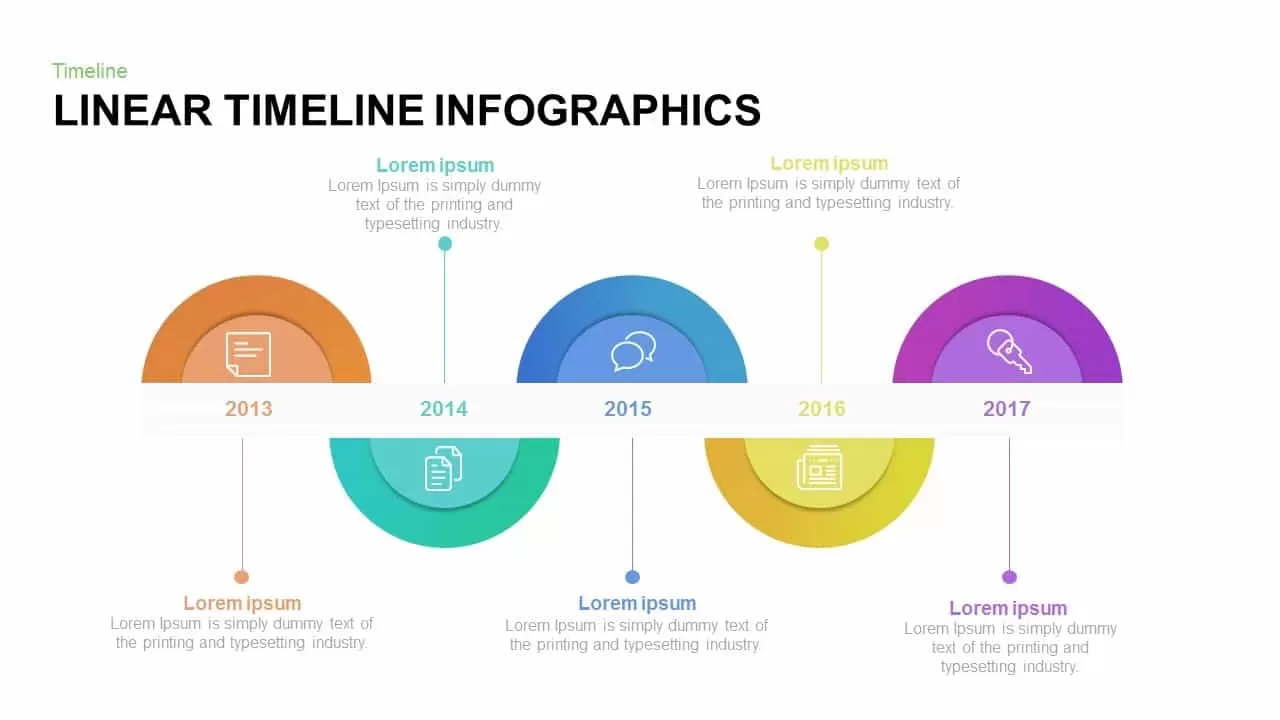
Professional Linear Timeline Infographic Template for PowerPoint & Google Slides
Timeline

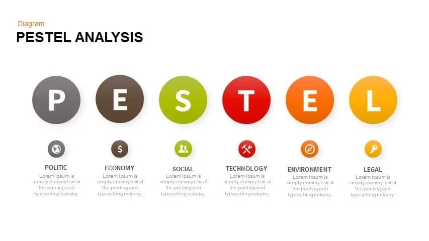
Professional PESTEL Analysis Diagram Template for PowerPoint & Google Slides
PEST
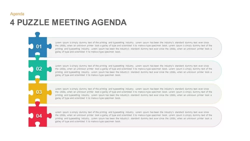
Professional Four Puzzle Meeting Agenda Template for PowerPoint & Google Slides
Agenda
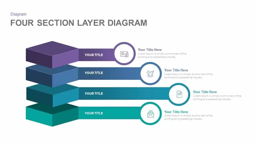
4 Section Layer PowerPoint Template and Google Slides
Process
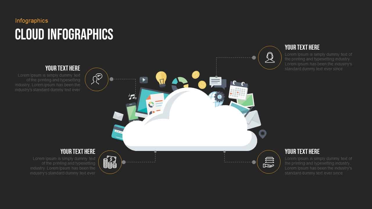
Free Professional Cloud Infographics Template for PowerPoint & Google Slides
Process
Free
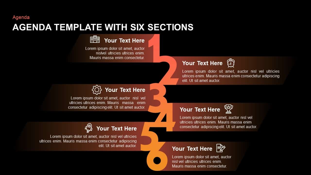
Six-Section Professional Agenda Template for PowerPoint & Google Slides
Agenda
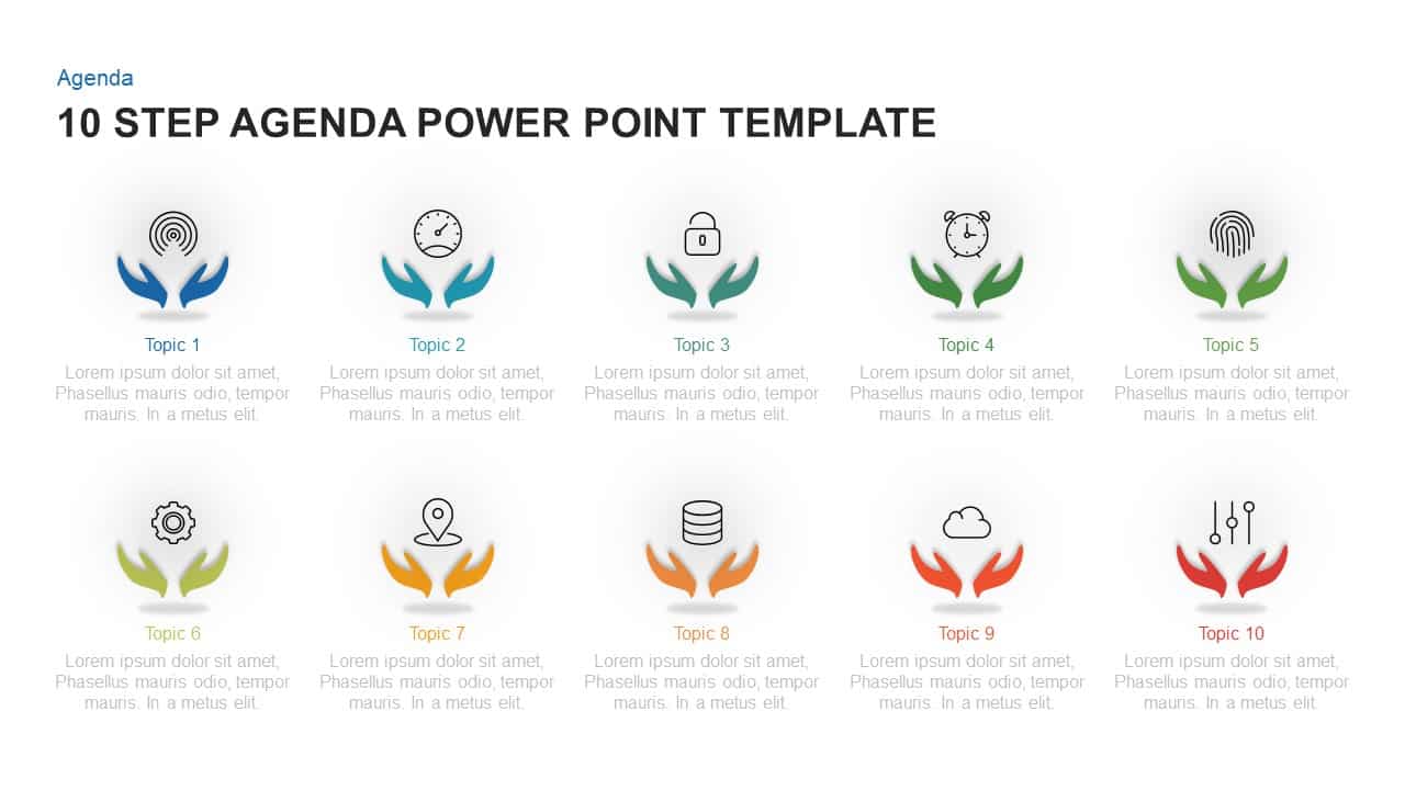
Professional Ten-Step Agenda Slide Template for PowerPoint & Google Slides
Agenda
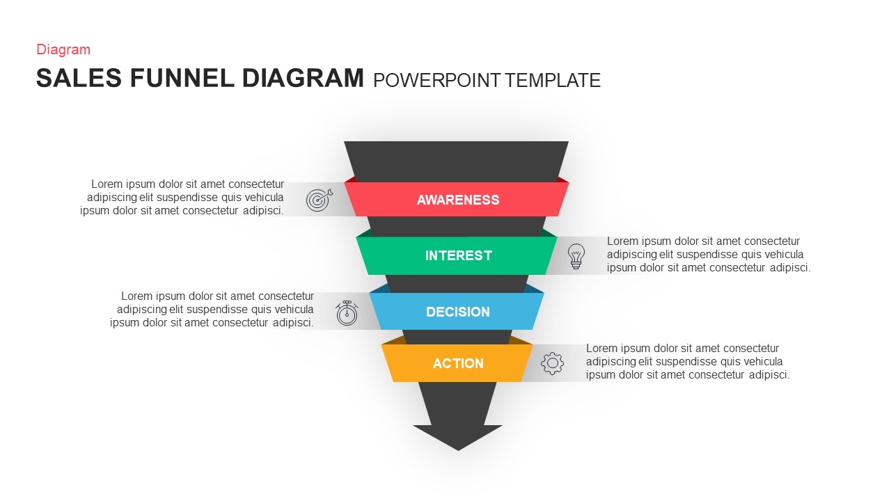
Professional Sales Funnel Diagram Template for PowerPoint & Google Slides
Funnel
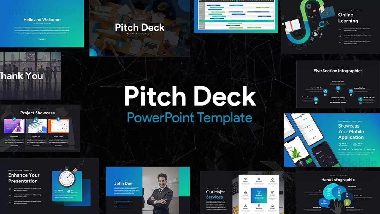
Dark Pitch Deck Template for PowerPoint & Google Slides
Pitch Deck
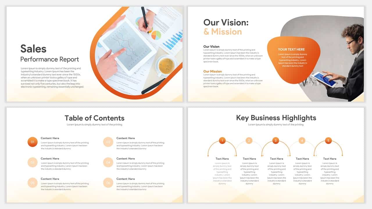
Professional Sales Performance Report Template for PowerPoint & Google Slides
Business Report
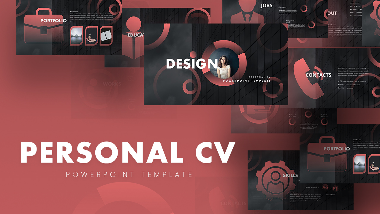
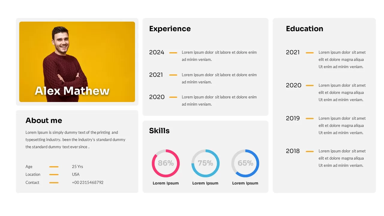
Professional Personal CV Presentation Template for PowerPoint & Google Slides
Company Profile
Professional Mobile App Showcase Deck Template for PowerPoint & Google Slides
Pitch Deck
Professional Sales Meeting Presentation Template for PowerPoint & Google Slides
Pitch Deck
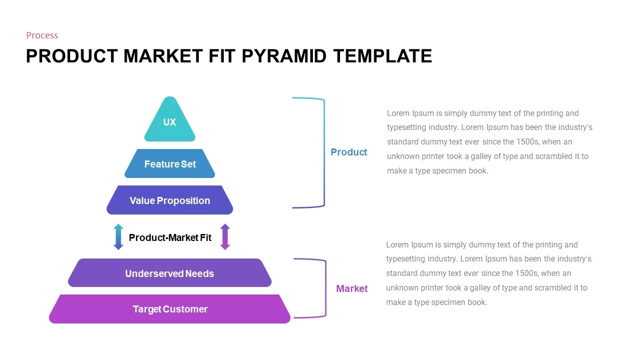
Professional Product Market Fit Pyramid Template for PowerPoint & Google Slides
Pyramid
Book Review PPT Template & Google Slides
Business
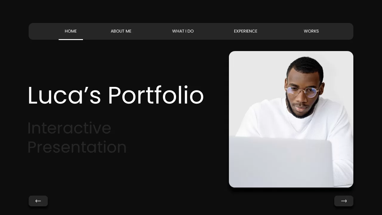
Professional Portfolio Profile Template for PowerPoint & Google Slides
Decks

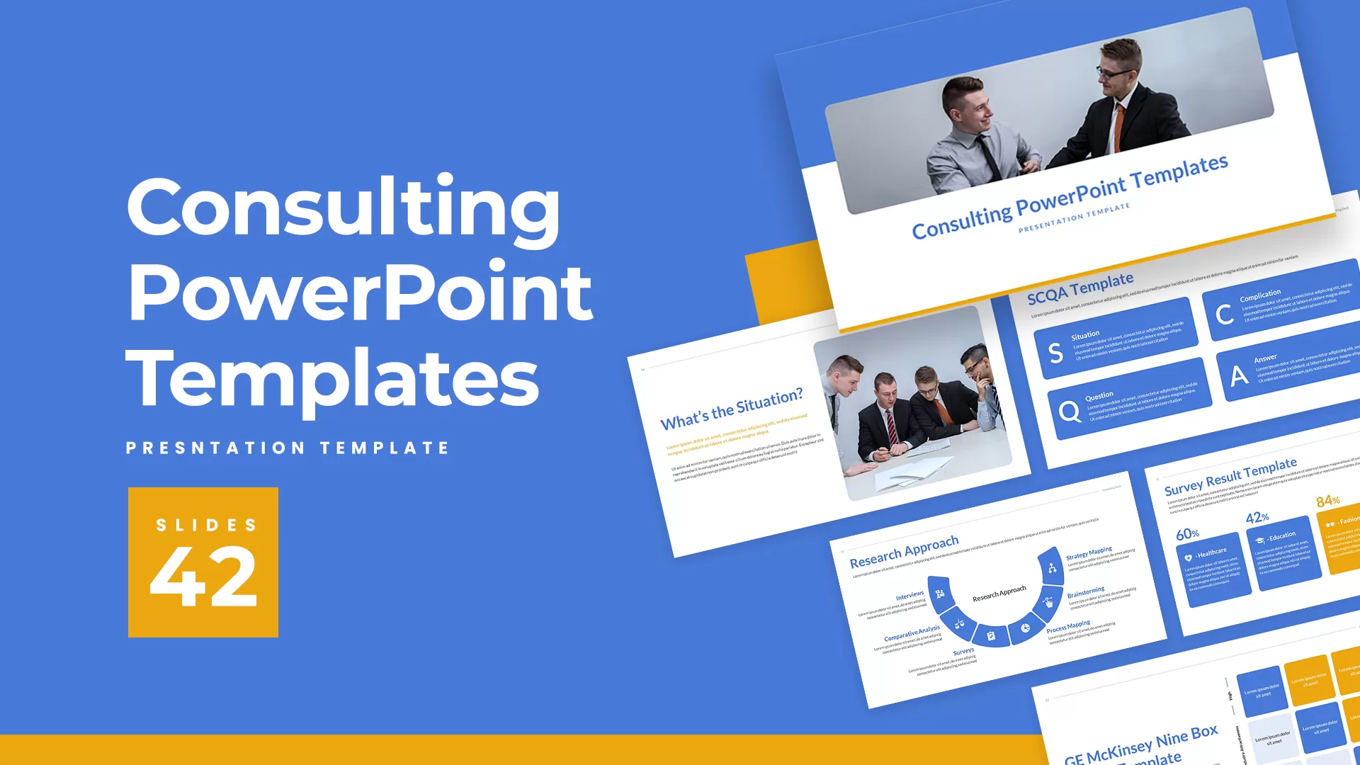
Professional Consulting Deck Presentation Template for PowerPoint & Google Slides
Pitch Deck
Professional Resume Profile Slide Template for PowerPoint & Google Slides
Recruitment
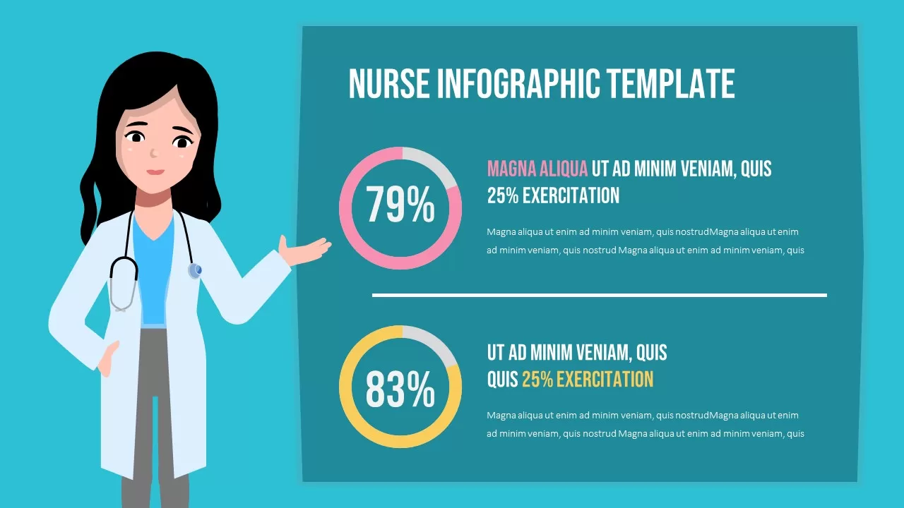
Professional Nurse Infographic Dashboard Template for PowerPoint & Google Slides
Nursing
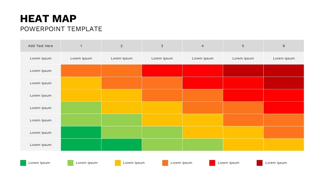
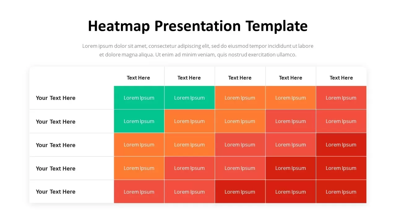
Heat Map Template for Presentations
Comparison Chart
Nursing PowerPoint Template and Google Slides
Nursing
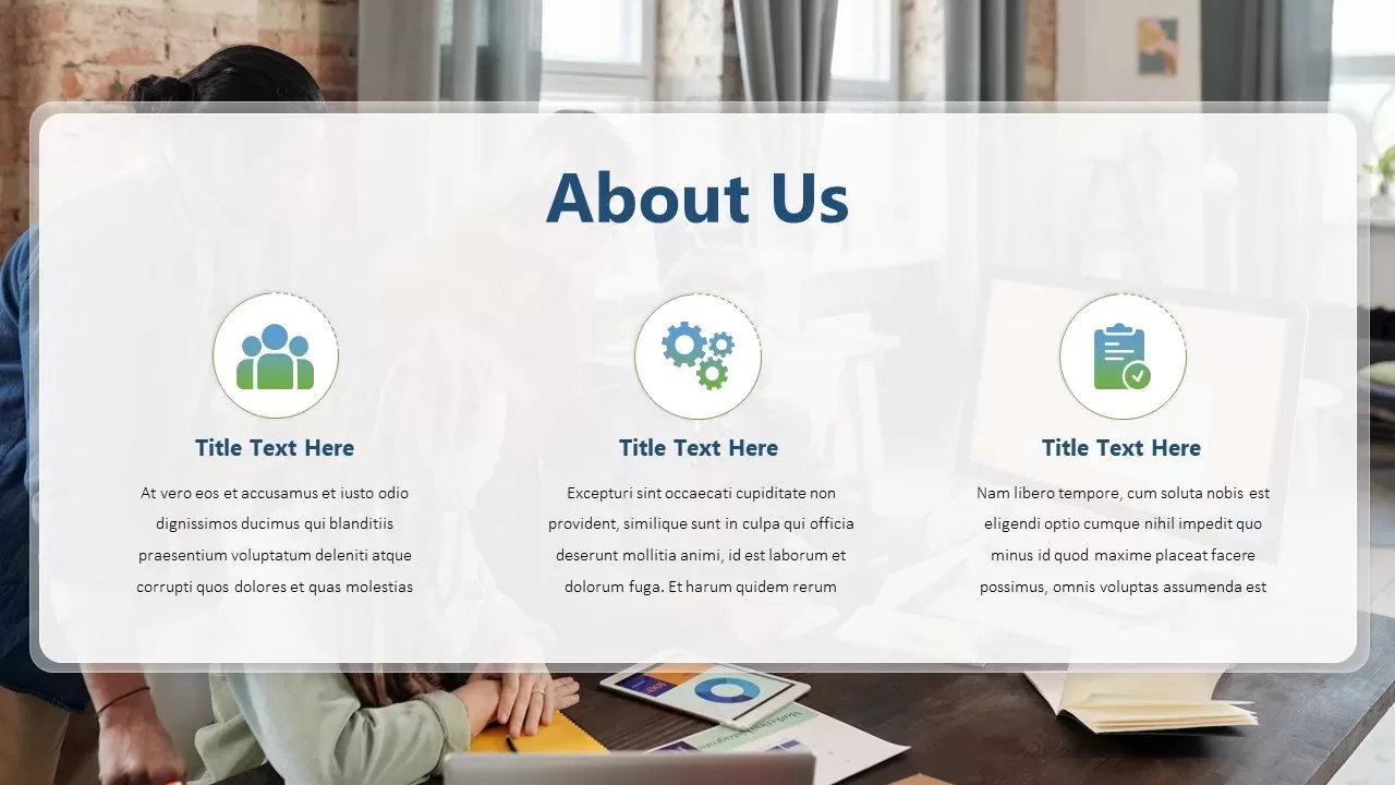
Professional Company About Us Slide Template for PowerPoint & Google Slides
Company Profile
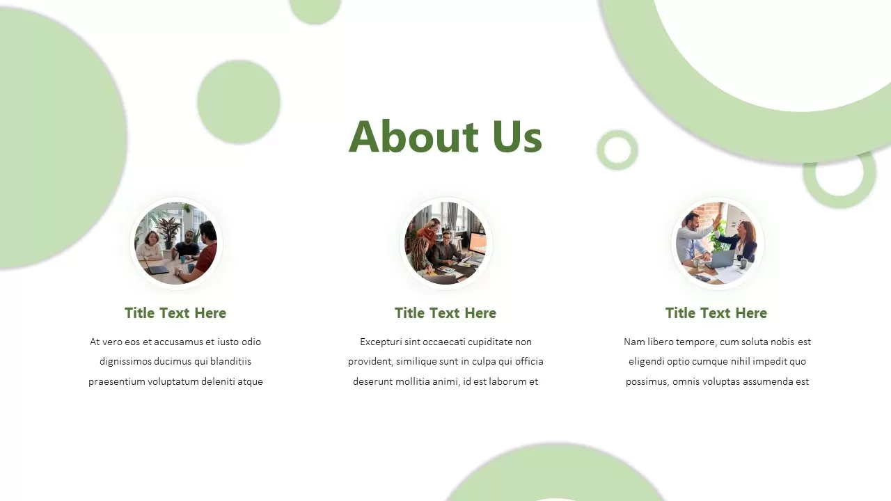
Professional Corporate Company About Us Template for PowerPoint & Google Slides
Graphics
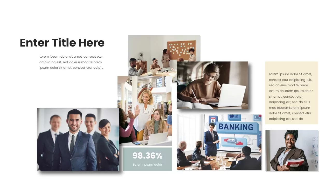
Professional Team Collage & KPI Slide Template for PowerPoint & Google Slides
Business
Professional Heatmap Data Visualization Template for PowerPoint & Google Slides
Infographics
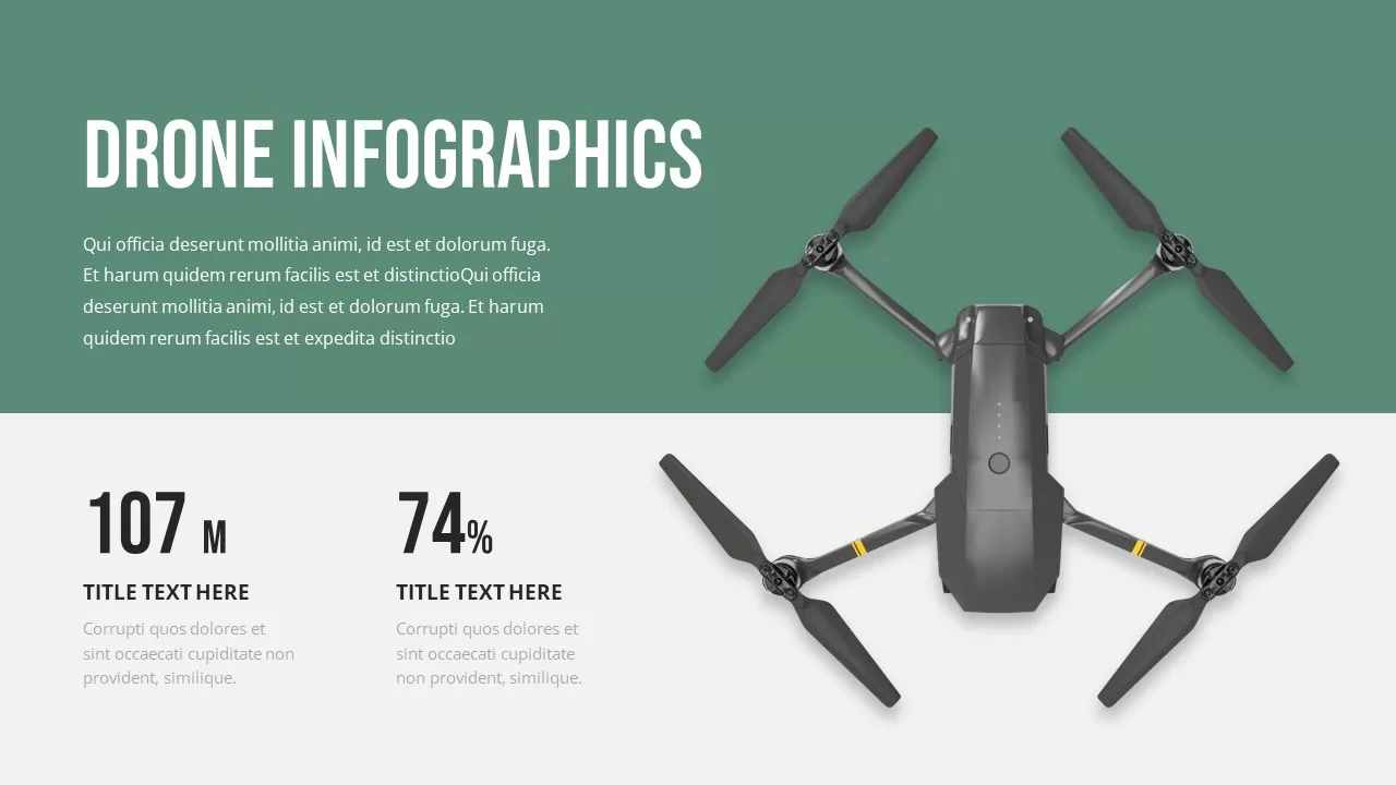
Professional Drone Infographic Slide Template for PowerPoint & Google Slides
Infographics
Professional Corporate Cover Slide Template for PowerPoint & Google Slides
Company Profile
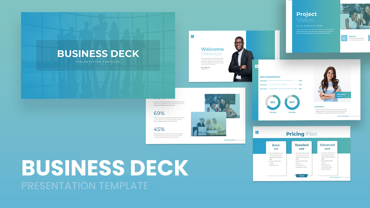
Professional Business Deck Presentation Template for PowerPoint & Google Slides
Company Profile
Professional Portfolio Presentation Template
Decks
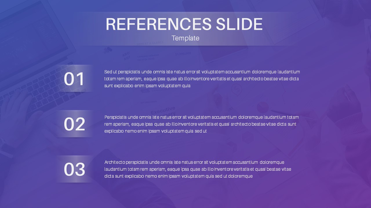
Professional References Slide Layout Template for PowerPoint & Google Slides
Infographics
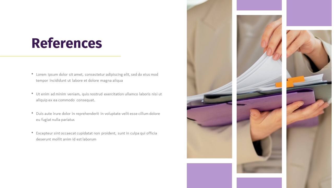
Professional Photo References Slide Template for PowerPoint & Google Slides
Business
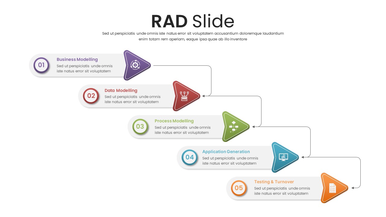
Professional Five-Step RAD Process Slide Template for PowerPoint & Google Slides
Process
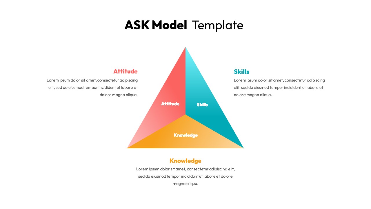
Professional ASK Model Template for PowerPoint & Google Slides
Employee Performance
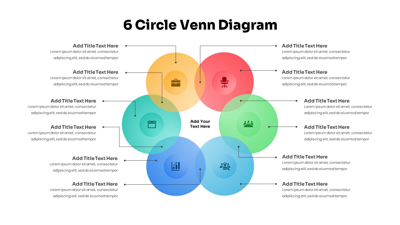
6 Circle Venn Diagram PowerPoint Template
Circular
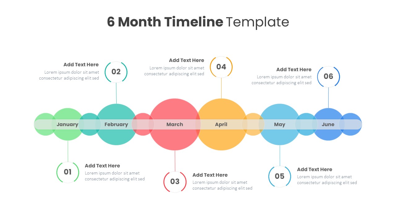
Professional Editable 6 Month Timeline Template for PowerPoint & Google Slides
Timeline
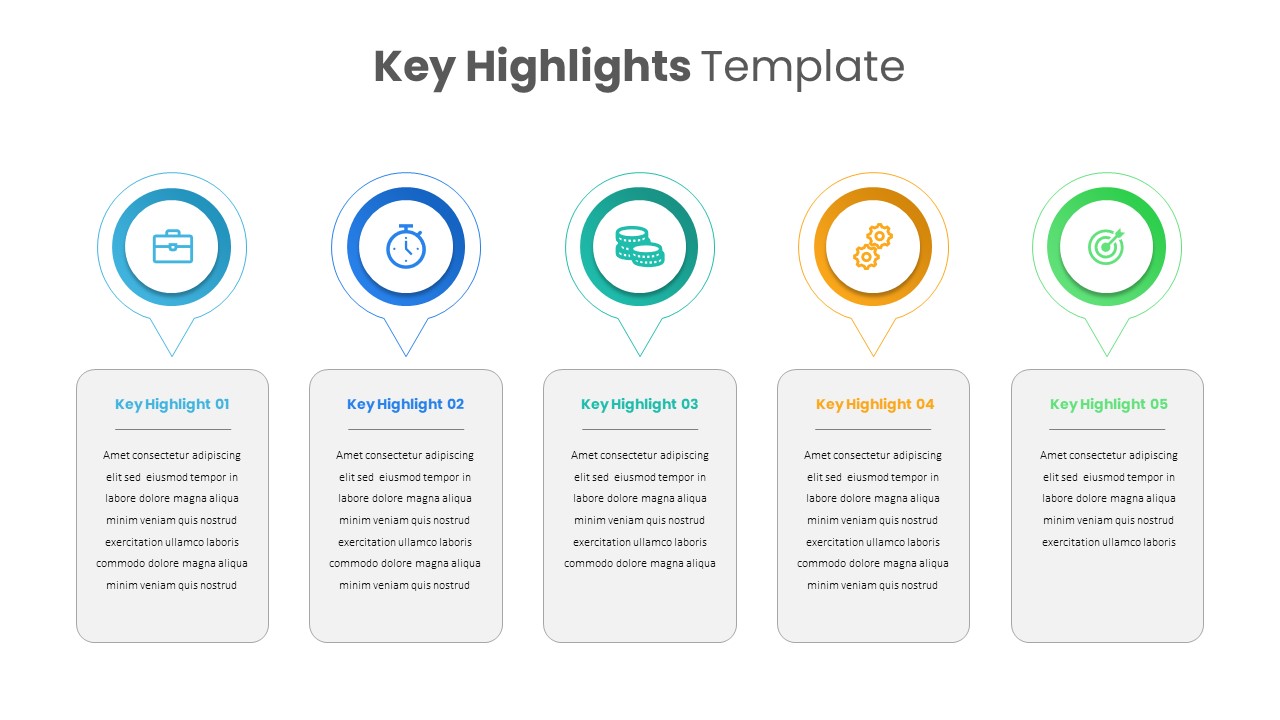
Key Highlights PowerPoint Template
Business
Golf PowerPoint Template
Graphics
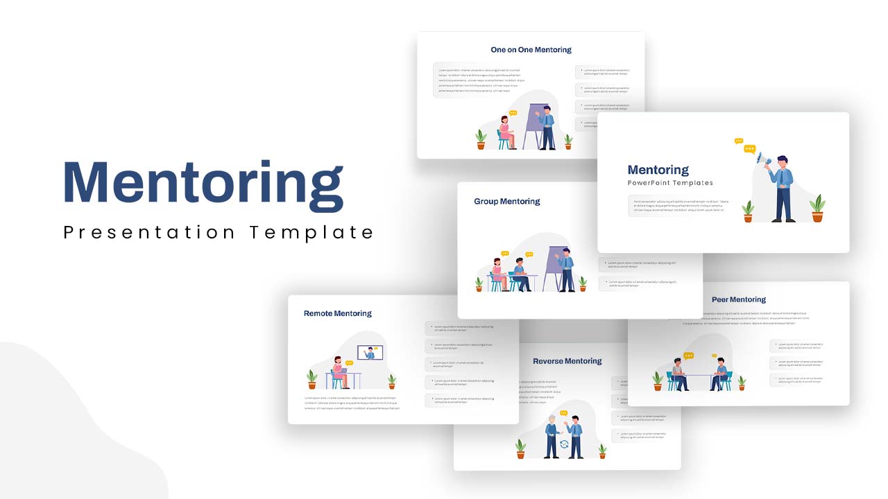
Professional Mentoring Presentation Template for PowerPoint & Google Slides
Leadership

Dental Clinic PowerPoint Presentation Template
Company Profile
Professional Law & Justice Presentation Template for PowerPoint & Google Slides
Company Profile
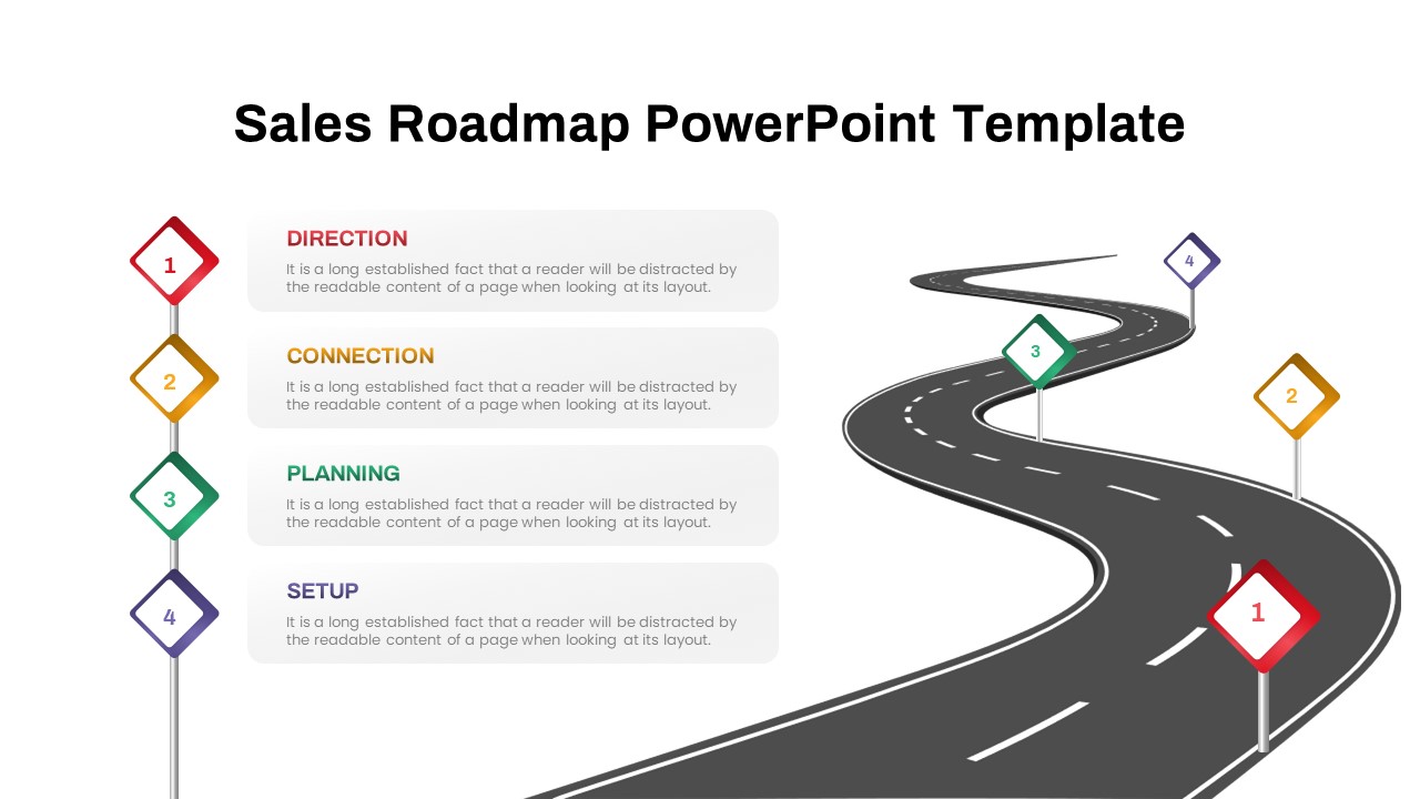
Sales Roadmap PowerPoint Template and Google Slides
Roadmap
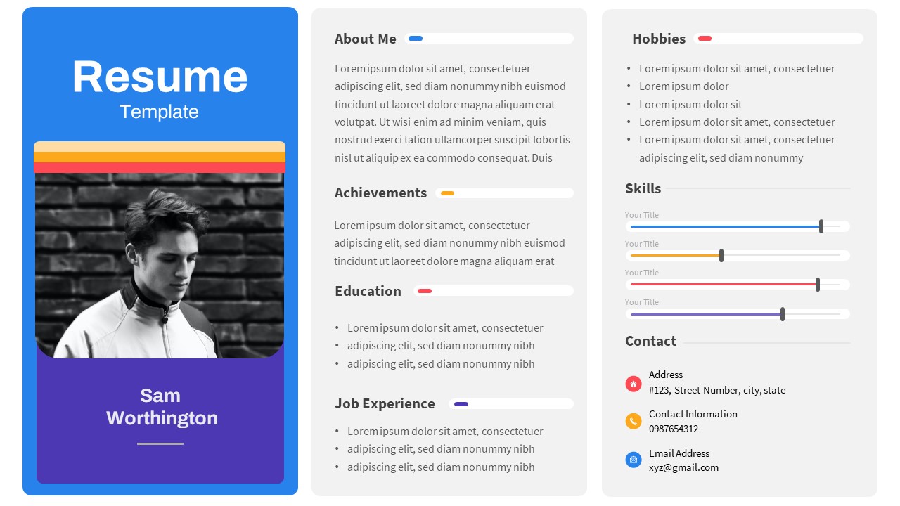
One Slide Page Resume Template
Recruitment
Free
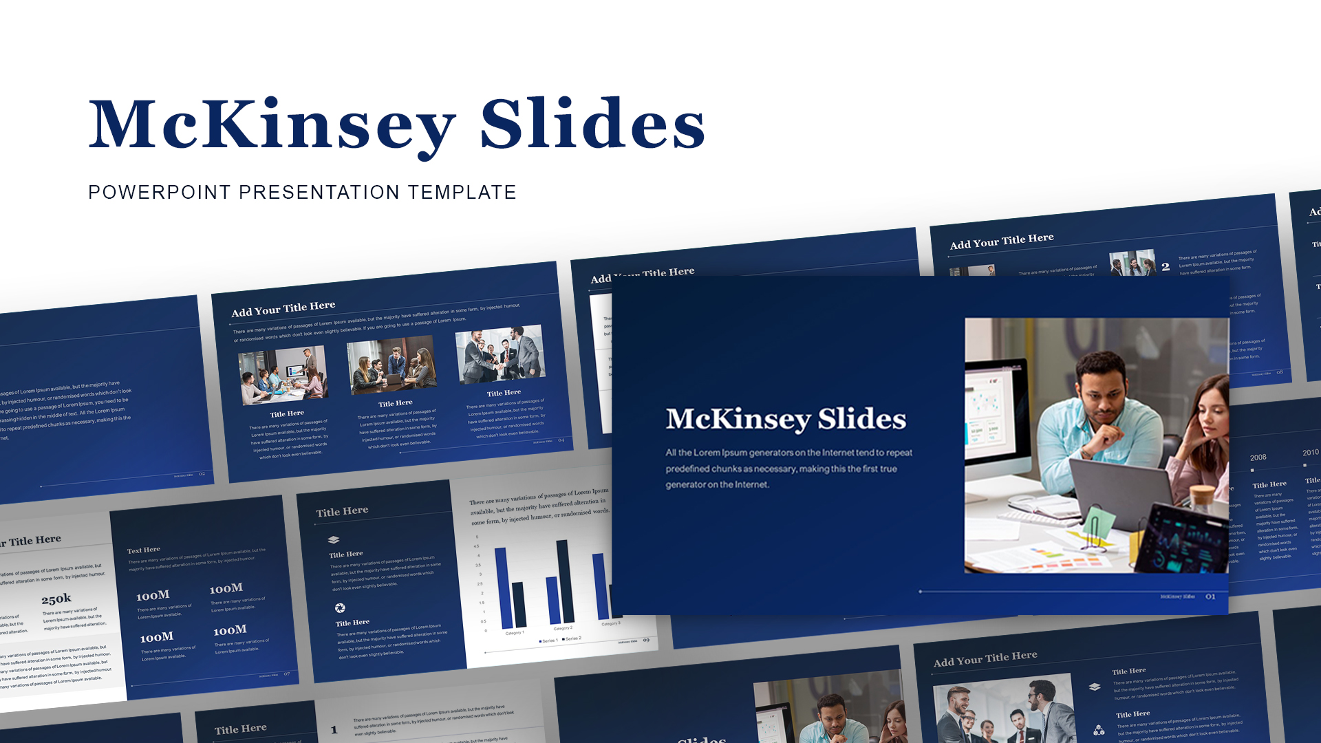
McKinsey-Style Professional Business Deck Template for PowerPoint & Google Slides
Business Report
Modern Professional Medical Service Template for PowerPoint & Google Slides
Health
Free Professional Carnival Pitch Deck Template for PowerPoint & Google Slides
Pitch Deck
Free
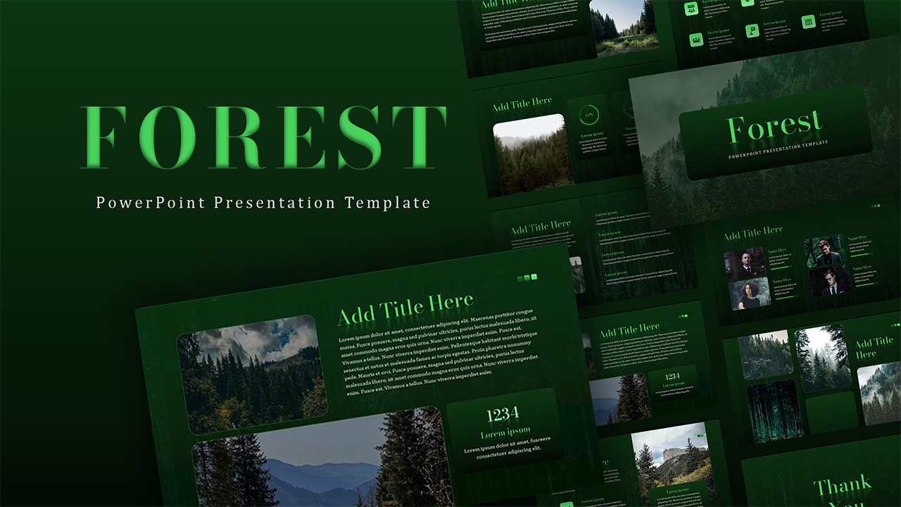
Free Forest PowerPoint Template
Company Profile
Free
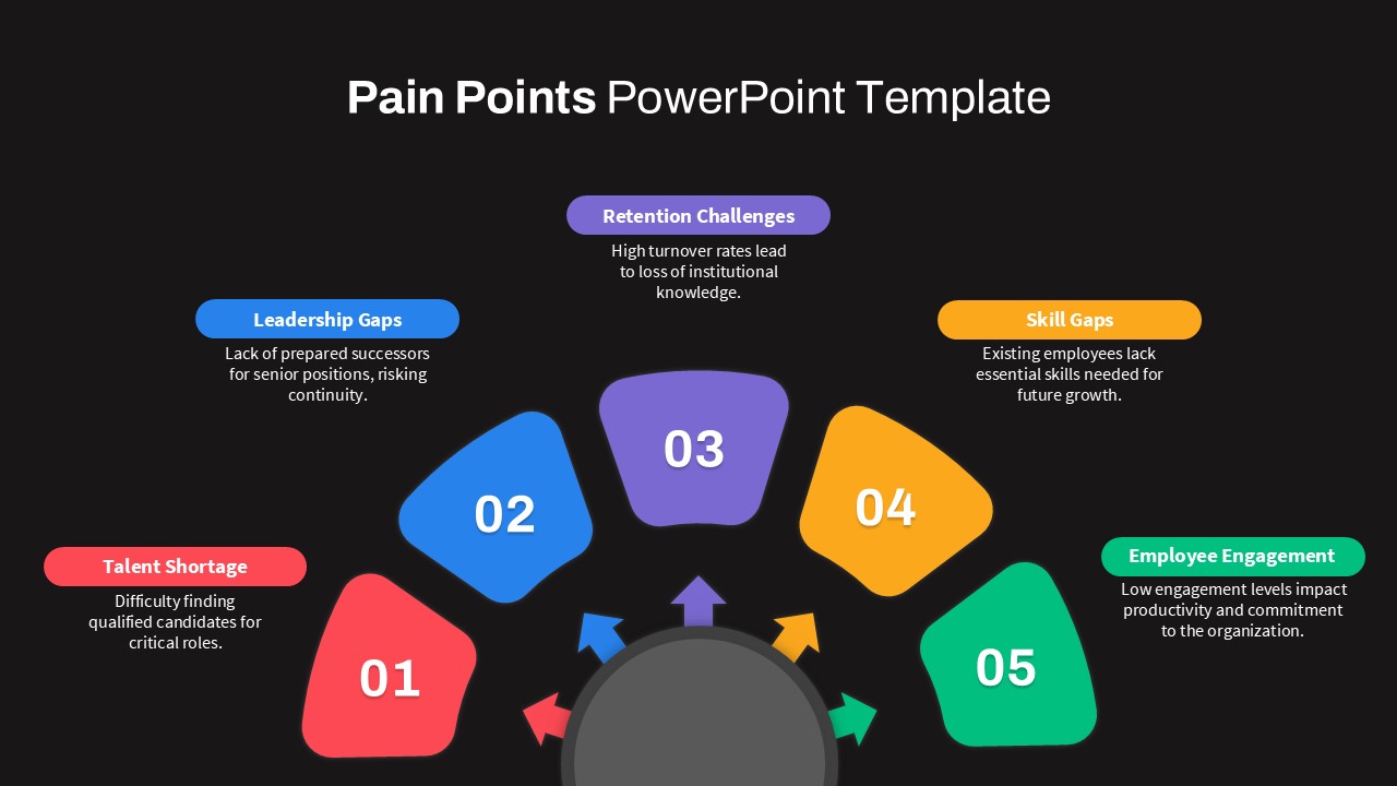
Professional Circular Pain Points Template for PowerPoint & Google Slides
Circular
Professional Green Geometric Background Template for PowerPoint & Google Slides
Background
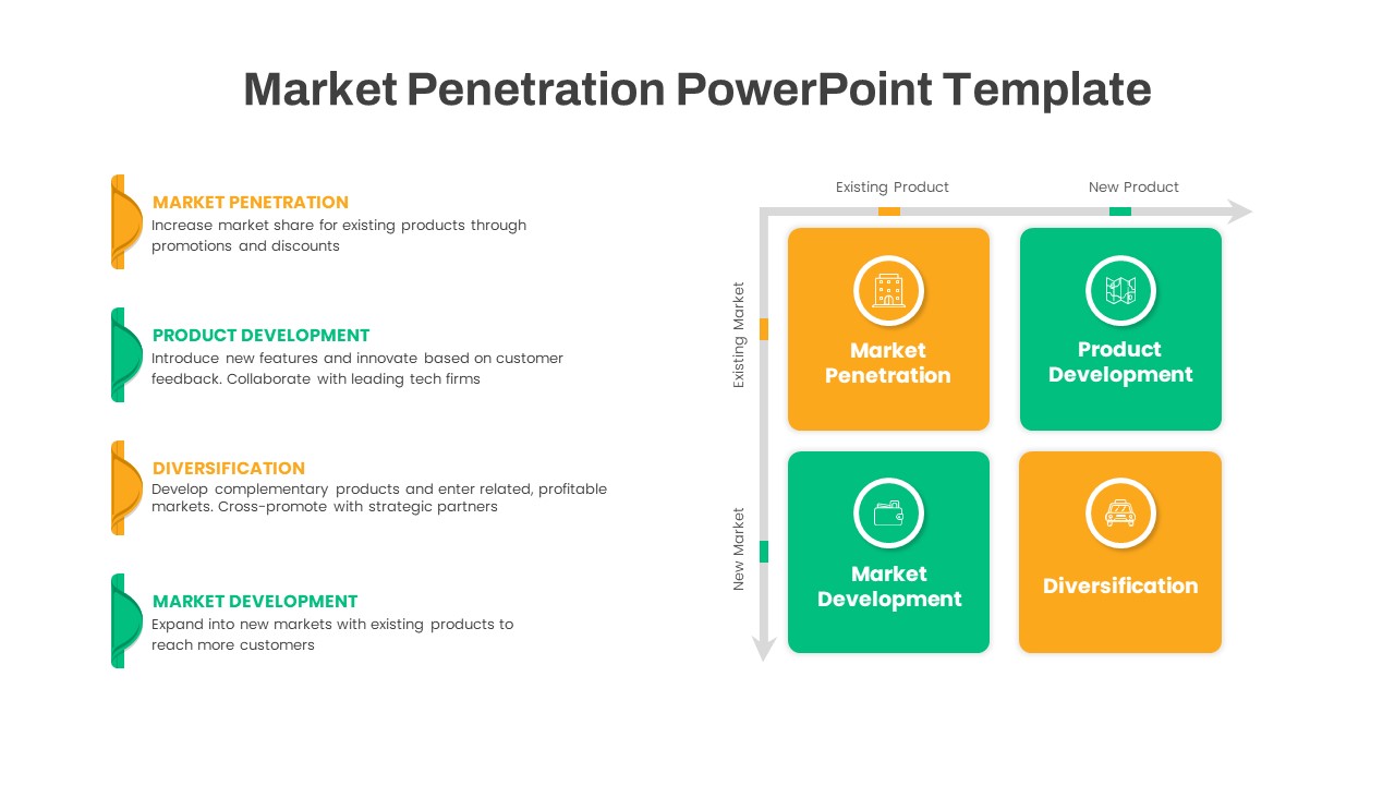
Ansoff Growth Matrix Professional Template for PowerPoint & Google Slides
Comparison
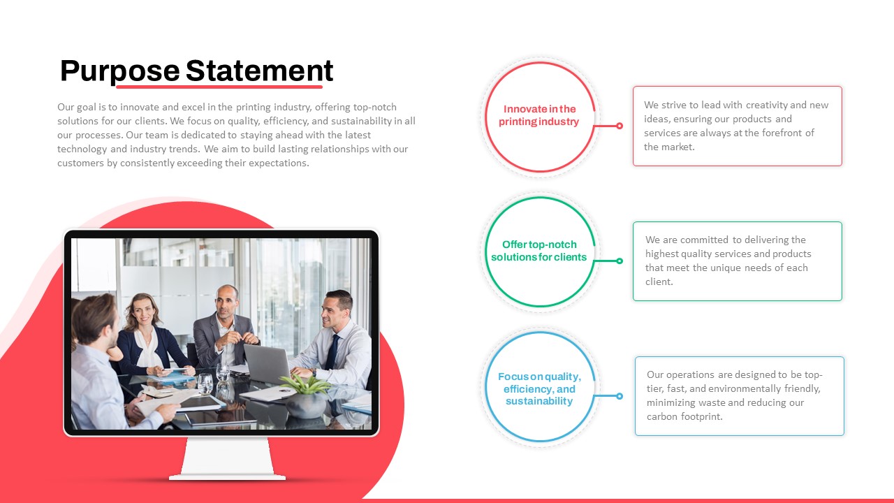
Professional Purpose Statement Slide Template for PowerPoint & Google Slides
Business Proposal
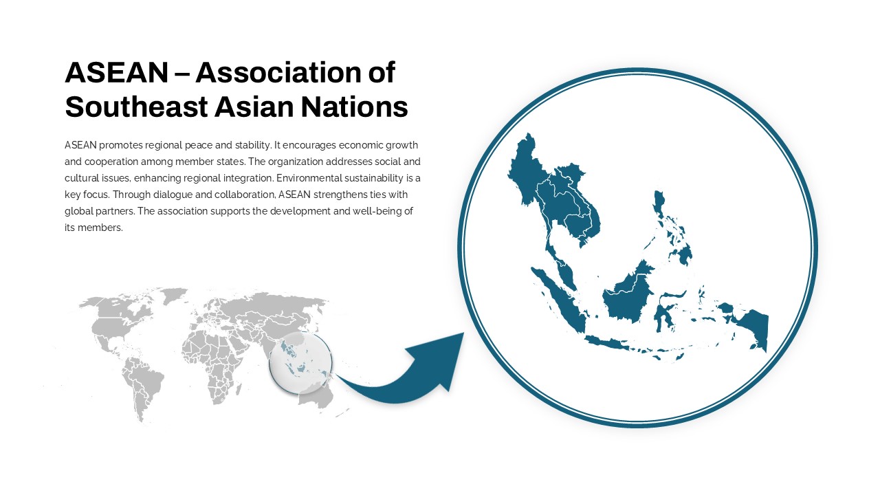
Professional ASEAN Region Zoom Map Slide Template for PowerPoint & Google Slides
World Maps
Professional Executive Board Meeting Template for PowerPoint & Google Slides
Business Report

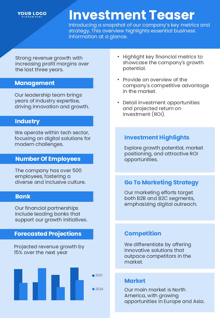
Professional Investment Teaser Slide Template for PowerPoint & Google Slides
Pitch Deck
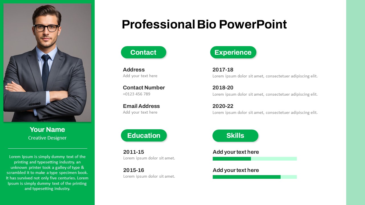
Modern Professional Bio Resume Slide Template for PowerPoint & Google Slides
Recruitment
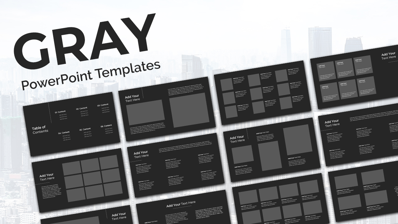
Gray Professional Deck template for PowerPoint & Google Slides
Pitch Deck
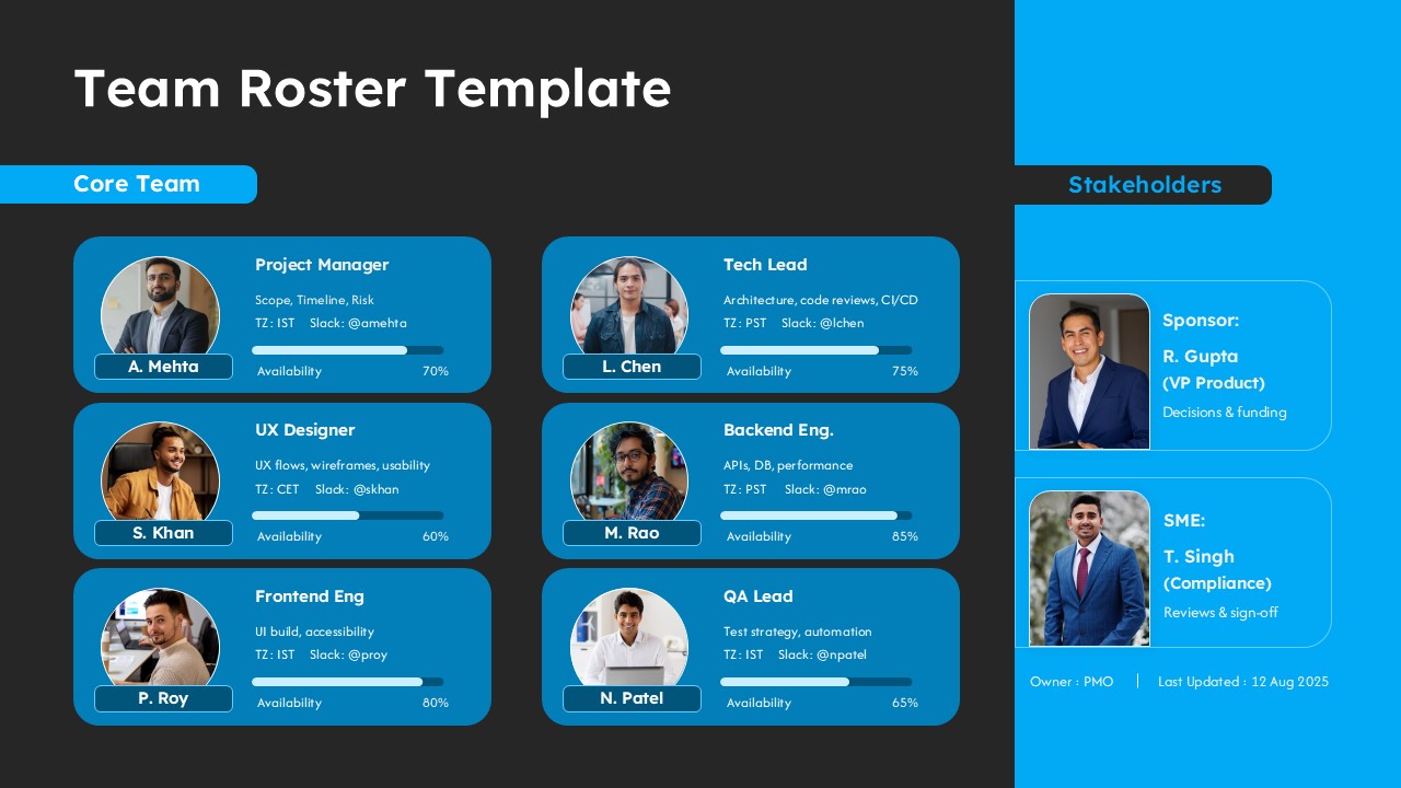
Professional Team Roster Template for PowerPoint & Google Slides
Our Team