Multiple Line Chart PowerPoint Template


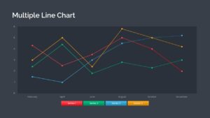
A multiple line chart powerpoint template is used to represent quantitative data or information by displaying the relationship between one or more variables using a series of connected points on lines or curves. It aids in comparing the trend of one variable with one or more other variables, showcasing changes in values as they increase, decrease, fluctuate, or remain constant. The Multiple Line Chart PPT and google slides templates is designed as a grouped line graph, enabling effective visualization of these trends and value changes.
The multiple line chart PowerPoint template consists of four lines and is designed specifically to illustrate multiple points. This type of graph displays many series of data on the same coordinate system. Users can utilize this template to showcase various data series that share common values on the horizontal axis while potentially differing on the vertical axis.
Multiple line chart PowerPoint templates can be used in various scenarios, including:
• Comparing Trends: Displaying multiple data series on the same graph allows for easy comparison of trends over time or across different categories.
• Analyzing Relationships: The lines connecting the data points help visualize the relationship between different variables and identify correlations or patterns.
• Tracking Performance: Multiple line charts in PowerPoint can be utilized to monitor the performance of different metrics or variables and identify areas of improvement or success.
• Presenting Comparative Data: This line graph template is effective for showcasing the differences in data between various groups, demographics, or regions, providing insights into variations and disparities.
The multiple-line graph ppt is useful for comparing trends in different activities or operations. Examples include comparing the progression of different diseases over time or examining the impact of the same disease in different demographics. Additionally, this template can be employed to illustrate year-wise and quarter-wise growth.
The PowerPoint line chart will effectively represent quantitative data through dotted segments, with each dot representing a specific value. The lines in the graph indicate the relationship between these dots. Each dotted line is separately colored in red, green, blue, and yellow. The presenters can use the segmented columns at the bottom as legends to display results. Download 100% editable graphs and charts from SlideBazaar!
Login to download this file

Item ID
SB03678
Related Templates

Gardner’s Theory of Multiple Intelligences Diagram Template for PowerPoint & Google Slides
Leadership

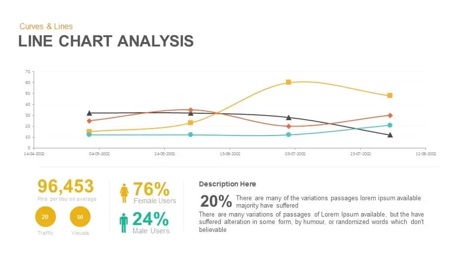
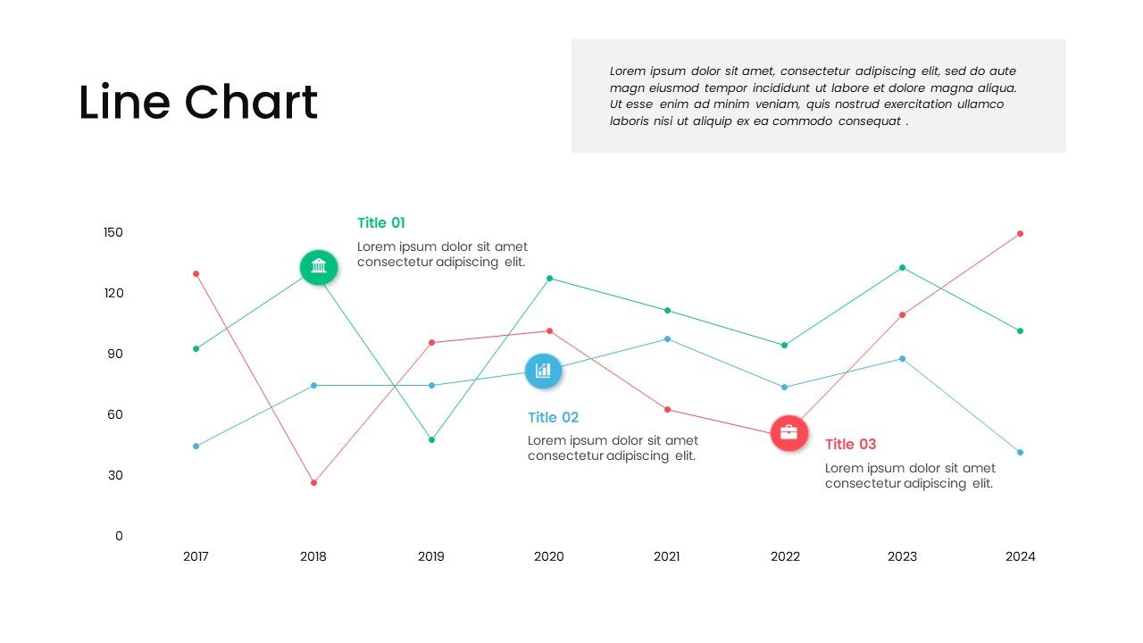
Line Chart Analysis template for PowerPoint & Google Slides
Charts

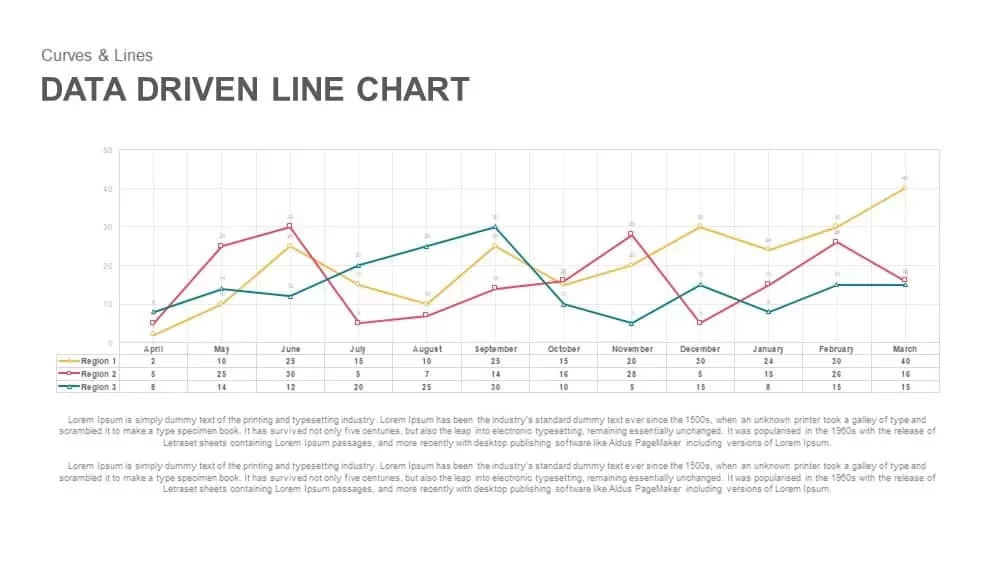
Data-Driven Line Chart Diagram Template for PowerPoint
Comparison Chart
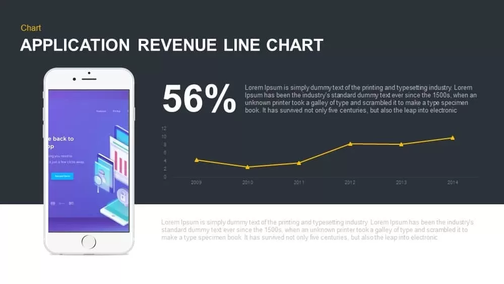
Application Revenue Line Chart KPI Template for PowerPoint & Google Slides
Revenue
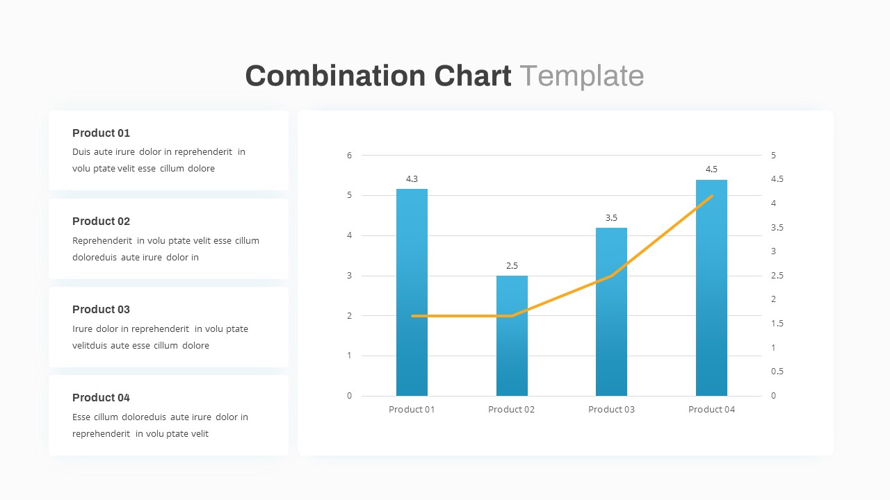
Combination Bar and Line Chart Template for PowerPoint & Google Slides
Bar/Column
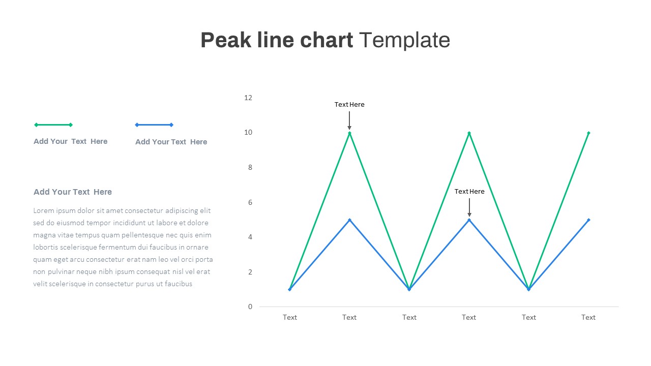
Editable Multi-Series Peak Line Chart Template for PowerPoint & Google Slides
Comparison Chart
Arrow Line Chart Template for PowerPoint & Google Slides
Comparison Chart
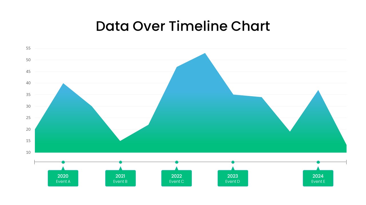
Data Over Timeline Chart Template for PowerPoint
Charts
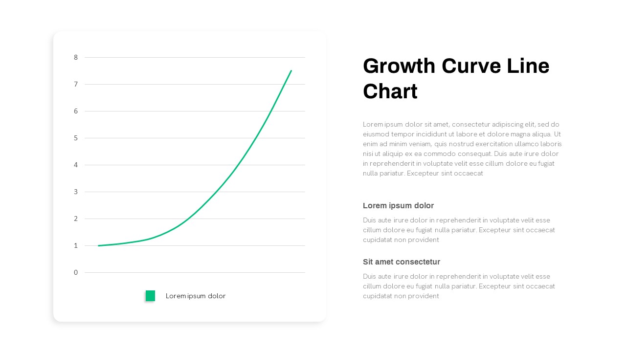
Growth Curve Line Chart Visualization Template for PowerPoint & Google Slides
Charts
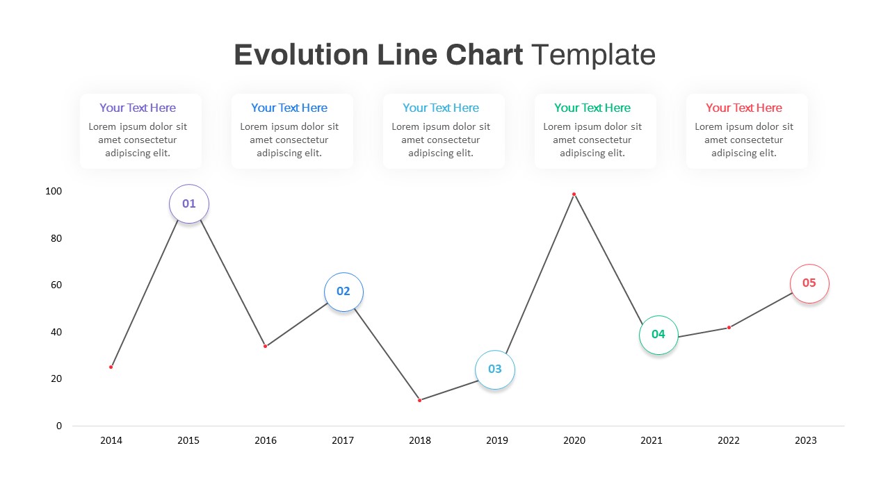
Evolution Line Chart with Milestones Template for PowerPoint & Google Slides
Timeline
Multi-Series Line Chart with Icons Template for PowerPoint & Google Slides
Comparison Chart
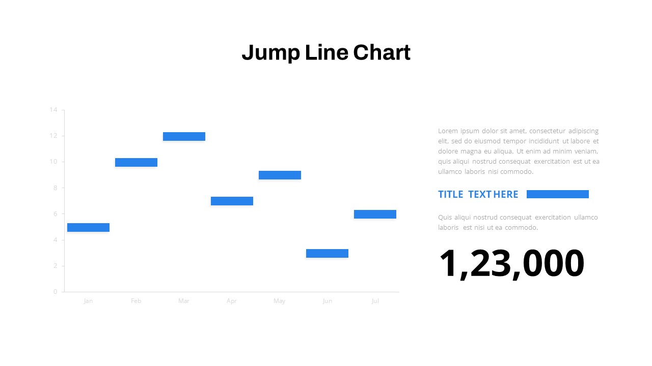
Interactive Jump Line Data Chart Template for PowerPoint & Google Slides
Comparison Chart
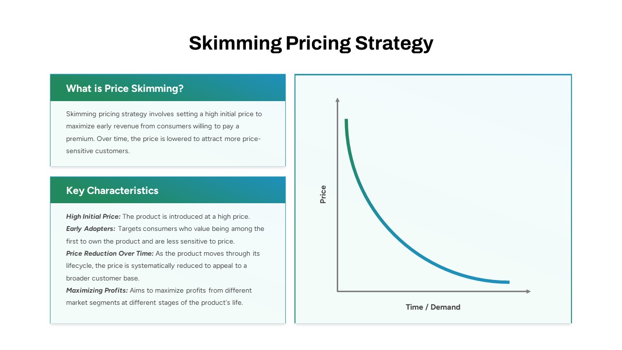
Skimming Pricing Strategy Line Chart Template for PowerPoint & Google Slides
Business Strategy
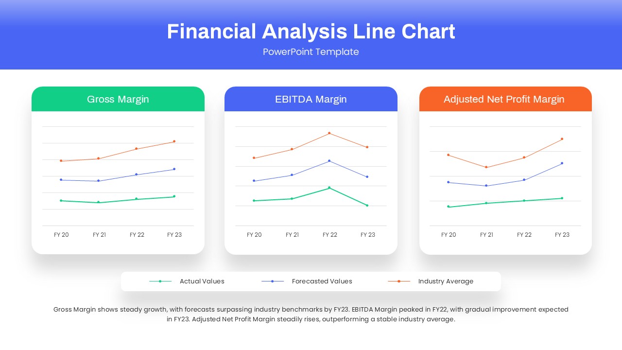
Dynamic Financial Analysis Line Chart Template for PowerPoint & Google Slides
Finance
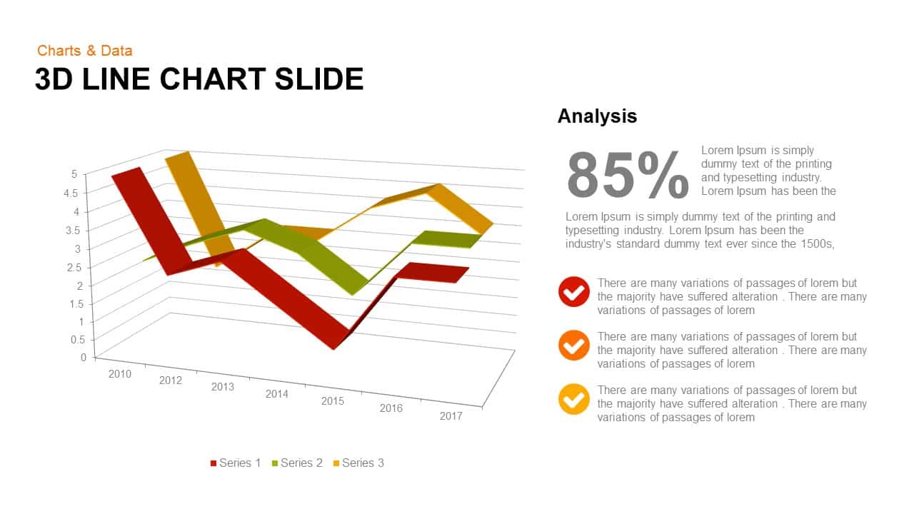
3D Line Chart for PowerPoint & Google Slides
Charts
Line Graph Analysis template for PowerPoint & Google Slides
Charts
Multi-Series Curved Line Graph Analytics Template for PowerPoint & Google Slides
Comparison Chart
Sales Growth Dashboard: KPI Gauge & Line Template for PowerPoint & Google Slides
Revenue

Creative Clothing Line Presentation Template for PowerPoint & Google Slides
Pitch Deck
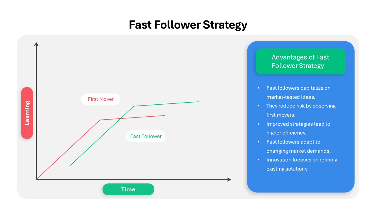
Fast Follower Strategy Line Graph Template for PowerPoint & Google Slides
Comparison Chart
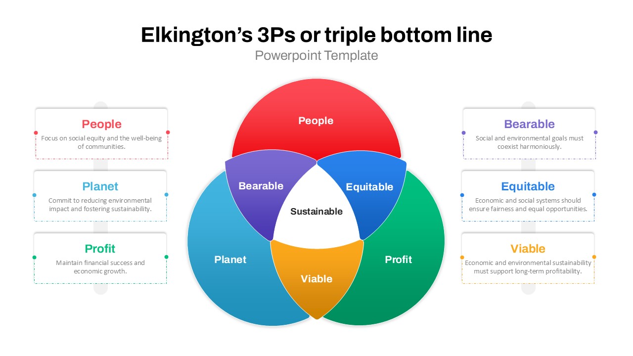
3Ps Triple Bottom Line Venn Diagram Template for PowerPoint & Google Slides
Circular
4 People Racing to Finish Line Template for PowerPoint & Google Slides
Accomplishment
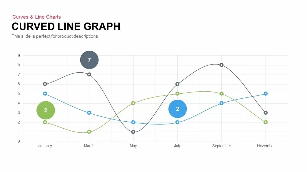
Curved Line Graph for PowerPoint & Google Slides
Timeline
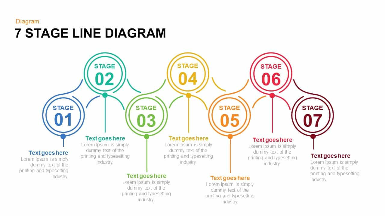
7 and 6 Stage Line Diagram Overview for PowerPoint & Google Slides
Infographics
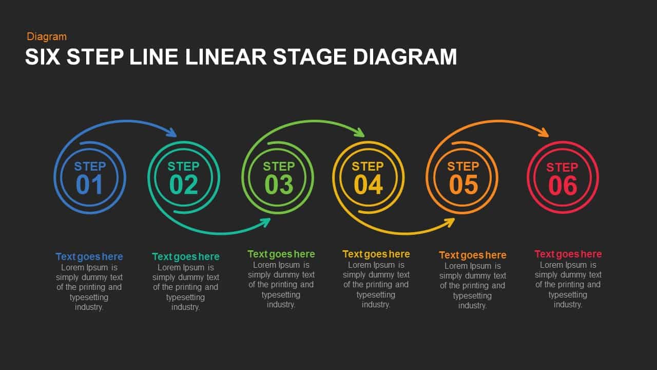
Five and Six Step Line Linear Stage Diagram for PowerPoint & Google Slides
Infographics
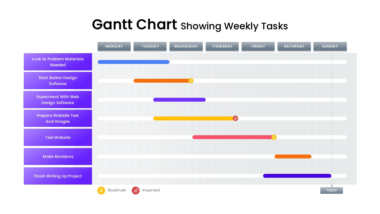
Gantt Chart Template Showing Weekly Tasks Template for PowerPoint & Google Slides
Gantt Chart