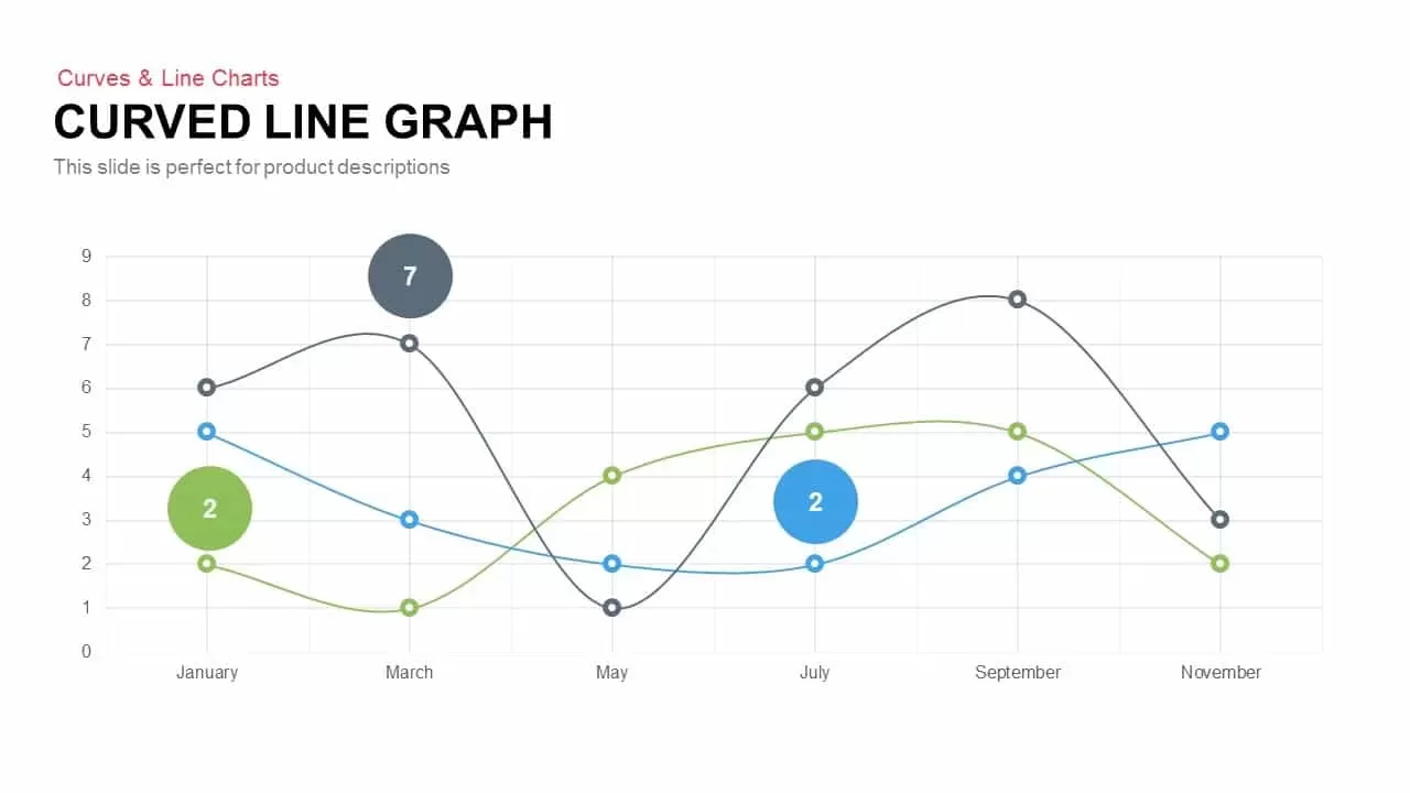
Multi-Series Curved Line Graph Analytics Template for PowerPoint & Google Slides
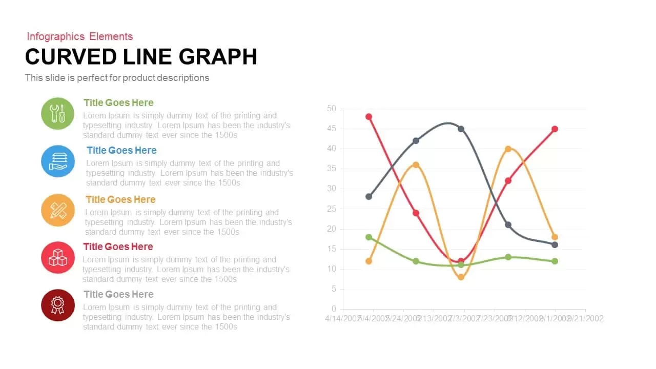


Utilize this interactive curved line graph template to showcase multi-series data insights with professional clarity and visual engagement. The right panel features four smoothly curved data lines—each in distinct hues of red, gray, orange, and green—mapped against a clean grid of time-series markers and value axes. On the left, five matching icons with colored circular backgrounds correspond to key metrics or categories. Editable labels and descriptive text blocks allow you to align each icon with its associated narrative, ensuring audiences simultaneously absorb contextual commentary and performance trends. The flat design aesthetic, crisp typography, and consistent color palette combine to produce a polished chart that remains legible even when projected or printed.
Engineered with versatility in mind, this slide provides fully customizable line styles, marker shapes, and tooltip placeholders for comprehensive annotation. Master slide configuration guarantees seamless adaptation across corporate branding or departmental color schemes. You can easily adjust axis scales, extend the timeline, or introduce additional series without disrupting the overall layout. Whether analyzing quarterly KPIs, tracking user engagement metrics, or comparing product performance over multiple periods, this curved line graph framework delivers precise visual comparisons while minimizing clutter.
Perfect for quarterly reviews, marketing presentations, and executive dashboards, this asset accelerates slide preparation by offering ready-to-use data placeholders and straightforward editing workflows. Its balanced two-column arrangement prevents information overload by separating narrative points and graphical data. Clean white background and subtle drop shadows maintain focus on core messages and critical insights, making this chart ideal for boardroom briefings, investor pitches, or internal strategy workshops. With this slide in hand, you can confidently translate complex datasets into compelling visual stories that resonate across audiences and facilitate data-driven decision-making.
Who is it for
Marketing analysts, business intelligence managers, product leaders, and financial officers will benefit from this curved line graph when presenting performance metrics, growth trends, or comparative analyses. Corporate strategists, investor relations teams, and project managers can leverage the customizable series and icon annotations to deliver clear, data-driven narratives at board meetings, sales reviews, and strategy sessions.
Other Uses
Beyond financial reporting, repurpose this graph for tracking website traffic trends, customer satisfaction scores, resource utilization, or risk probability assessments. Adapt the icons and line styles to illustrate campaign performance, supply chain metrics, operational KPIs, and multi-project progress comparisons.
Login to download this file

Item ID
SB00165
Related Templates

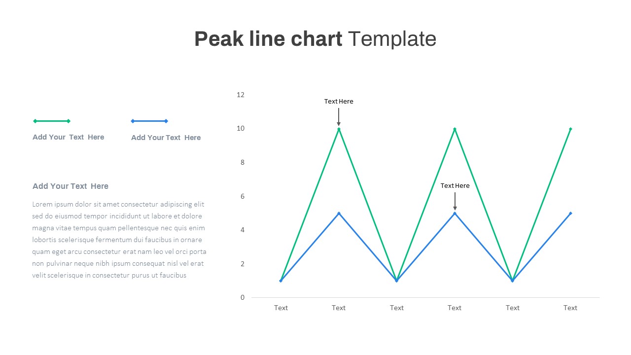
Editable Multi-Series Peak Line Chart Template for PowerPoint & Google Slides
Comparison Chart
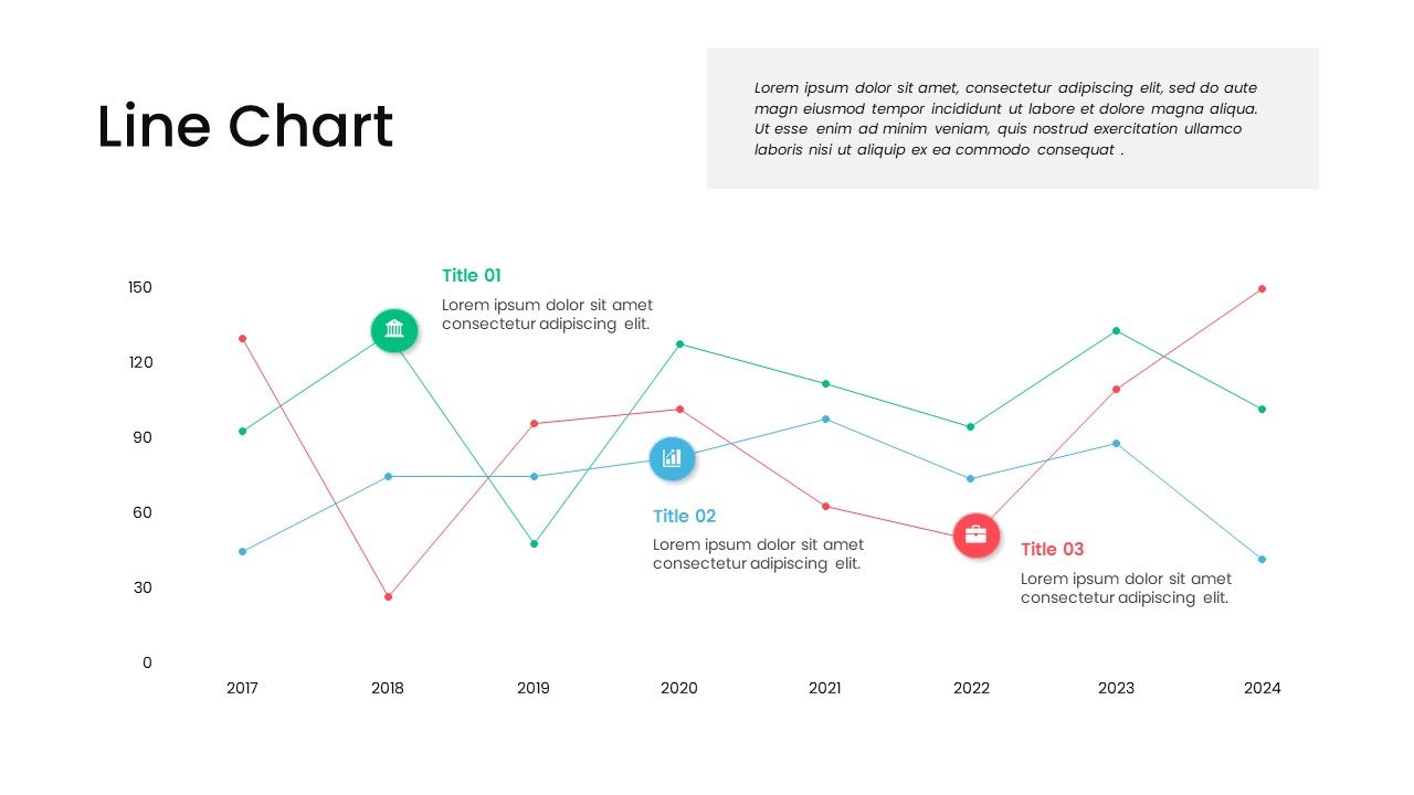
Multi-Series Line Chart with Icons Template for PowerPoint & Google Slides
Comparison Chart
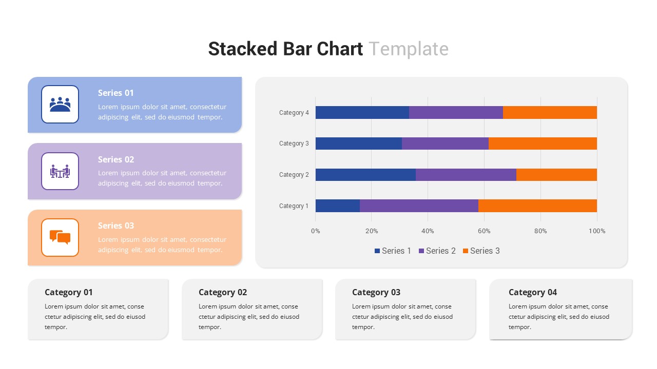
Multi-Series Stacked Bar Chart Template for PowerPoint & Google Slides
Bar/Column
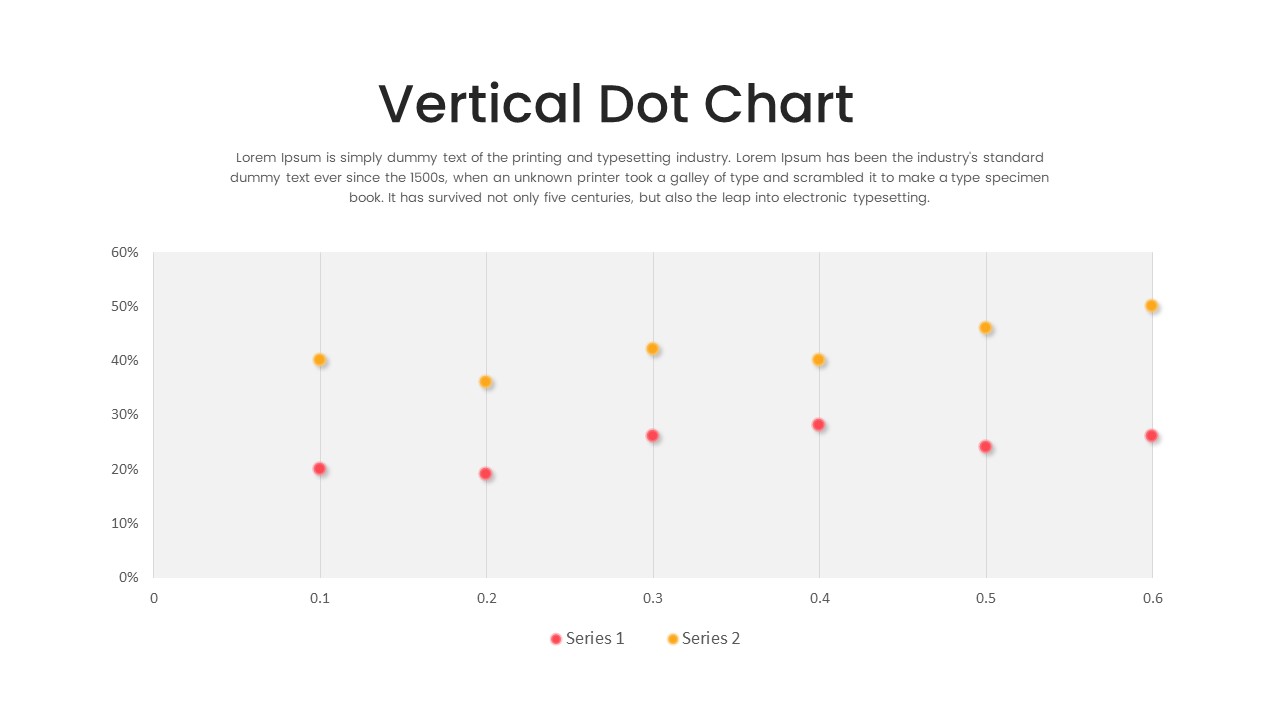
Multi-Series Vertical Dot Chart Template for PowerPoint & Google Slides
Comparison Chart
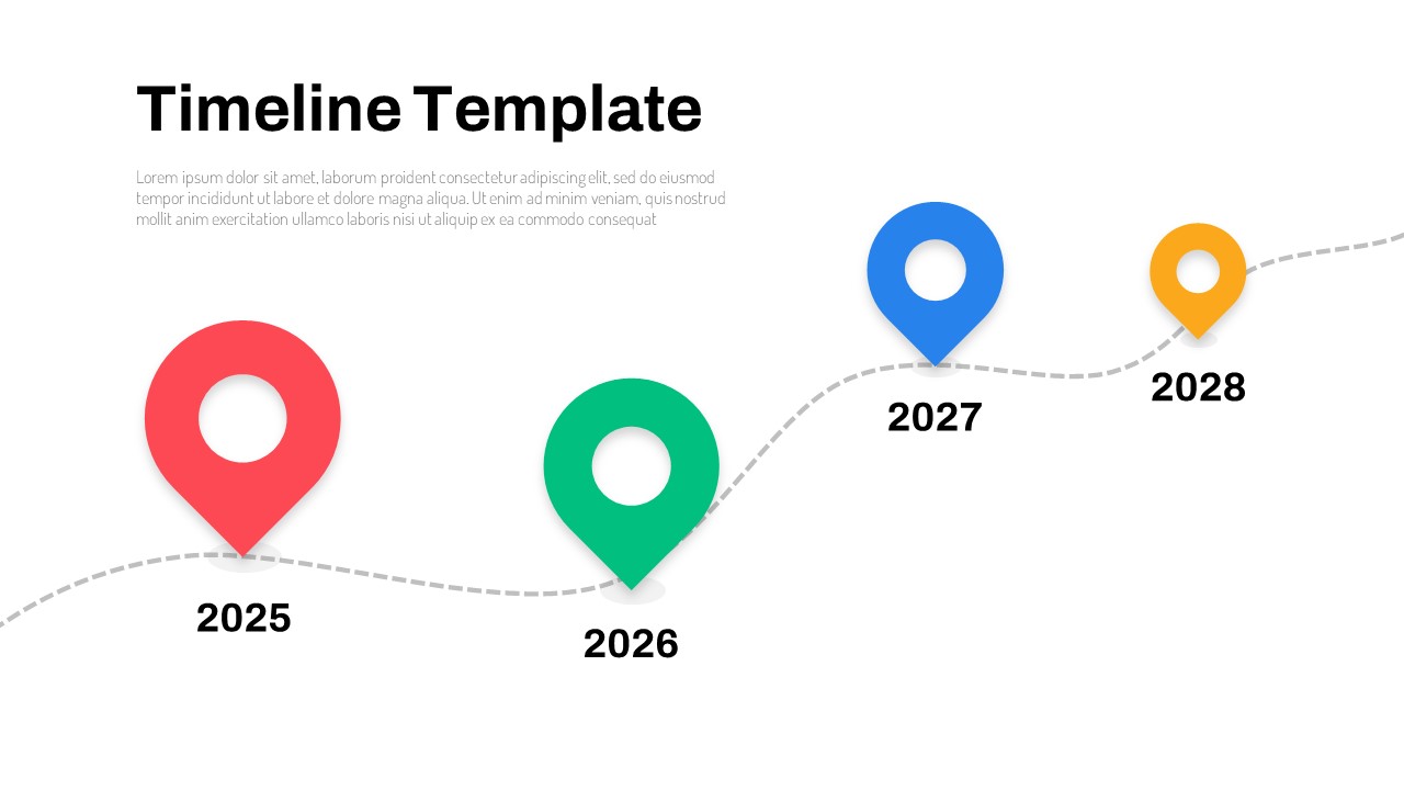
Curved Line Graph for PowerPoint & Google Slides
Timeline
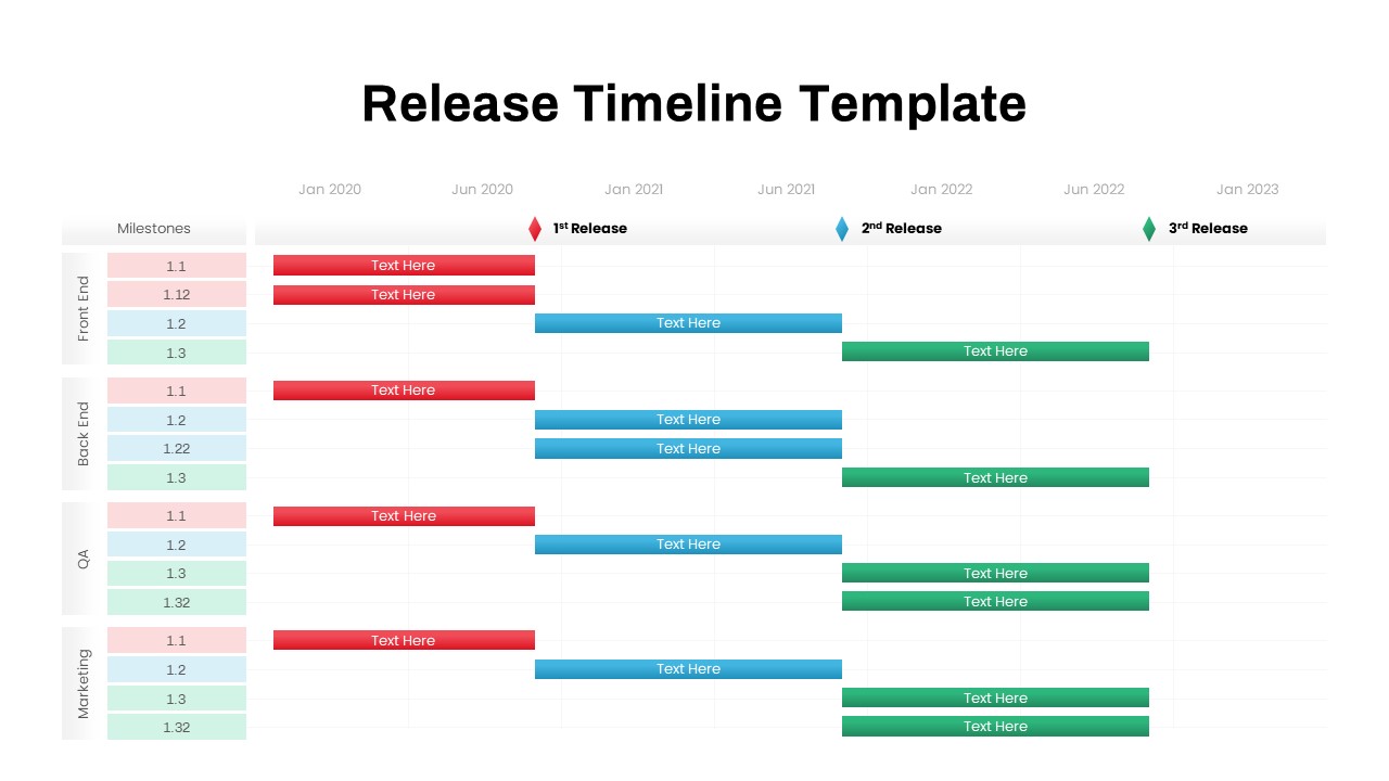
Multi-Team Multi-Phase Release Timeline Template for PowerPoint & Google Slides
Timeline
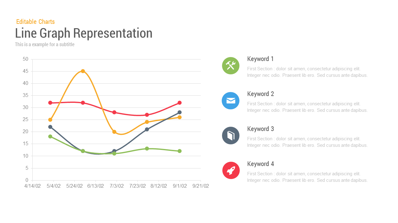
Line Graph Analysis template for PowerPoint & Google Slides
Charts
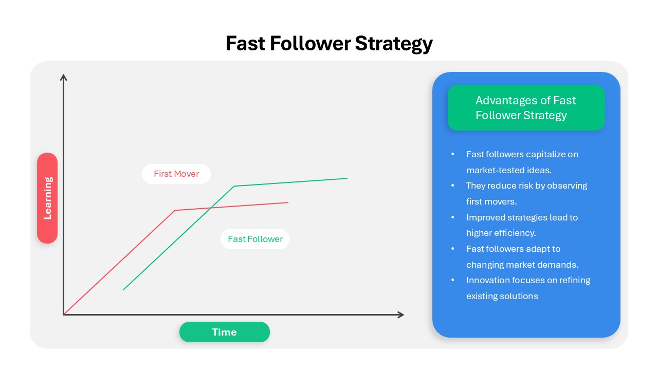
Fast Follower Strategy Line Graph Template for PowerPoint & Google Slides
Comparison Chart
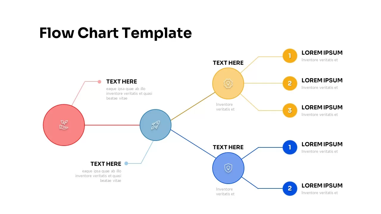
Multi-Color Five-Step Curved Arrow Template for PowerPoint & Google Slides
Process
Multi-color Curved Timeline Roadmap Template for PowerPoint & Google Slides
Timeline
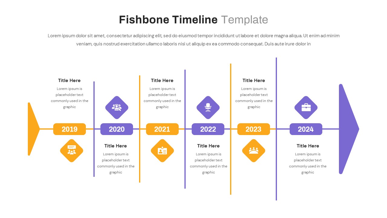
Fishbone Timeline Infographic Series Template for PowerPoint & Google Slides
Manufacturing
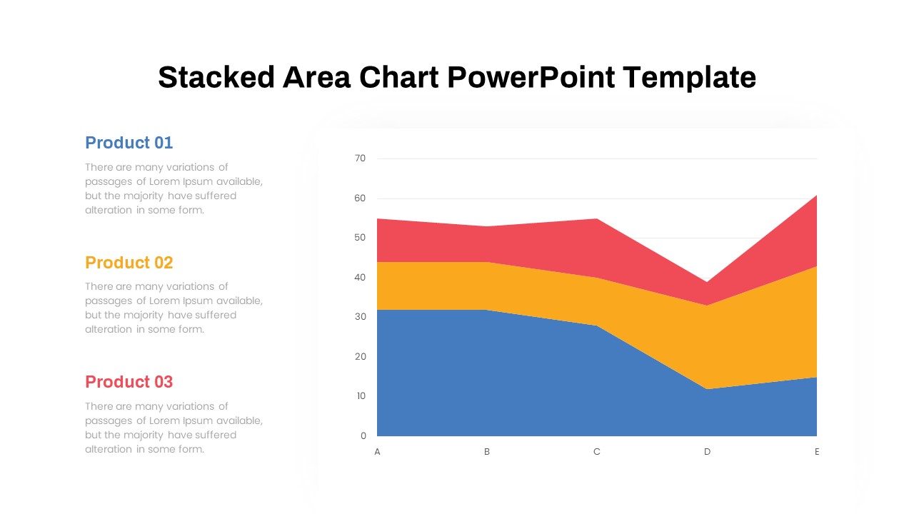
Dynamic Three-Series Stacked Area Chart Template for PowerPoint & Google Slides
Comparison Chart
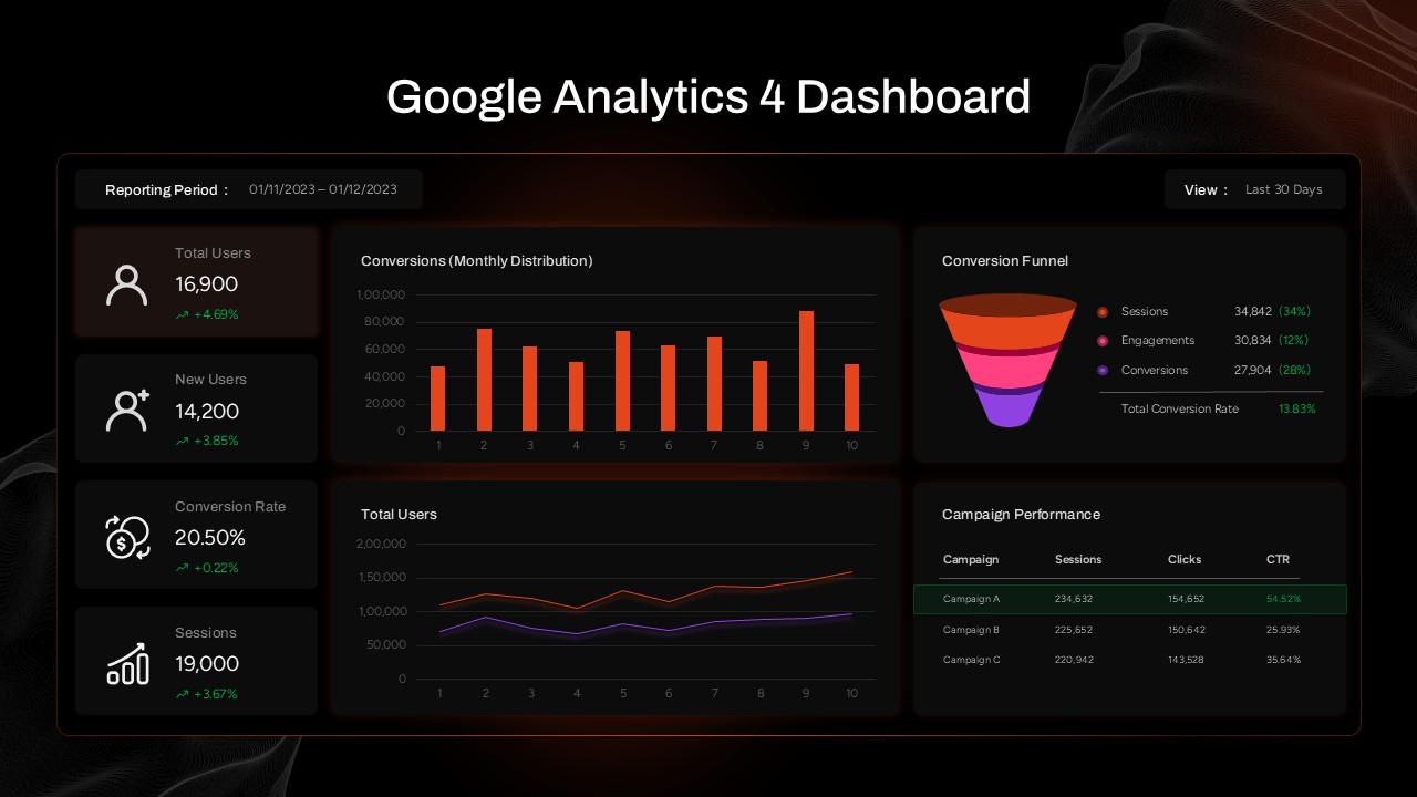
Google Analytics 4 (GA4) Dashboard Template for PowerPoint & Google Slides
Digital Marketing
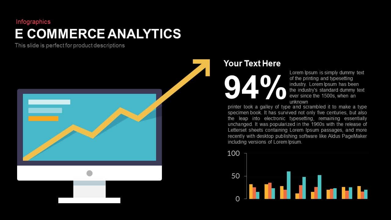
E-commerce Analytics Dashboard Template for PowerPoint & Google Slides
Bar/Column

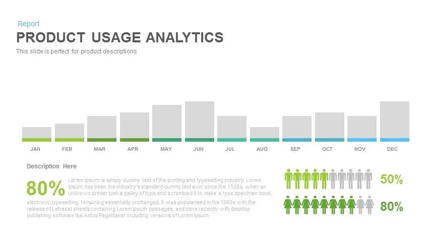
Product Usage Analytics Dashboard Chart Template for PowerPoint & Google Slides
Bar/Column
Data Analytics Dashboard Design template for PowerPoint & Google Slides
Bar/Column
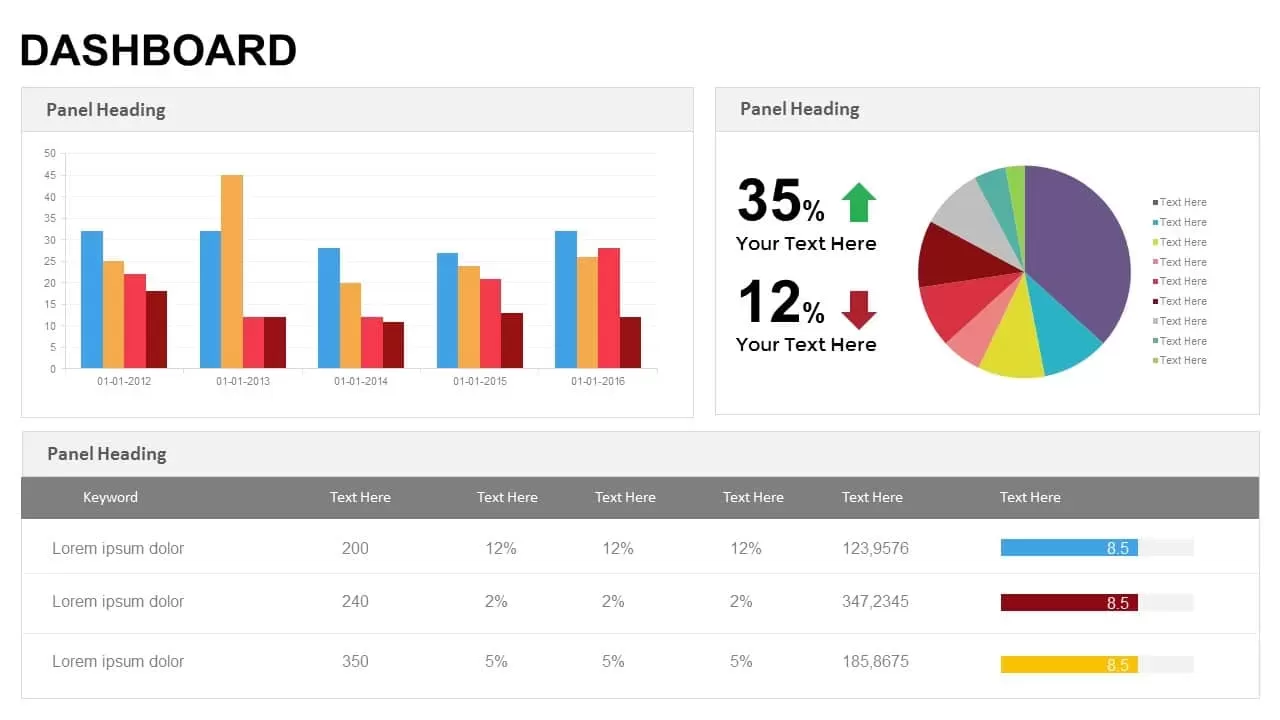
Business Dashboard Analytics & KPIs Template for PowerPoint & Google Slides
Bar/Column
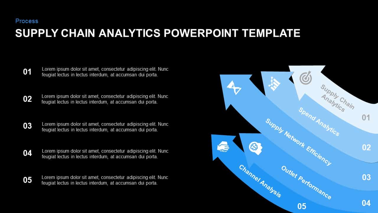
Supply Chain Analytics Process Template for PowerPoint & Google Slides
Process
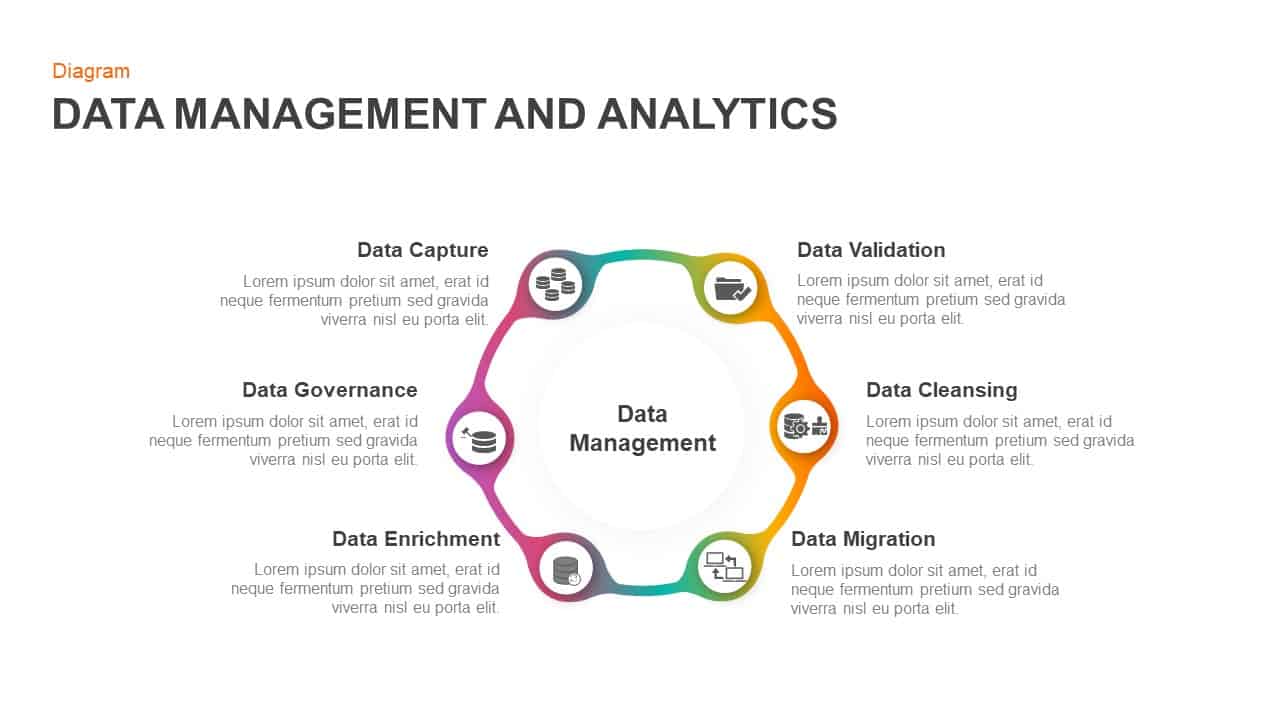
Data Management and Analytics Diagram Template for PowerPoint & Google Slides
Circular

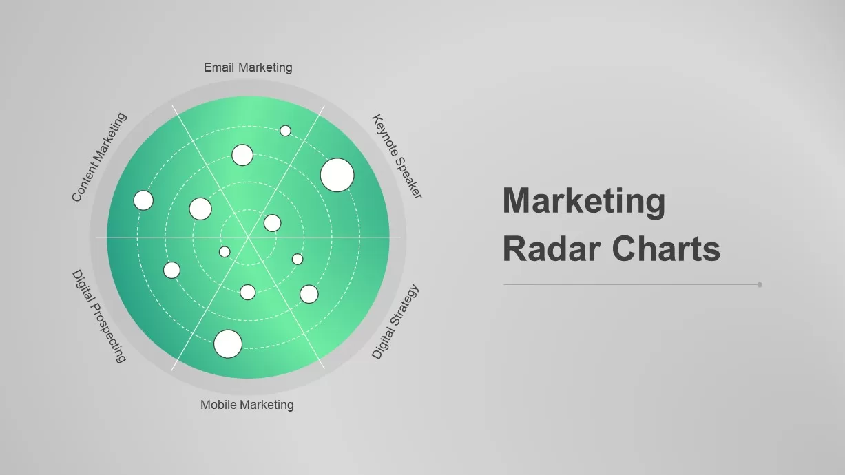
Dynamic Marketing Radar Chart Analytics Template for PowerPoint & Google Slides
Comparison
Digital Marketing Analytics Presentation Template for PowerPoint & Google Slides
Digital Marketing
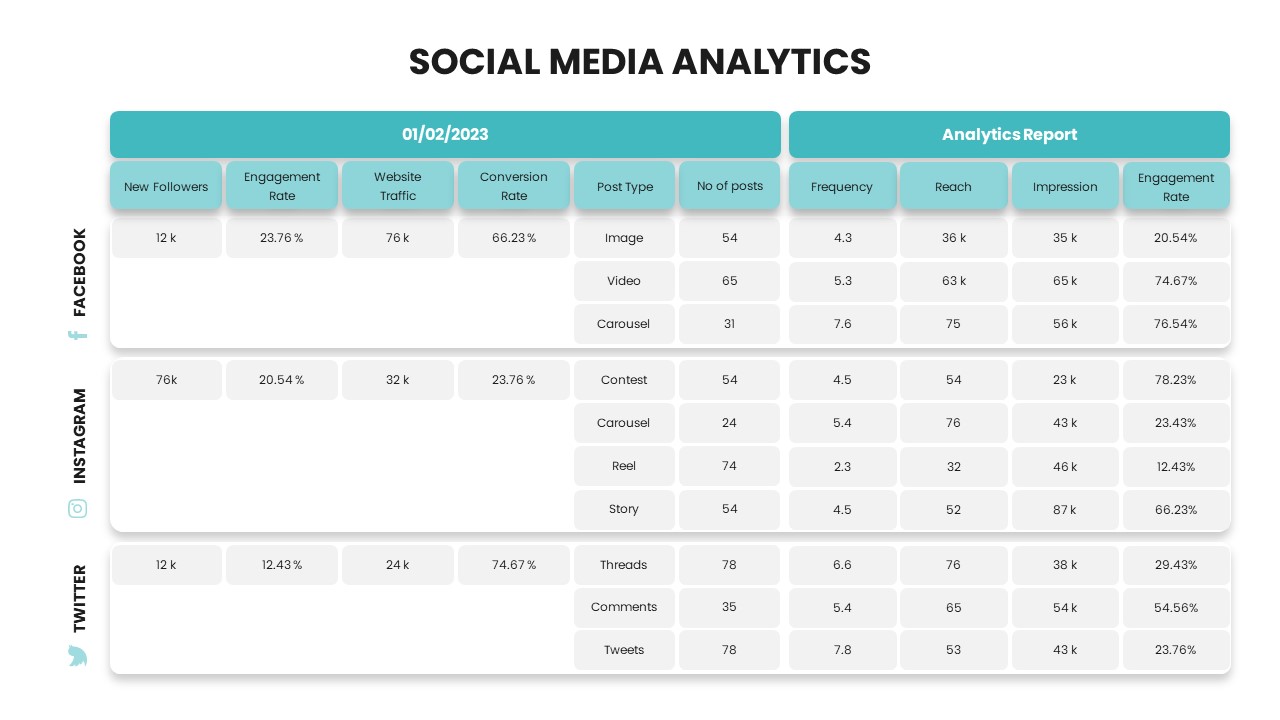
Social Media Analytics Dashboard Template for PowerPoint & Google Slides
Digital Marketing
Free Tiktok PowerPoint Template
Company Profile
Free
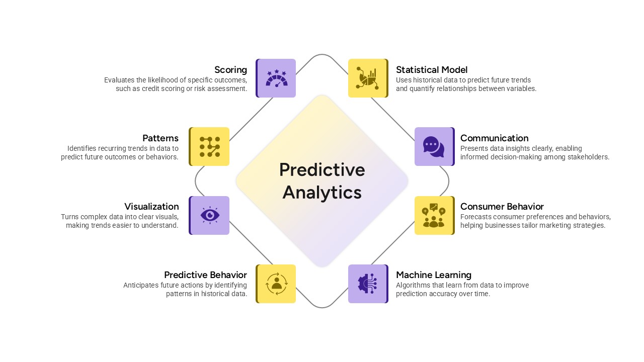
Predictive Analytics Diagram Template for PowerPoint & Google Slides
Process
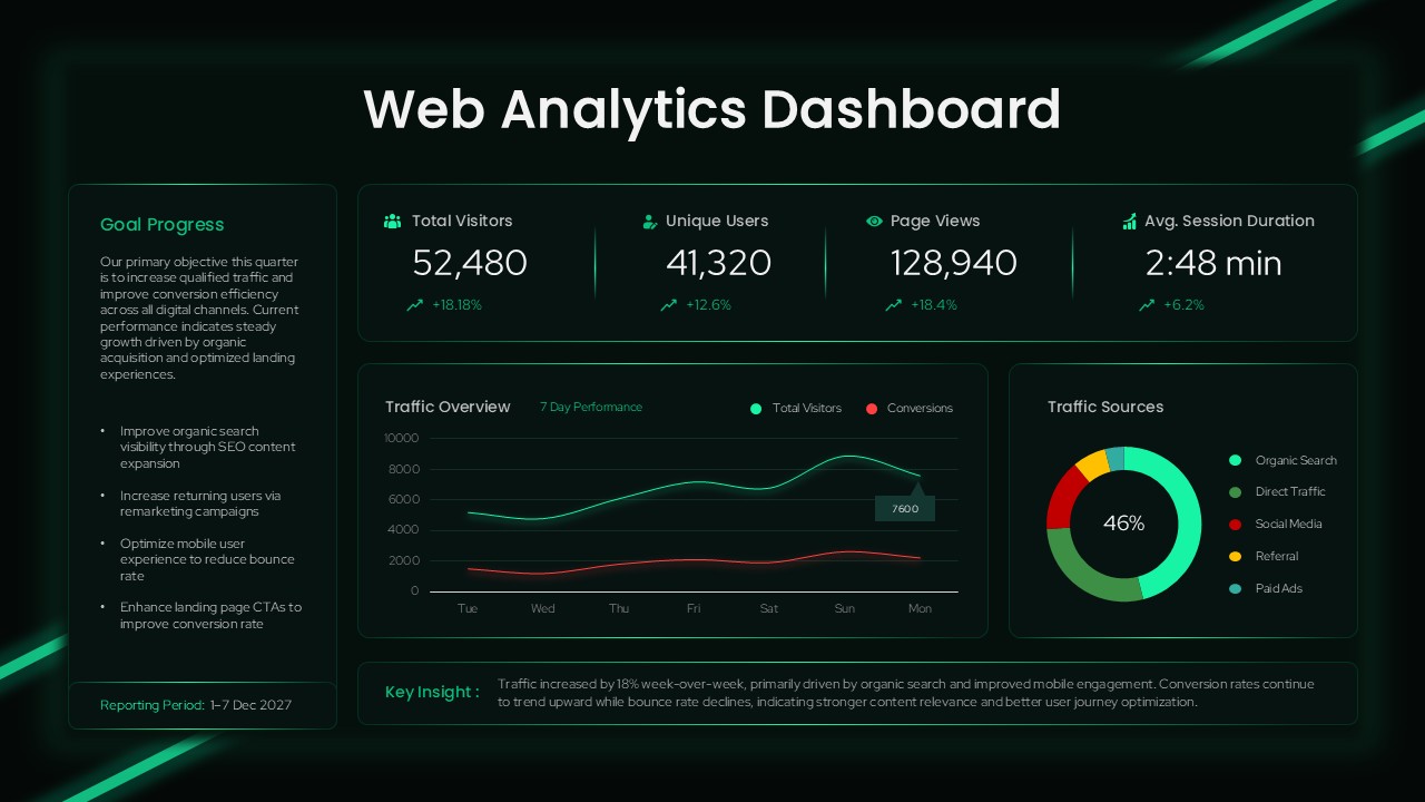
Web Analytics Dashboard Template for PowerPoint & Google Slides Presentations
Business
Free Facebook Presentation Template PowerPoint & Google Slides
Customer Experience
Free
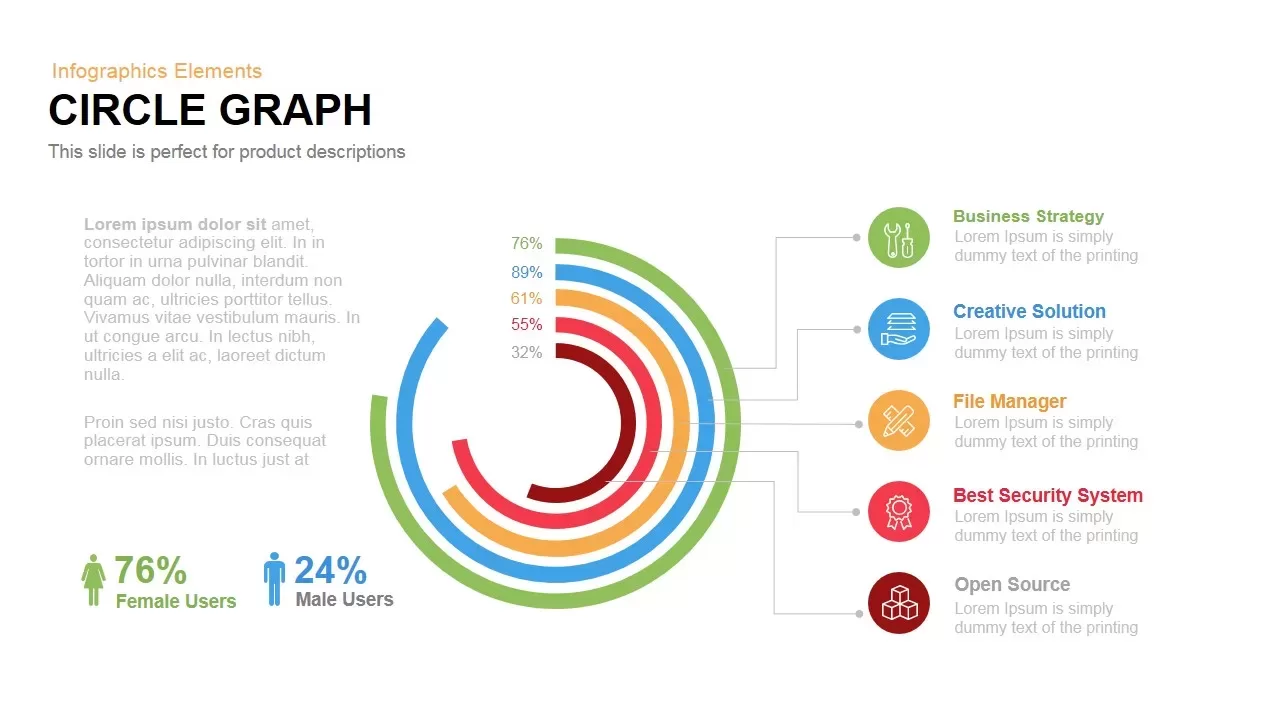
Circle Graph Data Visualization Template for PowerPoint & Google Slides
Circular
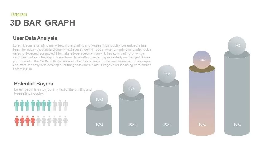
3D Bar Graph Infographic Template for PowerPoint & Google Slides
Bar/Column

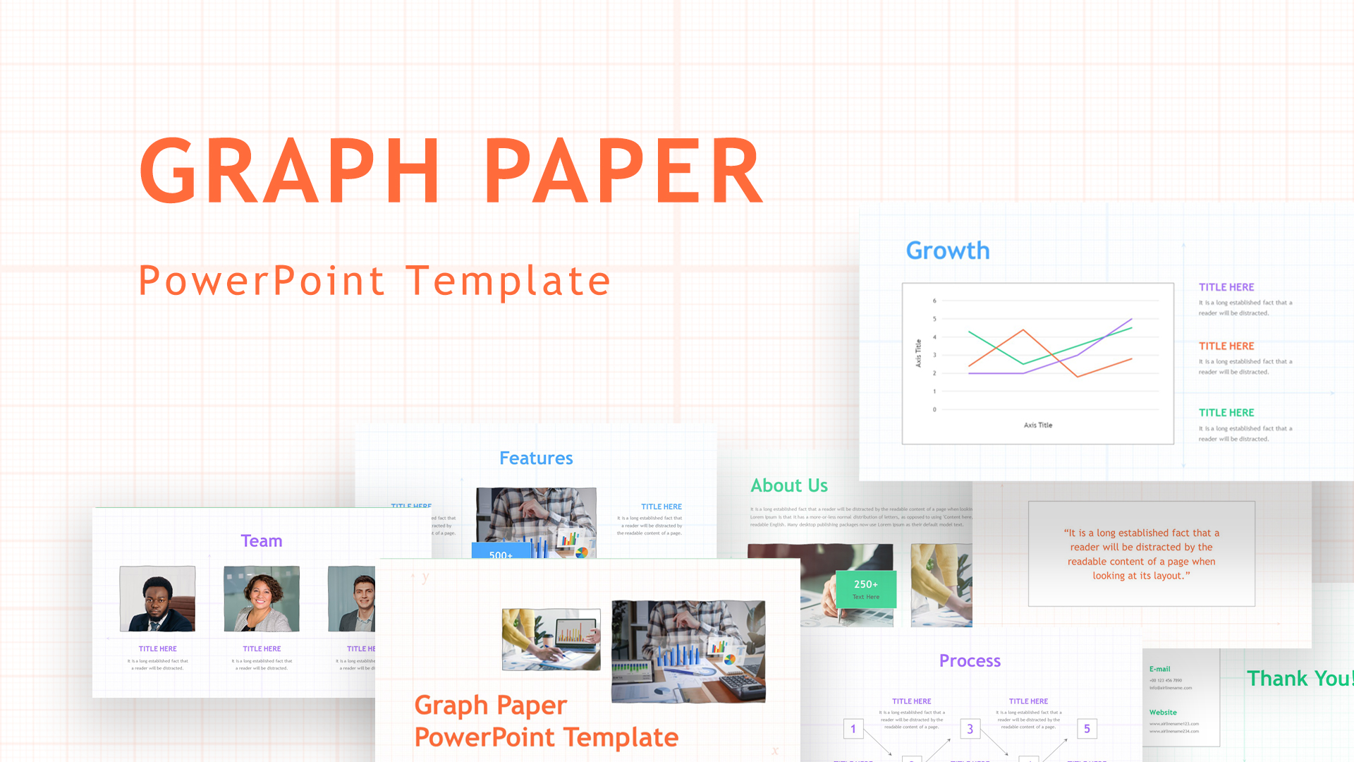
Graph Paper Background Presentation Template for PowerPoint & Google Slides
Company Profile
Blank Bar Graph Template for PowerPoint & Google Slides
Bar/Column
Progress Bar Graph Layout Design for PowerPoint & Google Slides
Charts
Five Options Business Bar Graph for PowerPoint & Google Slides
Business Report

Free Data Analytics Dashboard Template for PowerPoint
Charts
Free
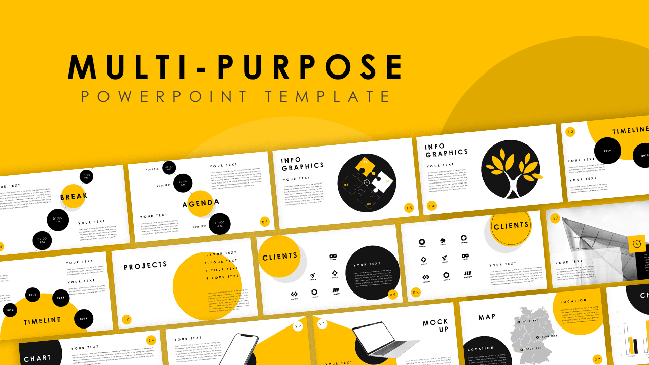
Smart Multi-Purpose PowerPoint Template for PowerPoint & Google Slides
Company Profile
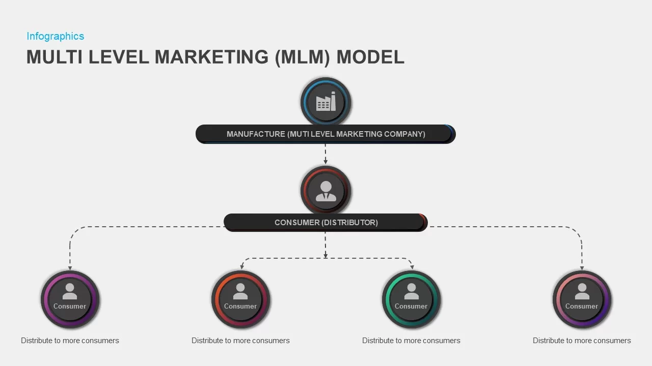
Multi-Level Marketing PowerPoint Template for PowerPoint & Google Slides
Business Models
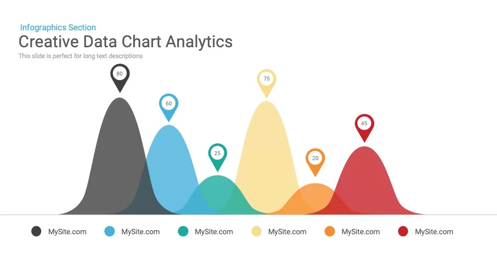
Creative data chart Analytics Presentation Template
Charts
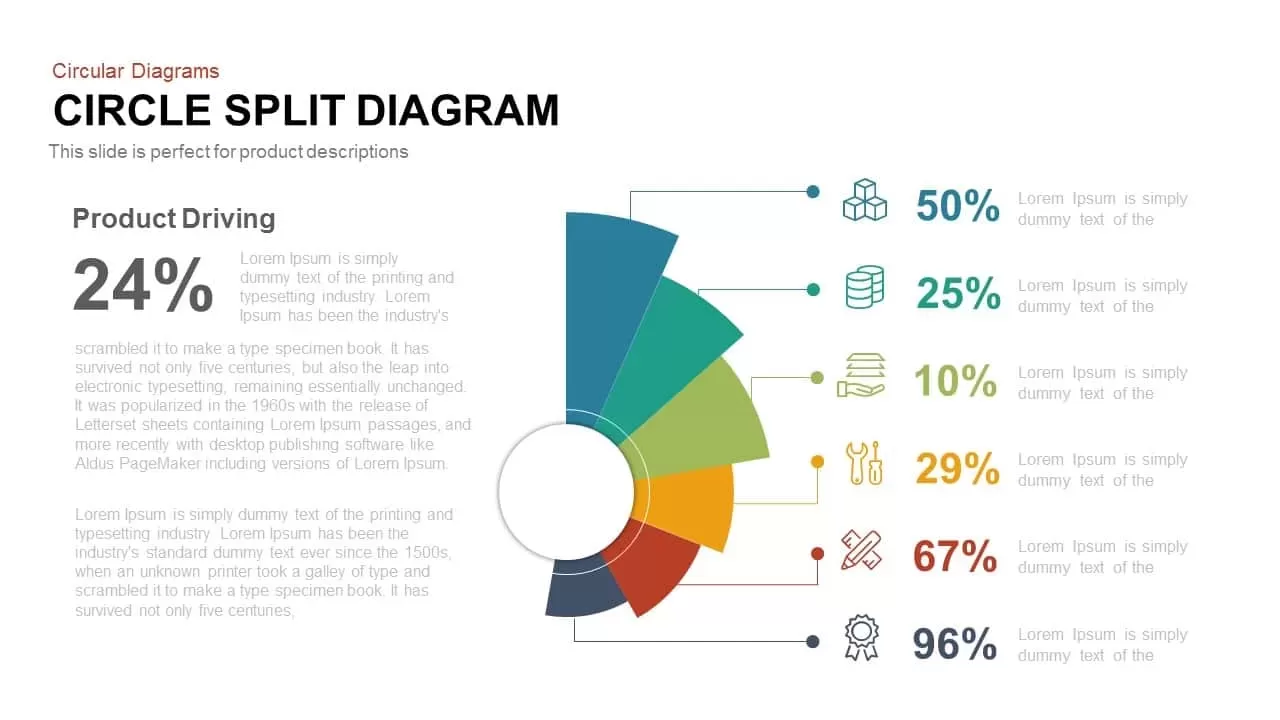
Multi-Segment Circle Split Diagram template for PowerPoint & Google Slides
Circular
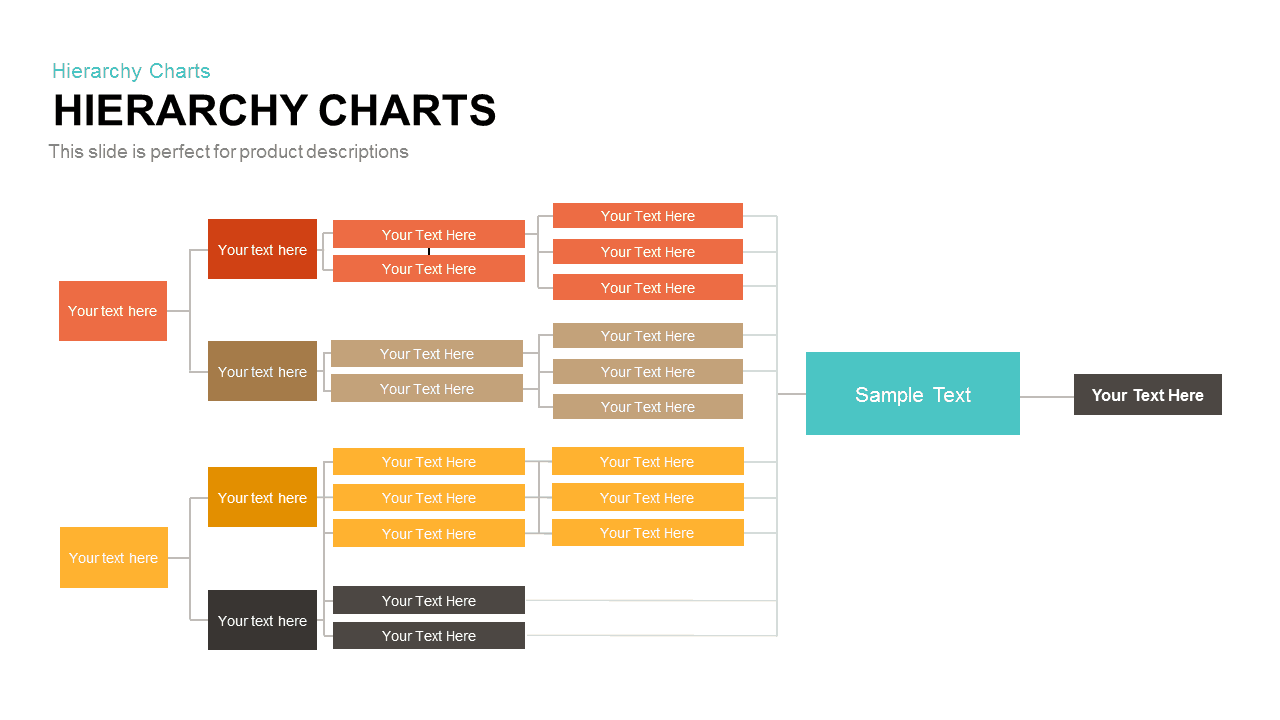
Horizontal Multi-Level Hierarchy Chart template for PowerPoint & Google Slides
Org Chart
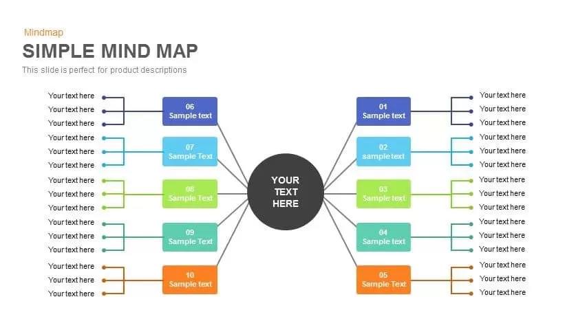
Simple Multi-Branch Mind Map Template for PowerPoint & Google Slides
Mind Maps
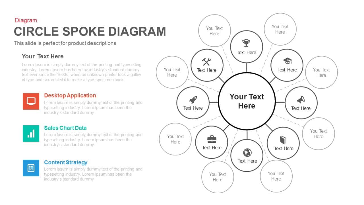
Multi-layout Circle Spoke Diagram Template for PowerPoint & Google Slides
Circular
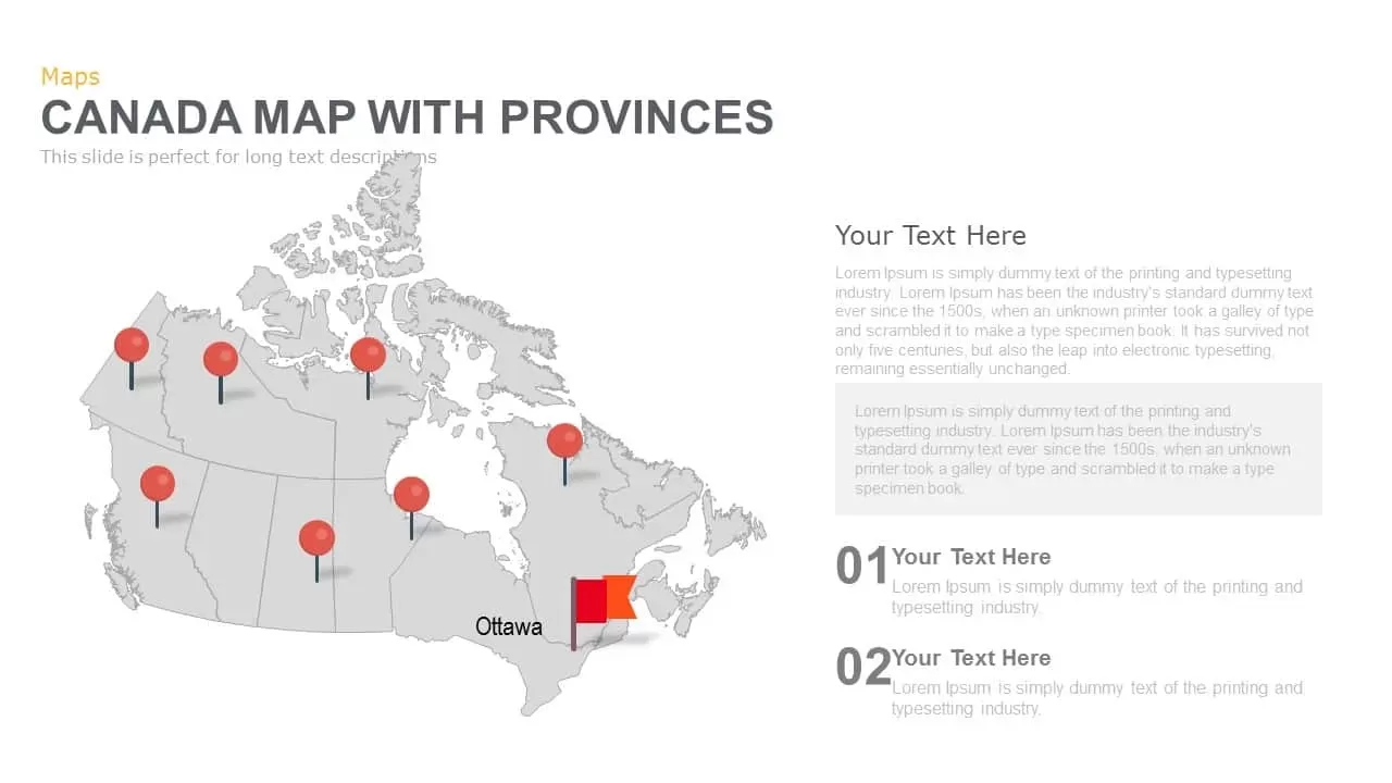
Canada Provinces Map Multi-Layout Template for PowerPoint & Google Slides
World Maps
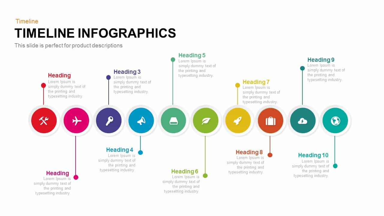
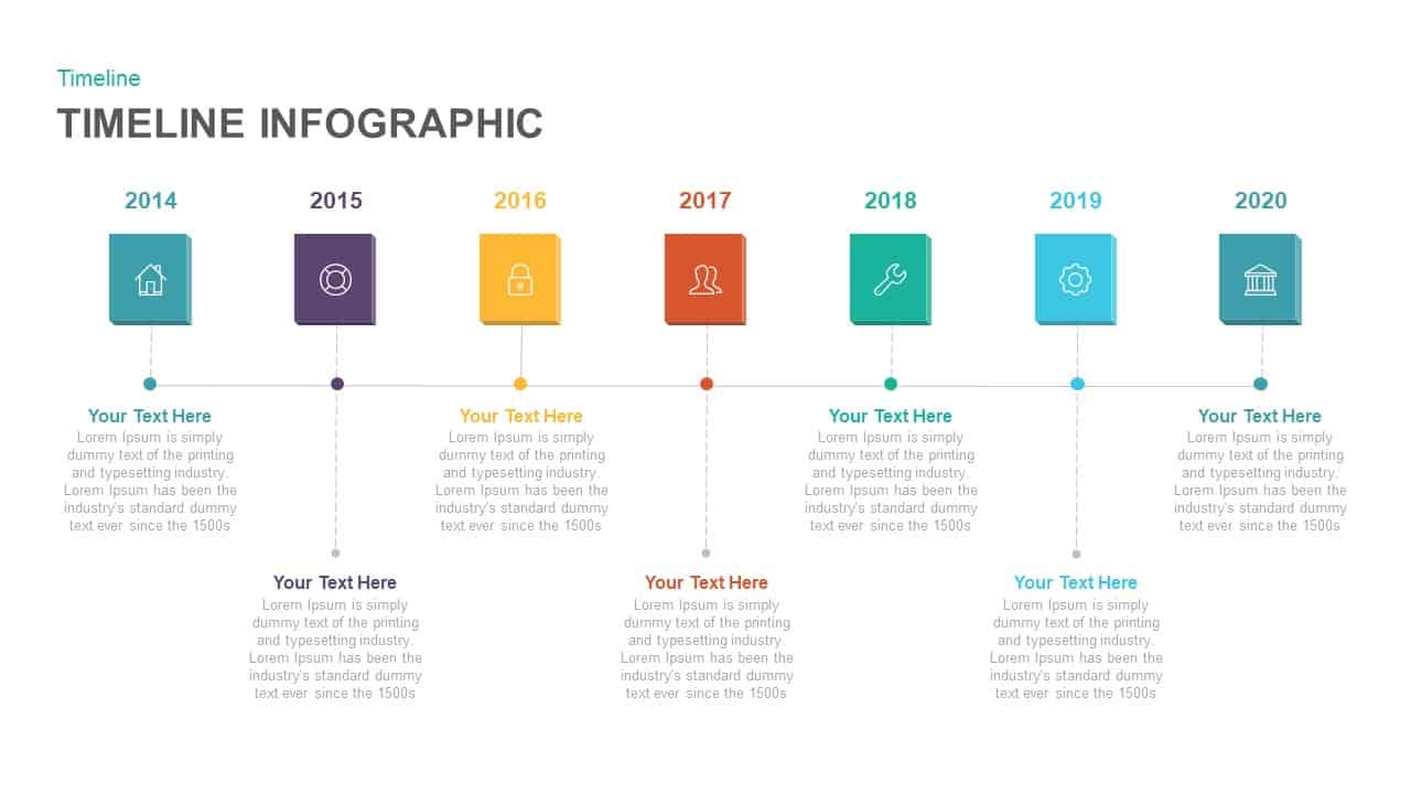
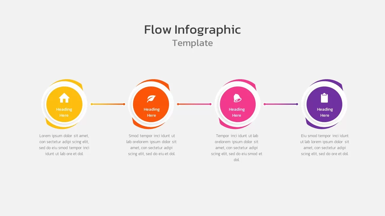
Multi-Stage Timeline Infographics Template for PowerPoint & Google Slides
Timeline
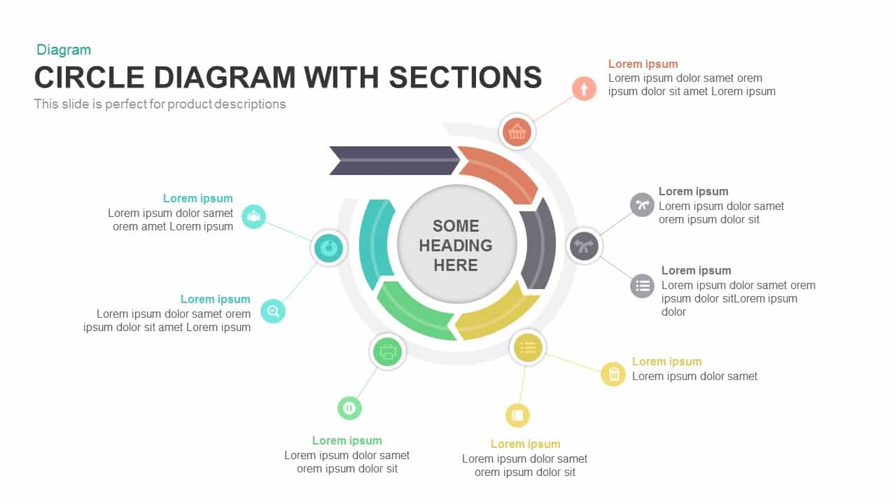
Modern Multi-Section Circle Diagram Template for PowerPoint & Google Slides
Circular
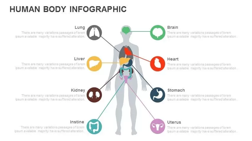
Multi-Organ Human Body Infographic Template for PowerPoint & Google Slides
Comparison
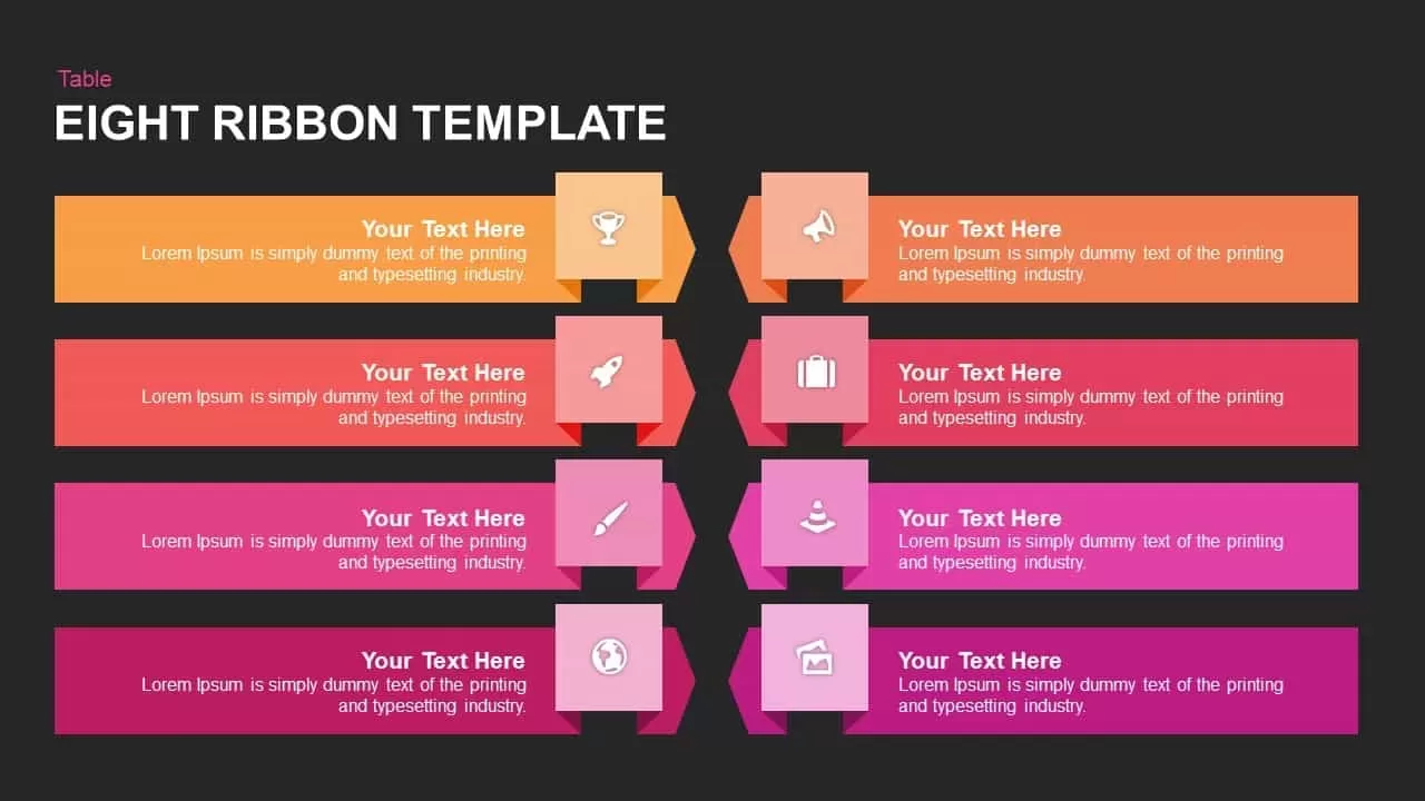
Multi-Color Eight-Step Ribbon Diagram Template for PowerPoint & Google Slides
Process
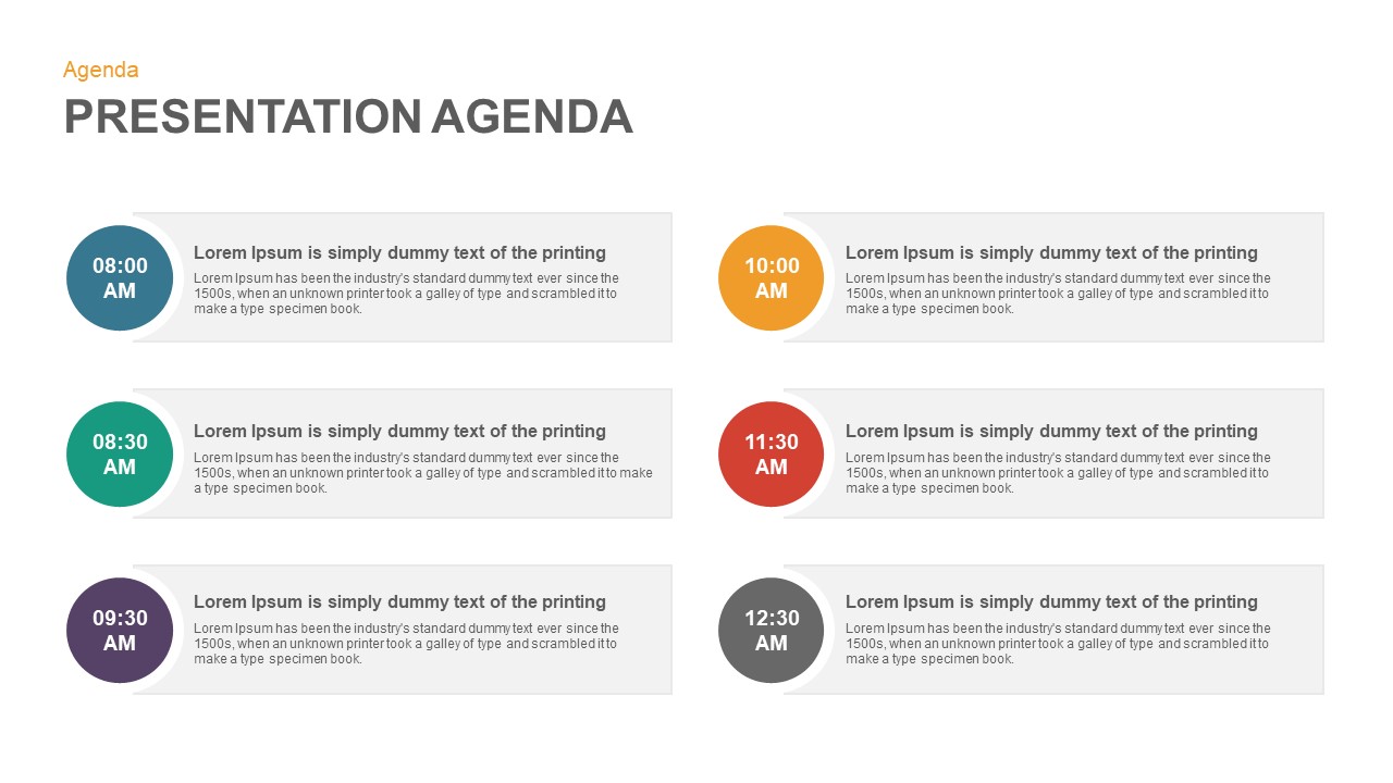
Multi-Style Presentation Agenda Template for PowerPoint & Google Slides
Agenda
Multi-Year Timeline Infographic Template for PowerPoint & Google Slides
Timeline

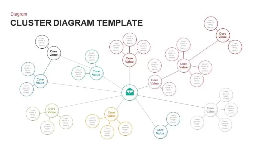
Multi-Cluster Mind Map Infographic Template for PowerPoint & Google Slides
Mind Maps
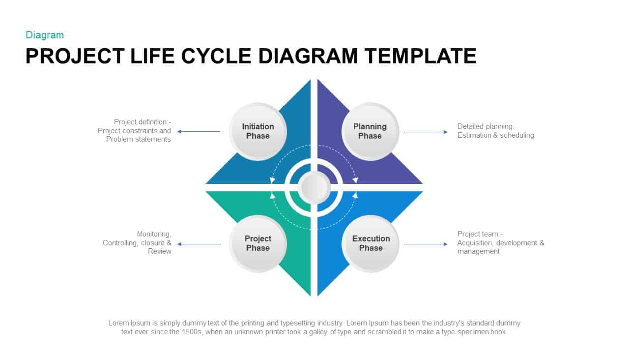
Multi-Style Project Life Cycle Diagram Template for PowerPoint & Google Slides
Process
Multi-Functional Presentation Template for PowerPoint & Google Slides
Pitch Deck
Multi-Purpose Corporate Infographic Template for PowerPoint & Google Slides
Company Profile
Free
Multi-Color Enneagram Circular Diagram Template for PowerPoint & Google Slides
Circular
Multi-Item Agenda Hub-and-Spoke Diagram Template for PowerPoint & Google Slides
Agenda
Doodle Multi Presentation Template for PowerPoint & Google Slides
Company Profile

Free Timeline Infographic Template
Timeline
Free
Free Multi-Level Roadmap Infographic Template for PowerPoint & Google Slides
Roadmap
Free
Free Circular Multi-Step Flow Chart Diagram Template for PowerPoint & Google Slides
Flow Charts
Free
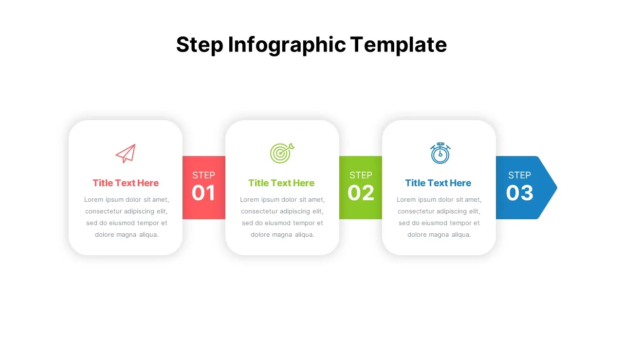
Multi-Step Infographic Process Layout Template for PowerPoint & Google Slides
Process
Multi-Style Flow Infographic Slide template for PowerPoint & Google Slides
Process
Automotive Infographic Multi-Layout Template for PowerPoint & Google Slides
Comparison
Animated Multi-Gear Cluster Infographic Template for PowerPoint & Google Slides
Process
January to December 12 Month Timeline PowerPoint Template
Timeline
Minimal Multi-Year Column Chart Template for PowerPoint & Google Slides
Bar/Column
Multi-Color Milestone Timeline Layout Template for PowerPoint & Google Slides
Timeline
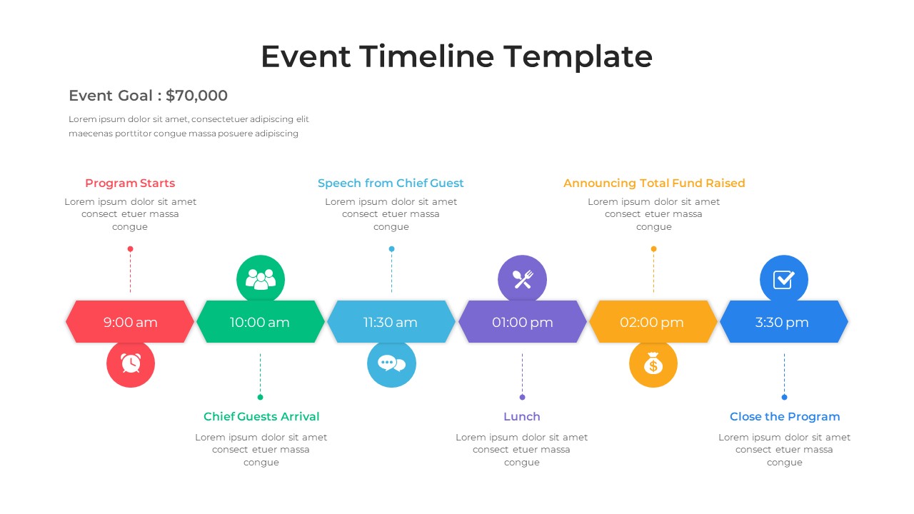
Event Timeline Template for PowerPoint & Google Slides
Timeline
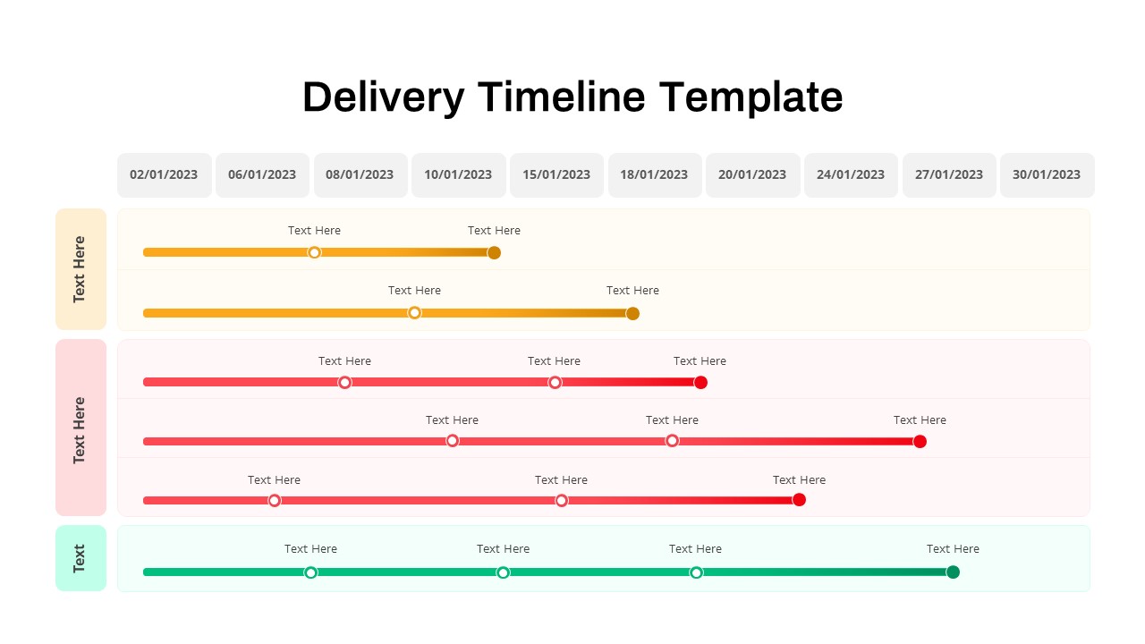
Delivery Timeline Multi-Row Template for PowerPoint & Google Slides
Timeline
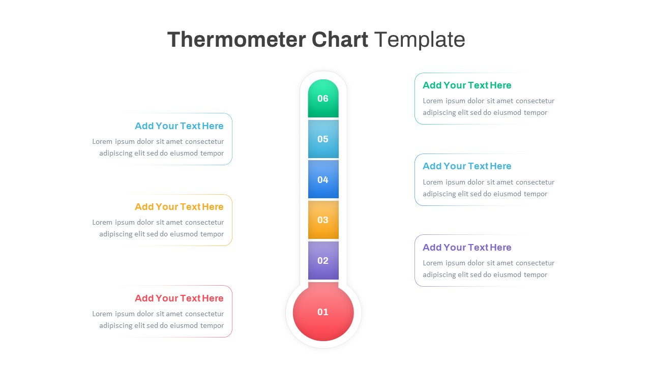
Multi-Variation Thermometer Chart Template for PowerPoint & Google Slides
Bar/Column
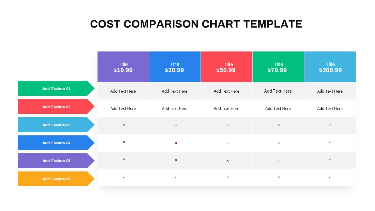
Interactive Multi-Use Cost Comparison Template for PowerPoint & Google Slides
Comparison
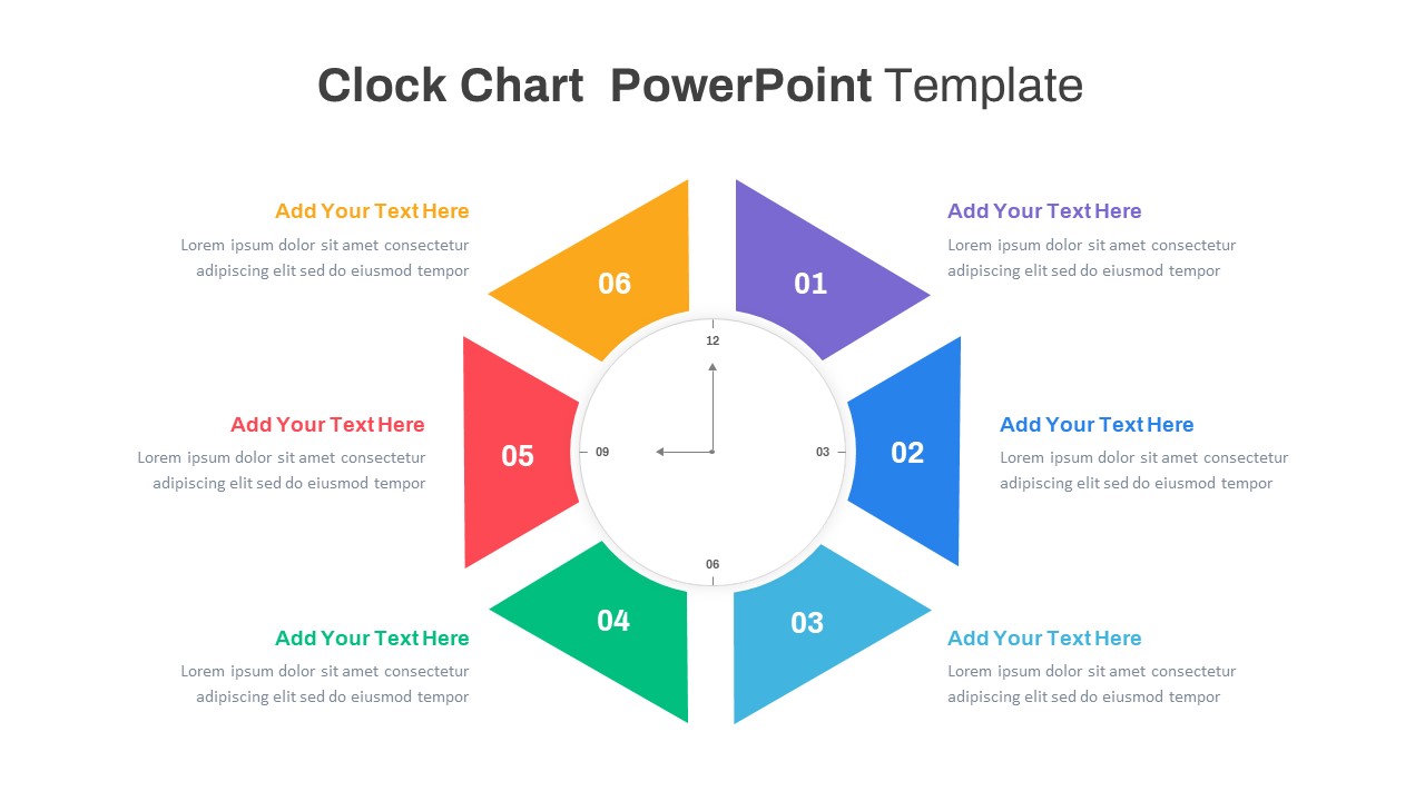
Multi-Style Clock Chart Diagram Template for PowerPoint & Google Slides
Circular
Multi-Variation Circular Chart Diagram Template for PowerPoint & Google Slides
Circular
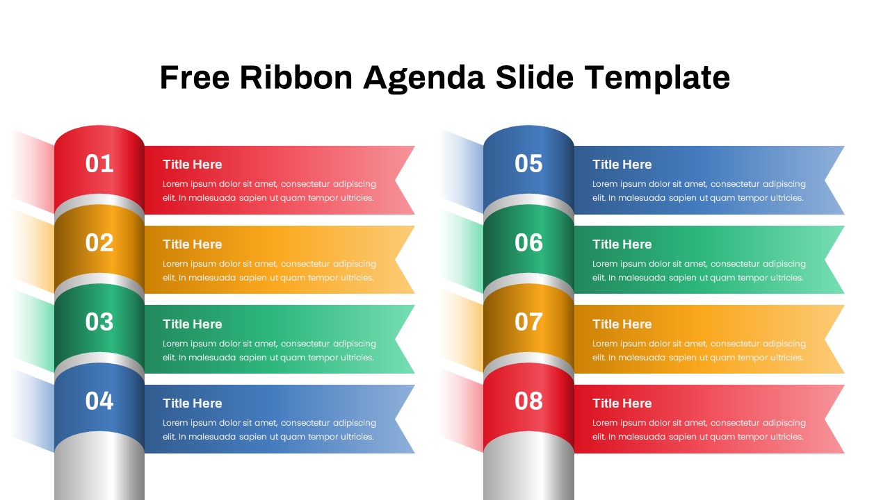
Free Editable Multi-Step Ribbon Agenda Slide Template for PowerPoint & Google Slides
Agenda
Free
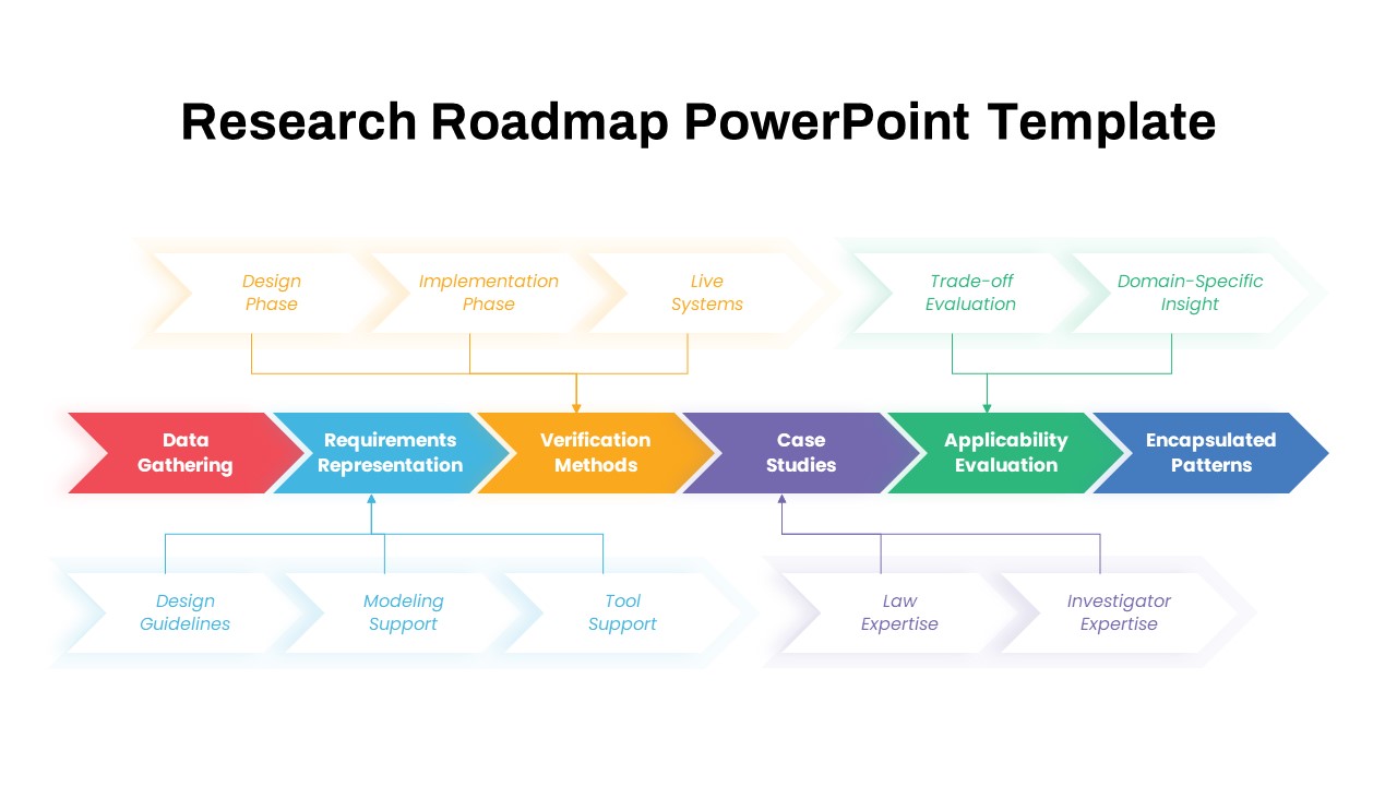
Multi-Phase Research Roadmap Infographic Template for PowerPoint & Google Slides
Roadmap
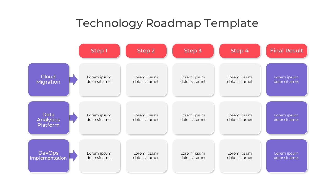
Multi-Color Technology Roadmap Template Pack for PowerPoint & Google Slides
Roadmap
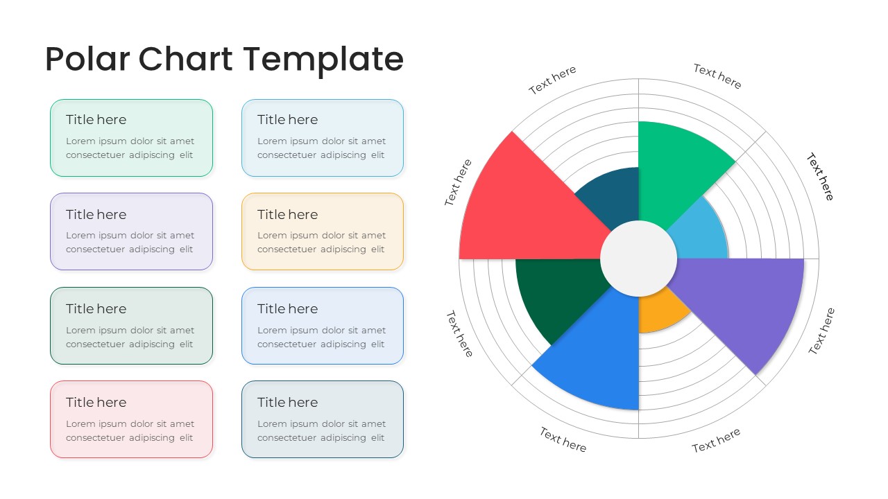
Modern Multi-Color Polar Chart Diagram Template for PowerPoint & Google Slides
Charts
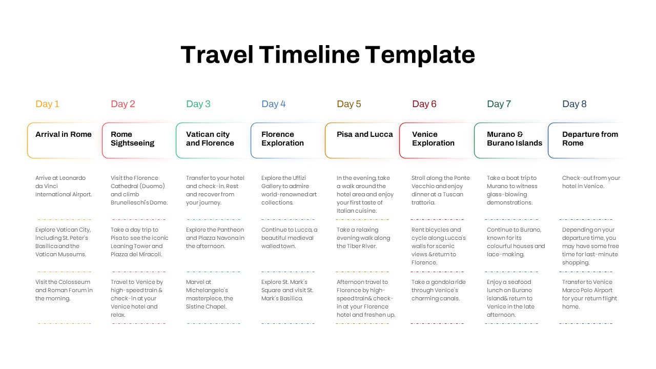
Free Elegant Multi-Day Travel Timeline Template for PowerPoint & Google Slides
Timeline
Free
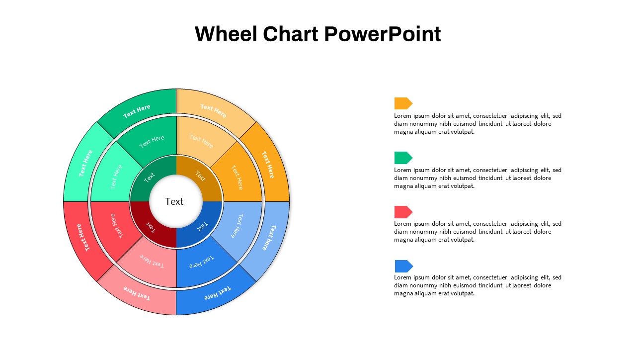
Multi-Level Wheel Chart Diagram template for PowerPoint & Google Slides
Pie/Donut
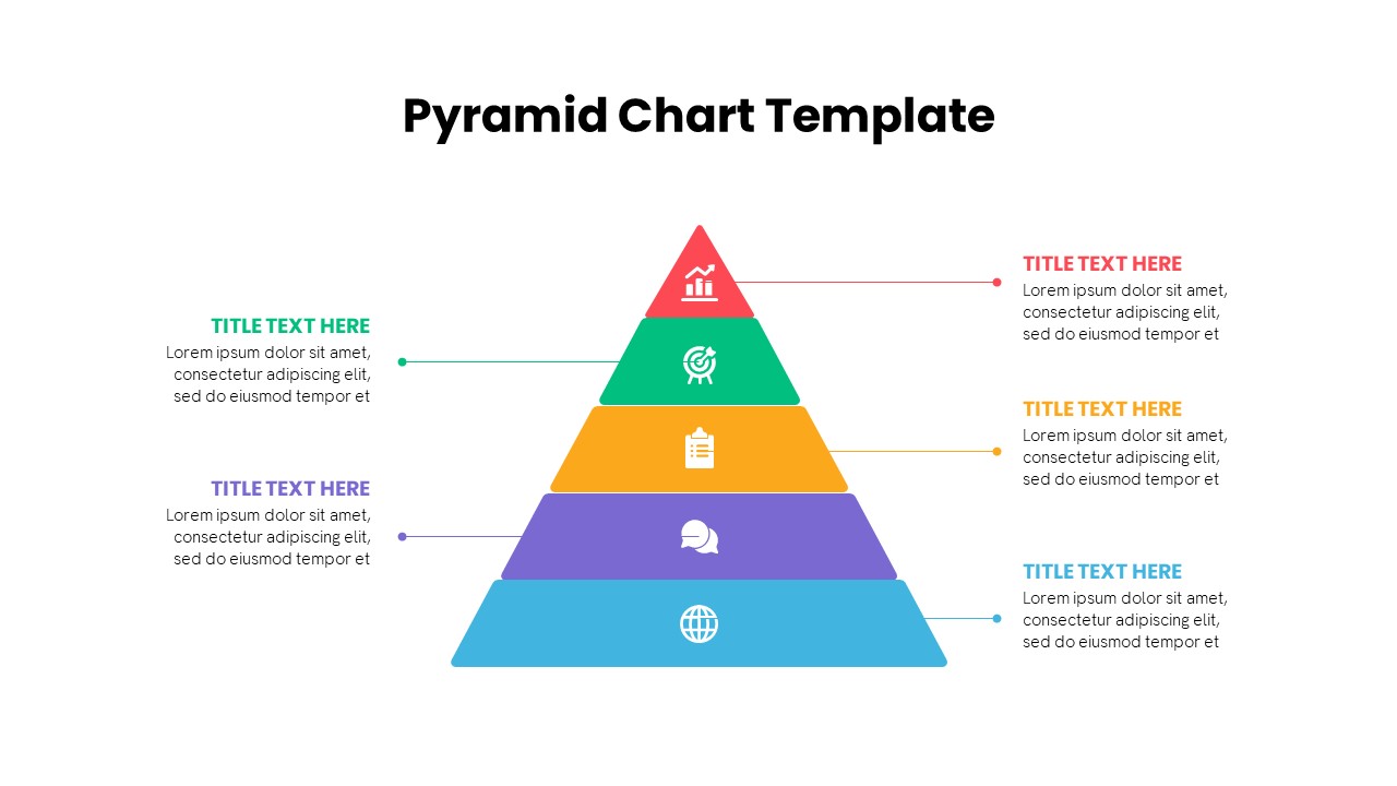
Multi-Level Colorful Pyramid Chart Template for PowerPoint & Google Slides
Pyramid
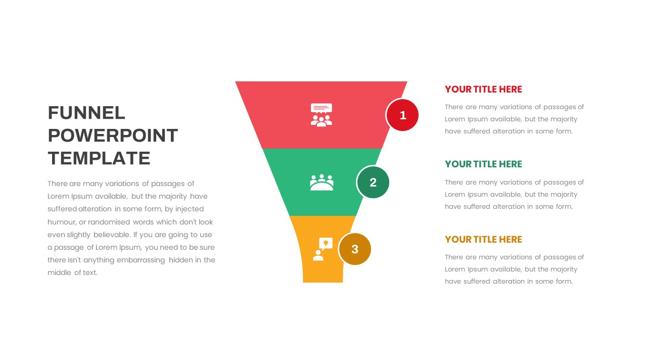
Free Multi-Step Funnel Infographic Slide Pack Template for PowerPoint & Google Slides
Funnel
Free
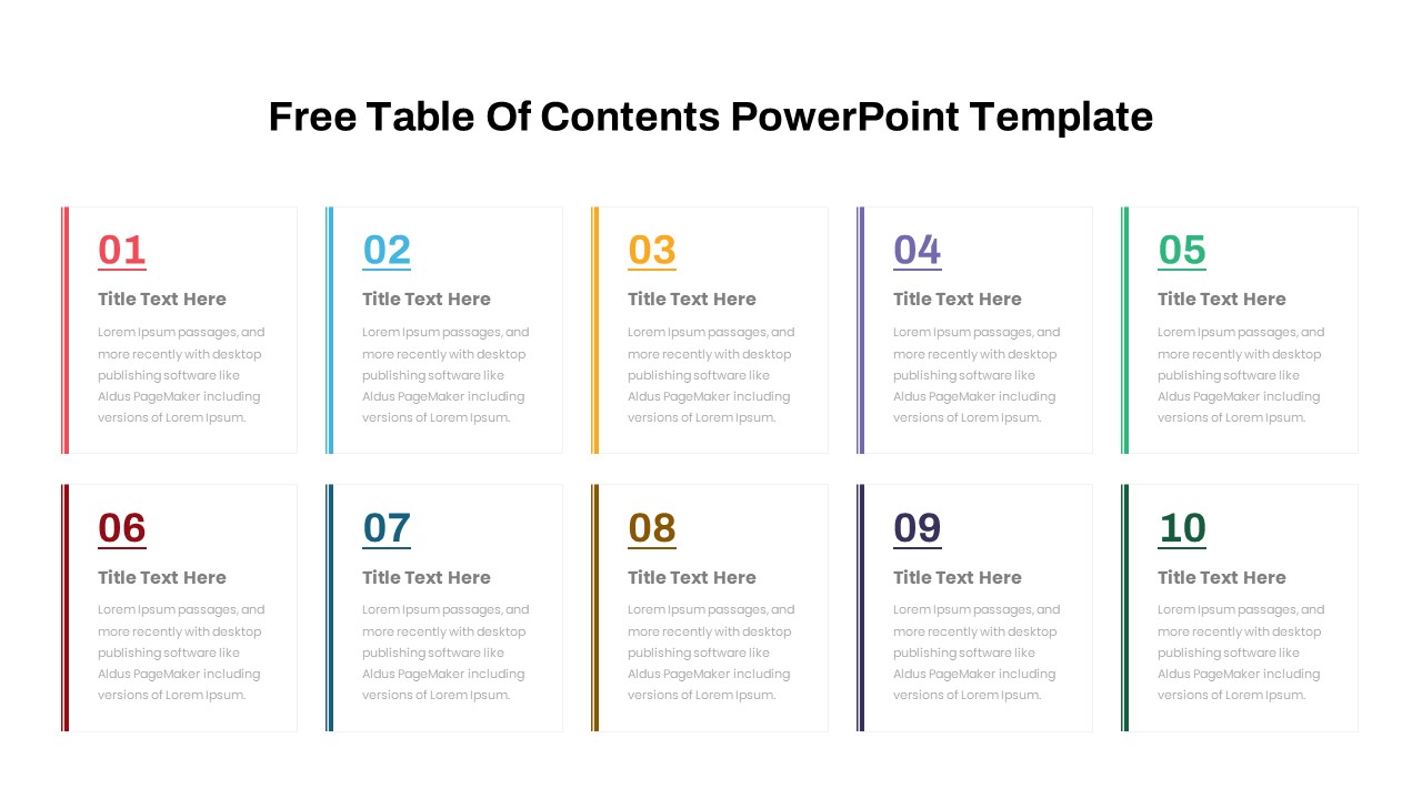
Free Table Of Contents PowerPoint Slides Template
Agenda
Free
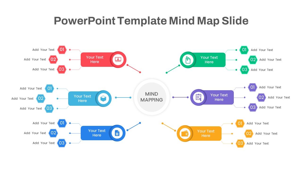
Colorful Multi-Branch Mind Map Slide Template for PowerPoint & Google Slides
Mind Maps
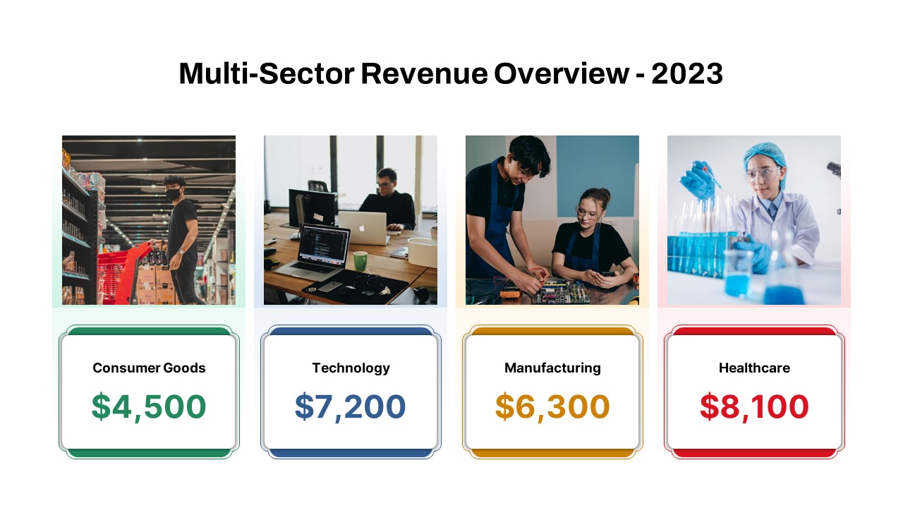
Multi-Sector Revenue Breakdown Cards Template for PowerPoint & Google Slides
Comparison
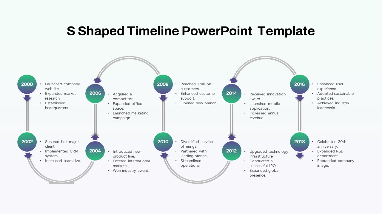
Multi-Year S-Shaped Roadmap Timeline Template for PowerPoint & Google Slides
Timeline
Multi-Style Board of Directors Profile Template for PowerPoint & Google Slides
Our Team
Multi-Point Diagram Presentation Template for PowerPoint & Google Slides
Process
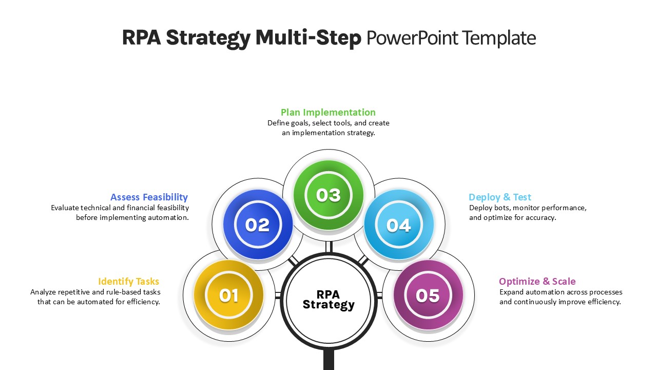
RPA Strategy Multi-Step Diagram Template for PowerPoint & Google Slides
Process
Animated Multi-Milestone Roadmap Template for PowerPoint & Google Slides
Roadmap
Multi-Column Table Presentation Template for PowerPoint & Google Slides
Table
Six-Row Multi-Column Table Presentation Template for PowerPoint & Google Slides
Table
Multi Color SWOT Analysis Quadrant Template for PowerPoint & Google Slides
SWOT
Application Revenue Line Chart KPI Template for PowerPoint & Google Slides
Revenue
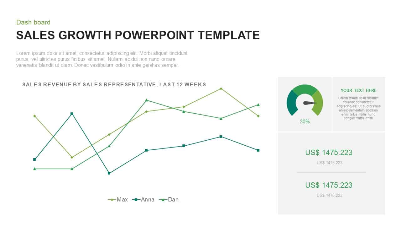
Sales Growth Dashboard: KPI Gauge & Line Template for PowerPoint & Google Slides
Revenue
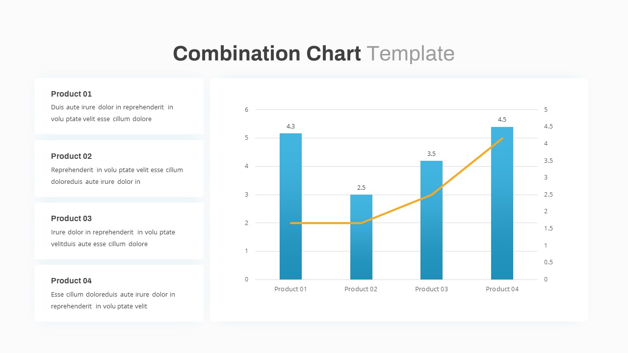
Combination Bar and Line Chart Template for PowerPoint & Google Slides
Bar/Column
Arrow Line Chart Template for PowerPoint & Google Slides
Comparison Chart
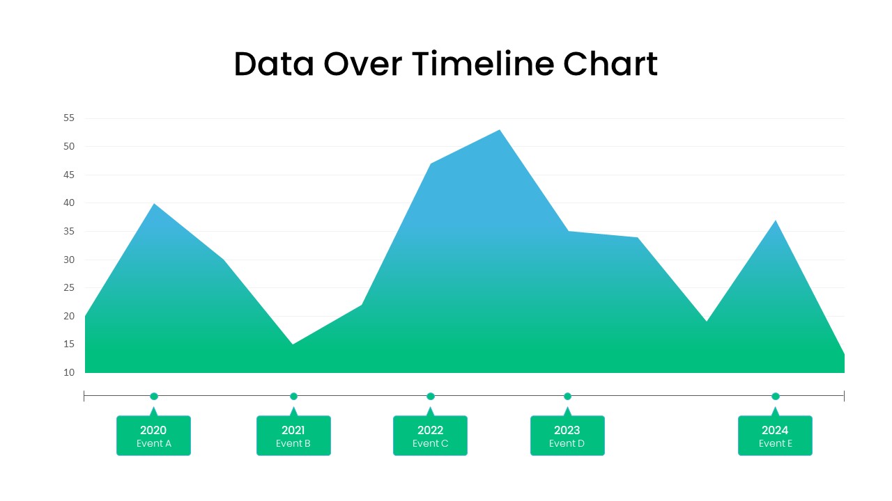
Data Over Time Line Chart template for PowerPoint & Google Slides
Charts
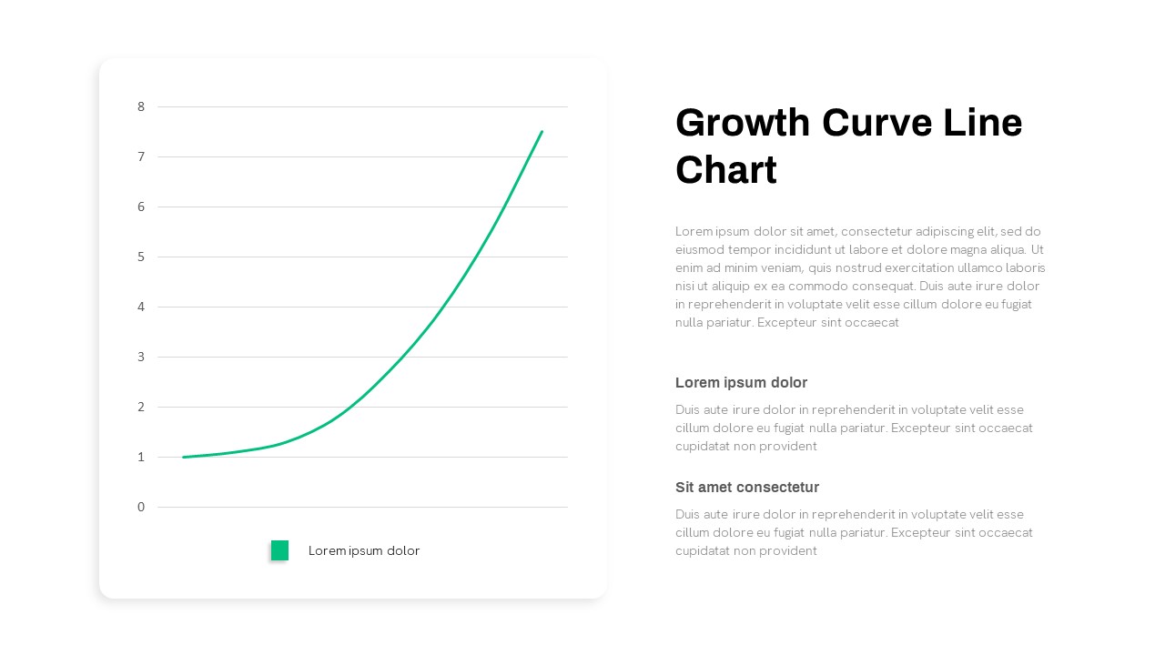
Growth Curve Line Chart Visualization Template for PowerPoint & Google Slides
Charts
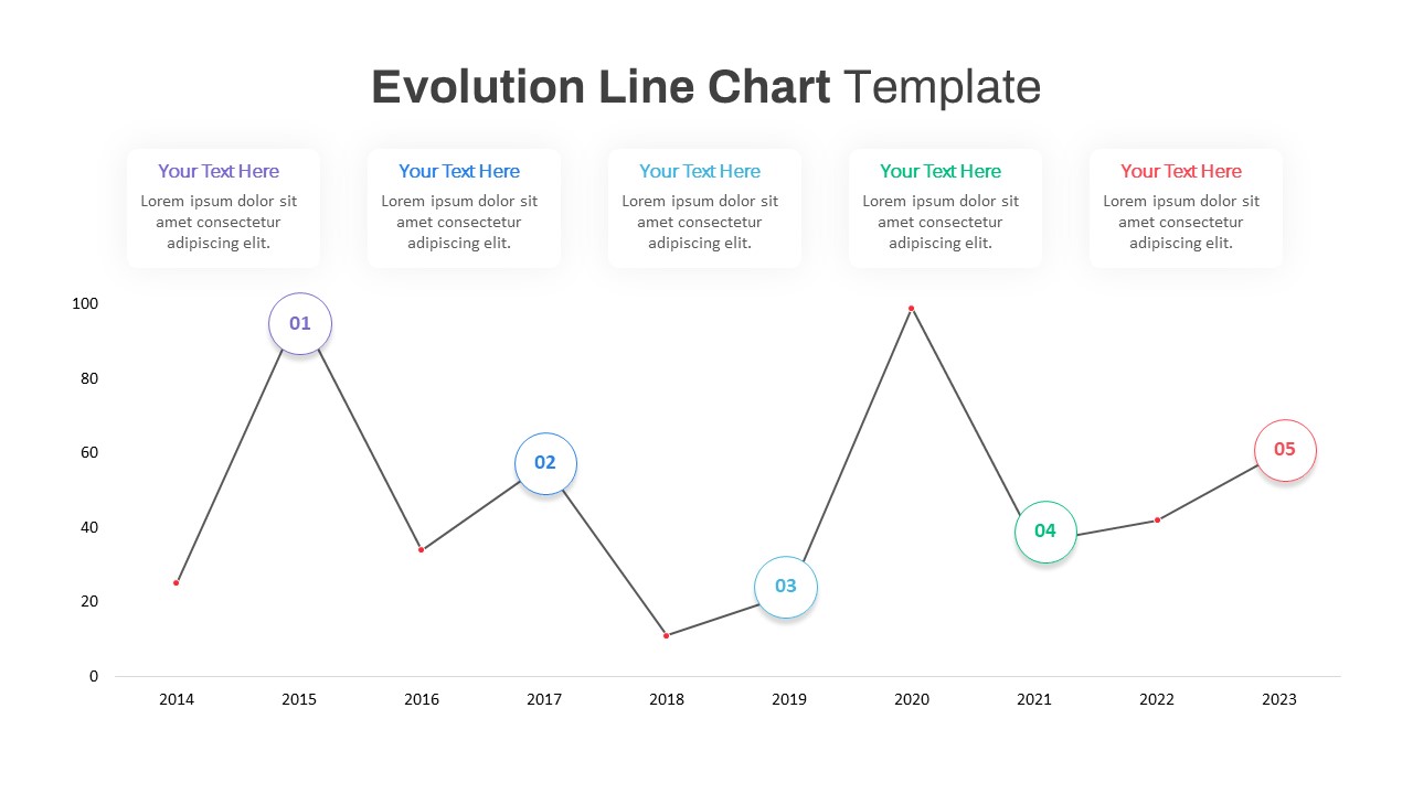
Evolution Line Chart with Milestones Template for PowerPoint & Google Slides
Timeline
Multiple Line Chart Comparison Template for PowerPoint & Google Slides
Comparison Chart
Creative Clothing Line Presentation Template for PowerPoint & Google Slides
Pitch Deck
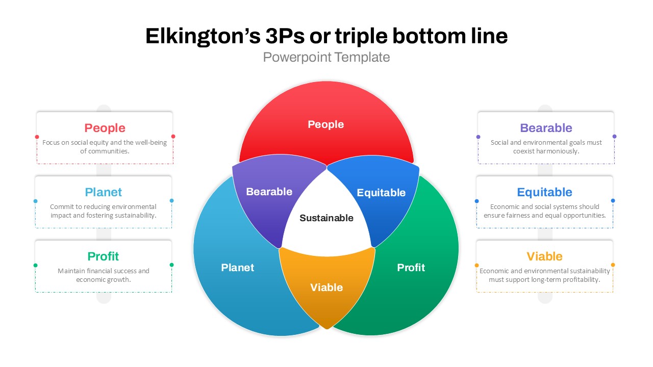
3Ps Triple Bottom Line Venn Diagram Template for PowerPoint & Google Slides
Circular
4 People Racing to Finish Line Template for PowerPoint & Google Slides
Accomplishment