Free Project Dashboard PowerPoint Template
Free Project Dashboard PowerPoint Template
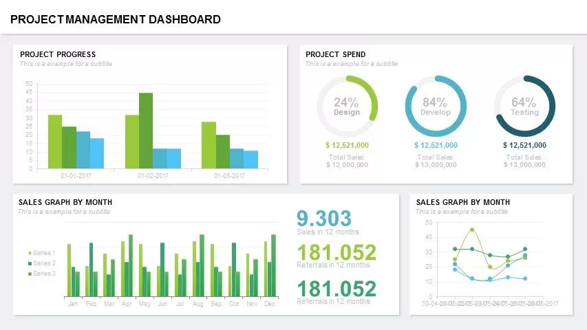
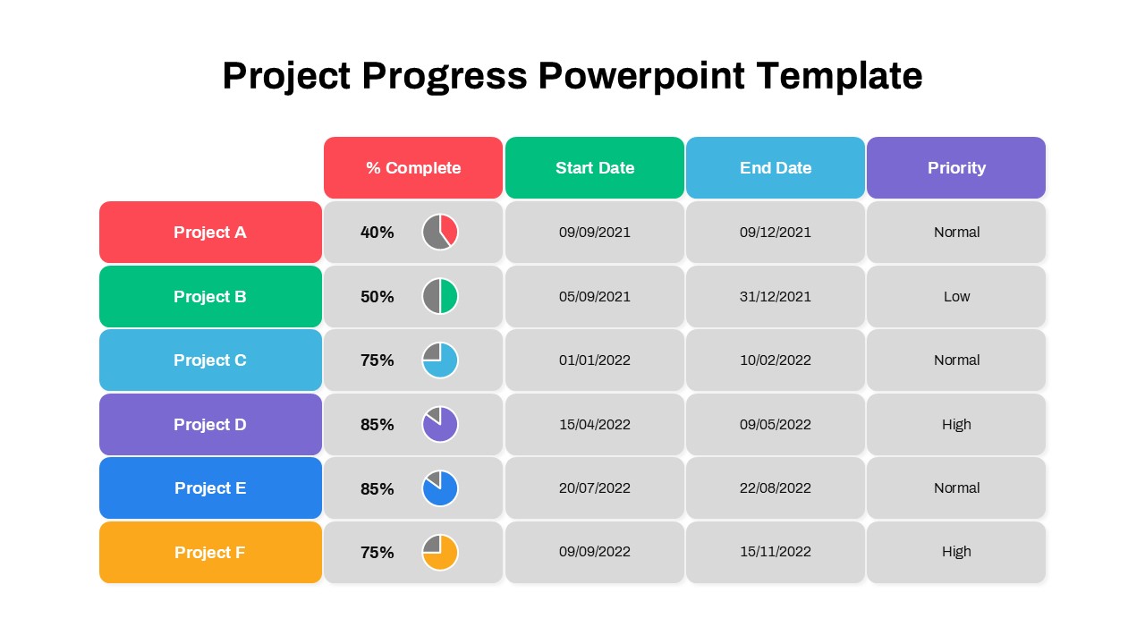
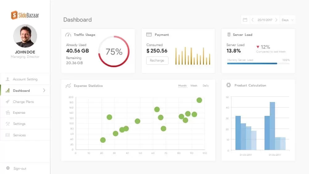
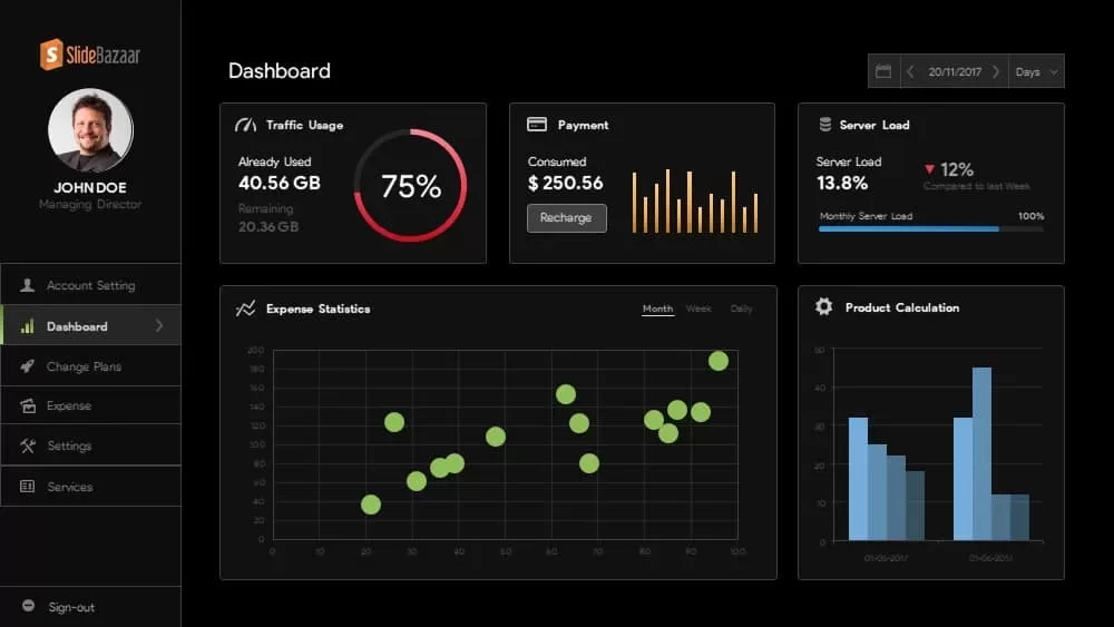
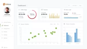
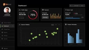
Project dashboard PowerPoint template free is a visual statistics your company’s sales data and growth. This dashboard template for PowerPoint can be used as a scorecard PowerPoint to present the most significant sings or KPIs that assist you to understand the current status of your company or business. A dashboard is a user interface that is similar to automobile dashboard, presents data in an easy to understand structure. It gives a quick view of the events, so the needy can easily learn what is happening. The free dashboard template is arranged in a flexible manner comprising distribution charts, growth charts, graph, bar diagrams, and simple pie chart. These are created with integrated PowerPoint shapes so you can easily customize the dashboard.
You can access more free PowerPoint templates by Slidebazaar.
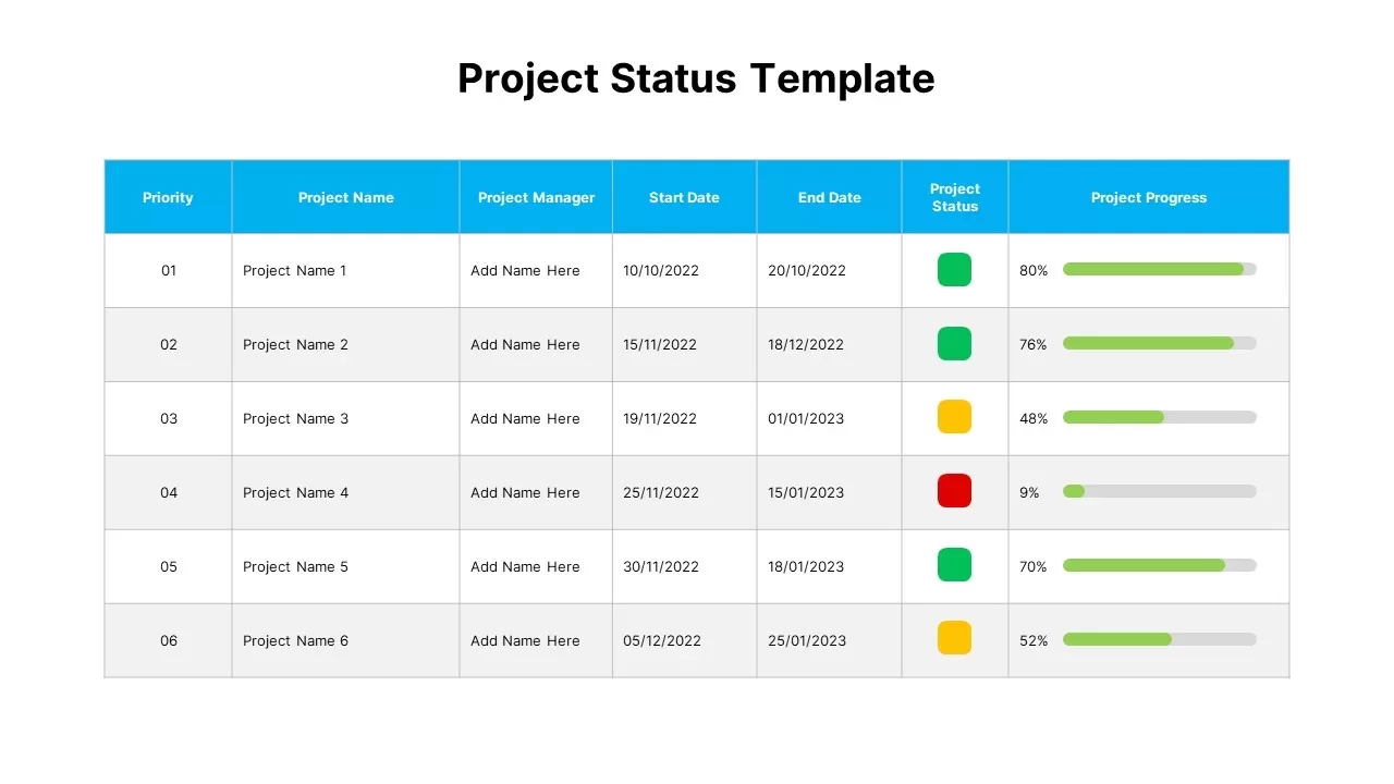
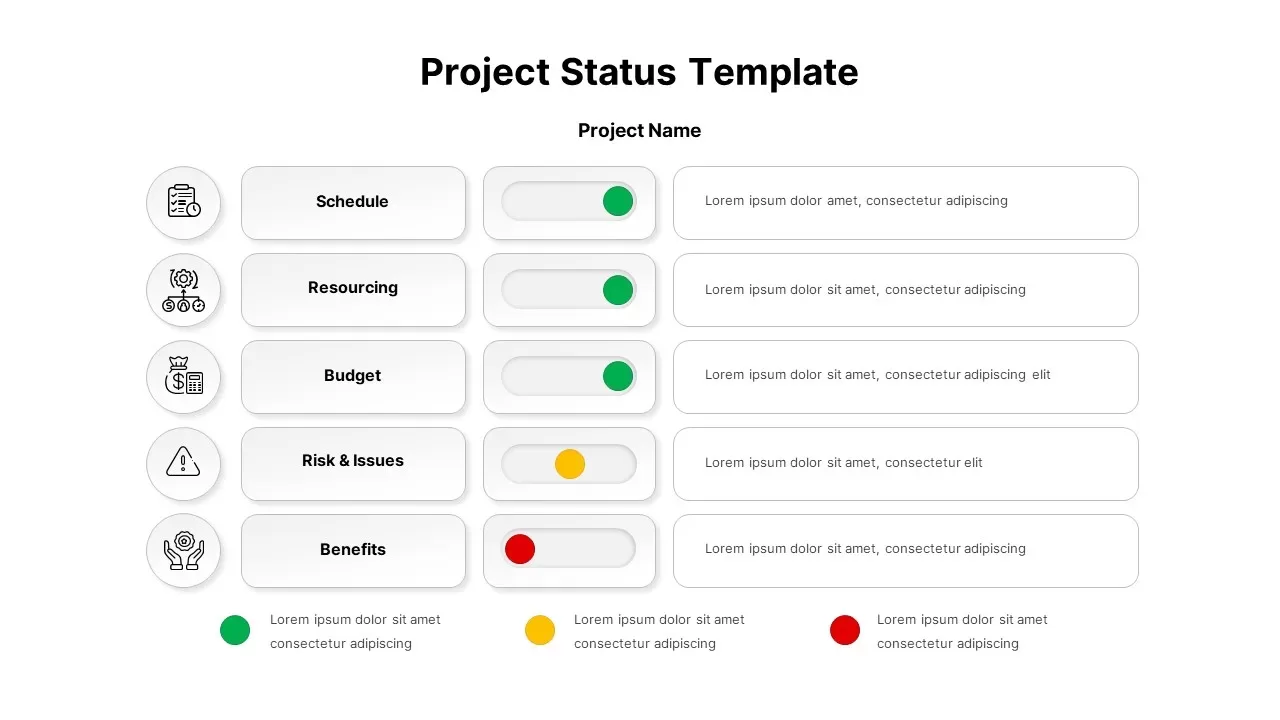
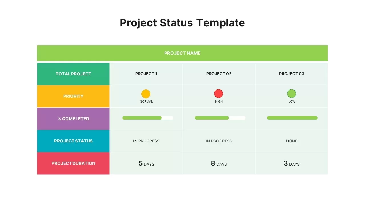
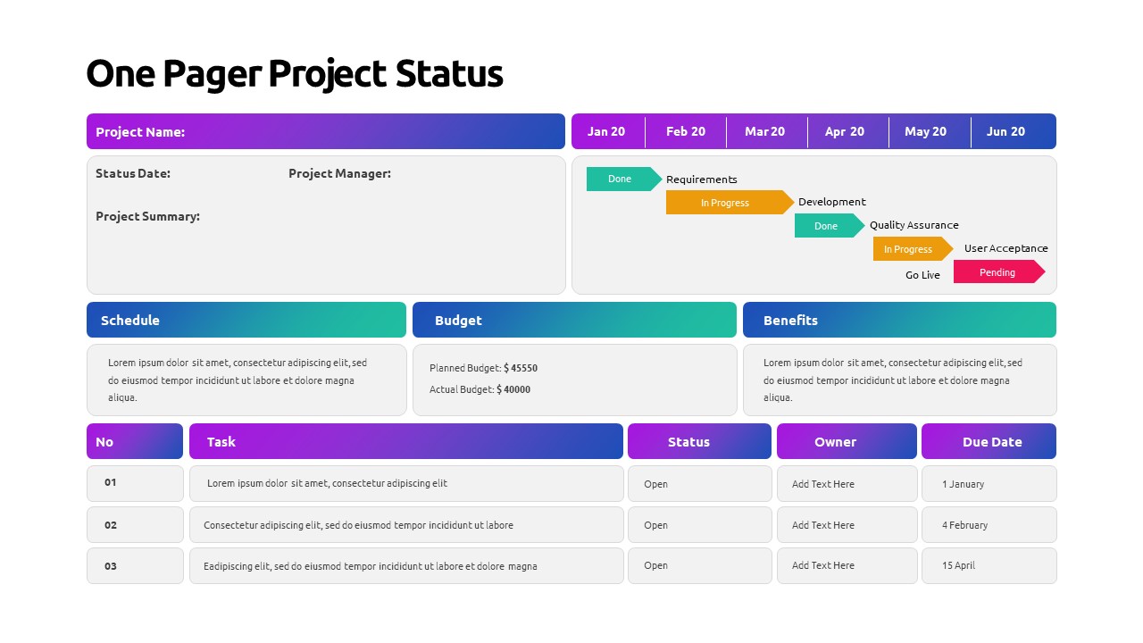
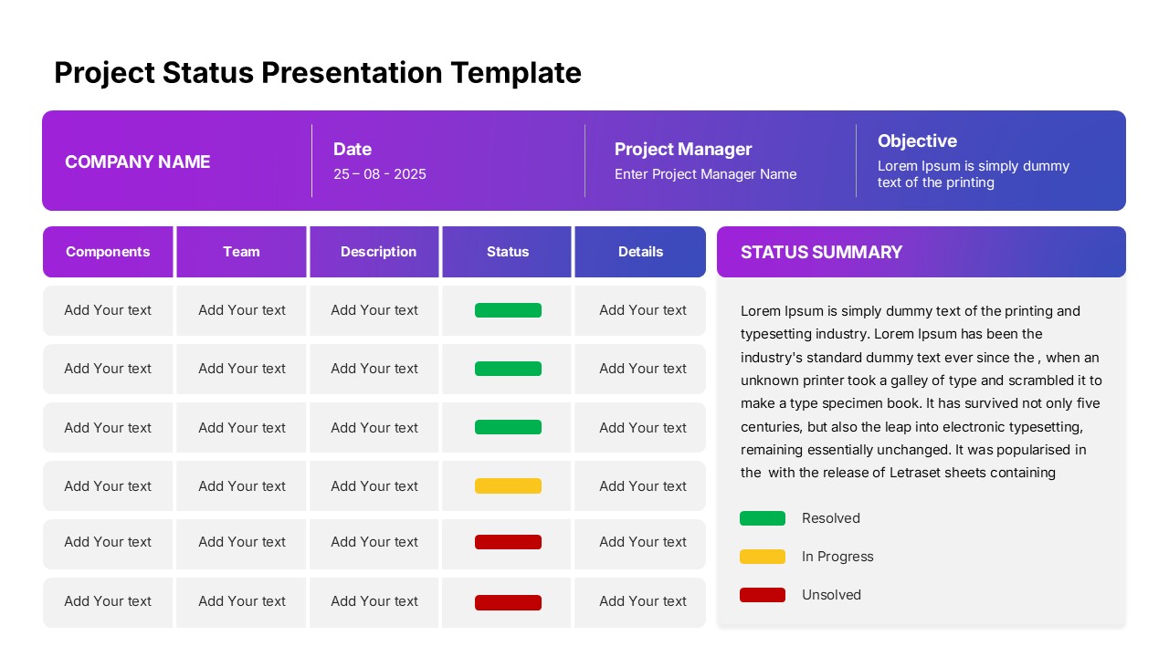
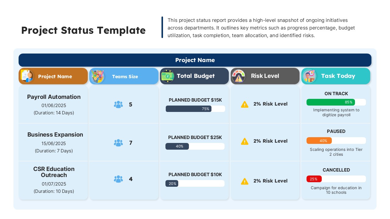
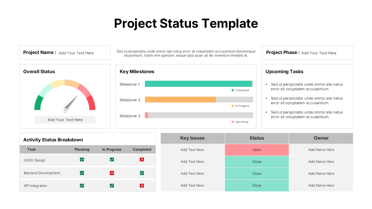
Regardless of industry, project managers can download free project dashboard ppt template to showcase project progress or data; this might be a presentation to executives, periodic check-in with team members, or a status update to an important client. Many companies choose to make a project management dashboard, however, slide bazaar offers, stunning dashboards and data charts in our gallery which are easily downloadable. Therefore, there is no need to waste your time to create dashboards. By using this project management dashboard free PowerPoint template, you can provide key statistics, departmental reports, and ongoing status of your project.
Explore more project management powerpoint templates and make your presentation engaging.
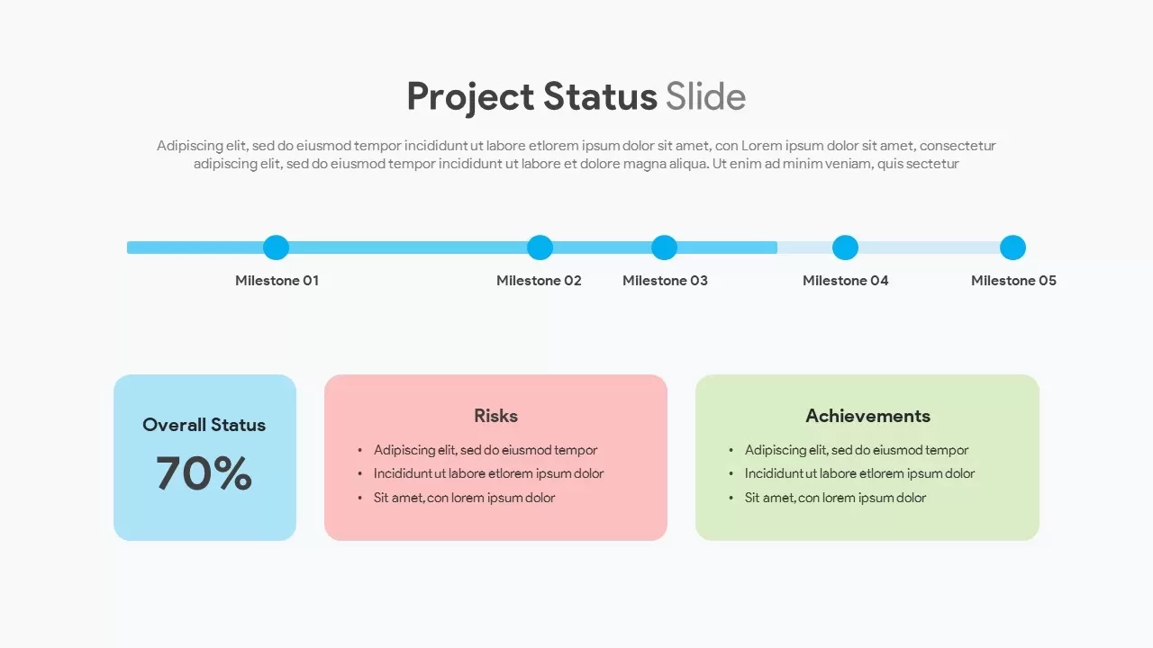
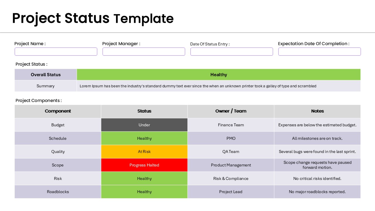
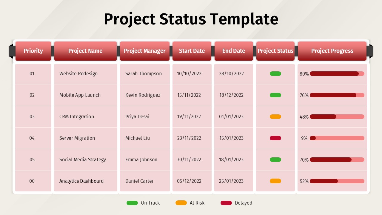
Free project status dashboard ppt template is a data driven template comprise progress reporting diagrams. It is a visual display of the most critical data, which fits completely in a single presentation deck to understand the complexity. Data is complex, while the visualization makes easy understanding. This is simplest way of data presentation by a single view screen. The dashboard ppt template is available in three slides and two background colors. You can present your sales overviews and project status using the charts and diagrams. The editable free PowerPoint project dashboard template is a PowerPoint template that allows your access even without registration.
Login to download this file

Item ID
SBF00020
Related Templates

Project Management Dashboard Template for PowerPoint & Google Slides
Project

Project Status Dashboard Table Template for PowerPoint & Google Slides
Project Status
Project Status Dashboard with Metrics Template for PowerPoint & Google Slides
Project Status
Colorful Project Status Dashboard Template for PowerPoint & Google Slides
Project Status
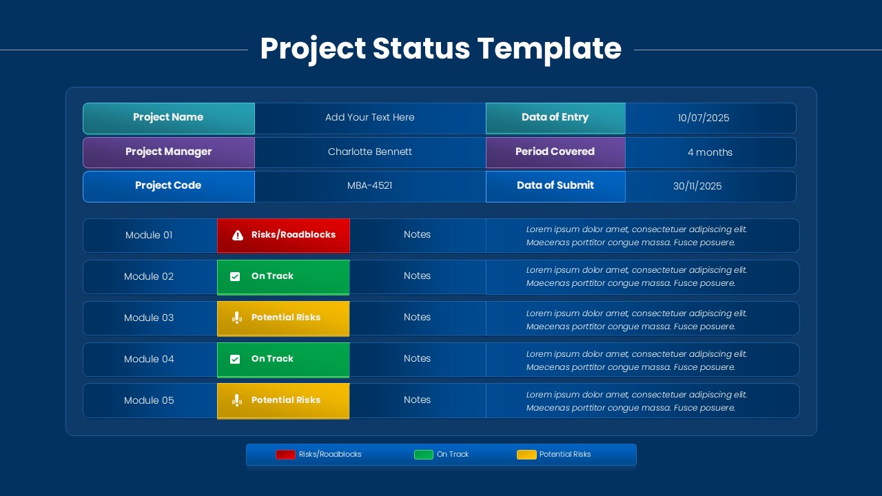
Project Status Dashboard Template for PowerPoint & Google Slides
Project Status
One Pager Project Status Dashboard Template for PowerPoint & Google Slides
Project Status
Project Progress Dashboard Pie Charts Template for PowerPoint & Google Slides
Project
Project Tracking Dashboard Table Template for PowerPoint & Google Slides
Project Status
Project Status Dashboard Report Template for PowerPoint & Google Slides
Project Status
Project Status Update Dashboard Table Template for PowerPoint & Google Slides
Project Status
Project Status Dashboard Template for PowerPoint & Google Slides
Project Status
Dashboard Project Status Template for PowerPoint & Google Slides
Project Status
Project Status Template Dashboard with Gauge for PowerPoint & Google Slides
Project Status
Project Status Dashboard with RAG Legend Template for PowerPoint & Google Slides
Project Status
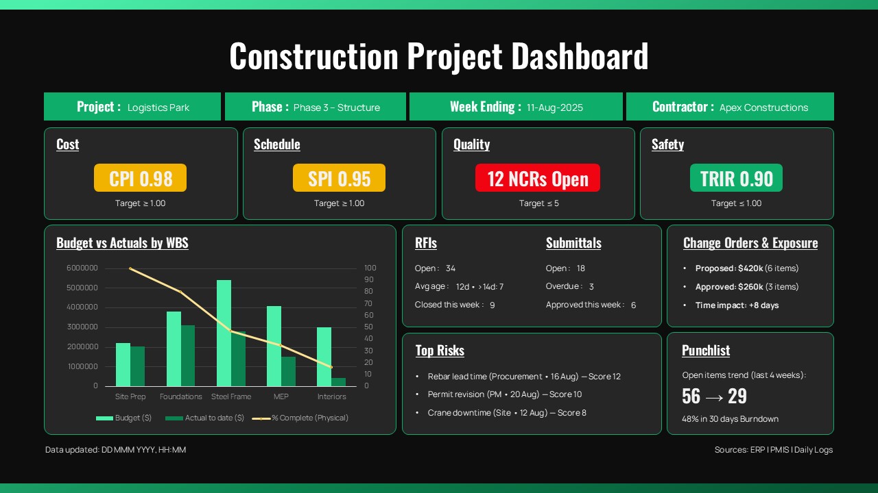
Construction Project Dashboard Template for PowerPoint & Google Slides
Project
Free Metro UI Dashboard Infographic Template for PowerPoint & Google Slides
Business Report
Free
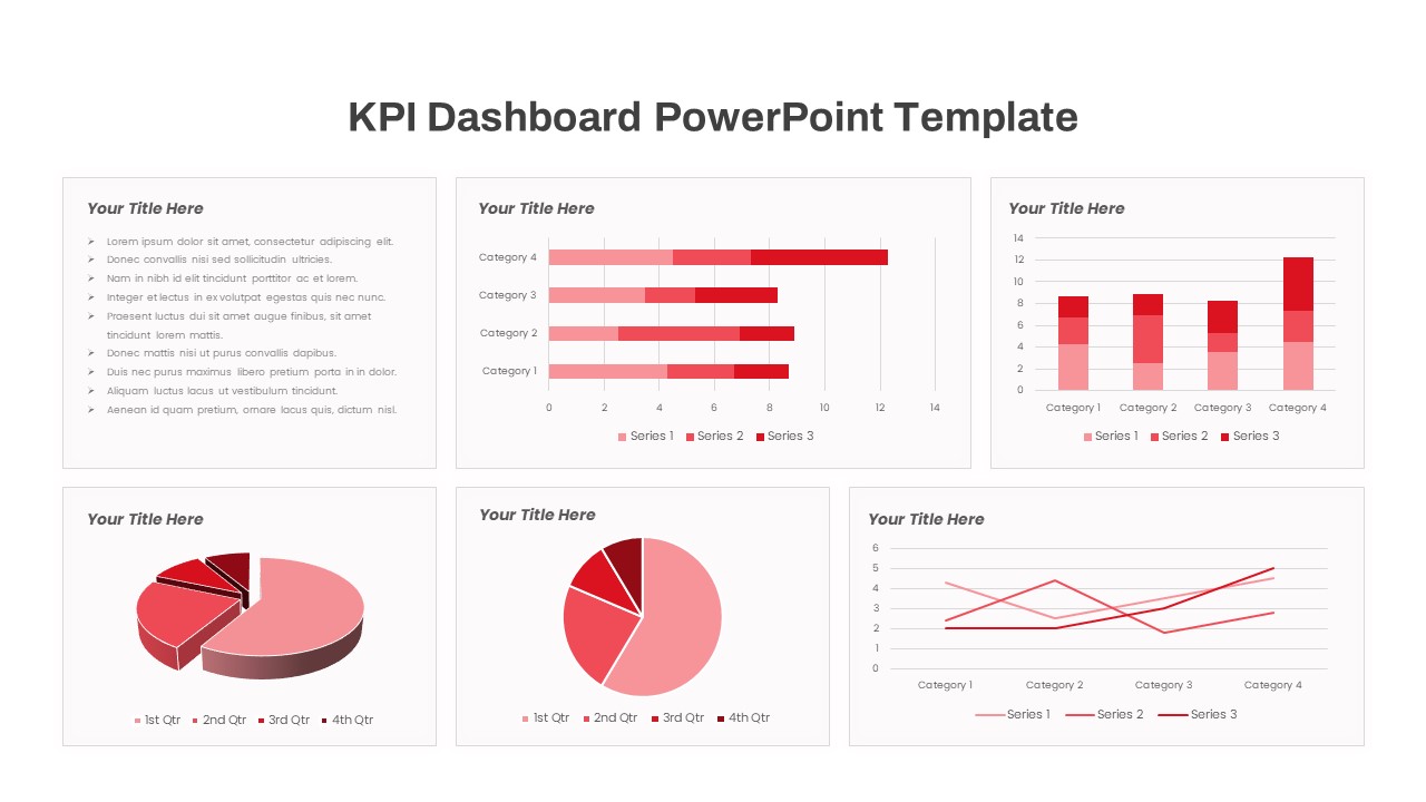
Free KPI Dashboard Template for PowerPoint & Google Slides
Charts
Free
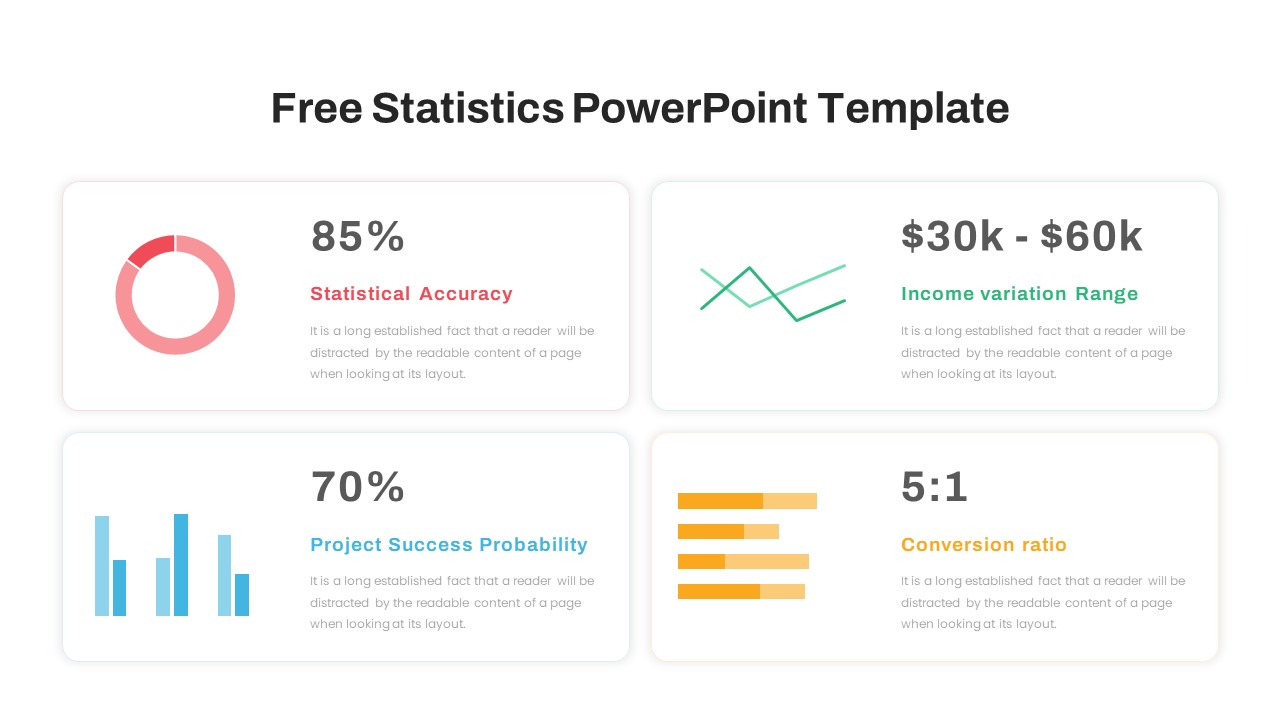
Free Infographic Statistics Dashboard Slide for PowerPoint & Google Slides
Bar/Column
Free
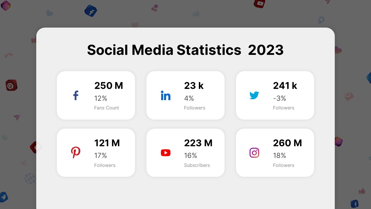
Social Media Statistics 2023 Dashboard Template for PowerPoint & Google Slides
Comparison
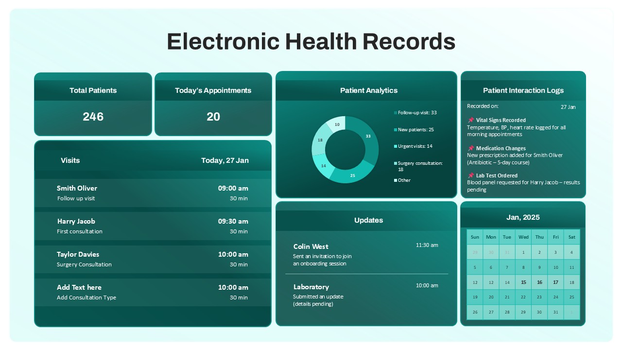
Electronic Health Records Dashboard template for PowerPoint & Google Slides
Health