Simple Scatter Chart Template for PPT Slides
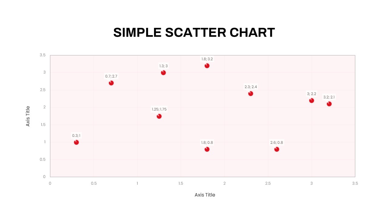
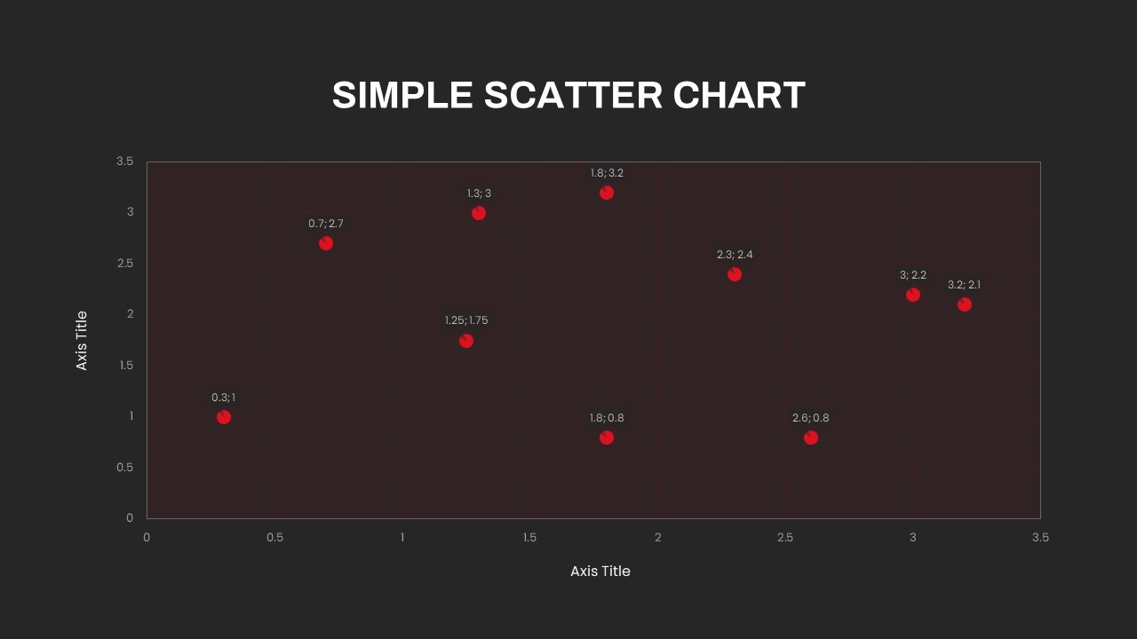
The Simple Scatter Chart Template helps present data comparisons in a clear visual format by placing individual values on a two-dimensional chart. It is designed for presentations where audiences need to quickly understand connections between metrics, discover data patterns, or compare different groups.
Core Elements
- X-Y Chart Layout – Display two related variables on horizontal and vertical axes.
- Data Point Visualization – Plot individual observations for quick comparison.
- Trend Analysis – Use the chart to communicate general patterns across datasets.
- Group Comparison – Separate or compare different customer, product, market, or performance groups.
- Outlier Identification – Highlight unusual data points that stand apart from the main dataset.
- Custom Annotations – Add labels, notes, or callouts to explain important findings.
Professional Applications
Use the Simple Scatter Chart Template for business reports, marketing analytics, sales presentations, financial analysis, customer research, performance measurement, scientific studies, and educational presentations. It can help teams communicate relationships between metrics such as sales and revenue, cost and performance, customer activity and retention, or other business variables.
Editable Presentation Design
The template is fully customizable, allowing you to update data, axis titles, labels, markers, colors, and supporting text. Compatible with PowerPoint and Google Slides, it provides a flexible foundation for creating professional scatter plot presentations, data analysis slides, statistical reports, and business insights.
Login to download this file

Item ID
SB03612


Related Templates

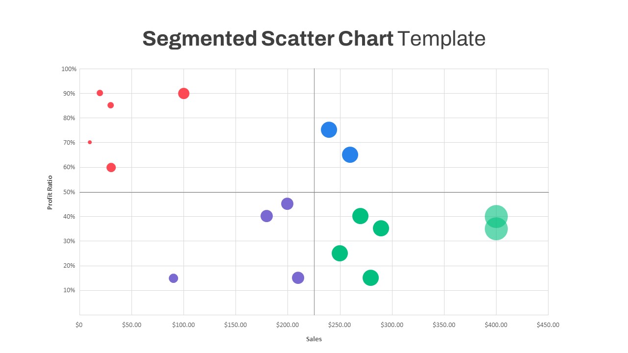
Segmented Scatter Chart Data Visualization Template for PowerPoint & Google Slides
Business Strategy
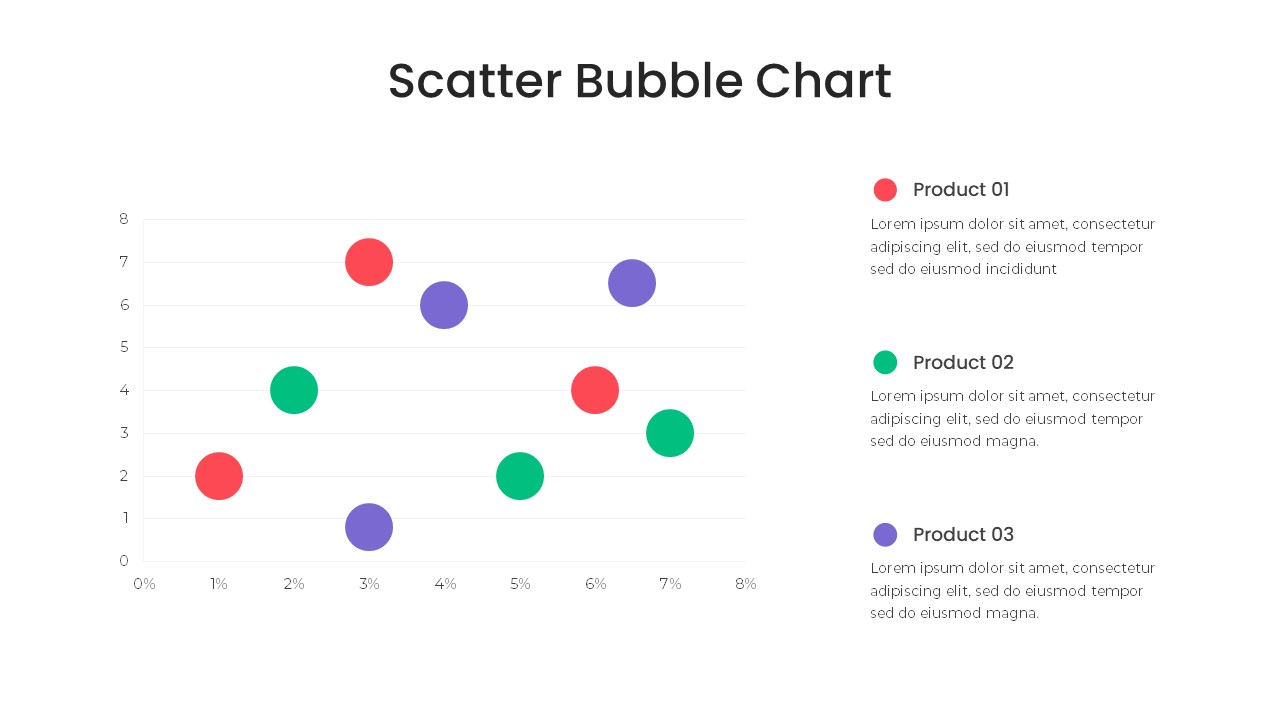
Bubble Chart Scatter, Diagram & Matrix Template for PowerPoint & Google Slides
Comparison Chart
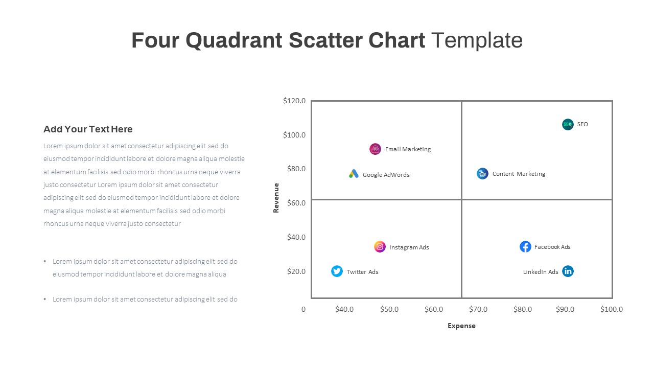
Four Quadrant Scatter Chart Powerpoint Template
Comparison Chart
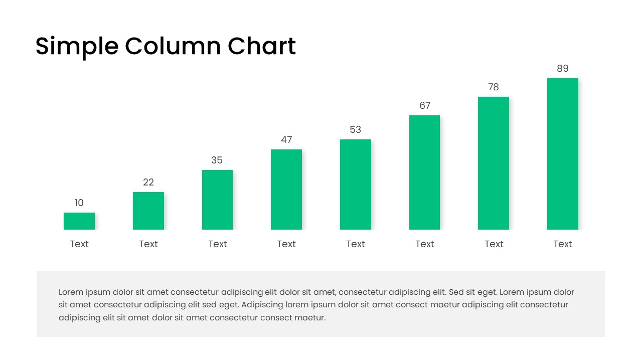
Free Editable Simple Column Chart for PowerPoint & Google Slides
Bar/Column
Free
Simple Bar Chart Data Visualization Template for PowerPoint & Google Slides
Bar/Column
Simple Area Chart Data Trends Analysis Template for PowerPoint & Google Slides
Comparison Chart
Simple Organizational Chart PowerPoint Template
Org Chart
Simple Vertical Timeline template for PowerPoint & Google Slides
Timeline

Simple Mind Map Template for PowerPoint and Google Slides
Mind Maps
Simple Black and White Presentation Template for PowerPoint & Google Slides
Pitch Deck

Simple Venn Diagram for PowerPoint and Google Slides
Comparison Chart
Free

Free Simple Green Plant Company Profile Deck Template for PowerPoint & Google Slides
Company Profile
Free
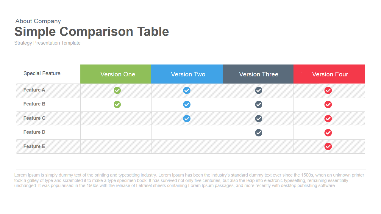
Simple Comparison Table PowerPoint Template
Comparison
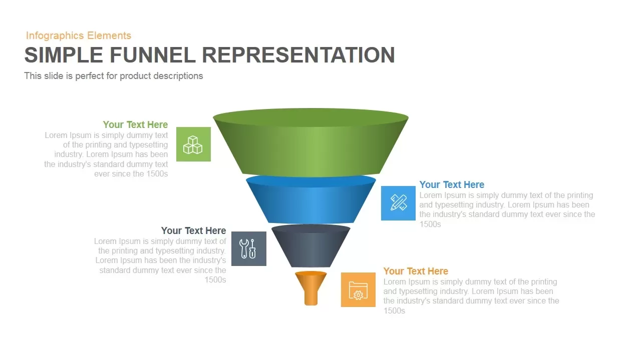
Simple Representation Funnel PowerPoint Template and Keynote Slide
Funnel
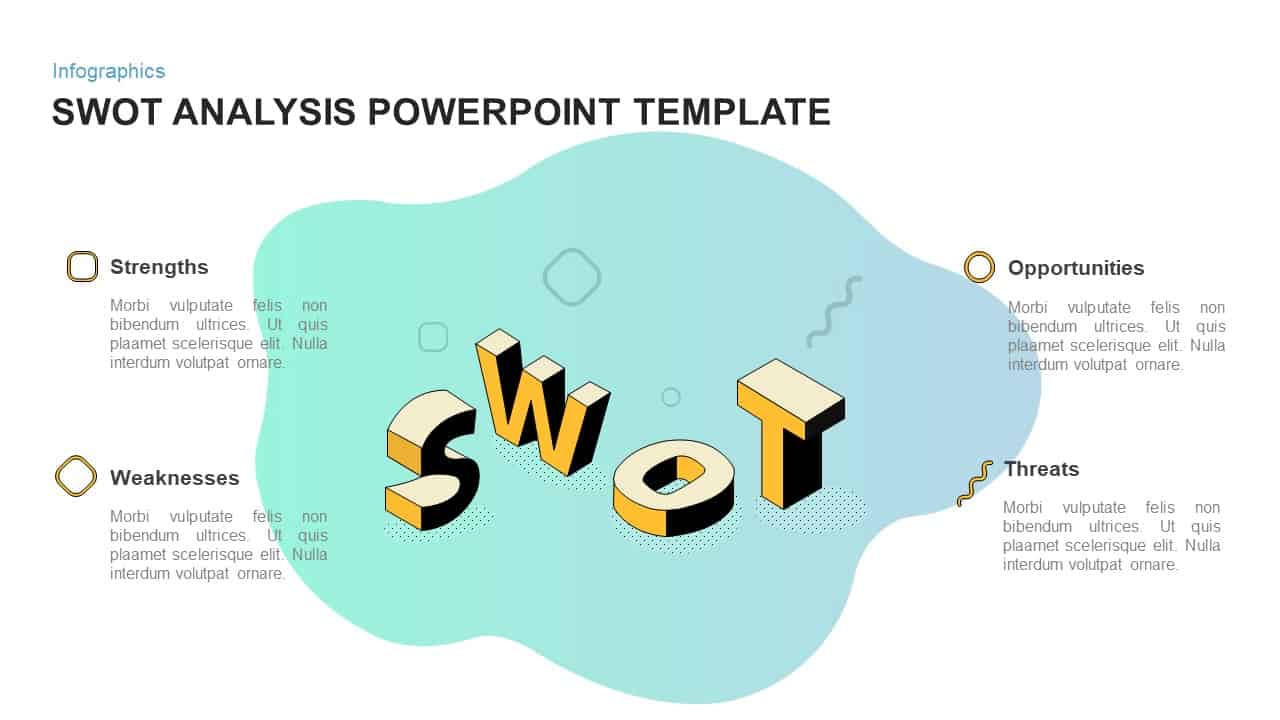
Simple SWOT Analysis PowerPoint Template
SWOT
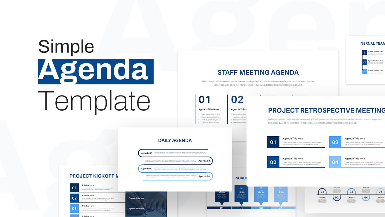
Simple Agenda PowerPoint Template
Agenda
Simple Flowchart PowerPoint Template
Flow Charts
Simple Project Proposal PowerPoint Template
Business Proposal
Simple Fact Sheet Template for Presentations
Business Report
Simple Business Deck Templates for PowerPoint Presentation
Company Profile