Segmented Scatter Chart Data Visualization Template for PowerPoint & Google Slides
Description
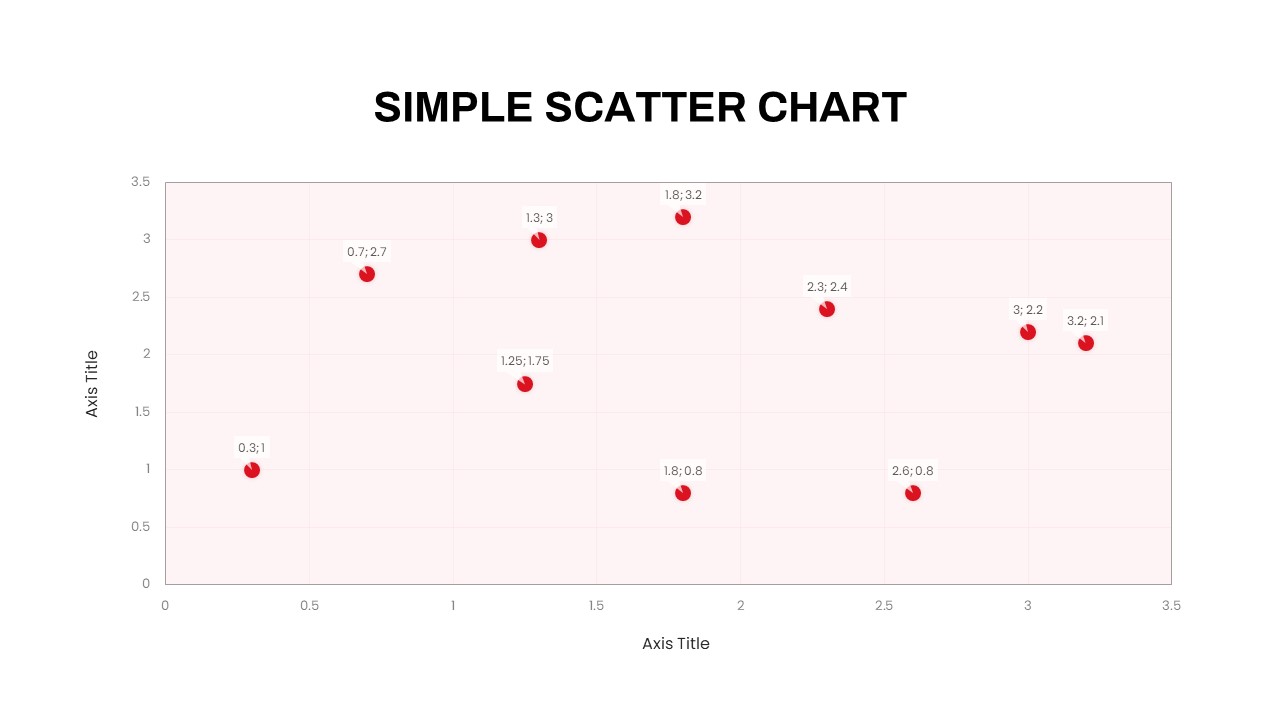
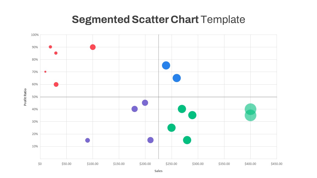
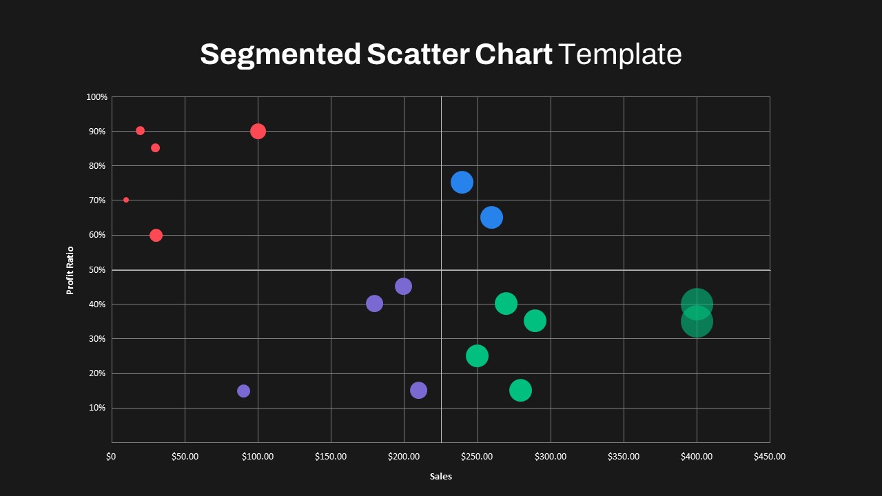
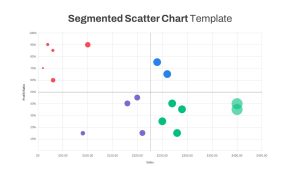
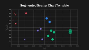
Present complex datasets clearly and effectively with this segmented scatter chart visualization. This versatile slide template helps users visualize relationships between multiple variables through color-coded bubbles, providing intuitive insights into sales performance and profit ratios. Distinctly colored segments—red, blue, purple, and green—seamlessly illustrate data clusters, trends, and outliers. Bubble sizes represent a third dimension, enhancing clarity and depth of analysis. The minimalist grid background, accompanied by clearly labeled axes, ensures readability, while the clean, professional layout adapts perfectly to corporate presentations, stakeholder meetings, or analytical reports. Compatible with both PowerPoint and Google Slides, it features editable placeholders, allowing effortless updates to data points and color schemes.
Who is it for
Ideal for business analysts, sales managers, marketing professionals, financial consultants, data scientists, and academic researchers who require effective tools to present data correlations, market segmentations, or performance insights.
Other Uses
Use this slide for product benchmarking, financial projections, strategic marketing analysis, market research findings, or customer behavior mapping. It can also serve as a versatile visual aid for teaching statistical methods or presenting complex survey results in workshops or classrooms.
Login to download this file

Item ID
SB03990
Related Templates

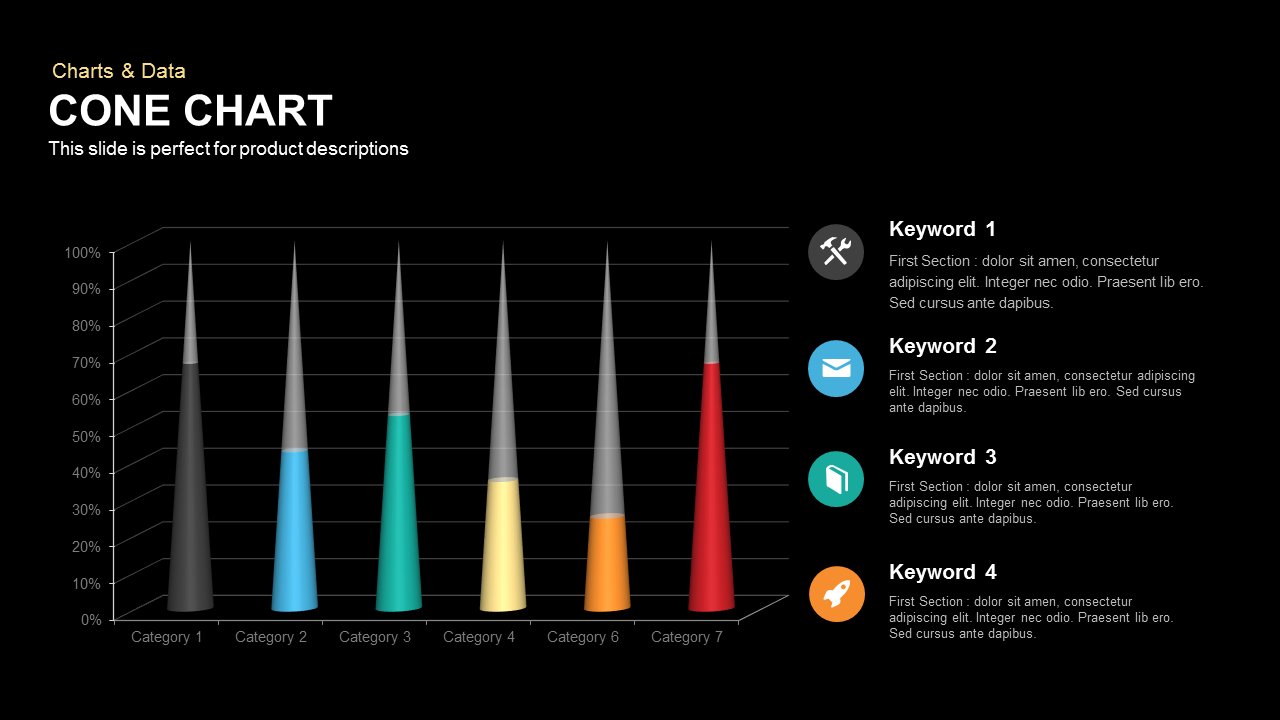
3D Cone Chart Data Visualization template for PowerPoint & Google Slides
Bar/Column
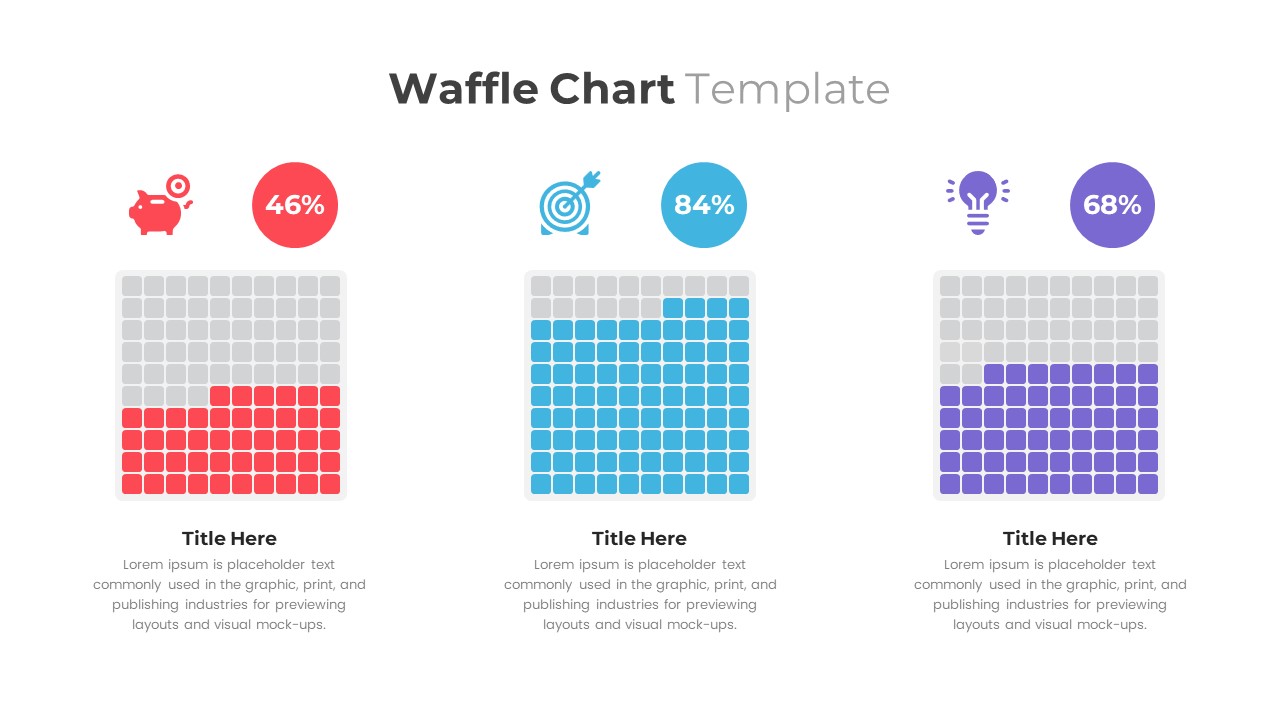
Waffle Chart Data Visualization Template for PowerPoint & Google Slides
Comparison Chart
Free Stacked Column Chart Data Visualization Template for PowerPoint & Google Slides
Bar/Column
Free
Simple Bar Chart Data Visualization Template for PowerPoint & Google Slides
Bar/Column
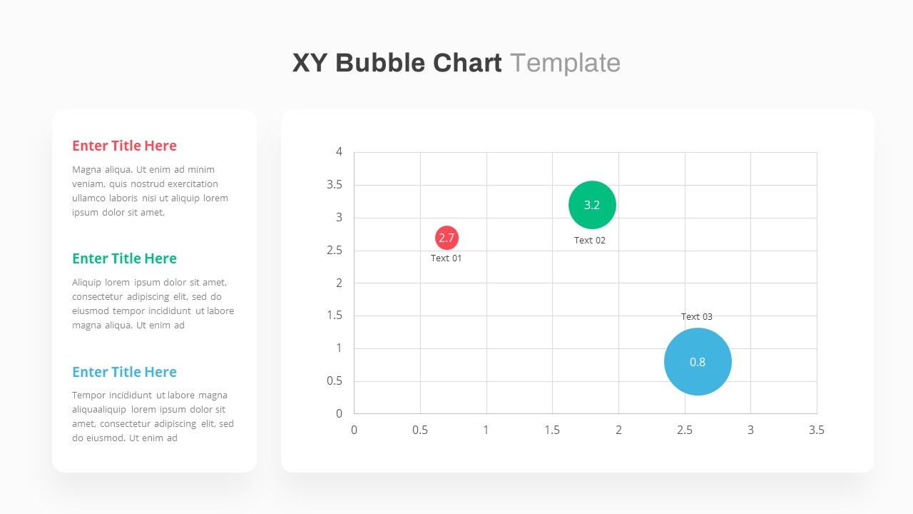
XY Bubble Chart Data Visualization Template for PowerPoint & Google Slides
Comparison Chart
Waterfall Chart Data Visualization Template for PowerPoint & Google Slides
Comparison Chart
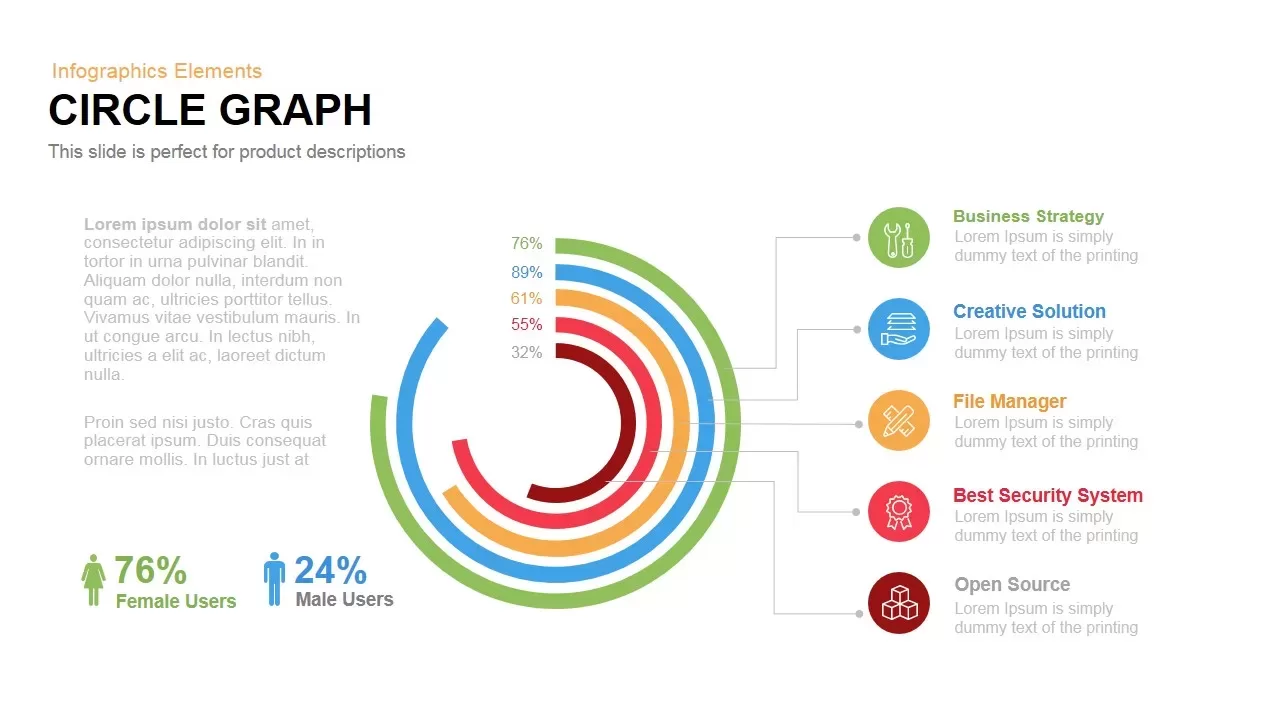
Circle Graph Data Visualization Template for PowerPoint & Google Slides
Circular
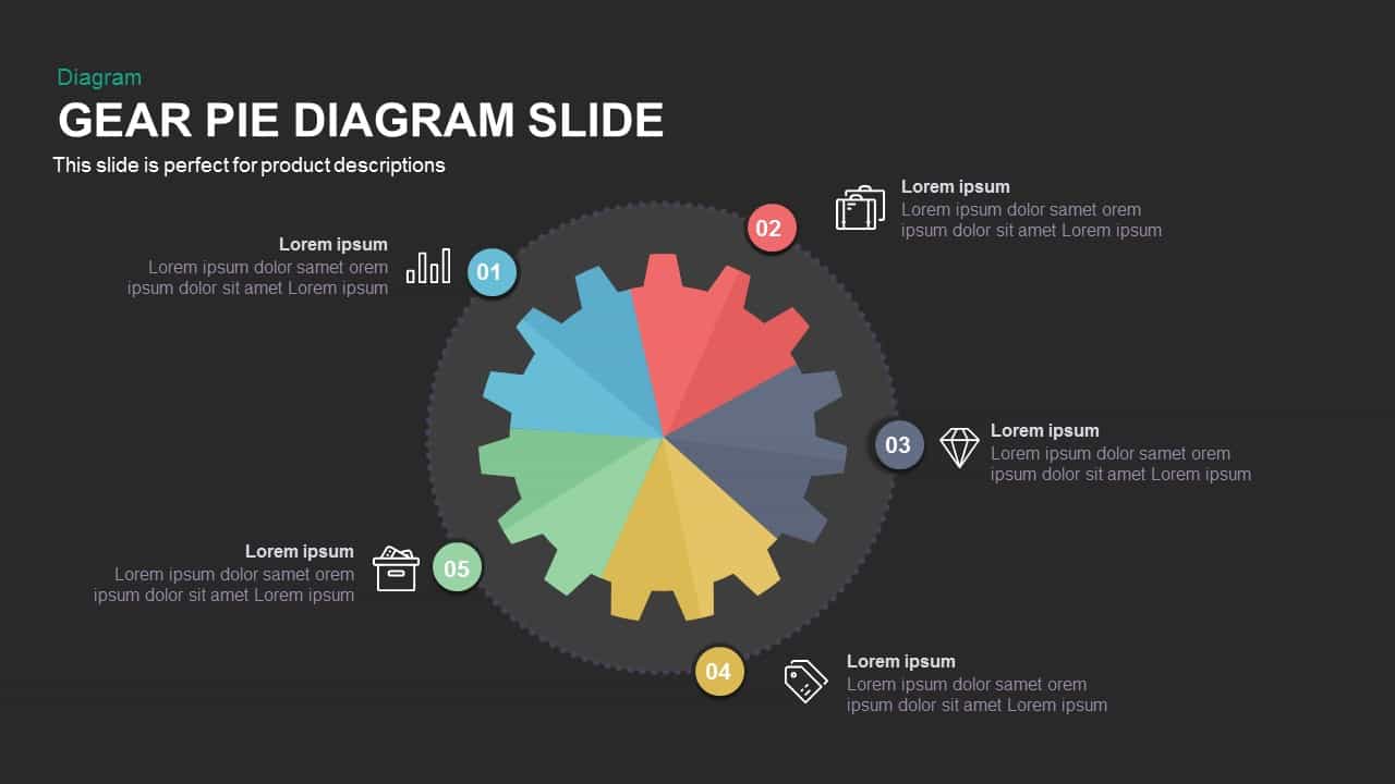
Gear Pie Diagram Data Visualization Template for PowerPoint & Google Slides
Pie/Donut
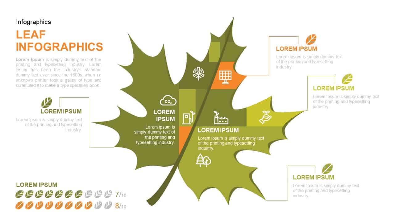
Leaf Infographic Data Visualization Template for PowerPoint & Google Slides
Infographics
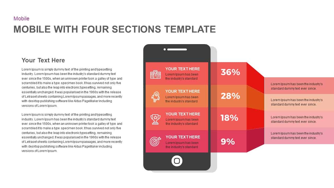
Mobile Infographics Data Visualization Template for PowerPoint & Google Slides
Infographics
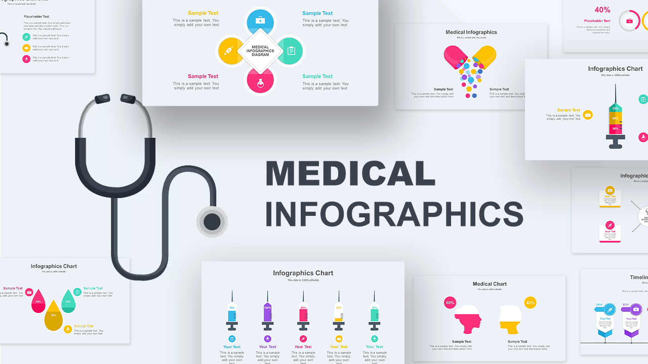
Medical Infographics Data Visualization Template for PowerPoint & Google Slides
Health
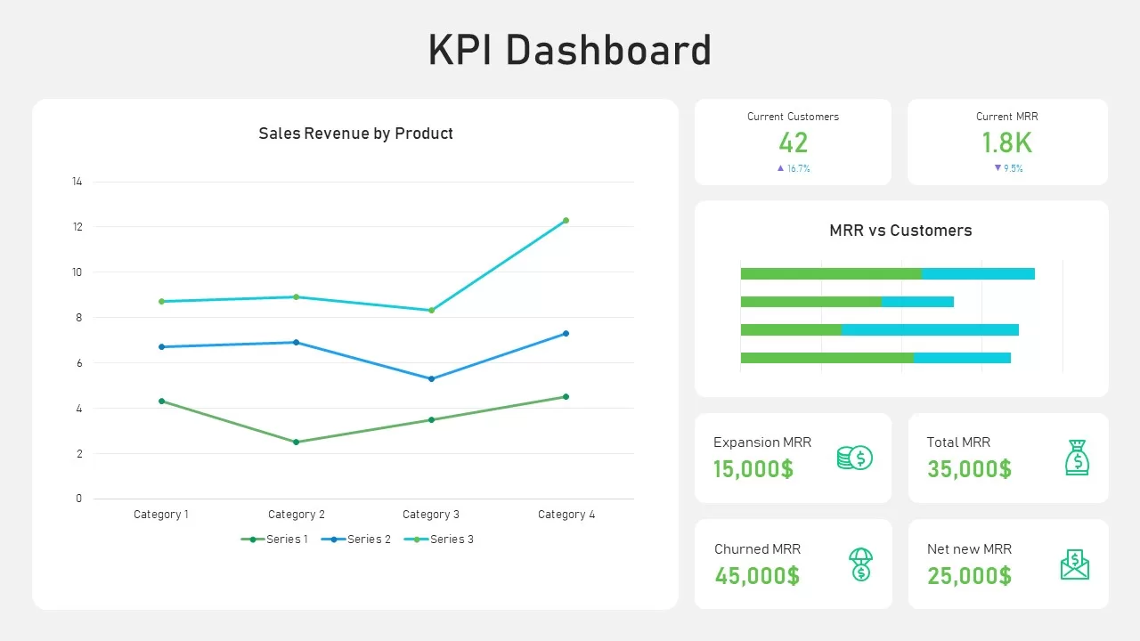
KPI Dashboard Data Visualization Template for PowerPoint & Google Slides
Bar/Column
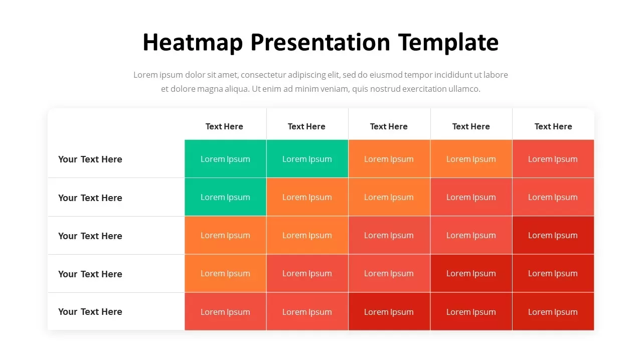
Professional Heatmap Data Visualization Template for PowerPoint & Google Slides
Infographics
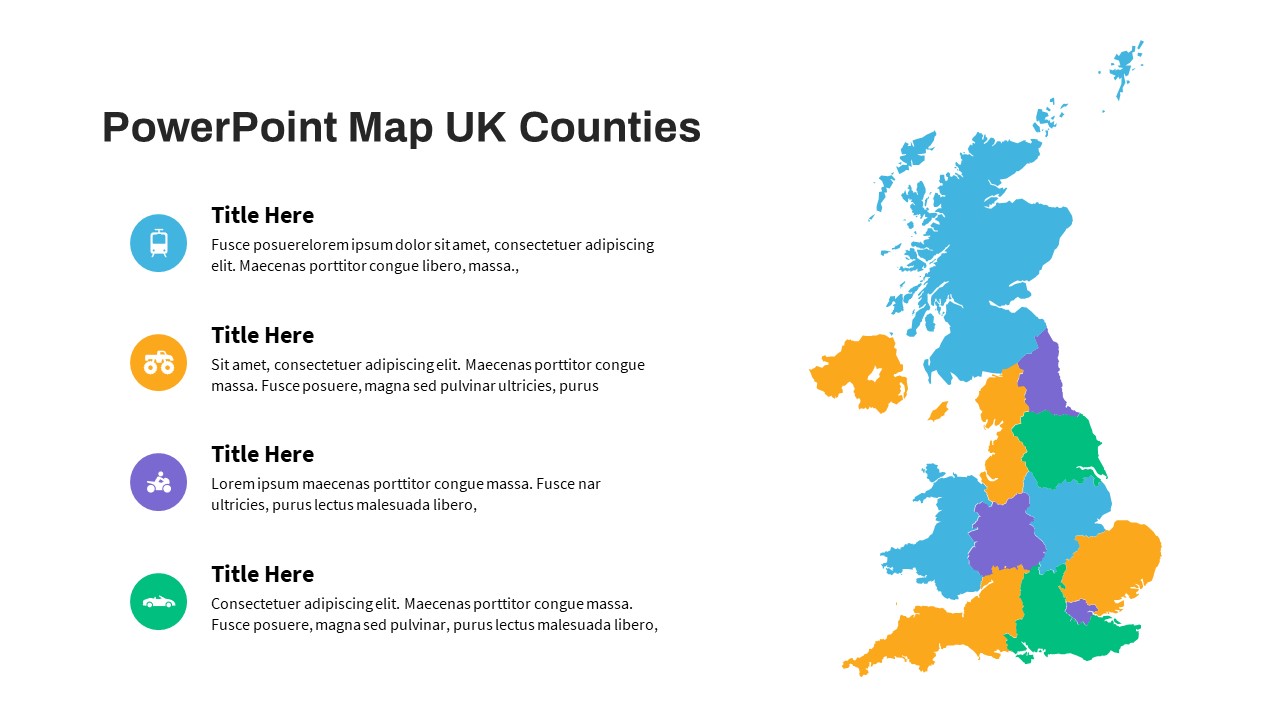
UK Counties Map Data Visualization Template for PowerPoint & Google Slides
World Maps
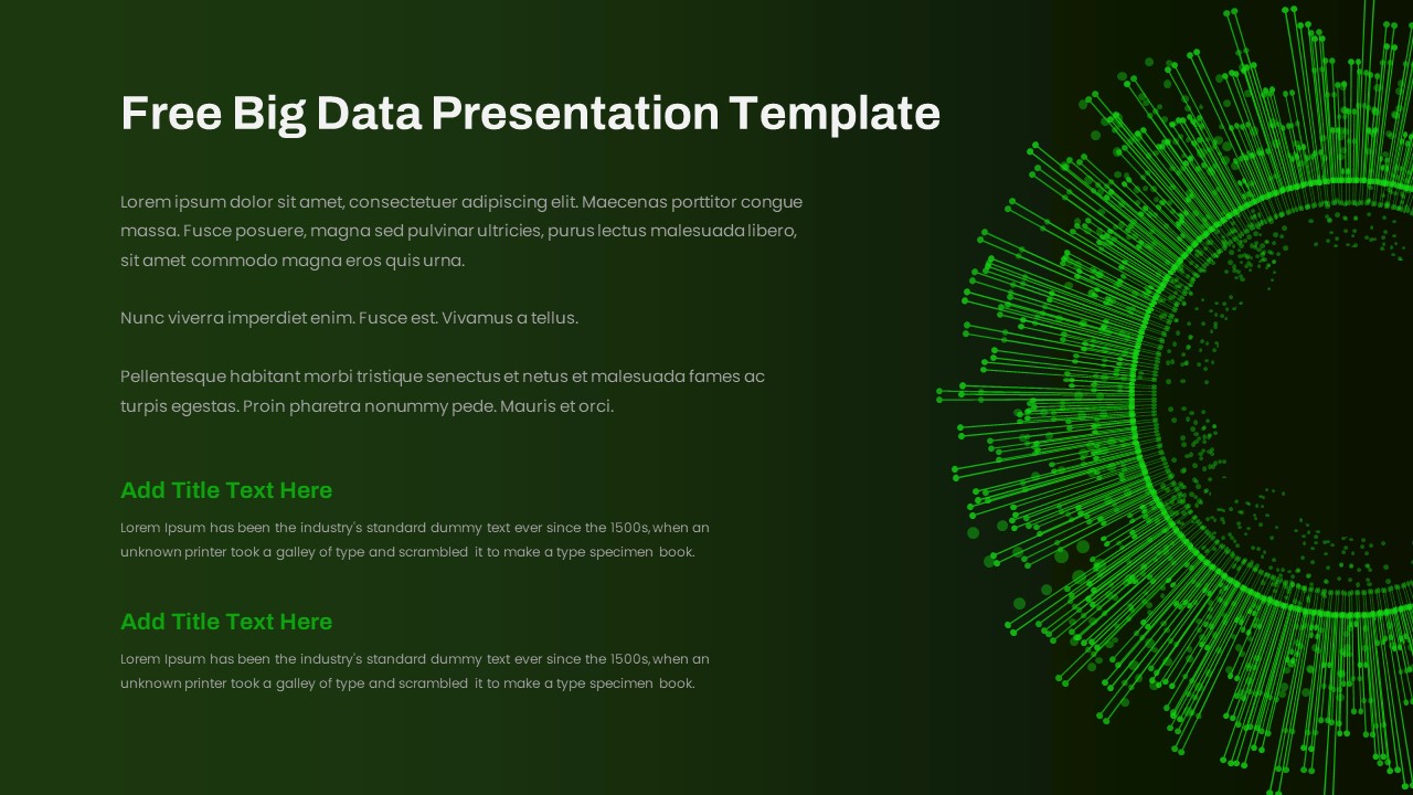
Free Big Data Network Visualization Template for PowerPoint & Google Slides
Circular
Free
Simple Scatter Chart Analysis Template for PowerPoint & Google Slides
Comparison Chart
Four Quadrant Scatter Chart Analysis Template for PowerPoint & Google Slides
Comparison Chart
Bubble Chart Scatter, Diagram & Matrix Template for PowerPoint & Google Slides
Comparison Chart
Mekko Chart with Segmented Branches & Leaves Template for PowerPoint & Google Slides
Bar/Column
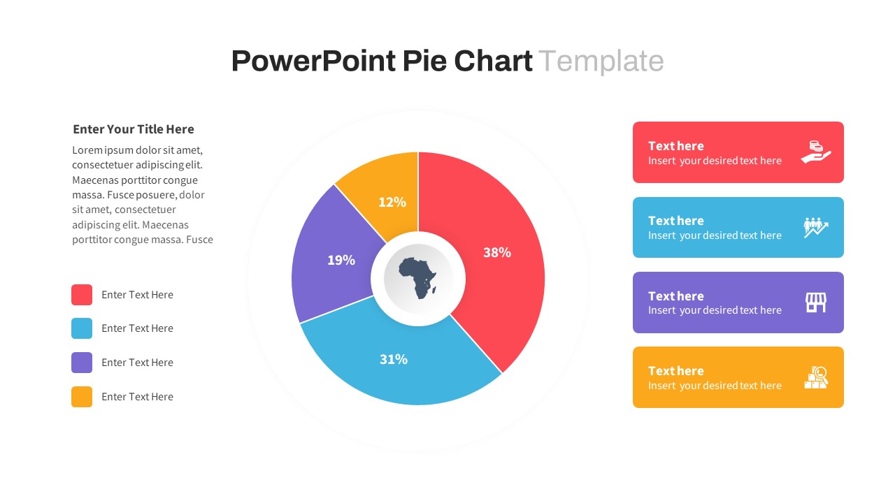
Segmented Pie Chart Infographic with Icons for PowerPoint & Google Slides
Pie/Donut
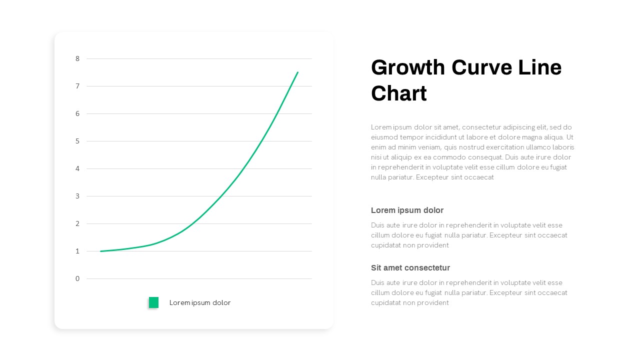
Growth Curve Line Chart Visualization Template for PowerPoint & Google Slides
Charts
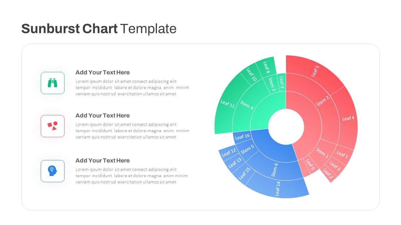
Dynamic Sunburst Chart Visualization Template for PowerPoint & Google Slides
Charts
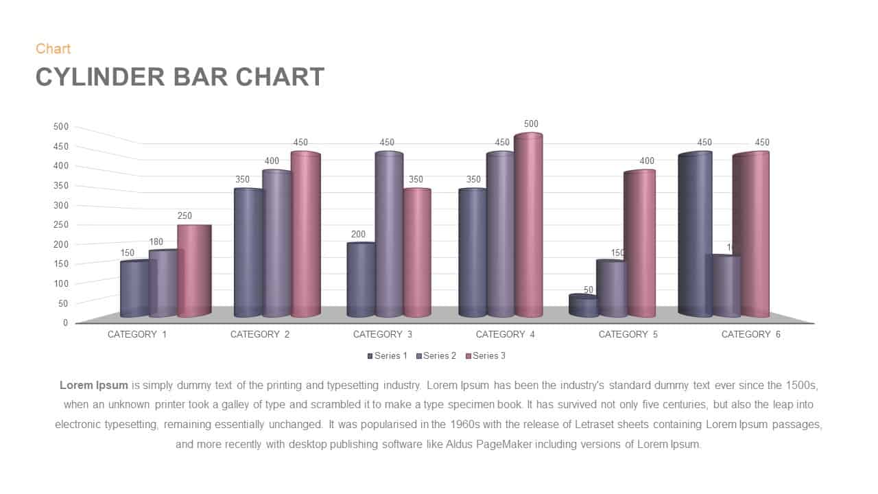
3D Cylinder Bar Chart Visualization Template for PowerPoint
Bar/Column
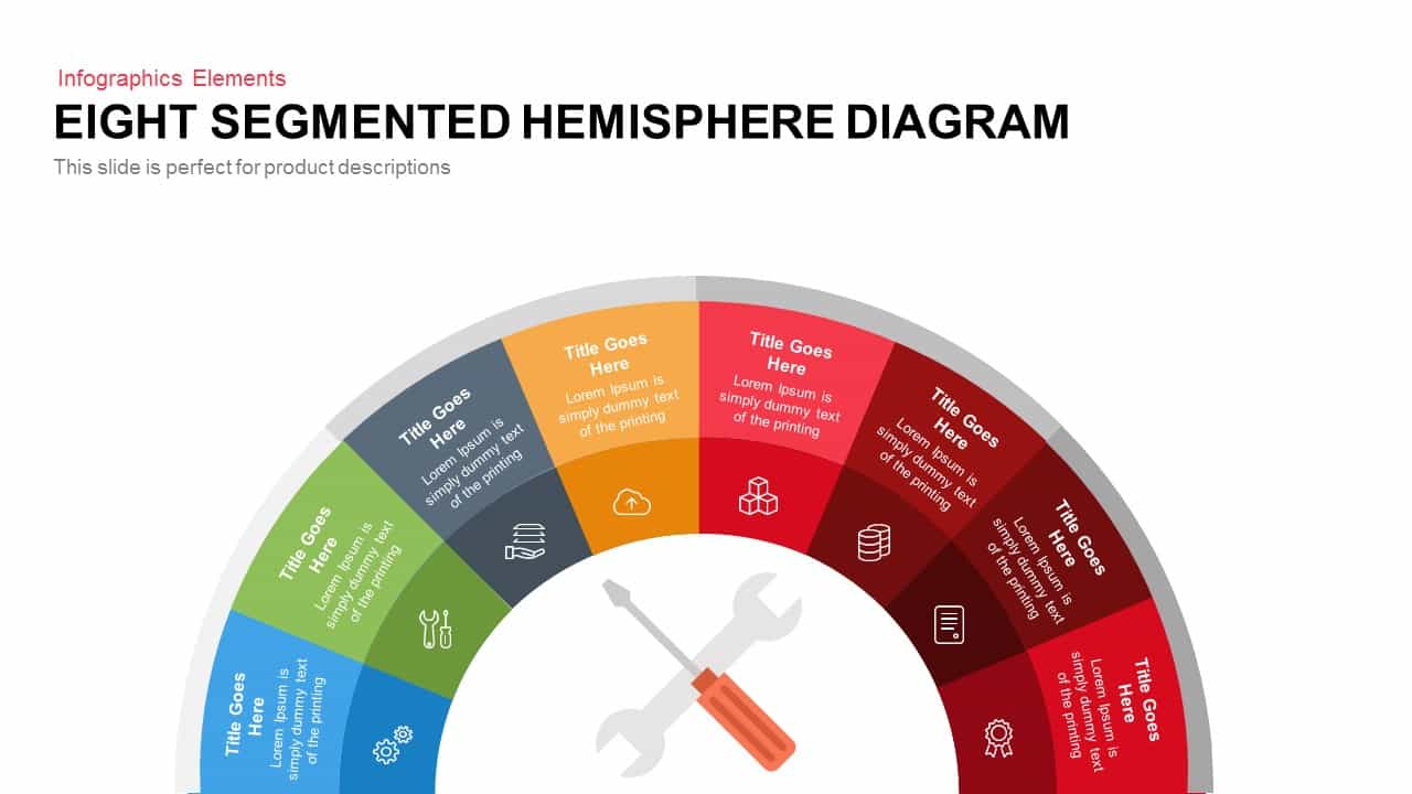
Eight Segmented Hemisphere Diagram Template for PowerPoint & Google Slides
Process
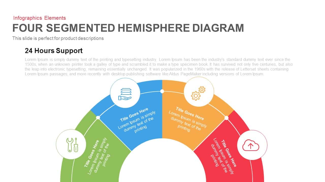
Four Segmented Hemisphere Diagram Template for PowerPoint & Google Slides
Process
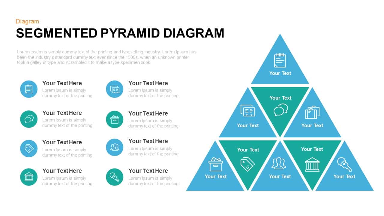
Segmented Pyramid Diagram Infographic Template for PowerPoint & Google Slides
Pyramid

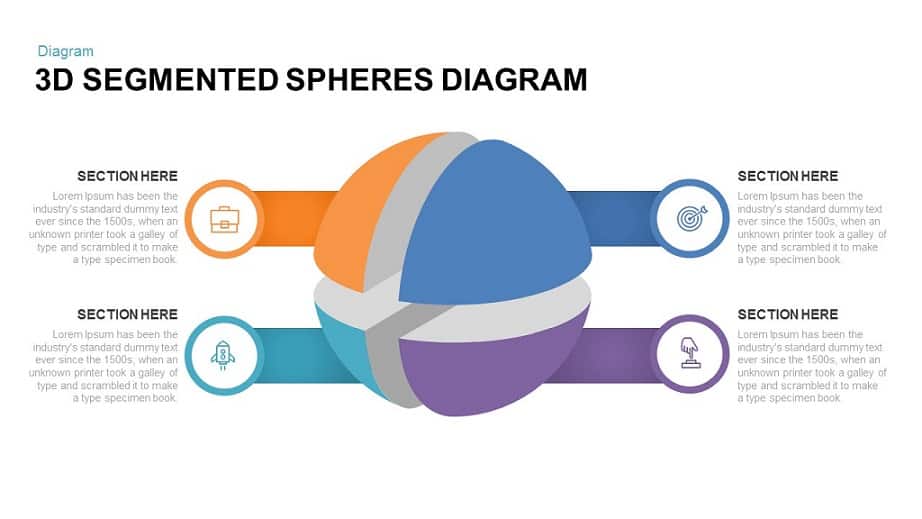
3D Segmented Spheres Diagram template for PowerPoint & Google Slides
Infographics
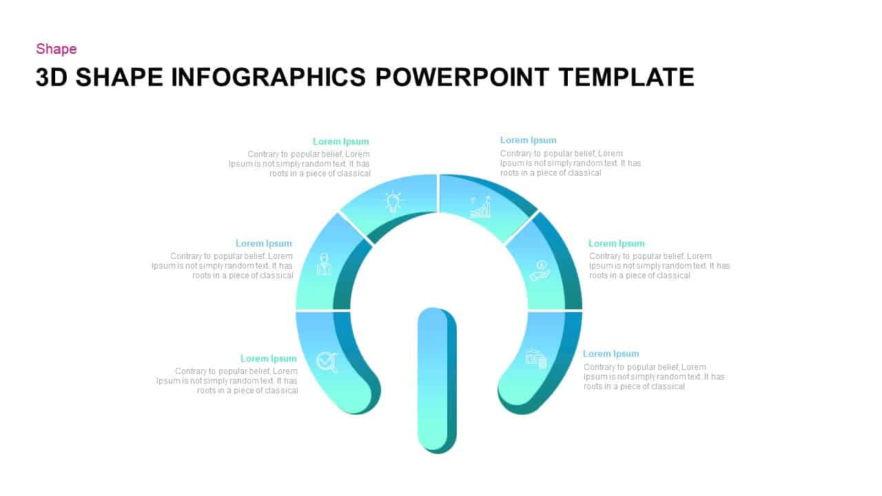
3D Segmented Shape Infographic Template for PowerPoint & Google Slides
Circular

Bold Diamond Risk Alert Visualization Template for PowerPoint & Google Slides
Risk Management
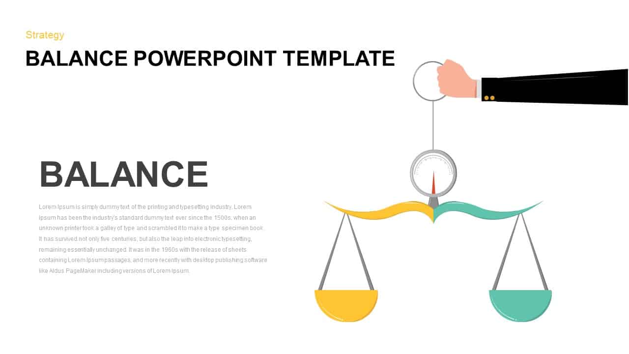
Balance Scale Visualization Infographic Template for PowerPoint & Google Slides
Comparison
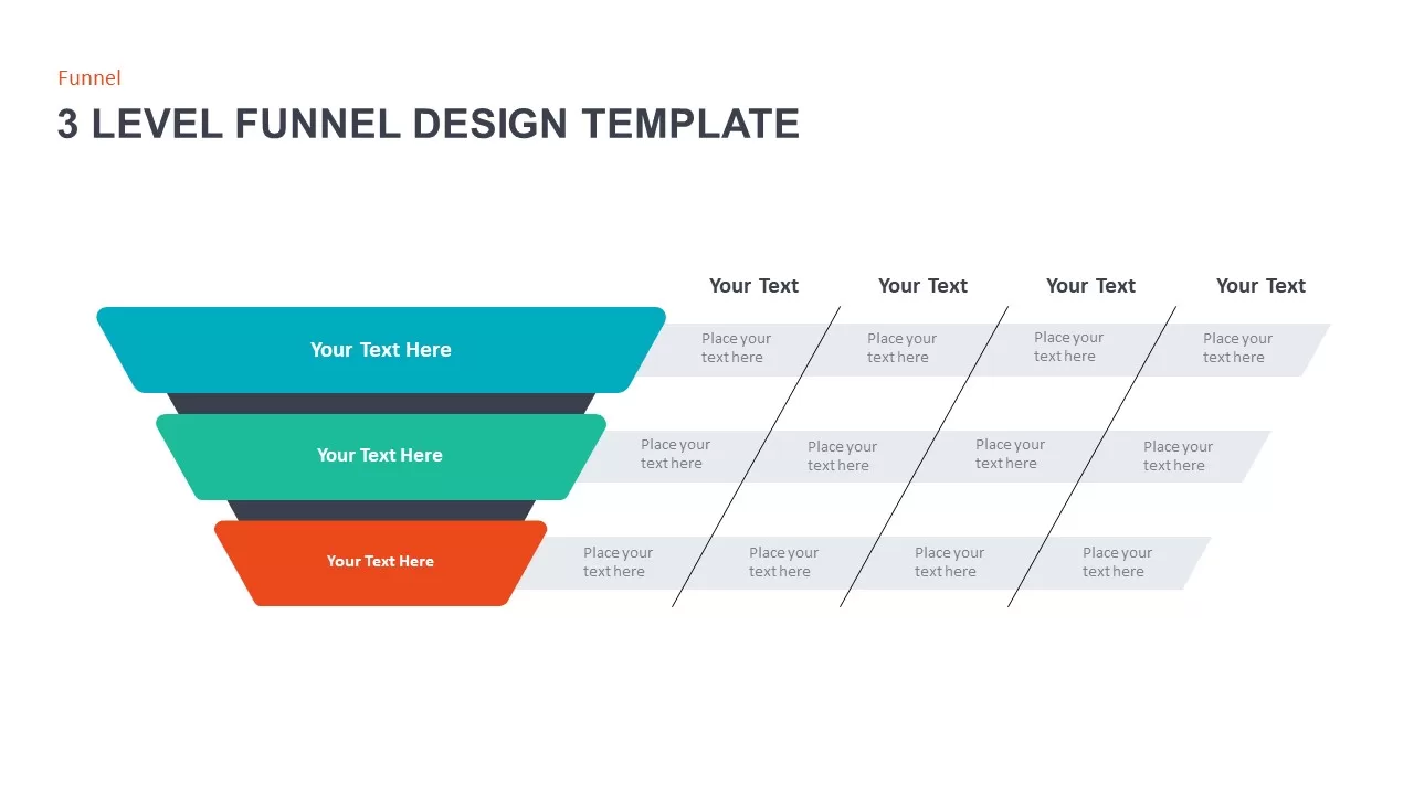
3 Level Funnel Design Visualization Template for PowerPoint & Google Slides
Funnel
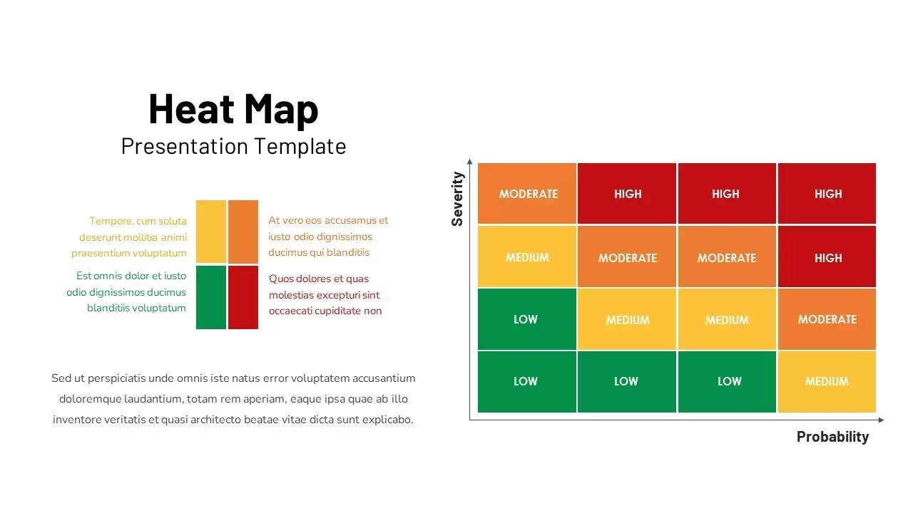
Professional Risk Heat Map Visualization Template for PowerPoint & Google Slides
Risk Management
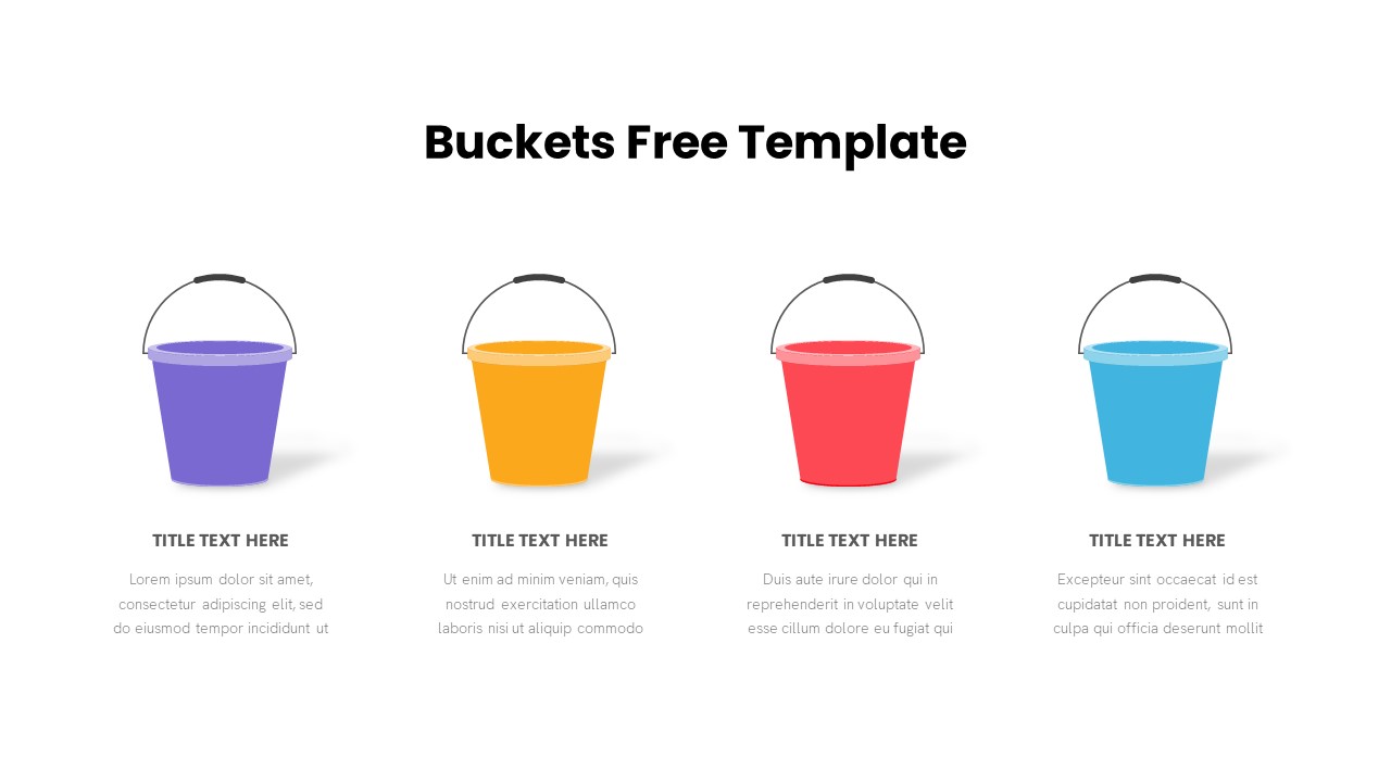
Free Bucket Process Visualization Template for PowerPoint & Google Slides
Process
Free
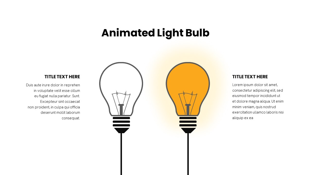
Animated Light Bulb Visualization Template for PowerPoint & Google Slides
Process
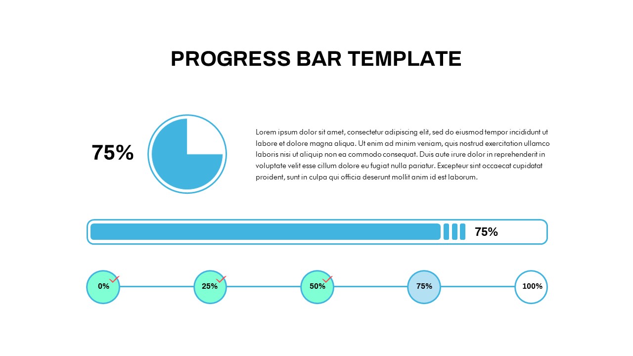
Progress Bar and Milestone Visualization Template for PowerPoint & Google Slides
Timeline
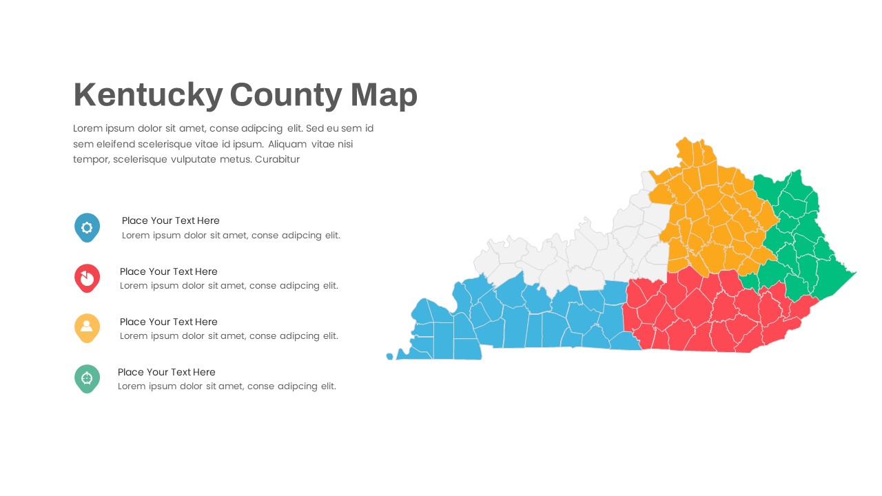
Kentucky County Map Visualization Template for PowerPoint & Google Slides
World Maps
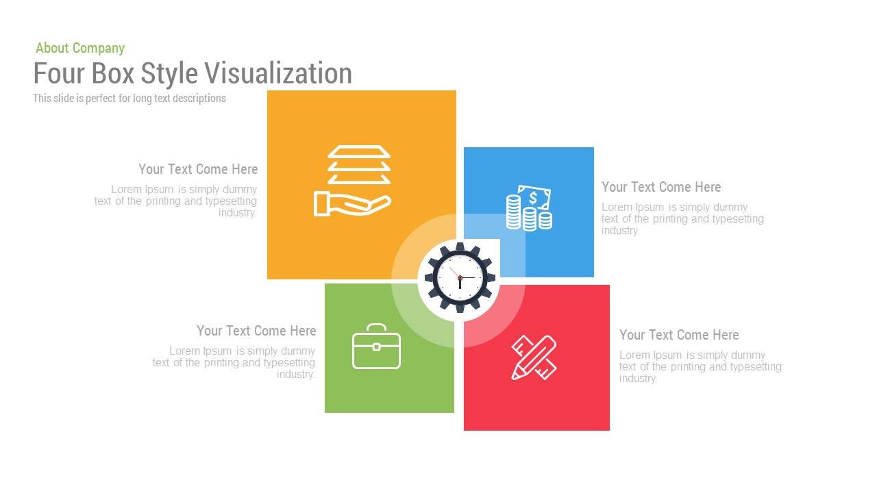
Free Four Box Style Visualization PPT Template & Slides
Process
Free
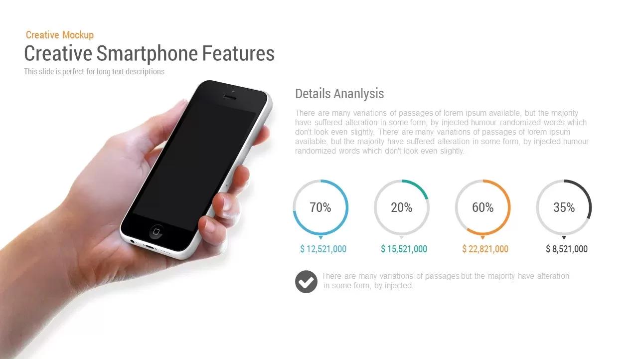
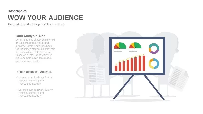
Mobile Data Analysis Chart template for PowerPoint & Google Slides
Charts
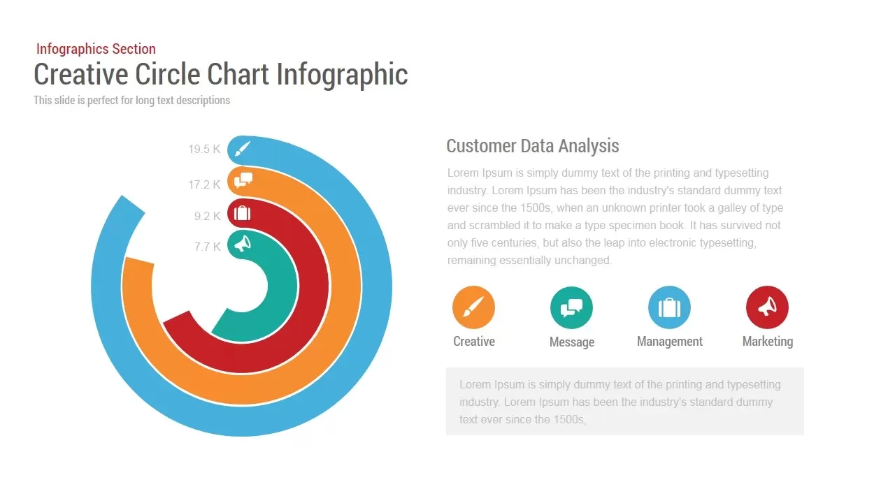
Circle Chart Data template for PowerPoint & Google Slides
Pie/Donut
Creative Data Analysis Bar Chart template for PowerPoint & Google Slides
Bar/Column
3D Bar Chart Data Infographics Template for PowerPoint & Google Slides
Bar/Column
Pencil Bar Chart Data Analysis Template for PowerPoint & Google Slides
Bar/Column
Tornado Chart Data Comparison Slide Template for PowerPoint & Google Slides
Bar/Column
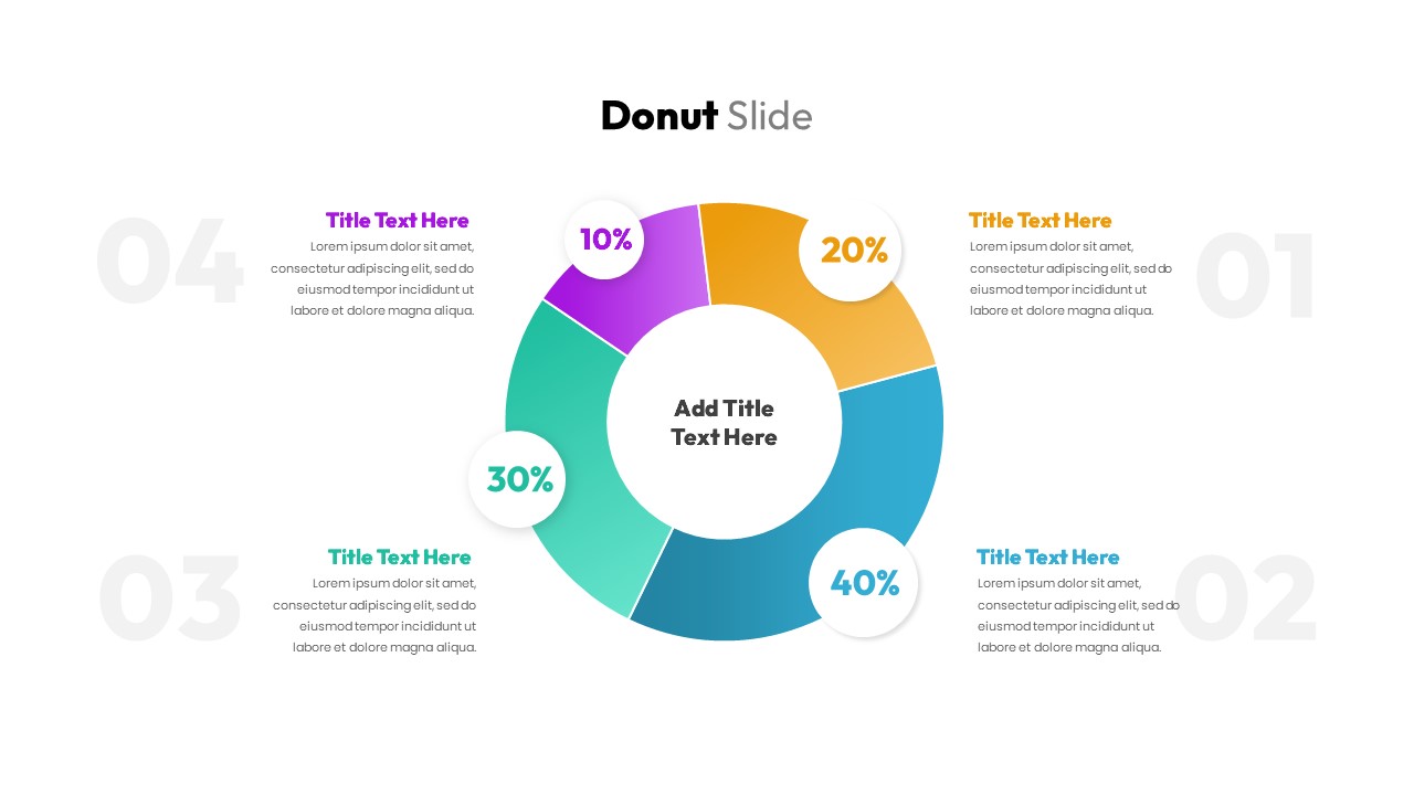
Donut Chart Data Breakdown template for PowerPoint & Google Slides
Pie/Donut
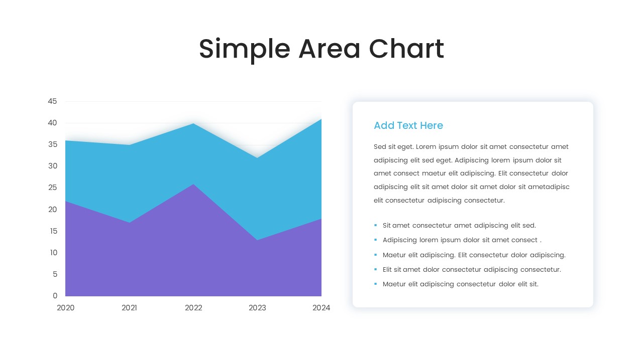
Simple Area Chart Data Trends Analysis Template for PowerPoint & Google Slides
Comparison Chart
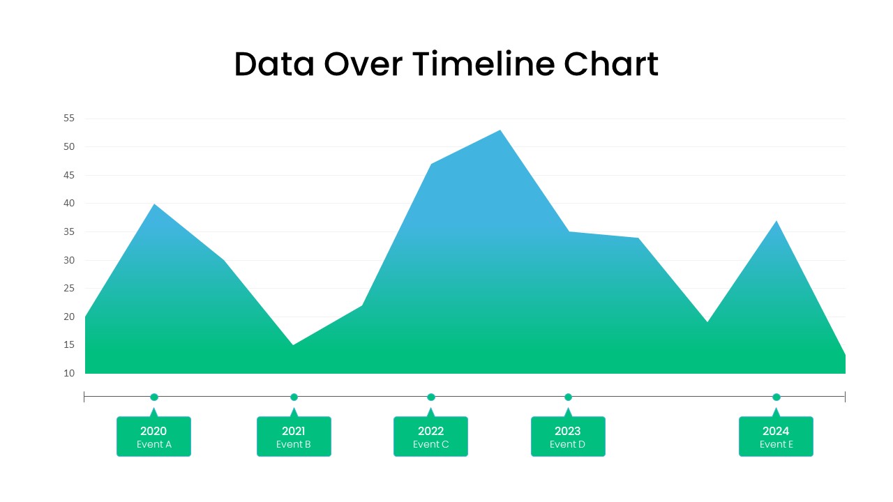
Data Over Time Line Chart template for PowerPoint & Google Slides
Charts
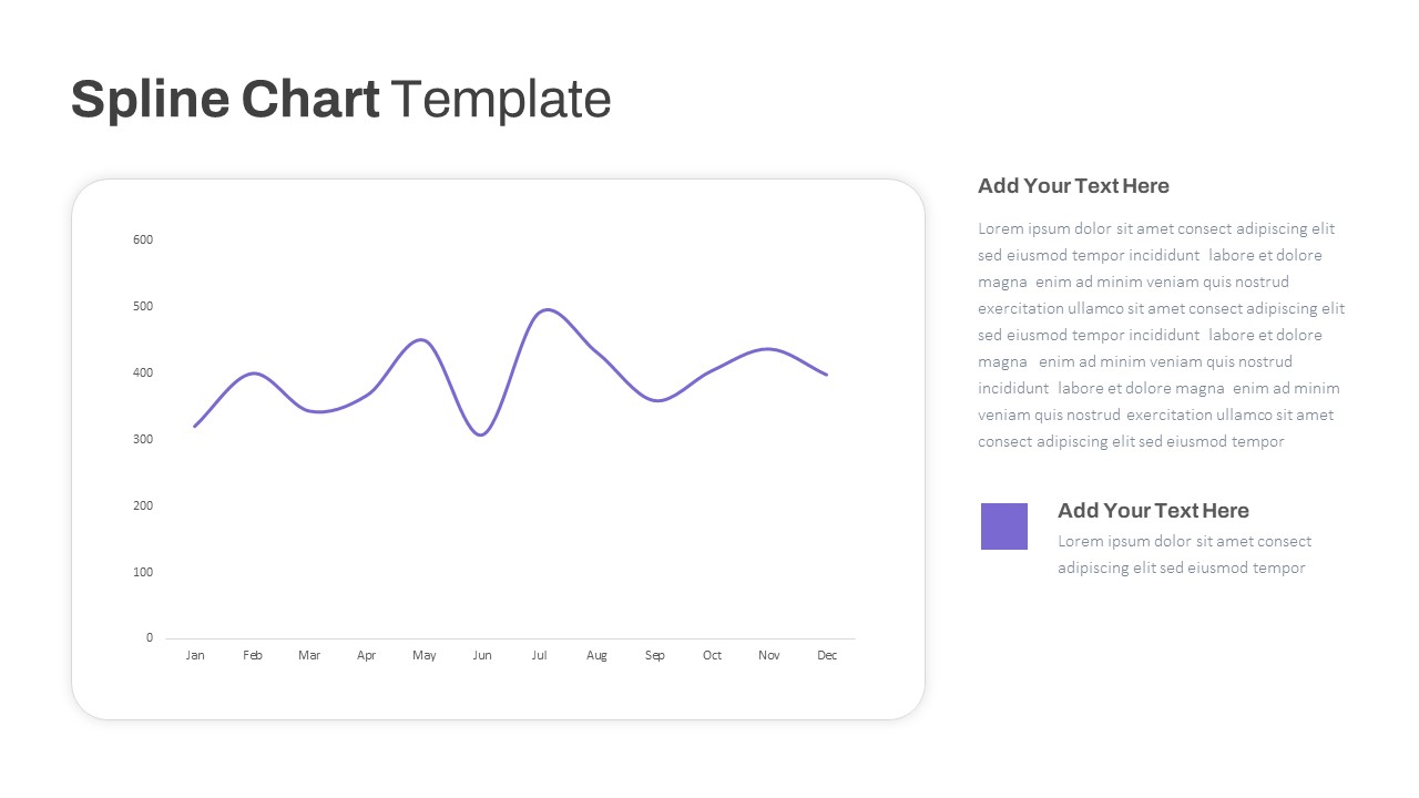
Multipurpose Spline Chart Data Trend Template for PowerPoint & Google Slides
Bar/Column
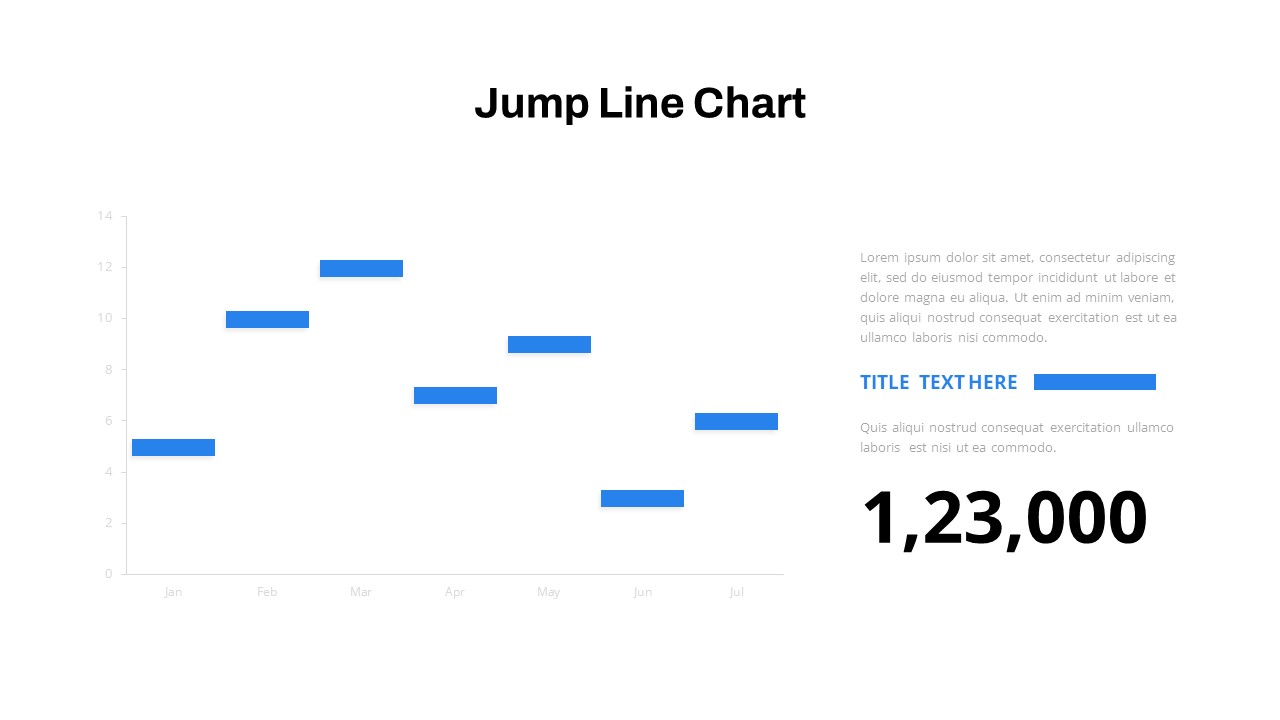
Interactive Jump Line Data Chart Template for PowerPoint & Google Slides
Comparison Chart
Data Analysis Bar Chart with Insights Template for PowerPoint & Google Slides
Bar/Column
Free
Bar Data Chart Slide for PowerPoint & Google Slides
Bar/Column
Weekly Data Chart Slide for PowerPoint & Google Slides
Comparison Chart

3D Column Chart with Data Table for PowerPoint & Google Slides
Bar/Column

Cone Data Chart for PowerPoint & Google Slides
Charts

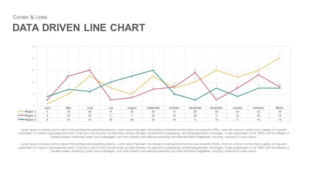
Data-Driven Line Chart Diagram Template for PowerPoint
Comparison Chart
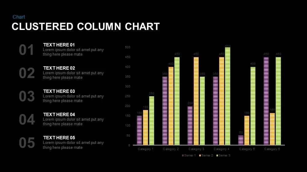
Clustered Column Chart Data Analysis Template for PowerPoint
Bar/Column
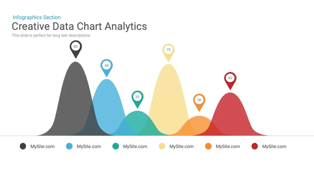
Creative data chart Analytics Presentation Template
Charts
Data Science PowerPoint Presentation Template for PowerPoint & Google Slides
Pitch Deck
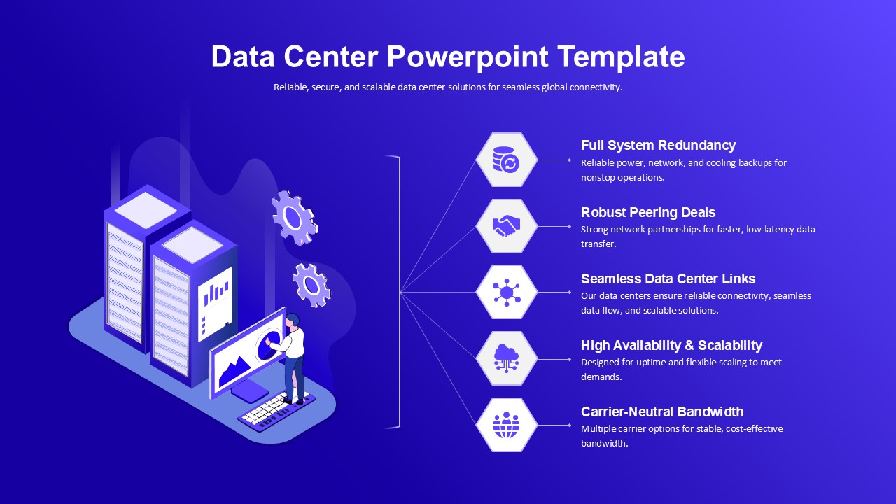
Data Center PowerPoint Template for PowerPoint & Google Slides
Information Technology
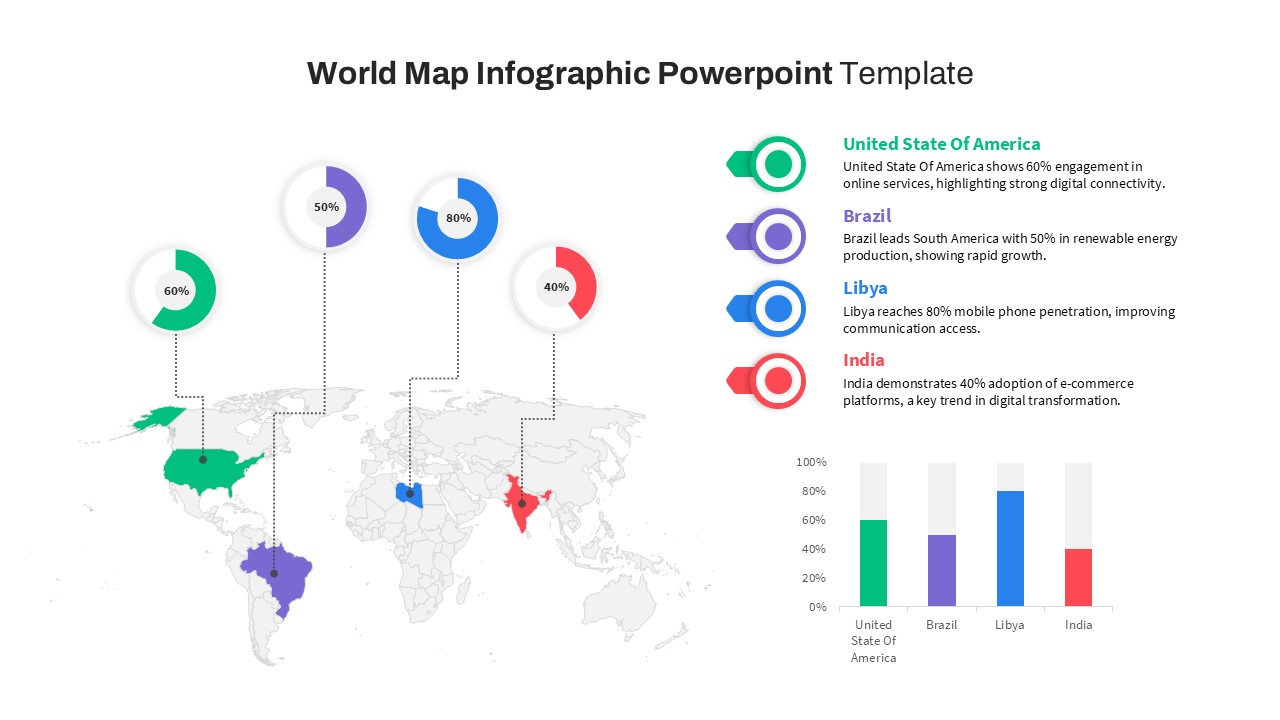
World Map Data template for PowerPoint & Google Slides
World Maps
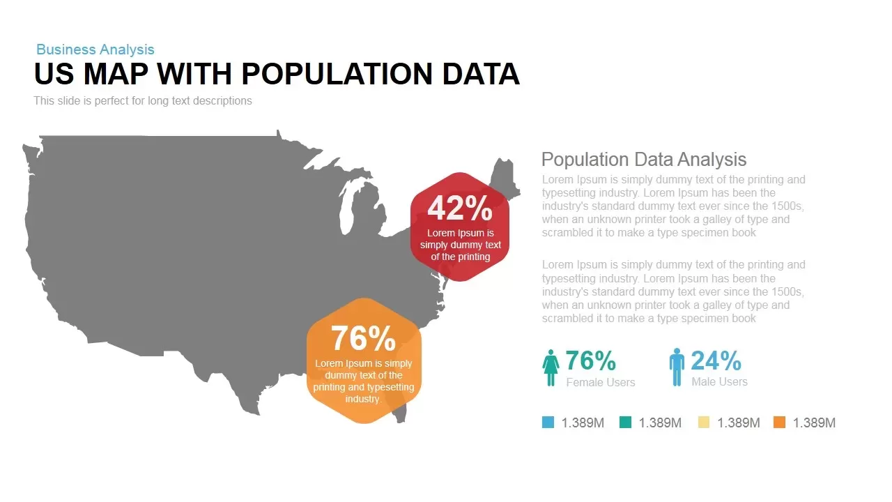
Interactive US Population Data Map Slide Template for PowerPoint & Google Slides
World Maps
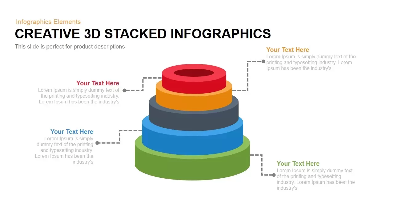
3D Stacked Infographic Layers Data Template for PowerPoint & Google Slides
Pyramid
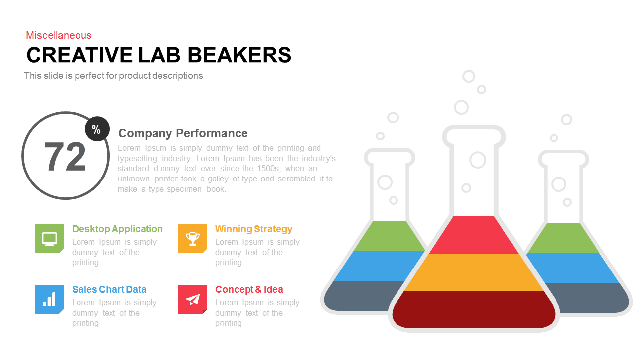
Creative Lab Beakers Data Infographic template for PowerPoint & Google Slides
Infographics

Dynamic Data Dashboard Infographic Template for PowerPoint & Google Slides
Bar/Column
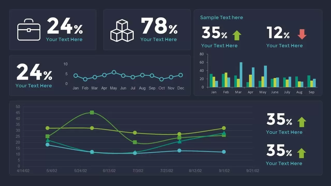
Data Analytics Dashboard Design template for PowerPoint & Google Slides
Bar/Column
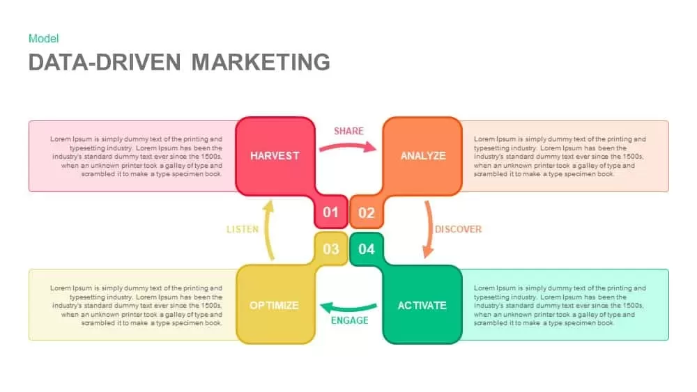
Data-Driven Marketing Cycle Diagram Template for PowerPoint & Google Slides
Customer Journey
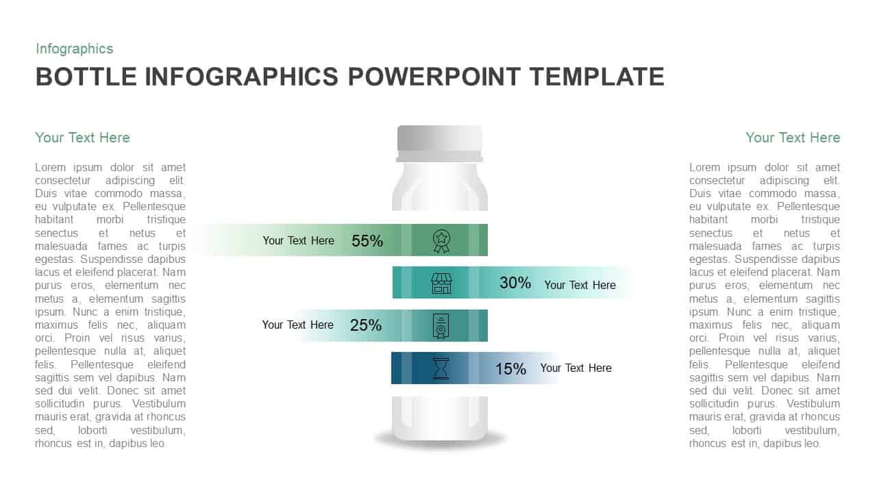
Bottle Data Percentage Infographic Template for PowerPoint & Google Slides
Infographics
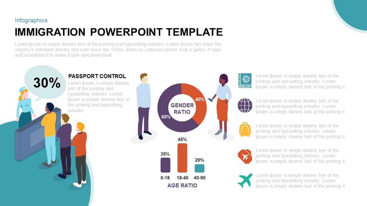
Immigration Data Dashboard Template for PowerPoint & Google Slides
Bar/Column
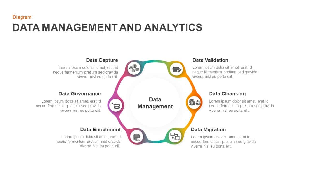
Data Management and Analytics Diagram Template for PowerPoint & Google Slides
Circular
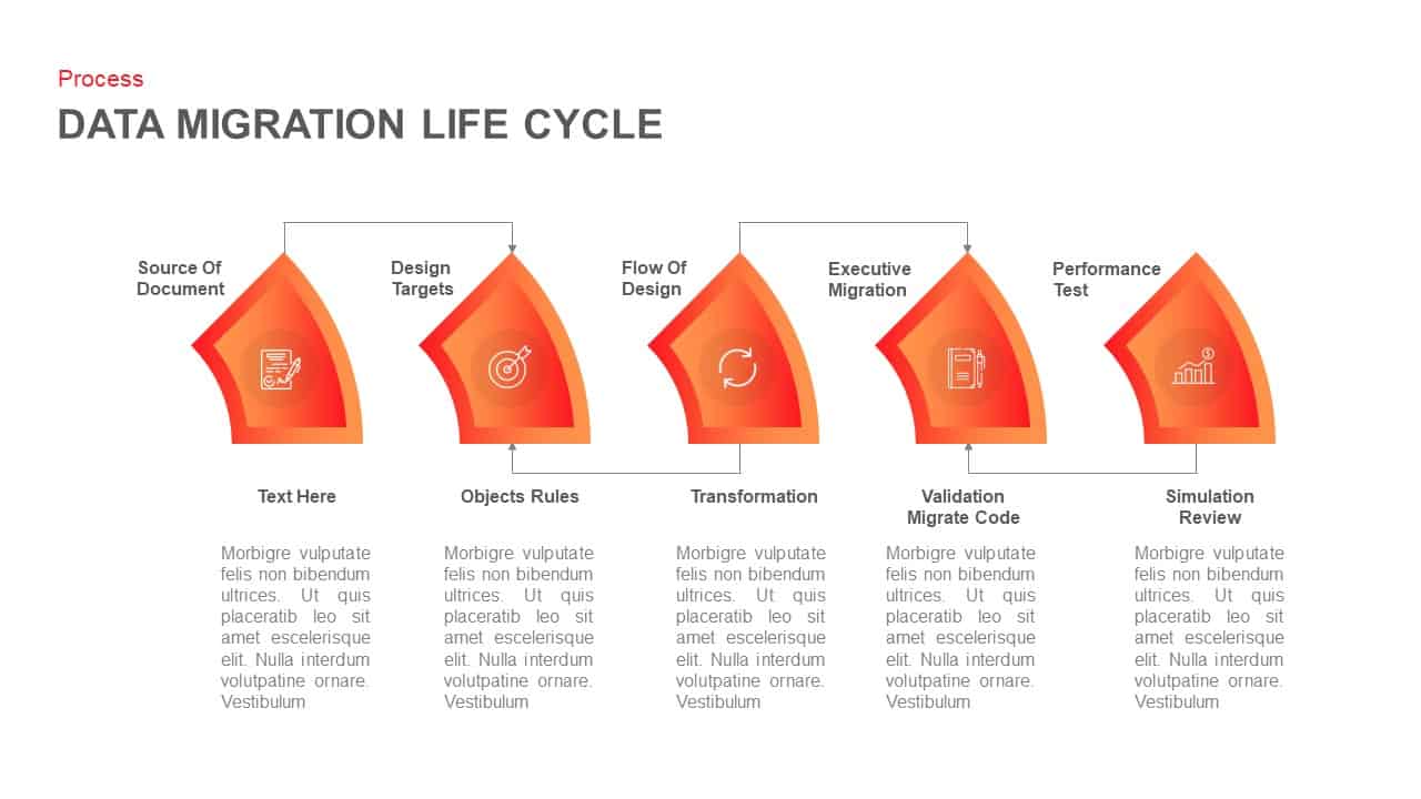
Data Migration Life Cycle Curved Diagram Template for PowerPoint & Google Slides
Process
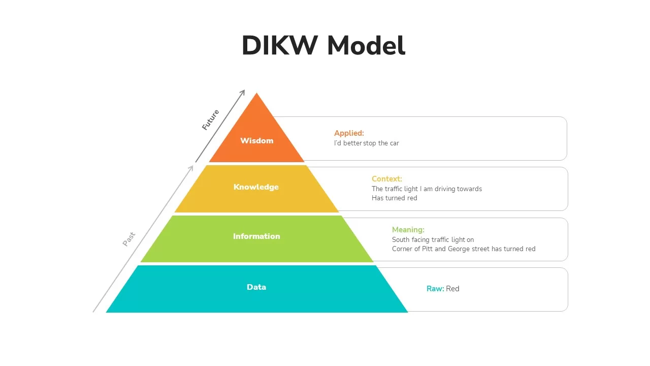
DIKW Data to Wisdom Pyramid Model Template for PowerPoint & Google Slides
Pyramid
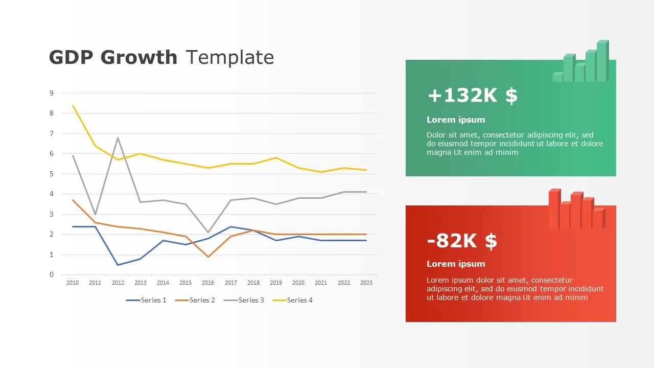
Data-driven GDP Growth Infographic Pack Template for PowerPoint & Google Slides
Infographics
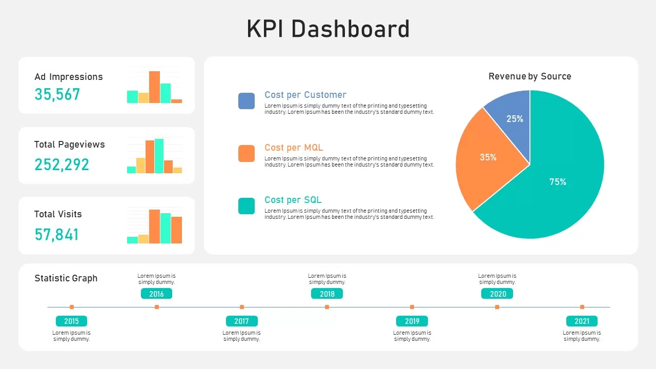
KPI Dashboard Data Overview Slide Template for PowerPoint & Google Slides
Bar/Column
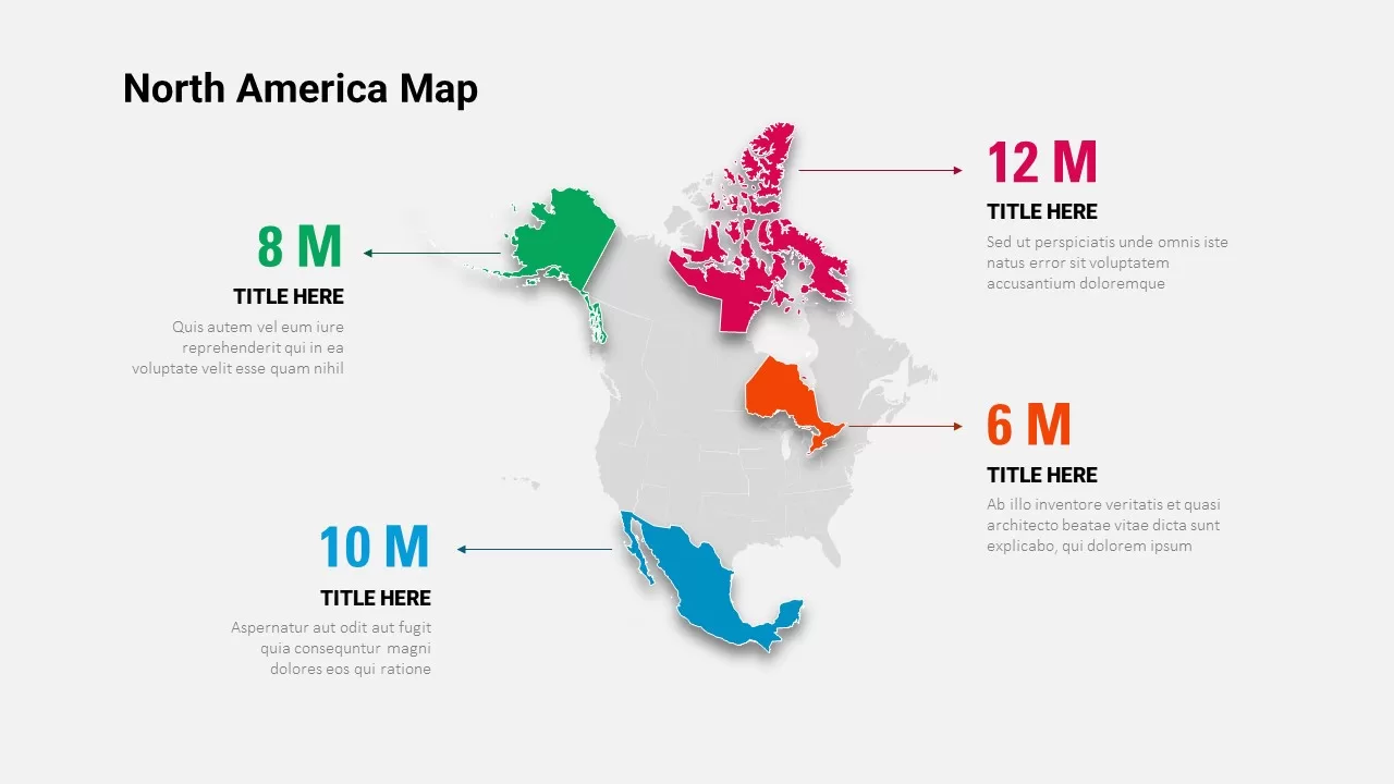
North America Data Map Callouts Template for PowerPoint & Google Slides
World Maps

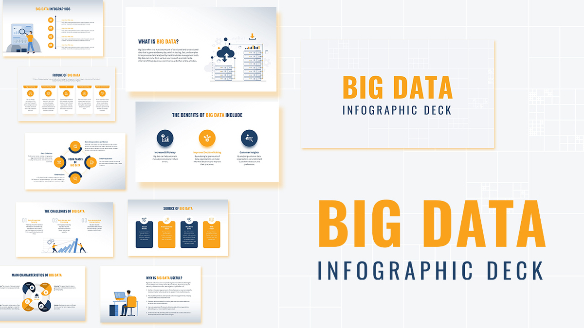
Modern Big Data Infographic Deck Template for PowerPoint & Google Slides
Decks
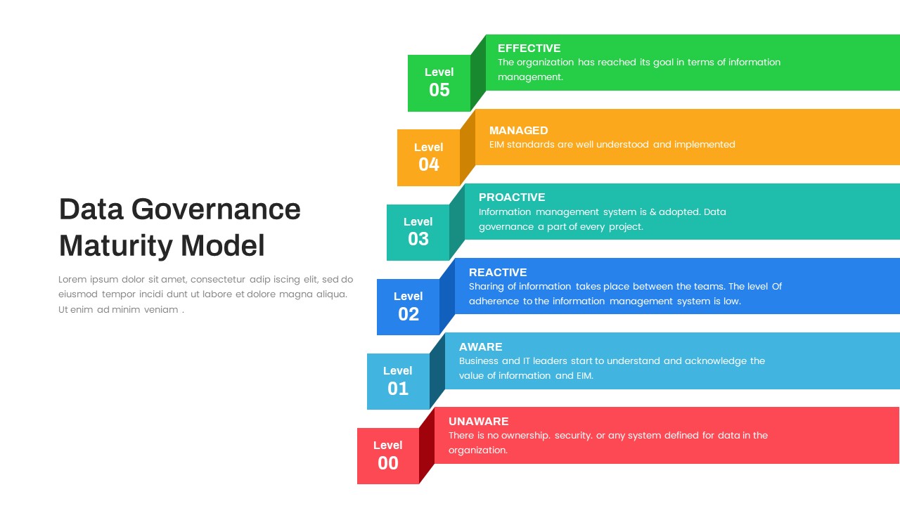
Layered Data Governance Maturity Model Template for PowerPoint & Google Slides
Process
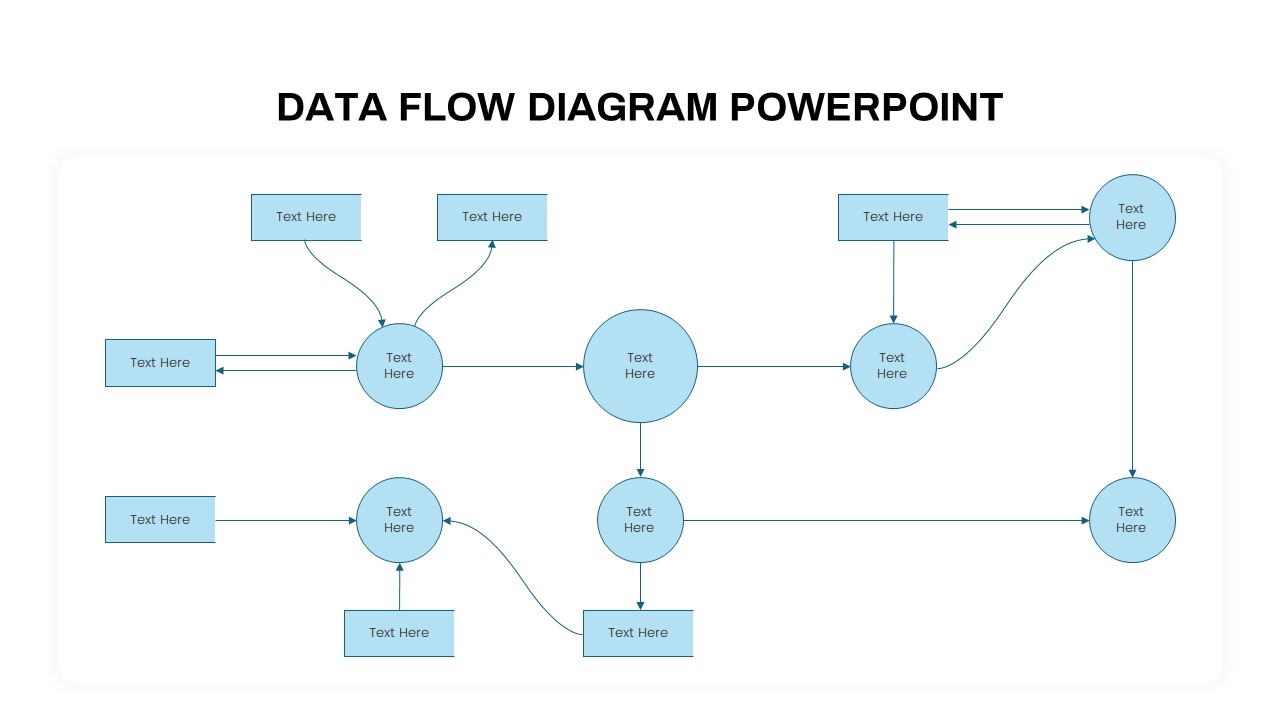
Advanced Data Flow Diagram Pack Template for PowerPoint & Google Slides
Flow Charts
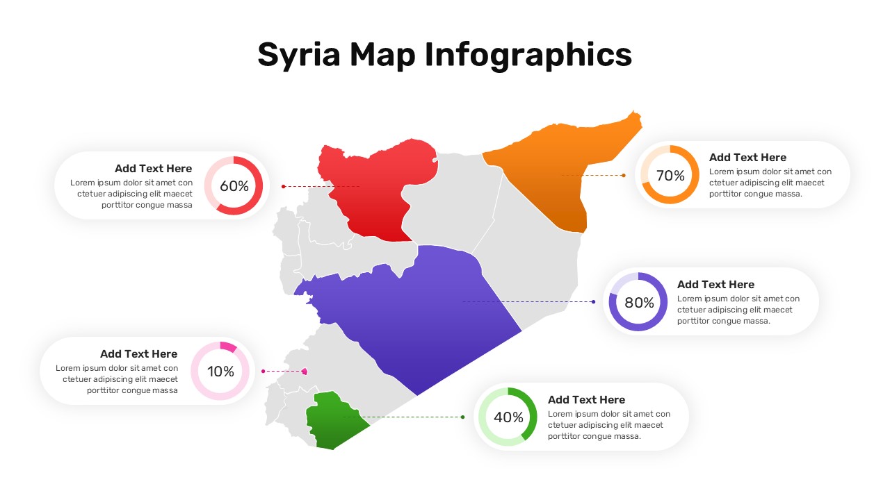
Syria Regional Data Map Infographic Template for PowerPoint & Google Slides
World Maps
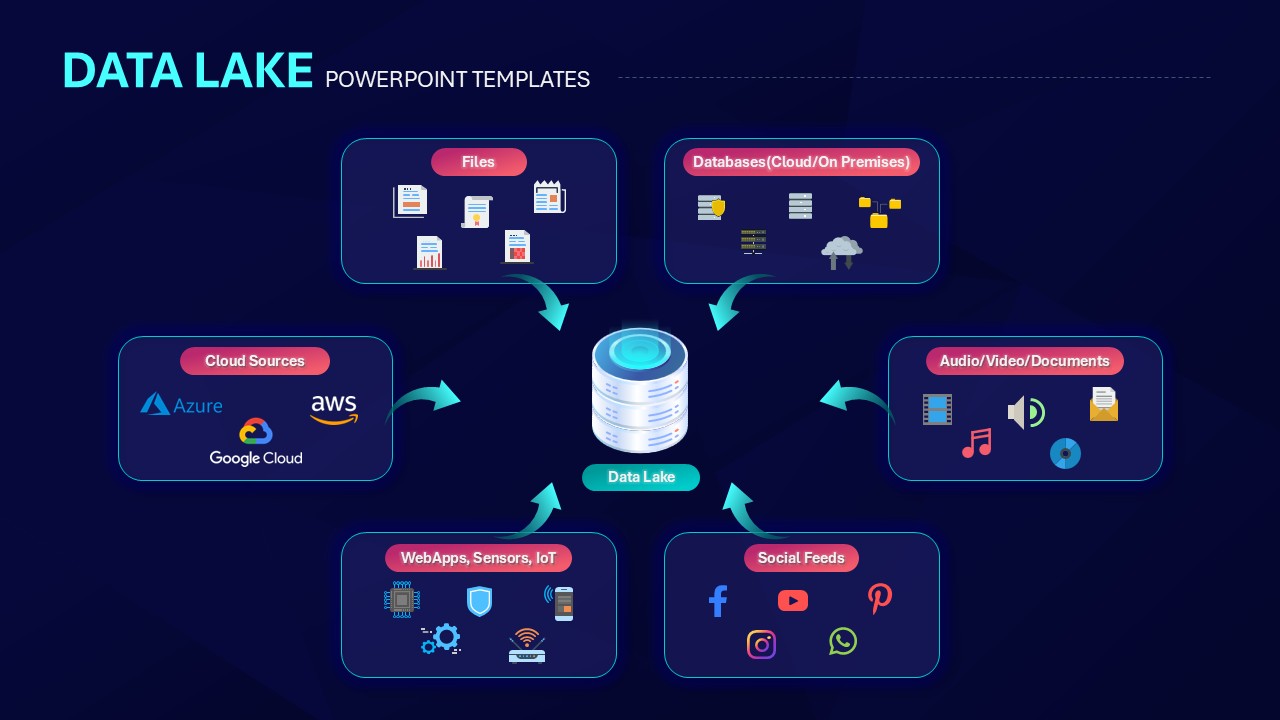
Data Lake Hub-and-Spoke Diagram Template for PowerPoint & Google Slides
Cloud Computing
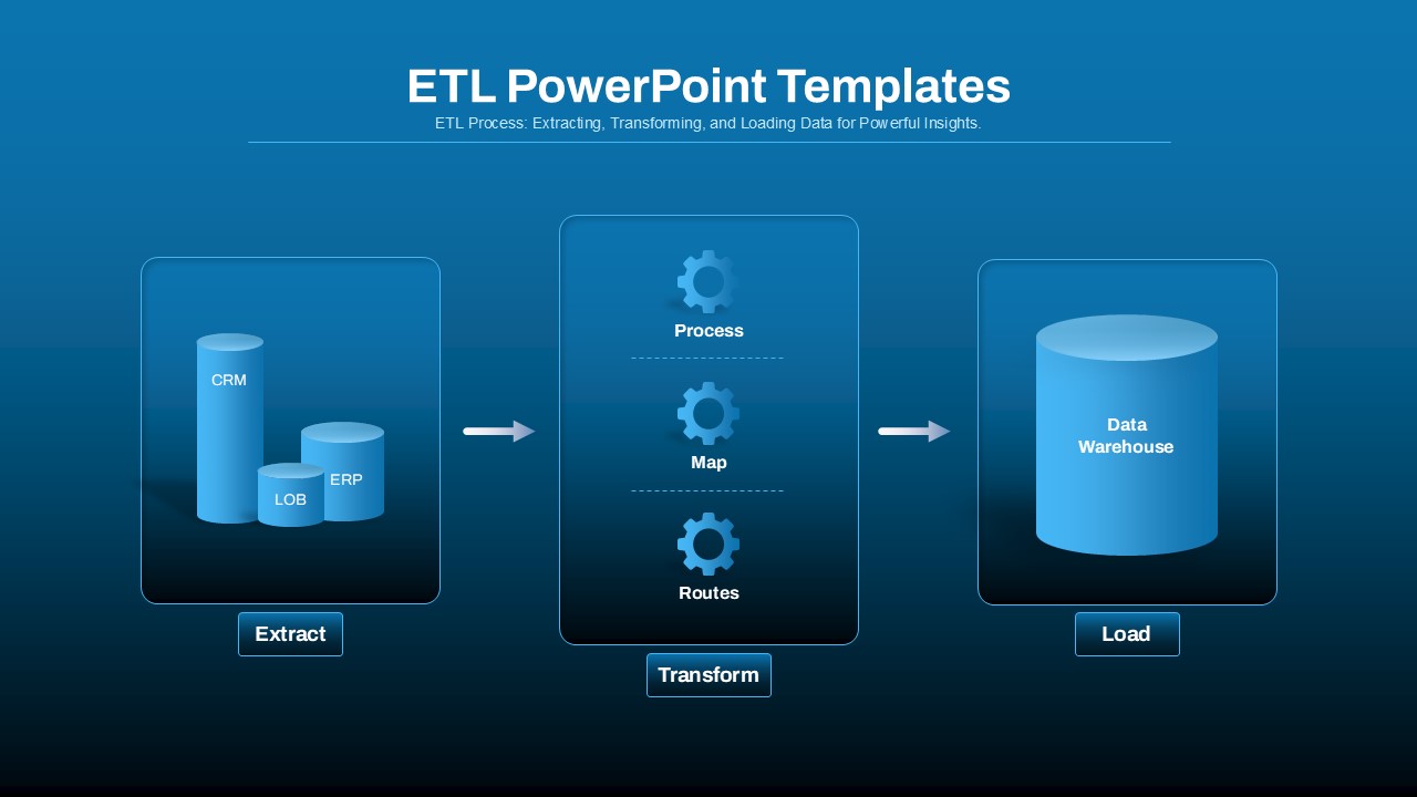
ETL Data Pipeline Workflow Diagram Template for PowerPoint & Google Slides
Process
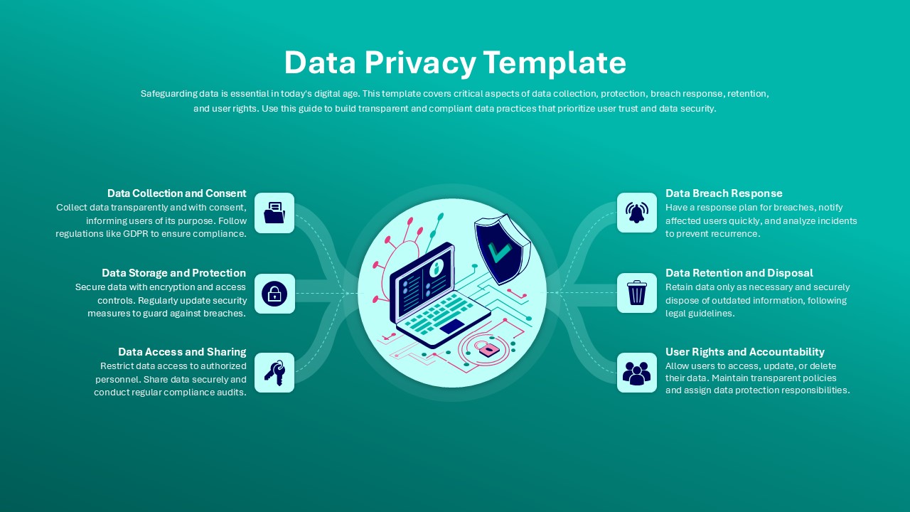
Data Privacy template for PowerPoint & Google Slides
Information Technology
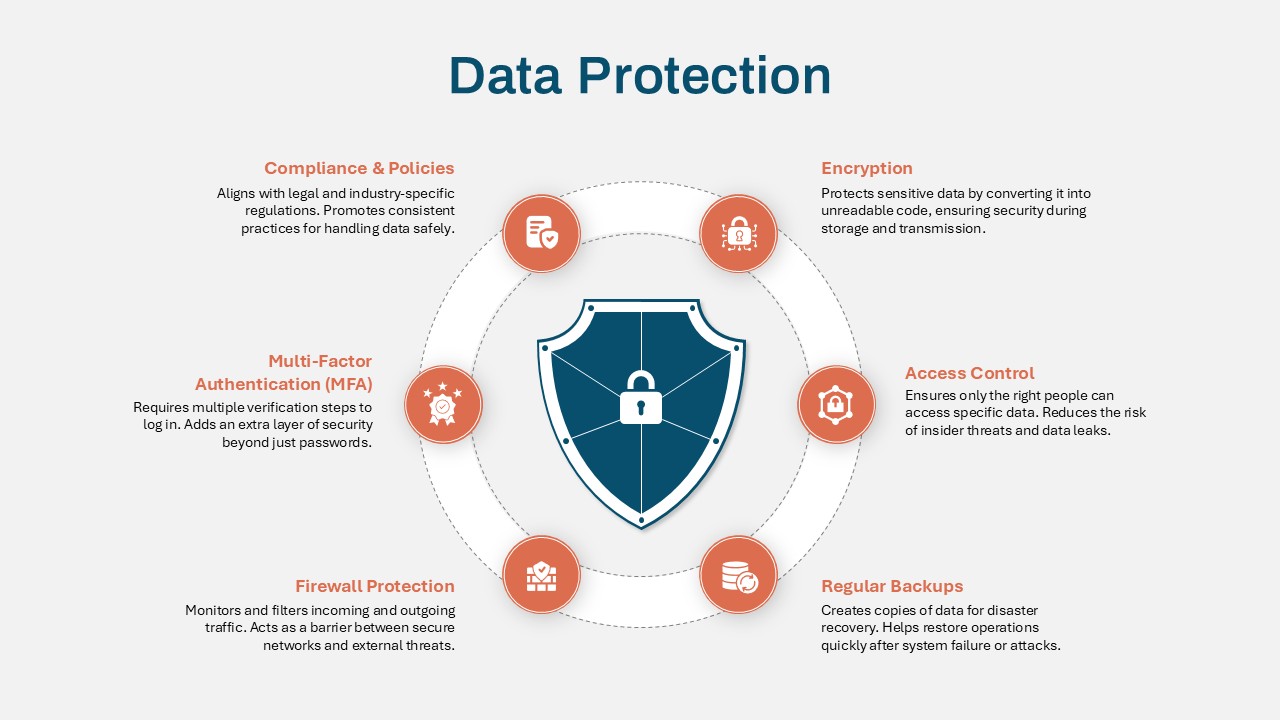
Data Protection Strategies template for PowerPoint & Google Slides
Information Technology
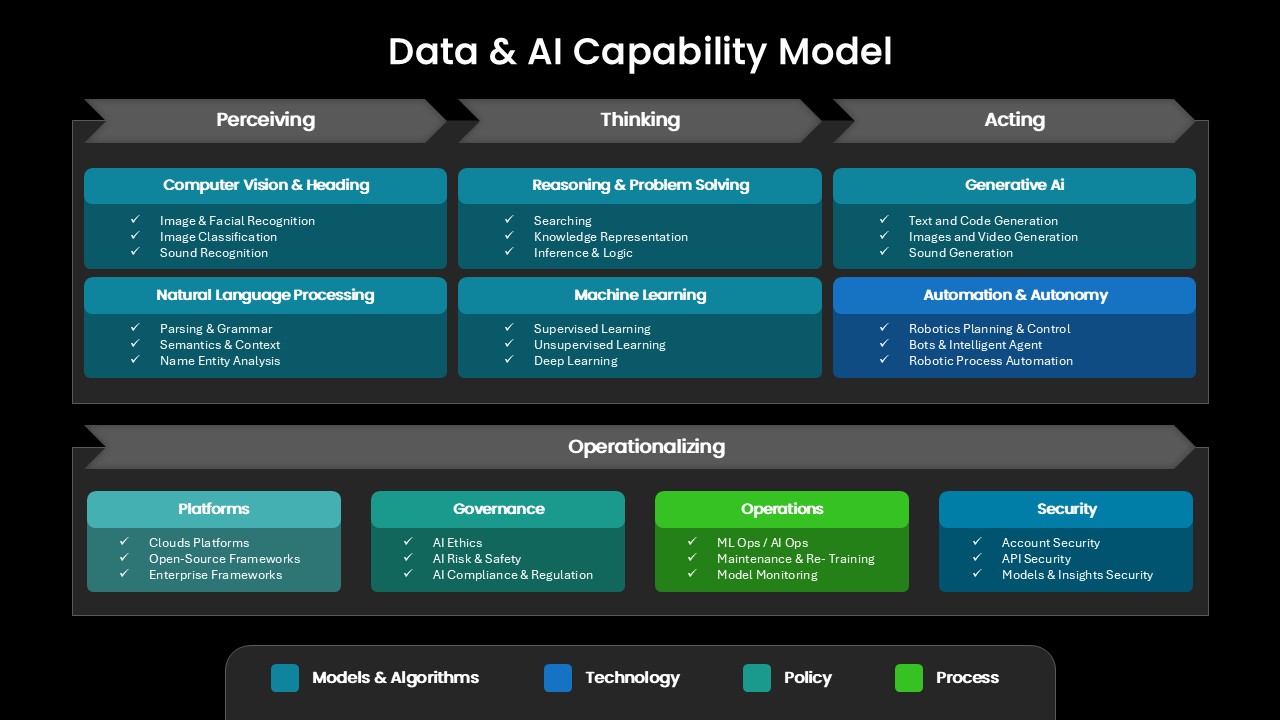
Comprehensive Data & AI Capability Model Template for PowerPoint & Google Slides
AI
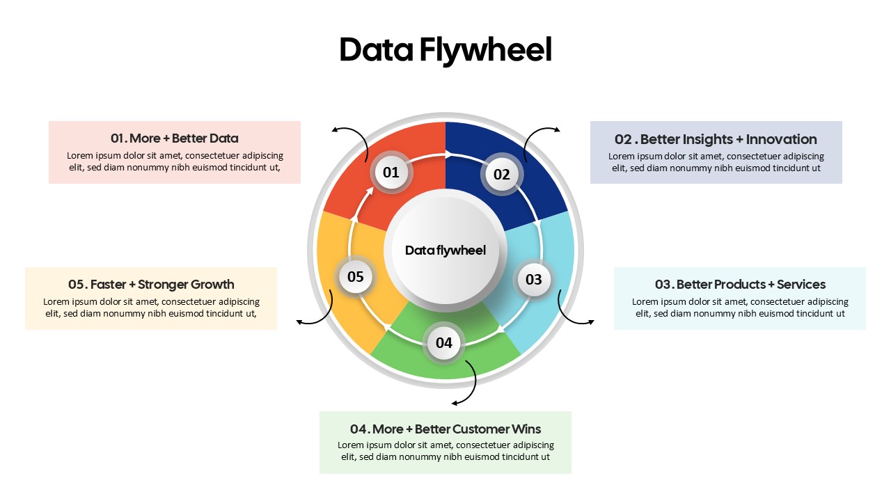
Data Flywheel Strategy template for PowerPoint & Google Slides
Business
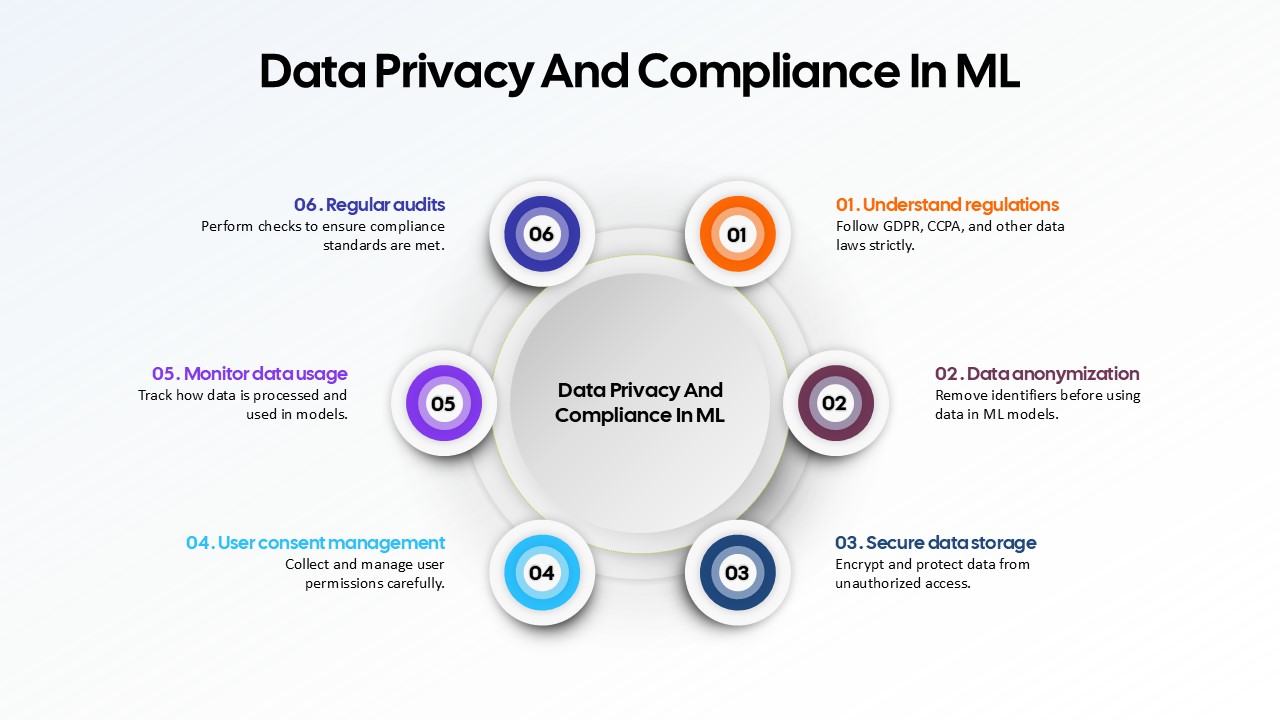
Data Privacy and Compliance in ML template for PowerPoint & Google Slides
Technology
Data-Driven AI in Insurance Infographic Template for PowerPoint & Google Slides
Circular
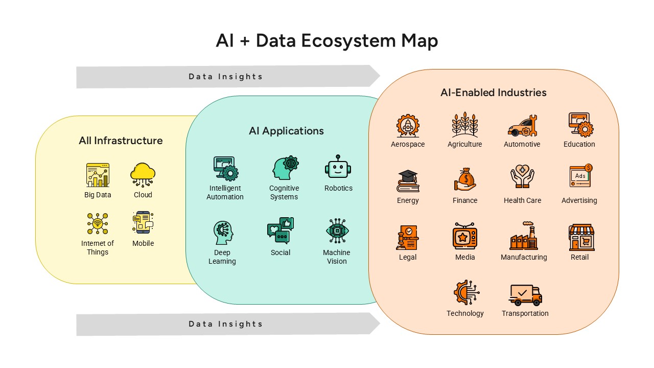
AI and Data Ecosystem Map Template for PowerPoint & Google Slides
AI
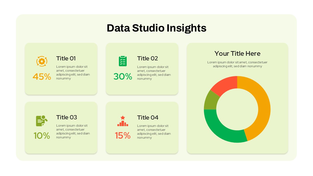
Data Studio Insights template for PowerPoint & Google Slides
Business Report
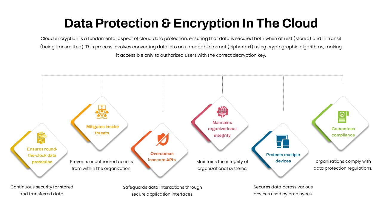
Data Protection & Encryption in the Cloud Overview template for PowerPoint & Google Slides
Cloud Computing
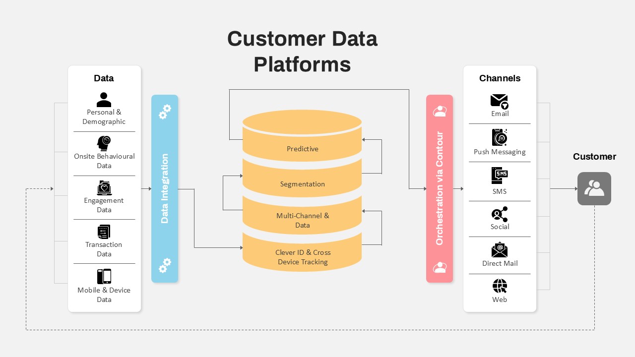
Customer Data Platform Workflow Diagram Template for PowerPoint & Google Slides
Information Technology
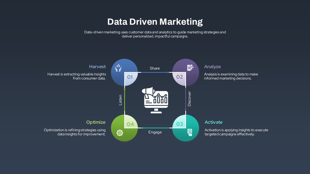
Data-Driven Marketing Lifecycle Diagram Template for PowerPoint & Google Slides
Process
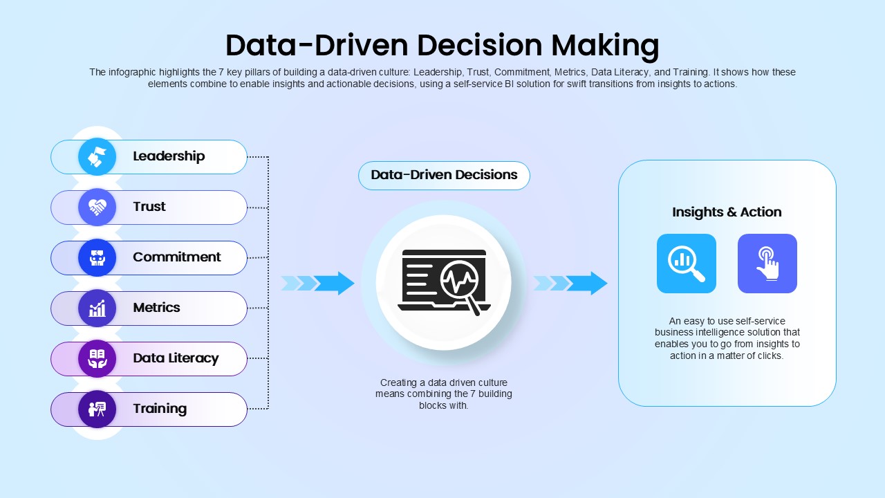
Data-Driven Decision Making overview template for PowerPoint & Google Slides
Business
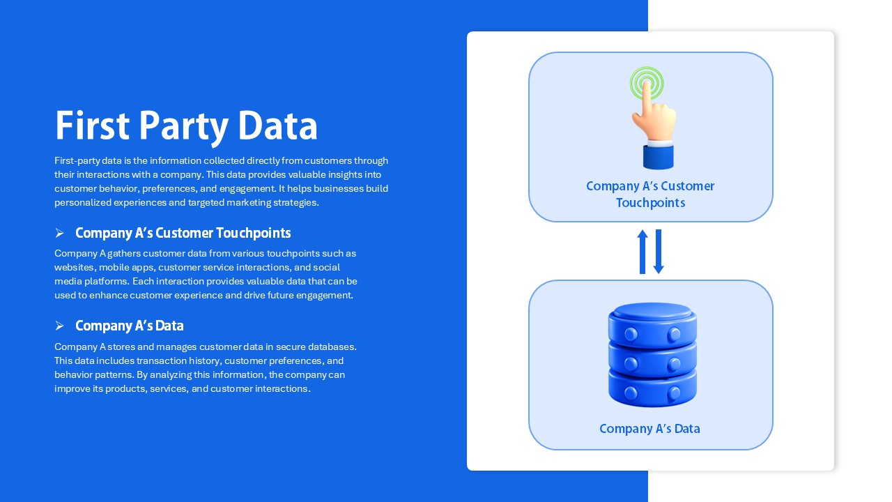
First Party Data Overview Template for PowerPoint & Google Slides
Business
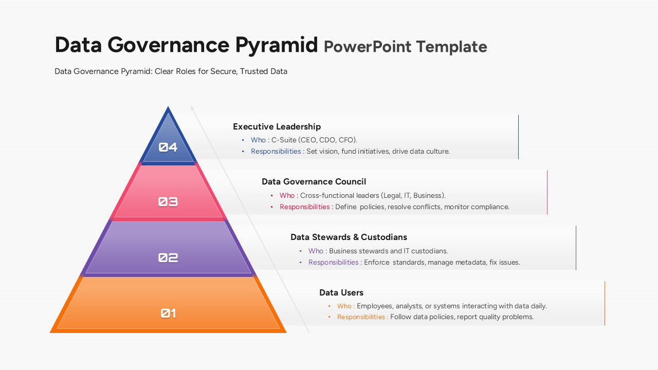
Data Governance Roles Pyramid Diagram Template for PowerPoint & Google Slides
Pyramid
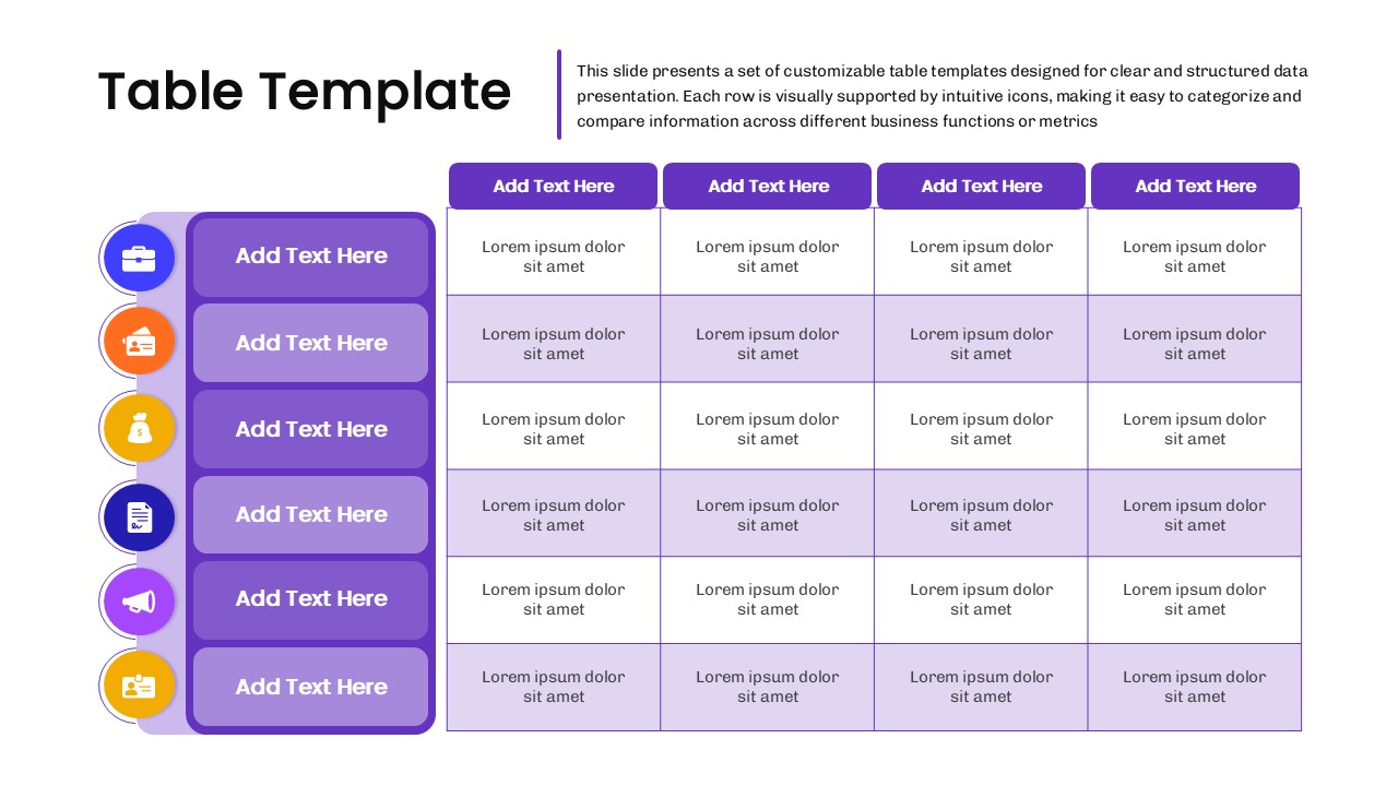
Business Data Table Template for PowerPoint & Google Slides
Table
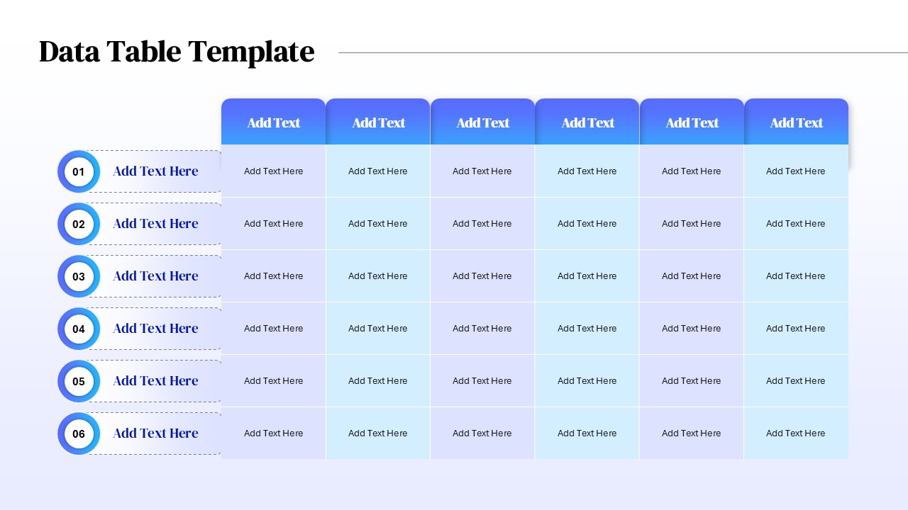
Six Column Data Table Template for PowerPoint & Google Slides
Table
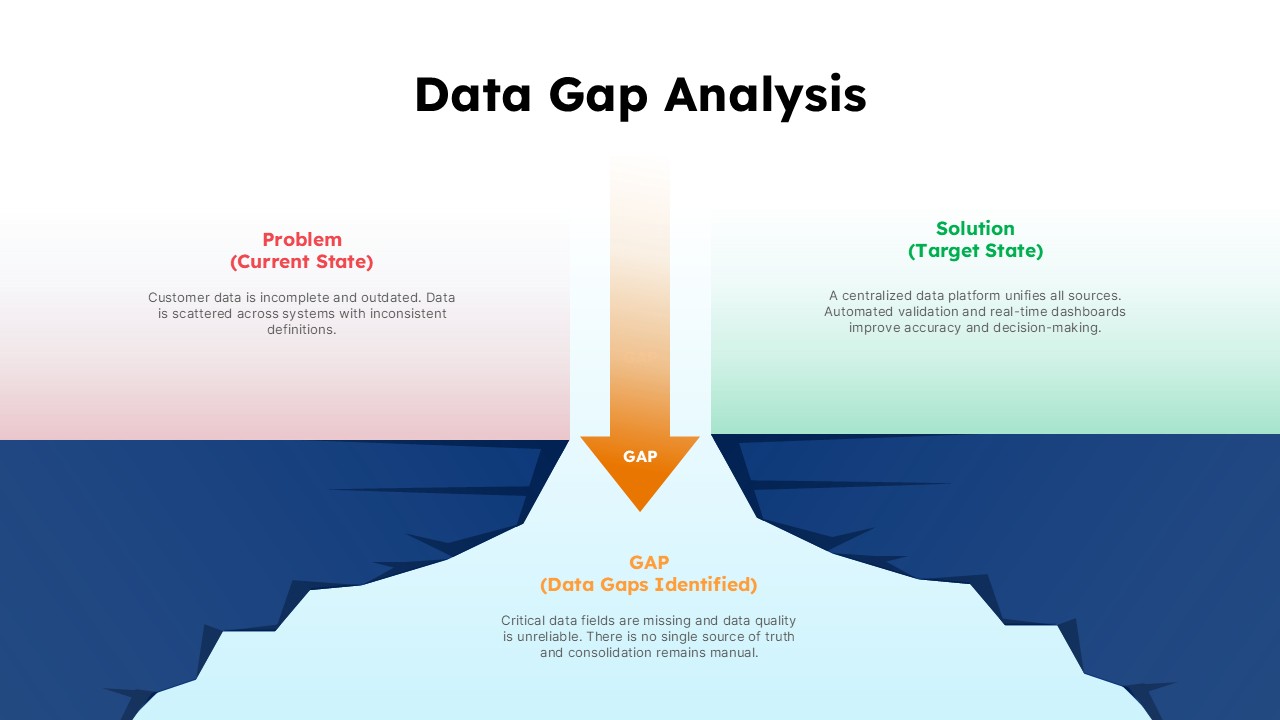
Data Gap Analysis Template for PowerPoint & Google Slides
Business
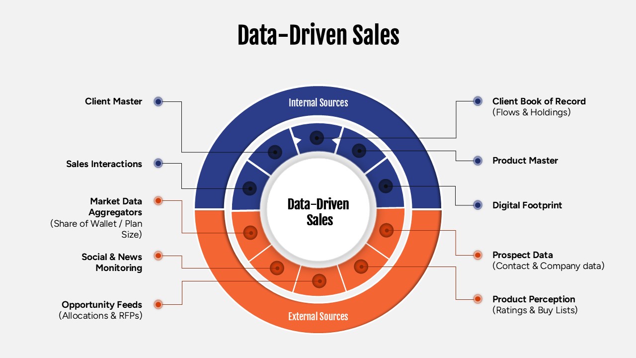
Data-Driven Sales Strategy Diagram Template for PowerPoint & Google Slides
Marketing
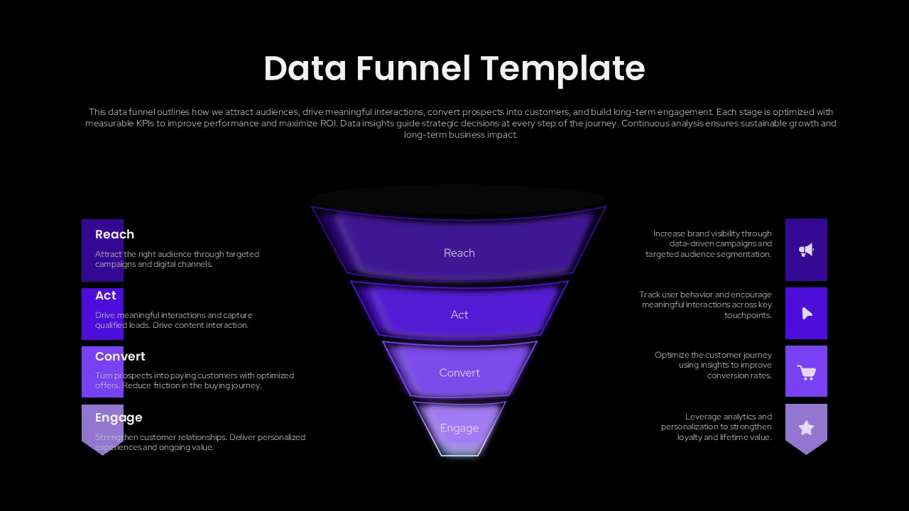
Data Funnel Template for Marketing Presentations (PowerPoint/Google Slides)
Funnel
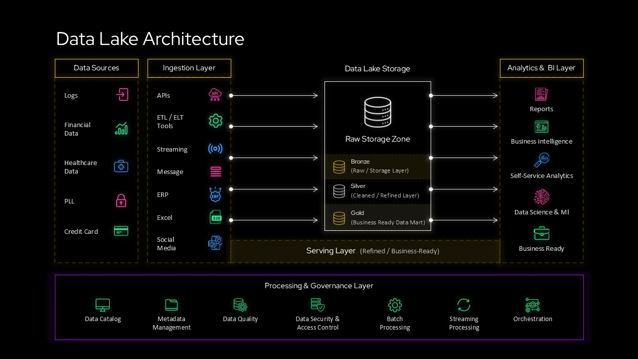
Data Lake Architecture Diagram Template for PowerPoint & Google Slides
Information Technology
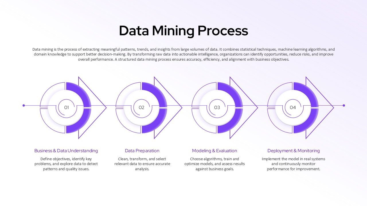
Data Mining Process Diagram Template for PowerPoint & Google Slides Presentation
Manufacturing