Data Management and Analytics Diagram Template for PowerPoint & Google Slides
Data Management and Analytics PowerPoint and Google Slides Template
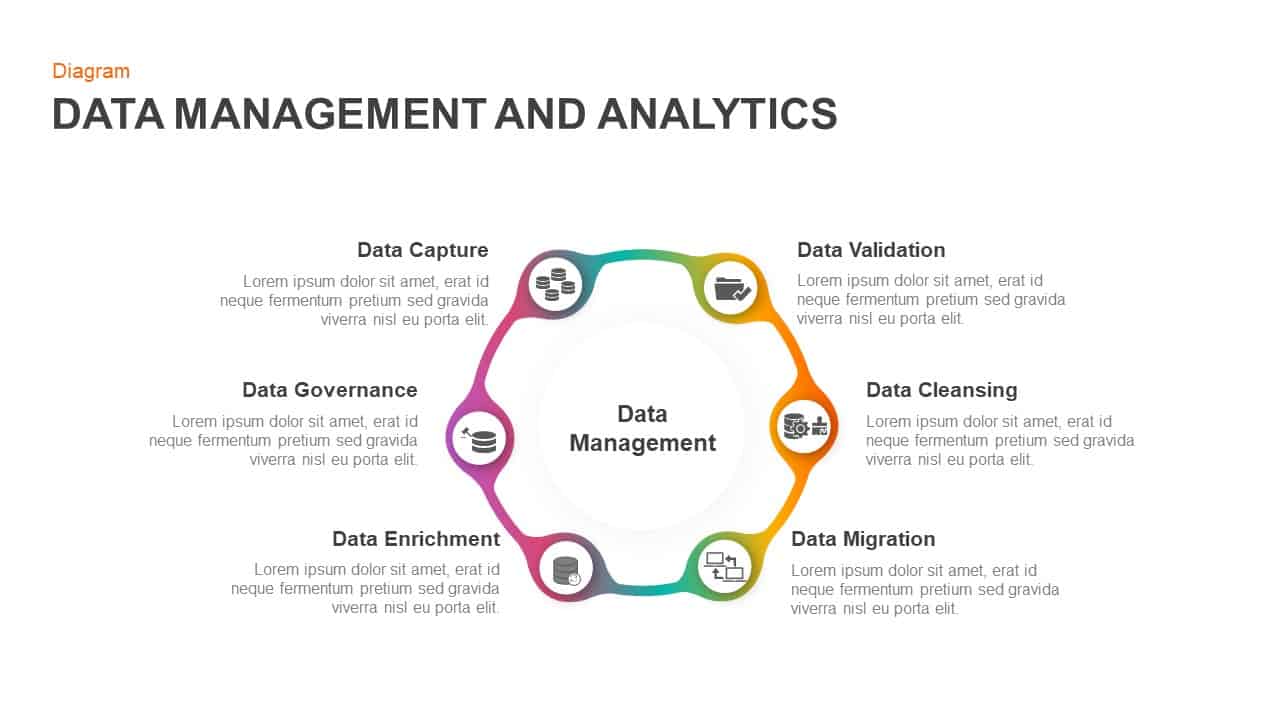
Walking stakeholders through an end-to-end data lifecycle or pitching an enterprise analytics workflow demands a clean, circular progression. This data management diagram provides database administrators, IT consultants, and analytics teams with an intuitive six-stage loop. Instead of boxing complex governance rules into plain bulleted lists, the layout tracks continuous optimization around a central hub, helping audiences see how raw intake flows all the way to clean migration and enrichment.
Key slide components and visual highlights include:
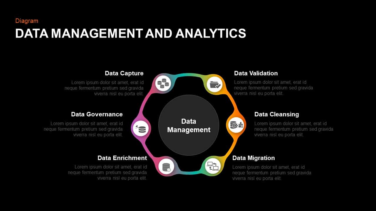
- A smooth six-node circular loop enclosing a bright central focal area labeled “Data Management”.
- Seamless gradient transitions linking stages across purple, magenta, bright orange, amber yellow, and emerald green.
- Dedicated milestone stations highlighting the complete data lifecycle: Data Capture, Data Validation, Data Cleansing, Data Migration, Data Enrichment, and Data Governance.
- Circular icon badges embedded at each stage, displaying line art symbols for servers, file validation, cleansing processes, networked workstations, and storage compliance.
- Balanced text blocks positioned around the perimeter with bold titles and room for implementation details or quality benchmarks.
- A minimalist white background engineered to maintain high contrast during live room screenings and remote calls.
- 100% editable vector components that allow quick changes to node colors, text descriptions, layout dimensions, or icons right inside PowerPoint and Google Slides.
Login to download this file

Item ID
SB01251


Related Templates

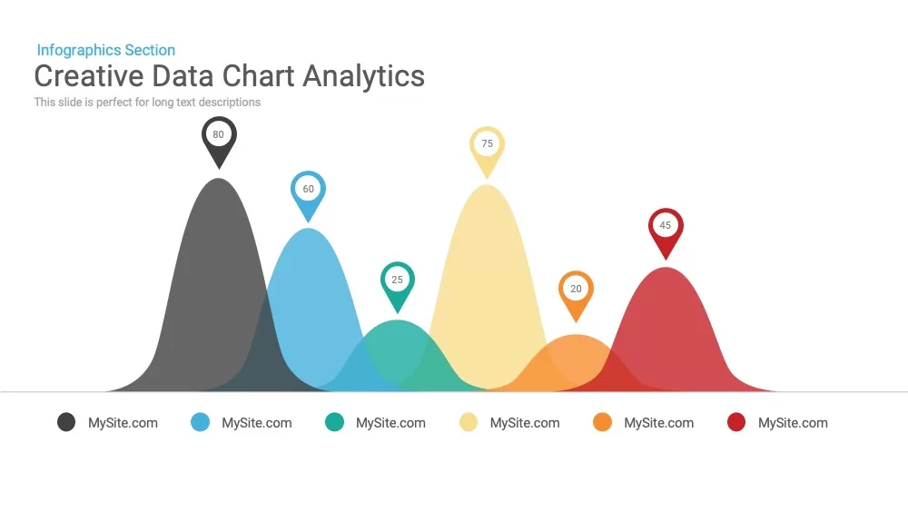
Creative Data Analytics Chart PowerPoint Template
Charts

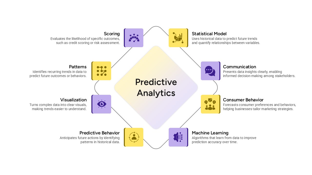
Predictive Analytics Diagram Template
Process
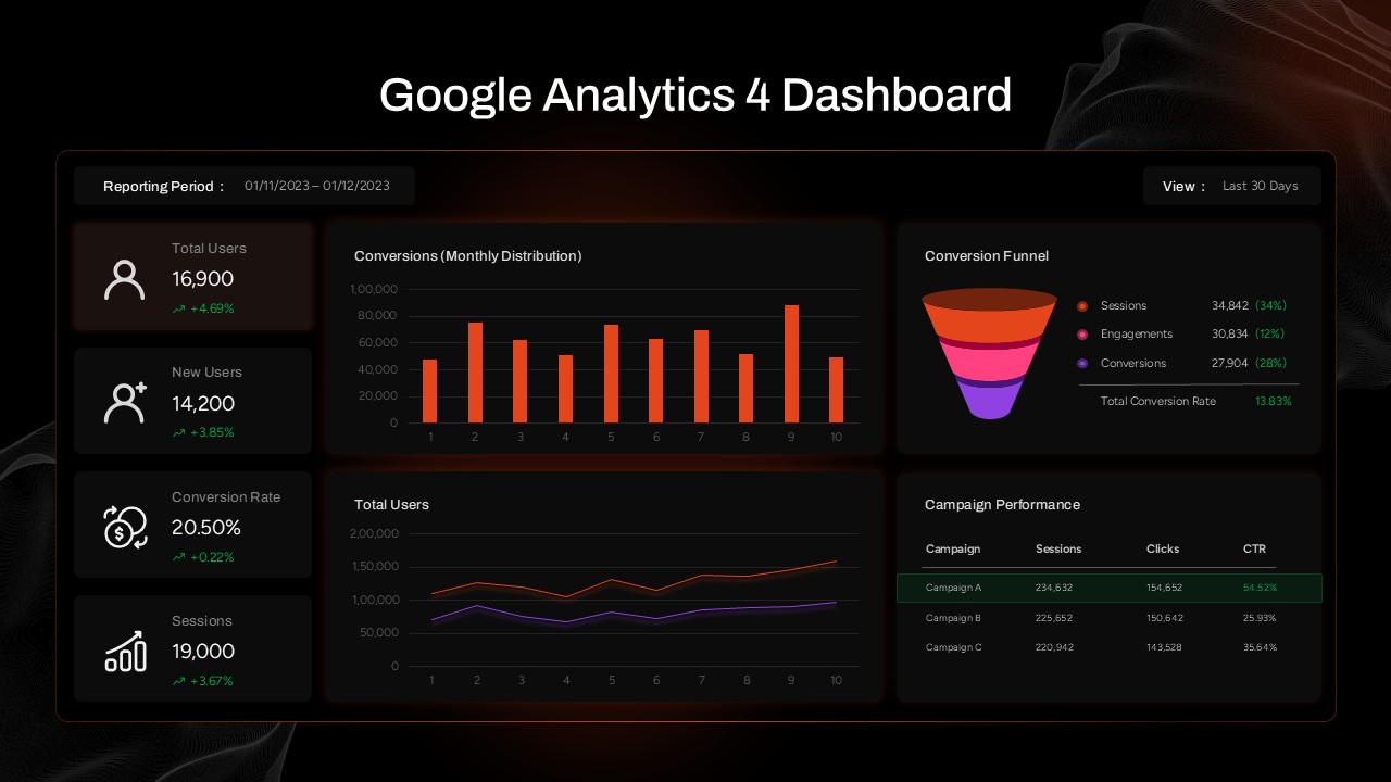
Google Analytics 4 (GA4) Dashboard Template for PowerPoint & Google Slides
Digital Marketing
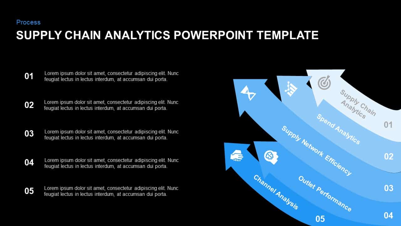
Supply Chain Analytics Process PowerPoint Template& Google Slides
Process
Web Analytics Dashboard Template
Business
HR Analytics Dashboard PowerPoint & Google Slides Template
HR
Free Social Media Analytics Map Presentation PowerPoint Template
World Maps
Free
E-Commerce Analytics PowerPoint Template
Bar/Column
Social Media Analytics PowerPoint Template
Digital Marketing

Product Usage Analytics Template
Bar/Column
Customer Data Platform Diagram for PowerPoint
Information Technology
Data-Driven Marketing Template for PPT & Google Slides
Process
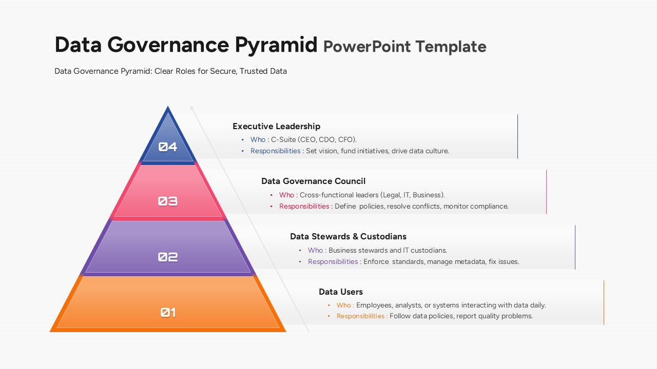
Data Governance Pyramid PowerPoint Template
Pyramid
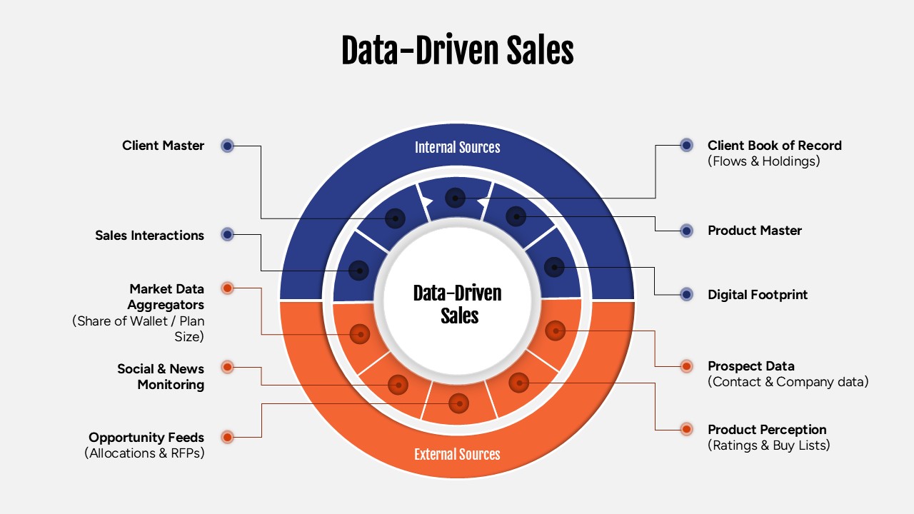
Data-Driven Sales Strategy Diagram Template
Marketing
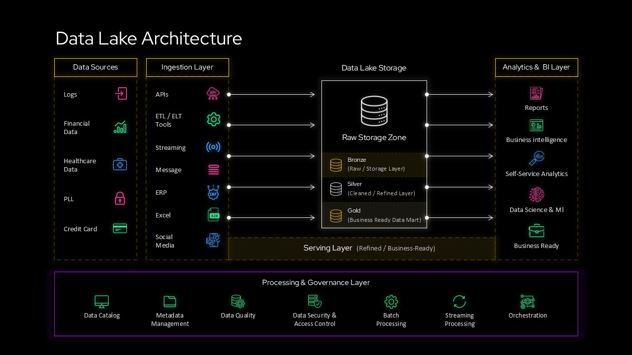
Data Lake Architecture Diagram for PowerPoint & Google Slides
Information Technology
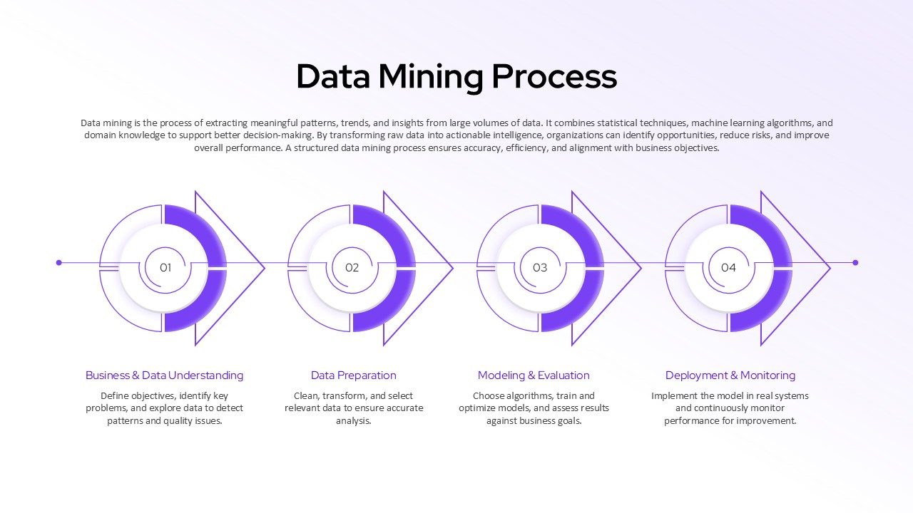
Data Mining Process Diagram Template
Manufacturing
Immigration Data Dashboard Template for PowerPoint & Google Slides
Bar/Column
Data Privacy and Compliance in ML Template
Technology
AI & Data Ecosystem Map Template PPT & Google Slides
Google Slides
Data Studio Insights PowerPoint Template
Business Report