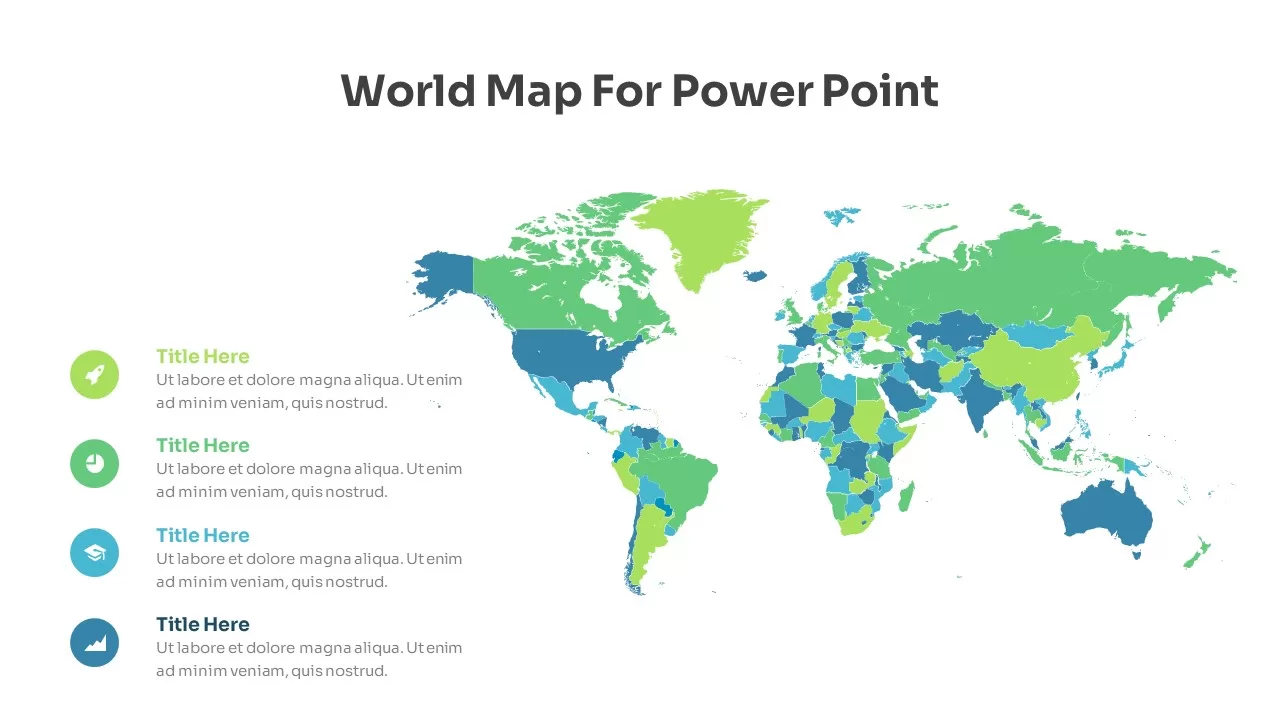
Free Editable Social Media Users Map Template for PowerPoint & Google Slides
One of the first things new presenters learn is that numbers alone rarely tell the full story. When you are showing where your audience lives, which platforms they use, and how they break down by demographic, a world map instantly makes that data more digestible than any table or bullet list ever could. This template is editable in both PowerPoint and Google Slides, so you can start replacing the placeholder content with your own figures right away. It sits comfortably among the better free PowerPoint templates available for social media and digital marketing presentations, offering a layout that feels considered rather than cobbled together.
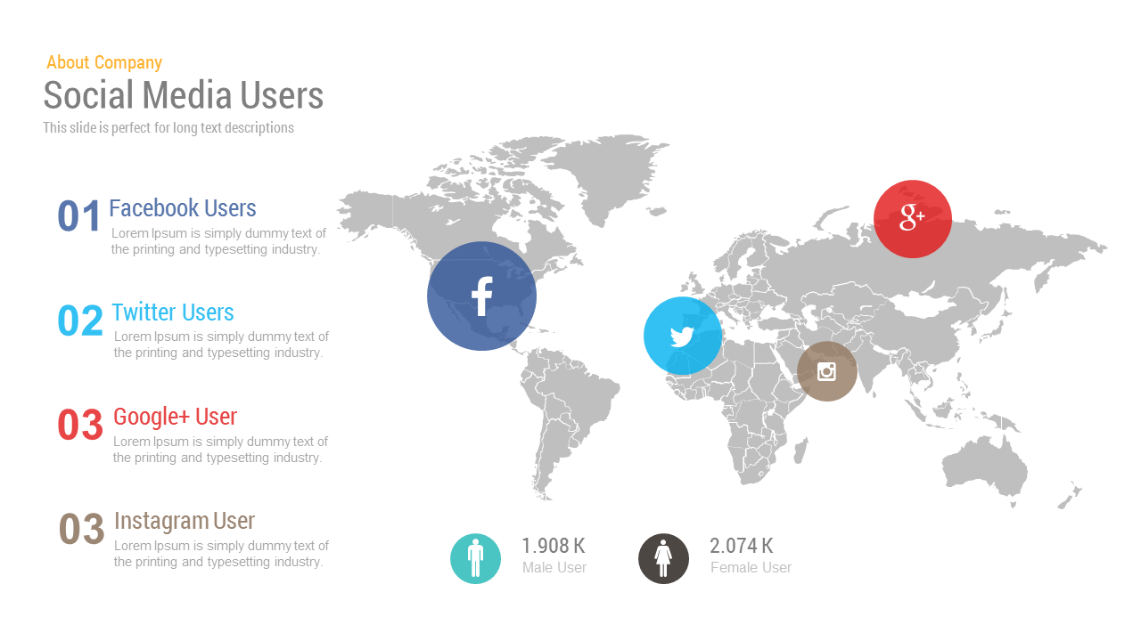
The slide places a flat world map at its center, with branded social media icons positioned geographically to show platform concentration by region. Facebook sits over the Americas, Twitter over Europe and the Middle East, Instagram over Asia, and Google+ over Russia, giving your audience an immediate spatial read on where each platform dominates. On the left, a numbered list runs through each platform with space for a short supporting description, so you are not relying on the map alone to carry the message. At the bottom, male and female user counts with corresponding icons add a demographic layer without crowding the visual.
How to Use This Slide in a Real Presentation
If you are building a deck around a social media strategy, a market entry plan, or a digital audience report, this slide works best as an orientation moment, the point in your presentation where you ground your audience in the geographic and platform reality before moving into recommendations. You can swap the existing platforms for whichever ones are relevant to your data, resize the icons to reflect relative audience size, and update the gender statistics to reflect your actual research. For anyone exploring PowerPoint map templates, this layout shows how geographic context and platform data can share a slide without one overwhelming the other.
Learning to present data well means choosing formats that match the nature of the information. Geographic and demographic data belongs on a map, and this template gives you a clean, ready-to-edit starting point that respects both your content and your audience’s attention.
Login to download this file

Item ID
SBF00009
Related Templates

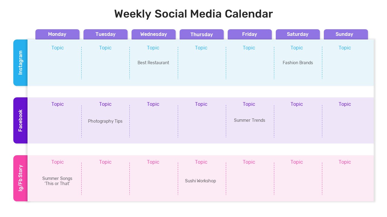
Weekly Social Media Calendar Editable Template
Digital Marketing
Free 3D Social Media Icons template for PowerPoint & Google Slides
Digital Marketing
Free
Free Social Media Hub-and-Spoke Infographic Template for PowerPoint & Google Slides
Circular
Free
Social Networking and Communication Template Editable In PowerPoint & Google Slides
Digital Marketing
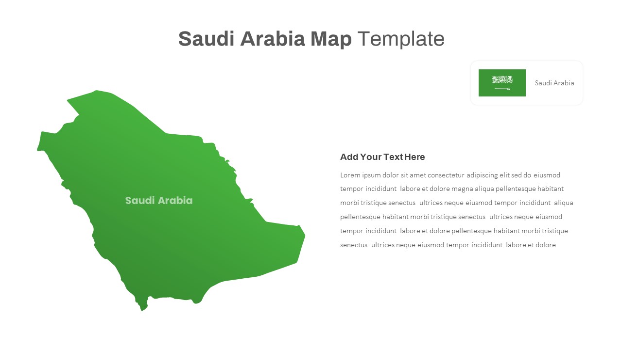
Free Editable Saudi Arabia Map Template for PowerPoint & Google Slides
World Maps
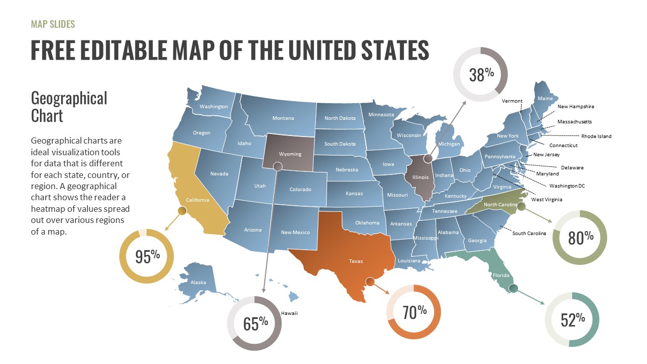
Free Editable U.S. Map Template for PowerPoint
World Maps
Free
Social Media Metrics template for PowerPoint & Google Slides
Comparison Chart
Comprehensive Social Media Icons Slide Template for PowerPoint & Google Slides
Advertising

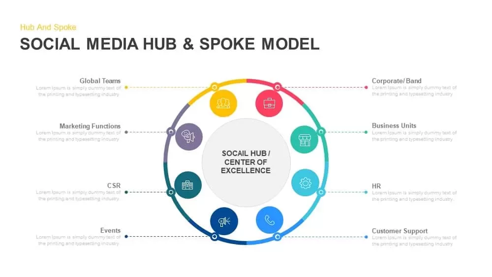
Social Media Hub & Spoke Model Template for PowerPoint & Google Slides
Process
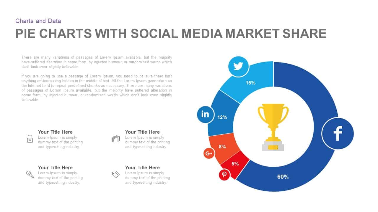
Social Media Market Share Pie Charts Template for PowerPoint & Google Slides
Pie/Donut
Social Media Mind Network Infographic Template for PowerPoint & Google Slides
Digital Marketing
Social Media Rocket Launch Infographic Template for PowerPoint & Google Slides
Marketing
Mobile App Social Media Metaphor Template for PowerPoint & Google Slides
Infographics
Social Media Network Infographic Template for PowerPoint & Google Slides
Circular
Social Media Metaphor Illustration Template for PowerPoint & Google Slides
Digital Marketing
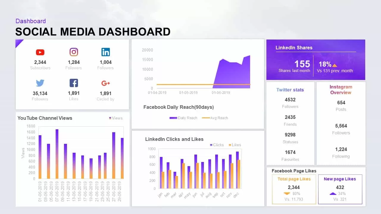
Social Media Performance Dashboard Template for PowerPoint & Google Slides
Bar/Column
Social Media Marketing Tool Template for PowerPoint & Google Slides
Digital Marketing
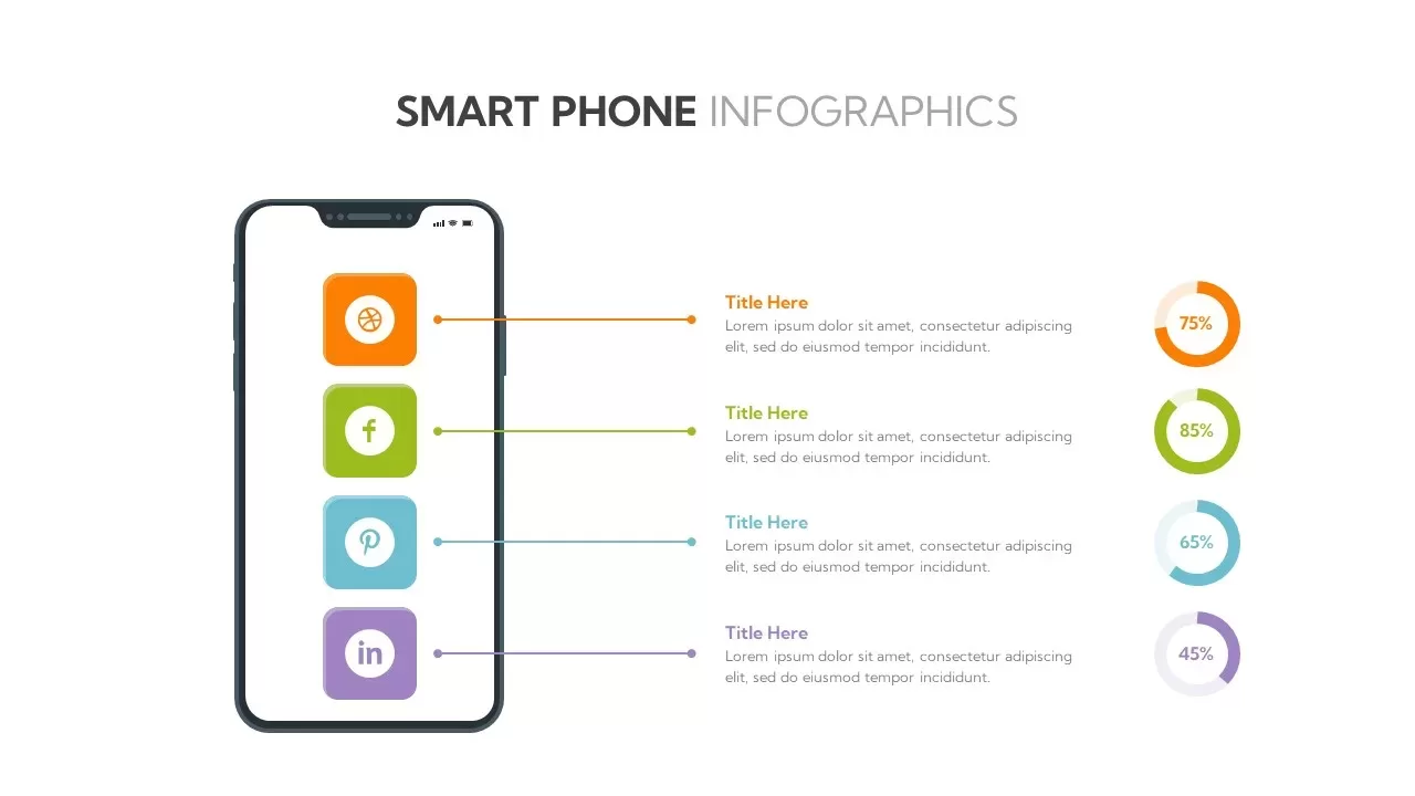
Social Media Smartphone Infographic Template for PowerPoint & Google Slides
Pie/Donut
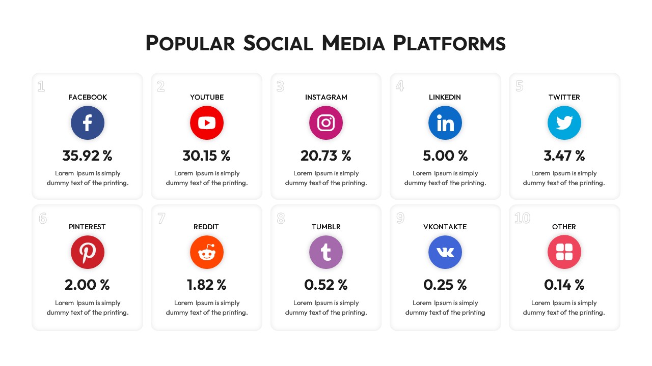
Popular Social Media Comparison Grid Template for PowerPoint & Google Slides
Digital Marketing
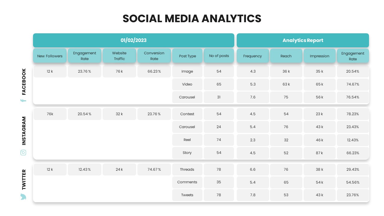
Social Media Analytics Dashboard Template for PowerPoint & Google Slides
Digital Marketing

Social Media Marketing Agency Pitch Deck Template for PowerPoint & Google Slides
Pitch Deck
Social Media Community Network Slide Template for PowerPoint & Google Slides
Circular
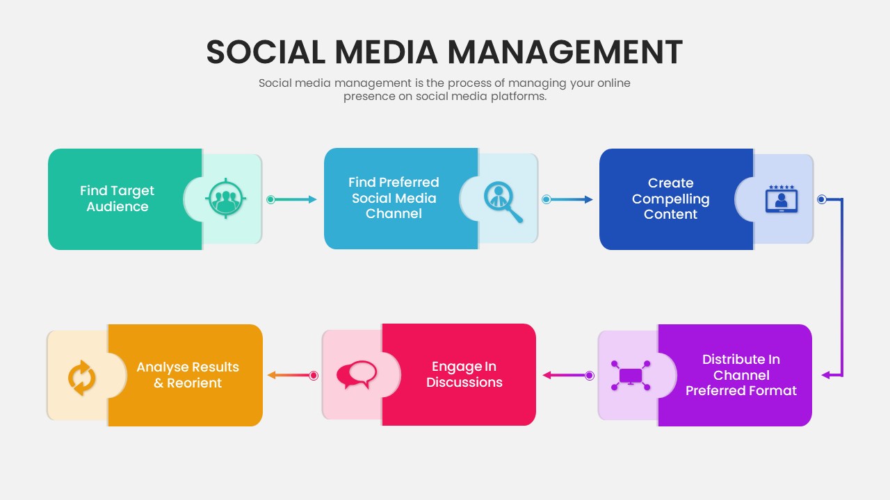
Six-Step Social Media Management Process Template for PowerPoint & Google Slides
Process
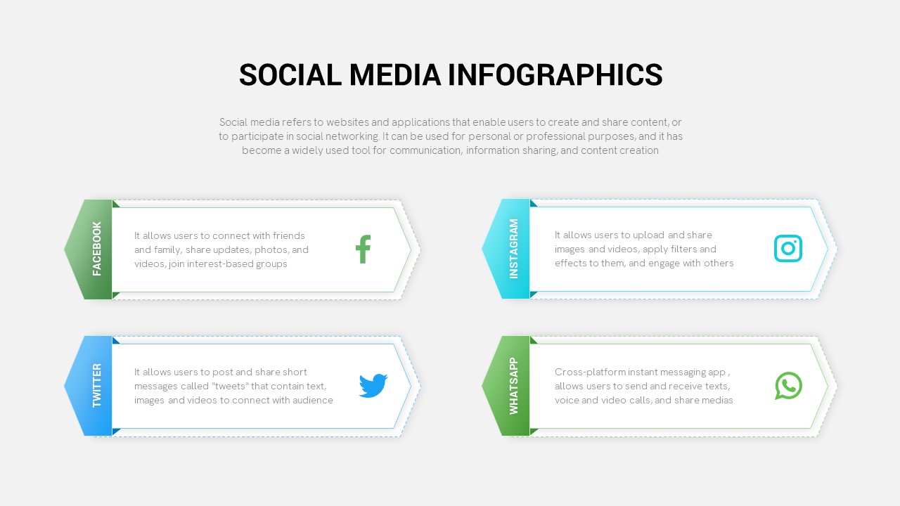
Modern Social Media Infographics Template for PowerPoint & Google Slides
Digital Marketing
Social Media Infographic Arrow Layout Template for PowerPoint & Google Slides
Arrow
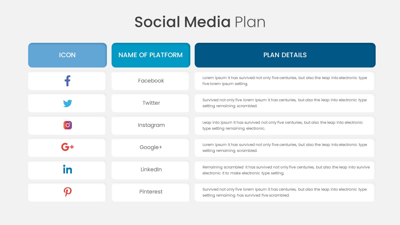
Social Media Plan Table Slide Deck Template for PowerPoint & Google Slides
Process
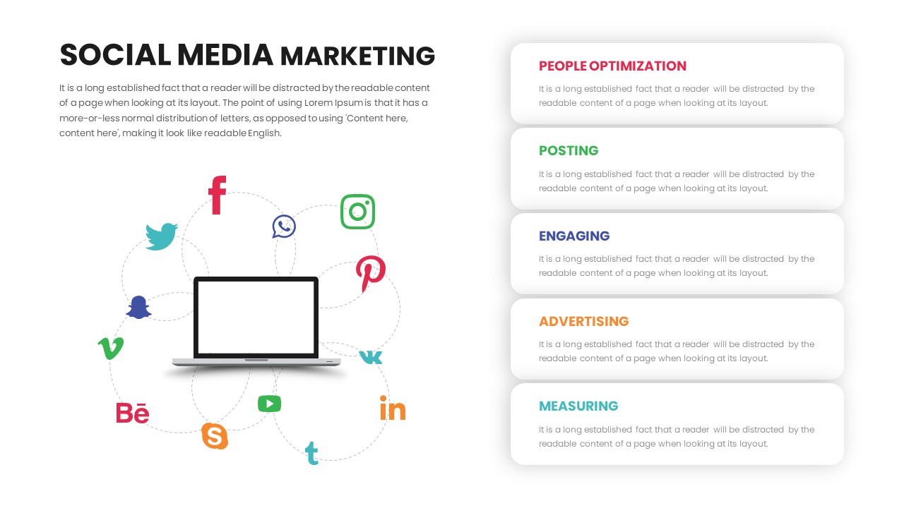
Social Media Marketing Connection Template for PowerPoint & Google Slides
Digital Marketing
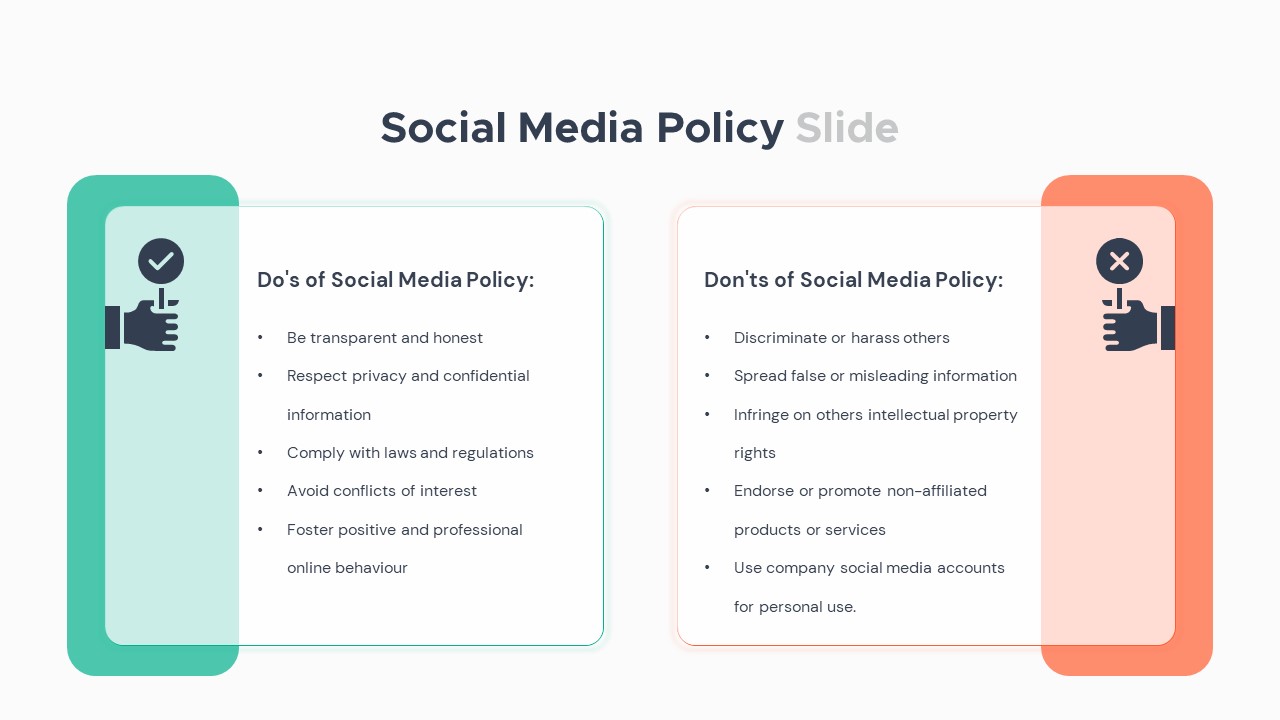
Social Media Policy Dos & Don’ts Slide Template for PowerPoint & Google Slides
Comparison
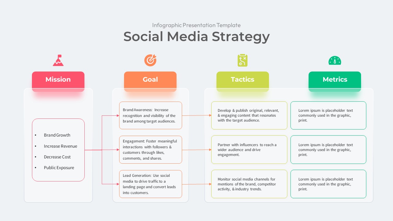
Social Media Strategy Infographic Presentation Template
Digital Marketing
Social Media Listening Overview Slide Template for PowerPoint & Google Slides
Customer Experience
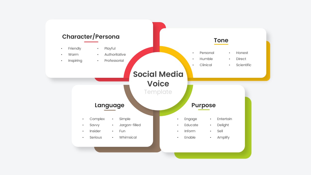
Social Media Voice Template for PowerPoint & Google Slides
Customer Experience
Social Media Hub-and-Spoke Infographics Template for PowerPoint & Google Slides
Circular
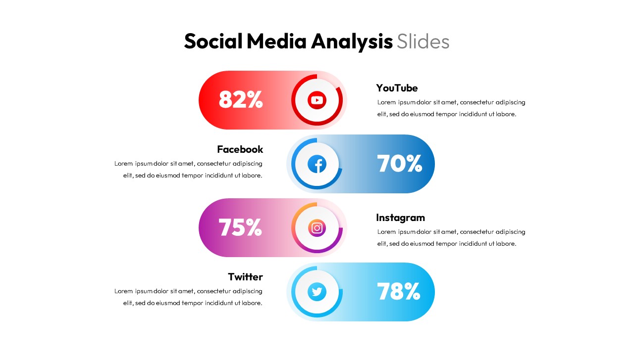
Social Media Analysis Metrics Slide Deck Template for PowerPoint & Google Slides
Digital Marketing
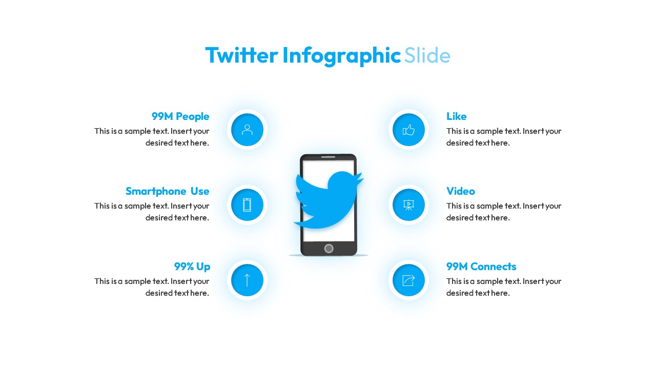
Twitter Social Media Infographic Template for PowerPoint & Google Slides
Circular
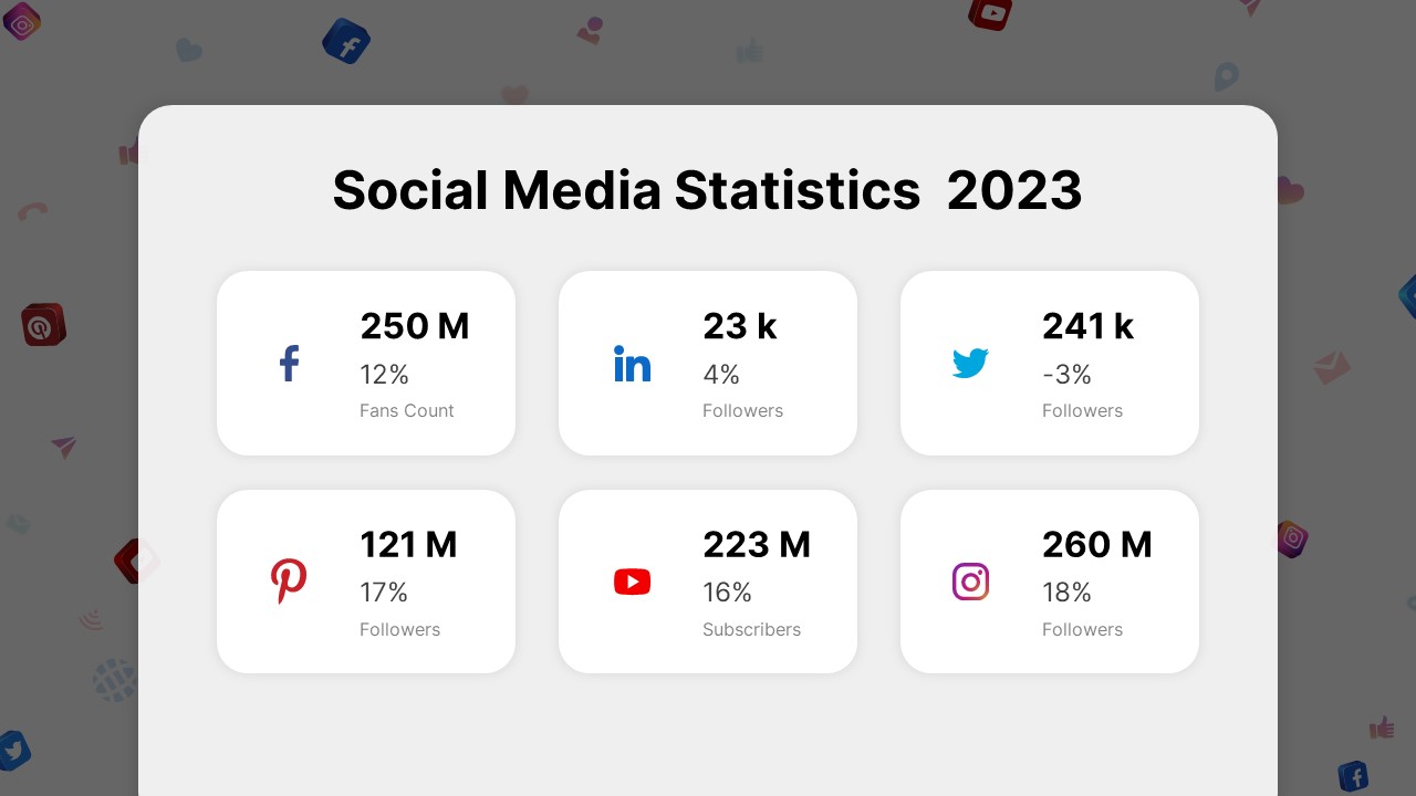
Social Media Statistics 2023 Dashboard Template for PowerPoint & Google Slides
Comparison
Social Media Report Presentation Template for PowerPoint & Google Slides
Digital Marketing
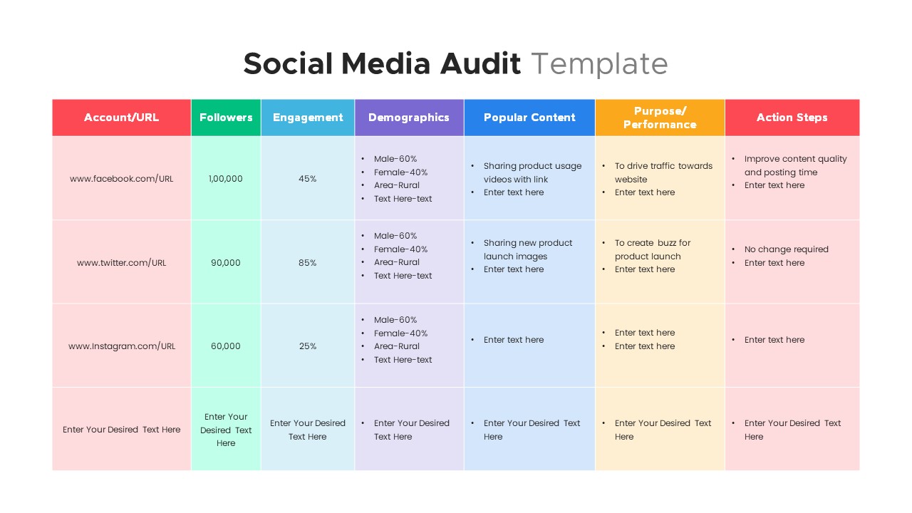
Comprehensive Social Media Audit Template for PowerPoint & Google Slides
Digital Marketing
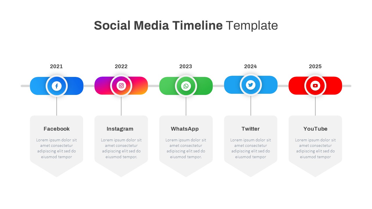
Modern Social Media Timeline Roadmap Template for PowerPoint & Google Slides
Timeline

Social Media Marketing Presentation Template for PowerPoint & Google Slides
Decks
Social Media Presentation Template for PowerPoint & Google Slides
Pitch Deck
Social Media Marketing Overview Template for PowerPoint & Google Slides
Advertising
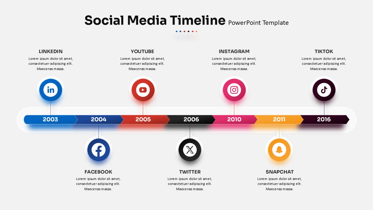
Social Media Timeline template for PowerPoint & Google Slides
Timeline
Social Media Recruiting Strategy template for PowerPoint & Google Slides
Business
Social Media Network Hub Diagram Slide for PowerPoint & Google Slides
Process
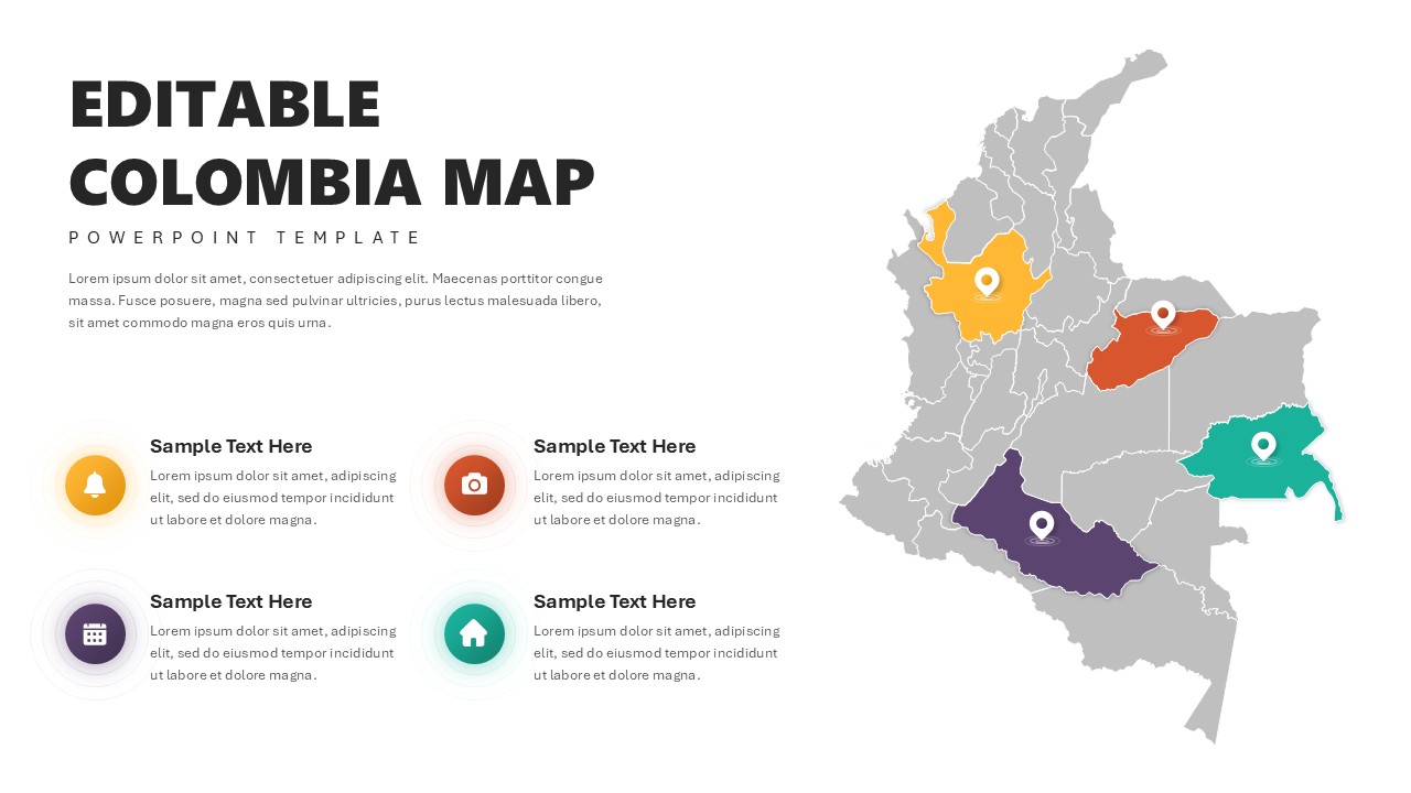
Editable Colombia Map PowerPoint Template for PowerPoint & Google Slides
Business Models

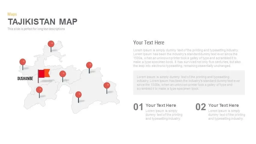
Editable Tajikistan Provinces Map Pack Template for PowerPoint & Google Slides
Maps
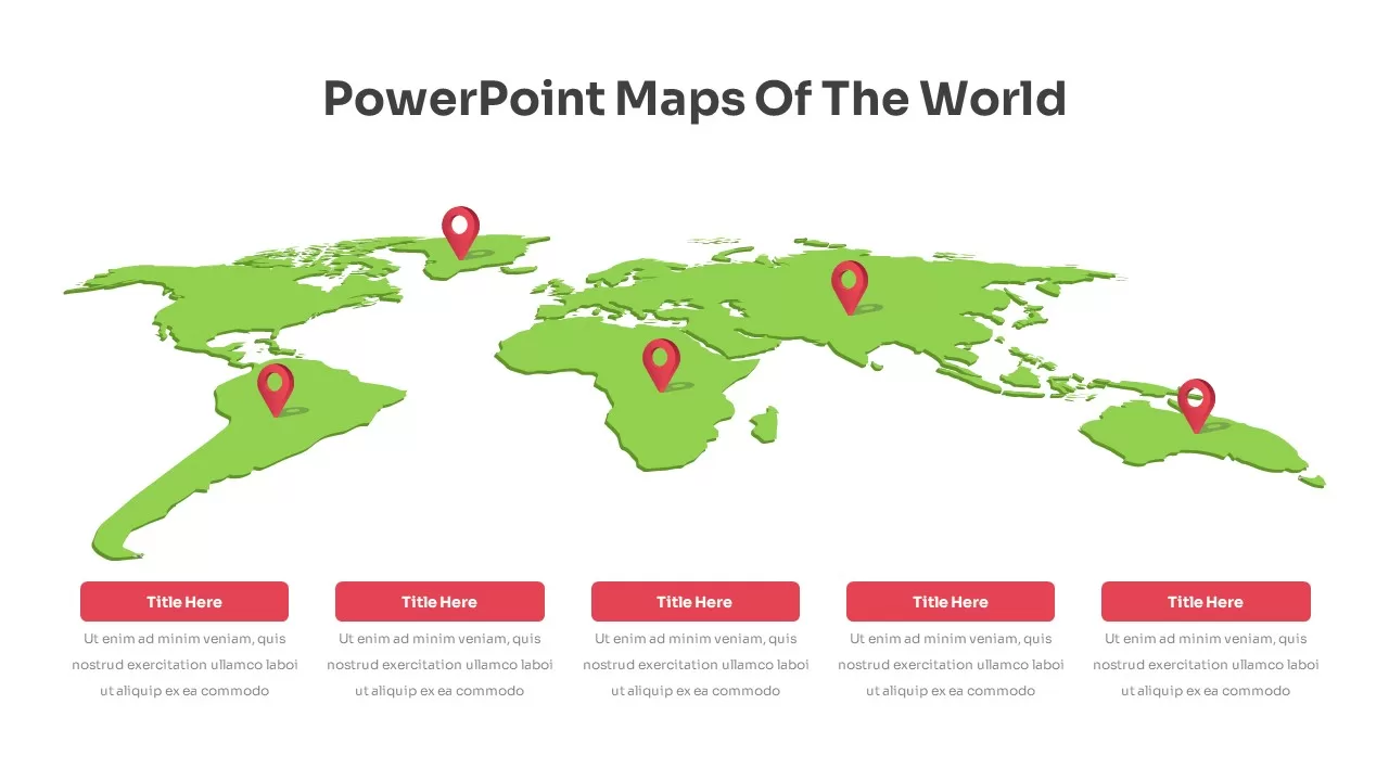
Fully Editable World Map Infographic Template for PowerPoint & Google Slides
World Maps
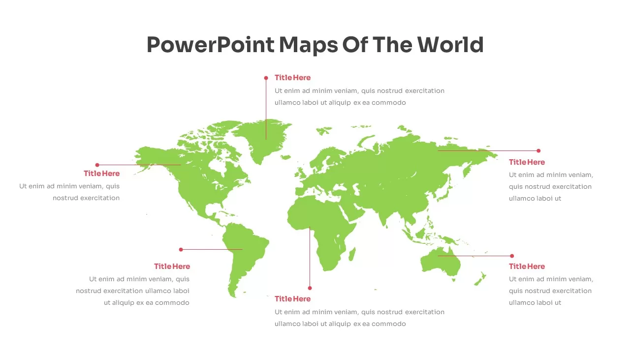
Editable World Map Callout Infographic Template for PowerPoint & Google Slides
World Maps
Editable World Map Callout Infographic Template for PowerPoint & Google Slides
World Maps
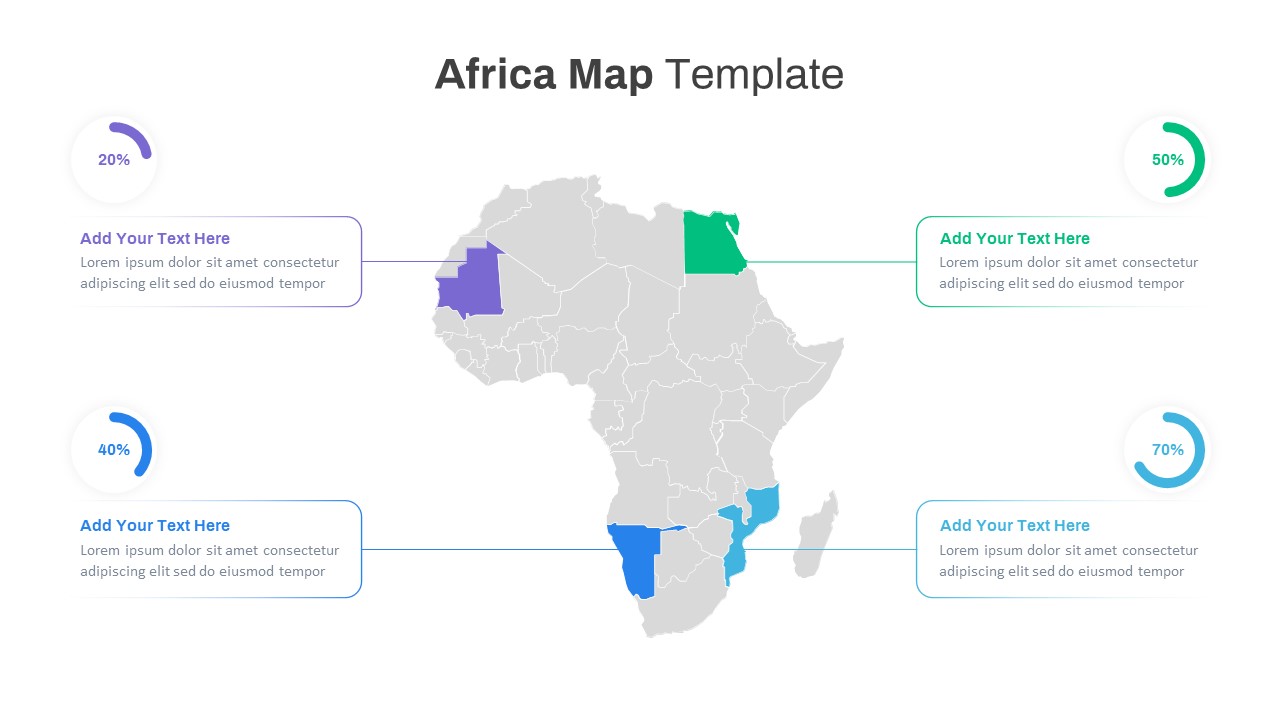
Editable Africa Map Infographic Data Template for PowerPoint & Google Slides
World Maps
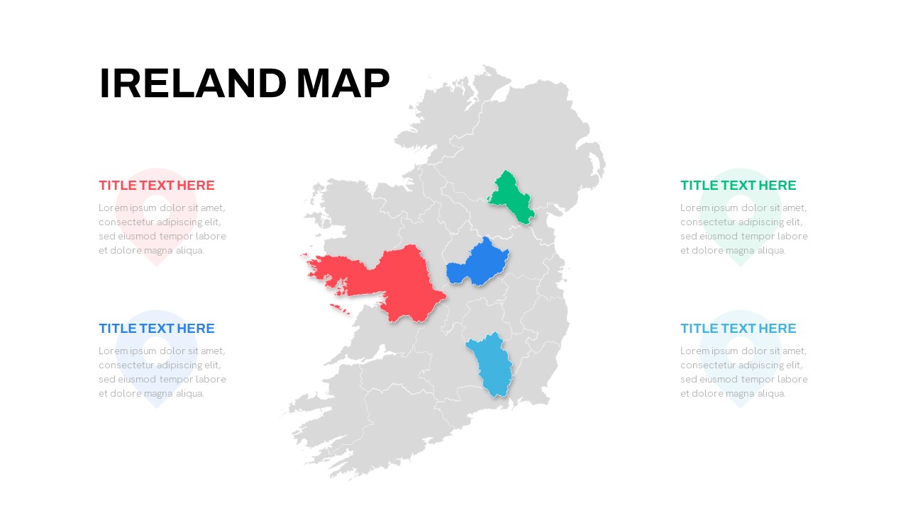
Editable Ireland Map Infographic Slide Template for PowerPoint & Google Slides
World Maps
Free
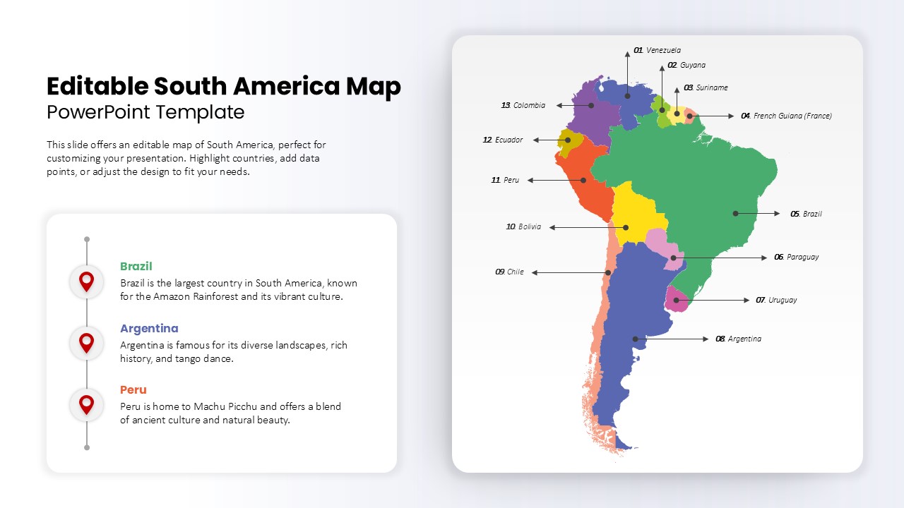
Editable South America Map Diagram Template for PowerPoint & Google Slides
Maps
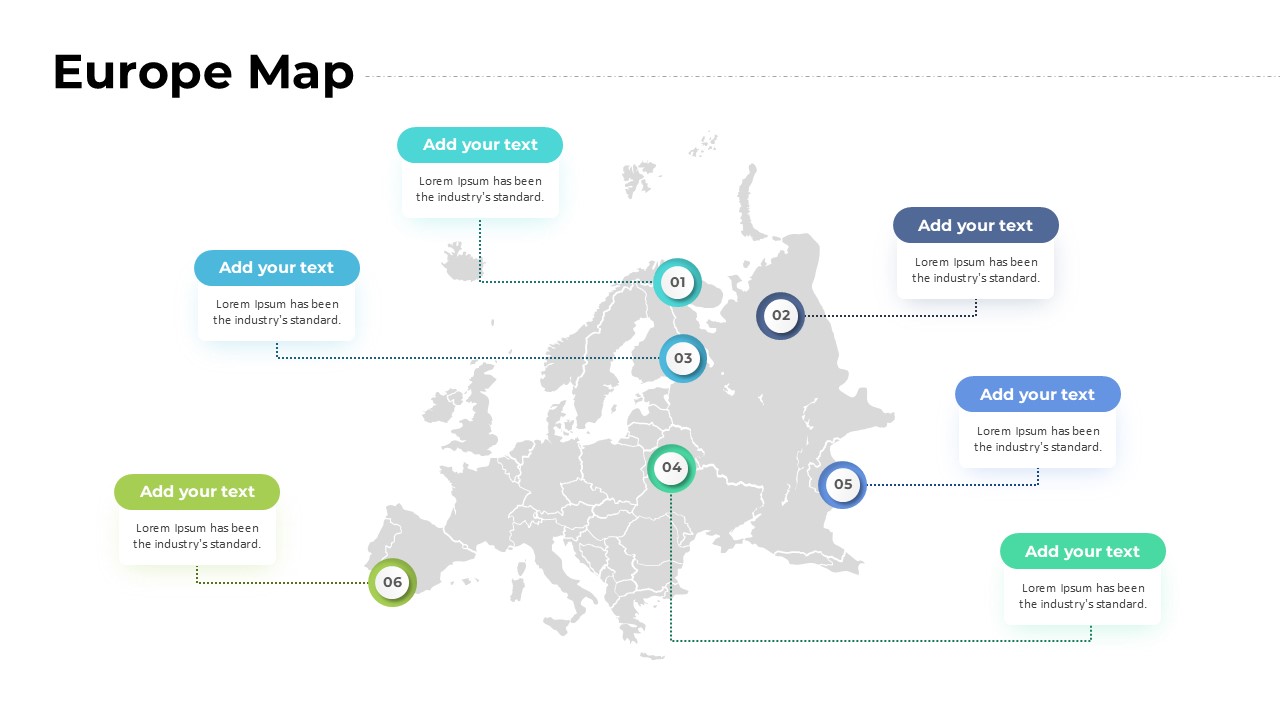
Europe Map with Six Editable Points Template for PowerPoint & Google Slides
World Maps
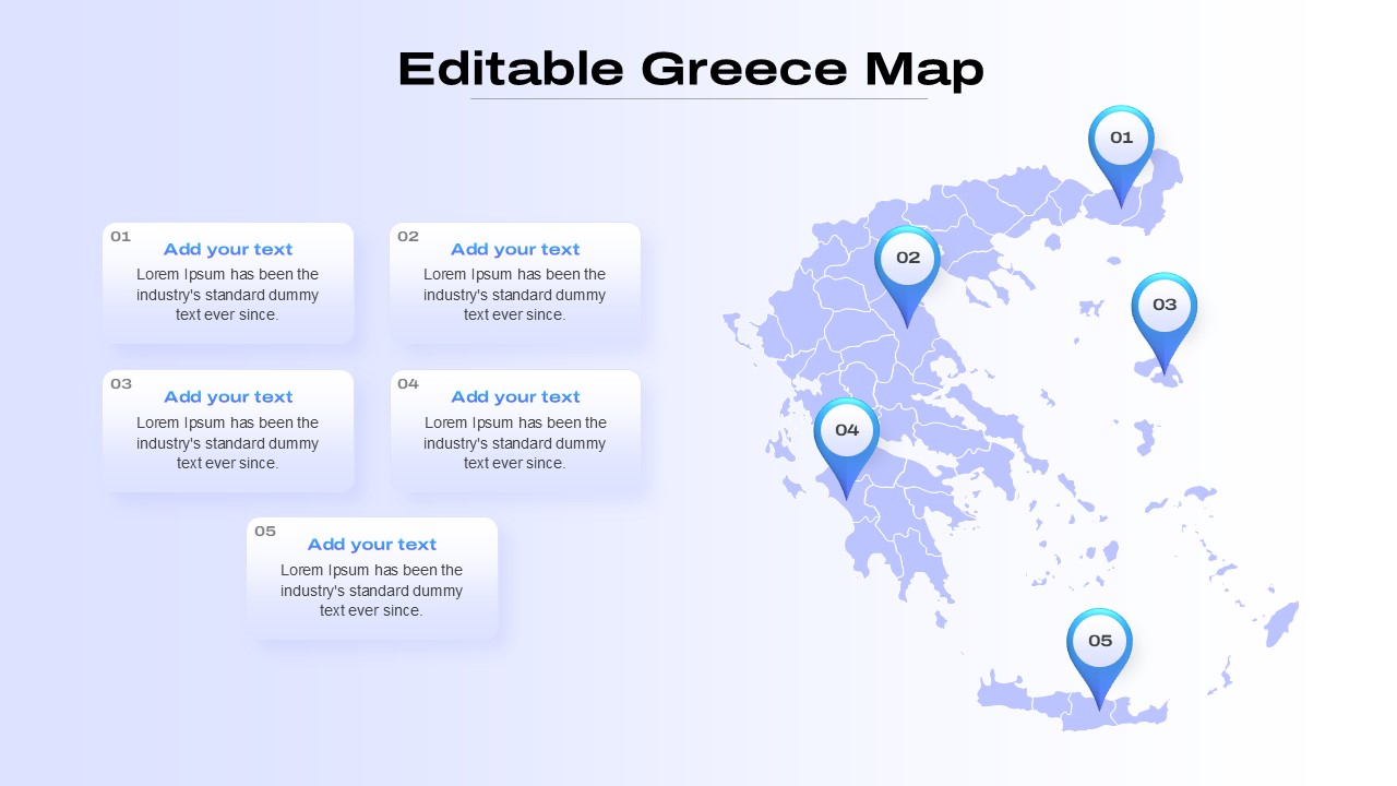
Editable Greece Map for PowerPoint & Google Slides
Maps
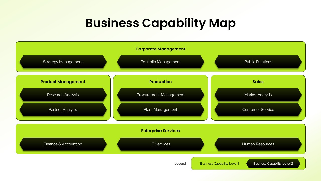
Business Capability Map Editable In PowerPoint & Google Slides
Business Strategy
Free Gear Infographics Template Editable In PowerPoint & Google Slides
Process
Free
Free Check Box PowerPoint Presentation Template
Infographics
Free
Free Editable Simple Column Chart Slide Template for PowerPoint & Google Slides
Bar/Column
Free
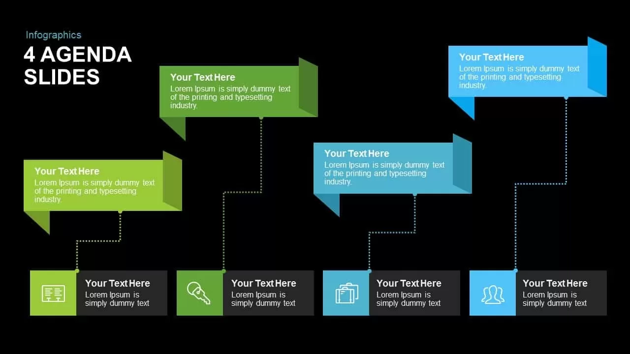
Free Editable Multi-Step Ribbon Agenda Slide Template for PowerPoint & Google Slides
Agenda
Free
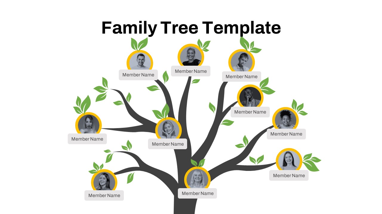
Free Editable Family Tree Genealogy Diagram Template for PowerPoint & Google Slides
Org Chart
Free
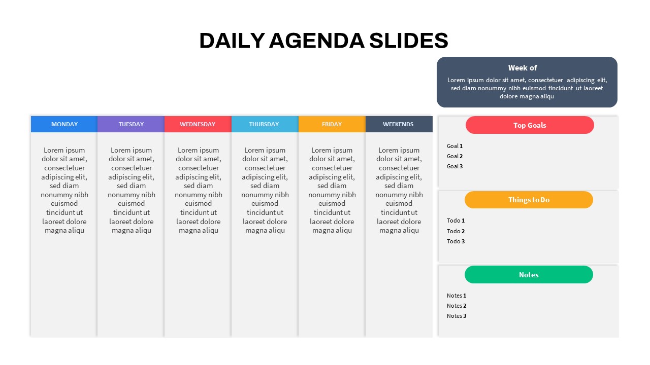
Editable Colorful Daily Agenda Slides Template for PowerPoint & Google Slides
Agenda

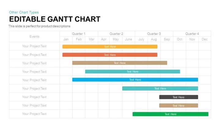
Fully Editable Gantt Chart Timeline template for PowerPoint & Google Slides
Gantt Chart
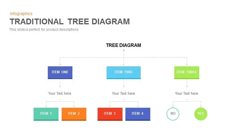
Editable Hierarchical Tree Diagram Template for PowerPoint & Google Slides
Decision Tree
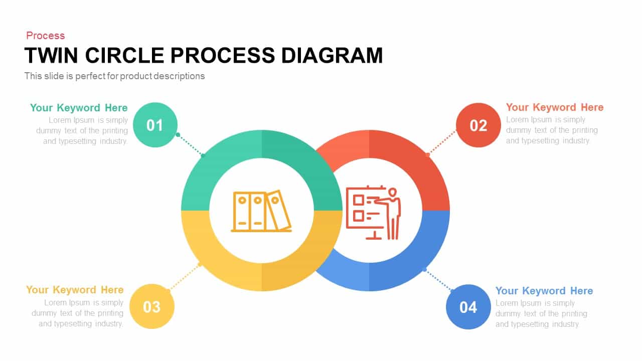
Editable Twin Circle Process Diagram Template for PowerPoint & Google Slides
Process
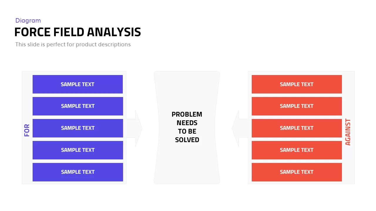
Editable Force Field Analysis Diagram Template for PowerPoint & Google Slides
Business Plan
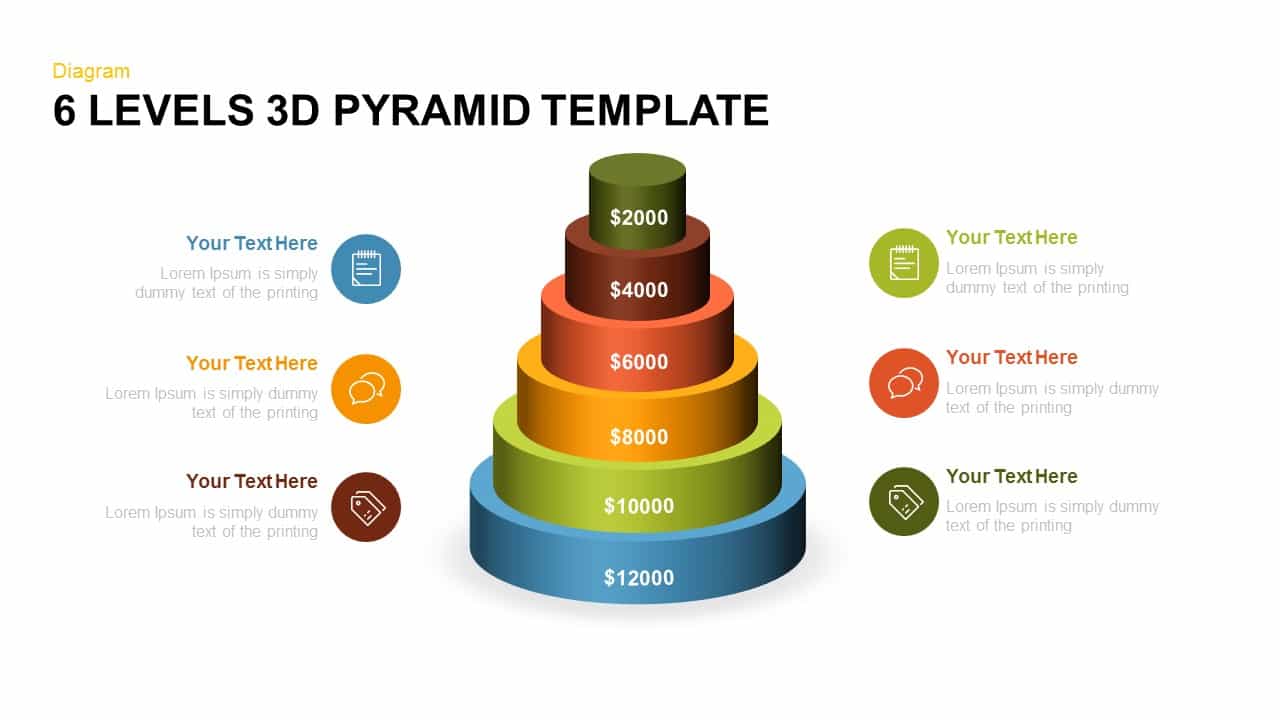
Editable Six-Level 3D Pyramid Diagram Template for PowerPoint & Google Slides
Pyramid
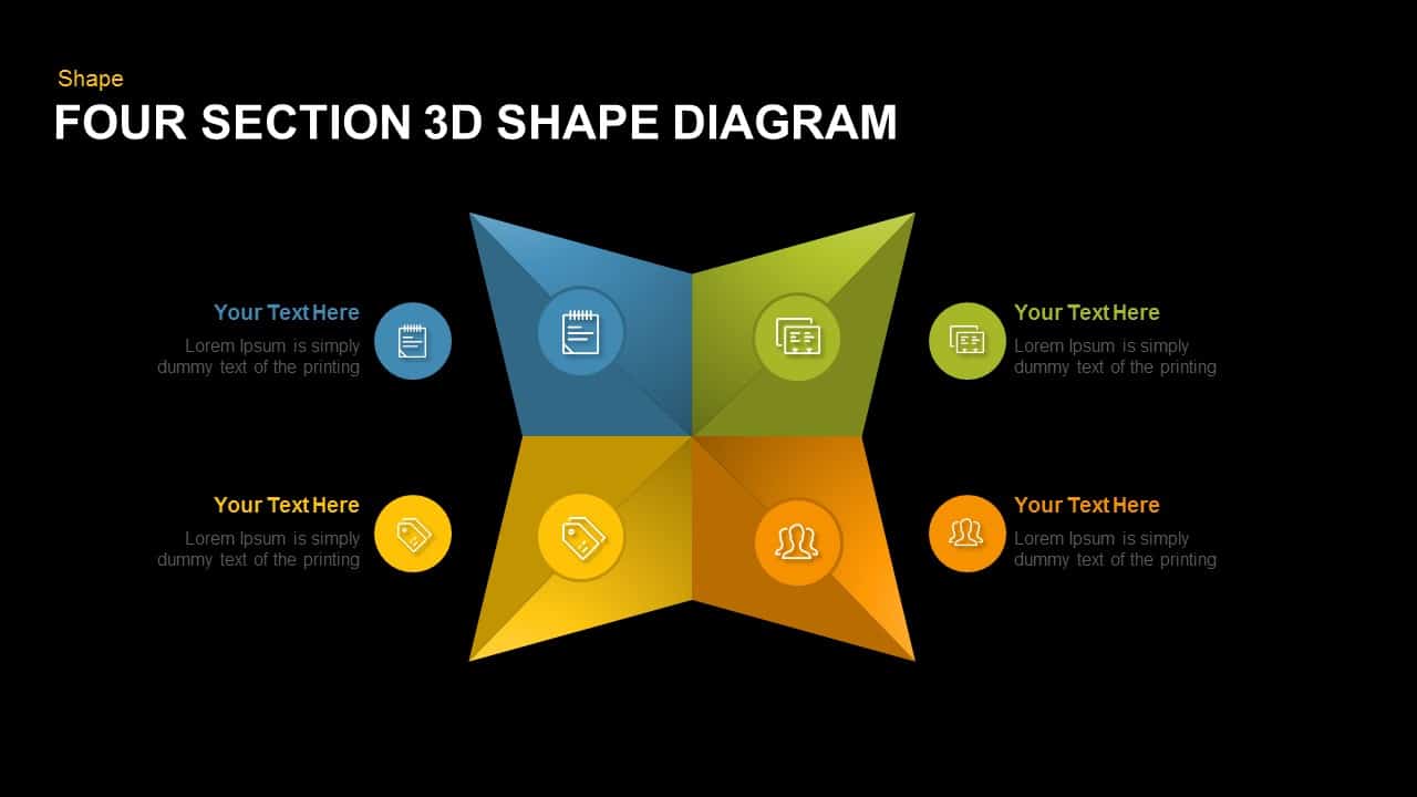
Editable Four-Section 3D Shape Diagram Template for PowerPoint & Google Slides
Comparison
Editable Four-Point Timeline Agenda Template for PowerPoint & Google Slides
Agenda
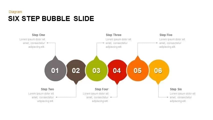
Editable Six-Step Bubble Process Diagram Template for PowerPoint & Google Slides
Process
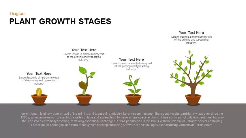
Editable Plant Growth Stages Diagram Template for PowerPoint & Google Slides
Process
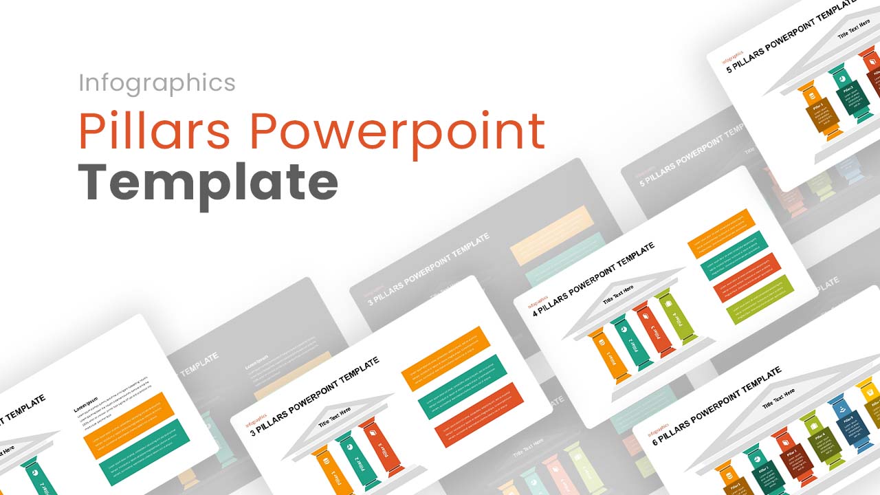
Editable Pillars Infographics Pack Template for PowerPoint & Google Slides
Infographics

Editable SIPOC Process Diagram Deck Template for PowerPoint & Google Slides
Pitch Deck
Editable Four-Quadrant TOWS Matrix Template for PowerPoint & Google Slides
Opportunities Challenges
Editable Buyer Persona Profile Slide Template for PowerPoint & Google Slides
Customer Journey
Editable 2024 Calendar Yearly Overview Template for PowerPoint & Google Slides
Decks
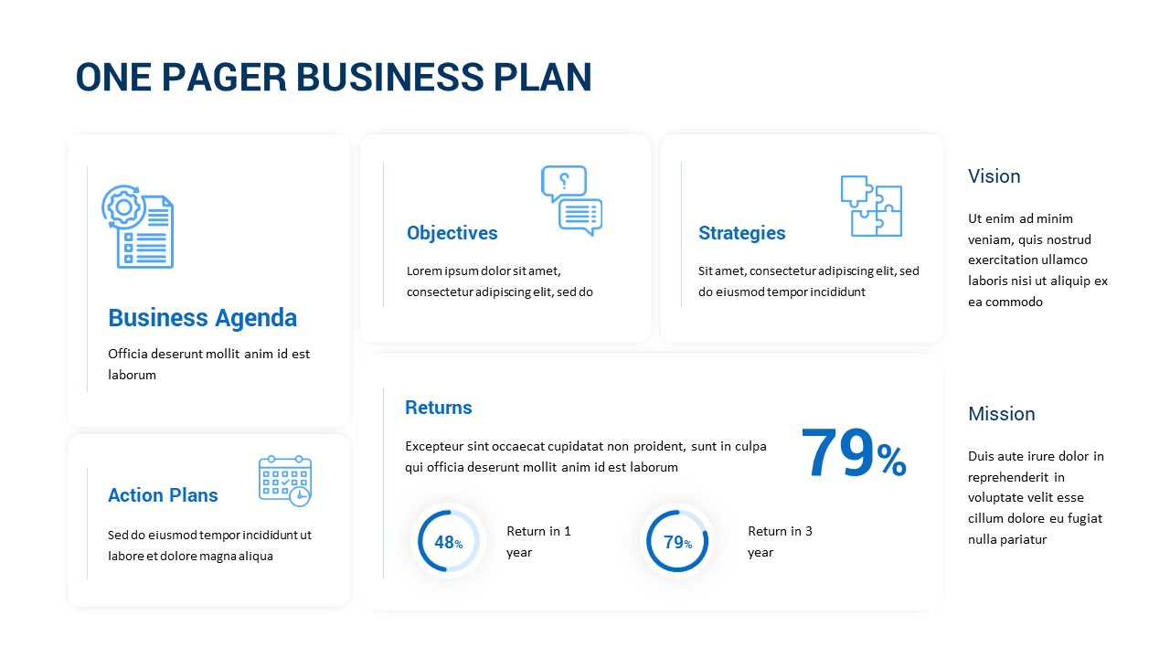
Editable One-Pager Business Plan Slide Template for PowerPoint & Google Slides
Business Plan
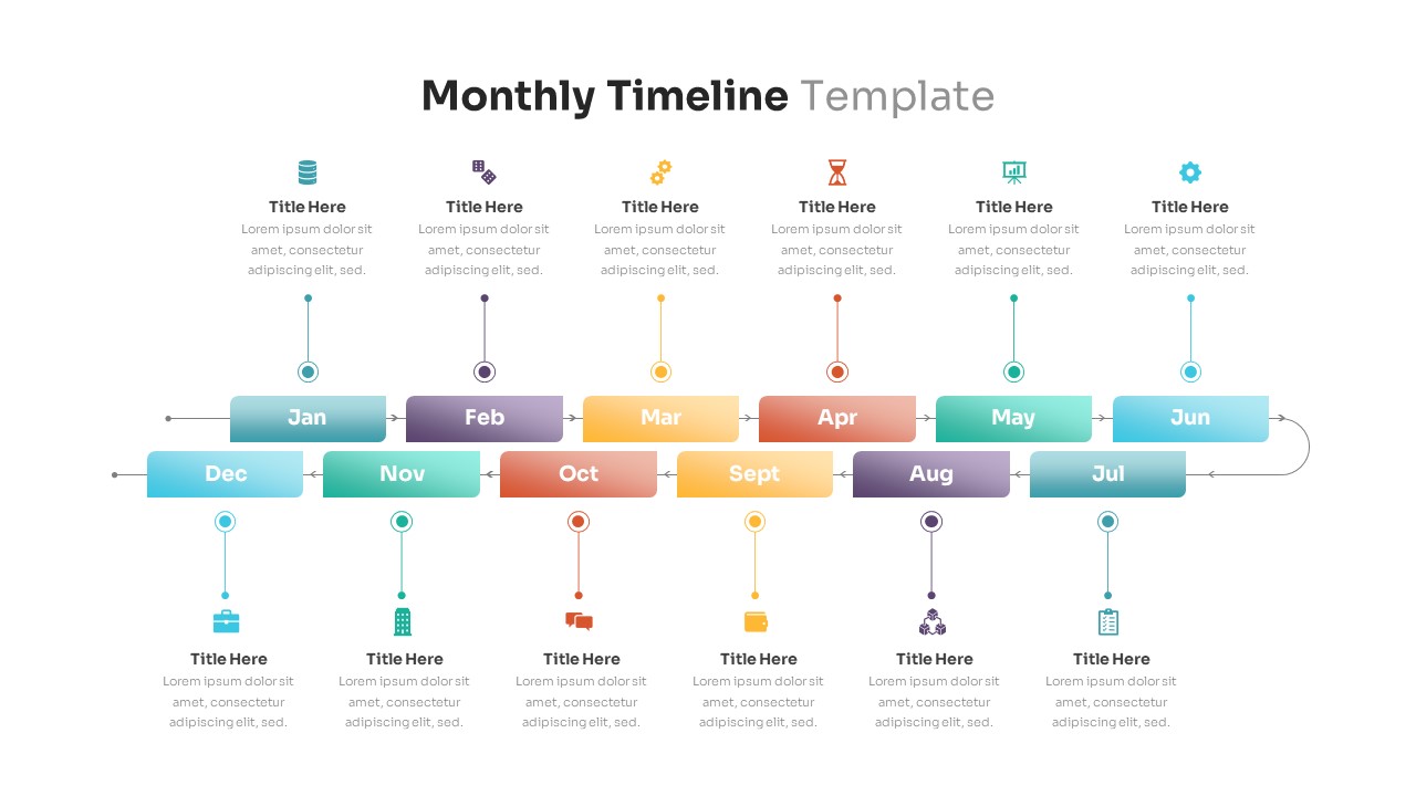
Editable Monthly Timeline Infographic Template for PowerPoint & Google Slides
Timeline
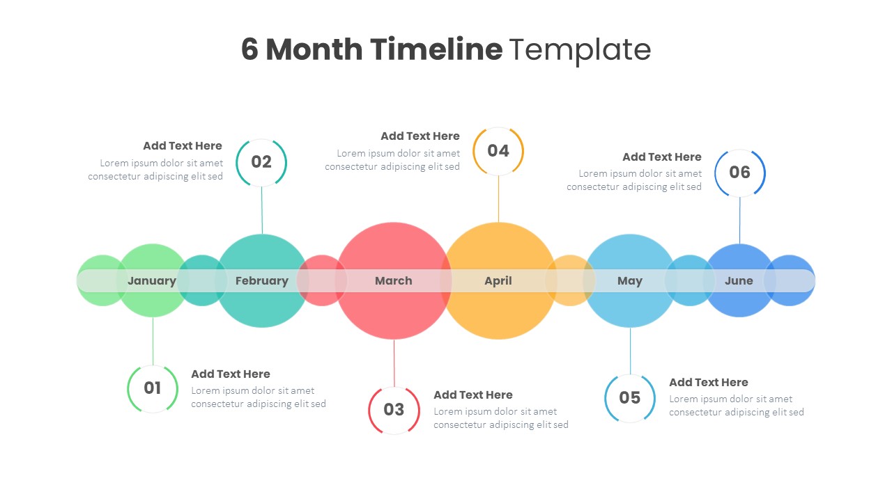
Professional Editable 6 Month Timeline Template for PowerPoint & Google Slides
Timeline
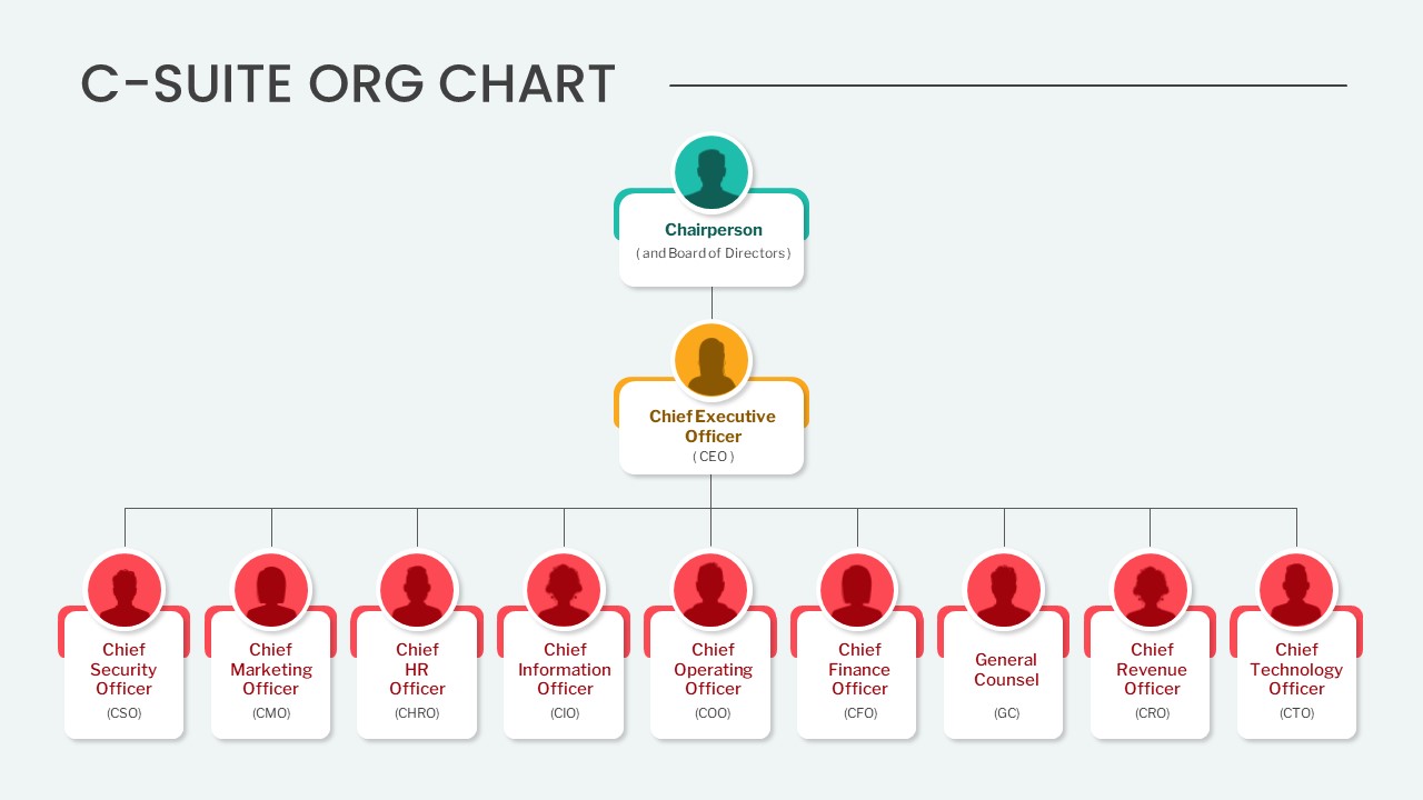
C-Suite Org Chart PowerPoint Template
Org Chart
Editable Sales Pitch Deck Presentation Template for PowerPoint & Google Slides
Pitch Deck
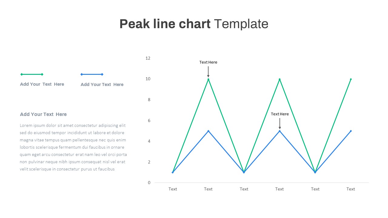
Editable Multi-Series Peak Line Chart Template for PowerPoint & Google Slides
Comparison Chart
Arrow Types PowerPoint Template
Arrow
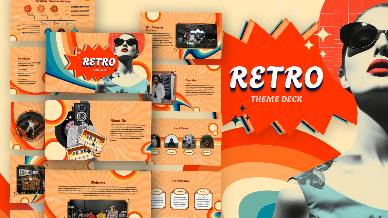
Fully Editable Retro Vintage Theme Deck Template for PowerPoint & Google Slides
Company Profile
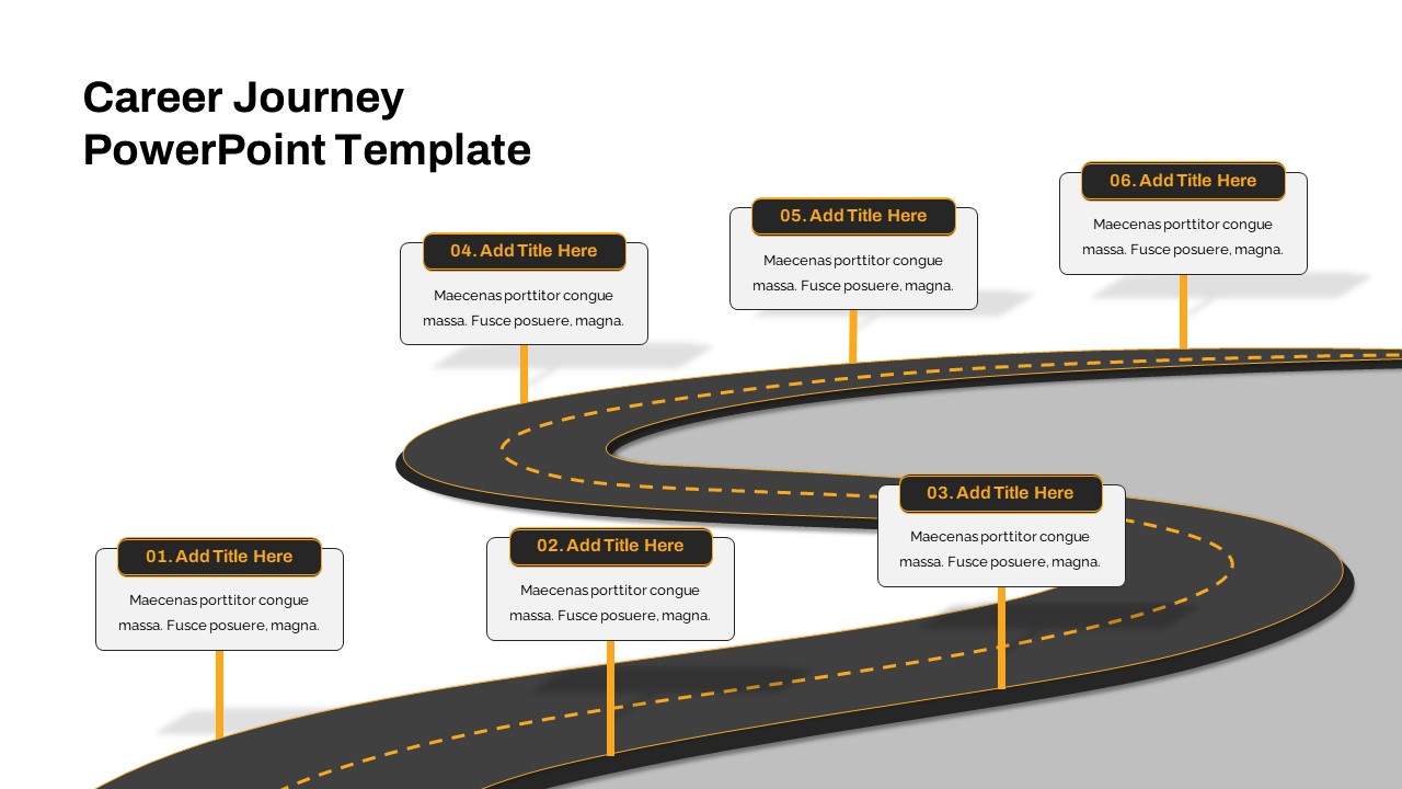
Editable Career Journey PowerPoint Presentation Template
Customer Journey
Free
Fully Editable Watercolor Theme Deck Template for PowerPoint & Google Slides
Pitch Deck
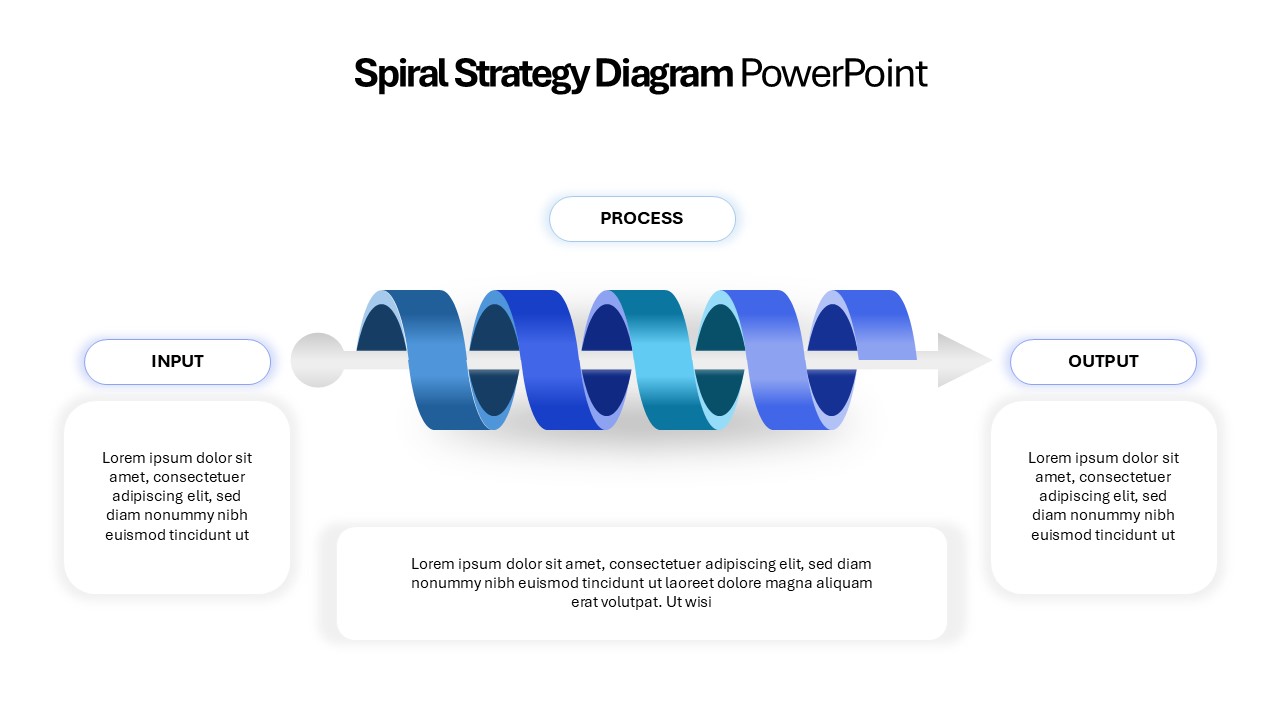
Editable 3D Spiral Strategy Diagram Template for PowerPoint & Google Slides
Process
Editable Timeline Table Template for PowerPoint Presentations & Google Slides
Timeline
Web Marketing Strategy Template Editable In PowerPoint & Google Slides
Digital Marketing
Agile Project Plan Template Editable in for PowerPoint & Google Slides
Project Management
Social Work PowerPoint Template For Free
Pitch Deck
Free
Free Nonprofit Charity Social Impact Deck Template for PowerPoint & Google Slides
Pitch Deck
Free
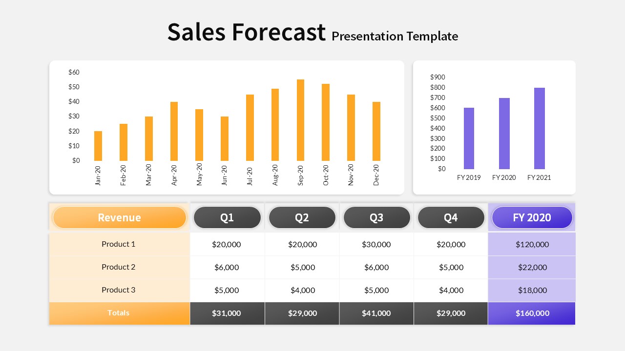
Editable Sales Forecast PPT Template & Slides
Revenue
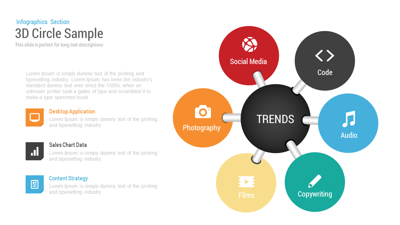
3D Circle Sample Editable Slide Template for PowerPoint
Circular
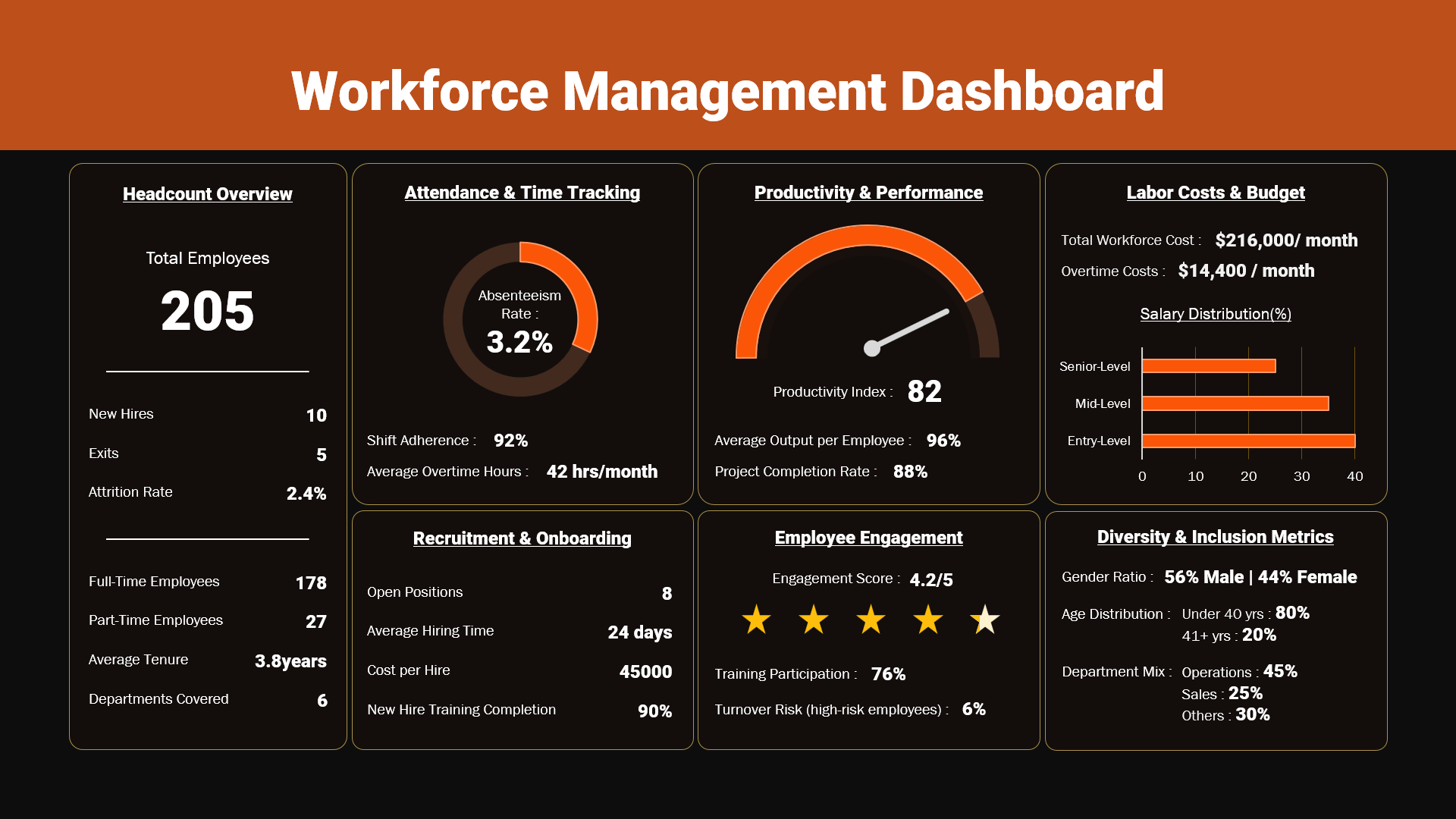
Editable Workforce Management Dashboard PowerPoint Template
Dashboard
Editable Restaurant Marketing Plan Presentation Template
Business Plan

News Metaphor Media Communication Slide Template for PowerPoint & Google Slides
Business Report
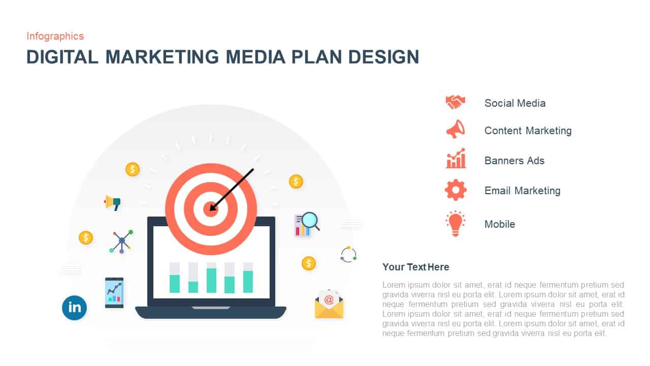
Digital Marketing Media Plan Infographic Template for PowerPoint & Google Slides
Digital Marketing
Influencer Media Kit Company Profile Template for PowerPoint & Google Slides
Company Profile
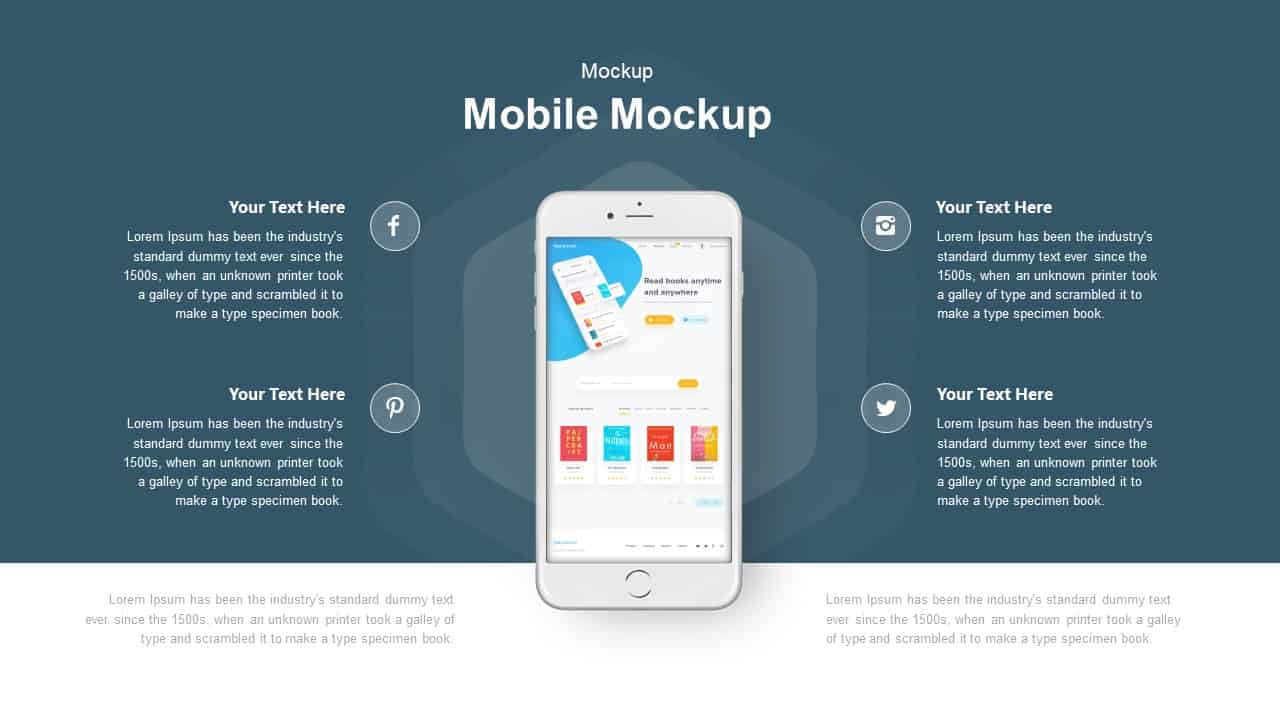
Mobile Mockup with Social Callouts Template for PowerPoint & Google Slides
Software Development
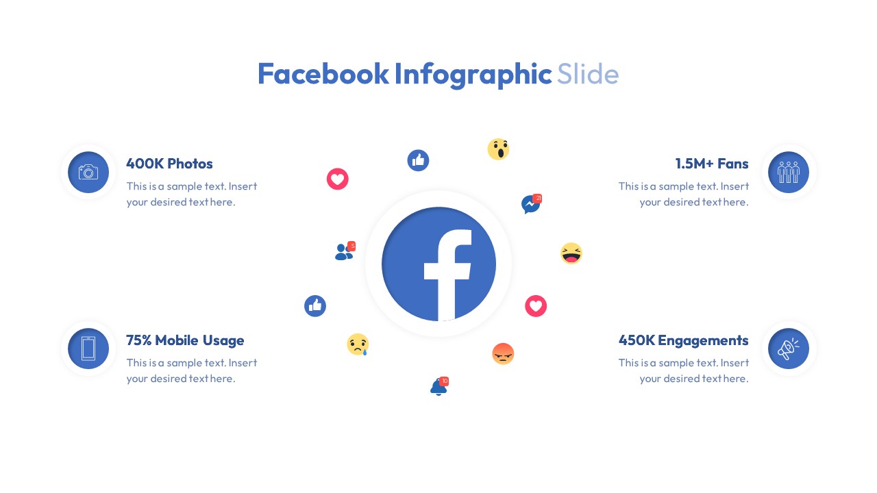
Facebook Social Metrics Infographic Template for PowerPoint & Google Slides
Graphics