Donut Chart Data Breakdown template for PowerPoint & Google Slides
Donut Slide Template
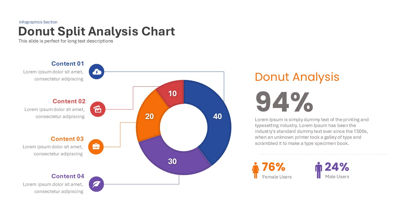
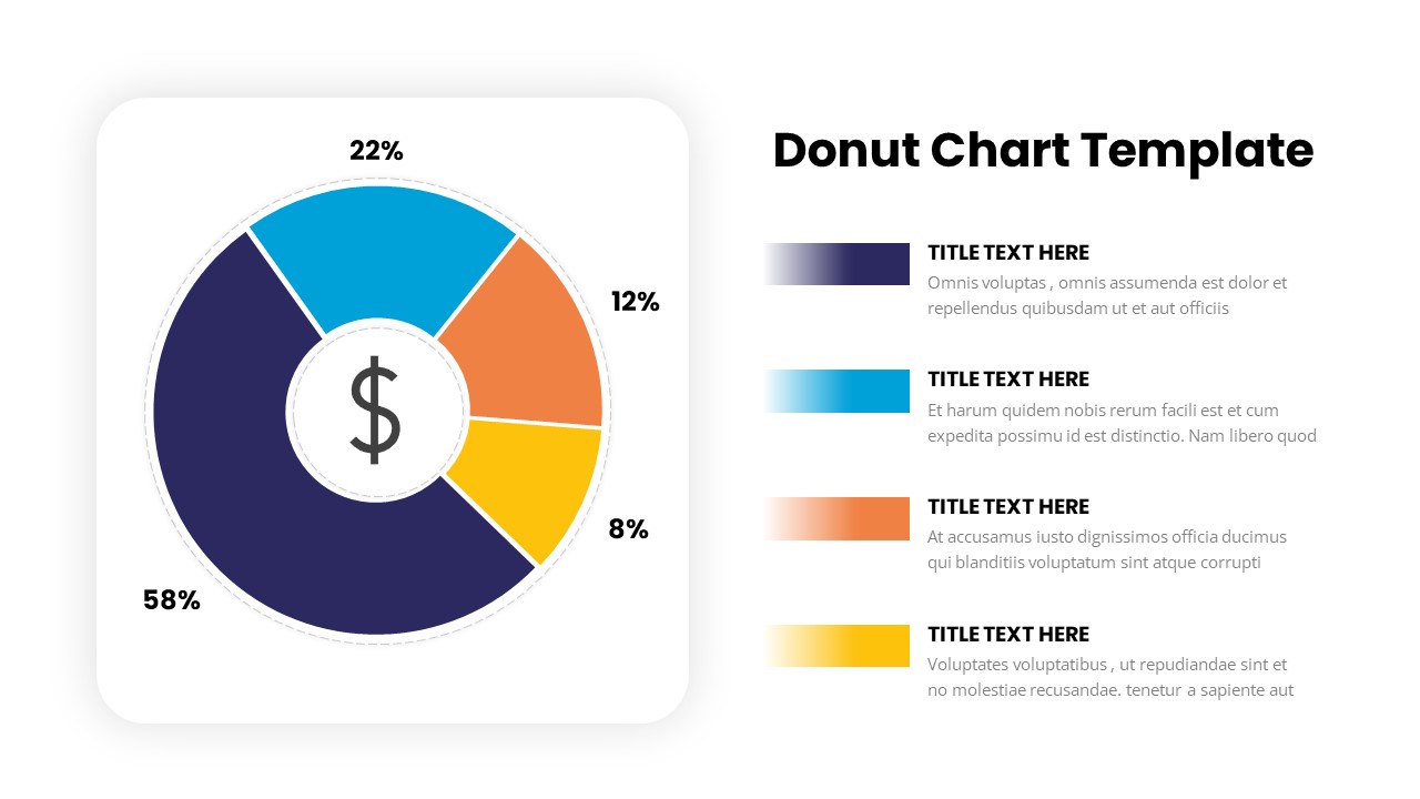
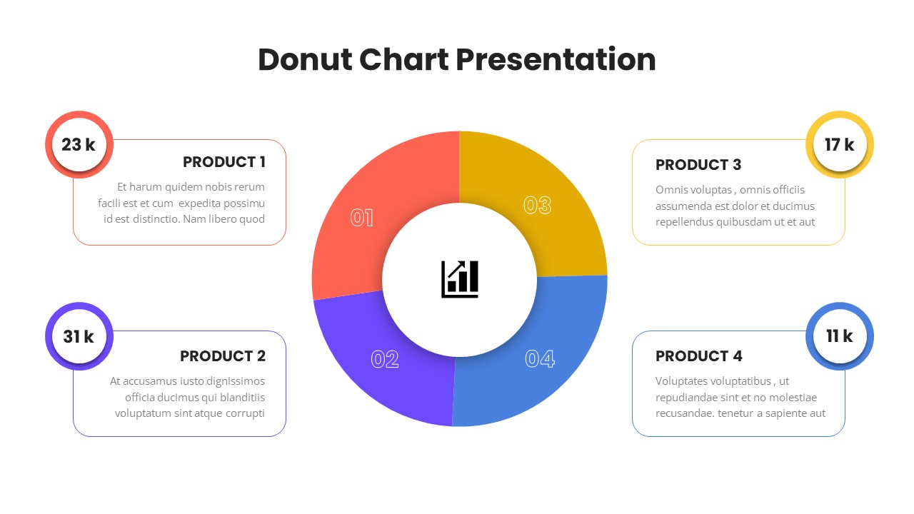
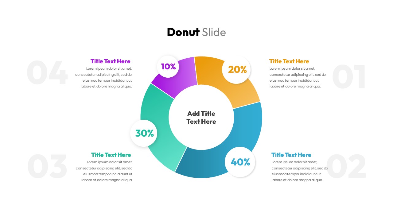
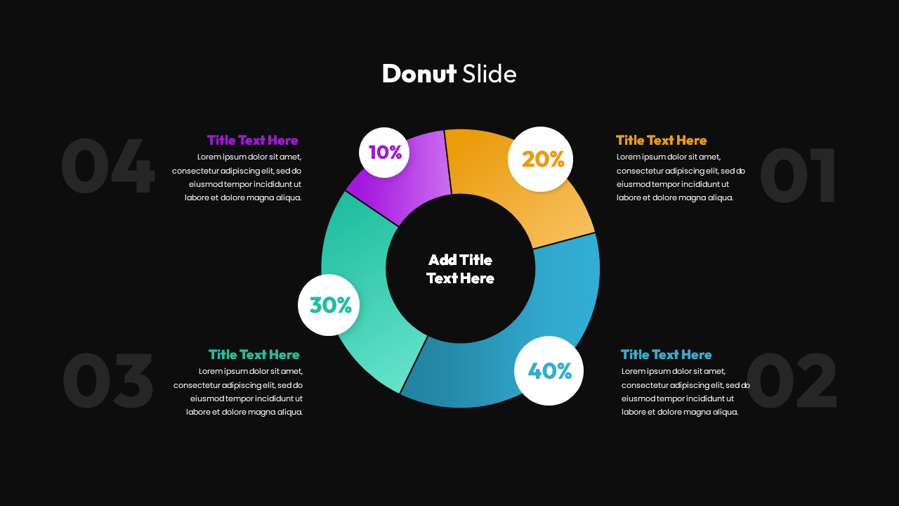
This visually engaging Donut Chart slide is perfect for presenting percentage-based data in a clean, colorful, and easy-to-understand format. The chart is divided into four sections, each represented by a distinct color—purple, yellow, orange, and blue—allowing for quick differentiation between data points. With percentage values clearly labeled within each section (10%, 20%, 30%, 40%), this design allows for a dynamic and informative presentation of any data analysis or comparative statistics.
The layout includes ample space around the donut chart to add detailed descriptions for each data segment. These text boxes can be customized to provide context for each percentage or describe the key takeaways, making it suitable for business presentations, sales meetings, or project reports. The vibrant colors and clear typography ensure your audience will be able to follow the data presentation with ease, while the donut chart design keeps the focus on the percentages and their significance.
Fully editable and compatible with both PowerPoint and Google Slides, this template allows for easy customization, enabling you to adjust the colors, text, and layout to best fit your presentation needs.
Who Should Download This Donut Chart PowerPoint Layout?
This PowerPoint Donut Comparison Chart is ideal for data analysts, business professionals, project managers, and marketing teams who need to deliver data-heavy narratives in a digestible format. It serves as a turnkey solution for teams conducting quarterly performance reviews, designing sales presentations, delivering project status updates, or facilitating strategic business meetings. By using this responsive layout, professionals can quickly update text blocks to provide deep context for each percentage or describe critical takeaways, ensuring the audience follows the data presentation with absolute ease.
Alternative Applications for this Donut Slide Template
Beyond standard data analysis, you can seamlessly adapt this donut chart Google Slides template for corporate budget breakdowns, market share comparisons, resource allocation pitches, and goal-setting reviews. It is equally effective for illustrating customer demographics, displaying visual survey results, or managing any operational scenario where segmented data needs to be clearly conveyed to stakeholders. The versatile, fully editable structure keeps the focus entirely on your specific metrics and their strategic significance, making this asset a highly adaptable tool for any professional presentation deck.
Login to download this file

Item ID
SB03227


Related Templates

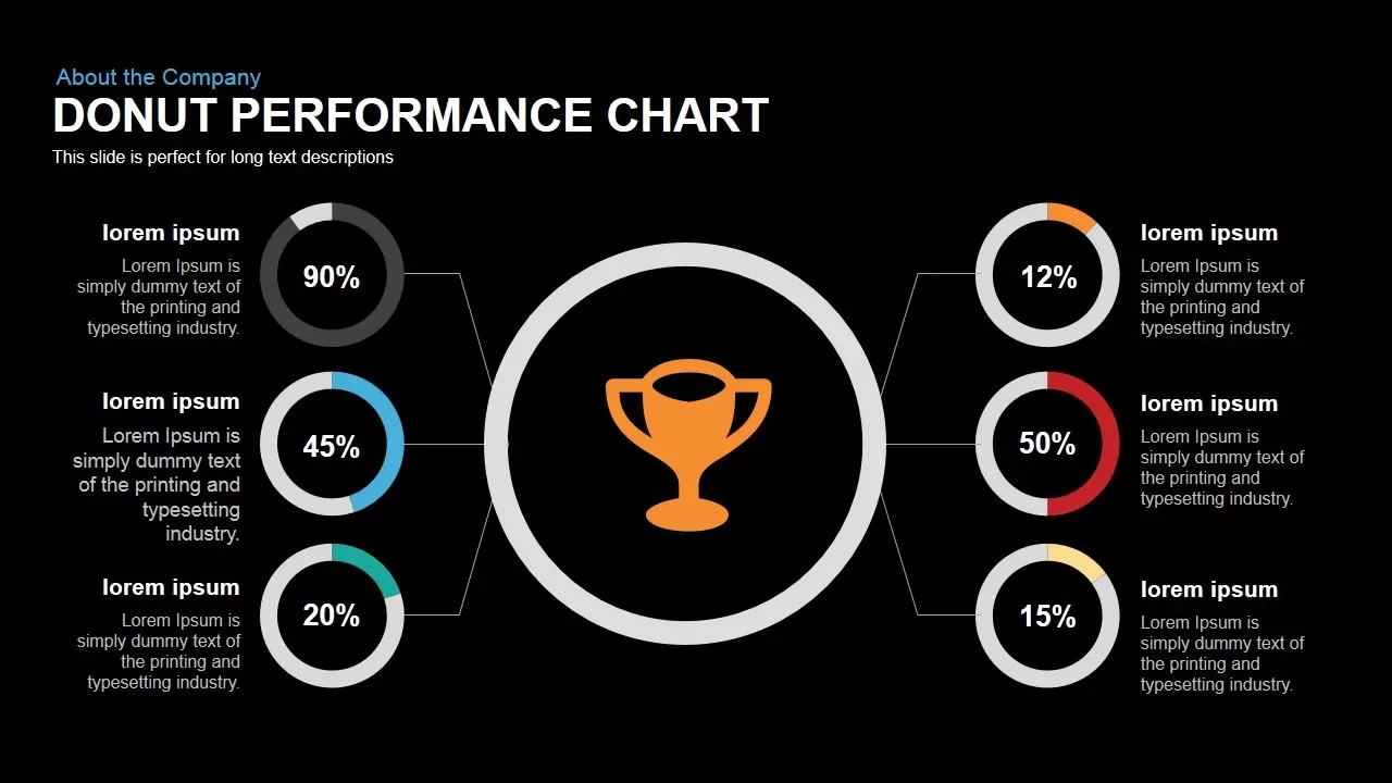
Donut Performance Chart template for PowerPoint & Google Slides
Pie/Donut
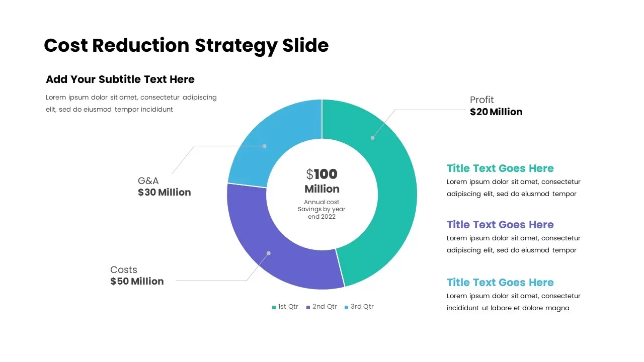
Cost Reduction Strategy Donut Chart Template for PowerPoint & Google Slides
Pie/Donut
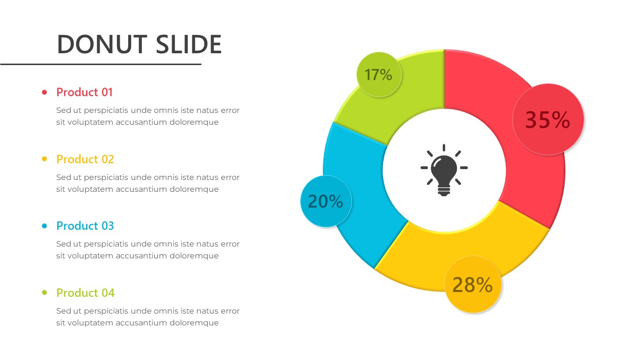
Donut Chart Template for PowerPoint & Google Slides
Pie/Donut
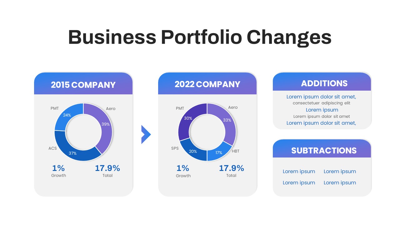
Business Portfolio Changes PPT Template
Pie/Donut
Technical Skills Donut Chart Overview Template
HR
Marketing Budget Allocation PowerPoint Template
Marketing
Donut Chart Infographic Template for PowerPoint
Pie/Donut
Donut Split Analysis Chart PowerPoint Template
Pie/Donut

Comparison Donut Chart PowerPoint Template
Pie/Donut

8 Section Donut Chart PowerPoint Template
Pie/Donut
Donut Chart PowerPoint Template
Pie/Donut
Multi level Donut Chart Template
Pie/Donut
Donut Chart Split Representation Template
Charts
Donut Chart Presentation Template
Pie/Donut
SIPOC Diagram with Process Breakdown Template for PowerPoint & Google Slides
Process
Amortization Breakdown Overview Template
Finance
Marketing Budget Allocation PowerPoint Template
Finance
KPI Tree Template
Infographics
Work Breakdown Structure Template for PowerPoint and Slides
Diagrams
Donut Diagram PowerPoint Template
Pie/Donut