3D Spheres Fill Level Infographic Deck Template for PowerPoint & Google Slides


Description
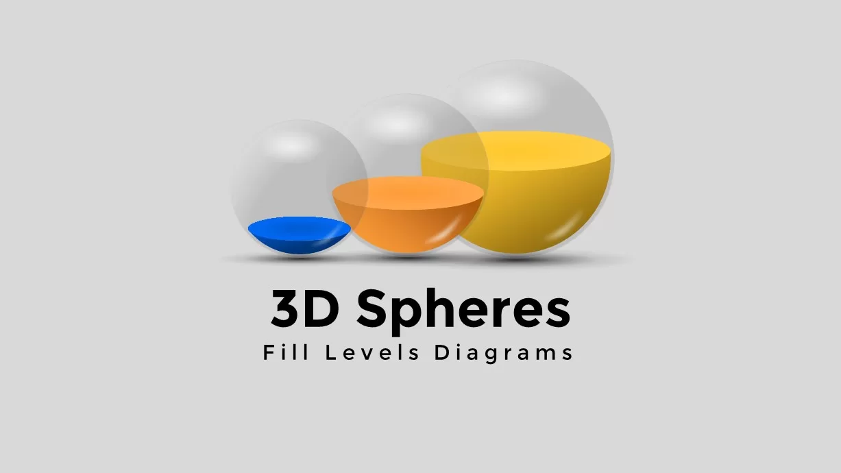
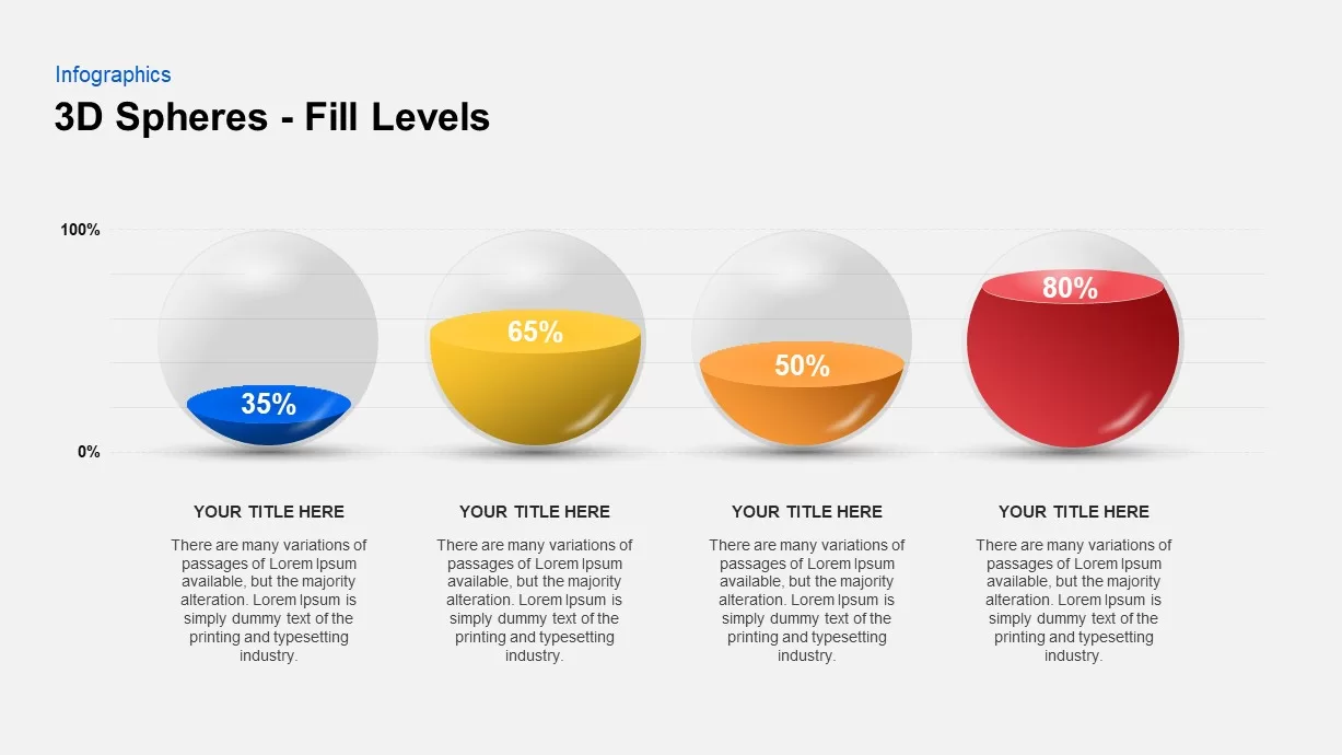
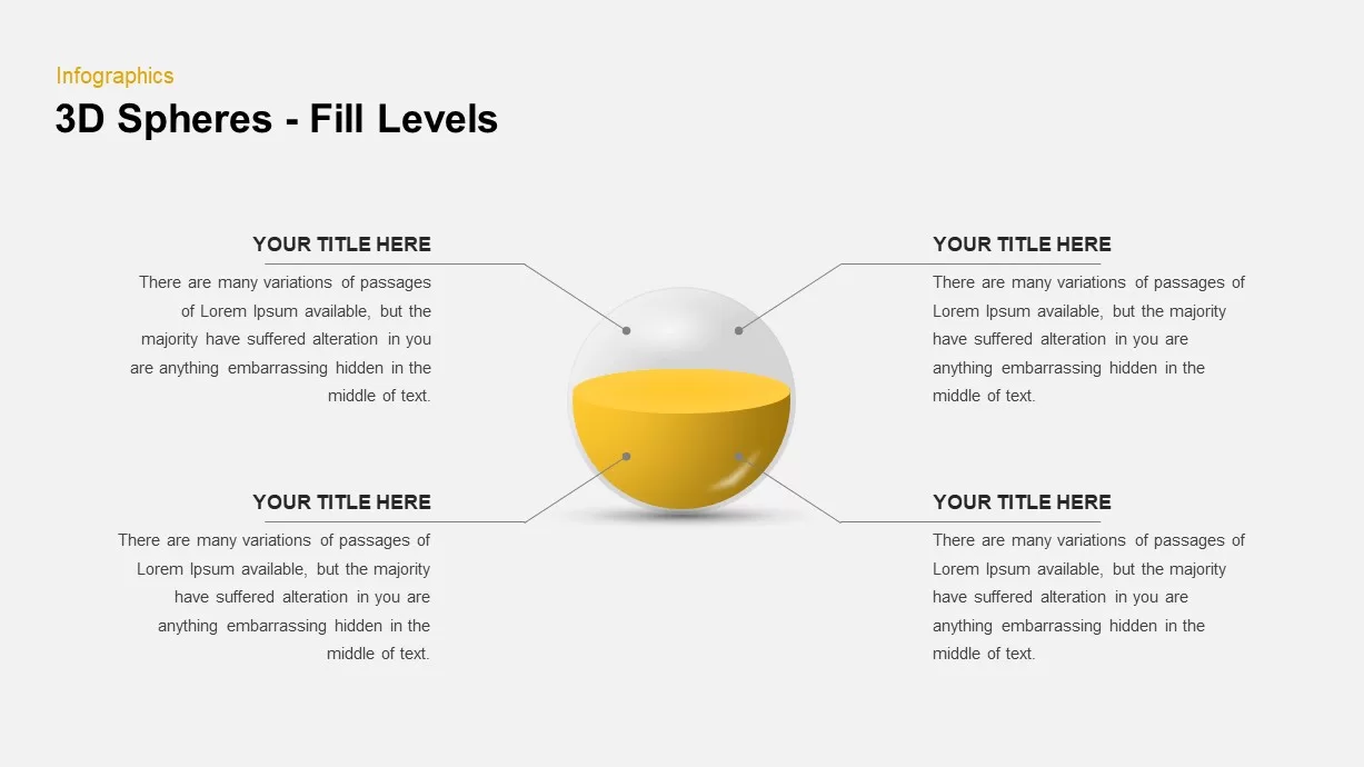
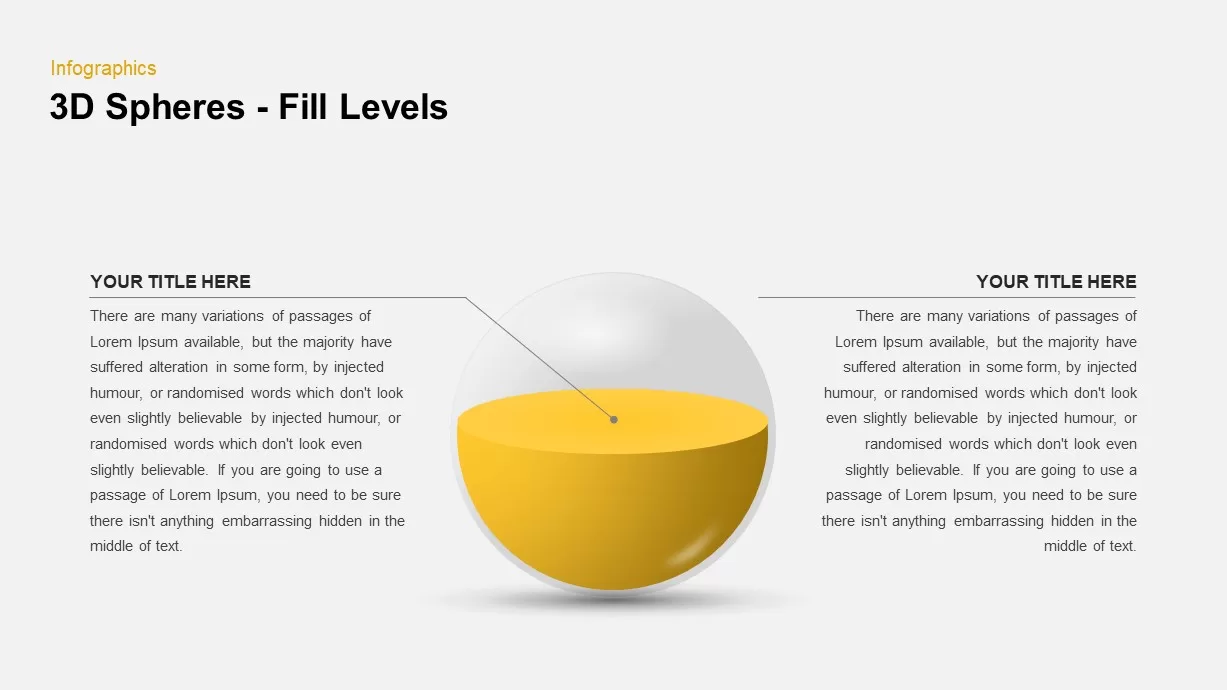
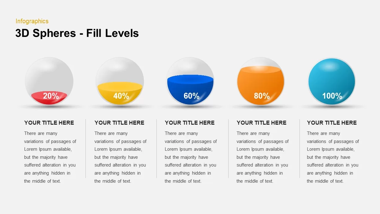
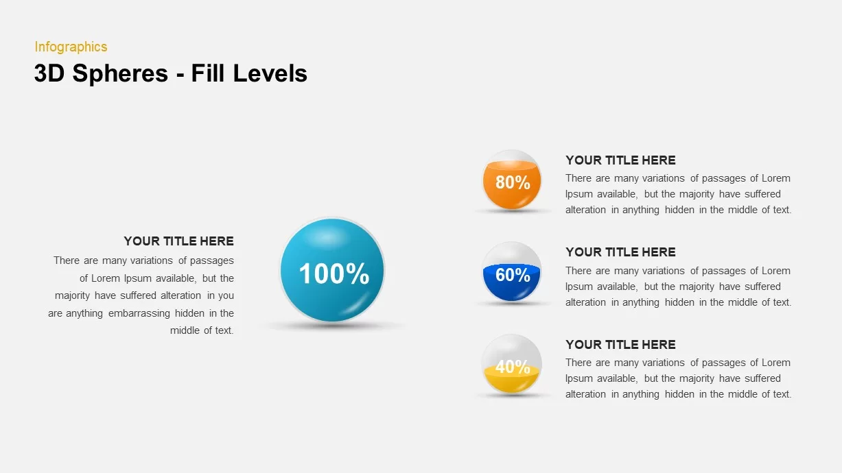
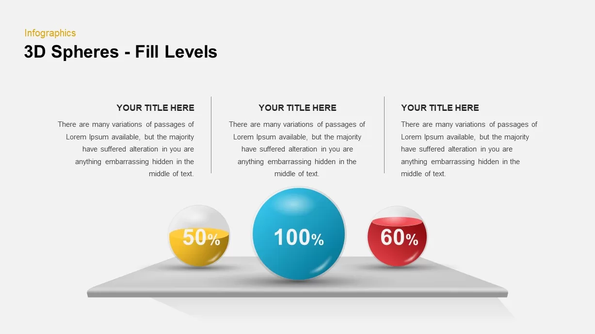
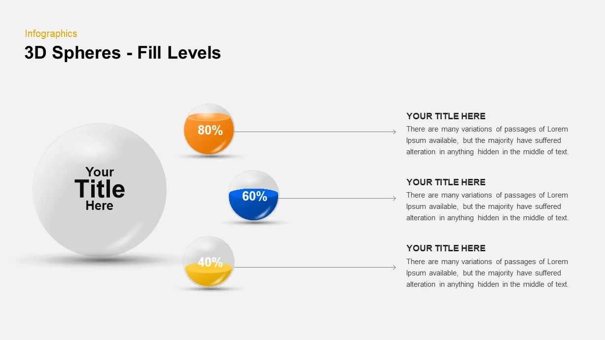
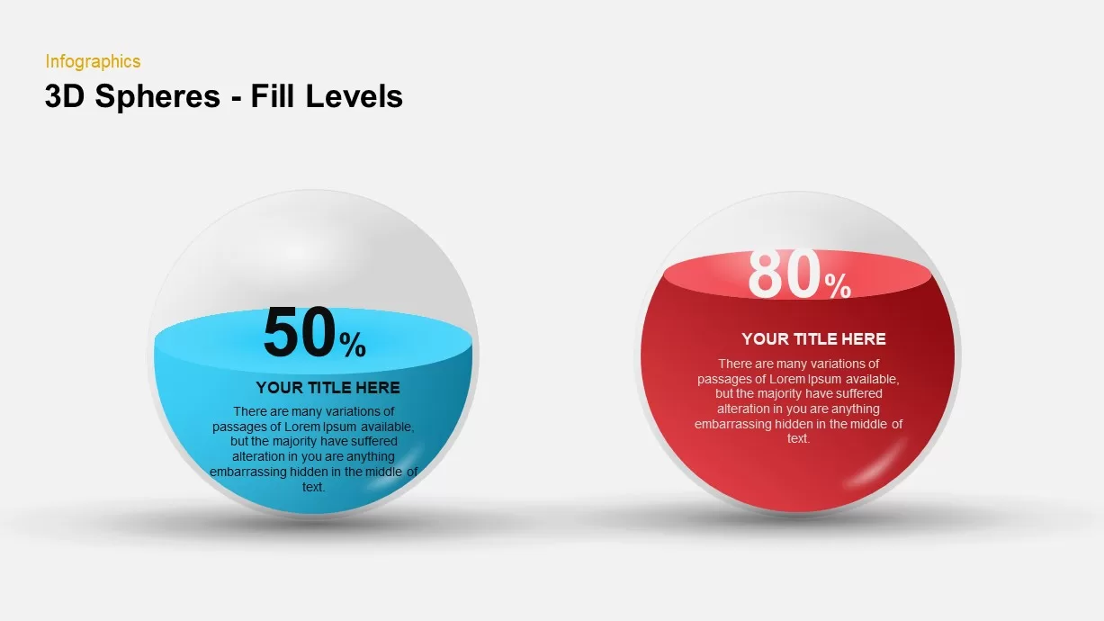
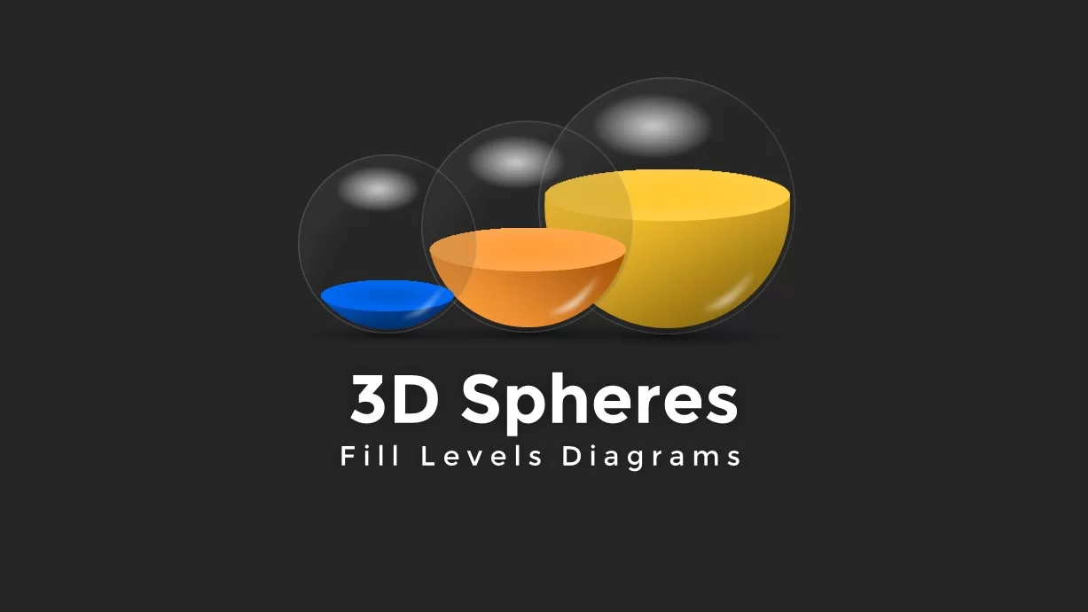
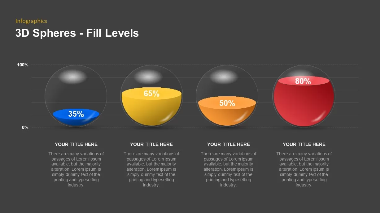
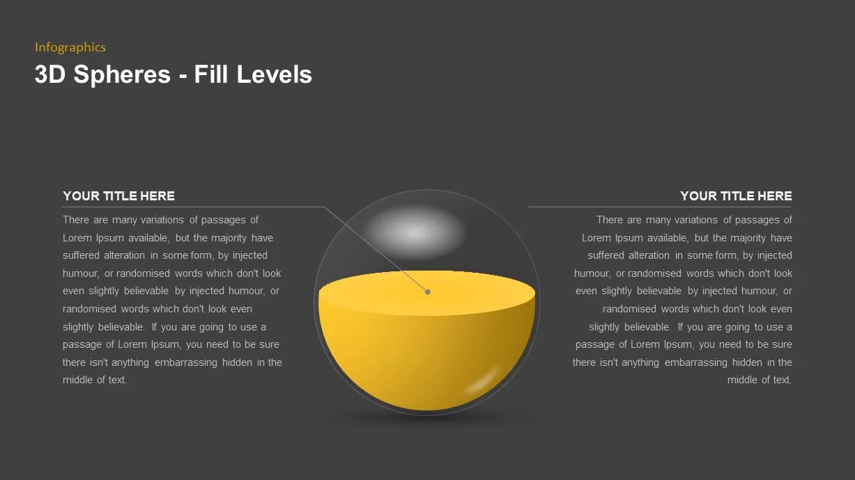
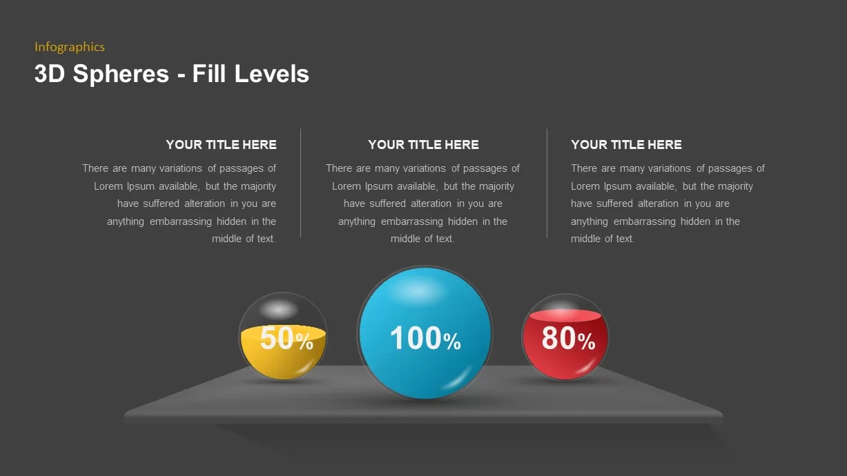
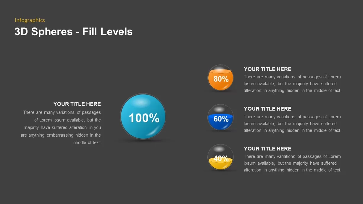
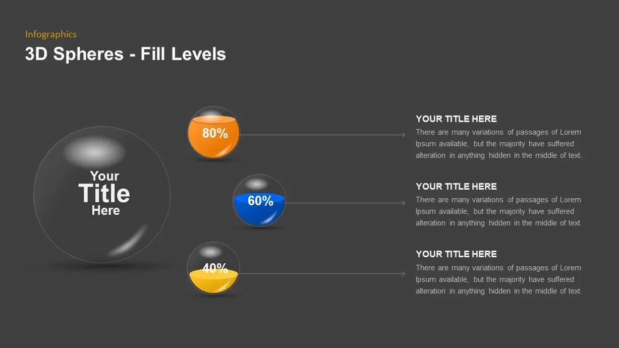
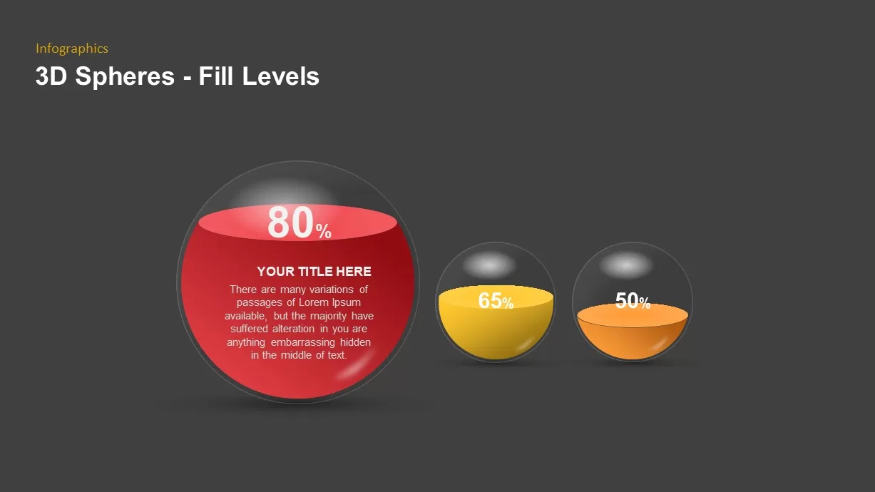
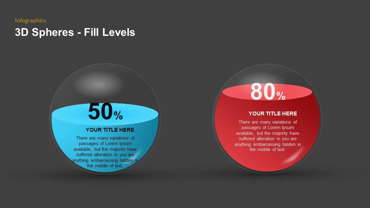
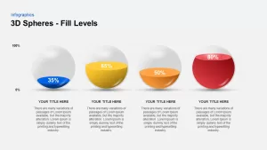
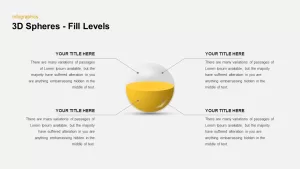
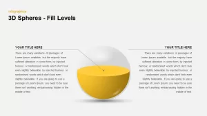
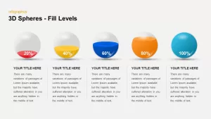
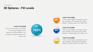
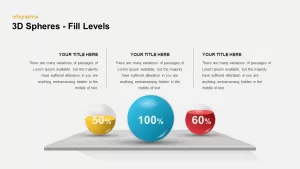
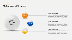
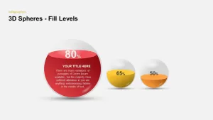
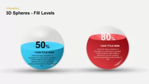
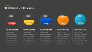
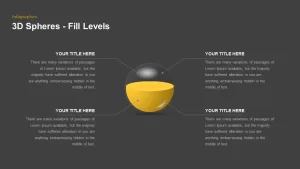
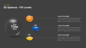
This 3D Spheres Fill Level Infographic Deck features ten versatile slides showcasing semi-transparent spheres partially filled with vibrant liquid layers—blue, yellow, orange, red, and teal—to represent percentage or capacity values. The collection includes a full-width comparative chart with gridlines and labels, a central spotlight diagram with four callouts, a horizontal progression of five fill-level spheres, and modular layouts combining a main sphere with three smaller data points. All graphics are built from editable vector shapes on master slides, allowing you to adjust fill percentages, swap colors, change text, and resize without loss of quality. Subtle drop shadows and highlights create a realistic 3D effect, while clean typography and consistent alignment guides ensure a polished professional look.
Who is it for
Data analysts, marketing professionals, and project managers will use these 3D sphere diagrams to present survey results, resource utilization, KPI achievements, or progress milestones. Trainers and consultants can leverage the eye-catching visuals to reinforce key metrics during workshops and briefings.
Other Uses
Beyond percentage displays, repurpose these spheres for capacity planning, budget allocation breakdowns, risk level indicators, or comparative performance snapshots. The modular layouts also suit dashboards, executive summaries, and digital reports.
Login to download this file

Item ID
SB01692
Related Templates

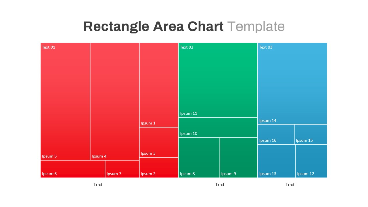
Rectangle Area Chart with Gradient Fill Template for PowerPoint & Google Slides
Comparison Chart
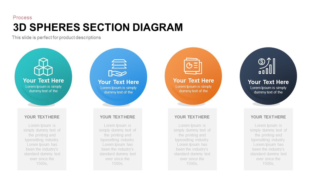
Four-Part 3D Spheres Section Diagram template for PowerPoint & Google Slides
Process

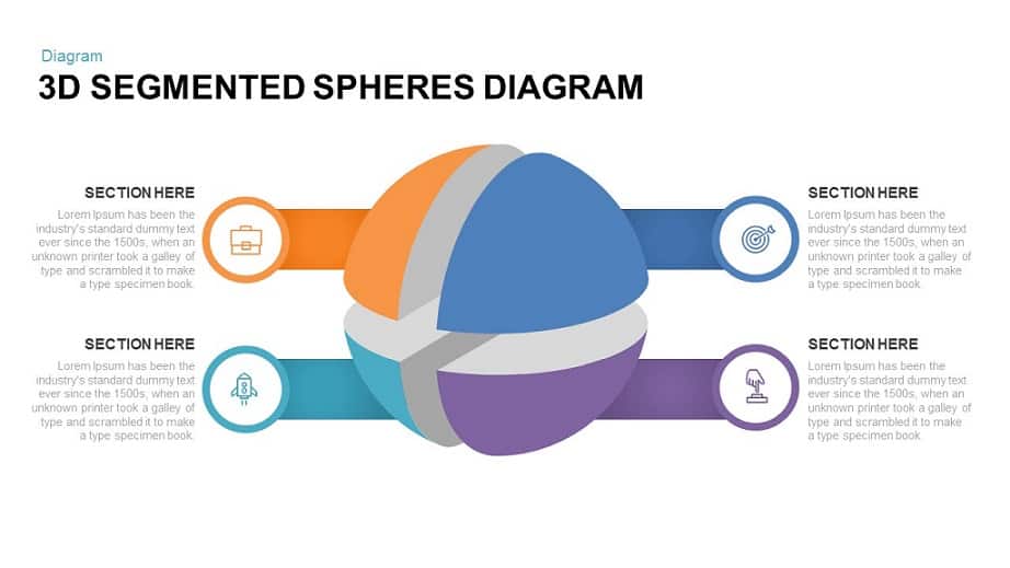
3D Segmented Spheres Diagram template for PowerPoint & Google Slides
Infographics

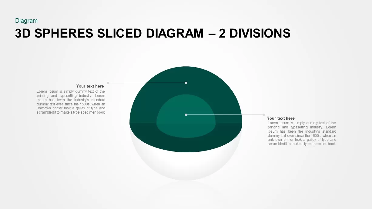
3D Spheres Sliced Diagram – 2 Divisions template for PowerPoint & Google Slides
Infographics
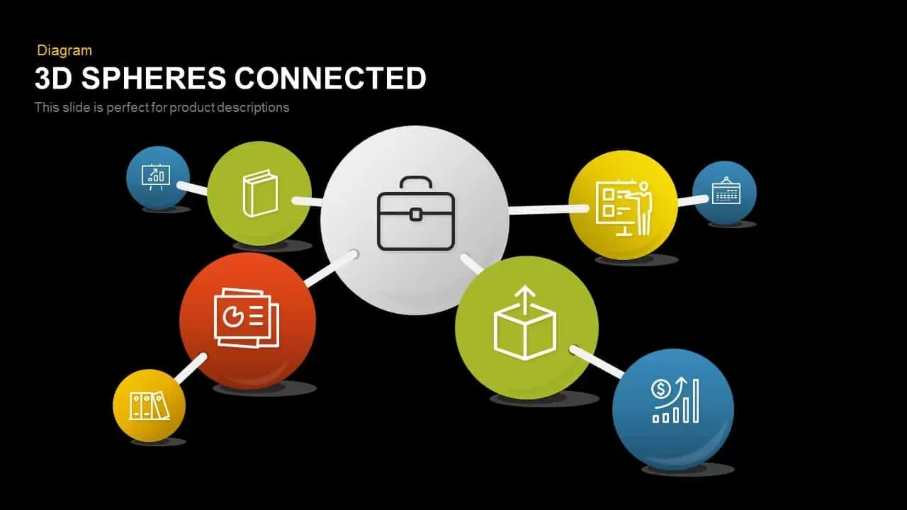
3D Spheres Connected PowerPoint Template and Google Slide Template
Process
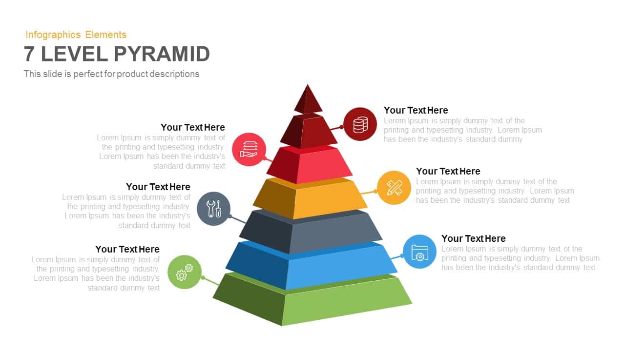
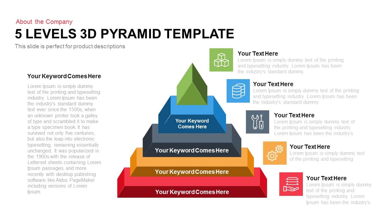
7-Level 3D Pyramid Infographic Diagram Template for PowerPoint & Google Slides
Pyramid
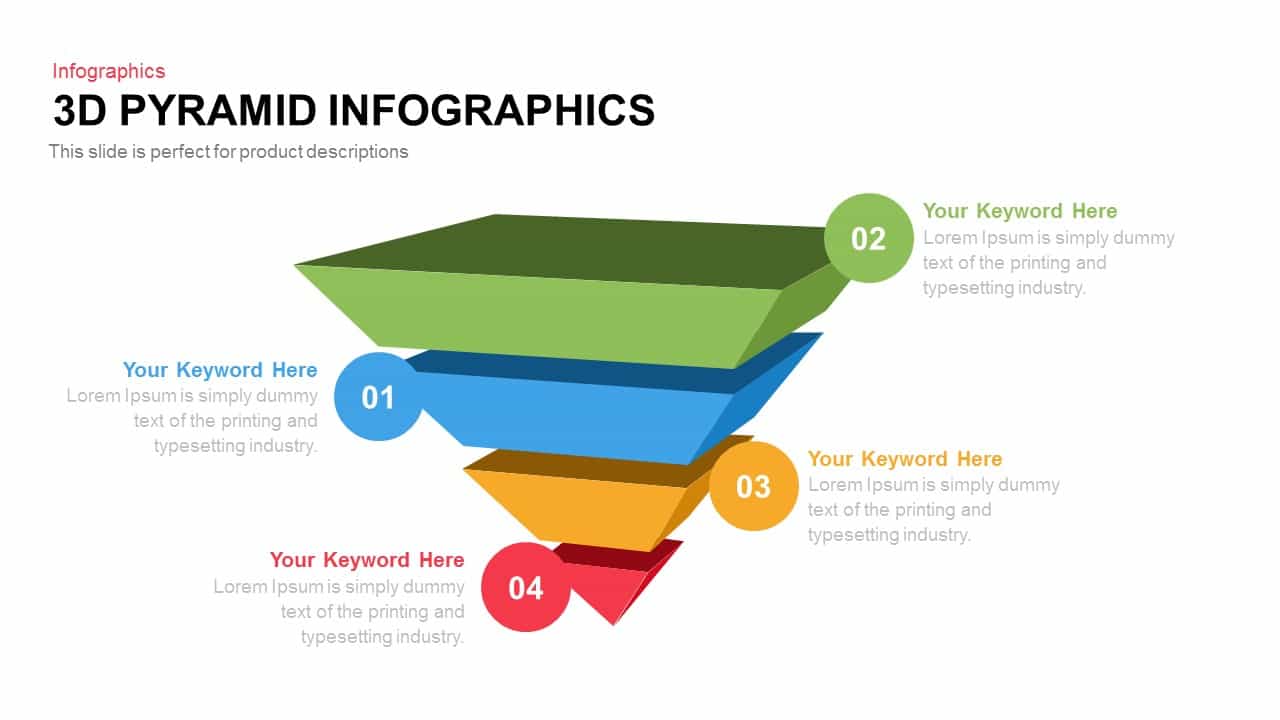
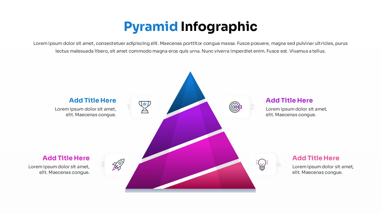
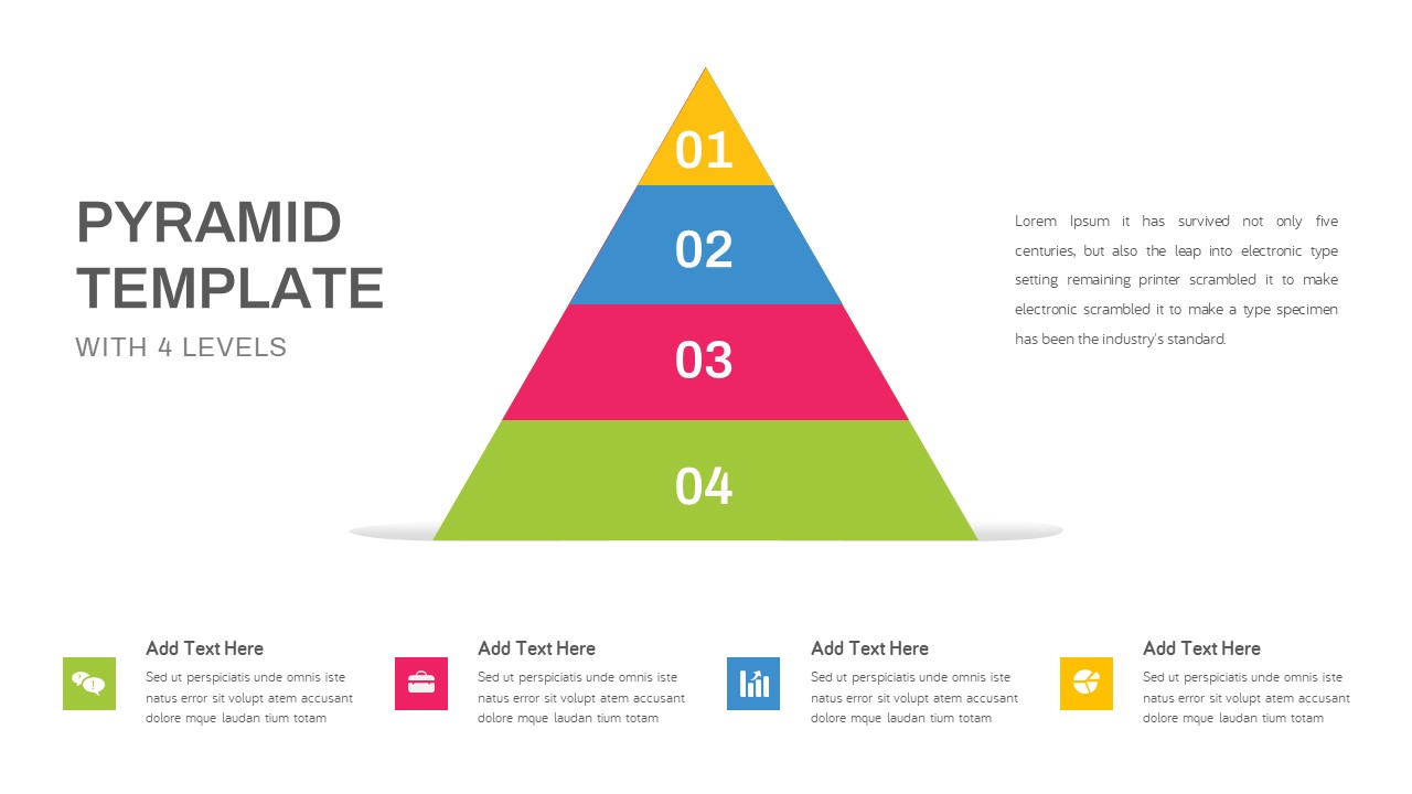
Four-Level 3D Pyramid Infographic Template for PowerPoint & Google Slides
Pyramid
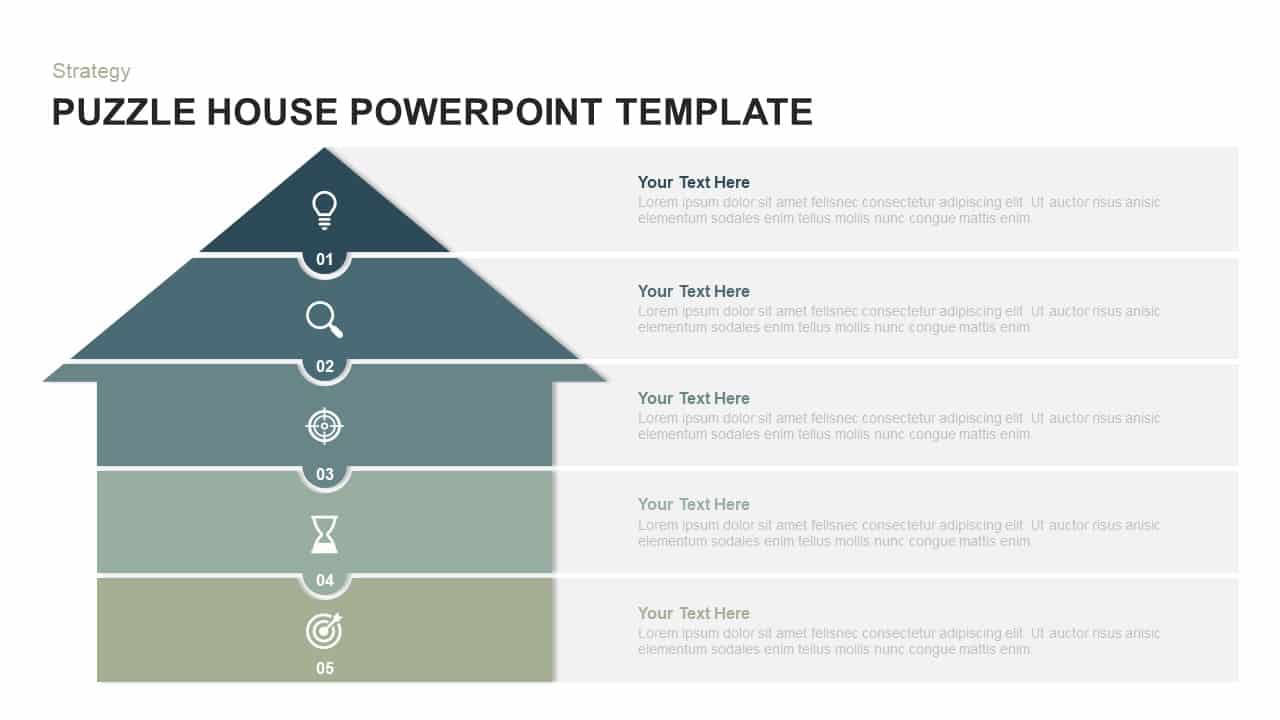
Five-Level Puzzle House Infographic Template for PowerPoint & Google Slides
Pyramid
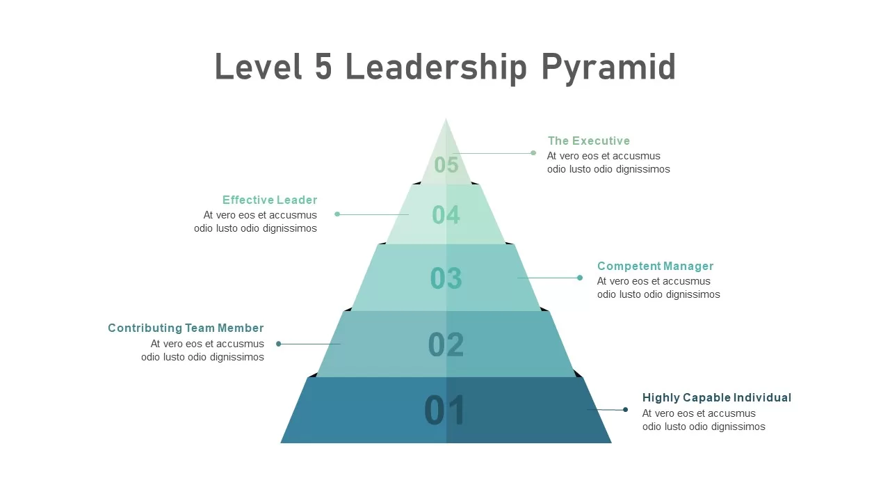
Level 5 Leadership Pyramid Infographic Template for PowerPoint & Google Slides
Pyramid

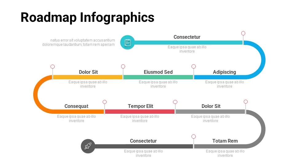
Free Multi-Level Roadmap Infographic Template for PowerPoint & Google Slides
Roadmap
Free
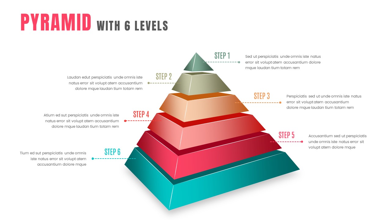
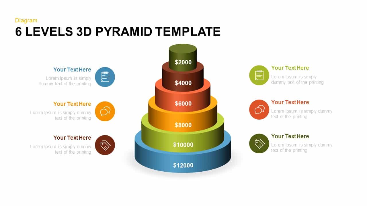
3D Six-Level Pyramid Diagram Infographic Template for PowerPoint & Google Slides
Pyramid
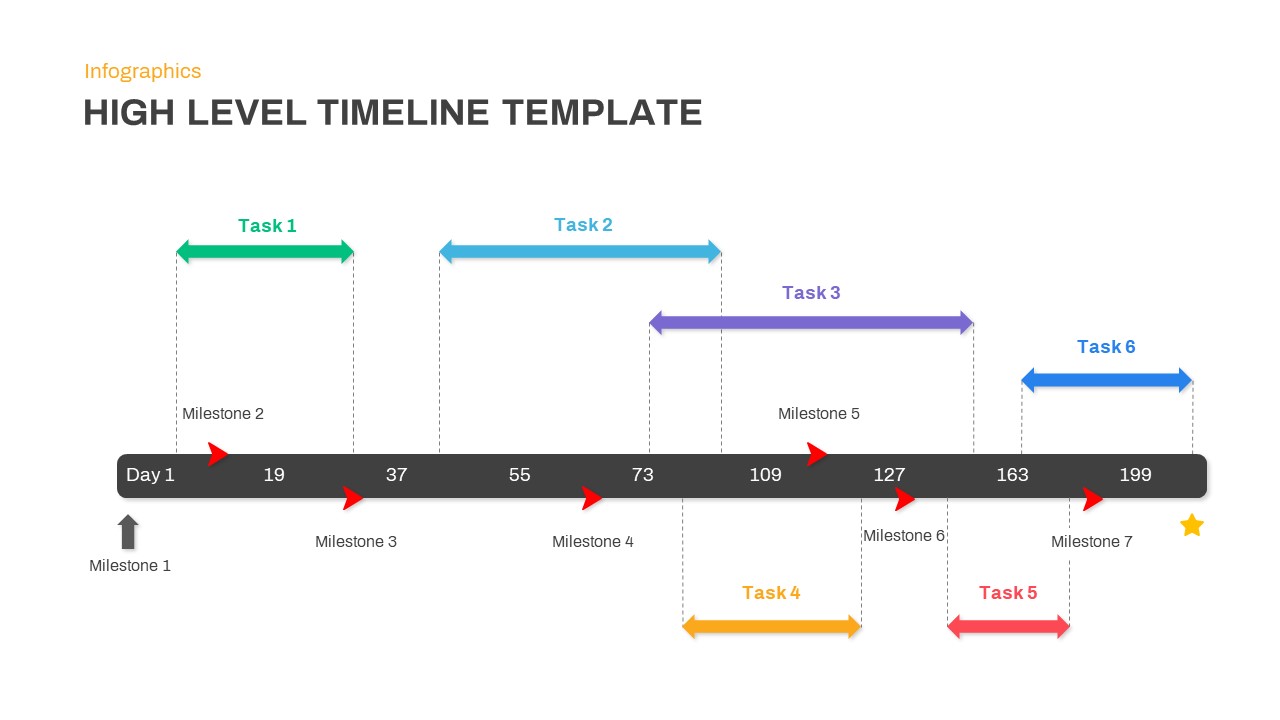
High Level Timeline PowerPoint Template
Timeline
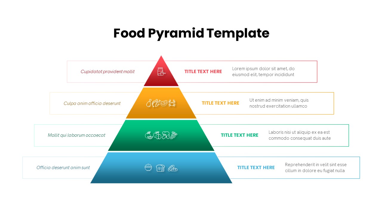
Four-Level Food Pyramid Infographic Template for PowerPoint & Google Slides
Pyramid
Four Level Pyramid Infographic Template for PowerPoint & Google Slides
Pyramid
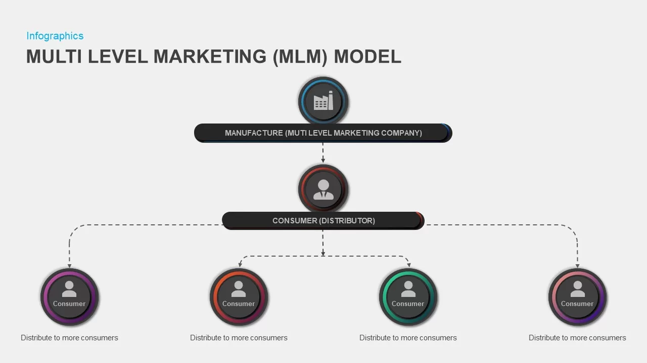
Multi-Level Marketing PowerPoint Template for PowerPoint & Google Slides
Business Models
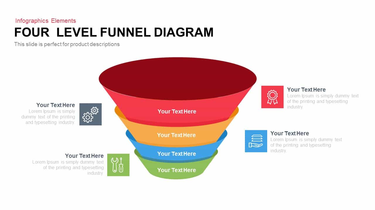
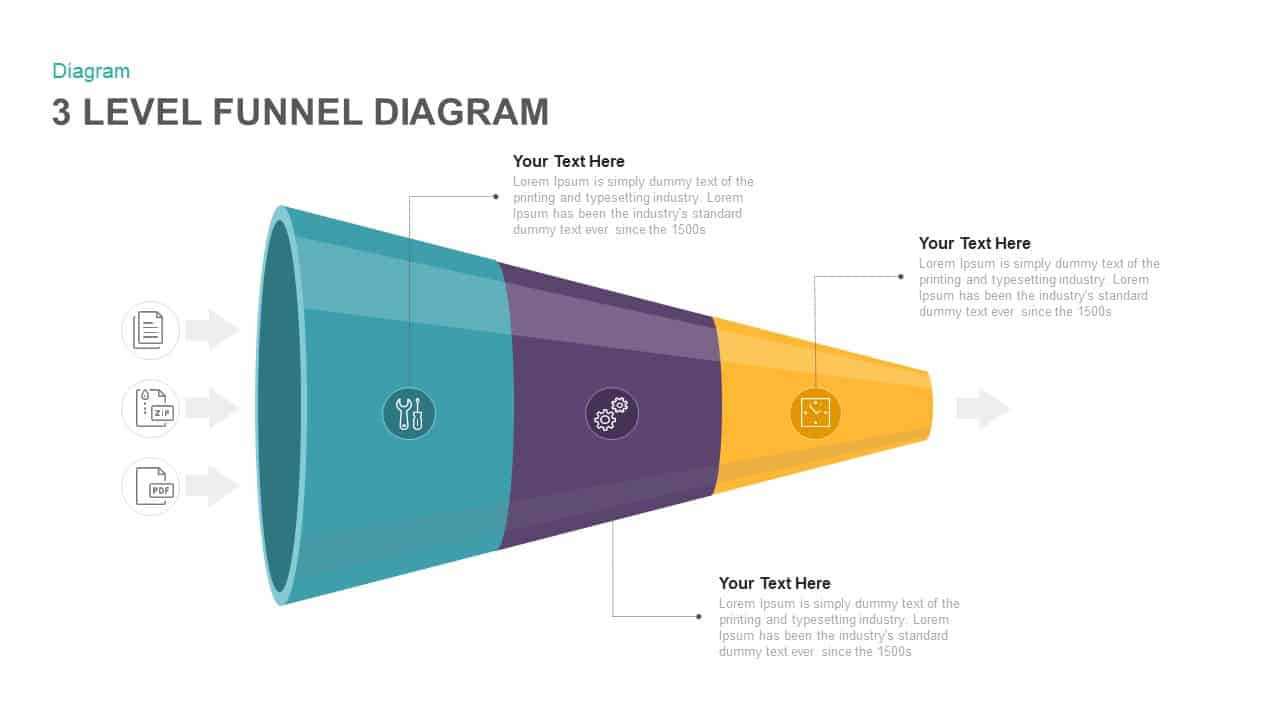
4 Level Funnel Diagram Template for PowerPoint
Funnel
Five-Level 3D Pyramid Hierarchy Template for PowerPoint & Google Slides
Pyramid
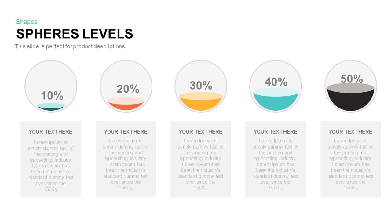
Spheres Levels PowerPoint Template
Infographics
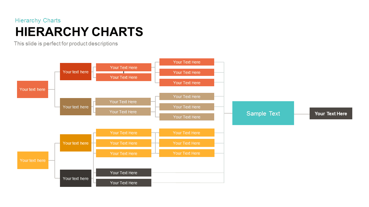
Horizontal Multi-Level Hierarchy Chart template for PowerPoint & Google Slides
Org Chart
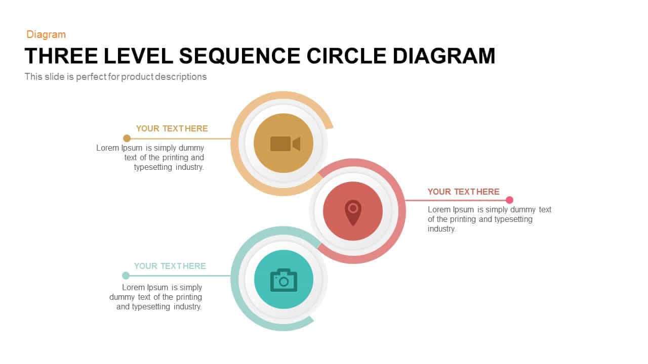
Three-Level Sequence Circle Diagram Template for PowerPoint & Google Slides
Circular
Editable Six-Level 3D Pyramid Diagram Template for PowerPoint & Google Slides
Pyramid

Four-Level Business Pyramid Diagram Template for PowerPoint & Google Slides
Pyramid
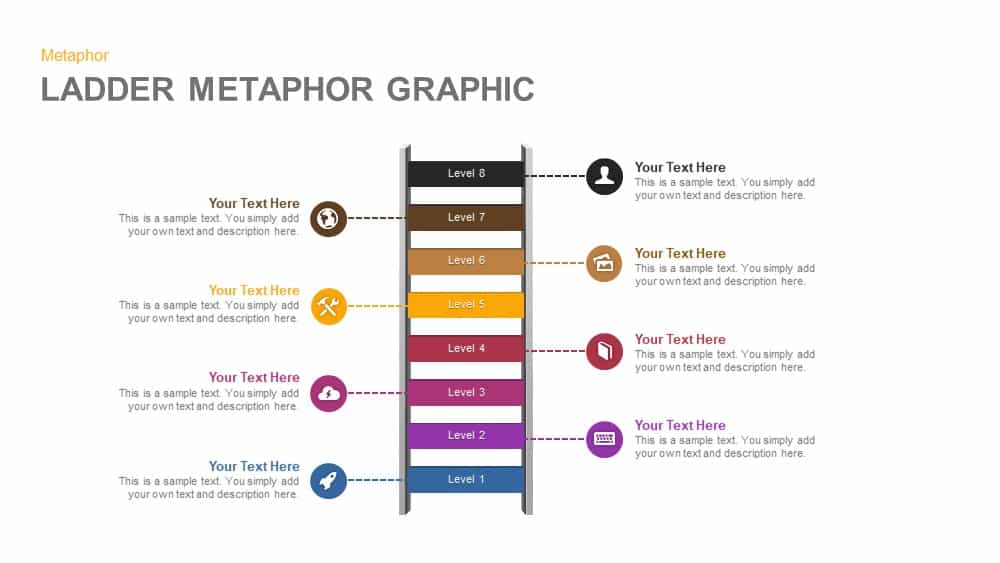
Eight-Level Ladder Metaphor Graphic Template for PowerPoint & Google Slides
Process
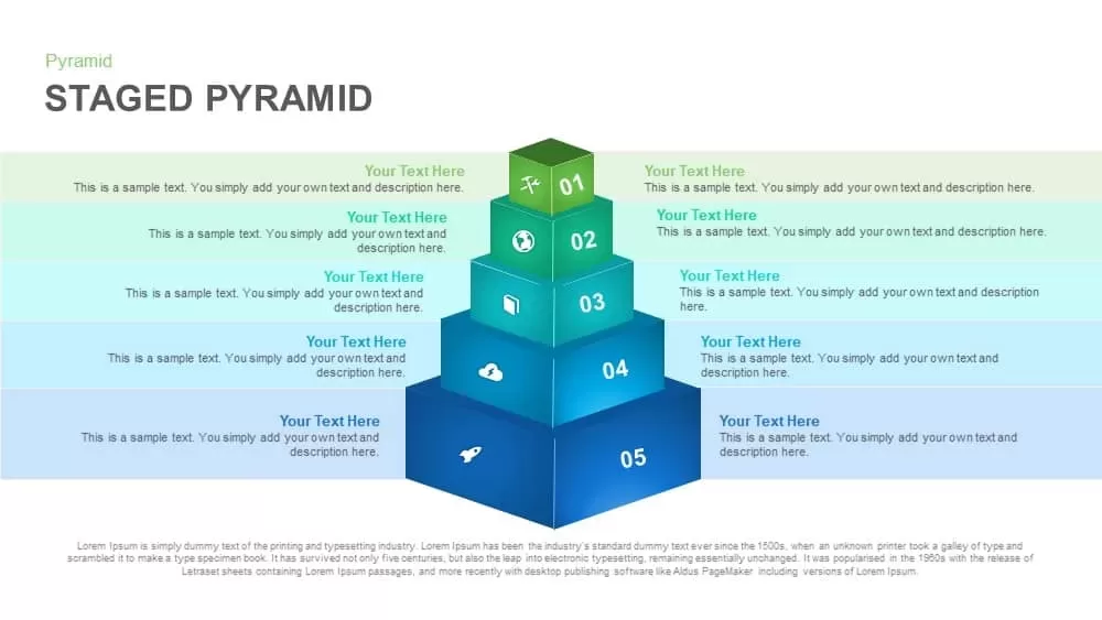
Five-Level Staged Pyramid Diagram Template for PowerPoint & Google Slides
Pyramid
Three Level Funnel Process Diagram Template for PowerPoint & Google Slides
Funnel
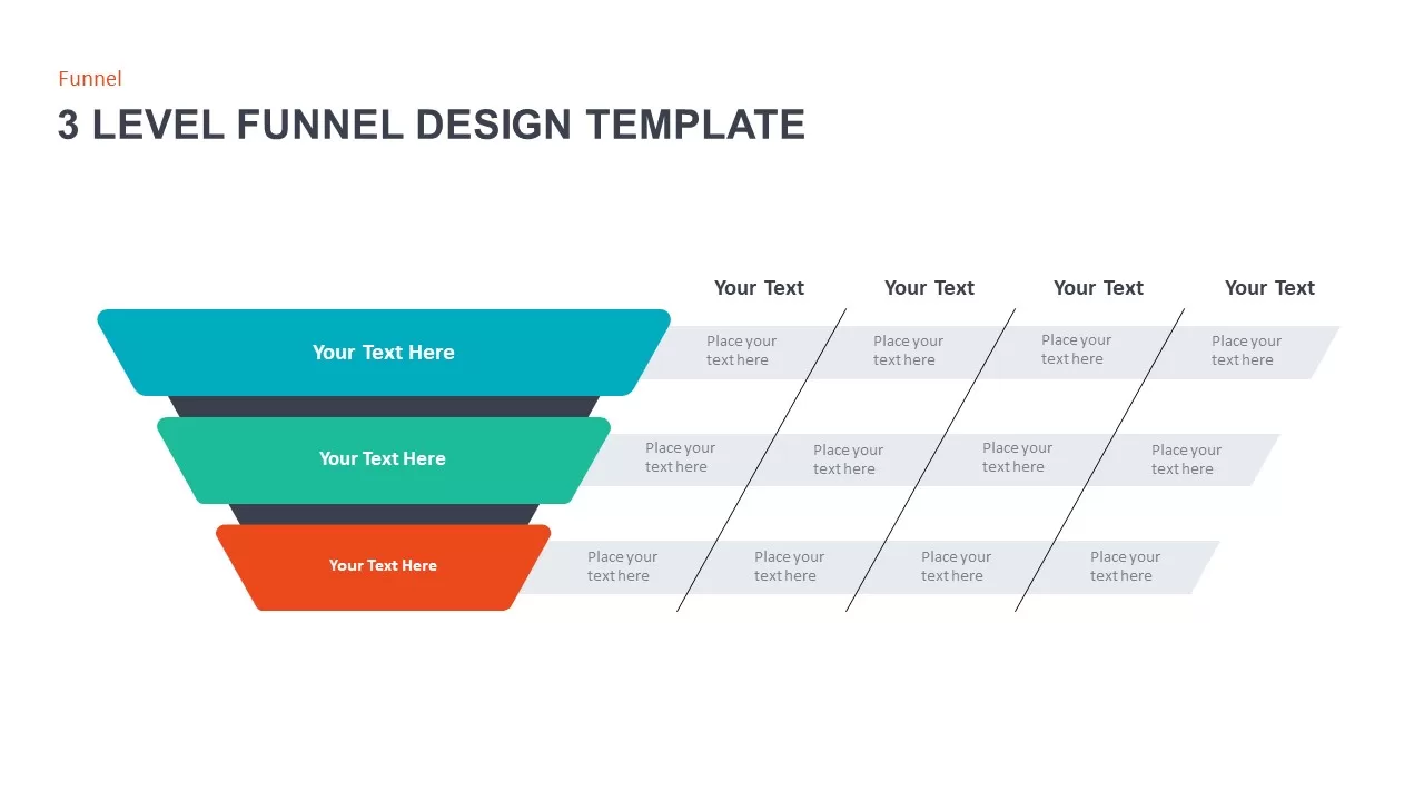
3 Level Funnel Design Template
Funnel
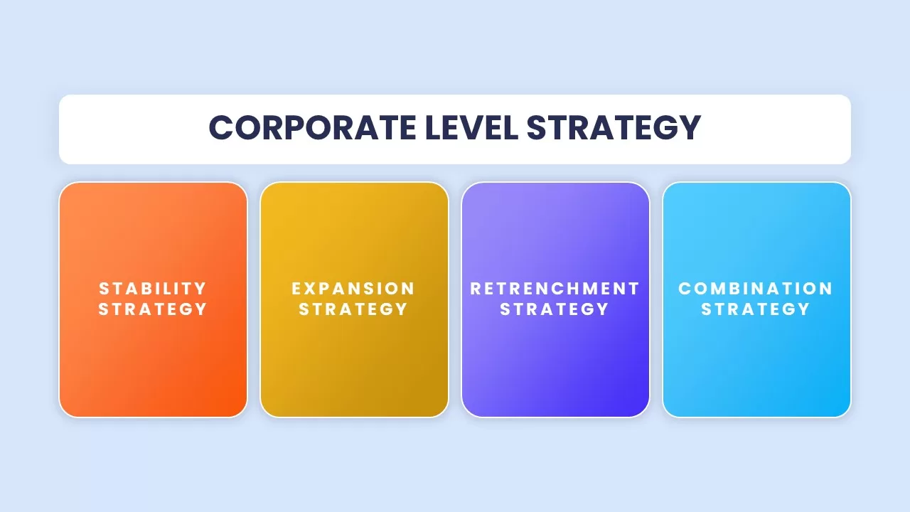
Corporate Level Strategy Overview template for PowerPoint & Google Slides
Business Strategy
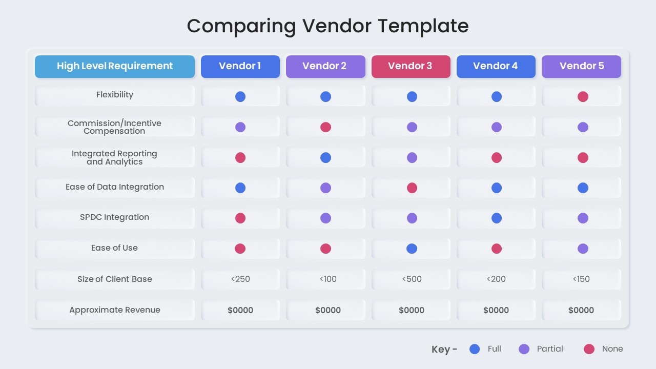
Vendor Comparison Matrix with High-Level Requirements template for PowerPoint & Google Slides
Comparison Chart
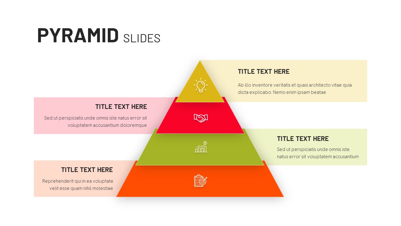
Four-Level Colorful Pyramid Diagram Template for PowerPoint & Google Slides
Pyramid
Modern Four-Level Pyramid Diagram Template for PowerPoint & Google Slides
Pyramid
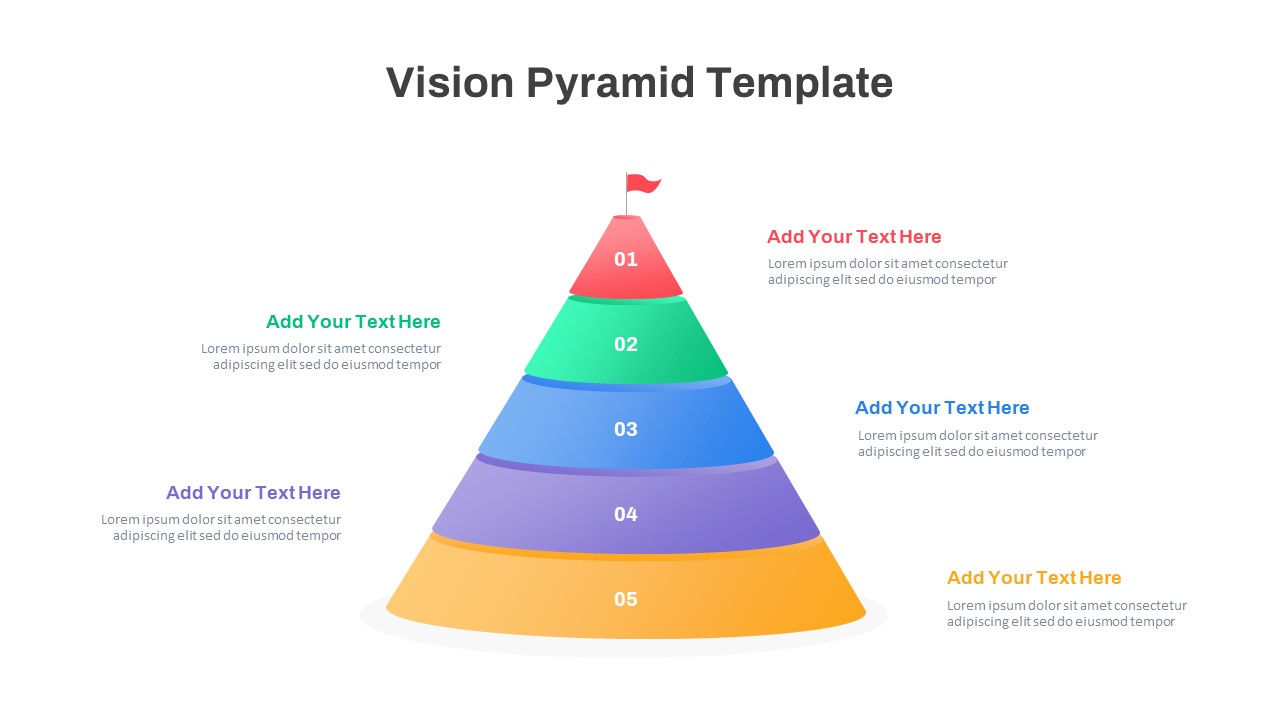
Five-Level Vision Pyramid Diagram Template for PowerPoint & Google Slides
Pyramid
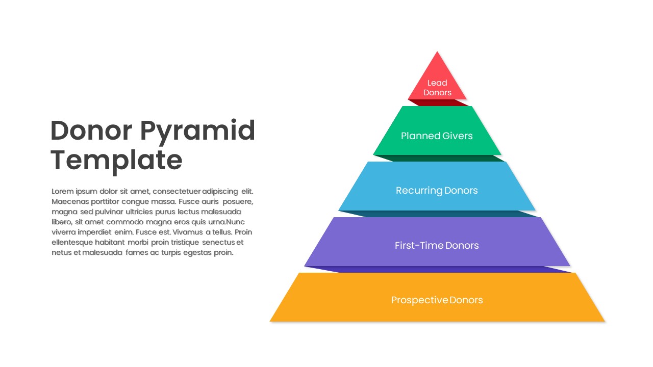
Donor Pyramid PowerPoint Template
Pyramid
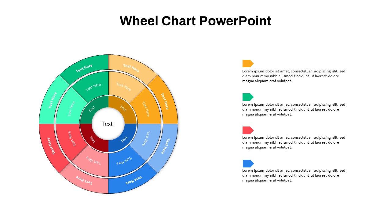
Wheel Chart PowerPoint Templates
Pie/Donut
Multi-Level Colorful Pyramid Chart Template for PowerPoint & Google Slides
Pyramid
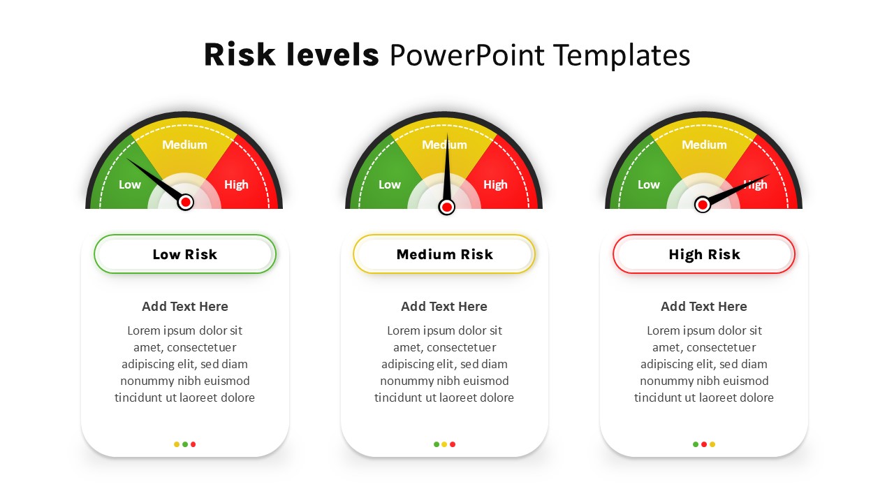
Risk Level Gauge Comparison Dashboard Template for PowerPoint & Google Slides
Comparison
Four-Level Colorful Pyramid Diagram Template for PowerPoint & Google Slides
Pyramid
5 Level Hierarchy Pyramid Template for PowerPoint & Google Slides
Pyramid
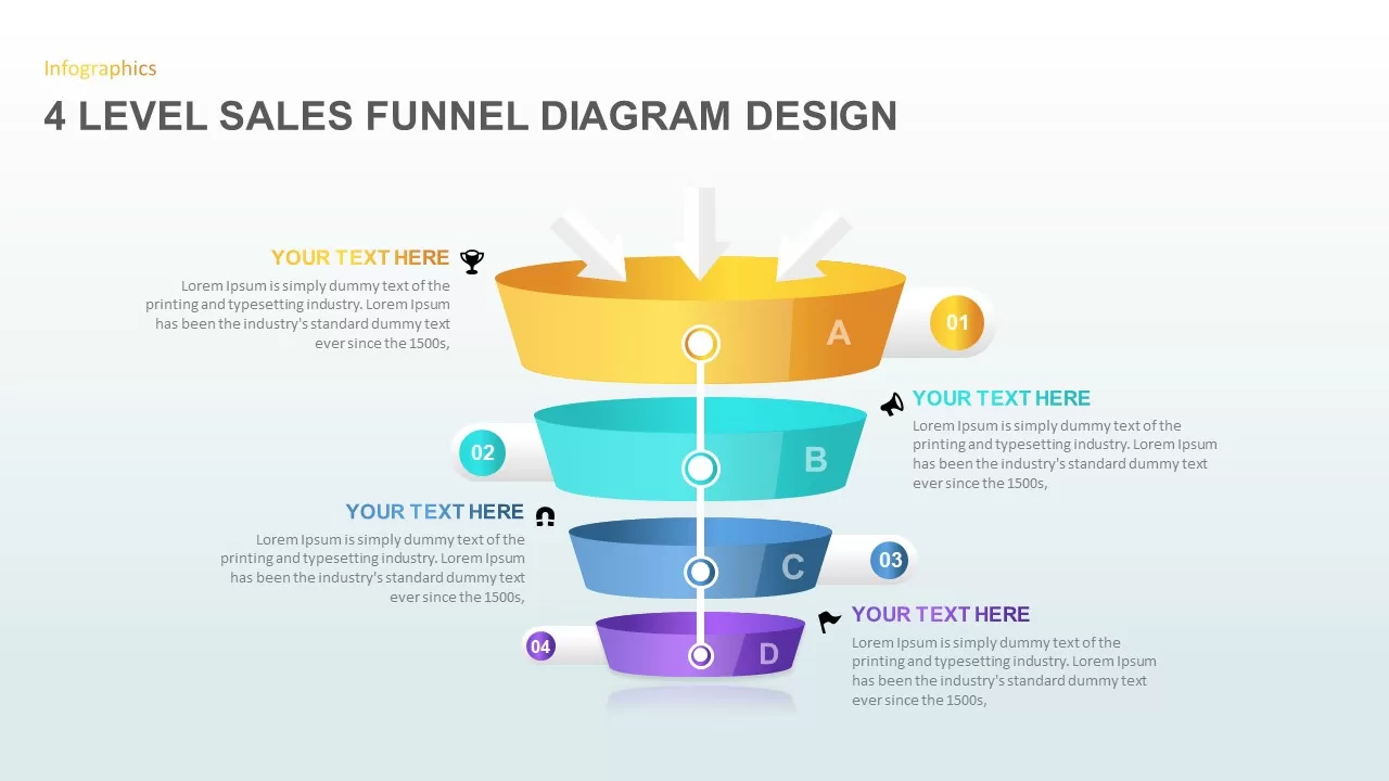
4 Level Sales Funnel Diagram Design for PowerPoint & Google Slides
Marketing Funnel

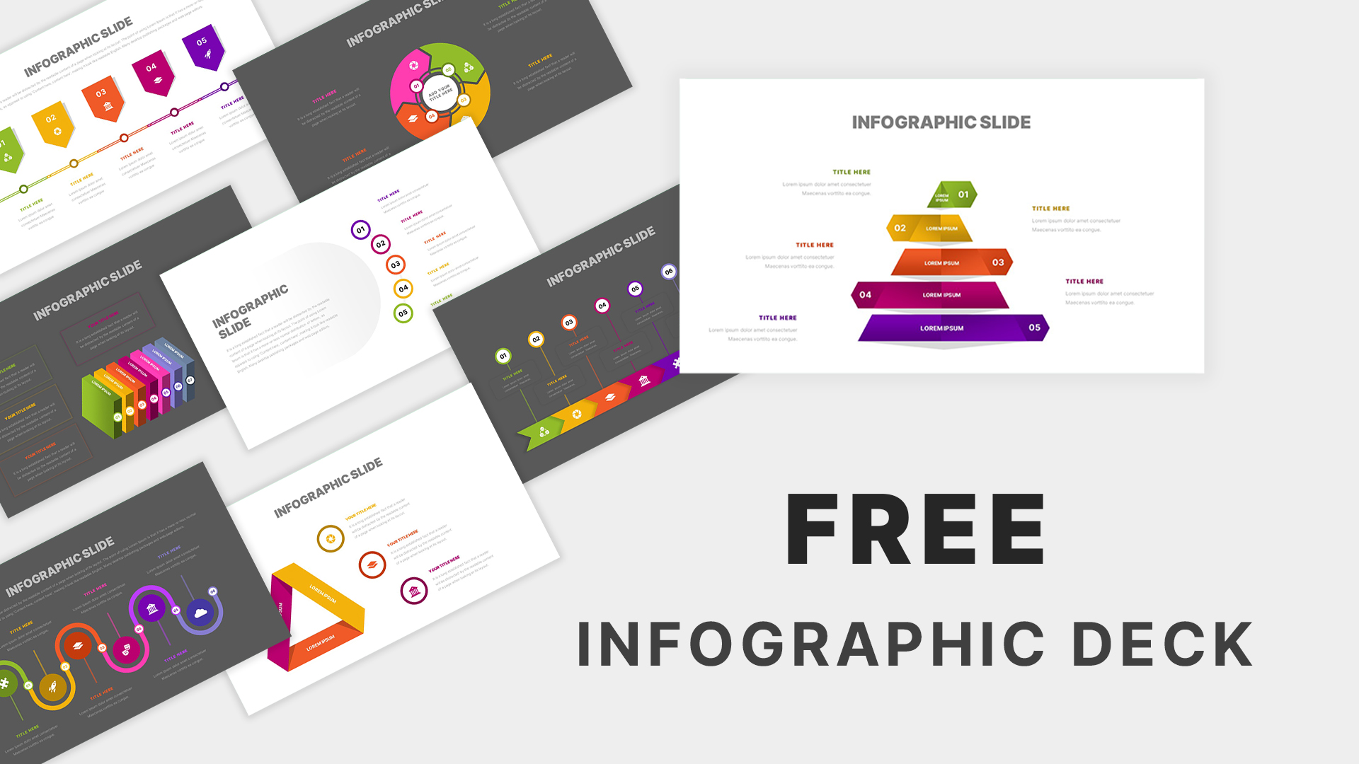
Free Infographic Deck PowerPoint Pack for PowerPoint & Google Slides
Infographics
Free
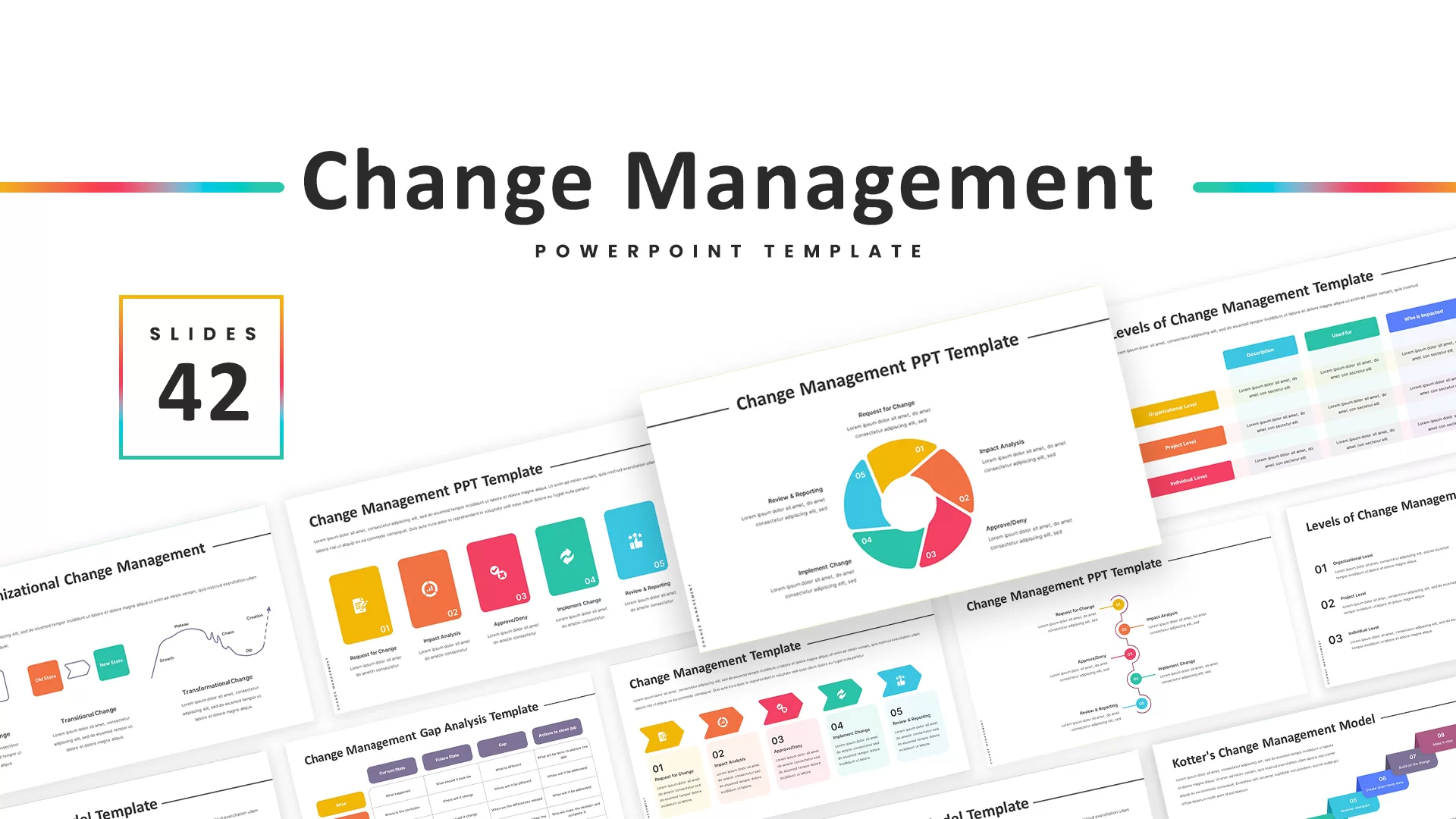
Change Management Infographic Deck Template for PowerPoint & Google Slides
Business Strategy
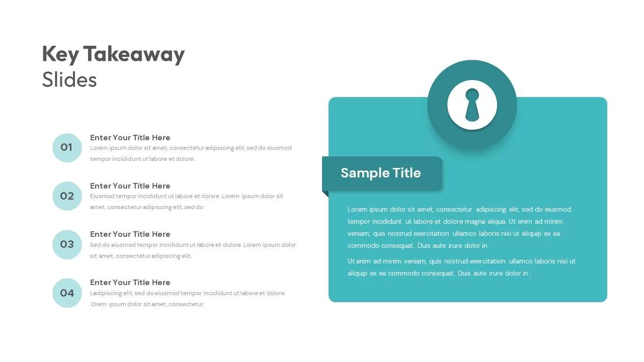
Key Takeaway Infographic Slide Deck Template for PowerPoint & Google Slides
Process

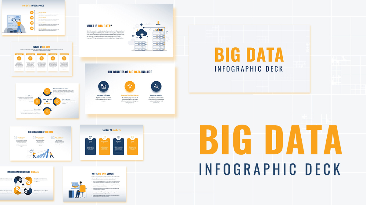
Modern Big Data Infographic Deck Template for PowerPoint & Google Slides
Decks
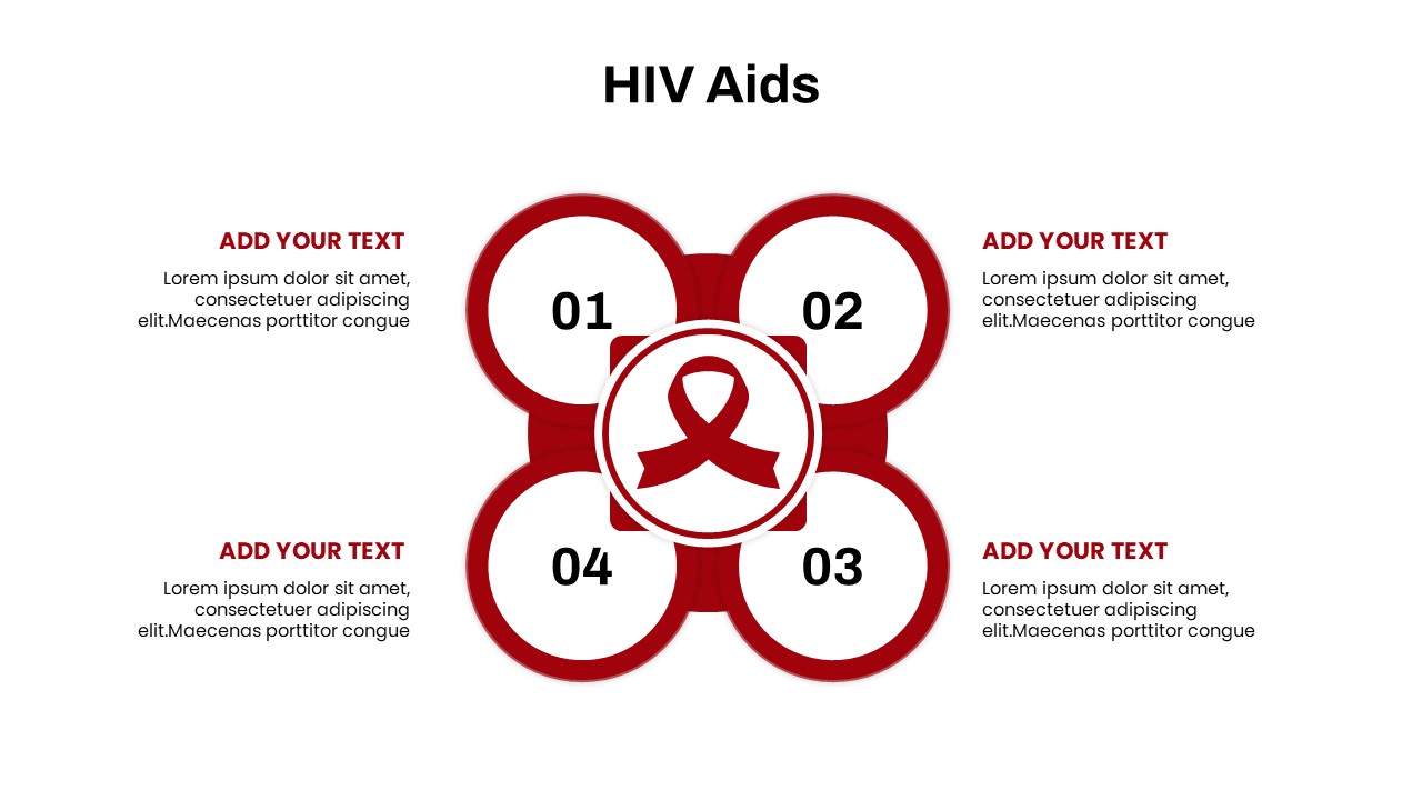
HIV AIDS Infographic Diagram Slide Deck Template for PowerPoint & Google Slides
Graphics
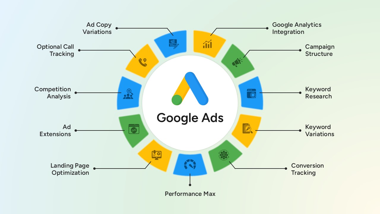
Google Ads Optimization & Performance Infographic Template for PowerPoint & Google Slides
Digital Marketing
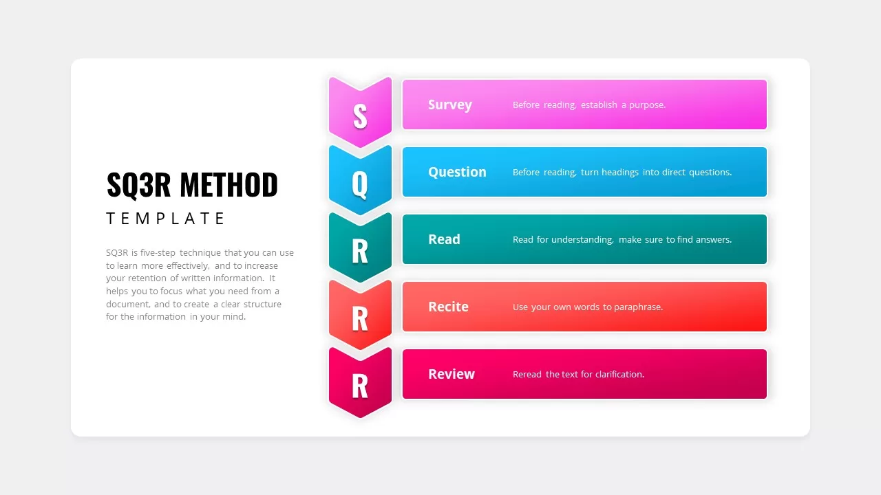
SQ3R Study Strategy Infographic Slides Template for PowerPoint & Google Slides
Business Strategy
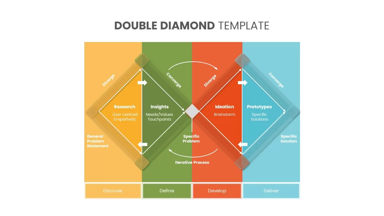
Double Diamond PowerPoint Template
Process
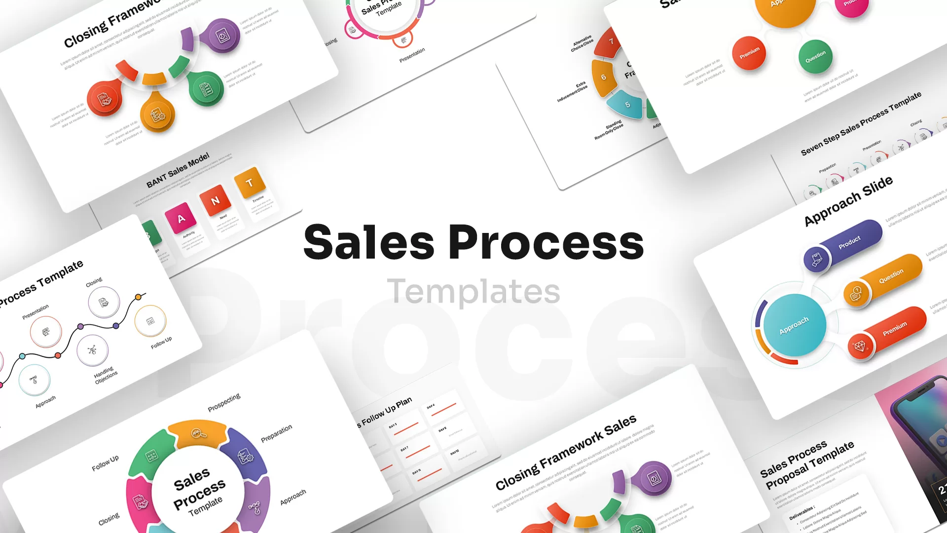
Sales Process PowerPoint Template
Process
Casino/Poker Chips Infographic Slides template for PowerPoint & Google Slides
Business Strategy
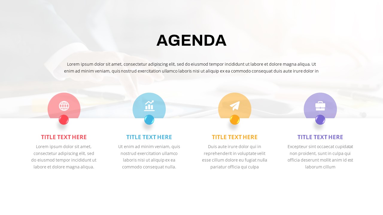
Agenda Infographic Pack of 2 Slides Template for PowerPoint & Google Slides
Agenda
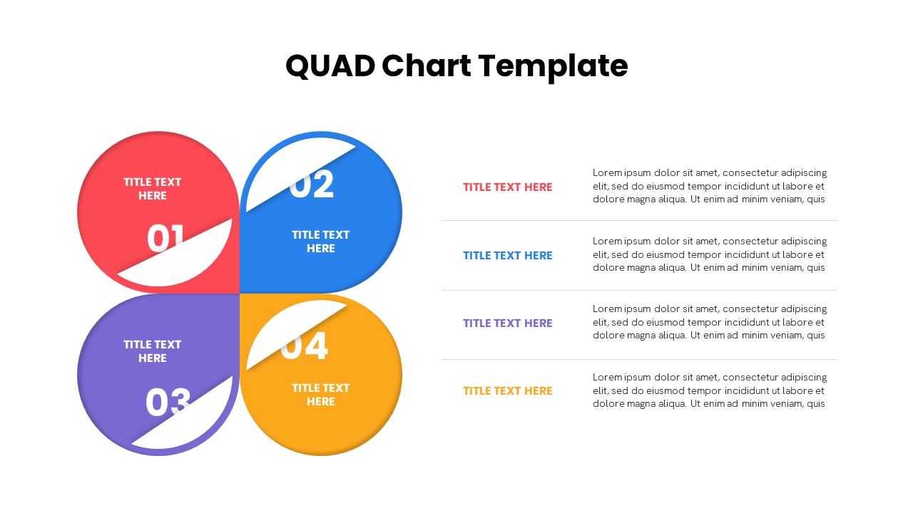
Quad Chart Infographic Pack of 8 Slides Template for PowerPoint & Google Slides
Comparison Chart
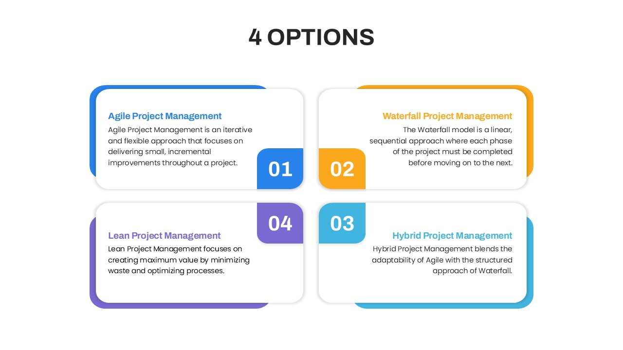
Four Options Infographic Slides Template for PowerPoint & Google Slides
Comparison
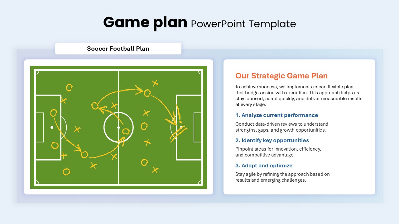
Game Plan Infographic Slides Pack Template for PowerPoint & Google Slides
Infographics
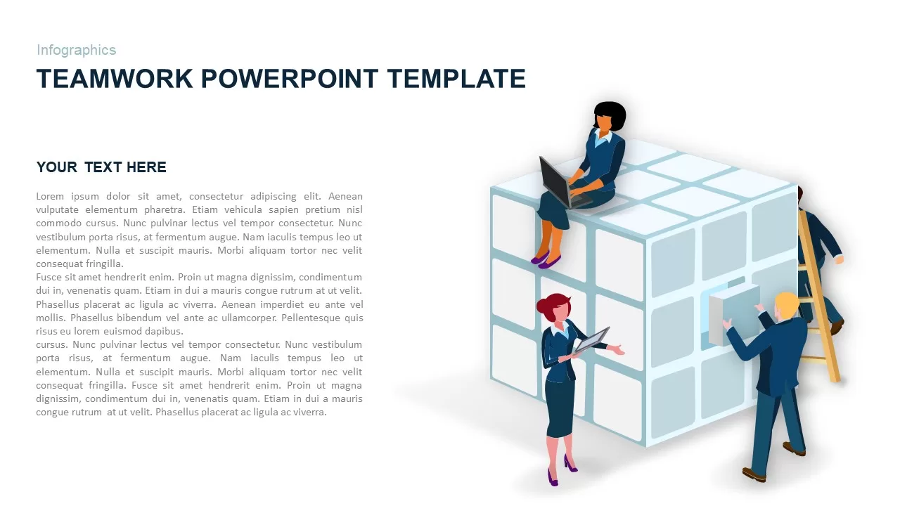
Teamwork PowerPoint Infographic Template for PowerPoint & Google Slides
Leadership
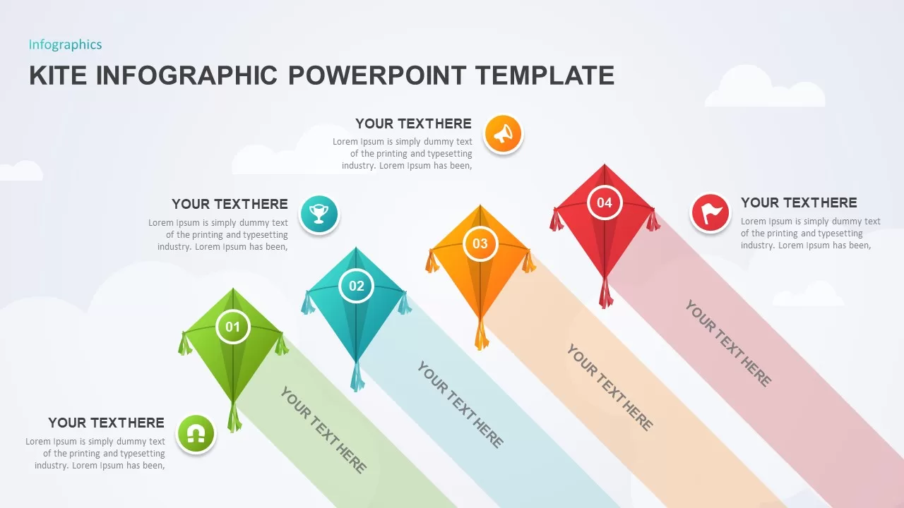
Kite Infographic PowerPoint Template for PowerPoint & Google Slides
Process
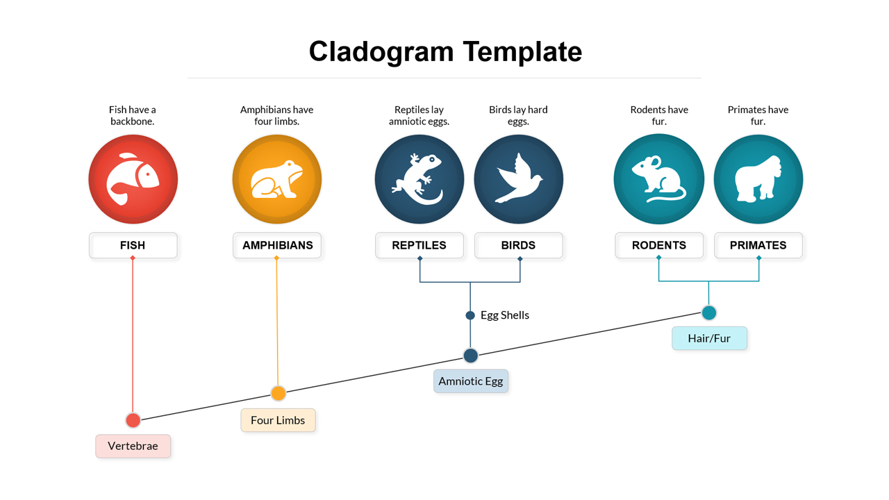
Cladogram Infographic Di Template for PowerPoint & Google Slides Template
Decision Tree
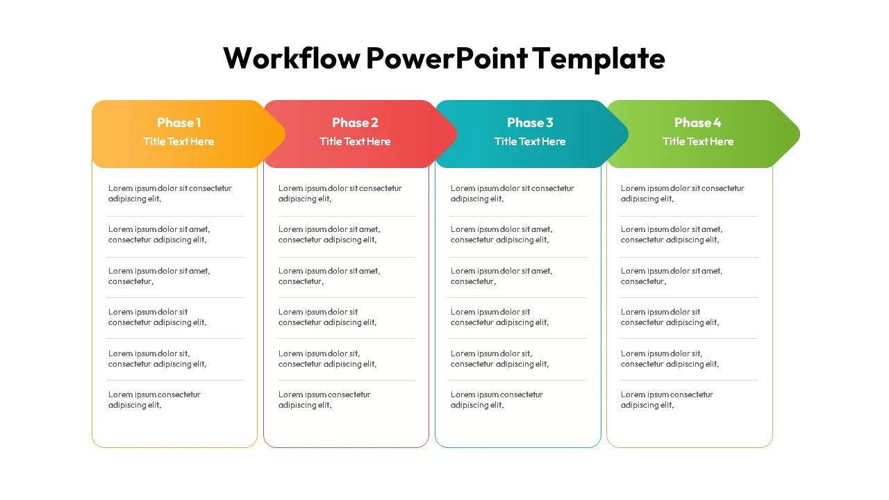
Workflow PowerPoint Template
Process
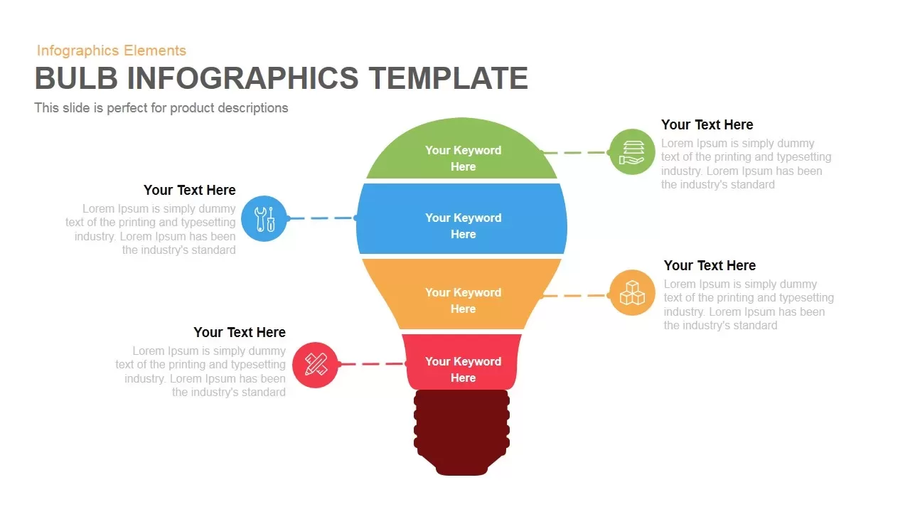
Layered Bulb Infographic Four Segments Template for PowerPoint & Google Slides
Funnel
Guide Metaphor Navigation Infographic Template for PowerPoint & Google Slides
Process

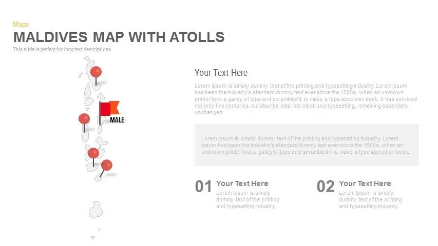
Maldives Map Infographic Template for PowerPoint & Google Slides
Maps
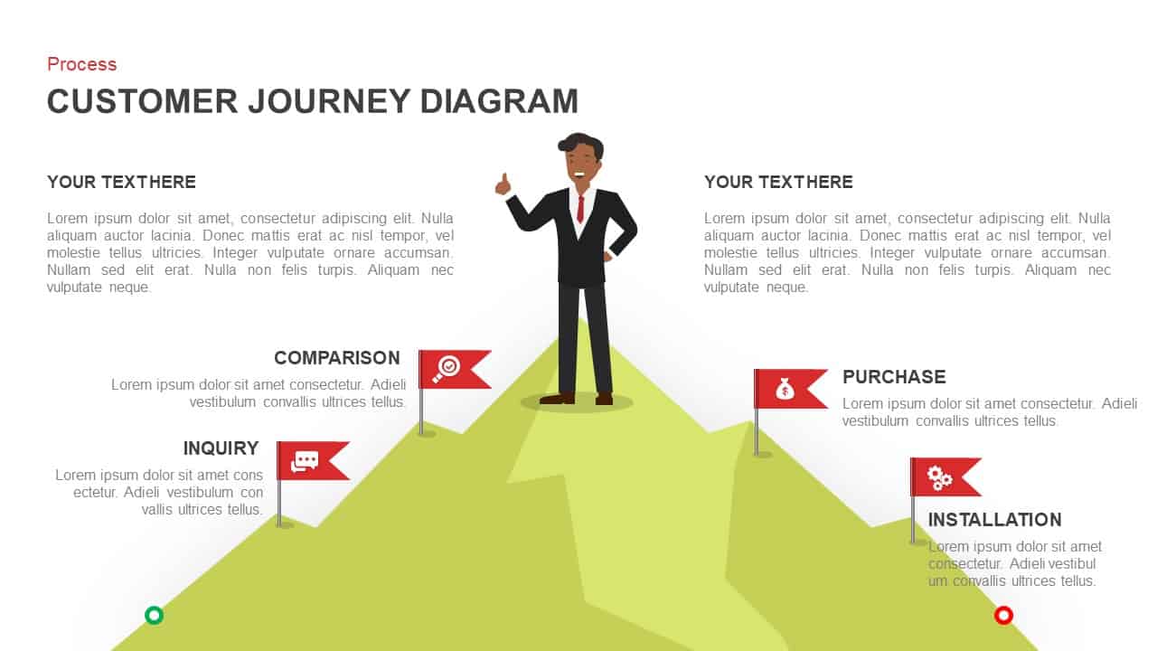
Customer Journey Diagram PowerPoint Template and Google Slides
Customer Journey

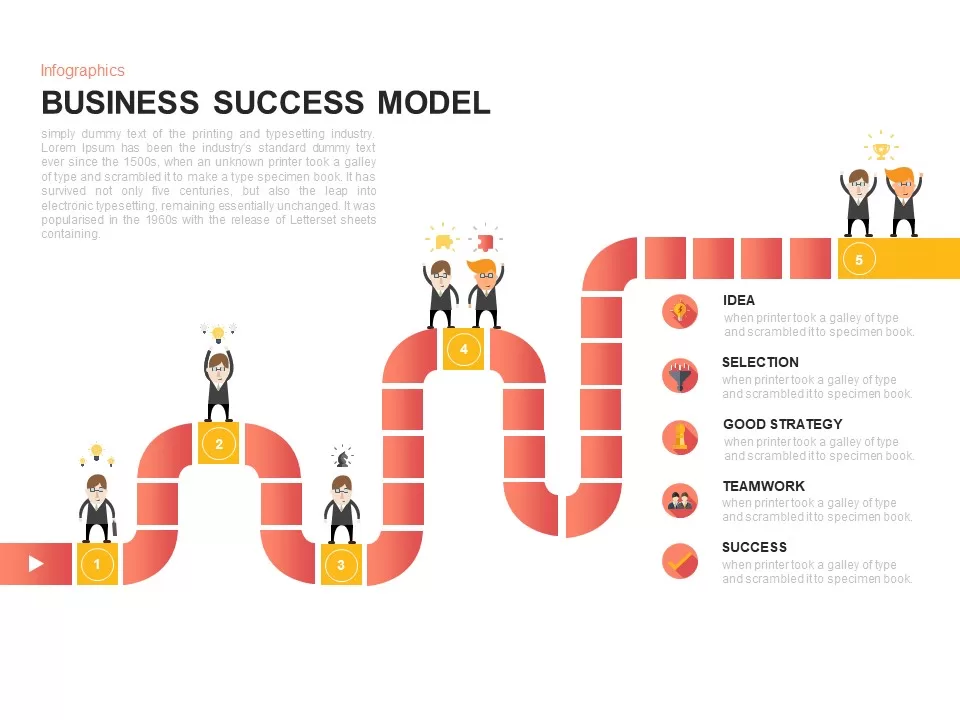
Business Success Model Infographic Template for PowerPoint & Google Slides
Roadmap
Dynamic AI Applications Infographic Template for PowerPoint & Google Slides
AI
Dynamic Growth Arrow Step Infographic Template for PowerPoint & Google Slides
Process
Five-Step Growth Infographic Slide Template for PowerPoint & Google Slides
Process
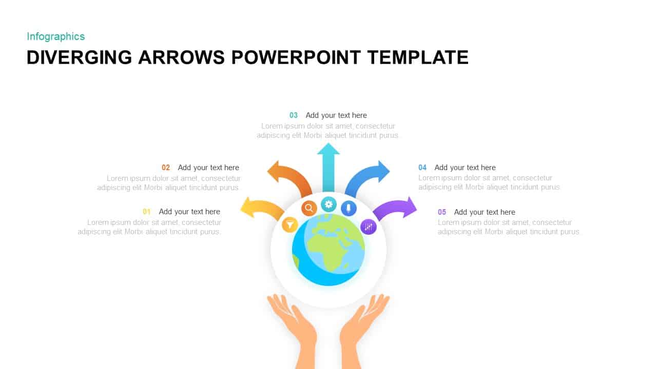
Diverging Globe Arrows Infographic Template for PowerPoint & Google Slides
Arrow
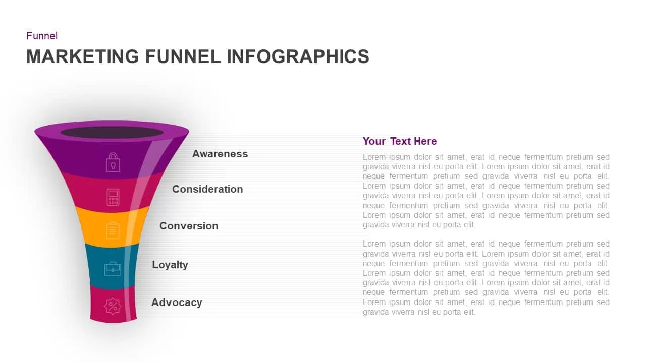
Five-Stage Marketing Funnel Infographic Template for PowerPoint & Google Slides
Funnel
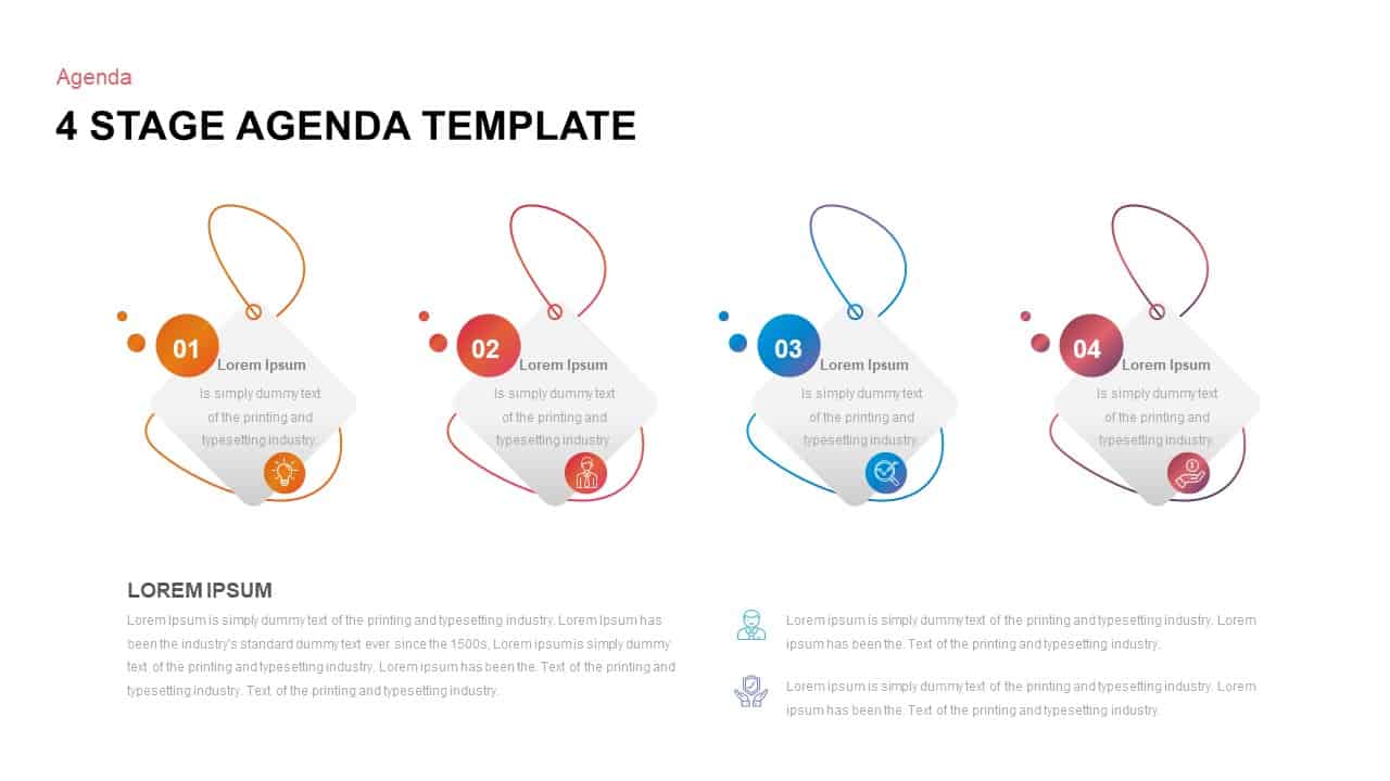
Four-Stage Agenda Infographic Slide Template for PowerPoint & Google Slides
Agenda
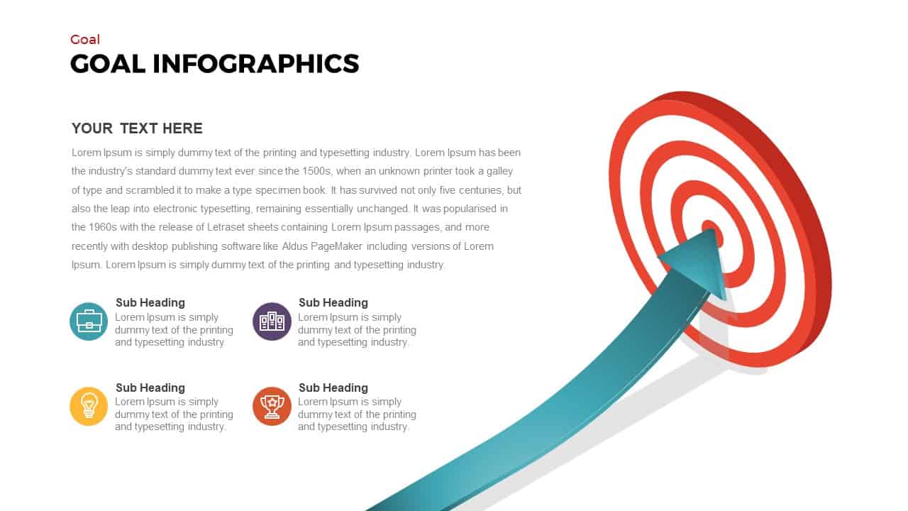
Goal Arrow and Target Infographic Template for PowerPoint & Google Slides
Goals
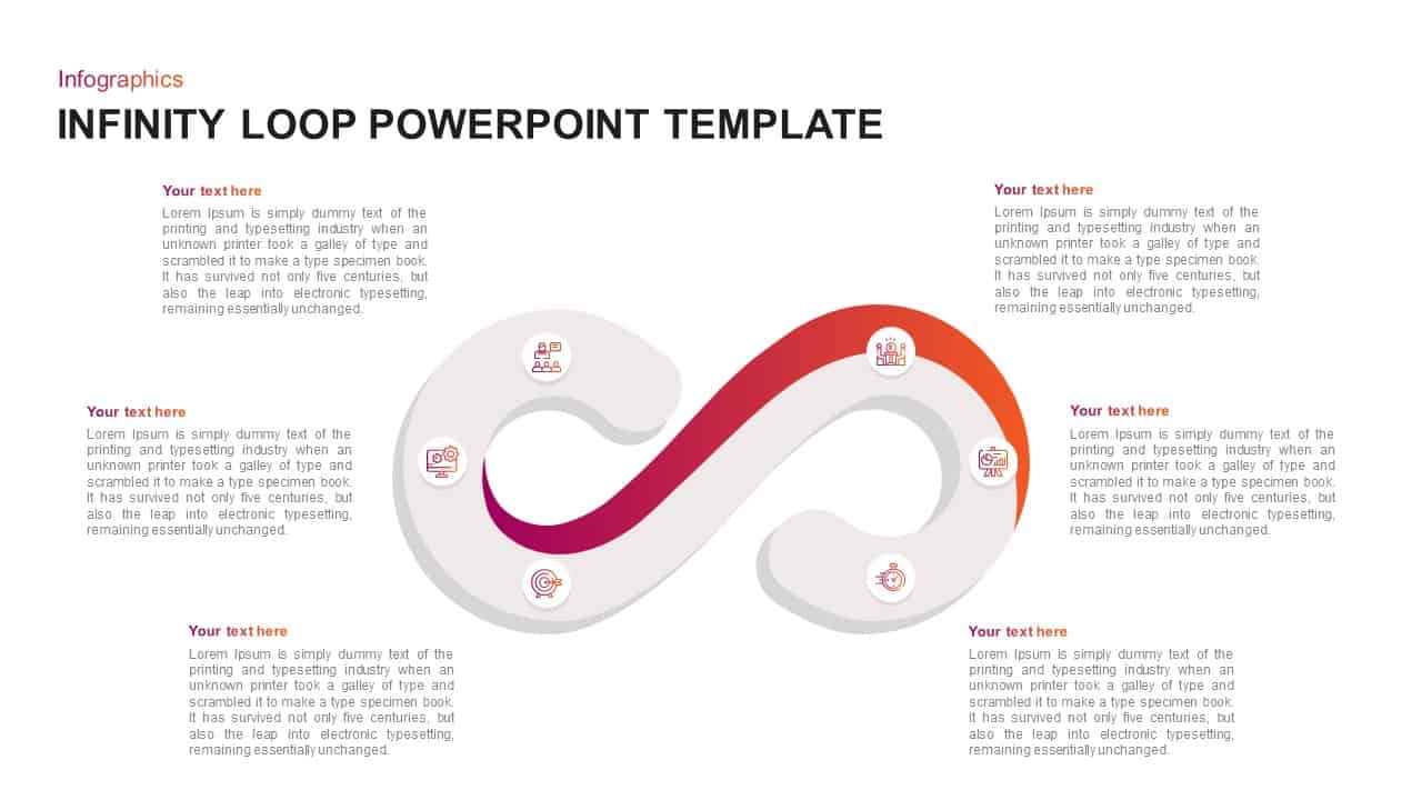
Infinity Loop Infographic template for PowerPoint & Google Slides
Process
4 Arrow Infographic Template
Arrow
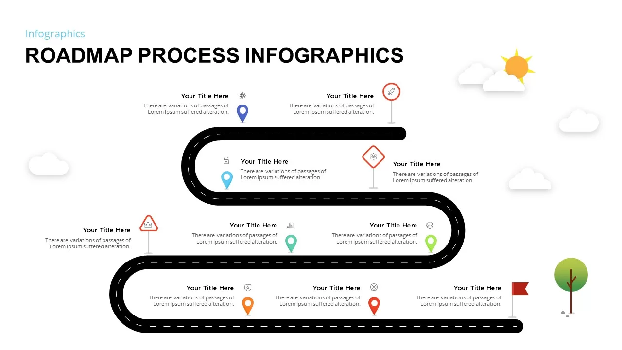
Roadmap Process Infographic Template for PowerPoint & Google Slides
Roadmap
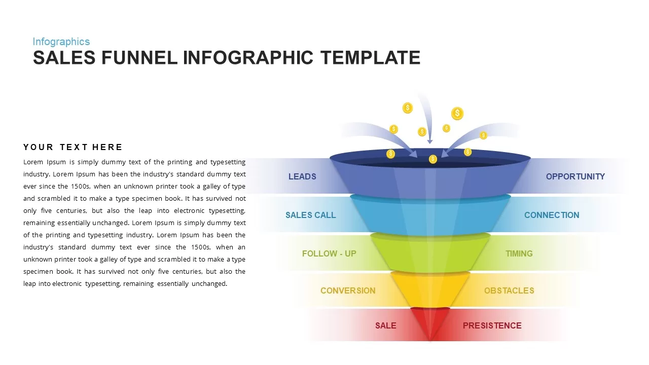
Sales Funnel Infographic Diagram Template for PowerPoint & Google Slides
Funnel
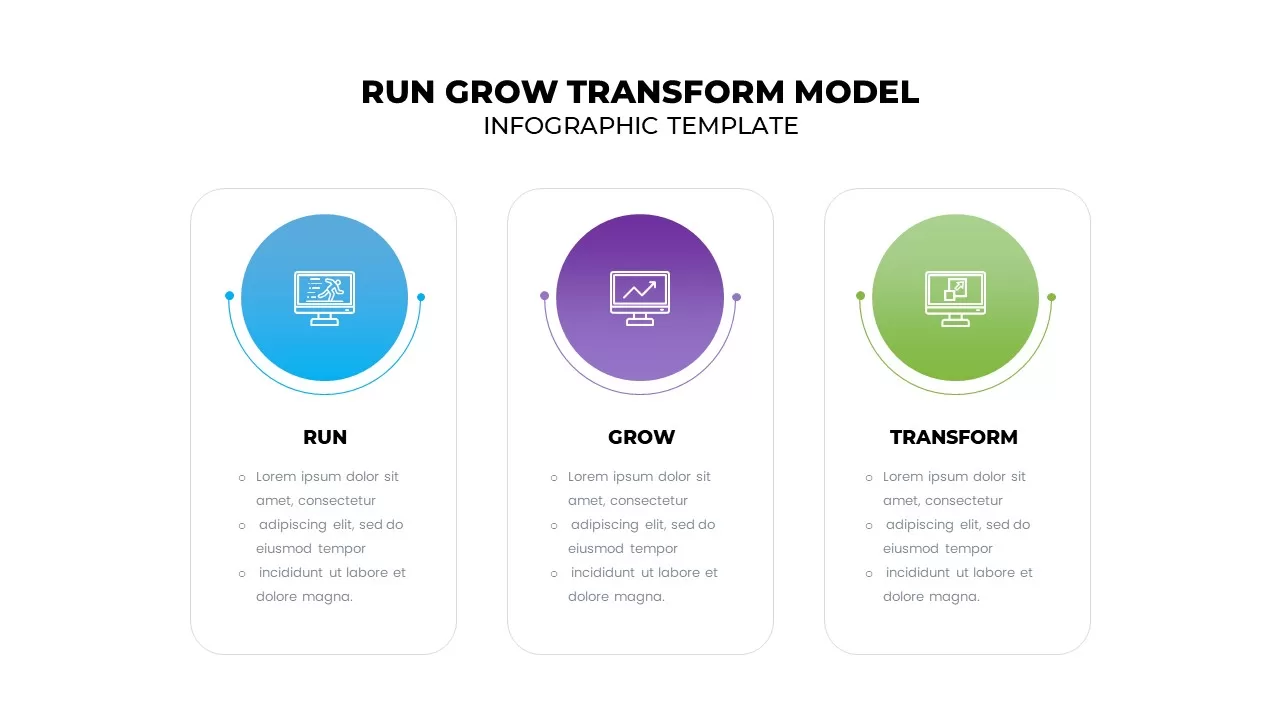
Run Grow Transform Model Infographic Template for PowerPoint & Google Slides
Business
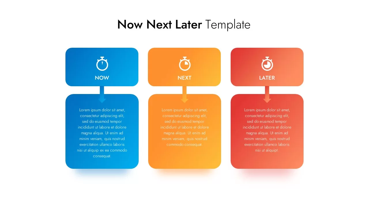
Now Next Later Template
Process
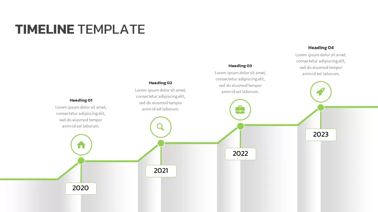
Modern Green Timeline Infographic Template for PowerPoint & Google Slides
Timeline
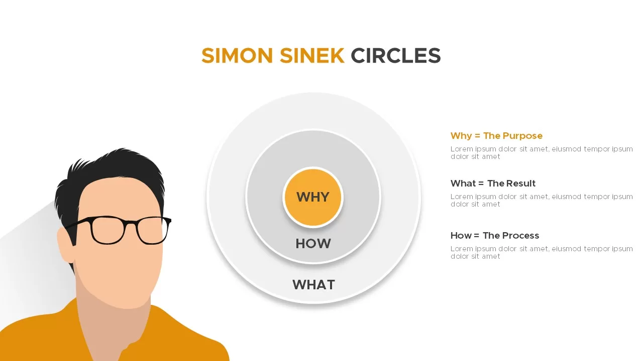
Simon Sinek Circles PowerPoint Templates and Google Slides
Business Strategy
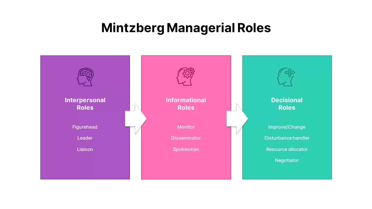
Mintzberg Managerial Roles Infographic Template for PowerPoint & Google Slides
Comparison Chart
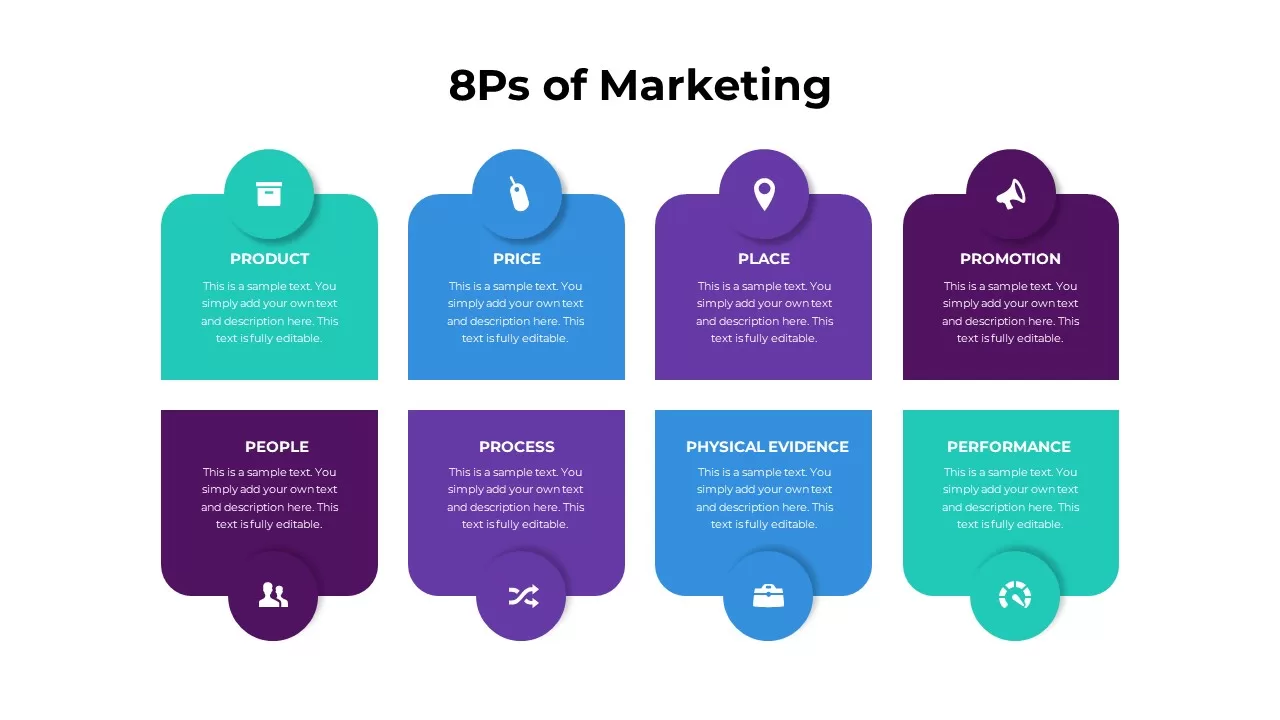
8Ps of Marketing Model Infographic Template for PowerPoint & Google Slides
Marketing
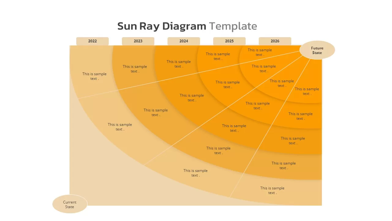
Sun Ray Diagram Template
Timeline
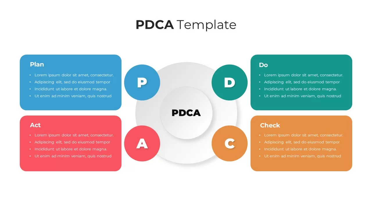
PDCA Four-Stage Cycle Infographic Template for PowerPoint & Google Slides
Process
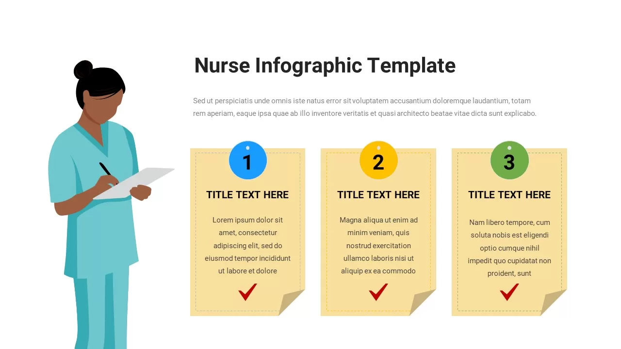
Nurse Checklist Infographic Sticky Notes Template for PowerPoint & Google Slides
Nursing
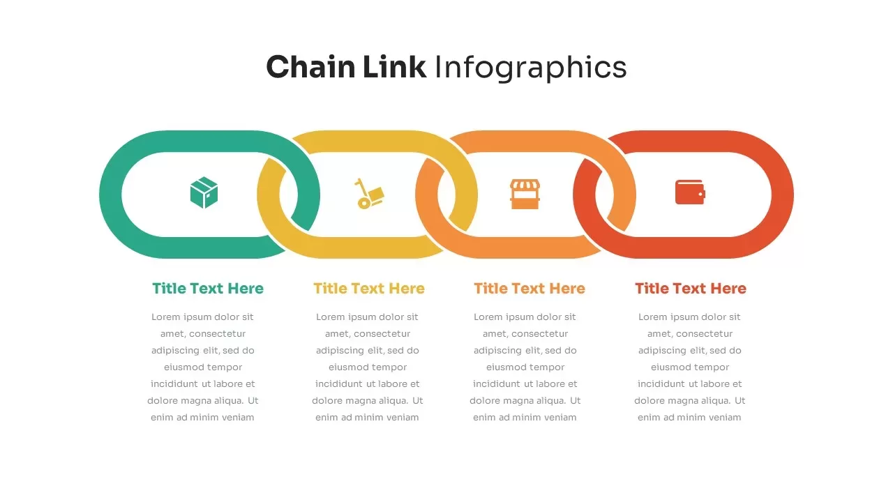
Chain Link Process Infographic Diagram Template for PowerPoint & Google Slides
Process
Automotive Infographic Multi-Layout Template for PowerPoint & Google Slides
Comparison
Professional Drone Infographic Slide Template for PowerPoint & Google Slides
Infographics
Casino Poker Slide
Business Proposal
Social Media Infographic Arrow Layout Template for PowerPoint & Google Slides
Arrow
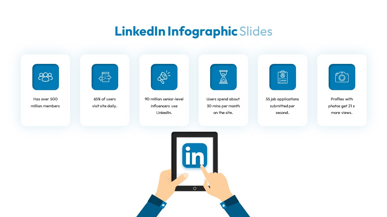
LinkedIn Metrics Infographic Slide Template for PowerPoint & Google Slides
Digital Marketing
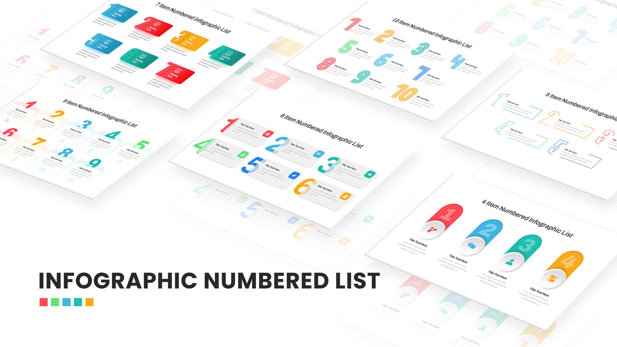
Numbered Infographic List Template For PowerPoint
Infographics
Bow and Arrow Goal Infographic Slide Template for PowerPoint & Google Slides
Goals
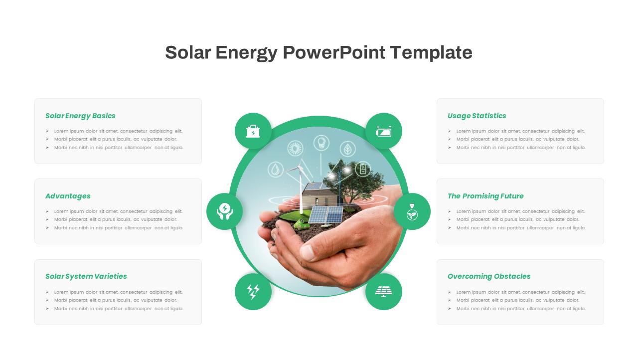
Free Solar Energy Infographic Slide Template for PowerPoint & Google Slides
Circular
Free
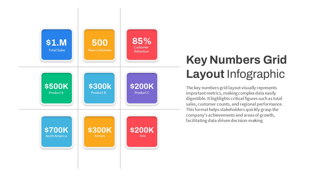
Key Numbers Grid Layout Infographic Template for PowerPoint & Google Slides
Business Report
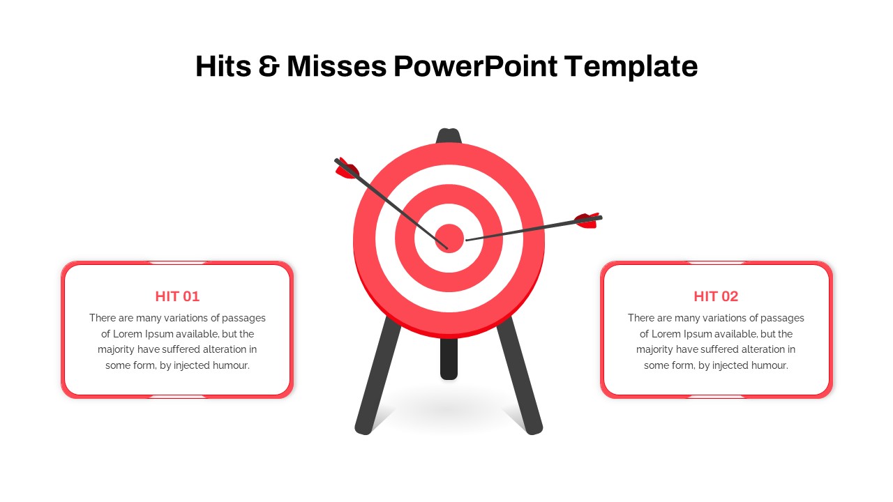
Hits & Misses Comparison Infographic Template for PowerPoint & Google Slides
Pitch Deck
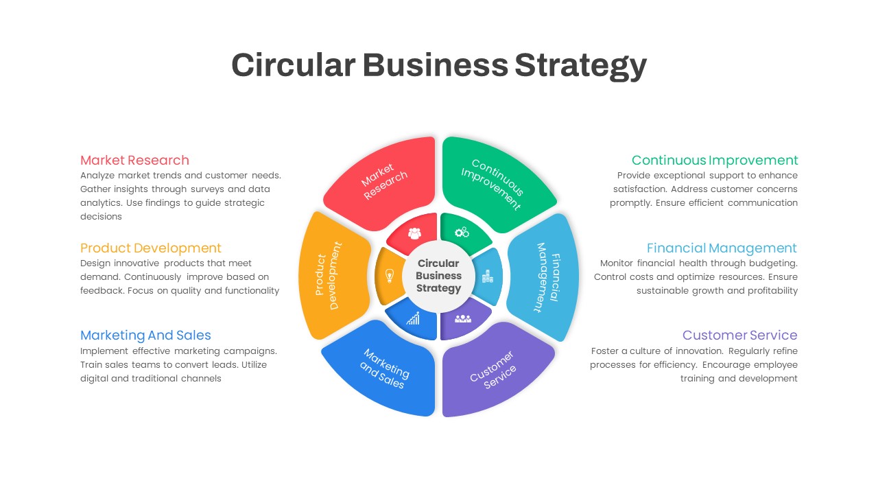
Circular Business Strategy Infographic Template for PowerPoint & Google Slides
Circular
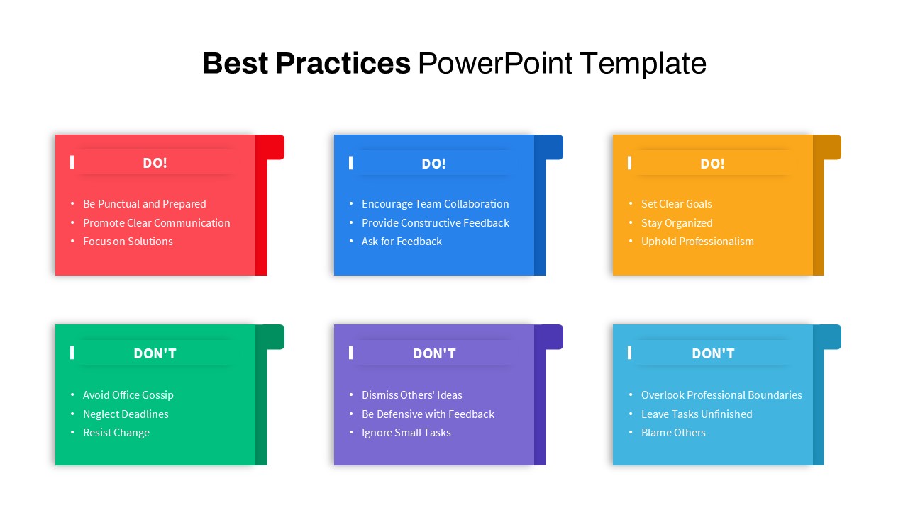
Best Practices Infographic Template for PowerPoint & Google Slides
Circular
Magnetic Talent Attraction Infographic Template for PowerPoint & Google Slides
Recruitment
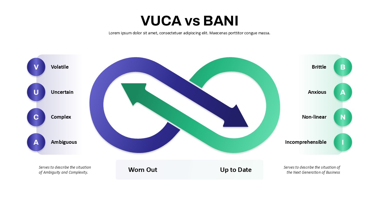
VUCA vs BANI Comparison Infographic Template for PowerPoint & Google Slides
Comparison
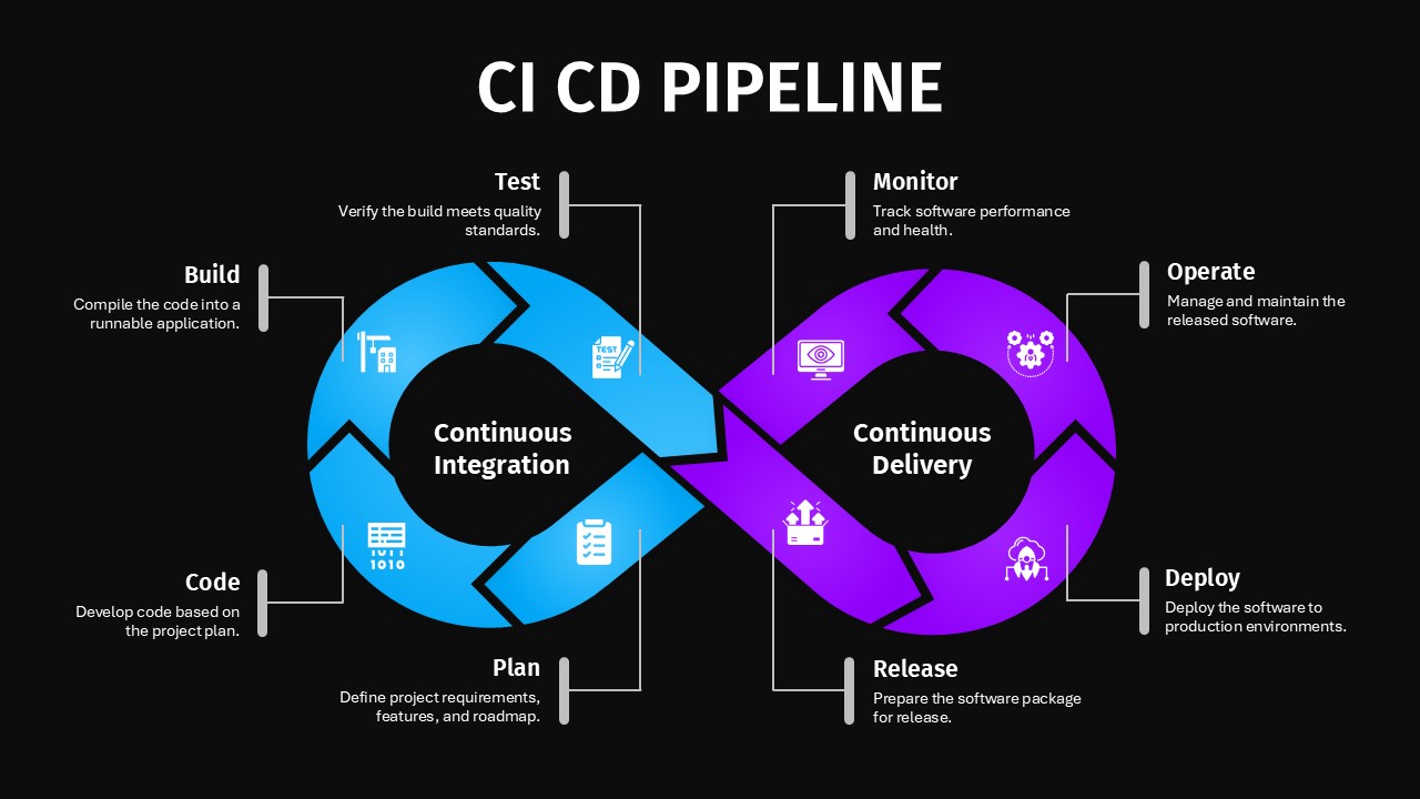
CI/CD Pipeline Infographic Template for PowerPoint & Google Slides
Flow Charts
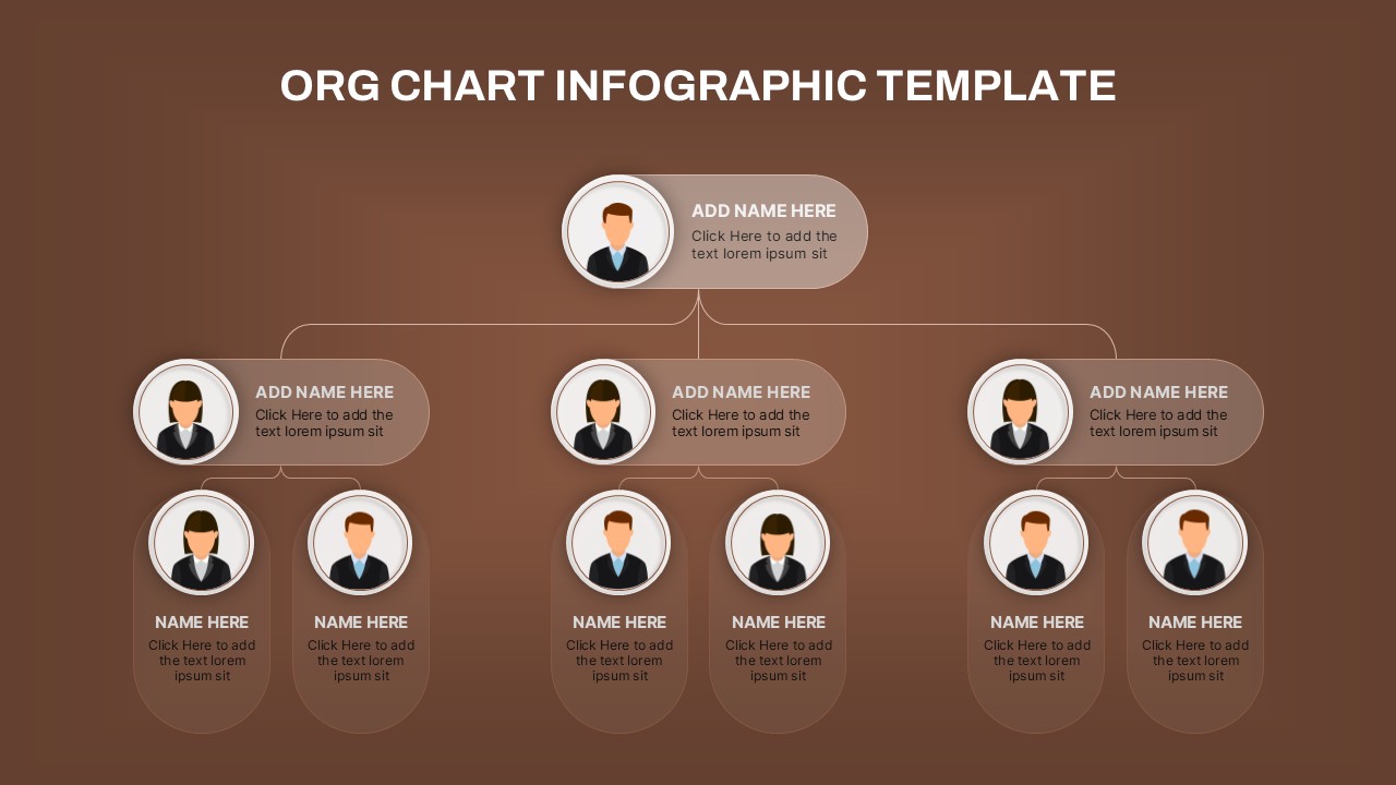
Hierarchical Org Chart Infographic Template for PowerPoint & Google Slides
Org Chart
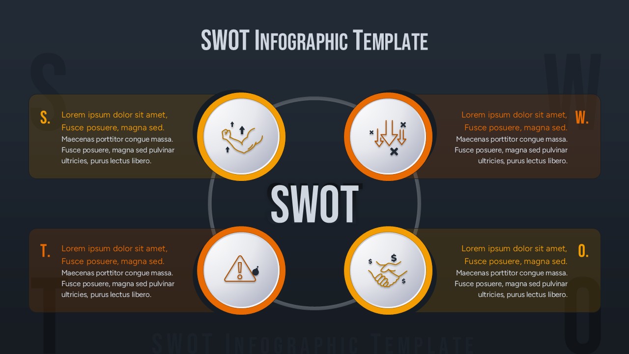
SWOT Analysis Infographic with Circular Icons Template for PowerPoint & Google Slides
SWOT
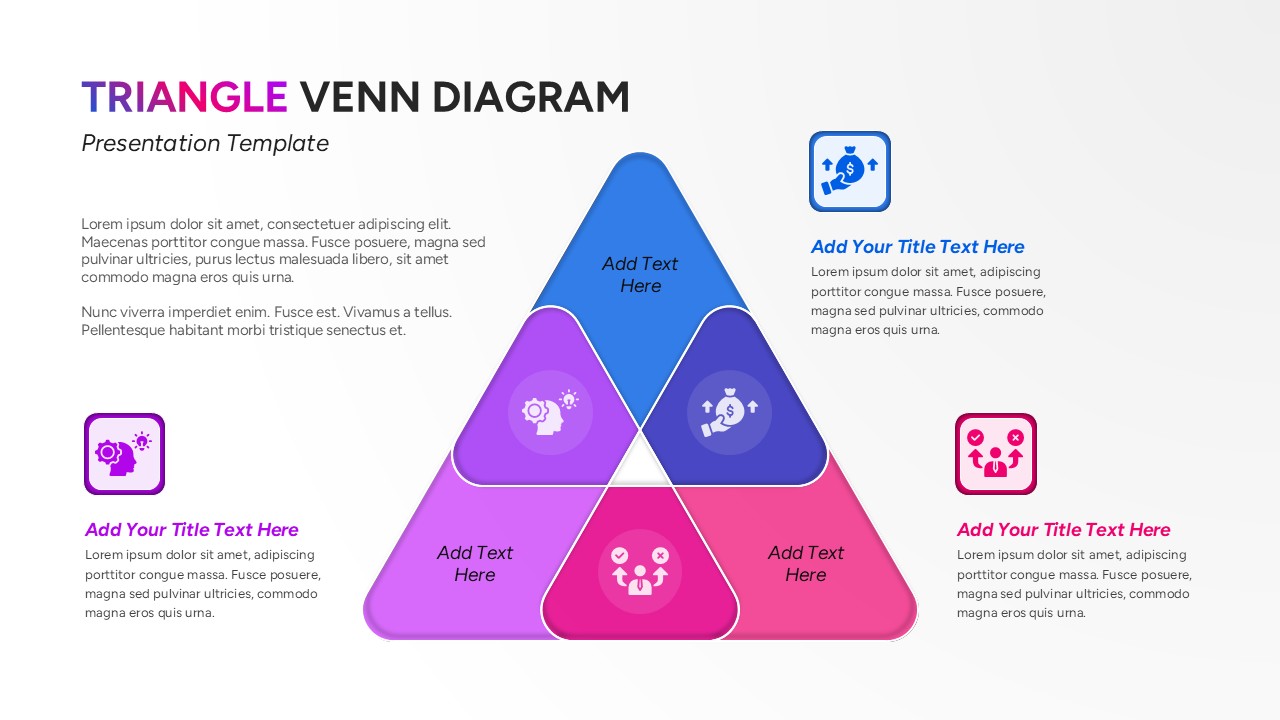
Triangle Venn Diagram Infographic Template for PowerPoint & Google Slides
Comparison