Free Statistics Dashboard Chart for PowerPoint & Google Slides
Statistics Dashboard Chart Slide
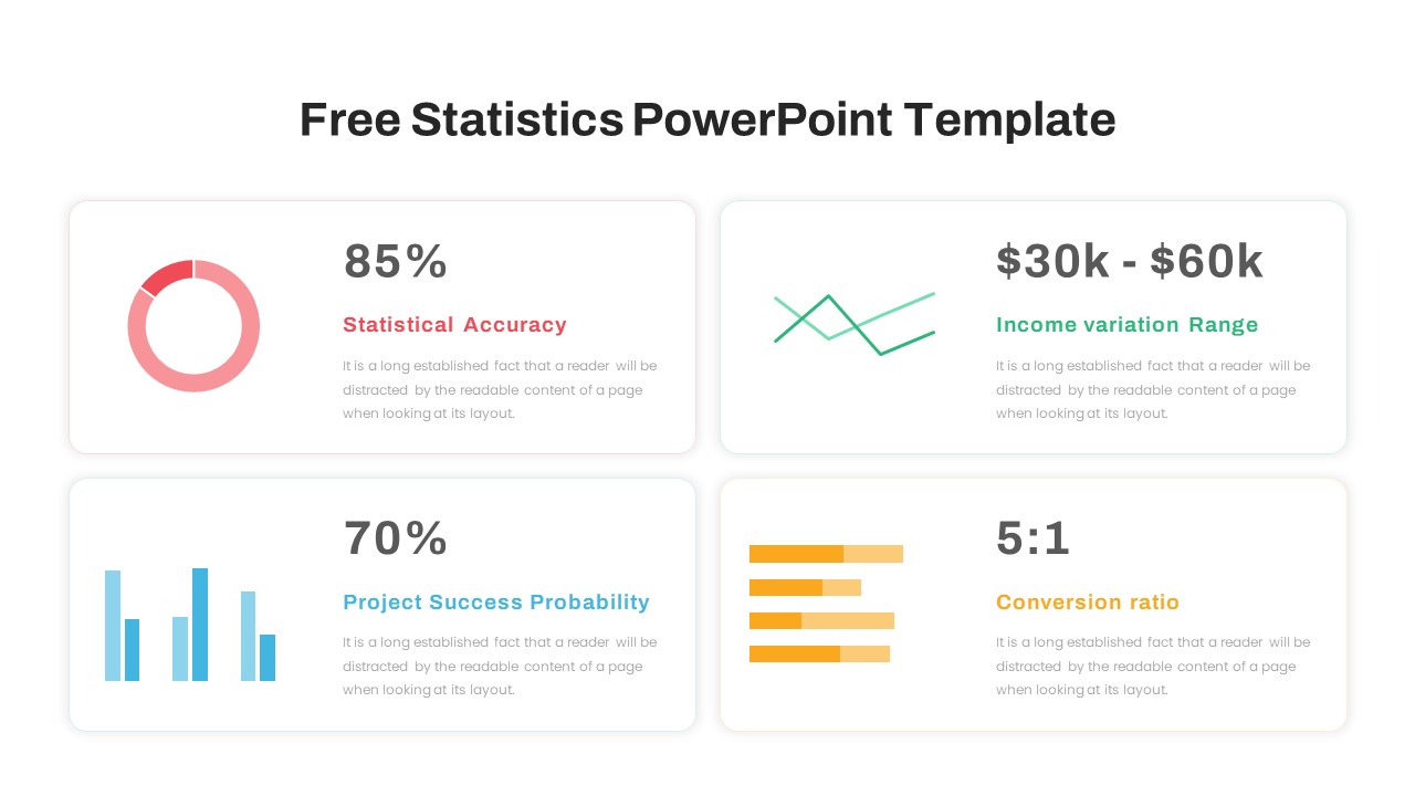
Data becomes meaningful only when it is presented in a format that allows users to identify trends, compare performance, and make informed decisions. A Statistics Dashboard Chart provides a centralized visual overview of key metrics, helping organizations transform complex datasets into clear and actionable insights. Designed with modern charts, KPI indicators, and performance visuals, this dashboard enables teams to monitor results efficiently and communicate findings with confidence.
Dashboard Structure and Flow
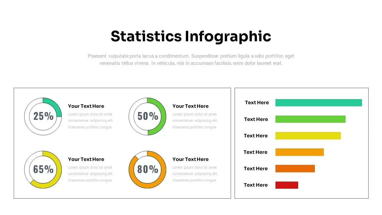
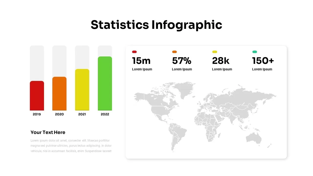
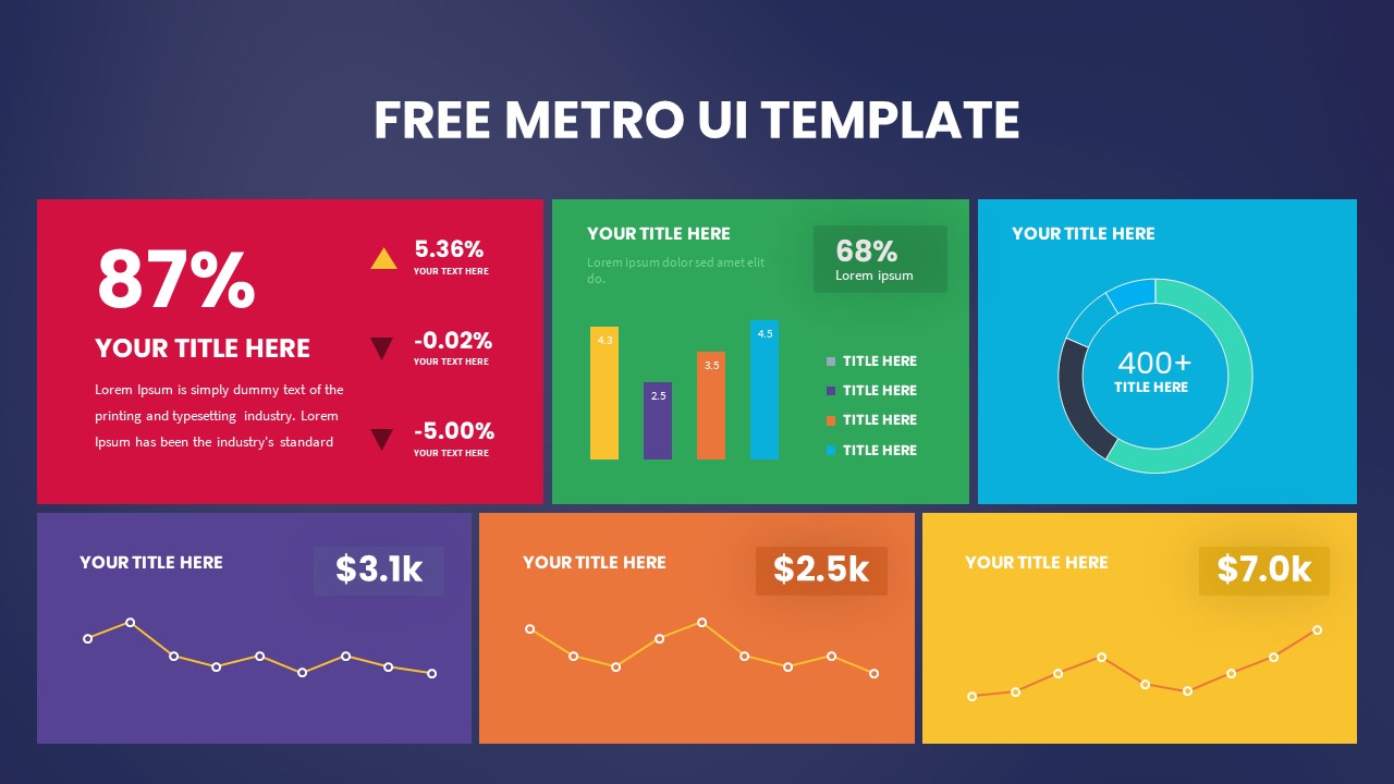
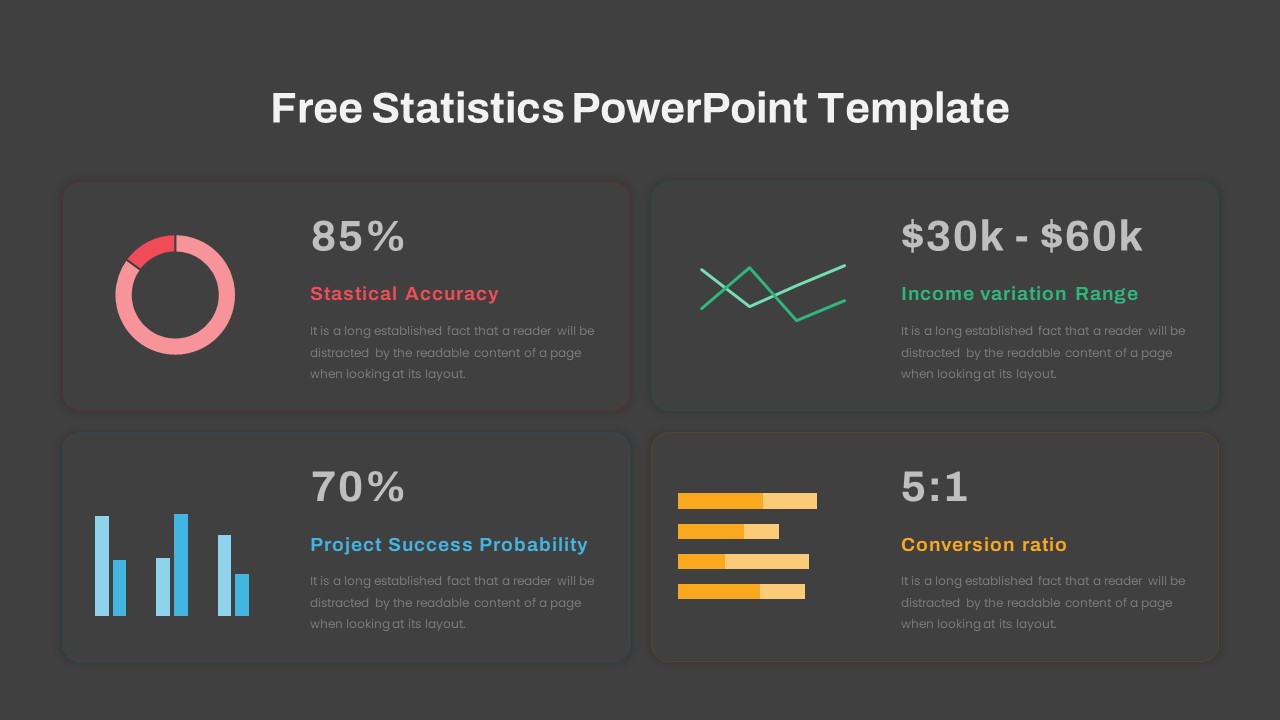
The dashboard begins with high-level performance indicators that summarize critical statistics. Percentage-based charts can highlight accuracy rates, growth levels, or achievement percentages. Trend charts help visualize changes over time, making it easier to identify upward or downward patterns. Bar charts present category comparisons, while ratio-based metrics provide a quick understanding of performance relationships and conversion effectiveness.
A dedicated section can be used to display income ranges, revenue distribution, customer engagement metrics, or operational performance indicators. Visual elements such as donut charts, line graphs, and progress bars simplify data interpretation and improve audience understanding during presentations and reporting sessions.
Uses of the Dashboard
A Statistics Dashboard Chart is useful for business reviews, performance tracking, project reporting, and strategic planning. Managers can use it to evaluate team productivity and operational efficiency. Marketing professionals can monitor campaign performance and conversion rates. Financial analysts can present revenue trends and budget utilization, while project teams can track progress against predefined objectives.
Who Benefits the Most
This dashboard is valuable for business executives, analysts, project managers, marketing teams, financial professionals, and decision-makers who rely on data-driven reporting. Its structured layout helps stakeholders quickly understand important metrics without reviewing lengthy reports.
Edit Options for Customization
Every section of the dashboard can be customized to fit specific reporting requirements. Users can modify colors, charts, labels, icons, and numerical values to align with branding guidelines and presentation goals. This flexibility allows the Statistics Dashboard Chart to support various industries, making it an effective solution for presenting performance data in a professional and visually engaging format.
Login to download this file

Item ID
SB04013


Related Templates

Dynamic Statistics & Progress Charts Template for PowerPoint & Google Slides
Pie/Donut
Statistics Infographic Template for PowerPoint and Google Slides
Bar/Column
Social Media Statistics PowerPoint Template
Comparison
Statistics Presentation Template
Business Report
Statistics Presentation Template
Infographics
Statistics Infographic
Bar/Column
Statistics Infographic Template
Infographics
Free Metro UI Template
Business Report
Free
Free KPI Dashboard Template for PowerPoint & Google Slides
Charts
Free

Free Project Dashboard PowerPoint Template
Charts
Free
Google Analytics 4 (GA4) Dashboard Template for PowerPoint & Google Slides
Digital Marketing

Project Management Dashboard PowerPoint Template and Google Slides Template
Project
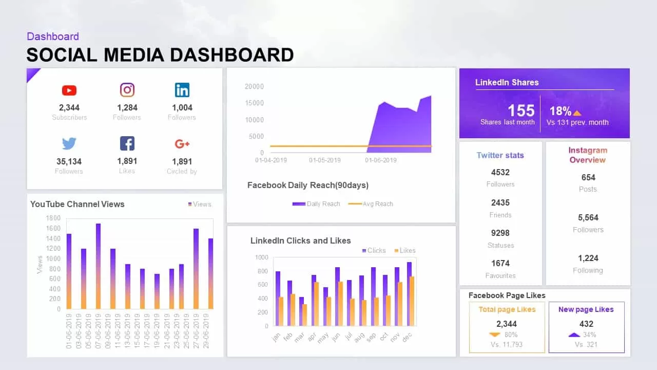
Social Media Performance Dashboard Template for PowerPoint & Google Slides
Bar/Column
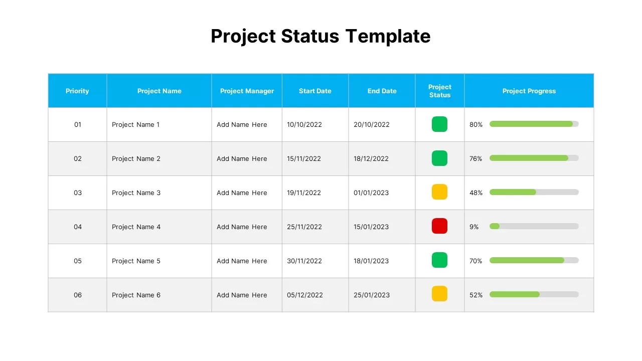
Project Status Dashboard Table Template for PowerPoint & Google Slides
Project Status
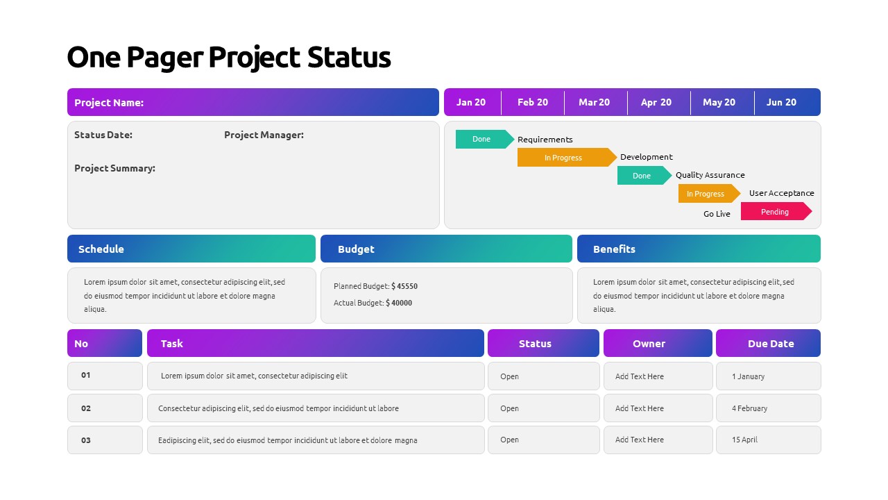
One Pager Project Status Dashboard Template for PowerPoint & Google Slides
Project Status
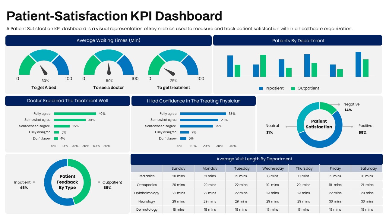
Patient Satisfaction KPI Dashboard
Business
Dashboard Project Status Template for PowerPoint & Google Slides
Project Status
Project Status Dashboard with RAG Legend Template for PowerPoint & Google Slides
Project Status
End of Year Review Dashboard Template for PPT & Google Slides
Business Report
HR Analytics Dashboard PowerPoint & Google Slides Template
HR