Statistics Infographic Template for PowerPoint and Google Slides
Statistics Template
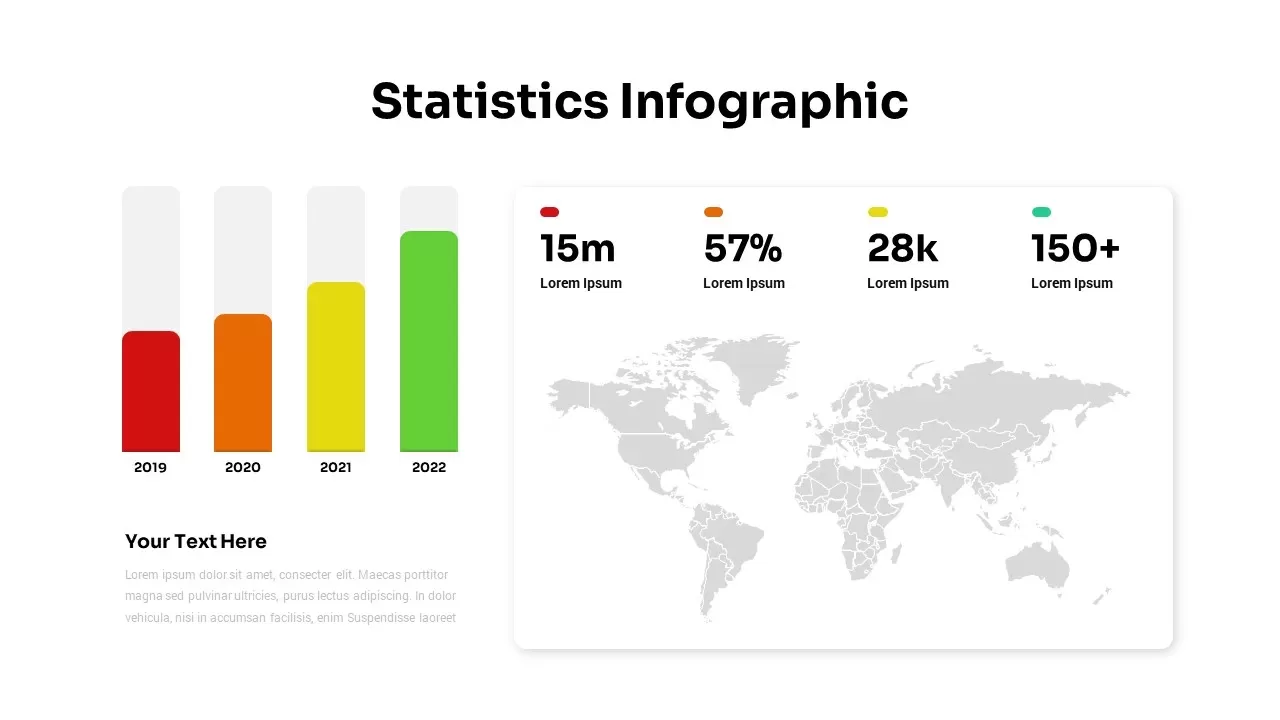
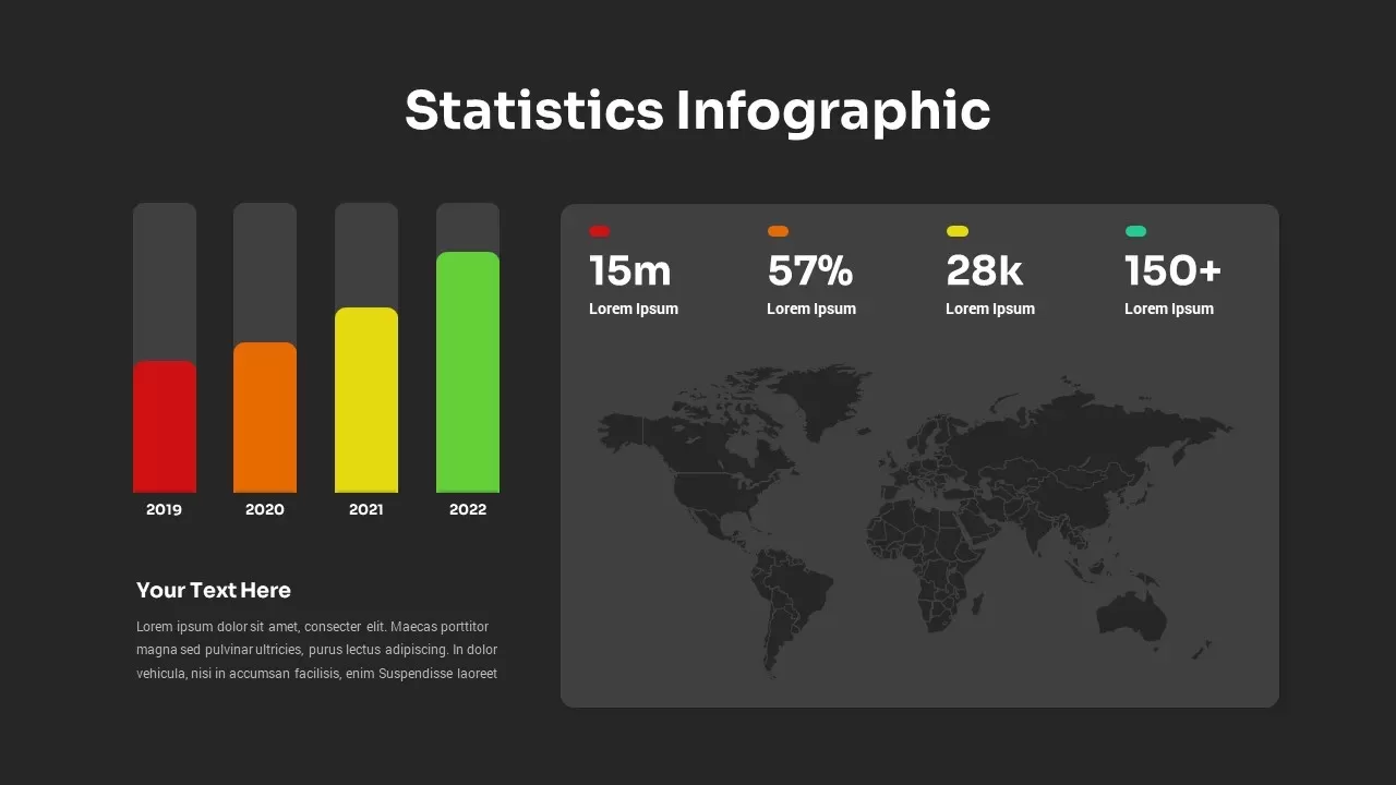
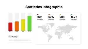
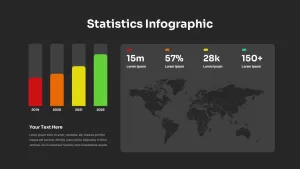
Visualize comparative data with power and clarity using this Statistics Infographic Template for PowerPoint and Google Slides. On the left, a four-year bar chart displays annual metrics (2019–2022) in a vibrant red, orange, yellow, and green gradient. Each bar is fully editable—adjust heights, swap colors, or relabel axes via native chart tools without disrupting your layout. Below the chart, a text zone invites deeper analysis or commentary. On the right, a world map emerges behind a clean, white panel featuring four key performance callouts: a 15 m metric in red, 57 % in orange, 28 k in yellow, and 150 + in teal—each paired with descriptive text placeholders. Master slide integration and vector shapes ensure that any change to fonts, colors, or data formats applies globally, preserving design consistency across your deck. Subtle drop shadows, generous white space, and crisp sans-serif typography maintain a professional, minimalist aesthetic that keeps the focus on your insights, whether you’re presenting in a boardroom, webinar, or printed report.
Who Should Download This Statistics Template
Business analysts, marketing managers, financial planners, and executive teams who need a high-impact slide to present annual growth trends, regional analytics, and KPI comparisons clearly and convincingly.
Other Use Cases of this Statistics Infographic Template
Repurpose this template to showcase quarterly sales figures, market-share breakdowns, demographic distributions, or project rollout statuses. Its dual chart-and-map format adapts seamlessly to any scenario requiring both temporal and geographic data visualization.
Login to download this file

Item ID
SB03043


Related Templates

Statistics Infographic Template
Infographics
Free Statistics Dashboard Chart for PowerPoint & Google Slides
Bar/Column
Free
Statistics Infographic
Bar/Column
Dynamic Statistics & Progress Charts Template for PowerPoint & Google Slides
Pie/Donut
Social Media Statistics PowerPoint Template
Comparison
Statistics Presentation Template
Business Report
Statistics Presentation Template
Infographics
Google Ads Presentation PowerPoint Template
Digital Marketing
Quad Chart Infographic Pack of 8 Slides Template for PowerPoint & Google Slides
Comparison Chart
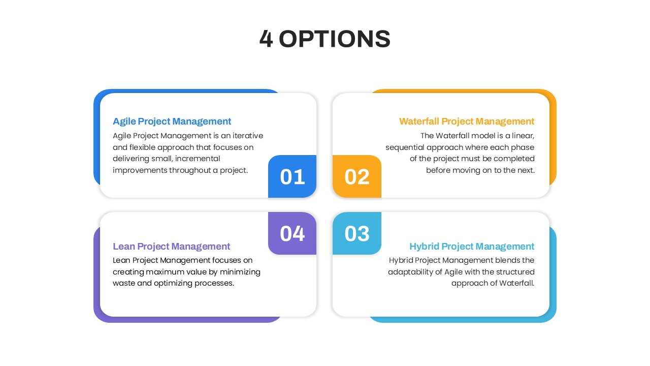
4 Options Project Management PowerPoint Template
Comparison
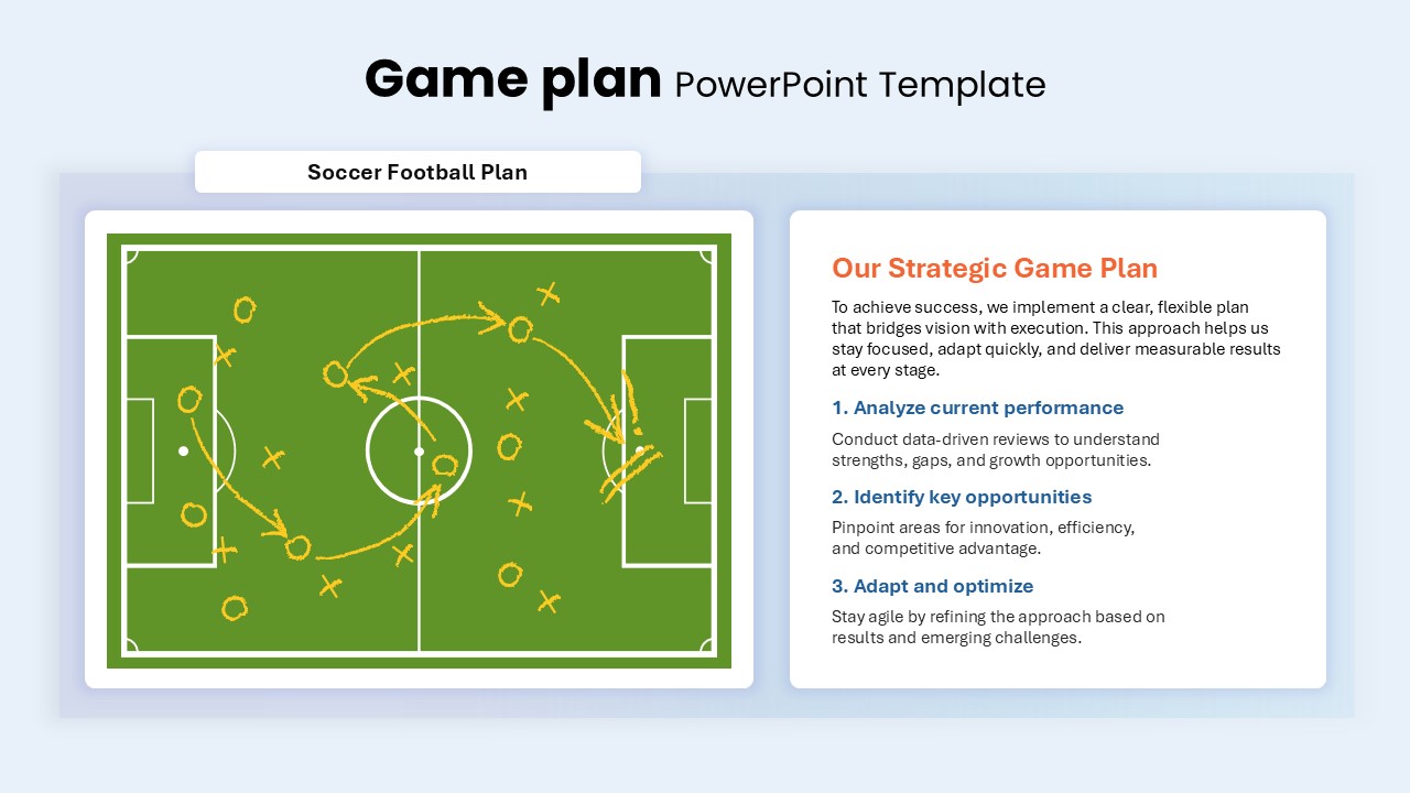
Game Plan Template for PPT & Google Slides
Infographics
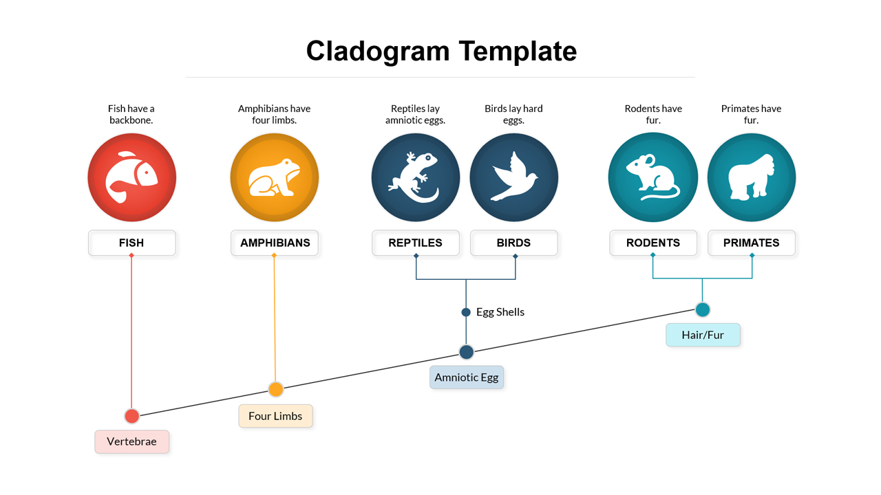
Cladogram Infographic Template
Decision Tree

Free Infographic Deck PowerPoint Pack for PowerPoint & Google Slides
Infographics
Free
3D Block Infographic template for PowerPoint & Google Slides
Infographics
Five-Step Puzzle Head Infographic Template for PowerPoint & Google Slides
Process
6 Step Infographic Template for PowerPoint & Google Slides
Process
Level 5 Leadership Pyramid Infographic Template for PowerPoint & Google Slides
Pyramid
Three-Path Curved Arrow Infographics Template
Arrow
Six-Step Hexagon Infographic Layout Template for PowerPoint & Google Slides
Infographics
Funnel PowerPoint Template
Funnel
Free