Patient Satisfaction KPI Dashboard
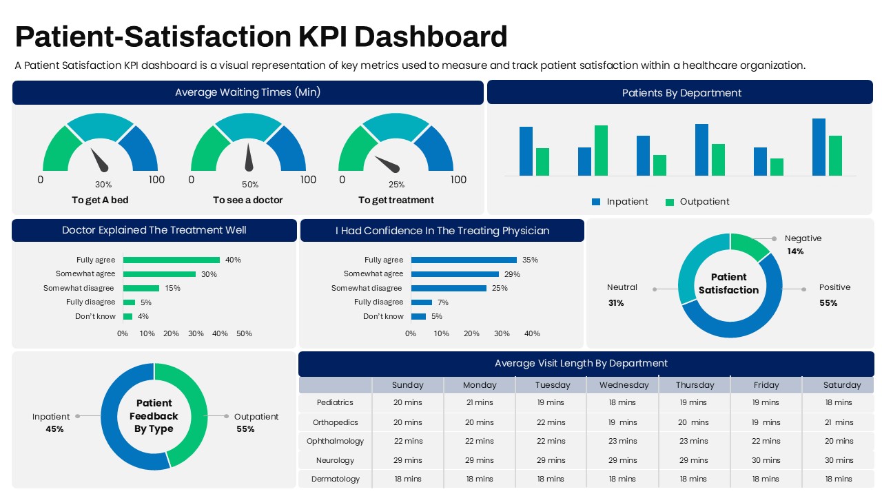
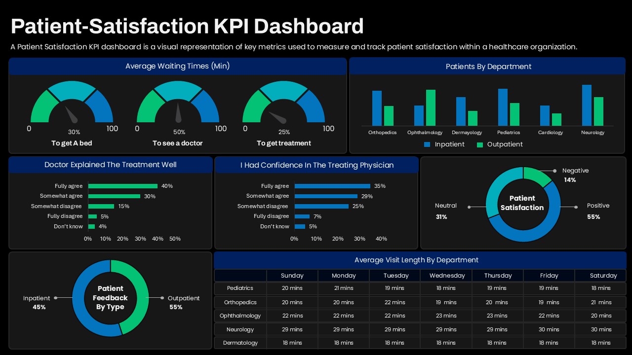
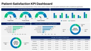
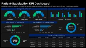
The Patient Satisfaction KPI Dashboard PowerPoint Template is an editable healthcare analytics dashboard designed to present key patient experience metrics in a clear and organized format. KPI dashboards provide an effective way to monitor satisfaction levels, waiting times, department performance, physician feedback, and other healthcare service indicators. This professional dashboard can be used for multiple purposes, like:
- Monitoring patient satisfaction and experience metrics
- Comparing inpatient and outpatient feedback data
- Presenting average patient waiting and visit times
- Reviewing physician communication and treatment feedback
- Analyzing satisfaction levels across healthcare departments
- Reporting healthcare service performance to stakeholders
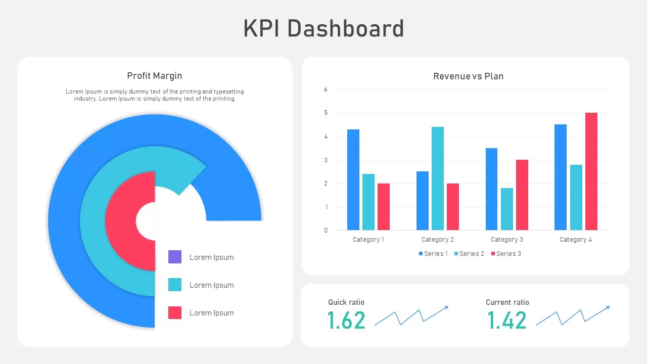
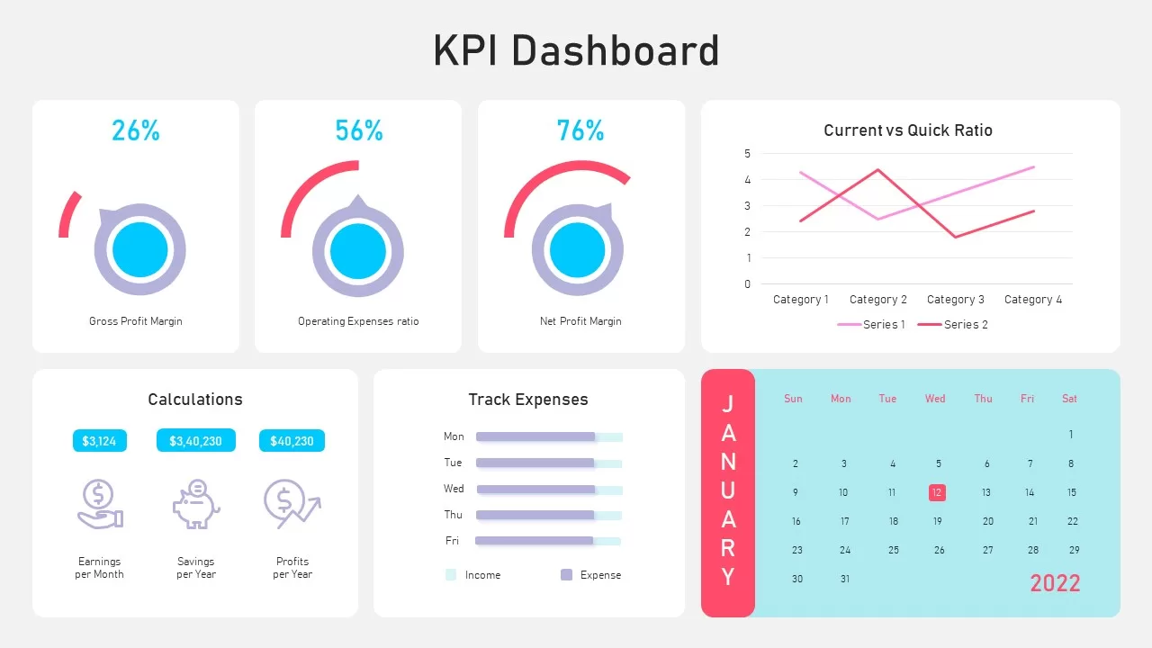
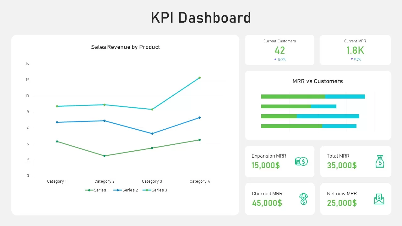
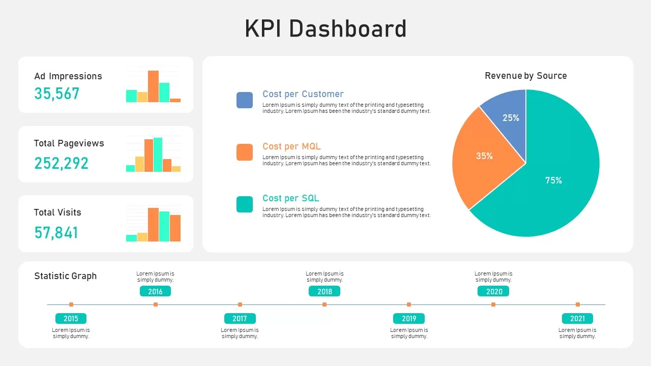
This is a useful presentation dashboard for healthcare organizations looking to summarize patient experience data in one visual layout. Our Patient Satisfaction KPI Dashboard PowerPoint Template includes multiple editable data visualizations, allowing presenters to display different aspects of patient feedback and service performance. The dashboard features gauge charts for average waiting times, a department comparison chart, horizontal bar charts for treatment explanations and physician confidence, and a donut chart showing overall patient satisfaction.
The feedback-by-type chart is usable to compare inpatient and outpatient responses, while the department table provides a detailed view of average visit length across different days. These visual elements allow healthcare professionals to present both high-level performance indicators and supporting data within a single dashboard. The charts, labels, numbers, colors, fonts, and other graphical elements can be customized according to the presentation requirements.
The template can be useful for hospital management meetings, healthcare performance reviews, patient experience reports, quality improvement presentations, clinical administration discussions, and service evaluation sessions. Users can replace the sample figures with their own data and adjust the dashboard components to reflect relevant KPIs. The clean grid-based layout also helps audiences quickly understand the relationship between patient satisfaction, service efficiency, and departmental performance. So, download and try editing this PPT template for your next presentation!
Login to download this file

Item ID
SB05414


Related Templates

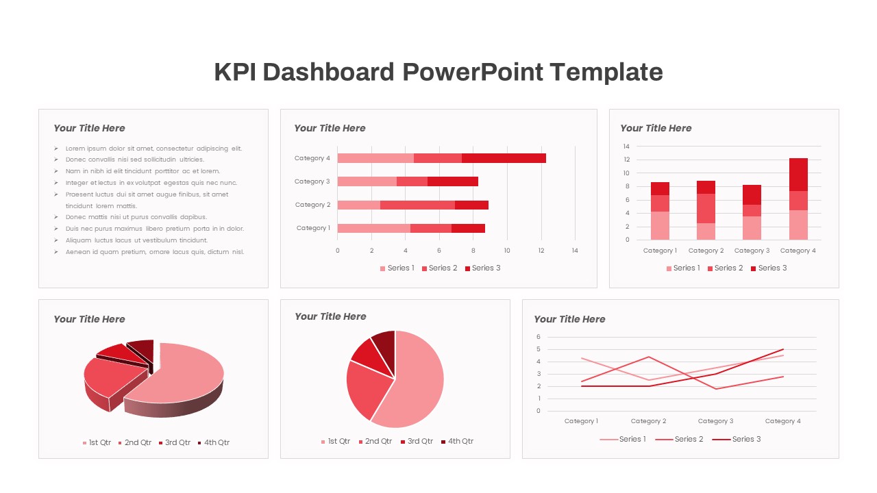
KPI Dashboard template for PowerPoint & Google Slides
Business Report
KPI Dashboard Infographics Template
Finance
KPI Dashboard Data Visualization Template
Bar/Column
KPI Dashboard Presentation Template
Bar/Column
Free KPI Dashboard Template for PowerPoint & Google Slides
Charts
Free
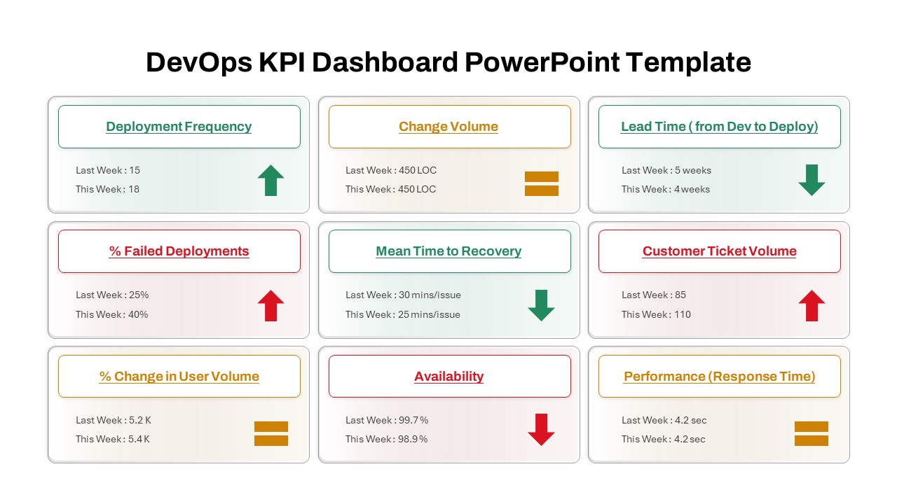
DevOps KPI Dashboard PowerPoint Template
Software Development
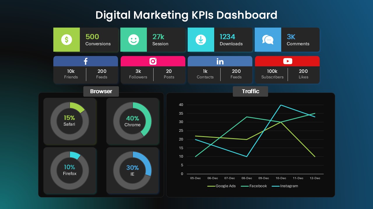
Digital Marketing KPI Dashboard Template
Business Report
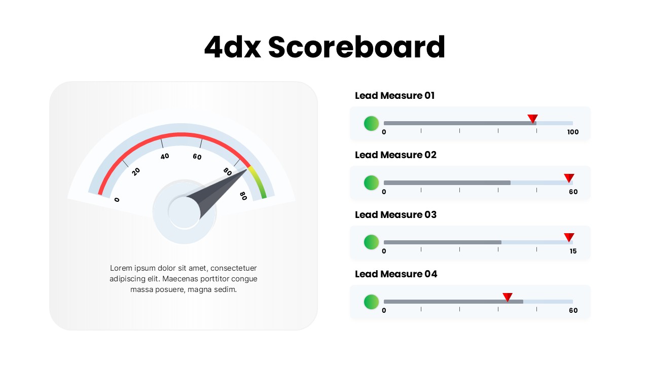
4DX Scoreboard Dashboard for PowerPoint & Google Slides
Business Strategy
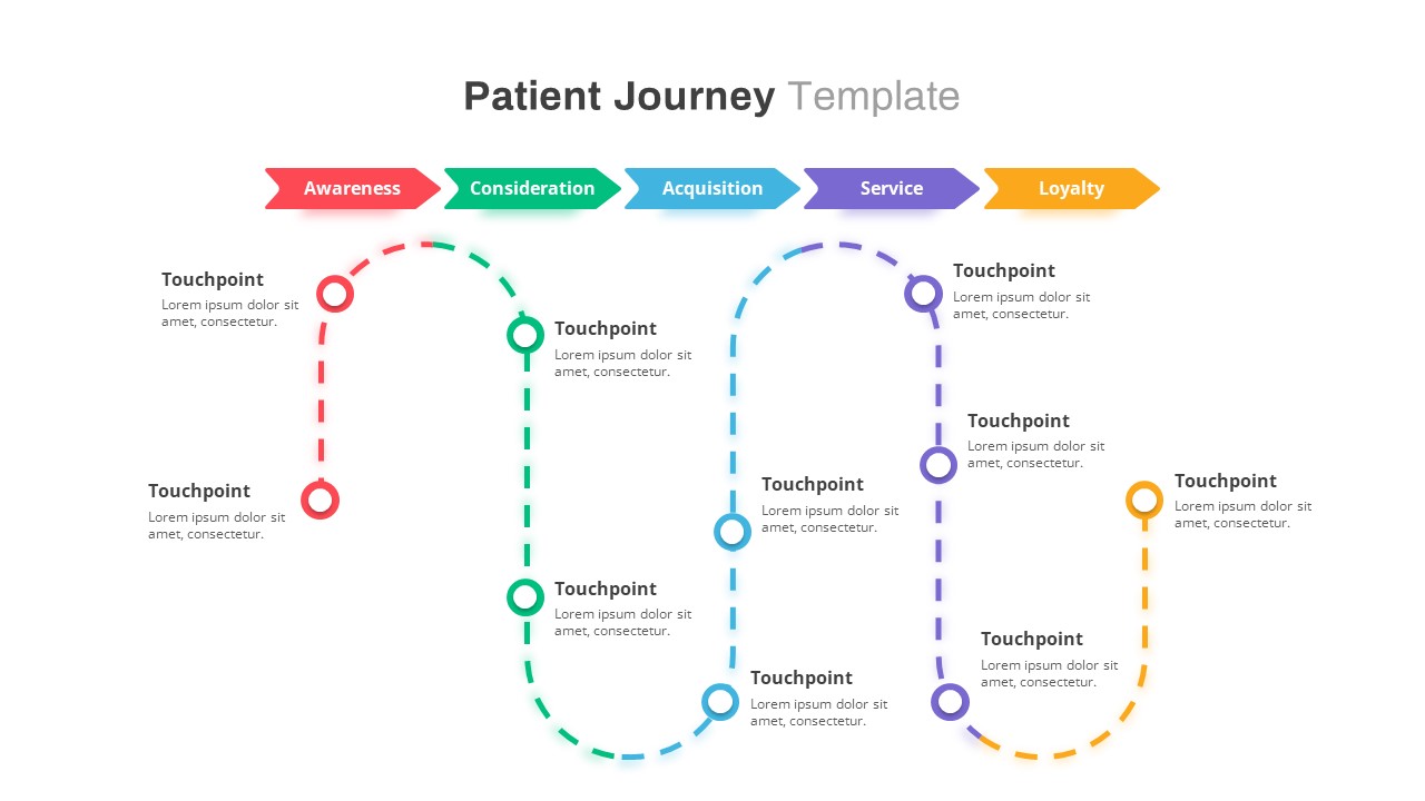
Patient Journey Map Template
Health
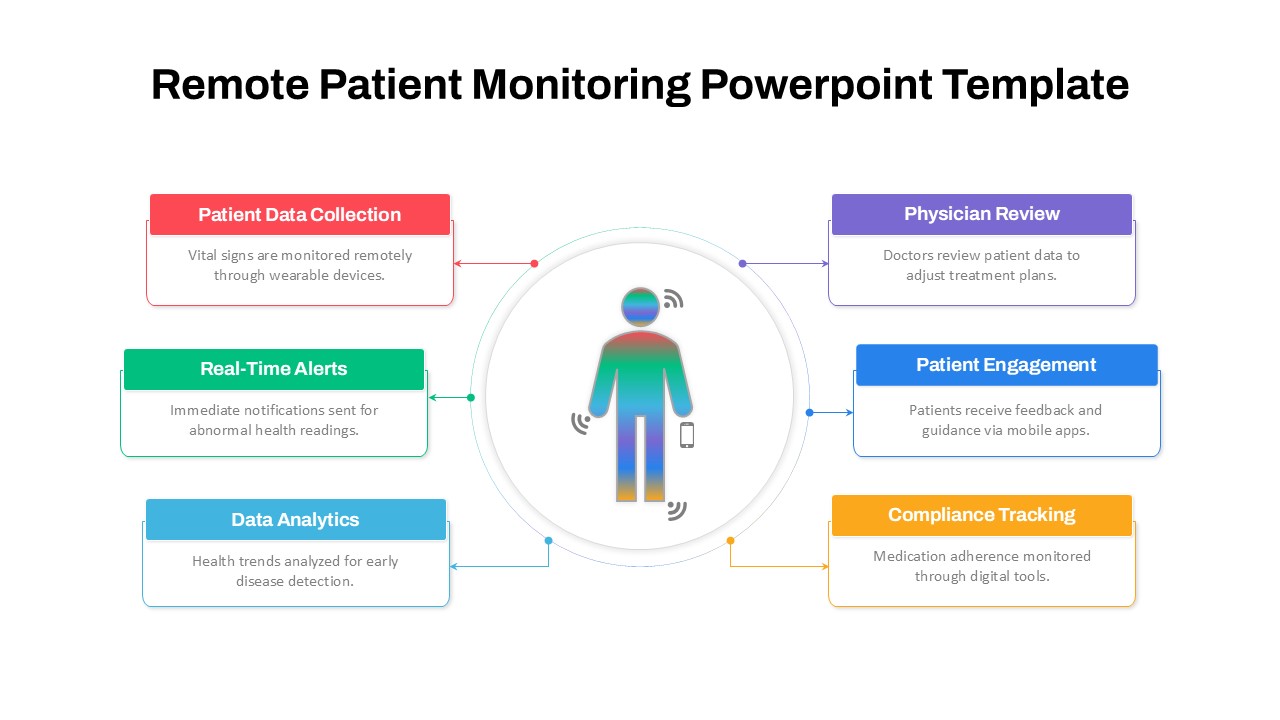
Remote Patient Monitoring PowerPoint Template
Health
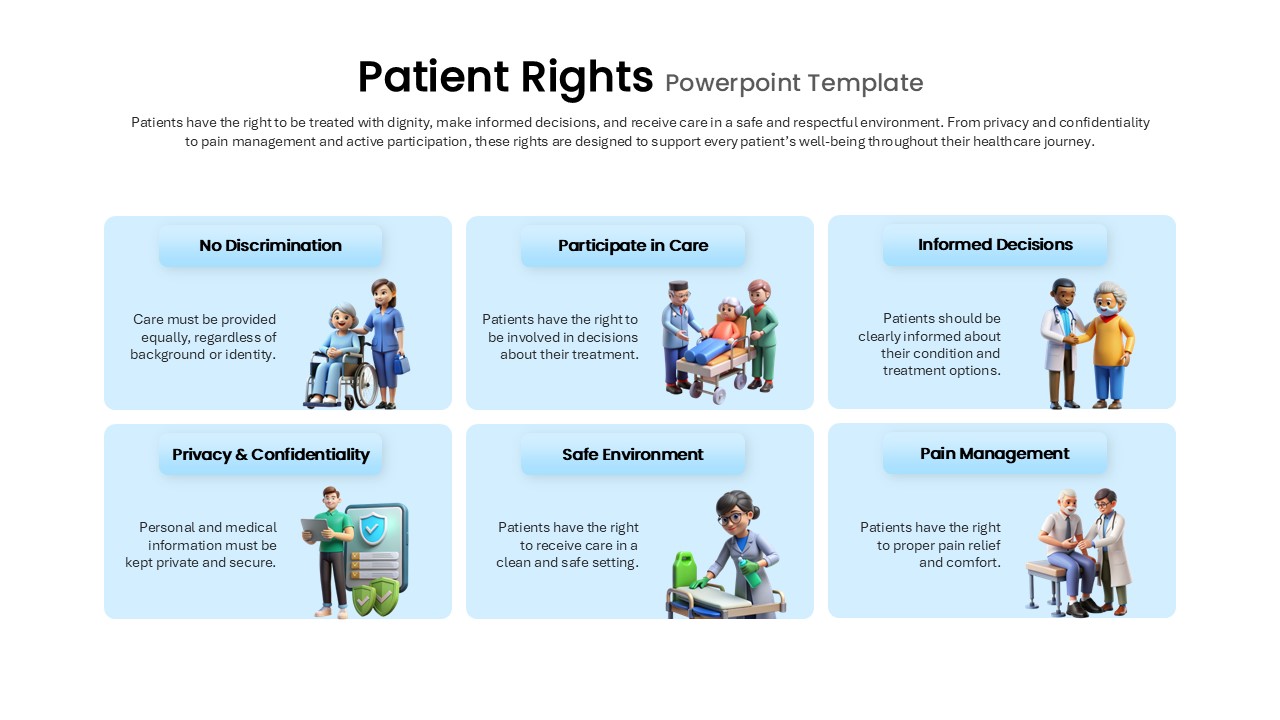
Patients Rights PowerPoint Template
Medical
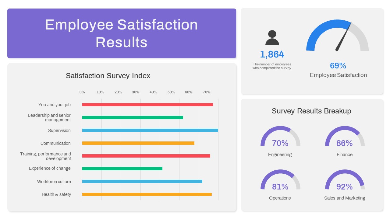
Employee Satisfaction PowerPoint Template
Employee Performance
Customer Satisfaction PowerPoint Template
Customer Experience
Customer Satisfaction Survey Result Presentation Template
Marketing
Candidate Satisfaction Score Template
Business

Application Revenue Line Chart KPI Template
Revenue
KPI Slide for PowerPoint
Business Report
Professional Team Collage & KPI Slide Template for PowerPoint & Google Slides
Business
Circular Image Gallery & KPI Metrics Template for PowerPoint & Google Slides
Pie/Donut
Purchasing KPI Analysis PowerPoint Template
Business Report