KPI Dashboard Presentation Template
KPI Presentation Template
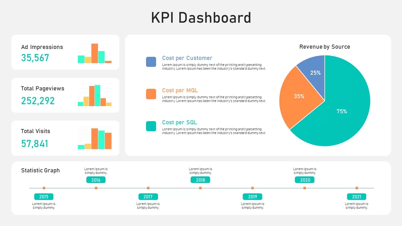
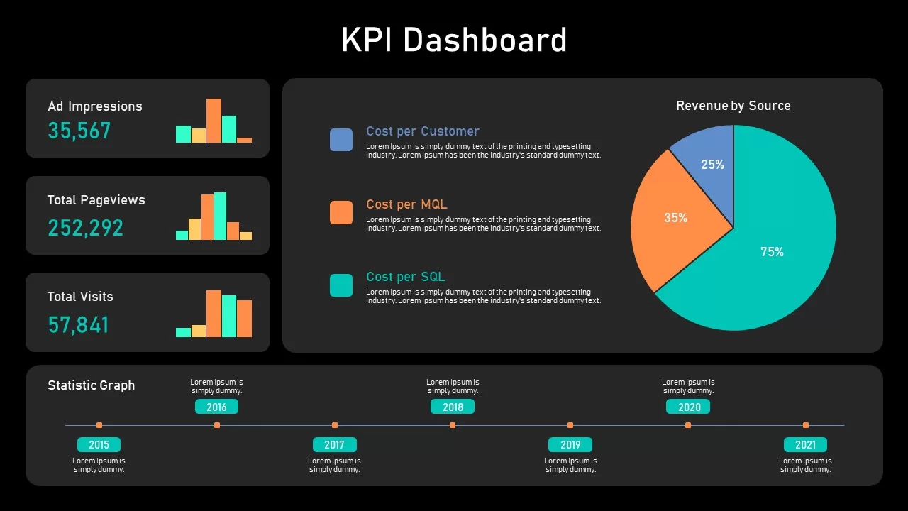
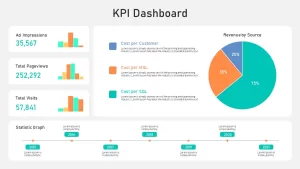
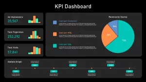
Showcase your key metrics at a glance with this fully editable KPI Dashboard Presentation Template. The column chart template features embedded bar-column charts for ad impressions, pageviews, and visits alongside prominent KPI cards displaying cost per customer, MQL, and SQL. A pie chart illustrates revenue distribution by source, and a horizontal timeline at the bottom highlights milestones from 2015 to 2021. Neutral container panels and generous white space keep attention on your data, while accent colors—cyan, orange, and blue—highlight performance shifts.
Built on master slides with vector-based graphics and named layers, this dashboard lets you update data series, swap chart types, and recolor accents in seconds. Simply replace placeholder figures and the charts and timeline will refresh automatically. Whether you’re using PowerPoint or Google Slides, you’ll benefit from pixel-perfect fidelity, seamless collaboration, and reduced formatting headaches.
Ideal for monthly reports, boardroom presentations, and investor updates, this KPI Dashboard slide distills complex data into an intuitive overview. Track subscription revenue, website performance, or any combination of KPIs with clarity and visual impact.
Login to download this file

Item ID
SB02756


Related Templates

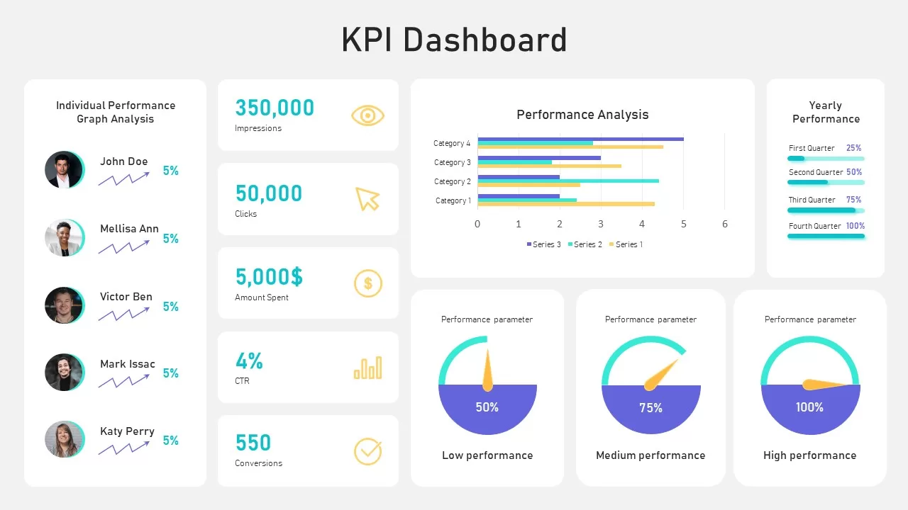
KPI Dashboard template for PowerPoint & Google Slides
Business Report
KPI Dashboard Infographics Template
Finance
KPI Dashboard Data Visualization Template
Bar/Column
Free KPI Dashboard Template for PowerPoint & Google Slides
Charts
Free
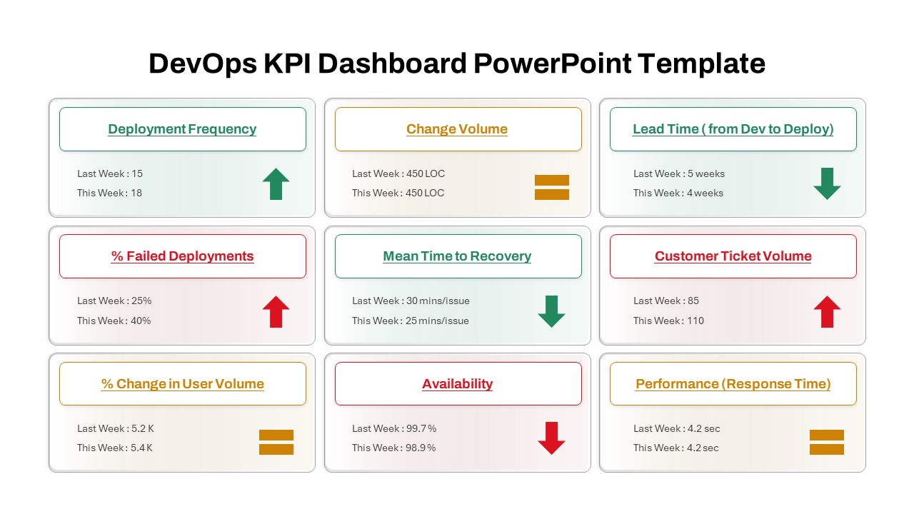
DevOps KPI Dashboard PowerPoint Template
Software Development
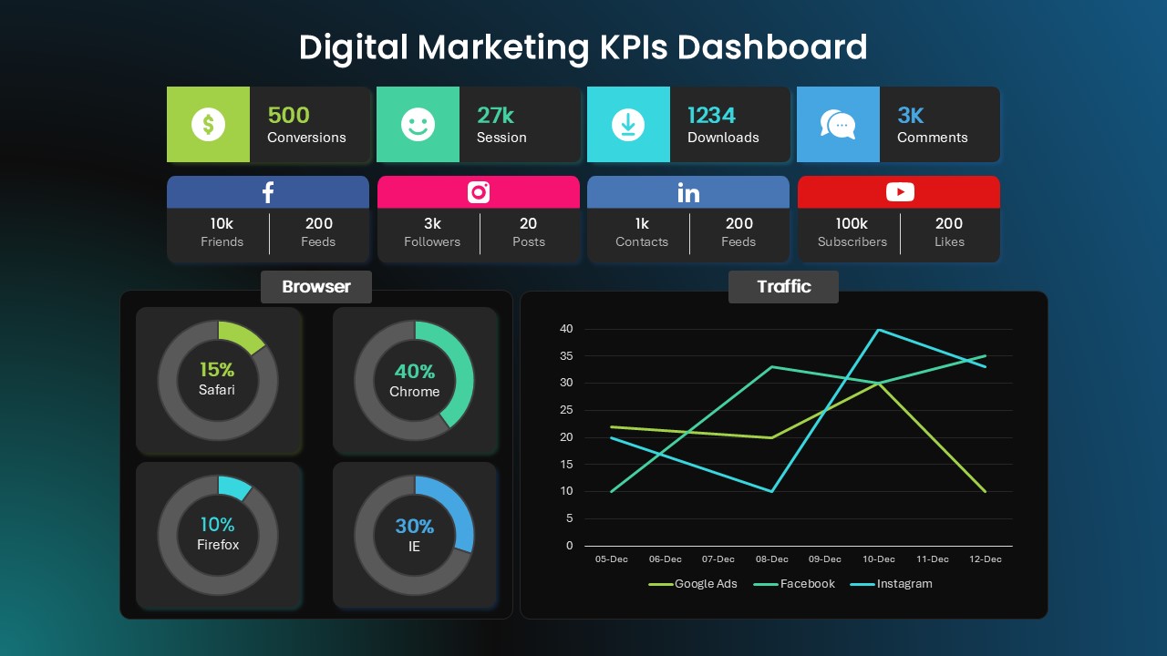
Digital Marketing KPI Dashboard Template
Business Report
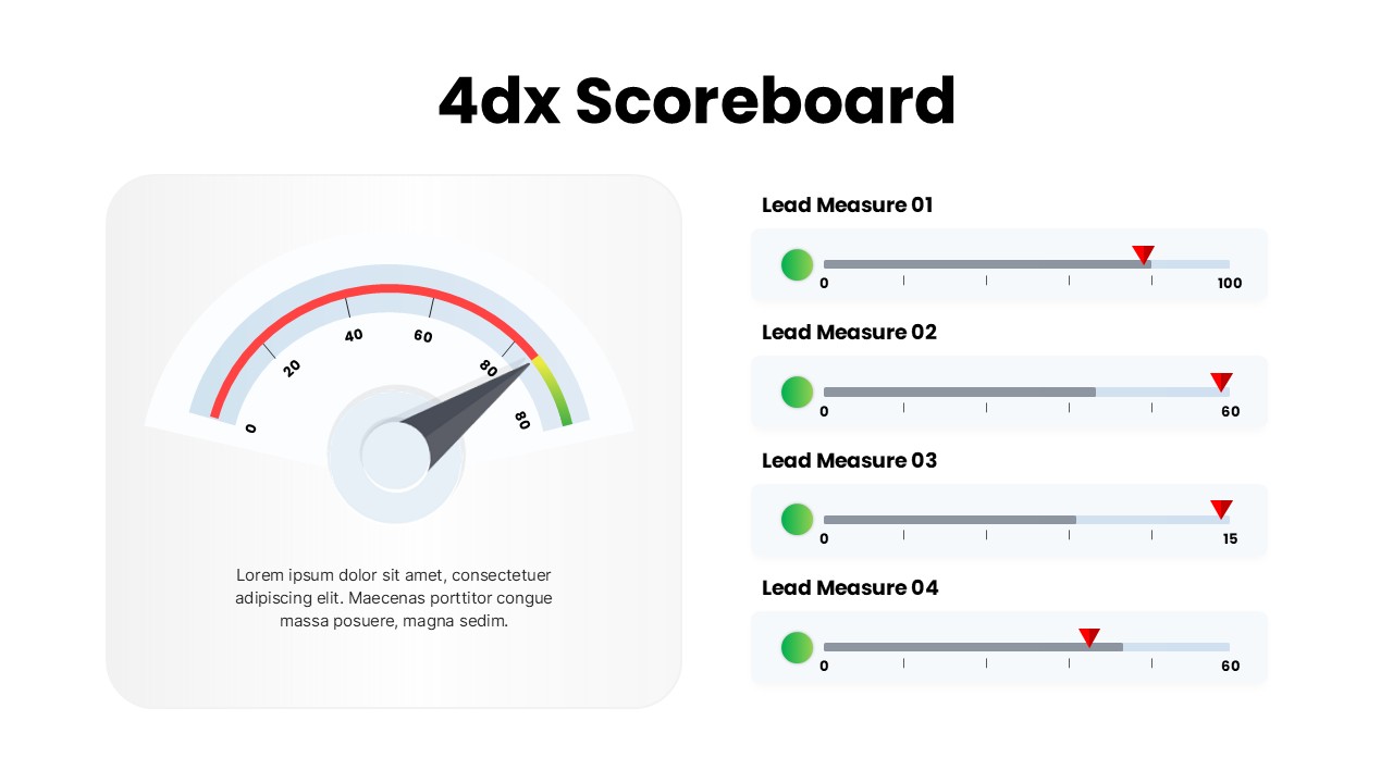
4DX Scoreboard Dashboard for PowerPoint & Google Slides
Business Strategy
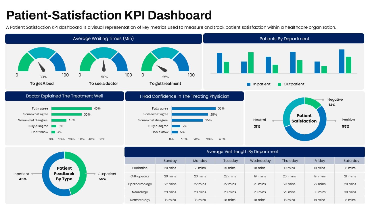
Patient Satisfaction KPI Dashboard
Business

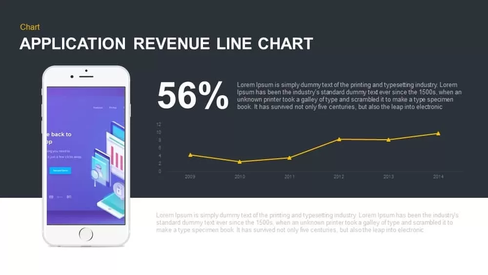
Application Revenue Line Chart KPI Template
Revenue
Professional Team Collage & KPI Slide Template for PowerPoint & Google Slides
Business
Circular Image Gallery & KPI Metrics Template for PowerPoint & Google Slides
Pie/Donut
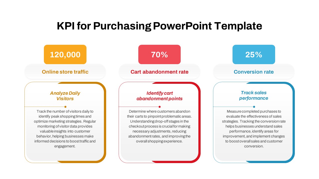
Purchasing KPI Analysis PowerPoint Template
Business Report
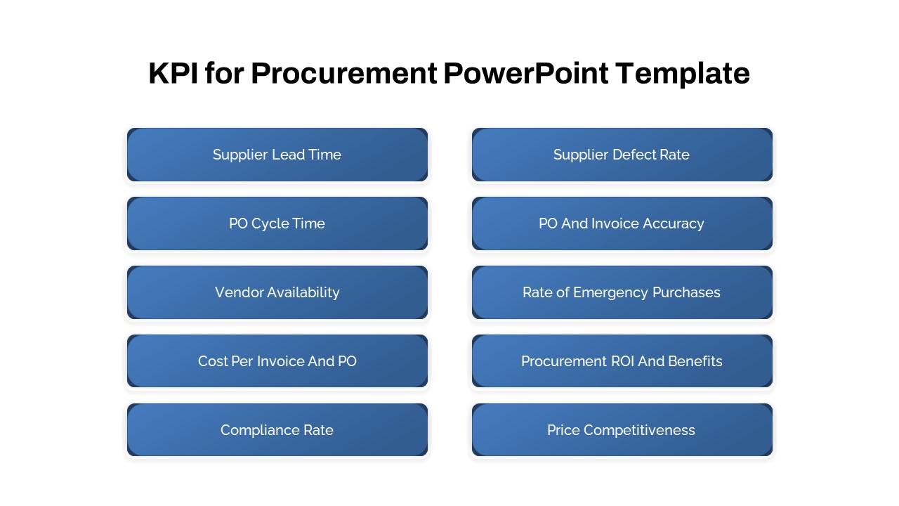
Procurement KPI PowerPoint Template
Business Report
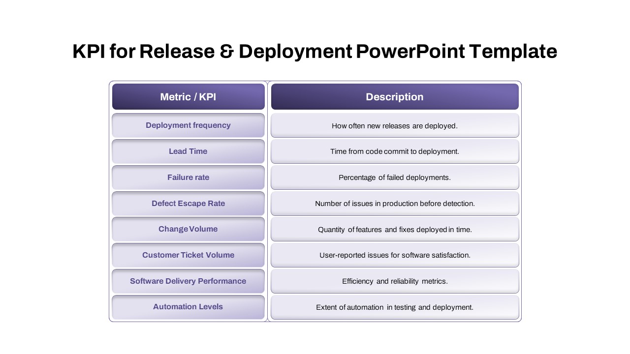
KPI for Release and Deployment Template
Software Development
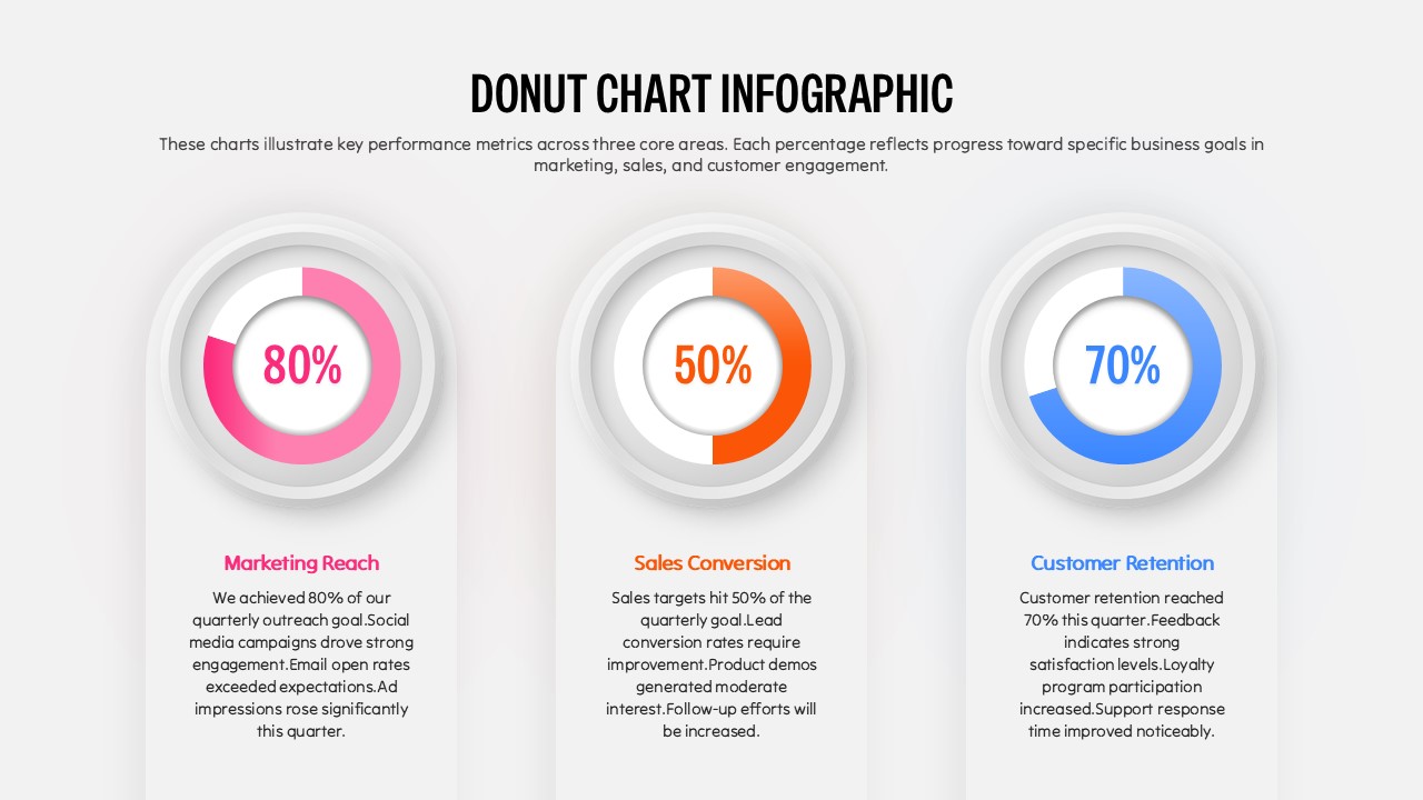
Donut Chart Infographic Template for PowerPoint
Pie/Donut
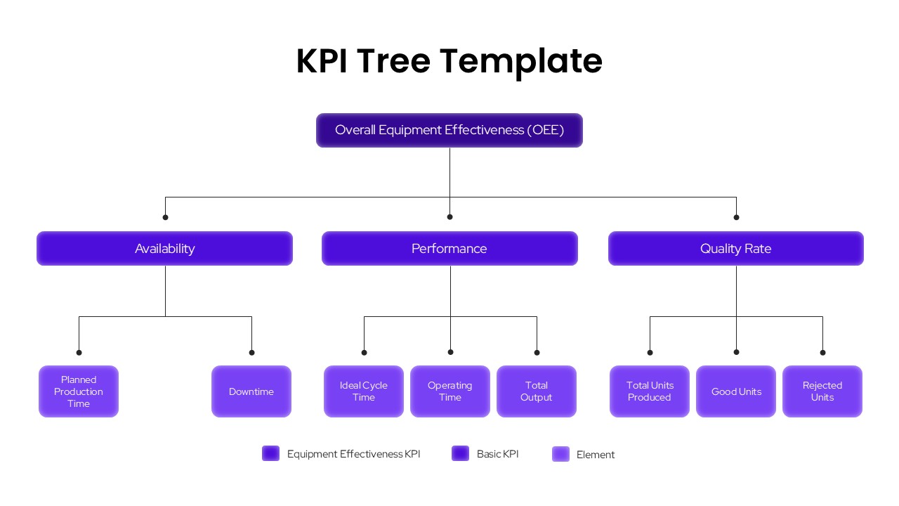
KPI Tree Template
Infographics
KPI Slide for PowerPoint
Business Report
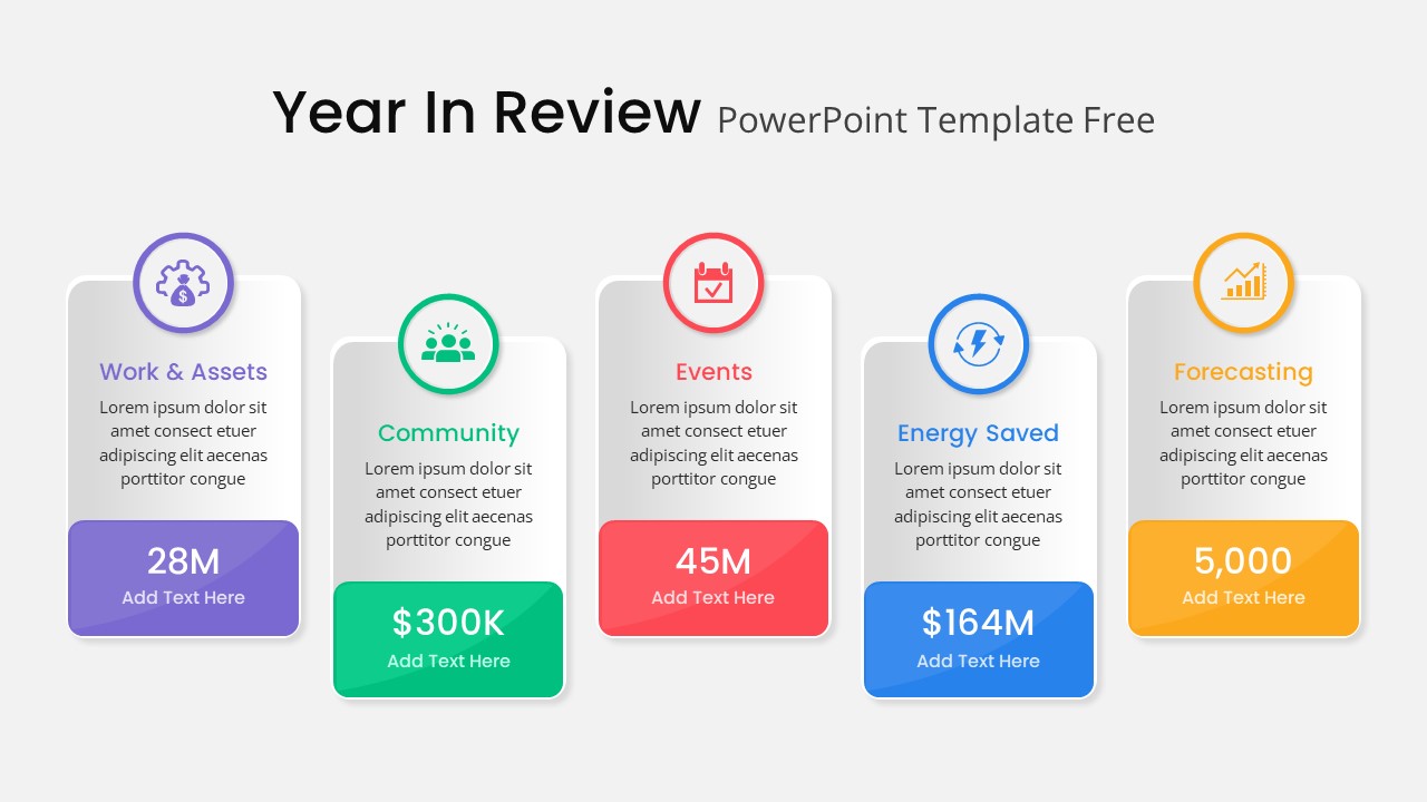
Year in Review KPI Highlights Slide for PowerPoint & Google Slides
Business Report
Business Intelligence Dashboard Presentation Template
Dashboard
Sales Dashboard Template for PowerPoint Template
Bar/Column