Survey Results Template Infographics

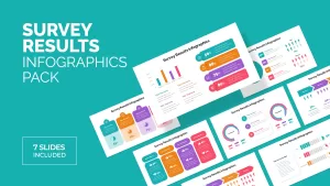


Survey Results Infographic for PowerPoint and Google Slides
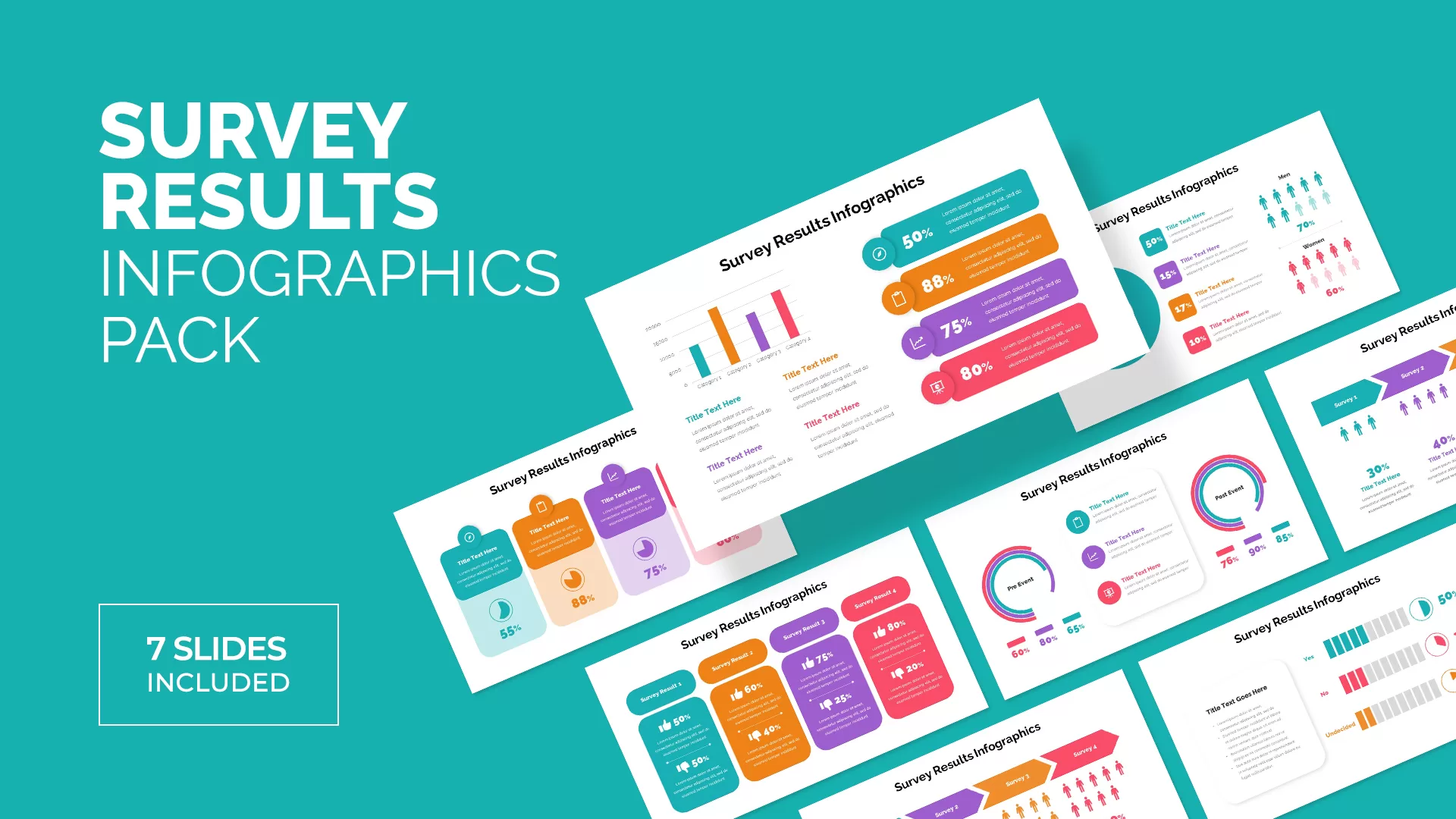
A survey results template infographic is crucial for businesses and organizations. This 16-slide presentation includes survey infographics created with different layouts and shapes. These multiple presentation slides for survey results presentation examples drive you to presenting survey results.
You can visualize your customer voices using the survey results infographics. Of course, reporting facts and figures with a storytelling methodology enables your viewers to easily interpret visuals. A survey result is a statistical presentation, so it may bore the audience. So, when you embed data and convert it into digital visuals, it may take your entire audience, and they can easily grab what you have presented. Use the survey presentation PowerPoint template for an easy understanding of statistical data.
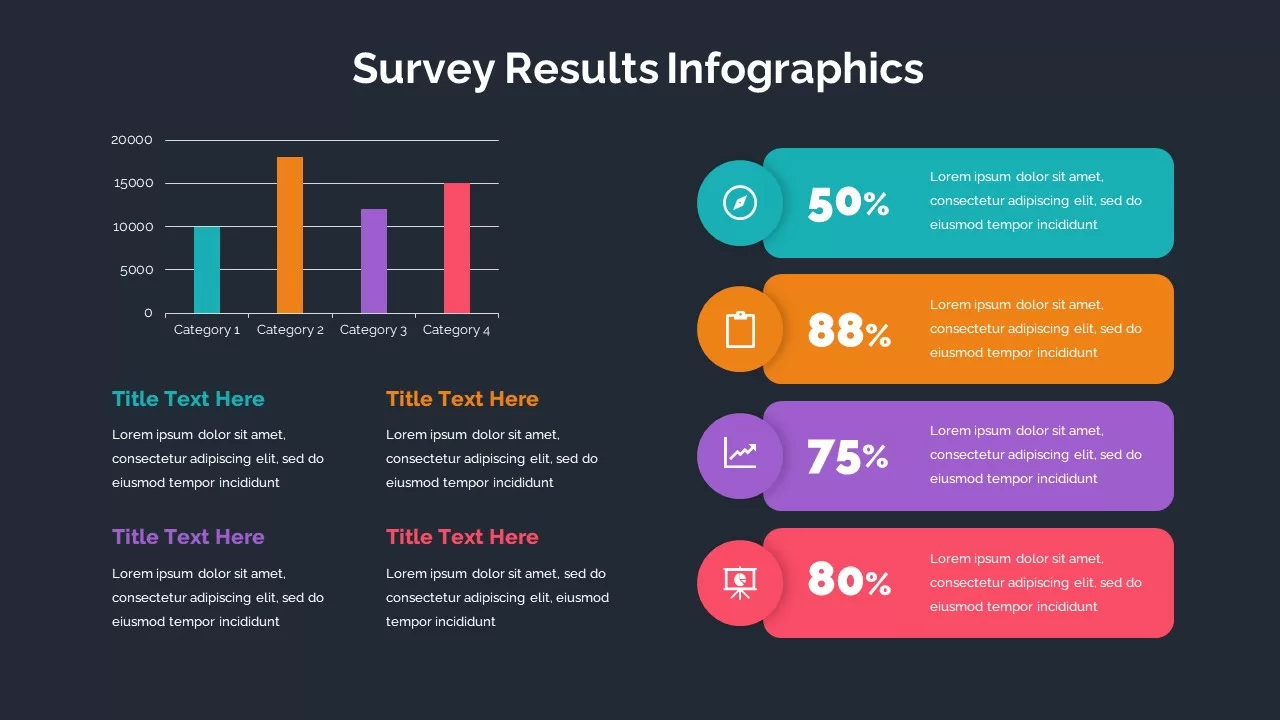
The survey results templates is a powerful visual tool containing charts and graphs for survey reports. Survey data charts in an engaging fashion will relay your research findings with statistical tools and tables. PowerPoint statistics presentation demands high-quality slides because people are often not interested in learning facts and figures as much as flat stories. So, you need visually compelling slides for data presentations. These graphics convey your business survey results and provide appealing visuals to understand customer voices.
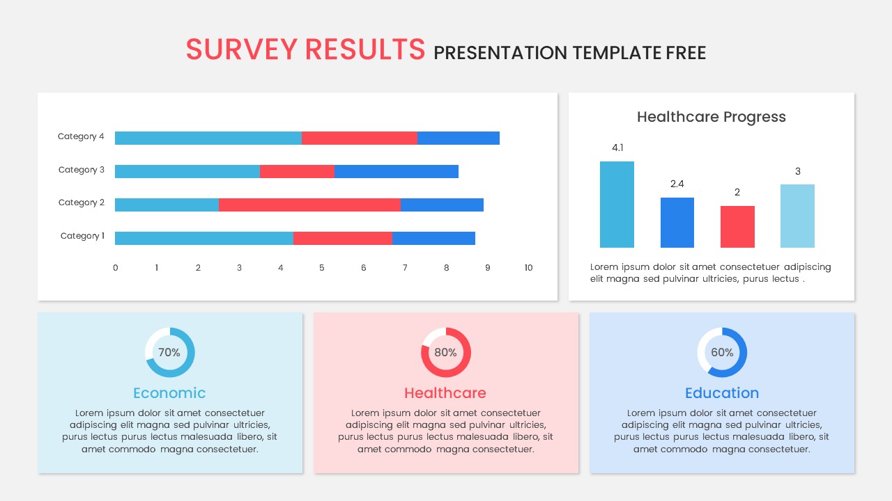
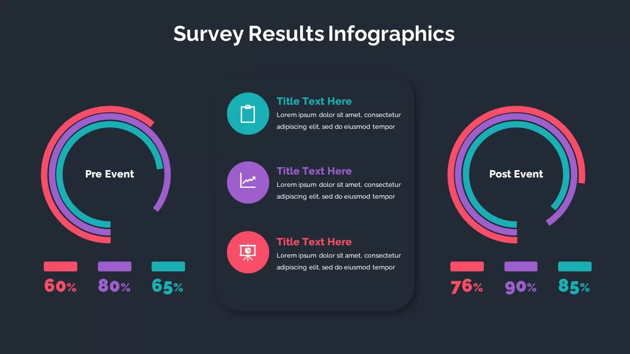
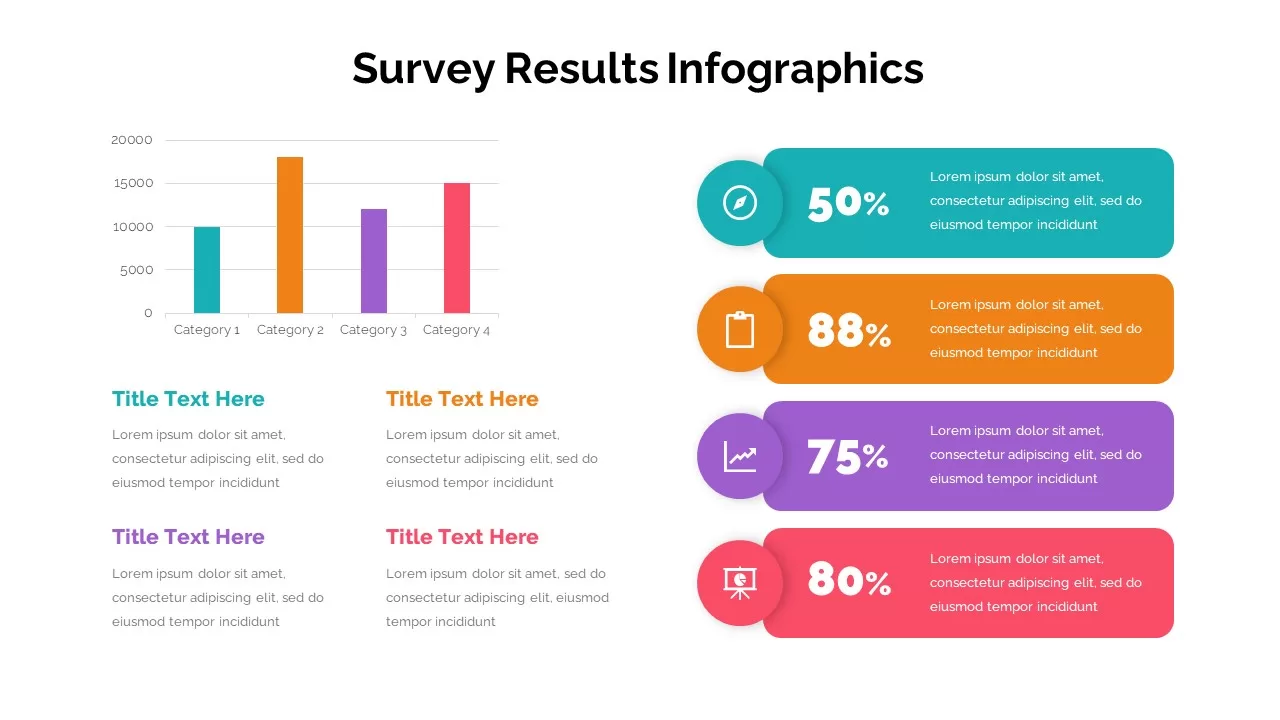
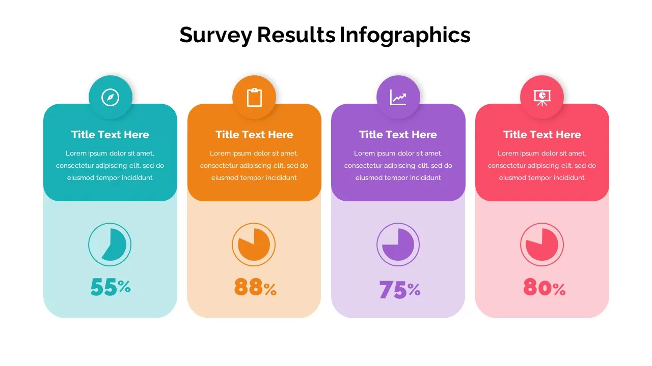
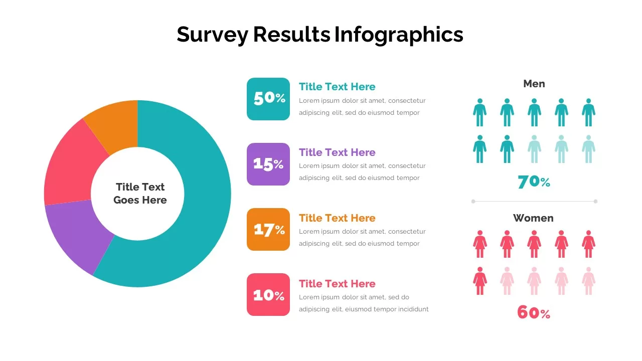
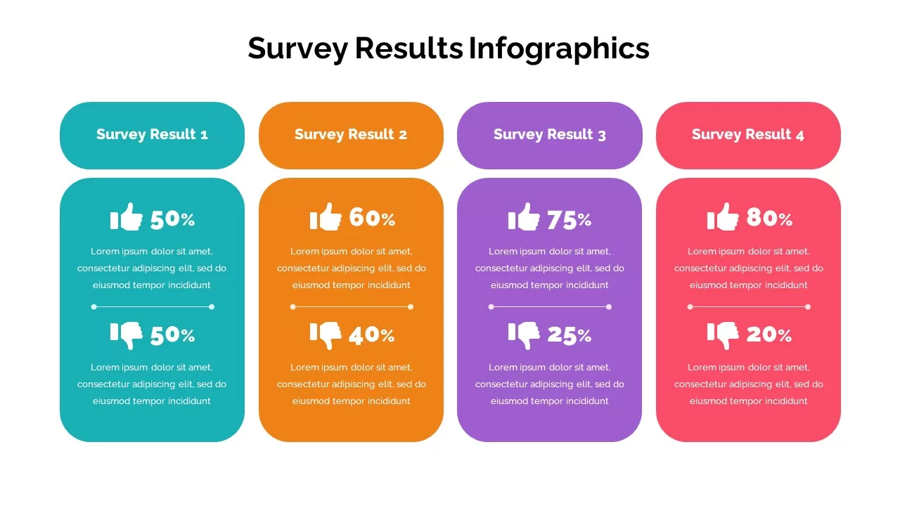
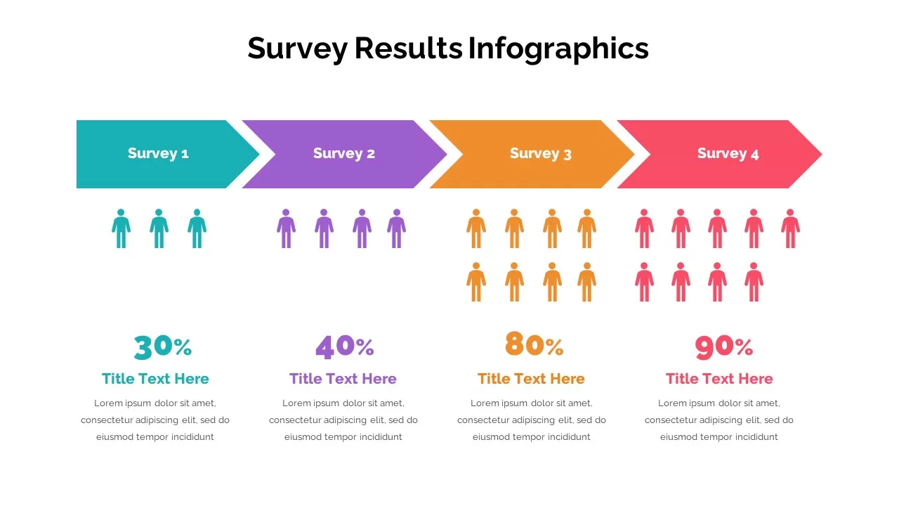
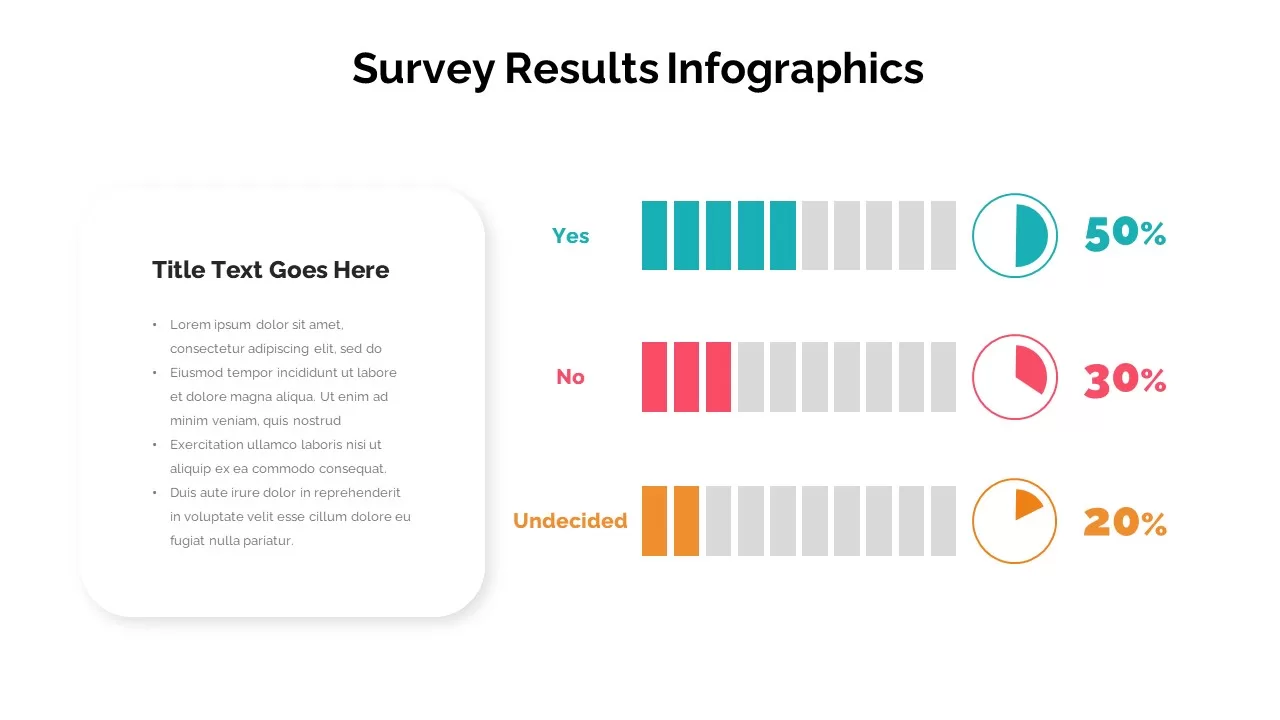
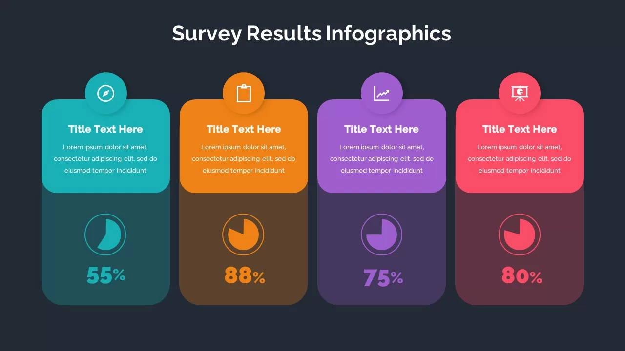
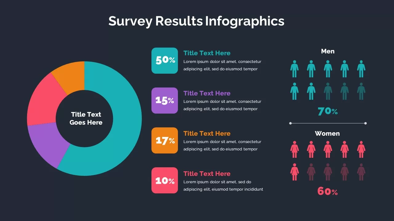
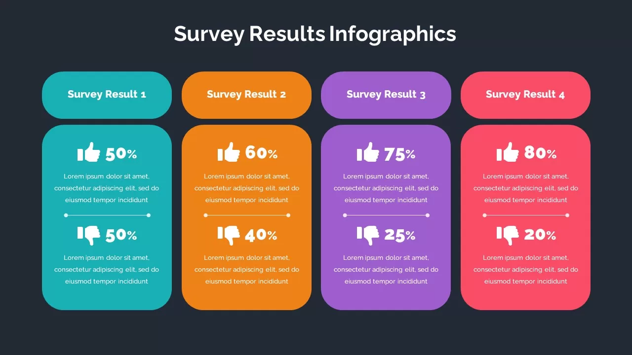
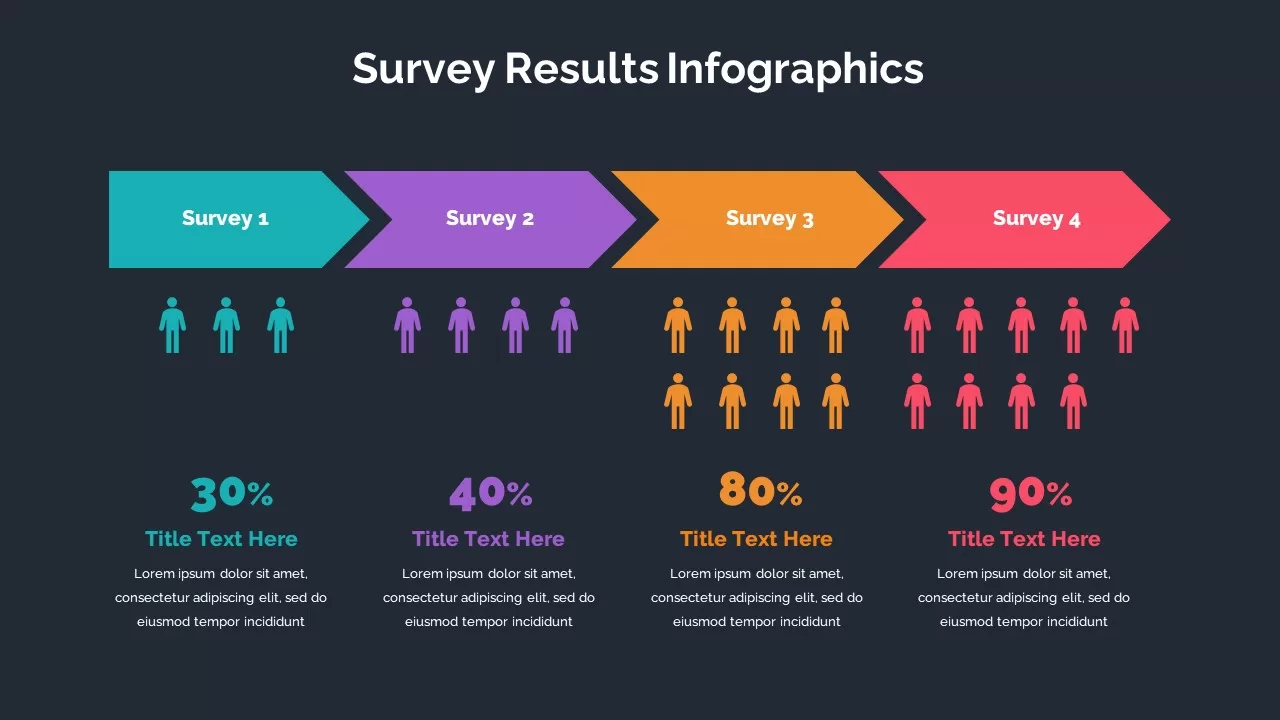
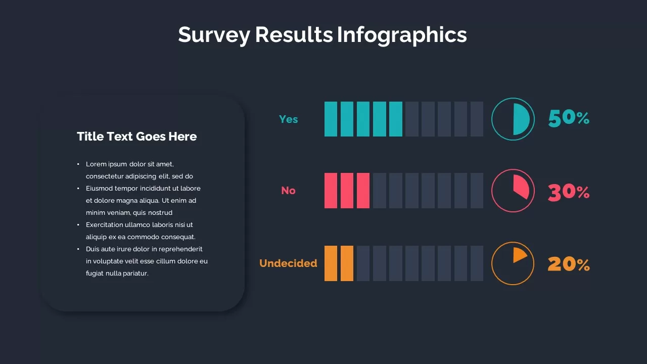
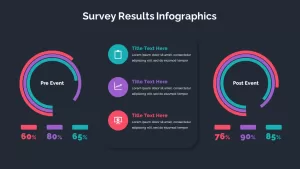
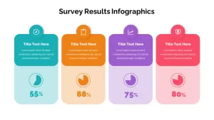
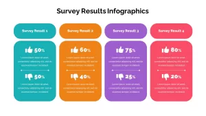
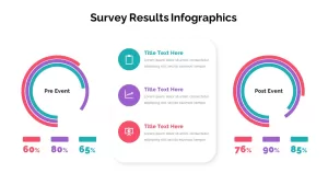
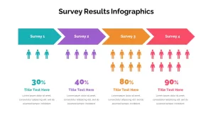
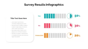
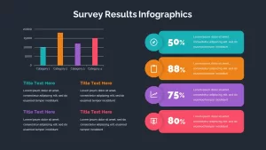
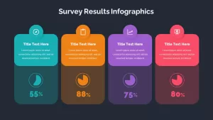
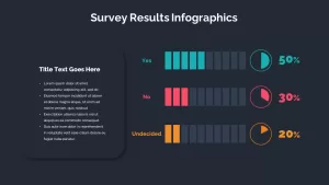
The survey results infographic template has a table and graphics in both white and black PowerPoint backgrounds. It is comprised of different slides, such as a bar chart slide with tinted square presentation and text areas; each bar in the chart has been colored differently so the viewers can easily get the survey results. The timeline template with Harvey’s ball presentation best shows opinion polls. A pie chart displaying the demographics is also tinted with different color combinations. Besides, a radial chart is also there to offer percentages—a chevron arrow timeline template designed for presenting survey results. Finally, a parallel bar diagram shows percentage distribution in the engaging visual chart—download the survey results presentation template for presenting facts and figures.
Who is it for
This template is perfect for market researchers, data analysts, business executives, and marketing teams who need to present survey results or data-driven insights. It is also great for educators or students conducting research projects and needing a polished way to display their findings.
Other Uses
In addition to presenting survey results, the template can be adapted for any scenario where you need to visualize data, such as sales performance reports, feedback analysis, or product testing results. Its flexible structure allows you to easily modify the content for various industries, making it a useful tool for anyone working with quantitative or qualitative data.
Login to download this file

Item ID
SB02735
Related Templates

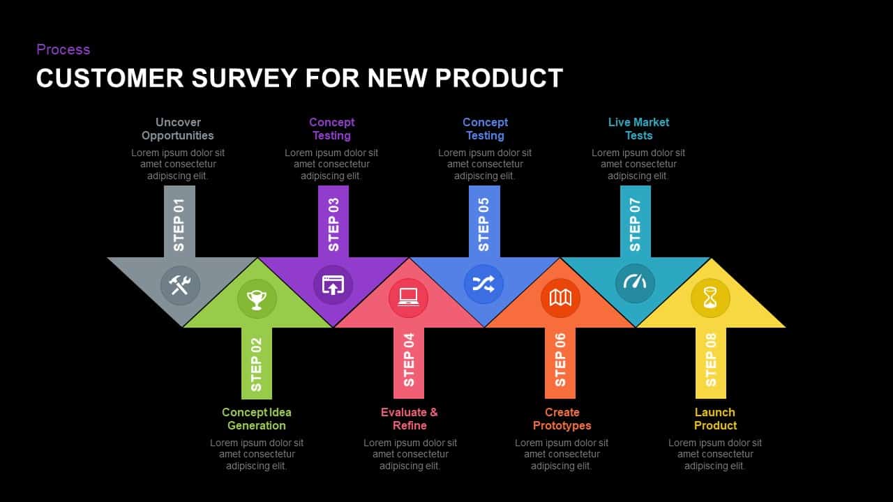
Eight-Step New Product Survey Process Template for PowerPoint & Google Slides
Process
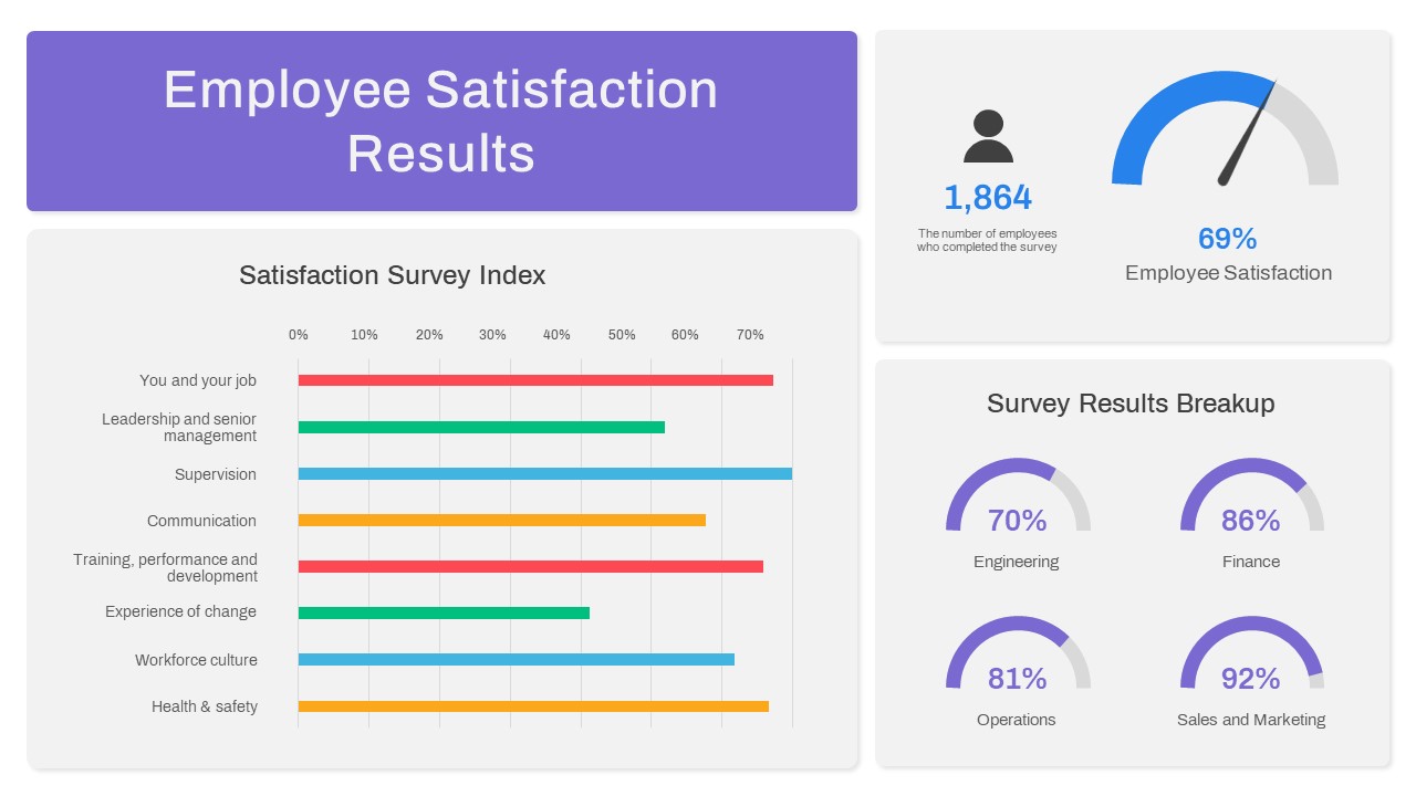
Employee Satisfaction Survey Dashboard Template for PowerPoint & Google Slides
Employee Performance
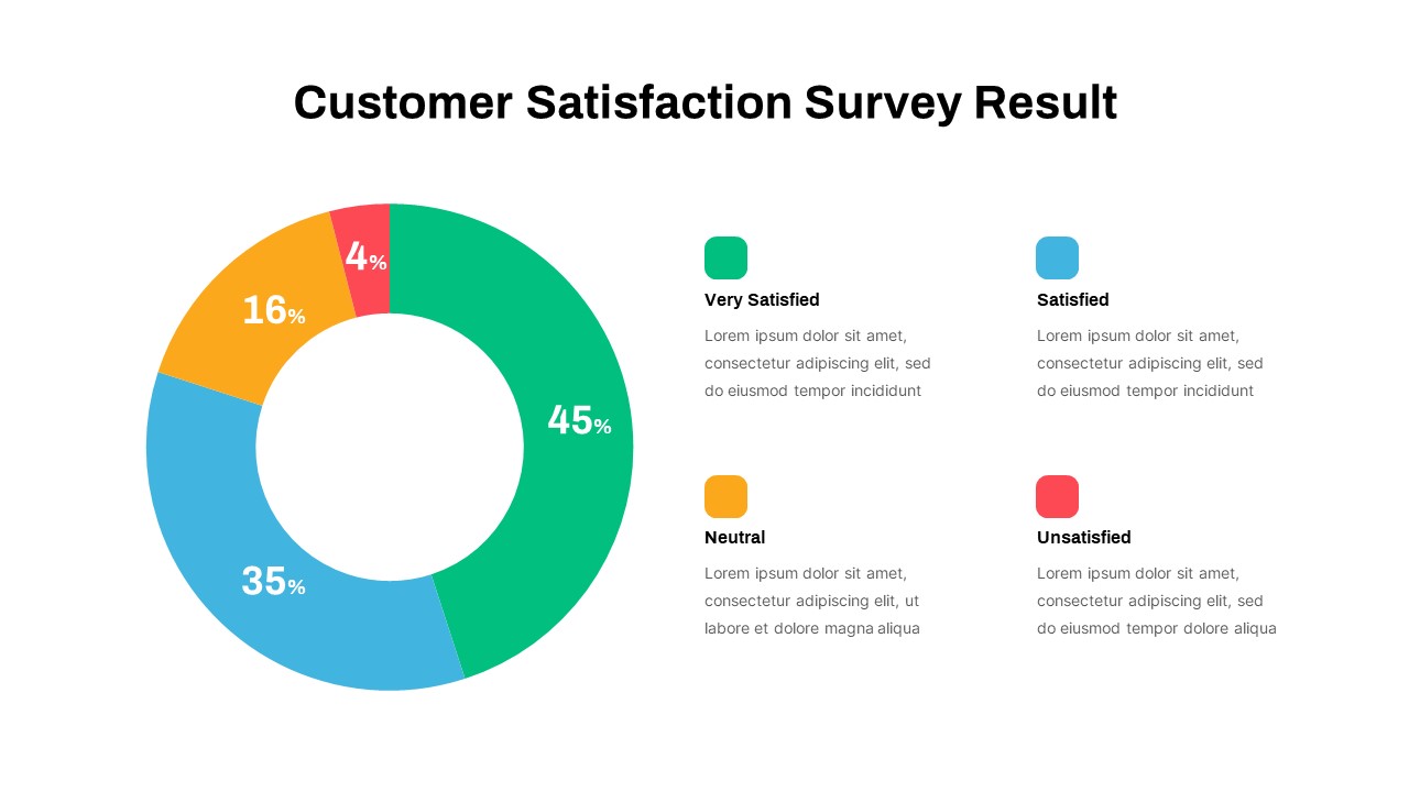
Customer Satisfaction Survey Result Presentation Template
Marketing
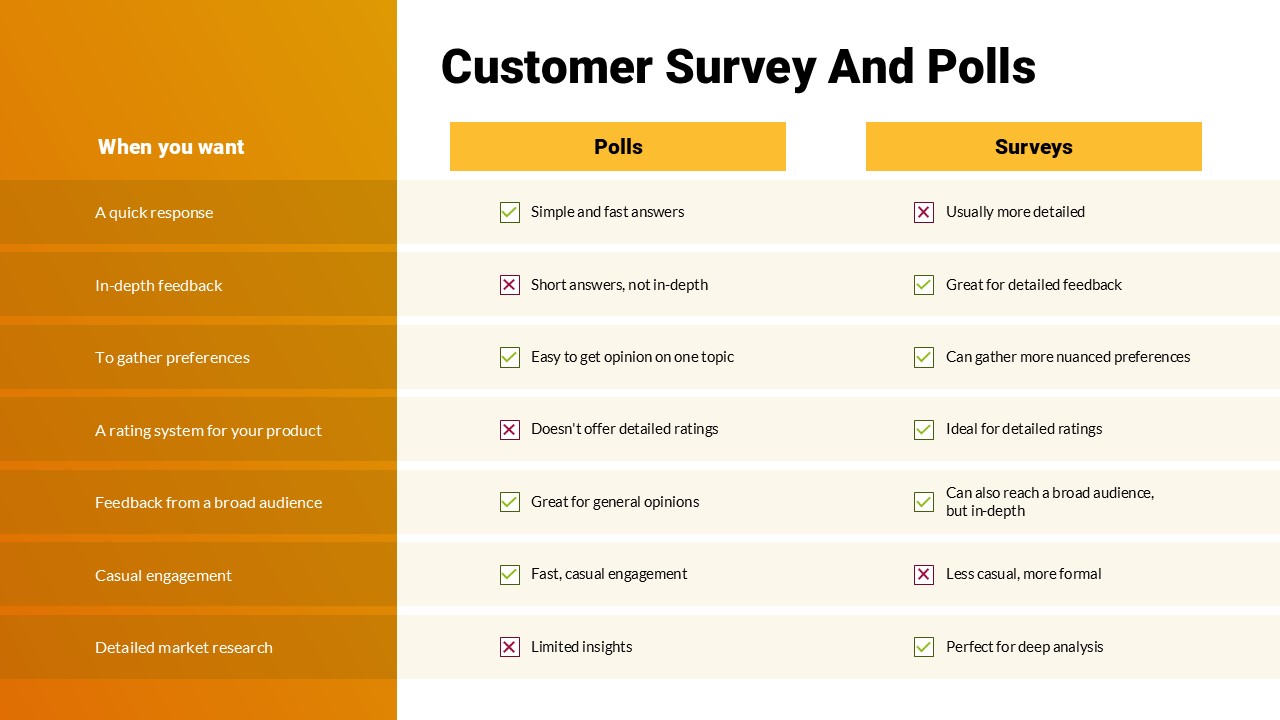
Customer Survey & Polls Comparison PowerPoint Template
Customer Experience
Free Survey Results Analysis Slide for PowerPoint & Google Slides
Business Report
Free
Up Growth Infographics PowerPoint Template
Arrow
Bubble Timeline Infographics PowerPoint Template and Keynote
Business
5-Stage Arrow Infographics Process Flow Template for PowerPoint & Google Slides
Arrow
Four Swoosh Arrow Infographics template for PowerPoint & Google Slides
Arrow
Eight-Segment 3D Arrow Infographics Template for PowerPoint & Google Slides
Arrow
Pipe Water Infographics Flow Diagram Template for PowerPoint & Google Slides
Process
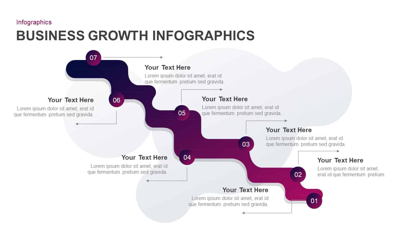
Business Growth Infographics Template for PowerPoint & Google Slides
Roadmap
Five-Step Circular Badge Infographics Template for PowerPoint & Google Slides
Circular
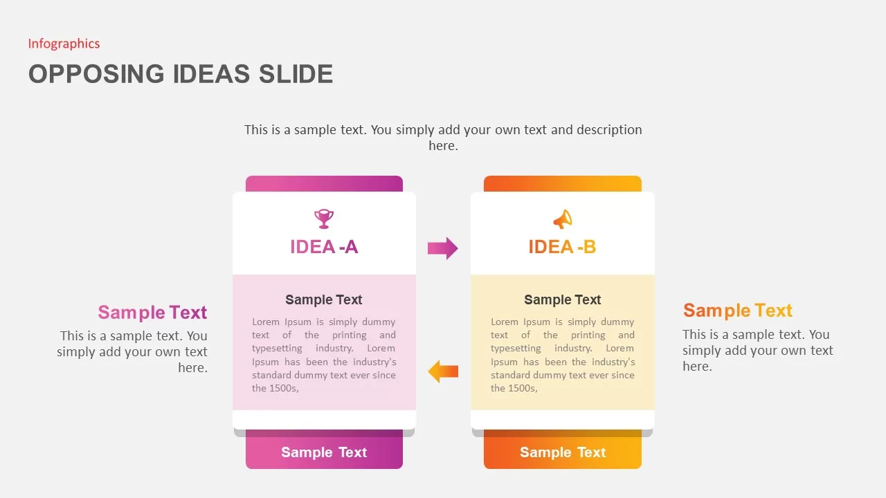
Opposing Ideas Infographics Pack Template for PowerPoint & Google Slides
Comparison
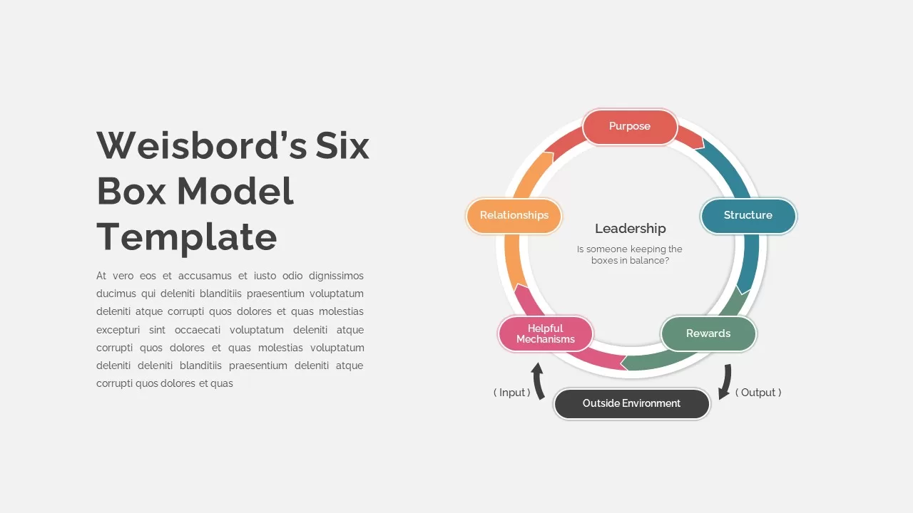
Weisbord’s Six Box Model Infographics Template for PowerPoint & Google Slides
Circular
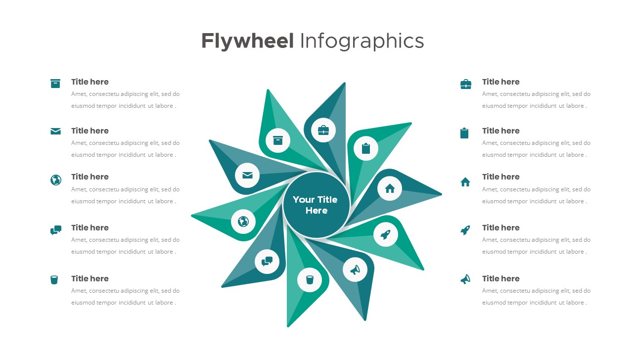
Flywheel Infographics template for PowerPoint & Google Slides
Business Strategy
Social Media Hub-and-Spoke Infographics Template for PowerPoint & Google Slides
Circular

Steps Infographics Template for PowerPoint & Google Slides
Decks
Free Roadmap Infographics Pack Template for PowerPoint & Google Slides
Pitch Deck
Free
Mental Health Infographics Template for PowerPoint & Google Slides
Health