Dynamic Statistics & Progress Charts Template for PowerPoint & Google Slides

Description
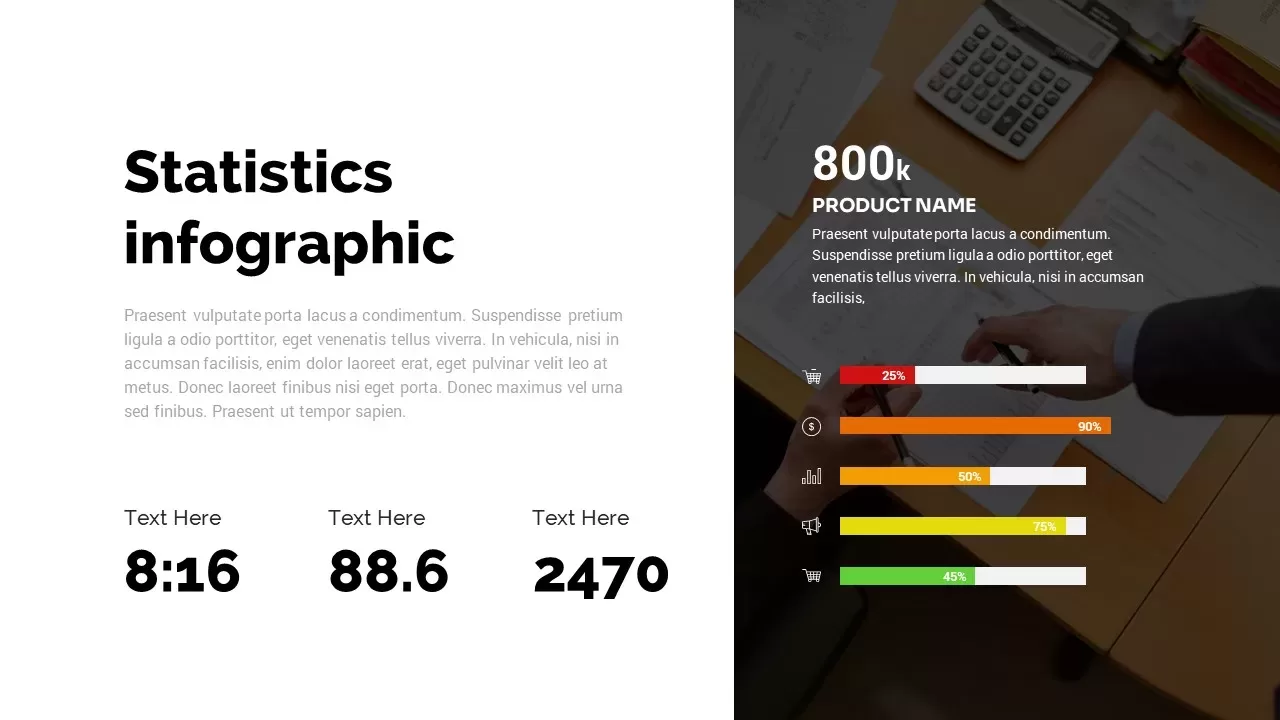
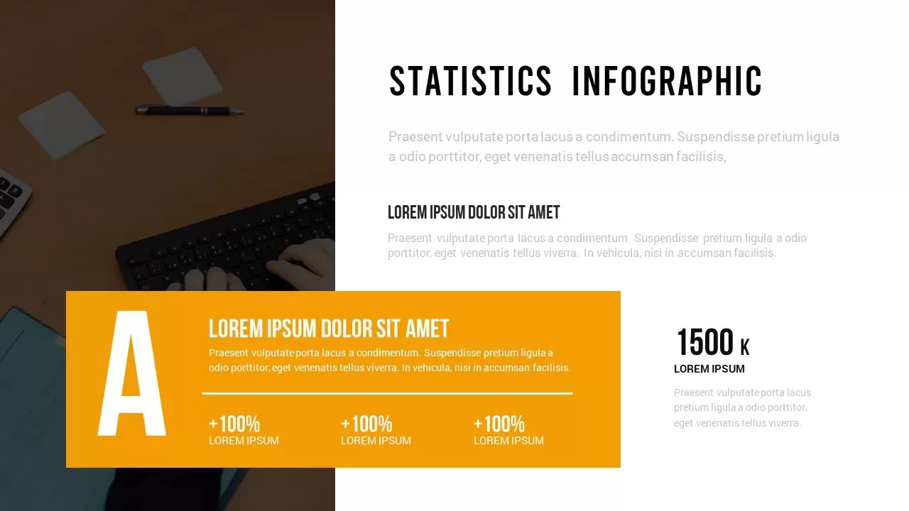
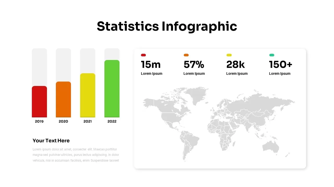
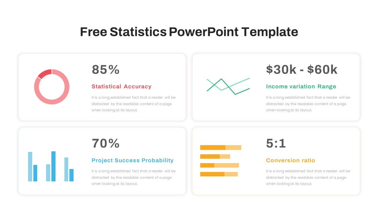
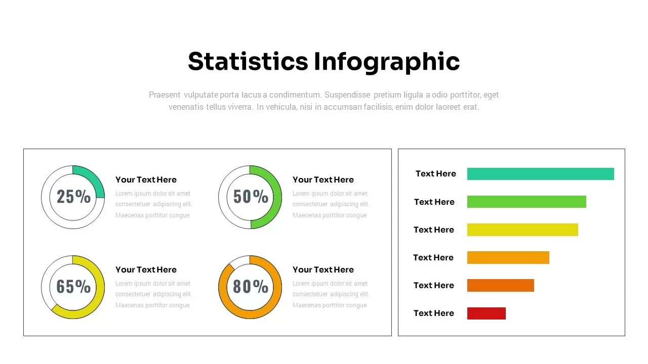
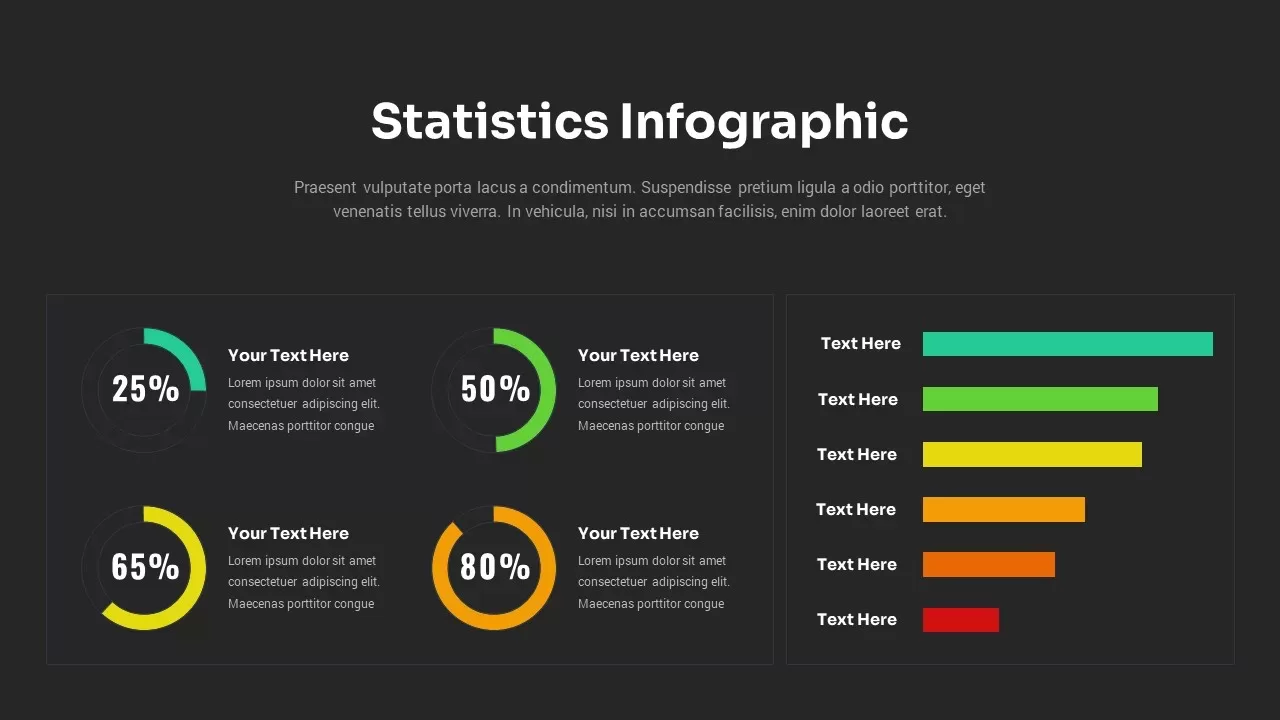
Leverage this dynamic Statistics Infographic & Progress Charts slide to present comparative data metrics with precision and visual impact. This fully editable layout combines four circular progress charts on the left with five horizontal bar comparisons on the right, all rendered in a vibrant color palette that spans teal, green, yellow, orange, and red accents. Each circular gauge features a bold percentage callout at its center and a custom text zone for contextual explanations, while the side bar chart uses proportional bars paired with descriptive labels to illustrate category rankings or KPI benchmarks. Both chart types are based on vector shapes and SmartArt integration, enabling you to adjust values, swap color accents, and update labels seamlessly without disrupting the overall alignment. The chart container frames maintain perfect balance, while subtle gridlines and axis guides enhance readability. Master slide support ensures global theme changes apply across all chart elements, streamlining your workflow and maintaining consistent styling throughout the deck.
The layout also supports conditional formatting and live data linking when paired with embedded Excel tables, providing an automated update mechanism for fast-changing datasets. Use drop-in icon placeholders to represent distinct metrics, apply custom gradients for brand conformity, or hide nonessential elements for cleaner views. Generous white space, minimalist typography, and subtle drop shadows add visual hierarchy and eliminate clutter, ensuring that your audience can digest complex statistics quickly. Whether you’re illustrating quarterly sales performance, survey results, performance benchmarks, or resource allocations, this infographic slide transforms raw numbers into an engaging visual narrative. Its scalable vector elements guarantee crisp rendering across desktop screens, boardroom projectors, and mobile devices, making it a versatile choice for any presentation scenario.
Who is it for
Data analysts, marketing managers, financial planners, and business consultants who need a high-impact slide to present percentage comparisons and KPI metrics clearly and professionally to stakeholders, executives, or clients.
Other Uses
Repurpose this versatile infographic to illustrate resource allocations, survey findings, budget forecasts, or operational performance across any category framework requiring immediate visual comprehension.
Login to download this file

Item ID
SB03040
Related Templates

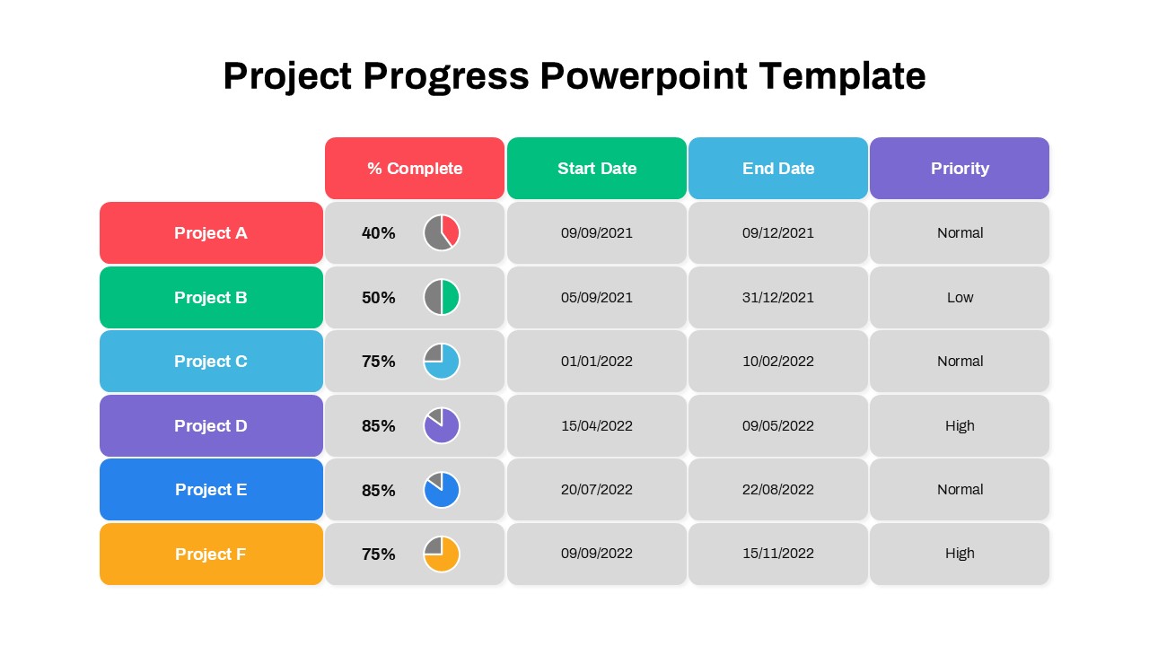
Project Progress Dashboard Pie Charts Template for PowerPoint & Google Slides
Project
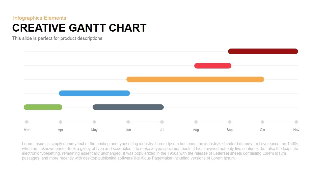
Creative Dynamic Gantt Chart Timeline Template for PowerPoint & Google Slides
Timeline
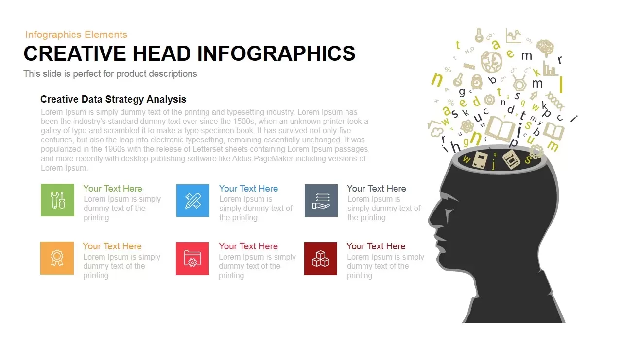
Dynamic Creative Head Infographics Template for PowerPoint & Google Slides
Circular
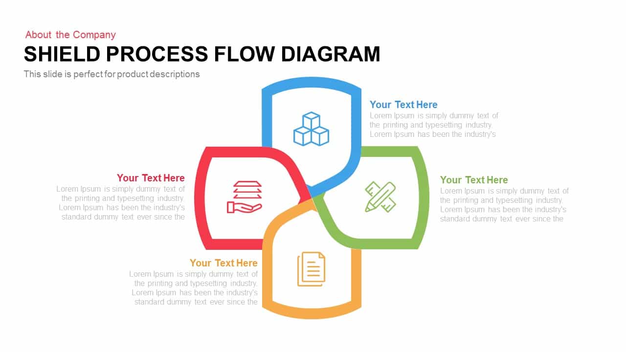
Dynamic Shield Process Flow Diagram template for PowerPoint & Google Slides
Process

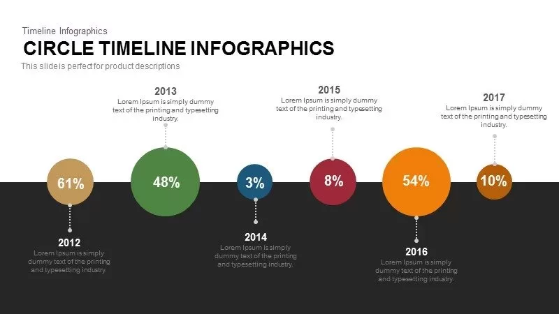
Dynamic Circle Timeline Infographics template for PowerPoint & Google Slides
Timeline
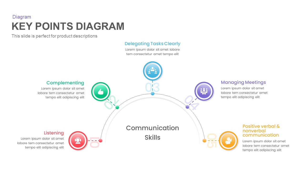
Dynamic Key Points Diagram Template for PowerPoint & Google Slides
Process

Dynamic Data Dashboard Infographic Template for PowerPoint & Google Slides
Bar/Column
Dynamic Arrow Process Template for PowerPoint & Google Slides
Process

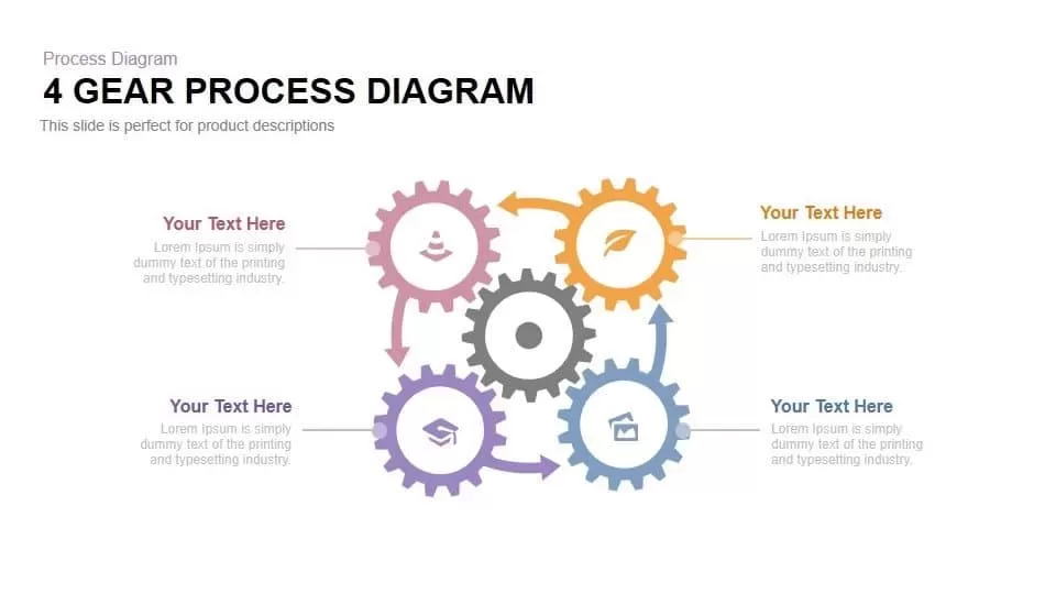
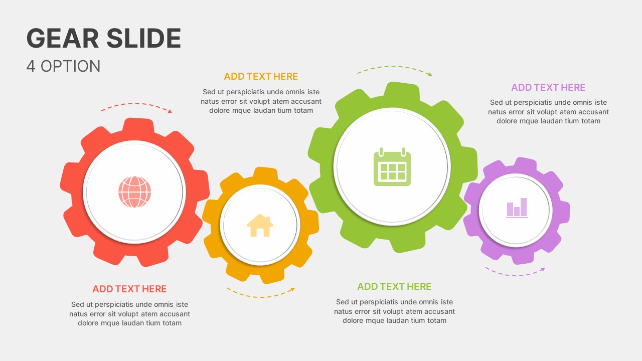
Dynamic 4 Gear Process Diagram Template for PowerPoint & Google Slides
Process
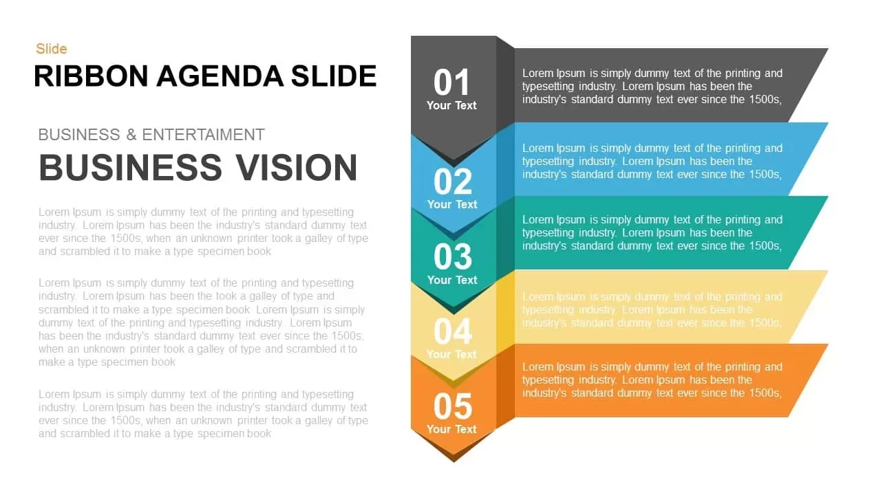
Dynamic Five-Step Ribbon Agenda Layout Template for PowerPoint & Google Slides
Agenda
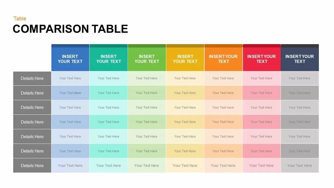
Dynamic Multicolor Comparison Table Template for PowerPoint & Google Slides
Comparison
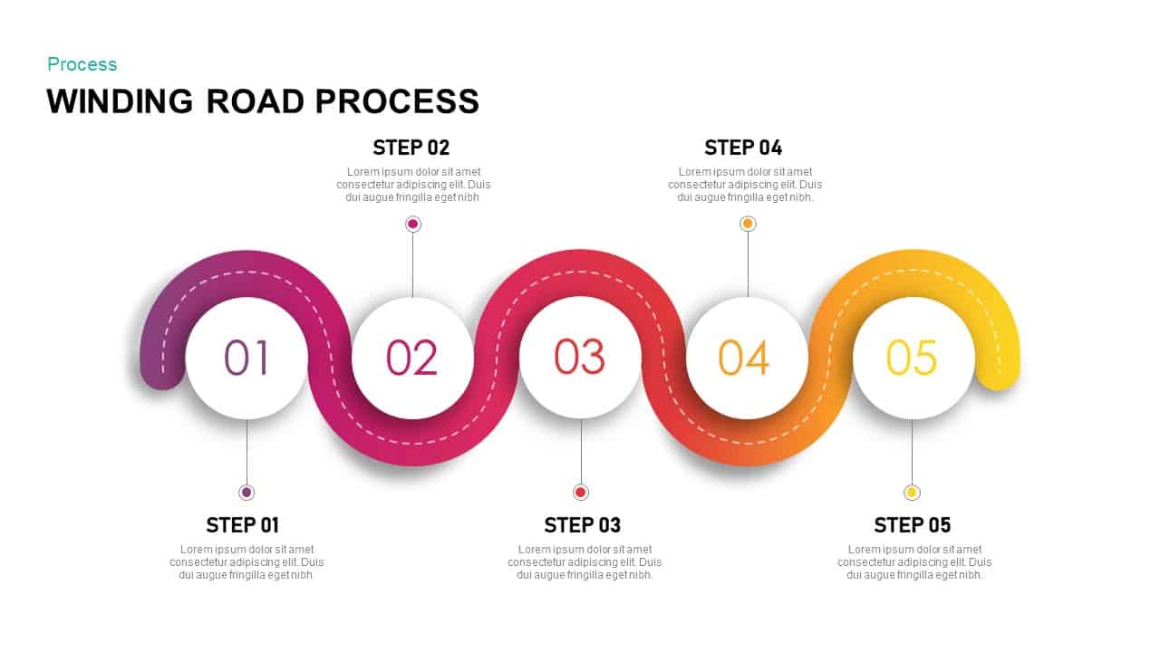
Dynamic Winding Road Process Timeline Template for PowerPoint & Google Slides
Process
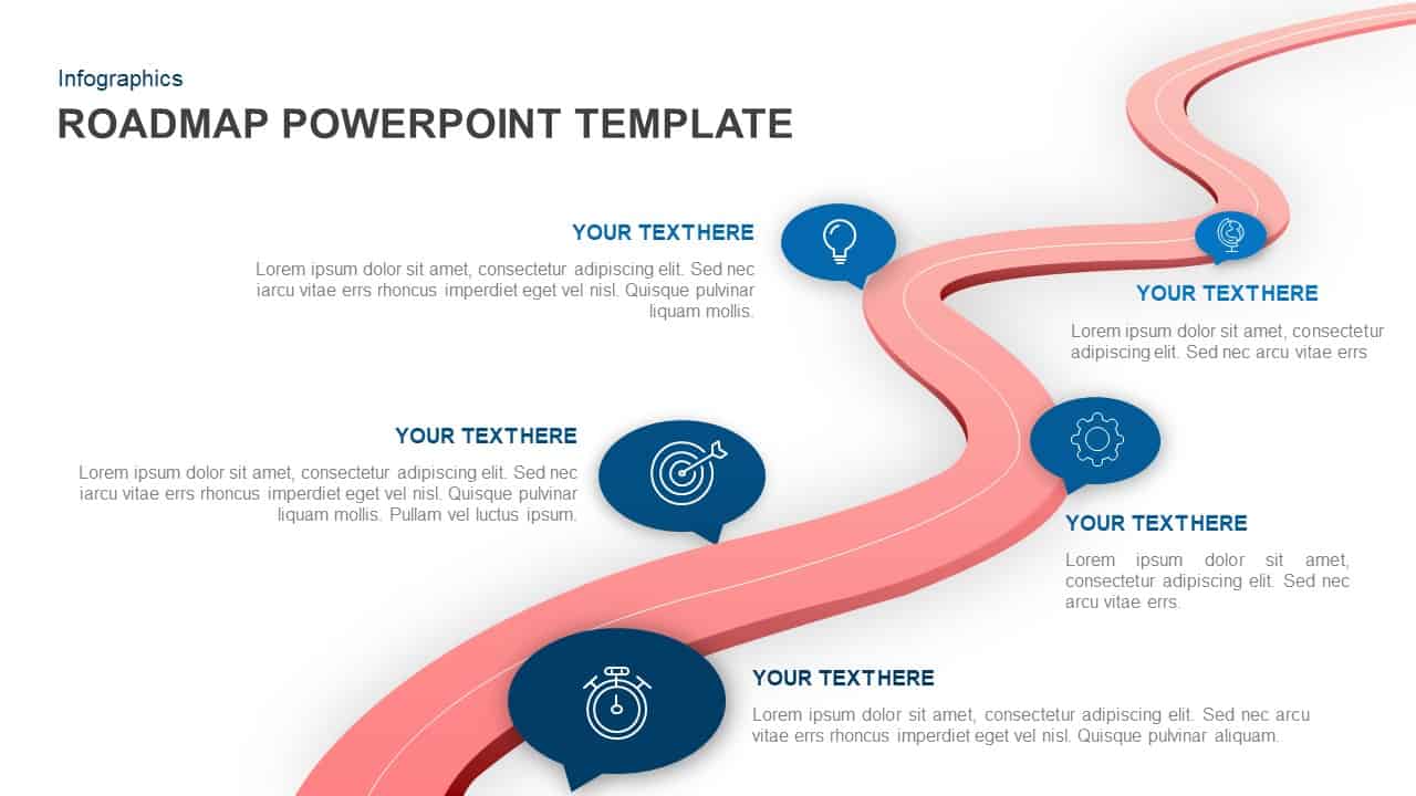
Dynamic Winding Roadmap Infographic Template for PowerPoint & Google Slides
Roadmap
Dynamic AI Applications Infographic Template for PowerPoint & Google Slides
AI
Dynamic Growth Arrow Step Infographic Template for PowerPoint & Google Slides
Process
Dynamic Online Education Illustration Template for PowerPoint & Google Slides
Business Proposal
Capital Structure Dynamic Split Chart Template for PowerPoint & Google Slides
Comparison Chart

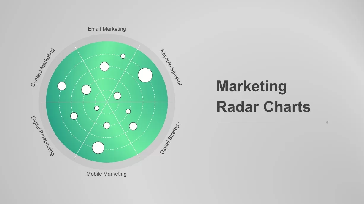
Dynamic Marketing Radar Chart Analytics Template for PowerPoint & Google Slides
Comparison
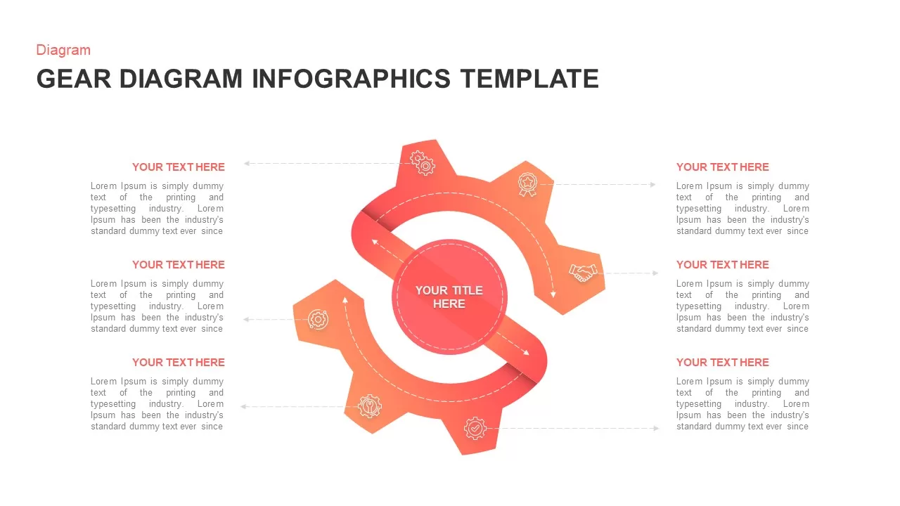
Dynamic Gear Diagram Infographics Template for PowerPoint & Google Slides
Process
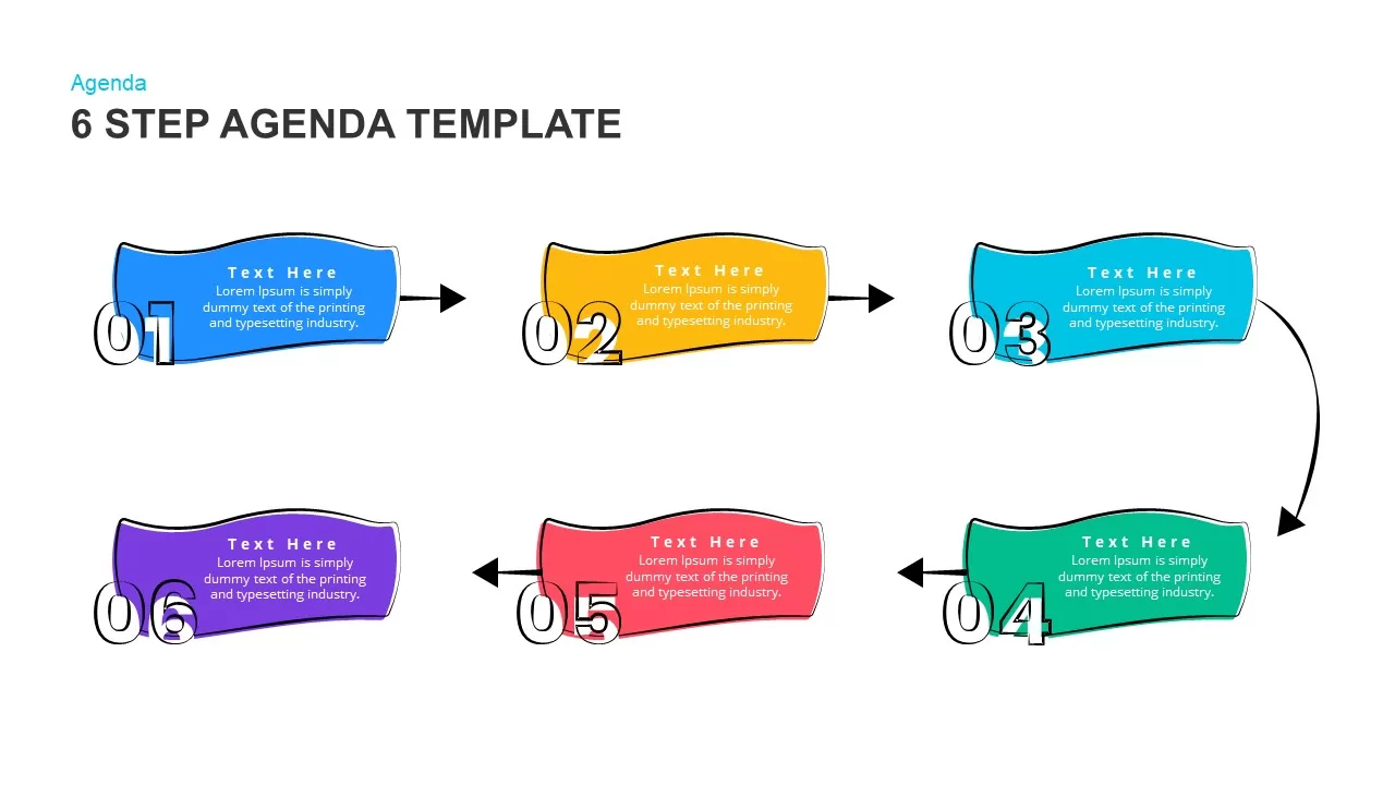
Modern & Dynamic 6-Step Agenda Sequence Template for PowerPoint & Google Slides
Agenda
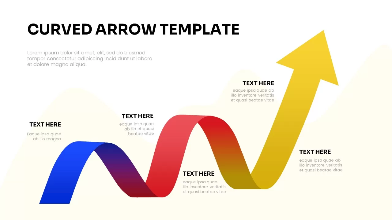
Dynamic Curved Arrow Process Roadmap Template for PowerPoint & Google Slides
Process
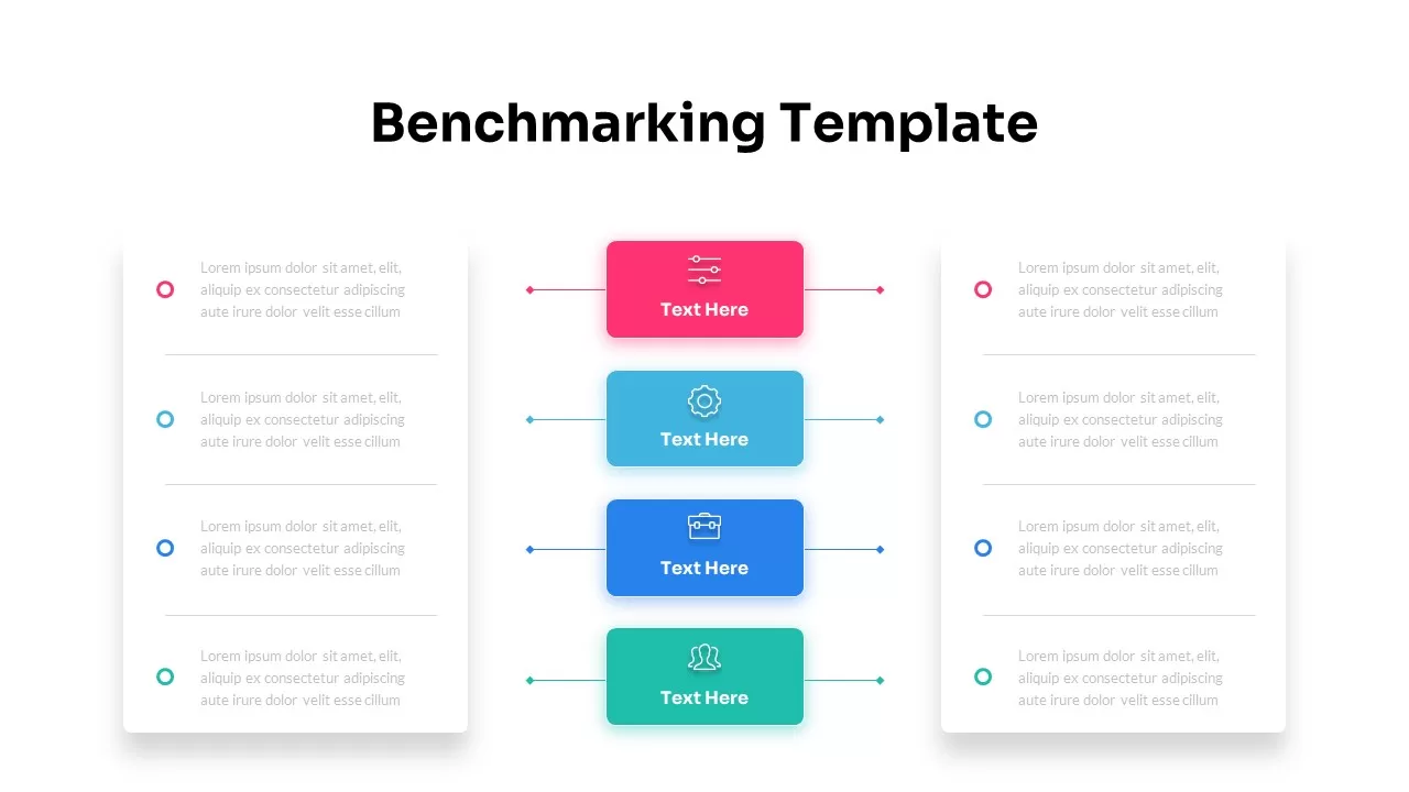
Dynamic Benchmarking Comparison Chart Template for PowerPoint & Google Slides
Comparison Chart
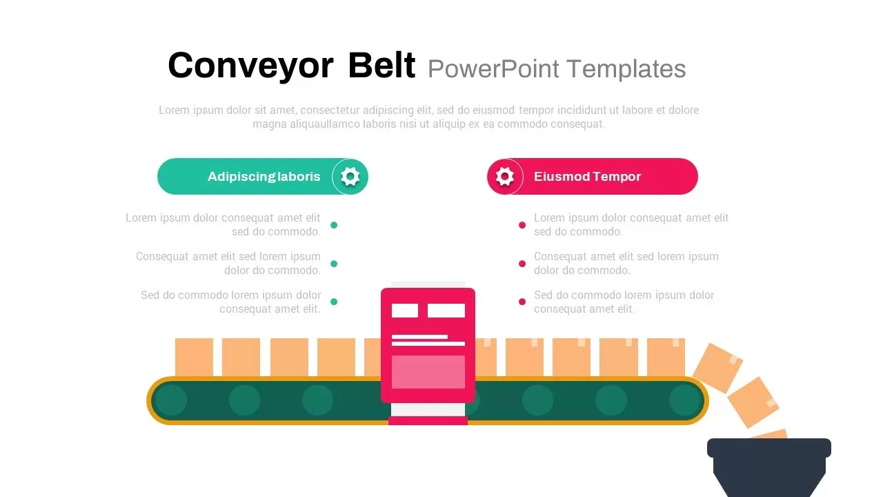
Dynamic Conveyor Belt Process Flow Template for PowerPoint & Google Slides
Process
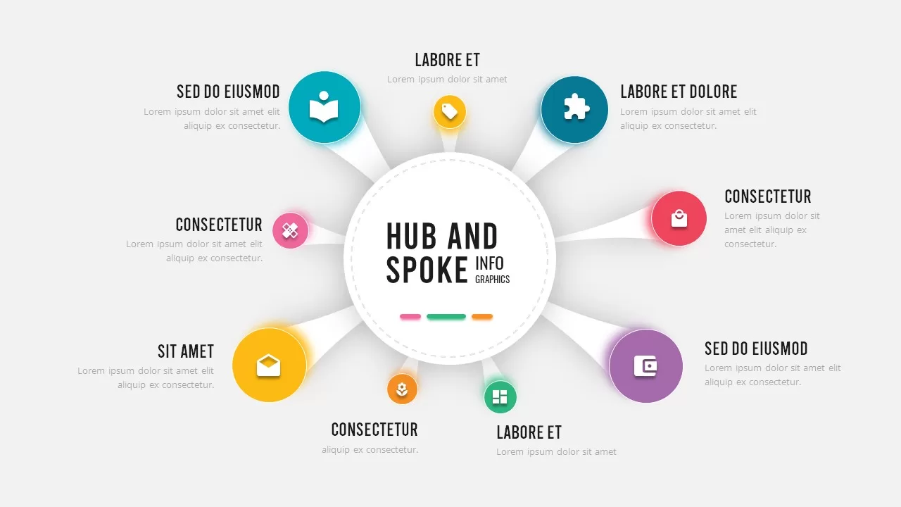
Dynamic Hub-and-Spoke Infographic Diagram Template for PowerPoint & Google Slides
Circular
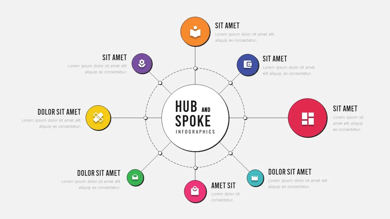
Dynamic Circular Hub-and-Spoke Infographic Template for PowerPoint & Google Slides
Circular
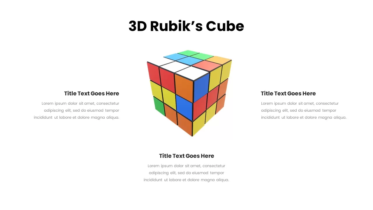
Dynamic 3D Rubik’s Cube Diagram Pack Template for PowerPoint & Google Slides
Infographics
Dynamic Four-Step Gear Process Template for PowerPoint & Google Slides
Process
Dynamic Basketball Training Promotion Template for PowerPoint & Google Slides
Advertising
Dynamic Hurdle Race Presentation Template for PowerPoint & Google Slides
Advertising
Dynamic Sprint Race Cover Slide Template for PowerPoint & Google Slides
Graphics
Dynamic Soccer Stadium Presentation Template for PowerPoint & Google Slides
Graphics
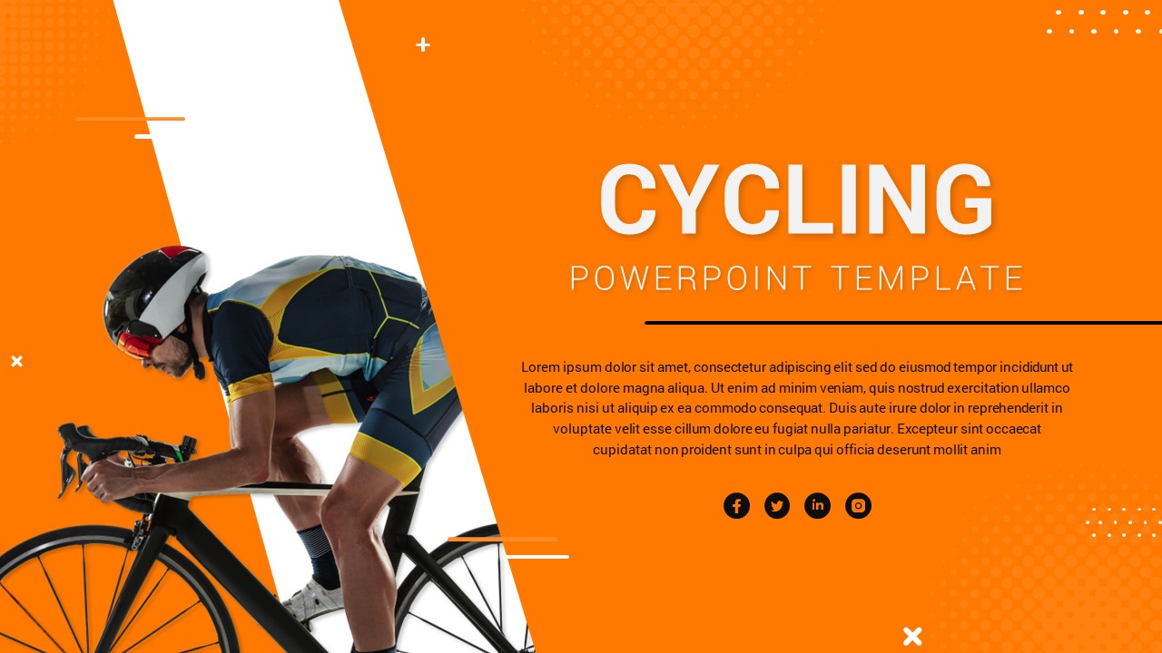
Dynamic Cycling Presentation Template for PowerPoint & Google Slides
Graphics
Dynamic Boxing Training Cover Slide Template for PowerPoint & Google Slides
Graphics
Dynamic Relay Race Presentation Slide Template for PowerPoint & Google Slides
Graphics
Dynamic Chevron Timeline Infographic Template for PowerPoint & Google Slides
Timeline
Dynamic Animated Question Mark Template for PowerPoint & Google Slides
Graphics
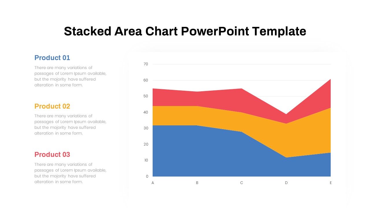
Dynamic Three-Series Stacked Area Chart Template for PowerPoint & Google Slides
Comparison Chart
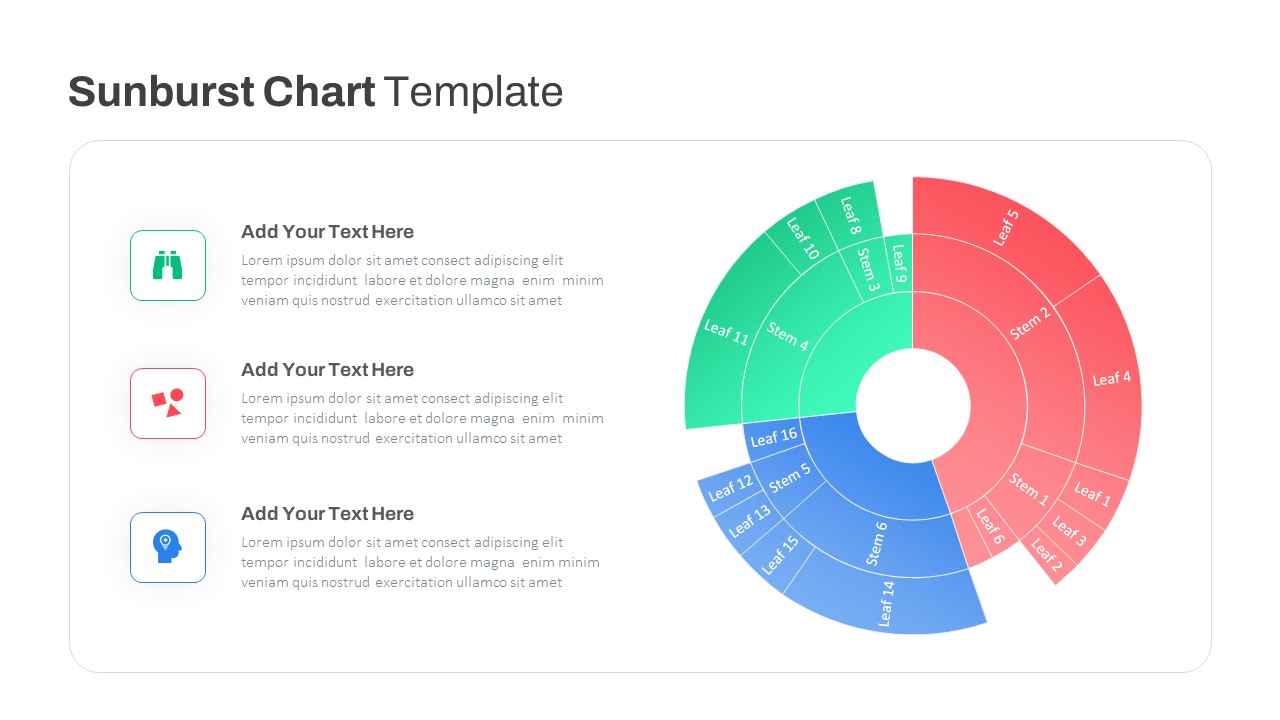
Dynamic Sunburst Chart Visualization Template for PowerPoint & Google Slides
Charts
Dynamic Abstract Corporate Theme Template for PowerPoint & Google Slides
Decks
Dynamic Investment & Finance Growth Template for PowerPoint & Google Slides
Finance
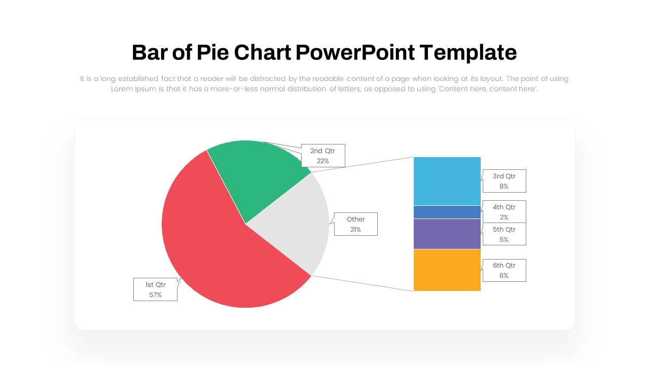
Dynamic Bar-of-Pie Chart Comparison Template for PowerPoint & Google Slides
Pie/Donut
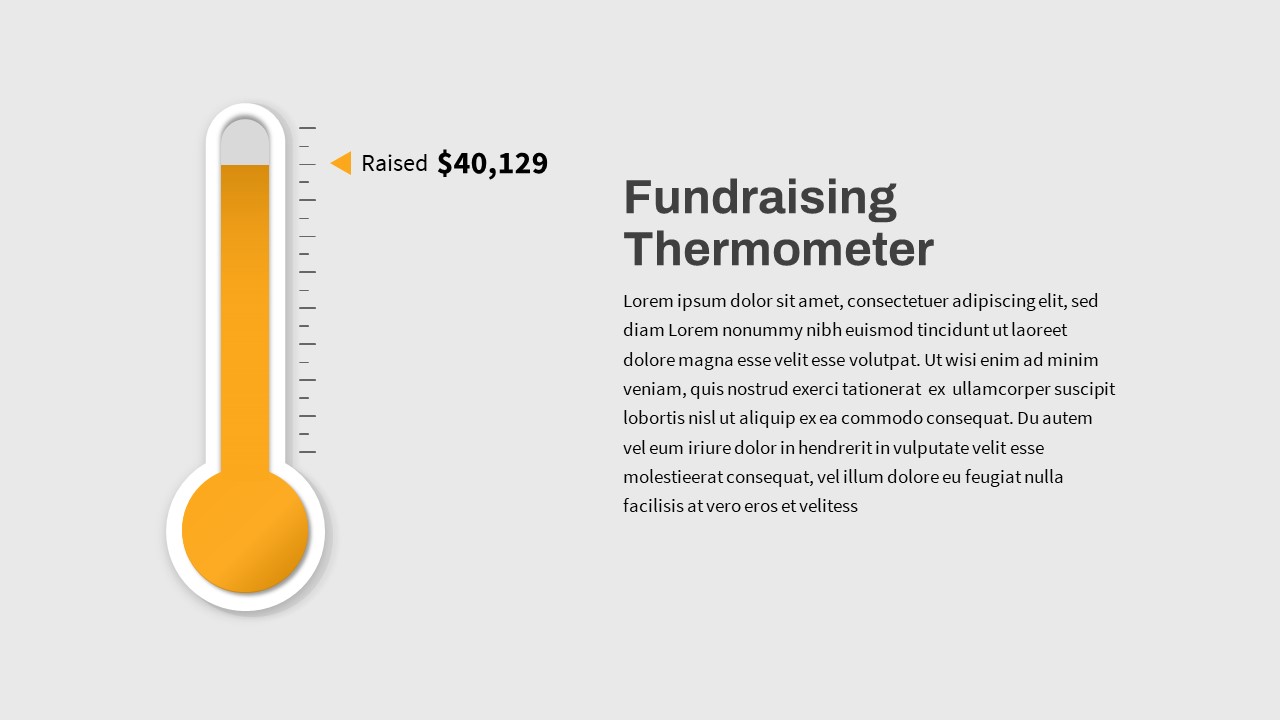
Dynamic Fundraising Thermometer Slide Template for PowerPoint & Google Slides
Revenue

Dynamic Green Field Sports Presentation Template for PowerPoint & Google Slides
Decks
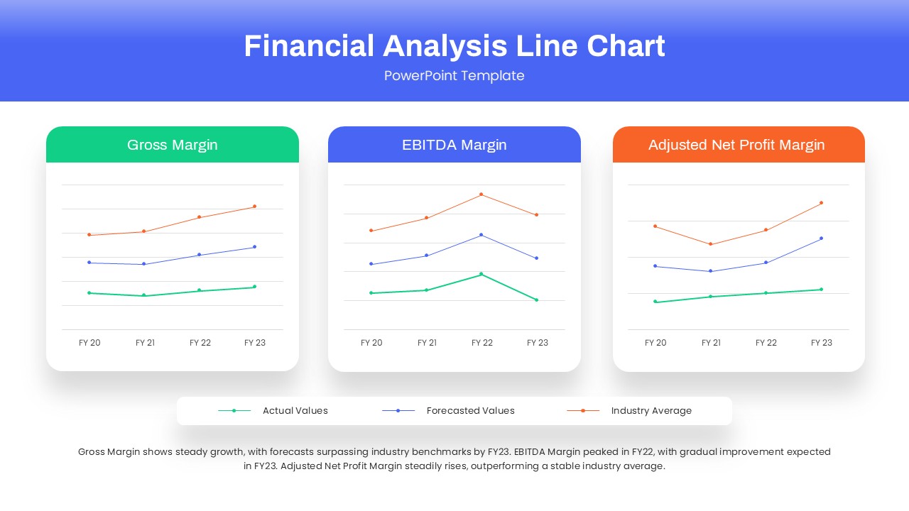
Dynamic Financial Analysis Line Chart Template for PowerPoint & Google Slides
Finance
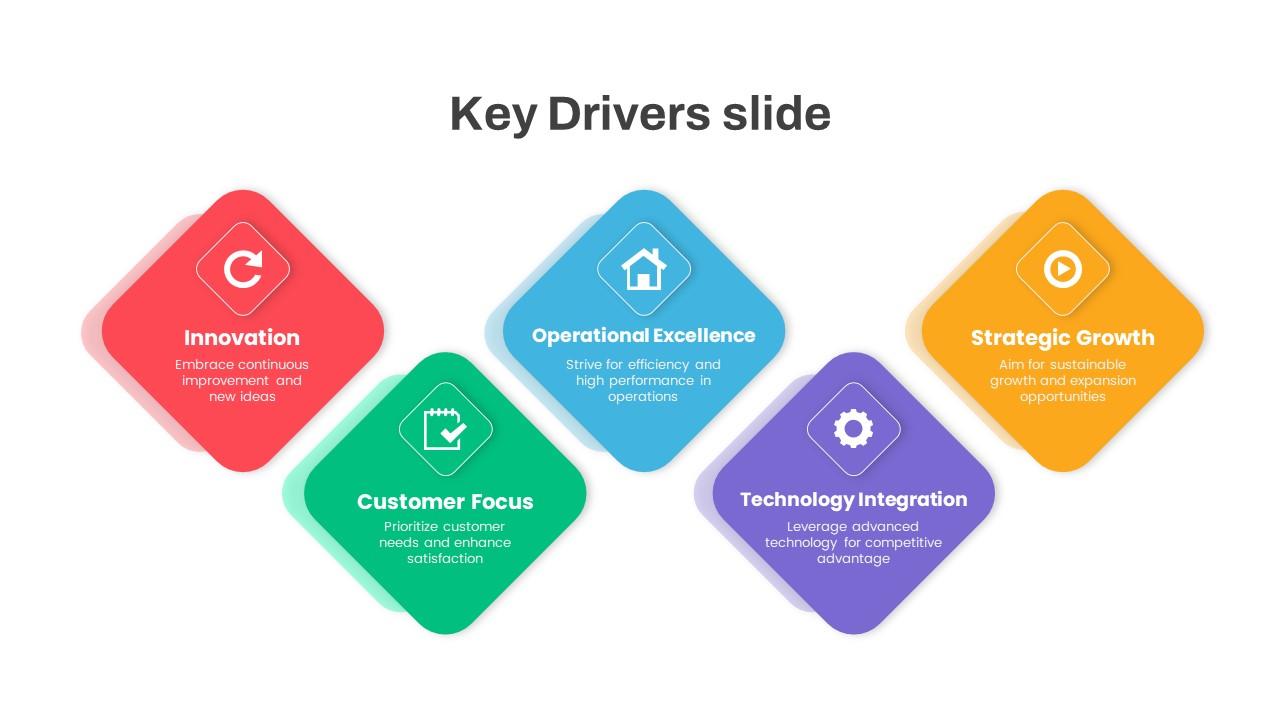
Dynamic Business Key Drivers Slide Template for PowerPoint & Google Slides
Process

Free Dynamic Global Warming Presentation Template for PowerPoint & Google Slides
Pitch Deck
Free
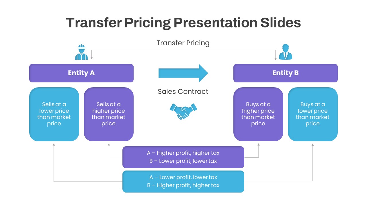
Dynamic Transfer Pricing Flow Diagram Template for PowerPoint & Google Slides
Finance
Dynamic Carousel Icon Hub Diagram Template for PowerPoint & Google Slides
Circular
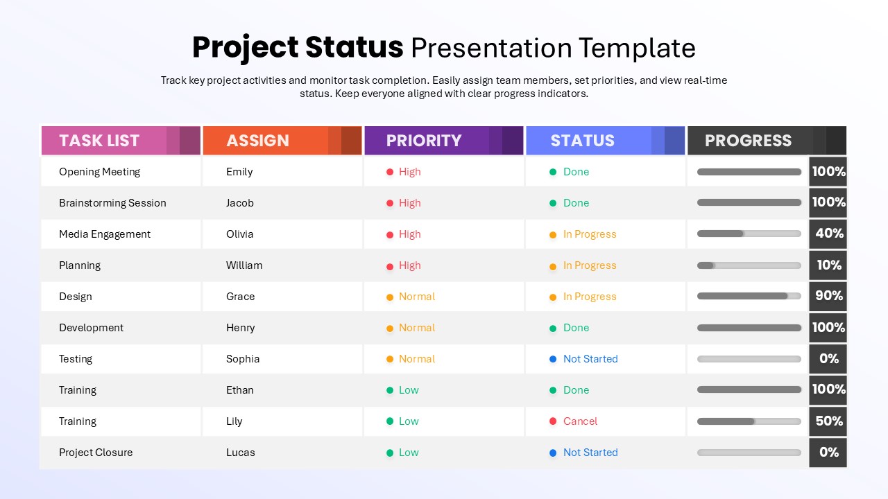
Dynamic Project Status Tracking Table Template for PowerPoint & Google Slides
Project Status
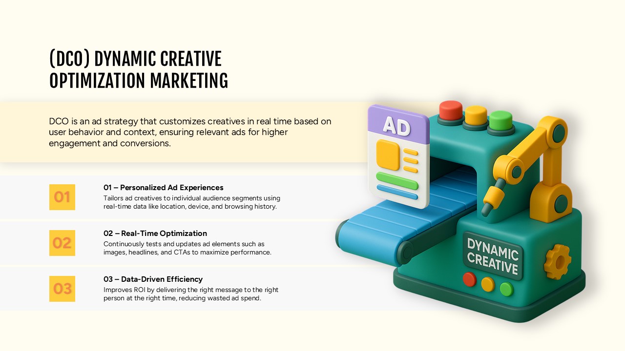
Dynamic Creative Optimization Marketing Template for PowerPoint & Google Slides
Digital Marketing
Dynamic Tennis Sports Theme Slide for PowerPoint & Google Slides
Graphics
Statistics Presentation Template for PowerPoint & Google Slides
Business Report
Statistics Infographic Template for PowerPoint & Google Slides
Infographics
Statistics Infographic & KPI Bar Chart Template for PowerPoint & Google Slides
Bar/Column
Statistics Infographic Template for PowerPoint & Google Slides
Bar/Column
Statistics Infographic Template for PowerPoint & Google Slides
Infographics
Statistics & Global Metrics Infographic Template for PowerPoint & Google Slides
Bar/Column
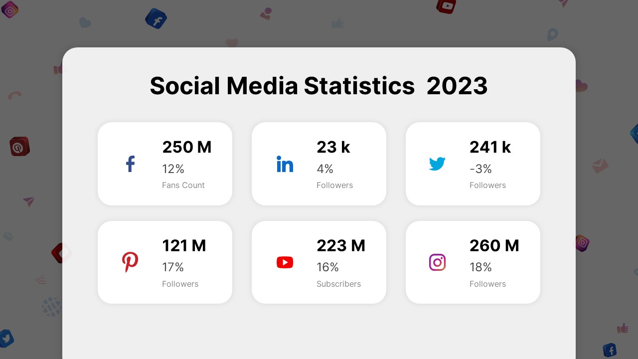
Social Media Statistics 2023 Dashboard Template for PowerPoint & Google Slides
Comparison
Free Infographic Statistics Dashboard Slide for PowerPoint & Google Slides
Bar/Column
Free
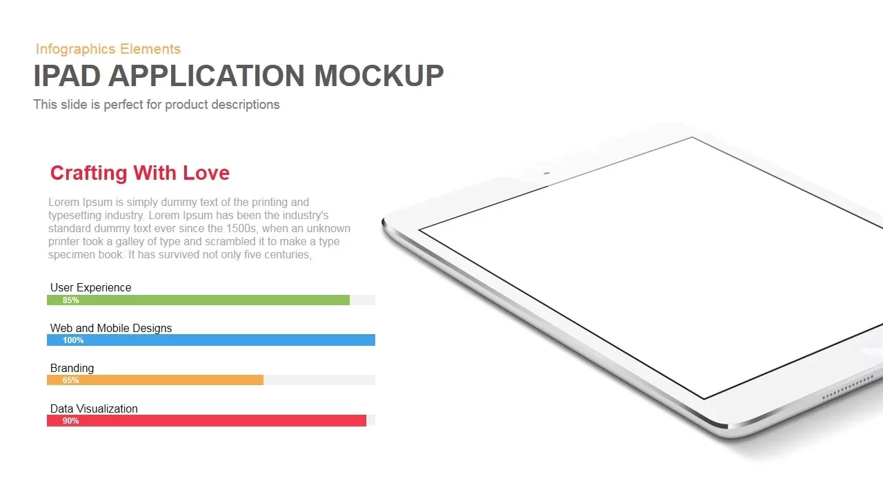
iPad App Mockup with Progress Metrics Template for PowerPoint & Google Slides
Bar/Column
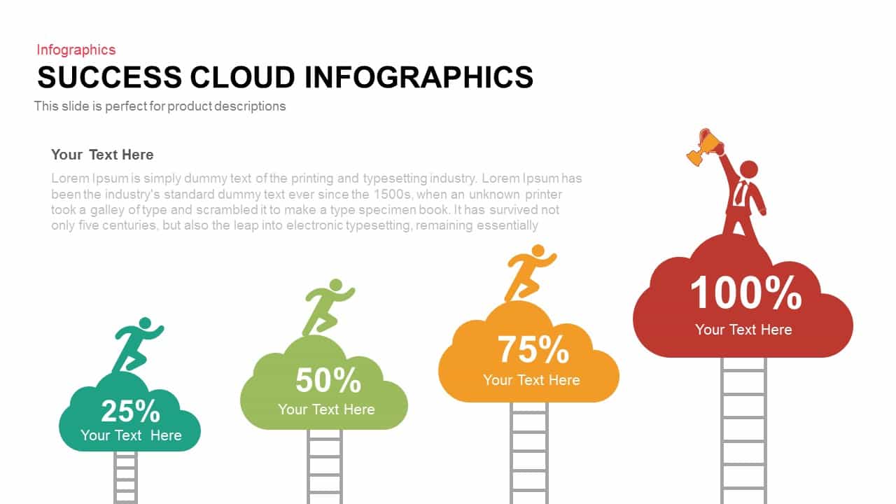
Success Cloud Progress Infographics Template for PowerPoint & Google Slides
Charts

Growth Arrow for Progress & Growth template for PowerPoint & Google Slides
Arrow
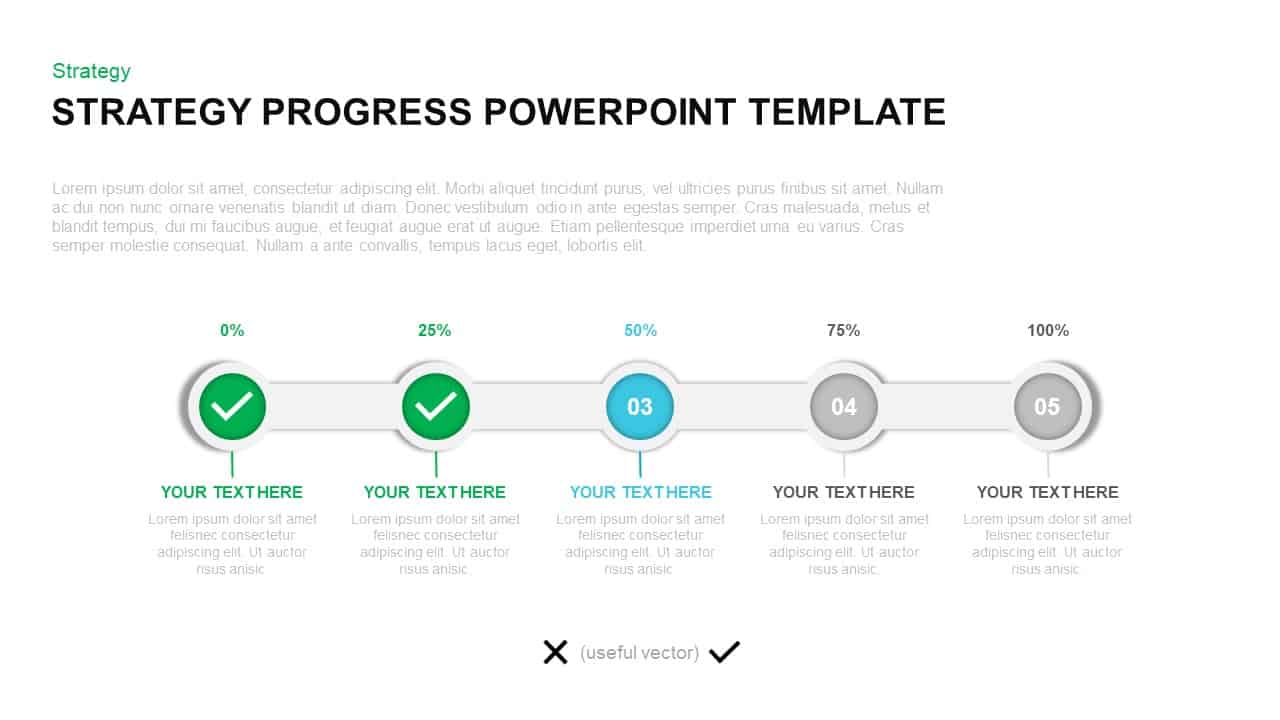
Strategy Progress Timeline Template for PowerPoint & Google Slides
Process
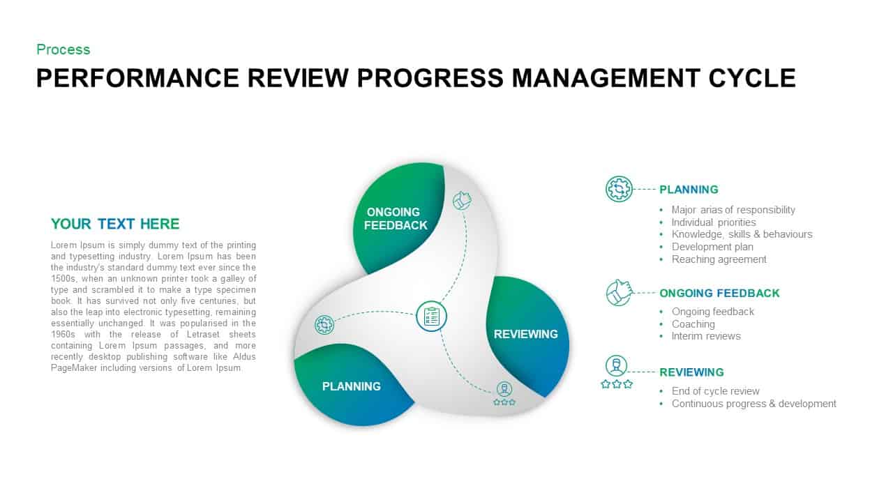
Performance Review Progress Management Template for PowerPoint & Google Slides
Process
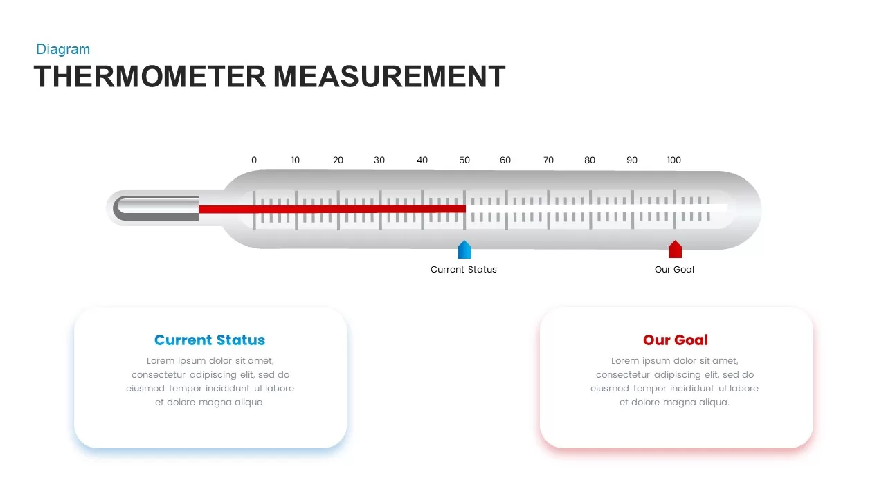
Thermometer Gauge Progress Measurement Template for PowerPoint & Google Slides
Comparison
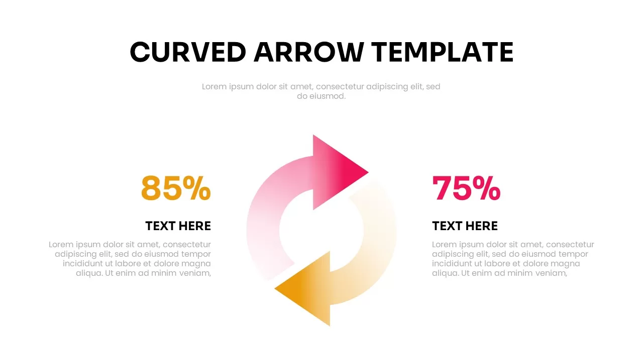
Free Curved Arrow Progress Chart template for PowerPoint & Google Slides
Project
Free
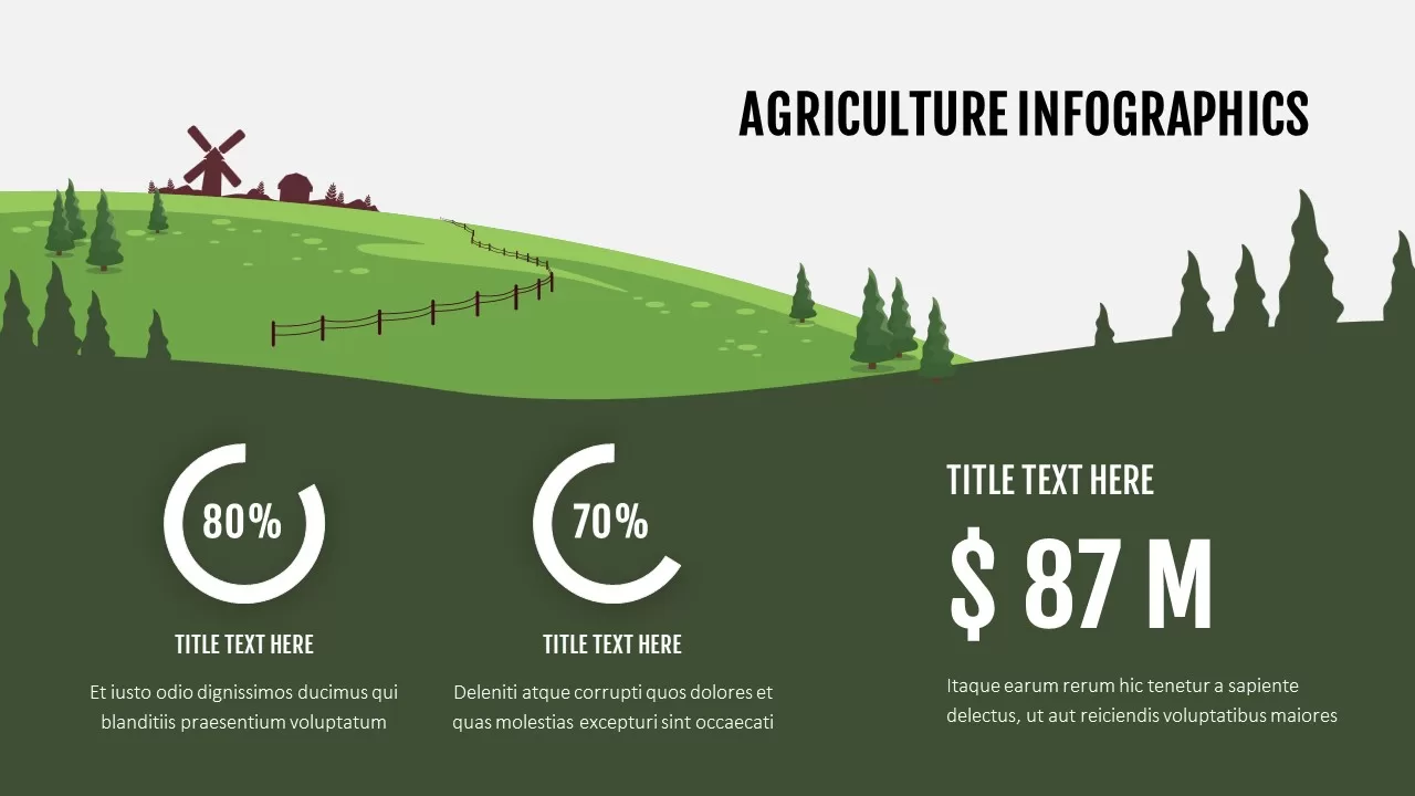
Agriculture Infographics Slide with Progress Rings & Metrics Template for PowerPoint & Google Slides
Pie/Donut
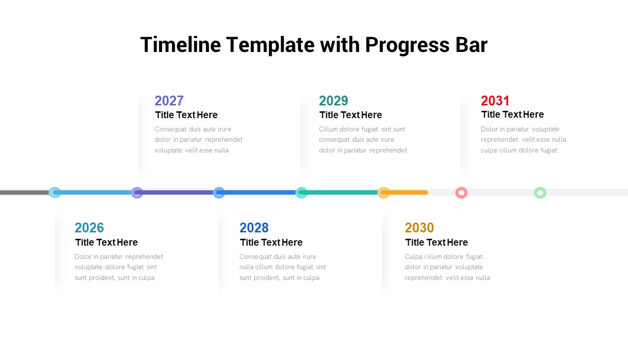
Timeline Roadmap with Progress Bar Template for PowerPoint & Google Slides
Timeline
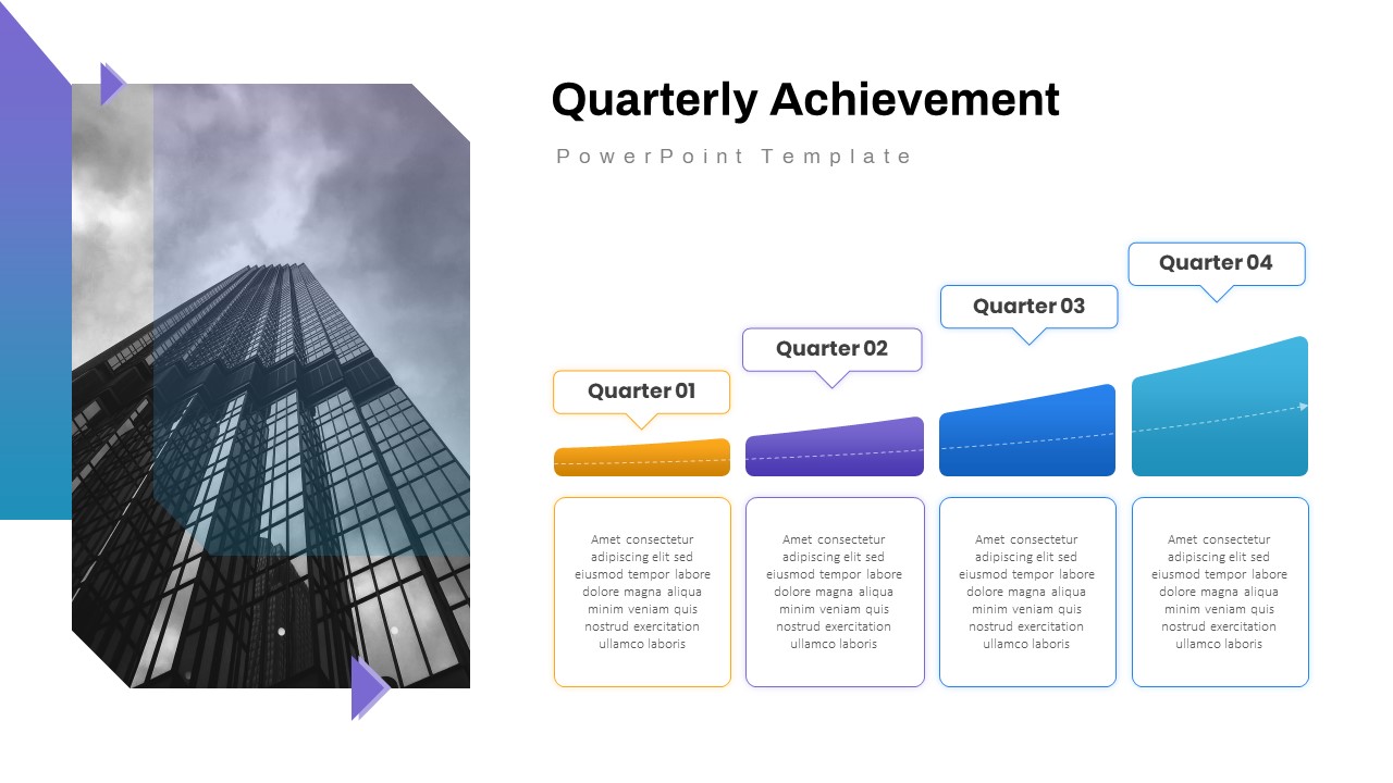
Quarterly Achievement Progress Template for PowerPoint & Google Slides
Accomplishment
Progress Bar and Milestone Visualization Template for PowerPoint & Google Slides
Timeline
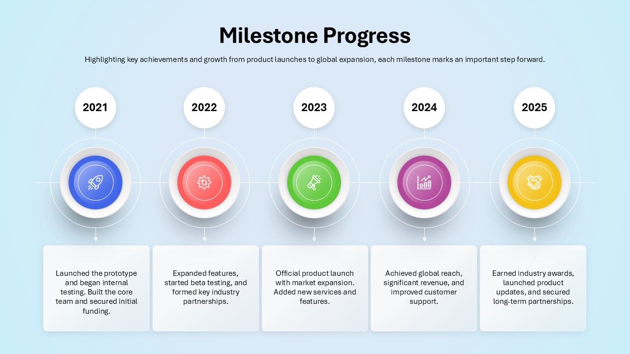
Milestone Progress template for PowerPoint & Google Slides
Business Plan
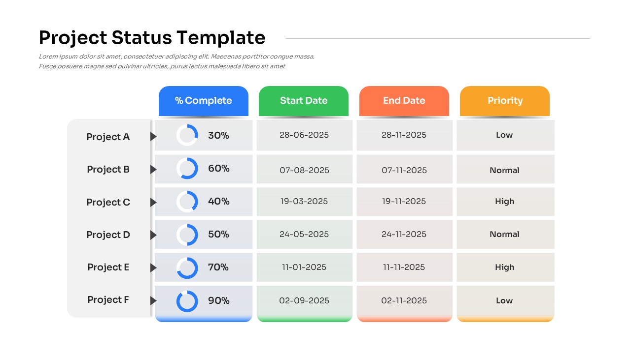
Project Status with Progress & Priority Template for PowerPoint & Google Slides
Table
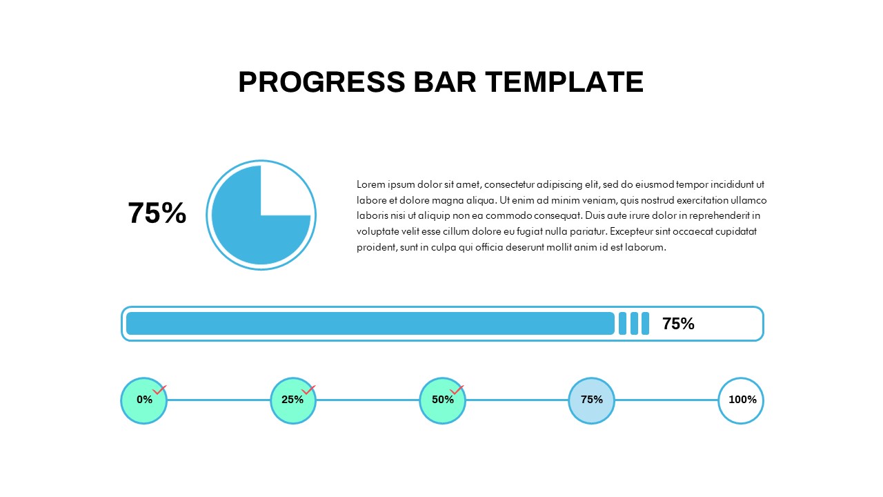
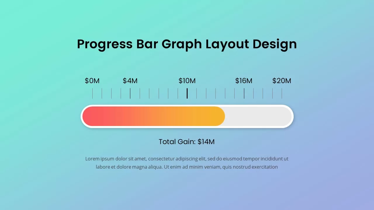
Progress Bar Graph Layout Design for PowerPoint & Google Slides
Charts
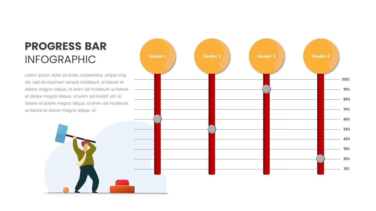
Progress Bar Infographic for PowerPoint & Google Slides
Business
Progress Bar infographic pack for PowerPoint & Google Slides
Business
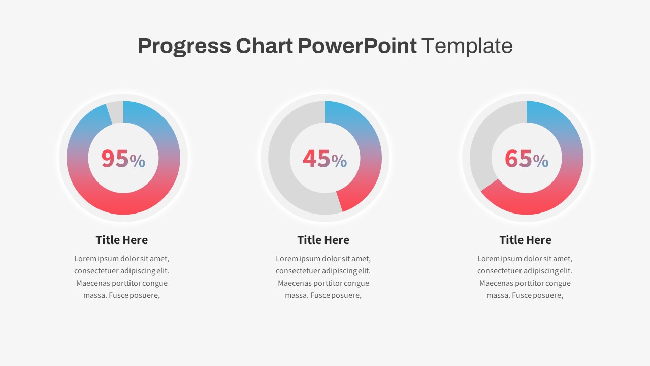
Progress Chart Slide for PowerPoint & Google Slides
Charts
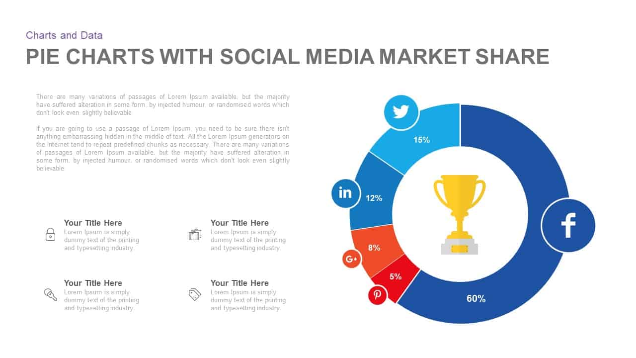
Social Media Market Share Pie Charts Template for PowerPoint & Google Slides
Pie/Donut
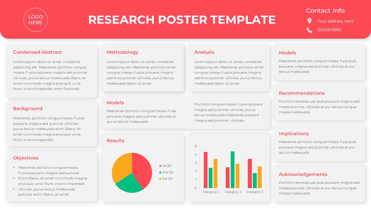
Free Research Poster with Charts Template for PowerPoint & Google Slides
Pie/Donut
Free
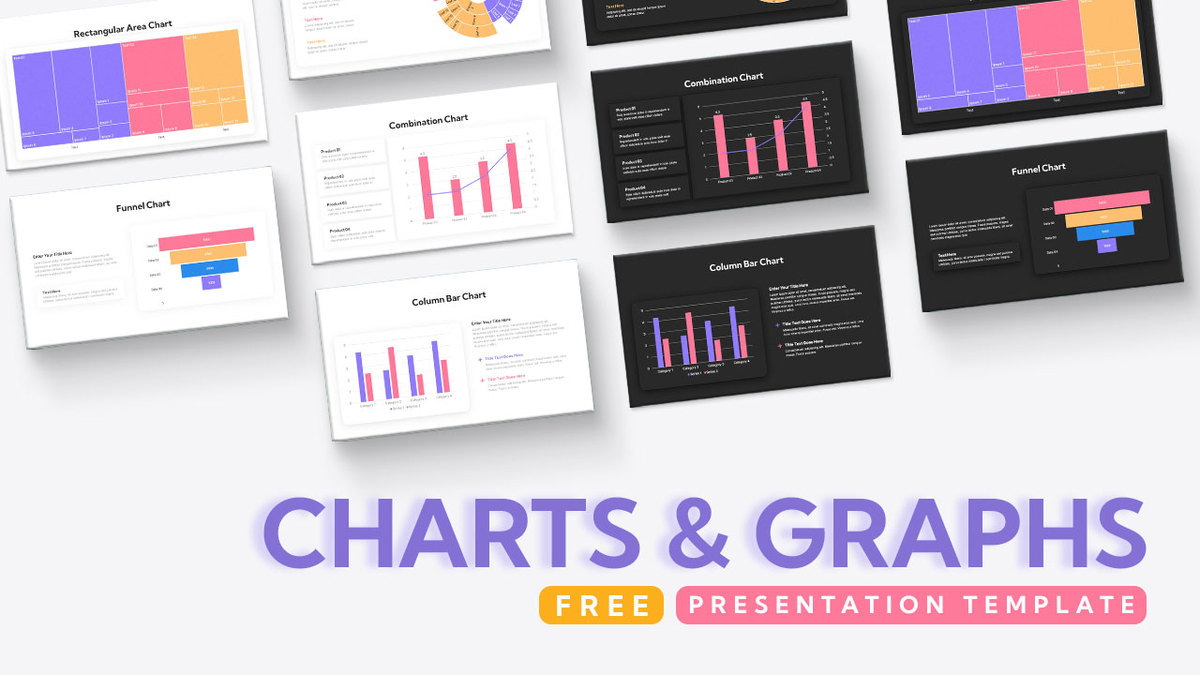
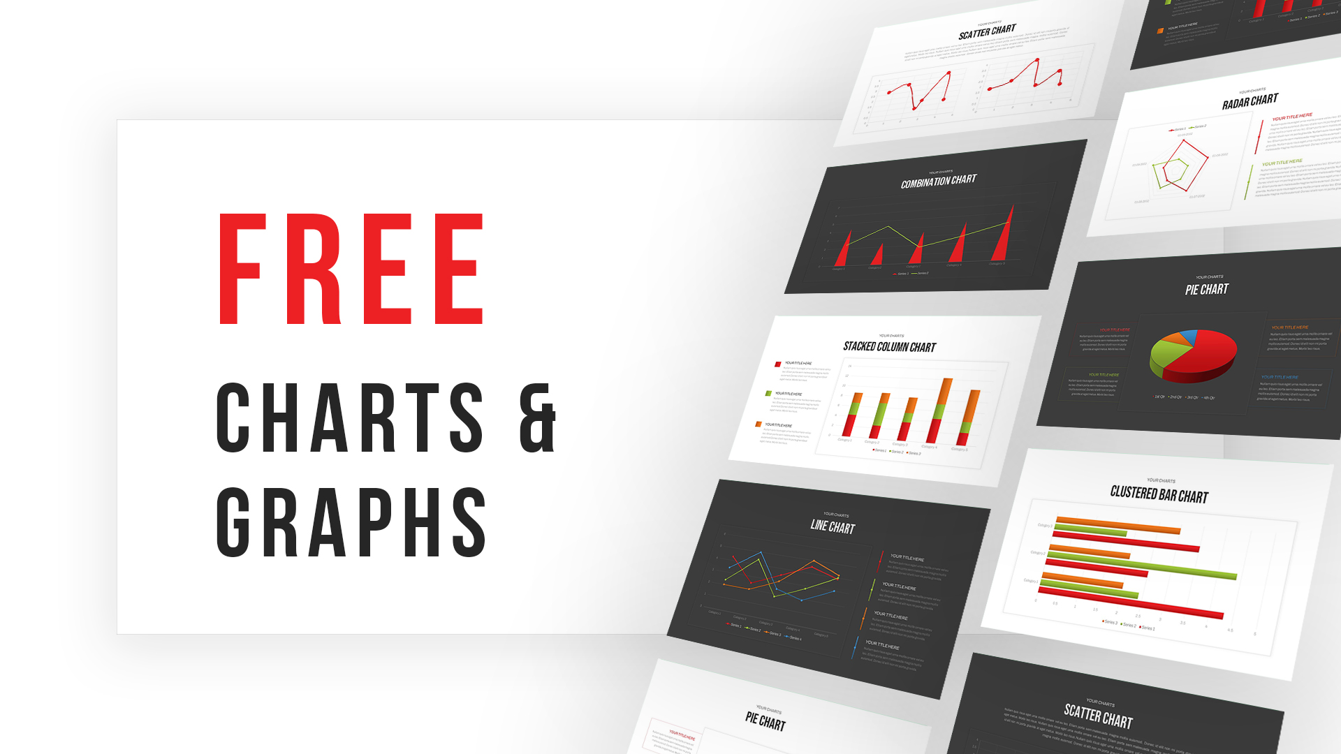
Free Comprehensive Charts & Graphs Template for PowerPoint & Google Slides
Charts
Free
Free Charts & Graphs Presentation Deck Template for PowerPoint & Google Slides
Pitch Deck
Free
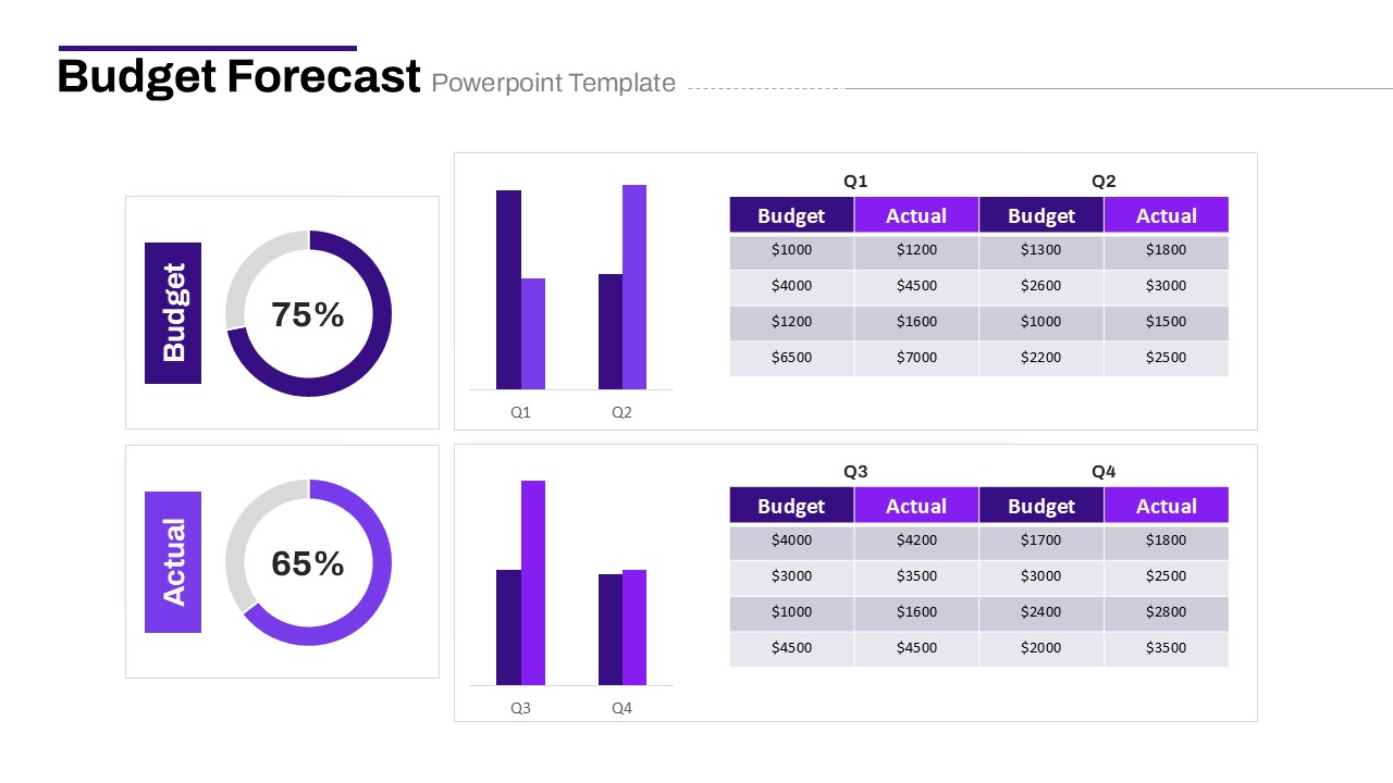
Budget Forecast Dashboard & Donut Charts Template for PowerPoint & Google Slides
Pie/Donut
4 Step Process PowerPoint & Google Slides Template for PowerPoint & Google Slides
Process