North America Map template for PowerPoint & Google Slides
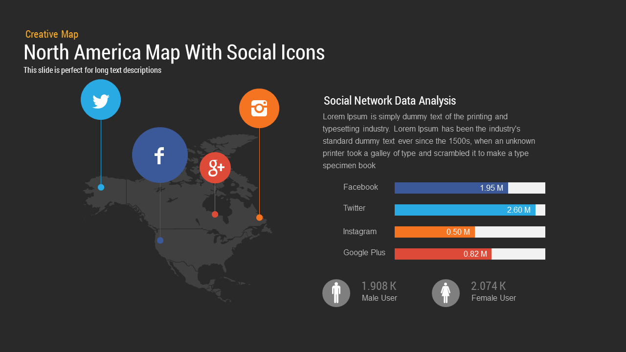
This North America Map template for PowerPoint & Google Slides offers a dynamic infographic slide featuring a dark, full‐slide silhouette of the North American continent as the backdrop. Overlay vibrant circular markers represent key social channels—light blue for Twitter, dark blue for Facebook, orange for Instagram, and red for Google Plus—each linked to precise map locations by dashed connectors. On the right, a dedicated analysis panel includes a headline placeholder for “Social Network Data Analysis” and space for two detailed paragraphs. Below the narrative, a multi‐series horizontal bar chart plots user metrics from 2010 through 2014, with each social network’s data bar colored to match its map marker. Crisp gridlines and subtle axis lines ensure clarity, while free web fonts guarantee typographic consistency across devices.
At the bottom, a demographic snapshot displays male and female user counts next to gender icons, enabling presenters to incorporate audience segmentation insights. All elements reside on master layouts, allowing global edits to color palettes, typography, and vector icons. Replace the North America silhouette with a world map or regional outline for alternate contexts, or swap dashed connectors for arrows to create directional flow.
Designed for 16:9 widescreens and adaptable to 4:3 formats, the slide projects clearly on HD screens and virtual meeting platforms. Rounded marker shapes, subtle drop shadows, and high‐contrast text against the dark background create a polished, professional aesthetic. A hidden variant slide offers alternate color themes and layout rearrangements for rapid customization.
Who is it for
Social media managers, digital marketers, data analysts, and brand strategists will find this slide invaluable for presenting regional channel performance. Consultants, agency teams, and executives can leverage it in investor pitches or quarterly business reviews.
Other Uses
Repurpose the template to visualize sales territories, market penetration by region, supply chain networks, or epidemiological data. Swap the bubbles for icons to create risk heat maps, resource allocation charts, or global campaign overviews in minutes.
Login to download this file

Item ID
SB00053
Related Templates

North America Percentage Map Infographic Template for PowerPoint & Google Slides
World Maps
North America Location Pin Map Overview Template for PowerPoint & Google Slides
World Maps
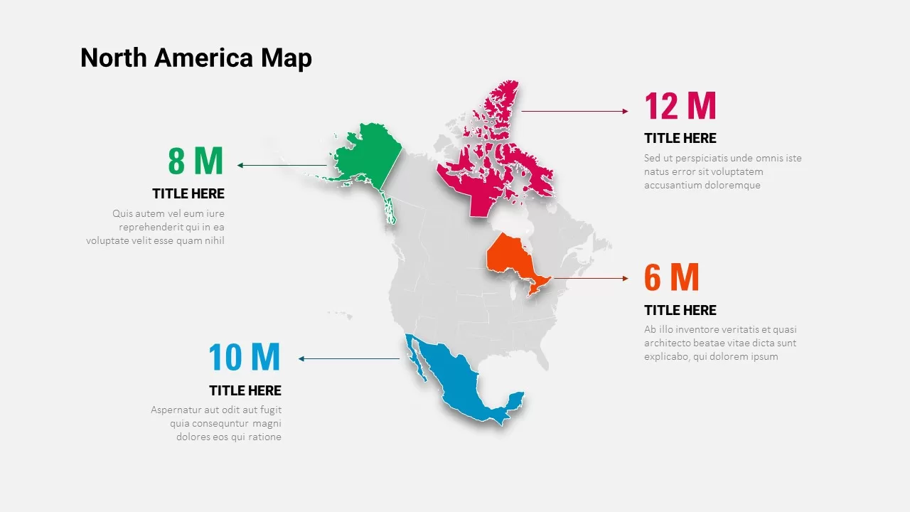
North America Map Infographic Slide Template for PowerPoint & Google Slides
World Maps
North America Regional Map Overview Template for PowerPoint & Google Slides
World Maps
North America Data Map Callouts Template for PowerPoint & Google Slides
World Maps
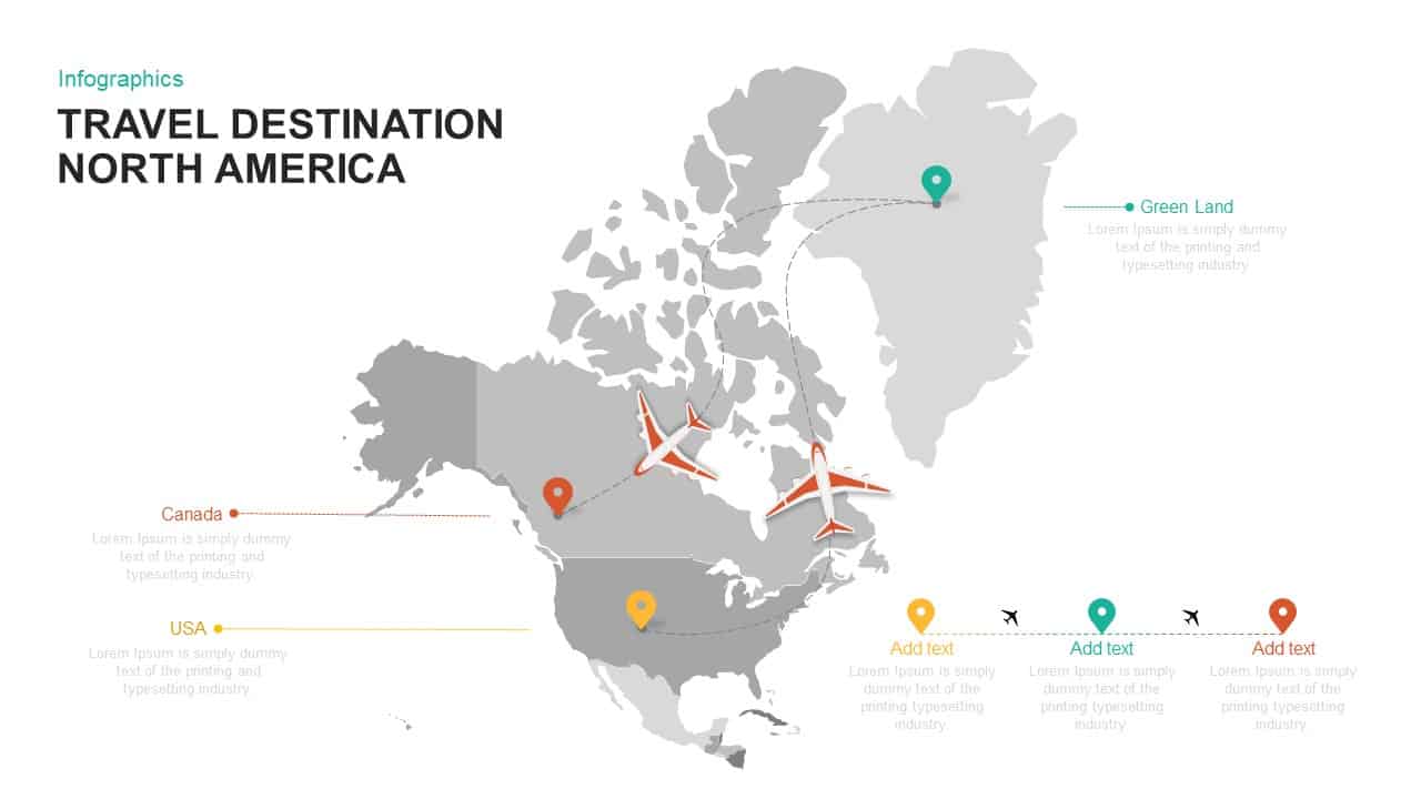
North America Travel Destinations Template for PowerPoint & Google Slides
World Maps

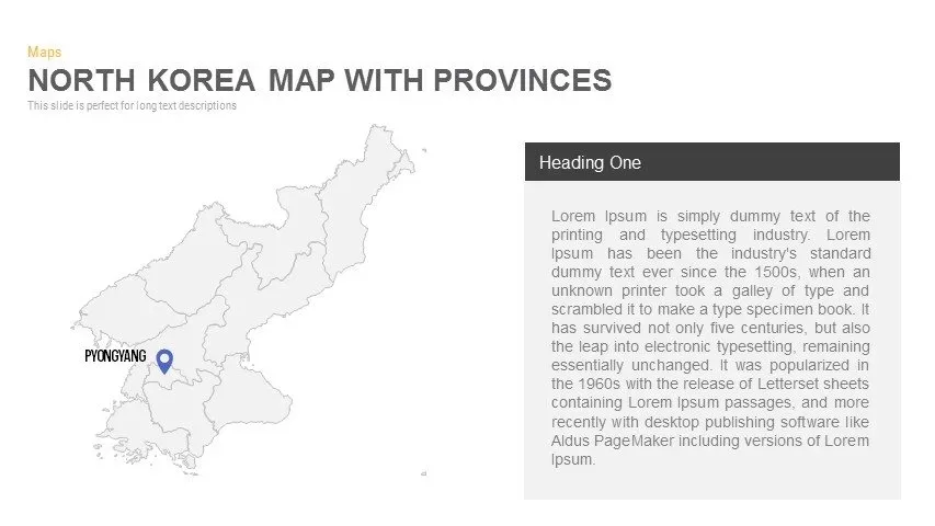
North Korea Map with Provinces Infographic Pack Template for PowerPoint & Google Slides
Maps
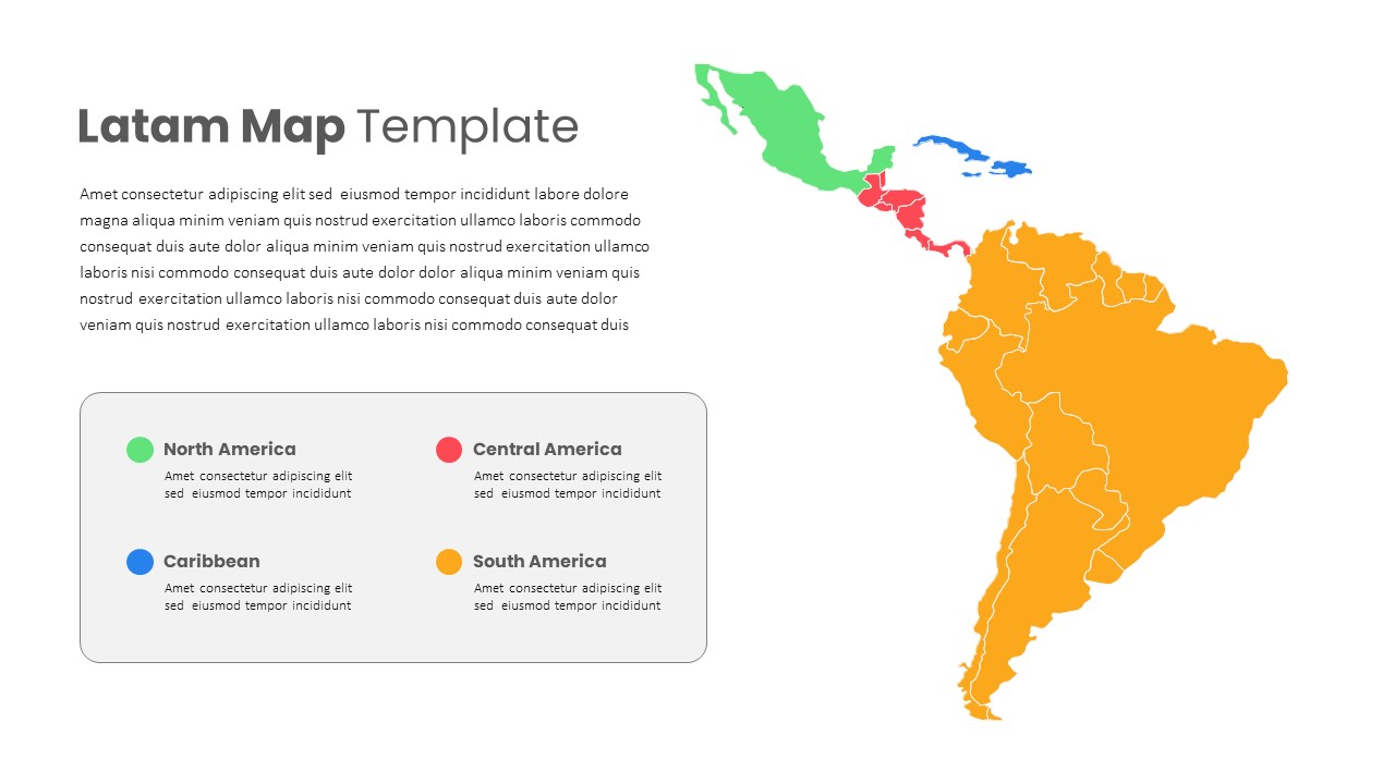
Latin America Regional Map Breakdown Template for PowerPoint & Google Slides
World Maps
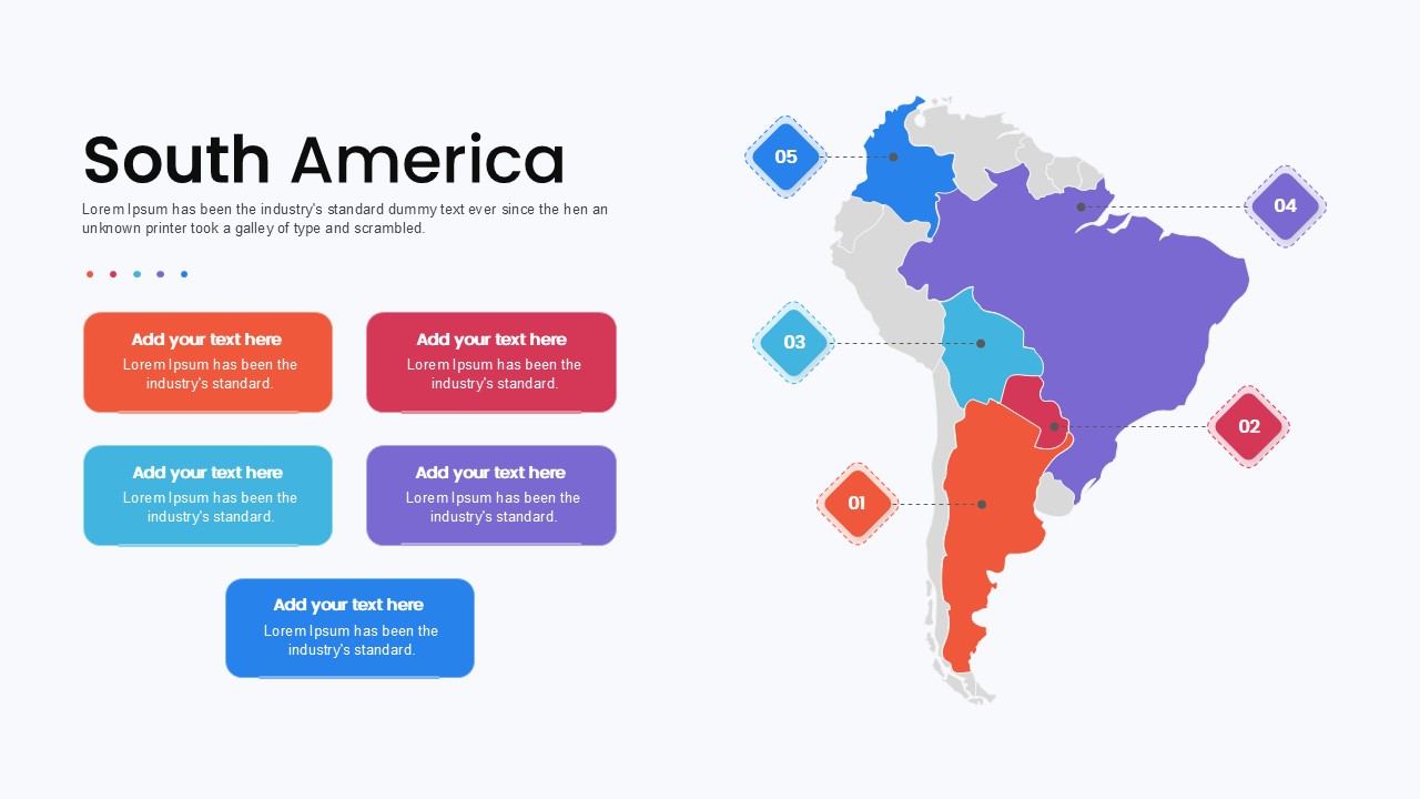
South America Map template for PowerPoint & Google Slides
Maps
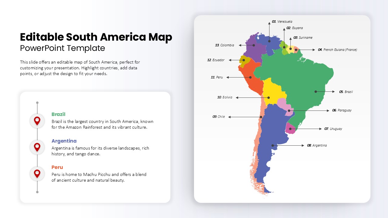
Editable South America Map Diagram Template for PowerPoint & Google Slides
Maps
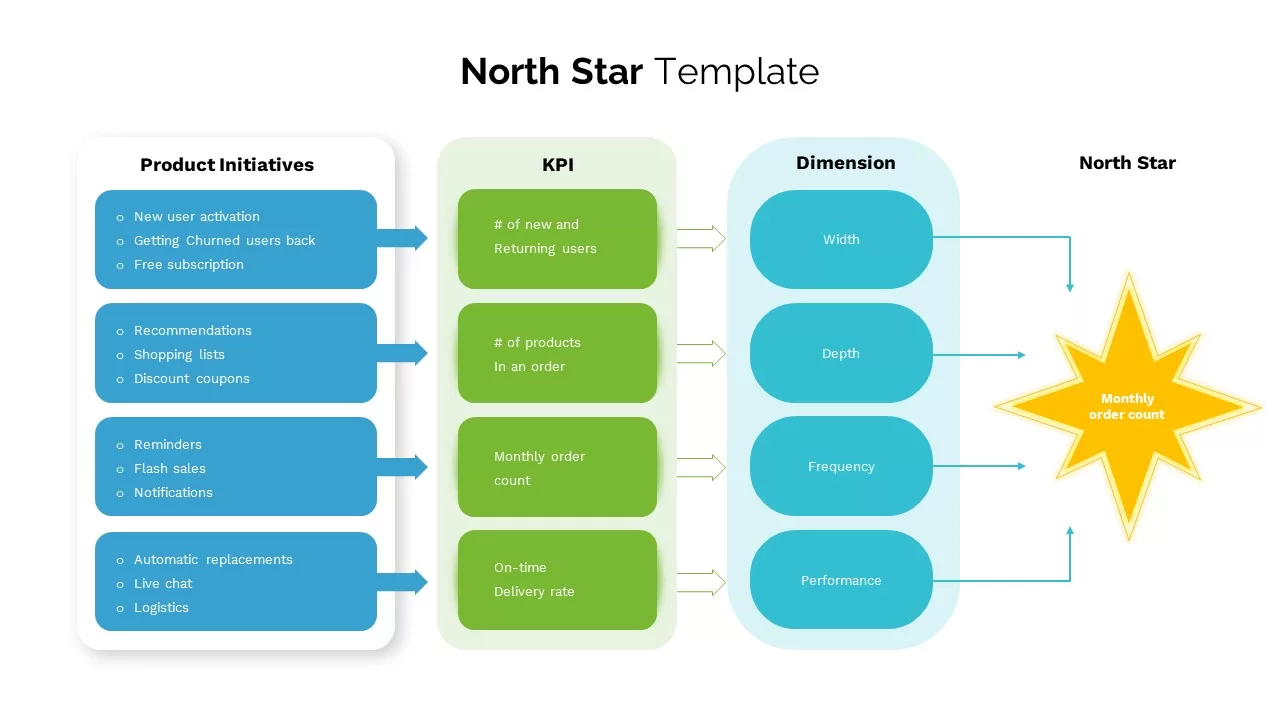
North Star template for PowerPoint & Google Slides
Business
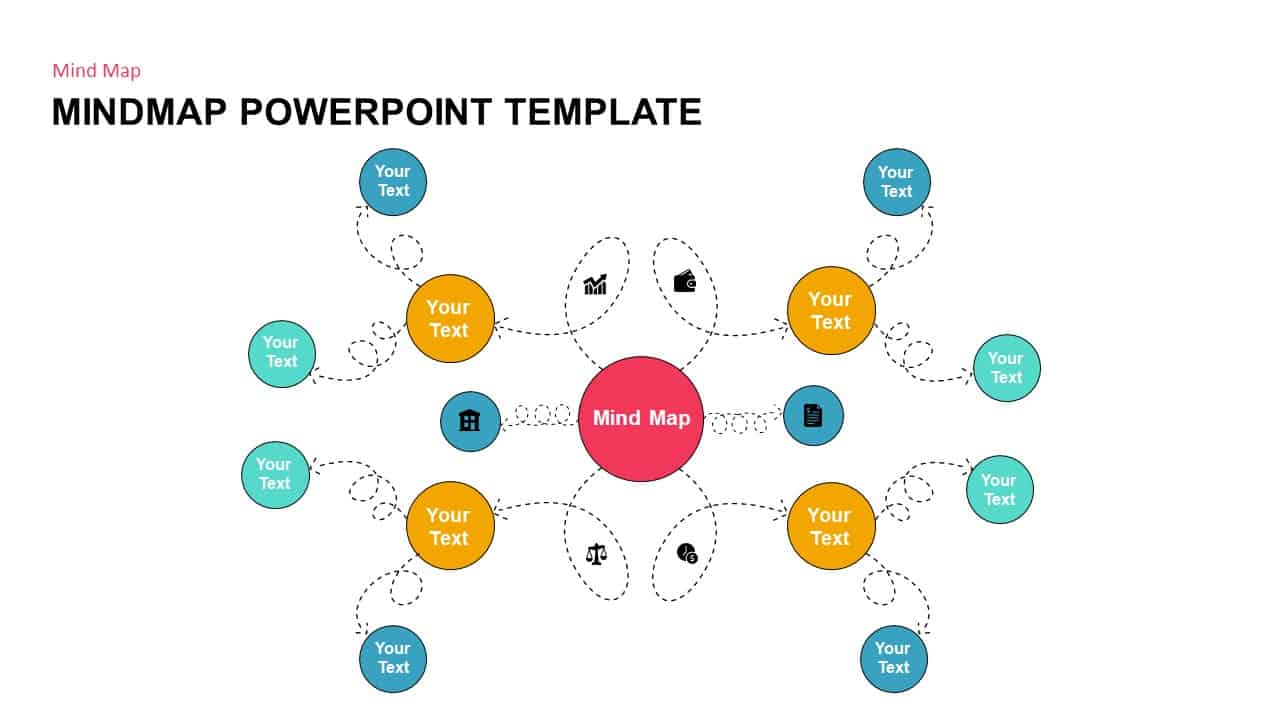
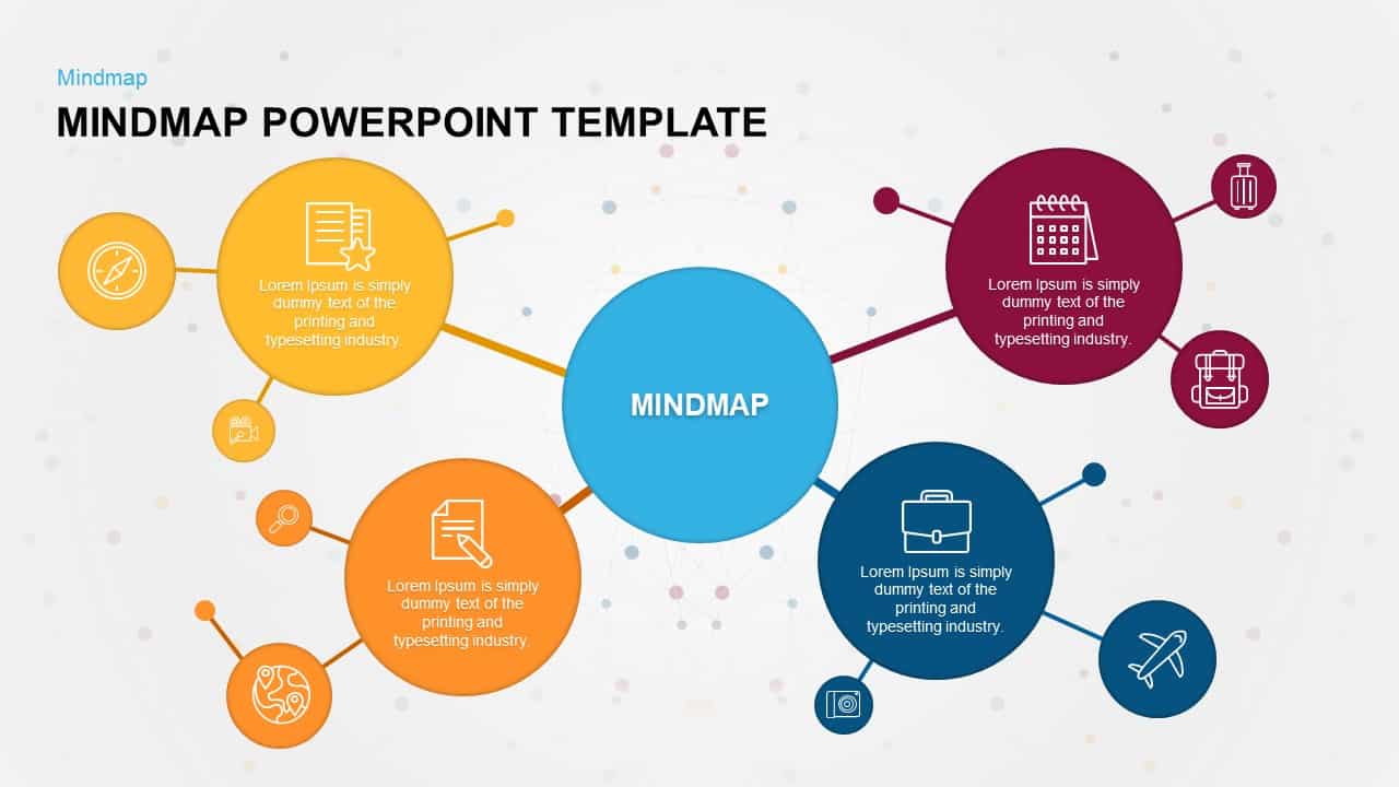
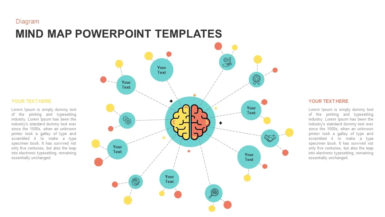
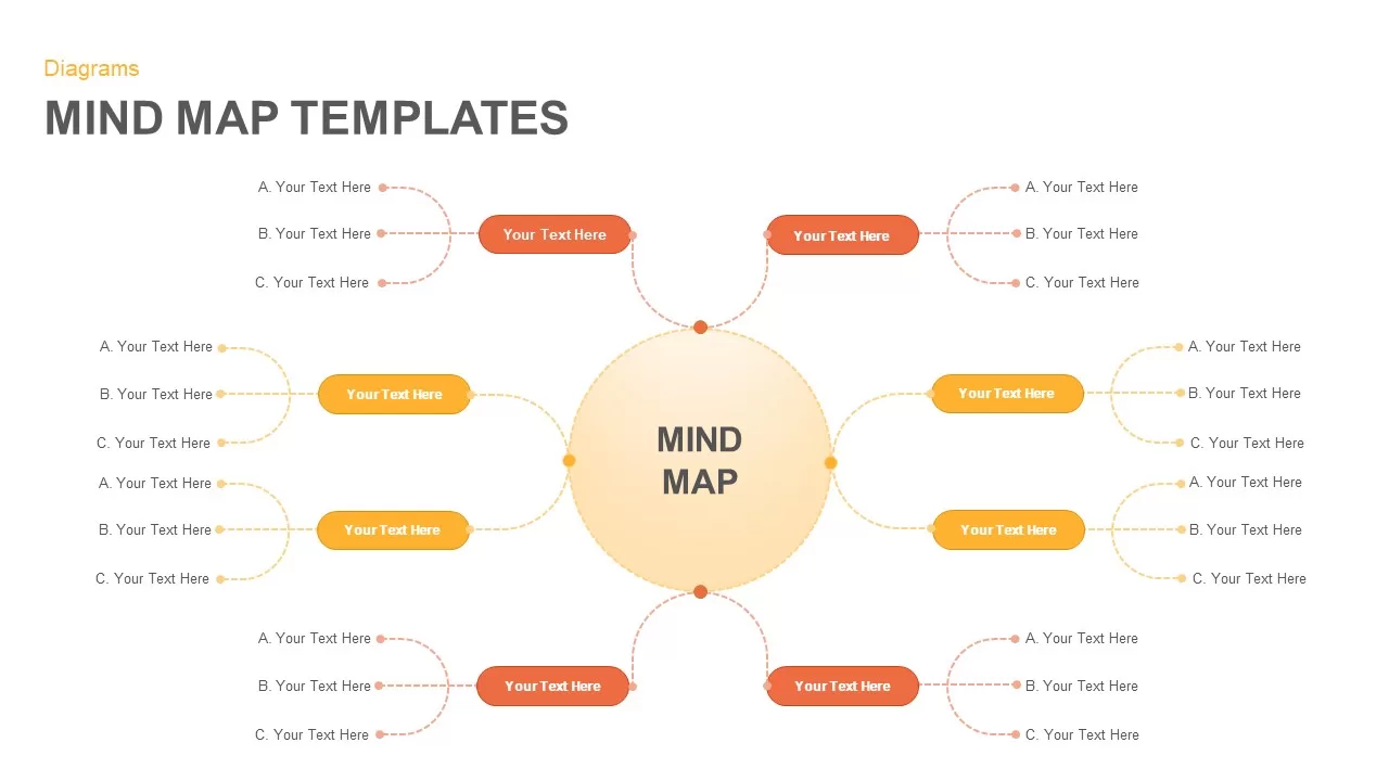
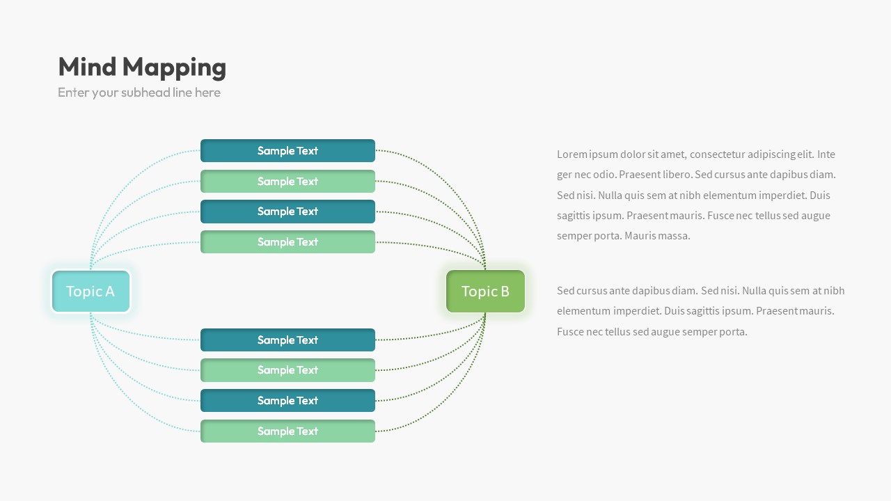
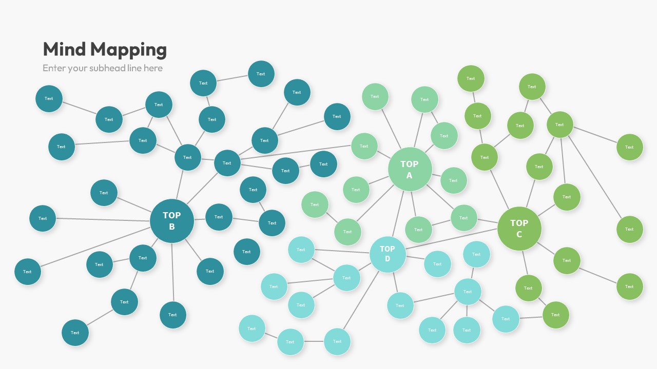
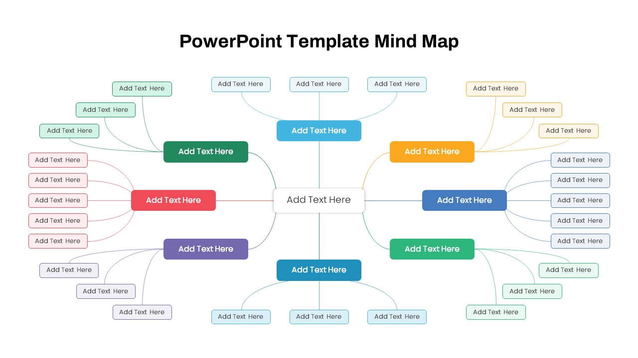
Mind Map PowerPoint template for PowerPoint & Google Slides
Mind Maps
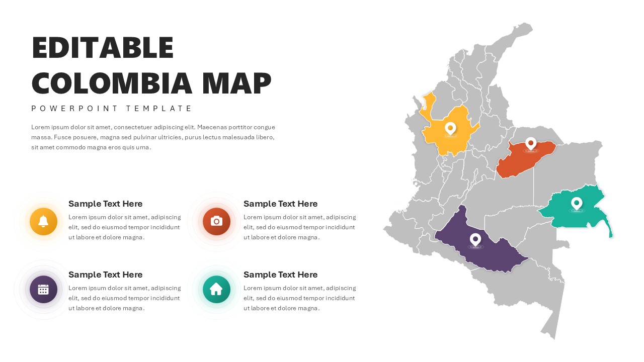
Editable Colombia Map PowerPoint Template for PowerPoint & Google Slides
Business Models
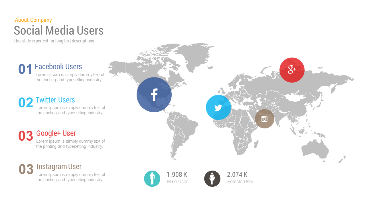
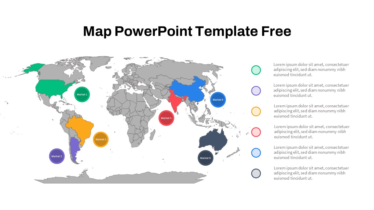
Free Social Media Users Map template for PowerPoint & Google Slides
World Maps
Free
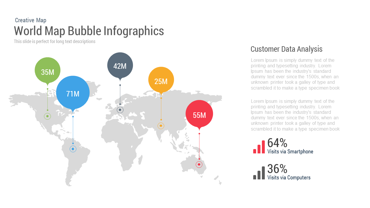
World Map Bubble template for PowerPoint & Google Slides
World Maps

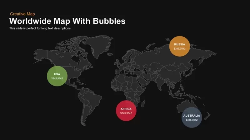
Worldwide Map with Bubbles template for PowerPoint & Google Slides
World Maps
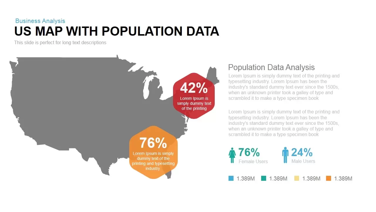
Interactive US Population Data Map Slide Template for PowerPoint & Google Slides
World Maps
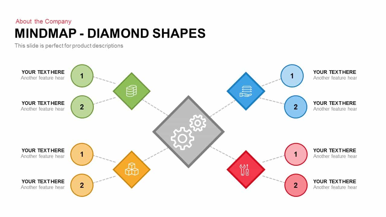
Diamond Mind Map Diagram Four Branches Template for PowerPoint & Google Slides
Mind Maps
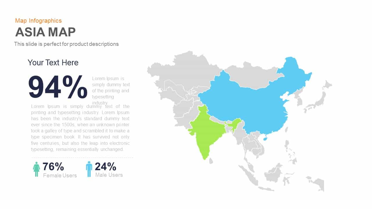
Asia Map Infographic with Demographics template for PowerPoint & Google Slides
World Maps
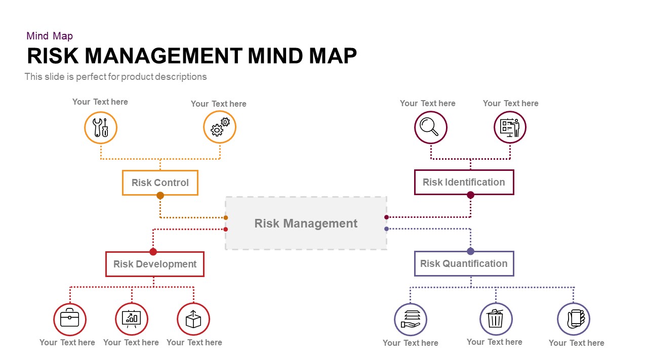
Risk Management Mind Map Radial Diagram template for PowerPoint & Google Slides
Mind Maps
Simple Multi-Branch Mind Map Template for PowerPoint & Google Slides
Mind Maps
United States Map with Zoom View template for PowerPoint & Google Slides
World Maps
Mexico Map With States Template for PowerPoint & Google Slides
World Maps
Panama Map with Region Markers Template for PowerPoint & Google Slides
World Maps
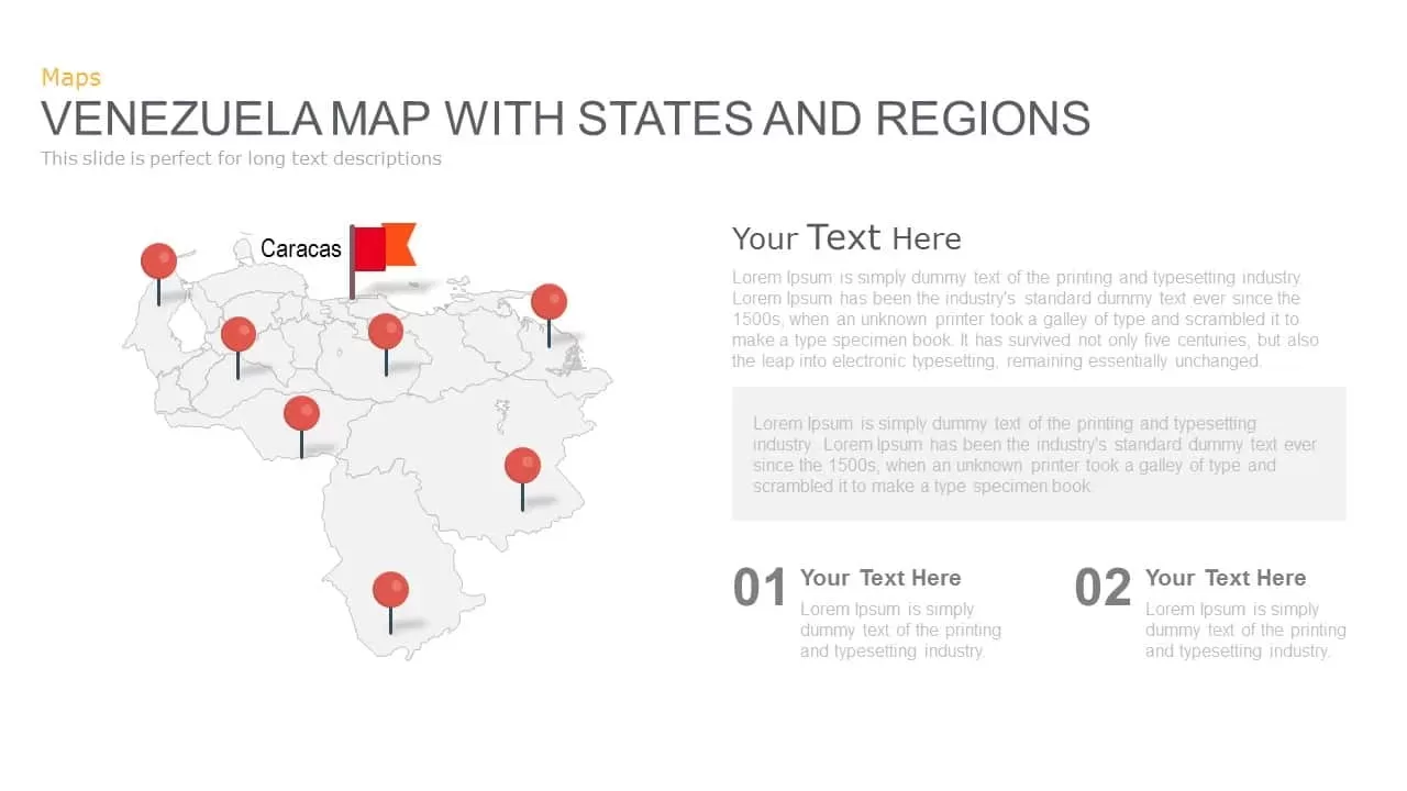
Venezuela Map with States and Regions Template for PowerPoint & Google Slides
World Maps
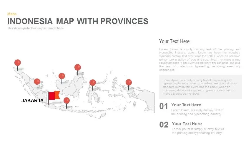
Indonesia Province Map Callout Slide Template for PowerPoint & Google Slides
Maps
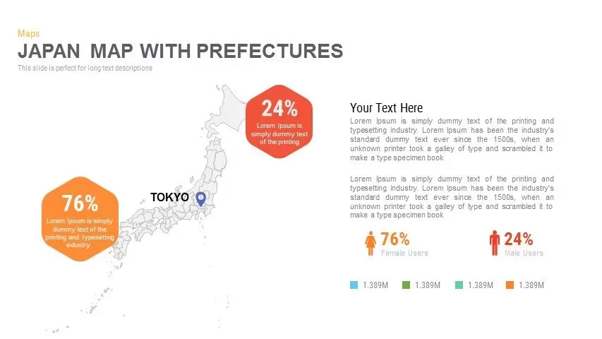
Japan Province Map Infographic Template for PowerPoint & Google Slides
Maps
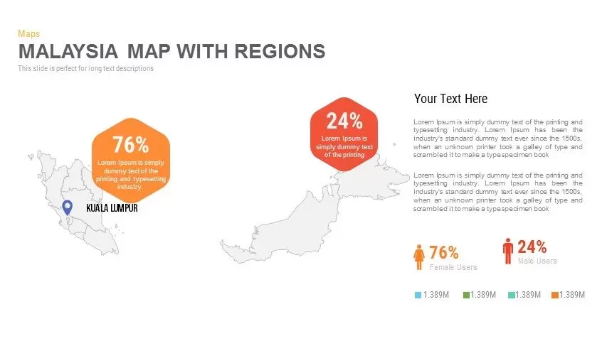
Malaysia Regional Map Infographic Template for PowerPoint & Google Slides
Maps
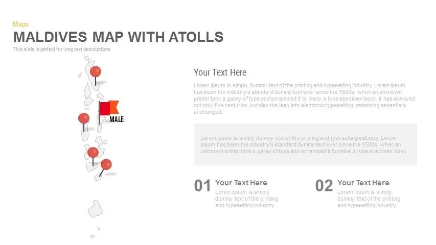
Maldives Map Infographic Template for PowerPoint & Google Slides
Maps
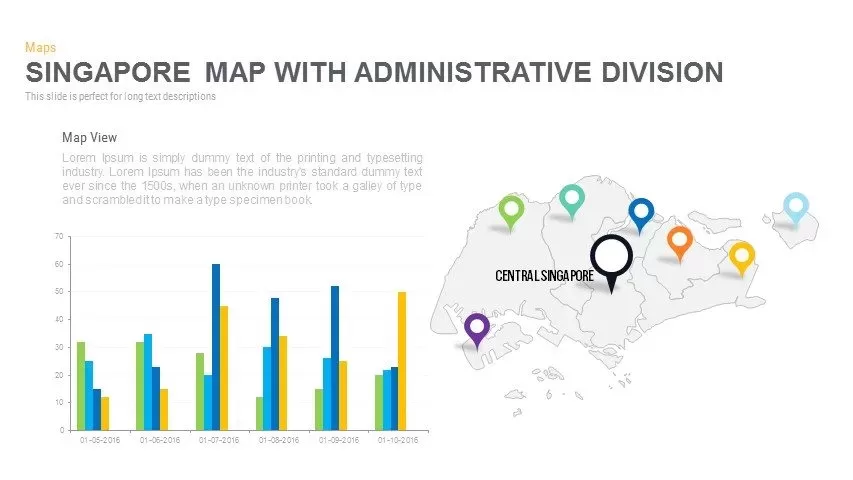
Singapore Map Pack Template for PowerPoint & Google Slides
Maps
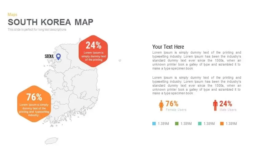
Infographic South Korea Map Template for PowerPoint & Google Slides
Maps
Sri Lanka Map Infographic Pack Template for PowerPoint & Google Slides
Maps
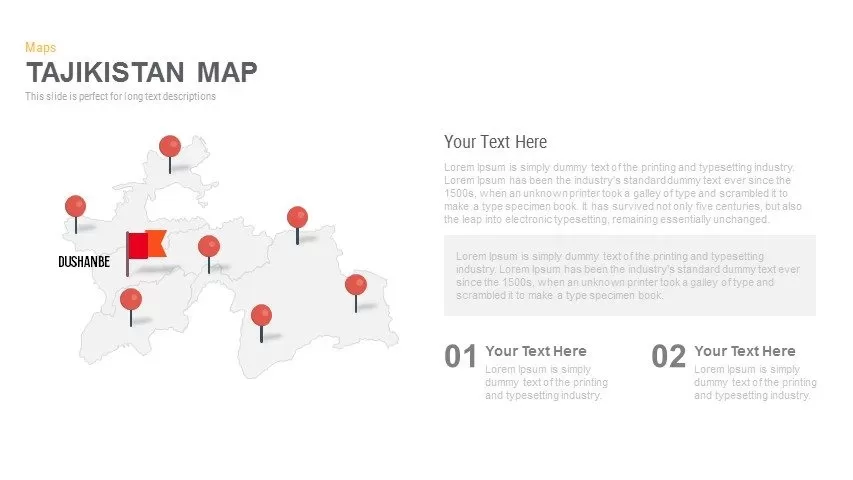
Editable Tajikistan Provinces Map Pack Template for PowerPoint & Google Slides
Maps
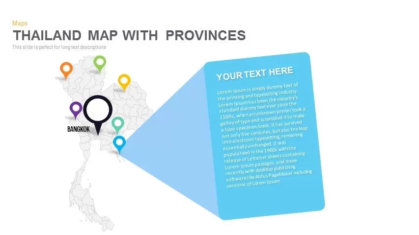
Thailand Provinces Map Infographic Pack Template for PowerPoint & Google Slides
Maps
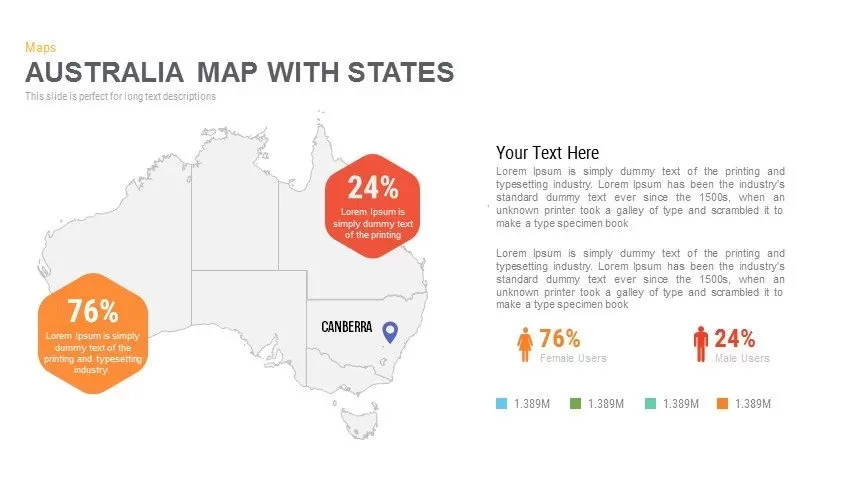
Australia Map with State Markers Template for PowerPoint & Google Slides
Maps
Angola Map with Provinces Slide Pack Template for PowerPoint & Google Slides
World Maps
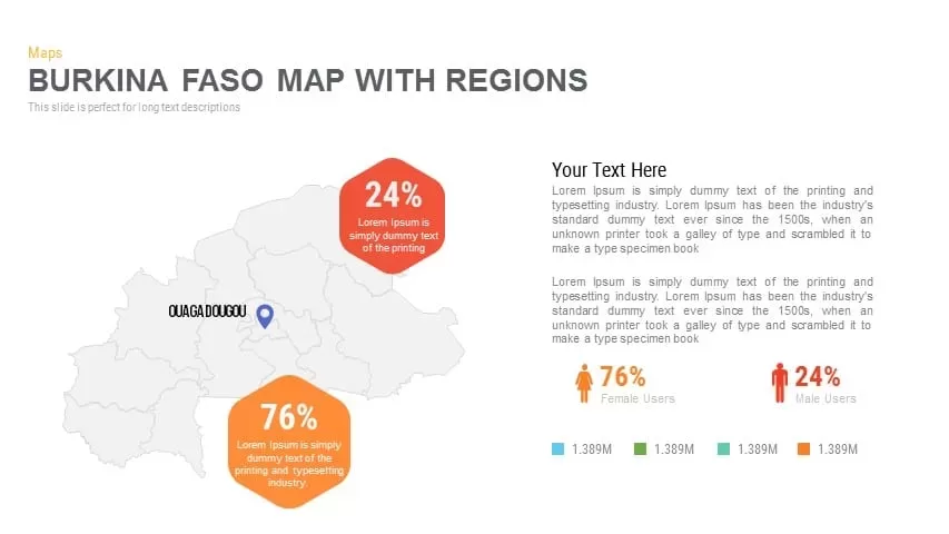
Burkina Faso Map with Regions Slide Pack Template for PowerPoint & Google Slides
World Maps
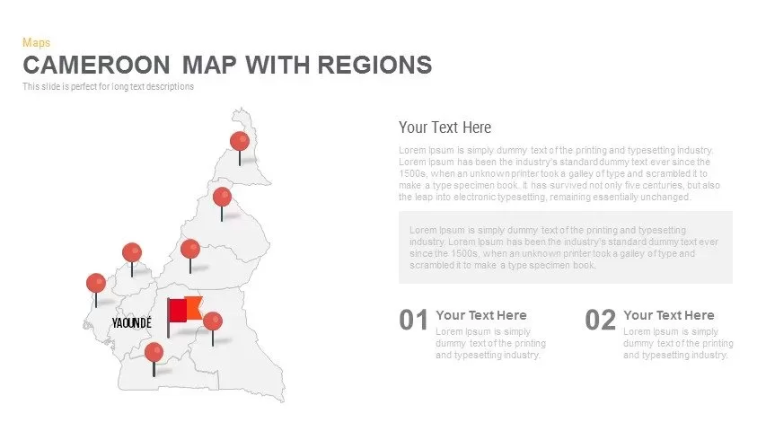
Cameroon Map with Regions Slide Pack Template for PowerPoint & Google Slides
World Maps
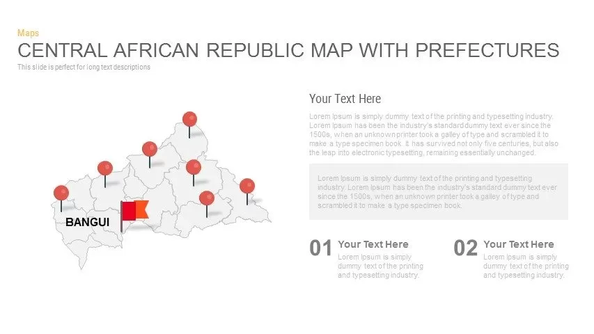
Central African Republic Prefectures Map Template for PowerPoint & Google Slides
World Maps
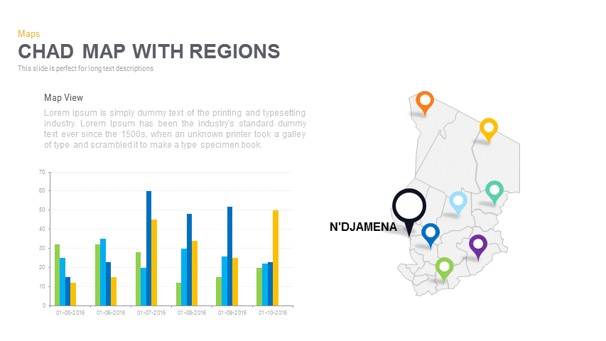
Chad Map with Regions Slide Pack Template for PowerPoint & Google Slides
World Maps
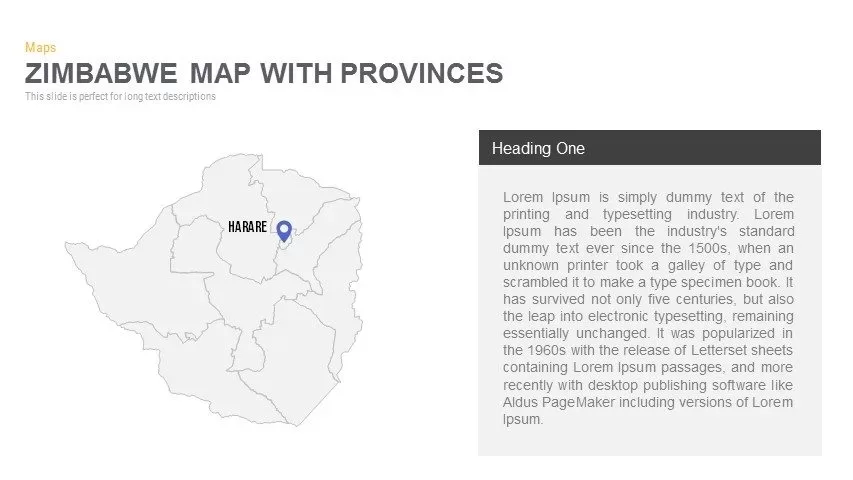
Zimbabwe Map with Provinces Slide Pack Template for PowerPoint & Google Slides
World Maps

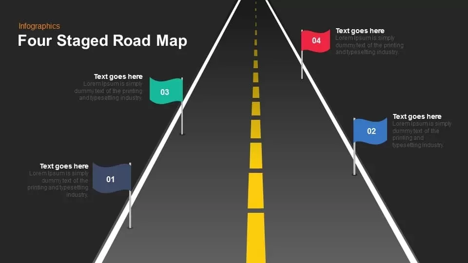
Four Staged Road Map template for PowerPoint & Google Slides
Roadmap

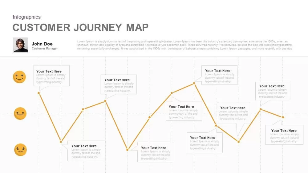
Emotional Customer Journey Map Template for PowerPoint & Google Slides
Customer Journey
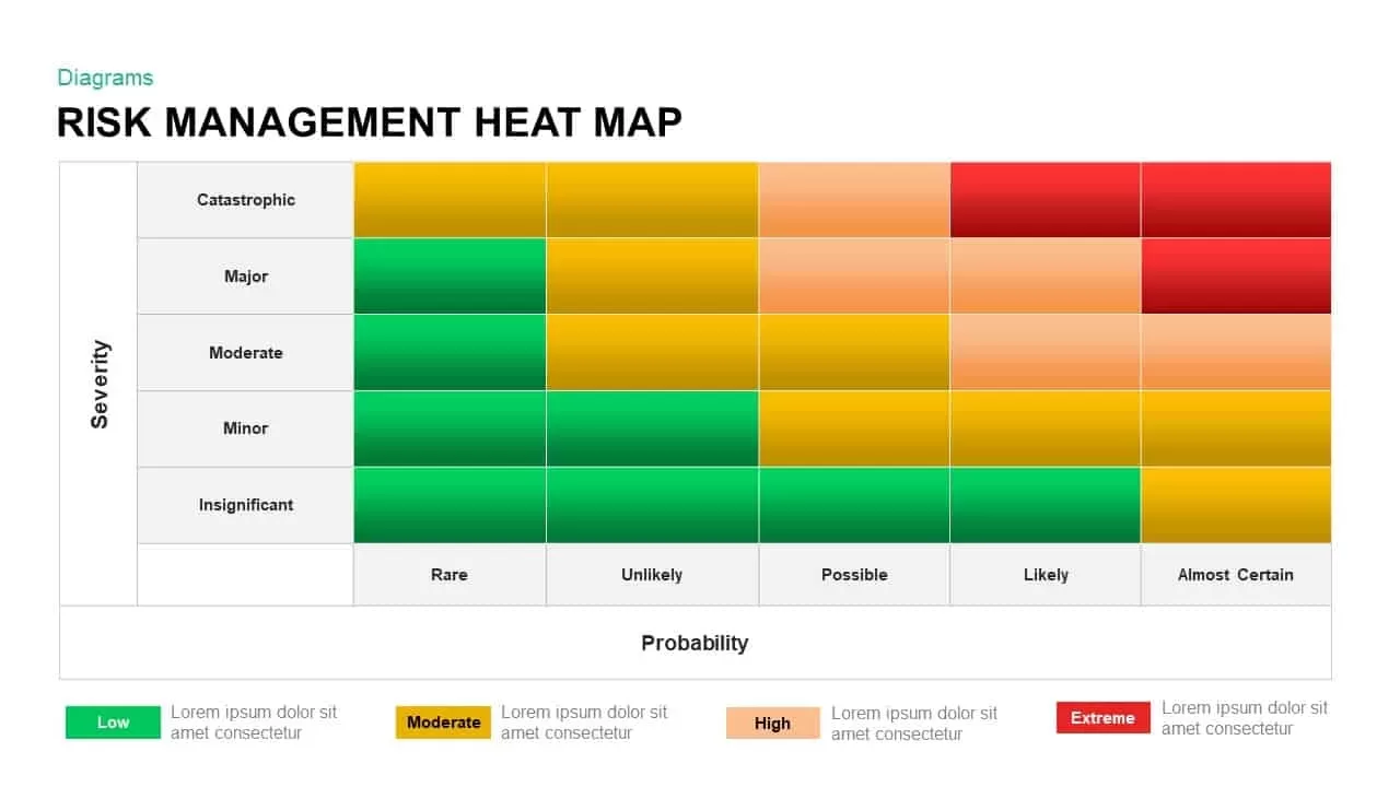
Risk Management Heat Map Diagram Template for PowerPoint & Google Slides
Comparison Chart
Colorful Mind Map Infographic Template with Icons for PowerPoint & Google Slides
Mind Maps
Colorful Mind Map Infographic Template for PowerPoint & Google Slides
Mind Maps
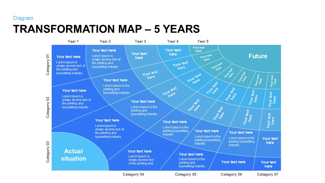
Five-Year Transformation Map Diagram Template for PowerPoint & Google Slides
Process

Modern World Map Callout Infographic Template for PowerPoint & Google Slides
World Maps
Mind Map Diagram Template for PowerPoint & Google Slides
Mind Maps
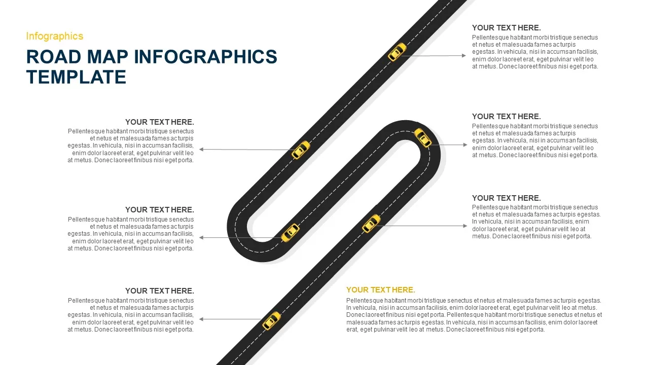
Six-Stage Road Map Infographic Timeline Template for PowerPoint & Google Slides
Roadmap
Versatile Mind Map Infographic Template for PowerPoint & Google Slides
Mind Maps
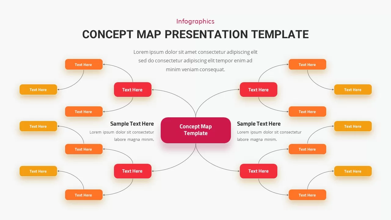
Concept Map Presentation Template for PowerPoint & Google Slides
Mind Maps
Structured Mind Map Infographic Diagram Template for PowerPoint & Google Slides
Mind Maps
Dual Topic Mind Map Infographic Template for PowerPoint & Google Slides
Mind Maps
Fully Editable World Map Infographic Template for PowerPoint & Google Slides
World Maps
Global Population Demographics & Map Template for PowerPoint & Google Slides
Bar/Column
Editable World Map Callout Infographic Template for PowerPoint & Google Slides
World Maps
Editable World Map Callout Infographic Template for PowerPoint & Google Slides
World Maps
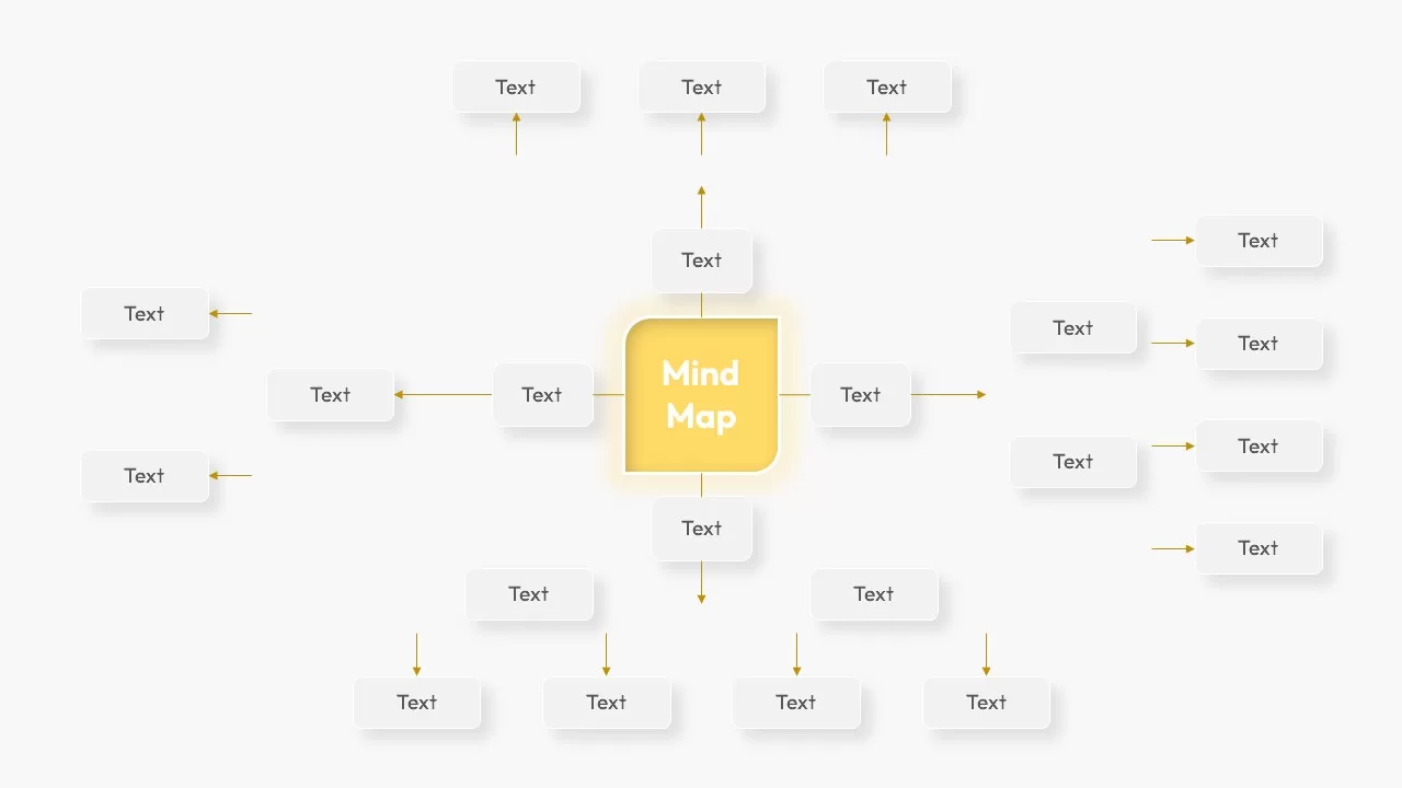
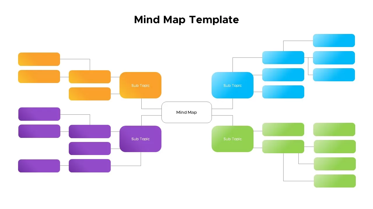
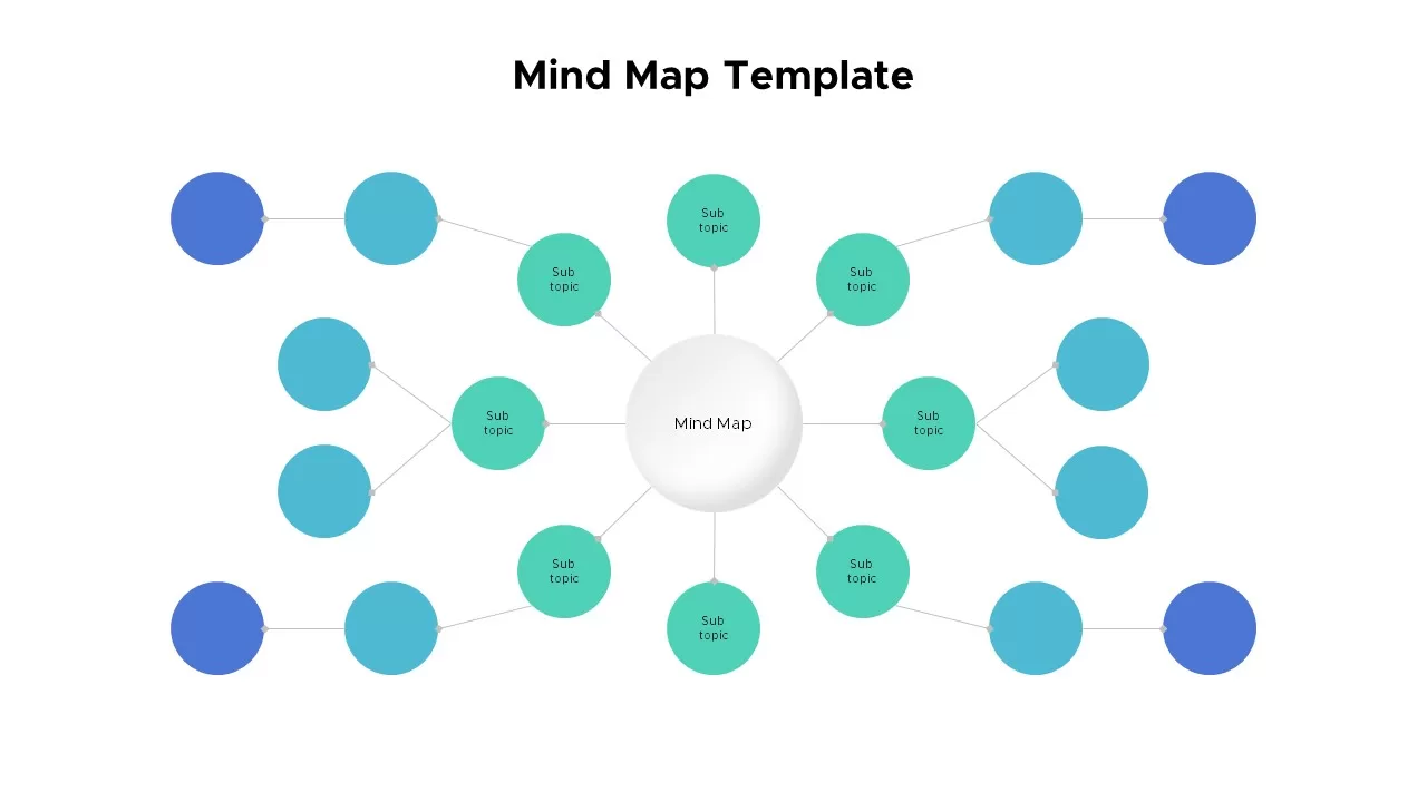
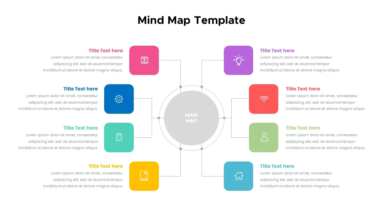
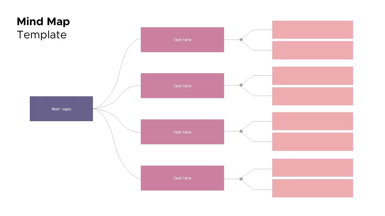
Mind Map Template for PowerPoint & Google Slides
Mind Maps
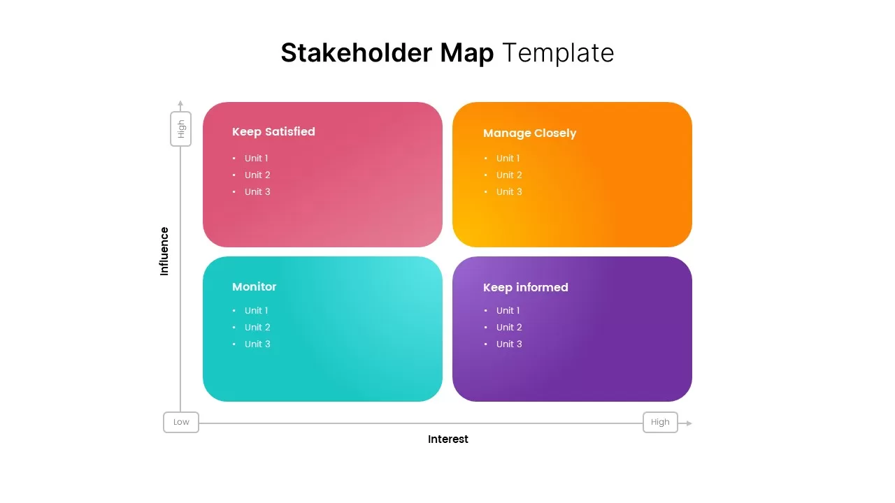
Stakeholder Map Template for PowerPoint & Google Slides
Business
Circular Mind Map Template for PowerPoint & Google Slides
Mind Maps
Colorful Mind Map with Icons Template for PowerPoint & Google Slides
Mind Maps
Colorful Mind Map Template for PowerPoint & Google Slides
Mind Maps
Mind Map Template for PowerPoint & Google Slides
Mind Maps
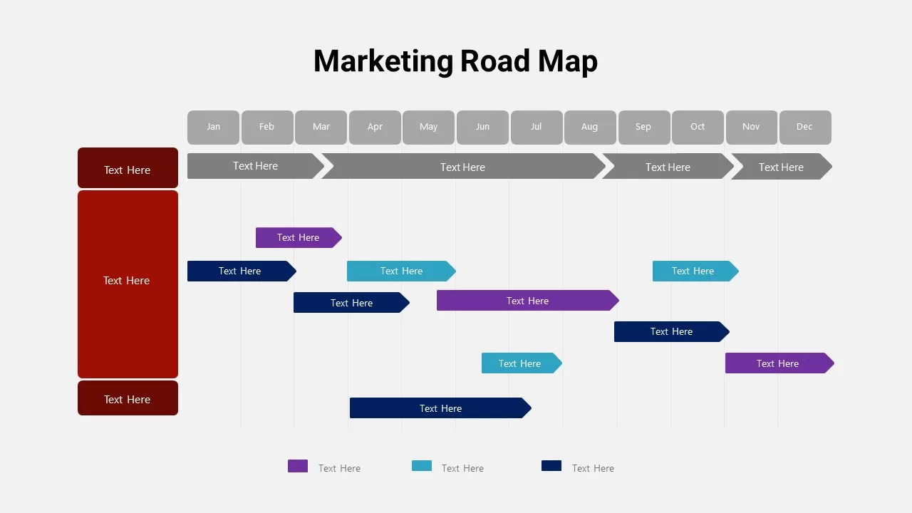
Detailed Marketing Road Map Timeline Template for PowerPoint & Google Slides
Timeline
Heat Map Analysis Template for PowerPoint & Google Slides
Risk Management
Professional Risk Heat Map Visualization Template for PowerPoint & Google Slides
Risk Management
Interactive Heat Map Template for PowerPoint & Google Slides
Bar/Column
Heat Map Risk Matrix Dashboard Template for PowerPoint & Google Slides
Comparison Chart
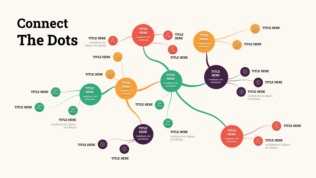
Connect the Dots Mind Map template for PowerPoint & Google Slides
Mind Maps
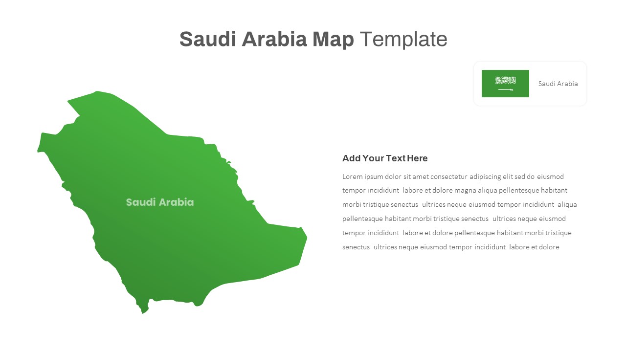
Free Editable Saudi Arabia Map Template for PowerPoint & Google Slides
World Maps
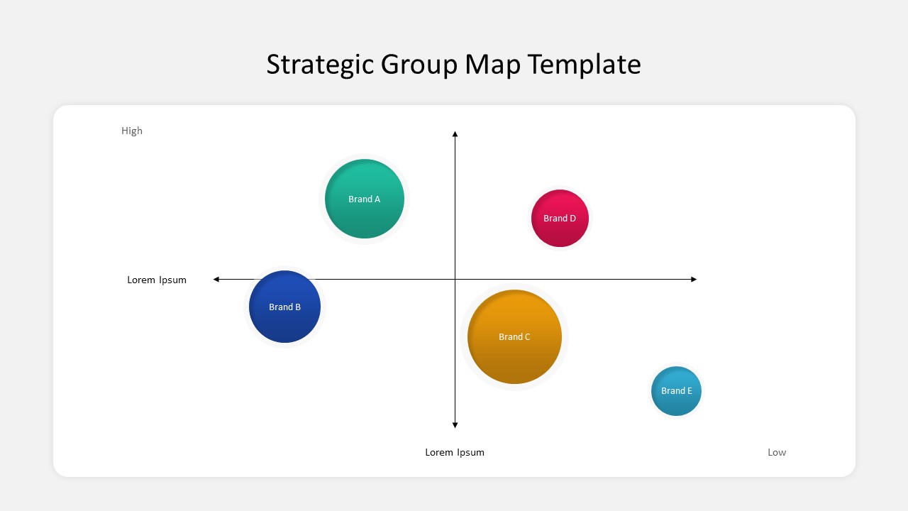
Business Strategic Group Map Analysis Template for PowerPoint & Google Slides
Competitor Analysis
Free
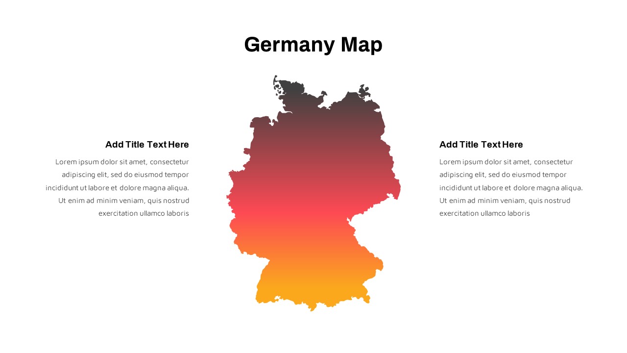
Germany Map with Regional Callouts Template for PowerPoint & Google Slides
World Maps
Free Global Market Distribution Map Template for PowerPoint & Google Slides
World Maps
Free
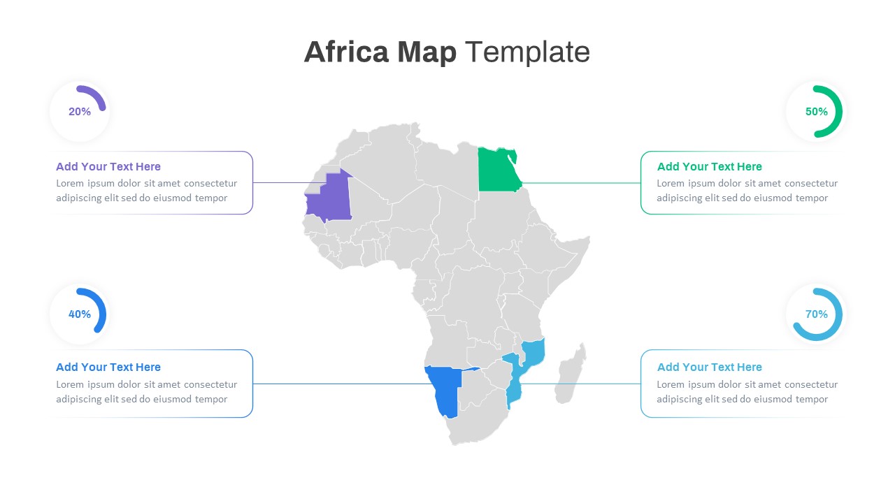
Editable Africa Map Infographic Data Template for PowerPoint & Google Slides
World Maps
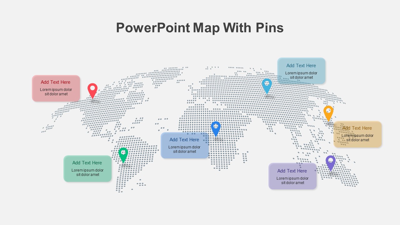
Colorful World Map with Location Pins Template for PowerPoint & Google Slides
World Maps
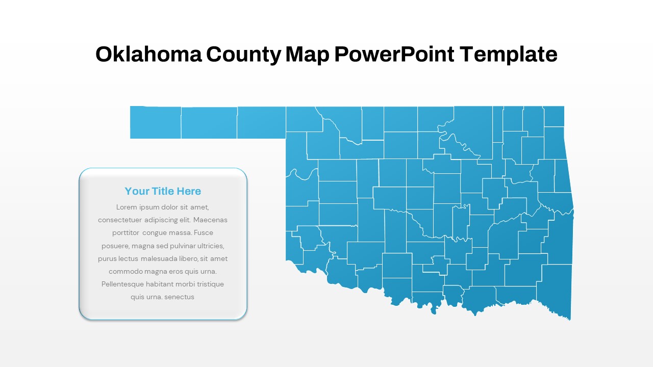
Interactive Oklahoma County Map Template for PowerPoint & Google Slides
World Maps
Modern Custom Eight-Branch Mind Map Template for PowerPoint & Google Slides
Mind Maps
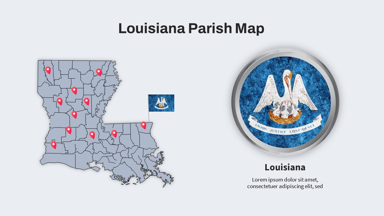
Louisiana Parish Map with Markers Template for PowerPoint & Google Slides
Maps
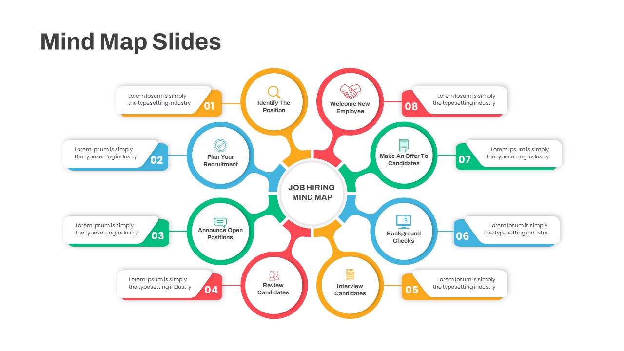
Eight-Step Job Hiring Mind Map Template for PowerPoint & Google Slides
Mind Maps
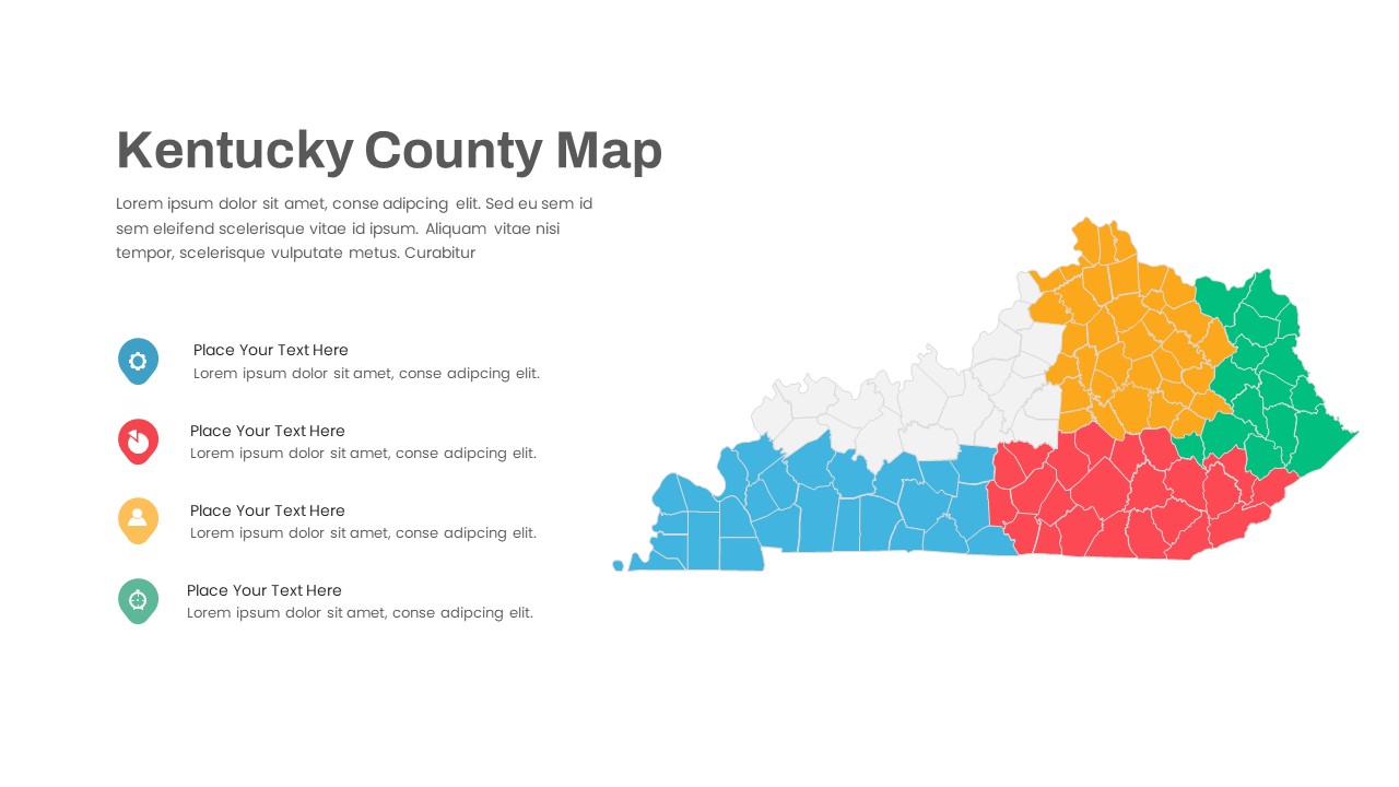
Kentucky County Map Visualization Template for PowerPoint & Google Slides
World Maps
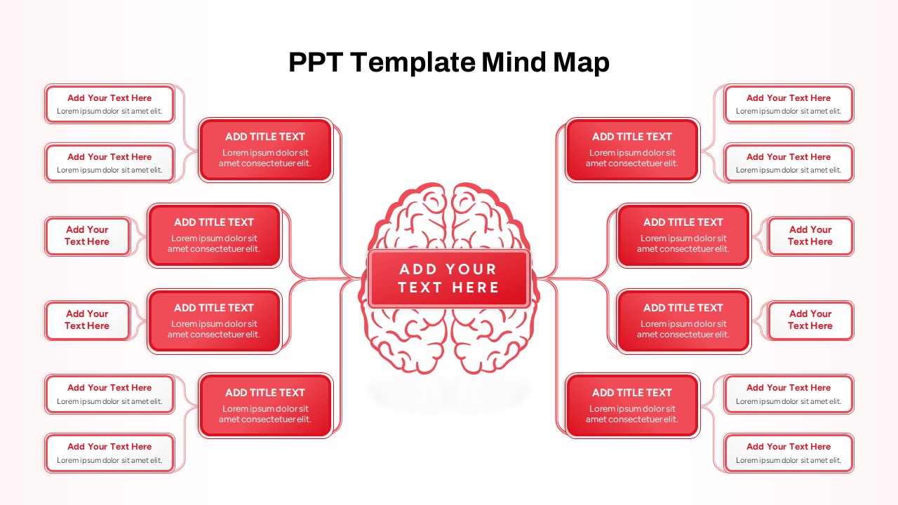
Red Brain Mind Map Diagram Template for PowerPoint & Google Slides
Mind Maps
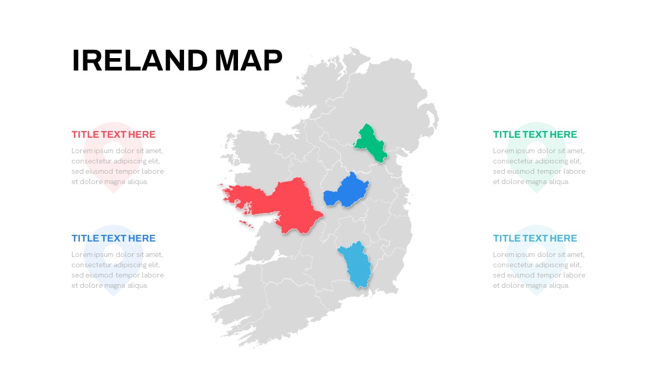
Editable Ireland Map Infographic Slide Template for PowerPoint & Google Slides
World Maps
Free
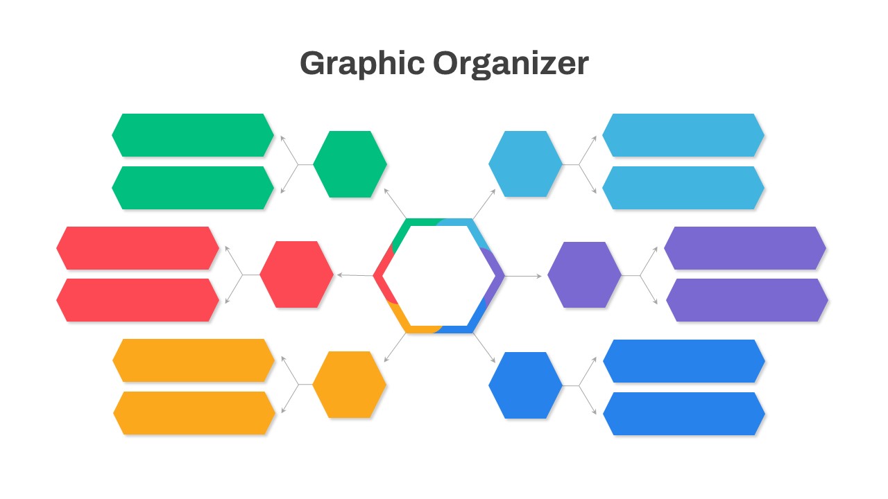
Graphic Organizer & Double Bubble Map Template for PowerPoint & Google Slides
Maps
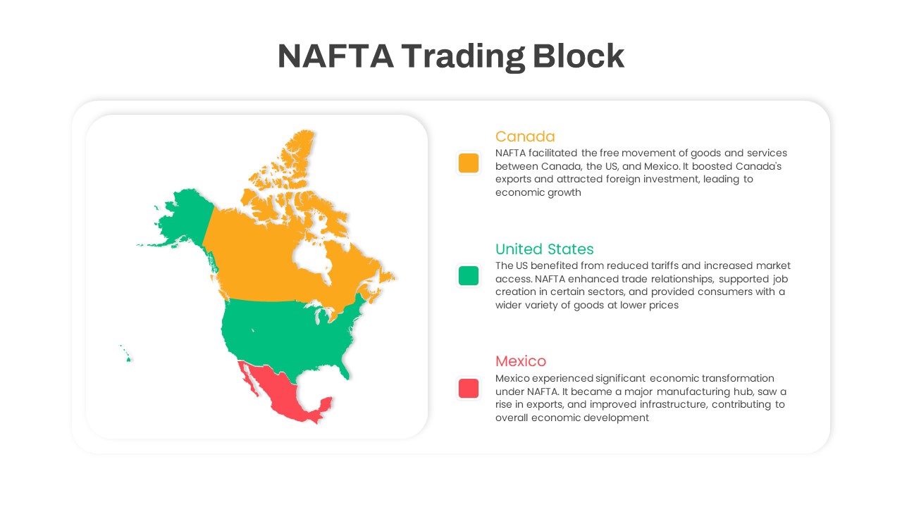
NAFTA Trading Block Map Infographic Template for PowerPoint & Google Slides
World Maps
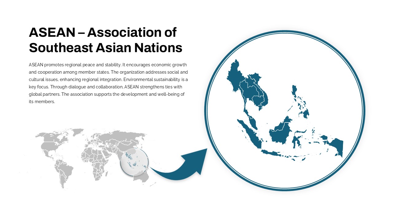
Professional ASEAN Region Zoom Map Slide Template for PowerPoint & Google Slides
World Maps
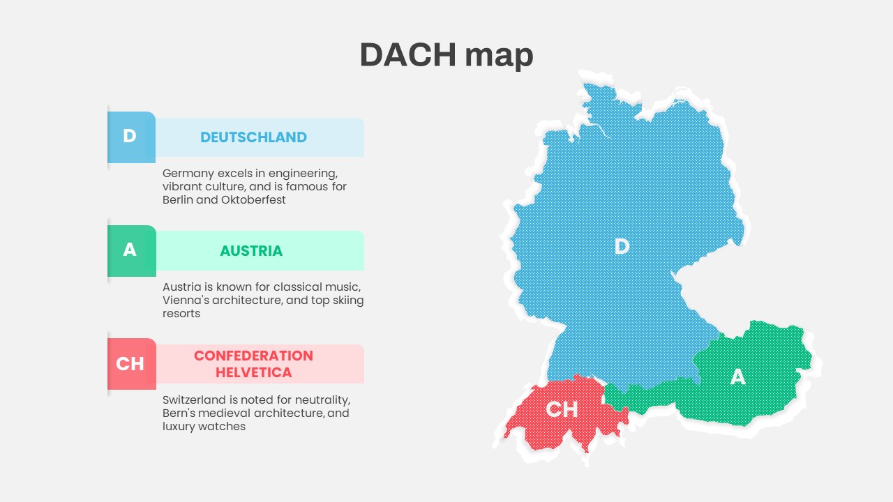
DACH Region Map with Country Highlights Template for PowerPoint & Google Slides
Maps
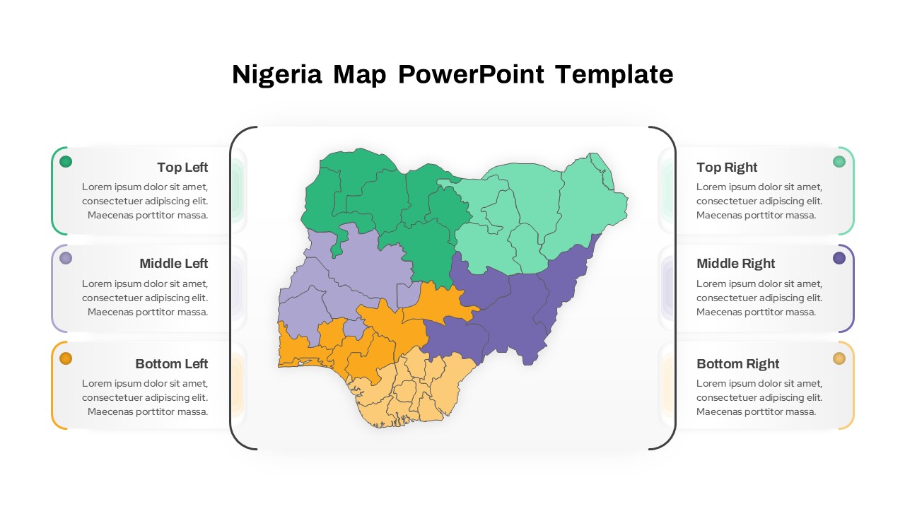
Nigeria Regional Callout Map Diagram Template for PowerPoint & Google Slides
Maps
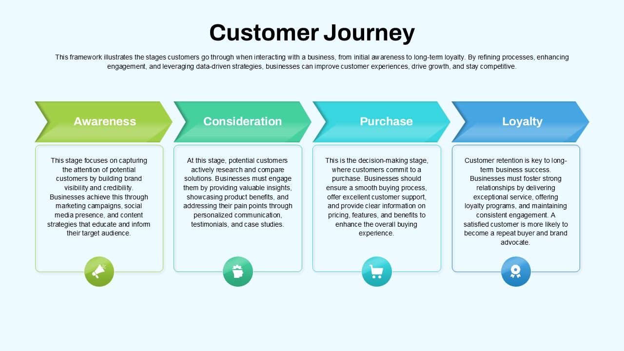
Customer Journey Process Map Infographic Template for PowerPoint & Google Slides
Customer Journey
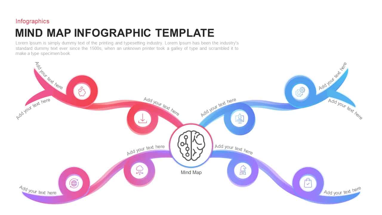
AI Mind Map & Hub-and-Spoke Diagram Template for PowerPoint & Google Slides
Mind Maps
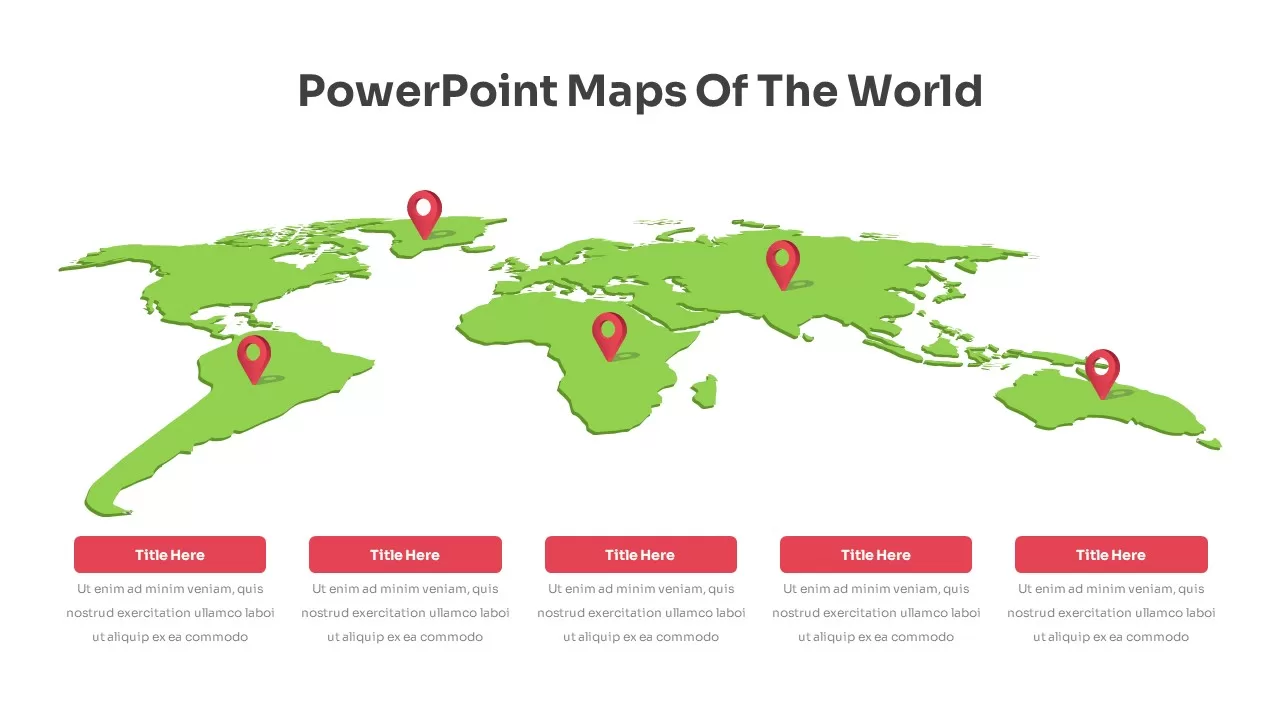
Global Map Highlighting Key Locations template for PowerPoint & Google Slides
World Maps
China Map Infographic Regional Stats Template for PowerPoint & Google Slides
World Maps
Hong Kong Geographic Map Infographic Template for PowerPoint & Google Slides
World Maps
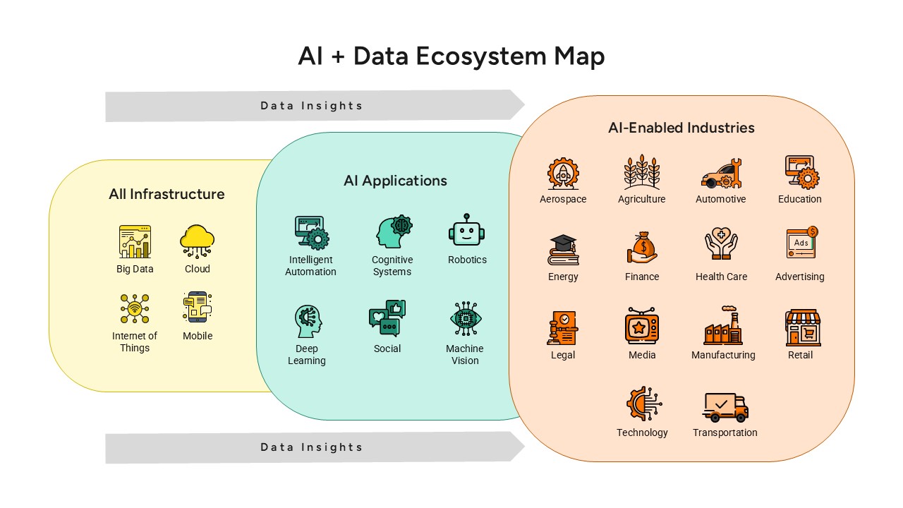
AI and Data Ecosystem Map Template for PowerPoint & Google Slides
AI
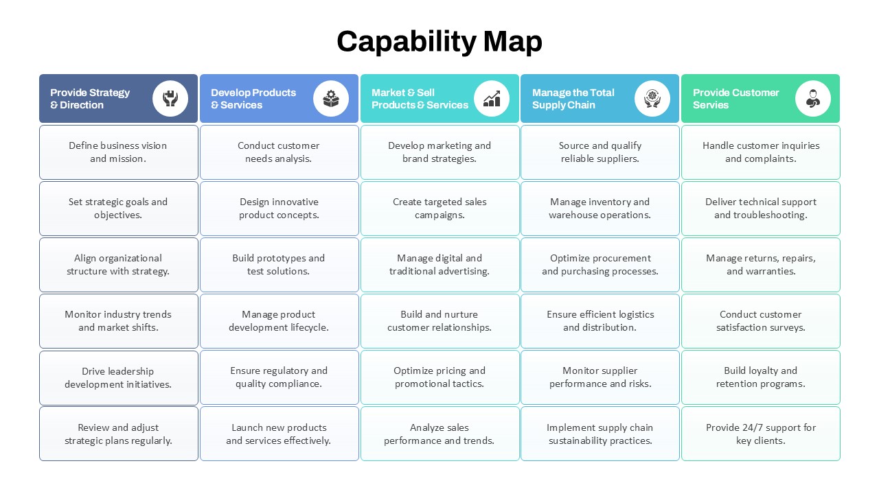
Capability Map Overview Template for PowerPoint & Google Slides
Business Strategy
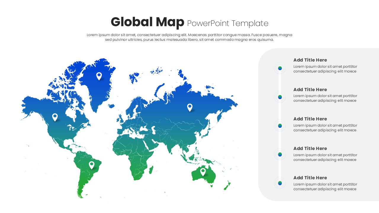
Global Map with Pinpoint Markers template for PowerPoint & Google Slides
Business
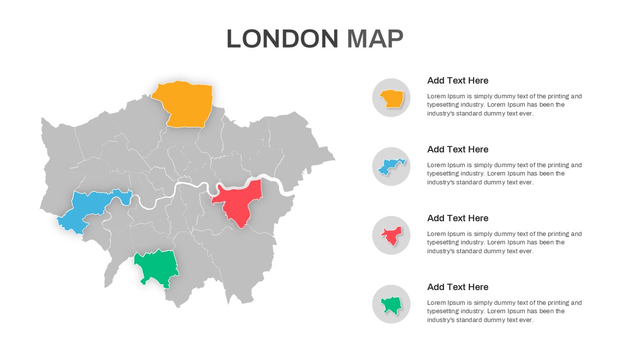
London Map with Highlighted Boroughs Template for PowerPoint & Google Slides
World Maps
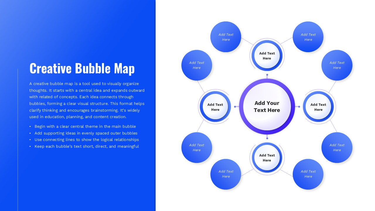
Creative Bubble Mind Map Template for PowerPoint & Google Slides
Mind Maps
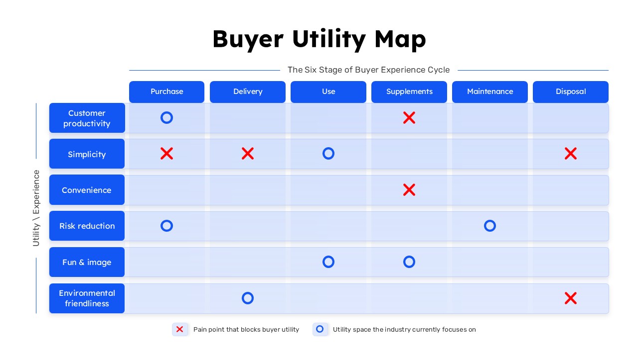
Buyer Utility Map Strategy Matrix Template for PowerPoint & Google Slides
Customer Journey
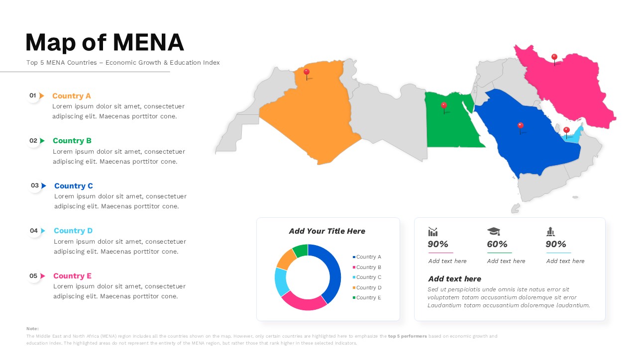
Map of MENA Infographic Template for PowerPoint & Google Slides
World Maps